colorterminology 114 S21 - Homework For You
4
ARCH 114 Studio ll: Spring, 2021 Color Introduction In visual perception a color is almost never seen as it really is -- as it physically is. This fact makes color the most relative medium in art. In order to use color effectively it is necessary to recognize that color deceives continually. To this end, the beginning is not a study of color systems. First it should be learned that one and the same color evokes innumerable readings. Josef Albers, Interaction of Color What is Color? Color is defined in two ways; in terms of the characteristics of light, described in terms of wavelengths or frequencies; and in terms of our perception of color in objects. The study of the first may be characterized as color theory (the science of color) and the study of the other, art theory (the visual and perceptual aspects of color). Our perception of color is of course dependent upon the science of color, but our visual understanding of color is filtered through the individual eye and the interpretive response of the brain. Thus, unlike the study of light, our perception of color is not objective. It is important to be clear, both in our study of color and in our use of color terminology, which aspect of color we are discussing. As designers, it is the visual/ non-objective aspects of color in which we are interested (the chemistry of color manufacture is also important, though we generally rely on the chemist), but we should note some background information in the science of color. In 1676, Sir Isaac Newton first demonstrated that light is the source of color. Newton passed a beam of sunlight through a triangular prism and produced the rainbow of hues of the visible spectrum. His conclusion was revolutionary: color is in the light, and the light we see as white is a mixture of all the colors of the visible spectrum. In Opticks (1705) he describes the first color wheel. Beginning in the late eighteenth century there was a surge of interest in defining colors systematically. Many two- and three-dimensional models have been proposed, among them the circle, triangle, and sphere and numerous diagrams of the relationships of colors. Most color theories have been compiled in the interest of defining standard colors, often for use in industry or as a guide for the painter, and many are accompanied by color samples. These compilations of color can be useful tools for the designer. We know that color results from light waves (electromagnetic energy) of differing lengths or frequencies. Light waves themselves have no color, but are interpreted by the eye and brain as color. The process of mixing lights to create colors is an additive process. The absence of light is black. The mixture of all colors of light results in white. The perceived color of a physical object is the result of absorption and reflectance of light. An object perceived as red absorbs all except the red light waves, which are reflected and seen by the eye. This is a subtractive process. (The pigment subtracts all but the red of the color spectrum.) Pigments combine in the subtractive system. The mix of all colors of the spectrum results in gray/black. The absence of color- absorptive pigments results in white (all colors of light are reflected and are seen as white). Since our perception of color is dependent upon the reflection of light, the color of ambient light affects the color of the object. A red object in green light looks black, since there are no red light waves in the light source to be reflected.
Transcript of colorterminology 114 S21 - Homework For You
ARCH 114 Studio ll: Spring, 2021 Color Introduction In visual perception a color is almost never seen as it really is -- as it physically is. This fact makes color the most relative medium in art. In order to use color effectively it is necessary to recognize that color deceives continually. To this end, the beginning is not a study of color systems. First it should be learned that one and the same color evokes innumerable readings. Josef Albers, Interaction of Color What is Color? Color is defined in two ways; in terms of the characteristics of light, described in terms of wavelengths or frequencies; and in terms of our perception of color in objects. The study of the first may be characterized as color theory (the science of color) and the study of the other, art theory (the visual and perceptual aspects of color). Our perception of color is of course dependent upon the science of color, but our visual understanding of color is filtered through the individual eye and the interpretive response of the brain. Thus, unlike the study of light, our perception of color is not objective. It is important to be clear, both in our study of color and in our use of color terminology, which aspect of color we are discussing. As designers, it is the visual/ non-objective aspects of color in which we are interested (the chemistry of color manufacture is also important, though we generally rely on the chemist), but we should note some background information in the science of color. In 1676, Sir Isaac Newton first demonstrated that light is the source of color. Newton passed a beam of sunlight through a triangular prism and produced the rainbow of hues of the visible spectrum. His conclusion was revolutionary: color is in the light, and the light we see as white is a mixture of all the colors of the visible spectrum. In Opticks (1705) he describes the first color wheel. Beginning in the late eighteenth century there was a surge of interest in defining colors systematically. Many two- and three-dimensional models have been proposed, among them the circle, triangle, and sphere and numerous diagrams of the relationships of colors. Most color theories have been compiled in the interest of defining standard colors, often for use in industry or as a guide for the painter, and many are accompanied by color samples. These compilations of color can be useful tools for the designer. We know that color results from light waves (electromagnetic energy) of differing lengths or frequencies. Light waves themselves have no color, but are interpreted by the eye and brain as color. The process of mixing lights to create colors is an additive process. The absence of light is black. The mixture of all colors of light results in white. The perceived color of a physical object is the result of absorption and reflectance of light. An object perceived as red absorbs all except the red light waves, which are reflected and seen by the eye. This is a subtractive process. (The pigment subtracts all but the red of the color spectrum.) Pigments combine in the subtractive system. The mix of all colors of the spectrum results in gray/black. The absence of color-absorptive pigments results in white (all colors of light are reflected and are seen as white). Since our perception of color is dependent upon the reflection of light, the color of ambient light affects the color of the object. A red object in green light looks black, since there are no red light waves in the light source to be reflected.

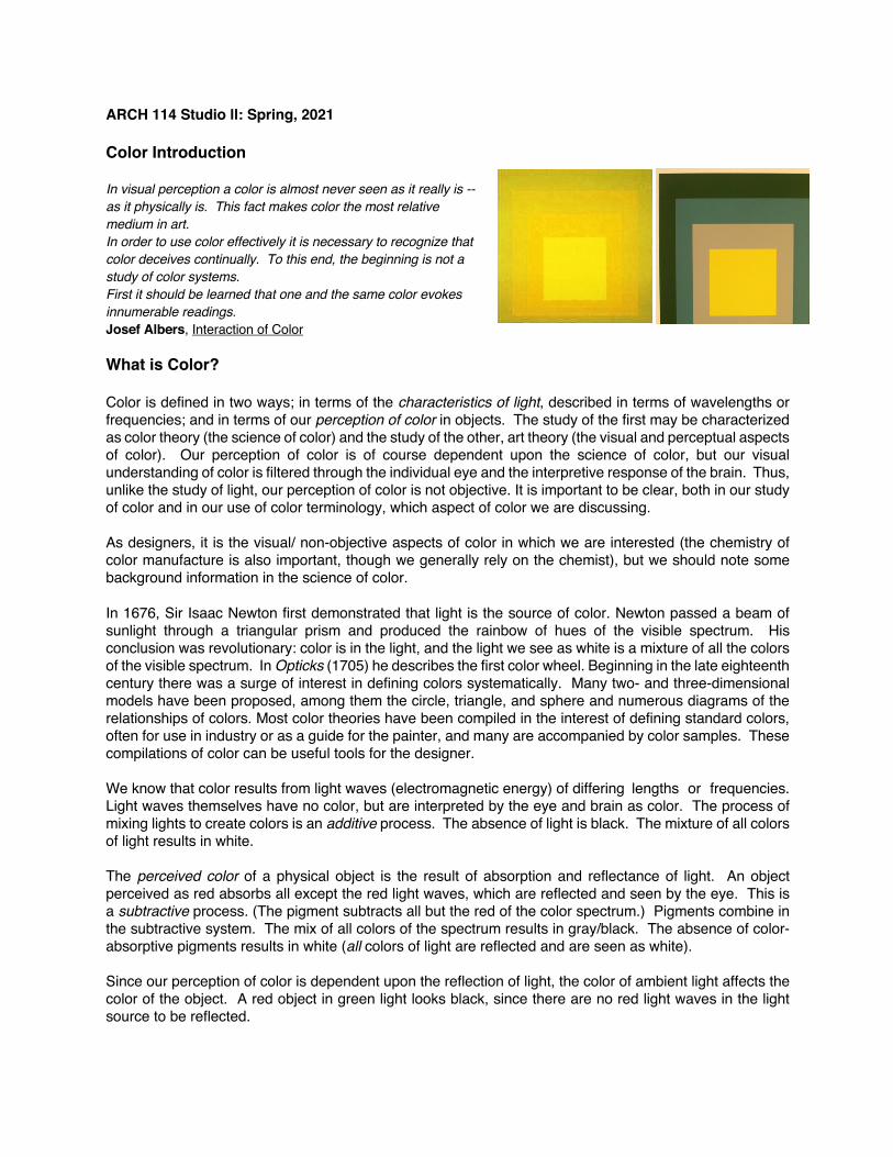
The Effects of Color What scientific color theories do not address are the effects of color on the viewer, on other colors in a composition, and the interdependence of color and form. Throughout the history of art and design, color has been used for its symbolic content, for expressive and psychological effects, and for pure visual and spatial effect. The common models for approaching color today, which emphasize the visual and spatial effects of color, are the teachings of Bauhaus instructors Johannes Itten and Josef Albers. Albers stressed the relativity of color perception and proposed an intuitive method for discovering the relationships between colors through a series of exercises. Itten also emphasized color relativity, and characterized the effects of color systematically in terms of seven color effects: Johannes Itten’s Seven Color Contrasts (color effects), in The Art of Color
• Contrast of Hue • Light/Dark Contrast • Cold/Warm Contrast • Complementary Contrast • Simultaneous Contrast • Contrast of Saturation (dull-vivid contrast) • Contrast of Extension (relative sizes of color areas)
Additional Visual and Spatial Effects:
• White makes adjacent hues appear darker. Black causes them to seem lighter. • Light values advance relative to darker values. • Cool colors recede; warm colors advance. (red/orange and blue/green are the warmest and coldest
colors respectively.) • Between two colors not precisely complementary, each visually shifts the other toward its
complement. • Neutral grays are easily influenced, in terms of perception, by adjacent colors. • A saturated color advances relative to a dull color of equal lightness. • The relative extent (area) and light value determine the force of a pure color. • The spatial effects of colors are influenced by background color. Light tones on a dark background
advance, but on a white background, the effect is reversed. • Areas of contrast between colors come forward; low contrast areas recede.

Color Terminology Color That aspect of things that is caused by differing qualities of the light reflected or emitted by them. It may be defined in terms of the observer, or of the light.
a. Perception: The appearance of objects or light sources described in terms of the individual’s perception of them, involving hue, lightness, and saturation for objects, and hue, brightness and saturation for light sources. b. Light: The characteristics of light by which the individual is made aware of objects of light sources through the receptors of the eye, described in terms of dominant wavelength, luminance, and purity. c. ISCC-NBS system defined in terms of Munsell color notation: numerical scales of hue, value and chroma
Three Attributes of Perceived Color: Hue The variety of color as illustrated on the color wheel, ranging from red through yellow, green, and blue and (circularly) back to red. (i.e. color name) Lightness (value) The relative darkness or lightness of a color. Saturation (chroma) Vividness of hue; degree of purity of a color; degree of difference from a gray of the same lightness. A saturated color can be diluted in four ways: by adding white, black, gray, or its complementary color Tint A gradation of a color made by adding white to it to lessen its saturation Tone A gradation of a color made by adding gray to it to lessen its saturation Shade The degree to which a color is mixed with black; gradation of darkness

Complementary color One of two colors which when ideally mixed in proper proportions, appears white (in terms of light) or gray (in mixing pigments), as in the combination of blue-green with red. (Opposite colors on the color wheel) Primary colors The colors from which all other colors are derived; varies depending on the means by which the color is produced. Red, blue and yellow are the primary colors for the painter’s process in producing color (mixing of pigments). The sets of primary colors are different when mixing projected light (RGB), describing the photographic and printing process (CMYK), and digital process (RGB or CMYK for monitor vs printer).