Colors of Life Axel Venn - Baumit
202
Colors of Life FACADE COLORS FOR ARCHITECTS Axel Venn Colors of Life. In this work by professionals, professionals learn everything about the most beautiful facade colors and use interactive templates to find the best color combinations for their next project. From the 888 Baumit Life colors that architects can choose from, Prof. Axel Venn has selected exactly 144 colors and assigned them to eight color series. The color researcher, designer and color artist not only makes the topic of color more accessible to readers, but also makes it tangible. Colors have an effect and they also have a DNA. „I‘ve developed individual DNAs for all 144 shades. Each individual color has its own color formula. This can be orientated towards the charismatic effect, structured by functionality, by emotionality, by future orientation, by value, „explains Professor Axel Venn, a distinguished expert in his field. A whole spectrum of innovations. Baumit Life is not only the most comprehensive color system for facades, but also the most innovative one. This is how you find products with a self-cleaning effect, excellent weather protection and a huge color system that is as varied, individual and beautiful as life itself. Here, color and function form a professional symbiosis. The eight color series offer the perfect choice. A program in which the signal strength is integrated to have a nice echo. All colors that Prof. Axel Venn has put together are available from Baumit. The Baumit history 1810 Lime kiln in Wopfing 1911 Registration of Wopfinger Stein- und Kalkwerke 1970 Start of dry mortar production 1972 Start of production of wet products 1980 Own cement works 1988 Foundation of the „Baumit“ brand 1990 Baumit goes international – Start of Baumit in Hungary 1999 Baumit develops „Baumit open“ – the breathable KlimaFassade 2002 Opening of Europe’s largest wet plaster works in Wopfing. 2003 Baumit purchases 100% of the German Bayosan Company 2005 Introduction of Baumit StarTrack – gluing instead of doweling 2006 Baumit Nanopor – the self-cleaning facade 2008 Robert Schmid takes over the management of Schmid Industrie Holding. 2012 Baumit develops Baumit „Life“ – Europe’s most comprehensive facade color system 2014 1. Baumit Life Challenge – „Europe’s Facade“competition 2015 Opening of Viva Research Park – Healthy Living becomes the central Baumit motif 2017 All of the Baumit companies in 27 countries operate under the umbrella of the Schmid Industrie Holding 2018 Baumit develops StarTop, the first plaster with Drypor effect FACADE COLORS FOR ARCHITECTS Axel Venn baumit.com
Transcript of Colors of Life Axel Venn - Baumit
Colors of LifeFACADE COLORS FOR ARCHITECTS
Axel Venn
Colors of Life.In this work by professionals, professionals learn everything about the most beautiful facade colors and use interactive templates to find the best color combinations for their next project. From the 888 Baumit Life colors that architects can choose from, Prof. Axel Venn has selected exactly 144 colors and assigned them to eight color series. The color researcher, designer and color artist not only makes the topic of color more accessible to readers, but also makes it tangible.
Colors have an effect and they also have a DNA. „I‘ve developed individual DNAs for all 144 shades. Each individual color has its own color formula. This can be orientated towards the charismatic effect, structured by functionality, by emotionality, by future orientation, by value, „explains Professor Axel Venn, a distinguished expert in his field.
A whole spectrum of innovations. Baumit Life is not only the most comprehensive color system for facades, but also the most innovative one. This is how you find products with a self-cleaning effect, excellent weather protection and a huge color system that is as varied, individual and beautiful as life itself. Here, color and function form a professional symbiosis. The eight color series offer the perfect choice. A program in which the signal strength is integrated to have a nice echo. All colors that Prof. Axel Venn has put together are available from Baumit.
The Baumit history
1810 Lime kiln in Wopfing1911 Registration of Wopfinger Stein- und Kalkwerke1970 Start of dry mortar production 1972 Start of production of wet products 1980 Own cement works 1988 Foundation of the „Baumit“ brand1990 Baumit goes international – Start of Baumit in Hungary 1999 Baumit develops „Baumit open“ – the breathable KlimaFassade2002 Opening of Europe’s largest wet plaster works in Wopfing.2003 Baumit purchases 100% of the German Bayosan Company2005 Introduction of Baumit StarTrack – gluing instead of doweling 2006 Baumit Nanopor – the self-cleaning facade 2008 Robert Schmid takes over the management of Schmid Industrie Holding.2012 Baumit develops Baumit „Life“ – Europe’s most comprehensive facade color system 2014 1. Baumit Life Challenge – „Europe’s Facade“competition 2015 Opening of Viva Research Park – Healthy Living becomes the central Baumit motif 2017 All of the Baumit companies in 27 countries operate under the umbrella of the Schmid Industrie Holding2018 Baumit develops StarTop, the first plaster with Drypor effect
FACA
DE C
OLOR
S FO
R AR
CHIT
ECTS
Ax
el V
enn
baumit.com

2

Einleitung
Dear partners and friends!
I am particularly pleased to present to you the continuation and further development of our Baumit Life color program, which is also the first book for architects on color design for the facade. For Baumit, facades are more than just a functional, protective shield. We regard them as an opportunity to give each building its unique character through the choice of material, structure and color.
In fact, the facade becomes the face of the building. Distinctive. Unmistakable. Extraordinary. In order to advance this vision, Baumit has developed the Life color system. Baumit Life is not only the most comprehensive color system for the facade, but also the most innovative one. A color system that is as varied, individual and beautiful as life itself. A color fan with 888 colors exclusively for architects. In addition to colors, the texture of the surfaces is of course crucial. Light and shadow, imitations and much more influence the architecture and our perception. Baumit provides an extensive program for individual design. Read more about this at the end of this book.
Architects play a very central role for us and so we have realized this unique project together with Professor Axel Venn. We are proud to have won over the internationally acclaimed color researcher, designer and artist, who has published more than 25 books, for this colorful and multifaceted project. For Professor Venn, colors and shapes have their own meta-linguistic, individual and collective content. For me, Professor Venn is not only the leading color expert, a wonderful person and speaker. With amorphy and synesthesia, he raises colors to another sensory level and brings them to life with his color DNA.
In this project, Professor Venn has again achieved something unique. From the nine million colors humans are able to see, he managed to filter out exactly 144 colors from Baumit Life and unite them in eight themes. The eight color series now offer an extraordinary selection. The result of this unique collaboration is the first comprehensive anthology for the facade, which you now hold in your hands.
A source of ideas and a toy for architects.Enjoy!
Mag. Robert SchmidCEO Baumit Beteiligungen

2
Professor Axel VennColor expert, artist and author

3
This applies in particular to 19th century residences. The white villa or the radiant light color of the royal palace were of a purity and innocent grandeur that was perceived as romantic. The white villa, surrounded by cypresses and situated on Mediterranean hills, was for several epochs accompanied by the yearning dreams of the viewers. Tens of thousands of prose works and countless delicate small books of poetry accommodated the rapturous emotions. To this day, and certainly beyond that, the splendid buildings still suggest an ideal image, even if they are the most mundane architectural creations: from a simple single-family house to a shopping or administrative center or a seat of government with a modernist design.
The omnipresent white and the renunciation of color is in many cities around the world not just a persistent phenom-enon of the external effect, but also still a relic of the latent bourgeois willingness to imitate. The acceptance of pure white unfortunately means a millionfold abandonment of the many better color shades. And architecture needs color! No matter what materiality it has. Cities and villages are nothing but geographical formations in the midst of nature or nature amidst artificially created man-made structures. – We call the frequently fissured, open-work, structured, divided, straight, slanted or round, colorfully achromatic, opalescent, reflective, sculptured modules facades. We look up at them or down or we look at them. Their physiognomies have perspective, panoramic, peep-box-like, some-times deceptive or infinitely smooth qualities and only present mirror images in their glass fronts.
The grand whole is the three-dimensional building. It is surrounded by flat and fissured elements that protect the interior from the exterior or open it towards it. Body language, exposition in materiality, gesture, presence, outline and color are rather optimized for high-contour presentation than for shapeless camouflage or submersible disap-pearance. We will always be curious to experience the newly built, renovated or completely new urban landscapes, whether as a cabinet of curiosities, fabulous diorama or futuristic daring exploit. In the future, we do not want to be bored in the agglomerations or centers, nor do we want to be deceived. We want our places to be authentic, meaningful, also curious, refreshing and adventurous. Inventiveness, infinite courage and container-loads of creativity, as well as sensitivity, flexibility, altruism, and prudence can be the right tools to open up new horizons. Beautiful streets, welcoming parks, stimulation potential and relaxation zones. Sociability and empathy are the most significant of the many requirements that await to be fulfilled. Let us spread only ten percent of the 9 million colors that humans can differentiate across cities and villages. The Minister of Taste or her colleague is requested to implement the ten percent mentioned above. If this is not achieved, the Color Commissioner will have to fix it.
Colors in architecture followed the classically feasible and elegantly possible.
ARCHITECTURE NEEDS COLOR!

4

5
INTRODUCTIONTemplates and application 06Amorphies 14Interviews with architects 16Synesthesia 18Color DNA 19 COLOR SERIES A – HA – Jade & White // Return to objectivity 20 B – Pebble & Basalt // Authentic functionality 40C – Navy & Azur // Infatuating lightness 60D – Wheat & Gold // Room for feeling comfortable 80E – Viola & Gentian // Seductive warmth 100F – Coral & Orange // Intensive signaling power 120G – Sand & Sun // Colorful appeal 140H – Pistachio & Sage // Healthyjoy of living 160
INTERVIEWS WITH ARCHITECTSEnrique Alvarez Sala-Walter // SPAIN 33Amir Vuk // BOSNIA 53Samuel Delmas // FRANCE 73Gábor Tari // HUNGARY 93Michele Gortan // ITALY 113Haack Lauerbauch // GERMANY 133Buerger Katsotas // GREECE 153Radu Teacă // ROMANIA 173
BAUMITBaumit Life Colors 182Paints and finishing plasters 188Baumit Creative Techniques 194Smooth Facade 196Classic Textures 197Effects on the Facade 198
CONTENT

6
THE TEMPLATES
The templates focus one‘s attention on a specific color selection and on self-created color compositions. They also help to implement new, indefinite ideas as well as target-oriented design aspects. The number of possible combinations is enormous. The segmentation by the eight color fields makes them both manageable and creatively controllable.
The general use of the colored templatesMove the templates across the color series matrix, so that the selection is completely structured. If you run the same colored template (e. g. color series D) across the colors of Matrix D, then you combine shades within one color series. You can also combine different color series with each other to make it more colorful and contrasting or brighter or fresher, friendlier or more muted. Also slide the templates over the amorphies, here the possible color combinations are almost infinite. Nevertheless, they remain within one world of color and taste. It becomes very exciting when the colored templates are moved over the architectural images, then the result is more concrete.
Take pictures of intermediate results and understand themIf you like a combination, first take a picture with your smartphone and write down the values - all colored template areas have color codes. This is also the case with the matrices, the other pictures have page numbers.
The use of black/white templates With the black/white templates, you can explicitly highlight a few specific shades and completely hide the rest of the surrounding area. By moving the template over the color series matrix, you get many application-friendly color harmonies. For example, you will find the 2, 4 or 9 colors that match each other perfectly. It makes a big difference whether you use the black or white side of the template: black creates a strong contrast. White, on the other hand, presents the lighter colors in a more differentiated way.
Five black/white templates

7
8 colored templates (front and rear side) corresponding to the 8 color series A - H with 18 colors each (+ 95% black + 5% white)
Templates

8
Another tip: Use both sides of the templates, black and white, as separating or basic colors respectively masking colors, because especially the light or very deep shades change not only when viewed in light or darkness, but also because of their surrounding colors: white respectively pastel nuances become almost indistinguishable with black surroundings, whereas with brighter surrounding hues they appear much more differentiated. Black swallows up color substance, whereas white stimulates color substance.
Unconventional use of the templatesYou can also experiment with the templates in a rather unconventional way: by covering two fields, vertically or horizontally, or also four and more fields by placing them on the book pages in the middle of the horizontal and vertical. Furthermore, it is possible to position two or three templates on top of each other on the book pages and obtain an additional multiple image.
0211 0232 0296 0284 0373 0152 0234 0089 0236
0382 0211 0152 0232 0234 0236 0289 0217 0219
0284 0373 0281 0291 0321 0219 0298 0286 0296
0281 0236 0234 0286 0211 0296 0232 0321 0382
0289 0217 0219 0089 0298 0286 0296 0284 0211
0089 0298 0286 0296 0284 0234 0281 0291 0321
0217 0289 0236 0234 0089 0286 0296 02810219
Matrix from the book: here color series D
Template with black background for the vertical row
The templates can be used universally:
9
0211 0232 0296 0284 0373 0152 0234 0089 0236
0382 0211 0152 0232 0234 0236 0289 0217 0219
0284 0373 0281 0291 0321 0219 0298 0286 0296
0281 0236 0234 0286 0211 0296 0232 0321 0382
0289 0217 0219 0089 0298 0286 0296 0284 0211
0089 0298 0286 0296 0284 0234 0281 0291 0321
0217 0289 0236 0234 0089 0286 0296 02810219
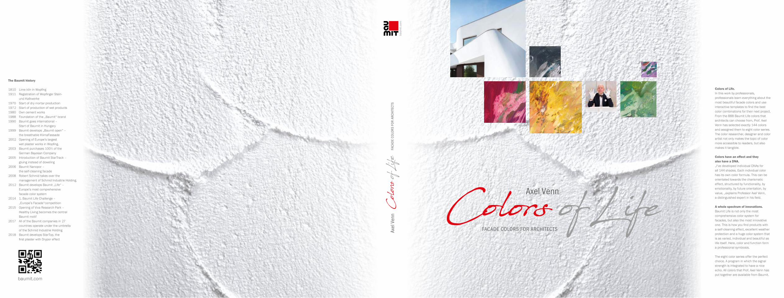
Template placed on Matrix D
Move templates by hand to get ever new results
Take a photo to record intermediate results (the smartphone is always at hand anyway)
Templates

10
0472 0506 0475 0474 0573 0847 B 0487 0159 0849 B
0571 0472 0576 0506 0395 B 0328 0329 0381 B 0299
0474 0573 0481 0393 B 0443 B 0489 0778 B 0477 0396 B
0481 0328 0487 0477 0472 0886 B 0506 0882 B 0884 B
0329 0489 0299 0989 B 0479 0477 0199 B 0474 0393 B
0159 0479 0477 0475 0474 0768 B 0481 0976 B 0521
0489 0329 0328 0487 0159 0399 B 0475 0421 B0299
Black or white side of the colored template at the same position of the same matrix:
The light colors appear much more differentiated.
Colored template

11
Also turn the template through 90° or 180°!
Amorphies can also be used as modules for both small- and large-scale design ideas. A large part of our perceptions is based on blurred images. In art and photography, such visual and experiential events are almost a time signal of the present and the future. That is why we want to include the new cognitive images as an integral part of this book. This is because many of the surface options can also be used for architecture and interior completion, which do not have to associate their colored characteristics exclusively with graphically staged surface dimensions.
Templates + color fields for individual designThe recipes for designing with amorphies are relatively easy to explain and understand. The colors are well known and are applied with handicraft means in the visible mixing ratios. The first samples for larger areas can be represented on a smaller scale and thus facilitate practicing. By working intensively with this book, it will be possible to implement many new aspects and creative possibilities.
Amorphie A+C: Place colored template A and H on top of it, then slide until the desired 3-color harmony appears.
Amorphous, blurred surfaces + templates
Templates

12
Template A on a blurred architectural photo
Take a real photo of a building and move different templates over it - search for a friendlier but similar facade color, or a different color for the window sills (here template E).
Template on blurred or real photograph

13
Template in angled position – 5-color section
Filter out finely differentiated grey shades
Color template on matrixThat‘s it.
4 colored templateson Matrix C
Black and colored template to achieve a stronger focus
Exciting 3-color compositions
2 colored templateson color series C
White template – 2 bright + vibrant shades
Pattern: a straight template -another one below at 45°.
Results for various applications
Templates

14
In principle, we perceive surfaces as amorphous images. We define paint on an indoor wall or a facade as being multi-toned, but in case of doubt, our quite simply structured perception quickly assesses, sometimes or often mistakenly too quickly, that the visible surface consists of a single substrate. The fact that we nonetheless make the wrong assumption confirms the realization that our color memory is really dreadful. We are not even able to distinguish color nuances at a distance of one centimeter from each other as identical, similar or different. Only the direct, ad-joining comparison can help us. “Colors are children of light,” said J. W. v. Goethe - and rightly so. We need it for visual perception. Approximately 80 - 95 percent of our perception happens solely through the partially complementary involvement of other sensory areas via optical receptors.
The reason why a whole chapter is dedicated to amorphies is based on the familiar, sufficiently informative as well as extremely sensitive, sometimes mysteriously romantic and dreamily gift-ed way of seeing the world also through what is blurred, foggy, cloudy, interwoven and hazy. It is not only focusing that describes the visual result of stimulation and sensation, but also the non-focusing way of seeing of a relaxed stare-in-the-air perception, which is nearer to us. The soft change of vision in slow motion instead of a strenuous, staccato-like race of images reveals the truth.
By the way, from time to time people love blur more than clearly colored, overly contoured reality. Especially large areas stretching across hundreds or thousands of square meters demonstrate their uniqueness in the diversity of their expressiveness. I still remember the effect of wrapping the Reichstag building – today it is home to the Bundestag in Berlin. Christo and his wife Jeanne- Claude wrapped it up in a metal-coated film, which reflected almost the entire city and the vast sky spreading over it. Small sports airplanes and occasionally ascending balloons and the some-times greying, and at other times high-contrast, sunlit clouds staged a magnificent moving image. As a result of this spectacular complete covering, a historically and architecturally questionable building reached a glorious climax once in its history.
AMORPHOR HOW WE SEE SURFACESDo not focus on everything.The blurred vision is often sufficient.

15
The amorphous is in contrast to the structured.
Amorphies have the quality of overlooking them. For us, they don‘t end at the picture‘s edge. We continue thinking and developing their content. Their appeal lies in the negation of the overly planned and prefabricated. They are the truly natural. They survive times. We notice this when, over the years, corrosive influences produce patina effects that cause other, mostly non-direc-tional changes to a previously intact surface through traces of time.
AMORPHOR HOW WE SEE SURFACES

16
Estu
dio
Álva
rez-
Sala
+ A
ybar
mat
eos
+ H
ombr
e de
pie
dra
17
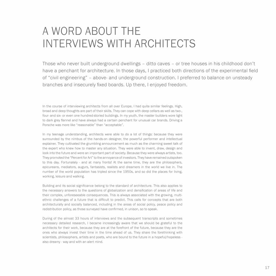
In the course of interviewing architects from all over Europe, I had quite similar feelings. High, broad and deep thoughts are part of their skills. They can cope with deep cellars as well as two-, four- and six- or even one hundred-storied buildings. In my youth, the master builders wore light to dark grey flannel and have always had a certain penchant for unusual car brands. Driving a Porsche was more like “reasonable” than “acceptable”.
In my teenage understanding, architects were able to do a lot of things: because they were surrounded by the nimbus of the hands-on designer, the powerful performer and intellectual explainer. They cultivated the grumbling announcement as much as the charming sweet talk of the expert who knew how to master any situation. They were able to invent, draw, design and look into the future and were an important part of society. Because they were always artists, too. They promoted the “Percent for Art” to the annoyance of investors. They have remained outspoken to this day. Fortunately - and at many fronts! At the same time, they are the philosophers, epicureans, mediators, augurs, fantasists, realists and dreamers in the world we live in. The number of the world population has tripled since the 1950s, and so did the places for living, working, leisure and walking.
Building and its social significance belong to the standard of architecture. This also applies to the necessary answers to the questions of globalization and densification of areas of life and their complex, unforeseeable consequences. This is always associated with the growing, multi-ethnic challenges of a future that is difficult to predict. This calls for concepts that are both architecturally and socially balanced, including in the areas of social policy, peace policy and redistribution policy, as those surveyed have confirmed, in unison, so to speak.
During of the almost 33 hours of interviews and the subsequent transcripts and sometimes necessary detailed research, I became increasingly aware that we should be grateful to the architects for their work, because they are at the forefront of the future, because they are the ones who always invest their time in the time ahead of us. They share the forethinking with scientists, philosophers, artists and poets, who are bound to the future in a hopeful/hopeless - also dreamy - way and with an alert mind.
A WORD ABOUT THE INTERVIEWS WITH ARCHITECTSThose who never built underground dwellings – ditto caves – or tree houses in his childhood don’t have a penchant for architecture. In those days, I practiced both directions of the experimental field of “civil engineering” – above- and underground construction. I preferred to balance on unsteady branches and insecurely fixed boards. Up there, I enjoyed freedom.

18
The synesthetic characteristics, i.e. combinations of different sensory impressions, on the other hand, enrich our sensations, and subsequently feelings and intuitions, that influence our behavior. Every human being has synesthetic talents, but these can vary in their extent. The examples presented below show what characteristic features are decisive. The question of a more effective influence on upcoming decisions, whether associations or synesthesia take effect, is more likely than one might think in favor of a synesthetically induced plau-sibility. Feelings seem more trustworthy to us than associations that tend more towards reason. Neuroscience justifies the success of trust-building and thus more powerful, advis-ing intuitions or feelings with the fact that they are simply older than logical thinking.
In the “infinite” evolutionary history, sensory and emotional capabilities must be attributed a significant share in the successful, survival-strategic result. Therefore, experts of the neu-roscientific and evolutionary theory scene believe it is remarkable that our species trusts its feelings rather than its reason. Furthermore, we find that our stronger emotional at-tachment too often and forcefully torpedoes what is actually a necessary, objective action, which results in a kind of duping of reason. On closer inspection, we are indeed willing to follow the feelings and not reason.
Another matrix interprets practical action. At the end, the many individual statements reflect a rather clear majority opinion. By the way, the color of happiness is predominantly colorful (see “The Color Dictionary” by Axel Venn p. 356/357).
SYNESTHESIA AND ASSOCIATIONContrary to synesthesia, associations represent unintentional connections or sequences of conceptions, which are based on experience as well as on a chain of logic-centered conclusions.

19
All of the 144 shades are evaluated by their “DNAs”. We use this term of “DNAs” as a linguis-tic aid from molecular science, which helps to certify an autonomous unmistakability of even the most sensitive tint. Each color shade has a number of distinctive features, characteristics, attributes, dominants and orientations that distinguish it from other colors in its characteristic properties. An assessment group comprising several experienced participants discussed their attributes in order to award points in the final discourse and calculate means from them. The references to color application, materiality and pure technical conditions were incorporated into the results. Creating, whether in architecture or design, requires precision.
For the combination of different materials or necessary redesigns, a color demand of the same tone is an indispensable prerequisite. Here too, the motto is: “A wrong shade ruins the concept”. Each color scale comprises eighteen colors from the Baumit color system. The analysis priorities were primarily selected according to future-oriented, pragmatic criteria. The seven researched color characteristics are answered according to their valence (strength + substantiality). The research characteristics of each individual color are:
communicative – functional – sustainable – striking– classic – innovative – emotional
In addition to individualized aesthetic impressions, colors also have values that certainly satisfy collectivist standards. In this respect, we assign economic and strategic impact to the shades. The matrix serves as a hint for users and designers. It will be able to also provide their clients and customers with an often-needed second opinion and quotable, science-related safeguarding during the project implementation.
THE COLOR DNASColors and their communicative meaning.

20
RETURN TO
OBJECTIVITY

21
COLOR SERIES A
Both the viewers and the architectures start
to move. The objective is pushing both of
them forward. The effect is more important
than reality. “Similarities”: most of the time,
we feel like the moved ones when we seem to
start moving between two trains.
RETURN TO
OBJECTIVITY
JADEWHITE

22
0441 brown-black
0446 pebble grey
0889 turquoise white
communicative █ █ █
functional █ █ █ █ █
sustainable █ █ █ █
striking █ █ █ █
classic █ █
innovative █ █ █
emotional █
communicative █ █
functional █ █ █
sustainable █ █
striking █
classic █ █ █ █
innovative █ █
emotional █
communicative █ █
functional █ █ █
sustainable █ █
striking █ █
classic █ █ █ █
innovative █ █ █ █
emotional █ █
0423 licorice brown
0937 silicate white
0979 Tyrolean white
communicative █ █
functional █ █ █ █
sustainable █ █ █ █
striking █ █
classic █ █ █
innovative █ █ █ █
emotional █ █
communicative █ █
functional █ █ █
sustainable █ █ █
striking █ █ █
classic █ █ █ █
innovative █ █ █ █
emotional █ █ █
communicative █ █ █
functional █ █
sustainable █ █ █
striking █ █ █
classic █ █
innovative █ █ █
emotional █
0425 smoky grey
0449 enamel white
1029 birch white
communicative █ █ █ █
functional █ █ █
sustainable █ █ █
striking █
classic █ █ █ █
innovative █ █ █
emotional █
communicative █ █
functional █ █
sustainable █ █ █
striking █ █ █
classic █ █ █
innovative █ █
emotional █
communicative █ █ █
functional █ █
sustainable █ █ █ █
striking █ █ █ █
classic █ █ █ █ █
innovative █ █ █
emotional █ █ █
THE COLORS AND THEIR COMMUNICATIVE MEANING.Authenticity can be determined by coloring in particular.

23
COLOR SERIES AJADE & WHITE
0018 ceramic white
0935 mud grey
0016 antique white
communicative █ █ █
functional █ █ █ █
sustainable █ █
striking █ █ █
classic █ █ █ █
innovative █ █ █ █
emotional █ █ █
communicative █ █
functional █ █ █
sustainable █ █ █ █
striking █
classic █ █
innovative █
emotional █
communicative █ █
functional █ █ █
sustainable █ █ █
striking █
classic █ █ █ █
innovative █ █
emotional █
0017 suet white
0014 cloud grey
0933 agate grey
communicative █ █
functional █ █ █
sustainable █ █ █ █
striking █ █ █ █
classic █ █ █ █ █
innovative █ █ █
emotional █ █
communicative █ █ █
functional █ █
sustainable █ █ █
striking █ █
classic █ █
innovative █ █ █
emotional █
communicative █ █
functional █ █ █
sustainable █ █ █ █
striking █ █ █
classic █ █
innovative █ █
emotional █
0939 zinc white
0972 green-grey
0015 wax white
communicative █ █
functional █ █ █
sustainable █ █ █
striking █ █
classic █ █ █ █
innovative █ █ █ █
emotional █ █
communicative █ █
functional █ █
sustainable █ █ █
striking █
classic █ █ █
innovative █ █ █
emotional █
communicative █ █ █
functional █ █ █ █ █
sustainable █ █ █ █
striking █ █ █
classic █ █
innovative █ █ █ █
emotional █ █ █

24
HIGH ESTEEM FOR PLAINNESS
Our experience is closely linked to shape and color values. As most recent studies show, we are close to the vast majority of mankind. Blue is the favorite color of us all. 35 percent of the world‘s population is committed to it! Grey is stable, pink is lovely and white is pure, plain and precious. The White House is the residence of the President, or the place where the dentist pulls out teeth. The tax office is located in the beige-grey building, the lawyer welcomes his clients in slightly tinted flannel grey. All this is not true or it is. Prejudices make sense in that they surprisingly bespeak the truth. Below is the matrix, which shows that empirical talent - similar to the affection for prejudices – is an important knowledge, experience and behavioral asset.
SYNESTHETICSmelling + tasting cement-like, moldy
Hearing monotonous, unmelodious
Skin sensation mildewed, cheesy
Sense of touch papery, frothy
Weight + center of gravity light, centered
Pressure + force light, very light
Object feeling limy, concrete-like
Sense of space open, hardly appealing
Shape + silhouette constructive, flat
Movement + dynamics static, robust
ASSOCIATIVEValue scarce, stony
Experience + stimulant murmuring, humming
Sensation neutral, temporizing
Kinetics + action rough to mortary
Functional signal centered, deep
Physiological signal moist, rough
Sociological signal lonely, commercial
Experience-based knowledge neutral to elegant
Material object pasty
Semiotic meaning technoid, solid
STRATEGICSignal + echo undefinable
Risk tolerance medium to low
Time orientation stable, unnoticed
Unique characteristic technical, insubstantial
Environmental reference middle to bottom
Room type object-oriented neutral
Product type constructive, plain
Gender reference neural, barley emotional
Shape + markings pasty to functional
Surface type smooth, even and rough
Shades with a focus on materiality. They promise grounding and clarity. We have learned to trust the shades of grey.

25
COLOR SERIES AJADE & WHITE
0014 0446 0016 0015 0423 0425 0937 0018 0449
0441 0014 0425 0446 0937 0449 0889 0979 1029
0015 0423 0935 0933 0972 1029 0017 0939 0016
0935 0449 0937 0939 0014 0016 0446 0972 0441
0889 0979 1029 0018 0017 0939 0016 0015 0014
0018 0017 0939 0016 0015 0937 0935 0933 0972
0979 0889 0449 0937 0018 0939 0016 09351029

26
FUTURE MEMORIES OF GLASS AND CONCRETE
Megacities all over the world. Building up high; it will be cozy if it is restricted to five or six floors.
The color blocks form the grid of the building. More variety will do the cityscapes good. Visual snooze facades in exchange for living constructions. Even the color codes should stay. At least the residents or office workers would know where their domicile is located.
A prerequisite is that the color code is clearly recognizable from the outside. As soon as you use the different templates to take a walk and look across this color range, the fun of trying, experimenting “blindly”, instructive error and inspiring failure grows. The partnership of the inspired light to dark grey nuances with the pure and muted blue shades is best achieved when they have a ratio of 80/20 or ± 90/10.
COLOR SERIES A + C

27
COLOR SERIES AJADE & WHITE + AZURE & NAVY
0014 0446 0016 0015 0423 0761 C 0937 0769 C 0449
0441 0014 0425 0446 0937 0449 0795 C 0979 0793 C
0015 0423 0935 0844 C 0972 0766 C 0017 0774 C 0016
0935 0449 0795 C 0939 0785 C 0016 0446 0791 C 0782 C
0889 0979 1029 0777 C 0017 0939 0787 C 0772 C 0014
0018 0017 0939 0016 0767 C 0842 C 0935 0933 0972
0979 0889 0449 0937 0018 0763 C 0016 0841 C1029

28
THE PLAYFUL, CHEERFUL YELLOW
Concubinage with grey. The Color Commissioner has no objection because he likes facades.
Starting a search for combinations all over again! The goalie‘s anxiety at the penalty kick is as proverbial as the master‘s anxiety about colors. That‘s nonsense! Designing always bears the virus of the skill-of-making-it-more-beautiful.
Combining black-grey with sun yellow and yellow-orange is one of the design virtues from Baroque to Bauhaus, from colorful-assiduous bungalow builders of the 1960s to functional factual architecture of our time. It requires highlights that add a rhythmic structure to the aus-tere, straight-lined design style with yellow block surfaces and, more often, by means of narrow and broad stripes. This is also often the case for window and door parapets, vertical sun screens or awnings, but also for building plinths.
COLOR SERIES A + G

29
COLOR SERIES AJADE & WHITE + GOLD & WHEAT
0014 0446 0016 0015 0423 0051 G 0937 0292 G 0449
0441 0014 0425 0446 0937 0449 1139 G 0979 0062 G
0015 0423 0935 0144 G 0972 0293 G 0017 0122 G 0016
0935 0449 0059 G 0939 0082 G 0016 0446 0064 G 0066 G
0889 0979 1029 0129 G 0017 0939 0122 G 0141 G 0014
0018 0017 0939 0016 0147 G 0125 G 0935 0933 0972
0979 0889 0449 0937 0018 0149 G 0016 0128 G1029

30
The templates can be used to develop different grids. In the process, the amorphous structures almost dissolve.
AMORPHIES
0423 licorice brown
0425 smoky grey 0017 suet white
0933 agate grey

31
COLOR SERIES AJADE & WHITE
COLOR SERIES A + CJADE & WHITE + AZURE & NAVY
0423 licorice brown
0425 smoky grey 0842 Azores blue
0772 cloth blue

32
JADE & WHITE + GOLD & WHEAT
0062 melon yellow 0122 absinth yellow
COLOR SERIES A + D
0423 licorice brown 0935 mud grey

33
ARCHITECTURE
Enrique Álvarez-Sala Walther
Together with the architects Ignacio Vicens, Cesar Ruiz-Larrea and Carlos Rubio Carvajal he founded an architecture studio. Under the name of Rubio & Alvarez- Sala Walther, he built the SyV Tower in the former Real Madrid Sport City, the Isla Chamartin residential tower and the urban intervention on the banks of the river Manzanares (as the M-30 motorway is now under-ground) together with Burgos & Garrido, Porras & La Casta and West8.Since July 2014, he has been solely in charge of running Estudio Alvarez-Sala Walther. Among the outstanding new projects of this phase are the renovation of the building at Paseo de la Castellana 44 (together with aybarmateos) and projects for companies such as ING or Axiare, all of which were awarded through tenders. Approximately 500 residential projects are currently being developed. PRIZES AND AWARDS:Projects by Enrique Álvarez-Sala Walther were selected by the Spanish Architecture and Urbanism Biennial (2016) and by the Venice Architecture Biennial (2004). Furthermore, he has received the following awards: the COAM Architecture Prize (1989), the Madrid City Council Award for New Buildings (1992 and 1996), the Basque- Navarrese Architects Associates Award (1999), the Alcalá de Henares City Architecture Award (2003), the Castilla la Mancha Contemporary Architecture Antho-logical Award (2006), the COAM Award for Architects (2009), the Asprima Award for the best social housing project (2010) and the FAD Urban and Landscape Award (2012). He has also received international awards from prestigious institutions: the Rudge Green Prize Award (2015) of Harvard University and the International Architecture Award (2012) of the Chicago Athenaeum.
Enrique Álvarez-Sala Walther
still uses a drawing table
and has probably copied a bit
from the infinite patience of
families who lived in a period
when time was inheritable.
Since graduating from the ETSAM University of Architecture in Madrid in 1977, he has combined practical architectural work with educational work at several universities (1983-2004 Professor at the Institute of Construction of the ETSAM School of Architecture and Visiting Professor at the European University of Madrid) and is now Professor at the University of Toledo.

34
Enrique Álvarez-Sala Walther // SPAIN
Torre PwC, third largest building in Spain
Access corridor, housing project, Seville
Estu
dio
Álva
rez-
Sala
+ A
ybar
mat
eos
+ H
ombr
e de
pie
dra

35
ARCHITECTURE
How tempting is the magnificent? Were emperors, kings and dictators judged by the impressive appearance of the buildings attributed to them?I think that these individuals were not responsible for the architecture of the cities, streets and administrative complexes and that they were not qualified to do so. If the architect was able to draw, he was able to handle his ideas without the help of the kings. Except for a few exceptions, the Pantheon or the Hagia Sophia or the Schönbrunn Palace or the Prado were created without the participation of those in power. Sometimes towers or skyscrapers mark the central landmarks of a city. However, it is rather the beautiful gardens that the townspeople use, because they provide the true, lasting memories and also future images. I am thinking of the Retiro Park in Madrid, which was opened to the public by Charles III a long time ago, the Schönbrunn Park in Vienna, the Tiergarten in Berlin and the Tuileries in Paris. What is a palace against a fragrant park? It‘s indestructible. A few good gardeners are more important than an architect.
Do you have more examples from more recent times?Who talks about the Empire State Building or the Chrysler Building when outlining New York‘s atmosphere? It‘s the Central Park that describes the Big Apple. The skyscrapers are becoming more and more expensive, the highest floors are the most valuable ones. And only if the view of Central Park is unobstructed.
The view is more important than the building?Living on the waterfront was and still is people‘s lifelong dream. I think that is a fallacy: only the view of the coast, which unites land and water, is really worth seeing. It is lonely; living in a national park without neighbors, without the view into the busy or inhabited distance, is deadly boring.
Can you relate to the metaphor “Importance of architecture”?Only to a limited extent, it‘s difficult and complex! I only do what seems logical to me. Good building is not expensive: whether whole cities, administrative buildings, hospitals or kindergartens. It is not the price that determines the essentials, but the benefit and the necessities must be confirmed. The view to the outside from the living room is important, not from the bathroom or bedroom. Well-conceived structures must be designed in such a way that they maintain their place. Anything else means unnecessarily spent money.
I DON’T LOOK FOR AESTHETICS, IT DEVELOPS.For architect Enrique Álvarez-Sala Walther, aesthetics is part of the construction – the pragmatic approach inspires him. He is not interested in the development of a pose as in ballet or drama. Enrique Álvarez-Sala Walther does not design architecture for the photographer. For him, it has nothing to do with posing.

36
Enrique Álvarez-Sala Walther // SPAIN
What about the particularly important architects?We don‘t need them, we only need good buildings. Not real or mirrored narcissists – Norman Foster became known here in Spain, then famous when he and Elena Ochoa, a well-known Spanish television journalist, made the headlines. Who cares about living architectural phenotypes? Hardly anyone.
What criteria must architecture meet in your view?Architecture can succeed and also fail on a large and small scale. I don‘t look for aesthetics, it develops. It is part of the construct. I am inspired by the pragmatic approach and not by the development of a pose as in ballet or drama. I don‘t design architecture for the photographer. Architecture has nothing to do with posing. Consider the blue Alinghi boat at full speed. The beautiful product is the construct! Good buildings also look good in bad weather.
A few sentences on the subject of sustainability?Behind sustainability is a lie, as much as behind marketing – if you eat a lot, you stay fat; being slim is much better. Giving and taking must exactly balance each other out: Cuba takes as much as it gives. Perhaps this is still the case in Burkina Faso. We, all of Europe and ninety percent of the world‘s states are plundering resources. Sustainable building is an abstract concept. We rave about it, but we do not act according to it.
What is your driving force as an architect for designing respectively staging buildings?I‘ve changed a lot over the course of my life. I teach at the university and explain to young people what the work of the architect is all about. I feel obliged to do it well. After all, I am one of fifty thousand in Spain. To experience a work in the making is exciting, because people accomplish it. If I look at the high-rise building for Price Waterhouse, which I designed and was in charge of the construction management, I employed all in all a fictitious, medium-sized village during the three-year construction period. This fact makes me happy. By the way, workers from 54 countries were involved in the construction of the building. Their common language was the drawings, materials or the handling of the tools: the DNA structure from floor to floor of a huge building is made up of all these things.
Retirement home, Santa Pola.
Sketches for the Salon de Reinos project, Prado Museum, Madrid

37
ARCHITECTURE
Do you like malls, train stations, traveling, tourists?I hate malls. But people love them or find them quite convenient. Train stations: I stand around there waiting many times. I like to spend time on that. I have enough patience and time. The train takes 25 minutes to reach my destination. So, I share my waiting time of also 25 minutes with the railway company. That‘s 50 minutes. Reality is stubborn. Programs that reduce time are not in my area of expertise. There is no tourism in the Extremadura region; staying there always lasts a lifetime. The other option is to fly to Rome for three hours and fall asleep in your own bed at home in the evening. To call Finland ugly is less harmful than declaring Barcelona to be beautiful. Saving resources also means not meeting anything and anyone – not a person, not a mouse, not a car.
What kind of requests do you normally make to your clients or investors?I prefer to trust the client‘s reason. In most cases, he has more professionalism. Together with the client, we look for a suitable location. Then work begins.
Elevation of a housing project, Seville
Estu
dio
Álva
rez-
Sala
+ A
ybar
mat
eos
+ H
ombr
e de
pie
dra

38
Enrique Álvarez-Sala Walther // SPAIN
Questions about the future: for example, in two, twelve and 30 years. How do you deal with it?First of all, my opinion on the long epochs: the Egyptian ruling families had time. Ramses, his father, grandfather and great-grandfather did the same as their grandchildren and great-grand-children. Time was inheritable. I myself still use the drawing table and have probably copied a bit from the endless patience of such families. The design on paper allows identification with the times. Every pencil line is authentic. I think that‘s what matters. Whether two or twelve years, in view of the Egyptian client families it is nothing.
What is beauty for you?Beauty is: uncomplicated, clear and pure. Schinkel buildings or Scharoun‘s Philharmonie in Ber-lin have the appeal of beauty. A selection of the attributes of beauty: safe, logical, functional, tangible, generous, simple, and recognizable. Berlin, Paris, Madrid are exemplary beautiful cities because they are above all authentic. However, these cities must be rediscovered again and again. According to Plato, beautiful is what is useful.
Let‘s take a look at the designs by Achille Castiglioni: plain and functional, economical: simply beautiful. I would like to know something about your favorite color(s).I think we all do not have favorite colors. Sometimes we love the red jacket more than the green one, sometimes it‘s grey, sometimes black, sometimes ochre – but no one apostrophizes it as one‘s favorite shades. In our everyday life, we decide on the favorite color at the latest when we have to make a choice. We need a warm peach shade to feel good, green with yellow to cheer us up and a warm red to attract attention, but blue to relax. Therefore, as the sum of (almost) all possibilities we say: “For example, blue.”
Snapshot in the architectural office Alvarez-Sala.

39
ARCHITECTURE
16 QUESTIONS TO Enrique Álvarez-Sala Walther
01 Beauty in architecture is just as important as...? Technology and social responsibility.
02 Three attributes that best describe your own architecture: Rigor, the will to integrate and diligence in the development of ideas.
03 Your favorite architects, artists, writers, composers? Marcel Proust, Schinkel and Manolo Millares.
04 Which historical building deserves your admiration? Sant‘ Andrea al Quirinale.
05 Which one do you despise the most? The advantage of historic buildings is that over time they get a patina that covers up everything. This makes it easy to accept even poor buildings.
06 What should architecture always achieve? To say something about the moment.
07 What should architecture never do? Humiliate its surroundings.
08 What are your favorites for an architectural city trip; places one should know: medium-sized town, big city, cosmopolitan city? Naples, Milan, Chicago.
09 What are your favorite colors in architecture? Those who reinforce the ideas of the project.
10 What are the resources you use most for your work? Time to reflect. Although this is the resource that is most often lacking.
11 How do you assess the current value of architecture from a cultural-sociopolitical point of view? On a scale of one (lowest) to ten (highest). It has a different value depending on the point of view (cultural, social and political). These values should not be mixed. If I had to decide, I would say that from a social point of view architecture has a higher value, although it has often been politically exploited.
12 Do you approve of disapprove of globalization in architecture? The globalization of ideas is welcome. However, there is a danger of losing the essence of an architecture in favor of its location.
13 Architecture and quality of life – how do you assess their connection? Improving quality of life is the objective of architecture.
14 What do facades mean to you in the urban landscape? They are the manifestation of progressive time.
15 What are the desirable future options in architecture? That it is capable of responding to society.
16 What is your favorite contemporary building? There are currently many people who do great things. I always describe the kindergarten in Tezuka to my students. So, I think that I probably really like it. When we talk about older buildings, I would mention the “Altes Museum” and the Berlin State Library by Scharoun. Both are in Berlin.

40
AUTHENTIC
FUNCTIONALITY

41
COLOR SERIES B
PEBBLEBASALT
Plants and building structures
take on bizarre forms. Their
functions are difficult to recognize.
Early historical street lanterns
conjure up similar looks – when the
sky is overcast and it constantly
rains, we experience such dim
scenarios rarely touched by light.AUTHENTIC
FUNCTIONALITY

42
THE COLORS AND THEIR COMMUNICATIVE MEANING.The expressiveness of all shades is principally unlimited.
0421 black-brown 0882 stone brown 0443 brown coal
0884 stone grey 0886 African grey 0976 pond grey
0847 benzene grey 0768 water grey 0989 pebble white
communicative █ █
functional █ █ █
sustainable █ █ █ █
striking █
classic █ █
innovative █ █
emotional █
communicative █ █ █
functional █ █ █ █
sustainable █ █ █
striking █ █
classic █ █
innovative █ █
emotional █
communicative █ █
functional █ █ █
sustainable █ █ █ █
striking █
classic █ █ █
innovative █ █ █
emotional █
communicative █ █
functional █ █ █ █
sustainable █ █ █ █
striking █ █
classic █ █ █ █
innovative █ █
emotional █ █
communicative █ █ █ █
functional █ █ █
sustainable █ █
striking █
classic █ █ █
innovative █ █
emotional █ █
communicative █
functional █ █ █
sustainable █ █ █
striking █
classic █ █ █
innovative █ █ █
emotional █
communicative █ █
functional █ █ █
sustainable █ █
striking █
classic █ █ █
innovative █ █ █
emotional █
communicative █
functional █ █ █
sustainable █ █
striking █
classic █ █ █
innovative █ █ █
emotional █ █
communicative █ █ █
functional █ █
sustainable █ █ █
striking █ █ █
classic █
innovative █ █
emotional █ █ █

43
COLOR SERIES B PEBBLE & BASALT
0778 smoke blue 0849 cherry green 0199 ocher white
0397 sand brown 0396 Sahara beige
0395 date brown
0399 nut kernel light
0393 noble brown 0381 earth brown
communicative █ █ █
functional █ █
sustainable █ █
striking █ █ █ █
classic █ █ █ █
innovative █ █
emotional █ █ █
communicative █ █
functional █ █
sustainable █ █ █
striking █ █
classic █ █ █ █
innovative █ █
emotional █ █
communicative █ █ █
functional █ █
sustainable █ █
striking █ █ █
classic █ █
innovative █ █ █
emotional █ █ █ █
communicative █ █
functional █ █ █
sustainable █ █ █
striking █ █
classic █ █
innovative █ █ █
emotional █ █ █
communicative █ █
functional █ █ █
sustainable █ █ █
striking █ █ █
classic █ █ █
innovative █ █ █ █
emotional █ █ █
communicative █ █
functional █ █ █ █
sustainable █ █ █
striking █ █
classic █ █
innovative █
emotional █ █
communicative █ █ █
functional █ █ █
sustainable █ █ █ █
striking █ █ █
classic █ █
innovative █ █
emotional █ █ █
communicative █ █
functional █ █ █
sustainable █ █ █
striking █
classic █
innovative █ █
emotional █ █
communicative █ █
functional █ █ █ █ █
sustainable █ █
striking █ █ █
classic █ █
innovative █ █
emotional █

44
VILLA DISTRICT PLUS HIGH MOUNTAIN PANORAMA
The title of this color chapter is probably revealing, but “Honi soit qui mal y pense”. Shamed be he who thinks bad of it. (The classic motto of the British Order of the Garter). The meaning of “synesthesia” (connection of different sensations), “associations” and “strategic characteristics” provide reference points to perception, sensation and our behavior. The color impressions on this page have a spectrum of verbal images which are listed in the matrix below. Colors or even complexions (an undefined number of several shades) generate a manageable overall view of our experience and perception spectrum.
SYNESTHETIC Smelling + tasting exquisite, moldy, salty
Hearing deep, bass, drum
Skin sensation indifferent, like iron
Sense of touch firm, metallic
Weight + center of gravity chunky, deep
Pressure + force heavy, strong
Object feeling stable
Sense of space oppressive, static
Shape + silhouette statuary, constructed
Movement + dynamics vigorous, hovering
ASSOCIATIVEValue medium to low
Experience + stimulant dignified-trivial
Sensation distancing, assessing
Kinetics + action motionless, still
Functional signal heavy, reliable
Physiological signal massive, oppressive
Sociological signal frightening, distant
Experienced-based knowledge dignified, sceptered
Material object super heavy, chunky
Semiotic meaning standstill, grief
STRATEGICSignal + echo distant, appraising
Risk tolerance medium – status-compliant
Time orientation stable, final
Unique characteristic shy with strangers
Environmental reference useful, faithful
Room type functional, minimalist
Product type high-quality, stable, durable
Gender reference neutral, universal
Shape + markings graphic, flat, linear
Surface type smooth, matt, glossy
Liberal metropolitan district and office buildings. Hybrid forms of homeland environment and lively cultural metropolis.

45
COLOR SERIES B PEBBLE & BASALT
0396 0399 0886 0778 0976
0421 0443 0847 0768 0989
0397 0395 0849 0199 0399
0395 0886 0884 0381 0421
0847 0989 0399 0397 0396
0778 0199 0395 0393 0381
0768
0884
0396
0882
0976
0768
0849
0847 0976
0443
0976
0989
0399
0199
0886
0778 0199 0399 0395
0397
0884
0393
0199
0778
0399
0886
0882
0886
0381
0396
0849
0397
0989

46
CALM POWER WITH ELEGANCE
Relevant color information aiming at emotionality and constructive action.
Visual treats can rarely be conveyed by means of gaudy and neon colors. They almost always herald the end of a conceptual idea. When the going gets tough, it becomes unpleasant for everyone involved and uninvolved: the makers and spectators.
The right emphases come at the end. The emphases are always the “gherkins on the sandwich” – they are picturesque decoration rather than the essential. Just like the crown of the monarch or the bride's bouquet.
That's why the “beautiful” shades belong to the finale of all considerations. They are the ones that give the colors designed over a large area a conciseness, casualness, sense or distinctive-ness, even when used in small doses.
COLOR SERIES B + E

47
COLOR SERIES B PEBBLE & BASALT + VIOLA & GENTIAN
0396 0884 0399 0397 0882 0695 E 0886 0388 E 0976
0421 0396 0443 0884 0886 0976 0419 E 0768 0697 E
0397 0882 0395 0393 0381 0687 E 0849 0417 E 0693 E
0395 0976 0886 0699 E 0396 0635 E 0884 0682 E 0421
0847 0768 0989 0778 0639 E 0684 E 0399 0788 E 0684 E
0778 0849 0199 0399 0397 0886 0633 E 0393 0691 E
0768 0847 0976 0886 0429 E 0199 0693 E 03950989

48
THE CHARM OF THE EXTRAORDINARY
Especially for bores – until the courage to say no fails them.
For some regions you would have liked a color mentor. Equipped with boldness, taste and cheer-fulness. As long as people don't let the bad color upset their stomach, but only dampen their good mood, little will happen in this case.
The designed impact of the red, orange, peach and rose shades to the ensemble of light and darker material colors created a baroque to classicist colorfulness that still inspires us. In Europe, we find them with different characteristics in the small regions.
The worldwide admiration for the historic views of Europe's cities confirms the essential factor of a broad citizenry of past eras and the present with a focus on art and culture. Shape and color are primarily responsible for the aura of a general enchantment.
COLOR SERIES B + F

49
COLOR SERIES B PEBBLE & BASALT + CORAL & ORANGE
0396 0884 0399 0397 0882 0576 F 0886 0489 F 0976
0421 0396 0443 0884 0886 0976 0501 F 0768 0474 F
0397 0882 0395 0393 0381 0489 F 0849 0506 F 0472 F
0395 0976 0886 0199 0299 F 0399 0573 F 0381 0571 F
0847 0768 0989 0475 F 0849 0329 F 0487 F 0501 F 0396
0778 0849 0199 0399 0397 0886 0299 F 0393 0521 F
0768 0847 0976 0886 0328 F 0199 0481 F 03950989

50
0421 black-brown0847 benzene grey
0396 Sahara beige 0393 noble brown
The color itself and its surroundings develop into a concentrate between harmonious complementation or high-contrast discord. Amorphies allow the reproduction of finely chased surface contents, whose experience quality is convincing due to its delicateness.
AMORPHIES

51
COLOR SERIES B PEBBLE & BASALT
0399 nut kernel light
0396 Sahara beige
0576 wine rose
0521 mountain ash red
PEBBLE & BASALT + CORAL & ORANGE
COLOR SERIES B + F

52
0421 black-brown
0976 pond grey0691 hyacinth blue
0631 garnet red
PEBBLE & BASALT + VIOLA & GENTIAN
AMORPHIES
COLOR SERIES B + E

53
ARCHITECTURE
Amir Vuk Zec
AWARDS:
1986: Award of the Republic of Yugoslavia for Architecture for an interior design project for a jewelry shop in Sarajevo, B&H 1988: Collegium Artisticum Award – Grand prix, project: Vila Dino, Sarajevo, B&H 1999: Collegium Artisticum Award – Grand prix for renovation, project: Šahinpašić Bank, Sarajevo, B&H 2001: Collegium Artisticum Award – Grand prix for applied arts, projects: Café Bugatti, Café Sixty and Café Boemi, Sarajevo, B&H 2003: Collegium Artisticum Award for implemen-tation, project: Turkish Cultural Center “Yunus Emre”, Sarajevo, B&H2005: Collegium Artisticum Award for interior design, project: Hotel Termag, Jahorina, B&H2007: Collegium Artisticum Award for implemen-tation, project: Mosque Ostojići, Bjelašnica, B&H2016: Collegium Artisticum Award – Grand prix, project: Pino Nature Hotel, Trebević, B&H2016: Shortlisted for the European Hotel Design Award, category: new building, project: Pino Nature Hotel, Trebević, B&H2017: Nomination for the European Union Prize for Contemporary Architecture – Mies van der Rohe Award, project: Pino Nature Hotel, Trebević, B&H2017: Golden A‘ Design Award in the category architecture, building and structure, Design cate-gory, project: Pino Nature Hotel, Trebević, B&H
Amir Vuk Zec combines
a special love of detail,
a careful choreographic
attitude towards used
materials and a friendly
relationship with the investor
and the client.
Amir Vuk ZEC – a respected architect from Sarajevo, who was given the nickname Zec (“rabbit”) for his speed and whose office is therefore often called “Office for Emergency Architecture”. Having worked in the field of architecture and design for the last 37 years, he has developed a creative personal style that reconciles the traditional with the modern and continuously draws and reinvents humane architectural atmosphere. Through his constructions he combines Bosnian micro-worlds, whereby he often starts with the existing building structure, giving it a special finishing touch with his love of detail, his extremely precise approach to staging the material and his friendly relationship with the investor and client.
IMPORTANT PROJECTS AND IMPLEMENTATIONS:
Shopping centers:VF Lukavac, B&H, 2001–2005: VF Koreja, B&H, 2005Competition project for fur BBI Center, Sarajevo, B&H, 2005“City Center In” Shopping Center, Orašje B&H, 2011:Gastronomy and hotels (excerpt):Interior design of Termag Hotel, Jahorina, 2004Osejava Hotel, Makarska, Croatia, 2009Koliba Restaurant, Jahorina, B&H 2010Han Hotel, Bjelašnica, B&H, 2010Termag Hotel, Jahorina, B&H, 2012Colors Inn Hotel, Sarajevo, B&H, 2013Delfi n Hotel, Bijela, Montenegro, 2014Pino Nature Hotel, Trebević, B&H, 2015Park Hotel, Bijela Montenegro, 2016Navis Hotel, Orašje, B&H, 2016Dekanter Wine Bar, Sarajevo, B&H, 2012Vukoje Wine Bar, Trebinje, 2012Kibe Mahala Restaurant, Sarajevo, B&H, 2013Golf club, Sarajevo, B&H, 2001Kimono Sushi Bar, Sarajevo, B&H, 2014Manolo Cafe & Restaurant, Sarajevo, B&H, 2016Marcaffe Coffee Shop, Tuzla, Sarajevo, B&H, 2017Regina Wine Bar, Međugorje, B&H, 2017Residential buildings and urban interventions:Residential and office building Mejtaš, Sarajevo, 2001Competition project Radićeva-Strase pedestrian bridge /Academy of Fine Arts, Sarajevo, B&H, 2002Culture:Turkish Cultural Center “Yunus Emre”, Sarajevo,B&H, 2002www.studiozec.ba

54
Amir Vuk Zec // BOSNIA
Which contents of your field of work occupy you in particular? Is it more likely to characterize you by subject matter or by ambition and passion?Latent curiosity and only one field of interest, only one story are not enough. I love the task that has to do with people, that brings architecture and interior design together. For this I need the building and the function. I am interested in the phenomena of the different assignments and their creative implementation in a philosophy of sensuality. Space as an expression of the body and horizontal structure is more important than all vertical. Humans live on the ground and not on clouds.
ARCHITECTURE NEEDS TO BE TACTILE, AROMATIC AND COLORFUL.A latent curiosity and only one field of interest, only one story is not enough for Amir Vuk Zec. As an architect, he loves the task that has to do with people, that brings architecture and interior design together.
Hotel Park, Bijela, Montenegro
Vukoje wine gallery, Trebinje, B&H
Dam
ir D
autb
egov
ić
Dam
ir D
autb
egov
ić

55
ARCHITECTURE
You probably don't really love high-rise buildings, skyscrapers or tall towers that much. You got it. My world is the internal and the external. The nearby surroundings are part of us acting persons. We share places with other people. I consider the relationship with the corner to be mini feel-good areas. Every person, whether at home, in a restaurant or at work, needs his or her “private” corner – in clerical buildings, in cafés or pubs, corners are our favorite places. I believe in it: architecture thrives on its emotional quality and intellectual charisma.
My next question is: architecture in the countryside or in the city. Where do you direct your greater interest?I was born in Sarajevo. The place where small, winding and hilly streets dominate the town – the urban streets were created only in the course of the 19th century under Austrian influence – I love the small houses that promise a feeling of security. They are controllable; inside them you can keep an overview. They have the charm of motherliness. My concept of life and design is the term “in-between”. Finding and shaping the center. Respect is due to my neighbors, who are also part of my personal center. As a commissioned architect, I feel obliged to define a personalized center for my clients. I transformed materiality into feelings. No more and no less.
Golf club, Sarajevo, B&H
Dam
ir D
autb
egov
ić

56
Amir Vuk Zec // BOSNIA
You have to love these tasks, because you cannot avoid approaching your clients in often very emotional ways. Sometimes I feel like a kind of shaman. But first of all, I am the interpreter, translator and implementer of an imagination. You know, Einstein said: science is the attempt. I like talking to my clients: our world is language. But I also think that ethics is also aesthetics. And the opposite of beauty (is not ugliness) but simply the fake.
Your future prospects for architecture that is created in 3D printing format. What do you recognize or suspect?The possibility of developing buildings using 3D printing is already a reality – I think it's a matter of the material as to how successful the technology will be. In reality there is hardly any bad material, in principle there is only the bad use of it. It is important that we learn to play with new technologies, just like the beautiful use of colors and color materials. Culture is nothing more but the continuation of the game. Architecture might have forgotten to embrace the playful, unprejudiced dialogue with revolutionary developments.
What do you think of buildings that have a lifespan of several days, weeks or a few months?Do you mean igloo hotels for example for super-cool wedding nights? A lot of the temporary dwellings have similar characteristics, but we use them more in our leisure time: living in a tent, in a garden hut, in a caravan or occasionally on the terrace or in a conservatory. It's wonderfully archaic when fresh air accompanies our slumber.
How do you combine globalization and regionalization in your architecture? Harmony or contrast?Global points of view affect the regional. I find both aspects to be helpful when incorporating them into our brainstorming. I not only like mixing in terms of food and drinks, but I also consider the best mix to be the better choice in all life situations. Architects always design according to their character. Most of them create mirror images of themselves. The good guys borrow from older or newer cultures. Imitations of Las Vegas, Hollywood, Bollywood or Disneyland belong to the nowhere of what is conceivable.
Manolo Cafe & Restaurant, Sarajevo, B&H
Pino Nature Hotel, Trebević, B&H
Dam
ir D
autb
egov
ić
Dam
ir D
autb
egov
ić
57
ARCHITEKTURARCHITEKT
Your favorite project so far?My last hotel building in the mountains of Sarajevo, the “Pino Nature Hotel”. Nature characterizes the interior and exterior. The surrounding nature was my advisor. The colors are derived from the landscape, from the flora, as offered by the summer and winter. What do you think of the local recreation area of “home”?Home is the right place to charge our batteries. If it meditatively influences our soul, then one's dwelling has become a kind of philanthropic home. Whether the desire for a feel-good ambience has been successful is signaled by a conversational ability that exists in a room. When friends leave your home only late at night or early in the morning, tired from storytelling, wine, music and the many stories, the insight of the yearning for the archaic-sentimental place of palaver becomes clear in retrospect.
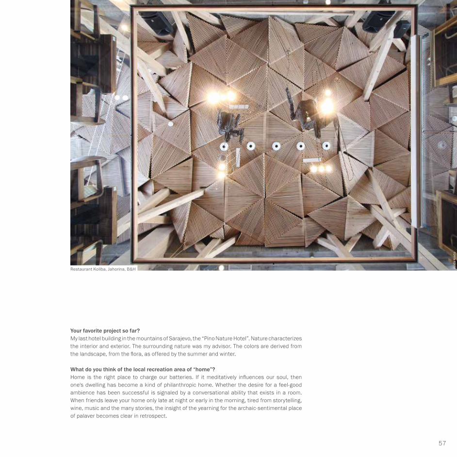
Restaurant Koliba, Jahorina, B&H Anid
a K
rečo

58
Amir Vuk Zec // BOSNIA
What do you consider the essential element of your work –being a designer, visionary, consultant or rather an artist?Vitruvius (Roman architect, 1st century BC) said: an architect must know everything and control everything. A house is art, but it must stand firm. As an architect, I try to take it from the primitive constructive to a higher level. That's my job as an artist. Frank O. Gehry builds machines of life, toys with playful shapes. Children start early with architecture: wooden and stone building blocks, metal construction kits made of colored sheet metal and plastic Lego bricks. The passion of the master builder is something we are born with.
Where is your favorite place to live?I love the place, the neighborhood, the street and my house here in the middle of Sarajevo. My other favorite place is my house on the splendid Dalmatian coast, near the ancient buildings of Diocletian (Roman Emperor, *236 or 245, †316 in Dalmatia). My feelings, my language, my essence feed on both lively places.
What has more control over you: homesickness or wanderlust?Every sailor has his harbor, writers and artists have a permanent place. And everyone has the birthplace or the place of one's childhood. My friends, music, art, work and all those who touch me determine my place, which is not geographical. I speak my mother's language.
What is your favorite color?All soft shades and all other colors except black and white. With our eyes we touch, with our hands we think. Every region, every corner in the world has its original colorfulness which changes at all times of day and year.
Hotel Pino Nature, Trebević, B&H
Hotel Pino Nature, Trebević, B&H
Dam
ir D
autb
egov
ić
Damir Dautbegović

59
ARCHITECTURE
01 Beauty in architecture is just as important as...? Aesthetics and ethics are one. The opposite of beautiful is not ugly, but false.
02 Three attributes that best describe your own architecture: Tactile, aromatic and colorful.
03 Your favorite architects, artists, writers, composers? Friedrich Nietzsche, Kengo Kuma and Terunobu Fujimori.
04 Which historical building deserves your admiration? Local: Svrzos House in Sarajevo (18th century), international: Alhambra in Granada (14th century).
05 Which one do you despise the most? I don't dislike anyone. The same applies to buildings.
06 What should architecture always achieve? Trying to be honest.
07 What should architecture never do? Be wrong.
08 What are your favorites for an architectural city trip; places one should know: medium-sized town, big city, cosmopolitan city? Dubrovnik / Florence / Paris.
09 What are your favorite colors in architecture? In the eyes of God and the artist, all colors are equal.
10 What are the resources you use most for your work? Imagination is more important than knowledge.
11 How do you assess the current value of architecture from a cultural-sociopolitical point of view? On a scale of one (lowest) to ten (highest). Five.
12 Do you approve of disapprove of globalization in architecture? Globality increases local value for someone who respects it.
13 Architecture plus quality of life – how do they reveal themselves best? It depends on awareness, because the holistic value of life is very important.
14 What do facades mean to you in the urban landscape? Reading the spirit of the city.
15 What are the desirable future options in architecture? More surface feel.
16 What is your personal favorite contemporary building? Ice Hotel in Sweden and Great (Bamboo) Wall Commune in Beijing, China
16 QUESTIONS TOAmir Vuk Zec

60
INFATUATING
LIGHTNESS

61
COLOR SERIES C
Volatilized shades of blue with yellow
highlights and camouflage effects.
We take such bright and sometimes
even foggy pictures back home from
running and cycling. What remains is
the rhythm of breathing and the rolling
noise of the tires on the road.
NAVYAZUR

62
0791 petrol blue 0841 dull blue 0842 Azores blue
0782 thunderstorm blue 0844 Nile blue 0795 baby blue
0785 silver-blue 0767 paradise blue 0787 mountain lake blue
communicative █ █ █
functional █ █ █ █
sustainable █ █ █
striking █ █ █
classic █ █ █ █
innovative █ █ █ █
emotional █
communicative █ █ █
functional █ █ █ █
sustainable █ █ █ █
striking █ █ █ █
classic █ █
innovative █ █ █ █
emotional █ █
communicative █ █ █
functional █ █ █ █
sustainable █ █ █
striking █ █ █
classic █ █ █
innovative █ █ █ █
emotional █ █
communicative █ █ █ █
functional █ █ █ █
sustainable █ █ █
striking █ █ █ █
classic █ █ █ █
innovative █ █ █ █ █
emotional █ █ █
communicative █ █
functional █ █ █ █
sustainable █ █ █ █
striking █ █
classic █ █ █ █
innovative █ █ █
emotional █ █
communicative █ █ █ █ █
functional █ █
sustainable █ █ █
striking █ █ █
classic █ █ █ █
innovative █ █ █ █
emotional █ █
communicative █ █ █ █ █
functional █ █ █
sustainable █ █
striking █ █ █ █
classic █ █ █ █
innovative █ █ █ █ █
emotional █ █ █
communicative █ █ █ █
functional █ █
sustainable █ █
striking █ █ █ █
classic █ █ █
innovative █ █ █
emotional █ █
communicative █ █
functional █ █
sustainable █
striking █ █ █
classic █ █ █
innovative █ █ █ █
emotional █ █ █
COLORS AND THEIR COMMUNICATIVE MEANING.Colors need order and locating – not only in communication.

63
COLOR SERIES CNAVY & AZURE
0769 ice blue 0777 white-blue 0766 light blue
0763 sky blue 0793 grey-blue
0772 cloth blue
0774 pale blue
0761 pure blue 0771 porcelain blue
communicative █ █
functional █
sustainable █ █ █
striking █ █ █ █
classic █ █ █ █
innovative █ █ █
emotional █ █
communicative █ █
functional █ █ █
sustainable █ █ █
striking █ █ █ █
classic █ █ █
innovative █ █ █
emotional █ █ █
communicative █ █ █ █
functional █ █ █ █
sustainable █ █ █
striking █ █ █ █ █
classic █ █ █ █
innovative █ █ █ █ █
emotional █ █ █
communicative █ █ █ █
functional █ █ █
sustainable █ █
striking █ █ █
classic █ █ █
innovative █ █ █ █ █
emotional █ █ █ █
communicative █ █ █ █ █
functional █ █ █
sustainable █ █
striking █ █ █ █
classic █ █ █ █ █
innovative █ █ █ █
emotional █ █ █ █
communicative █ █ █
functional █ █ █
sustainable █ █ █
striking █ █ █ █
classic █ █ █ █
innovative █ █ █ █
emotional █ █ █
communicative █ █ █ █ █
functional █ █ █
sustainable █ █ █
striking █ █ █ █
classic █ █ █ █
innovative █ █ █
emotional █ █ █ █
communicative █ █ █ █ █
functional █ █ █ █
sustainable █ █ █
striking █ █ █ █
classic █ █ █ █
innovative █ █ █ █
emotional █ █ █
communicative █ █ █ █
functional █ █ █ █ █
sustainable █ █ █
striking █ █ █ █
classic █ █ █ █
innovative █ █
emotional █

64
THE WHITE CITY AT THE BLUE SEA
Blue shades demand our respect because they seem so well-ordered. They display a kind of static structure and simultaneously trigger a locating effect, which suggests security features of orienta-tion and recognition to our perception system. Banks and insurance companies like to use blue as their corporate colors. That is probably over, because in reality they have not lived up to this high standard. Blue and white incorporate the same metaphor in a very similar way: both shades have the same appearance characteristics of clarity, purity, functionality as well as taste and design quality.
SYNESTHETICSmelling + tasting sparkling, fresh, mineral
Hearing distant, nostalgic, flute
Skin sensation cooling, frosty
Sense of touch smooth, watery
Weight + center of gravity medium, heavy
Pressure + force medium to light
Object feeling watery, icy
Sense of space open, cooling, cold
Shape + silhouette areal, block-like
Movement + dynamics flowing to inactive
ASSOCIATIVEValue medium to low
Experience + stimulant highly reserved, futuristic
Sensation differentiated, calm
Kinetics + action wavy, slithering
Functional signal technical, innovative
Physiological signal watery to icy
Sociological signal calming, neutral
Experienced-based knowledge neat, transcendent
Material object watery, icy
Semiotic meaning intelligent, infinite
STRATEGICSignal + echo attractive, cold as ice
Risk tolerance medium, assuring
Time orientation stable and expectant
Unique characteristic aloof, uniform-like
Environmental reference winterly, romantic
Room type factual, clear, worthy
Product type functional, concrete
Gender reference rather male uniform
Shape + markings undulate, watery
Surface type oozing, smooth
is reflected in the water and changes into blue or heavy steel-grey.

65
COLOR SERIES CNAVY & AZURE
0793 0782 0774 0763 0841 0842 0782 0769 0795
0791 0793 0842 0782 0844 0795 0785 0767 0787
0763 0841 0772 0761 0771 0787 0777 0766 0744
0772 0795 0844 0766 0793 0774 0782 0771 0791
0785 0767 0787 0769 0777 0766 0774 0763 0793
0769 0777 0766 0744 0763 0844 0772 0761 0771
0767 0785 0795 0844 0769 0766 0774 07720787

66
GUIDING PRINCIPLE OF RATIONALITY AND INTENTION
The blue together with the stable. The ostensible and the substrates. Structures and surfaces.
The presentation of the symbiosis of powerful grey & brown shades and their bright counterparts with blue colors does not need to be trained. They have always belonged together: inside and outside. Whether in old or new buildings – these are tried and tested color schemes.
In some areas of the interior, too, whether bathroom, kitchen, staircases or hallways! Functional orientation is more popular among people than any warm-hearted furnishing. The office style is cultivated in the homely environment and extends into the bedroom.
The home office marked the beginning, but has gone out of fashion. The traumatic loss of the beautiful working environment next to the children‘s room explains the transformation of the whole ambience into an office-like atmosphere.
COLOR SERIES C + A

67
COLOR SERIES CNAVY & AZURE + JADE & WHITE
0793 0782 0774 0763 0841 0842 0014 A 0446 A 0795
0791 0793 0842 0782 0844 0795 0425 A 0767 0015 A
0763 0841 0772 0761 0771 0449 A 0777 0017 A 0939 A
0772 0795 0844 0766 0937 A 0774 0423 A 0771 0441 A
0785 0767 0787 1029 A 0777 0889 A 0018 A 0933 A 0793
0769 0777 0766 0744 0763 0844 0972 A 0761 0935 A
0767 0785 0795 0844 0979 A 0766 0016 A 07720787

68
THE CHEERFULNESS OF THE CONTRAST
Cool blue meets the flowery. The possibility of tieing poetry to architecture
Why the unconventional strives to escape to the conventional – and why this happens so often. Occasionally, the idea of escaping runs in exactly the opposite direction, when, for example, the young old people turn into hippies with shaggy hair.
Sometimes architecture wanders from constructivist to the bolide-like, from the Mediterranean to the archaic, from the classic-generous to the twee-cute or soaks and sunbathes in the Medi-terranean for 15 years (from 1990–2005).
Colors always play a major role in these endeavors. This combination also shows that the cool blue gets a new connotation through a few patches of floral colors, which changes from formerly functional architecture to the other discipline, let‘s call it “experimental” – or quaint. The images that architecture creates are often wonderfully crazy, exciting, stimulating, imaginative and narrative – if only we take a close look.
COLOR SERIES C + D

69
COLOR SERIES CNAVY & AZURE + WHEAT & GOLD
0793 0782 0774 0763 0841 0382 D 0782 0234 D 0795
0791 0793 0842 0782 0844 0795 0211 D 0767 0236 D
0763 0841 0772 0761 0771 0289 D 0777 0217 D 0234 D
0772 0795 0844 0766 0232 D 0774 0321 D 0771 0373 D
0785 0767 0787 0089 D 0777 0284 D 0286 D 0281 D 0793
0769 0777 0766 0744 0763 0844 0291 D 0761 0152 D
0767 0785 0795 0844 0219 D 0766 0211 D 07720787

70
0782 thunderstorm blue
0767 paradise blue
0769 ice blue
0793 grey-blue
The individual representation of each color reveals the action mechanisms of the dependence on convergence and distance between the shades. Discover a lot more while taking a color walk.
AMORPHIES

71
COLOR SERIES CNAVY & AZURE
NAVY & AZURE + JADE & WHITE
0787 mountain lake blue
COLOR SERIES C + A
0772 cloth blue0441 brown-black
0935 mud grey

72
NAVY & AZUR + WHEAT & GOLD
COLOR SERIES C + D
0842 Azores blue
0769 ice blue
0234 Madeira shade
0321 Swedish red
AMORPHIES

73
ARCHITECTURE
Samuel Delmas
2011: award for innovative affordable housing, book and exhibition: EDF2010: finalist in the EDF competition for low-carbon architecture, book and exhibition, EDF 2008: selected for “44 young architects”, book and touring exhibition presenting 44 selected young international practices.2006: selected for EMERGENCE 4: selection of 26 young European architects 2004: selected for “Panorama of young architecture in Languedoc-Roussillon”, 10 selected architects, exhibition and catalogue 2004: selected for the Public Prize for Architecture, A+F
Together with his employees,
he always tries to give
the designs expressive
contents and the massive
buildings a sense between
camouflage and reality.
It is always important to him
to incorporate further aspects
of experiment and chance.
a+ s
amue
ldel
mas
arc
hite
cte
born on 05.02.1977 Aurillac, France 2001: graduated as an architect at the Montpellier School of Architecture, followed by his first trip to Japan.1998–2003: working with Claude Maurett, Emmanuel Nebout, Chaix et Morel, Brunet-Saunier 2003: Paris, part-time lecturer, Montpellier School of Architecture2007–2013: elected council member of the Ordre des Architectes d’Ile-de-France 2010–2017: Vice President, Maison de L’Architecture d’Ile-de-France
PRIZES AND AWARDS:
2017: Architecture Academy / Medal for architecture of the Prix Dejean2016: nominated for Equerre d‘ argent / EHPAD category (Homes for senior citizens in need of care) Alice Prin: BRO2017: winner of the Palmarès Award for sustainable architecture and construction / category: buildings with apartments and daycare facilities: CER2016: winner of the AIT Award / category: workplace with tertiary medical-social orientation: NOZ2015: BigMat 15 International Architecture Award, special distinction for young architects: NOZ2015: Barbara Cappochin International Prize, special distinction: exhibition in Italy and Japan: ASN2012: selected for “Europe 40 Under 40”, selection of 40 European architects under 40 years of age2012: winner of the Palmarès Grand Public Archicontemporaine, the public vote on contemporary architecture, exhibition at the Cité de l’Architecture, Paris. Category: workplace, GENcategory: shared accommodation, CHAprivate residential construction, TRA

74
Samuel Delmas // FRANCE
Social housing in Gentilly, France
Julien Lanoo, exterior
Her
vé A
bbad
ie
Julie
n La
noo

75
ARCHITECTURE
Your program is impressive, your black project book shows about 50 examples of your work. Would you like to tell me more about your priorities?I am not interested in largest buildings, but rather those of plausibility and coherence. They should have an understanding-oriented substance, which is made up of the smartest possible combination of geometry, material, floor plan, space and ambience. My last single-family house, which was built not far from Paris, is built of dark steel with corroded areas and plenty of glass. It‘s cubic in shape. Simply beautiful and purist.
And who is the client?A shoe salesman with a small truck. He drives through the countryside and attends to his customers in the villages. He‘s popular in the province. He lives in this house together with his wife. Both seem to be happy, because the shoe business is doing well.
How did he come up with the idea of building a house, it is, after all, based on an unusual concept?It wasn‘t exactly his idea to build this house. The site comprises about 2000 m2 of land and the periphery is free. No houses far and wide. Beautiful Lebanese cedars in the garden. The existing old sheds and small cottages were demolished before construction commenced. The couple accepted my proposal for the new building. They‘re happy. The countryside and nature are the horizon. The overall experience of sky, house, glass, metal, space and trees expresses itself in a kind of collage of beautiful proportions.
MY BUILDINGS ARE COHERENT INSIDE-OUTSIDE PROJECTS.Samuel Delmas‘ buildings are also created from playfully staged, offset assignments or magnetic constructions.
Frederic Gemonet, Saulx-les-Chartreuxa+
sam
ueld
elm
as a
rchi
tect
es

76
Samuel Delmas // FRANCE
Where do you prefer to live, if not in Paris?I like living in Paris. I spent a few years in Montpellier – also nice. My second favorite spot would be a house in the south of Paris, Fontainebleau. The house is in the middle of the forest. Big, tubby rocks all around. No houses, only nature. My second home could look like that or similar.
How does the “Savoir-Vivre” express itself in your buildings? How should people preferably dwell, live and possibly work? How open is your domicile? Small family, extended family, friends?Your questions are aiming at an important philosophy that is always present in my thoughts. This aims at an idea of identification and intensity for house’s use. I don‘t draw cubic monoliths. My buildings are coherent inside-outside objects, which have emerged from playfully staged, staggered or serial “biological” assignments or magnetic constructions. My employees and I always try to give the designs expressive contents and the massive buildings a sense between camouflage and reality. It is always important to incorporate further aspects of experiment and chance. We also do not reject ideas beyond the realm of possibility. So, we are also trying to formulate goals that are far from being logical. The work often revolves around the sensational. Not the object, but the idea is the focus of a creative debate. We draw a lot and like to draw people, especially as silhouettes in the construction drawings. In the initial sketch stage, i.e. in the first planning phase of the intended projection, we try to add a human face, because only humans determine the scale.
What is your credo in this design phase?My credo is: Finding better ideas through feelings and thinking – about the location and the geometry of the building.
Daycare center in Asnieres Sur Seine, France
herv
é ab
badi
e
Social housing in Gentilly, France
Julie
n La
noo

77
ARCHITEKTUR
What must your buildings reflect? Competence, sustainability or surprise and amazement?We never focus on expressing the function. We prefer to hide it. We always reveal the context, towards the landscape, it should show what it offers. The result is not the envelope. We‘re trying to hide the shape. We show the facade. I certainly don‘t want to reveal at first sight what the building is. It is more important to me to embed it in nature. I care about the good reputation it is supposed to develop. I don’t want any opposition to what already exists, to the landscape and the people.
I‘ll keep changing the subject. The most beautiful streets in Paris, the most beautiful boulevard? Perhaps the most beautiful park?When I was young, I didn‘t like stone. Later I learned to love it. I especially like Haussmann‘s wide boulevards (George-Eugène Haussmann, Parisian prefect and town planner, *1809 †1891). The pointed corners in which the boulevards merge, in a triangular shape, laid out like a goose foot. This clarity in eight cardinal points delights me and the curious observer. The most beautiful garden? All I have left to choose is Jardin André Citroën. It is 14 ha large and located in the 15th Arrondissement, next to the Eiffel Tower: good layout, good design. Meadows and watercourses, white, black, red and blue gardens, fountains, greenhouses.
What is so typically French in contemporary architecture?Many tendencies, but I don‘t recognize any guiding principles. We, ten younger architects, are trying to establish a group. But we dream more about it than that we are really willing to organize ourselves. We have not yet arrived at any culture, name or consensus. The young Japanese architects are much further. So are the Portuguese and the Swiss. Our chances are good, but with a lot of individualists, the dream will hopefully not remain just a dream.
Your favorite building materials?I don‘t have any favorite products. We are changing them every day and can use (almost) every-thing. If I have the chance, I only use one material. We try to redefine the material for each construction project. Sometimes it can happen that in a project consisting of four complexes, for example, different materials are used for each one. This means much more work, but we have thus increased the individuality and intimacy of individual segments.
Your predictions for the future of architecture? More digitalized, more technoid or more human?Perhaps the most frequently used material in France is wood. Sustainable places are built of wood – a glaring contradiction to concrete and at the same time a new humane demand. I designed this 50-meter tall residential tower as a pure timber construction. It is still “standing” alone in the middle of the competition. I hope we will win, then it would be the tallest building of its kind in France. By the way, this model shows red, black and yellow as a natural, specific material.
Social housing in Gentilly, France
Her
vé A
bbad
ie

78
Samuel Delmas // FRANCE
How do you and your young architects regard the careful dealing with nature?Today, we are treating nature with more care than ten years ago. In between times, we had lost sight of its protection. For five or six years now, active consideration for nature conservation has been celebrating a renaissance. It is particularly my young colleagues who are promoting this necessary impetus because it is vital for the generations that will follow us.
What piece of advice do you give young architecture students? I tell them: “If you have a message and want to get it accepted, remain persistent. Take apart the objections of inexperienced administrators and dilettante laymen.”
Can architecture alleviate or eliminate the situation of differences: ethnic, cultural, social, political? I call that A plus needs: it applies especially to this project, which we visited earlier, a multifun-ctional building complex: living, kindergarten, services, offices and shops etc.: more space for living, more feeling, better, simple functions, more friendliness and more feel-good atmosphere. Conclusion: improvement of life for the individual and the community.
Which country or place would you like to get to know? I want to learn more about Japan – with its magnificent, exemplary architecture. Then I‘d like to visit Peru, Machu Picchu (Inca town, built in the 15th century, situated at an altitude of 2430 m in the Andes) – a passion since my childhood (TV cartoon), then see New York again and, of course, Vorarlberg in Austria.
What is your favorite color?Not the colors as substrate – but the colors of the materials are my favorites.
Daycare center in Asnieres Sur Seine, France
Daycare center in Paris, France
L‘im
age
cont
empo
rain
e
Julie
n La
noo

79
ARCHITECTURE
01 Beauty in architecture is just as important as...? Geometry.
02 Three attributes that best describe your own architecture: Intimate/surprise/harmony.
03 Your favorite architects, artists, writers, composers? Peter Zumthor, Pierre Soulages, Donald Jud.
04 Which historical building deserves your admiration? Flatiron/New York, Neue Nationalgalerie/Berlin, Palazzo della Civiltà Italiana/Rome.
05 Which one do you despise the most? None.
06 What should architecture always achieve? Consistency.
07 What should architecture never do? Be mean.
08 What are your favorites for an architectural city trip; places one should know: medium-sized town, big city, cosmopolitan city? Japan: Tokyo / Kyoto, Switzerland: Basel, Zurich, Lausanne, Vals..., Country: Vorarlberg (Austria), Olot (Spain, RCR).
09 What are your favorite colors in architecture? Bright ones.
10 What are the resources you use most for your work? Feeling, time, beauty.
11 How do you assess the current value of architecture from a cultural-sociopolitical point of view? On a scale of one (lowest) to ten (highest). Seven.
12 Do you approve or disapprove of golobalization in architecture? I deplore “the international style”.
13 Architecture plus quality of life – how do they best reveal themselves? The connection exists between the benefit, the program and the architect‘s ability to initiate a paradigm shift that goes beyond mastery.
14 What do facades mean to you in the urban landscape? The composition of landscape is necessary to be in harmony with or in opposition to it.
15 What are the desirable future options in architecture? That it is more central for the decision, for the project.
16 What is your favorite contemporary building? Thermal Baths in Vals by Peter Zumthor.
16 QUESTIONS TO Samuel Delmas

80
ROOM FOR FEELING
COMFORTABLE

81
WHEATGOLD
COLOR SERIES D
In the complementary contrast
of red and green. It takes a
blink of an eye to generate the
buildings of a cityscape, which
is revealed to us in epic short
form. Not as a real image,
but as a touch of vague insight.

82
0382 night red 0373 Siena 0152 sandstone
0232 bamboo 0234 Madeira hue 0236 nougat
0289 bright clay 0217 cream 0219 autumn white
communicative █ █
functional █ █ █ █ █
sustainable █ █ █ █
striking █ █
classic █ █ █
innovative █ █
emotional █
communicative █ █
functional █ █ █ █
sustainable █ █ █ █
striking █ █ █
classic █ █
innovative █ █
emotional █ █
communicative █ █ █
functional █ █ █ █
sustainable █ █ █ █
striking █ █
classic █ █ █
innovative █ █
emotional █ █
communicative █ █ █
functional █ █ █
sustainable █ █ █ █
striking █ █
classic █ █ █
innovative █
emotional █ █ █
communicative █ █
functional █ █ █
sustainable █ █ █
striking █ █
classic █ █ █ █
innovative █ █
emotional █ █ █
communicative █ █ █
functional █ █ █
sustainable █ █
striking █ █ █
classic █ █ █ █
innovative █
emotional █ █ █
communicative █ █ █
functional █ █
sustainable █ █
striking █ █ █ █
classic █ █ █ █ █
innovative █ █ █
emotional █ █ █ █
communicative █ █ █
functional █ █
sustainable █ █
striking █ █ █
classic █ █ █ █
innovative █ █
emotional █ █ █
communicative █ █
functional █
sustainable █
striking █ █ █ █
classic █ █ █ █
innovative █ █ █
emotional █ █ █
THE COLORS AND THEIR COMMUNICATIVE MEANING.Each color has its own characteristics.

83
COLOR SERIES DWHEAT & GOLD
0089 champagne 0298 pale orange 0286 apricot light
0284 bright orange 0211 golden ochre
0281 curry
0296 saffron yellow
0291 Pompeii yellow 0321 Swedish red
communicative █ █ █
functional █
sustainable █
striking █ █ █
classic █ █ █
innovative █ █
emotional █ █
communicative █ █ █
functional █ █
sustainable █ █ █
striking █ █ █ █
classic █ █ █ █
innovative █ █
emotional █ █ █ █
communicative █ █ █ █
functional █ █
sustainable █ █
striking █ █ █
classic █ █ █ █
innovative █ █ █
emotional █ █ █ █ █
communicative █ █ █ █
functional █ █
sustainable █ █ █ █
striking █ █ █ █
classic █ █ █ █
innovative █ █
emotional █ █ █ █
communicative █ █ █
functional █ █
sustainable █ █
striking █ █ █ █
classic █ █ █ █
innovative █ █
emotional █ █ █ █ █
communicative █ █ █ █
functional █ █ █
sustainable █ █ █
striking █ █ █
classic █ █ █ █
innovative █ █ █
emotional █ █ █ █ █
communicative █ █ █ █
functional █ █ █ █
sustainable █ █ █ █ █
striking █ █ █
classic █ █ █ █
innovative █ █
emotional █ █ █ █
communicative █ █ █ █
functional █ █ █ █
sustainable █ █ █
striking █ █ █ █
classic █ █ █
innovative █ █
emotional █ █ █ █ █
communicative █ █ █
functional █ █ █ █
sustainable █ █ █ █
striking █ █ █
classic █ █ █ █ █
innovative █ █
emotional █ █ █ █

84
LIFE WITH NATURE AND COMFORT
The color range invites to more comfortable living. Houses that describe the precincts of a city or hamlet: from the North Cape to the Alps, from Canada to the Black Forest adaptations of rural new buildings in South Korea. The longing for security and integration into the everyday routines of living together are among the essential criteria when choosing a flat – eccentricity rather happens on the edge. We prefer familiar images. Seasons, nature, streets and houses and their colors form a meaningful world of aspiration, reality and insights.
SYNESTHETICSmelling + tasting peary, earthy
Hearing grumbling, soft
Skin sensation woods, warming
Sense of touch bamboo, smooth
Weight + center of gravity medium, at the bottom
Pressure + force bouncy
Object feeling elastic, woody
Sense of space homely
Shape + silhouette stable, grown
Movement + dynamics safe, moveable
ASSOCIATIVEValue medium, useful
Experience + stimulant close to nature, calming
Sensation determining, warming
Kinetics + action calm, soothing
Functional signal preserving, archaic
Physiological signal ergonomic, warming
Sociological signal cozy, friendly
Experienced-based knowledge well-tried, bourgeoise
Material object wooden, durable
Semiotic meaning reliable, natural
STRATEGICSignal + echo woody, good
Risk tolerance low, assuring
Time orientation stable, always “in”
Unique characteristic close to nature
Environmental reference ecological, prospective
Room type sedate, comfortable
Product type normal, sedate
Gender reference neutral, universal
Shape + markings natural, recognizable
Surface type tangible, topographic
In the country, in the village, in the city. Colors are programmatic decision-making aids. We share most of their parameters on the regional, European and global level.

85
COLOR SERIES DWHEAT & GOLD
0211 0232 0296 0284 0373 0152 0234 0089 0236
0382 0211 0152 0232 0234 0236 0289 0217 0219
0284 0373 0281 0291 0321 0219 0298 0286 0296
0281 0236 0234 0286 0211 0296 0232 0321 0382
0289 0217 0219 0089 0298 0286 0296 0284 0211
0089 0298 0286 0296 0284 0234 0281 0291 0321
0217 0289 0236 0234 0089 0286 0296 02810219

86
REFERENCE POINT: LANDSCAPE COLORS OF THE NEW CLASSICNaturalness versus rigor. Structure versus rhythm. Related to colors from the field and meadows in white and shady hues.
The formerly recognizable natural color spectrum is given an additional creative model by assign-ing nuances with an almost technical appeal. It adds new, partly undercooled and hard, pithy shades to the playing field. In this way, the colors bring the cuddly, sculptural basic shades that are influenced by nature to a functional design level.
We have mixed the characteristic features of two color melodies. The result is a rather soft, barely audible color melody. As soon as we slowly move the template across the colored areas, we realize that especially the low-contrast colors are able to provide graceful color tones.
COLOR SERIES D + A

87
COLOR SERIES DWHEAT & GOLD + JADE & WHITE
0211 0232 0296 0284 0373 0935 A 0234 0017 A 0236
0382 0211 0152 0232 0234 0236 0889 A 0217 0018 A
0284 0373 0281 0291 0321 0939 A 0298 0015 A 0446 A
0281 0236 0234 0286 0014 A 0296 0933 A 0321 0972 A
0289 1029 A 0219 0979 A 0298 0016 A 0937 A 0441 A 0211
0089 0298 0286 0296 0284 0234 0425 A 0291 0423 A
0217 0289 0236 0234 0014 A 0286 0449 A 02810219

88
REFERENCE POINT: LANDSCAPE AS GREEN AS THE BIG BANGArchitecture with floral content. Hard as wood and soft as an apricot. Combined with shades of living green nature: fresh and growing and thriving.
In color design, too, it is always about the antagonistic harmonies – opposites serve for clarifi-cation and plausibility. They call for statements that can rarely be solved intellectually, and it is easier to do so with aesthetic moments that clearly do not have the charm of infallibility.
Together, the green and landscape-related wood and earth tones develop a color structure of a calming, quite emotional quality. Life in the middle of nature is becoming more and more popular: and the zeitgeist is pointing towards the future. Life in the giant cities will only be possible in the foreseeable future if an ecological balance is restored. Natural materials with a strong sustainability appeal are among the appropriate tools. The installation of vertical green gardens has therefore become one of the minimum gestures of a responsible city dweller in a very short period of time.
COLOR SERIES D + H

89
COLOR SERIES DWHEAT & GOLD + PISTACHIO & SAGE
0211 0232 0296 0284 1027 H 0152 0234 1038 H 0236
0382 0211 0152 1142 H 0234 0236 1071 H 0217 0121 H
0284 0373 0281 0291 0321 1137 H 0298 1031 H 0296
0281 0236 0234 0286 1075 H 0296 0981 H 0321 0971 H
0289 0217 0219 0069 H 0298 1076 H 0296 1037 H 0211
0089 0298 0286 0296 0284 0234 1035 H 0291 1057 H
0217 0289 0236 0234 1149 H 0286 1034 H 02811078 H

90
Deliberately designing amorphies. Lending the surfaces a broad variety.Developing impulses for new design models.
0382 night red
0296 saffron yellow
0234 Madeira hue
0289 bright clay
AMORPHIES

91
COLOR SERIES DWHEAT & GOLD
0321 Swedish red
WHEAT & GOLD + JADE & WHITE
COLOR SERIES D + A
0441 brown-black0382 night red
0284 bright orange

92
WHEAT & GOLD + PISTACHIO & SAGE
1142 May green
1031 loden green
0289 bright clay
0211 gold ochre
COLOR SERIES D + H
AMORPHIES

93
ARCHITECTURE
Gábor Tari
For the architect, some of
the avant-garde is not to his
liking. All in all, however,
everything is a question of
one‘s position. The love
for academic art is predominant
because it is as dynamic as it is.
Gábor Tari has been working as an expert for Baumit Hungary for almost a decade. His work also includes the planning of the colors of historical buildings, e. g. Esterházy Castle in Fertőd, Hungary, Vasarely Museum in Pécs, Hungary. His wall paintings and sculptures can be found in public buildings and squares. Underground enamel wall paintings are in Újpest, Hungary. His works have been shown in various exhibitions, and he has given numerous interviews as an artist and expert in Dynamic Color Engineering.
2006: Doctoral degree
Since 2012 he has been Associate Professor at the Budapest University of Technology. He has given numerous speeches and published articles in his field both in Hungary and abroad. Much of his work includes designing and planning the colors for the facades of concrete block housing estates.
In Hungary, there are 500,000 apartments of this type for which prefabricated concrete slabs are used. Many of them are being renovated to make them more energy-efficient. Efforts are being made to make them more visually appealing, as they are well visible in most cities.
▮ Staff member of the Faculty of Architecture at the Institute for Graphic Form and Design.▮ Artistic Director of the Seminar for Dynamic Colour Engineering.▮ Graduate of the Hungarian Academy of Fine Arts, Faculty of Painting. ▮ He continued his studies as a postgraduate student at the same university.

94
Gábor Tari // HUNGARY
Renovation of prefabricated buildings in Budapest 4., Szigeti Street
Wall painting in an underground station in Budapest

95
ARCHITECTURE
What moves you? What is your special professional focus? Where does the eyes of the expert wander to? Now I have to go far afield: My gaze is directed towards the 21st district in Budapest. Directly on the Danube. A former industrial and residential area, which is to become more interesting again through color and color art applied to the buildings. By the way, this site, which is densely covered with tall and mighty buildings, is called Csepel. The buildings are solid prefabricated concrete slab buildings in all possible configurations, streets, squares, squares, densely packed and loosened areas, sometimes small-scale, sometimes huge. My task is to restore and secure the viability of the area by means of sensible technical and visual repairs. Csepel is the name of the 21st district in Budapest. It is the only district on the island of the same name. In the 19th century, Csepel became an important industrial area. In particular, a center for heavy industry developed there. Numerous worker‘s dwellings as well as gardens were built in the vicinity. On 1 January 1950, Csepel was incorporated into the capital along with many other municipalities.
You make me curious, what does your master plan look like?The local administration has invited me to develop a design for the renovation of streets, squares, corners and individual buildings. Each small- and medium-size area receives an independent color philosophy indicating differentiation. Depending on the orientation of the buildings and squares, authenticity alternates with authenticity. The special features consist of a variety of complementary color directions. The buildings have a similar constructive intention – as hardly different as prefabricated concrete buildings are, often barely perceptible. I‘m trying to make them more independent than they ever were. The proximity of the banks of the ponderous Danube often supports my efforts: the trees, the other bank and the flowing water. The surroundings and the conditions of light, of the seasons and of the day that convey new asso-ciations. The sky, that always insists on a permanent joy of change, the sun, sometimes bright, fair or drowsy or the endless grey of the surroundings are the latent helpers of my intentions.
TRADITIONALIST OR MODERNIST?When it comes to Gábor Tari, it always depends on the type of architecture. Vasarely Museum in Pecs

96
Gábor Tari // HUNGARY
What maxims do you apply in order to get a polyphonic and yet coherent concept?Every corner and every street has its peculiarities. I try to capture them and extract and make use of the color and form contents from this existing “composition”. The Garden City district has old trees. It provides further inspiration for the “Shades of Green” all around. I then select the light-dark hues: pastel to medium shades, often accompanied by complementary contrasts consisting of muted greenish grass to slightly greyed purple shades. The Ady Endre Street is characterized by the light‘s colors of light blue, violet, orange and beige, which get lost in many brightening effects up to a semi-white tinge. For example, the inner-city area VII reveals a num-ber of more stringent and almost colorful shades. Chrysanthemums Street in District III plays with the rediscovered colors of the 1950s. They are applied very opaquely. Their form and color contents reveal a lot about Vasarely and the colors emigrated with him from Hungary, entirely in the style of modernity of the 1960s.
We have just talked a lot about the old and the renewable. Are you a traditionalist or rather a modernist?It depends on the architecture in question. Some of the avant-garde I don‘t like. I can‘t warm to Concept Art. For me, Frank O‘Gerhy represents Concept Art; I take him seriously. Peter Eisenmann (*1932 in Newark, New Jersey), Daniel Liebeskind (*1946 in Łódź, Poland). All three of them are great architects. I don‘t care about the later works of Zaha M. Hadid (*1950 in Bagdad; †2016 in Miami, Florida). It is all a question of one‘s position. I love academic art, I want it to be as dynamic as it is. That‘s why traditional techniques in photography and cine-matography also appeal to me. Art videos are often almost unbearable, because of their ex- cessive length alone if they last more than 24 hours.
From the distant world to the nearby region. How do the Hungarians live, what makes them happy, what makes them unhappy?Here, people work more than elsewhere. They often need two or three jobs. The average earnings in Norway, for example, are ten times higher than in this country. The wages are too low to enjoy the leisure time in a meaningful and fun way. There‘s no time for hobbies. It‘s normal to have two weeks off. However, one‘s home is more important than anywhere else in Europe. We need the apartment as a retreat. By the way, 80–90% are personal property. The apartment is my castle, even though it is part of the prefabricated concrete building. People
Sample wall in the Baumit training center in Dorog, Hungary
Sculpture by Gabor Tari

97
ARCHITECTURE
as persons spending their leisure time are rarely seen from the eighth floor on the children‘s playground with a little daughter or son. Of course, many people live in prefabricated buildings. We try to enhance this architecture with fantasy and a new dignity.
What does the dream home look like?The proverbial dream of living takes place far away in Hollywood: this includes the villa, sur- rounded by a huge garden and all this in everlasting sunshine. The attainable dream is dreamed and often lived in a single-family house in the satellite city located twenty to thirty kilometers away. The young people like to live in the city center, where there are cafés, pubs and music – the normal family lives a rather simple, more rational life.
Can you give me a few more details about the culture of life in society, in one’s leisure time and when getting together?The “nightlife society”, which is otherwise so often portrayed in Europe, only applies to young people. Starting at the age of thirty, the family is more popular. Only on birthdays and holidays, contacts to friends and the more distant family are celebrated – “With little children you don‘t have much time” is the motto. To what extent do folkloric currents make themselves felt in architecture? Is there such a thing as a traditional or innovative homeland characteristic that can be found in housing construction? I especially think of the village houses with their bright white plaster and thatched roofs, which consist of up to two or three floors. The regional is very popular, whether on the shores of Lake Balaton or in the mountains. Both historical materials and modern ones are en vogue. Imre Makovecz is well known for his wonderful folklore country houses. Besides György Csete and the Pécs Group, Makovecz represented Hungarian organic architecture. His buildings are influenced by Rudolf Steiner, Antoni Gaudí, Frank Lloyd Wright and the Hungarian Art Nouveau style of Ödön Lechner. Makovecz‘s main works include the Redoute (Vigadó) in Szigetvár (*1985 †1987). Makovecz’s works gained international acclaim, especially in the 1970s and 1980s in connection with postmodernism; after the fall of the Berlin Wall, he was allowed to design the Hungarian pavilion of the World Exhibition in Seville.
What do you experience in Hungary – urban or rural exodus.In principle, we are more likely to experience a considerable rural exodus, because the job prospects are simply better in the cities. Here, too, young people move to the city, the young families to the countryside, but always within easy reach by car. The older ones like to go back to the city center. We are particularly keen on shopping centers. We often lack the time and money to visit theatres and concerts. We are a modern society. We learn quickly and work a lot – we own two cars per family, so we are mobile enough to follow spontaneous inspirations.
How much color and which materials does architecture need? We have two architect‘s opinions in the academy: the one that color is sufficiently present in all materials, whether stone, metal, wood, glass. The second, more frequently practiced opinion that color belongs to architecture, richer than ten years ago, because colors are zeitgeist and therefore also trendy. Historical buildings almost always had a color, that‘s something I per- ceived as a monument exploring color scout. When I got down to the last or one but last layer of paint on historic buildings, is became apparent that the “bon ton” (of the client and architect) included a good color tone!
Painting by Gabor Tari

98
A short sightseeing tour of Budapest. First of all, which are the most recommended hotels? The best and most remarkable hotel is the Budapest Hilton in the 15th century castle. It is brilliantly connected to the beautiful chapel dating from the same period. The Gellert Hotel with its 40°C hot springs, located directly on the Danube, is world famous. Outside Budapest, I can mention the Heviz in particular, on the small lake near the Austrian border. (By the way, it is the most biologically active thermal lake in the world. Around 410 liters of fresh water gushes out of the spring every second. Every 48 hours the water of the 38-meter deep and 4.4/ha large lake area is renewed.) Your recommendation is asked again: The most beautiful streets or the most beautiful buildings of Budapest? From a historical point of view, this is Andressy Street. Andrássy út is the most famous boulevard in Budapest, Hungary‘s capital city, which is about 2.5 kilometers long and connects the city center with the city forest respectively the Heroes‘ Square. It was declared a UNESCO World Heritage Site in 2002. The BÁLNA is considered one of the most beautiful, modern buildings. The Bálna (the whale) is a commercial, cultural, entertainment and gastronomic center, meeting point for everyone. Müpa Budapest. The building offers space for three artistic styles: music, visual arts and theatre. The exhibition rooms, the concert hall and the theatre operate independently of each other. The Palace of Arts, along the banks of the Danube. A great place to get to know the Hungarian culture. An insider‘s tip – Várkert Bazár is a market in Budapest‘s first district on Miklós-Ybl Square. The listed building is part of the UNESCO World Cultural Heritage Site on the banks of the Danube, Andrássy Street and the Castle Palace. The complex forms one of the entrances to the castle hill. It is located in the park of the old castle – in direct continuation of the parliament. Everything is splendidly renovated: museums, an open-air sculpture park and beautiful old bridges.
Which place, outside of or in Europe, attracts you most?Two cities: I want to see San Francisco again after thirty years – and I want to get to know St. Petersburg. The San Francisco cable car streets are indescribably beautiful and interesting, as are the downhill rides. The cable car is one of the few mobile national historic landmarks in the United States and is the only remaining cable car in the world with decoupling carriages. The encounters of the people in this city are unforgettable as well as their kindness and openness.
What are your favorite colors?0521 and 0845 from the Baumit fan. I mean, pepper stone red and the faded grey-green. The hues are opposite each other out of conviction and at the same time quite capricious.
Gábor Tari PhD
Gábor Tari // HUNGARY

99
ARCHITECTURE
01 Beauty in architecture is just as important as...? For me, beauty lies in architecture: dynamics, balance, individual style, regionalism, freedom of shape and colors in relation to shape and materials.
02 Three attributes that best describe your own architecture: I am a color artist who plans districts and neighborhoods. Therefore, color harmony is the most important aspect concerning art history.
03 Your favorite architects, artists, writers, composers? Aires Matheus, Baumschlag und Eberle Arch. Richardo Lagorretta, W. De Kooning, Conrad Marca Relli etc. and alternately G. Appolinaire, P. Reverdy, E. Hemingway. Composer: Eleni Karaindrou.
04 Which historical building deserves your admiration? Esterházy Castle, Fertőd – I have created the new color.
05 Which one do you despise the most? I don‘t remember buildings that I don‘t like, but the Oslo City Hall is “very interesting” in terms of its size, conditions, empty spaces, etc.
06 What should architecture always achieve? A great name! Or great buildings without one.
07 What should architecture never do? Destroy the townscape because of building contractors, money, politicians and so on.
08 What are your favorites for an architectural city trip; places one should know: medium-sized town, big city, cosmopolitan city? Oslo, Trondheim. China’s contemporary architecture. London’s new buildings, Berlin, Bretagne.
09 What are your favorite colors in architecture? I like all the colors ...
10 What are the resources you use most for your work? All of them are important! Being able to express my intuitions correctly – then I could work with them. Intuition alone is not enough to work. One always encounters contradictions. And the fine gradations are very important. Young people cannot perceive this.
11 How do you assess the current value of architecture from a cultural-sociopolitical point of view? On a scale of one (lowest) to ten (highest). Eight.
12 Do you approve or disapprove of globalization in architecture? In some areas and places I welcome it, in others not at all!
13 Architecture plus quality of life – how do they reveal themselves best? Through its significance.
14 What do facades mean to you in the urban landscape? They essentially make up the history: We successively collect, preserve and restore the signs of the past. New buildings are in this context less relevant in comparison ...
15 What are the desirable future options in architecture? New materials, new shapes. The latter is more difficult, but the fine gradations are becoming more and more important.
16 What is your personal favorite contemporary building? The new buildings behind the Oslo Opera House.
16 QUESTIONS TOGábor Tari

100
SEDUCTIVE
WARMTH

101
COLOR SERIES E
The picture resembles a film
sequence from the early 20th century.
The promenading persons consciously/
unconsciously assume their role.
Iron grids on glazed, round shaped,
purple-colored bricks mark off a
well-maintained front garden from
the rest of the street scene.
VIOLAGENTIAN

102
0691 hyacinth blue 0682 violet-grey 0693 grape blue
0684 violet-purple 0695 eye’s blue 0687 heliotrope bright
0697 viola white 0788 moon blue 0779 cyan white
communicative █ █ █ █
functional █ █ █
sustainable █ █ █
striking █ █ █ █
classic █ █ █
innovative █ █ █ █
emotional █ █ █
communicative █ █ █ █
functional █ █ █
sustainable █ █ █
striking █ █ █
classic █ █ █ █
innovative █ █ █
emotional █ █ █
communicative █ █ █ █
functional █ █ █
sustainable █ █ █
striking █ █ █ █ █
classic █ █ █ █
innovative █ █ █ █
emotional █ █ █ █
communicative █ █ █
functional █ █
sustainable █ █
striking █ █
classic █ █ █
innovative █ █ █ █
emotional █ █ █
communicative █ █ █
functional █ █
sustainable █ █
striking █ █ █
classic █ █ █
innovative █ █ █ █
emotional █ █ █
communicative █ █ █ █
functional █ █
sustainable █ █
striking █ █ █ █ █
classic █ █ █
innovative █ █ █
emotional █ █ █ █ █
communicative █ █
functional █ █
sustainable █
striking █ █
classic █ █ █ █
innovative █ █ █ █
emotional █ █ █
communicative █ █ █
functional █ █
sustainable █ █
striking █ █ █ █
classic █ █ █ █
innovative █ █ █ █ █
emotional █ █ █
communicative █ █
functional █
sustainable █ █
striking █ █ █
classic █ █
innovative █ █ █
emotional █ █ █ █
THE COLORS AND THEIR COMMUNICATIVE MANING.Color signals provoke echoes and thus make sense.

103
COLOR SERIES EVIOLA & GENTIAN
0699 white blue 0429 stone white 0388 sand cream
0639 pale pink 0417 grey-rose
0635 antique pink
0419 quartz pink
0633 ruby red 0631 garnet red
communicative █ █ █
functional █ █
sustainable █ █
striking █ █
classic █ █ █
innovative █
emotional █ █
communicative █
functional █ █ █
sustainable █ █
striking █
classic █
innovative █ █ █
emotional █ █
communicative █ █
functional █ █
sustainable █ █ █
striking █
classic █ █ █
innovative █
emotional █ █
communicative █ █
functional █
sustainable █ █
striking █ █ █ █
classic █ █ █ █
innovative █ █ █
emotional █ █ █ █ █
communicative █ █ █
functional █ █
sustainable █ █
striking █ █ █ █
classic █ █ █
innovative █
emotional █ █ █
communicative █ █ █
functional █ █ █
sustainable █ █ █ █
striking █ █ █ █ █
classic █ █ █ █
innovative █ █
emotional █ █ █ █
communicative █ █ █ █
functional █ █
sustainable █ █
striking █ █ █ █
classic █ █ █ █
innovative █ █ █
emotional █ █ █ █
communicative █ █ █ █
functional █ █ █
sustainable █ █ █ █
striking █ █ █ █
classic █ █ █ █ █
innovative █ █
emotional █ █ █ █
communicative █ █ █ █
functional █ █ █
sustainable █ █ █ █
striking █ █ █ █
classic █ █ █ █ █
innovative █ █
emotional █ █ █

104
COLOR POSITION WITH RISK ANNOUNCEMENT
Design, whether in architecture, interior design or when it comes to fashion, is fortunately increas-ingly freeing itself from common sense. The willingness to take risks for creative experimentation is increasing in many areas of creative professions. We have recognized that experimental brain-storming also needs the input and motivation of contradiction and loud criticism. Unusual shape and color concepts require more of the loud discomfort of the opponents than a silent disregard of the speechless majority. That‘s why it is important to occasionally work with pink, antique pink, violet and lilac colors – and only if we were to overcome the status quo.
Idea, grace and styling. If colors suggest emotions, skeptics can become claqueurs.
SYNESTHETICSmelling + tasting mild, fruity
Hearing harp, melodious
Skin sensation pleasant, neutral
Sense of touch delicate, silky
Weight + center of gravity medium balance
Pressure + force medium to light
Object feeling silky to chintz
Sense of space gentle, rather bright
Shape + silhouette elegant, often feminine
Movement + dynamics buoyant, elegant
ASSOCIATIVEValue medium to precious
Experience + stimulant appealing, feminine
Sensation soft, close, warming
Kinetics + action gentle, dancing
Functional signal light, centered
Physiological signal emphasized, unfamiliar
Sociological signal individual, new
Experienced-based knowledge new, stimulating
Material object fabric-like, creamy
Semiotic meaning elegant, moving
STRATEGICSignal + echo friendly, stimulating
Risk tolerance suspenseful, light
Time orientation present, prospective
Unique characteristic feminine + masculine
Environmental reference fashionable, experimental
Room type elegant, light
Product type pretty, cosmetics
Gender reference rather feminine
Shape + markings moving, bolide-like
Surface type opal, plastic, varnish

105
COLOR SERIES EVIOLA & GENTIAN
0417 0684 0419 0639 0682 0682 0695 0699 0687
0691 0417 0693 0684 0695 0687 0697 0788 0779
0639 0682 0635 0633 0631 0779 0429 0388 0419
0635 0687 0695 0388 0417 0419 0684 0631 0691
0697 0788 0779 0699 0429 0388 0419 0639 0417
0699 0429 0388 0419 0639 0695 0635 0633 0631
0788 0697 0687 0695 0699 0388 0419 06350779

106
COLOR MIX
Fashion look and techno shades. Elective affinities to the place in the cheerful competition of the color families.
The color mix contains a more factual appearance. The bright, tinted white shades and their medium and darker nuances considerably broaden the entire range. The grey and brown colors influence the sorbet and pastel shades in their contrasting effect.
The dominance continues to be with the light to dark red-rose and blue-purple hues. Only in the template test, the radiance of the artistically and architecturally gifted coloring of the color series becomes apparent. Keep your camera ready while you‘re searching and experimenting.
COLOR SERIES E + A

107
COLOR SERIES E VIOLA & GENTIAN + JADE & WHITE
0417 0684 0419 0639 0682 0933 A 0423 A 0699 0687
0691 0417 0693 0684 0695 0687 0889 A 0788 0979 A
0639 0682 0635 0633 0631 0017 A 0429 0935 A 0441 A
0635 0687 0695 0937 A 0417 0446 A 0684 0972 A 0691
0697 0788 0779 0699 0014 A 0425 A 0419 1029 A 0441 A
0699 0429 0388 0419 0639 0695 0939 A 0633 0449 A
0788 0697 0687 0695 0016 A 0388 0014 A 06350779
108
THE FAVORITE COLOR: “SIMPLY COLORFUL”
Predominantly summer atmosphere. Holidays in the amusement park or in a 5-star color hotel.
In case this hasn‘t arrived in holiday wonderland yet? It‘s high time for investors: the old grey is now called colorful! Those who only have chicken-hearted courage for cumulative white should rather attend to the enlightening fun with the multicolored.
Who‘s talking about Hollywood or Bollywood? Color mixing is one of the democratic virtues of our time. A box of paints belongs in the handbag or coat pocket of all architecture enthusiasts.
Let‘s check out the available 10 million individual colors and add a few 100 or 1000 of them to our notepad!
COLOR SERIES E + D

109
COLOR SERIES EVIOLA & GENTIAN + WHEAT & GOLD
0417 0684 0419 0639 0234 D 0152 D 0695 0089 D 0687
0691 0417 0693 0684 0695 0687 0296 D 0788 0234 D
0639 0682 0635 0373 D 0631 0236 D 0429 0382 D 0419
0635 0687 0695 0388 0281 D 0419 0298 D 0291 D 0691
0697 0788 0779 0699 0217 D 0388 0289 D 0639 0284 D
0699 0429 0388 0419 0639 0695 0286 D 0633 0217 D
0788 0697 0687 0695 0219 D 0388 0321 D 06350779

110
Amorphies form a creative basis to arrive at new and sometimes unprecedented sequences of shades. The trial often brings us closer to a result than pure calculation. The pastel color nuances that contain a floating, airy substance seem to us like light spots.
0695 eye’s blue0417 grey-rose
0631 garnet red 0693 grape blue
AMORPHIES

111
COLOR SERIES EVIOLA & GENTIAN
VIOLA & GENTIAN + JADE & WHITE
0682 violet grey
0972 green-grey
0441 brown-black
0633 ruby red
COLOR SERIES E + A

112
VIOLA & GENTIAN + WHEAT & GOLD
COLOR SERIES E + D
0281 curry
0382 night red0633 ruby red
0693 grape blue
AMORPHIES

113
ARCHITECTURE
Michele Gortan
Being an architect also
means being an active
humanist. People must
be given at least a decent
life in their four walls.
His research work before and after graduation has always focused on highlighting the relation-ship between construction processes, the development and interpretation of suitable instruments for architectural and urban trans-formation and the critical study of the results. At the same time, he never lost a close connection with professional practice on the construction site and human resources management. His professional career developed along a path of theoretical but above all practical training. He pursued his research activities on topics related to the recognition, protection and restoration of the historical and ecological heritage in connection with modern technological progress. In 1990, the year he opened his studio, he started accepting professional commissions in the public and private sectors. He has carried out projects for private residential buildings, commercial buildings for small and medium-size businesses as well as renovation work on public and private buildings: from the preparation of initial documentation to the verification of ownership, the procedures at the land registry, topography, the overall planning to execution.
In addition, he has taken on all work within the scope of managing activities in the execution phase. In recent years, he has turned to sustain-able timber construction. As a representative of the Udine Chamber of Architects, he has participated in several conciliation and discussion rounds at the regional level on topics such as sustainability, urban renewal and energy-efficient refurbishment of buildings in EU projects. He has also carried out assignments on behalf of the Ministry of Defense, and since 2009 he has been part of the command of the Italian Army‘s selected reservists. Thereby he has carried out assignments as an expert in architecture, and planned and realized numerous infrastructural projects with local companies and professionals.
He has implemented and supervised the projects “San Daniele 2020: giardino inatteso”, “Agenda 2030 in Strada ed in Arte” and “Arte per il paesaggio”, “Agenda 2030 Art Cividale” and “Arte Pubblico in Pubblico Spazio”. On the site, there are currently four projects in the implementation phase, which were presented during the “European Sustainability Week” from 30 May to 5 June 2017.
He opened his studio in 1990 as a technical draughtsman and joined the College of Geometry in Udine in 1992. In 2006, he completed his studies of architecture at the University of Architecture in Venice (IUAV) and on 19 December 2007, he was appointed by the Faculty Council of IUAV as a research assistant for restoration. He was admitted to the Chamber of Architects in 2007.

114
Michele Gortan // ITALY
Mr. Gortan, thank you very much for the opportunity to talk about architecture in general and your personal experiences, wishes and hopes. How do you describe your favorite architecture? Wonderful examples of architecture date back to the Renaissance period, and they still reveal their exemplary characteristics to us today. Sustainability is also confirmed by the port cities of Hamburg and Trieste, for example, which are about the same age and as stable as they were 120 years ago. The architect of the Port of Trieste actually gave a 100-year guarantee to his clients. More than 120 years are already over and everything is still firmly in place.
ARCHITECTURE MUST UNITE AND NOT DIVIDE.For Michele Gortan, architects with a sense of responsibility have to create houses with a social infrastructure today.
School in Herat, Afghanistan
School in Herat, Afghanistan

115
ARCHITECTURE
I would like to get to know your most beautiful city? Where is it and what‘s its name?Aarhus, in Jutland, Denmark, is my favorite city, closely followed by Copenhagen. I first visited Aarhus in 1984. I come back every year. The place has the inimitable charm of the cities on the waterfront, just like Hamburg, Copenhagen or Venice. In Aarhus, the European City of Culture, people, whether young or old, regardless of their ethnic origin, live together in freedom, unity and friendship without any ghettoization. I think that the clear view of the wide sea is respon-sible for this, similar to Trieste.
This almost answers my next question. Architecture by the water – has it always been a favorite location for city planners and architects? Building and living at the waterfront has been very attractive since time immemorial, because water meant life. We ourselves are made up of 80 percent water. By the way, people living at the waterfront are a special species, whether they come from Como, Aarhus, Amsterdam or Palermo, they resemble each other in a mysterious way.
Michele Gortan
Cividale del Friuli, floating installation

116
Michele Gortan // ITALY
That brings me to the next question: Do residential buildings or building ensembles have to be a multi-cultural, multi-functional and multi-social biotope? I know, I experience and work on such incredibly important projects. Architecture must unite and not divide. Today, architects with a sense of responsibility have to create houses with a social infrastructure. These must at least offer people a decent life in their four walls. Being an architect also means being an active humanist.
Who is decisive for the success of architecture – the investor, the user or the visitor and viewer?If I look at the Alexanderplatz in Berlin, I see a disaster of aesthetic irresponsibility, composi-tional confusion and latent neglect of the future. A failure of possibly all parties involved. The visitors perceive the chaos expectantly, curiously or with a shrug of their shoulders. By cont-rast, what happened in Milan at the time of the Expo was fantastic. The tower block with green permanent overgrowth alone. 40 percent of the horizontal surfaces are planted. This is how an oxygen supplier was created. Experiencing the quality of life and taking responsibility for it was one of the many stations during the Expo.
How do you present your ideas to your clients? Construction drawings, 3D models or visualized 3-D designs?Usually, depending on the project and scope, these are besides drawings haptic 3-D models. Spatial experiences can be easily visualized using small-format film.
What influence does the natural environment have on your work?In my work in Afghanistan, nature is both my source of inspiration and my advisor. The buildings in their function and aesthetics are part of the geographic features, the weather, temperature differences and the entire infrastructure. I use the millions of years old materiality, the formal contents, the colors, the light, the structures as an explanatory model for what I do.
School in Herat, Afghanistan
Extension of a school in Klina, Kosovo

117
ARCHITECTURE
How much effort do you have to invest in explaining the meaning of your concepts?It often takes me years to make my ideas understandable to all those involved. The most difficult thing is often to solve jealousy among local residents and responsible persons. The pedagogical approach includes conveying objective standards of reason and sustainability as unambiguous analyses. I call that conveying “common objectives”.
What else can architectural planning achieve in terms of security, support and infrastructure?In many parts of the world, this is indeed a challenge that, besides others, the architect has to meet. When he is working in crisis regions, considering, as already mentioned, Afghanistan as well as some Balkan and Middle Eastern countries. With its possibilities, architecture is able to help secure the legally protected and life good of security and a future. It is clearly about the best possible conflict-free coexistence of different people. “Former enemies should become friends” is my formula and serves as the title of such projects.
What do you start with the request to design a building that will last undamaged for the next 300 years?We have thousands of examples to show that this is possible. I have an office in a Renaissance building. This can be done, as you can see. But a guarantee? What if after 97 years the house built in 2017 collapses?
Extension of a school in Klina, Kosovo

118
Michele Gortan // ITALY
What is your idea of the world‘s metropolises in thirty or fifty years‘ time?The City of Utopia looks different than most of us think: it will consist of an urban center of 10, 15 or more individual sub-towns and 10, 15 city centers, and around it will be satellite cities that are connected by intelligent local and medium distance transportation. The City of Utopia is no longer continuously growing. “The future is called cell division.”
Imagine being able to live in dwellings that are no longer firmly anchored to the earth, what form of housing would you prefer? To live on water, to be at home in the air or to live your life on earth with a constant nomadic urge to move?I could live in a traveling land perpetuum, a kind of thick, leisurely caravan. It would be hard to imagine being in permanent movement on the water, but perhaps it would be acceptable. To be living in the air for a long time is kind of crazy, maybe in a big balloon, airship or something like that? I don‘t think so. Perhaps I do?
Now to the all-important question: your favorite color in architecture? In fact, very tricky: everything depends on the location. I have experienced the play of colors: “The Blue in the Desert”.
School in Herat, Afghanistan
School in Herat, Afghanistan

119
ARCHITECTURE
01 Beauty in architecture is just as important as...? Sustainability.
02 Three attributes that best describe your own architecture: Functionality, sustainability, pragmatic utopia.
03 Your favorite architects, artists, writers, composers? Imhotep, Michelangelo Buonarroti, Leonardo da Vinci.
04 Which historical building deserves your admiration? Pyramids, St. Peter‘s Basilica and the Colosseum in Rome.
05 Which one do you despise the most? Nobody deserves disregard. Everyone can teach something. 06 What should architecture always achieve? Make cities inclusive, safe, robust and sustainable.
07 What should architecture never do? Cause discomfort.
08 What are your favorites for an architectural city trip; places one should know: medium-sized town, big city, cosmopolitan city? Aarhus / Rome – Herat / Beijing.
09 What are your favorite colors in architecture? White, black, red (with color gradations).
10 What are the resources you use most for your work? Passion.
11 How do you assess the current value of architecture from a cultural-sociopolitical point of view? On a scale of one (lowest) to ten (highest). Nine – architecture could play a significant role.
12 Do you approve or disapprove of globalization in architecture? Globalization must be accepted with knowledge and awareness.
13 Architecture plus quality of life – how do they reveal themselves best? Like the two sides of a coin.
14 What do facades mean to you in the urban landscape? For me it is like the white (musical) score (the blank sheet) for the composer.
15 What are the desirable future options in architecture? It is architecture that has to create possibilities or proposals for the future.
16 What is your personal favorite contemporary building? The “BIG Mountain” in Copenhagen (the new waste
incineration plant).
16 QUESTIONS TO Michele Gortan

120
INTENSIVE
SIGNALING POWER

121
COLOR SERIES F
When viewed in bright light,
colors obtain brilliance.
Undoubtedly, a building extracted
from a street scene. The rhythm
of surfaces and lines tells its
story in succinct sentences:
the integration into the not quite
bourgeois ambience.
CORALORANGE

122
THE COLORS AND THEIR COMMUNICATIVE MEANING.Traditional ideas usually define the talents of a color.
0571 Venetian red 0573 rust red 0576 wine rose
0506 apricot 0487 mallow pink 0328 peach light
0329 pearl rose 0489 rose quartz 0299 light corn
communicative █ █
functional █ █ █
sustainable █ █
striking █ █ █
classic █ █ █ █
innovative █
emotional █ █ █
communicative █ █ █
functional █ █ █ █
sustainable █ █ █
striking █ █
classic █ █
innovative █ █ █
emotional █ █ █ █
communicative █ █ █
functional █ █ █ █
sustainable █ █ █ █
striking █ █ █
classic █ █ █ █
innovative █ █
emotional █ █ █ █
communicative █ █ █ █
functional █ █
sustainable █
striking █ █ █
classic █ █
innovative █
emotional █ █ █ █
communicative █ █ █ █
functional █
sustainable █
striking █ █ █
classic █ █ █ █
innovative █ █
emotional █ █ █ █
communicative █ █
functional █
sustainable █ █
striking █ █ █
classic █ █ █
innovative █ █ █ █
emotional █ █ █
communicative █ █ █
functional █
sustainable █ █
striking █ █ █
classic █ █
innovative █ █ █
emotional █ █ █ █
communicative █ █ █
functional █
sustainable █
striking █ █ █ █
classic █ █ █ █
innovative █ █ █
emotional █ █ █ █
communicative █ █ █
functional █ █
sustainable █ █
striking █ █
classic █ █ █
innovative █
emotional █ █ █ █

123
COLOR SERIES FCORAL & ORANGE
0159 white beige 0479 curry white 0477 India cream
0474 chrome-orange 0472 crimson-orange
0481 pure orange
0475 apricot light
0501 coral red 0521 mountain ash red
communicative █ █ █
functional █
sustainable █ █
striking █ █
classic █ █ █
innovative █
emotional █ █ █ █
communicative █ █
functional █
sustainable █ █ █
striking █ █ █
classic █ █
innovative █ █ █
emotional █ █ █ █
communicative █ █ █
functional █ █
sustainable █ █
striking █ █ █ █ █
classic █ █ █ █
innovative █ █
emotional █ █ █ █
communicative █ █ █
functional █ █
sustainable █ █
striking █ █ █ █
classic █ █ █
innovative █ █ █ █
emotional █ █ █ █
communicative █ █ █ █
functional █ █ █
sustainable █ █
striking █ █ █ █
classic █ █
innovative █ █
emotional █ █ █ █
communicative █ █ █ █
functional █ █ █
sustainable █ █ █ █
striking █ █ █ █
classic █ █ █
innovative █ █
emotional █ █ █ █ █
communicative █ █ █ █ █
functional █ █ █ █
sustainable █ █
striking █ █ █ █ █
classic █ █
innovative █ █ █
emotional █ █ █ █ █
communicative █ █ █ █ █
functional █ █ █
sustainable █ █ █
striking █ █ █ █
classic █ █ █
innovative █ █ █ █
emotional █ █ █ █
communicative █ █ █ █ █
functional █ █ █
sustainable █ █ █
striking █ █ █ █
classic █ █ █
innovative █ █ █ █
emotional █ █ █ █ █

124
RED TELEPHONE BOOTHS, RED FLAGS
By the way, I‘m glad there‘s red. After all, 8% of men – worldwide – have protanomaly respectively dyschromatopsia. Only 0.4% of all women have color dysphoria. The cause of this is genetic. Red is the second most popular color for both genders. It varies only by a few percentage points from year to year. Our greatest love is red, because red warms and we consider it to be the sweetest, tastiest of all colors. It’s awful when pickled cucumbers tasted like ripe raspberries from one day to the next and cucumbers like ripe sweet cherries. In a few months, the client would renovate the red buildings into green and the green ones into red. None of this is very likely to happen, we remain in love with red: with the red color of the house, the favorite red wine and the red Ferrari.
Red castles, red noses and red in architecture appreciated and rejected again
SYNESTHETICSmelling + tasting sweet, pungent, berrylike
Hearing loud to high
Skin sensation warming to hot
Sense of touch handy and fruity
Weight + center of gravity medium to heavy
Pressure + force medium to strong
Object feeling velvety, fabric-like
Sense of space festive, blissful
Shape + silhouette oval to round
Movement + dynamics active, quick
ASSOCIATIVEValue medium to determining
Experience + stimulant exciting, powerful
Sensation tantalizing
Kinetics + action fast, excited
Functional signal dynamic
Physiological signal warm, close
Sociological signal exciting, thrilling
Experienced-based knowledge power-conscious
Material object racecar, plastic
Semiotic meaning vital energy, Eros
STRATEGICSignal + echo activating, stimulating
Risk tolerance medium, inspiring
Time orientation stable, royal
Unique characteristic arousing, active
Environmental reference flowery, warm, maturing
Room type distinct, enticing
Product type functional, varnish
Gender reference festive, decorative
Shape + markings floral, abstract
Surface type velvety, voluminous

125
COLOR SERIES FCORAL & ORANGE
0472 0506 0475 0474 0573 0576 0487 0159 0328
0571 0472 0576 0506 0487 0328 0329 0489 0299
0474 0573 0481 0501 0521 0489 0479 0477 0475
0481 0328 0487 0477 0472 0475 0506 0521 0571
0329 0489 0299 0159 0479 0477 0475 0474 0472
0159 0479 0477 0475 0474 0487 0481 0501 0521
0489 0329 0328 0487 0159 0477 0475 04810299

126
COMFORTABLE LIVING NEEDS RED
The base, the wall, the roof. Single-family homes and apartment buildings are signalizing. Red as a shade for social cement.
The signals of the red shades indicate that red is a typical community color. Due to our neuronal disposition, it brings out the sense of community, because our facial color is reddish and we already got to know it during our tender infancy. Those creatures, whom we did not trust un- selfishly with our eye open, had this light peach-colored flesh color.
Early childhood psychology explains our hot love of red in this way. Even if red is accompanied by shades of grey, we are still happy with the coloring.
Because we welcome a few portions of functional objectivity, because we are occasionally skeptical about an excess of emotional color care.
COLOR SERIES F + B

127
COLOR SERIES F CORAL & ORANGE + PEBBLE & BASALT
0472 0506 0475 0474 0573 0847 B 0487 0159 0849 B
0571 0472 0576 0506 0395 B 0328 0329 0381 B 0299
0474 0573 0481 0393 B 0443 B 0489 0778 B 0477 0396 B
0481 0328 0487 0477 0472 0886 B 0506 0882 B 0884 B
0329 0489 0299 0989 B 0479 0477 0199 B 0474 0393 B
0159 0479 0477 0475 0474 0768 B 0481 0976 B 0521
0489 0329 0328 0487 0159 0399 B 0475 0421 B0299

128
FACADES AS IF IN A FLOWER OUTFIT
Hoist the horizontal front garden into the vertical. Single-family homes and apartment buildings.
In Art Nouveau architecture, this is what the great masters have shown us in perfection. Facades decorated with mostly creeping plants, leaves and large-format flowers. The hues are pastel, often slightly clouded. The surfaces as well as the woodwork on windows and doors and the entire building are sculptured in the same way. The wrought-iron lattice work also wraps around the alcove, the balustrades, the voluminous entrance and marks off the roadside property.
The opportunity to give the Bolide-like, non-static constructivist in architecture more space is making new friends. The “formalities” may not have been clarified yet, but conceptual building based on the models of nature is also becoming more popular among building owners.
COLOR SERIES F + D

129
COLOR SERIES FCORAL & ORANGE + WHEAT & GOLD
0472 0506 0475 0474 0573 0289 D 0487 0159 0298 D
0571 0472 0576 0506 0281 D 0328 0329 0373 D 0299
0474 0573 0481 0501 0152 D 0489 0089 D 0477 0217 D
0481 0328 0487 0211 D 0472 0219 D 0506 0382 D 0234 D
0329 0489 0299 0159 0321 D 0477 0286 D 0474 0296 D
0159 0479 0477 0475 0474 0284 D 0481 0232 D 0521
0489 0329 0328 0487 0159 0291 D 0475 0236 D0299

130
The color series have appeals full of tonality and a varying meaning, depending on whether they are surrounded by black or white: with black: inviting, demarcating; with white: light and harmonizing.
0328 peach light 0472 crimson orange
0501 coral red 0573 rust red
AMORPHIES

131
COLOR SERIES FCORAL & ORANGE
CORAL & ORANGE + PEBBLE & BASALT
0886 Africa grey
0882 stone brown
0481 pure orange
0576 wine rose
COLOR SERIES F + B

132
0211 gold ochre
0152 sandstone0576 wine rose
0481 pure orange
CORAL & ORANGE + WHEAT & GOLD
COLOR SERIES F + D
AMORPHIES

133
ARCHITECTURE
Haack Lauerbach
A home thus becomes
a peaceful platform for
observing the activity outside.
The ultimate standpoint
of harmony is home.
It provides security and
a constant.
Mathias HaackDipl.-Ing. Architekt BDAborn on 20.03.1963
Studied in Munich and BremenCIEE Scholarship, Council on InternationalEducational Exchange, New Haven Connecticut, USAWorking in the office of Prof. W. Fauser, MunichWorking in the office of Prof. Steidle & Partner, MunichWorking in the office of Cesar Pelli & Associates, New Haven, Connecticut, USA Working in the office of Prof. Oestreich, BerlinProject manager in the office Arata Isozaki, Tokyo/BerlinVisiting lecturer at TU BerlinVisiting lecturer at Münster University of Applied Sciences2014 to 2016 Teaching assignment at Darmstadt University, Faculty of Architecture/Urban Planning1999 Appointment to the BDA, Rhineland-Palatinate1994 Gnädinger Haack Architekten, BerlinSince 1998 Architectural office Haack LauerbachArchitekten BDA
www.haacklauerbach.de
Heike Haack LauerbachDipl.-Ing. Architektin BDAborn on 14.03.1967
Studied in Karlsruhe and BremenWorking as architect with Gruppe 4+, KarlsruheWorking as architect in the office Prof. T. Heide, BerlinProject manager in the office BGKK, BerlinVisiting lecturer at TU BerlinVisiting lecturer at Münster University of Applied SciencesResearch assistant at the Karlsruhe Instituteof Technology, Chair of Prof. R. Kramm1999 Appointment to the BDA, Rhineland-Palatinate Since 1998 Architectural office Haack Lauerbach Architekten BDA

134
Haack Lauerbach // GERMANY
Individual House Voluntari, Bucharest, 1999
Renovation of a listed half-timbered house
Renovation of a listed half-timbered house

135
ARCHITECTURE
Everyone is talking about the destination of their next trip to Hamburg. What about the Elphi (Elbphilharmonie)? We are also excited. We’ve already booked a guided architectural tour. So far, we have not formed a judgment, not even a prejudice. After Mr. de Meuron had looked around the site for the first time, we read, he took the train back to Basel. During the trip he sketched a design that was already very close to the original. Perfection is the opposite of fantasy, people say. The example shows: as a starting point for perfection it is helpful.
How difficult is it for architects to merge old with new, functions with emotions, the distinct with the distinct?Your question is about the complexities of building in existing contexts, about extensions, conversions and annexes. We analyze the atmosphere, the spirit that is inherent in every thing. We look to the left and right, we are detectives and archaeologists at the same time – we meticulously try to read in old traces and to uncover them. Between the old wooden floorboards we have found a lot of small and smallest objects that are immortalized themselves. Always close to the window, because this is where the manual work was done. Outside and inside, we have the color layer analyzed in order to be able to again use the recipe of the coloring and its composition.
FOCUS ON IMPROVING THE QUALITY OF LIFE.For the architect couple Haack Lauerbach, living has gained a greater significance year after year. Home is the non-replaceable retreat.
Renovation of a listed half-timbered house

136
Haack Lauerbach // GERMANY
Are we facing a second revolution of electrification respectively digitization? What impact does this have on private building projects?We are in the middle of a digitized, electrified world. Young people have great faith in them – they believe that the digitalized world is the better option: consequently, the digital is superior to the analogue principle. Since each coin has two sides, there is also an unmistakable, authentic-archaic counter-world. It symbolizes people‘s willingness to contradict. We go to the beach for a swim and sunbathing with our tablet. Part of the architects‘ more exclusive university education again takes place at the drawing board. The only way out: merging of digitization and the analog. Haptic, tangible models remain useful. They support the digital with the “old” sensory and experience values of feeling, acoustics and olfactory perception.
What do you think of the metaphor: “Show me how you live and I‘ll tell you who you are”?Living has become increasingly important year after year. Home is the non-replaceable retreat. He is regarded as the peaceful platform for observing the hustle and bustle outside. The ultimate standpoint of harmony is home. It provides protection and a constant. Big cars have fallen into disrepute. It is not the image that is in demand, instead value takes its place. The inward view, a kind of spiritualization with too much gut feeling, occupies us. The bohemian society is pondering.
Where do you want to live in Germany and where on no account?Preferably in Berlin, in the immediate vicinity of the Literaturcafé. Two weeks ago, however, we once again fell in love with Amsterdam. We consider a lonely little island in the sea to be uninhabitable. But nothing beats Ottersheim.
Multipurpose hall, Otterheim
Renovation of a listed half-timbered house

137
ARCHITECTURE
Can you tell us something about Ottersheim?Years ago, we consciously made the place our home. We like everything here. The small town reveals the responsibility we have for each other – when the light is on, the neighbors stop by. Anonymity is an alien concept. Here too, architecture is celebrated and newly defined and developed. In this place you become even more aware of the fact that architecture has to be developed for people.
Where do small towns get their strong points from?First of all, the local political structures must be in good hands. Naturally, the new establishment of new residents must be encouraged intelligently. The infrastructures should reach the perfect level: schools, kindergartens, restaurants, pubs, grocery stores, butcher‘s shops, bakeries, places for celebrations and sports halls promote and maintain social ties and do so in intergenerational community. In addition, a beautiful landscape with good connections to the surrounding medium-sized and large cities. And on top of that, good, vivid architecture.
Let‘s talk about the design philosophy – what do we have to consider: small houses, large houses, small or large apartments, apartment blocks, multi-generational living, etc.?You address issues we are confronted with every day. For example, when it comes to answering questions about the ideas of intrinsic value, sustainability, usage benefits or pure size, space requirements and construction volumes. Ideas often drift into pure size, only then does the discussion about construction and maintenance costs begin. In many cases, the demand for living space turns out to be excessive. For single-family or duplex houses, we use other information and reference points. We always advise people with a focus on improving their quality of life. Our consultation covers the entire network of building construction. Usually, we provide a true 3-D model with precise construction drawings. We then present the building and design materials down to the smallest detail. The colors on 40 x 60 cm large panels in all possible techniques, including quartz-containing substrates. Door, window and parquet patterns, fabrics, ceramic tiles and original stones for interior and exterior use. We compose pictures that express our intentions in an educational form. We act in the same way when working on buildings for private individuals, companies and public authorities – when designing public buildings, the decision is made by expert committees; users often have a say. We use the same teaching and learning-oriented system with a new strategy to be formulated in each case. When the arguments have been exchanged, a joint agreement is easier to reach, it is in any case more effective.
Haack Lauerbach House
Conversion of a listed villa

138
Haack Lauerbach // GERMANY
Stone house or timber house?Neither white nor black. Each material has its intrinsic value. It depends on the project – regionality on the mountain looks different from regionality on the banks of a river or lake. It‘s all about finding a concept. What‘s typical? Up until 300 years ago, there was almost exclusively regional architecture. In exceptional cases, the great architects of churches, castles and fortresses came from Italy or France. Mixtures of building types emerged. At the same time, building into open spaces and evolved villages and cities meant a departure from sustainability or regional adaptation. The internationalization of building began with the diversity of the ethnic groups that had arrived, which already started at the beginning of the modern era and the refugee movements within Europe caused by war and turmoil.
What does your dream house look like?Preferably the sea in the south, the mountains in the north, the city in the east and the landscape in the west. We are very close to our dream house: it floats on a platform, built on one level. The footbridge runs generously around the entire building ‒ we live on a single level.
My last question: your favorite colors?We know that the “wrong” shades are destructive. Our colors are never a coincidence. For us they are, regardless of the building, visible signs in the landscape, in the soft image of the city, with changing light and changing weather conditions ‒ we would like people to enjoy our colors when they see them. Apart from that, we have no favorite colors because they are always part of a composition. They explain themselves.
“Haus am Eck”
“Haus am Eck”

139
ARCHITECTURE
01 Beauty in architecture is just as important as...? Poetry in literature.
02 Three attributes that best describe your own architecture: Complex, harmonious, distinct.
03 Your favorite architects, artists, writers, composers? Philip Johnson, Oscar Niemeyer, Sigmar Polke, Robert Seethaler, Johann Sebastian Bach.
04 Which historical building deserves your admiration? Villa Rotonda, Andrea Palladio.
05 Which one do you despise the most? None.
06 What should architecture always achieve? Being clever, sensible and convincing.
07 What should architecture never do? It should not be meaningless and superfluous.
08 What are your favorites for an architectural city trip; places one should know: medium-sized town, big city, cosmopolitan city? Gent, Lisbon, Berlin.
09 What are your favorite colors in architecture? Colors matching the task, they are object-related and individual.
10 What are the resources you use most for your work? Intelligence.
11 How do you assess the current value of architecture from a cultural-sociopolitical point of view? On a scale of one (lowest) to ten (highest). Eight.
12 Do you approve or disapprove of globalization in architecture? I welcome it if regionality is not lost.
13 Architecture plus quality of life – how do they reveal themselves best? Through a smile on one’s face.
14 What do facades mean to you in the urban landscape? The eye does not only see the facade, but also things that mean something to every viewer: the location and shape in the structure of the city indicate its function, colors or gilded landmarks indicate power, elements subtly express the design wishes.
15 What are the desirable future options in architecture? Knowledge of the diversity of architecture within the population.
16 What is your personal favorite contemporary building? Mr. and Mrs. C. Leonhardt House, Philip Johnson.
16 QUESTIONS TO Haack Lauerbach

140
COLORFUL
APPEAL

141
COLOR SERIES G
A yellow house at the crossroads
remains an eventful place. It is
visible day and night as soon as
the neighborhood is covered in grey!
A pinch more yellow would inspire
many a town. Especially when grey-
white and greige still characterize
the townscape.
SANDSUN
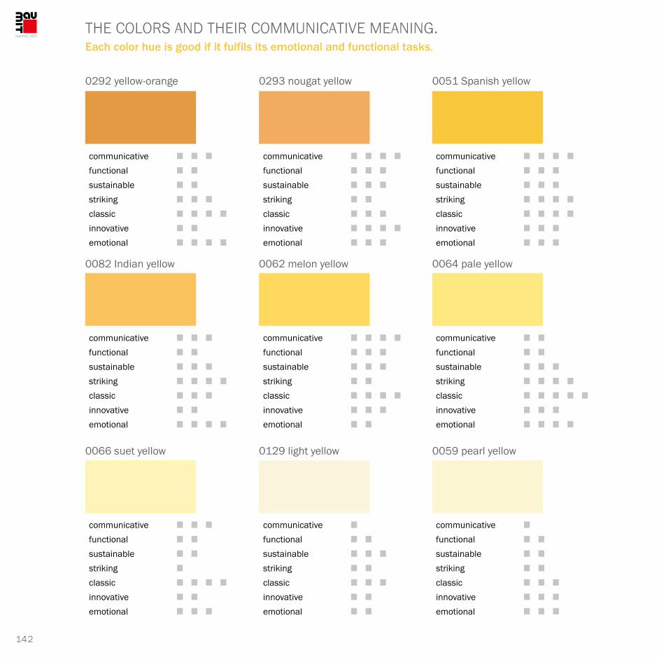
142
0292 yellow-orange 0293 nougat yellow 0051 Spanish yellow
0082 Indian yellow 0062 melon yellow 0064 pale yellow
0066 suet yellow 0129 light yellow 0059 pearl yellow
communicative █ █ █
functional █ █
sustainable █ █
striking █ █ █
classic █ █ █ █
innovative █ █
emotional █ █ █ █
communicative █ █ █ █
functional █ █ █
sustainable █ █ █
striking █ █
classic █ █ █
innovative █ █ █ █
emotional █ █ █
communicative █ █ █ █
functional █ █ █
sustainable █ █ █
striking █ █ █ █
classic █ █ █ █
innovative █ █ █
emotional █ █ █
communicative █ █ █
functional █ █
sustainable █ █ █
striking █ █ █ █
classic █ █ █
innovative █ █
emotional █ █ █ █
communicative █ █ █ █
functional █ █ █
sustainable █ █ █
striking █ █
classic █ █ █ █
innovative █ █ █
emotional █ █
communicative █ █
functional █ █
sustainable █ █ █
striking █ █ █ █
classic █ █ █ █ █
innovative █ █ █
emotional █ █ █ █
communicative █ █ █
functional █ █
sustainable █ █
striking █
classic █ █ █ █
innovative █ █
emotional █ █ █
communicative █
functional █ █
sustainable █ █ █
striking █ █
classic █ █ █
innovative █ █
emotional █ █
communicative █
functional █ █
sustainable █ █
striking █ █
classic █ █ █
innovative █ █ █
emotional █ █ █
THE COLORS AND THEIR COMMUNICATIVE MEANING.Each color hue is good if it fulfils its emotional and functional tasks.

143
COLOR SERIES GSAND & SUN
0019 chrome white 1139 lily white 0149 chalk yellow
0147 cream yellow 0125 light ochre
0144 corn yellow
0128 limestone yellow
0122 absinth yellow 0141 clay yellow
communicative █ █
functional █
sustainable █
striking █
classic █ █ █
innovative █ █ █
emotional █ █
communicative █ █ █
functional █ █ █
sustainable █ █ █ █
striking █ █ █ █
classic █ █ █
innovative █ █
emotional █ █ █
communicative █ █
functional █ █ █
sustainable █ █ █
striking █ █
classic █ █
innovative █ █ █
emotional █ █ █
communicative █ █
functional █ █
sustainable █ █ █
striking █ █ █
classic █ █ █ █
innovative █ █ █ █
emotional █ █ █
communicative █ █ █ █
functional █ █ █
sustainable █ █ █
striking █ █
classic █ █ █ █
innovative █ █
emotional █ █ █
communicative █ █ █
functional █ █ █
sustainable █ █ █ █
striking █ █
classic █ █ █
innovative █ █ █
emotional █ █
communicative █ █ █ █
functional █ █ █ █ █
sustainable █ █ █ █
striking █ █ █
classic █ █ █ █
innovative █ █ █ █
emotional █ █ █ █ █
communicative █ █ █
functional █ █ █
sustainable █ █ █ █
striking █ █
classic █ █ █ █
innovative █ █
emotional █ █ █ █
communicative █ █ █
functional █ █ █ █ █
sustainable █ █ █ █ █
striking █ █
classic █ █ █ █
innovative █ █ █
emotional █ █ █ █

144
YELLOW IS THE REAL SPRINGTIME COLORYellow only exists in the light range. As a facade color it is omnipotent. Whether castle, apartment building or container shed.
Yellow makes you thirsty rather than hungry. The color lasts for a long time in childhood: in the playful and obvious botanical and in the constructive when it involves building blocks. Many kindergartens, day-care centers and schools use yellow. It should present individuality, freshness and, of course, youthfulness. Yellow as a command color is not well received! However, the young and old are particularly fond of yellow as a soft drink, a sweet and dessert. In urban architecture, the use of the banana color is a deliberate, sometimes unconsciously provocative and unusual staging that contrasts with established ad also historic colors.
SYNESTHETICSmelling + tasting pleasant, woody
Hearing muted, murmur
Skin sensation neutral – wood-like smooth
Sense of touch woody to sandy
Weight + center of gravity medium, at the bottom
Pressure + force light to medium
Object feeling pleasant, inconspicuous
Sense of space bright, shapeless
Shape + silhouette simple, functional
Movement + dynamics measured and calm
ASSOCIATIVEValue low, unaccentuated
Experience + stimulant neutral to calm
Sensation light, pleasant
Kinetics + action sandy to paper-like
Functional signal light to at the top
Physiological signal neutral, sunny
Sociological signal neutral to sentimental
Experienced-based knowledge simple, natural
Material object sticky, paper-like
Semiotic meaning resting, flat
STRATEGICSignal + echo casual but striking
Risk tolerance low to arbitrary
Time orientation stable
Unique characteristic revealing, sunny
Environmental reference cheerful and fresh
Room type sedate, reduced
Product type understatement
Gender reference neutral, open
Shape + markings structures, sunny
Surface type sticky, linen-like

145
COLOR SERIES GSAND & SUN
0125 0082 0128 0147 0293 0051 0062 0019 0064
0292 0125 0051 0082 0062 0064 0066 0129 0059
0147 0293 0144 0122 0141 0059 1139 0149 0128
0144 0064 0062 0149 0125 0128 0082 0141 0292
0066 0129 0059 0019 1139 0149 0128 0147 0125
0019 1139 0149 0128 0147 0062 0144 0122 0141
0129 0066 0064 0062 0019 0149 0128 01440059

146
MINDFULNESS AND BENEFIT
They complement each other in terms of design. A chorus of yellows and greys. Cheerful mind and practicality.
Mixing shades of grey with yellow creates a symbiosis of calming harmony. It helps yellow to obtain an appealing seriousness and the grey associate color to acquire a relaxed, high-quality addition.
It‘s good when shades become accomplices: each shade has its own individuality. In the ensemble, they complement and support each other in making a joint statement. It‘s good to make sure that the yellow hue is sufficiently cloudy. In case of doubt, facade colors that seem to be illuminated from a cloudy sky are always better than offensive gaudy shades.
It will always be worthwhile to prescribe sufficiently large color samples, to look at them again and again in changing natural light and then make a decision.
COLOR SERIES G + A

147
COLOR SERIES GSAND & SUN + JADE & WHITE
0125 0082 0128 0147 0293 0972 A 0062 0446 A 0423 A
0292 0125 0051 0016 A 0062 0889 A 0066 0014 A 0059
0147 0293 0144 0122 1029 A 0059 0449 A 0149 0016 A
0144 0064 0062 0149 0018 A 0128 0933 A 0141 0441 A
0066 0129 0059 0019 1139 1029 A 0128 0015 A 0017 A
0019 1139 0149 0128 0147 0937 A 0144 0979 A 0141
0129 0066 0064 0062 0019 0935 A 0128 0425 A0059

148
SPRING FESTIVAL UNDER-NEATH THE CONSTRUCTION SITE FENCEGreen refreshes yellow. A sympathetic gesture in the center or on the edge.
Whether idyllic allotment garden or in the middle of urban bustle or a lonely settlement or a reha-bilitation clinic, a retirement home or a villa in the biotope next to the city center or somewhere on the edge of the periphery – green is at home on many facades.
Nature-oriented hideaways designed, decided upon and built with consistency. They will soon be experiencing a renaissance – despite all the current yearnings for the big city. They offer the chance to enjoy at least one stage of life in or near nature – such desires are age-independent. They come, become stronger, vanish for a while until they are finally turned into reality.
Places to live are borrowed places. People‘s existence continues to be more nomadic than we would like. Natural environmental conditions have the power to bed us in the green.
COLOR SERIES G + H

149
COLOR SERIES GSAND & SUN + PISTACHIO & SAGE
0125 0082 0128 0147 0293 1078 H 0062 0019 1035 H
0292 0125 0051 0082 1031 H 0064 0066 1142 H 0059
0147 0293 0144 0122 0141 0981 H 0971 H 0149 1021 H
0144 0064 0062 1027 H 0125 1038 H 1057 H 0141 0981 H
0066 0129 0059 0019 1149 H 1137 H 0128 1034 H 0125
0019 1139 0149 0128 1071 H 0062 1037 H 0122 1027 H
0129 0066 0064 0062 0069 H 0149 1075 H 01440059

150
One, two or more templates in various combinations, whether deliberate or at random, demonstrate different coloristic results. New visual treats or mere facts.
0292 yellow-orange 0064 pale yellow
0059 pearl yellow 0141 clay yellow
AMORPHIES

151
COLOR SERIES GSAND & SUN
SAND & SUN + JADE & WHITE
0019 chrome white
0051 Spanish yellow
0446 pebble grey
0889 turquoise-white
COLOR SERIES G + A

152
SAND & SUN + PISTACHIO & SAGE
0141 clay yellow
0292 yellow-orange0128 limestone yellow
0062 melon yellow
COLOR SERIES G + H
AMORPHIES

153
ARCHITECTURE
Buerger Katsota
This young architectural company, which has been successful for 10 years, has made a name for itself. Its varied portfolio includes residential, commercial and cultural projects. The office is currently involved in a large number of projects in Europe and Asia, both in the public and private sector, ranging in scale from a master plan for a 180,000 sqm resort at the Caspian Sea (AZ) to a high-end residential project of 1,600 sqm in Carinthia (AT) and holiday homes on Greek islands.
The work of buerger katsota architects is based on a solid foundation of design, budget and program control as well as project management. High-quality design and the best end results are guaranteed from planning to implementation. The studio has an established team of highly qualified consultants who provide integrated services for every complex architectural challenge.
buerger katsota architects are committed to a research- based approach and reject pre-determined stylistic approaches. When designing for a world with a population of more than 6 billion people, the studio constantly reflects this global condition of “urbanization” and con- sciously addresses it in each of its projects, whether small or large. Their work is characterized by the physical context of each project and the understanding and sensitivity with regard to the culture and climate of a place. In addition to the environmental, social and economic aspects of sustain-ability, the empirical potential of light and materials, details and construction are among the studio‘s main concerns. The constant questioning of the “given” and the “proven” generates a process of abstraction that leads to subtle but innovative architectural visions for “new” realities.
The architects need space for
interventions. If architecture is
always the answer to a specific
place, then in the first place,
they must look at people and
try to understand them.
buerger katsota architects is a team of architects working in the fields of urban design and master planning, architecture, interior and product design for private and public commissions.
PRIZES AND AWARDS:
2015, 2013: Nomination for the Mies van derRohe Award, Prize of the European Union for Contemporary Architecture2013: “Prize for Public and Community Use” of the Hellenic Institute of Architecture2010: Award “Architecture Abroad” of the Union of Greek Architects.2014, 2012: Participation in the Architecture Biennale, Venice

154
Demetra Katsota // GREECE
When I put your biography in numbers, have you been an architect for more than 10 years?That‘s about right. My husband and I have been working together for over 12 years. Our studio operates in several countries, including Austria, Russia, Croatia, Ukraine and, of course, Greece. We see ourselves as a generator of a necessarily changing program. It is essential for us to give our work a morale. We need room for intervention. I suspect that in the course of this conversation we will often return to the ethos of designing.
You have studied, worked and learned in several countries around the world. What are the places that you feel particularly attracted to personally and professionally?All I can say is that architecture always provides an answer to a specific place. That is why I must first of all look at people and try to understand them. Our life and work took or is taking place in many places: USA, England, Austria, Greece, and Japan; the latter was and still is my favorite station. Japanese architecture teachers such as Toyo Ito (*1941), Shigeru Ban (*1957) and Kazuyo Sejima (*1956) had the greatest influence on me. They are among the protagonists of the architectural turnaround. Their motto was: away from bubble architecture!
Where would you definitely not like to live or work?In countries ruled by dictators or autocratic regimes. Exceptions to this rule would only be possible for me if projects of humanitarian importance were involved: for example, hospitals, schools, rehabilitation facilities which are under international observation even during the planning phase.
Square in front of the market in Larnaca, Cyprus
Demetra Katsota and her husband are working with their studio in several countries. It is essential for them to give their work a morale.
IT‘S ALL A MATTER OF FINDING A CONCEPT.
Student studios in Patras, Greece

155
ARCHITECTURE
Kura Culture Center in Mingachevir, Azerbaijan

156
Demetra Katsota // GREECE
What influences have shaped you in particular?For my husband and me, these are two people: Palladio and Semper. Andrea Palladio (*1508, †1580), renaissance architect particularly active in northern Italy and Gottfreid Semper, the builder of Dresden‘s “Semper Opera” (*1803, †1879). I was very interested and influenced by the archaeology of the landscape. Digging and reading in it was exciting and revealing and at the same time changed my language, because I was able to describe many things that were previously unknown.The geographic influences all around Greece, the North and Central Europe, the East to Persia and the South as far as North Africa have shaped our history. Classical Greece is therefore also the result of what happened around us and influenced our culture and its diversity. The Renaissance, the Classicism of Schinkel and the Neoclassicism of the late 19th century lived by the fragments of classical Greece. And this has continued into the 21st century. And they still give Europe its cultural, aesthetic and, in a broader sense, its socio-political identity.
Does the success of architecture depend on global demands, points of view and knowledge transfer?Yes, that‘s inevitable. The Internet plays a major role in this: globally and regionally. Work has changed. Standards, norms and knowledge enhancement are part of it – this is how architecture approaches in its entire style throughout the world. Sixty or seventy years ago, the phenomenon already existed: let‘s look at the projects of Gropius, Le Corbusier and then Oskar Niemeyer, the architect of Brasilia.
What historical or contemporary architects and their architecture could enthuse you? The ETH Zurich as an educational institution, the great density of architecture in Switzerland and Austria as a whole, but also in Belgium, the Netherlands, Spain and the buildings of British architects in the late 1990s. The buildings of Herzog and De Meuron, EM2N, Rudolf Olgiati, marte & marte, Vogt Landscape. They all influenced me and, yes, partly also inspired me. And the following: again in first place Andrea Palladio, Otto Wagner, the town planner, Sigurd Lewerentz, Mies van der Rohe, Alison & Peter Smithson are precious to me, but especially AP.
Is there such a thing as a world city of architecture?London definitely belongs in this group. The city has rejuvenated itself in the last fifteen years. Beijing has completely renewed itself from 1992 to the present day and turned everything
PXAthens – Installation at the 13th Biennale in Venice, Italy
Student studios in Patras, Greece

157
ARCHITECTURE
upside down. Grey-blue has become colorful, 10–15 million bicycles have turned into 10–15 million cars. Tokyo is magnificent. Everything that was valid 20 years ago has disappeared. Not even the rudiments of the past can be recognized – a city without a monument, a country that has subjected itself to a notorious, not only architectural evolution.
Is Tokyo the model for an aspiring city?This may be possible. Tokyo is the result of tremendous density. The plots are tiny, the financing expensive, the profitable not profitable enough. That is why the costs of living are constantly growing, beyond reason. It is to be feared that Tokyo will one day present the prototype among the giant cities, where it is almost impossible to live any longer ‒ or else it will revolutionize itself over and over again.
Back to the local present. Please describe the most expressive house you think was built in your studio.It must be the house on Corfu. It is a holiday home, suitable for relaxing, sleeping, swimming and enjoying the landscape. Nine, ten-meter-high olive trees grow through the terraces. They are reflected in the water of the pool. The house offers a combination of essential needs: – To contemplate the landscape, to experience the drama of the hills in all phases of light.– To discover the horizon beyond the infinite waters of the pool to new shores of light.– The combination of architecture, nature and horizons.
Do you plan both? The exterior and the interior?We are responsible for the construction, which also describes the interior of the building. We do not interfere in the design of the ambience. We do not necessarily want to enter a terrain that is filled with trap doors and snap traps.
COOP Bank Headquarters in Nicosia, Cyprus

158
Demetra Katsota // GREECE
Your opinion about the ornament or decoration of the building or close to it?The materiality itself is ornamental enough for us. Plants are one of the possibilities of legitimate representation; thus, they are additional values of architectural design. Then they are part of the main thing and not of the cheap embellishment.
A few keywords about housing construction and living: The construction, design, philosophy, pragmatism...?Houses and living spaces should be flexible, transparent, safe, homely, social and sustainable, but also suitable for landscapes. Ideally, they should be suitable for several families. Made for two, three generations or for two, three families. I advocate that the living together of people requires – as a prerequisite – a planning and social wisdom of the architect in order to be successful or to achieve better results.
Where do you prefer to live apart from the Earth, on the Moon, Mars or Jupiter?Preferably, I don‘t want to live anywhere else but on Earth. I think that a weekend on the moon could be bearable. I would probably like to look at the Earth below a small horizon.
Goethe said: “Colors are the children of light”. Which child is your choice?The earth shades from white to black. The shadow hues of greens and browns. The fluorescent of yellow. And many possible colors as trademarks of a building.
House H on Corfu, Greece
Residential block Annenheim in Treffen, Austria

159
ARCHITECTURE
01 Beauty in architecture is just as important as...? Structure.
02 Three attributes that best describe your own architecture: Light, bright, abstract.
03 Your favorite architects, artists, writers, composers? Richard Deacon, Michail Pirgelis.
04 Which historical building deserves your admiration? Villa Emo by Andrea Palladio.
05 Which one do you despise the most? None.
06 What should architecture always achieve? Be appropriate.
07 What should architecture never do? Be inappropriate.
08 What are your favorites for an architectural city trip; places one should know: medium-sized town, big city, cosmopolitan city? Tokyo.
09 What are your favorite colors in architecture? Nature.
10 What are the resources you use most for your work? Strategy with intuition.
11 How do you assess the current value of architecture from a cultural-sociopolitical point of view? On a scale of one (lowest) to ten (highest). Unfortunately 1 (historically it will probably be around 9).
12 Do you approve or disapprove of globalization in architecture? Was and still is always global.
13 Architecture plus quality of life – how do they reveal themselves best? – – –
14 What do facades mean to you in the urban landscape? Expression of the way of life.
15 What are the desirable future options in architecture? As architects to develop tools to better influence the constructed space and city. We can still achieve a lot more...
16 What is your personal favorite contemporary building? Many, they are constantly changing.
16 QUESTIONS TO Demetra Katsota

160
HEALTHY
JOY OF LIVING

161
COLOR SERIES H
When the green of leaves or
green of grass passes by, such
color impressions arise.
In some rural areas, buildings
are finished with beautiful green
plaster. And houses are still
carefully enveloped with espalier
and proliferous climbing plants.
PISTACHIOSAGE

162
THE COLORS AND THEIR COMMUNICATIVE MEANING.Green is the most prestigious color in the world because it is the symbol of nature.
0971 nickel green 0981 deep turquoise 1034 oak green
1035 Ireland green 1027 pale olive 1037 gentle green
1038 spring green 1057 ice green 1078 light green
communicative █ █ █
functional █ █ █ █ █
sustainable █ █ █ █
striking █ █
classic █ █ █
innovative █ █ █ █
emotional █ █ █
communicative █ █ █ █
functional █ █ █
sustainable █ █ █ █
striking █ █ █ █
classic █ █ █ █
innovative █ █ █
emotional █ █ █ █
communicative █ █ █ █
functional █ █ █
sustainable █ █
striking █ █ █
classic █ █
innovative █ █
emotional █ █
communicative █ █ █
functional █ █ █ █
sustainable █ █ █ █ █
striking █ █ █
classic █ █ █ █
innovative █ █ █ █ █
emotional █ █ █ █
communicative █ █ █ █
functional █ █ █
sustainable █ █ █
striking █ █
classic █ █ █
innovative █ █ █
emotional █ █
communicative █ █
functional █ █ █
sustainable █ █ █
striking █ █
classic █ █
innovative █
emotional █ █ █
communicative █ █ █ █
functional █ █
sustainable █ █ █
striking █ █ █ █
classic █ █ █
innovative █ █ █ █
emotional █ █ █
communicative █ █ █
functional █ █
sustainable █ █
striking █ █ █
classic █ █ █
innovative █ █
emotional █ █ █
communicative █ █ █
functional █ █ █
sustainable █ █ █ █
striking █ █
classic █ █ █
innovative █ █
emotional █ █ █

163
COLOR SERIES HPISTACHIO & SAGE
0069 summer yellow 1149 white-green 1137 pistachio bright
1075 bamboo green 1142 May green
1071 sap green
1076 sage green
1031 loden green 1021 antique green
communicative █ █ █
functional █ █ █
sustainable █ █
striking █ █ █ █
classic █ █ █
innovative █ █ █
emotional █ █
communicative █ █ █
functional █ █
sustainable █ █
striking █ █ █
classic █ █ █
innovative █ █ █
emotional █ █ █
communicative █ █
functional █ █ █
sustainable █ █ █
striking █ █ █ █
classic █ █
innovative █ █
emotional █ █ █ █
communicative █ █ █ █
functional █ █ █
sustainable █ █ █ █
striking █ █ █ █ █
classic █ █ █
innovative █ █
emotional █ █ █ █
communicative █ █ █
functional █ █ █ █
sustainable █ █ █
striking █ █ █
classic █ █
innovative █ █ █ █
emotional █ █ █
communicative █ █
functional █ █ █
sustainable █ █ █
striking █
classic █ █
innovative █ █
emotional █ █ █
communicative █ █ █ █ █
functional █ █ █
sustainable █ █ █
striking █ █ █ █ █
classic █ █ █ █
innovative █ █ █ █
emotional █ █ █ █
communicative █ █ █ █
functional █ █ █ █
sustainable █ █ █ █ █
striking █ █ █ █
classic █ █ █ █
innovative █ █
emotional █ █
communicative █ █
functional █ █ █ █
sustainable █ █ █ █
striking █ █
classic █ █ █
innovative █ █
emotional █ █ █

164
THE CHALLENGEIts name is green. Green provides social anchoring points in all regions of the world.
We‘ve grown accustomed to green. Wherever green appears, we develop a quiet consensus across ideologies and borders. Green has already established itself as the main color of hope of the 21st century. In three or four centuries time, color archaeologists will be able to determine the times of origin on the basis of the diversity of green. The three levels of the matrix developed below indicate the strength and stability of the natural color. In everyday neighborhood life, the philanthropic significance is not only reflected in the good gesture of planting some trees, but it is often sufficient to give a house wall a leaf-green coat of paint, thus demonstrating a good green conscience. Green possesses the original gene of affection, attentiveness and friendship.
SYNESTHETICSmelling + tasting fresh, plant-like
Hearing whooshing, rustling
Skin sensation moist, cool
Sense of touch waxy, firm
Weight + center of gravity lightweight, centered
Pressure + force light, flexible
Object feeling biological, flexible
Sense of space free, recreative
Shape + silhouette bolide-like, evolved
Movement + dynamics growing, swaying
ASSOCIATIVEValue low to medium
Experience + stimulant animating, spring
Sensation pleasantly fresh
Kinetics + action agitated, flapping
Functional signal unsteady, low
Physiological signal healthy, vitamin-packed
Sociological signal buoyant, free
Experienced-based knowledge naturally growing
Material object plastic, gardening tools
Semiotic meaning artificial + natural
STRATEGICSignal + echo conspicuous, friendly
Risk tolerance positively low
Time orientation seasonal and eternal
Unique characteristic natural, pleasant
Environmental reference ecologic, rural
Room type sedate, natural
Product type simple, original
Gender reference feminine + masculine
Shape + markings areal, biological
Surface type floral, fresh

165
COLOR SERIES HPISTACHIO & SAGE
1142 1035 1076 1075 0981 1034 1027 0069 1037
0971 1142 1034 1035 1027 1037 1038 1057 1078
1075 0981 1071 1021 1021 1078 1149 1137 1076
1071 1037 1027 1137 1142 1076 1035 1021 0971
1038 1057 1078 0069 1149 1137 1076 1075 1142
0069 1149 1137 1076 1075 1027 1071 1031 1021
1057 1038 1037 1027 0069 1137 1076 10711078

166
COMBINATION WITH BEIGE AND GREY-BROWN
A changed color field. With new contents neutral and pragmatic.
The color image is reminiscent of forest soil covered with moss. On dark brown-tinted, moist bark and wood-black earth roots. During our walk through the forest, we experience not only green in its fresh vegetable origin, but also as an attacked piece of nature that has been exposed to biological decay.
The color in its own materiality defines its effect. We perceive nature as an example and a guide and not necessarily as a decal. We learn a lot from what it represents aesthetically and sensitively rather than what it is physically, biologically and chemically.
COLOR SERIES H + A

167
COLOR SERIES HPISTACHIO & SAGE + JADE & WHITE
1142 1035 1076 1075 0981 0446 A 1027 0423 A 1037
0971 1142 1034 1035 1027 1037 0889 A 1057 0018 A
1075 0981 1071 0979 A 1021 1029 A 1149 0016 A 1076
1071 1037 1027 1137 0014 A 0972 A 1035 0441 A 0971
1038 1057 1078 0979 A 1149 1137 0014 A 1075 0015 A
0069 1149 1137 0016 A 1075 0937 A 1071 0933 A 1021
1057 1038 1037 1027 0069 0939 A 1076 0935 A1078

168
BLUE-GREEN MARITIME ARCHITECTURE
Architecture with freshness symptoms. Popular in the north, appreciated elsewhere.
Fresh shades make life cheerful and brighten up the short days. Clear shades of green and blue ensure better weather and a good mood.
In general, the feeling of well-being and comfort is enhanced by bright colors. The house, the garden, the entire living space appears tidier and more entertaining – outside and inside are not alien to each other, but converge.
This is often expressed in the summer message: “Inside is outside – and outside is inside”. Here, the same materials are used and the same comfort is demanded. The outdoor barbecue replaces the kitchen. The place for chatting is the secluded terrace.
COLOR SERIES H + C

169
COLOR SERIES HPISTACHIO & SAGE + NAVY & AZURE
1142 1035 1076 1075 0981 0769 C 1027 0774 C 1037
0971 1142 1034 1035 1027 1037 0763 C 1057 0785 C
1075 0981 1071 0771 C 1021 0844 C 1149 0782 C 1076
1071 1037 1027 1137 0787 C 0791 C 1035 0761 C 0971
1038 1057 1078 0842 C 1149 1137 0772 C 1075 0793 C
0069 1149 1137 0841 C 1075 0795 C 1071 0763 C 1021
1057 1038 1037 1027 0069 0785 C 1076 0777 C1078

170
1075 bamboo green0971 nickel green
1034 oak green 1031 loden green
AMORPHIES
The templates can be used to develop different grids. Thereby the amorphous surface structures almost dissolve.

171
COLOR SERIES HPISTACHIO & SAGE
PISTACHIO & SAGE + JADE & WHITE
0972 green-grey
0441 brown-black
1031 loden green
1057 ice green
COLOR SERIES H + A

172
0761 pure blue
0842 Azores blue1142 May green
1076 sage green
PISTACHIO & SAGE + NAVY & AZURE
COLOR SERIES H + C
AMORPHIES

173
ARCHITECTURE
Radu Teacă
Architecture must be art.
Scenography and atmosphere
develop sensations and
feelings. For the architect,
everything else is a pure
envelope. The evolutionary and
most important element lies
in the middle of the belly, the
small core marks the soul,
the artistic and elementary.
2004: Commissioner of the exhibition representing Romania at the Biennale in Venice2005: Invited to the jury of the international competition “Sustainable Buildings”, Zurich, organized by Holcim and ETH Zurich.2010: Publication of the monograph “Radu Teacă projects 1990–2010” in the Igloo Profile series2011: RIFF Architecture Conference (JW Marriott Grand Hotel Bucharest), lecture: “Space Modeling”. As an architect and co-architect, he is involved in more than 30 projects including office buildings, commercial buildings and single- family houses as well as in about 40 interior design projects.
ARBEITEN (AUSWAHL)▮House on str. Petricani – Bucharest▮Housing block Șos. Nordului – Bucharest▮Housing in Sibiu▮Galati Student Hostel ▮Housing in Samurcași – Ilfov
AWARDS AND COMPETITIONS2013: The Chairman’s of the Bucharest Branch Award of the ANNUAL AECHITECTURE GALA in Bucharest with the project “Art Gallery Galateca”2013: Nomination in the category of architecture books of the ANNUAL AECHITECTURE GALA in Bucharest with the publication “Space without Time. Contemporary Orthodox Architecture” 2011: Nomination for the Awards Arhitext Design, distinction in the category of White Building, Igloo Publishing House, finalist with the project “The house by the lake”2011: Nomination for the Brick Award Vienna, project: “Lodging Complex Buftea”2011: 2nd prize in the interior design competition “Insign Awards”
Doctor of Architecture (1999), university lecturer at the Chair of Design Synthesis at the University of Architecture and Urban Planning „ION MINCU“, Bucharest. Architectural office ARTLINE, Bucharest. www.raduteaca.ro

174
Radu Teacă // ROMANIA
Competition project “Collective housing Stejarii 2”
Individual House Voluntari, Bucharest, 1999

175
ARCHITECTURE
What does the term “green building” mean to you? The future, the present, only a trend or significantly more?First of all, I associate this term with the pure future. Classical, logical thinking forces us to the implementation. All known, applied energy technologies require oil and gas supplies from North, Central and Southwest Asia. I think that is worrying from a strategic point of view. In 2015, the Romanian pavilion at the World Expo showcased how the interaction with nature needs to change. Our generation has the obligation to reclaim nature for us. The large cities must no longer be artificial agglomerations, but ideally living biotopes. Buildings will mutate into stepped, terraced horizontal plantations. The pure plant-like vertical structures are, well, were a trend, spectacular though and beautiful to look at. But really helpful?
What else does the architect do? Will he become an urban landscape designer?He will have to do this willingly and hopefully with expertise and passion. Architecture has always been the natural access to the community of destiny of landscape, nature and life and civilization. Green nature exists for the architect designing all around: inside, in between and outside the building. By Green Building I understand advantages for the following parameters: Economy, ecology, life quality (health), biology (consisting of fauna and flora), aesthetics and pure function.
I am currently planning such buildings as new buildings and as conversion projects. We develop building complexes or are working on them. They are divided into geometric individual seg-ments whose negative spaces form the inside/outside areas. In summer the trees are green and in winter they are covered with snow. Large glass surfaces demand our participation in the exterior! In the southern part of our country we experience an old Turkish tradition of glass window walls, which had been over since the 18th century. Incidentally, all the plots had an only knee-high fence protected by a gigantic, four to five-meter high gate. Indoors or outdoors were always more of a decoration than useful protection.
ARCHITECTURE IS ALWAYS A CULTURAL ACT.For Radu Teacă, buildings describe more than just an envelope.
Esarfei office building in Bucharest, Romania

176
Radu Teacă // ROMANIA
Individual House D. Gjerea, Bucharest, 2002
Căsa pe str. G. Georgescu, Bucharest, 2006
How much space does a person or a family need?When I leave out the garage area and only consider the living spaces, then 180 to 300 m² are adequate. We need space, also as a sign of time, enough of both is available. Houses need good quality materials and craftsmanship. For most of the historic buildings in our latitudes, the roofs had pointed gables so that the rain, snow and ice would disappear faster. I like to remember traditional techniques and materials. Walls and roofs last for centuries if they are well-designed and made of decent materials, for example wood.
Are interior and exterior part of living? Part of the architecture?Buildings consist of exterior and interior spaces. Even if they belong together only visually, without any apparent functional connection, they still form a unity: buildings in nature are supposed to be open, in the city they better close themselves off. Location and function describe the substantial possibilities: whether it‘s a residential building, church, restaurant, museum, school or a circus tent.
Your opinion about beauty – more than shape or pure functionality?Everything depends on synthesis – it creates the conditions. The prerequisites are to be queried: 1. location and environment, 2. functionality and standard, 3. size and form. The architect takes the role of manager. He defines the physical space to which the form adapts. Then it is about the structure to which the function adapts. As an ingenious decision supporter and manager, the architect is both the source of ideas, the artistic director and the philanthropic assistant.

177
ARCHITECTURE
Where do you work, where is your favorite place?Architecture is always a cultural act, because buildings describe more than just an envelope. Architecture must be art. Scenography and atmosphere develop sensations and feelings. Everything else is pure shell. The evolutionary and most important element lies in the middle of the bellows or belly, the small nucleus – the atomic nucleus of the atom – it marks the soul, the artistic and elementary.
Can you explain the standard of beauty to us?Beauty usually results from a situation. Beauty is as hard to pinpoint as wisdom, goodness or malice. Beauty is boundless, free and uncommitted. It can do without rules, is not measurable. Beauty is always the result of a conceptual truth.
My further question also touches on the concept of the previous question. How much glass does architecture need?Again, this is a question of the concept. I know some people who have fallen in love with glass, like Oscar Wilde‘s Dorian Gray in his reflection. The others use solid facades. Just like Mario Botta or his teacher Louis Kahn (*1901, †1974). Contrary to that I name I. M. Pei who designed the glass pyramid at the Louvre. I appreciate Louis Kahn and Botta as much as I. M. Pei.
Do office buildings have to be reinvented. Do we need more creative minds than administrators who keep the offices occupied today?Offices demand a high degree of functionality ‒ but inside and outside, there has to be room for feelings. Offices need all the qualities of a humane, biological infrastructure. The light, the colorfulness plays an important role here. No black, no white. But shades of spring and summer, art, heaven and good mood. The humane gesture is an indispensable element of design. A recipe for this: large office buildings, whether 30 or 80 storeys high, need a large piazza that is at least two or three times the diameter of the building‘s height. The expanse of the forecourt reduces the intensity of the height.
Sednona office building

178
Can you help relieve stress through architecture? Stress reduction in a shopping center is possible. What contributes to the humanization of workplaces also applies to shopping malls:– plenty of natural light– plenty of natural green – natural materials – enthusing color schemes: bright, floral and color hues of the sky
The humane place. How emotional must it be?It is the marketplaces that exert a formative influence on the atmosphere of a place. They represent something like the agora, the meeting place of the ancient Greeks. This means: free communication as an institutional value. A kind of Speaker‘s Corner everywhere and on top of everything. The public space needs both: the agora and the bazaar, that means the market as a commercial, entertaining meeting point.
Your favorite city in Romania?Apart from Bucharest, I love Sighisoara and Cevj in particular. These are medieval towns dating from the 16th and 17th centuries in impressive surroundings. Furthermore, these are places and areas like: Maramures, the most unspoilt region in Romania. Medias, Sibiu and Sulina and the whole Danube Delta.
Which architectural task is particularly appealing to you for the near or distant future?I still have this wish: to build a large church – I have already built a chapel. Maybe also a resort with a content in dialogue with the landscape.
The last question: your favorite colors?White nuances work best with my architecture. But I always try to create feelings with my buildings. That‘s why I use the chromatic power of materials ‒ from brick, sandstone and granite to wood. But it‘s also easy for me to use chance. By the way, I use black when designing large stores for expensive Swiss watch brands.
“Golden Lightning” office building in Bucharest, Romania
“Golden Lightning” office building in Bucharest, Romania
Radu Teacă // ROMANIA

179
ARCHITECTURE
01 Beauty in architecture is just as important as...? Functionality.
02 Three attributes that best describe your own architecture: 1. The relationship to the context; 2. the essentialization of form in connection with function and location; 3. the intention to semanticize functions, an attempt to lend spiritual connotations to several apparently sophisticated functions. I believe that this is the difference between shelter and architecture. Architecture must be a cultural action.
03 Your favorite architects, artists, writers, composers? Architects: Le Corbusier, Louis Kahn, Souto de Moura. Artists: Brâncuși, Mondrian, Ghenie. Writers: Hölderlin, Thomas Mann, Mario Vargas Llosa, Mircea Cărtărescu. Composers: Bach, Richard Strauss, Frank Zappa, King Crimson, Keith Jarrett etc.
04 Which historical building deserves your admiration? The Parthenon / Hagia Sophia.
05 Which one do you despise the most? Palace of the parliament in Bucharest.
06 What should architecture always achieve? The right to (co-)exist with the location. To be a result of the symbiosis with the context. To help shape the city or part of the city as a coherent whole and help people to find fulfillment in it through feelings transferring the qualities of the locations.
07 What should architecture never do? An independent object that does not take the environment into account. Not to have the a priori tendency to become a monument, no matter what kind of architectural object it is.
08 What are your favorites for an architectural city trip; places one should know: medium-sized town, big city, cosmopolitan city? Antwerp / Barcelona / Paris.
09 What are your favorite colors in architecture? White and the colors (and textures) of natural materials.
10 What are the resources you use most for your work? Intuition, feeling, animation but also the ability for synthesis.
11 How do you assess the current value of architecture from a cultural-sociopolitical point of view? On a scale of one (lowest) to ten (highest). Eight
12 Do you approve or disapprove of globalization in architecture? Globalisation has the advantage that it propagates new materials, techniques and trends. However, if this propagation is not refined by a local filter (of archetypes, traditions, specific climatic conditions) and imitations are created as a result, they represent the negative side of the phenomenon.
13 Architecture plus quality of life – how do they reveal themselves best? On a the material, sensory and practi- cal level as well as on a cultural level of architecture, which in itself suggests a life scenario and therefore has a civilizing character.
14 What do facades mean to you in the urban landscape? Facades are part of the urban landscape, part of the city as a whole and create the feeling of being born from it. The same result can be achieved when an architect con-sciously wants to create a contrast with the location by creating a tension between the architectural object and the surroundings. This tension can be beneficial to the location as a whole and justify the existence of the construction.
15 What are the desirable future options in architecture? I hope that architecture will become “free of necessity” – an expression that the famous philosopher Berdjajew coined with reference to transcendence. This would mean that the emerging technologies would free architecture even more from the constraints of gravity and climatic factors, so that the original concept could be implemented even more directly and unchanged than was previously possible. On the other hand, I wish that this liberation will not become a catalyst for an intention whose manifestation I have observed more and more in recent years: The intention to create “extraordinary”, “very special” objects that exist solely as an end in themselves and are independent of the location, surrounding context and the public space.
16 What is your personal favorite contemporary building? The retirement home by Aires Mateus in Alcácer do Sal.
16 QUESTIONS TO Radu Teacă

180
Baumit. Ideas with a future.

181
Baumit. Ideas with a future.

182

183
Baumit. Ideas with a future.
Colors can stimulate, cool down, create a cozy or an activating ambience, they lend character and influence our emotions. They are not only beautiful to look at, but also express cultural trends. Make use of the power and magic of color to create something unique. Create your own way of LIFE!
For a long time, the individuality of a building has been limited to its architecture. But today we know that the facade gives the building its unique character. That‘s why Baumit developed the Baumit Life system comprising 888 shades. Whether you prefer soft pastel hues or intense dark colors – Baumit Life offers unlimited design possibilities.
Baumit also recommends: Only in the morning we are able to see colors correctly. Facade colors should best be chosen at this time of day. In the course of the day, however, perception changes with the length of time you are awake. Researchers at the University of Houston, USA came to this conclusion. For the first time, they have been able to prove that sleep has an impact on the way we see our surroundings. It showed that grey increasingly gets a slight but measurable green tinge in the course of the day. During the nighttime sleep this error is corrected and at the start of the day, grey is again grey.
Immerse yourself in a world of emotion and creativity – Baumit LIFE is more than “just” Europe‘s most comprehensive color system for the facade. It creates individuality and breathes life into facades.
BAUMIT LIFE COLORS

184
baumitlife.com

185
Baumit. Ideas with a future.
CREATE YOUR DREAM FACADE ONLINEBaumit offers four different selection methods to help you choose the right shade of color! This way you, too, can create your own personal dream facade at www.baumitlife.com
1. Color theory: Are you looking for a certain shade, but are not sure which is right one for you? Be inspired by our category “color theory”!2. Color inspiration: Are you uncertain whether to opt for “Cappuccino”, “Olive”, “Mint”, “Sand” or “Lavender”, but you are not sure which Baumit Life color is best suited for this spectrum? Use the category “Color Inspiration”.3. Color trends: Be inspired by the Baumit trend world. What suits you best? Urban, Sea or Asian Life? With the category “Color trends” you, too, will find your color shade.4. Color psychology: Do you want to know what effect really is behind a certain color? For the renowned German color expert Prof. Axel Venn, colors are more than just simple shades. They represent feelings, forms, senses, they have their own DNA. Professor Venn has developed the Life Color System with eight different color series exclusively for Baumit. Each series comprises 18 unique shades of color with their unique meaning.

186
FUNCTION – STATE OF THE ARTBaumit finishing coatings are not only easy to apply and highly attractive, they also provide the perfect solution for every problem. From the self-cleaning effect with photocatalysis and nano-technology to the particularly intensive colors with CoolPigments, Baumit finishing coatings prove to be a real all-rounder for almost every requirement. TIP: All Baumit facade colors.
DESIGN – CREATIVE EXPRESSIONThe appearance of your facade is not only about colors. Think in a creative way and choose a plaster with a unique texture. Whether combed or wiped, coarse or smooth. Are you looking for something extravagant? No problem: With Baumit effect coatings you can give your facade that certain something. Whether modern trend colors, metallic gloss or glittering effect – Baumit effect coatings allow unlimited creativity, uniqueness and imagination and thus open up a completely new dimension in facade design.
WONDERFUL, UNIQUE FACADES – FOR A LIFETIME Finishing coatings from Baumit last for decades – guaranteed. They protect your facade from environmental influences such as moisture and heat and make it permanently beautiful. They help you to create designs as attractive and unique as life itself!

187
Baumit. Ideas with a future.
Finishing coatings from Baumit last for decades – guaranteed. They protect your facade from environmental influences such as moisture and heat and make it permanently beautiful. They help you to create designs as attractive and unique as life itself!

188

189
Baumit. Ideas with a future.
Excellent durability.Thanks to their unique formulas, Baumit facade paints are particularly weather-resistant. In this way, they prevent damage to the facade and protect the building structure for many years.
Sprayable with airless devices.All Baumit facade paints are suitable for use with airless systems! In recent years, airless paint spraying equipment has become increasingly popular on the market. Using these devices, the paint can be applied quickly and evenly in just a few minutes. This saves a lot of time and money.
Lightfastness.Baumit facade paints are characterized by their high lightfastness. Well integrated pigment com-ponents ensure intensive, long-lasting and beautiful colors.
Excellent yield.The unique formula guarantees maximum efficiency in terms of productivity and yield, depending on structure and grain size. Sgraffito structures with a grain size of at least 2.0 mm have a material consumption of 2.9 kg/m2, whereas 1.5 mm require 2.5 kg/m2, and 3.0 mm correspondingly 3.9 kg/m2. Groove structures use 2.6 kg/m2 with a grain size of 2.0 mm and 3.6 kg/m2 with a grain size of 3.0 mm.
SustainabilityIn order to protect your facade against organic substances such as algae and mold and to guar-antee long-lasting results, all products contain safe and harmless encapsulated biocides. Since the addition of biocides is not desirable in special cases, a biocide-free formula can also be ordered. Do you have further questions? Your Baumit expert advisor will be happy to assist you.
PAINTS AND FINISHING PLASTERSA building facade is much more than just a superficial appearance. The more compact the protective wall, the better your house will be protected against environmental influences such as heat, rain and hail.

190
The power of light and the special photocatalyst give Baumit Nanopor a particularly efficient self-cleaning effect - for a permanently brilliant, clean facade. The microscopically smooth sur-face of Baumit NanoporTop protects the facade from dirt, as dirt particles have little grip on the surface. With the special extra, the self-cleaning effect of photocatalysis, Baumit Nanopor offers additional protection against soiling. For facades, this means that the beauty and cleanliness of the surfaces is preserved for even longer - in short: the value of the building remains unchanged and renovation intervals are extended.
BAUMIT NANOPOR WITH PHOTOCATALYSIS
Self-cleaning Natural Anti-ageing for the facade
Standard Coating after several years Baumit Nanopor
EFFECT
SELFCLEANING
PHOTOCATALYSIS
LON
G-LASTING CLEANLINESS

191
Baumit. Ideas with a future.
BAUMIT STARTOP PROTECTION THROUGH DRYPOR EFFECT
Surface with very low dirt accumulation Good protection against algae and fungi Best processing properties
Baumit StarTop, the next generation of silicone resin plaster, is enriched with a new filler. Like a coral, Baumit StarTop has a very large surface with many hollows and pores. This allows a particularly fast and generous distribution of surface moisture. At the same time, this very fine microstructure also ensures particularly fast drying.
Baumit StarTop uses the hydrophobic / hydrophilic principle to reduce the accumulation of dirt on the surface. The hydrophobic character of a premium silicone plaster provides very good water repellency and excellent drainage characteristics. The hydrophilic coral structure causes a spreading of moisture in case of fog or dew and subsequently ensures faster drying of the surface. The combination of these three functions - dripping off of rain drops, moisture absorption in case of dew and the rapid drying of the surface - ensure facades with a particularly low dirt accumulation. Another highlight is the improved processing properties. StarTop is easier and quicker to apply and shows a very even and beautiful texture. Thanks to its pleasant and smooth properties, Baumit StarTop can be applied with less physical effort.
DRYPOREFFECT
QUIC
K DR
YING EFFECT BEST PROCESSING
ALGAE PROTECTION

192
maske??
0191 0201 0211 0221 0231 0241 0281 0291 0301 0311 0321 0331 0341 0351
1041 1051 1061 1071 1111 1121 1131 1141 1151 1161
0021 0031 0041 0051 0061 0071 0081 0121 0131 0141 0151 0161 0171 0181
0381 0391 0401 0411 0421 0431 0441 0451 0461 0471 0481 04910361 0371
0571 0581 0591 0601 0611 0621 0631 0671 0681 06910501 0511 0521 0561
0751 0761 0771 0781 0791 0831 0841 0851 08610701 0711 0721 0731 0741
0981 0991 1001 1011 1021 10310871 0881 0891 0901 0911 0921 0931 0971
Intense facade colors are in greater demand than ever, and PuraTop makes it even easier to implement the aesthetic requirements efficiently and sustainably. Until now, homeowners and architects were limited in their choice of colors because intensive colors had faded and heated up the facade. With the unique formula of Baumit PuraTop and PuraColor, it is now possible to use all 888 colors from the Baumit Life color system in any intensity. Due to the integrated CoolPigments technology, the paint lends the facade an extraordinary effect and can also be applied on top of thermal insulation composite systems.
Unlimited variety of colors Intense shades CoolPigments technology
BAUMIT PURAFACADE PAINT WITHOUT LIMITS
ALLUREEFFECT
CO
OL PIGMENTS TECHNOLOGY
FULL
RAN
GE OF COLORS INTENSE COLOR TONES

193
Baumit. Ideas with a future.
CoolPigments reflect much of the sunlight they are exposed to, resulting in a lower surface temperature. This allows the use of dark trend colors in combination with thermal insulation composite systems. The new pigment is mixed with paints and plasters and supplied as factory tinting, which means that all 888 Life colors with a lightness value of less than 20 can be applied to large surfaces onto thermal insulation composite systems or monolithic masonry.
Surface with CoolPigments: While standard pigments absorb a large part of the sunlight, CoolPigments reflect the sun‘s rays and thus reduce the surface temperature. Thus, Baumit plasters and paints always stay cool. Total solar reflection (TSR) and lightness value (HBW): The lightness value (HBW) describes the brightness of a color for the human eye in comparison to pure white (= HBW 100) or deep black (= HBW 0). While the HBW only considers the visible wavelength range, the thermal warming of a facade depends on the total solar radiation, including ultraviolet and infrared radiation. This is measured by the TSR value (= total solar reflection). The higher the TSR value, the more solar radiation is reflected and the lower is the thermal warming of the surfaces.
Allows application of dark color onto ETICS Reduces surface temperature Safety and top quality in one
1 CoolPigments2 Standard pigments3 Sunlight (light spectrum)4 Reflected sunlight
BAUMIT PREMIUM LINECOOLPIGMENTS TECHNOLOGY

194
Infinite design possibilities Huge range of individual structures Brilliant colors for unique surfaces
The individual appearance of a facade does not only depend on its color. Be creative and give the plaster any imaginable structure with the freely moldable Baumit CreativTop. Baumit CreativTop is a ready-to-use, silicone-reinforced modeling plaster that gives you complete free-dom in processing. Different surface structures create a play of light and shadow and give the facade a depth that changes in a subtle way over the course of the day and the seasons. This versatile and easy-to-use finishing plaster is available in most Baumit Life colors. Thus, endless creations are possible. Give your imagination free rein! Regardless of whether rubbed, smoothed, combed or dabbed, coarse or fine - these and numerous other facade structures can become reality with Baumit CreativTop. Now you can not only choose the right color, but also the right structure for the facade of your house.
BAUMIT CREATIVTOPCREATIVE TECHNIQUES

195
Baumit. Ideas with a future.
prodded structure
MAX TREND VARIO
FINE PEARL SILK
smooth, metallic effect
MAX TREND
FINE PEARL
VARIO
SILK
decorative stripe structure
MAX TREND
PEARL SILK
VARIO
FINE
roughly rubbed structure
MAX TREND VARIO
FINE PEARL SILK
coarse concrete imitation
MAX VARIO
FINE PEARL
TREND
SILK
spatula structure
MAX
PEARL SILK
TREND VARIO
FINE
relief structure
MAX TREND
PEARL SILK
VARIO
FINE
wood imitation
MAX TREND VARIO
PEARLFINE
smooth concrete imitation
MAX TREND
PEARL
VARIO
FINE SILK
plucked structure
MAX
PEARL SILK
TREND VARIO
FINE
smooth metallic effect
MAX TREND
FINE PEARL
VARIO
SILK
spray structure
TREND VARIO
FINE PEARL SILK
MAX
comb structure
MAX TREND
PEARL
VARIO
FINE SILK
brush structure
MAX
PEARL SILK
TREND VARIO
FINE
brickwork imitation
MAX TREND VARIO
PEARLFINE
rolled structure
PEARL SILK
TREND VARIO
FINE
MAX
SILK
SILK

196
BAUMIT SMOOTH FACADE
Perfectly smooth surfaces Purist and modern Ideal contrast
Baumit CreativTop offers endless design possibilities for the facade. But besides all the structures and colors, you always need a purist option: the smooth facade. Smooth facades celebrate a – in the truest sense of the word – brilliant comeback in international architecture. In Eastern and Southern Europe, they have of course always been the standard. This is due to the fact that in these regions the surface rendering of plaster was experimented with, whereas in Northern and Western Europe classical structures were preferred. Moreover, all architectural styles developed from interior to exterior design. This means that today all possibilities of crafts-manship, such as the “fine” surface, can also be applied to the facade. For this reason, Baumit has launched three products on the market that in a brilliant way create a “smooth facade”: CreativTop Vario, CreativTop Pearl and CreativTop Fine.
Smooth facades on top of ETICS: It goes without saying that a smooth facade can also be created on a composite thermal insulation system. In order to achieve a smooth surface, you only need a bit of dexterity and the right know-how. CreativTop is applied on top of the reinforcement plaster layer. Using CreativTop Vario as the first coat creates a levelling layer. This is followed by the application of CreativTop Pearl or CreativTop Silk in a two-step process.
At a glance:Baumit CreativTop Vario = levelling layerBaumit CreativTop Pearl = fine-grained surface Baumit CreativTop Silk = smooth surface

197
Baumit. Ideas with a future.
The days when plasters played a purely functional role are long gone. Today, owners, architects and designers are focusing on the visual appearance of working and living environments. The structure, type and color of paint can be adapted to any lifestyle. Almost everything is possible: a fine grain conveys an unobtrusive flair, whereas a coarse grain exudes a rustic charm - in any case in combination with a creative color coordination.
Groove structureThe grain size and grading curve determine the general thickness and depth of the groove structure. Depending on the technology used, the orientation of the resulting texture is round, longitudinal or oblique. It is a smoothing plaster, but the structural grain is generally round and softer grooves can be achieved by rubbing. The use of round pebbles makes it very easy to create furrowed structures. The movement of the spatula rubs the pebbles across the substrate thus creating the grooves, which can be individually designed according to the spatula movement. The more precisely the movement is executed, the smoother is the resulting structure. If the work is carried out by several people, it is important to coordinate the spatula movement in order to ensure a uniform appearance.
Sgraffito structureA sgraffito structure is achieved by a precise proportion of marble with exact grain sizes (1.5, 2.0 and 3.0mm). The so-called support grain is the basis of a smooth surface. This plaster contains coarsely broken structural grains. The plaster is applied in grain thickness and then spread with a spatula. The even distribution of the textured grain results in a smooth surface. This plaster is very easy to apply, as the structure depends only to a certain extent on the movement of the spatula.
Coarse grain size for high durability Scratch and groove structure For every individual taste
BAUMITCLASSIC TEXTURES
Groove structure
Sgraffito structure

198
BAUMIT LASUR Matt Decorative facade design Individual designs
Regardless of whether it is a town house from the mid-19th century, a building from the days of industrialization, a century-old farmhouse or a modern building. An elegant facade design ensures a harmonious improvement. Where a stylish look is in demand, Baumit Lasur is the right choice. Baumit Lasur is ready to use and suited for decorative walls and facades both indoors and out-doors. With its new matt finish, this glaze is particularly suitable for renovating old facades in an appropriate sty-le as well as for harmonious creations on new buildings. Available for unconventional facades in the following colors: Shine, Sensual, Impulse, Gentle, Solid, Mystic, Fresh, and Casual.
Elegant gloss Modern design High resistance
Modern facades preferably have a „cool outfit“. Designs using Baumit Metallic attract attention without appea-ring unfriendly. Choosing the colors will be easy for you because the shades can be perfectly combined with each other. The high resistance to weather influences is a welcome side effect. Baumit Metallic is a very robust coating with a very high proportion of metallic pigments. It can be applied with a lambskin roller or sprayed on. No matter whether the surface is smooth or highly tex-tured, with Baumit Metallic you always get a special „eye-catcher“. Available in the attractive colors: Titanium, Platinum, Sapphire, Emerald, Gold, Ruby, Bronze, and Azurite.
Shimmering, metallic or glittering effects on the facade: due to the use of new technologies, Baumit effect coatings now make even more exquisite and unique highlights on your facade possible. This is the world of Baumit Lasur, Metallic and Glitter.
BAUMIT METALLIC

199
Baumit. Ideas with a future.
Shimmering and elegant Decorative and extraordinary Water-repellent
Successful architecture should not hide. Baumit Glitter is the right option for anyone who wants to give their facade that certain special something. The facade shines with a natural shimmer without being pompous. An unmistakable way of demonstrating taste. Baumit Glitter makes it possible to create unique „special effects“ on the facade. With 4 striking effects and an elegant metallic shimmer, you can achieve new dimensions in facade design and express your creativity, uniqueness and imagination.
Pasty colored stone plaster Water-repellent and extremely abrasion-proof
Especially suitable for base areas
The base area of a facade is exposed to special loads such as dirt, mechanical stress and rainwater. Baumit MosaicTop is the perfect coating for the base area. The pasty, varied colored stone plaster is therefore par-ticularly suitable for surfaces that have to withstand special mechanical loads. It is highly water-repellent and permeable to air. Baumit MosaicTop can also be used indoors, e. g. in stairwells. With 36 different versions, it also allows a wide range of individual designs.
BAUMIT GLITTER BAUMIT MOSAIC TOP