
Color: The Newest Tool for Technical Communicators—Redux
11
APPLIED THEORY SUMMARY Discusses color properties and color systems Re-examines and supports Jan V. White’s advice to technical communicators to use color to increase document usability Discusses what technical communicators should know about color to work effectively with professional printers Color: The Newest Tool for Technical Communicators—Redux JO MACKIEWICZ INTRODUCTION A lthough using color in print documents is no longer as uncommon as it was when Jan V. White’s popular article, “Color: The Newest Tool for Technical Communicators,” appeared in Technical communication in 1991, many of us still do not feel comfortable in using it. Most of us technical communicators did not go to design school, thereby acquiring a nuanced understanding of color theory. Sim- ilarly, many of us have not worked in professional print shops, thereby acquiring a keen understanding of printer output. Even the textbooks we read in technical com- munication courses usually devote just one or two pages to color (Reep 2006, 158 –159; Smith-Worthington and Jefferson 2005, 152–153). Although most of us are not as “chromophobic” as we once were, we may lack back- ground knowledge about color and, therefore, lack con- fidence in our choices. As technical communicators, we realize that we should know something about color theory so that we can choose colors and color combinations that increase documents’ usability. We know that color can do more than just dress a document or create visual interest. We also realize that we should know something about the practice of using color effectively and methods of obtaining the colors we intend. In this article, I expand on White’s important article (so important that it was republished in STC’s fiftieth anni- versary issue of Technical communication in 2003). From White’s focus on the practice of creating usable documents, I zoom out to discuss a broader spectrum of both theory and practice related to color in technical communication, particularly in relation to print documents. That is, in this article, I examine research and best practices to provide some of that confidence-building background knowledge about color. THEORY AND PRACTICE OF COLOR On a very basic level, we can divide our understanding of color into two categories: theory and practice. Color theory informs us, helping us understand underlying, universal principles that govern all situations. Color practice directs us, telling us how to use color most effectively. Figure 1 diagrams theoretical and practical knowledge about color that is of interest to technical communicators. White (2003) focused mainly on four branches of this diagram; these four fall under the “creating usable documents” node (and ap- pear in italics in Figure 1). This article discusses the rest of the branches—more considerations about color for techni- cal communicators. COLOR THEORY It is easy to be put off by mention of color theory; it seems a bit precious to those of us whose first concern is making sure our intended users easily and efficiently use our documents. However, a little bit of theory in this case can go a long way. For example, understanding color’s components could help a technical communicator choose a more accessible color com- bination and then explain that choice to others. Understanding color properties Essentially, as Sir Issac Newton showed when he split a beam of white light with a spectrum, colors are wave- lengths of light. Objects around us absorb and reflect dif- ferent wavelengths of light, and we perceive the reflected ones as color. These visible wavelengths—the visible light spectrum as opposed to ultraviolet light and infrared light—are the wavelengths to which we attach names: red, Manuscript received 19 November 2007; revised 28 February 2008; accepted 5 May 2008. Volume 56, Number 1, February 2009 • TechnicalCOMMUNICATION 3
Transcript of Color: The Newest Tool for Technical Communicators—Redux

APPLIED THEORY SUMMARY� Discusses color properties and color systems� Re-examines and supports Jan V. White’s advice
to technical communicators to use color toincrease document usability
� Discusses what technical communicators shouldknow about color to work effectively withprofessional printers
Color:
The Newest Tool for TechnicalCommunicators—ReduxJO MACKIEWICZ
INTRODUCTION
Although using color in print documents is nolonger as uncommon as it was when Jan V.White’s popular article, “Color: The NewestTool for Technical Communicators,” appeared
in Technical communication in 1991, many of us still donot feel comfortable in using it. Most of us technicalcommunicators did not go to design school, therebyacquiring a nuanced understanding of color theory. Sim-ilarly, many of us have not worked in professional printshops, thereby acquiring a keen understanding of printeroutput. Even the textbooks we read in technical com-munication courses usually devote just one or two pagesto color (Reep 2006, 158–159; Smith-Worthington andJefferson 2005, 152–153). Although most of us are not as“chromophobic” as we once were, we may lack back-ground knowledge about color and, therefore, lack con-fidence in our choices.
As technical communicators, we realize that we shouldknow something about color theory so that we can choosecolors and color combinations that increase documents’usability. We know that color can do more than just dressa document or create visual interest. We also realize thatwe should know something about the practice of usingcolor effectively and methods of obtaining the colors weintend. In this article, I expand on White’s important article(so important that it was republished in STC’s fiftieth anni-versary issue of Technical communication in 2003). FromWhite’s focus on the practice of creating usable documents,I zoom out to discuss a broader spectrum of both theoryand practice related to color in technical communication,particularly in relation to print documents. That is, in thisarticle, I examine research and best practices to providesome of that confidence-building background knowledgeabout color.
THEORY AND PRACTICE OF COLOROn a very basic level, we can divide our understanding ofcolor into two categories: theory and practice. Color theoryinforms us, helping us understand underlying, universalprinciples that govern all situations. Color practice directsus, telling us how to use color most effectively. Figure 1diagrams theoretical and practical knowledge about colorthat is of interest to technical communicators. White (2003)focused mainly on four branches of this diagram; these fourfall under the “creating usable documents” node (and ap-pear in italics in Figure 1). This article discusses the rest ofthe branches—more considerations about color for techni-cal communicators.
COLOR THEORYIt is easy to be put off by mention of color theory; it seems abit precious to those of us whose first concern is making sureour intended users easily and efficiently use our documents.However, a little bit of theory in this case can go a long way.For example, understanding color’s components could help atechnical communicator choose a more accessible color com-bination and then explain that choice to others.
Understanding color propertiesEssentially, as Sir Issac Newton showed when he split abeam of white light with a spectrum, colors are wave-lengths of light. Objects around us absorb and reflect dif-ferent wavelengths of light, and we perceive the reflectedones as color. These visible wavelengths—the visible lightspectrum as opposed to ultraviolet light and infraredlight—are the wavelengths to which we attach names: red,
Manuscript received 19 November 2007; revised 28 February2008; accepted 5 May 2008.
Volume 56, Number 1, February 2009 • TechnicalCOMMUNICATION 3

orange, yellow, green, blue, indigo, and violet. All of us, ofcourse, have heard of these color terms before, but whatsometimes goes unnoticed is that these terms really refer tojust one of three color properties that together create thedifferent colors we perceive. That is, color has three prop-erties: hue, value, and saturation. Terms like “red” and“green” refer to a color’s hue (also called pigment). Non-specialists tend to use the terms “color” and “hue” inter-changeably, but when we technical communicators differ-entiate between color and hue, using the terms correctly,we are able to discuss our rhetorical and design intentionsexactly. Figure 2 shows a spectrum of hues.
Differentiating between color and hue is importantbecause two different colors can have the same hue. Forexample, Figure 3 shows an array of colors, all with thesame hue. These colors differ not in hue but in value. Valueis a property of color that is also called lightness or lumi-nance. Value is related to the amount of light a colorreflects. Low value colors appear more blackish, andhigher value colors appear whitish; therefore, pastels arehigh value colors.
The third property of color is saturation (also calledchroma). Saturation is the degree to which a hue is present.In conceptualizing saturation, it helps to think of ink beingabsorbed into paper. The more ink, the more saturated thepaper becomes. Saturation is usually measured as purity inrelation to gray. Figure 4 shows colors with identical hueand value but varying saturation (from more green to moregray).
In understanding these three properties, hue, value,and saturation, we are better able to specify and analyze
differences among colors. After such analysis, we can talkto professional printers more easily because we understandtheir jargon.
Understanding color systemsAlso under the aegis of color theory are color systems—tools for understanding relationships among colors andcolor combinations. One tool that is particularly helpful totechnical communicators (as well as artists) is a colorwheel. Different color wheels for different purposes exist,but one of the very first color wheels, created by JohannesItten, shows how colors contrast in hue (Figure 5).
Itten’s color wheel, often called the mixing color wheel
ecitcarP roloC yroehT roloC
understanding color properties
understanding color systems
creating usable documents
communicating with the printer
increasingreadability
ensuringaccessibility
managing color across documents
determining type of print process
focusing attention
associating elements
prioritizing elements
signaling organization
Figure 1. Theoretical and practical knowledge about color.
Figure 2. A spectrum of hues.
Figure 3. Colors with identical hue but different value.
Figure 4. Colors with identical hue and value but differentsaturation.
APPLIED THEORYColor: The Newest Tool for Technical Communicators—Redux Mackiewicz
4 TechnicalCOMMUNICATION • Volume 56, Number 1, February 2009
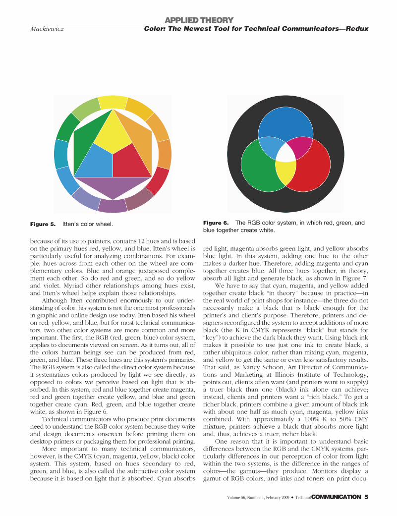
because of its use to painters, contains 12 hues and is basedon the primary hues red, yellow, and blue. Itten’s wheel isparticularly useful for analyzing combinations. For exam-ple, hues across from each other on the wheel are com-plementary colors. Blue and orange juxtaposed comple-ment each other. So do red and green, and so do yellowand violet. Myriad other relationships among hues exist,and Itten’s wheel helps explain those relationships.
Although Itten contributed enormously to our under-standing of color, his system is not the one most professionalsin graphic and online design use today. Itten based his wheelon red, yellow, and blue, but for most technical communica-tors, two other color systems are more common and moreimportant. The first, the RGB (red, green, blue) color system,applies to documents viewed on screen. As it turns out, all ofthe colors human beings see can be produced from red,green, and blue. These three hues are this system’s primaries.The RGB system is also called the direct color system becauseit systematizes colors produced by light we see directly, asopposed to colors we perceive based on light that is ab-sorbed. In this system, red and blue together create magenta,red and green together create yellow, and blue and greentogether create cyan. Red, green, and blue together createwhite, as shown in Figure 6.
Technical communicators who produce print documentsneed to understand the RGB color system because they writeand design documents onscreen before printing them ondesktop printers or packaging them for professional printing.
More important to many technical communicators,however, is the CMYK (cyan, magenta, yellow, black) colorsystem. This system, based on hues secondary to red,green, and blue, is also called the subtractive color systembecause it is based on light that is absorbed. Cyan absorbs
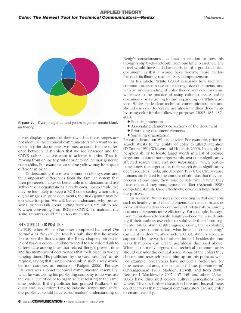
red light, magenta absorbs green light, and yellow absorbsblue light. In this system, adding one hue to the othermakes a darker hue. Therefore, adding magenta and cyantogether creates blue. All three hues together, in theory,absorb all light and generate black, as shown in Figure 7.
We have to say that cyan, magenta, and yellow addedtogether create black “in theory” because in practice—inthe real world of print shops for instance—the three do notnecessarily make a black that is black enough for theprinter’s and client’s purpose. Therefore, printers and de-signers reconfigured the system to accept additions of moreblack (the K in CMYK represents “black” but stands for“key”) to achieve the dark black they want. Using black inkmakes it possible to use just one ink to create black, arather ubiquitous color, rather than mixing cyan, magenta,and yellow to get the same or even less satisfactory results.That said, as Nancy Schoon, Art Director of Communica-tions and Marketing at Illinois Institute of Technology,points out, clients often want (and printers want to supply)a truer black than one (black) ink alone can achieve;instead, clients and printers want a “rich black.” To get aricher black, printers combine a given amount of black inkwith about one half as much cyan, magenta, yellow inkscombined. With approximately a 100% K to 50% CMYmixture, printers achieve a black that absorbs more lightand, thus, achieves a truer, richer black.
One reason that it is important to understand basicdifferences between the RGB and the CMYK systems, par-ticularly differences in our perception of color from lightwithin the two systems, is the difference in the ranges ofcolors—the gamuts—they produce. Monitors display agamut of RGB colors, and inks and toners on print docu-
Figure 5. Itten’s color wheel. Figure 6. The RGB color system, in which red, green, andblue together create white.
APPLIED THEORYColor: The Newest Tool for Technical Communicators—ReduxMackiewicz
Volume 56, Number 1, February 2009 • TechnicalCOMMUNICATION 5
ments display a gamut of their own, but these ranges arenot identical. As technical communicators who want to usecolor in print documents, we must account for the differ-ence between RGB colors that we see onscreen and theCMYK colors that we want to achieve in print. That is,moving from online to print or print to online may generatecolor shifts. For example, an online yellow may look quitedifferent in print.
Understanding these two common color systems andtheir important differences from the familiar system thatItten pioneered makes us better able to understand and usesoftware our organizations already own. For example, wemay be less likely to keep a RGB color setting when usingdigital images in print documents; the RGB gamut may betoo wide for print. We will better understand why profes-sional printers talk about cutting back on CMY ink to addK when converting from RGB to CMYK. To maintain thesame amounts could mean too much ink.
EFFECTIVE COLOR PRACTICEIn 1929, when William Faulkner completed his novel TheSound and the Fury, he told his publisher that he wouldlike to see the first chapter, the Benjy chapter, printed inink of various colors. Faulkner wanted to use colored ink todifferentiate among lines that related Benjy’s present timeand his memories of occurrences that took place in widelyranging times. His publisher, by the way, said “no” to hisrequest, saying that using colored ink in such a way wouldbe too complex an endeavor (Padgett 2006). PerhapsFaulkner was a closet technical communicator; essentially,what he was asking his publishing company to do was usethe visual cue of color to organize text relating to the sametime periods. If the publisher had granted Faulkner’s re-quest and used colored ink to indicate Benjy’s time shifts,the publisher would have eased readers’ understanding of
Benjy’s consciousness, at least in relation to how histhoughts slip back-and-forth from one time to another. Thenovel would have had characteristics of a good technicaldocument, in that it would have become more reader-focused, facilitating readers’ easy comprehension.
In his article, White (2003) discusses how technicalcommunicators can use color to organize documents, andwith an understanding of color theory and color systems,we move to the practice of using color to create usabledocuments by returning to and expanding on White’s ad-vice. White made clear technical communicators can andshould use color to “create usefulness” in their documentsby using color for the following purposes (2003, 485, 487–488):
� Focusing attention� Associating elements or sections of the document� Prioritizing document elements� Signaling organization
Research bears out White’s advice. For example, prior re-search attests to the ability of color to attract attention(D’Zmura 1991; Wickens and Hollands 2000). In a study ofpeople’s ability to locate target words in a list of coloredtarget and colored nontarget words, text color significantlyaffected search time, and not surprisingly, when partici-pants knew the target color, their search times significantlydecreased (Nes, Juola, and Moonen 1987). Clearly, becausehumans are limited in the amount of stimulus that they canprocess at one time, they must be selective in what theyfocus on, and they must ignore, or filter (Ashcraft 1998)competing stimuli. Used effectively, color can help them inthe process.
In addition, White notes that coloring verbal elementssuch as headings and visual elements such as text boxes oricons allows readers to comprehend relationships amongdocument elements more efficiently. For example, he says,user manuals—notoriously lengthy—become less daunt-ing if their authors use color to subdivide them “into seg-ments” (487). Winn (1991) agrees, saying that exploitingcolor to group information, what he calls “color cueing,”can clarify a document’s structure (183). White’s advice issupported by the work of others. Indeed, besides the fourways that color can create usefulness discussed above,White also briefly argues that technical communicatorsshould consider the cultural associations of the colors theychoose, and research backs him up on this point as well.For example, researchers have noticed a preference forblue across cultures, the so called “blue phenomenon”(Choungourian 1968; Madden, Hewitt, and Roth 2000).Because I (Mackiewicz 2007, 147–148) and others (Aslam2006) have discussed color’s cultural associations else-where, I bypass further discussion here and instead focuson other ways that technical communicators can use colorto create usability.
Figure 7. Cyan, magenta, and yellow together create black(in theory).
APPLIED THEORYColor: The Newest Tool for Technical Communicators—Redux Mackiewicz
6 TechnicalCOMMUNICATION • Volume 56, Number 1, February 2009

Increasing readability with contrasting colorsLikely the main concern of technical communicators whochoose the background colors for their print and onlinedocuments is readability—how well verbal and visual ele-ments show up in relation to the colors “behind” them.Readability research makes clear that a document’s back-ground and its foreground elements, particularly its verbalelements, must contrast. That is, for foreground elements tobe salient, they must be salient in relation to their back-ground. Readability research shows that, regardless ofcolor combination, more contrast equates to greater read-ability in print (Bruce and Foster 1982; Radl 1980) andonline (Hill and Scharff 1999).
It is possible to be more specific about backgroundtext color choices, however, by turning to recent researchon online documents. In studies of Web pages, positivepolarity, the contrast of dark text on a light background,has been found to be more readable than light text on adark background (Shieh and Lin 2000; Wang, Fang, andChen 2003), what is called negative polarity. Figures 8 and9 show examples.
That said, it seems that to use contrast effectively, wetechnical communicators should do more than eyeball dif-ferent hues for contrast. Rather, we can put our knowledgeabout color and its components, hue, value, and saturationto work in choosing contrasting background and fore-ground elements. Differentiating color’s properties is im-portant in light of recent research that makes clear valueaccounts for readability as much or even more than hue, aswas previously thought (Lin 2003). For example, two ver-sions of negative polarity design, white text on a blackbackground and light blue text on a dark blue background,were found to be equally readable, even though the lightblue on dark blue version contrasted in value rather thanhue (Hall and Hanna 2004, 192). On the other hand, asFigure 10 shows, two colors may contrast starkly in hue butmay not generate readable text if they do not contrast invalue.
Saturation plays a role in readability as well. Moresaturation in foreground text can generate greater contrast,as Figure 11 shows.
In short, we technical communicators need to pay
attention to all three color components as we attempt tocreate contrast and maximally readable documents. Whenwe do, we get added value: black and white reproductionsof our documents will be more readable too.
Ensuring accessibility of colorThis discussion of contrasting colors and emphasizing in-formation with color alludes to the need to make docu-ments—print as well as online—maximally usable. How-ever, another component of usability is accessibility,making sure that all users are able to access all of theinformation from documents. Our use of color can threatendocument accessibility if we do not consider the needs ofpeople who have visual impairments such as partial sightand impairments brought on by aging and congenital def-icits. Indeed, some people’s impairments may lessen theirability to distinguish among all three color properties. Forexample, people with deuteranomaly, a difficulty differen-tiating red and green, may have trouble using a manual thatemploys colored tabs to group and organize sections andtrouble matching a pie chart’s wedges to its key if thosetabs or chart elements are red and green.
An important step in maintaining the accessibility of all
Four score and seven years ago our fathers brought forth on this continent, a new nation, conceived in Liberty, and dedicated to the proposition that all men are created equal.
Figure 10. Contrasting hues in text and background.
Four score and seven years ago our fathers brought forth on this continent, a new nation, conceived in Liberty, and dedicated to the proposition that all men are created equal.
Figure 11. Light violet with less saturation than the violettext with more saturation.
Four score and seven years ago our fathers brought forth on this continent, a new nation, conceived in Liberty, and dedicated to the proposition that all men are created equal.
Figure 8. Positive polarity of dark text on a lightbackground.
Four score and seven years ago our fathers brought forth on this continent, a new nation, conceived in Liberty, and dedicated to the proposition that all men are created equal.
Figure 9. Negative polarity of light text on a darkbackground.
APPLIED THEORYColor: The Newest Tool for Technical Communicators—ReduxMackiewicz
Volume 56, Number 1, February 2009 • TechnicalCOMMUNICATION 7

information in our color documents is to ensure that “theinformation conveyed with color” is also conveyed“through another visual means” to make sure that “userswho cannot see color can still perceive the information”(Caldwell and others 2008); that is, the information thatcolor conveys should be redundant. Technical communi-cators can design manual tabs, pie charts, and other doc-ument elements so that the information these items conveywith color is conveyed through other means as well. Forexample, in addition to using color on a manual’s tabs tosignal discrete sections, the manual’s colored tabs couldshow an icon or state section names explicitly. In thisexample, providing the information conveyed with colorthrough another visual means ensures that users who can-not see color can still perceive the information.
Another important strategy in designing for accessibil-ity is contrasting foreground elements with background,paying attention once again to value. A background and aforeground color that are of equivalent value, even if theydiffer in hue and saturation, can be less accessible topeople who have visual impairments.
To distinguish background from foreground color in amanner that enhances accessibility, Aries Arditi, a re-searcher with Lighthouse International, recommends firstchoosing colors that contrast in hue. His illustration ofcolors that should be contrasted against each other is usedby permission and shown in Figure 12. The hues blue-green, green, yellow, and orange (hues Arditi calls “lightcolors”) should be contrasted against blue, violet, purple,and red (hues Arditi calls “dark colors”).
The second step in creating contrast is to “lighten the
light colors and darken the dark colors” (Arditi 2005).Figure 13 shows how light colors (green and yellow) canbe made lighter and dark colors (purple and blue) can bemade darker to create more contrast.
COMMUNICATING WITH A PROFESSIONAL PRINTERTechnical communicators more often than not are respon-sible for document production. To maintain effective work-flows and to generate the publication products we intend,we need to speak the language of the people who work inthe printing industry. When we can discuss color manage-ment and print process with printers, we decrease thelikelihood of inconsistent and incorrect colors, as well asprinting runs that cost more than they should.
In preparing this section, I spoke to three experts:Nancy Schoon (referenced earlier) often works with pro-fessional printers on her university’s publications, and shehas been working in publishing and higher education for27 years; Mike Mackiewicz, digital graphic artist withMark-It Graphics in Osceola, WI, has worked for 25 yearsin graphic production; Steve Johnson, president of the Glen
Figure 12. Arditi’s (2005) illustration of “light” and “dark”colors to contrast for accessibility.
Figure 13. Examples of Arditi’s (2005) accessible colorcontrasts.
APPLIED THEORYColor: The Newest Tool for Technical Communicators—Redux Mackiewicz
8 TechnicalCOMMUNICATION • Volume 56, Number 1, February 2009
Ellyn, IL, printing company Copresco, has worked for morethan 30 years in printing. These experts had some advicefor better communication with printers. First, they all madeclear that technical communicators should explicitly statetheir priorities for their documents. Schoon, for example,pointed out that if your images have flesh tones, makingsure those tones are realistic will likely be your priority(e-mail message to author, January 14, 2007). Johnsonexemplified the point this way: “On a fashion print, fleshtones are critical, whereas on a bar graph, exact matchingof a shade of green is less important than that the greensufficiently contrast with the red and the blue” (e-mailmessage to author, January 28, 2008).
Second, these experts also stressed the benefits ofshowing the printer a hardcopy of the publication. Accord-ing to Mackiewicz, this hardcopy will show the printer“your expectation of the final product” (e-mail message toauthor, November 1, 2007). Schoon agrees, noting that ahardcopy “gives the printer something to match” (e-mailmessage to author, January 14, 2008). Showing a hardcopyto the printer can also mitigate discrepancies between thecopy the printer at the office produced and one the printerwill be able to produce. For example, Johnson said that hecautions clients that “‘muddy’ ink-jet prints, as often pro-duced on a writer’s printer, show greater contrast than finalhigh quality digital or offset prints” (e-mail message toauthor, January 28, 2008).
Managing color across documentsOne critical component of our color practice is ensuring thatthe colors we see on our screens match the ones our profes-sional printer produces and ensuring that the colors wechoose continue to match across a printing run and subse-quent runs. Understanding how color can create more effec-tive documents amounts to little if the colors we intend aredifferent from the ones that our printer produces.
Of course, the first step in managing color is to payattention to the specific RGB (for example, R � 89, G �131, B � 103) or CMYK numbers (for example, C � 75,M � 24, Y � 65, K � 14) that we choose when usingsoftware like InDesign (in these cases, to create a greenish-gray color). Those numbers encode the intended amountof colorant—amounts of red, green, and blue or amountsof cyan, magenta, yellow, and black. However, even afterwe carefully choose colors, we must get those colors toappear on another device or in print, which can be tricky.For one thing, the gamut (or range) of colors that mostprinters can produce is far more limited than the gamut ofcolors (colorant combinations) that one can create with agiven software application. As Fraser writes, “CMYK print-ers still deal with the idiosyncrasies of chemical inks, dyes,and pigments on sheets of mashed wood pulp that we call‘paper’” (Fraser and others 2004, 57).
We increase our chances of getting the colors that weintend by following the main guidelines that Kelly (2007),president of PDF-specializing Apago, delineates. One im-portant point he makes is that we should prepare files, suchas our PDF files, to common standards. For example, headvises using a PDF/X setting rather than a standard PDFsetting. PDF/X, which itself comes in several varieties withdifferent purposes, is a subset of PDF that ensures compat-ibility between the document that the technical communi-cator intends and the printer’s output.
In addition, if our budgets allow, we can vastly improveour chances of good print outcomes if we request a presscheck. In a press check, a printer will arrange a day and timethat the job will be on the press and ready to run. The printerwill give the customer copies of the document as it comes offthe press and will give the customer time to inspect thedocument for content and color. If the customer is not satis-
Figure 14. A newsletter with two spot colors (brown andblack) and a duotone image.
APPLIED THEORYColor: The Newest Tool for Technical Communicators—ReduxMackiewicz
Volume 56, Number 1, February 2009 • TechnicalCOMMUNICATION 9

fied, the printer can make some corrections to the press. If thecustomer is satisfied, the printer will ask him or her to sign offon the press sheets and will give the customer press proofs(Mackiewicz, e-mail message to author, November 1, 2007). Itis important to know, however, that corrections made at theproof stage tend to be pricy. For that reason, according toSchoon, you may want to favor asking for a press check when
you need to correct a press run, such as when a heavily inkedsection of the document interferes with another section thatfollows it through the press run (e-mail message to author,January 14, 2008). For all intents and purposes, however,press checks guarantee that the printed document meets ex-pectations and that there are no surprises (Mackiewicz, e-mailmessage to author, November 1, 2007).
Figure 15. A full-color newsletter.
APPLIED THEORYColor: The Newest Tool for Technical Communicators—Redux Mackiewicz
10 TechnicalCOMMUNICATION • Volume 56, Number 1, February 2009

Determining the type of print processAn important factor in creating quality publications andmanaging the cost of publications is determining whetherour documents would be better printed with spot color orwith process, or CMYK color. In offset printing, bothchoices are possible.
Offset printing, as opposed to digital printing, involvestransferring ink from a plate to a rubber blanket and finallyto the paper. Digital printing involves layering toner on thesurface of the paper; toner, digital printing’s “ink,” does notabsorb into the paper. With digital printing, only processcolor is possible.
Spot color refers to inks that are mixed before theprinting run; they are created according to formulae forspecific colors, usually in relation to widely used colorsystems like Pantone® Matching System or Trumatch. Forthis reason, spot colors are often called “custom colors.”Pantone 3258, a shade of green, is one example. Becausespot colors are mixed before printing, they ensure thatimportant and specific colors, such as colors in corporatelogos, appear in print as intended. They are also useful forgetting vibrant colors to appear in print. They are necessaryfor generating fluorescent and metallic colors.
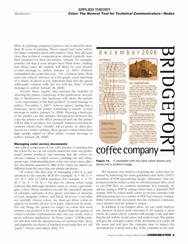
In terms of cost, using spot color may be the betterchoice when a document contains just one or two colors,including black. (That is, black counts as one color.) Figure14 shows an example of a newsletter that uses two spotcolors: black and brown.
Besides showing the use of two spot colors, Figure 14also shows the use of a duotone image (the newsletter’sphotograph of the building). Duotone images use two inks;black and some other color. Such images are more com-plex than two colors on distinct areas of a page, but they doindeed require only two colors. In fact, sepia-toned images,the kind associated with 1800’s photography, are duotoneimages.
If a document contains full-color photographs or mul-ticolored graphics, it requires process color. Process refersto the process of combining cyan, magenta, yellow, andblack (CMYK) together to create a multi-color image. Withprocess color, a document containing a wide range ofcolors gets the benefit of CMYK’s ability to produce thou-sands of colors. Figure 15 shows an example of a newslet-ter that contains full-color pictures and uses process color.
Sometimes a document might require both process andspot color. For example, to increase the intensity of aparticular process color, a printer may suggest adding aspot color.
In process color printing, an image is converted to half-tones, tiny dots of color. Figure 16 shows halftones up close.Set in different angles and overlaid on top of each other,halftones trick our perception. They combine to create color,such as the light blue color in the background of Figure 16.
In process color printing, the halftones of each of theCMYK colors are placed onto separate plates. Layered onpaper, CMYK halftones combine to create the appearanceof thousands of colors. Figure 17 shows how four plates ofhalftones in CMYK combine to create a process color im-age.
CONCLUSIONSince Jan V. White’s article first appeared in Technicalcommunication, color documents have become far morecommon as they became less cost prohibitive. Even so,many of us technical communicators remain a bit nervousabout using color in our organization’s documents, or wemay use color in a haphazard manner, choosing colors onthe fly or according to personal preferences. Although wehave become more familiar with new software that allowsus freedom when creating color documents, we may lack afoundation in color theory and practice that can guide ourchoices. In addition, for many of us, the science and art thatprofessional printers blend to produce our color publica-tions is a bit intimidating. It does not help that the printingindustry seems rife with jargon, such as “rich black” and“halftone.”
In this paper, I have built on advice of White (2003),advice so good it was reprinted 12 years after its firstpublication. I have expanded out from White’s coverage ofpractices related to creating usable documents to theory—color properties and systems in particular. I have alsoexpanded White’s discussion of color and usability, exam-ining research that suggests ways to increase documentreadability and accessibility. Finally, I have discussed colorpractices related to communicating with printers. In doingso, I have tried to alleviate some of the nervousness thatcomes with using color. It is of course impossible to ad-dress every topic related to color that technical communi-cators might encounter on the job, but it is clear thatknowing these essentials about color theory and practice
Figure 16. Halftones in process color.
APPLIED THEORYColor: The Newest Tool for Technical Communicators—ReduxMackiewicz
Volume 56, Number 1, February 2009 • TechnicalCOMMUNICATION 11

can enhance competence and boost confidence in relationto using color in print documents. TC
ACKNOWLEDGEMENTSI am indebted to Rachael Winter, a talented designer and recentlygraduated technical communications student. Rachael creatednearly all of the images in this paper. I also thank Nancy Schoonand Steve Johnson for advice and thoughtful comments. Finally,a big thanks to my uncle, Mike Mackiewicz.
REFERENCESArditi, A. 2005. Effective color contrast, Lighthouse
International, http://www.lighthouse.org/accessibility/effective-color-contrast/
Ashcraft, M. H. 1998. Fundamentals of cognition. New York:Addison-Wesley.
Aslam, M. M. 2006. Are you selling the right colour? A cross-cultural review of colour as a marketing cue. Journal ofmarketing communications 12:15–30.
Bruce, M., and J. J. Foster. 1982. The visibility of coloredcharacters on colored backgrounds in view data displays.Visible language 16:382–390.
Caldwell, B., M. Cooper, L. G. Reid, and G. Vanderheiden(ed.) 2008. Understanding WCAG 2.0: A guide tounderstanding and implementing WCAG 2.0. http://www.w3.org/TR/2008/WD-UNDERSTANDING-WCAG20-20081103/
Choungourian, A. 1968. Color preference and culturalvariation. Perceptual and motor skills 26:1203–1206.
D’Zmura, M. 1991. Color in visual research. Vision research31:951–966.
Fraser, B., C. Murphy, and F. Bunting. 2004. Real world colormanagement. Berkeley, CA: Peachpit Press.
Hall, R. H., and P. Hanna. 2004. The impact of web pagetext-background colour combinations on readability,
retention, aesthetics and behavioural intention. Behaviourand information 23:183–195.
Hill, A. L., and L. V. Scharff. 1999. Legibility of computerdisplays as a function of colour, saturation, and texturebackgrounds. In Engineering psychology and cognitiveergonomics, Ed. D. Harris. Sydney: Ashgate, pp. 123–130.
Kelly, D. 2007. 10 Tips to improve color management.Publishing Executive.http://www.pubexec.com/story/story.bsp?sid�66060&var�story.
Lin, C. 2003. Effects of contrast ratio and text color on visualperformance with TFT-LCD. International journal ofindustrial ergonomics 31:65–72.
Mackiewicz, J. 2007. Perceptions of clarity andattractiveness in PowerPoint graph slides. Technicalcommunication 54:145–156.
Madden, T. J., K. Hewett, and M. S. Roth. 2000. Managingimages in different cultures: A cross-national study of colormeanings and preferences. Journal of internationalmarketing 8:90–107.
Nes, F. L. V., J. F. Juola, and R.J.A.M. Moonen. 1987. Attractionand distraction by text colors on displays. In Human-computerinteraction—INTERACT’87, Eds. J. J. Bullinger and B. Shackel.Amsterdam: North-Holland Publishing, pp. 625–630.
Padgett, J. B. 2006. William Faulkner anecdotes and trivia.William Faulkner on the web. http://www.mcsr.olemiss.edu/�egjbp/faulkner/trivia.html#wl3.
Radl, G. W. 1980. Experimental investigations for optimalpresentation-mode and colours of symbols on the crt-screen. In Ergonomic aspects of visual display terminals,Eds. E. Grandjean and E. Vigliani. London: Taylor &Francis, pp. 127–136.
Reep, D. C. 2006. Technical writing: Principles, strategies,and readings, 6th ed. New York: Pearson.
Shieh, K., and C. Lin. 2000. Effects of screen type, ambientillumination, and color combination on VDT visualperformance and subjective preference. Internationaljournal of industrial ergonomics 26:527–536.
Smith-Worthington, D., and S. Jefferson. 2005. Technicalwriting for success, 2nd ed. Mason, OH: South-Western.
Wang, A., J. Fang, and C. Chen. 2003. Effects of VDT
Figure 17. CMYK combined to create a process color.
APPLIED THEORYColor: The Newest Tool for Technical Communicators—Redux Mackiewicz
12 TechnicalCOMMUNICATION • Volume 56, Number 1, February 2009

leading-display design on visual performance of users inhandling static and dynamic display information dual-tasks. International journal of industrial ergonomics 32:93–104.
White, J. V. 2003. Color: The newest tool for technicalcommunicators. Technical communication 50:485–491.
Wickens, C. D., and J. G. Hollands. 2000. Engineeringpsychology and human performance, 3rd ed. Upper SaddleRiver, NJ: Prentice Hall.
Winn, W. 1991. Color in document design. IEEE transactionson professional communication 34:180–185.
JO MACKIEWICZ is with the English Department of AuburnUniversity, where she teaches technical editing and a course calledgrammar and style in technical communication. Her research exam-ines clarity and politeness in spoken and written professional commu-nication, and she has published in Journal of business and technicalcommunication, Technical communication, and IEEE transactionson professional communication. She is co-authoring a book aboutdocument design and is Editor-in-Chief of IEEE transactions on pro-fessional communication. Contact: [email protected].
APPLIED THEORYColor: The Newest Tool for Technical Communicators—ReduxMackiewicz
Volume 56, Number 1, February 2009 • TechnicalCOMMUNICATION 13