COLOR IN THE CONSTRUCTED RELIEF A Thesis
66
COLOR IN THE CONSTRUCTED RELIEF A Thesis Submitted to the Faculty of Graduate Studies and Research in Partial Fulfilment of the Requirements for the Degree of Master of Arts in the Department of Art College of Arts and Science University of Saskatchewan Saskatoon, Saskatchewan by David Stewart Geary Saskatoon, Saskatchewan 0 1985 D.S.Geary
Transcript of COLOR IN THE CONSTRUCTED RELIEF A Thesis

COLOR IN THE CONSTRUCTED RELIEF
A Thesis
Submitted to the Faculty of Graduate Studies
and Research in Partial Fulfilment
of the Requirements for the Degree
of Master of Arts
in the
Department of Art
College of Arts and Science
University of Saskatchewan
Saskatoon, Saskatchewan
by
David Stewart Geary
Saskatoon, Saskatchewan
0 1985 D.S.Geary

The author has agreed that the Library, University
of Saskatchewan, may make this thesis freely available for
inspection. Moreover, the author has agreed that permission
for extensive copying of this thesis for scholarly purposes
may be granted by the professor or professors who super-
vised the thesis work recorded herein or, in their absence,
by the Head of the Department or the Dean of the College
in which the thesis work was done. It is understood that
due recognition will be given to the University of Saskatchewan
in any use of the material in this thesis. Copying or publi-
cation or any other use of the thesis for financial gain,
without the approval of the University of Saskatchewan and
the author's written permission, is prohibited.
Requests for permission to copy or to make any other
use of material in this thesis in whole or in part should
be addressed to:
Head of the Department of Art University of Saskatchewan Saskatoon, Canada.

ACKNOWLEDGEMENTS
I wish to express my appreciation and thanks to
Professor Eli Bornstein for his invaluable help and
support in the form of advice, assistance and example
during the course of my graduate studies and before.
Also I wish to thank the College of Graduate
Studies and Research who provided me with much needed
financial assistance in the form of scholarships.
I would also like to thank the Department of Art
and Art History, the Division of Extension and Community
Relations, and the Division of Audio Visual Services for
part-time employment during the course of my graduate
studies. This added financial assistance was very much
appreciated.

TABLE OF CONTENTS
Page
I. INTRODUCTION
II. DEVELOPMENT OF COLOR IN THE CONSTRUCTED
RELIEF
1
3
III. WORKING IN COLOR IN 3 DIMENSIONAL SPACE 15
IV. COLOR IN NATURE - COLOR IN ART
V. DEVELOPMENT AND USE OF TRANSPARENT
MATERIAL: ITS RELATION TO THE
CONSTRUCTED RELIEF
21
25
VI. SUMMARY/CONCLUSION 34

LIST OF ILLUSTRATIONS
Fig. 1 King Tutan Khaman Tomb Relief. Painted wood with
gold leaf, glass, and stone inlays. ca. 1350 B.C.
Fig. 2 Detail of low relief from Parthenon. Athens. Marble, 448-432 B.C.
Fig. 3 Relief. Amiens Cathedral. Painted marble, 1220-1241.
Fig. 4 Paul Gauguin Be Loving, You Will Be Happy. Carved and painted lindenwood, 1889-90.
Fig. 5 Josef Hoffmann. Stucco relief, 1902.
Fig. 6 Pablo Picasso. Guitar. Sheet metal and wire, 1912.
Fig. 7 Jacques Lipchitz. Still life with musical instru-ment. Polychrome stone, 1918.
Fig. 8 Henri Laurens. Guitar and Clarinet. Polychrome stone, 1920.
Fig. 9 Alexander Archipenko. Medrano II. Mixed media, 1914.
Fig. 10 Vladimir Tatlin. Assemblage of Materials. Mixed media, 1917.
Fig. 11 Liubov Popova. Painterly bas relief. Oil, plaster, paper, 1917.
Fig. 12 Naum Gabo. Head of a Woman. Celluloid and metal on wood, 1917.
Fig. 13 Naum Gabo. Construction in Relief. Plastic, 1920.
Fig. 14 Ilya Chashnik. Suprematist Relief. Painted wood and plaster, ca 1920-25.
Fig. 15 Ivan Puni. Cubo-sculpture. Painted wood, sheet metal, plaster, cardboard, 1915.
Fig. 16 Jean Arp. Painted wood relief, 1917.
Fig. 17 Jean Gorin. Contrepoint No. 31. Painted wood, 1948.
Fig. 18 Cesar Domela. Construction. Mixed media, 1929.

Illustrations, contd.
Fig. 19 Burgoyne Diller Construction. Painted wood, 1938.
Fig. 20 Charles Biederman. Structurist work #45. Painted aluminum, 1953-68.
Fig. 21 Joost Baljeu. Synthesist Construction 2d. Painted wood, 1964-66.
Fig. 22 Eli Bornstein. Double Plane Structurist Relief #6. Painted plexiglas, 1970-72.
Fig. 23, 24, 25, 26, 27, 28, 29, 30. David Geary. Structur-ist Reliefs. Painted wood and plexiglas, 1982-1985.
Fig. 31 David Geary. Nature-Construction sequence.
Fig. 32 Rose Window, Chartres Cathedral (inside view). Glass and lead. Early 13th century.
Fig. 33 Laszlo Moholy-Nagy. Space Modulator CMP II. Oil on plexiglas in a shallow painted box, 1940.
Fig. 34 Irene Rice Pereira. Rose Flux. Glass painting, 1952.
Fig. 35 Eric Olson. Optochrome Structure, SPR-73 (2 views).Glass and polarizing film, 1973.
Fig. 36 Georgy Kepes. Kinetic Light. Mural, KLM office, N.Y. Mixed media with lights, 1959.
Fig. 37 Julio Le Parc. Continuel Mobile, blanc sur blanc. Plexiglas, wood, string, 1968-69.

INTRODUCTION/ABSTRACT
The colored constructed relief is a relatively new
invention in the history of art. Inventions such as this
one come into being as a result of syntheses of various,
sometimes disparate, currents, ideas or mediums -- in
this case, the separate mediums of painting and sculpture,
once thought to be mutually exclusive. A discussion of
how the element of color developed in the relief medium
from the turn of the century to the present comprises a
large section of this paper. The works of various artists
who made significant contributions to this development are
cited. The artists were and are from many different countries
in Europe and the Americas. Virtually all of them were aware
of, and frequently acknowledged, the influence of the art
works and artistic ideas of their predecessors and con-
temporaries.
Relatively rapid dissemination of artistic ideas has
occurred over a wide geographic area in the 20th century
for a number of reasons: Because of certain influential
artists who travelled widely carrying their ideas with them,
because of travelling international exhibitions,and
especially because of art books, journals and periodicals.
Another section of this paper deals with my own
approach to working with color in the relief medium known
as the structurist relief, from the personal, practical

-2-
viewpoint of working methods and also from the perspective
of sources or ideas behind the work.
This paper also speculates on new directions or new
syntheses of materials and ideas which might be incorporated
in the future of this medium, with emphasis on the use of
colored transparent material.

-3-
DEVELOPMENT OF COLOR IN THE CONSTRUCTED RELIEF
Definition of relief (Webster's):
(6.a) A mode of sculpture in which forms and figures are distinguished [as by modelling of soft material, hammering of thin, malleable material, or cutting away the surface in a hard material] from a surrounding plane surface.
The relief medium is at least as old as painting and
sculpture, and the use of applied color in this medium
goes back to the low reliefs carved in wood and stone by
Neolithic man. Forms of relief art decorating palaces and
temples were developed to very high stages of refinement in
most cultures on earth; and full color was most often an
integral element in these reliefs. The Assyrians, Greeks,
Egyptians, Central Americans, Polynesians, East Indians and
Chinese all had highly developed styles of relief carving
with elaborate color that was sometimes naturalistic and
sometimes more decorative or expressionistic. In the
western world, it is difficult for us to imagine well known
reliefs from antiquity such as those on the frieze of the
fig.2 Parthenon in Athens, Greece, as being originally decorated
in full, naturalistic color, but they were, as was all
Greek sculpture. Time and the elements have erased most
traces of this, unfortunately, giving us a very limited
appreciation of Greek sculpture in general. The story is
very different in the case of some of the Egyptian reliefs
dating back some 4000 years. Those reliefs found sealed

-4-
within the pyramids have had their color perfectly pre-
fig.1 served. Many of the European Medieval and Gothic religious
fig.3 relief narratives and icons have much of their color intact,
also.
It was during the Renaissance that the use of color
was discontinued in the relief medium, and in sculpture as
well, and this tendency continued more or less until the
twentieth century. However, at least one artist we know of,
fig.4 Paul Gauguin,just before the turn of the century,made carved
wooden polychrome reliefs influenced by traditional Oceanic
art forms.
In Europe, there was widespread artistic experimenta-
tion and overturning of established values after 1900, re-
flecting new scientific, political and technological revolu-
tions. One area that this led to was the development of a
new concept in relief art -- the constructed relief.
Constructed simply meaning assembled or built up out of
various elements or units as opposed to the traditional
idea of being carved or modelled, an innovation reflecting
the availability of new building tools and methods, as
much as fresh aesthetic concepts.
The development of the type of colored constructed
relief known as the structurist relief had much of its
inspiration in painters and groups of painters such as
Cezanne and the Impressionists, the Cubists, the de Stijl
group and the Suprematists; and its immediate physical

Fig 1: Egyptian Relief,ca 1350 B.C.
1
Fig 2: Relief, Parthenon,ca 448 B.C.
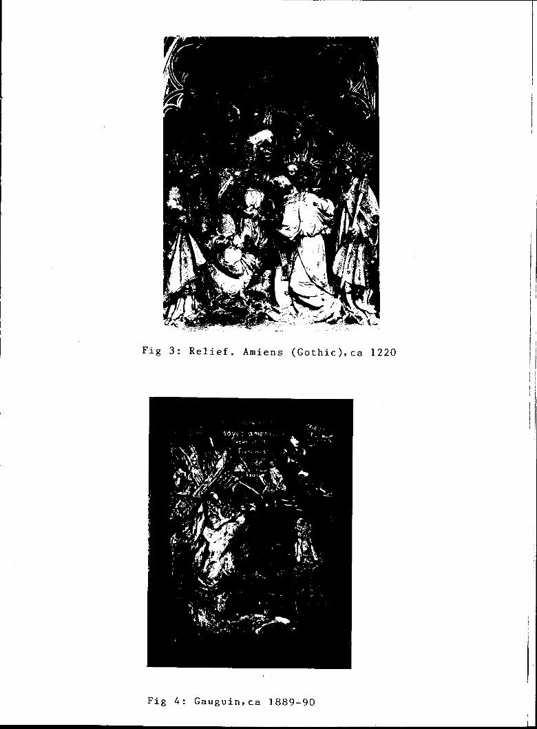
Fig 3: Relief. Amiens (Gothic),ca 1220
Fig 4: Gauguin,ca 1889-90
-5-
roots in collage and assemblage art of the Cubists and
Constructivists. Therefore, structurist reliefs owe
more to the world of painting, perhaps, than to sculpture
as had been the case traditionally with many forms of
carved reliefs. Further, traditionally, relief had been
tied to architecture. This has changed too, as most types
of reliefs today are more independent from architecture.
The development of color in this new constructed
relief medium, as with all developments in art, is not a
neat and tidy chronology, but with the perspective of
approximately eighty years, certain tendencies make them-
selves evident and either an overall devolution, or stasis; or
evolutionary refinement can be sensed. A key aspect of
evolution is specialization and the constructive medium
known as structurist relief art has evolved in that it
has become more specific and more refined in its configura-
tion and use of color and materials.
Following are brief comments on several of the
artists whose works represent significant developments in
this evolution.
Turn-of-the-century architects such as Adolph Loos,
Frank Lloyd Wright, and Josef Hoffmann devised their own
geometric and angular decorative designs, windows, and
ornaments to adorn their own buildings. This was a deliber-
ate shift away from the twisted and curved forms of the

International Art Nouveau style of the time. Hoffmann,
in fact, is credited with making the first totally
abstract decorative reliefs in white stucco at the
fig.5 Beethoven Exhibition Sezession building, Vienna, in 1902.
He referred to these as "crystallized ornament".1
In 1912 Pablo Picasso made a wire and sheet metal
fig.6 assemblage called Guitar
and other assemblages of
lighthearted, casual and
on the wall of his studio. This
his during the same period were
modest experiments in Cubist form
projected into real three-dimensional space. The color was
minimal, often being just the intrinsic color of the found
materials he used in these first few assemblages. These
assemblages were an extension of the idea of using bits of
found printed-paper materials in his Cubist paintings and
were probably inspired by the vernacular collage joke post-
cards, weather charms and greeting cards of the period.
Picasso never took his early relief constructions seriously
and so never refined this idea himself (in fact he never
attempted to achieve elegance of craftsmanship) although
he did inspire many other artists to explore the relief
medium with a Cubist approach and in an abstract way.
Some of the Cubists worked in the relief medium and then
only for part of their artistic life. It is curious there
weren't more, for it seems a natural extension of the
Cubist idea of a painting implying simultaneous viewpoints
and so, three dimensions. The best known of the Cubist

Fig 5: Hoffmann, 1902
Fig 6: Picasso, 1912

Fig 7: Lipchitz, 1918
Fig 8:, Laurens, 1920

-7-
fig.7 relief artists were Jacques Lipchitz and Henri Laurens,
the latter being the most interested in the element of
fig.8 color. In Laurens' stone polychrome reliefs and constructions
in wood from 1915 to 1918, color was applied as in a painting
and ranged from being simple and muted in the stone reliefs
to very rich and elaborate in the wooden assemblages.
To illustrate how much these reliefs were an outgrowth from
the world of painting and not sculpture, we note that the
subject matter of the reliefs of Laurens and Lipchitz was
often traditional painting subject matter, ie., still life.
Alexander Archipenko, too, could be considered a
Cubist for at least part of his career. He, like the other
Cubist relief artists, did a number of colored free-standing
or self-supporting table and corner reliefs. He coined the
term "sculpto-painting" to
fig.9 Medrano II.(1914-15)
Assembled of gaily painted
describe these.
is a good example of one.
tin, glass, wood and oilcloth,
it is thought to be inspired, like other Archipenko pieces,
by some famous painted wooden circus marionettes which were
receiving much acclaim in Paris at the time.
Archipenko wrote Polychrome Manifesto in 1912 in
which he urged artists to return to making colored 3-D art.
In this he states:
Polychrome sculpture, like nature, pro-duces an infinite variety of effects . . since the reality of forms produces natural light and shadow in which the patterns of colors automatically change their nuances.

-8--
In spite of this statement, Archipenko's ebullient
color was more decorative than sculptural, as was that of
the other Cubist relief-makers. For the Cubists, color
remained primarily a pictorial element tacked onto three-
dimensional constructions.
Russian Constructivist Vladimir Tatlin, credited with
building the first non-representational relief independent
of architecture, in 1913, was another who claimed to be
inspired by Picasso's Guitar of 1912. From 1913 to 1920 he
fig.10 made several reliefs,deliberately unrefined, for he considered
them researches for future artworks. He, in turn, inspired
many other Russians to work in a totally abstract direction.
As far as can be determined, most of them, like Tatlin, did
not exploit color as an integral part of their conceptions,
using either the color of the found material or partially
modelling painted elements of the relief with paint as if
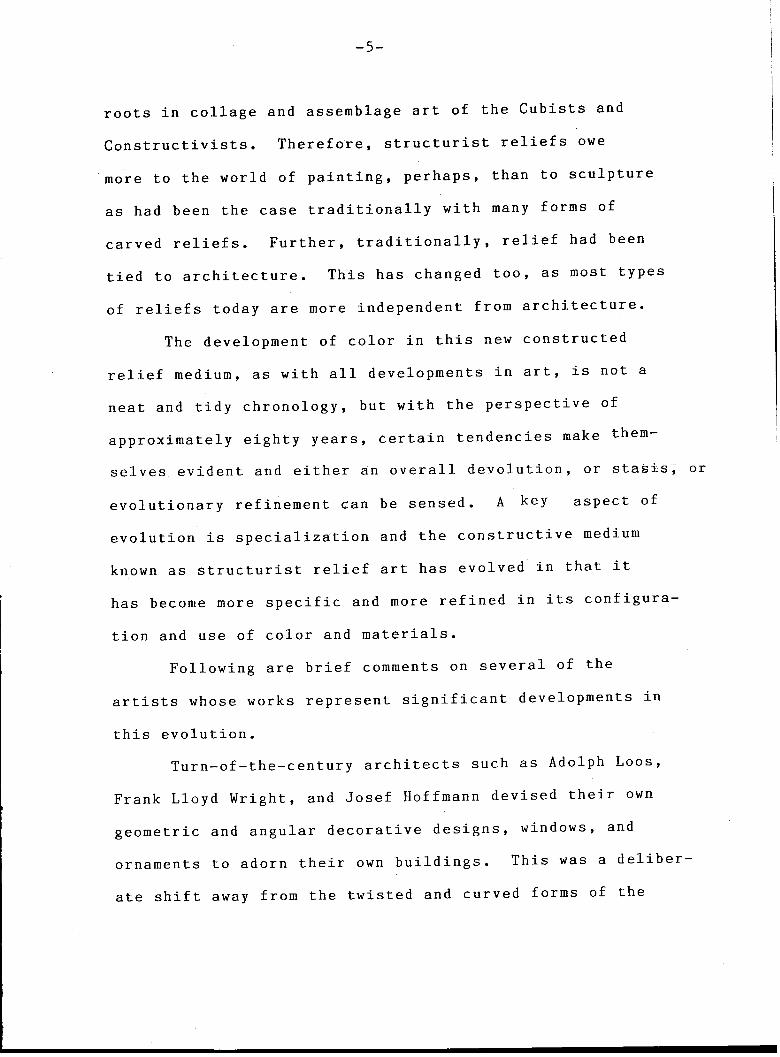
they were paintings (as in the few reliefs made by Liubov
fig.11 Popova from 1915 to 1917) -- a redundant measure, it seems,
since if the shapes are actually three-dimensional, real
light serves as the modelling agent. It should be noted
that in Russia the historical and widespread presence of
the sculptural home icon, often a corner icon, with added
bits of colored clothing and other colored materials, was
as much of an influence on Tatlin and others as was
Picasso and Cubism in general.
Naum Gabo, another Russian, had a period of relief-

Fig 9: Archipenko,1914 Fig 10: Tatlin, 1917
Fig 11: Popova, 1917
Fig 12: Gabo, 1917
-9-
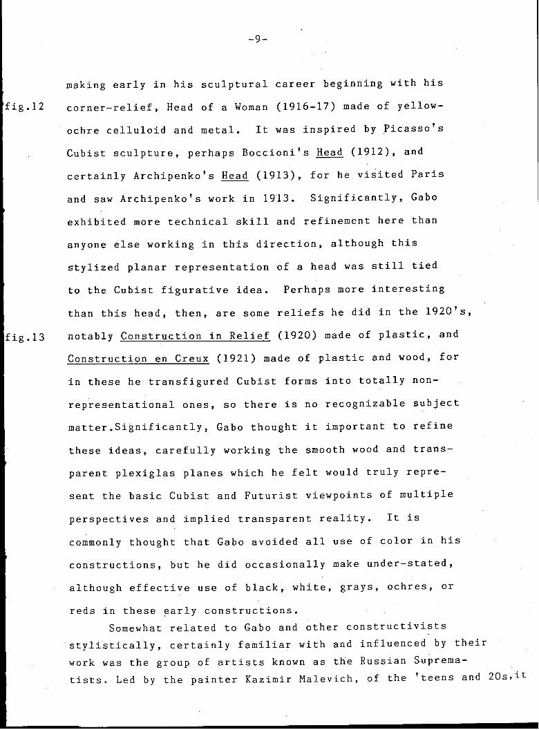
making early in his sculptural career beginning with his
corner-relief, Head of a Woman (1916-17) made of yellow-
ochre celluloid and metal. It was inspired by Picasso's
Cubist sculpture, perhaps Boccioni's Head (1912), and
certainly Archipenko's Head (1913), for he visited Paris
and saw Archipenko's work in 1913. Significantly, Gabo
exhibited more technical skill and refinement here than
anyone else working in this direction, although this
stylized planar representation of a head was still tied
to the Cubist figurative idea. Perhaps more interesting
than this head, then, are some reliefs he did in the 1920's,
fig.13 notably Construction in Relief (1920) made of plastic, and
Construction en Creux (1921) made of plastic and wood, for
in these he transfigured Cubist forms into totally non-
representational ones, so there is no recognizable subject
matter.Significantly, Gabo thought it important to refine
these ideas, carefully working the smooth wood and trans-
parent plexiglas planes which he felt would truly repre-
sent the basic Cubist and Futurist viewpoints of multiple
perspectives and implied transparent reality. It is
commonly thought that Gabo avoided all use of color in his
constructions, but he did occasionally make under-stated,
although effective use of black, white, grays, ochres, or
reds in these early constructions.
Somewhat related to Gabo and other constructivists
stylistically, certainly familiar with and influenced by their
work was the group of artists known as the Russian Suprema-
tists. Led by the painter Kazimir Malevich, of the 'teens and 20s,it

Fig 13: Gabo, 1920
Fig 14: Chashnik,ca 1920-25

Fig 15: Puni, 1915
Fig 16: Arp, 1917
-10-
included a few relief makers, although this aspect of
the movement didn't develop as it might have, due to
certain social and political obstacles in Russia at the
time. Malevich, an accomplished colorist in his early
Cubo-Futurist paintings, limited color usage in his later
abstract compositions, because the forms were simple
geometric shapes. This limitation carried over into his
followers' reliefs. Color was limited in the few works
fig.14 which have survived. Ilya Chashnik did a number of reliefs
fig.15 around l915-1925 as did Ivan Puni. Black, white, gray,
green and red are used. The color is expressive, in its
limited palette, not naturalistic.
fig.16 Jean Arp's reliefs of the period from 1917 onwards,
unlike the others discussed here, consist of amalgams of
platelike free or biomorphic shapes, tenuously related
to natural forms and organized according to what Arp calls
"the laws of chance," reflecting his Dadaist bent.
But the color element is more controlled. His color is
elaborate, expressive and attractive, applied for pure
sensation, not to be naturalistic or symbolic. These
reliefs are soundly constructed, having a smooth finish and,
significantly, color areas are very flat and uniform, with
no reference to brush strokes. Arp never merged colors,
always keeping them distinct, an approach to color applica-
tion that other relief artists were later to incorporate,
to accentuate color relationships by de-emphasizing textural
elements.

Fig 17 Gorin, 1948
Fig 18: Domela, 1929
-11-
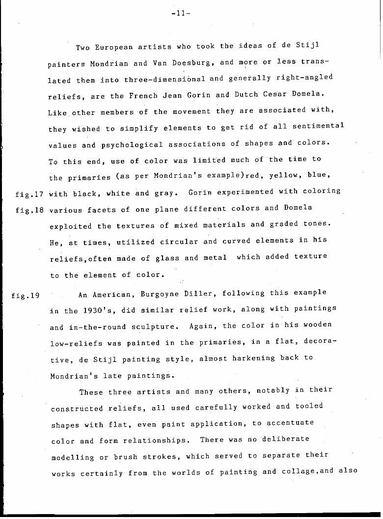
Two European artists who took the ideas of de Stijl
painters Mondrian and Van Doesburg, and more or less trans-
lated them into three-dimensional and generally right-angled
reliefs, are the French Jean Gorin and Dutch Cesar Domela.
Like other members of the movement they are associated with,
they wished to simplify elements to get rid of all sentimental
values and psychological associations of shapes and colors.
To this end, use of color was limited much of the time to
the primaries (as per Mondrian's example )red, yellow, blue,
fig.17 with black, white and gray. Gorin experimented with coloring
fig.18 various facets of one plane different colors and Domela
exploited the textures of mixed materials and graded tones.
He, at times, utilized circular and curved elements in his
reliefs,often made of glass and metal which added texture
to the element of color.
fig.19 An American, Burgoyne Diller, following this example
in the 1930's, did similar relief work, along with paintings
and in-the-round sculpture. Again, the color in his wooden
low-reliefs was painted in the primaries, in a flat, decora-
tive, de Stijl painting style, almost harkening back to
Mondrian's late paintings.
These three artists and many others, notably in their
constructed reliefs, all used carefully worked and tooled
shapes with flat, even paint application, to accentuate
color and form relationships. There was no deliberate
modelling or brush strokes, which served to separate their
works certainly from the worlds of painting and collage,and also
-12-
from much of the found-object Constructivist reliefs of
previous years, as well as from the colored assemblage
reliefs of the Dadaists like Kurt Schwitters and Max
Ernst.
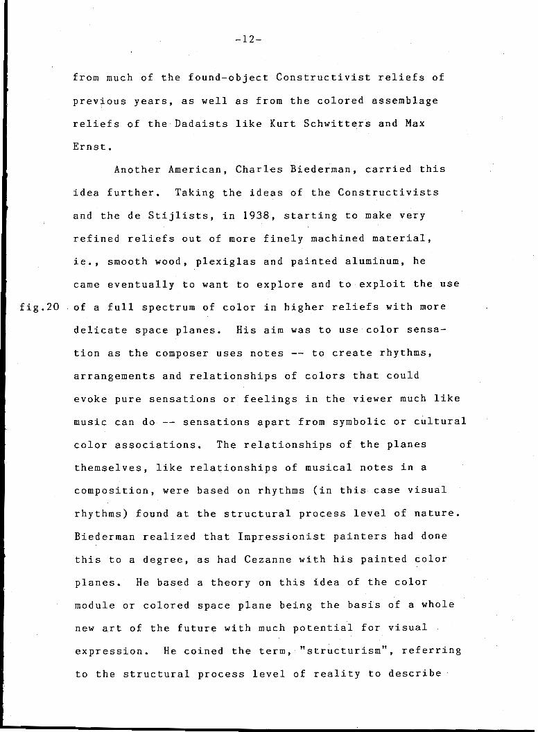
Another American, Charles Biederman, carried this
idea further. Taking the ideas of the Constructivists
and the de Stijlists, in 1938, starting to make very
refined reliefs out of more finely machined material,
ie., smooth wood, plexiglas and painted aluminum, he
came eventually to want to explore and to exploit the use
fig.20 of a full spectrum of color in higher reliefs with more
delicate space planes. His aim was to use color sensa-
tion as the composer uses notes -- to create rhythms,
arrangements and relationships of colors that could
evoke pure sensations or feelings in the viewer much like
music can do -- sensations apart from symbolic or cultural
color associations. The relationships of the planes
themselves, like relationships of musical notes in a
composition, were based on rhythms (in this case visual
rhythms) found at the structural process level of nature.
Biederman realized that Impressionist painters had done
this to a degree, as had Cezanne with his painted color
planes. He based a theory on this idea of the color
module or colored space plane being the basis of a whole
new art of the future with much potential for visual
expression. He coined the term, "structurism", referring
to the structural process level of reality to describe
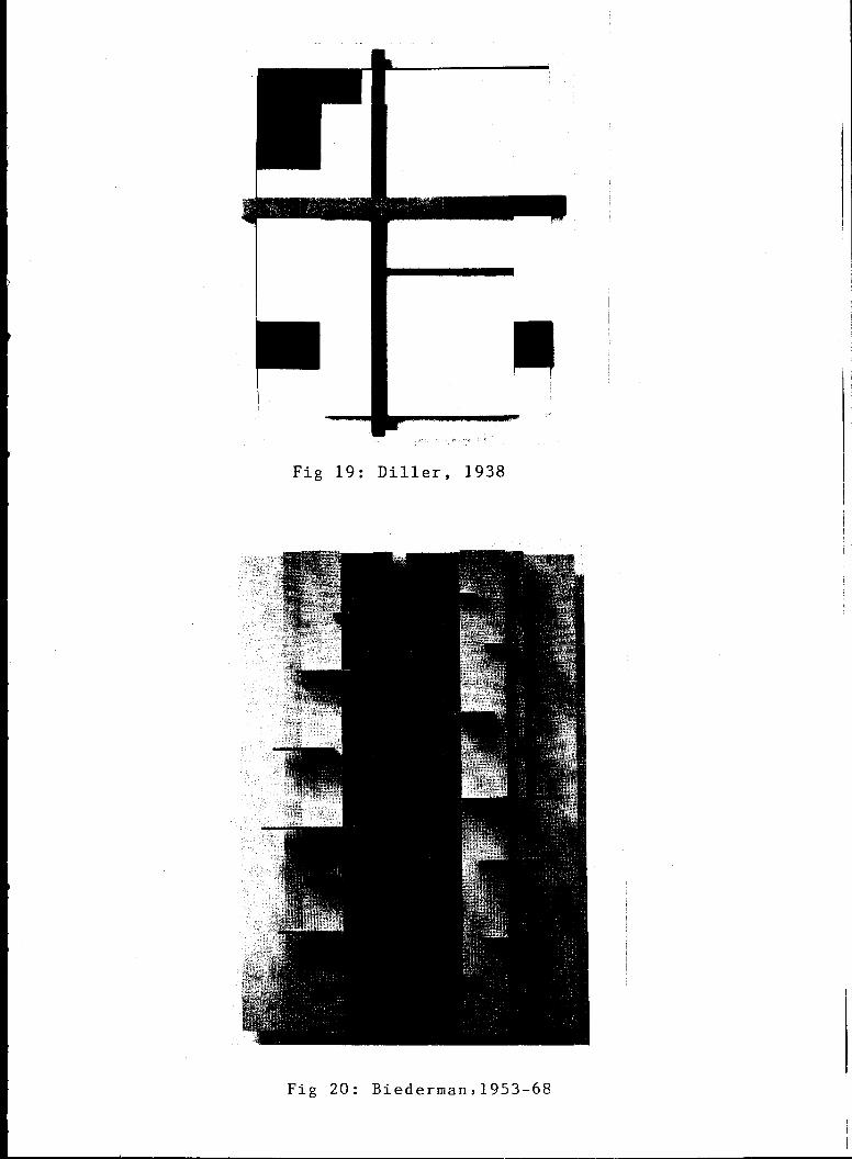
Fig 19: Diller, 1938
Fig 20: Biederman,1953-68

-13-
this school of artistic thought (a term he later dropped).
The structural process level of reality referred to
by Biederman is an organic view perhaps more familiar to
biologists or naturalists than to many artists who are his
contemporaries. This process refers to the building
blocks, the systems and symmetries with which visible
nature is constructed.
Natural scientists have determined that, so far as
they know, the natural world is composed of variations and
combinations of six basic modules and configurations: the
sphere, hexagon, spiral, helix, branch and meander. Nature
has arrived at these shapes because they are the most
efficient for their particular purposes. In Biederman's
case, he settled on the machined module of the orthogonal
color plane because of its neutral but efficient shape --
efficient, both for the actual construction process and for
maximizing color reflection and interplay.
Biederman combined this type of organic/scientific/
technological perspective with his view of the history of
art as an evolutionary refinement. With his emphasis on
the physical characteristics that are unique to machine-
made art objects, he put together these factors to create
the particular look of the structurist relief. He has
experimented with artificially illuminated planes, opaquely
colored planes and transparent color planes in his reliefs
to the present. Others have since developed the structurist

-14--
idea, adding variations and other dimensions, and further
altering the course of its development.
fig.21 Joost Baljeu in Holland, from the 50's onward, has
constructed interesting multi-layered reliefs and in-the-
round constructions related to these developments, although
(typical of the European approach) with perhaps less color
involvement than North American artists who work in this
area.
fig.22 Eli Bornstein in Canada, also from the 50's onward,
has developed elaborate multi-planed configurations in his
reliefs that present very involved and subtle color effects
and are strongly evocative of organic forms. Bornstein is
also the founder and editor of The Structurist, an art
journal which discusses various aspects of the medium as
well as other related areas of interest.
Color in the Cubist relief and in the Constructed
relief has, over the past years, had various approaches
and intents, sources and syntheses, often being associated
with the symbolism and expressionism that is peculiar to
the world of painting. But the type of colored con-
structed relief as envisioned by Biederman, Bornstein and
others who have been influenced by all these developments
certainly seems to let the viewer react to pure color
sensations in three-dimensional light and space in a most
direct way. And for any artist working in this area, a
unique set of challenges and possibilities present
themselves.

Fig 21: Baljeu, 1964-66
Fig 22: Bornstein, 1970-72

-15-
WORKING IN COLOR IN THREE-DIMENSIONAL SPACE
The colored constructed relief medium poses quite
different problems for the colorist than painting, poly-
chromed carved reliefs or colored sculpture. Modelling,
chiaroscuro, gradations and subtleties of tone and color
are an important aspect of both figurative and abstract
painting. In relief art, the real light does the modelling
and creates the graduations and tonal nuances so it is un-
necessary or redundant to do this with paint. In painting,
there is just one physical plane to contend with, the
actual rectangle of canvas; so the painter naturally does
everything he can to enliven that one plane (the picture
surface). In a structurist relief, there might be dozens
of individual planes, or even hundreds of planes when we
include each facet or edge of each individual space plane,
but either natural or artificial light, by its nature,
differentiates each of these planes from the others.
However, just as in painting, a colored relief artist must
be aware of how colors affect each other. He should be
aware, intuitively or otherwise, that color has "three
dimensions" as Munsell pointed out hue, value and
intensity. He should know there are warm colors that
advance, cool ones that recede, that there are primaries,
secondaries and tertiaries and complementary after-images,
and that the appearance of a given color is altered by
surrounding colors. But unlike working in two-dimensional
-16-
mediums, he soon finds out there are fundamental differences
in color effects when using three dimensions. An illustra-
tion to demonstrate the difference between color use in
two-dimensional mediums and in the three-dimensional
structurist relief medium is as follows:
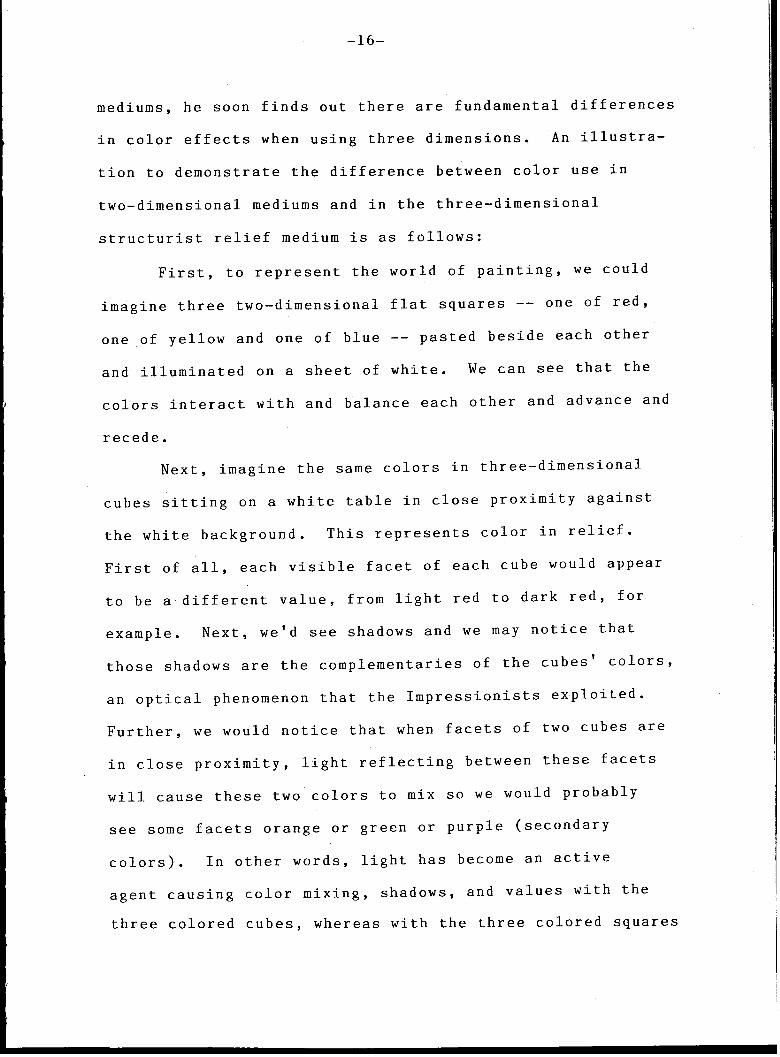
First, to represent the world of painting, we could
imagine three two-dimensional flat squares -- one of red,
one of yellow and one of blue -- pasted beside each other
and illuminated on a sheet of white. We can see that the
colors interact with and balance each other and advance and
recede.
Next, imagine the same colors in three-dimensional
cubes sitting on a white table in close proximity against
the white background. This represents color in relief.
First of all, each visible facet of each cube would appear
to be a different value, from light red to dark red, for
example. Next, we'd see shadows and we may notice that
those shadows are the complementaries of the cubes' colors
an optical phenomenon that the Impressionists exploited.
Further, we would notice that when facets of two cubes are
in close proximity, light reflecting between these facets
will cause these two colors to mix so we would probably
see some facets orange or green or purple (secondary
colors). In other words, light has become an active
agent causing color mixing, shadows, and values with the
three colored cubes, whereas with the three colored squares

-17-
all the light could do was illuminate them.
In the relief medium, sometimes different finishes
are used, like a matte finish, which, curiously, reflects
more color than a glossy finish, although not necessarily
more light. If super glossy transparent color material
is used, or transparent color and opaque colors combined,
we can imagine further complexities because the light will
pass through forms and have a slight mirroring effect at
the same time because of the shiny surfaces.
Perhaps this simple example can give an indication
of the possibilities and complexities that have to be
dealt with, even in a relief, with a relatively simple
configuration. There are many variables. Light is most
important. If the object is in natural light, we can
imagine the arrangement changing during the day with
changing shadows, reflections and color temperatures.
Then if an artificial light is put over it, it will change
again, depending on the temperature and placement of that
light.
Sculptural shapes are painted often either to
accentuate their configurations in space, or for a variety
of other considerations. The structurist relief is much
more like a painting, then, compared to most colored
sculpture -- like an Impressionist painting, perhaps, for
it deals with a multitude of space planes or "color mole-
cules", a term used by structurist artist Eli Bornstein
-18-
to describe the unit of construction and to show the
strong link with the ideas of Cezanne and the Impressionist
painters who dealt with some of the same optical concerns.2
The French Impressionists used broken color, ie.,
daubs of pure colors in close proximity that mixed optically
from a distance. This perceptual and physically sensuous
use of color was a most unique contribution to the history
of painting. Sometimes it was applied very thickly, the
paint daubs or "molecules" being somewhat analogous to
the space planes in strucurist reliefs.
A painting using different colors of one middle value
tends to flatten a picture considerably. In a relief, this
would not necessarily happen as light would create shadows
and a range of tones. In fact in the relief medium it is
difficult to use light valued colors and dark valued colors.
It is best to stay in the lighter mid-range because of the
modelling action of real light on the forms.
Similarly, unlike painting, pure, intensive, or rich
colors are very difficult to work with in 3-D for they tend
to appear darker. For example, in a painting, Prussian
blue can be a very effective and dramatic color but in
a 3-D space plane it can appear almost black. Black, for
that matter, being the absence of color, is extremely
difficult to use in three-dimensions. Therefore, many
relief artists, including myself, avoid using it altogether,
finding it better to let the shadows, that are a by-product

-19-
figs.23,,30
of the light upon •he planes, be the dark accents of a
piece rather than sing pigments for that purpose. It
is sometimes effec ive to mix white with colors to
maximize reflectio This has become a kind of personal
working rule of th mb.
In fact, wor ing in this medium over the past
several years, I h ve arrived at a number of color rules
of thumb that seem to work for me. They are not hard and
fast rules, merely working rules of thumb or tools that
seem helpful much f the time. These follow:
. First of 11, over the years, without consciously
planning to, I hav gradually settled on a palette that
parallels the twel e colors of Munsell's color wheel --
blue, blue-violet, violet, red-violet, red, red-orange,
orange, yellow-ora ge, yellow, yellow-green, green,
blue-green. Mixin• one's own pigment often creates dull
or muddy colors, a d I find these primaries, secondaries
and tertiaries are enough colors to use at this time,
certainly given th- further modulating effects of light
in this work. And there are certain brands of these colors
that are especially bright, clean and clear.
. Much of the time colors aren't mixed together, but,
as mentioned, these straight colors are mixed with at
least some white,
is on the wall.
to maximize light
to maximize light play once the piece
lat paint is used for the same reason,
play.

-20-
. If using different values of one basic color,
the darker plane is most often used on top of the lighter.
• Reliefs are often predominently one or two colors
and those colors usually end up being cool, recessive ones
blues or greens, with smaller accents of complementaries
or whites. This is admittedly a personal preference at
this juncture, but large areas of yellow, red or orange
seem too active or intense by their particular physical
nature and tend to dominate a piece too much.
▪ Colors or values in the same piece that are very
close to each other are generally avoided. Each color
unit should be clearly independent in this sense, to
avoid ambiguity.
• Complementary color schemes are used and a very
limited number of colors is used in a given piece
maybe five or six. Again, this is because the light
creates more colors and shades.

Fig. 23 Geary ,1983-85
Fig. 24 Geary,1983-85
Fig.25 Geary,1983-85
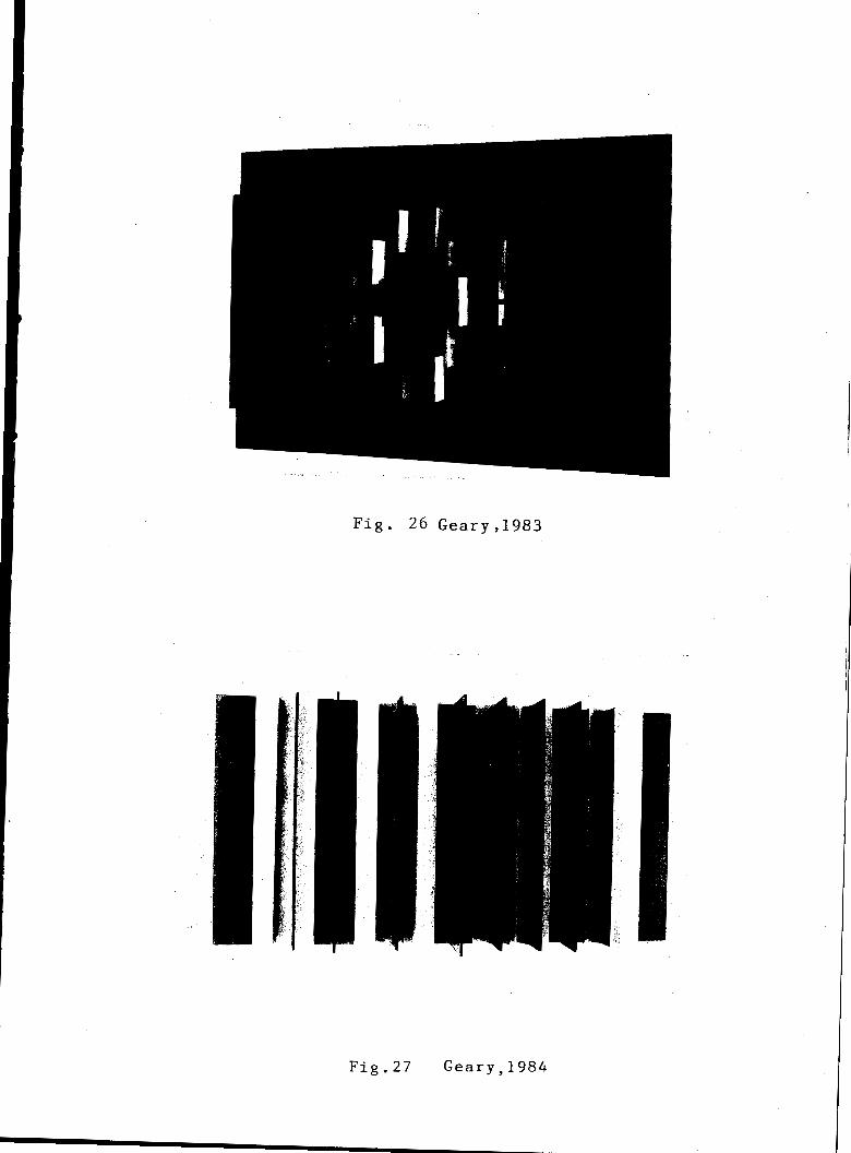
Fig. 26 Geary,1983
Fig.27 Geary,1984
Fig. 28 Geary,1983 Fig. 29 Geary,1983
Fig. 30 Geary,1983

-21-
COLOR IN NATURE - COLOR IN ART
I first worked in the medium of the constructed
relief under Professor Bornstein in the late 1960's.
The approach was to begin with low white relief configura-
tions and slowly build complexities of color along with
complexities of space planes -- to begin by using white
and primaries only and slowly add more color.
My palette is still limited, but deliberately so,
due to the nature of the medium itself, because color
effects are increased due to light and shadow play.
Another important consideration is that reliefs are not
flat -- they are physical multi-dimensional inventions
of light and space, so the inspiration from nature is
from what Biederman and others call the "structural process
level of nature" (those three-dimensional constructions and
symmetries of color modules we see in nature's engineering
marvels) in the spiral plane arrangements of galaxies or
in a nautilus shell; in the trunk/branch/capillary networks
of our own arterial system, of a river delta or of branches
of a tree; in the delicately colored regular hexagonal
facets of a beehive or a rose quartz crystal.
We look to nature for more impressionistic constructions
or arrangements, too. For example, the eye might be drawn
to a spray of yellow and red and purple leaves on a branch
in fall (and note how it changes as one moves around it),
or to an irregular cluster of purple flowers in a green
-22-
field or an irregular cluster of blue, white and red stars
in a blue violet sky. The biologist, astronomer, physicist
and mathematician will tell you that there is always a
system, a structure, underneath the sometimes seemingly
chaotic appearance of things, even if it isn't immediately
apparent. As a constructive artist, I see these systems
tied inexorably with the element of color and light --
color and light and structure are inseparable elements in
this view of the world.
The color in my own reliefs certainly isn't a direct
translation of these reactions and interpretatons of colors
in nature I have just described, although these things are
a part of it. The nature of the materials, developments
from previous artworks (works are often in series), formats
(eg. the triptych), influences from other artists, and many
more factors come into play, to eventually make the artwork
(which is a constructed invention unto itself) an object
that, while not directly resembling anything in the natural
world, can evoke some of the feeling of nature's colored
constructions. An example will illustrate: Some years
ago, my interest in nature photography and color led me
to do a series of color photographs one fall of a shallow
ravine close to my home. I was taken by the still, clear
blue-green water with different colors of leaves --
yellow, brown, green -- floating on the water, under the
water and lying on the bottom of the ravine. The reflection
of the sky, clouds, and leaves from trees overhead made

-23-
ig. 31
this scene even more intriguing to me. I was taken with
the bright colors and equally with the spatial quality or
levels of reality evident -- ie., the bottom level of the
ravine, the surface level of the water itself, and the
level of the sky reflected on that surface -- and the
colored leaves acting as an element tying the levels
together. It appealed to me as a fascinating subject for
large color photographs.
One day a few years later, while toying with a piece
of transparent blue plexiglas, I happened to look at these
photos again. It occurred to me to somehow use these photo-
graphic impressions as a basis for some colored constructions,
and I realized that the clear, water-like blue plexiglas in
conjunction with opaquely colored planes, would be the best
way to realize this. I had used transparent material only
once before, and then in a limited way, but now the material
seemed appropriate to express the idea of little yellow,
red and green elements on top of and behind a transparent
blue substance.
This concept was built as a free-standing structurist
construction (the idea needed more depth than a relief could
offer). The finished work, being a vaguely rectangular,
symmetrical construction, certainly didn't resemble water
and leaves, but I felt it did evoke the idea of bright,
floating units in an opaque blue and transparent blue field.
Since that time I have developed this general idea much

ikT,MEV
W ns• et
gate UMW RIM NUM NOM Vall14 Polio MINK
111111111.-- — pasmanummeneen sesammonnu assimunies assommummem 11111111111111.11MINIS
Fig. 31
D. Geary: (1) Photograph; (2) Collage; (3) Collage with Grid; (4) Structurist Construction 1978.
Detail sequence from The Structurist No.17/18.

-24-
further with different kinds of configurations and dif-
ferent color schemes in both reliefs and free-standing
constructions. In fact, I have since developed a strong
interest in combining colored transparent, transluscent
and colored opaque forms in this medium, and accordingly
have done some research into the problems and prospects
of using transparent materials in colored relief con-
structions.

-25-
DEVELOPMENT AND USE OF TRANSPARENT
MATERIAL: ITS RELATION TO THE CONSTRUCTED RELIEF
Through the ages, ever since man discovered natural
transparent material like amber and gemstones or fabricated
it, like glass, he has been compelled to produce art with it,
due to its sensual and mystical attraction, its inherent
brilliant, fire-like reflections, dazzling highlights, and
pure, water-clear quality.
Working in these materials has always posed technical
difficulties and physical limitations. For example, rock
crystal is extremely hard and difficult to carve except in
planes, and glass is a brittle and fragile material. Even
so, artists have used these substances to create objects
of great beauty and artistic merit.
The Chinese have always done carvings in colored and
clear semi-precious stone, in green jade, rose quartz,
carnelian and rock crystal.
Apart from small works by artisans in the so-called
minor arts, transparency as a quality in Western art
reached its zenith perhaps with the breathtaking, brightly
colored stained glass Rose windows of France and Germany
of the period between 1170 and 1270 A.D. The Rose windows
fig.32 of Chartres Cathedral are a good example of the pinnacle
of this art form.
Artists have worked throughout the centuries to the

-26-
present in stained glass windows and in glass sculpture
in-the-round; the latter on a relatively small scale be-
cause of limitations involved in the heating, casting and
blowing processes. Colored glass was a popular artistic
medium in the Art Nouveau and Art Deco periods.
It was not until the early part of the twentieth
century when new industrial transparent materials were
invented, that artists were capable of exploring fully
many new possibilities. This new material, plastic, was
the most significant invention for artists working in
transparency since the invention of glass over 1000 years
ago. On a historical time scale, our century is merely
the beginning of this plastics technology applied to art.
Shortly after this material became available, sculp-
tors began to work with it. As mentioned previously, Naum
Gabo (along with his brother Antoine Pevsner) made
excellent use of this plastic, both clear and colored, in
relief constructions. Their work in this material, start-
ing about 1917, had great significance for future artists,
for they not only pioneered the manipulation of this
material, but they reflected the new scientific-industrial
aesthetic which was coming to the fore, parallelling and
reflecting an emerging new world view of man in general
based on new 20th century perceptions of reality, reflected
in Cubist and Futurist ideas of art -- namely, a simultan-
eously perceived, multi-faceted perception of the world.
-27-
Umberto Boccioni, the Futurist painter and sculptor
said in his Technical Manifesto of 1910:
Who can still believe in the opacity of bodies, since our sharpened and multi-plied sensitiveness has already penetrated the obscure manifestations of the medium? Why should we forget in our creations the doubled power of our sight, capable of giving results analagous to those of X-rays?
•
This also implied the notion that all is fleeting; there
is no concreteness and there is a loss of solidity.
Previously, Cubist painting had hinted at this in a two-
dimensional, illusionistic way, representing several views
of an object at one time, but Pevsner and Gabo added a
third dimension real space.
Two artists must be mentioned here, although they
were not constructed relief artists per se. These are
the Hungarian Laszlo Moholy-Nagy and the American Irene
Rice-Pereira, both of whom made rather ingenious and
unique transparent colored wall constructions from the
1920's to the early 1950's in America constructions
that have some pertinence to our discussion and much
relevance to persons (like myself) who work with clear
and colored plexiglas in the constructed relief medium
and in-the-round constructions. These two people could
be called light artists, as they were manipulating colored
light effects more than any other element in their works.
Their transparent wall pieces are thus perhaps closer

-28-
to the spirit of stained glass window art than to either
painting or sculpture. But if the color constructed
relief had its roots in the synthesis of certain kinds
of painting and sculpture, it can be further developed
with other syntheses or borrowings from other media,
incorporating new technologies. One of these mediums
is the transparent medium which Rice-Periera called
"glass painting" or "glass construction" and which
Moholy called "space modulators" or "light modulators".
Moholy was a prolific pioneering artist in the new
materials who also did a great deal of writing on the
physical and aesthetic aspects of transparency and light-
art that typify the thoughts of many contemporary artists
who work in these materials. One of Moholy's many
fig.33 artistic inventions, his "light modulators", were clear
plastic sheets painted on both surfaces that threw
colored shadows when mounted slightly above a white
backboard. He has said of these:
The new plastics allow a new type of visual expression to develop. Glass-like sheets, pliable, can be curved, convex and concave. They can be perforated so that light and pigment will be fused into a new unity. Artificial light sources (spotlights,moving lamps) can continuously

Fig. 32 Rose Window, 13th Century
Fig. 33 Moholy-Nagy, 1940 Fig. 34 Rice-Pereira, 1952

change the composition. This kind of picture is most probably the passage between easel painting and light dis-play, a new type of moving pictures.
My 'transparent' pictures around 1921 became completely freed of elements reminiscent of nature. The liberation from the necessity to record was their genesis. I wanted to eliminate all factors which might disturb their clarity. My desire was to work with the peculiar characteristics of colors, with their pure relationships. I chose simple geo-metrical forms as a step towards such objectivity. I see today that this step was the logical continuation of the cubist paintings that I had admir-ingly studied.3
Moholy might also seem to have been playing with
possibilities suggested by Malevich, whose work he greatly
admired along with Mondrian's, but where Malevich's
Suprematist elements would hover ambiguously in an illusion-
istic white space, Moholy's colored elements are made flat
in real space, casting real shadows.
In an essay entitled, "Directness of the Mind;
Detours of Technology", (1926), Moholy proclaimed that
technology lags behind its potential because of the per-
sistence of thought categories based on older technologies.
In other words, the history of western painting'-was a
technological detour, and pigment was a poor substitute
for the direct use of colored light. He later predicted
that the art schools of the future would, by the same token,
be Academies of Light. In 1944 he stated:
I believe that light painting executed on transparent plastics is at a revolu-
-30-
tionary stage in technique and attitude. It paves the way towards the projection of color, light and shadow on a screen instead of merely pigmenting a surface.
4
Similar in some ways to the transparent paintings
of Moholy but more complex are the glass paintings of
Irene Rice-Pereira. She used up to three layers of
plastic or glass over a painted backboard and since she util-
ized industrial materials, the glass layers were combina-
tions of flat, corrugated and pebbled textures which
added to the interplay of light and color. Great care
went into the application of paint on the glass. She used
special colors devised by craftspersons who worked in glass.
Many had to be imported from Europe -- porcelain cement,
laboratory ceramic fluid and glyptol resin. She managed
to achieve vibrant transparent colors with these oil and
plastic paints. According to some, Pereira achieved great
poetry with these constructions because of the incorpora-
tion of real light. The light source was literally in the
depth of the painting and seemed to radiate outwards.
Her works grew out of the late '30s and '40s belief,
inherited from the Russian Constructivists, that science
and new materials could bring about a better world, and
that artists could contribute to that enterprise by using
such technological developments in their work.
Like Moholy, she was greatly influenced by the
Constructivists and Mondrian, but she stayed with neither
and developed her own expression out of these influences.

-31-
ig. 34 "Rose Flux" is typical of her glass paintings.
reviewer in Art News, September, 1952, said of it:
. . . and the glass constructions have one quality in which they are not equalled by the paintings on canvas: their ability to refract light in continuous movement. Rose Flux is one of the most radiant in this respect, producing an effect of con-tinuous light and interweaving space which changes at every movement of the spectator. Its triple layers trap and amplify light in mobile sequences. A ruby red that was carried toward fiery warmth by an orange on a lower level, strikes blue and becomes an ally of a host of violets. Blue swims into a field of amber and plunges to emerald depths.
Aesthetics are largely a measure of cultural pre-
conceptions and associations. Every day we see trans-
lucent and transparent colored plastics used in such common
mass-produced items as cheap dinnerware, children's toys,
trinkets, souvenirs or joke items. These associations
might lead some to think (consciously or subconsciously)
that transparent material in general can have no intrinsic
quality or aesthetic value, that it represents cheapness,
worthlessness or impermanence. Of course, this isn't true
at all, for some of the new plastics have striking optical
properties and are as durable (or more durable being inert)
as many metals. But cultural associations die hard.
Historical evidence points to the emergence of a
changed aesthetic when a new medium is introduced; but it
takes time to shift one's aesthetic outlook. Concepts of
color and texture belonging to opaque and solid mediums are
not appropriate to transparent materials. A new sense of
-32-
color and light is required.
Perhaps, working in relatively traditional opaque
media, we can get some sort of notion of how to regard
new transparent art objects by borrowing or adapting a
definition of beauty from another era -- from a group of
people who have worked with transparent and translucent
materials for centuries -- gem stone workers. The whole
basis of the gemologist's aesthetic is categorizing the
different effects of light passing through a material,
as opposed to just falling on a material.
This can perhaps explain why many descriptions and
discussions of transparent art works, like the one of
Rice-Pereira's "Rose Flux", above, tend to be reminiscent
of descriptions of gems; for they are descriptions of
light rather than descriptions of surface activity.
This is a whole different set of considerations than
we apply to most painting and sculpture and relief art, as
color in traditional media is tempered and altered with
such properties as surface texture, two and three dimensional
rhythms, opaque form, shadow play, and form in space. The
question of how one uses these transparent materials gets
to be an important one when the material is "captivating",
"novel", and "pretty", as some describe plastics.
Moholy wrote in the 40's about this aspect of
"prettiness" in transparent art. His advice is still
appropriate today:
Results . . . bring some danger with them, the smooth perfection of the plastics, their light-flooded,

-33-
sparkling planes could lure one into an effective but decorative perform-
. .
Though plastics are new materials, not thoroughly tested, I had the feeling that one has to work with them, in spite of the danger of pretty effects. It may take decades until we will really know the material, and before we can deVelop a genuine technique to handle them. . .
These new effects with their emotional content and spiritual aspirations can only be grasped, however,-after their novelty' aspect has been overcome by
serious consideration of the problems involved .5

-34-
SUMMARY/CONCLUSION
The colored constructed relief, or the structurist
relief has evolved into a medium unto itself and is at a
stage in its development where it can express positive and
constructive color/light sensations, impressions, and moods
that are almost analagous to what music can express aurally.
It has much potential, for, as is the case with other mediums,
once an artist becomes deeply involved in this area, he/she
can sense that it is rife with possibilities as yet unex-
plored and unexploited.
Working within this medium, I personally feel part
of a continuum. A strong appreciation and a certain empathy
is felt with the precursors mentioned who worked in various
types of relief art. As well, there's a feeling of associa-
tion with artists currently working in this area, and a
certain excitement anticipating further developments and
discoveries relating to this work, to expand its scope and
expression, for there undoubtedly will be new borrowings
from other areas of endeavor.
The structurist relief, growing as it did out of
the worlds of painting and collage, has relied to a large
measure, though certainly not completely, on the opaque
color plane as its unit of construction. Artists with
differing approaches have taken it in various directions
and often into complex, involved and delicate configurations.

-35-
As the work has come into its own over the years, it has
grown further away from the wall, as it were, and become
more spatial, implying more movement, as sculpture does.
That is, a viewer is enticed to walk around the work.
The more of this type of spatial involvement, the more the
various facets of the space planes themselves seem to
change hues and values -- a reaction of the combination
of real light involvement and the viewer's movement.
Because of this interaction, the elements in a structurist
relief can assume an ethereal, weightless or floating
quality.
This might lead to the question, "Why couldn't the
units themselves have real movement -- that is, move by
mechanisms or by natural forces, like air? Why couldn't
they actually float by use of an anti-magnetic force as
in a zero-gravity environment?" The modules could have
various shapes. As well, the modules could be made truly
ethereal looking by using transparent materials like plexi-
glas, new plastics or even some kind of colored or
irridescent (polaroid) film that would have no real sub-
stance, no edges, just serve as a plane in space. Or one
could incorporate light sources or produce the whole work
with prisms or nothing but controlled pulses of light. Of
course, by this point the medium would have transformed
itself into another area entirely, as unlike its current
form as the constructed relief is unlike the carved or
-36-
modelled relief of ages past. At any rate, all these
ig.35
ig.36
possibilities are close at hand for use in this medium
as soon as the technical difficulties and limitations are
overcome. These materials and elements can and will be
used to expand this medium to express "color music" as
Biederman would put it, in an organic way.
Much of this kind of research or work has already
been done in various mediums - in the_pasttwenty-fiveyears
or so by several individuals (for example, Eric Olson's
use of polarized film in transparent sculpture, Georgy
Kepes' use of pure light in the KLM wall mural) and
especially by a number of groups of artists, mostly in
Europe. Perhaps the best known of these groups is le
Group Recherche d'A t Visuels (GRAV) formed in Paris in
1960 by an international gathering of artists, many South
Americans among them. Their aim was to break down the
conventions of aestheticism, to create new categories of
art besides painting and sculpture, to create an art that
was more accessible to society at large and less elitist
and personalized. Their use of industrial materials and
methods supported these views. GRAV constructions drew
away from the classical forms and laws of composition.
One device frequently used was systems of repeated modules
device often used in modern electronic musical composi-
tions), a system that seemed, to many reviewers, rather
cold and intellectual. In a given work this element
could seem predictable and repetitious.
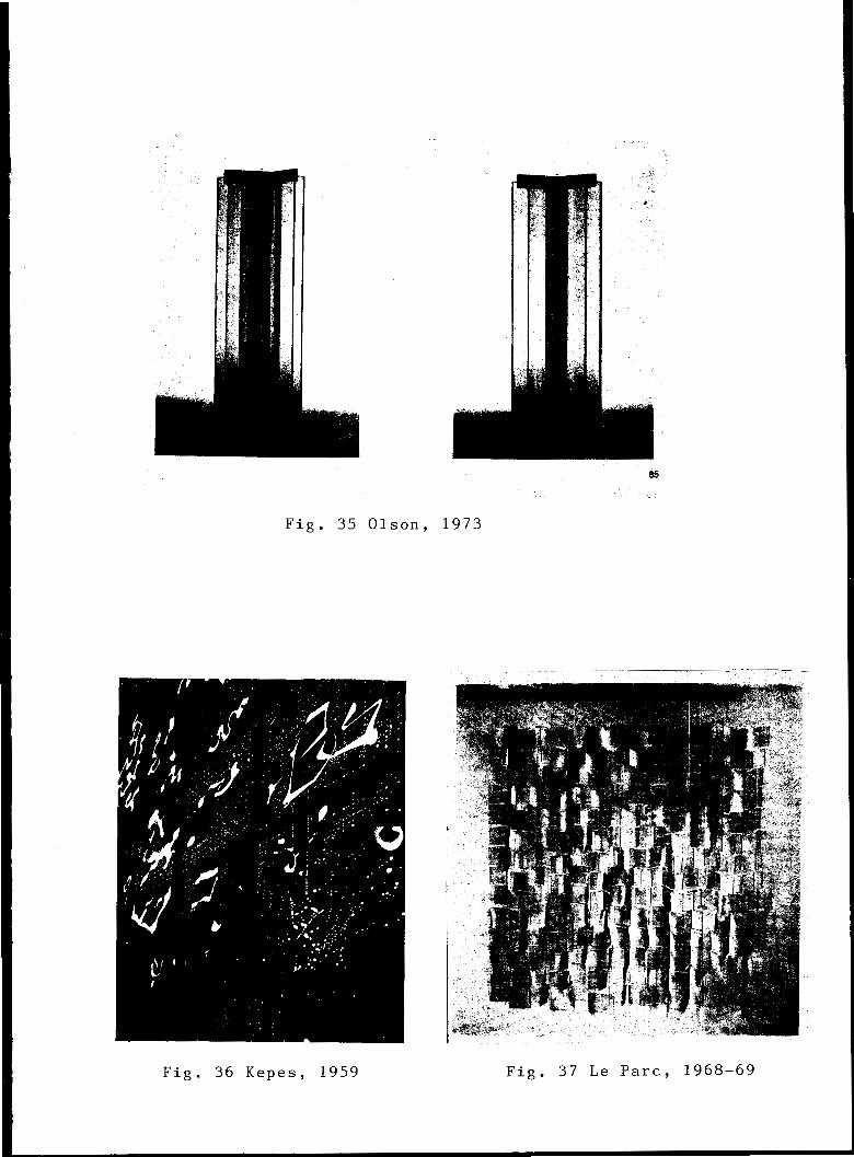
Fig. 35 Olson, 1973
Fig. 36 Kepes, 1959
es
Fig. 37 Le Parc, 1968-69

-37-
Many of the GRAV artists worked in a kind of relief
medium, as well as in-the-round, using lights and reflective
surfaces. But perhaps the inventive work of founding mem-
fig.37 ber Julio le Parc would be the most interesting to look at
for our purposes. As well as light boxes and metallic
constructions, he made a series of colorless, transluscent
and transparent mobile reliefs -- multiple threaded planes
of plexiglas that hung in front of a white backboard that
would move slightly with air currents. This is certainly
different from our concern for an organic colored conception,
but is related from the point of view of materials, and
interesting for the possibilities it suggests, (one
possibility might be light-weight mobile color reliefs
that could make delicate sounds like wind chimes).
GRAV artists reflect another important concern that
has been expressed in the writings of many avant-garde
artists of this century mentioned in this paper -- the
desire to get back to a communal art that is more accessible
to people and is less elitist. In fact, many of the radical
shifts in approach by everyone from the Cubist Picasso to
the Dadaist Arp, to some of the Russian Constructivists,
have been motivated to a large degree by anti-bourgeois
feeling, a desire to shock or just to poke fun at bourgeois
sensibilities, by deliberately turning existing artistic
values upside down -- for example, by using found colored
objects in artworks. Others, like Malevich, Gabo, Biederman,

-38-
GRAV artists and others, are motivated similarly but with
a more positive, almost utopian viewpoint, at least
according to their writings, if not their actions.
Perhaps what all these artists were trying to put
across was that the artist, besides conveying his point
of view and personality, be in the service of art rather than
art being strictly in service to him. In fact, the color
constructed relief is a medium that could especially lend
itself to this point of view for a number of reasons: It is
a relatively new medium; free from regional, sentimental
or symbolic associations; and it is dynamic -- dynamic
meaning open-ended enough for increasingly more possibilities
and approaches.
Some of the new possibilities in the structurist
medium (apart from new clear plastics already cited and new
technologies such as laser cutting and welding devices, new
chemical super-adhesives and color computer graphic design-
ing systems) are new color materials. For example, there
are materials with their own kinds of light and color
properties -- materials with built-in luminescence. There
are new ceramics and plastics with a very wide variety of
colors and degrees of transparency and
do away with the necessity of applying
Some plastics have different densities
opacity, which may
color altogether.
and surface textures
which further affect their intrinsic color. There are new
paints, too, with different textures such as super high
-39-
gloss or pearlescent. There are even (relatively) new
colors such as day-glo or metallic ones that challenge our
existing theories about color systems.
Although working in the structurist medium in its
present state seems to have endless possibilities, with
these new elements and tools and means who knows what could
be expressed? It is exciting to speculate about the use
of these new colors and materials in three dimensions. It
is the aspiration of many who work in this medium that it
evolve further into a very refined art, capable of using
pure color/light sensation in three dimensions for profound
expressions as yet unknown, capable of moving large numbers
of people emotionally as a spectacular sunset can, or as
the works of the great musical composers can.
I believe the medium is at an early, perhaps "primitive"
stage of that evolution at the moment, though, like all so-
called primitive art, it is even now capable of great
color/light expression and has much to express in our time.
I am working towards being a part of that process.

-40-
NOTES
1 Santomasso, Eugene, The Structurist No. 21/11, 1981-82, Josef Hoffmann 's Reliefs at the Beethoven Exhibition of "The Vienna Secession".
2 Bornstein, Eli, The Structurist No. 13/14, 1973-74, "The Color Molecule in Art".
3 Moholy-Nagy, Laszlo, The New Vision and Abstract of an Artist, Wittenborn, Shultz, Inc., New York, 1947.
4 Ibid.
5 Ibid.
-41-
BIBLIOGRAPHY
Arnason, H.H. History of Modern Art. N.J.: Prentice Hall Inc., and N.Y.: Harry N. Abrams Inc., 1968.
Bann, Stephen, Ed., The Tradition of Constructivism, New York: The Documents of 20th Century Art, Viking Press, 1974.
Biederman, Charles, Art as the Evolution of Visual Knowledge, Red Wing, Minnesota: 1948.
Birren, Faber, Color and Human Response, N.Y., Cincinnati, Toronto, London, Melbourne: Van Nostrand Reinhold Co.
Birren, Faber, History of Color in Painting, N.Y.: Reinhold Publishing Corp., 1965.
Elsen, Albert, Origins of Modern Sculpture, N.Y.: George Brazillier, 1974.
Friedman, Mildred E., De Stijl 1917-1931, Visions of Utopia, Minneapolis, Minn.: Walker Art Center, New York: Abbeville Press, Publishers, 1982.
Goodrich, Lloyd and John Baur, American Art of our Century, New York: Praeger, for' the Whitney Museum, 1961.
Gordon, John, Geometric Abstraction in America, New York: Praeger, for the Whitney Museum, 1962.
Graves, Maitland, Color Fundamentals, New York, Toronto, London: McGraw-Hill Co., 1951.
Hammacher, A.M., Jacques Lipchitz, New York: Harry N. Abrams, Inc., 1975.
Hess, Thomas B. and John Ashbury, Ed., Light - from Atom to Laser, New York: The MacMillan Co., 1969.
Hibbard, Howard, Masterpieces of Western Sculpture from Medieval To Modern, New York, Hagerstown, San Francisco, London:
Harper and Row,. Publishers, 1977.
Janis, Sidney, Abstract and Surrealist Art in America, New York: Arno Press, 1969.
Lane, John R. and Susan C. Larson, Ed., Abstract Painting and Sculpture in America, 1927-1944, Pittsburgh: Museum of Art, Carnegie Institute; New York: Harvey N. Abrams, 1983.
Lodder, Christina, Russian Constructivism, New Haven and London: Yale University Press, 1983.

BIBLIOGRAPHY -42-
Miener, John, 7 -1-adimir Tatlin and the Russian Avant Garde, New Haven :and London: Yale University Press, 1983.
Moholy-Nagy, Lasm1o, The New Vision and Abstract of an Artist, New York: -Wittenborn, Shultz, Inc., 1947.
Moholy-Nagy, Laszlo, Vision in Motion, Chicago: P. Theobald and Co., 1956.
Penrose, Roland, The Sculpture of Picasso, New York: Museum of Modern Art, 1967.
Popper, Origins and Development of Kinetic Art, London: Studio Vista, 1968.
Read, Herbert, and Leslie Margin, Gabo, Harvard University Press, 1957.
Rickey, George, Constructivism - Origins and Evolution, New York: George Braziller, 1967.
Rotzler, Willy, Constructive Concepts, N.Y.: Rizzoli Inter-national Publications, 1977.
Rosenblum, Robert, Cubism and 20th Century Art, New York: (revised edition), Harry N. Abrams, Inc., 1966.
Selz, Jean, Modern Sculpture - Origins and Evolution, New York: George Braziller, 1963..
Seuphor, Michel, L'Art Abstrait No. 1, France: Maeght Editeur, 1971.
Sloane, Patricia, Color: Basic Principles and New Directions, London: Studio Vista, 1968.
Varley, Helen, Color, London: Marshal Editions, Ltd.
-43-
BIBLIOGRAPHY
Periodicals, Journals and Exhibition Catalogues
Art in America, Vol. 67, No. 6, "Demystifying Pereira" by Theresa Schwartz, 1979.
Art News, No. 46, "How I Work" by I. Rice-Pereira, Sept. 1947.
Art News, No. 51, "Pereira Paints a Picture - Rose Flux" by D. Seckler, Sept., 1951.
Graphis, No.-105, "Groupe de Recherche d'Art Visuel" by P. Descargues, Jan./Feb., 1963, Vol. 19.
Magazine of Art, "I. R. Pereira" by E: McCausland, Dec., 1946.
The Structurist Number 13-14, 1973-74, "The Color Molecule in Art" by Eli Bornstein.
The Structurist Number 13-14, 1973-74, "Light Art on a New Scale" by Georgy Kepes.
The Structurist Number 15-16, 1975-76, "From Surface to Space - The Art of Liubov Popova",.by John Bowlt.
The Structurist Number 21-22, 1981-82, "Josef Hoffmann's Reliefs at the Beethoven Exhibition of the Vienna Secession, 1902. Beginnings of Abstraction", by Eugene Santomasso
The Planar Dimension, Margit Rowell, Solomon R. Guggenheim Museum, N. Y., 1979, Exhibition Catalogue.
Structure in Art, a catalogue, University of Saskatchewan, Saskatoon, Feb.12-Mar.2, 1973.
Structure in Art, "The Constructed Relief as a New Medium", by Eli Bornstein.
Studio International, Vol. 190, No. 976, "Photography and Moholy-Nagy's Do-it-yourself Aesthetic" by Caroline Fawkes, Jul/Aug., 1975.