Color Associations as Advertising Strategies: An Analysis ...
44
Portland State University Portland State University PDXScholar PDXScholar University Honors Theses University Honors College 2016 Color Associations as Advertising Strategies: An Color Associations as Advertising Strategies: An Analysis of Consumer Attitudes Toward the Analysis of Consumer Attitudes Toward the Healthfulness of Energy Bar Packaging Healthfulness of Energy Bar Packaging Rachel Lotz Portland State University Follow this and additional works at: https://pdxscholar.library.pdx.edu/honorstheses Let us know how access to this document benefits you. Recommended Citation Recommended Citation Lotz, Rachel, "Color Associations as Advertising Strategies: An Analysis of Consumer Attitudes Toward the Healthfulness of Energy Bar Packaging" (2016). University Honors Theses. Paper 249. https://doi.org/10.15760/honors.285 This Thesis is brought to you for free and open access. It has been accepted for inclusion in University Honors Theses by an authorized administrator of PDXScholar. Please contact us if we can make this document more accessible: [email protected].
Transcript of Color Associations as Advertising Strategies: An Analysis ...
Portland State University Portland State University
PDXScholar PDXScholar
University Honors Theses University Honors College
2016
Color Associations as Advertising Strategies: An Color Associations as Advertising Strategies: An
Analysis of Consumer Attitudes Toward the Analysis of Consumer Attitudes Toward the
Healthfulness of Energy Bar Packaging Healthfulness of Energy Bar Packaging
Rachel Lotz Portland State University
Follow this and additional works at: https://pdxscholar.library.pdx.edu/honorstheses
Let us know how access to this document benefits you.
Recommended Citation Recommended Citation Lotz, Rachel, "Color Associations as Advertising Strategies: An Analysis of Consumer Attitudes Toward the Healthfulness of Energy Bar Packaging" (2016). University Honors Theses. Paper 249. https://doi.org/10.15760/honors.285
This Thesis is brought to you for free and open access. It has been accepted for inclusion in University Honors Theses by an authorized administrator of PDXScholar. Please contact us if we can make this document more accessible: [email protected].
Color Associations as Advertising Strategies: An Analysis of Consumer Attitudes Toward the Healthfulness of Energy Bar
Packaging
By: Rachel Lotz
Portland State University Honors Thesis
Spring 2016
Advisor: Maureen O’Connor
Table of Contents Abstract 1. Introduction 2. Background 3. Literature Review 4. Methodology 4.1 First Preliminary Study 4.2 Second Preliminary Study 4.3 Main Study 4.3.1 Creation of Study 4.3.2 Participants 4.3.3 Administering Main Study 4.3.4 Results 4.3.5 Discussion and Conclusion 5. Limitations and Further Research 6. References 7. Appendix
Abstract
Color plays a strong role in shaping consumers’ attitude toward brands,
expectations, and likeability in the field of advertising. Associations with colors are
formed within consumers’ culture and are often universal in meaning. Through
three studies, the role of color in relationship to perceived healthfulness on energy
bar packaging is observed. The results show a strong correlation between a
particular color associated with healthfulness due to preconceived color
associations often highlighted in advertising strategies. However the results raised
unexpected, yet insightful correlations with other colors, which participants
identified as healthy. When participants were asked to pick the energy bar that they
perceived as the healthiest out of the group, their answers suggested a consistent
idea of health related colors. Implications are discussed for using color as an
advertising strategy in order to sustain strong brand recognition and likeability in
the energy bar market.
1. Introduction
The growth of American advertising in the 20th century is a direct result of
industrialism, urbanization, and mass print media (Pollay, 1985). Advertising
boomed in the years leading up to World War II, and accelerated rapidly with the
expansion of broadcast radio and television. By the 1960’s advertisement spending
had reached $2 billion worldwide (Pope, 1974) and currently is $200 billion
(Statista, 2016). During this time the marketers and scholars have applied basic
principles of psychology to better understand the impact advertising has on
consumer behavior (Pollay, 1985).
One of the more interesting aspects of this research has been the study of
color as it impacts consumer behavior. Given my background in graphic design and
advertising, my research seeks to better understand the relationship between color
and consumer behavior, specifically as it impacts attitudes about advertising and
consumer packaged goods. Although research has been conducted on many aspects
of this relationship, it is my intent to address the impact of color in consumer-
packaged goods, specifically the category of energy bars, which has had limited
attention from scholars. My hypothesis asks, does color in energy bar packaging
shape consumer perceptions about healthiness of U.S packaged foods?
2. Background
The energy bar category is known by many names: snack bars to nutritional
bars to candy bars, and even weight-loss bars. It is made up of different brand
names, types, and textures to appeal to an array of consumers and their needs
(Crawford, 2015). The definition of an energy bar is a bar-shaped convenience food
intended to boost physical energy, typically containing a combination of fats,
carbohydrates, and proteins and fortified with vitamins and minerals
(Erinnudi.com, 2014). Each bar is built around taste and nutritional value and offers
the consumer a snack in between meals, a way to manage weight loss or keep
energy up throughout the day. Nutritional value often serves as the main factor to
help one make a decision about what bar to purchase (Mintel.com, 2015). This
paper specifically focuses on energy bars, rather than the larger category of snack
bars.
There are various types of energy bars available for purchase. Activity bars
focus on providing an energy resource to consumers, while they are involved in an
outdoor activity such as hiking or backpacking (Wildpacker.com, 2010). Meal
replacement bars or weight-loss bars focus attention on the nutritional ingredients
within the bar that fill up the stomach the fastest and are most often consumed in
replacement of a meal such as breakfast (Wildpacker.com, 2010). Each bar aims to
have a certain limit of calories for those who keep count, as well as high grams of
protein, carbohydrates, and vitamins. The third type of bar in the energy bar
category is a protein bar that is designed solely to promote muscle gain. These types
of bars are packed full of protein to be eaten before a strenuous workout or activity
and allow the body to sustain higher intensity workouts (Wildpacker.com, 2010).
Endurance bars are also designed to be consumed before a long workout, but have a
higher ratio of complex carbohydrates in order to provide a longer lasting amount of
energy during the duration of the workout, with no side effects such as a crash one
typically feels from sugar. The last type of bar offered on the market are organic
bars, which suit the needs of consumers who want a more natural, not processed
source of energy. These bars differ from others within the energy bar category, as
they do not add protein, gluten, or soy ingredients and generally satisfy consumer
snack needs. Organic bars pride themselves in offering simple, recognizable and
nourishing ingredients (Wildpacker.com, 2010).
Energy bars dominate the market that was once led by snack and cereal bars,
as they attract individuals who identify with current health and wellness trends
(Agr.gc.ca, 2015). Energy bars were first introduced as food for astronauts in order
to provide food that was fresh and did not need to be refrigerated, yet still had
flavor and nutrients (Erinnudi.com, 2014). The Pillsbury Company transformed
early space food into bars that could be eaten on earth in the late 1960’s. They were
called “ Food Sticks” and sold to the general public (Erinnudi.com, 2014). After this
first entrance into the market, Power Bar took hold of the market by being the first
to commercially release bars primarily for athletes in 1986 (Erinnudi.com, 2014).
These bars were sources of energy for athletes with high amounts of protein that
could eat almost anywhere. As of the 21st century energy bars are readily available
for anyone. Energy bars are meeting a wider array of consumer needs than snack
and cereal bars are able to, including weight-loss, protein, and indulgence.
Nutritional and health bars had their most significant market growth
between 2011 and 2013 reaching 39.6% of the total share of the snack and nutrition
bar category. Snack and cereal bars make up approximately 60% of the category
share (Crawford, 2015). At the end of 2013, market revenue reached $5.5 billion for
this market, and Mintel’s research projects that profits will reach $6.2 billion by

2018 (Crawford, 2015). This growth has been driven largely by growth in sports
and outdoor activities.
Since being introduced into the market in the late 1960’s energy bars have
reached double-digit growth rates due to consumer needs being addressed and
innovations that match current purchase trends and consumer behavior
(Erinnudi.com, 2014). The market has also doubled in size when compared to other
forms of snack foods, and has tripled in the section of packaged foods. From 2013 to
2016, the market has shown a steady increase of 4% per year, and is projected to
continue to increase at 4% until 2017 (Agr.gc.ca, 2015). Millennial snacking habits
are driving this growth, as they tend to be more regular snackers than other
demographics (Agr.gc.ca, 2015). The convenience of these energy bars and multi-
functional uses attract many consumers, capitalizing on impulse purchases in places
such as gas stations, department stores, and grocery stores, with advantages that
traditional snacks do not offer.
The largest setback to this market is the price of individual bars, as Mintel’s
data found that nearly half of consumers presented with the option to purchase an
energy bar have found them to be overpriced, which deters them from purchase
(Crawford, 2015). The second most influential factor when purchasing an energy
bar is the bar’s ability to live up to its expectation of performance in supplemental
energy or weigh-loss. Low levels of satisfaction often deter consumers.
Energy bars motivate consumers to think about nutritious alternatives that
contain sources of fiber and protein. Energy bars satisfy just that, but offering
simple, natural, and pure ingredients. The number one reason consumers choose
health and wellness bars as a snack is to tie them over until their next meal, often
providing many Americans with more than one third of their total daily caloric
intake (Agr.gc.ca, 2015). When choosing among snack options, consumers may be
inclined to choose energy bars over cookies and chips, given their combination of
convenience and nutrition. Americans, especially between the ages of 18 and 44, are
increasingly becoming more health conscious, and are willing to spend money
toward sources of energy that satisfy their busy lifestyles (Agr.gc.ca, 2015). Today
29% of Americans are currently dieting, 55% have dieted at least once within the
past year, and 69% exercise at least once a week (Agr.gc.ca, 2015). Consumers drive
these health trends also drive the market share higher, since consumers who are
more health conscious and exercise often are more likely to consume nutritious
sources of food (Agr.gc.ca, 2015).
About two-thirds of Americans or 68 percent of all purchases, happen at the
point of purchase (Burke, Raymond, Garber, and Jones, 2000). Packaging
contributes greatly to influencing a consumer’s decision to purchase. Packaging can
attract attention, communicate the image and name of the particular brand, stand
out against competitors, and increase the product’s perceived functionality (Burke,
Raymond, Garber, and Jones, 2000). Consumer decision is defined as a mental
orientation characterizing a consumer’s approach to making a choice, based on
cognitive and affective orientations. These orientations can be divided into two
categories: visual and informational, that assists consumers in making the purchase
decision (Pinya, Silayoi, and Speece, 2004). Correct packaging alone can increase the
brand’s total revenue and competitive advantage, because marketers are relying
more and more for packaging to sell their product in retail environments (Pinya,
Silayoi, and Speece, 2004). Packaging has become critical to the success or failure of
a brand as market conditions become increasingly competitive.
Packaging also adds to the shopping experience with unique aesthetic value
particular to each brand and evokes feeling sets that connect with the consumers’
purchase environment and culture and helps to influence decision-making.
Research tells us that consumers are attracted to aesthetically pleasing packaging,
and that packaging has the power to influence consumer decisions (Burke,
Raymond, Garber, and Jones, 2000).
Purchase decisions are often made based on visual search conducted in a
cluttered environment, such as the aisles of grocery stores, with time constraints.
When a decision is weighted heavily by a consumer the larger amount of
involvement factors are taken into consideration, such as reliability, price, color, or
size. Consumers will always put more effort towards a high involvement decision,
because the decision alone will require more of a mental process than low
involvement products. If the consumer is new to the category, such that their
purchase is for a unique product that they have never bought before or it is a
purchase that does not happen often, the consumer likely to spend more time at the
point of purchase to make sure they are making the right decision. In low
involvement purchases, such as toothpaste or cereal, consumers spend less time
scanning all brands in a category.
Packaging plays an important role in brand recognition and can draw
consumers back to the brand during point of purchase decision-making. In the
consumer’s final decision making step, packaging factors will increase the likelihood
for the particular brand to be chosen based on the increased awareness of the
particular brand itself (Burke, Raymond, Garber, and Jones, 2000). This brand
attention and familiarity drives purchasing decisions, and can eventually lead
consumers to become loyal to that brand.
A package that is familiar to the consumer, or can stand out within the
category, such as Coca Cola for the soda category, increases purchase decisions.
Once particular packaging captures the consumers’ attention, they begin to evaluate
the product by a subset of factors, such as price, nutritional content, etc. The
meaning the packaging conveys to the consumer is a helpful factor in the purchase
decision. The more the package’s textual and visual information aligns with the
consumer’s goals and values, the consumer is more likely to purchase. If a package
does not identify with the brand’s purpose or is not what the consumer expected, it
decreases the likelihood that consumer’s will choose that brand (Burke, Raymond,
Garber, and Jones, 2000). For example, if a consumer saw a toothpaste package that
was purple, rather than traditional red or blue or green, they might be less likely to
purchase that product based on its packaging, because the purple color conveys
meaning that is inconsistent or unfamiliar to the consumer’s already perceived idea
of what toothpaste packaging should be.
Technology advancements in printing have dramatically influenced the
sophistication of consumer goods packaging as we know them today. Technology
has made it easier than ever to print a desired project at the press of a button, and
continues to become more innovative every year. From the process of lithography
to relief printing to the modern printing press, printing has positively influenced the
way that consumers select and purchase their products, specifically packaged goods.
Lithography revolutionized printing and was used in prints and illustrations
(Whal, 2015). Lithography consisted of tinting the printing stone with one or two
colors. However, printers still heavily relied on artists for more detailed work
during this time. After the invention of lithography, chromolithography was the next
step for color printing, which was the process of several blocks printed together
side-by-side producing flat single colors (Whal, 2015). In the late eighteenth
century, advertisers and magazines often featured chromolithography work (Whal,
2015). Even into the nineteenth century, the process of lithography was still
expensive because of the knowledge and expertise that each printer had but allowed
for faster production (Whal, 2015). In the twentieth century photographic processes
replaced lithography, and allowed for other technological achievements to occur.
Even though the processes of lithography, chromolithography, and relief
printing had been around for centuries, the modern printing press combined these
efforts, and made the process of color printing more readily available to the public
and at a cheaper cost. The printing press allowed for high production and quick
turnover. Full color advertising has slowly been implemented since the 1920’s.
Color became integrated into advertising after the First World War, but declined
again when the Great Depression hit, due to a lack of money in the economy, and
consumers were only purchasing services that were vital to surviving. Color became
a part of advertising again in the era after World War II. As the advertising industry
was booming again, the industry began to evolve through the style of art
incorporated into the advertisements (Pope, 1974). Artists and copywriters were
responsible for this immersion. It was the first time that many artists were hired to
work for agencies. This unique contribution was just what these companies needed
(Pope, 1974). Artists incorporated various new approaches into advertising and
printing allowed images to come to life through the use of color, and technological
advancements allowed photography and typography to become a positive artistic
addition to the scene (Pollay, 1985).
Flexography printing, which is a form of relief printing, where ink is placed
on rubber plates, then raised to print above the surface as a three dimensional
positive relief, was used mainly for food packaging within the United States in the
early 20th century (Gomez, 2000). In the 1960’s Andy Warhol popularized the use of
screen-printing as an art form, by producing acrylic paint printed on linen (The
History of Print from 1990 to 1999, 2015). Also in 1962 the HelioKlischograph K190
was introduced, being the first in the series of many gravure-printing systems that
would pave the way for the evolution of technology in color printing in packaging
(The History of Print from 1990 to 1999, 2015).
Research conducted in the 1960’s led to the academic discipline of the
relationship between consumer behavior and general advertising strategies. This
was the first time that the application of psychology was apparent and persuasion
was used to influence consumers to purchase (Pope, 1974). It was during the same
time that advertising started the “Creative Revolution” which could be seen through
direct marketing. Advertisements began to be more subtle and creative with their
approaches, targeting smaller groups of consumers who already had an interest in
their product. This shift from targeting everyone in the mass market, to smaller
subgroups proved to be successful especially within the United States (Pope).
Advertising was becoming better known and practiced by designers,
marketers, and consumers alike. Soon enough nearly four-fifths of advertisements
by the 1970’s incorporated color. Marketers began to shift their attention towards
the presentation of the product with stylish packaging, rather than simply stating
the information related to the product or the price on the packaging (Pollay, 1985).
This strategy created a brand positive preference for consumers. Marketers’ ability
to establish control over consumers’ through advertisements, and product on the
shelves showed to be effective through the increase of consumer demand in those
particular products (Pope, 1974).
In recent years, improvements to the industry have produced technology for
fast washouts and screening to improve print and ink color quality. Full color
printing is more possible than ever thanks to the finest printing processes today
that combine skilled operators and computer technology. Flexography has endured
much technological advancement during this time, such as the use of photopolymer
printing plates and printing inks, allowing it to still be a preferred form of printing
into the 1990’s (Gomez, 2000).
Advancements in printing have led to more image, type, and color being used
in packaging. This positively impacts individual brand recognition and likeability on
the shelf, which in turn influences consumer behavior at the point of purchase. As a
result of the increase in popularity of printing, packaging has been more heavily
relied on in advertising, as a strategy to influence consumers.
3. Literature Review
The research conducted consists of various journal articles, and chapters of
books discussing how color associations are established in brand advertising, the
attitudes these associations create in consumers, and the relationship these colors
play into consumers’ perceptions of healthfulness and food preferences. I believe
that I must reach a general understanding of the color associations that consumers
create as a result of advertising in order to address my thesis question. After reading
articles on these topics I have come to learn that color in advertising is still a
relatively new subject, where most of the research and studies are analytical and
experience based, as opposed to speculation and anecdotal.
There are three areas within my thesis that I have found important to
research separately in order to understand their relationship with another. First, I
researched color and the associations that are formed based on subliminal
meanings, second, the role color has in the evolving field of advertising, product
packaging and the influence of consumer attitudes, and lastly the perception of
healthfulness in the food industry of the United States.
In order to understand color associations we must first understand color
itself. Color is a sensation that humans encounter as a result of objects reflecting
light within the world around us (Holtzschue, 2011). The body then creates a
response from this experience known as a stimulus, which can be measured based
on the type of color and quantity emitted. Colors can also be understood in terms of
wavelengths, which are the dispersed into the visible spectrum that can be seen by
the human eye. Colors found to have shorter wave lengths such as blue and green,

have been thought to be less arousing and appealing than colors with longer wave
lengths, such as red and orange (Elliot, Friedman, Maier, Meinhardt, and Moller,
2007). Color vision has evolved tremendously from our ancestors, as it first was a
result of environmental adaptation and survival of the fittest, serving as a signal for
animals to hunt and gather (Elliot, Friedman, Maier, Meinhardt, and Moller, 2007).
In spite of evolution, our color vision is unique and tailored to each individual
because each individual sees the three properties of color - hue, saturation, and
value - differently (Amitava, Chattopadhyay, Dahl, Gorn, and Yi, 1997). Saturation
and brightness are the most influential characteristics on the human’s perception of
color (Kryousi, 2015). The way that humans perceive color is unique to everyone
one of us, and so is the way that the experience is stored in our memory to be
recalled in future situations. No two consumers can see the same color, and
reactions to color have been thought to be highly individualized to each consumer
as a result of personal liking preferences and past experiences (Hewett, Madden,
and Roth, 2000). Nonetheless, general color assumptions and associations are
thought to exist. Individuals can still agree upon the unspoken language of color, as
cultural understandings, and shared common experiences such that red on a stop
sign draws our attention to slow down or an orange cone on the roadway usually
suggests construction or to proceed with caution.
Color serves as a visual activation to communicate ideas and feelings through
associations. These associations are developed and taught in the culture. As citizens
of particular cultures, we learn to connect a meaning or specific experience to a
perceived color. Some common associations long held in our Western culture are
yellow with prosperity, red with love, purple with royalty, blue with loyalty, and
white with purity (Gabor).
Color associations are also formed depending on the context of product
consumption, or to distinguish the specific product from competitors in the same
market (Grossman, 1999). Color is an important advertising strategy that is used to
condition the consumer to respond to the message of the brand in a certain way by
establishing brand loyalty or consumer trust. It is up to the marketer to make the
message clear, and not too subtle. The message that the packaging of the product
presents should be able to be recognized and understood by the consumer in less
than 90 seconds (Gabor). Color is one of the largest consumer controlling factors for
marketers as an advertising strategy, and their associations should serve as cues to
direct consumer preferences in the way in which consumers see brands and the
qualities that they embody.
Advertising strategies are executed by attracting the attention of the
consumer, and by increasing their involvement with the product through recall and
recognition (Kryousi, 2015). Involvement can be as simple as an emotional reaction
to the product, either in a positive or negative light. Color is chosen to serve as a
marketing cue, because it can often evoke psychological connections such as
pleasure, arousal, and dominance on an emotional level in humans rather than a
logical level of response (Gabor). Color serves as a strong image cue to consumers,
and can also imply a particular brand’s position within a given market. An example
of this is the well-known technology company, IBM, with logo colors of white and
blue that evokes the perception of “gentle” and “peaceful” (Hewett, Madden, and
Roth, 2000). These color associations may be particularly attractive to consumers as
they are inviting and approachable, in a often-intimidating industry of technology.
However if IBM wished to have a more sharp or intuitive appeal for consumers, it
may consider changing its logo colors to orange or red (Hewett, Madden, and Roth,
2000).
Recalling the highly influential characteristics of color, brightness and
saturation, a study conducted by Antigone Kryousi and George Panigyrakis, “Color
Effects in Print Advertising: A Research Update,” found that when these properties
in a print advertisement are increased, the attitude and preference toward the
particular brand’s advertisements and packaging also increases in the eyes of the
consumer. Thus highly saturated or high-brightness colors evoke greater feelings of
excitement and higher brand recognition and retention. In addition to saturation
and brightness, the number of colors included in packaging, logos, and other
influential visual elements impact the meanings, as they become more diverse and
complex when more colors are introduced (Hewett, Madden, and Roth, 2000).
Furthermore, marketers need to understand the influence of color in advertising in
order to recognize and address their target audience.
Color’s role in advertising is diverse because it serves as a visual element in
packaging, through a continuation of advertising communications, and connects the
product and the consumer. It is so influential that a survey conducted by O. Gabor,
concluded that color incorporated effectively it can increase brand recognition by
38%, improve information of the product by 40%, and ultimately increase the
positive attitude that the consumer has about the product by 22% (Gabor).
Marketers select colors, and the number of colors, used within their advertisements
with careful consideration, because it is one of the top three considerations, aside
from price and quality that consumers consider at point of purchase (Hewett,
Madden, and Roth, 2000). Advertisements have the option to be printed black and
white, with a spot color (in one area of the advertisement only one color is used
once, this is often seen in a logo). Advertisements can also be printed four color
CMYK, which stands for cyan, magenta, yellow, and key, or three color RGB, which
stands for red, green, and blue. Selecting the correct color or colors, for an
advertisement is a very important and strategic task for the success of a product.
Gabor’s survey concluded that two color advertising increases the perception and
effectiveness of the message by 20%, and multicolored by 40% when compared to
traditional black and white advertising (Gabor).
Color can also tremendously influence the way that food is perceived and its
assumed taste. Through our ‘experience qualities’ as referred to by Christian Pinson
in his article, “An Implicit Product Theory Approach to Consumer’s Inferential
Judgments about Products,” the consumer can conclude the taste of the food only on
the basis of previous personal experiences, seeing that each consumer has their own
taste palette. Another type of quality that the consumer relies on is known as search
qualities, of which the color of food is one, as it is a quality that allows the consumer
to easily ‘search’ for a particular food. This search is conducted before the purchase,
and does not necessarily rely on previous experience or interaction with that
particular food.
Colors can indicate ripeness, the kinds of ingredients that may be included,
origin of the food, and even quality (Elliot, 2012). A common example is explained in
the chapter “Taste™,” by Charlene Elliot, where green bananas are assumed to not
be ripe and ready to eat, where yellow bananas are perceived as better tasting and
more appealing, and brown colored bananas are discarded and not eaten because
they are not seen as fresh. As this decision process is not the same for every
consumer, it is a general conclusion that can be based off of personal experiences
and associations within our environmental culture. Healthy, fresh foods are the
most desirable because they are the most marketable (Elliot, 2012), and consumers
often use color as a determinant of freshness. An example of these expectations is
the preference that consumers have towards yellow skinned poultry when
compared white skinned poultry. A chicken producer by the name of Frank Perdue
chose to alter his product for consumption in supermarkets by feeding his chicken
large amounts of corn and marigold petals (Pinson, 1986).
The relationship between color and packaging is extremely important in the
food industry. Packaging allows consumers to make quick, yet educated decisions
about the food at the time of purchase. Jonathan Schuldt’s article, “Does Green Mean
Healthy? Nutrition Label Color Affects Perceptions of Healthfulness”, brings to light
the influence that color has on consumers when they make a conscious health
decision about their food. Based on associations that consumers have been taught,
this study shows that green can be often be correlated to mean healthy, fresh, and
even natural. When participants were given the choice of a chocolate bar with the
calorie count highlighted in red, they thought twice about their decision. When the
same participants were presented with another chocolate bar with the calorie label
highlighted in green they did not stop as often to reconsider their choice. Same
chocolate bar, same ingredients, yet the color association with green subconsciously
influenced them to think that their choice was healthier than the than the chocolate
bar with the highlighted red label.
The literature suggests the strong influence that color associations have on
consumers as an advertising strategy. It is important as a marketer to give a
generous amount of time when choosing the colors used in a product’s packaging,
because something as small as increasing the hue of a color or picking a two-color
advertisement over black and white can tremendously change the consumer’s
attitude. These decisions are vital to the relationship with consumers as they
decipher the healthfulness of a product. There is still a gap in the research of this
field, because there is little evidence of the use of color that is not anecdotal or based
on personal experiences of the researchers. The downside to this perceived gap is
that it leaves too much room for opinion and theory based articles, as opposed to
quantitative data and factual research. This gap proves to provide little to no
conclusions in regards to consumers’ perception of healthfulness as a result of color
used in packaging.
4. Methodology
As the research I conducted shows, studies related to color in food packaging,
specifically energy bar packaging, is very limited or merely does not exist. This lack
of knowledge creates a gap within the research of this field that I aimed to address
with the following surveys. The two preliminary surveys were administered to
provide a foundation for the main study through qualitative research and diminish
any biases towards colors that would effect participants’ decisions. The main study
consisted of creating mock energy bars packaging administered in unstructured
one-on-one interviews. I had the ability to hold various factors constant on the
packaging in hopes to focus solely on color in the main study. In doing so I was able
to conclude an answer to the gap in the research brought to light in my literature
review.
4.1 First Preliminary Survey
This first survey was administered to determine the existence and size of the
energy bar target market, and determine the key reasons consumers eat energy
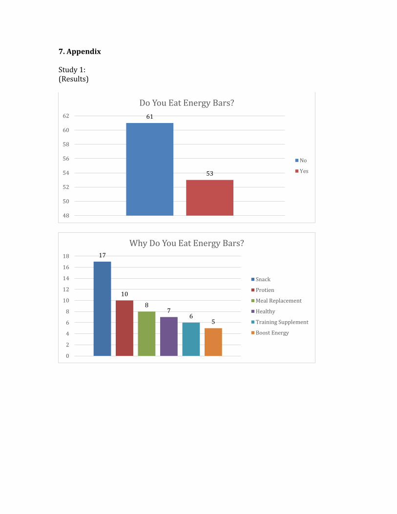
bars. I found the top 5 reasons consumers eat energy bars.
A total of 114 people filled out this survey online through a link that I
provided them through social media and email accounts. I created the survey on a
generator called Qualtrics. This survey was kept short and simple to get as many
responses as possible. The last question of this survey was the most important, as it
included all secondary, primary, and tertiary colors. The motive was to understand
what colors I would use in the main study. I asked the participants to pick one color
they associate the most with healthfulness. This survey set the groundwork for what
questions would be asked and used in my second survey.
Out of the people who took this survey, the results were as follows: 46% of
participants answered that they in fact eat energy bars. From the second question I
found the top 5 reasons why energy bars are eaten. 20 people said they eat them for
a snack, 9 people said to boost energy, 6 people said for source of protein, 11 people
said for a meal replacement, and 8 people said for other various reasons. I was able
to conclude from these results that the main consumption of energy bars is for a
snack. I asked participants, independent of energy bar consumption, to pick the
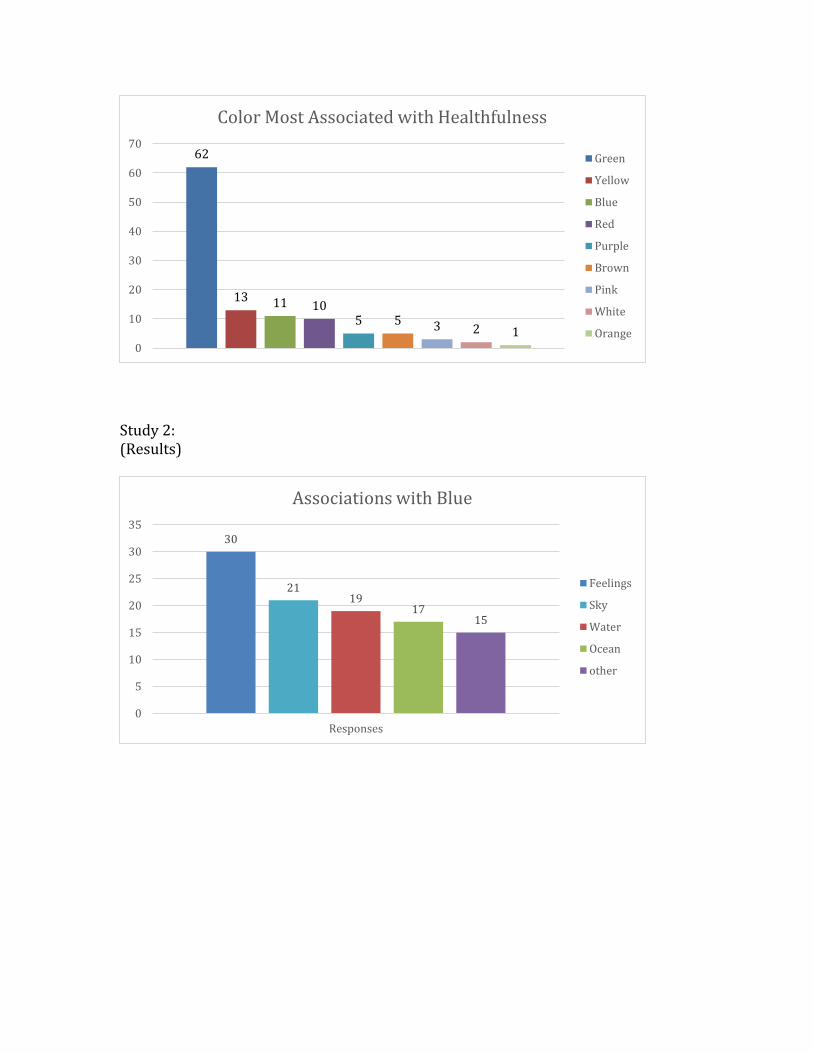
color that they felt is most associated with healthfulness and 55% chose the color
green, 12% chose the color yellow, and 10% chose the color blue.
4.2 Second Preliminary Survey
The second survey was conducted to better understand words and phrases
that participants associate with various colors. At the end of the survey I asked
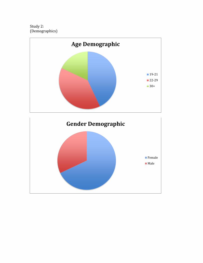
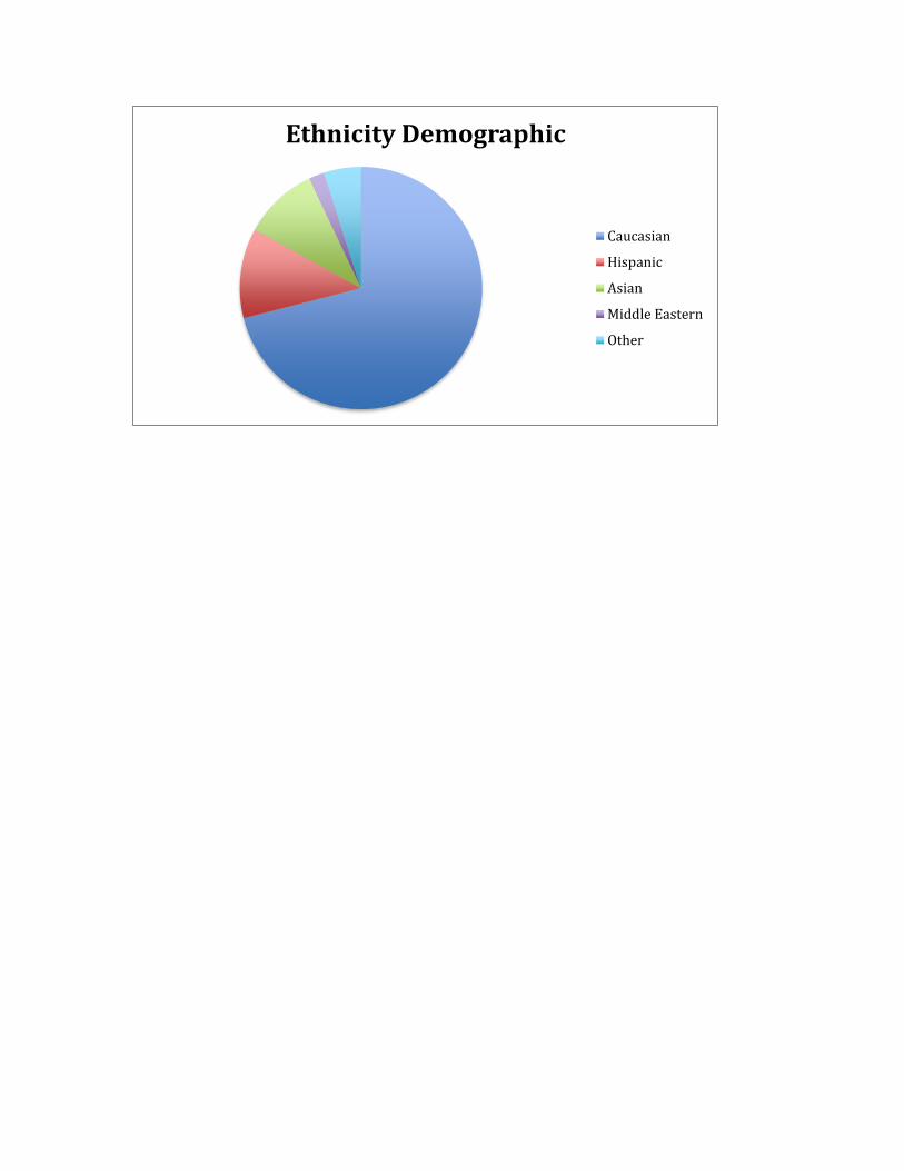
demographic questions to distinguish the consumers that took the survey. I asked
each of the participants’ for their age, gender, occupation, marital status, and
ethnicity. Refer to the pie charts in the Appendix under Study 2, for the breakdown
in percentage of each demographic category that was surveyed for.
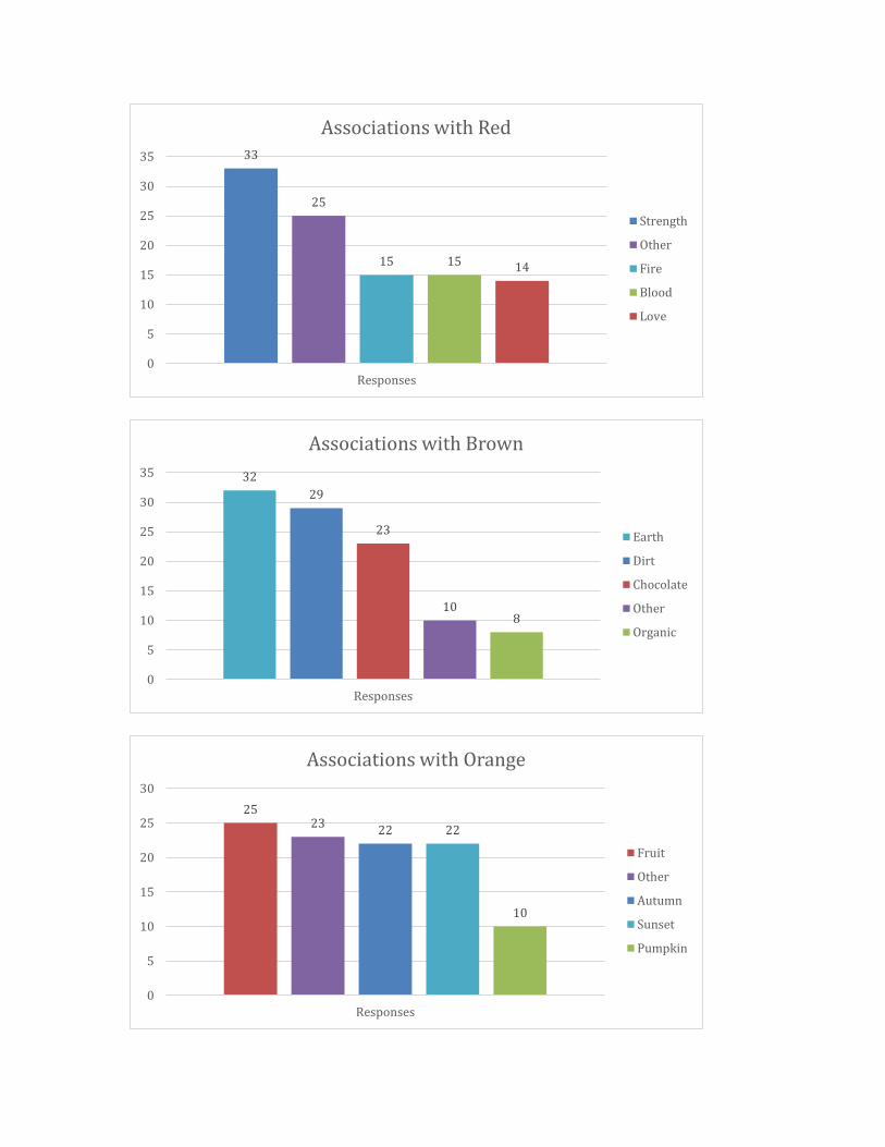
Like the first survey I electronically dispersed a link to the survey that was
created on Qualtrics, through social media and email accounts. A total of 106 people
took this survey. I did not screen participants before they took the survey, as to
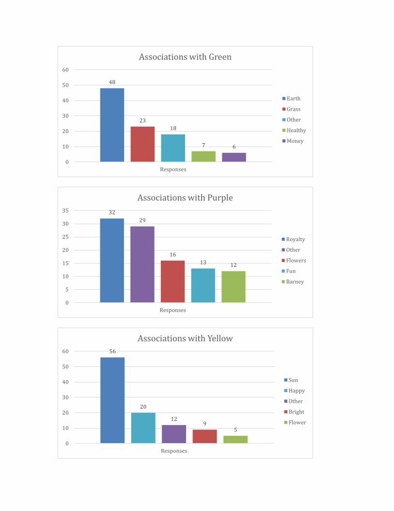
whether or not they ate energy bars. The results were compiled into graphs, each
for a separate color and categorize the top five associations that participants
identified. These graphs can be found in the Appendix under Study 2.
4.3 Main Study
The main study best incorporated and answered my thesis question directly
through the creation of mock energy bar packaging. It also addressed the gap that I
had previously brought to light as I was able to conduct a specific study in the field
of energy bars, to answer my hypothesis question, does color in energy bar

packaging shape consumer perceptions about healthiness of U.S packaged foods?. I
will discuss the procedure of creating this study, the participants who were involved
in the quantitative research, administering the study, and results.
4.3.1 Creation of Study
Using the results from the first two studies, I was able to determine the
colors for the mock energy bar packages. I selected seven colors to be used on the
packaging. As a result of my two preliminary studies, I decided to chose the colors
green, red, yellow, orange, blue, purple and brown. I hoped to control the main
study with the true hue of each color family, rather than variations of colors, such as
blue green, or orange red. These true colors best represented the colors that are
often seen on energy bars that consumers see in locations such as grocery stores,
gas stations, and coffee shops.
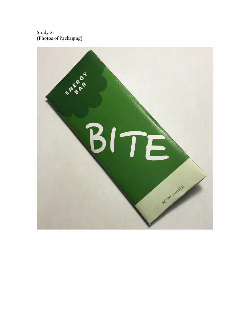
Secondly I designed energy bar packaging to present to the participants
when taking this survey. I wanted to create my own packaging, because then I had
the ability to control various components that are featured on traditional energy bar
packaging. The only change that occurred between wrappers was the colors; I chose
to keep all the other factors constant. My own packaging allowed me to eliminate
any bias participants would face when deciding which energy bar packaging is
healthier. These biases could be seen in the form of factors such as calorie count,
protein count, name of the energy bar, flavor, price, and many others. As a result I
chose to eliminate these factors from the packaging completely or put a placeholder
of a zero in for the original numbers. To see a closer detail of the energy bar
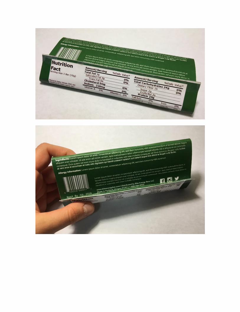
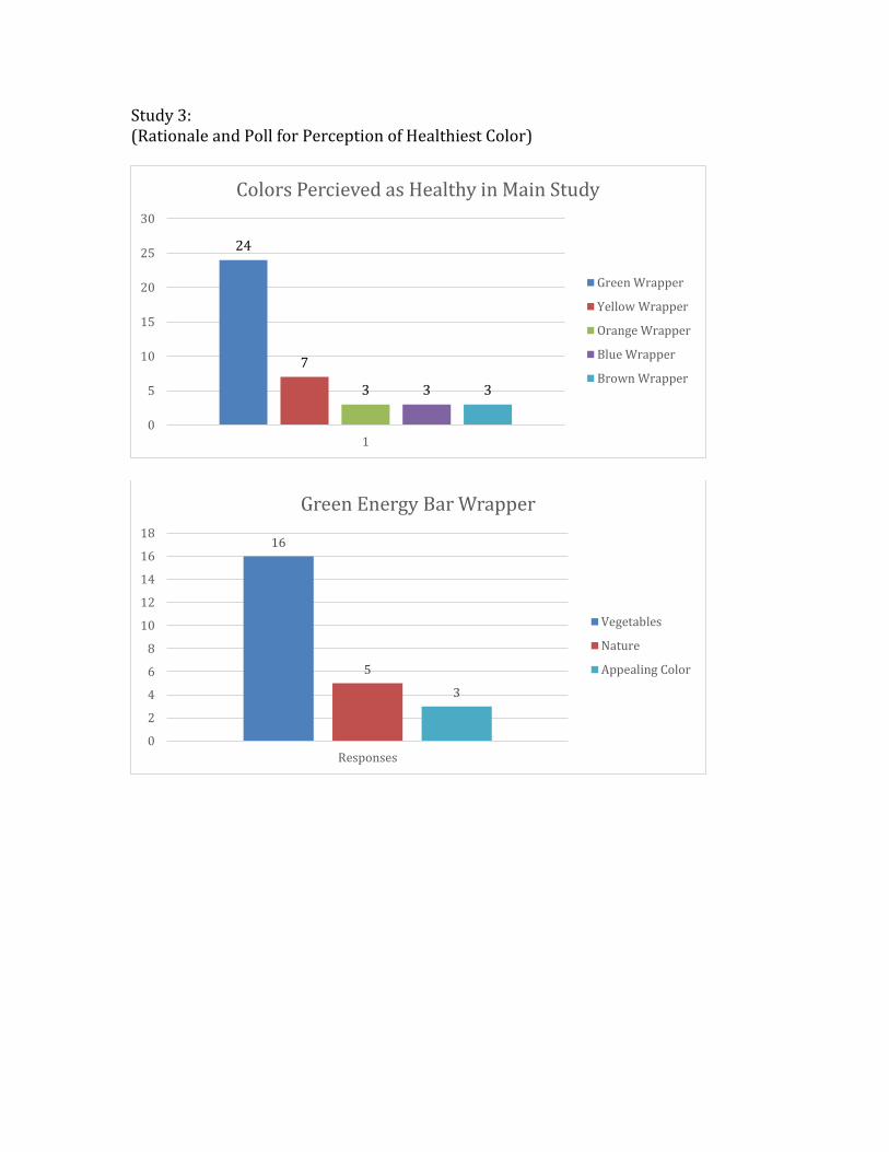
packaging and the details, refer to Study 3 in the Appendix.
4.3.2 Participants
For the main study, 40 people who identified as energy bar consumers, were
asked to choose which energy bar packaging they believed to be the healthiest. They
all observed the same seven packages that I had designed, as I laid them out on a
table. The participants in this study were between 18 and 65 years of age. 25 of
them were female and 15 of them were male. Roughly 75% of the participants are
affiliated with Portland State University, while the other 25% are a mix between
retired or in the workforce. All of these participants are individuals I interact with
on a fairly regular basis, as they are recognized as my coworkers, superiors,
roommates, family members, or peers. Many of the participants I also recognize as
moderately to highly health conscious, as a large portion of them are frequent gym
goers.
4.3.3 Administering Main Study
It was important to administer the main study in person, through one-on-one
interviews. If I distributed the main study through social media sites and email as I
had done with the preliminary surveys, the colors of the packaging being viewed on
a computer screen would differ from participant to participant, because of various
factors on their screen such as pixels, angle, or brightness. By asking participants to
observe the same seven wrappers in person, I could control the colors that they
were observing. I did not give participants any further information regarding my
study, so as not to impact their decision. I asked the participant to observe the seven
energy bars, pick which one they believed to be the healthiest and to tell me why
they chose that particular wrapper.
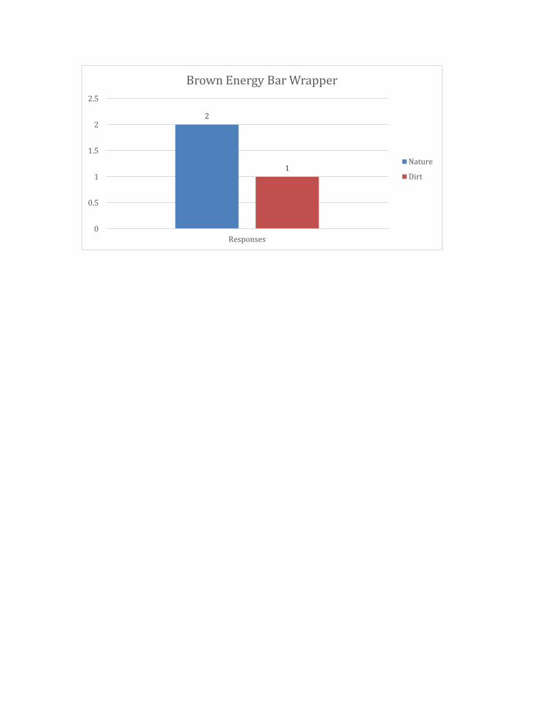
4.3.4 Results
The results from the main study concluded that the green energy bar was
perceived as the healthiest out of all seven colors that were presented. The yellow
energy bar was chosen as the second healthiest, and the orange energy bar tied for
third along with the blue and brown energy bars. No one chose the purple or red
energy bars as healthy during this study. I compiled a graph for each energy bar
color. In order see the specific responses of each participant in further detail,
explaining as to why they believed a particular color the be the healthiest, refer to
Study 3 in the Appendix.
4.3.5 Discussion and Conclusion
The goal of this study was to investigate what color is perceived as the
healthiest in the eyes of consumers to answer, to what extent does color in energy
bar packaging shape consumer perceptions about healthiness of U.S. packaged
foods. From my results in the main study, I was able to conclude that, yes, the color
green does in fact influence the perception of healthfulness on energy bar
packaging.
One of my favorite aspects was proctoring the main study because I was able
to watch how participants walked through their selections. Some participants did
not pick up or interact with any of the energy bars, which I believe resulted in
making their decision more quickly than others. Other participants chose to ask
more questions, diligently inspected the contents of the packaging, or provided me
with a very in depth answer to my question of which packaging they perceived as
the healthiest and why. Some participants even answered beyond just one word or
short phrase, providing me with more insight into their individual decision-making
processes.
Many of the participants in the main study had made a point to ask me if
there was a right or wrong answer to the question that I asked. They gave this
impression through their body language and facial expressions that led me to think
that they thought they were being tricked into picking one color over the rest. I
assured them that they could pick whichever color they believed to be the healthiest
because there was no right or wrong answer to my study, but rather I only wanted
to observe the behavior and tendencies of them as consumers.
Before conducting my three studies, when I was researching articles for my
literature review, I hypothesized that the results would be very heavy towards the
color green in regards of perceived healthfulness, due to the strong pan cultural
associations of health with the color green. I did not envision other colors being
perceived as healthy by participants. However, the results from the main study were
spread across five out of the seven colors that I presented them with, which really
surprised me. The packages in green, orange, yellow, brown, and blue were picked
at least once by a participant who viewed that color as the healthiest packaging out
of the group. The two packages that were not picked at all for healthfulness were the
purple and red packages.
Packaging color turns out to be highly influential on the perception of
healthfulness. Against expectations going into this study of the color green being the
only healthy color, there are in fact more perceived healthy colors in the eyes of
consumers. However, these colors are secondary to green in their ability to convey
healthfulness.
5. Limitations and Further Research
Earlier in this paper, other factors on energy bar packaging such as calorie
count, flavor, or brand names were discussed as they suggested potential biases for
participants in the main study that would impact perceptions on the healthfulness of
packaging. For this reason I kept all factors constant except for color in order to
make color the highlight of the main study. As some participants realized this
control within the study when they took a closer look at the packaging, it could have
influenced them to not view the packaging as authentic energy bars and not take the
study as seriously.
If I were to conduct this study again I would not have included the color
brown packaging in the main study because too many of participants’ first response
was to disregard that particular packaging because it too strongly suggested a
chocolate candy bar. I believe this proposed a limitation for my study, as the initial
response was reflected from candy bars rather than energy bars which my study
was specific towards.
Another limitation to my study may have been the significant amount of the
participants with a strong health conscious background, which may have slightly
influenced the results to pick particular colors such as green and yellow, because
their eyes often associate with those colors in their everyday activities. It would be
interesting to see if the same results showed with other demographics of
participants in the main study who had less of a health conscious background. I

could then compare participants’ results between those with a strong health
oriented background, and little to no health background.
An additional limitation to the main study, could have been the small amount
of participants in comparison to the larger number of participants that were in the
two preliminary studies. It would be worth seeing if the same results would be
produced, if I asked upwards of one hundred or two hundred participants, rather
than only forty.
Due to the control in the main study being only for one color on each of the
energy bar packaging, it would be worth investigating a study where there are
multiple colors used on the packaging, and to see what color combination is still
perceived as the healthiest option in the eyes of consumers. In an additional future
study, it would also be worth looking into, if color in smaller areas of the packaging,
such as behind numbers of the calorie count, only in the logo/brand name font, or
only used as the border of the packaging, still has the same affect of perception of
healthfulness in the eyes of consumers or would produce completely different
results. It would be interesting to prove if a combination of colors really does make
color associations become more complex than one solid color on the entire
packaging.
In other areas of this paper, I discussed color associations as a result of
subliminal meanings in regards to culture connections, colors role in advertising,
overall product packaging and the influence of consumer attitudes. As a result of
researching these areas and understanding the role that color plays within each of
these fields, it would be interesting to create an additional study that controlled for
a different aspect on consumers and their behavior, such as the hierarchy of color in
a logo or a combination of colors throughout the packaging. Some other examples to
explore in future studies could be controlling for the emotions provoked within a
consumer by energy bar packaging, the likelihood to buy the particular product, or
enhancing brand attitudes, or likeability.
6. References
"Advertising Spending in the U.S. 2014 | Statistic." Statista. The Statistics Portla, 2016. Web. 17 May 2016. Burke, Raymond, and Lawrence Garber, and Morgan Jones. “The Role of Package Color in Consumer Purchase Consideration and Choice.” Facstaff.elon.edu. 2000. Web. 2 Nov. 2015.
Chattopadhyay, Amitava, and Darren W. Dahl, and Gerald J. Gorn, and Tracey Yi. “Effects of Color as an Executional Cue in Advertising: They’re in the Shade.” Management Science. 43.10 (1997): 1387- 00. Print.
“Comparing Energy Bars.” Wildpacker.com. 2010. Web. 2 Nov. 2015.
Crawford, Elizabeth. “Nutrition and Health Bars Expand Market Share by Tying into Wellness, Athleticism.” Foodnavigator-usa.com. 15 Jan. 2015. Web 2 Nov. 2015.
Elliot, Charlene. “Taste™” The Sense and Society. 7.3. (2012): 276-88. Print. Eliott, Andrew, J., Markus A. Maier, Arien C. Moller, Ron Friedman and Jorg
Meinhardt (2007), “Color and Psychological Functioning: The Effect of Red on Performance Attainment,” Journal of Experimental Psychology, General, 136 (1), 154-168. Print.
“Food History: Energy Bars.” Erinnudi.com. 7 Nov. 2014. Web. 2 Nov. 2015.
Gabor, O., V. Microhnyk, and N. Skyrgun. “Brand-Coloring in the Formation of Visual Symbolism Brand.” National University of Food Technologies.
Gomez, Ana. “A Historical Essay on the Development of Flexography.” 1 Feb. 2000. Print. 14 Nov. 2015.
Grossman, Randi Priluck, and Joseph Wisenbilt. “What We Know About Consumers’ Color Choices.” Journal of Marketing Practice: Applied Marketing Science. (1999): 78-88. Print. Hewett, Kelly, Thomas J. Madden, and Martin S. Roth (2000), “Managing Images in Different Cultures: A Cross-National Study of Color Meanings and Preferences,” Journal of International Marketing, Vol. 8. No. 4, 90-107. Print.
Holtzschue, Linda. Understanding Color, an Introduction for Designers. Wiley. 2011. Print.
Kryousi, Antigone, and George Panigyrakis. “Color Effects in Print Advertising: A Research Update.” Corporate Communications: An International Journal. 20.3 (2015): 233-55. Print.
Pinson, Christian. “An Implicit Product Theory Approach to Consumer’s Inferential Judgments about Products.” International Journal of Research in Marketing. (1986): 19-38. Print. Pollay, Richard. “The Subsiding Sizzle: A Descriptive History of Print Advertising, 1900 – 1980.” Journal of Marketing. (1985): 24-37. Print. Pope, Daniel. “The Development of National Advertising 1865-1920.” The Journal of Economic History. 34.1. (1974) 295-296. Print. Pope, Daniel. “Making Sense of Advertising.” History Matters: The U.S. Survey on the Web. 1-16. Print.
Schuldt, Jonathon. “Does Green Mean Healthy? Nutrition Label Color Affects Perceptions of Healthfulness.” Health Communication. 28:8. (2013): 815-21. Print.
Silayoi, Pinya, and Mark Speece. “Packaging and Purchase Decisions: An
exploratory Study on the Impact of Involvement Level and Time Pressure.” 2004. Web. 2 Nov. 2015.
“Snack, Cereal, and Nutrition Bars in the United States.” Agr.gc.ca. 16 Jan.
2015. Web. 2 Nov. 2015. “Snack, Nutrition and Protein Bars – US – March 2015.” Mintel.com. March
2015. Web. 2 Nov. 2015.

Van Lith, Rianne. Communicating Health through Package Color and Material. MS Thesis. University of Twente, Enschede. 2015. Portland State University Google Scholar. Web. 10 September 2015.
Whal, Walter. “A Brief History of Color Printing.” Prime-office.com. 27 Mar.
2015. Web. 14 Nov. 2015.
7. Appendix
Study 1: (Results)
61
53
48
50
52
54
56
58
60
62
Do You Eat Energy Bars?
No
Yes
17
10
87
65
0
2
4
6
8
10
12
14
16
18
Why Do You Eat Energy Bars?
Snack
Protien
Meal Replacement
Healthy
Training Supplement
Boost Energy
Study 2: (Results)
62
13 11 105 5 3 2 1
0
10
20
30
40
50
60
70
Color Most Associated with Healthfulness
Green
Yellow
Blue
Red
Purple
Brown
Pink
White
Orange
30
2119
1715
0
5
10
15
20
25
30
35
Responses
Associations with Blue
Feelings
Sky
Water
Ocean
other
48
23
18
7 6
0
10
20
30
40
50
60
Responses
Associations with Green
Earth
Grass
Other
Healthy
Money
32
29
16
13 12
0
5
10
15
20
25
30
35
Responses
Associations with Purple
Royalty
Other
Flowers
Fun
Barney
56
20
129
5
0
10
20
30
40
50
60
Responses
Associations with Yellow
Sun
Happy
Other
Bright
Flower
33
25
15 15 14
0
5
10
15
20
25
30
35
Responses
Associations with Red
Strength
Other
Fire
Blood
Love
32
29
23
108
0
5
10
15
20
25
30
35
Responses
Associations with Brown
Earth
Dirt
Chocolate
Other
Organic
2523
22 22
10
0
5
10
15
20
25
30
Responses
Associations with Orange
Fruit
Other
Autumn
Sunset
Pumpkin
Study 2: (Demographics)
Age Demographic
19-21
22-29
30+
Gender Demographic
Female
Male

Marital Status Demographic
Single
Married
Divorced
Occupation Demographic
Student
Administration
Retired
Self-Employed
Medical
Social Work
Other
Ethnicity Demographic
Caucasian
Hispanic
Asian
Middle Eastern
Other
Study 3: (Photos of Packaging)
Study 3: (Rationale and Poll for Perception of Healthiest Color)
24
7
3 3 3
0
5
10
15
20
25
30
1
Colors Percieved as Healthy in Main Study
Green Wrapper
Yellow Wrapper
Orange Wrapper
Blue Wrapper
Brown Wrapper
16
5
3
0
2
4
6
8
10
12
14
16
18
Responses
Green Energy Bar Wrapper
Vegetables
Nature
Appealing Color

3
2 2
0
0.5
1
1.5
2
2.5
3
3.5
Responses
Yellow Energy Bar Wrapper
Brightly Colored
Outdoors
Fruit
2
1
0
0.5
1
1.5
2
2.5
Responses
Orange Energy Bar Wrapper
Fruit
Vitamins
3
0
0.5
1
1.5
2
2.5
3
3.5
Responses
Blue Energy Bar Wrapper
Fruit
2
1
0
0.5
1
1.5
2
2.5
Responses
Brown Energy Bar Wrapper
Nature
Dirt