Cognitive Psychology; Perception
24
COGNITIVE PSYCHOLOGY: PERCEPTION ITS IMPLICATIONS TO INTERACTIVE SYSTEMS DESIGN
-
Upload
nelvin-rivera-nool -
Category
Documents
-
view
64 -
download
7
description
Cognitive Psychology; Perception
Transcript of Cognitive Psychology; Perception

COGNITIVE PSYCHOLOGY: PERCEPTION
ITS IMPLICATIONS TO INTERACTIVE SYSTEMS DESIGN
1
I. INTRODUCTION
We usually acquire information about the world through our sense of sight.
Experts generally agree that people retain about thirty percent of what they see. However,
people may interpret the same object differently. Many people only look at an object and
very few actually see it. This situation differentiates sensation from perception.
This paper aims to describe the role of sensation and attention to human
perception; explain the three approaches to perception; examine the implications for
interactive system design of the different approaches to perception; and discuss how
cultural factors impact the design of interactive systems.
II. DISCUSSION
A. Sensation, Attention and Perception
Sensation is the process by which our senses gather information and send it to the
brain. A large amount of information is being sensed at any one time such as brightness
of the lights, temperature in a room, someone talking, a distant car, or the smell of
perfume. In this discussion, the sense of sight is much emphasized.
In a large crowd of people, our eyes may focus on only one person or few
persons, who catch our attention. Hence, attention is selective. We concentrate on some
information, but we neglect other inputs, either at the start or after spending some time
processing before deciding they are not significant. This aspect of attention calls for
careful consideration on how to design interfaces that attract users’ attention to the
important features or information on the screen. For instance, an object on a screen
should be appropriate in size, color, location or style to entice attention.
2
In addition, our attention is limited. We can process a particular amount of
information for a certain period of time. Thus, an application or website should not
contain numerous information, which may confuse or frustrate users.
Moreover, our ability to maintain attention is limited. Our concentration on a task
usually tends to wane, especially when we are tired or the task in not interesting.
Therefore, applications and tasks should be made as interesting and attractive as possible.
Perception refers to the interpretation of what we take in through our senses. The
way we perceive our environment is what makes us different from one another. In the
next section, the various approaches on how our sensation are organized and interpreted
and how we make sense of what we see are discussed.
B. Approaches to Human Perception
Human perception is an intricate process that we usually take for granted. For
example, how do we identify familiar objects, symbols or people? The following
discussion examines how the brain processes the information that the eye captures.
1. Structuralist Approach
Structuralism, the simplest view of human perception, was established by the
German psychologist Wilhelm Wundt (1832-1920). Wundt studied conscious experience
by analyzing its structure or component parts. This approach is linked to our everyday,
common-sense view of the world. The structuralist view suggests that perceived objects
consist of elementary features. When we encounter an object or event, our senses
undertake a series of increasingly complex examinations of its structure that lead to
3
perception. This approach emphasizes bottom-up processing. Bottom-up processing is
also known as “small chunk” processing and suggests that we perceive elements by
starting with the smaller, more fine details of that element and then building upward until
we have a solid representation of it in our minds. For instance, a visual event is defined
by its location, movement, shape, size and intensity.
However, structuralist approach does not explain how the input to our senses
differs continually yet we perceive a relatively unchanging world; how we make use of
incomplete information; and how we are selective of the information to which we attend
or respond. Further, it does not explain the existence of visual or other illusions.
2. Gestalt Approach
Gestalt psychologists, including Christian von Ehrenfels (1859-1932), Max
Wertheimer (1880-1943), Wolfgang Kohler (1887-1967) and Kurt Koffka (1886-1941),
developed one of the first substantial approaches to human perception. Gestalt is a
German word meaning configuration or pattern. According to Gestalt psychologists, the
whole is different than the sum of its parts. Consequently, perception is not built up from
sensations but is a result of perceptual organization.
Phenomena of Human Perception
Gestalt psychologists identified a number of important phenomena of human
perception, some of are discussed below.
4
Contextual Information
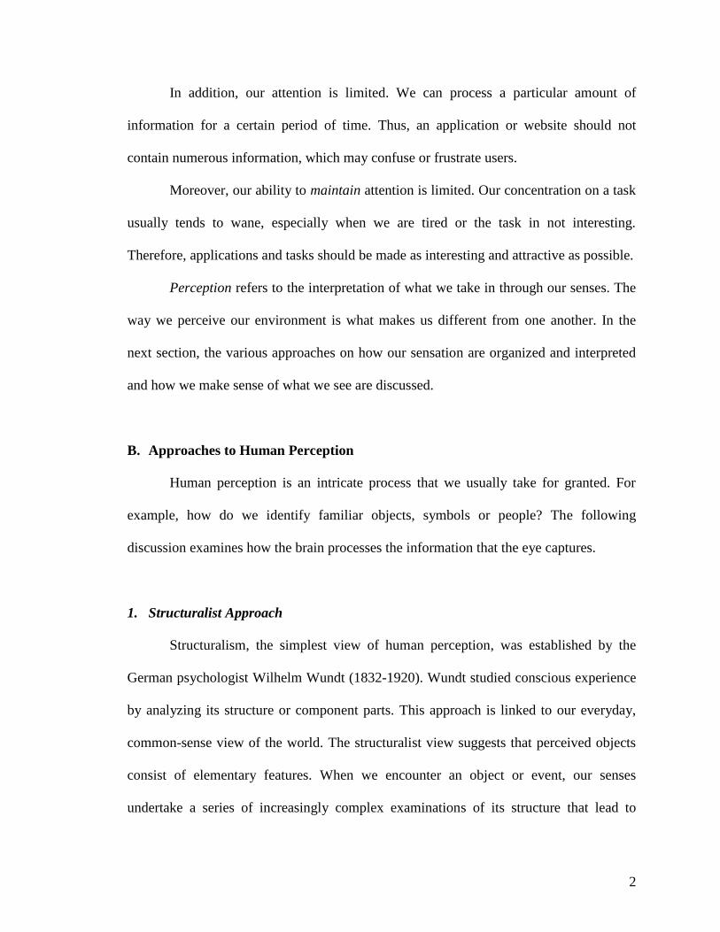
Our brain can use information about the context in which a symbol appears. It can
use the contextual information to verify the symbol, so that we can see complete and
meaningful words. Thus, contextual perception has also application for interface design.
For instance, an icon design that means one thing in one part of the interface might mean
something completely different in another place. An illustration of this is a checkbox as
shown:
This symbol usually indicates that an item is selected. However, the same symbol
represents for “Close” when located in the top right corner of a window in Microsoft
Windows. In this example, we perceive different buttons in the different contexts, but
with the same representation.
World Knowledge
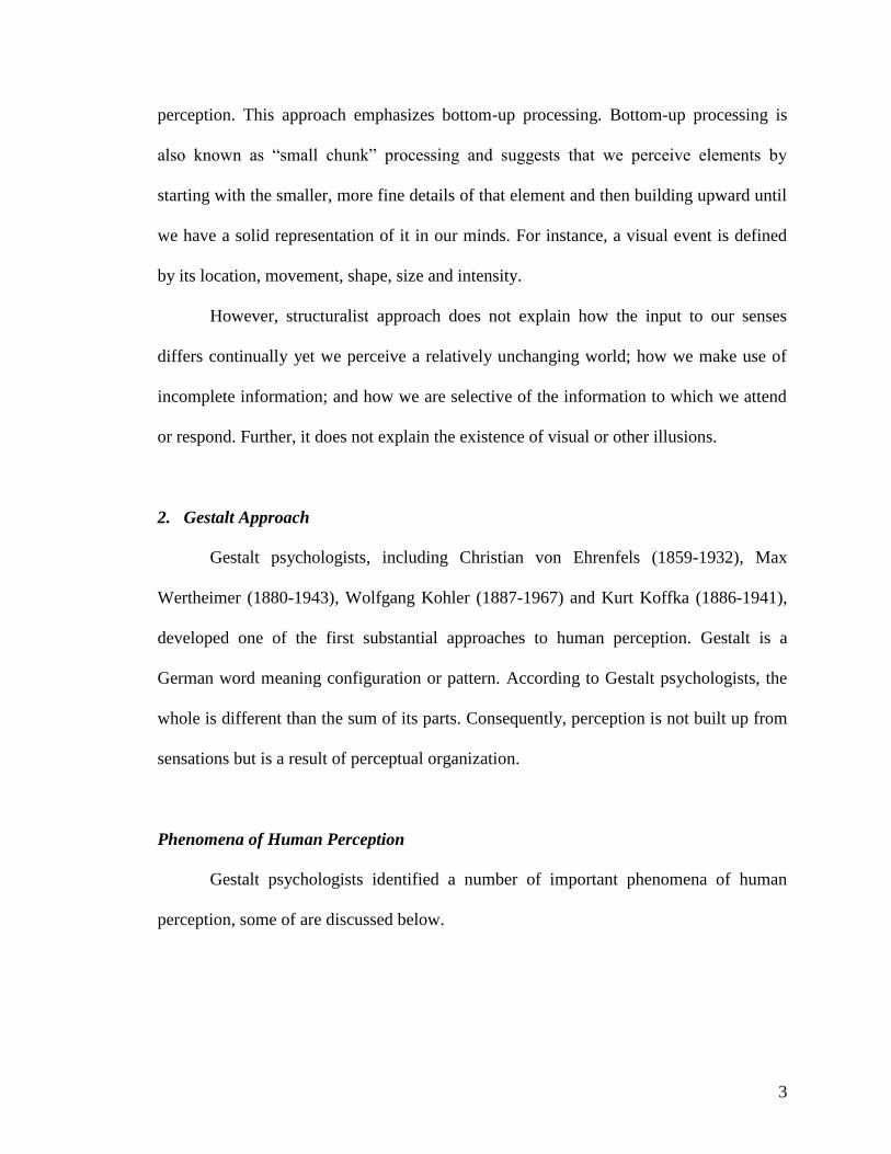
Our exposure to and encounter with various objects and events in the world since
our childhood have afforded us an immense amount of knowledge. This knowledge is
utilized by our perceptual systems in order for us to identify objects which are partially
obscured. In the three figures below, we can easily recognize that the middle one is an
apple, even though almost half of the original information is obscured. However, the third
figure is much difficult to determine since much more information is missing.
X
5
The illustration above indicates that edge and contour information is essential.
Other information, such as color, may no longer be needed. Although an apple, which
largely depends on color to recognize it, can be quickly identified in black and white.
This implies that we may show an object in silhouette or only those lines that most
clearly define the object, especially where screen resolution is limited.
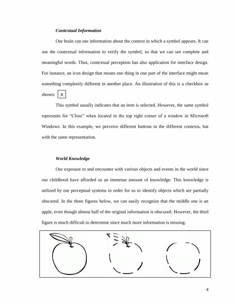
Figure and Ground
“Figure and ground” refers to the way we determine what part of environment is
the figure so that it stands out from the background. When you look at the figure below,
what do you see? Do you see two people facing each other? Or do you see a vase?
Edgar Rubin, a Danish psychologist, was the first to systematically investigate the
figure-ground phenomenon. The phenomenon captures the idea that in perceiving a visual
field, some objects take a prominent role (the figures) while others recede into the
background (the ground).
If the viewer could hardly distinguish the figure from the background, he may be
confused and this results to misinterpretation. Therefore, it is vital to clearly differentiate
between figure and background in order to produce definite pictures and symbols.
6
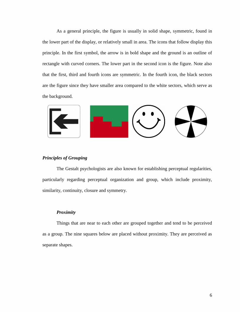
As a general principle, the figure is usually in solid shape, symmetric, found in
the lower part of the display, or relatively small in area. The icons that follow display this
principle. In the first symbol, the arrow is in bold shape and the ground is an outline of
rectangle with curved corners. The lower part in the second icon is the figure. Note also
that the first, third and fourth icons are symmetric. In the fourth icon, the black sectors
are the figure since they have smaller area compared to the white sectors, which serve as
the background.
Principles of Grouping
The Gestalt psychologists are also known for establishing perceptual regularities,
particularly regarding perceptual organization and group, which include proximity,
similarity, continuity, closure and symmetry.
Proximity
Things that are near to each other are grouped together and tend to be perceived
as a group. The nine squares below are placed without proximity. They are perceived as
separate shapes.
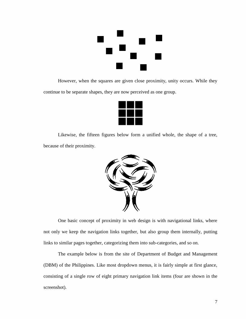
7
However, when the squares are given close proximity, unity occurs. While they
continue to be separate shapes, they are now perceived as one group.
Likewise, the fifteen figures below form a unified whole, the shape of a tree,
because of their proximity.
One basic concept of proximity in web design is with navigational links, where
not only we keep the navigation links together, but also group them internally, putting
links to similar pages together, categorizing them into sub-categories, and so on.
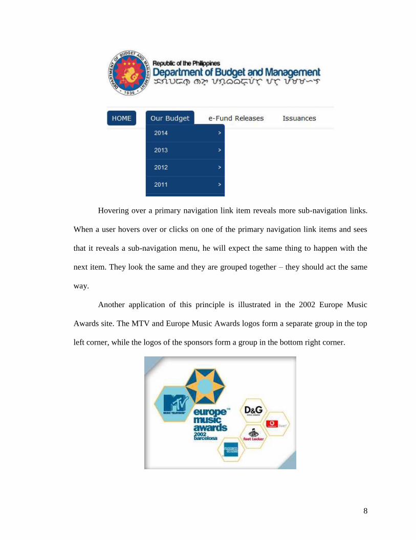
The example below is from the site of Department of Budget and Management
(DBM) of the Philippines. Like most dropdown menus, it is fairly simple at first glance,
consisting of a single row of eight primary navigation link items (four are shown in the
screenshot).
8
Hovering over a primary navigation link item reveals more sub-navigation links.
When a user hovers over or clicks on one of the primary navigation link items and sees
that it reveals a sub-navigation menu, he will expect the same thing to happen with the
next item. They look the same and they are grouped together – they should act the same
way.
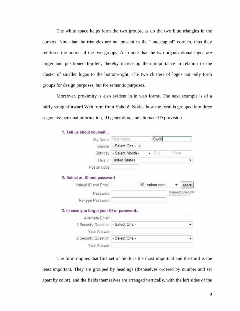
Another application of this principle is illustrated in the 2002 Europe Music
Awards site. The MTV and Europe Music Awards logos form a separate group in the top
left corner, while the logos of the sponsors form a group in the bottom right corner.
9
The white space helps form the two groups, as do the two blue triangles in the
corners. Note that the triangles are not present in the “unoccupied” corners, thus they
reinforce the notion of the two groups. Also note that the two organizational logos are
larger and positioned top-left, thereby increasing their importance in relation to the
cluster of smaller logos to the bottom-right. The two clusters of logos not only form
groups for design purposes, but for semantic purposes.
Moreover, proximity is also evident in in web forms. The next example is of a
fairly straightforward Web form from Yahoo!. Notice how the form is grouped into three
segments: personal information, ID generation, and alternate ID provision.
The form implies that first set of fields is the most important and the third is the
least important. They are grouped by headings (themselves ordered by number and set
apart by color), and the fields themselves are arranged vertically, with the left sides of the
10
field aligned with one another. All of this reinforces the relationships of the of three
groups of information, sorted by importance. Proximity is used to indicate grouping and
importance.
Similarity
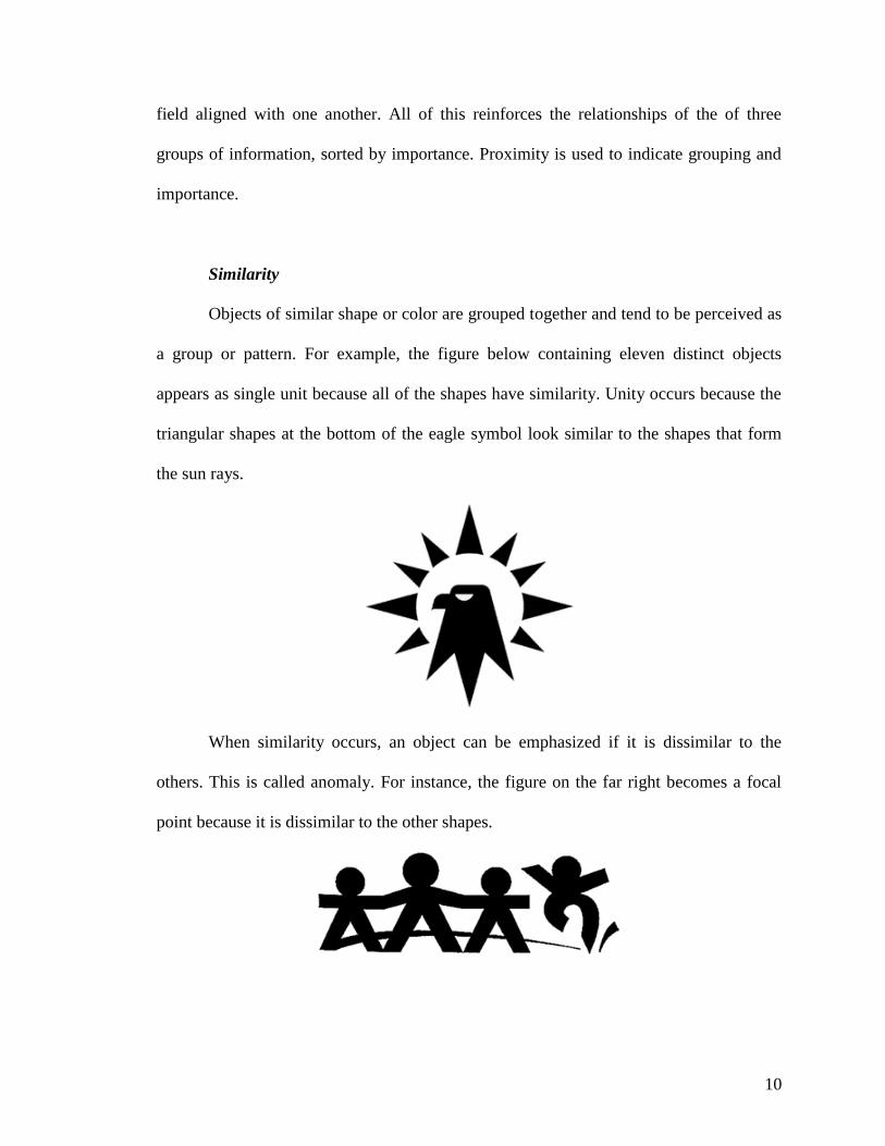
Objects of similar shape or color are grouped together and tend to be perceived as
a group or pattern. For example, the figure below containing eleven distinct objects
appears as single unit because all of the shapes have similarity. Unity occurs because the
triangular shapes at the bottom of the eagle symbol look similar to the shapes that form
the sun rays.
When similarity occurs, an object can be emphasized if it is dissimilar to the
others. This is called anomaly. For instance, the figure on the far right becomes a focal
point because it is dissimilar to the other shapes.
11
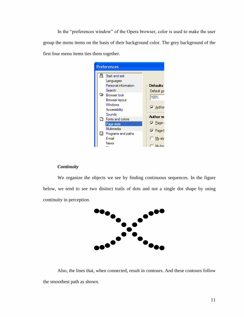
In the “preferences window” of the Opera browser, color is used to make the user
group the menu items on the basis of their background color. The grey background of the
first four menu items ties them together.
Continuity
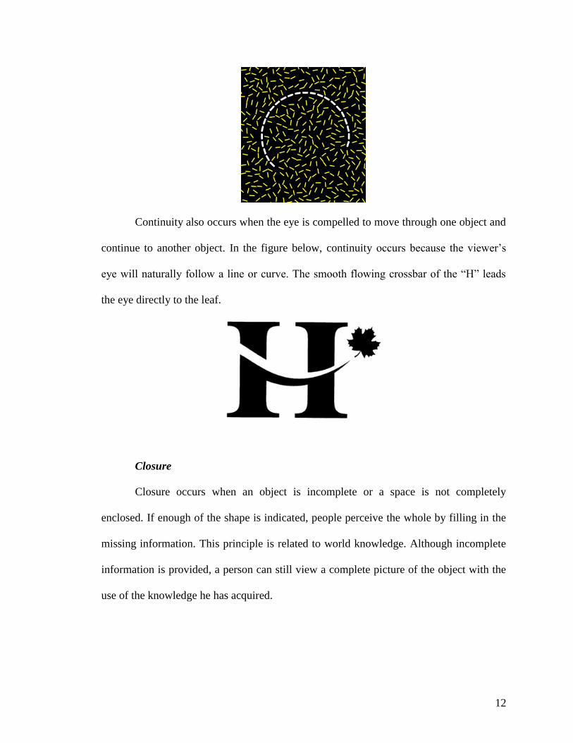
We organize the objects we see by finding continuous sequences. In the figure
below, we tend to see two distinct trails of dots and not a single dot shape by using
continuity in perception.
Also, the lines that, when connected, result in contours. And these contours follow
the smoothest path as shown.
12
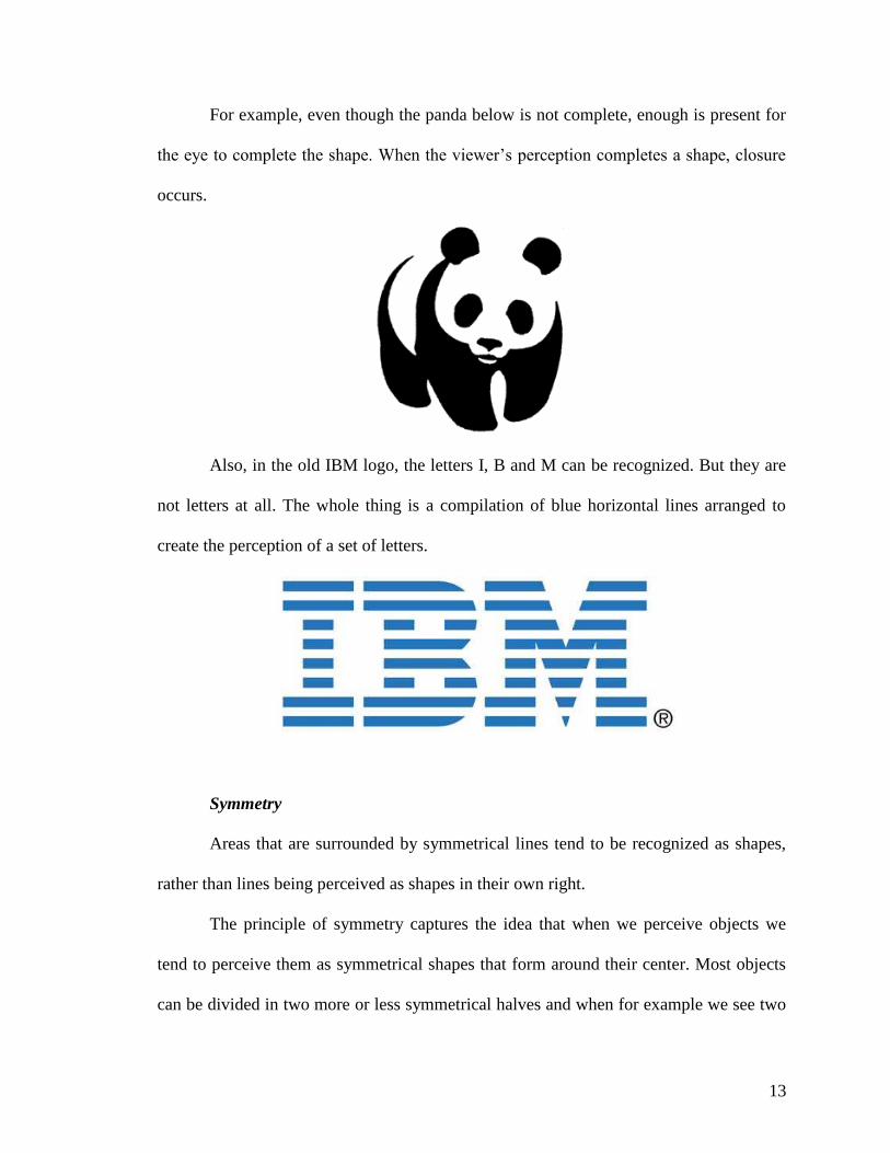
Continuity also occurs when the eye is compelled to move through one object and
continue to another object. In the figure below, continuity occurs because the viewer’s
eye will naturally follow a line or curve. The smooth flowing crossbar of the “H” leads
the eye directly to the leaf.
Closure
Closure occurs when an object is incomplete or a space is not completely
enclosed. If enough of the shape is indicated, people perceive the whole by filling in the
missing information. This principle is related to world knowledge. Although incomplete
information is provided, a person can still view a complete picture of the object with the
use of the knowledge he has acquired.
13
For example, even though the panda below is not complete, enough is present for
the eye to complete the shape. When the viewer’s perception completes a shape, closure
occurs.
Also, in the old IBM logo, the letters I, B and M can be recognized. But they are
not letters at all. The whole thing is a compilation of blue horizontal lines arranged to
create the perception of a set of letters.
Symmetry
Areas that are surrounded by symmetrical lines tend to be recognized as shapes,
rather than lines being perceived as shapes in their own right.
The principle of symmetry captures the idea that when we perceive objects we
tend to perceive them as symmetrical shapes that form around their center. Most objects
can be divided in two more or less symmetrical halves and when for example we see two
14
unconnected elements that are symmetrical, we unconsciously integrate them into one
coherent object (or percept). The more alike objects are, they more they tend to be
grouped.
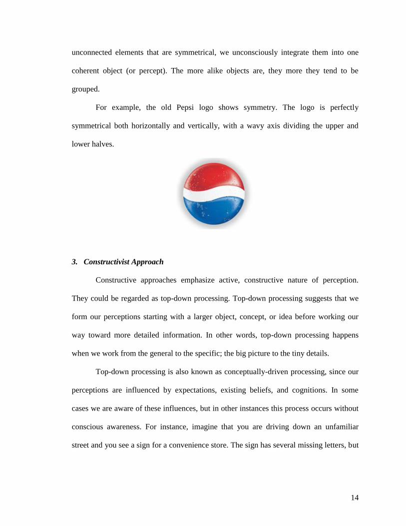
For example, the old Pepsi logo shows symmetry. The logo is perfectly
symmetrical both horizontally and vertically, with a wavy axis dividing the upper and
lower halves.
3. Constructivist Approach
Constructive approaches emphasize active, constructive nature of perception.
They could be regarded as top-down processing. Top-down processing suggests that we
form our perceptions starting with a larger object, concept, or idea before working our
way toward more detailed information. In other words, top-down processing happens
when we work from the general to the specific; the big picture to the tiny details.
Top-down processing is also known as conceptually-driven processing, since our
perceptions are influenced by expectations, existing beliefs, and cognitions. In some
cases we are aware of these influences, but in other instances this process occurs without
conscious awareness. For instance, imagine that you are driving down an unfamiliar
street and you see a sign for a convenience store. The sign has several missing letters, but
15
you are still able to read it because you use top-down processing and rely on your
existing knowledge to make an educated guess about what the sign says.
Therefore, when designing icons and visual elements, the designer must have a
thorough understanding of users’ prior knowledge so that they will be properly guided in
formulating hypothesis and interpretation.
C. Implications for Interactive System Design
The different approaches to understanding human perception provide significant
insights in designing interactive systems. Some of the implications are as follows.
Considering the importance in perception of top-down processes, namely:
expectations, context, ideas and preferences, system design should match the
expectations and preferences of the users.
As bottom-up processes are essential in perception, the objects and tasks in the
application should be designed carefully to attract, retain and enhance the
attention of the users and be clear enough that their use can be easily understood.
Automatic processes or perceptual habits and deliberate processes should be
allowed for. That is, the screen designs should be compatible with users’ habits
and automatic responses and also make it clear how users should use purposeful
actions.
Users are accustomed to automatically filling in the gaps of incomplete
information. Thus, the system design should enable users to fill in the gaps
correctly.
16
The screen designs should also enable users to identify key objects and tasks.
Context gives meaning to a symbol. Thus, screen designs should integrate icons
that match with the users’ experience and setting to avoid ambiguity and
confusion about their meaning.
D. Cultural Factors that Impact the Design of Interactive Systems
The culture in which we grow up greatly influences our perceptions, thoughts and
actions. Form this aspect, culture is a target audience-oriented process in terms of the
design interface. In this process, cultural qualities of an individual, group, society, or
class described as the target audience become more of an issue (Honold, 2000). Cultural
qualifications contain the priorities, interests, personal perceptions, and values of the
audience characterized as user. Cultural qualifications can show variety among societies,
and directly affect the quality of the design accordingly.
The concept of culture in the design media can be identified as reflections of
emotions, behaviors, and the way of thinking of the individuals considered as users.
Hofstede’s (1980) approach, which contains five different dimensions of culture, appears
to be effective in the culturalization process of design media. The five main cultural
dimensions that include culturally sharp distinctions are: Power Distance, Collectivism
vs. Individualism, Femininity vs. Masculinity, Uncertainty Avoidance, and Long- and
Short-Term Orientation.
According to Hofstede (1980); power distance expresses the differences and the
perception styles changing from culture to culture in terms of the acceptances and
17
expectations upon equality of power distribution between more powerful and less
powerful members of associations, organizations, and groups in a society.
Individualism-Collectivism describes the distance between collective preferences
brought by the social life of the cultures where environmental factors, such as family,
friends, colleagues, are dominant and personal preferences in decision- making process of
individuals in social life. Individualism is the distance where the influence of the extent
of individuals’ connection with their culture is minimum on the decision-making process.
Collectivism means that decision-making process of individuals takes place free from
individual questioning in the context of cultural expectations and strong relations.
Masculinity-Femininity (MAS) dimension contains the highlights between men and
women over the content of social roles and differences between highlights and degrees in
different countries. MAS dimension is basically based upon clear discrimination of social
preferences, roles and expectations between femininity and masculinity. Hofstede (1980)
states that in MAS dimension, success and result-based preferences come into forefront in
the masculine-dominant societies. On the other hand, the process is more important in
feminine-dominant societies. In this dimension, femininity displays affectionate,
unassertive, and life quality-based perception styles whereas masculinity exposes an
ambitious, endurable and materialist understanding of success.
Uncertainty Avoidance dimension is about the competence range over decision-
making and application processes. This dimension regards the perception of the members
of a culture on uncertain and unknown situations. Cultures differ from each other on the
dimension of avoidance from the uncertainty. Different rituals, varied values based upon
formality, perceptions on time concept, legal-local-social entailments, and tolerance
18
range concerning uncertainty, in fact; demonstrate the type of differences that societies
have in uncertainty avoidance dimension.
For Long-term (time) orientation, Hofstede separates eastern and western
countries. He emphasizes that eastern countries mostly focus on application and virtual
behaviors while western countries focus on belief and the search of truth.
Adapting Hofstede’s theory on five different dimensions of culture to interactive
media design creating process, Marcus and Gold (2000), who reconsidered the process in
planning, searching, analysis, design, development, evaluation, documentation, trial,
and application phases, detected some components in which the effects can be felt in the
designing process. The first of these is metaphors. Metaphors are cultural highlights that
lead to permanence in the images of the design and content. Another component consists
of the presentation of the mental model, appropriate organization and organization
functions, roles, and data in the designing process. Navigation is the motion of the control
panels and dialog boxes of menus within the arrangement of designing process.
Appearance is how design emerges with visuals sound, and text content and others.
Marcus (2002) highlights the necessity to pay attention to local cultural
qualifications in addition to the reality of multi-nationalism and multiculturalism for
creating globally valid designs. In user interface designs, intercultural qualifications
include local, religious, historical and aesthetic characteristics of a culture; and local
designs shall meet the requirements in some specific local scales. Marcus and Gould
(2000) listed the components consisting cultural factors in interactive interface designs as
user necessities, priorities, metaphors, appearance, mental pattern, and navigation.
19
According to Hofstede (1980), countries show high Power Distance (PD) focus on
hierarchy and authority. From Marcus and Gould’s (2000) point of view, in interactive
media designs, PD factor can be detected as a metaphor in this way: If there are visuals,
expressions, and content from which hierarchy and authority of that culture can be felt in
a web site design, the quality of that site about metaphors is an indicator of high PD.
While cultures with high PD indicator adopt more imposing, more organized and
clearly classified design structure; cultures with low PD indicator prefer a simple,
informally organized and classified design structure. When PD indicator is considered in
terms of web design, clear indicators of configuration (web site map, and details of
communication data, etc.) become obvious. In a web site, structural indicators about each
page’s content can also be indicators of high PD. Besides, while web sites are enriched
with options such as open access, multiple choices, and shared path within the scope of low
PD, structures that enable choices that users are led by the design can be discerned. In
interaction dimension, the type of interaction content is accepted as an indicator of high and
low PD. While interactions are informative, leading, supportive, and guiding for the
mistakes or errors made by the user in low PD dimension, this approach may not be leading
or may be more adamant and more implicit in high PD countries. In appearance dimension,
countries with high PD indicator may be content with the visuals, logos, sounds, colors,
slogans, or page setup related to that particular regime, nation, culture, or specific items in
the content of design. As to low PD indicator, cultures may prefer activities of daily life,
popular images, symbols, page settings, or colors (Marcus & Gould, 2000).
Marcus and Gould (2000) states that, in high and low Collectivism vs.
Individualism (IDV) designs, it is important whether the achievements, objects, and
20
expectations of the community to which the design belongs to are mentioned individually
or communally. One can talk about high IDV in a design where success concerns the
whole community.
Metaphors in the design are expected to appear male or female in terms of
Femininity vs. Masculinity (MAS) dimension of culture. In the context of metaphors,
communities in which femininity is prominent are expected to have visuals with
femininity theme such as family, shopping, female figure, whereas in male-dominated
communities visuals with masculinity theme such as competitions, sport, meetings, etc.,
are expected to appear. In terms of mental model, in countries with high level of MAS,
one can talk about a process-oriented design structure with more social interaction while
in the others with low level of MAS, there may be more goal-oriented design structure.
Concerning navigation in countries with low level of MAS, there is more functionality
and practicality on directing whereas in the others with high level of MAS designs which
are more elaborative and with more individualistic choices regarding masculinity draw
attention. Use of vivid colors and prominent figures in the designs is a low MAS
indicator while softer colors and figures can be described as the markers of high MAS
(Marcus & Gould, 2000).
In Uncertainty Avoidance (UA) dimension, high numbers of metaphors and
markers regarding the aim of a design in both the content and visuals of a web design are
signs of high UA. As for communities with high UA level, the messages, content, and
visuals which are clear and prominent are associated with the lives of individuals, and
direct meanings are deliberate preferences. In a web site about a certain topic, the
existence of more visuals and the choice of messages related to daily life indicate high
21
level of UA. However more general, more symbolic, and less detailed visuals, messages,
and contents can be accepted as a mark of low UA value. In high UA-signaled countries;
while designs with simple, clear and limited choices, and less user tolerance over
mistakes or failure to meet the expectations are discussed, more tolerant approaches are
evident in terms of mental model in the others with low UA. Regarding navigation
cultures with high UA, navigation options of the site have more clear and adamant rules
while in cultures with low UA, navigations can be enriched for the users by various
alternatives and choices on the use of the site. In terms of page view and occurrence;
while there is tolerance towards unexpected and extraordinary options in the cultures with
low UA indicator, going beyond the ordinary view may not be positively regarded in the
cultures with high UA indicator (Marcus & Gould, 2000).
Long vs. short term (time) orientation (LTO) may appear in the content in terms
of mental model. Reference of corporate objectives, short and long- term expectations,
and aims in the content can be accepted as LTO. If, in the content, corporate quality is
mentioned together with current content, one can talk about STO. Indicators concerning
long and short-term targets can be admitted as data for LTO and STO in the sense of
interactions and the development of the site (Marcus & Gould, 2000).
As a concrete example, there are strong cultural reasons why the most user-
friendly menu, usually the File menu, is in the top left corner of the screen. This is so
because people in a western culture start reading from the top left-hand corner and
proceed across the top until moving on the next line. On the other hand, someone from
China reads in columns, so it might be more culture-sensitive to put the menu down the
left edge of the screen.
22
III. CONCLUSION
Perception is vital in designing interactive systems. A prerequisite to perception is
attention, which involves selection of one of many possible perceptual and mental
activities to focus on. Thus, system designs should attract and hold users’ attention to the
objects and tasks in the application. Otherwise, users will fail in carrying out tasks or
perform a similar, familiar task in place of the desired one. Also, focusing users’ attention
to the wrong components of a user interface can result to distraction, and eventually
failure in the tasks.
The common approaches to perception include structuralist, Gestalt and
constructivist approach. Each of these approaches has significant implications to systems
design. Also, human perceptual systems are shaped by culture. Therefore, a
comprehensive and in-depth understanding of human perception and its limitations as
well as the role of cultural factors is the key to the successful design interfaces.
REFERENCES
Hofstede, G. (1980). Culture’s consequences, international differences in work-related
values. Beverly Hills, CA: Sage.
Honold, P. (2000). Culture and context: An empirical study for the development of a
framework for the elicitation of cultural influence in product usage. International
Journal of Human-Computer Interaction, 12(3-4), 327-345.
Marcus, A. (2002). Global and intercultural user-interface design. In J. A. Jacko & A.
Sears (Eds.), The human-computer interaction handbook: Fundamentals, evolving
technologies and emerging applications (pp. 441-462). Mahwah, NJ: Lawrence
Erlbaum.
23
Marcus, A., & Gould, E. W. (2000). Crosscurrents: Cultural dimensions and global Web
user-interface design. Interactions, 7(4), 32-46.
Soegaard, M. (2005). Gestalt principles of form perception. Available at
http://www.interaction-design.org/encyclopedia/gestalt_principles_of_form_
perception.html
Stanford Encyclopedia of Philosophy. (2006). Wilhelm Maximilin Wundt. Available at
http://plato.stanford.edu/entries/wilhelm-wundt/