Codes and Conventions of contents pages in Music Magazines
9
PRODUCTION TASK CODES AND CONVENTIONS INTO CONTENTS PAGE OF MUSIC MAGAZINES By Phoebe McCarthy 12RP2
-
Upload
phoebeconnie -
Category
Design
-
view
486 -
download
1
Transcript of Codes and Conventions of contents pages in Music Magazines
PRODUCTION TASK CODES AND CONVENTIONS
INTO CONTENTS PAGEOF MUSIC MAGAZINES
By Phoebe McCarthy 12RP2
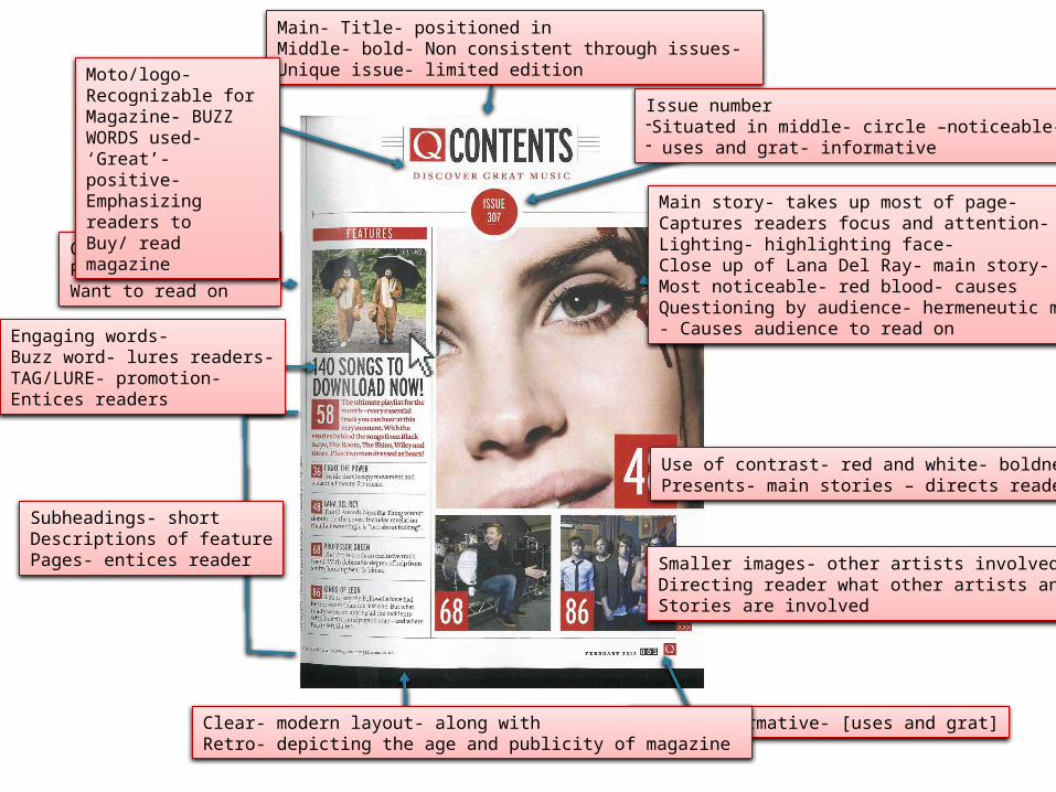
Main- Title- positioned in Middle- bold- Non consistent through issues- Unique issue- limited edition
Issue number -Situated in middle- circle –noticeable-- uses and grat- informative
Main story- takes up most of page-Captures readers focus and attention-Lighting- highlighting face-Close up of Lana Del Ray- main story-Most noticeable- red blood- causes Questioning by audience- hermeneutic model- Causes audience to read on
Smaller images- other artists involved- Directing reader what other artists and Stories are involved
Use of contrast- red and white- boldness-Presents- main stories – directs reader
Date- informative- [uses and grat]Clear- modern layout- along with Retro- depicting the age and publicity of magazine
Subheadings- shortDescriptions of featurePages- entices reader
Comical image-Reader questioning-Want to read on
Engaging words-Buzz word- lures readers-TAG/LURE- promotion-Entices readers
Moto/logo-Recognizable for Magazine- BUZZ WORDS used- ‘Great’- positive-Emphasizing readers to Buy/ read magazine
Q CODES AND CONVENTIONS
• The magazine Q copies their direct masthead onto every issue, this is a continuous feature of the magazine. This enables the magazine contents page to be recognizable for the audience. The famous logo and constant use of the bold contrasting colours [red and white] not only become recognizable to the audience but also engage with the reader. However I am not able to use this feature in my final production as I am only making one issue of a contents page however throughout my front cover, contents page and double age spread I hope to use the same colour scheme to make the magazine look more professional and attractive.
• The layout of the this particular issue, is a key feature that enables the magazine to look modern yet retro. In my opinion I especially like the different block shapes to create the layout. For example the different sized squares for the images and feature numbers, I feel like this is a good yet unique way to depict what is in the magazine by creating a more younger look. I would like to use this concept in my contents page as my target audience is based within the younger generation and I feel like this catch the attention of the younger generation.
• Furthermore onto the design the block colours used throughout the page are white, red and black I feel like again this makes the magazine look very professional along with this Q magazine have used images as the main perception, enabling them to be the first feature the audience see, directing the consumers to the main stories. I wish to use this factor in my final production.
• Another convention of the contents page, is the ‘caught of guard’, ‘urban’ images apart from the main image, the smaller features include a more causal photograph, I feel that this again engages with the younger generation everything is not so mart, therefore I would like to use this my final production.
Issue number- shows recentInformation- [uses and grat]-Informative towards the reader
Short description-Feature pages- lures readerIn- informing what is in Involved in the magazine
Use of different sized images-Looks more interesting-keepingreaders attention in a positive way
Large page number-Informs readers about the main stories
White boarder aroundNumber- professional look
Varied sized fonts- simple toFigure out and know where the Story is in the magazine
No masthead – unique- original
Quotes- key feature In Contents- credibility- insightInto main story- creates a Personal relationship between Artists and audience
NME CODES AND COVENTIONS
• On of the main key features, that caught my eye in NME’s contents was the use of large, bold numbers to depict the page numbers. The use of a white box out behind contrasted with the black and appeared bigger and more distinct to the audience. When first looking at the page, this is the first thing the audience would see, not only does it clearly inform the audience of the were all the features are placed in the magazine. It also makes the magazine look more professional and fun, by not just listing the page references, appealing to the younger generation. I wish to use this convention in my contents production.
• By NME not using their distinguishable logo, and using bold text to clearly state to the audience what is ‘INSIDE THIS WEEK’; this peruses a more casual appearance, appealing to the younger generation as the layout and fonts used are not all in the same text and you as a reader do not receive what you think you are in the magazine, (by their logo not being used in the contents) this is a key feature for why the magazine is so successful with the younger generation especially.
• The use of very different pictures throughout the contents page, engages the reader as it appears unique and the images invite you to look at them as they are not what you expect to see; the use of casual pictures [not model images] again appeal to the younger generation, I would like to include this convention in my final production as by re searching into the range of music magazines, my main aim is for my magazine pages to appeal to my target audience of 16-25 year olds.
• Finally the use of quotes from the various artists portray the magazine to be credible, this is a positive impact towards the magazine as the audience will be directed to the different stories as they know the stories are real and not made up by the use of quotes.
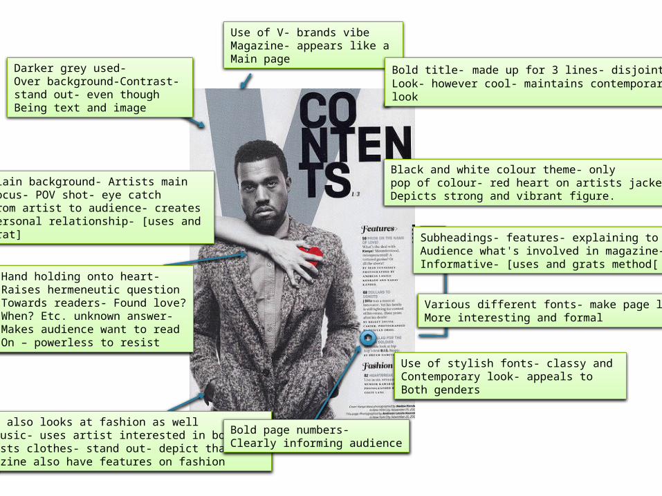
Use of V- brands vibe Magazine- appears like a Main page
Bold title- made up for 3 lines- disjointedLook- however cool- maintains contemporary look
Black and white colour theme- only pop of colour- red heart on artists jacket-Depicts strong and vibrant figure.
Plain background- Artists mainFocus- POV shot- eye catch From artist to audience- creates Personal relationship- [uses and Grat]
Hand holding onto heart-Raises hermeneutic questionTowards readers- Found love?When? Etc. unknown answer-Makes audience want to readOn – powerless to resist
Vibe also looks at fashion as well As music- uses artist interested in both-Artists clothes- stand out- depict that the Magazine also have features on fashion
Bold page numbers-Clearly informing audience
Use of stylish fonts- classy and Contemporary look- appeals toBoth genders
Subheadings- features- explaining to Audience what's involved in magazine-Informative- [uses and grats method[
Various different fonts- make page lookMore interesting and formal
Darker grey used-Over background-Contrast- stand out- even thoughBeing text and image
VIBE CODES AND CONVENTIONS
• One convention I think makes VIBE a classic and a successful magazine is the continuous feature of the ‘V’ shape in the contents. In VIBE magazines the ;letter ‘V’ is made up of using bold font, lines shapes etc. This is a significant feature as it symbolizes the name of the magazine without including the masthead making the magazine more interesting and classy. In my contents page I would like to use this feature somehow to get the same look.
• The disjointed title; adds a great effect and engages the reader thoroughly as it is not seen is many magazines, making this contents different to any other. Furthermore towards this I especially like this due to the cool look yet still maintaining the contemporary feel and look of the magazine.
• The use of various different fonts again makes the magazine very unique and recognizable. On the contents, where the features are many different fonts are used this makes the features really stand out also depicting the fashion and design side of the magazine. Using quirky fonts is a main convention I want to use in my production.
• The black and white model image along with the simplistic colour scheme allows the magazine to be perceived to the audience that the magazine features a classy, young and contemporary design and layout.
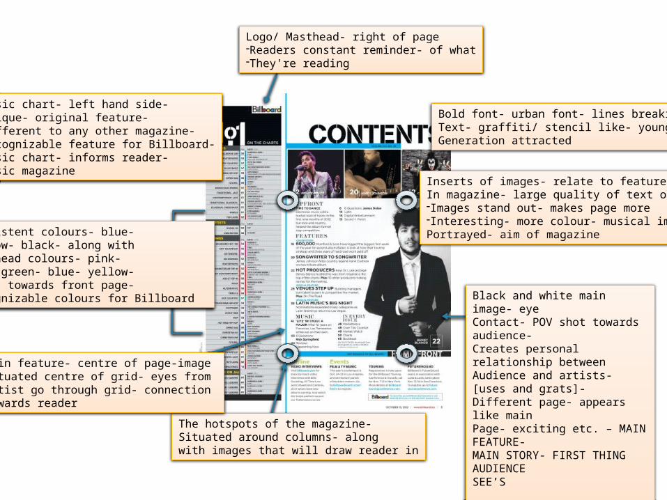
Logo/ Masthead- right of page-Readers constant reminder- of what-They're reading
Bold font- urban font- lines breaking upText- graffiti/ stencil like- younger Generation attracted
Inserts of images- relate to featuresIn magazine- large quality of text on page-Images stand out- makes page more-Interesting- more colour- musical image Portrayed- aim of magazine
Black and white main image- eye Contact- POV shot towards audience- Creates personal relationship between Audience and artists- [uses and grats]-Different page- appears like main Page- exciting etc. – MAIN FEATURE-MAIN STORY- FIRST THING AUDIENCE SEE’S
The hotspots of the magazine-Situated around columns- along with images that will draw reader in
Main feature- centre of page-image Situated centre of grid- eyes fromArtist go through grid- connection Towards reader
Consistent colours- blue-Yellow- black- along with Masthead colours- pink-Red- green- blue- yellow-Links towards front page-Recognizable colours for Billboard
Music chart- left hand side-Unique- original feature-Different to any other magazine-Recognizable feature for Billboard-Music chart- informs reader- Music magazine
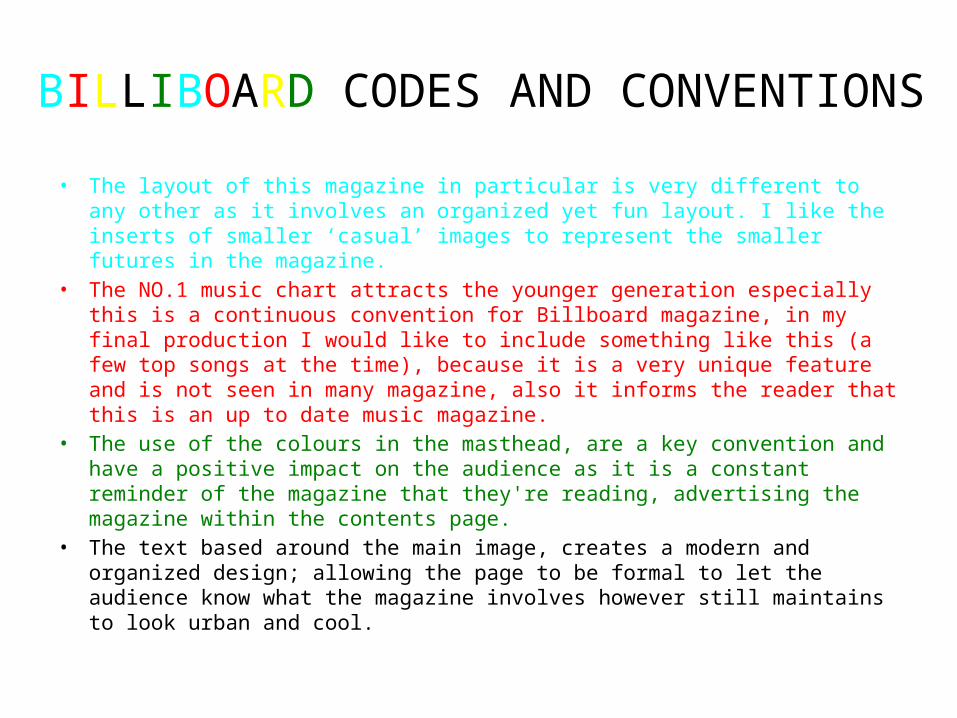
BILLIBOARD CODES AND CONVENTIONS • The layout of this magazine in particular is very different to any other as it involves
an organized yet fun layout. I like the inserts of smaller ‘casual’ images to represent the smaller futures in the magazine.
• The NO.1 music chart attracts the younger generation especially this is a continuous convention for Billboard magazine, in my final production I would like to include something like this (a few top songs at the time), because it is a very unique feature and is not seen in many magazine, also it informs the reader that this is an up to date music magazine.
• The use of the colours in the masthead, are a key convention and have a positive impact on the audience as it is a constant reminder of the magazine that they're reading, advertising the magazine within the contents page.
• The text based around the main image, creates a modern and organized design; allowing the page to be formal to let the audience know what the magazine involves however still maintains to look urban and cool.