Codes and conventions double page
9
Production Task- Research into Codes and Conventions of DOUBLE PAGE Harry Gupta
-
Upload
harry-gupta -
Category
Social Media
-
view
196 -
download
0
Transcript of Codes and conventions double page
Production Task-Research into
Codes and Conventions of
DOUBLE PAGE
Harry Gupta
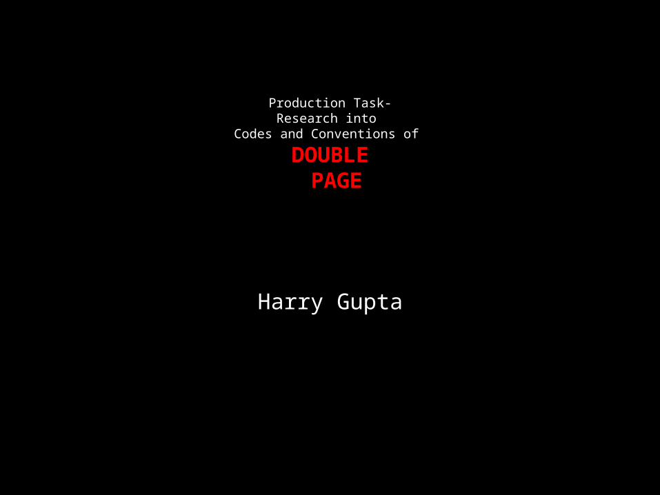
Model, Lady Gaga positioned with chains covering her hands which are holding her breasts as she poses in a suggestive way. Underneath the chains she is presumably nude- appealing to a male audience, attracting the male gaze. Uses and grat.
There is a big bold red letter ‘L’ centered across the right hand page- covering parts of the information in red. This links into the style and logo of ‘Q’ magazine and creates a romantic sensual feeling, when looking at the letter and the model. The red ‘L’ also links into the start of the article and of the model, Lady Gaga herself (as it is the starting letter of her stage name).
The lighting and colour of the image conveys a sexual indication as well as a romanticism.
Lady Gaga, stares facing the camera, allowing the audience to react form this creating them to form a personal relationship with her, as to why she is holding her breasts with chains around her neck- hermeneutic question- uses and grat.
There doesn't’t seem to be a title for this double page spread- besides the title of the artist. At the top right hand side of the page, in fancy lower case italics is the word ‘Lady’ (using feminine font for the word ‘lady’) and uppercase sharp letters for ‘GAGA’. This sense of direction creates an importance to the reader implying that this article is definitely about her.
Drop capitals usually at the start of an article but in this they’re on the start of new paragraphs.The colour scheme to this magazine consists of three colours, black white and red as do many other previous magazines.

Q Codes and Conventions• They have used contrasting make up in the image for Gaga• Image in keeping with the house style of red, black and white.• Classy, sophisticated image look- kept image dedicated to the
whole of the first page and the article to the second page however still linking in the two pages together with the colour scheme.
• Tidy column structure- maintaining the quirkiness of GAGA by having a giant ‘L’ overlapping the text.
• Typical reading habit of having the image on the left and the text on the right- I intend on using this to my advantage when I make my double page spread.

House style clearly pink and peach- model, Nicki Minaj displays that with flashes of pink on her lips and a part on her dress. It is carried out throughout the article with big upper case letters saying “NICKI MINAJ” and headers here and there to highlight something important in the article.
Masthead, “THE GOSPEL ACCORDING TO NICKI MINAJ” suggests the theme of religion and a ‘holy’ article. This could entice a wider target audience than was expected. However only on this double page spread does Minaj talk about 6 of the 10 commandments earlier discussed.
The image of Minaj is almost central and it catches the audience’s attention as she is dressed in a bright animal patterned clothing, wearing rather bold, loud ‘iconic’ jewelry.
The text content is biased and based towards a younger target audience as it is subtly incorporating religion without forcing it upon the reader. In addition to this the information has been broken down into smaller sections. As a result to this, the language is simplified down, so that it is easier to read. In addition to the target audience, with the house style as pink, it is obvious that it is biased towards teenage girls.
When asked in the article about her new image, Minaj replied “I really toned down the sexual stuff. There was no need for me to do it.” this helps the reader understand why she is now an ‘icon’ for younger teenage girls- and why parents would be opposed to their kids buying the magazine.

Codes and Conventions• The title of the magazine is unknown, however they have continued
the house theme of pink, white and black throughout the magazines double page spread.
• They’ve used contrasting fonts, from italics to bolds to small fonts to larger fonts, from black fonts to pink fonts.
• They’ve dominated the page by having large Nicki centered in the middle of the page. This agrees with the status mentioned in the article that she is ‘The Queen’ and ‘Savior’ as they have portrayed her as this big bold icon.
• Included religion in article, creates wider target audience.• Mise en scene is fun bright animal printed tight dress- along side a
funky pose by Nicki.• Name as an enticing title.
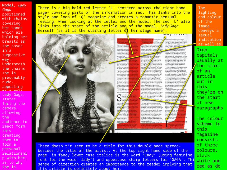
No clear mast head- just quote from what model, Lily Allen had to say. Black and white text- in a magazine/newspaper print – gives off effect. The artist is known for being very verbal and unconventional- explaining the strange choice of text. However, I don’t think that I would want half of my double page dominated by a big unessesary quote.
Model wearing red links into style of NME magazine as well as being outlined (background) by white. She dominates the right page. Going against the typical view of picture on the left and text on the right- disturbs the readers pattern.
Limited amount of text in the article. Mainly all the same size of font- creating continuity and neatly displayed columns- easy to read.
I think that I will attempt to keep the big picture in my double page spread- however will not have ½ of my double page spread dominated by a quote. It is wasting space, where you could’ve made the actual contents of the information bigger and easier to read- or add mire information in. Hermeneutic Qn- why the big bold quote.
We are provided with a mid shot of the model, with hands placed on hips and looking directly at us. This creates direct address and creates a personal connection with Allen and the audience. Uses & Grats.
House style of black white and red (from her shirt and writing). This is a commonly used house style, much like the Q GAGA magazine.
NME Codes and Conventions(ALLEN)
• Image on right hand side instead of left- disturbs the layout of reader.
• Unnecessary big bold quote in middle of page- dominating half of page.
• Name highlighted in red implying significance- in my double page spread I intend on having the models name bigger and bolder.
• Contrasting colours of red, white and black to create the house style.
• No clear recognizable masthead• Text very small as squeezed in on bottom of page due to large
quote.• Model dominates right page. Mid shot.
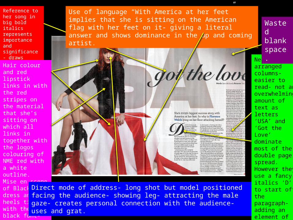
Reference to her song in big bold italics represents importance and significance- draws attention to that.
Hair colour and red lipstick links in with the red stripes on the material that she’s sitting on which all links in together with the logos colouring of NME red with a white outline.Mise en scene of Black dress and heels ties in with the black font- house style red, black and white.
Direct mode of address- long shot but model positioned facing the audience- showing leg- attracting the male gaze- creates personal connection with the audience- uses and grat.
Neatly arranged columns- easier to read- not an overwhelming amount of text as letters ‘USA’ and ‘Got the Love’ dominate most of the double page spread. However they use a fancy italics ‘D’ to start off the paragraph- adding an element of sophistication to the article.
Use of language “With America at her feet” implies that she is sitting on the American flag with her feet on it- giving a literal answer and shows dominance in the up and coming artist.
Wasted blank space.

NME Codes and Conventions(FLORENCE)
• Image on left hand side- comfortable for the reader.• Use of red throughout the article- suggesting romance and
passion as she wears a short black dress revealing a lot of her legs.
• There isn’t much text, (which I feel shouldn’t be the case) however, the image is very bold and striking that it is acceptable for it to control most of the focus towards the model.
• The contrast between colours, white background allows the model to stand out more.
• No clear recognizable masthead.• Text is quite small- could’ve been made bigger to fill up some of
the empty space.