Codes and convections of a film magazine
3
Codes and Convections of a film magazine Masthead: this is the name and title of the magazine, it is generally located at the top of the page, they are typically like this so then it is the first thing the reader sees, follows the rule of thirds convections. All mastheads are classically big and bold therefore grapping the reader’s attention. Also from my research I noticed that most film magazines feature sans-serif fonts all in capitals such as EMPIRE and TOTAL FILM two of the biggest film magazine, I think they do this as an another method to grab reader’s attention and to give the magazines a better aesthetic feel. Skyline: also known as the banner, it is essentially information at the top of the magazine which is created to give an overall summary of what’s inside. Generally, they are used if the magazine has some sort of special feature or it could be tagline for a for a particular film magazine itself. Overall they are a way to build excitement for the audience and provide a general overview of the theme of the issue.
Transcript of Codes and convections of a film magazine
Codes and Convections of a film magazine
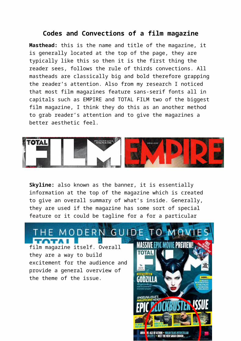
Masthead: this is the name and title of the magazine, it is generally located at the top of the page, they are typically like this so then it is the first thing the reader sees, follows the rule of thirds convections. All mastheads are classically big and bold therefore grapping the reader’s attention. Also from my research I noticed that most film magazines feature sans-serif fonts all in capitals such as EMPIRE and TOTAL FILM two of the biggest film magazine, I think they do this as an another method to grab reader’s attention and to give the magazines a better aesthetic feel.
Skyline: also known as the banner, it is essentially information at the top of the magazine which is created to give an overall summary of what’s inside. Generally, they are used if the magazine has some sort of special feature or it could be tagline for a for a particular film magazine itself. Overall they are a way to build excitement for the audience and provide a general overview of the theme of the issue.
Imagery: the imagery in magazines often prevails the main feature within the magazine, usually about a particular film which is up coming. The main imagery on magazines nearly always involves the main actor/s from the featured film. Secondary images can also be used; they are often located near the bottom in a horizontal film strip formation. These images are often shots from the film to tense the reader of upcoming films.

Colour scheme: usually the colour scheme used on the front on a magazine prevails the image and the film the image is representing, for example if the magazine was advertising a horror film there would most likely be the use of the colour red because that represents blood and death which horrors involve. Also the use of the colours can reflect the colour schemes of particular films for example Captain America Empire, the rest of the front cover adopted the colour scheme of red, white and blue which are the colours that the character Captain America wears and are shown to represent that film.
Buzz words: These are words or phrases that are designed to grasp the reader’s attention, most of the time words such as ‘free’ and ‘exclusive’ these help to entice the reader to buy the magazines. These persuasive devices can also include competitions that are another form to grasp the reader’s attention. Buzz words are
usually located along the top of the front cover to catch the readers eye.
Anchorage text: These are essentially sell lines that are on the cover to tell the audience what kind of information they will find inside. It tells the reader what the story inside will involve.