![User-Guided Clustering in Heterogeneous Information ...jiyang3.web.engr.illinois.edu/files/mochin.pdf · Clustering is a traditional and fundamental task in network mining [14]. In](https://static.fdocuments.in/doc/165x107/5f610663ef07681ea7570a2c/user-guided-clustering-in-heterogeneous-information-clustering-is-a-traditional.jpg)
Clustrophile 2: Guided Visual Clustering Analysis · clustering analysis and guided exploratory...
11
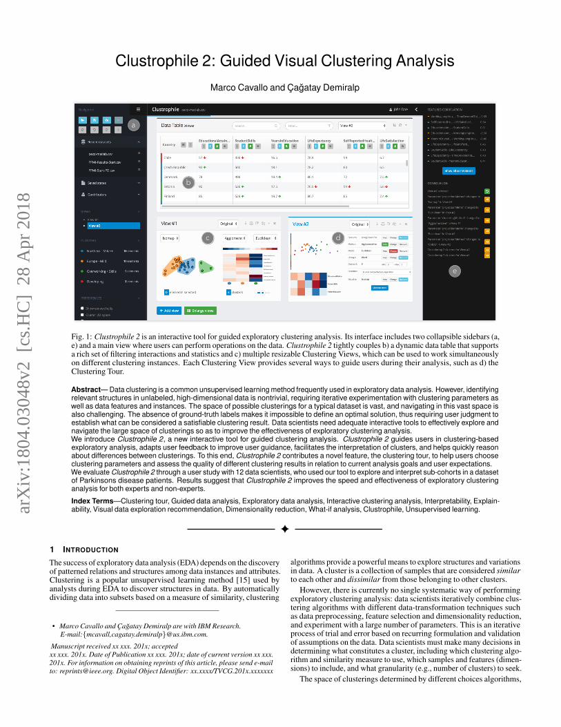
Clustrophile 2: Guided Visual Clustering Analysis Marco Cavallo and C ¸a˘ gatay Demiralp a b c e d Fig. 1: Clustrophile 2 is an interactive tool for guided exploratory clustering analysis. Its interface includes two collapsible sidebars (a, e) and a main view where users can perform operations on the data. Clustrophile 2 tightly couples b) a dynamic data table that supports a rich set of filtering interactions and statistics and c) multiple resizable Clustering Views, which can be used to work simultaneously on different clustering instances. Each Clustering View provides several ways to guide users during their analysis, such as d) the Clustering Tour. Abstract— Data clustering is a common unsupervised learning method frequently used in exploratory data analysis. However, identifying relevant structures in unlabeled, high-dimensional data is nontrivial, requiring iterative experimentation with clustering parameters as well as data features and instances. The space of possible clusterings for a typical dataset is vast, and navigating in this vast space is also challenging. The absence of ground-truth labels makes it impossible to define an optimal solution, thus requiring user judgment to establish what can be considered a satisfiable clustering result. Data scientists need adequate interactive tools to effectively explore and navigate the large space of clusterings so as to improve the effectiveness of exploratory clustering analysis. We introduce Clustrophile 2, a new interactive tool for guided clustering analysis. Clustrophile 2 guides users in clustering-based exploratory analysis, adapts user feedback to improve user guidance, facilitates the interpretation of clusters, and helps quickly reason about differences between clusterings. To this end, Clustrophile 2 contributes a novel feature, the clustering tour, to help users choose clustering parameters and assess the quality of different clustering results in relation to current analysis goals and user expectations. We evaluate Clustrophile 2 through a user study with 12 data scientists, who used our tool to explore and interpret sub-cohorts in a dataset of Parkinsons disease patients. Results suggest that Clustrophile 2 improves the speed and effectiveness of exploratory clustering analysis for both experts and non-experts. Index Terms—Clustering tour, Guided data analysis, Exploratory data analysis, Interactive clustering analysis, Interpretability, Explain- ability, Visual data exploration recommendation, Dimensionality reduction, What-if analysis, Clustrophile, Unsupervised learning. 1 I NTRODUCTION The success of exploratory data analysis (EDA) depends on the discovery of patterned relations and structures among data instances and attributes. Clustering is a popular unsupervised learning method [15] used by analysts during EDA to discover structures in data. By automatically dividing data into subsets based on a measure of similarity, clustering • Marco Cavallo and C ¸a˘ gatay Demiralp are with IBM Research. E-mail:{mcavall,cagatay.demiralp}@us.ibm.com. Manuscript received xx xxx. 201x; accepted xx xxx. 201x. Date of Publication xx xxx. 201x; date of current version xx xxx. 201x. For information on obtaining reprints of this article, please send e-mail to: [email protected]. Digital Object Identifier: xx.xxxx/TVCG.201x.xxxxxxx algorithms provide a powerful means to explore structures and variations in data. A cluster is a collection of samples that are considered similar to each other and dissimilar from those belonging to other clusters. However, there is currently no single systematic way of performing exploratory clustering analysis: data scientists iteratively combine clus- tering algorithms with different data-transformation techniques such as data preprocessing, feature selection and dimensionality reduction, and experiment with a large number of parameters. This is an iterative process of trial and error based on recurring formulation and validation of assumptions on the data. Data scientists must make many decisions in determining what constitutes a cluster, including which clustering algo- rithm and similarity measure to use, which samples and features (dimen- sions) to include, and what granularity (e.g., number of clusters) to seek. The space of clusterings determined by different choices algorithms, arXiv:1804.03048v2 [cs.HC] 28 Apr 2018
Transcript of Clustrophile 2: Guided Visual Clustering Analysis · clustering analysis and guided exploratory...
Clustrophile 2: Guided Visual Clustering Analysis
Marco Cavallo and Cagatay Demiralp
a
b
c
e
d
Fig. 1: Clustrophile 2 is an interactive tool for guided exploratory clustering analysis. Its interface includes two collapsible sidebars (a,e) and a main view where users can perform operations on the data. Clustrophile 2 tightly couples b) a dynamic data table that supportsa rich set of filtering interactions and statistics and c) multiple resizable Clustering Views, which can be used to work simultaneouslyon different clustering instances. Each Clustering View provides several ways to guide users during their analysis, such as d) theClustering Tour.
Abstract— Data clustering is a common unsupervised learning method frequently used in exploratory data analysis. However, identifyingrelevant structures in unlabeled, high-dimensional data is nontrivial, requiring iterative experimentation with clustering parameters aswell as data features and instances. The space of possible clusterings for a typical dataset is vast, and navigating in this vast space isalso challenging. The absence of ground-truth labels makes it impossible to define an optimal solution, thus requiring user judgment toestablish what can be considered a satisfiable clustering result. Data scientists need adequate interactive tools to effectively explore andnavigate the large space of clusterings so as to improve the effectiveness of exploratory clustering analysis.We introduce Clustrophile 2, a new interactive tool for guided clustering analysis. Clustrophile 2 guides users in clustering-basedexploratory analysis, adapts user feedback to improve user guidance, facilitates the interpretation of clusters, and helps quickly reasonabout differences between clusterings. To this end, Clustrophile 2 contributes a novel feature, the clustering tour, to help users chooseclustering parameters and assess the quality of different clustering results in relation to current analysis goals and user expectations.We evaluate Clustrophile 2 through a user study with 12 data scientists, who used our tool to explore and interpret sub-cohorts in a datasetof Parkinsons disease patients. Results suggest that Clustrophile 2 improves the speed and effectiveness of exploratory clusteringanalysis for both experts and non-experts.
Index Terms—Clustering tour, Guided data analysis, Exploratory data analysis, Interactive clustering analysis, Interpretability, Explain-ability, Visual data exploration recommendation, Dimensionality reduction, What-if analysis, Clustrophile, Unsupervised learning.
1 INTRODUCTION
The success of exploratory data analysis (EDA) depends on the discoveryof patterned relations and structures among data instances and attributes.Clustering is a popular unsupervised learning method [15] used byanalysts during EDA to discover structures in data. By automaticallydividing data into subsets based on a measure of similarity, clustering
• Marco Cavallo and Cagatay Demiralp are with IBM Research.E-mail:{mcavall,cagatay.demiralp}@us.ibm.com.
Manuscript received xx xxx. 201x; acceptedxx xxx. 201x. Date of Publication xx xxx. 201x; date of current version xx xxx.201x. For information on obtaining reprints of this article, please send e-mailto: [email protected]. Digital Object Identifier: xx.xxxx/TVCG.201x.xxxxxxx
algorithms provide a powerful means to explore structures and variationsin data. A cluster is a collection of samples that are considered similarto each other and dissimilar from those belonging to other clusters.
However, there is currently no single systematic way of performingexploratory clustering analysis: data scientists iteratively combine clus-tering algorithms with different data-transformation techniques suchas data preprocessing, feature selection and dimensionality reduction,and experiment with a large number of parameters. This is an iterativeprocess of trial and error based on recurring formulation and validationof assumptions on the data. Data scientists must make many decisions indetermining what constitutes a cluster, including which clustering algo-rithm and similarity measure to use, which samples and features (dimen-sions) to include, and what granularity (e.g., number of clusters) to seek.
The space of clusterings determined by different choices algorithms,
arX
iv:1
804.
0304
8v2
[cs
.HC
] 2
8 A
pr 2
018
parameters, and data samples and attributes is vast. The sheer size of thisexploration space is the first challenge in exploratory clustering analysis.Data scientists need tools that facilitate iterative, rapid exploration of thespace of data clusterings. The second important challenge is how to nav-igate efficiently in this large space, rather than mere ad hoc wandering.Therefore, clustering tools would benefit from incorporating techniquesthat guide users, imposing a structure over the space of clustering thatleads to efficient navigation. Although clustering is unsupervised bydefinition, we consider here the common case of complete absenceof labels for validation (sometimes referred to as “fully unsupervisedclustering”). If formal validation is not possible, how do we estimatethe meaningfulness of the outcome of a clustering algorithm? Usingthe concepts of cluster compactness (closeness of data points withinthe same cluster) and separation (how far a cluster is from others),different internal validation measures have been introduced to estimatethe “goodness” of a clustering and compare it to other clustering results.Though widely used, these metrics fail to incorporate the context of theanalysis and the users goals and her prior knowledge and expectations,which often have significant role in determining the meaningfulness ofa clustering result. For instance, if a user is interested in determining aset of progression states in Parkinson’s disease, discovering that the bestclustering—according to the Silhouette index—is that separating peopleaffected by the disease on their right side and those affected on their leftside is of limited use. Furthermore, each internal validation metric takesinto account slightly different characteristics of the data and should becarefully chosen based on the clustering task [23]. There is indeed noabsolute best criterion that, independently of the data and of the finalaim of the clustering, can establish the best result for the users needs.
We introduce Clustrophile 2, a new interactive tool for guidedclustering analysis. Clustrophile 2 guides users in clustering-basedexploratory analysis, adapts user feedback to improve user guidance,facilitates the interpretation of clusters, and helps reason quicklyabout differences between clusterings. To this end, Clustrophile 2contributes a novel feature, the Custering Tour, to help users chooseclustering parameters and reason about the quality of different clusteringresults in line with user’s analysis goals and expectations. We evaluateClustrophile 2 through a user study with 12 data scientists of varyingskill sets who used our tool to explore and interpret sub-cohorts in adataset of Parkinsons disease patients. We find that the Clustering Tourenables data scientists to discover algorithms and parameters that theyare unfamiliar with or hesitant to use. Similarly, the Clustering Tourhelps data scientists avoid prematurely fixing on a particular set of dataattributes or algorithmic parameters during exploratory analysis.
In addition to the Parkinson dataset used for the evaluation study, weuse the OECD Better Life (OECD for short) dataset [30] to demonstratethe use of our tool in figures throughout the paper. The OECD datasetconsists of eight numerical socioeconomic development indices of 34OECD member countries. Below we first summarize related work andthen discuss our design criteria for Clustrophile 2. We then present theuser interface of Clustrophile 2 along with the integrated visualizationsand interactions, operationalizing the design criteria presented. Thenwe introduce the clustering tour and the underlying graph model. Nextwe present a qualitative user study conducted with 12 data scientists,followed by an in-depth discussion of the study results. We concludeby summarizing our contributions and reflecting on lessons learned.
2 RELATED WORK
Clustrophile 2 draws from prior work on interactive systems for visualclustering analysis and guided exploratory data analysis.
2.1 Tools for Visual Clustering AnalysisPrior research applies visualization to improve user understanding ofclustering results across domains. Using coordinated visualizationswith drill-down/up capabilities is a typical approach in earlier interactivetools. The Hierarchical Clustering Explorer (HCE) [40] is an early andcomprehensive example of interactive visualization tools for exploringclusterings. It supports the exploration of hierarchical clusterings ofgene expression datasets through dendrograms (hierarchical clusteringtrees) stacked up with heatmap visualizations.
Earlier research has also introduced clustering comparison techniquesin interactive systems [6, 21, 24, 33, 40]. DICON [6] encodes statisticalproperties of clustering instances as icons and embeds them in the plane
on the basis of similarity using multidimensional scaling. Pilhofer etal. [33] propose a method for reordering categorical variables to alignwith each other, thus augmenting the visual comparison of clusterings.Others has proposed similar visual encoding techniques for comparingdifferent clusterings of data dimensions with applications to geneexpression datasets in mind. To that end, HCE [40], CComViz [53],Matchmaker [21], StratomeX [22] and XCluSim [24] all encodechanges across clusterings of dimensions by essentially tracing themwith bundled lines or ribbons.
Earlier work also proposes tools that incorporate user feedbackinto clustering. Matchmaker [21] builds on techniques from [40]with the ability to modify clusterings by grouping data dimensions.ClusterSculptor [29] and Cluster Sculptor [5] enable users to superviseclustering processes. Schreck et al. [39] propose using user feedbackto bootstrap the similarity evaluation in data space (trajectories, inthis case) and then apply the clustering algorithm. FURBY [43] letsusers refine or improve fuzzy clusterings by choosing a threshold,transforming fuzzy clusters into discrete ones.
ClustVis [27] uses both PCA and clustering heatmaps but in isolationwithout interaction or coordination. Clustrophile [7] coordinatesheatmap visualizations of discrete clusterings with scatterplot visual-izations of dimensionality reductions. It also enables ANOVA-basedsignificance testing and visual correlation analysis along with what-ifanalysis through dimensionality reduction scatterplots. Akin to Clus-trophile, ClusterVision [20] incorporates significance test and couplesclustering visualizations with dimensionality reduction scatterplots.Clustrophile 2 extends Clustrophile with 1) a richer set of clustering al-gorithms, 2) new features to guide users in clustering analysis, includingthe Clustering Tour, and 3) broader and deeper support for visual andstatistical analysis and validation of clustering instances and clusters.
2.2 Guiding Users in Exploratory Data Analysis
Prior research in data analysis propose various tools and techniquesto guide users in exploring low-dimensional projections of data. Forexample, PRIM-9 (Picturing, Rotation, Isolation, and Masking—inup to 9 dimensions) [10] enables the user to interactively rotate themultivariate data and view a two-dimensional projection of the datacontinuously updated. Motivated by user behavior in the PRIM-9 system,Friedman and Tukey [11] propose first the projection index, a measurefor quantifying the “usefulness” of a given projection plane (or line),and then an optimization method, projection pursuit, to find projectiondirection that maximizes the projection index value. The proposedindex considers projections that result in large spread with high localdensity to be useful (e.g., highly separated clusters). In a complementaryapproach, Asimov introduces the grand tour, a method for viewingmultidimensional data via orthogonal projections onto a sequence of two-dimensional planes [2]. Asimov considers a set of criteria such as density,continuity, and uniformity to select a sequence of projection planes fromall possible projection planes. Hullman et al. [16] study how to generatevisualization sequences for narrative visualization. Similar to Hullmanet al., Clustrophile 2 also models the visual exploration space as a graph.However, Clustrophile 2 uses an undirected graph model and focuses onmodeling clustering state space. GraphScape [18] extends Hullman etal. with an actionable model implemented using the Vega-Lite grammarand a new transition cost function. Akin to GraphScape, Clustrophile 2’smodeling of the state space and state transitions is actionable. WhileGraphScape purely considers chart specifications without taking data oruser preferences into consideration, Clustrophile 2 transitions considerboth data, clustering parameters, and user preferences.
Visualization recommender systems also model the space of visualexploration and evaluate various measures over the space to decide whatto present the user. For instance, Rank-by-Feature [41], AutoVis [50],Voyager [51], SeeDB [47], and Foresight [8] use statistical features andperceptual effectiveness to structure the presentation of possible visu-alizations of data. Clustrophile 2 also provides methods for enumerationand ranking of visual exploration. However, while recommendationsystems typically focus on suggesting individual charts based onattributes, Clustrophile 2 uses the Clustering Tour to focus on clusteringsand their visualizations, complementing existing recommender systems.SOMFlow [38] enables iterative clustering together with self-organizingmaps (SOMs) to analyze time series data. To guide users, SOMFlowalso uses clustering quality metrics. Clustrophile 2 goes beyond the use

of quality metrics, considering user feedback, clustering parameters,data features along with interpretable explanations in guiding users.
3 DESIGN CRITERIA
We identify a set of high-level design criteria to be considered indeveloping systems for interactive clustering analysis. These criteriaare based both on research literature and on the regular feedback wereceived from data scientists during the development ofClustrophile 2.D1: Show variation within clusters Clustering is useful for groupingdata points based on similarity, thus enabling users to discover salientstructures. The output of clustering algorithms generally consists ina finite set of labels (classes, clusters) to which each data point belongs.In fuzzy clustering, the output is the probability of belonging to oneof those classes. However, in both cases the user receives little or noinformation about the differences among data points in the same cluster.Clustrophile 2 combines various visualizations of the data—table, scat-terplots, matrix diagrams, distribution plots—to facilitate the explorationof data points at different levels of granularity. In particular, scatterplotsrepresent dimensionally reduced data and thus provide a continuousspatial view of similarities among high-dimensional data points.D2: Allow quick iteration over parameters The outcome of aclustering task is highly dependent on a set of parameters: some of themmay be chosen based on the type of data or the application domain,others are often unknown a priori and require iterative experimentationto refine. Clustrophile 2 enables users to interactively update and applyclustering and projection algorithms and parameters at any point whilestaying in the context of their analysis session.D3: Represent clustering instances compactly It is important forusers be able to examine different clustering instances fluidly and inde-pendently without visual clutter or cognitive overload. We define “clus-tering instance” to be the outcome of a clustering algorithm accordingto specific parameters. The Clustrophile 2 interface uses the “Cluster-ing View” element as the atomic component representing a clusteringinstance. Clustering View pairs a projection scatterplot and a clusteringheatmap, using two complementary visualizations. A compact, self-descriptive representation is also useful for visually comparing differentclustering instances. Clustrophile 2 lets users work simultaneouslyon multiple Clustering Views, which can be freely organized by usersacross the interface and help them keep track of how different choicesof features, algorithms and distance measures affect clustering results.D4: Facilitate interpretable naming How to attach meaning to the“learned” structures in clustering is an important yet challenging problem.It is essential to facilitate the meaningful naming and description of clus-ters and clustering instances. For each cluster computed, Clustrophile 2designates the cluster centroid as the cluster representative and assignsits identifier as the cluster name. Clustrophile 2 lets the user freelyrename the cluster according to her understanding of the data.D5: Support analysis of large datasets The ability to interactivelyexplore and analyze large datasets is important for analysts in many do-mains and has been a major request of our collaborators. Clustrophile 2adopts caching, precomputation, sampling and feature selection, whichcan be considered a form of importance sampling, to support analysiswith larger datasets. Addressing computational scalability also helpsmitigate the visual scalability issues. Clustrophile 2 also supportscommon interaction techniques such as panning & zooming and visualgrouping with smooth convex-hull patches to reduce visual clutter.Finally, Clustrophile 2 lets the user select a set of “preferred features”that will have higher rendering priority in situations in which it wouldbe hard to represent many data features, as in the matrix plot (heatmap)of the Clustering View.D6: Support reasoning about clusters and clustering instancesUsers often would like to know what features (dimensions) of the datapoints are important in determining a given clustering instance, or howdifferent choices of features or distance measures might affect the cluster-ing, or whether it is a “valid” or “good” clustering. Users also would liketo understand the characteristics of data points in a given cluster that dis-tinguish the cluster from other clusters and how these data points cometo be in the cluster. Clustrophile 2 dynamically chooses a combinationof metrics based on the data and user preference in supporting clusteringanalysis. It also includes automated metric suggestions, visual explana-tions (e.g., decision-tree based cluster visualization), quantitative indi-cators (e.g., stability and confidence scores), textual descriptions and hy-
a
b
Proportional cluster sizes
Parameters
Rows = featuresColumns = clusters
Blue: low values, Red: high values
Cluster number slider
Fig. 2: Clustering View, representing a clustering instance. a) Ascatterplot shows the rows of the dataset projected on a 2D plane,where distance encodes the similarity between data points, whereas b)a heatmap allows easy comparison of clusters (represented by columns)by feature (row). Clustrophile 2 supports displaying multiple ClusteringViews at a time, allowing users to compare different clustering results.
perlinks to help user better interpret results and make informed decisions,eschewing the blind use of clustering parameters and validation methods.D7: Promote multiscale exploration Clustering requires users to it-eratively generate hypotheses and try to validate them. Consequently,it is fundamental for interpretability and trust to arm the user with theability to reach the same solution in multiple ways, thus enabling dataexploration at multiple scales. Clustrophile 2 integrates views to com-pare and analyze single clustering results, drill down the perspectiveof single clusters, identify potential subclusters and even inspect singlepoints with respect to their feature distribution. Clustrophile 2 lets usersview statistical summaries for each cluster and perform “isolation” [11],which enables splitting clusters characterized by mild features into moresignificant subclusters. Dynamic filtering and selection of single datapoints are also implemented and coupled with statistical analysis to iden-tify and eventually remove outliers and skewed distributions in the data.D8: Keep a stateful representation of the current analysis One ofthe primary motivations for data analysts in using interactive toolsis to increase their productivity or save time. The iterative nature ofa clustering analysis continuously forces users to try out differentparameters and features, perform a set of computations and decide whichof the many directions to take nextmaking the analysis session extremelyhard to reproduce. Clustrophile 2 enters each operation performed byusers in a log, enabling them to undo/redo single operations and alsoto review the workflow of their analysis.D9: Guide users in clustering analysis Due to the number of possiblecombinations, iterative experimentation on different clusteringparameters can be non-trivial or time consuming, and becomes evenmore challenging in a high-dimensional dataset. Furthermore, mostusers do not know in detail the advantages and disadvantages ofclustering or projection methods, sometimes choosing them blindly andsimply trying all possible parameter combinations. It is thus importantthat the system provide assistance to the user in navigating complexclustering spaces, while incorporating the user’s feedback in the process.Clustrophile 2 provides textual explanations with suggestions on when itcould be worth using certain parameters with references (hyperlinks) toexisting literature. Clustrophile 2 also provides automated suggestionsbased on the dataset currently analyzed, on previous computationsand on user preferences. Clustrophile 2 introduces a novel feature,the Clustering Tour. The Clustering Tour recommends a sequenceclusterings based on clustering configuration choices, data features, anduser feedback. It samples the clustering space promoting coverage inthe absence of user feedback. When the user “likes” a recommendedclustering, Clustrophile 2 recommends “nearby” clusterings.
4 USER INTERFACE AND INTERACTIONS
In this section we briefly describe the main components of theClustrophile 2 interface and interactions. Clustrophile 2 has beendeveloped iteratively according to the design considerations introducedin the previous section. We refer back to the relevant design criteria tomotivate our design choices. Clustrophile 2 interface consists of a main,

a b
dOutliers
Cluster colors Enable/disable feature
cOpen statistics panel
Fig. 3: Data table showing the dataset associated to the current Clus-tering View in tabular format. A user can dynamically filter the tableby a) searching text and b) matching expressions. The user can also c)enable/disable data attributes to exclude/include them in analysis, sortthe table by a feature value, and display feature histograms along withsummary statistics. For each data point, a color band shows the assignedcluster and up and down rows, respectively green and red, highlight high-and low-value outliers. d) The statistics panel shows, for each feature, his-togram density estimation, aggregate statistics and top correlations of thecurrent attribute (blue) with the remaining attributes in the dataset (gray).
central view Fig. 1, two collapsible sidebars (left Fig. 1 and right Fig. 1)and multiple modal windows displayed with relevant interactions.
The left sidebar (or Navigation Panel) contains a button menu toimport datasets from comma-separated-values (CSV) files, load datafrom previous analyses and export the results (i.e. clusters, chart images)of the current session. Clustrophile 2 supports saving the current state ofthe analysis (D8) for follow-up analysis and sharing it with contributorswho are also listed in the Navigation Panel. The right sidebar (hidden bydefault) records a log of the operations and parameter changes made bythe user (Fig. 1), enabling him easily to revert the analysis to a previousstate (D8). A convenient list of the top pairwise feature correlationsin the dataset is also displayed (Fig. 1), facilitating a quick overviewof statistical dependencies. The main view is subdivided into an upperregion containing the Data Table (Fig. 1) and a lower region that displaysone or more clustering views. Clustrophile 2 in fact enables datascientists to work simultaneously on multiple clustering instances (D3),but at the same time links the coordinated Data Table view to only oneinstance at a time. The currently selected clustering instance is generallythe one the user last interacted with, and its corresponding ClusteringView is marked with a blue header. The selected instance and its clusternames are also made available in the Navigation Panel (Fig. 1).
4.1 Visualization ViewsClustering View A Clustering View (Fig. 2) represents a singleclustering instance and has the goal of both visualizing the identifiedclusters and characterizing them based on their distinctive features. Inour user interface, the Clustering View also lets the user dynamicallychange projection and clustering parameters for an associated clusteringinstance, and keeps them always visible for easier comparison withother Clustering Views.
The minimal set of visualizations we choose to summarize aclustering instance consists of a scatterplot (Fig. 2, left) and a heatmap(Fig. 2, right). The scatterplot provides a two-dimensional projection ofthe data obtained using dimensionality reduction and encodes clusteringassignments through color. Since clustering algorithms divide datainto discrete groups based on similarity, projections are a natural wayto represent different degrees of variation within and between groupsas distance between elements (D1). Each cluster of points can also beidentified by a colored convex hull, simplifying the visualization in caseof a larger number of data points (D5).
The heatmap aims instead at providing a qualitative and quantitativedescription of each cluster based on the aggregate feature values ofthe data points it contains. Each column of the matrix represents acluster; rows represent data features (dimensions). The color of eachcell encodes the average value of cluster members for a specific featurewith respect to the feature distribution. For instance, in the heatmap inFig. 2 the dark red cell indicates that the Red cluster is characterized byvery high WORKINGLONGHOURS, whereas the dark blue cells indicatethat the same cluster has very low EDUCATIONALATTAINMENT andSTUDENTSKILLS (i.e., red means higher values, blue lower values).
This way, each cluster can be quickly described (D6) by observingthe heatmap vertically (e.g. intense colors indicate the key featuresidentifying a cluster, mild colors indicate average values); similarly,clusters can be compared by looking horizontally at the matrix diagram(e.g., from the second row of the heatmap, it is easy to see that the greencluster is the one with highest STUDENTSKILLS). By hovering on eachcell, the user can inspect the average feature value of each cluster andthe p-value associated to the current selection feature algorithm (whichencodes the relevance of a feature). Clusters are ordered from largest tosmallest and display their member number and color right beneath eachcolumn. Since with high-dimensional datasets (D5) the number of rowswould become too large, we display only the top ten relevant features,which are chosen automatically by a feature selection algorithm (moreon this later) or manually selected by the user.
Users can select one or more data points or clusters from both thescatterplot and the heatmap. When a selection is performed, it is re-flected in both visualizations and the Data Table. The isolation featurefurther lets users re-cluster and re-project only the selected points, anoperation particularly useful for finding subclusters (D7). From the Clus-tering View, users can dynamically change the parameters associatedto the associated clustering instance. Currently supported clusteringmethods include K-means, Agglomerative (Hierarchical), Spectral [42],DBSCAN [9], Birch [52], Cure [13] and CLIQUE [1] algorithms that,as applicable, can be combined with ten different clustering metrics andthree types of linkage strategies. Six types of projection methods are alsoavailable: PCA [45], MDS [19], CMDS [46], t-SNE [25], Isomap [44]and LLE [37]. Users can also define custom projection and clusteringalgorithms and metrics. We note that by default Clustrophile 2 appliesdimensionality reduction and clustering in high-dimensional space, andthen visualizes the results using, respectively, a scatterplot and a heatmap.
The user can control the number of displayed clusters through a sliderlocated underneath the heatmap (Fig. 2). Different numbers of clustersare automatically precomputed by Clustrophile 2 based on user settings,so that the user can quickly change the number of clusters withoutwaiting for further computations (D5). Another parameter that can bechosen from the clustering view is the sampling rate of the data; thisis useful for doing clustering in the presence of larger datasets (D5).Data Table While the Clustering View provides a high-level summary ofa clustering instance, it is fundamental for data scientists to be able to drilldown in the data and inspect individual data samples. The Data Tableview gives the user the raw data, supporting statistical analysis, automaticoutlier detection, selection and filtering. These features in particularmake it possible to reason about how single data points and feature dis-tributions affect the current clustering, and help the user decide which di-mensions should be considered or excluded by the clustering algorithm.
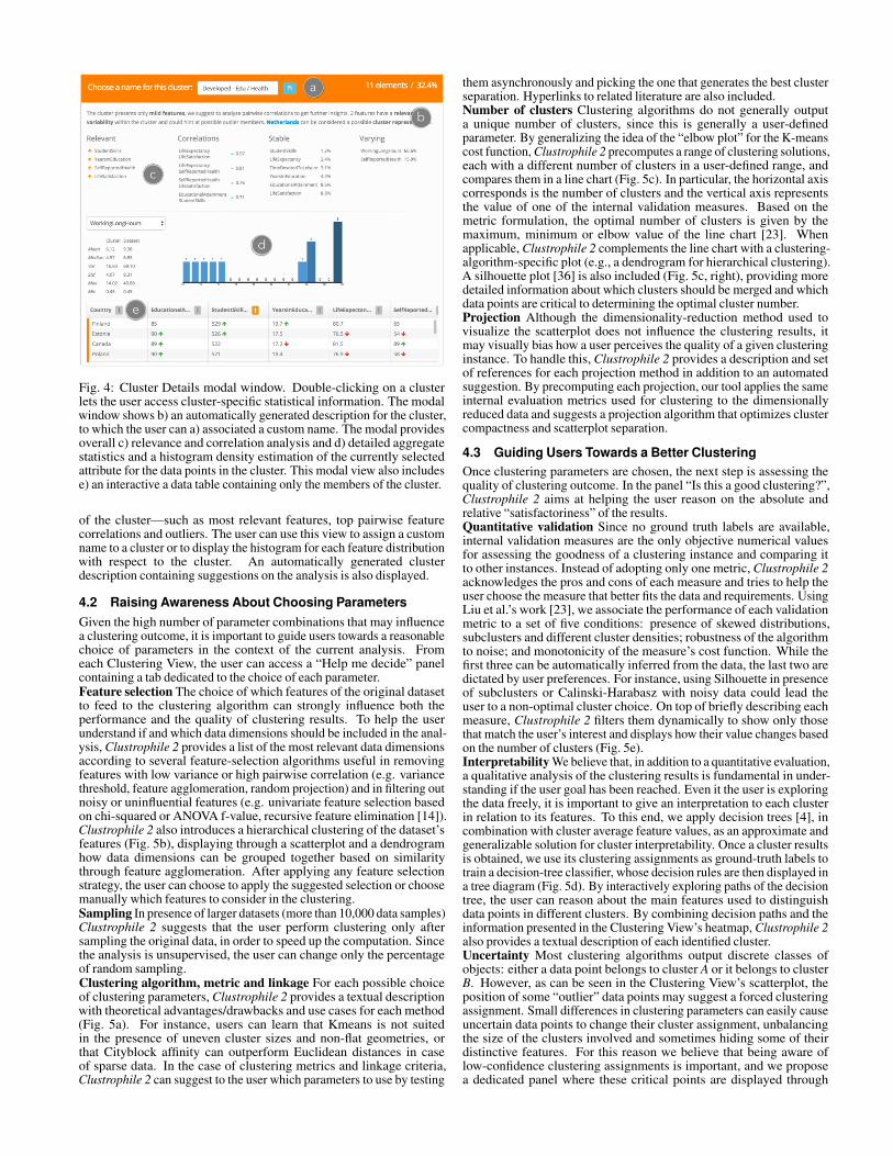
The Data Table (Figure 1a) contains a dynamic table visualizationof the current dataset in which each column represents a feature(dimension) and each row represents a data sample. The Data Tabledisplays the data and cluster assignments associated only to the currentlyselected Clustering View. For each row, a vertical, colored band encodesthe cluster of membership of the associated data sample (Figure 1b),whereas a set of green or red arrows respectively identify particularlyhigh or low feature values (“outliers”) with respect to each featuredistribution (Figure 1b). Clicking on the buttons next to each featurename orders rows by cluster or by column and displays basic statisticson a particular feature in a pop-up window (Figure 3d). In particular,Clustrophile 2 can compare the statistical values computed on thecurrently selected rows and those of the whole dataset (Figure 3g), plusa histogram plot of the feature distribution. A list of the features that cor-relate most to the selected feature is also given, allowing quick discoveryof data trends. The search functionality (Figure 3a) lets users select datasamples using arbitrary keyword search on feature names and values.Users can also filter the table using expressions in a mini-language(Figure 3b). For example, typing age>40&weight<180 dynamicallyselects data points across visualizations in which the fields age andweight satisfy the entered constraint. When some rows are selected,the corresponding points of the scatterplot and cluster columns in theheatmap in the current Clustering View are highlighted.Cluster Details While the Data Table works well for inspecting singledata points and feature distributions across the dataset, the ClusterDetails modal (Fig. 4) aims at a deeper characterization of a specificcluster. The modal can be opened by double-clicking on any cluster inthe user interface and contains statistical information about the members
a
c
d
e
b
Fig. 4: Cluster Details modal window. Double-clicking on a clusterlets the user access cluster-specific statistical information. The modalwindow shows b) an automatically generated description for the cluster,to which the user can a) associated a custom name. The modal providesoverall c) relevance and correlation analysis and d) detailed aggregatestatistics and a histogram density estimation of the currently selectedattribute for the data points in the cluster. This modal view also includese) an interactive a data table containing only the members of the cluster.
of the cluster—such as most relevant features, top pairwise featurecorrelations and outliers. The user can use this view to assign a customname to a cluster or to display the histogram for each feature distributionwith respect to the cluster. An automatically generated clusterdescription containing suggestions on the analysis is also displayed.
4.2 Raising Awareness About Choosing ParametersGiven the high number of parameter combinations that may influencea clustering outcome, it is important to guide users towards a reasonablechoice of parameters in the context of the current analysis. Fromeach Clustering View, the user can access a “Help me decide” panelcontaining a tab dedicated to the choice of each parameter.Feature selection The choice of which features of the original datasetto feed to the clustering algorithm can strongly influence both theperformance and the quality of clustering results. To help the userunderstand if and which data dimensions should be included in the anal-ysis, Clustrophile 2 provides a list of the most relevant data dimensionsaccording to several feature-selection algorithms useful in removingfeatures with low variance or high pairwise correlation (e.g. variancethreshold, feature agglomeration, random projection) and in filtering outnoisy or uninfluential features (e.g. univariate feature selection basedon chi-squared or ANOVA f-value, recursive feature elimination [14]).Clustrophile 2 also introduces a hierarchical clustering of the dataset’sfeatures (Fig. 5b), displaying through a scatterplot and a dendrogramhow data dimensions can be grouped together based on similaritythrough feature agglomeration. After applying any feature selectionstrategy, the user can choose to apply the suggested selection or choosemanually which features to consider in the clustering.Sampling In presence of larger datasets (more than 10,000 data samples)Clustrophile 2 suggests that the user perform clustering only aftersampling the original data, in order to speed up the computation. Sincethe analysis is unsupervised, the user can change only the percentageof random sampling.Clustering algorithm, metric and linkage For each possible choiceof clustering parameters, Clustrophile 2 provides a textual descriptionwith theoretical advantages/drawbacks and use cases for each method(Fig. 5a). For instance, users can learn that Kmeans is not suitedin the presence of uneven cluster sizes and non-flat geometries, orthat Cityblock affinity can outperform Euclidean distances in caseof sparse data. In the case of clustering metrics and linkage criteria,Clustrophile 2 can suggest to the user which parameters to use by testing
them asynchronously and picking the one that generates the best clusterseparation. Hyperlinks to related literature are also included.Number of clusters Clustering algorithms do not generally outputa unique number of clusters, since this is generally a user-definedparameter. By generalizing the idea of the “elbow plot” for the K-meanscost function, Clustrophile 2 precomputes a range of clustering solutions,each with a different number of clusters in a user-defined range, andcompares them in a line chart (Fig. 5c). In particular, the horizontal axiscorresponds is the number of clusters and the vertical axis representsthe value of one of the internal validation measures. Based on themetric formulation, the optimal number of clusters is given by themaximum, minimum or elbow value of the line chart [23]. Whenapplicable, Clustrophile 2 complements the line chart with a clustering-algorithm-specific plot (e.g., a dendrogram for hierarchical clustering).A silhouette plot [36] is also included (Fig. 5c, right), providing moredetailed information about which clusters should be merged and whichdata points are critical to determining the optimal cluster number.Projection Although the dimensionality-reduction method used tovisualize the scatterplot does not influence the clustering results, itmay visually bias how a user perceives the quality of a given clusteringinstance. To handle this, Clustrophile 2 provides a description and setof references for each projection method in addition to an automatedsuggestion. By precomputing each projection, our tool applies the sameinternal evaluation metrics used for clustering to the dimensionallyreduced data and suggests a projection algorithm that optimizes clustercompactness and scatterplot separation.
4.3 Guiding Users Towards a Better ClusteringOnce clustering parameters are chosen, the next step is assessing thequality of clustering outcome. In the panel “Is this a good clustering?”,Clustrophile 2 aims at helping the user reason on the absolute andrelative “satisfactoriness” of the results.Quantitative validation Since no ground truth labels are available,internal validation measures are the only objective numerical valuesfor assessing the goodness of a clustering instance and comparing itto other instances. Instead of adopting only one metric, Clustrophile 2acknowledges the pros and cons of each measure and tries to help theuser choose the measure that better fits the data and requirements. UsingLiu et al.’s work [23], we associate the performance of each validationmetric to a set of five conditions: presence of skewed distributions,subclusters and different cluster densities; robustness of the algorithmto noise; and monotonicity of the measure’s cost function. While thefirst three can be automatically inferred from the data, the last two aredictated by user preferences. For instance, using Silhouette in presenceof subclusters or Calinski-Harabasz with noisy data could lead theuser to a non-optimal cluster choice. On top of briefly describing eachmeasure, Clustrophile 2 filters them dynamically to show only thosethat match the user’s interest and displays how their value changes basedon the number of clusters (Fig. 5e).Interpretability We believe that, in addition to a quantitative evaluation,a qualitative analysis of the clustering results is fundamental in under-standing if the user goal has been reached. Even it the user is exploringthe data freely, it is important to give an interpretation to each clusterin relation to its features. To this end, we apply decision trees [4], incombination with cluster average feature values, as an approximate andgeneralizable solution for cluster interpretability. Once a cluster resultsis obtained, we use its clustering assignments as ground-truth labels totrain a decision-tree classifier, whose decision rules are then displayed ina tree diagram (Fig. 5d). By interactively exploring paths of the decisiontree, the user can reason about the main features used to distinguishdata points in different clusters. By combining decision paths and theinformation presented in the Clustering View’s heatmap, Clustrophile 2also provides a textual description of each identified cluster.Uncertainty Most clustering algorithms output discrete classes ofobjects: either a data point belongs to cluster A or it belongs to clusterB. However, as can be seen in the Clustering View’s scatterplot, theposition of some “outlier” data points may suggest a forced clusteringassignment. Small differences in clustering parameters can easily causeuncertain data points to change their cluster assignment, unbalancingthe size of the clusters involved and sometimes hiding some of theirdistinctive features. For this reason we believe that being aware oflow-confidence clustering assignments is important, and we proposea dedicated panel where these critical points are displayed through

Feature relevance
b c
Cost function
Silhouette plot
Validation metrics
Metrics variation with cluster number
f Reassignment of uncertain labels
a
e
Feature agglomeration
Feature clustering
Parameter suggestions
dDecision rules
Automated cluster description
Radius ~ Uncertainty Test for robustness
Fig. 5: Providing guidance in clustering analysis. The figure displays only a subsets of the views included in the “Help me decide” (top row) andthe “Is this a good clustering?” (bottom row) panels of each Clustering View. a) Textual explanations and hyperlinks are used to suggest clusteringparameters, b) different feature selection algorithms and visualizations are used to understand the relevance of data dimensions, and c) cost functionand metric plots are used to suggest a good number of clusters. To evaluate the “goodness” of a clustering, d) decision rules and automated clusterdescriptions are used to foster interpretability, e) several evaluation metrics are dynamically suggested, and f) uncertain clustering assignmentsare visualized and tested.
b
c
e
d
a
Fig. 6: Clustering Tour interface. Users can explore possible clusteringsolutions generated by our algorithm by simply clicking on the“Generate solution” button. On the left, a) previous solutions arelisted and compared, while b) the current one is represented througha scatterplot and a heatmap visualization in the middle. Users can alsodefine c) constraints on clustering parameters , specifying which onescan be modified by the Clustering Tour algorithm.
a variation of Clustering View’s scatterplot (Fig. 5f). When fuzzyclustering confidence values are not available, we use the distribution ofper-point silhouette scores to determine which data points are uncertain.In particular, here we let users reassign the class of these points andfind the combination of parameters that produces the cluster assignmentclosest to the their expectations. This is currently done by applying allcombinations of clustering algorithms and metrics and by ranking theoutcomes based on their Adjusted Mutual Information score [48].
4.4 Clustering TourBy iteratively changing all clustering parameters, a user can dynamicallyexplore the space of possible clustering solutions until a satisfactory solu-tion or set of insights on the data is found. However, even with guidancein parameter choice, the space of possible parameter combinations andclustering solutions is too large to explore manually in its entirety. Thereare certain parameter choices that largely affect the clustering outcome,whereas other parameters have minimal influence on the results. Overall,it would be useful to let users explore first the parameter choices that de-termine solutions very different from each other, metaphorically makinglarge leaps in the space of possible clusterings, in order to get a quick tourof the data. If the user likes a solution and wants to refine it, then other pa-rameter choices can be made to explore solutions similar to the selectedone. With this concept in mind, we introduce a Clustering Tour feature to
Δl1, Δp1
✓
ⅹ
✓✓
Δl2, Δp2
Optimize Δs in the neighborhood
If negative user feedback, close branch and go back, restarting in a different directionUse neighborhood to infer
Δl from a hypothetical Δp
Apply high Δp to generate sample solutions
Starting node
a
f
d
b
Pick the solution with highest Δlc
If positive user feedback, fix relevant parameters and apply smaller Δpe
: difference in clustering outcome (dissimilarity): difference in clustering parameters: difference in clustering score (validation measures)
ΔlΔpΔs
Fig. 7: Clustering Tour model. In a graph of possible clustering solutions(nodes), we aim first to explore outcomes that are very different fromeach other (∆l encodes the distance between nodes). To this end, weestimate the impact of each clustering parameter (∆p) and sample a setof possible solutions that should optimally be distant from the currentnode. Once a user gives positive feedback on a clustering result, theneighborhood of the node is explored, applying smaller parameterchanges and optimizing cluster separation (∆s).
help the user quickly explore the space of possible clustering outcomes.The interface shown in Fig. 6 contains (a) a list of previously exploredsolutions, (b) a scatterplot and a heatmap representing the current solu-tion, (3) a set of buttons for the user to give feedback, and (4) a choice ofmodalities with which the user can constrain how parameters are updated.
To determine which clustering solutions to suggest to the user, our al-gorithm considers three fundamental measures. Let’s imagine the spaceof possible clustering solutions as a fully connected graph where eachsolution is a node (Fig. 7). Each clustering outcome is generated i by achoice of parameters p, has a clustering assignment (i.e. class labels) land has a score s given by a linear combination of internal clustering val-idation measures. The distance between two nodes in the graph is givenby ∆l, since we want to prioritize the exploration of clusters that have dif-ferent outcomes. In our case, we compute ∆l as 1−AMI, where AMI isthe Adjusted Mutual Information score [48]. The same edge connectingthe two nodes is also associated to their difference in parameters (∆p)and their difference in scores (∆s). We consider the current choice ofparameters of the associated Clustering View to be the entry node of thegraph: nodes in the same neighborhood will have very similar outcomeswhile distant nodes will probably lead to different clustering assignments.Since computing the full graph would be computationally infeasible, wesample a set of nodes that are distant from one another by inferring ∆lfrom a hypothetical ∆p. In other words, we want to estimate roughlywhich parameter changes would create the largest modification in cluster
User sets constraint:2 < #clusters < 5
Kmeans, Euclidean, PCA Agglomerative, Seuclidean,Average, MDS
Birch, Euclidean, Isomap Kmeans, Euclidean, t-SNE
Feature selection is applied!
Japan
MexicoMexico
Trying different features!
Japan
✓
User sets constraint:Projection = t-SNE
Positive user feedback
Smaller modifications from now on
Agglomerative, Cityblock,Complete, MDS
Starting node Prioritize Δl: try to generate very different solutions Prioritize Δs: improve current result
Semantics have not changed!
Fig. 8: Clustering Tour sequences for the OECD dataset. Starting from the initial clustering instance, the tour explores different parametercombinations, proposing alternative solutions to the user. In particular, by observing the changes in the heatmap, we can interpret how the algorithmproduces new unexpected and semantically interesting solutions. For instance, it is interesting to discover how very different countries such asJapan and Mexico can even cluster together. Once the user gives positive feedback, the tour proposes alternatives that are similar to the selected one.
assignments. To do this, we asynchronously apply a randomized subsetof each parameter category to the current clustering and assign a weightto each of them based on the ∆l produced. For instance, if modifyingthe number of clusters in the current solution produces on average a ∆shigher than changing the clustering metric, cluster number will have ahigher weight in the determination of a possible ∆p. Once this first stepis computed, a set of ∆p is chosen giving priority to changing first param-eters with higher weight. Based on our tests, changes in input featuresare those that determine the biggest ∆l and thus those that are exploredfirst. In the absence of user constraints, input features are determined bycyclically applying a subscore to each data dimension through the fea-ture selection methods described in Section 4.2 and selecting those withhighest relevance and/or lowest pairwise correlation. At the same time,we randomly exclude from the analysis features of very high relevance toprevent single features from biasing the clustering result. The remainingparameters are explored in a similar way by applying sampling andrandomization. Once a clustering suggestion is computed, we perform asubset of the dimensionality reduction methods in Section 4.1 and applyclustering validation measures on their output to choose the one that bestvisualizes the separation among clusters. The result is then shown to theuser, who can continue generating solutions that are very different fromone another by pressing the “Generate new solution button” to exploredifferent perspectives on the data. If the user is relatively satisfied withthe current solution, he presses the “I like it” button to explore the neigh-borhood of the current node in the graph. In this situation high-weightparameters (often features and cluster number) tend to remain fixed,and lower-weight parameters (e.g., typically the clustering metric) arechanged to produce slight variations in the clustering outcome. Onlyat this stage, when the semantics of the identified clusters has becomestable, are validation measures used to decide which solution to suggestto the user. If the user presses the “Very bad :(” button, the ClusteringTour goes back to the previous node of the graph and explores a differentdirection (i.e. tries to generate a solution with high ∆l from the dislikedsolution). At any point of the Clustering Tour, the user can constrain theexploration of to a subset of the available parameters, deciding whichones should be fixed or changed and which ones should be decided bythe algorithm. When the user is satisfied, he can decide to apply theidentified parameters to the associated Clustering View.
We illustrate in Fig. 8 a sample execution of the Clustering Tour onthe OECD dataset, showing the results generated by the algorithm basedon user feedback.
4.5 System Architecture
Clustrophile 2 is deployed as cloud-based web application basedon a client-server architecture model. Users get access to the toolthrough their web browsers, by connecting to a website hosted on adedicated server, which also holds a MongoDB [28] database containinginformation about users and their datasets. In particular, the systemenables users to create accounts and upload their own datasets, savethe state of their analyses and share it with other users. Clustrophile 2
0
20
40
60
Time
Hackers Scripters
App Users
0
20
40
60
Time
No prior Knowledge
Domain Experts
0
20
40
Parameters
Hackers Scripters
App Users
0
20
40
Parameters
No prior Knowledge
Domain Experts
Fig. 9: Average analysis time and total number of parameters changed,grouped by data analyst archetype and domain expertise. Hackersseem to be the group investing more time on the analysis and changingthe most number of parameters. Domain expertise appears to slightlyreduce the average analysis time.
s web interface is implemented in Javascript with the help of D3 [3] andReact [35], whereas PEG.js [32] was used to compile the mini-languageused for filtering. A separate analytics server on the same physicalmachine carries out the computations required by Clustrophile 2,exchanging input and output values with the user interface in JSONformat. The analytics server, based on Flask and running Python, makesheavy use of NumPy [49], scikit-learn [31] and PyClustering [34]libraries. To minimize the amount of information exchanged betweenthe client application and the analytics server, the latter creates a sessionfor each user and keeps their datasets in memory (stateful server), so thatfront-end operations do not require sending the raw data to the back end.Secondly, we reduce the number of computational requests generated bythe user through a caching system in the client application, leveragingthe fact that clustering analysis is iterative by nature.
5 USER STUDY
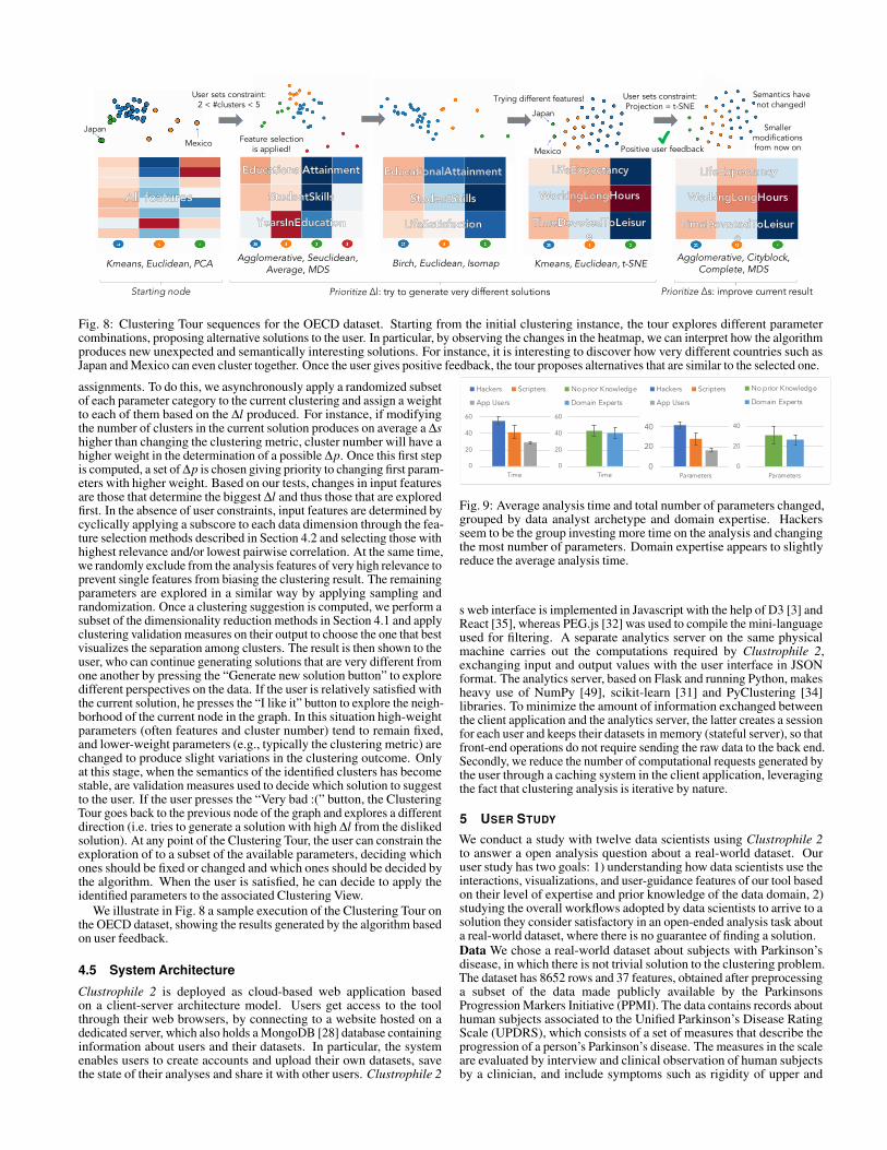
We conduct a study with twelve data scientists using Clustrophile 2to answer a open analysis question about a real-world dataset. Ouruser study has two goals: 1) understanding how data scientists use theinteractions, visualizations, and user-guidance features of our tool basedon their level of expertise and prior knowledge of the data domain, 2)studying the overall workflows adopted by data scientists to arrive to asolution they consider satisfactory in an open-ended analysis task abouta real-world dataset, where there is no guarantee of finding a solution.Data We chose a real-world dataset about subjects with Parkinson’sdisease, in which there is not trivial solution to the clustering problem.The dataset has 8652 rows and 37 features, obtained after preprocessinga subset of the data made publicly available by the ParkinsonsProgression Markers Initiative (PPMI). The data contains records abouthuman subjects associated to the Unified Parkinson’s Disease RatingScale (UPDRS), which consists of a set of measures that describe theprogression of a person’s Parkinson’s disease. The measures in the scaleare evaluated by interview and clinical observation of human subjectsby a clinician, and include symptoms such as rigidity of upper and
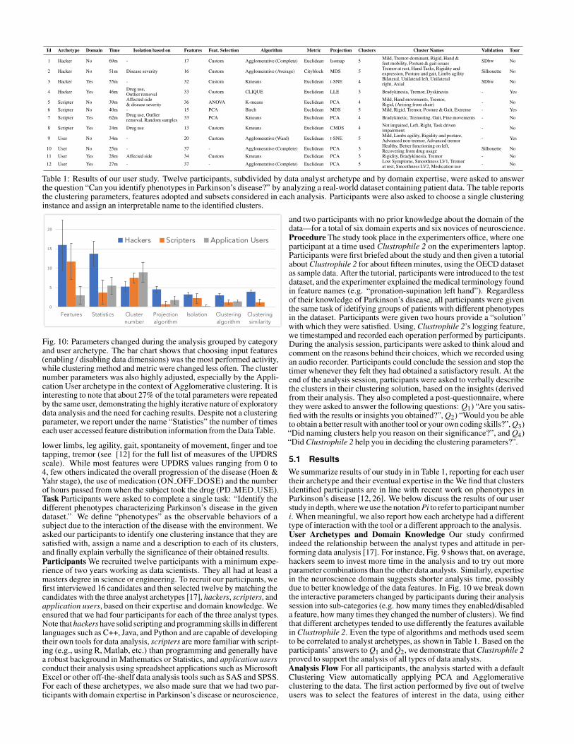
Id Archetype Domain Time Isolation based on Features Feat. Selection Algorithm Metric Projection Clusters Cluster Names Validation Tour
1 Hacker No 69m - 17 Custom Agglomerative (Complete) Euclidean Isomap 5 Mild, Tremor-dominant, Rigid, Hand &feet mobility, Posture & gait issues SDbw No
2 Hacker No 51m Disease severity 16 Custom Agglomerative (Average) Cityblock MDS 5 Tremor at rest, Hand Tasks, Rigidity andexpression, Posture and gait, Limbs agility Silhouette No
3 Hacker Yes 55m - 32 Custom Kmeans Euclidean t-SNE 4 Bilateral, Unilateral left, Unilateralright, Axial SDbw No
4 Hacker Yes 46m Drug use,Outlier removal 33 Custom CLIQUE Euclidean LLE 3 Bradykinesia, Tremor, Dyskinesia - Yes
5 Scripter No 39m Affected side& disease severity 36 ANOVA K-means Euclidean PCA 4 Mild, Hand movements, Tremor,
Rigid, (Arising from chair) - No
6 Scripter No 40m - 15 PCA Birch Euclidean MDS 5 Mild, Rigid, Tremor, Posture & Gait, Extreme - Yes
7 Scripter Yes 62m Drug use, Outlierremoval, Random samples 33 PCA Kmeans Euclidean PCA 4 Bradykinetic, Tremoring, Gait, Fine movements - No
8 Scripter Yes 24m Drug use 13 Custom Kmeans Euclidean CMDS 4 Not impaired, Left, Right, Task drivenimpairment - No
9 User No 34m - 20 Custom Agglomerative (Ward) Euclidean t-SNE 5 Mild, Limbs agility, Rigidity and posture,Advanced non-tremor, Advanced tremor - Yes
10 User No 25m - 37 - Agglomerative (Complete) Euclidean PCA 3 Healthy, Better functioning on left,Recovering from drug usage Silhouette No
11 User Yes 28m Affected side 34 Custom Kmeans Euclidean PCA 3 Rigidity, Bradykinesia, Tremor - No
12 User Yes 27m - 37 - Agglomerative (Complete) Euclidean PCA 5 Low Symptoms, Smoothness LV1, Tremorat rest, Smoothness LV2, Medication use - No
Table 1: Results of our user study. Twelve participants, subdivided by data analyst archetype and by domain expertise, were asked to answerthe question “Can you identify phenotypes in Parkinson’s disease?” by analyzing a real-world dataset containing patient data. The table reportsthe clustering parameters, features adopted and subsets considered in each analysis. Participants were also asked to choose a single clusteringinstance and assign an interpretable name to the identified clusters.
0
5
10
15
20
Features Statistics Clusternumber
Projectionalgorithm
Isolation Clusteringalgorithm
Clusteringsimilarity
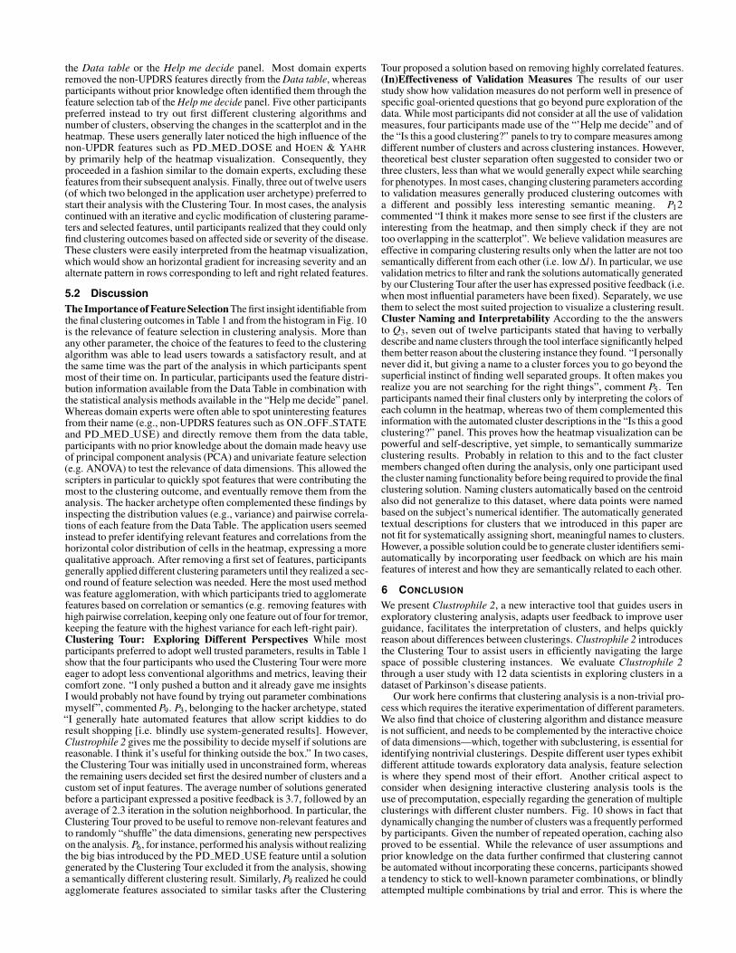
Hackers Scripters Application Users
Fig. 10: Parameters changed during the analysis grouped by categoryand user archetype. The bar chart shows that choosing input features(enabling / disabling data dimensions) was the most performed activity,while clustering method and metric were changed less often. The clusternumber parameters was also highly adjusted, especially by the Appli-cation User archetype in the context of Agglomerative clustering. It isinteresting to note that about 27% of the total parameters were repeatedby the same user, demonstrating the highly iterative nature of exploratorydata analysis and the need for caching results. Despite not a clusteringparameter, we report under the name “Statistics” the number of timeseach user accessed feature distribution information from the Data Table.
lower limbs, leg agility, gait, spontaneity of movement, finger and toetapping, tremor (see [12] for the full list of measures of the UPDRSscale). While most features were UPDRS values ranging from 0 to4, few others indicated the overall progression of the disease (Hoen &Yahr stage), the use of medication (ON OFF DOSE) and the numberof hours passed from when the subject took the drug (PD MED USE).Task Participants were asked to complete a single task: “Identify thedifferent phenotypes characterizing Parkinson’s disease in the givendataset.” We define “phenotypes” as the observable behaviors of asubject due to the interaction of the disease with the environment. Weasked our participants to identify one clustering instance that they aresatisfied with, assign a name and a description to each of its clusters,and finally explain verbally the significance of their obtained results.Participants We recruited twelve participants with a minimum expe-rience of two years working as data scientists. They all had at least amasters degree in science or engineering. To recruit our participants, wefirst interviewed 16 candidates and then selected twelve by matching thecandidates with the three analyst archetypes [17], hackers, scripters, andapplication users, based on their expertise and domain knowledge. Weensured that we had four participants for each of the three analyst types.Note that hackers have solid scripting and programming skills in differentlanguages such as C++, Java, and Python and are capable of developingtheir own tools for data analysis, scripters are more familiar with script-ing (e.g., using R, Matlab, etc.) than programming and generally havea robust background in Mathematics or Statistics, and application usersconduct their analysis using spreadsheet applications such as MicrosoftExcel or other off-the-shelf data analysis tools such as SAS and SPSS.For each of these archetypes, we also made sure that we had two par-ticipants with domain expertise in Parkinson’s disease or neuroscience,
and two participants with no prior knowledge about the domain of thedata—for a total of six domain experts and six novices of neuroscience.Procedure The study took place in the experimenters office, where oneparticipant at a time used Clustrophile 2 on the experimenters laptop.Participants were first briefed about the study and then given a tutorialabout Clustrophile 2 for about fifteen minutes, using the OECD datasetas sample data. After the tutorial, participants were introduced to the testdataset, and the experimenter explained the medical terminology foundin feature names (e.g. “pronation-supination left hand”). Regardlessof their knowledge of Parkinson’s disease, all participants were giventhe same task of idetifying groups of patients with different phenotypesin the dataset. Participants were given two hours provide a “solution”with which they were satisfied. Using, Clustrophile 2’s logging feature,we timestamped and recorded each operation performed by participants.During the analysis session, participants were asked to think aloud andcomment on the reasons behind their choices, which we recorded usingan audio recorder. Participants could conclude the session and stop thetimer whenever they felt they had obtained a satisfactory result. At theend of the analysis session, participants were asked to verbally describethe clusters in their clustering solution, based on the insights (derivedfrom their analysis. They also completed a post-questionnaire, wherethey were asked to answer the following questions: Q1) “Are you satis-fied with the results or insights you obtained?”, Q2) “Would you be ableto obtain a better result with another tool or your own coding skills?”, Q3)“Did naming clusters help you reason on their significance?”, and Q4)“Did Clustrophile 2 help you in deciding the clustering parameters?”.
5.1 ResultsWe summarize results of our study in in Table 1, reporting for each usertheir archetype and their eventual expertise in the We find that clustersidentified participants are in line with recent work on phenotypes inParkinson’s disease [12, 26]. We below discuss the results of our userstudy in depth, where we use the notation Pi to refer to participant numberi. When meaningful, we also report how each archetype had a differenttype of interaction with the tool or a different approach to the analysis.User Archetypes and Domain Knowledge Our study confirmedindeed the relationship between the analyst types and attitude in per-forming data analysis [17]. For instance, Fig. 9 shows that, on average,hackers seem to invest more time in the analysis and to try out moreparameter combinations than the other data analysts. Similarly, expertisein the neuroscience domain suggests shorter analysis time, possiblydue to better knowledge of the data features. In Fig. 10 we break downthe interactive parameters changed by participants during their analysissession into sub-categories (e.g. how many times they enabled/disableda feature, how many times they changed the number of clusters). We findthat different archetypes tended to use differently the features availablein Clustrophile 2. Even the type of algorithms and methods used seemto be correlated to analyst archetypes, as shown in Table 1. Based on theparticipants’ answers to Q1 and Q2, we demonstrate that Clustrophile 2proved to support the analysis of all types of data analysts.Analysis Flow For all participants, the analysis started with a defaultClustering View automatically applying PCA and Agglomerativeclustering to the data. The first action performed by five out of twelveusers was to select the features of interest in the data, using either
the Data table or the Help me decide panel. Most domain expertsremoved the non-UPDRS features directly from the Data table, whereasparticipants without prior knowledge often identified them through thefeature selection tab of the Help me decide panel. Five other participantspreferred instead to try out first different clustering algorithms andnumber of clusters, observing the changes in the scatterplot and in theheatmap. These users generally later noticed the high influence of thenon-UPDR features such as PD MED DOSE and HOEN & YAHRby primarily help of the heatmap visualization. Consequently, theyproceeded in a fashion similar to the domain experts, excluding thesefeatures from their subsequent analysis. Finally, three out of twelve users(of which two belonged in the application user archetype) preferred tostart their analysis with the Clustering Tour. In most cases, the analysiscontinued with an iterative and cyclic modification of clustering parame-ters and selected features, until participants realized that they could onlyfind clustering outcomes based on affected side or severity of the disease.These clusters were easily interpreted from the heatmap visualization,which would show an horizontal gradient for increasing severity and analternate pattern in rows corresponding to left and right related features.
5.2 DiscussionThe Importance of Feature Selection The first insight identifiable fromthe final clustering outcomes in Table 1 and from the histogram in Fig. 10is the relevance of feature selection in clustering analysis. More thanany other parameter, the choice of the features to feed to the clusteringalgorithm was able to lead users towards a satisfactory result, and atthe same time was the part of the analysis in which participants spentmost of their time on. In particular, participants used the feature distri-bution information available from the Data Table in combination withthe statistical analysis methods available in the “Help me decide” panel.Whereas domain experts were often able to spot uninteresting featuresfrom their name (e.g., non-UPDRS features such as ON OFF STATEand PD MED USE) and directly remove them from the data table,participants with no prior knowledge about the domain made heavy useof principal component analysis (PCA) and univariate feature selection(e.g. ANOVA) to test the relevance of data dimensions. This allowed thescripters in particular to quickly spot features that were contributing themost to the clustering outcome, and eventually remove them from theanalysis. The hacker archetype often complemented these findings byinspecting the distribution values (e.g., variance) and pairwise correla-tions of each feature from the Data Table. The application users seemedinstead to prefer identifying relevant features and correlations from thehorizontal color distribution of cells in the heatmap, expressing a morequalitative approach. After removing a first set of features, participantsgenerally applied different clustering parameters until they realized a sec-ond round of feature selection was needed. Here the most used methodwas feature agglomeration, with which participants tried to agglomeratefeatures based on correlation or semantics (e.g. removing features withhigh pairwise correlation, keeping only one feature out of four for tremor,keeping the feature with the highest variance for each left-right pair).Clustering Tour: Exploring Different Perspectives While mostparticipants preferred to adopt well trusted parameters, results in Table 1show that the four participants who used the Clustering Tour were moreeager to adopt less conventional algorithms and metrics, leaving theircomfort zone. “I only pushed a button and it already gave me insightsI would probably not have found by trying out parameter combinationsmyself”, commented P9. P3, belonging to the hacker archetype, stated“I generally hate automated features that allow script kiddies to doresult shopping [i.e. blindly use system-generated results]. However,Clustrophile 2 gives me the possibility to decide myself if solutions arereasonable. I think it’s useful for thinking outside the box.” In two cases,the Clustering Tour was initially used in unconstrained form, whereasthe remaining users decided set first the desired number of clusters and acustom set of input features. The average number of solutions generatedbefore a participant expressed a positive feedback is 3.7, followed by anaverage of 2.3 iteration in the solution neighborhood. In particular, theClustering Tour proved to be useful to remove non-relevant features andto randomly “shuffle” the data dimensions, generating new perspectiveson the analysis. P6, for instance, performed his analysis without realizingthe big bias introduced by the PD MED USE feature until a solutiongenerated by the Clustering Tour excluded it from the analysis, showinga semantically different clustering result. Similarly, P9 realized he couldagglomerate features associated to similar tasks after the Clustering
Tour proposed a solution based on removing highly correlated features.(In)Effectiveness of Validation Measures The results of our userstudy show how validation measures do not perform well in presence ofspecific goal-oriented questions that go beyond pure exploration of thedata. While most participants did not consider at all the use of validationmeasures, four participants made use of the “’Help me decide” and ofthe “Is this a good clustering?” panels to try to compare measures amongdifferent number of clusters and across clustering instances. However,theoretical best cluster separation often suggested to consider two orthree clusters, less than what we would generally expect while searchingfor phenotypes. In most cases, changing clustering parameters accordingto validation measures generally produced clustering outcomes witha different and possibly less interesting semantic meaning. P12commented “I think it makes more sense to see first if the clusters areinteresting from the heatmap, and then simply check if they are nottoo overlapping in the scatterplot”. We believe validation measures areeffective in comparing clustering results only when the latter are not toosemantically different from each other (i.e. low ∆l). In particular, we usevalidation metrics to filter and rank the solutions automatically generatedby our Clustering Tour after the user has expressed positive feedback (i.e.when most influential parameters have been fixed). Separately, we usethem to select the most suited projection to visualize a clustering result.Cluster Naming and Interpretability According to the the answersto Q3, seven out of twelve participants stated that having to verballydescribe and name clusters through the tool interface significantly helpedthem better reason about the clustering instance they found. “I personallynever did it, but giving a name to a cluster forces you to go beyond thesuperficial instinct of finding well separated groups. It often makes yourealize you are not searching for the right things”, comment P5. Tenparticipants named their final clusters only by interpreting the colors ofeach column in the heatmap, whereas two of them complemented thisinformation with the automated cluster descriptions in the “Is this a goodclustering?” panel. This proves how the heatmap visualization can bepowerful and self-descriptive, yet simple, to semantically summarizeclustering results. Probably in relation to this and to the fact clustermembers changed often during the analysis, only one participant usedthe cluster naming functionality before being required to provide the finalclustering solution. Naming clusters automatically based on the centroidalso did not generalize to this dataset, where data points were namedbased on the subject’s numerical identifier. The automatically generatedtextual descriptions for clusters that we introduced in this paper arenot fit for systematically assigning short, meaningful names to clusters.However, a possible solution could be to generate cluster identifiers semi-automatically by incorporating user feedback on which are his mainfeatures of interest and how they are semantically related to each other.
6 CONCLUSION
We present Clustrophile 2, a new interactive tool that guides users inexploratory clustering analysis, adapts user feedback to improve userguidance, facilitates the interpretation of clusters, and helps quicklyreason about differences between clusterings. Clustrophile 2 introducesthe Clustering Tour to assist users in efficiently navigating the largespace of possible clustering instances. We evaluate Clustrophile 2through a user study with 12 data scientists in exploring clusters in adataset of Parkinson’s disease patients.
Our work here confirms that clustering analysis is a non-trivial pro-cess which requires the iterative experimentation of different parameters.We also find that choice of clustering algorithm and distance measureis not sufficient, and needs to be complemented by the interactive choiceof data dimensions—which, together with subclustering, is essential foridentifying nontrivial clusterings. Despite different user types exhibitdifferent attitude towards exploratory data analysis, feature selectionis where they spend most of their effort. Another critical aspect toconsider when designing interactive clustering analysis tools is theuse of precomputation, especially regarding the generation of multipleclusterings with different cluster numbers. Fig. 10 shows in fact thatdynamically changing the number of clusters was a frequently performedby participants. Given the number of repeated operation, caching alsoproved to be essential. While the relevance of user assumptions andprior knowledge on the data further confirmed that clustering cannotbe automated without incorporating these concerns, participants showeda tendency to stick to well-known parameter combinations, or blindlyattempted multiple combinations by trial and error. This is where the
system can come into play and assist the user in making parameters moreexplainable or in comparing alternative choices through the support ofstatistical analysis. The Clustering Tour we introduce here demonstrateshow to nudge users to think outside the box and while findingsolutions of interest, avoiding premature fixation to certain attributesor algorithmic and parametric choices. Finally, interpreting clusteringresults is more relevant than comparing them through validation metrics.To this end, we urge the development of clustering tools that facilitateinterpretability, under the assumption that the usefulness of a clusteringoutcome mostly depends on the underlying data and user task.
REFERENCES
[1] R. Agrawal, J. Gehrke, D. Gunopulos, and P. Raghavan. Automaticsubspace clustering of high dimensional data for data mining applications,vol. 27. ACM, 1998.
[2] D. Asimov. The grand tour: A tool for viewing multidimensional data.SIAM J. Sci. Stat. Comput., 6(1):128–143, Jan. 1985. doi: 10.1137/0906011
[3] M. Bostock, V. Ogievetsky, and J. Heer. D3: Data-driven documents. IEEETrans. Visualization & Comp. Graphics, 17(12):2301–2309, 2011.
[4] L. Breiman. Classification and regression trees. Routledge, 2017.[5] P. Bruneau, P. Pinheiro, B. Broeksema, and B. Otjacques. Cluster sculptor,
an interactive visual clustering system. Neurocomputing, 150:627–644,2015. doi: 10.1016/j.neucom.2014.09.062
[6] N. Cao, D. Gotz, J. Sun, and H. Qu. Dicon: Interactive visual analysisof multidimensional clusters. IEEE Transactions on Visualization andComputer Graphics, 17(12):2581–2590, Dec 2011.
[7] C. Demiralp. Clustrophile: A tool for visual clustering analysis. In KDDIDEA, 2016.
[8] C. Demiralp, P. J. Haas, S. Parthasarathy, and T. Pedapati. Foresight: Rec-ommending visual insights. Proc. VLDB Endow., 10(12):1937–1940, 2017.
[9] M. Ester, H.-P. Kriegel, J. Sander, X. Xu, et al. A density-based algorithmfor discovering clusters in large spatial databases with noise. In Kdd,vol. 96, pp. 226–231, 1996.
[10] M. A. Fisherkeller, J. H. Friedman, and J. W. Tukey. Prim-9: An interactivemultidimensional data display and analysis system. In Proc. FourthInternational Congress for Stereology, 1974.
[11] J. H. Friedman and J. W. Tukey. A projection pursuit algorithmfor exploratory data analysis. IEEE Transactions on Computers,C-23(9):881–890, Sept 1974.
[12] C. G. Goetz, B. C. Tilley, S. R. Shaftman, G. T. Stebbins, S. Fahn,P. Martinez-Martin, W. Poewe, C. Sampaio, M. B. Stern, R. Dodel, et al.Movement disorder society-sponsored revision of the unified parkinson’sdisease rating scale (mds-updrs): Scale presentation and clinimetric testingresults. Movement disorders, 23(15):2129–2170, 2008.
[13] S. Guha, R. Rastogi, and K. Shim. Cure: an efficient clustering algorithm forlarge databases. In ACM Sigmod Record, vol. 27, pp. 73–84. ACM, 1998.
[14] I. Guyon, J. Weston, S. Barnhill, and V. Vapnik. Gene selection forcancer classification using support vector machines. Machine learning,46(1-3):389–422, 2002.
[15] T. Hastie, R. Tibshirani, J. Friedman, and J. Franklin. The elementsof statistical learning: data mining, inference and prediction. TheMathematical Intelligencer, 27(2):83–85, 2005.
[16] J. Hullman, S. Drucker, N. H. Riche, B. Lee, D. Fisher, and E. Adar. Adeeper understanding of sequence in narrative visualization. IEEE Transac-tions on Visualization and Computer Graphics, 19(12):2406–2415, 2013.
[17] S. Kandel, A. Paepcke, J. M. Hellerstein, and J. Heer. Enterprise dataanalysis and visualization: An interview study. IEEE Transactions onVisualization and Computer Graphics, 18(12):2917–2926, 2012.
[18] Y. Kim, K. Wongsuphasawat, J. Hullman, and J. Heer. Graphscape:A model for automated reasoning about visualization similarity andsequencing. In ACM Human Factors in Computing Systems (CHI), 2017.
[19] J. B. Kruskal. Multidimensional scaling by optimizing goodness of fit toa nonmetric hypothesis. Psychometrika, 29(1):1–27, mar 1964.
[20] B. C. Kwon, B. Eysenbach, J. Verma, K. Ng, C. De Filippi, W. F. Stewart,and A. Perer. Clustervision: Visual supervision of unsupervised clustering.IEEE transactions on visualization and computer graphics, 24(1):142–151,2018.
[21] A. Lex, M. Streit, C. Partl, K. Kashofer, and D. Schmalstieg. Comparativeanalysis of multidimensional, quantitative data. IEEE Trans. Visual. Com-put. Graphics, 16(6):1027–1035, nov 2010. doi: 10.1109/tvcg.2010.138
[22] A. Lex, M. Streit, H.-J. Schulz, C. Partl, D. Schmalstieg, P. J. Park, andN. Gehlenborg. Stratomex: Visual analysis of large-scale heterogeneousgenomics data for cancer subtype characterization. In Computer graphicsforum, vol. 31, pp. 1175–1184. Wiley Online Library, 2012.
[23] Y. Liu, Z. Li, H. Xiong, X. Gao, and J. Wu. Understanding of internalclustering validation measures. In Data Mining (ICDM), 2010 IEEE 10thInternational Conference on, pp. 911–916. IEEE, 2010.
[24] S. L’Yi, B. Ko, D. Shin, Y.-J. Cho, J. Lee, B. Kim, and J. Seo. XCluSim: avisual analytics tool for interactively comparing multiple clustering resultsof bioinformatics data. BMC Bioinformatics, 16(11):1–15, 2015. doi: 10.1186/1471-2105-16-S11-S5
[25] L. v. d. Maaten and G. Hinton. Visualizing data using t-sne. Journal ofmachine learning research, 9(Nov):2579–2605, 2008.
[26] P. Mazzoni, B. Shabbott, and J. C. Cortes. Motor control abnormalitiesin parkinsons disease. Cold Spring Harbor perspectives in medicine,2(6):a009282, 2012.
[27] T. Metsalu and J. Vilo. Clustvis: a web tool for visualizing clustering ofmultivariate data using principal component analysis and heatmap. Nucleicacids research, 43(W1):W566–W570, 2015.
[28] MongoDB. https://www.mongodb.com.[29] E. J. Nam, Y. Han, K. Mueller, A. Zelenyuk, and D. Imre. Cluster Sculptor:
A visual analytics tool for high-dimensional data. In Proc. IEEE VAST’07,2007.
[30] OECD Better Life Index. http://www.oecdbetterlifeindex.org/.Accessed: May 27, 2016.
[31] F. Pedregosa, G. Varoquaux, A. Gramfort, V. Michel, B. Thirion, O. Grisel,M. Blondel, P. Prettenhofer, R. Weiss, V. Dubourg, J. Vanderplas, A. Passos,D. Cournapeau, M. Brucher, M. Perrot, and E. Duchesnay. Scikit-learn:Machine learning in Python. Journal of Machine Learning Research,12:2825–2830, 2011.
[32] PEG.js. http://pegjs.org/.[33] A. Pilhofer, A. Gribov, and A. Unwin. Comparing clusterings using bertin’s
idea. IEEE Trans. Visual. Comput. Graphics, 18(12):2506–2515, dec 2012.[34] PyClustering. https://github.com/annoviko/pyclustering.[35] React.js. https://facebook.github.io/react/.[36] P. J. Rousseeuw. Silhouettes: A graphical aid to the interpretation and
validation of cluster analysis. Journal of Computational and AppliedMathematics, 20:53 – 65, 1987. doi: 10.1016/0377-0427(87)90125-7
[37] S. T. Roweis and L. K. Saul. Nonlinear dimensionality reduction by locallylinear embedding. science, 290(5500):2323–2326, 2000.
[38] D. Sacha, M. Kraus, J. Bernard, M. Behrisch, T. Schreck, Y. Asano,and D. A. Keim. Somflow: Guided exploratory cluster analysis withself-organizing maps and analytic provenance. IEEE Transactions onVisualization and Computer Graphics, 24(1):120–130, 2018.
[39] T. Schreck, J. Bernard, T. von Landesberger, and J. Kohlhammer.Visual cluster analysis of trajectory data with interactive kohonen maps.Information Visualization, 8(1):14–29, 2009.
[40] J. Seo and B. Shneiderman. Interactively exploring hierarchical clusteringresults [gene identification]. Computer, 35(7):80–86, jul 2002.
[41] J. Seo and B. Shneiderman. A rank-by-feature framework for unsupervisedmultidimensional data exploration using low dimensional projections. InProcs. InfoVis, pp. 65–72, 2004.
[42] J. Shi and J. Malik. Normalized cuts and image segmentation. IEEE Trans-actions on pattern analysis and machine intelligence, 22(8):888–905, 2000.
[43] M. Streit, S. Gratzl, M. Gillhofer, A. Mayr, A. Mitterecker, andS. Hochreiter. Furby: fuzzy force-directed bicluster visualization. BMCbioinformatics, 15(6):S4, 2014.
[44] J. B. Tenenbaum, V. De Silva, and J. C. Langford. A global geo-metric framework for nonlinear dimensionality reduction. science,290(5500):2319–2323, 2000.
[45] M. E. Tipping and C. M. Bishop. Probabilistic principal componentanalysis. Journal of the Royal Statistical Society: Series B (StatisticalMethodology), 61(3):611–622, 1999.
[46] W. Torgerson. Multidimensional scaling: I. theory and method.Psychometrika, 17(4):401–419, 1952.
[47] M. Vartak, S. Rahman, S. Madden, A. Parameswaran, and N. Polyzotis.Seedb: Efficient data-driven visualization recommendations to supportvisual analytics. Proc. VLDB Endow., 8(13):2182–2193, Sept. 2015. doi:10.14778/2831360.2831371
[48] N. X. Vinh, J. Epps, and J. Bailey. Information theoretic measures for clus-terings comparison: Variants, properties, normalization and correction forchance. Journal of Machine Learning Research, 11(Oct):2837–2854, 2010.
[49] S. v. d. Walt, S. C. Colbert, and G. Varoquaux. The numpy array: Astructure for efficient numerical computation. Computing in Science &Engineering, 13(2):22–30, 2011.
[50] G. Wills and L. Wilkinson. AutoVis: Automatic visualization. Info. Visual.,9(1):47–69, 2008.
[51] K. Wongsuphasawat, D. Moritz, A. Anand, J. Mackinlay, B. Howe,and J. Heer. Voyager: Exploratory analysis via faceted browsing ofvisualization recommendations. IEEE Trans. Visualization & Comp.

Graphics (Proc. InfoVis), 2016.[52] T. Zhang, R. Ramakrishnan, and M. Livny. Birch: an efficient data
clustering method for very large databases. In ACM Sigmod Record, vol. 25,pp. 103–114. ACM, 1996.
[53] J. Zhou, S. Konecni, and G. Grinstein. Visually comparing multiplepartitions of data with applications to clustering. In Visualization and DataAnalysis 2009, vol. 7243, p. 72430J. International Society for Optics andPhotonics, 2009.


![Analysis Guided Visual Exploration of Multivariate Datadavis.wpi.edu/xmdv/docs/vast07_nms.pdf · Recognition]: Clustering—Similarity Measures 1 INTRODUCTION ... to financial market](https://static.fdocuments.in/doc/165x107/603422a77dd6263cd46e2711/analysis-guided-visual-exploration-of-multivariate-recognition-clusteringasimilarity.jpg)