Chapter 8, Data Management, Interpretation, and Presentation ...
23
This document is Chapter 8 of the Volunteer Estuary Monitoring Manual, A Methods Manual, Second Edition, EPA-842-B-06-003. The full document be downloaded from: http://www.epa.gov/owow/estuaries/monitor/ Voluntary Estuary Monitoring Manual Chapter 8: Data Management, Interpretation, and Presentation March 2006
-
Upload
truongdang -
Category
Documents
-
view
224 -
download
0
Transcript of Chapter 8, Data Management, Interpretation, and Presentation ...

This document is Chapter 8 of the Volunteer Estuary Monitoring Manual, A Methods Manual, Second Edition, EPA-842-B-06-003. The full document be downloaded from: http://www.epa.gov/owow/estuaries/monitor/
Voluntary Estuary Monitoring Manual
Chapter 8: Data Management, Interpretation, and Presentation
March 2006

Chapter 8Data Management, Interpretation,and Presentation
Data are like letters of the alphabet: taken individually, they reveal very little. Put
together with a little thought and organization, however, those same letters can tell a
complete story. By highlighting data management, interpretation, and presentation,
this chapter shows how data can be used to tell a story about your estuary.

Photos (l to r): The Ocean Conservancy, L. Monk, The Ocean Conservancy, K. Register

Chapter 8: Data Management, Interpretation, and Presentation
Overview
Volunteer estuary monitoring objectives differ from one program to the next.
Meeting those objectives, however, usually requires similar steps. Regardless of
whether a volunteer program wants to use its data for citizen education or resource
management, the program must make its data understandable to its audience.
Many goals will be unmet if the volunteer program cannot clearly convey what its
data say about the estuary.
Data are like letters of the alphabet: taken individually, they reveal very little. Put
together with a little thought and organization, however, those same letters can tell a
complete story. By highlighting data management, interpretation, and presentation,
this chapter shows how data can be used to tell a story about your estuary.
8-1
Volunteer Estuary Monitoring: A Methods Manual

Chapter 8: Data Management, Interpretation, and Presentation
After Data Collection: What Does It Mean?
Figure 8-1. Steps necessary to prepare data for presentation. Data tell a story about the estuary.
Consider this situation: You have the monitoring equipment. Volunteers are in the field collecting data. Enthusiasm is high. Everything is going smoothly and it’s time to relax.
But is it really?
As difficult as it may be to accept, the aforementioned situation means one thing: there is much more work to be done. What will you do with the incoming data? As discussed in previous chapters, monitoring organizations should know the answer to this question before they collect their first sample. These decisions are made, in part, based on the needs of potential data users, who are particularly concerned about:
• databases and software used to manage the data;
• procedures followed in order to verify and check the raw volunteer data;
Data Management As discussed in previous chapters, data
sheets should not only be easy for volunteers to complete, but should also record all desired information about the estuary and the sampling sessions. The volunteer leader cannot overemphasize to volunteers the importance of careful and accurate data recording. Incomplete or inaccurate data sheets can cause serious problems when it
Data Sheet INTRODUCTION
Data Data Data Analysis/ DataCollection Management Interpretation Presentation
• analytical procedures employed to convert the raw data into findings and conclusions; and
• reporting formats.
Knowing how the data will be used should drive the development and everyday management of a volunteer monitoring program.
Most programs intend to use their data to tell a story about the estuary’s health. Similarly, most volunteers who collect the data want to know what their information reveals about the estuary. Without communicating that data in a meaningful way to your intended audience, the hard work of many volunteers and volunteer leaders could be wasted. To take information from data sheets and convert it to something that makes sense to your audience requires several elements, which are summarized in Figure 8-1 and described in the remainder of this chapter. ■
comes time to interpret the data. Such problems can damage your program’s credibility and/or render the data useless, making all worthwhile efforts futile.
Data management is everyone’s responsibility. The commitment by volunteers to collect high quality data must be matched by the program’s commitment to make the information understandable to its volunteers and other data users. From the very early stages of planning a volunteer monitoring program, a sound data management plan must be a priority. It should be clear how the data will be processed, when it will be processed and reported, and who will be responsible for each task. An attitude of “Let’s just get the data now and figure out what to do with it
8-2
Volunteer Estuary Monitoring: A Methods Manual

Chapter 8: Data Management, Interpretation, and Presentation
later” can lead to wasted time and effort and a huge data backlog.
Where Does the Data Go? It is difficult to get any meaning from boxes
full of data sheets. The information collected by volunteers needs to be organized and readily accessible. Years ago, this may have meant that the data might be organized in handwritten tables. This method is still an option, but a computerized data management system provides a great deal of advantages, especially if the data collection effort is conducted at many sites and/or over a long time period (Lease, 1995).
Database or Spreadsheet?
Today’s computer software includes a variety of spreadsheet and database packages that allow you to organize the data and perform statistical analyses. These options make it easier to detect relationships between data points. Spreadsheets are adequate for most data management needs and have the advantage of being relatively simple to use. Most spreadsheet packages have graphics capabilities that will allow you to plot your data onto a graph of your choice (i.e., bar, line, or pie chart). Examples of common spreadsheet software packages are Lotus 1-2-3, Excel, and Quattro Pro.
Database software may be more difficult to master and usually lack the graphics capabilities of spreadsheet software. If you manage large amounts of data, however, having a database is almost a necessity. It can store and manipulate very large data sets without sacrificing speed. The database can also relate records in one file to records in another. This feature allows you to break your data up into smaller, more easily managed files that can work together as though they were one.
The ability to query data is one of the most significant advantages of using a database. For example, the user can search for records that show water temperature exceeding X
degrees over a specified time period, or identify monitoring sites that have dissolved oxygen levels between X and Y and the dates of those observations. The questions can be simple or quite complex and the answers or output can be organized in a variety of ways.
If you use a database for data storage and retrieval, you may still want to use a spreadsheet or other program with graphics capabilities. Many spreadsheet and database software packages are compatible and will allow you to transport data sets back and forth with relative ease. Specific parts of the database (such as results for a particular water quality variable from all stations and all sampling events) can then be transported into the spreadsheet, statistically analyzed, and graphically displayed. Examples of popular database software packages are dBase, Access, FileMaker Pro, and FoxPro.
Designing a Data Management System
Many people are capable of writing their own programs to manipulate and display data. The disadvantage of using a “homegrown” software program, however, is that if its author leaves the monitoring program, so too does all knowledge about how the program works. Commercial software, on the other hand, comes with consumer services that provide over-the-phone help and instructions, users’ guides, replacement guarantees, and updates as the company improves its product. Most commercial programs are developed to import and export data in standard formats. This feature is important because if you want to share data with other programs or organizations, all you need are compatible software programs. However, some file conversions may be more difficult than advertised by the software manufacturer. To avoid potential problems, consult with any groups, government agencies, or laboratories with whom you plan to share data and ensure that your software packages are compatible (Lease, 1995).
8-3
Volunteer Estuary Monitoring: A Methods Manual

Chapter 8: Data Management, Interpretation, and Presentation
Shared Databases Greater efforts are being made to develop data storage systems that facilitate data exchange among different monitoring groups. A shared database serves to assimilate all the data being collected in a particular region and therefore helps to increase understanding of environmental conditions. Volunteer organizations are increasingly being encouraged to submit their data to these shared databases.
To participate in a shared database, the volunteer organization usually must have a quality assurance project plan (see Chapter 5) that meets the requirements of the group maintaining the shared database. Using software programs that are compatible with the shared database may also be necessary.
Shared databases may be developed for a specific resource (e.g., a river) or as a general clearinghouse of information. One example of a broad database is the U.S. Environmental Protection Agency’s (EPA’s) national water and biological data storage and retrieval system, called STORET. With STORET, volunteer programs can submit data to a centralized file server which permits national data analyses and through which data can be shared among organizations. A specific set of quality control measures is required for any data entered into the system. For more information, see the EPA Web page at www.epa.gov/owow/STORET/.
Data sharing also occurs at the state level. For example, the Oregon Department of Environmental Quality (DEQ) will accept data from volunteers and load it into an in-house monitoring database, the Laboratory Analytical Storage and Retrieval (LASAR). These data are then periodically uploaded to the STORET system. The Department has established a Required Data Elements Policy to enhance the widest use of data collected in Oregon. Visit the DEQ Web site for contact information and a copy of the policy: http://www.deq.state.or.us/wq/.
When designing databases or spreadsheets, always keep in mind what you will ultimately Helpful Hint do with the data. Will you produce graphs or Ease of data entry is always an important reports? Will you need to show a map with element to consider. Here are some key data collection sites? Try to design your suggestions: data management system in a manner that will • Design the database or spreadsheet make it easy to generate your final product. before you collect any data—this will
Another consideration is who will input the help in the creation of your data sheets. data and create the final products. As more people, and especially volunteers, are • Ideally, the database or spreadsheet
involved in data entry and management, more input screen and the field data sheets
emphasis should be placed on making the used by volunteer monitors should look alike.system easy to use.
• Design the database or spreadsheet in such a way that it is readily apparent where data should be entered. Data cells can be highlighted with a special color, for example.
8-4
Volunteer Estuary Monitoring: A Methods Manual

Chapter 8: Data Management, Interpretation, and Presentation
Coding Systems
Any data management system should be flexible enough to meet future needs, especially as data start to accumulate. An easily understood coding system will help simplify the tracking and recording of data. Codes developed for sample sites, parameters, and other information on field and lab sheets should parallel the codes you use in your database. If you will be sharing your information with a state or local natural resource agency, you may want your coding system to match or complement the agency’s system.
Sample Sites
Because sample sites tend to change or grow in number over time, it is important to have an accommodating site numbering system. A good convention to follow is to use a site coding system that includes an abbreviation of the waterbody or project plus a site number (e.g., GOR021 for a site on the Gooms River). By using a site abbreviation and three-digit code, 999 sites can be created for each project, which is plenty for most volunteer programs.
Water Quality Parameters
It is also important to develop a coding system for each of the water quality parameters you are testing. These are the codes you will use in the database or spreadsheet to identify and extract results. To keep the amount of clerical work to a minimum, abbreviate without losing the ability to distinguish parameters from one another. For example, EC could represent E. coli bacteria and FC could be the code for fecal coliform bacteria.
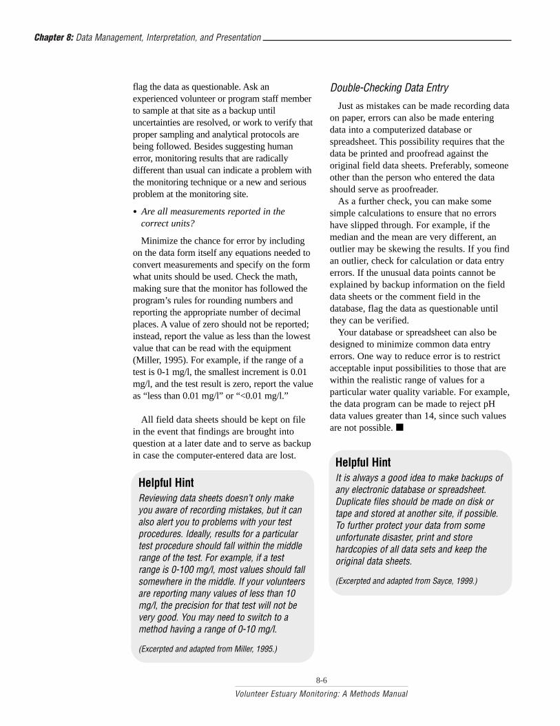
Reviewing Data Sheets Writers have editors to look for mistakes in
grammar, punctuation, etc. Similarly, someone should be available to review volunteers’ data sheets. Even the best professionals and volunteers can make data
recording mistakes; misplaced decimal points, forgotten calculations, or data values accidentally left blank are entirely possible.
The program coordinator or designated data analyst should screen and review the field data sheets immediately as they are received and before the data are entered into the database or spreadsheet. Waiting to review the data sheets for discrepancies is not advised; the longer you wait, the more likely it is that the person who collected the data will forget important details about the sampling effort that could clarify any inconsistencies.
When reviewing the data sheets, the program coordinator or other designated person should ask the following:
• Are the field data sheets complete?
If a person is consistently leaving a section of the sheet incomplete, ask why. You may learn that he or she is unclear about a monitoring procedure or has misunderstood some instructions.
• Are the monitoring results very different from what might usually be expected for the site? If unexpected, are they still within the realm of possibility?
For example, can the kit or technique used actually produce the reported results? Does the monitor offer any possible explanations for the results (e.g., a sewage treatment plant malfunction had been recently reported)? Is there additional corollary information that supports the data (e.g., a fish kill has been observed along with the extremely low dissolved oxygen readings)?
Also check for consistency between similar parameters. For example, total solids and turbidity should track together—if one goes up, so should the other.
• Are there outliers—findings that differ radically from past data or other data from similar sites?
Values that are off by a factor of 10 or 100 should be questioned. Follow up on any data that seem suspect. If you cannot explain why the results are so unusual, but they are still within the realm of possibility, you may want to
8-5
Volunteer Estuary Monitoring: A Methods Manual
Chapter 8: Data Management, Interpretation, and Presentation
flag the data as questionable. Ask an Double-Checking Data Entry experienced volunteer or program staff member to sample at that site as a backup until uncertainties are resolved, or work to verify that proper sampling and analytical protocols are being followed. Besides suggesting human error, monitoring results that are radically different than usual can indicate a problem with the monitoring technique or a new and serious problem at the monitoring site.
• Are all measurements reported in the correct units?
Minimize the chance for error by including on the data form itself any equations needed to convert measurements and specify on the form what units should be used. Check the math, making sure that the monitor has followed the program’s rules for rounding numbers and reporting the appropriate number of decimal places. A value of zero should not be reported; instead, report the value as less than the lowest value that can be read with the equipment (Miller, 1995). For example, if the range of a test is 0-1 mg/l, the smallest increment is 0.01 mg/l, and the test result is zero, report the value as “less than 0.01 mg/l” or “<0.01 mg/l.”
All field data sheets should be kept on file in the event that findings are brought into question at a later date and to serve as backup in case the computer-entered data are lost.
Helpful Hint Reviewing data sheets doesn’t only make you aware of recording mistakes, but it can also alert you to problems with your test procedures. Ideally, results for a particular test procedure should fall within the middle range of the test. For example, if a test range is 0-100 mg/l, most values should fall somewhere in the middle. If your volunteers are reporting many values of less than 10 mg/l, the precision for that test will not be very good. You may need to switch to a method having a range of 0-10 mg/l.
(Excerpted and adapted from Miller, 1995.)
Just as mistakes can be made recording data on paper, errors can also be made entering data into a computerized database or spreadsheet. This possibility requires that the data be printed and proofread against the original field data sheets. Preferably, someone other than the person who entered the data should serve as proofreader.
As a further check, you can make some simple calculations to ensure that no errors have slipped through. For example, if the median and the mean are very different, an outlier may be skewing the results. If you find an outlier, check for calculation or data entry errors. If the unusual data points cannot be explained by backup information on the field data sheets or the comment field in the database, flag the data as questionable until they can be verified.
Your database or spreadsheet can also be designed to minimize common data entry errors. One way to reduce error is to restrict acceptable input possibilities to those that are within the realistic range of values for a particular water quality variable. For example, the data program can be made to reject pH data values greater than 14, since such values are not possible. ■
Helpful Hint It is always a good idea to make backups of any electronic database or spreadsheet. Duplicate files should be made on disk or tape and stored at another site, if possible. To further protect your data from some unfortunate disaster, print and store hardcopies of all data sets and keep the original data sheets.
(Excerpted and adapted from Sayce, 1999.)
8-6
Volunteer Estuary Monitoring: A Methods Manual

Chapter 8: Data Management, Interpretation, and Presentation
Data Interpretation
While computers are quite helpful in organizing data, deciphering the story behind these facts remains a human job. The overall purpose of data interpretation is to get answers to your study design questions—the same questions that originally provoked you to start your monitoring program.
As an example, imagine that you want to determine where water quality criteria are not being met in the estuary. To do this, you must first develop preliminary findings, or objective observations about your data (Dates, 1995). By looking at the data, for example, you might be able to identify:
• variables that failed to meet water quality criteria;
• monitoring sites that regularly failed to meet the criteria;
• dates on which most or all of the sites did not meet the criteria, and the environmental conditions (e.g., weather, flow) on those dates;
• sites upstream and downstream of a suspected pollution source that show different monitoring results; and
• changes in one water quality variable that coincide with changes in another.
Your findings will help you look more critically at the data. With the facts in hand, you might naturally want to figure out why the data are what they are, especially if your findings reveal that water quality criteria are not met in certain areas. This will require more effort, but is certainly worthwhile: once reasons for poor water quality are found, solutions can be developed.
Ask yourself questions to help you decide whether human alterations, natural conditions, and/or data collection processing mistakes might explain your results.
• Could weather influence your results (e.g., do problem levels coincide with intense rainstorms)?
• Do specific sources explain your results (e.g., can increased bacteria levels be attributed to a wastewater treatment plant, failing septic system, or a large population of waterfowl or domesticated animals)?
• Do changes in one of your indicators appear to explain changes in another? For example, high temperatures (caused by a thermal discharge or a heat wave) might explain low oxygen levels.
• Do your visual observations explain any of your results? Did your samplers report any strange pipes, construction activity, flocks of birds, or dry weather discharges from storm drain pipes?
• For multiple years of data, are there overall trends? For example, did the submerged aquatic vegetation (SAV) community improve or deteriorate over time? The former could be explained by improved pollution control; the latter, by new pollution sources.
• If you are monitoring the impact of a pollution source (e.g., a wastewater treatment plant), are there other upstream impacts that might be influencing and confusing your results? For example, if a dairy farm is located immediately upstream from the wastewater treatment plant that you are monitoring, it might be difficult to figure out which source is causing the water quality problems revealed by your data. Alternatively, it could be difficult to determine how the two sources combine to cause the problems.
• Could unusual or unexpected data be attributed to contaminated samples or human sampling error?
• Did the time of sampling affect your results? For example, dissolved oxygen levels are generally lowest in the early morning hours. Sampling for dissolved
8-7
Volunteer Estuary Monitoring: A Methods Manual

Chapter 8: Data Management, Interpretation, and Presentation
oxygen in the afternoon could overlook the estuary’s worst-case conditions.
• Could the water quality variable occur in several places throughout the ecosystem? For example, if you found low levels of phosphorus in the water column, there might be high levels in bottom sediments or plants. Algae blooms are evidence of nutrient enrichment that may not be apparent in water samples.
Helpful Hint Comparing older photos with more recent ones from the same location can help volunteers understand changing land uses and perhaps help you interpret water quality changes.
Summary Statistics
Figure 8-2. Graphic Summary statistics describe the basic representation of the attributes of a set of data for a given mean. The mean is parameter. There are many different types of located at the peak of a normal or bell-shaped statistics that can be used. Program leaders distribution curve. should consult a standard statistics manual,
their data users, and their quality
Freq
uenc
yFr
eque
ncy
Value
Mean
assurance project plan toMean determine which statistical
methods are most appropriate for their data. Two of the most frequently used descriptors of environmental data are the mean and standard deviation. They are briefly described here.
Textbook statistics commonly assume that if a parameter is measured many times under the same conditions, then the measurement values will be randomly distributed around the average with more values clustering near the average than further away. In this ideal situation, a graph of the frequency of each measure plotted against its magnitude
Value
should yield a bell-shaped or normal curve. The mean and the standard deviation determine the height and breadth of this curve, respectively (Figures 8-2 and 8-3).
The mean is simply the sum of all the measurement values divided by the number of measurements. Commonly referred to as the “average,” this statistic marks the highest point at the center of a normal curve (Figure 8-2).
The standard deviation, on the other hand, describes the variability of the data points around the mean. Very similar measurement values will have a small standard deviation, while widely scattered data will have a much larger standard deviation (Figure 8-3). A high standard deviation indicates imprecise data (see Chapter 5 for a discussion of precision and an equation for calculating standard deviation).
While both the mean and the standard deviation are quite useful in describing estuarine data, often the actual measures do not fit a normal distribution. Other statistics sometimes come into play to describe the data. Some data are skewed in one direction or the other, while others might produce a flattened bell shape (Figure 8-4).
Deviation from the normal distribution often occurs in estuary sampling because the estuary is dynamic, with many factors influencing the condition of its waters. The various methods used to collect data can also cause non-normal distributions. For example, if volunteers are collecting water quality data in SAV beds (see Chapter 18), the distribution of water quality variables will tend to be skewed toward good water quality because water quality has to be of a certain minimum standard to support the growth of these underwater plants.
Another common cause of non-normal distribution occurs because of detection limits. A detection limit marks the boundary above or below the concentrations or values measured by a particular method. Secchi depth measurements, for example, have an upper detection limit determined by water depth (i.e., the Secchi depth cannot exceed the water depth) and a lower limit determined by
8-8
Volunteer Estuary Monitoring: A Methods Manual

Chapter 8: Data Management, Interpretation, and Presentation
the smallest increment of measure on the For example, data showing high rope. Figure 8-5 shows how both low and turbidity and accompanied by high values may be truncated by these visual observations of detection limits. abnormally cloudy water could
Mean
Freq
uenc
y S=1
S=2
S=3
indicate a significant sediment Mystery Solved? or nutrient runoff problem from
We might like to think our data will tell us many possible sources (e.g., construction sites, farmland,
everything about what is happening in the forestry operations, golf courses,
estuary. In reality, the data may not tell the etc.). Such information should Value
whole story—or even part of it. As with any be brought to the immediate
scientific study, your data may be inconclu- Figure 8-3. Graphic representation of the standard deviation. A small standard attention of proper authorities for
sive, especially if your program has been monitoring for only a short time (Dates,
further investigation. deviation corresponds to a “peaked” fre-Keep in mind that your data quency distribution, while a larger stan
1995). Indeed, since the workings of an dard deviation corresponds to a moreshould support your interpretations.estuary are complex, it is often difficult to determine trends for many water quality variables (e.g., nutrients) unless the monitoring has occurred over several seasons. In fact, several years’ worth of unusual data may be quite misleading and tell a story very different than the long-term situation. Concluding that you need additional information to better understand the estuary is
“flattened” distribution. Still, your interpretations are simply your best judgments about the data. Even if you include your volunteers, data users, and others who are knowledgeable about the estuary in reviewing the data, others may disagree with your interpretation. That is not atypical. However, as long as your data support your interpretation and you have followed a
completely acceptable. On the other hand, anomalous data can
indicate problems requiring immediate action.
reasonable data interpretation process, you should be able to defend your position. ■
Normal (Bell-shaped) Right Skewed Left Skewed Flattened
Freq
uenc
y
Value
0
0.5
1
1.5
2
Jan Feb Mar Apr May Jun Jul Aug Sep Oct Nov Dec
Minimum measure on Secchi rope
Depth of water at site
Secc
hi D
epth
(met
ers)
Month
Figure 8-4. Examples of frequency distributions. Because of the complexity of estuarine systems, deviations to the normal bell-shaped distribution curve are common.
Figure 8-5. Example of limitations on Secchi depth measurements in an hypothetical monitoring program.
8-9
Volunteer Estuary Monitoring: A Methods Manual

Chapter 8: Data Management, Interpretation, and Presentation
Data Presentation
A project coordinator in Puerto Rico reviews the significance of marine debris data with her young volunteers. Presentations should be designed according to the type of audience (photo by L. Monk).
When you feel fully confident that you have assembled the best possible picture of environmental conditions in your study areas, it is your job to make others—your volunteers, data users, local fishing clubs, or any other audience—aware of what you found.
Know Your Audience Whether citizen programs convey
monitoring results in a periodic newsletter, annual report, or by verbal presentation, the key to rousing and sustaining the interest of the audience remains the same. The speaker or writer must determine the interests, background, and level of technical understanding of the target audience and prepare the presentation accordingly. Remember: The burden of communication is on the presenter to convey the information, not on the audience to understand (Sayce, 1999).
In presenting data results to volunteers or other interested parties, several points merit consideration:
• Highly technical or extremely simplistic presentations bore the audience. An informative and lively approach, molded to the expectations of the audience, will be far more effective. Simple graphics often help make complicated issues much more understandable.
• A presentation should focus on a clear message related to your audience’s interests. Your audience will likely be more interested in specifics such as trends in water quality, seasonal variation, quality assurance issues, or the identification of trouble spots in the estuary rather than an across-the-board synopsis of all the monitoring results.
• Data presentations, whether written or verbal, should be both timely and relevant. Volunteers will maintain a higher level of interest if they see a quick turnaround of their data into usable and informative graphics and summaries. Moreover, your nutrient data won’t have much influence on community decision-makers if you miss the public hearing on a sewer upgrade project. As mentioned earlier, trends may be difficult to determine with limited data, so one should exercise caution when implying that data show long term trends.
• Better understanding on the part of your audience may lead to more community support, more funding, better management policies, and greater citizen involvement.
When presenting data, one of your chief goals should be to maintain the attention and interest of your audience. This is very difficult using tables filled with numbers. Most people will not be interested in the absolute values of each parameter at each sampling site; rather, they will want to know the bottom line for each site (e.g., is it good or bad) and seasonal and year-to-year trends.
8-10
Volunteer Estuary Monitoring: A Methods Manual

Chapter 8: Data Management, Interpretation, and Presentation
Technical vs. Non-Technical Audiences When addressing water quality or planning professionals, you should provide information about:
• the purpose of the study;
• who conducted it;
• how it was funded;
• the methods used;
• the quality control measures taken;
• your interpretation of the results;
• your conclusions and recommendations; and
• further questions that have arisen as a result of the study.
Graphics, tables, and maps may be fairly sophisticated. Be sure to include the raw data in a written report’s appendix and note any problems encountered.
A report for the general public should be short and direct. It is very important to convey information in a non-technical style and to include definitions for terms and concepts that may be unfamiliar to the layperson. Simple charts, summary tables, and maps with accompanying explanations can be especially useful. Include a brief description of the program, the purpose of the monitoring, an explanation of the parameters that were monitored, the location of sample sites, a summary of the results, and any recommendations that may have been made.
In any written report or presentation, you should acknowledge the volunteers and the sources of funding and other support.
(Excerpted and adapted from USEPA, 1997.)
Graphics sophisticated graphic styles may be required to present some data, three basic types are
Graphics, when used properly, are excellent often used for volunteer monitoring data: thetools to present a great deal of information in bar graph, pie chart, and line graph.a condensed yet understandable format. They enliven the presentation, highlight trends, and Bar Graphillustrate comparative relationships. Graphics include flowcharts, maps, and graphs or charts The bar graph uses
50 of the data. Such graphics, along with simple columns (Figure
narrative interpretation, summary statistics, 8-6). The height of 40
tables, overheads, and slides, help construct a each column represents
well-rounded and interesting presentation. the value of a data 30
point, making comparisons of the data 20
Graphs and Charts relatively easy. 10
Results summarized from the volunteer- Modifications can be collected data can be displayed in any of made to the standard 0
#1 #2 #3 #4several styles of graphs. Choosing the style bar graph for visual Categorythat best conveys the information is critical appeal. For example,and requires careful thought. Although more Figure 8-7 shows Figure 8-6. Bar graph.
Units
8-11
Volunteer Estuary Monitoring: A Methods Manual

Chapter 8: Data Management, Interpretation, and Presentation
1-M
ay
15-M
ay
1-Ju
n
16-J
un
1-Ju
l
16-J
ul
1-Au
g
16-A
ug
1-Se
p
16-S
ep
1-Oc
t
16-O
ct turbidity data, as measured by a Secchi disk. In this graphic, depth increases in a
No. o
f Fec
al C
olifo
rm B
acte
riain
100
ml w
ater
Figure 8-7. Modification of typical bar graph to illustrate Secchi depth data.
0
200
600 simplicity and clarity. Certain data may be better described by a
400 pie chart than others. For example, it can be
800
1000 The chart’s pie shape, with the pie
The pie chart (Figure 8-9) is a simple yet effective means of comparing each category
1200 Not permissible for swimming
Permissible for swimming
Desirable for swimming
Permissible for boating and fishing (under 5,000)
within the data set to the whole. It is best used
1-M
ay
15-M
ay
1-Ju
n
16-J
un
1-Ju
l
16-J
ul
1-Au
g
16-A
ug
1-Se
p
16-S
ep
1-Oc
t
16-O
ct
Secc
hi D
epth
(met
ers)
0
0.5
1
1.5
2
2.5
31-O
ct31
-Oct
percentages of marine debris found at a particular site (e.g., the percent of plastic, paper, glass, etc., debris), but not for presenting dissolved oxygen trends.
very useful for summarizing the composition
wedges representing distinct categories, makes this graphic style popular due to its
representing the total and the individual
to present relational data, such as percentages.
downward direction along the vertical axis to simulate actual water depth. This minor change from the norm, along with the use of Secchi disk icons extending down from the “surface,” makes the data easy to understand.
In bar graphs of pH, dissolved oxygen, bacteria, or other water quality variables for which a standard value exists, consider inserting a line across the graphic showing the standard (Figure 8-8). This helps in understanding when your results indicate problems.
Pie Chart
Figure 8-9. Pie chart.
8-12
Volunteer Estuary Monitoring: A Methods Manual
Figure 8-8. Bar graph showing fecal coliform data values and comparing them Helpful Hintwith water quality standards. If there are many small percentages in your
pie chart, consider reducing the clutter by Category 4 Category 1 grouping the values together as an “other”
category. Identify the items in the “other” slice of the pie elsewhere, especially if you are presenting the information to a technical audience.
Category 3 Category 2

Chapter 8: Data Management, Interpretation, and Presentation
Line Graph • bathymetric maps, 40
A line graph (Figure 8-10) is constructed by which show the connecting the data points with a line. It can relief (deep and 30
be effectively used for depicting changes over shallow portions)
Units 20time or space. This type of graph places more on the bottom of
emphasis on trends and the relationship estuaries;
• Geographic 10
Information System (GIS) 0
maps, which are #1 #2 #3 #4 #5 #6
computer-gener- Category
ated and can show a variety of features (see box, Figure 8-10. Line graph.
page 8-14);
• highway or street atlas maps;
• geologic maps;
• soil maps;
• geologic or engineering hazards maps;
• flood inundation maps; and
• hand-drawn maps.
18
16
among data points and less emphasis on any particular data point.
Line graphs can also be used to compare two water quality variables that may be related. Figure 8-11, for example, shows dissolved oxygen concentrations and water temperature. The plot of the two parameters shows that as water temperature increases through the summer, oxygen levels generally decline. The opposite occurs as cooler autumn temperatures set in.
Maps and Photographs
Displaying the results of your monitoring data on a map can be a very effective way of helping people understand what the data signify. A map can show the location of sample sites in relation to features such as cities, wastewater treatment plants, farmland, and tributaries that may have an effect on water quality. This type of graphic display can
Water Temperature
Dissolved Oxygen
25 14
Diss
olve
d Ox
ygen
[mg/
l]
Wat
er T
emp.
[deg
rees
C]
be used to effectively show the correlation between specific activities or land uses and the impacts they have on the ecosystem. Because a map displays the estuary’s relationship to neighborhoods, parks, and recreational areas, it can also help to elicit concern for the estuary and strengthen interest
2012
10 15
8
6 10
4
in protecting it. 2
There are different types of maps available. 0 These include:
• topographic maps, which show natural features and elevations;
1-M
ay
15-M
ay
1-Ju
n
16-J
un
1-Ju
l
16-J
ul
1-Au
g
16-A
ug
1-Se
p
16-S
ep
1-O
ct
16-O
ct
31-O
ct
Figure 8-11. Line graph comparing values for two related water quality variables.
8-13
Volunteer Estuary Monitoring: A Methods Manual
30
5
0

Chapter 8: Data Management, Interpretation, and Presentation
Helpful Hint Here are some tips for making your graphics easy to understand:
• Have the graph serve a clear purpose. The information contained in the graph should be relatively easy to interpret and relate closely to the text of a document or script of a presentation.
• Do not distort the meaning of the data. Graphical representations of the data points should be proportional to each point’s actual value (Figure 8-12).
• Ensure that the labeling of graphics is clear and accurate. A table of the data values should accompany any graph that is likely to be misunderstood.
• Keep the graphic design simple. Complex or tricky graphics often hide the true meaning of the data. Avoid cluttering the graph with labels, arrows, grids, fill patterns, and other “visual noise” that unnecessarily complicate the graphic. Use simple fonts that are easy to read.
• Limit the number of graphic elements. A pie chart, for example, should be divided into no more than five or six wedges. Keep the number of superimposed lines on a line graph and the quantity of columns in a bar graph to a minimum.
• Consider the proportions of the chart and the legibility of the type and graphic elements. A horizontal format is generally more visually appealing, simpler to understand, and makes labels easier to read. The elements should fill the dimensions of the graph to create a balanced effect. Ensure that the axes are labeled with legible titles and that the tick marks showing data intervals are not crowded along the axis lines. Avoid cryptic abbreviations whenever possible, remembering that you want your audience to fully understand the information in the graphic.
• Create a title for the chart that is simple yet informative. • Remember that 8 percent of the U.S. population is colorblind. When color-coding results, don’t use both red and green
on the same graphic. You may also use shapes or symbols in addition to color. • Whether you use color, shading, or patterns, be sure that an easy-to-understand data key is included or that the data are
clearly labeled. • If you will need to photocopy color graphics, make sure that the colors are still distinguishable when the graphics are
photocopied in black and white. • Be consistent when comparing data; for example, don’t mix pie charts with bar graphs.
(Portions excerpted and adapted from Schoen et al., 1999.)
Geographic Information Systems Computer software systems that allow you to map and manipulate various layers of information (such as water quality data, land use information, county boundaries, or geologic conditions) are known as Geographic Information Systems (GIS). They can vary from simple systems run on personal computers to sophisticated and very powerful ones that run on large mainframes. For any GIS application, you need to know the coordinates of your sample sites—either their latitude and longitude, or some alternate system. You can also locate your sites on a topographic map that can be digitized onto an electronic map of the watershed. Once these points have been established, you can link your database to the points on the map, query your database, and create graphic displays of the data.
Powerful GIS applications typically require expensive hardware, software, and technical training. Any volunteer program interested in GIS applications may consider working in partnership with other organizations such as universities, natural resource agencies, or large nonprofit groups that can provide access to a GIS.
8-14
Volunteer Estuary Monitoring: A Methods Manual

30
20
10
0
Chapter 8: Data Management, Interpretation, and Presentation
pH
a) b)pH, Gooms Bay pH, Gooms Bay
14 8
79
pH 6
4 5
4 Site 1 Site 2 Site 3 Site 4 Site 5 Site 1 Site 2 Site 3 Site 4 Site 5
c) Total Phosphorous, Gooms Bay
d) Total Phosphorous, Gooms Bay
50 35
40
TP(µ
g/l) 32.5
TP(µ
g/l)
30
27.5
25 Above Golf Course Below Above Golf Course Below
Figure 8-12. Scale considerations for presenting data. The pH graph in (a) gives the mistaken impression that the results are similar at each site. The graph in (b) uses a narrower y-axis scale, thereby doing a better job of showing the significant differences among monitoring sites. Changing scales to dramatize insignificant differences (c and d), however, is not recommended.
The display map should show principal features such as roads, municipal boundaries, waterways, and other familiar landmarks (e.g., schools and churches). It should have sufficient detail and scale to show the location of sample sites and have space for summary information about each site.
When displaying your data on a map, consider the following:
• Keep the amount of information presented on each map to a minimum. Do not try to put so much on one map that it becomes visually complicated and difficult to read or understand. A good rule of thumb is to read the map without referring to the legend. If the map is not easily understood or if symbols, lines, and colors are not distinct from each other, then you should use another map to display a different layer or “view” of the data. For example, if there are several dates for which you wish to display sampling results, use one map for each date.
• Clearly label the map and provide an explanation of how to interpret it. If you need a long and complicated explanation, you may want to present the data differently. If you have reached a clear conclusion, state the conclusion on the map. For example, if a map shows that tributaries are cleaner than the mainstem, use that information as the subtitle of the map.
• Provide a key to the symbols that are used on the map.
• Rather than packing lots of information into a small area of the map, use a “blowup” or enlargement of the area elsewhere on the map to adequately display the information.
• Use symbols that vary in size and pattern to represent the magnitude of results. For example, a site with a fecal coliform level of 10 colonies/ 100 ml could be a light gray circle with a 1/16-inch diameter while a site with a level of 200 colonies/100 ml would be a dark gray circle 1/4-inch
8-15
Volunteer Estuary Monitoring: A Methods Manual

Chapter 8: Data Management, Interpretation, and Presentation
A volunteer distributes information to passersby at an Earth Day event in Washington, DC (photo by The Ocean Conservancy).
in diameter. Start by finding the highest and lowest values, assign diameters and patterns to those values, and then fill in steps along the way. For the above example you might have four ranges: 0 to 99, 100 to 199, 200 to 500, and 500+.
Photographs also add great value to your project. Aerial photos of the monitoring sites add a “personal touch,” allowing citizens to see their houses or favorite fishing spots. This can pique their interest in the project.
Ground-level pictures of algal blooms, monitoring sites, and volunteers in action are also helpful. They are qualitative records of your estuary’s health or your monitoring project and help your audience understand your project and program’s activities. Compiling a photo library is always a good idea, especially when last-minute additions are needed for reports, press releases, display booths, and presentations.
Getting the Word Out On a regular basis, a successful volunteer
estuary monitoring program should report key findings to volunteers, data users, and the general public, including the media. As mentioned previously, state water quality agencies will require detailed reports, whereas shorter and less technical summaries are more appropriate for the general public.
The volunteer program should develop a strategy for distributing and publicizing reports. All reports should be subjected to the review process prescribed by your quality assurance project plan, and your program’s
leaders should be confident about the data and comfortable with the statements and conclusions before the report is made public. When your report’s findings and conclusions are released to the public, you will need to be prepared to respond to questions regarding the data and your interpretation of that data.
Some ideas for distributing project results and informing the public include the following:
Written Report
A written document is a good instrument for getting your information out to a wide audience. If you have access to a mailing list of people who are interested in your estuary, mail the report with a cover letter that summarizes the major findings of the study. The cover letter should be brief and enticing so that the recipient will be curious enough to read the report. If you want people to take some kind of action, such as supporting the expenditure of public funds to upgrade a sewage treatment plant, you may want to ask for their support in the cover letter. If you do not have an extensive mailing list, perhaps other organizations that share your goals would be willing to supply you with their lists. Be sure to also send the report to state and federal agencies; newspapers; radio and television stations; local libraries; colleges and universities; research stations; and high schools, if appropriate.
Instead of long technical reports, you may want to develop fact sheets for public distribution. These summaries of your findings and conclusions should make your points quickly and instruct the reader on how to obtain more information.
Speaking Tour
Develop an oral presentation (with slides, overheads, etc.) that could be offered to groups such as the local chamber of commerce, civic clubs, conservation organizations, schools, and government entities. Your presentation could even be videotaped for distribution to a wider audience.
8-16
Volunteer Estuary Monitoring: A Methods Manual

Chapter 8: Data Management, Interpretation, and Presentation
Public Meetings
Schedule a series of public meetings that highlight the monitoring program, its findings, and its recommendations. At the meetings, distribute the written report, answer questions, and tell your audience how they can get involved. These meetings can also help you recruit more volunteers.
Be sure to schedule the meetings at times when people are more likely to attend (i.e., weekday evenings, weekend days) and avoid periods when people are usually busy or on vacation. Invite the media and publicize the meetings in newspaper calendars; send press releases to radio and television stations, newspapers, and other organizations; and ask volunteers to distribute fliers at grocery stores, city hall, etc.
Press Releases and Press Conferences
As explained in Chapter 3, distributing a press release is a cost-effective means of informing the public about the results and accomplishments of your program. Develop a mailing list of newspapers, radio and television stations, and organizations that solicit articles for publication. Send the news release to volunteers and others who are interested in publicizing the monitoring program.
If your report contains some real news or if it has led to a significant event (e.g., the mayor or city council has recognized the value of the report and issued a statement of support), hold a press conference (see Chapter 3 for details).
Exhibits
Set up displays at river festivals, county fairs, conferences, libraries, storefront windows, boat ramps, or parks. Exhibits allow you to show your data to a variety of audiences, usually in an informal setting.
Web Sites
Placing data on your program’s Web site or the sites of project partners can be a useful and convenient way to make your data available. Almost everyone has access to the Internet and developing a Web page is relatively easy.
People curious about your project can view the Web site for raw data, graphics, photos, and commentary. In addition, posting information on the site can save staff resources that would otherwise be spent printing and mailing the results or explaining results over the phone.
Once people know where they can find your data, they can continue to check the site for updates.
Other Publicity
Be creative in getting your report and message out. Try writing letters to the editor or op-ed articles for local or statewide papers, producing radio feeds (a recording of the group’s leader played over the phone to a radio station), issuing media advisories, and even advertising in publications. ■
8-17
Volunteer Estuary Monitoring: A Methods Manual

Chapter 8: Data Management, Interpretation, and Presentation
References and Further Reading
Portions of this chapter were excerpted and adapted from:
Dates, G. 1995. “Interpreting Your Data.” The Volunteer Monitor 7(1).
Lease, F. 1995. “Designing a Data Management System.” The Volunteer Monitor 7(1).
Schoen, J., M-F. Walk, and M.L. Tremblay. 1999. Ready, Set, Present! A Data Presentation Manual for Volunteer Water Quality Monitoring Groups. Massachusetts Water Watch Partnership. Univ. of Massachusetts, Amherst. Web site: http://www.umass.edu/tei/mwwp/datapresmanual.html.
U.S. Environmental Protection Agency (USEPA). 1997. Volunteer Stream Monitoring: A Methods Manual. EPA 841-B-97-003. November. Office of Water, Washington, DC. 211 pp.
Other references:
Dates, G., and J. Schloss. 1998. Data to Information: A Guide for Coastal Water Quality Monitoring Groups in New Hampshire and Maine. Univ. of Maine Cooperative Extension and ME/NH Sea Grant. Waldoboro, ME.
Ely, E. (ed.) 1995. The Volunteer Monitor. “Special Topic: Managing and Presenting Your Data.” 7(1).
Hubbell, S. 1995. “Seize the Data.” The Volunteer Monitor 7(1).
Miller, J.K. 1995. “Data Screening and Common Sense.” The Volunteer Monitor 7(1).
Rector, J. 1995. “‘Variability Happens’: Basic Descriptive Statistics for Volunteer Programs.” The Volunteer Monitor 7(1).
River Watch Network. 1995. Program Organizing Guide. River Watch Program of River Network. Montpelier, VT.
Sayce, K. 1999. “Data Analysis and Presentation.” In: Meeting Notes—U.S. Environmental Protection Agency (USEPA)/Center for Marine Conservation (CMC) workshop: Volunteer Estuary Monitoring: Wave of the Future. Astoria, OR: May 19-21, 1999.
U.S. Environmental Protection Agency (USEPA). 1990. Volunteer Water Monitoring: A Guide for State Managers. EPA 440/4-90-010. August. Office of Water, Washington, DC. 78 pp.
U.S. Environmental Protection Agency (USEPA). 1997. Proceedings—Fifth National Volunteer Monitoring Conference: Promoting Watershed Stewardship. August 3-7, 1996, University of Wisconsin-Madison. EPA 841-R-97-007. Web site: http://www.epa.gov/owow/volunteer/proceedings/toc.html.
8-18
Volunteer Estuary Monitoring: A Methods Manual

Unit OneChemical Measures
Oxygen • Nutrients • pH and Alkalinity • Toxins

Photos (l to r): G. Carver, R. Ohrel, R. Ohrel