Chapter 3: SPC as Shewhart...
57
Chapter 3: SPC as Shewhart intended Following is a set of four articles written by Prof. Henry R. Neave of the erstwhile British Deming Association . He continues to lecture on the Deming philosophy under the banner “The Deming Dimension” . These articles titled “SPC – Back to the Future” are a classic introduction to understanding SPC . "SPC—Back to the Future" Part 1 – An 11-year-old can do it! SPC? "SPC? Oh, Statistical Process Control. Nothing to do with us. We're not in manufacturing." "SPC? Oh yes, I think the shop-floor does some of that. Nothing to do with me: I'm a manager." "SPC? Oh, I don't understand anything about that. I just collect the numbers and pass them on to Quality Control." "SPC? Oh, that's not for me. I'm no mathematician." "SPC? Oh, no way. I don't trust statistics." "SPC? Oh yes, of course. I'm a professional statistician. It's quite simple really. But you have to be sure that your data are normally distributed, else it's not valid." Six responses. Six sad responses. 11-year-old Patrick A story which the American management teacher Dr W Edwards Deming was fond of relating during his celebrated four-day seminars concerned 11-year- old Patrick Nolan (Neave, 1990a: 393- 395). Day by day, Patrick recorded the time of arrival of his school-bus and plotted it on a chart. Figure 1 shows Patrick's chart as drawn by Dr Deming (reproduced from a roll of overhead projector transparency after one of his seminars). The times of arrival varied, of course (else the points would just have formed a straight line). But most of the variation was effectively random—"chance"—within certain
Transcript of Chapter 3: SPC as Shewhart...

Chapter 3: SPC as Shewhart intendedFollowing is a set of four articles written by Prof. Henry R. Neave of the erstwhile British Deming Association . He continues to lecture on the Deming philosophy under the banner “The Deming Dimension” . These articles titled “SPC – Back to the Future” are a classic introduction to understanding SPC .
"SPC—Back to the Future"Part 1 – An 11-year-old can do it!
SPC?"SPC? Oh, Statistical Process Control. Nothing to do with us. We're not in manufacturing.""SPC? Oh yes, I think the shop-floor does some of that. Nothing to do with me: I'm a manager.""SPC? Oh, I don't understand anything about that. I just collect the numbers and pass them on to Quality Control.""SPC? Oh, that's not for me. I'm no mathematician.""SPC? Oh, no way. I don't trust statistics.""SPC? Oh yes, of course. I'm a professional statistician. It's quite simple really. But you have to be sure that your data are normally distributed, else it's not valid."
Six responses. Six sad responses.11-year-old Patrick
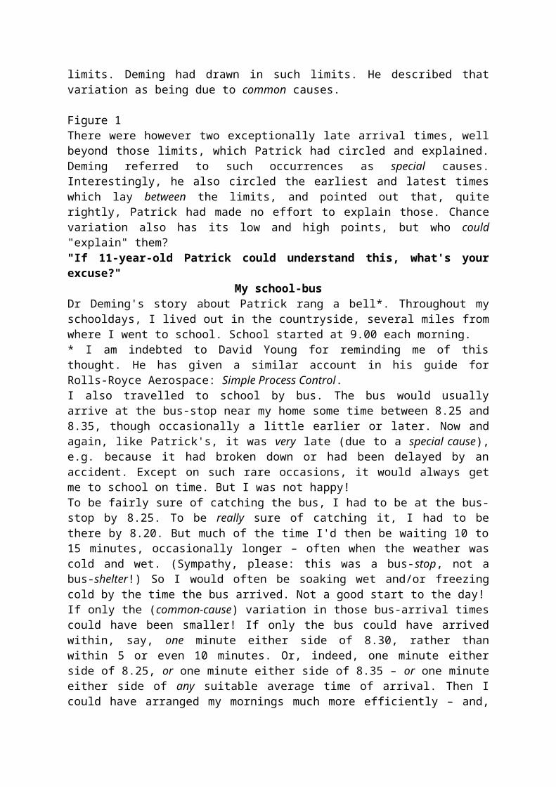
A story which the American management teacher Dr W Edwards Deming was fond of relating during his celebrated four-day seminars concerned 11-year-old Patrick Nolan (Neave, 1990a: 393-395). Day by day, Patrick recorded the time of arrival of his school-bus and plotted it on a chart.Figure 1 shows Patrick's chart as drawn by Dr Deming (reproduced from a roll of overhead projector transparency after one of his seminars). The times of arrival varied, of course (else the points would just have formed a straight line). But most of the variation was effectively random—"chance"—within certain limits. Deming had drawn in such limits. He described that variation as being due to common causes.
Figure 1There were however two exceptionally late arrival times, well beyond those limits, which Patrick had circled and explained. Deming referred to such occurrences as special causes. Interestingly, he also circled the earliest and latest times which lay between the limits, and pointed out that, quite rightly, Patrick had made no effort to explain those. Chance variation also has its low and high points, but who could "explain" them?"If 11-year-old Patrick could understand this, what's your excuse?"
My school-busDr Deming's story about Patrick rang a bell*. Throughout my schooldays, I lived out in the countryside, several miles from where I went to school. School started at 9.00 each morning.* I am indebted to David Young for reminding me of this thought. He has given a similar account in his guide for Rolls-Royce Aerospace: Simple Process Control.I also travelled to school by bus. The bus would usually arrive at the bus-stop near my home some time between 8.25 and 8.35, though occasionally a little earlier or later. Now and again, like Patrick's, it was very late (due to a special cause), e.g. because it had broken down or had been delayed by an accident. Except on such rare occasions, it would always get me to school on time. But I was not happy!To be fairly sure of catching the bus, I had to be at the bus-stop by 8.25. To be really sure of catching it, I had to be there by 8.20. But much of the time I'd then be waiting 10 to 15 minutes, occasionally longer – often when the weather was cold and wet. (Sympathy, please: this was a bus-stop, not a bus-shelter!) So I would often be soaking wet and/or freezing cold by the time the bus arrived. Not a good start to the day!If only the (common-cause) variation in those bus-arrival times could have been smaller! If only the bus could have arrived within, say, one minute either side of 8.30, rather than within 5 or even 10 minutes. Or, indeed, one minute either side of 8.25, or one minute either side of 8.35 – or one minute either side of any suitable average time of arrival. Then I could have arranged my mornings much more efficiently – and, with rare exceptions, suffered no more than a two-minute soaking!Thus I learned at an early age that variation affected my quality of life. The variation was actually more important than the average time of arrival. The greater the variation, the more I risked either missing the bus altogether or getting wet through.Variation is the enemy of quality.
How it all beganIn the early 1920s, people in the Western Electric Company were hard at work trying to improve telephone technology and associated equipment. For a while they made great progress. But then the rate of progress slowed. They were still trying as hard, if not harder than before. They were still pouring time and money – and probably emotion – into the improvement effort, but somehow it just wasn't working any more. They were experimenting and analysing and trying to interpret data in just the same ways as before. Those ways had previously reaped great rewards. But no longer. Increasingly, not only were they failing to improve: they were beginning to make things worse rather than better! That is when they invited Dr Walter Shewhart to help them.Now we'll let Dr Deming take up the story (transcribed directly from a presentation to an audience in Versailles, France on 6 July 1989) (Neave, 1990b: 2-3):
"Part of Western Electric's business involved making equipment for telephone systems. The aim was, of course, reliability: to make things alike so that people could depend on them. But they found that the harder they tried to achieve consistency and uniformity, the worse were the effects. The more they tried to shrink variation, the larger it got. When any kind of error, mistake or accident occurred, they went to work on it to try to correct it. It was a noble aim. There was only one little trouble. Things got worse.

Eventually the problem went to Walter Shewhart at the Bell Laboratories. Dr Shewhart worked on the problem. He became aware of two kinds of mistakes:
1. Treating a fault, complaint, mistake, accident as if it came from a special cause when in fact there was nothing special at all, i.e. it came from the system: from random variation due to common causes.
2. Treating any of the above as if it came from common causes when in fact it was due to a special cause.
What difference does it make? All the difference between failure and success”
Dr Shewhart decided that this was the root of Western Electric's problems. They were failing to understand the difference between common causes and special causes, and that mixing them up makes things worse. It is pretty important that we understand those two kinds of mistakes. Sure we don't like mistakes, complaints from customers, accidents; but, if we weigh in at them without understanding, we only make things worse. This is easy to prove."How did Mr Deming (as he then was) learn about this? By great good luck! At the time, he was studying for his PhD in Mathematical Physics at Yale. Just like most students these days, he was having to "work his way through college", i.e. earn money to support himself. For this reason, he took summer vacation jobs in 1925 and 1926—at the Western Electric Company. He just happened to be there at the right time. How fortunate! For it was Shewhart's breakthrough in this new understanding of the types and causes of variation that proved to be the launch pad for W Edwards Deming's extraordinary life's work.Apart from introducing some of the basic concepts, this early piece of history is important in emphasising that the environment and purpose in and for which SPC was created was one of improvement. Shewhart invented the control chart to provide guidance on the types of action most likely to bring about improvement and warnings on the types likely to do harm.Interestingly, Dr Deming first used the terms "common cause" and "special cause" not in connection with control charts but whilst discussing prison riots (Deming, 1986: 314-315)! Did something special occur to spark off a riot? Or was it due to the procedures, the environment, the morale of both the prisoners and the prison staff, the way the staff treated the prisoners, etc.? That is, was the common state of affairs (which Deming would refer to as the system) in the prison such that riots would be bound to occur from time to time? Or would it take something special?
Learning And UnlearningWe're already two-thirds through this article. So I can probably now risk confessing my origins without too much fear of frightening off those readers who have come this far!I began my career life as a conventional mathematical statistician. I learned conventional mathematical statistics as a student, and then, as a Lecturer, I taught what I had learned.In my own defence, I had some reservations. These led me to dabble in areas of the subject regarded by the purists as slightly unconventional. But I had neither the wit nor the courage to dip more than my toe in the water.So then came my stroke of great good luck! I was singularly fortunate in the early 1980s to become involved with the British subsidiaries of the first American company to start taking Dr Deming's work at all seriously. As I soon discovered, this was some

30 years after the Japanese began to learn from him, and instituted their famous national award for quality in his name (Figure 2).
FIGURE 2 The Deming MedalBut I was puzzled. I was told that Dr Deming's work was based on statistics – my chosen career path. Yet, search as I might, I could find little in his work that had any relationship with the subject on which I had been building
my career and reputation.Despite that continuing perplexity, in 1985 I received an
invitation to assist Dr Deming at his first four-day seminar to be held in Britain. I enjoyed that same privilege and responsibility during all of his visits to Europe throughout the remaining nine years of his life.I looked forward eagerly to that first four-day seminar. Now I would at last learn the truth about where my great knowledge of mathematical statistics would fit into it all!Wrong again! Granted, there was some stuff about collecting and analysing data. But it really was rather disappointing. The only technique he ever seemed to use was the control chart – and he didn't even do that right! Where were the probabilities, the normal distributions, the Central Limit Theorem, the action and warning limits? You see, for years I had covered control charts in my 60-lecture first-year course at the University: I'd probably spend one lecture, maybe even two, on it. Seemed rather dull, really – nothing more than a slightly glorified significance test. And this was all he was using – and, worse still, without any of the clever mathematics?Yes, unlearning is much more difficult—and painful—than learning.
Words of wisdom……from Dr Shewhart, who created the subject…
"The fact that the criterion which we happen to use has a fine ancestry of highbrow statistical theorems does not justify its use. Such justification must come from empirical evidence that it works. As a practical engineer might say, the proof of the pudding is in the eating." (Shewhart, 1931: 18)"Some of the earliest attempts to characterise a state of statistical control were inspired by the belief that the normal law characterised such a state. The normal law was found to be inadequate: all hopes [for such an approach] are blasted." (Shewhart, 1939, p12)
…and from Dr Deming—surely Shewhart's most famous protégé!…"It would be wrong to attach any particular figure to the probability that a statistical signal for detection of a special cause could be wrong, or that the chart could fail to send a signal when a special cause exists. The reason is that no process is steady, unwavering."(Deming, 1986: 334)"It is true that some books on the statistical control of quality and many training manuals for teaching control charts show a graph of the normal curve and proportions of area thereunder. Such tables and charts are misleading and derail effective study and use of control charts." (Deming, 1986: 335)"It is nothing to do with probabilities. No, no, no, no: not at all. What we need is a rule which guides us when to search in order to try to identify and remove a specific cause, and when not to. It is not a matter of probability. It is nothing to do with how many errors we
make on average in 500 trials or 1000 trials. No, no, no—it can't be done that way. We need a definition of when to act, and which way to act. Shewhart provided us with a communicable definition: the control chart. Shewhart contrived and published the rules in 1924. Nobody has done a better job since." (Neave, 1990b: 4)
…and from the Japanese, who both learned and unlearned…"The ease with which [Dr Deming] was able to speak in simple terms was admirable. He showed that quality control is not exclusively for those who are strong in mathematics. The usual diffidence of technicians who lack mathematical knowledge, but should be the ones actually in charge of quality control, has been completely wiped away." (JUSE, 1950)"Prior to Deming's visits in the early 1950s, Japanese quality control had been butting its head against a wall created by adherence to difficult statistics theories. With Deming's help, this wall was torn down." (Noguchi, 1995: 35-37)
…and finally, from Dr Deming's lecture-notes in Japan in 1950:"The control chart is no substitute for the brain."References(Some of the quotations are abbreviated, but without losing their original sense.) Deming, W Edwards (1951), Elementary Principles of the Statistical Control of
Quality, Nippon Kagaku Gijutsu Renmei, Tokyo. Deming, W Edwards (1986), Out of the Crisis, Massachusetts Institute of
Technology, Centre for Advanced Engineering Study. Neave, Henry R (1990a), The Deming Dimension, SPC Press, Knoxville,
Tennessee. Neave, Henry R (1990b), Profound Knowledge, British Deming Association
Booklet A6. Noguchi, Junji (December 1995), "The Legacy of W Edwards Deming",
Quality Progress, vol 28, no 12. Shewhart, Walter A (1931), Economic Control of Quality of Manufactured
Product, van Nostrand, New York. Shewhart, Walter A (1939), Statistical Method from the Viewpoint of Quality
Control, Graduate School of the Department of Agriculture, Washington. Statistical Quality Control (August 1950), JUSE, Tokyo, vol 1, no 6.
"SPC—Back to the Future"Part 2 – Boring – or not ?
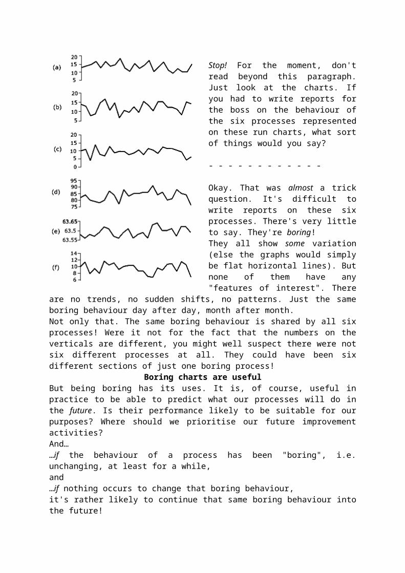
Boring chartsRemember 11-year-old Patrick's chart last month? This month we shall take a look at a dozen similar charts: admittedly tidied up a bit and with lines joining the points. But they're all just the same idea: a simple graph of values recorded once a day, or once a week, or once a month, or once a minute—whatever's appropriate. Such charts are often referred to by names such as run charts, running records, or time series.Let's look straightaway at the first six run charts: Figure 1.
Stop! For the moment, don't read beyond this paragraph. Just look at the charts. If you had to write reports for the boss on the behaviour of the six processes represented on these run charts, what sort of things would you say? - - - - - - - - - - - - Okay. That was almost a trick question. It's difficult to write reports on these six processes. There's very little to say. They're boring!They all show some variation (else the graphs would simply be flat horizontal lines). But none of them have any "features of interest". There are no trends, no sudden shifts, no patterns. Just the same boring behaviour day after day, month after month.Not only that. The same boring behaviour is shared by all six processes! Were it not for the fact that the numbers on the verticals are different, you might
well suspect there were not six different processes at all. They could have been six different sections of just one boring process!
Boring charts are usefulBut being boring has its uses. It is, of course, useful in practice to be able to predict what our processes will do in the future. Is their performance likely to be suitable for our purposes? Where should we prioritise our future improvement activities?And……if the behaviour of a process has been "boring", i.e. unchanging, at least for a while,and…if nothing occurs to change that boring behaviour,it's rather likely to continue that same boring behaviour into the future!Thus, subject to those two "if"s, we can predict future behaviour. That's very useful in practice. So we can write something positive in those reports!Phrases used to describe processes which are demonstrating such boring but useful behaviour are said to be
← in statistical controlor
← exhibiting controlled variationor simply
← stableNever mind "can". How?
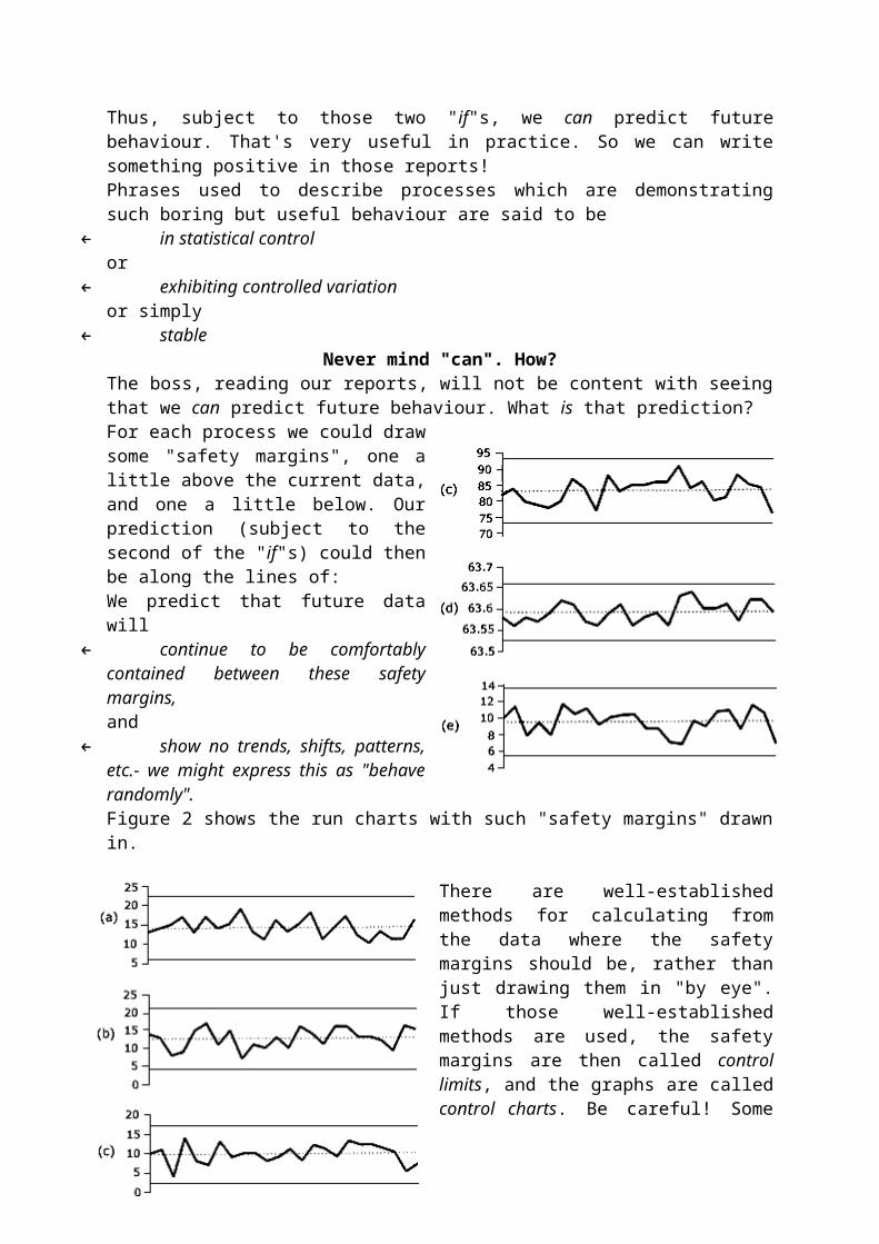
The boss, reading our reports, will not be content with seeing that we can predict future behaviour. What is that prediction?

For each process we could draw some "safety margins", one a little above the current data, and one a little below. Our prediction (subject to the second of the "if"s) could then be along the lines of:We predict that future data will
← continue to be comfortably contained between these safety margins,and
← show no trends, shifts, patterns, etc.- we might express this as "behave randomly".Figure 2 shows the run charts with such "safety margins" drawn in.
There are well-established methods for calculating from the data where the safety margins should be, rather than just drawing them in "by eye". If those well-established methods are used, the safety margins are then called control limits, and the graphs are called control charts. Be careful! Some people (including "experts") sometimes get it wrong! A good method of calculating control limits will be developed in the next article.
Interesting chartsNow let's look at another six run charts: Figure 3.
How about writing reports on those? - - - - - - - - - - - - Now we have a different story—or, rather, six different stories! Unlike the first six, these charts are not "boring". Why are these processes relatively "interesting"?Because things happen in them. The behaviour of each one of these processes changes during the time covered. Sometimes the changes are gradual, sometimes abrupt.
For example, process (a) starts off fairly level (centred around 13), then drops for a while to an average of around 6, and then rises quite abruptly and exhibits more volatile behaviour. Yes, now we have something to say! (Later in the article we'll see what these processes actually were and what was going on in them: you'll then be able to judge how well your reports fit the facts!)Earlier we saw that processes which are "boring" i.e. are in statistical control—have the distinct advantage of being "predictable". Such predictability is never 100% certain, but one can be pretty confident about it subject to that second big "if".It follows that the same cannot be said of "interesting" processes! They are "interesting" precisely because they are unpredictable: they do surprising things, their behaviour changes unexpectedly. (I'm assuming that we do not know in advance of any reasons likely to cause such changes.) Thus we describe them with the opposite terminology. These processes are
← out of statistical controlor
← exhibiting uncontrolled variationor
← unstableSo, in terms of predictability,"boring" is nice "interesting" is nasty
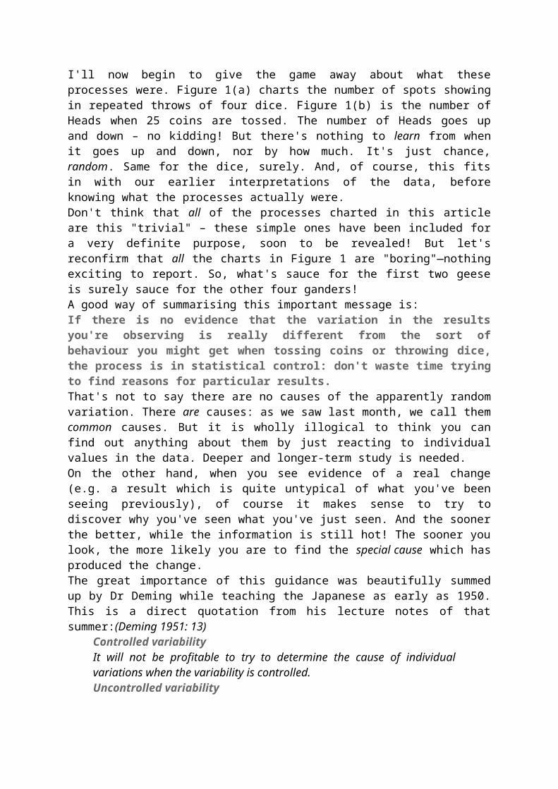
Interpreting process dataThe time is now ripe for some crucial thinking about trying to analyse/use/interpret data from the two types of process.With processes which are in statistical control, isn't it pointless to try to "explain" why any particular individual value in the data is what it is? For "in statistical control" means "unchanging behaviour"—so there can be nothing to "explain"!Appreciation of this one fact could result in many management meetings being cut to a fraction of their normal length!I'll now begin to give the game away about what these processes were. Figure 1(a) charts the number of spots showing in repeated throws of four dice. Figure 1(b) is the number of Heads when 25 coins are tossed. The number of Heads goes up and down – no kidding! But there's nothing to learn from when it goes up and down, nor by how much. It's just chance, random. Same for the dice, surely. And, of course, this fits in with our earlier interpretations of the data, before knowing what the processes actually were.Don't think that all of the processes charted in this article are this "trivial" – these simple ones have been included for a very definite purpose, soon to be revealed! But let's reconfirm that all the charts in Figure 1 are "boring"—nothing exciting to report. So, what's sauce for the first two geese is surely sauce for the other four ganders! A good way of summarising this important message is:If there is no evidence that the variation in the results you're observing is really different from the sort of behaviour you might get when tossing coins or throwing dice, the process is in statistical control: don't waste time trying to find reasons for particular results.That's not to say there are no causes of the apparently random variation. There are causes: as we saw last month, we call them common causes. But it is wholly illogical to think you can find out anything about them by just reacting to individual values in the data. Deeper and longer-term study is needed.

On the other hand, when you see evidence of a real change (e.g. a result which is quite untypical of what you've been seeing previously), of course it makes sense to try to discover why you've seen what you've just seen. And the sooner the better, while the information is still hot! The sooner you look, the more likely you are to find the special cause which has produced the change.The great importance of this guidance was beautifully summed up by Dr Deming while teaching the Japanese as early as 1950. This is a direct quotation from his lecture notes of that summer:(Deming 1951: 13)
Controlled variabilityIt will not be profitable to try to determine the cause of individual variations when the variability is controlled.Uncontrolled variabilityIt will be profitable to try to determine and remove the cause of uncontrolled variability.
So what about the other four processes in that first batch? We now know that it is not sensible to try to explain individual results in those processes either. But what were they?Figure 1(c) was one for those of you who know something of Dr Deming's work: it's a set of results from his famous Experiment on the Red Beads.(Neave 1990: chapter 6) Figure 1(d) was a series of measurements of my pulse-rate, recorded just before breakfast over a period of 24 consecutive days (the final 24 days of October 1991, to be precise). Figure 1(e) shows the total lengths recorded in the first 24 samples from A Japanese Control Chart.(Wheeler, 1984) (This is a highly-recommended case study, to which I shall refer several times in these articles. It is available both as a document and a video.) And Figure 1(f) shows the monthly American trade deficits (in billions of dollars) during 1988 and 1989.Quite a selection of processes! And deliberately thus chosen.
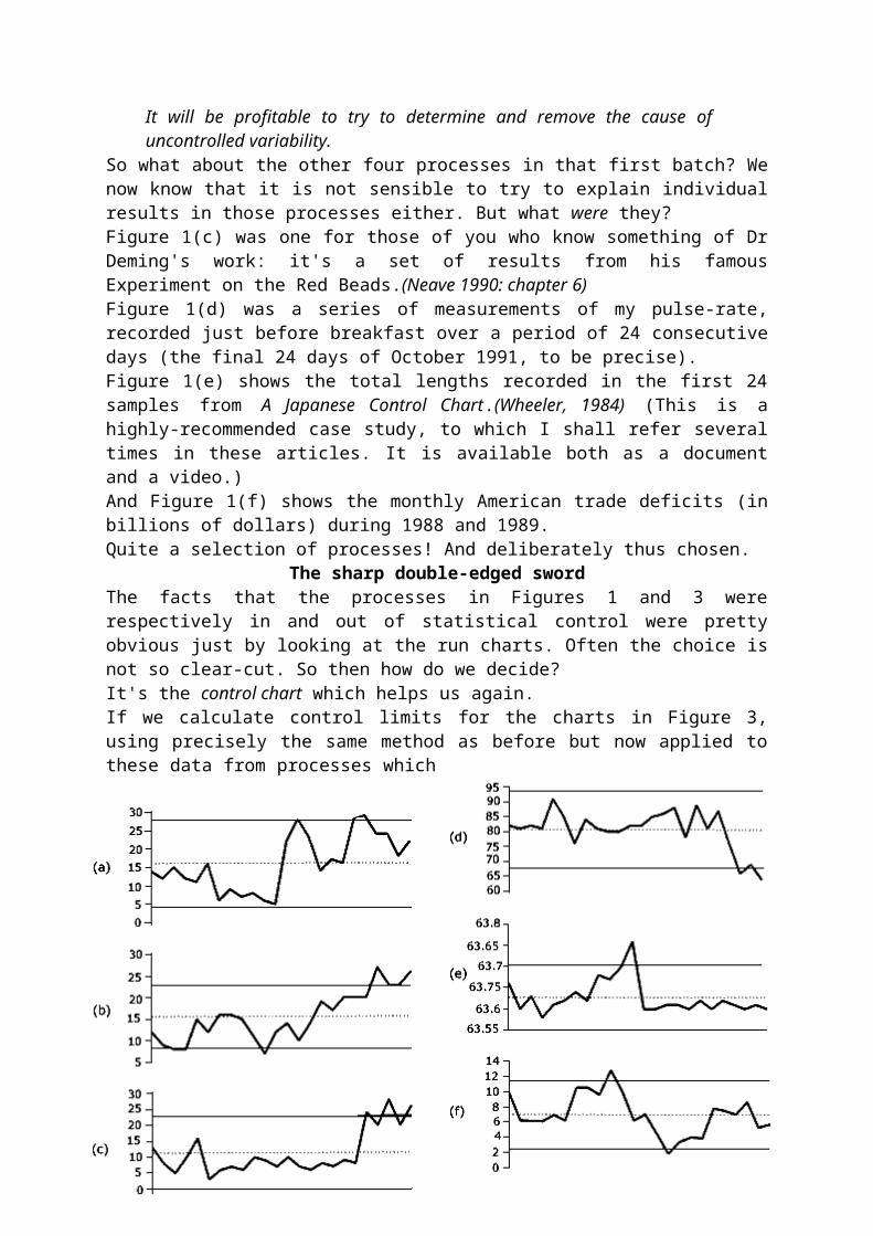
The sharp double-edged swordThe facts that the processes in Figures 1 and 3 were respectively in and out of statistical control were pretty obvious just by looking at the run charts. Often the choice is not so clear-cut. So then how do we decide?It's the control chart which helps us again.

If we calculate control limits for the charts in Figure 3, using precisely the same method as before but now applied to these data from processes which are out of statistical control, we get Figure 4. Now each process has points outside the control limits.
So, the control chart serves us in two roles:1. When the process is in statistical
control, the control limits predict the likely range of variation in the future—the near future, at least; and
2. The control chart helps us diagnose when such prediction is feasible and when it isn't. When points fall outside the control limits, this is evidence that the process is out of statistical control, i.e. such prediction is not feasible.
These two features make the control chart a supremely sharp, double-edged sword :It can diagnose. It can predict.Another phrase often used to describe the control chart is the Voice of the Process.It helps the process speak to us, telling us e.g. what it is doing and what it is capable
of doing.What of the six out-of-control processes (Figures 3 and 4)? What were they?They were the same processes as before! But these data came from later times, when special causes were in operation. In some cases, I know what the special causes were, for it was I that created them!
Figure 4(a) For the first six points, I used four dice as before. For the next six points I used only two dice. For the rest, I used six dice. I was changing the process, i.e. producing special causes. The control chart had already diagnosed that something had been happening to the process, but of course couldn't tell you what. It simply told you that it was worth looking.
Figure 4 (b) Here I began by tossing 25 coins as before. But over the final 10 points I added two extra coins each time.
Figure 4(c) Here I did something to artificially double the scores near the end of the sequence.
Figure 4(d) These data were from November 1991. Near the end of that month, my doctor prescribed a beta-blocker to reduce my blood pressure and pulse rate!
Figure 4(e) Here a fault developed. It is evident from the chart when the fault was diagnosed and rectified.
Figure 4(f) These were the monthly US trade deficits over 1990 and 1991. The temporary downward trend was possibly due to the onset of recession, dampening demand and thus reducing imports.
The control charts cannot tell you the whole story—but they certainly tell you when there is a story to be told!
Guidance for improvementAs we know from the Western Electric story, Shewhart created the control chart to provide guidance for improvement. What kinds of interpretations of data, and what kinds of actions, are likely to be fruitful? Just as important, what kinds of interpretations and actions are literally likely to do more harm than good?Here is a summary of guidance for improvement using control charts:If the control chart judges the process to be in statistical control, improvement effort should be directed at the process as a whole, using information over a relatively long period of time. Do not be distracted by shorter-term data or, even worse, individual data-points.If the process is out of statistical control, initial improvement effort needs to be directed at trying to identify the special cause(s) of the instability and taking appropriate action; in this case it is justifiable, indeed necessary, to investigate shorter-term effects in the data, particularly as guided by points which are beyond the control limits.Appendix: Technical notes1. Control charts are given different names, according to the types of data
represented on them. The charts here for "one-at-a-time" data are sometimes referred to as X-charts. Why "X"? It's the mathematician's favourite letter-I know of no better reason!
2. If a process is in statistical control, the control limits on its X-chart are sometimes called its Natural Process Limits - for that's what they are!
References Deming, W Edwards (1951), Elementary Principles of the Statistical Control of
Quality, Nippon Kagaku Gijutsu Renmei, Tokyo. Neave, Henry R (1990), The Deming Dimension, SPC Press, Knoxville,
Tennessee Wheeler, Donald J (1984), A Japanese Control Chart (booklet and video),
SPC Press, Knoxville, Tennessee. “SPC – Back to the Future”
Part 3 – So, how do we compute those control limits?The double-edged swordHow do we decide where to draw those control limits, and why?Recall from last month's article that we need them to provide us with that "sharp, double-edged sword". Get it wrong, and one or both edges of our sword will be blunt and useless.What are the two edges of the sword?
1. When the process is in statistical control, the control limits predict the likely range of variation in the future (the near future, at least); and
2. The control chart helps us diagnose when such prediction is feasible and when it isn't.
Let's illustrate (Figure 1) with a couple of the control charts we saw last month: my early-morning pulse rates before and after I was prescribed the beta-blocker!
Figure 1
(The control limits in Figure 1(b) were calculated from the data on that chart. Since, in fact, these were simply later data from the same process as in Figure 1(a)—at which time the process was in statistical control—we could in practice just have used the same control limits as in Figure 1(a). But when you first saw the graphs, you didn't know they were from the same process, so these control limits were computed reflecting that lack of knowledge.)Two criteriaControl limits must satisfy two criteria:
1. They must be far enough apart to comfortably contain virtually all the data produced by the process when it is in statistical control; and
2. They must be close enough together for some of the data-points to lie outside them when the process is out of statistical control.
What do these criteria imply?Simply that the control limits should cover the extent of common-cause variation in the process: no less (else we'll contradict the first criterion) and no more (else we'll contradict the second criterion). That's it! That's the guiding principle.So how do we do it?
1. We'll need some "indication" or "measurement" of the common-cause variation.
And then2. We'll designate the distance between the average (the Central Line of the
control chart) and the control limits in terms of that measurement of the common-cause variation. Specifically: the distance out to the control limits will be a suitable multiple of the measurement of variation.
How can we measure variation?Measuring variation is a less familiar concept than just measuring weight, or
time, or indeed calculating an average. But that is what we're going to need. A "measurement of variation" is what it says: it measures variation! If the variation is large, the measurement is high; if the variation is small, the measurement is low.Mathematical statisticians have long had their favourite measurement of variation: they call it the standard deviation. It's not the only way of measuring variation—though "standard" might give that impression! It is made to look even more sacrosanct through traditionally being designated by a Greek letter : ( pronounced "sigma" ).In fact, the standard deviation can be somewhat daunting to non-mathematicians: it has a complicated formula. Fortunately, in the control-charting context, we do not have to suffer that formula – for the very good reason that it is not appropriate for calculating control limits! But…here comes a very deep bear-trap—one into which many of the unwary have fallen. "Scientific" calculators can compute that formula for you. All you do is enter the data and press a button ( labelled , or s, or n-1, amongst various possibilities ). So, if you like pressing buttons, that can be very tempting!
But it will often give you wrong control limits! Don't do it!
In a nutshell, the trouble with the "conventional formula" for is that if we use it on data from a process which is in statistical control then we get sensible control limits; but if we use it on data from a process which is out of statistical control, we may get crazy limits! But how do we know whether our process is in or out of statistical control? By using a control chart, of course. Errr…, that means we have to calculate control limits. But, you've just said that unless the process is in statistical control, the conventional may give us crazy control limits. Right!
Call it a circular argument, begging the question, or what you will. The conventional will not do the job. The edges it gives our sword may be extremely blunt. We'll soon see why.What is the "conventional "?;So what is the "conventional ", the standard deviation-just the general idea, not the detailed formula? It is, in effect,an indication of the "typical" or "representative" distance between the individual items of data and their average.Let's see if you can guess roughly what is just by looking at some data! Figure 2 shows another couple of the run charts based on data we saw in the last paper. I've changed the pictures slightly. To help you, I've inserted their Central Lines (averages) and I've given them both the same vertical scale.Estimate roughly the value of for both of these two processes. ( Try the first one, then check the answer below. Then come back and try the second one. )
Figure 2
Figure 2(a) The average is 14.1, and the lowest and highest values are 10 and 19. So the largest distance away from the average of any of the values charted is about 5. Several of the values are at a distance of around 3 or 4 away from the average, with the rest being closer. A guess for of anything between 2 and 3 would have been very reasonable. The standard formula for actually gives 2.5.The variation in Figure 2(b) is
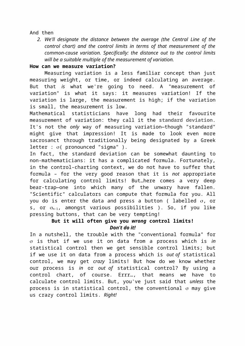
obviously smaller. Look back at it now and make a guess—preferably before reading the answer below!Figure 2(b) A very acceptable guess here is that the variation is about half that of the first chart, which would suggest that is around 1.2 or a little bigger. The standard formula in fact gives 1.5.So, while it is true that the conventional formula for can be regarded as quite complicated by non-mathematicians, it is possible to make a reasonable guess at its value. One cannot expect to get very close to its value by guesswork, but one can hit the general "order of magnitude" of s, i.e. be "in the same ballpark".Shewhart's "3 -limits". WhySo how many s away from the Central Line should the control limits be placed in order to satisfy those two criteria above? In Shewhart's own words:
"Experience indicates that 3 seems to be an acceptable economic value."

That's it! He experimented. He found that if he placed the limits much closer than 3 from the Central Line then he embarked upon too many false trails for special causes which didn't exist; and if he put them much further out then he started missing important clues of special causes.Figure 3 shows Shewhart's 3-limits for the run charts of Figure 2.
Figure 3As with all the control charts in Figure 2 of last month's article, these control limits comfortably contain the data from the processes.The conventional doesn't work!But those processes are in statistical control. What happens if we try the
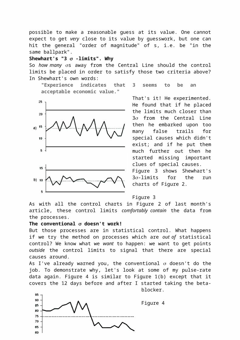
method on processes which are out of statistical control? We know what we want to happen: we want to get points outside the control limits to signal that there are special causes around.As I've already warned you, the conventional doesn't do the job. To demonstrate why, let's look at some of my pulse-rate data again. Figure 4 is similar to Figure 1(b) except that it covers the 12 days before and after I started taking the beta-blocker.
Figure 4Who could doubt (even if I hadn't told you the circumstances) that a special cause had changed the behaviour of this process?!But suppose we were to try to compute control limits from these data using the conventional .
What was my average pulse-rate over those 24 days? It was about 75: during the first half of the chart it was well above 75, in the second half it was well below.Now what was that conventional ? You'll recall : an indication of the "typical" or "representative" distance between the individual items of data and their average.What's that here? It's around 10! Virtually all the data lie between 80 and 90 or between 60 and 70—i.e. on average about 10 from 75! Where would that put the 3 -limits? At about 45 and 105!! Try drawing them in on Figure 4. I think you'll agree they're not very useful! A special cause has massively changed the behaviour of this process, yet none of the data reach even halfway to those limits. It's not the data's fault: it's the fault of stupid limits!What can we do instead?Why has this happened?

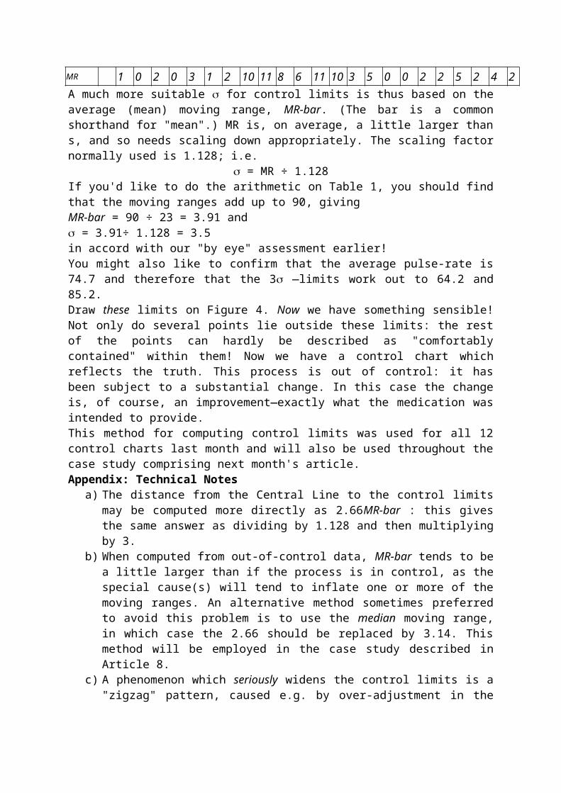
As pointed out earlier, the crucial requirement is that the used for control limits must represent common-cause variation. My pulse-rate process was in statistical control both before and after taking the beta-blocker—but of course with very different averages. Common-cause variation is the "random" variation around the local average. If you attempted a "by eye" assessment of separately for each half of Figure 4 you'd probably come up with, say, 3 or 4—not 10!Unfortunately it is not always the case that we can easily split the run chart into such separate in-control sections. Often, for example, changes in the process are much more gradual than here. So we need a more automatic method of measuring localised variation only. We'll still illustrate it with the pulse-rates data.The 24 pulse-rates are listed in Table 1. Under the data I have entered the day-to-day changes in the pulse-rates. These are called moving ranges (MR) and they represent the most localised variation available to us in our data. Table 1Pulse-rate 81 80 82 82 85 86 88 78 89 81 87 76 66 69 64 64 64 66 64 69 67 63 61 MR 1 0 2 0 3 1 2 10 11 8 6 11 10 3 5 0 0 2 2 5 2 4 2A much more suitable for control limits is thus based on the average (mean) moving range, MR-bar. (The bar is a common shorthand for "mean".) MR is, on average, a little larger than s, and so needs scaling down appropriately. The scaling factor normally used is 1.128; i.e.
= MR ÷ 1.128If you'd like to do the arithmetic on Table 1, you should find that the moving ranges add up to 90, giving MR-bar = 90 ÷ 23 = 3.91 and = 3.91÷ 1.128 = 3.5in accord with our "by eye" assessment earlier!You might also like to confirm that the average pulse-rate is 74.7 and therefore that the 3 —limits work out to 64.2 and 85.2.Draw these limits on Figure 4. Now we have something sensible! Not only do several points lie outside these limits: the rest of the points can hardly be described as "comfortably contained" within them! Now we have a control chart which reflects the truth. This process is out of control: it has been subject to a substantial change. In this case the change is, of course, an improvement—exactly what the medication was intended to provide.This method for computing control limits was used for all 12 control charts last month and will also be used throughout the case study comprising next month's article.Appendix: Technical Notes
a) The distance from the Central Line to the control limits may be computed more directly as 2.66MR-bar : this gives the same answer as dividing by 1.128 and then multiplying by 3.
b) When computed from out-of-control data, MR-bar tends to be a little larger than if the process is in control, as the special cause(s) will tend to inflate one or more of the moving ranges. An alternative method sometimes preferred to avoid this problem is to use the median moving range, in which case the 2.66 should be replaced by 3.14. This method will be employed in the case study described in Article 8.
c) A phenomenon which seriously widens the control limits is a "zigzag" pattern, caused e.g. by over-adjustment in the process. If control limits computed from moving ranges seem too wide, check for this effect.
d) Some people prefer a different calculation of control limits for processes like (b) and (c) in this article, giving a so-called np-chart. But there's no real need.
SPC—Back to the Future!4. Case Study: " ... And what's this saving cost you?"
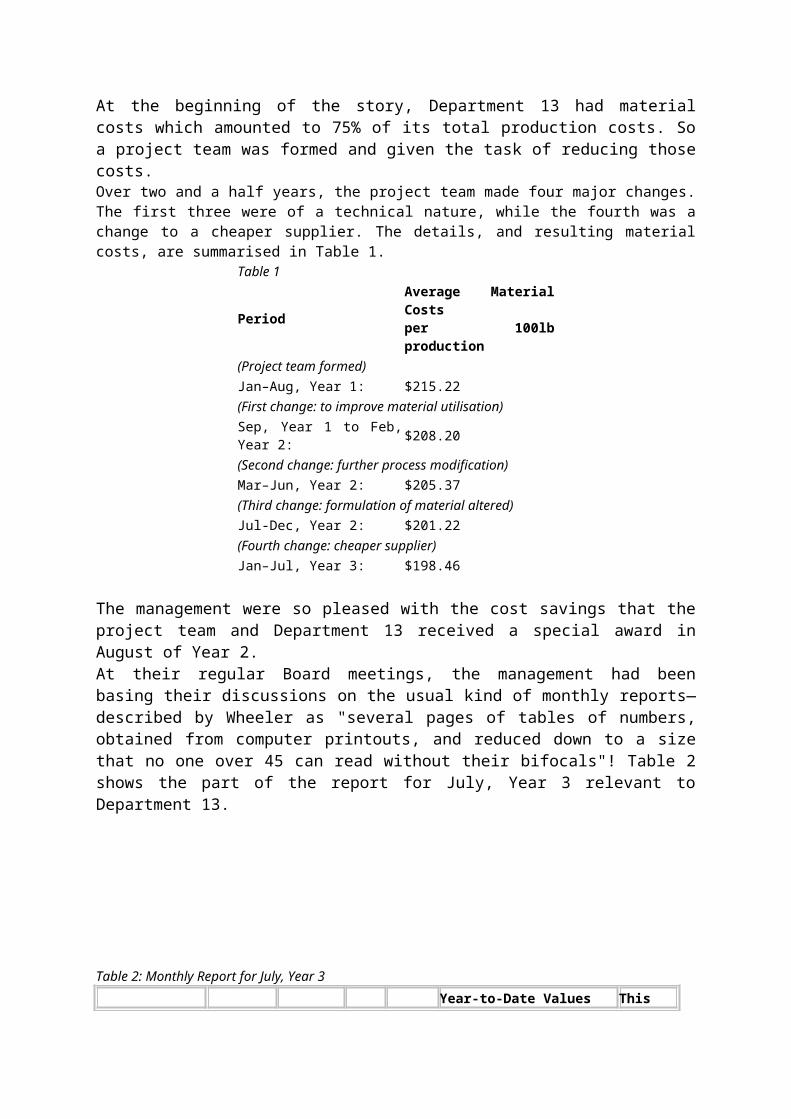
"Elementary, my dear Watson"The quotation which forms the title of this article deserves immortality. It is a question that should be asked repeatedly at most meetings of both management and politicians.It comes from a video "The Short-Sighted Boss" made for the DTI's 1986 National Quality Campaign. An electrical goods manufacturing company is running into trouble. In a dream, its Managing Director brings in Sherlock Holmes as a Management Consultant, played by Nigel Hawthorne. During his investigations, Holmes observes with interest some electric toasters having very short leads. In answer to his enquiry, he learns that the Production Department had recommended making the flex on the toasters a foot shorter than the previous rather more convenient length. Holmes is told: "Saves us two or three thousand quid a year, apparently". In reply, he asks the above question.The question is also an ideal title for the case study described in this article. The case study is not a dream—though it must have seemed like one to many people: a bad dream. It is originally reported in Don Wheeler's superb little book: Understanding Variation—the Key to Managing Chaos (Wheeler, 1993: 88-89) , and this abbreviated account is given here with the author's permission and assistance. (Incidentally, if you wish to limit yourself to reading just one book on control-charting, Understanding Variation has to be it!)Tips of icebergsThe case study tells the story of an improvement effort in a section of a traditionally managed company. That section is referred to as "Department 13". (For any superstitious readers, it might be worth pointing out that it was Department 13's customer that turned out unlucky, rather than Department 13 itself!)At the beginning of the story, Department 13 had material costs which amounted to 75% of its total production costs. So a project team was formed and given the task of reducing those costs.Over two and a half years, the project team made four major changes. The first three were of a technical nature, while the fourth was a change to a cheaper supplier. The details, and resulting material costs, are summarised in Table 1.
Table 1
Period Average Material Costsper 100lb production
(Project team formed)Jan–Aug, Year 1: $215.22(First change: to improve material utilisation)Sep, Year 1 to Feb, Year 2: $208.20(Second change: further process modification)Mar–Jun, Year 2: $205.37(Third change: formulation of material altered)Jul-Dec, Year 2: $201.22(Fourth change: cheaper supplier)Jan–Jul, Year 3: $198.46

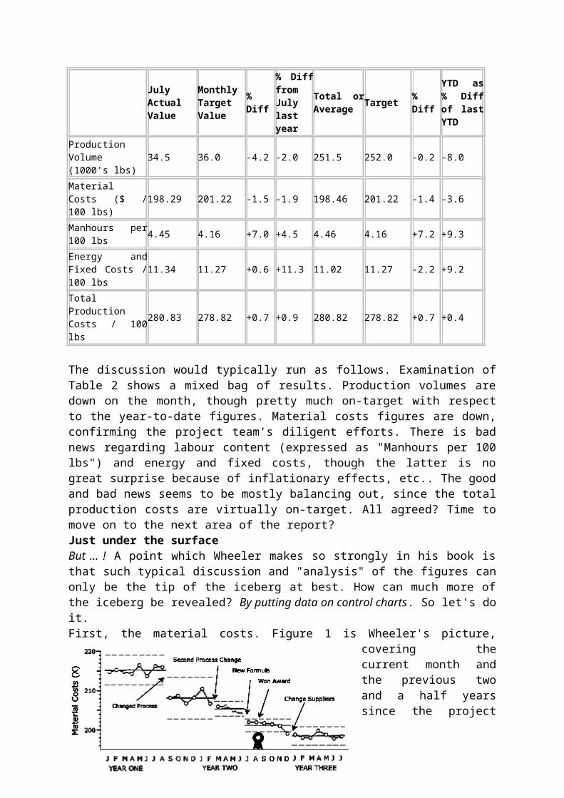
The management were so pleased with the cost savings that the project team and Department 13 received a special award in August of Year 2.At their regular Board meetings, the management had been basing their discussions on the usual kind of monthly reports—described by Wheeler as "several pages of tables of numbers, obtained from computer printouts, and reduced down to a size that no one over 45 can read without their bifocals"! Table 2 shows the part of the report for July, Year 3 relevant to Department 13.
Table 2: Monthly Report for July, Year 3 Year-to-Date Values
This YTD as % Diff of last YTD
July Actual Value
MonthlyTargetValue
% Diff
% Difffrom Julylast year
Total or Average Target % Diff
ProductionVolume (1000's lbs)
34.5 36.0 -4.2 -2.0 251.5 252.0 -0.2 -8.0
Material Costs ($ / 100 lbs) 198.29 201.22 -1.5 -1.9 198.46 201.22 -1.4 -3.6
Manhours per 100 lbs 4.45 4.16 +7.0 +4.5 4.46 4.16 +7.2 +9.3
Energy and Fixed Costs / 100 lbs 11.34 11.27 +0.6 +11.3 11.02 11.27 -2.2 +9.2
Total Production Costs / 100 lbs 280.83 278.82 +0.7 +0.9 280.82 278.82 +0.7 +0.4
The discussion would typically run as follows. Examination of Table 2 shows a mixed bag of results. Production volumes are down on the month, though pretty much on-target with respect to the year-to-date figures. Material costs figures are down, confirming the project team's diligent efforts. There is bad news regarding labour content (expressed as "Manhours per 100 lbs") and energy and fixed costs, though the latter is no great surprise because of inflationary effects, etc.. The good and bad news seems to be mostly balancing out, since the total production costs are virtually on-target. All agreed? Time to move on to the next area of the report?Just under the surfaceBut ... ! A point which Wheeler makes so strongly in his book is that such typical discussion and "analysis" of the figures can only be the tip of the iceberg at best. How can much more of the iceberg be revealed? By putting data on control charts. So let's do it.
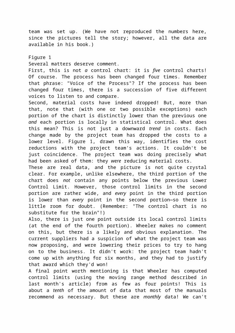
First, the material costs. Figure 1 is Wheeler's picture, covering the current month and the previous two and a half
years since the project team was set up. (We have not reproduced the numbers here, since the pictures tell the story; however, all the data are available in his book.)
Figure 1Several matters deserve comment.First, this is not a control chart: it is five control charts! Of course. The process has been changed four times. Remember that phrase: "Voice of the Process"? If the process has been changed four times, there is a succession of five different voices to listen to and compare.Second, material costs have indeed dropped! But, more than that, note that (with one or two possible exceptions) each portion of the chart is distinctly lower than the previous one and each portion is locally in statistical control. What does this mean? This is not just a downward trend in costs. Each change made by the project team has dropped the costs to a lower level. Figure 1, drawn this way, identifies the cost reductions with the project team's actions. It couldn't be just coincidence. The project team was doing precisely what had been asked of them: they were reducing material costs. These are real data, and the picture is not quite crystal clear. For example, unlike elsewhere, the third portion of the chart does not contain any points below the previous Lower Control Limit. However, those control limits in the second portion are rather wide, and every point in the third portion is lower than every point in the second portion—so there is little room for doubt. (Remember: "The control chart is no substitute for the brain"!)Also, there is just one point outside its local control limits (at the end of the fourth portion). Wheeler makes no comment on this, but there is a likely and obvious explanation. The current suppliers had a suspicion of what the project team was now proposing, and were lowering their prices to try to hang on to the business. It didn't work: the project team hadn't come up with anything for six months, and they had to justify that award which they'd won!A final point worth mentioning is that Wheeler has computed control limits (using the moving range method described in last month's article) from as few as four points! This is about a tenth of the amount of data that most of the manuals recommend as necessary. But these are monthly data! We can't afford to wait three years before computing limits for the first time! Of course, limits computed from so few points have to be treated with greater caution. But who could disagree that they are pretty helpful in interpreting these data?Further under the surfaceOther figures are available for Department 13. Do you recall some concern over the "Manhours per 100 lbs"? Would it be helpful to put those figures on a similar chart? Wouldn't it just?! See Figure 2.
Figure 2Ouch! This picture is absolutely crystal clear. Each portion of the chart is distinctly higher than the one before. And each portion of the chart is locally in statistical control.
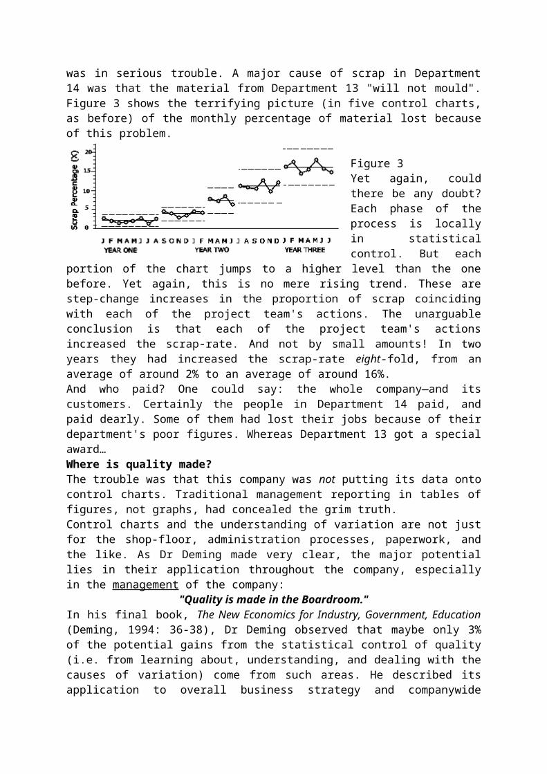
No exceptions. No doubt. Again, this is no mere trend. Each and every change made by the project team raised the required labour content for the product.But, of course, that wasn't their concern. Their job was to reduce cost of materials. They did it—and indeed management rewarded them handsomely for it (remember what happened in August of Year 2).The original account in Wheeler's book contains several other charts, most of which we shall omit here for brevity. One showed the production volumes drifting down over most of the period—though they appeared to have been moving upwards before the project team became active. Energy and fixed costs mostly showed a straightforward gradual trend upwards, confirming the suggestion that this was mostly an inflation effect. Total production costs had nevertheless been gently moving downwards, though interestingly they immediately increased after the change to the cheaper supplier. Have you ever known a cheaper supplier raise your costs?Who paid?But the worst is yet to come. The one important thing not yet investigated is the quality of what Department 13 produces. That, of course, cannot be judged until we see what happened to Department 13's customer over the same period. Department 13's customer was (logically enough) Department 14. Department 14 was in serious trouble. A major cause of scrap in Department 14 was that the material from Department 13 "will not mould". Figure 3 shows the terrifying picture (in five control charts, as before) of the monthly percentage of material lost because of this problem.
Figure 3Yet again, could there be any doubt? Each phase of the process is locally in statistical control. But each portion of the chart jumps to a higher level than the one before. Yet again, this is no mere
rising trend. These are step-change increases in the proportion of scrap coinciding with each of the project team's actions. The unarguable conclusion is that each of the project team's actions increased the scrap-rate. And not by small amounts! In two years they had increased the scrap-rate eight-fold, from an average of around 2% to an average of around 16%.And who paid? One could say: the whole company—and its customers. Certainly the people in Department 14 paid, and paid dearly. Some of them had lost their jobs because of their department's poor figures. Whereas Department 13 got a special award…Where is quality made?The trouble was that this company was not putting its data onto control charts. Traditional management reporting in tables of figures, not graphs, had concealed the grim truth.Control charts and the understanding of variation are not just for the shop-floor, administration processes, paperwork, and the like. As Dr Deming made very clear, the major potential lies in their application throughout the company, especially in the management of the company:
"Quality is made in the Boardroom."
In his final book, The New Economics for Industry, Government, Education (Deming, 1994: 36-38), Dr Deming observed that maybe only 3% of the potential gains from the statistical control of quality (i.e. from learning about, understanding, and dealing with the causes of variation) come from such areas. He described its application to overall business strategy and companywide systems such as personnel, training, purchasing, legal and financial matters, etc., i.e. to the management of the organisation, as:
"Here are the big gains, 97%, waiting."If the 3% is big (and it is), the 97% is massive.
References The Short-Sighted Boss (video) (1984), Video Arts (for the Department of
Trade and Industry). Wheeler, Donald J (1993), Understanding Variation—the Key to Managing
Chaos, SPC Press, Knoxville, Tennessee. Deming, W Edwards (1994), The New Economics for Industry, Government,
Education, Massachusetts Institute of Technology, Centre for Advanced Engineering Study.
6.3. Operational Definitions: Understanding and use for improvement
What is an Operational Definition? It is a definition which reasonable men can agree on and do business with. Words have no meaning unless they are translated into action agreed upon by everyone. An operational definition puts communicable meaning into a concept. It is not open to interpretation.
Why is an Operational Definition necessary? All meaning begins with concepts. A concept is ineffable (i.e. unspeakable, beyond description) One can hardly do business with concepts--use of concepts rather than operational definitions causes serious problems in communication e.g. Reports, Instructions, Procedures which are incomprehensible to all except those who have written them! Operational definitions are necessary for achieving clarity in communication.
Importance and use of Operational Definitions. Deming regards understanding and application of operational definitions as of supreme importance. The Japanese paid great attention to use of operational definitions and Deming realised that the benefits obtained were comparable to the benefits obtained by use of concepts and tools of Statistical Process Control.Shewhart believed his work on Operational definitions to be of greater importance than his work on the Theory of variation and Control Charts.It will be appreciated that use of operational definitions has a great deal to do with reducing variation. After all if there is more clarity in defining and communicating the needs of internal and external customers, variability is bound to reduce.
Examples of Operational Definitions: Clean the table--clean enough to eat on or eat off or to sell or to operate on?
We need to specify to make it an operational definition. Satisfactory? – For what? To whom? What test shall we apply?
Careful, correct, attached, tested, level, secure, complete, uniform – all need operational definitions.
Definition of sales and accidents often change due to management pressure. Zero Defects – What is a defect? e.g. What is a surface with no cracks?
What is a crack? Do cracks too small to be seen with the naked eye need to be counted? Are these to be detected by a magnifying glass? What magnification?
Related Concept: "There is no true value of anything." If so, what is
there? There is a number that we get by carrying out a procedure--a procedure which needs to be operationally defined. If we replace this by another procedure (also operationally defined ) we are likely to get another number. Neither is right or wrong. If the procedure is not operationally defined we are likely to get different numbers even with the same procedure! For example:
a) Percent iron content of iron ore mined by Yawata Steel Co.--- Old method : by scooping samples off the top of trucks. New Method: by taking samples off the conveyor belt. Neither method is right or wrong. The question is--does either serve the purpose better? If so, use it.
b) Long term average number of red beads attained in the red beads experiment.
Contrary to what one would expect, this figure is not directly related to the proportion of red beads. Hundreds of usages of two different paddles have produced averages of 9.4 and 11.3 respectively! The clear answer must be 10 as per the law of large numbers since the ratio of white beads to red beads is 4:1. However we must appreciate that this would be true if sampling were done by random numbers. But this is mechanical sampling--a different method. c) Value of (circumference / Diameter ). Mathematical theory says it is an irrational constant with the first few figures being 3.14159265……But the conditions under which this is true are--
The measurement method must be of infinite accuracy for both the straight line and the circle.
The circle must be a perfect circle. Both the lines (circumference as well as diameter) must be of zero
thickness.In practice the above conditions are not satisfied. So however we define and
measureC/D we will never obtain the value . e.g. if we measure up to 3 places of
decimel--C=6.237cms, D=1.985cms and C/D= 3.142065. The procedure must be
defined, there is no right or wrong. The relevant question is not whether an operational definition is right or wrong? The question is does it do what we want it to do?
Chapter 4: Theory of Improvement
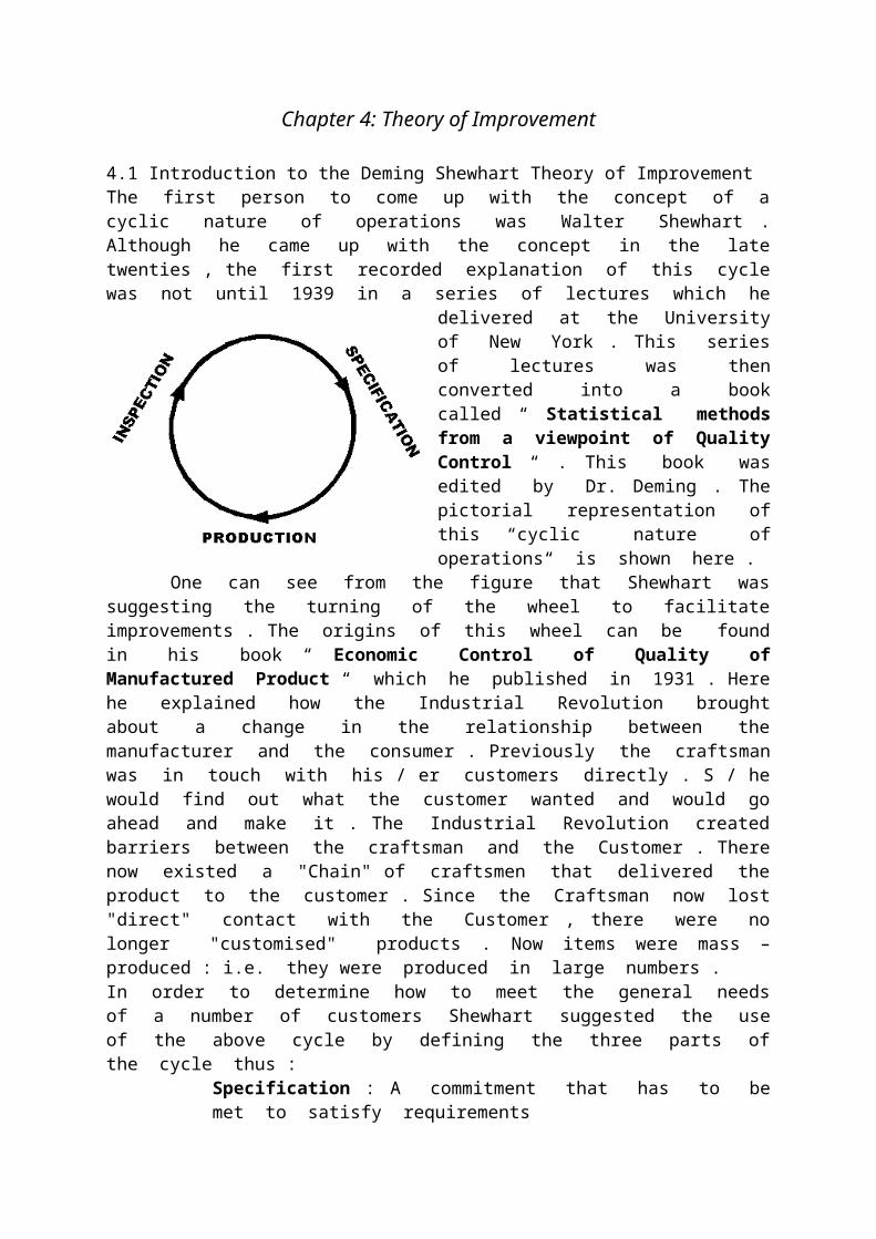
4.1 Introduction to the Deming Shewhart Theory of ImprovementThe first person to come up with the concept of a cyclic nature of operations was Walter Shewhart . Although he came up with the concept in the late twenties , the first recorded explanation of this cycle was not until 1939 in a series of lectures which he delivered at the University of New York . This series of lectures was then converted into a book called “ Statistical methods from a viewpoint of Quality Control “ . This book was edited by Dr. Deming . The pictorial representation of this “cyclic nature of operations“ is shown here .
One can see from the figure that Shewhart was suggesting the turning of the wheel to facilitate improvements . The origins of this wheel can be found in his book “ Economic Control of Quality of Manufactured Product “ which he published in 1931 . Here he explained how the Industrial Revolution brought about a change in the relationship between the manufacturer and the consumer . Previously the craftsman
was in touch with his / er customers directly . S / he would find out what the customer wanted and would go ahead and make it . The Industrial Revolution created barriers between the craftsman and the Customer . There now existed a "Chain" of craftsmen that delivered the product to the customer . Since the Craftsman now lost "direct" contact with the Customer , there were no longer "customised" products . Now items were mass – produced : i.e. they were produced in large numbers . In order to determine how to meet the general needs of a number of customers Shewhart suggested the use of the above cycle by defining the three parts of the cycle thus :
Specification : A commitment that has to be met to satisfy requirements Production : An effort that is carried out to meet these requirements . Inspection : An act carried out to assess the effectiveness of the efforts to meet these requirements .
Shewhart called this " The Scientific Process of acquiring Knowledge " . He suggested the use of Statistical Methods to " break " the barriers between the manufacturer and the customer . By the use of Statistical Methods , one could determine the " average " needs of the customers and could hence be " ensured " of meeting the needs of a number of customers . Also Statistical Methods could be applied at the three stages in the cycle to improve the operations within the company thus : After going through the cycle once , whatever learned from the inspection process – shortfalls / advantages of the production and specification processes – could be used as a starting point of the second journey through the cycle . That is , the specifications could be found wanting from a customer point of view which could be improved further , alternatively , the production process
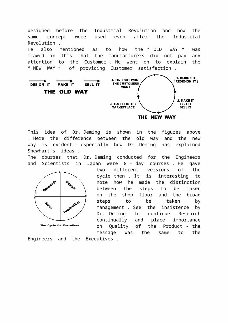
could be found wanting in some respects as regards meeting specifications - which could be then corrected , and so the cycle would continue to rotate , every journey through the cycle making the outcomes better and better , and also giving the manufacturer better and better insights into his manufacturing processes , his customers and ultimately his organisation . Dr. Deming understood exactly what it was Shewhart was trying to say . When he got an opportunity to deliver lectures to the Japanese on Quality in 1950 , his lectures carried a lot of concepts that were introduced by Shewhart . The lectures that Dr. Deming delivered to the Japanese were converted into a book called " Elementary Principles of the Statistical Control of Quality " which was published in 1950 and re - printed in 1952 . Here one can see the origins of the Deming Wheel as we know it today . Dr. Deming was trying to get the idea of the cyclic nature of operations to the Japanese . While doing so he mentioned how products used to be designed before the Industrial Revolution and how the same concept were used even after the Industrial Revolution . He also mentioned as to how the “ OLD WAY “ was flawed in this that the manufacturers did not pay any attention to the Customer . He went on to explain the “ NEW WAY “ of providing Customer satisfaction .
This idea of Dr. Deming is shown in the figures above . Here the difference between the old way and the new way is evident – especially how Dr. Deming has explained Shewhart’s ideas . The courses that Dr. Deming conducted for the Engineers and Scientists in Japan were 8 – day courses . He gave two different versions of the cycle then . It is interesting to note how he made the distinction between the steps
to be taken on the shop floor and the broad steps to be taken by management . See the insistence by Dr. Deming to continue Research continually and place importance on Quality of the Product - the message was the same to the Engineers and the Executives .
He basically expanded on THE NEW WAY of manufacturing making the steps in the cycle more elaborate . He further went on to describe what he called "THE BETTER WAY” . This concept of a "Helix" or "Spiral" of Improvement was perhaps the first ever recorded . There are many who claimed that the first to come up with the concept of the Spiral of Quality was Dr. Juran . Dr. Juran did not put forth the spiral concept of Quality till 1974 . Dr. Deming conceptualised this in 1950 !
The steps 1,2,3,4 are the same from THE NEW WAY . The radius of the helix which goes on increasing in size indicates the improvement in the product due to an increase in knowledge of the process , materials , etc. In his book “Out of the Crisis” , Dr. Deming had outlined his now famous 14 points . As an explanation for Point no 14 , he urged Managers to make use of the Shewhart Cycle which is shown in the figure .
He called it the Shewhart Cycle but also clarified that this what was the Japanese called the Deming Cycle . Although he did not use the acronym PDCA , the steps in the cycle do indicate that it is a PLAN - DO - CHECK - ACT cycle . In 1990 , Dr. Deming professed what he called - A System of Profound Knowledge . This was the culmination of his philosophy

. As a result of this , the Deming Wheel further underwent a change and the word "CHECK" was replaced with the word "STUDY" . Dr. Deming emphasised that you need to "Study" the results - in checking you might miss something . In his last book " The New Economics for Industry , Government and Education " the Deming Wheel appears as shown .
As seen in the figure , he has altered the wordings of the Cycle shown above and made it sound simple . He has called it the PDSA cycle in this book . It should be noted now that the cycle is no longer called the PDCA loop but the PDSA loop . This loop has become the underlying philosophy of the QS 9000 standard .
Many have gone on to add different steps under the PLAN , DO , STUDY and ACT phase , but the basic notion of a cyclic nature of operations has remained the same . 4.2 The Origins of the Theory of ImprovementThe origins of this thinking go back to the early twentieth century . Walter Shewhart was a great follower of the philosopher and epistemologist , Clarence Irwing Lewis . Epistemology deals with the science of learning and acquiring knowledge . Lewis had written a book in 1929 called “ Mind and the World – Order - An outline of the Theory of Knowledge “ . In this book he had mentioned that we must have a theory to begin with when we want to acquire knowledge . A theory could be a hunch , a set of principles , a set of laws , etc . Actual testing of the theory and recordings of the observations could make us improve the theory , change the theory or , even abandon the theory . No theory is wrong – only effective or ineffective . Every theory is good in it’s own world , but may be ineffective in another . Let us take an example to explain this . There is a child aged 6 years who has been watching his father go to work everyday . The father goes to work on a motorcycle . The child has seen something that happens every morning and has drawn a conclusion – “My father kicks the lever on the right hand side very hard ,and the motorcycle revs to life“ . His theory is very simple, you just have to kick the lever very hard to make the motorcycle start . One fine day , when no one was at home, he decided to “start“ the vehicle himself . He climbed on the motorcycle and kicked on the lever hard, but nothing happened . He kicked again, but nothing happened again . Obviously, his theory was ineffective . There must have been something he missed out . So, the next time he observed his father closely as he started his motorcycle. He found that he did miss out something! His father turned a key on top before kicking at the lever! So that was it ! His theory changed – now he realised that one had to open a “lock“ before he kicked the lever. Now if he did not have a theory – he would not have anything new to learn, he would not have had any questions . So now with his revised theory, he tried to start the motorcycle himself and succeeded. Some time later, he saw his father kicking away at the lever, but the
motorcycle did not start . He then heard his father tell his mother that he would take the bike to the neighbours' to see if they could help out. The boy accompanied his father to the neighbours house. The neighbour was an elderly gentleman who listened to the boy's father very attentively . He then took the bike , ran with it for some distance , then jumped and sat on it and lo and behold ! – the bike started ! The boy was pretty confused by now . His revised theory about the “key" and "kick" needed some revision. He asked his father "what did he do that yo weren't doing ?" . The father told the boy that "he would understand when he grew up !" When the boy grew a little older , he learnt about Newton's laws of motion in school . It then struck him that the neighbour had got the bike into some kind of momentum before starting it ! So that's what the lever was used for ! It gave the rear wheel some momentum and that's how the bike started ! why couldn't he think of this before? He couldn’t because he did not know of certain principles - i.e. Newton's laws of motion . Now , armed with these principles , he could predict the starting of the bike . Soon he grew up and inherited his father's motorcycle . Whenever he faced a problem of starting , he would just run with the bike and start it ! One fine day , he faced a starting problem again , only this time , even when he ran with the bike , i did not start . So , he approached the mechanic who had put up shop a few blocks away and gave him the following explanation – “I tried to run with the bike and start it in motion , but it wouldn’t start .“ . To which the mechanic just bent down and put his hand under the chassis and removed a contraption which he called the “Spark Plug“ . He then went on to show the boy “how dirty it was“ , cleaned the tip and put the plug back in it’s place under the chassis . Now when the mechanic kicked the lever the bike started . It was then that it dawned on the boy that when he kicked at the lever or ran with the bike , a spark was formed in the gap in the Spark Plug which then ignited the fuel and started the bike . ( this explanation will make hard boiled engineers laugh ) Now all through his stages of growth , the boy lived in different worlds , and , he had a theory that was useful until it was replaced by a better theory that “ explained” things better and more importantly – helped him predict the outcome of actions . So we can say that a theory is -
“A sentence that relates cause with effect ; fits without fail all observations of the past , and , helps us predict the future for a similar set of causes , with the risk of being wrong”
Information , though easily available to everyone , is not knowledge . Theory is a statement that relates cause to effect and helps us
predict the future . Interpreting information with the aid of theory leads to knowledge . No theory is wrong - just adequate or inadequate .
Thus theory has temporal spread . Theory is a window into the world . Without theory there are no questions to ask . Without theory we will have nothing new to learn . All knowledge advances theory by theory . This is the foundation of the PDSA cycle .
To sum up , the steps in understanding a “ Theory of Knowledge “ are : Ask Questions Formulate Theories Carry out Experiments Observe
Confirm Theories Verify Theories Act on any differences Make improvements if necessary Repeat the cycle
A pictorial representation is shown below .
Applied science is more exacting than pure science . In other words , a scientist can carry out experiments in a laboratory under controlled conditions - An engineer or Manager on the shop floor does not have this liberty . By using a theory of knowledge however , the engineer / manager can learn while carrying out their daily activities . Thus the job of a Manager nowadays can be defined as follows
The System ( Organisation ) consists of People and Resources . The Job of a Manager is to work on the System – To improve the system constantly with the help of the people in the system applying a theory of knowledge .
4.3 Applications of the Theory of KnowledgeIn order to encourage process thinking, breaking down barriers between departments is very important. A practical way of doing this is for people of different departments to get together and list out the inputs and outputs of the process – this itself can lead to a much better understanding of the process . Inputs are a combination of a number of factors , these are inclusive of but not limited to :
People Machines Methods Materials Measurements Environment
The flow diagram shall indicate inputs and outputs as a combination of these factors . A typical flow diagram will look like one shown below
A Flow Chart is helpful in understanding a system and this understanding is necessary to trace the consequences of a proposed change. The very exercise of constructing a valid flow chart leads straightaway to some considerable improvement. ( Valid here means what actually happens, not what is supposed to happen. )
Important points about a system:a) A system is unlikely to be well defined in practice unless it is both
suitable and adequate for the job intended and is written down in a way comprehensible to all involved.
b) Whether in the form of flow charts or textual a system does need to be documented to indicate what actually happens.
c) If a system cannot be written down, it probably does not exist.d) The greater the complexity, the greater the indications of trouble – there
is a need for simplification. Applying the theory of improvement to this diagram we can get a figure as shown below :
Putting the Theory of Improvement in Practice The following set of steps can be used to put the theory of improvement in practice :PLANDevelop an Improvement Plan / Projects as a part of the Business Plan focussed towards the CustomerStep 1 : Identify and Prioritise the Opportunity for ImprovementStep 2 : Document the Present Process ( Include Process Mapping )Step 3: Create a vision of the Improved ProcessStep 4 : Define the Scope of the Improvement EffortDOCarry out the Improvement PlanStep 5 : Pilot Proposed ChangesSTUDYStudy and evaluate ResultsStep 6 : Observe what was learnt about the Improved ProcessACTAdjust or change Process Based Knowledge gainedStep 7 : Institutionalise / Operationalise the new mix of resourcesStep 8 : Repeat Cycle / Steps if Improvement not sustained / for new Projects
Extending this to the entire business of the organisation , this theory will now look like this :
A further manifestation of the theory of improvement can be used to approach problem solving :
Danger of sub-optimisation There is interdependence between component sub-processes of a system.
Management of a system therefore requires knowledge of the interrelationships between all the components within the system and of everybody that works in it. The greater the interdependence, the greater is the need for communication and co-operation between the components.
If the above is not taken into account and attempts are made to improve the system (by alteration of procedures) without considering the ramifications on all the outputs it may be a case where "we are being ruined by best efforts" by local sub-optimisation. This optimisation of a sub-process is often incompatible with optimisation of the system as a whole.
Management action required to avoid the above danger. All activities should be co-ordinated to optimise the whole system. Performance of any component sub-process should be evaluated in terms of
it's contribution to the aim of the system, not for it's individual production or profit, nor for any other competitive measure.
Optimisation of a system may be incompatible with optimisation of a larger system. A further responsibility of management, therefore, is to look for opportunities to widen the boundaries of their system for the purpose of better service and profit i.e. win-win. Deming gives supreme importance to both internal and external customers. This is clear from some of his quotes given below:a) "The consumer is the most important part of the production line.
Quality should be aimed at the needs of the consumer--present and future."
b) "The consumer is more important than raw material. It is usually easier to replace the supplier of raw material than it is to find a new consumer."
c) "People on a job are often handicapped by inherited defects and mistakes."
d) "A problem in any operation may affect all that happens thereafter."
Practical gains can be made by sorting out problems in the upstream system and thus preventing occurrence of downstream difficulties rather than trying to manage results.
Chapter 5: Joy in Work , Innovation and Co – operation ( Win – Win )
5.1 IntroductionIt is important to understand The need for innovation of product and process in addition to continuous
improvement The importance of joy in work in bringing about such improvement and
innovation The need for creating a climate where joy in work, continuous
improvement and innovation can flourish How such a climate can be created?
Deming accorded a lot of importance to the above aspects in later years as is clear from some of his quotations given below :
"Management's overall aim should be to create a system in which everybody may take joy in work." ( At Denver in August 1988)
"Management's job is to create an environment where everybody may take joy in work". (In the T.V. documentary 'Doctor's Orders'.)
"Why are we here? We are here to come alive, to have fun, to have joy in work." (at the start of many of his Seminars.)
Chances of joy in work are destroyed by faulty practices of management such as performance appraisal, M.B.O and arbitrary numerical targets. These practices deliberately introduce conflict, competition and fear which are the direct opposite of Co-operation ( win-win ). Important aspects to keep in mind about Deming's controversial points concerning these practices.Abolition of performance appraisal, fear, arbitrary targets and mass inspection are natural consequences of the development of Deming's Principles and will be good only in the appropriate environment. In the wrong environment they can do more harm than good. For example: Mass inspection becomes redundant when processes are brought into control, moved much nearer to partnership ( than conflict ) and an environment of continual improvement established. It would be crazy to abolish mass inspection if this environment has not been created.
Why are these practices so common? The answer is that they are all examples of making the best of a bad job. When the working environment is bad such practices do (at least on the surface) make things less bad. The concept of joy in work is irrelevant (even ridiculous) in this context. But Deming is concerned with the far sighted objective of turning the bad job into a very good one! And joy in work plays a large part indeed in this context!
How on earth do we motivate people if appraisals, fear, targets, incentives, threats and exhortations are removed?
Deming's answer to the above question: If management stopped de-motivating people they would not have to worry about motivating them! If management are successful in their job of enabling, engendering and encouraging joy in work there would be no need for motivation. People with joy in work are fuelled by intrinsic

( rather than extrinsic ) motivation – they become able willing and enthusiastic to contribute to the 4 prongs of Quality.Deming suggests that only ~2% of Management and ~ 10% of shop floor people experience joy in work – if this figure can be increased to, say, 25% or 50% it would mean a dramatic change and lead to a transformation, which is what Deming is talking about!
Innovation and Improvement – the four prongs of Quality. In addition to continuous improvement, Deming attaches a lot of importance to Innovation. This is clear from some of his quotations from 'Out of the Crisis':
"Statistical Control opened the way to innovation.""One requirement for innovation is faith that there will be a future. Innovation, the foundation of the future, cannot thrive unless Top Management have declared their unshakeable commitment to Quality and productivity".
Deming refers to the four prongs of Quality as : a) Innovation in products and services.b) Innovation in process.c) Improvement of existing products and services.d) Improvement of existing process. The above is the order of importance. The order of application has to be the
reverse – it is dangerous to invent new processes / products when the present ones are behaving badly / unreliably and we do not know why?
Where does innovation come from?It does not come from the customer. "How would he know?" The customer does fine prior to the to the innovation. People can't miss what they do not know about. But when good innovation does become available, the customer discovers that he needs it! (e.g. word processors, microwave oven, felt tip pens, synthetic fibres).We need to stay ahead of the customer. Innovation comes from the producer who looks ahead to find answers to the questions:--What new products or services will help the customer, be attractive to him, entice him, whet his appetite?
How does Management create a climate where innovation flourishes? Deming's answer :
"Concentrate on generating joy in work and the power of intrinsic motivation will lead to innovation, thus enabling the organisation to grow and prosper."
The opportunity for innovation and the environment for it to flourish has to be nurtured by Management. That is why Deming frequently says : "Quality is made in the Board Room". "We have smothered innovation by patchwork, appraisal, putting people into slots, rugged individualism", Says Deming.
Why should people do a good job instead of only time-serving and getting away with the minimum they can?Three possible reasons could be :
a) fear b) financial incentive or c) they want to d) will obviously be the most effective. This answer emphasises the importance of joy in work 5.2. Backbone of the New Philosophy
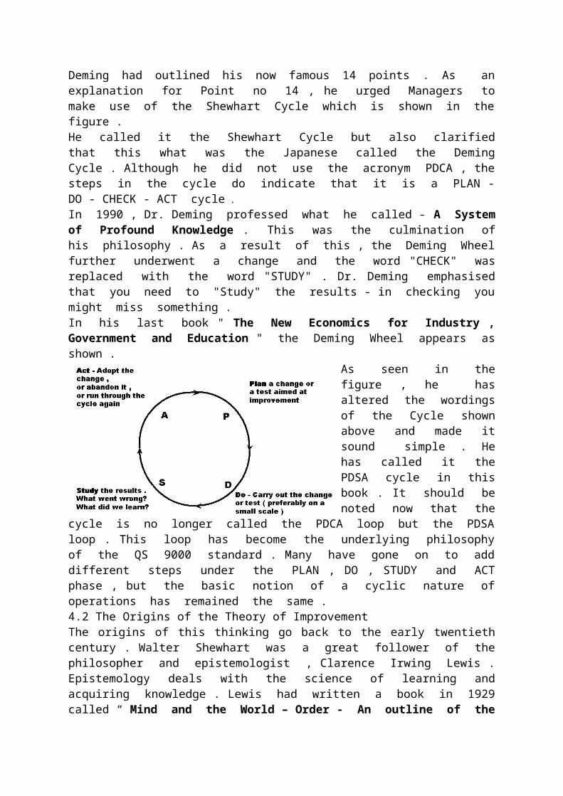
Co-operation (win-win) as opposed to Competition (win-lose). Deming has brought out the pivotal role of co-operation in his following statement
in one of his Seminars in London : "The very purpose of the 14 points is to help carry out co-operation, to create joy in work."
Deming's description of the needed transformation as a "new system of reward" in his following quote ( from a paper read at Osaka on 24th July 1989 ) summarises a lot of the "Backbone of his Philosophy"
"The transformation will be a new system of reward. The aim will be to unleash the power of human resource contained in intrinsic motivation. In place of competition for high rating, high grades, to be number one, there will be co-operation between people, divisions, companies, governments and countries. The result will, in time, be greater innovation, science, applied science, technology, expanded market, greater material reward for everyone. There will be joy in work, joy in learning. Anyone who enjoys his work is a pleasure to work with. Everyone will win, no losers."
5.3. Basis of transformationConversion from the old economics based on conflict and competition ( I win – you lose ) to a new economics based on co-operation ( win-win ). This means :
Conversion from the mistaken belief that competition is inherently good for everyone to the realisation that working together for mutual benefit and benefit of society at large has far greater potential.
Conversion from the current society in which both cause and effect of there being winners is that there must be losers to a future society in which there need be no losers and neither are any desired.
This is Total Transformation.
5.4. What will such transformation do? Open the door for optimisation rather than sub-optimisation-- to realise the full
potential of the system. Make possible the changes required in climate i.e. joy in work, innovation and
co-operation. Joy in work can come about only if your internal suppliers are doing their best for you, which implies co-operation.
Joy in work will encourage and enable people to contribute improvement and innovation to their work and the work of those around them.
5.5. Meaning of co-operation? It does not mean mandatory co-operation or taking money from one wallet
and giving to another. It does not mean mere patience or forbearance. For example if our flight is delayed and we are held up in the gate area for hours, we may eventually be thanked for our co-operation. But: "That's not co-operation. What can prisoners do?"
The word is sometimes used with evil connotations – for collusion, for dividing up markets to the disadvantage of customers. This is not what we are talking about.
It is win - win as opposed to win - lose. This does take more time and energy but is superior, more so when there is a common goal. The gains are much more than winning at the expense of the other.
Win - win style implies building trust, gaining commitment and managing opposition.
Winning in the collaborative ( win – win ) style means fulfilling your needs consistent with your beliefs and values, finding out the real needs of the other side and showing them how to get the same while you get what you want.
5.6. Why is competition regarded as good and important for progress?
In the absence of a system of co-operation (i.e. adoption of co-operation as a Theory, a Principle and an objective) a system of competition is appealing and is seen as effective.
A system of competition is easy to create and easy to manage (e.g. lowest tender, performance appraisal, bonuses and incentive plans, man of the month schemes, M.B.O, arbitrary numerical targets, grading and ranking disregarding knowledge from the experiment on red beads.)
In management it is often easier to develop a strategy whose direct aim is to choke a competitor rather than create improvements for the benefit of customers and society as a whole..
The current apparent need for competition, rather than being an automatic 'fact of life', indicates the large scale of the transformation needed. It makes the best of a bad job whereas the real task is to transform the bad job into a good one so that the bad practices become redundant.
Confusion arises because 'competition' and 'improvement' are often used synonymously---& consequently competition is considered as 'good'. This is not correct because competition only focuses attention on the need for improvement. Real improvement comes about only by a change in the way the organisation is managed, a quantum jump to a better system, learning the alternative system and work towards improvement each day.
5.7. Meaning of competition – competing against vs competing with.
The word competition is used in the following senses:-a) Win - lose as in a contest: we may call this competing against.b) Existence of alternatives.c) Competitive meaning as good as.d) Competing with e.g. as in a game of basketball with friends in which both
sides enjoy developing their skills and players even change sides after each game.
When used in sense a), meanings b) and c) are often implied.
Competing against is very different from competing with as will be clear from a comparison of the characteristics of each of the two:-
Competing against Competing with
Stress on winning Stress on having fun, improving skills, acquiring mastery—winning / losing is
unimportant.
Focus on other team / person / group Focus on improvement of own work, skills teamwork.
Little room for co-operation Co-operation an integral part of process.
Fear of losing No such fear
Fight for market share – be no.1 Focus on customer – improve standard of living.
Judge own performance and compare
Continual improvement of product, process with other people and systems. Open to new ideas. Does not ignore what others do but focus is not on beating them.
'Competing with' will give you superior product or service but it is wrong to call this a benefit of competition as understood in the usual sense ( i.e. competing against ).
5.8. Harmful effects of competition – co-operation vs. competition
Business / Industry is essentially a co-operative situation. A competitive reward system, merit rating etc constitute an 'imposed structure' which changes this into a forced competitive situation. This causes conflict and destroys the desire to help. It creates an artificial scarcity of winners, no matter how excellent the people involved.
It is the 'system of beliefs' which determines how people act, not the way they are rewarded externally. For example if one holds the belief that success is not outscoring anyone else but the peace of mind obtained by doing one's best, intrinsic motivation will drive him towards excellence in work. Co-operation encourages such intrinsic motivation while competition kills it.
Competition between departments leads to maximising results of each department which in turn means sub-optimisation due to the reality of interdependency of departments. For maximising results of the organisation as a whole each department should spend time and effort to ensure that the product or service is optimal for the next (i.e. it's internal customer). This can only be achieved by co-operation.
In a competitive environment, greater effort may only mean a greater attempt to get credit – instead of getting together, people will fight. If no one cares who gets the credit, amazing results can be achieved. This is only possible through co-operation.
Win - lose implies much destruction. By definition one person / group's 'gain' is at the expense of another person / group i.e. the other person / group suffers a loss. The destruction is actually much greater because the struggle to win in the short term (for survival) uses up resources which could otherwise be used for long term advancement.
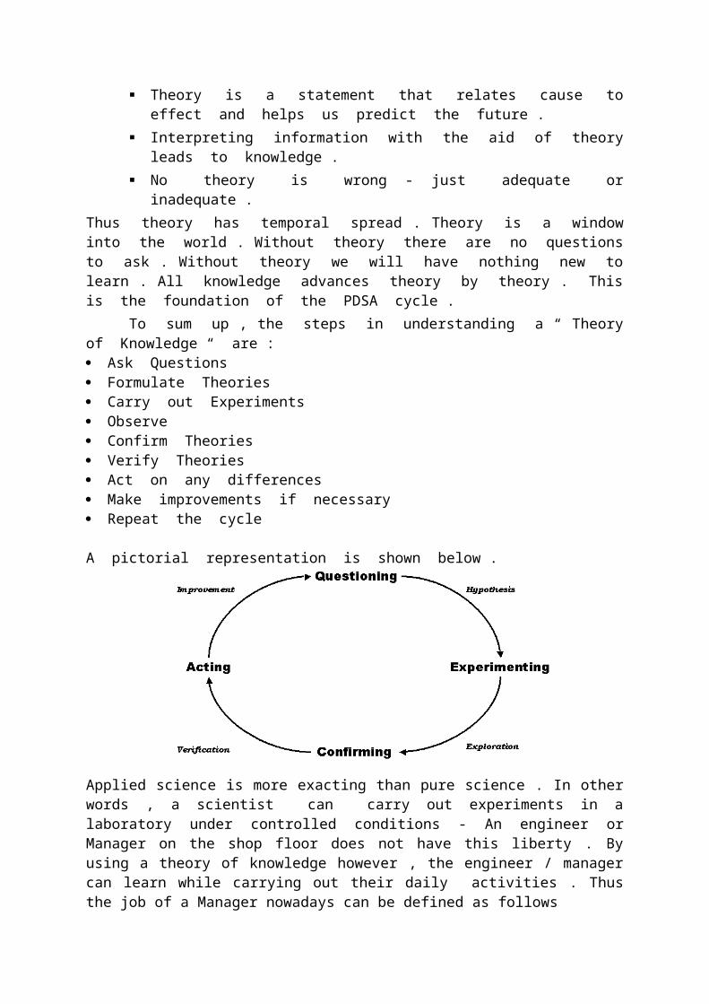
5.9. What should Management do? Learn to practice co-operation as a system, as a principle, as a strategy
and as an objective – instead of the easy management system of competition. In the words of Dr Deming himself:
"One of the first steps in the transformation will be to learn about co-operation: Why, What and How?"
What the above implies is that co-operation should not be incidental or an accident: it should be the aim – the new management style!
Provide the type of leadership which nurtures teamwork. What does lack of teamwork mean in practice? This is very aptly described in Dr Deming's own words as follows: "People on a job are often handicapped by lack of privilege to work together with people in the preceding and following operations." So management must create conditions in which people will have the privilege to work together with their 'suppliers' as well as with their 'customers'.
Remove the various manifestations of the win-lose philosophy which hold us back from co-operation (Win-Win)and are barriers to real progress viz. Merit system. Performance Appraisal constrained by a forced distribution, where it
becomes formally necessary to put somebody else under in order to get a higher rating. This creates an artificial scarcity of 'winners'. This is unavoidable in a game of tennis where somebody wins, somebody else loses--but does life in general and work in particular have to be played like a game of tennis? Surely a better way is to have everybody working for the Organisation rather than against each other!
Managing departments in a system of competition. In an inner competitive environment, what matters the trouble you may cause to other departments? (Indeed it can actually be advantageous!) The tremendous harm that this causes is clear when we appreciate that every department is a supplier or customer or both to every other department.
As the industrial world expands, considerations of efficiency & economics move us to greater and greater interdependence. It is better for this interdependence to be based on co-operation and partnership rather than conflict and distrust.Co-operate with competitors for mutual benefit.
"Compete? Yes, but in the framework of co-operation first. Everybody wins."Examples of such co-operation : Possible areas of co-operation could be – increasing the market, improving
industry image, using interchangeable parts, agreeing on standards, working with common vendors and improving the processes for producing products and services.
2 service stations on same corner, taking turns to stay open late night – both make greater profit and it benefits customers also!
Deming's car refused to start. The garage-man arrived ( to tow away the car for repairs ) driving his competitor's pick-up truck – two competitors had just one truck, resulting in considerable savings to both.
5.10. Immense financial loss due to competition and conflictHarm that is caused by internal competition and conflict, the fear that is thereby generated and the good that is brought about by internal co-operation and team-work, is of massive proportions. For example :
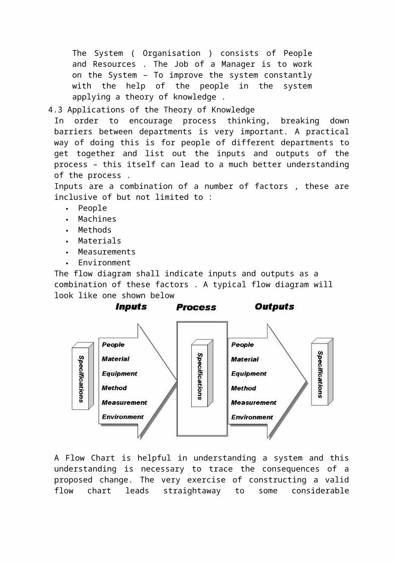
A purchasing manager, under pressure to reduce his figures, changes to a cheaper source, even if he buys poorer products and service as a result.
Engineering design imposes unnecessary tight tolerances to compensate for the fact that manufacturing never reaches the standards asked of it.
Departments performing better than budget start spending near the end of the year because they know that otherwise their next year's budget will be reduced.
Towards the end of the month, salesmen start doing everything to meet their quotas, with scant regard for the problems caused to Manufacturing, Administration and Delivery, let alone the customer.
5.11. Huge Financial Advantages of Co-operation: An example Consider an organisation with just 3 areas or departments. In the left hand
column of the following tables are listed options available for each area to adopt or not to adopt, according to their choice. The remaining columns show the potential effects of adoption of the options. The effect of each option on the individual areas and hence (by summation) on the whole organisation is examined. For the sake of ease of illustration it is assumed that each + or -corresponds to gain or loss of the same amount of moneythroughout. Options which are locally beneficial to one area may well be quite the opposite for other areas-- suppose each areas gains and losses are as indicated.Now let us examine what would be the likely gains and losses under 3 different scenarios :Scenario 1.Internal competition and conflict between Departments / Areas, hierarchical management style, MBO etc.In such an environment there are barriers between areas and each area naturally adopts options which are beneficial to itself. The likely gains and losses to different areas and the net effect on the organisation are tabulated below: The net effect on the organisation happens to be zero in this case, i.e. equal to the effect of doing nothing at all (which would be a rather easier way of achieving the same result!) Depending on the details, the net effect could have been positive, Zero or negative.
Areas and their options
Effects of Options
Effect on Area A
Effect on Area B
Effect on Area C
Net Effect on the
CompanyArea A
i + - - -
ii + - + +
iii + - - -
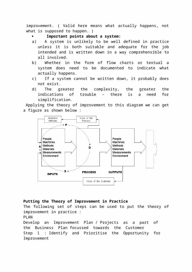
Area B
i - + - -
ii + + - +
Area C
i + + + +++
ii - - + -
iii - - + -
Net Effect of Adopted Options
++ -- 0 0
Scenario 2.Management environment improves so that areas become aware of the effect of their actions on other areas and the old inter-departmental rivalries are replaced by teamwork for mutual benefit and benefit of the organisation.In this changed environment only those options are adopted which produce net benefit to the organisation. Hence only 3 of the 8 options are now adopted and the likely gains and losses would be as tabulated below :
Areas and their options
Effects of Options
Effect on Area A
Effect on Area B
Effect on Area C
Net Effect on the
CompanyArea A
i + - - -
ii + - + +
iii + - - -

Area B
i - + - -
ii + + - +
Area C
i + + + +++
ii - - + -
iii - - + -
Net Effect of Adopted Options
+++ + + +++++
Thus, by this more judicious and restricted choice of actions (i.e wise choice of both action and inaction) the organisation is much better off and in the new management environment everybody gains.Scenario 3.The environment improves further and options which never saw the light of day previously are now considered. These are options which are locally disadvantageous to the area which can adopt them but which give benefit to other areas. Amongst this greater range of options, again the ones to be adopted or nor adopted are now chosen according (respectively) to whether they are or are not of net benefit to the whole organisation. The likely gains and losses in this situation are tabulated below :
Areas and their options
Effects of Options
Effect on Area A
Effect on Area B
Effect on Area C
Net Effect on the
CompanyArea A
i + - - -
ii + - + +
iii + - - -

iv - + + +
v - + + +
vi - - + -
Area B
i - + - -
ii + + - +
iii + - + +
iv + - + +
Area C
i + + + +++
ii - - + -
iii - - + -
iv + + - +
v + - - -
Net Effect of Adopted Options
++++ ++ ++++ ++++++++++
The bottom line results speak for themselves.
5.12. Analysis and advice of Dr. Deming on the above exampleDeming is of the opinion that scenario 1 describes most of the world. He mentions a company which is divided into 4 companies, each supplying all the others. Each is rated on it's own profits! Such foolish practice is common.Deming further summarises the lessons to be learnt from the above exercise as follows :
"Options for various companies to consider, or for managers of the various divisions within a company, must be stated, and enumerated. Approximate effects of action on each option stated, (yes, no or leave it alone) for every staff area involved, must be computed.A new set of options might turn out to be better for everybody. Ingenuity is required to generate the options to consider. This is management's job.Divisions should not operate without recognition of their interdependence. They will otherwise almost with certainty make decisions which are far from optimum for the company as a whole, and everybody will lose."