Chapter 3 Determining Effective Data Display with Chartscs385.cs.ua.edu/Chapter.03.pdf•Understand...
63
Determining Effective Data Display with Charts Chapter 3
Transcript of Chapter 3 Determining Effective Data Display with Chartscs385.cs.ua.edu/Chapter.03.pdf•Understand...

Determining Effective Data Display with Charts
Chapter 3

Chapter Introduction
• Creating effective charts that show quantitative information clearly, precisely, and efficiently
• Basics of creating and modifying line and column charts
• Influence of chart type on viewer’s perception • How charts can be used in specific situations • Building a management dashboard by
combining different chart types within the same chart
Succeeding in Business with Microsoft Excel 2010 2

Chapter Introduction (continued)
• Chart types covered in this chapter: area, bubble, column, doughnut, line, pie, radar, stock, XY (scatter)
To go to Level 1, click here
To go to Level 2, click here
To go to Level 3, click here
Succeeding in Business with Microsoft Excel 2010 3

Chart Types Covered in this Chapter
• Area • Bubble • Column • Doughnut • Line • Pie • Radar • Stock • XY (Scatter)
Succeeding in Business with Microsoft Excel 2010 4
Level 1 Objectives: Analyzing Basic Chart Types
• Understand the principles of effective data display
• Analyze various Excel chart types
• Determine appropriate uses for different chart types
• Modify the chart type and the chart source data
• Specify chart options, including chart and axes titles, legends, and data labels
Succeeding in Business with Microsoft Excel 2010 5

Visualizing Data
Succeeding in Business with Microsoft Excel 2010 6 Level 1 home

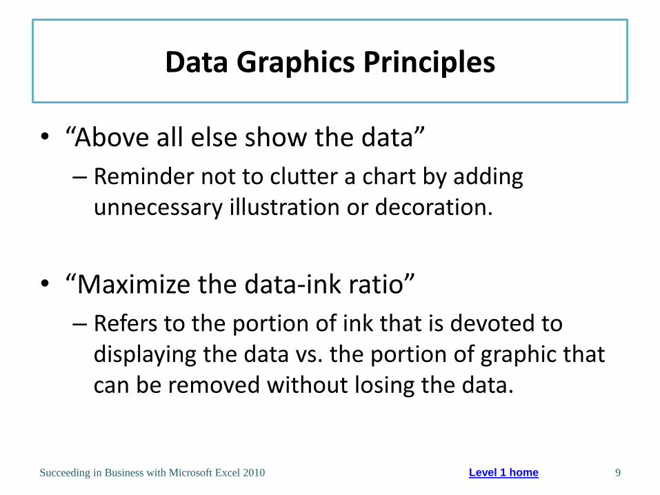
Data Graphics Principles (Tufte)
• Above all else, show the data
• Maximize the data-ink ratio, within reason
• Erase non-data-ink, within reason
• Erase redundant data-ink, within reason
• Revise and edit
Succeeding in Business with Microsoft Excel 2010 7 Level 1 home

Data Graphics Principles
Succeeding in Business with Microsoft Excel 2010 8 Level 1 home
Data Graphics Principles
• “Above all else show the data”
– Reminder not to clutter a chart by adding unnecessary illustration or decoration.
• “Maximize the data-ink ratio”
– Refers to the portion of ink that is devoted to displaying the data vs. the portion of graphic that can be removed without losing the data.
Succeeding in Business with Microsoft Excel 2010 9 Level 1 home

Data Graphics Principles
• “Erase non-data-ink” – Non-data-ink is a part of the chart that decorates
more than informs.
• “Erase redundant data ink” – Redundant data ink is ink that repeats information.
• “Revise and edit” – Revise and edit charts like you would a piece of
writing.
Succeeding in Business with Microsoft Excel 2010 10 Level 1 home

Data Graphics Principles
Succeeding in Business with Microsoft Excel 2010 11 Level 1 home

Effective Charting in Excel
• Creating Chart in Excel
– Select data to display
– Click Insert tab on Ribbon
– Click a button in Charts group or Dialog Box Launcher
Succeeding in Business with Microsoft Excel 2010 12 Level 1 home

Chart Types
Succeeding in Business with Microsoft Excel 2010 13 Level 1 home

Understanding Line and Column Charts
• Line chart- displays trends over time or by category.
• Column chart- compares values across categories in a vertical orientation.
Succeeding in Business with Microsoft Excel 2010 14 Level 1 home
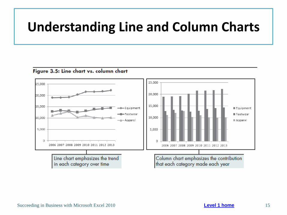
Understanding Line and Column Charts
Succeeding in Business with Microsoft Excel 2010 15 Level 1 home

Comparing Line and XY (Scatter) Charts
• XY (Scatter) charts plot numeric values on both the x- and y- axes based on the value of the data.
• Whereas a line chart plots numeric values on one axis and category labels equidistantly on the other axis.
Succeeding in Business with Microsoft Excel 2010 16 Level 1 home

Comparing Line and XY (Scatter) Charts
Succeeding in Business with Microsoft Excel 2010 17 Level 1 home

Changing the Chart Source Data
Succeeding in Business with Microsoft Excel 2010 18 Level 1 home

Results of Changing Source Data
Succeeding in Business with Microsoft Excel 2010 19 Level 1 home

Specifying Chart Layout Options
• Click chart to display Chart Tools contextual tabs
• Chart Tools Layout Tab
• Options grouped by Labels, Axes, and Background
Succeeding in Business with Microsoft Excel 2010 20 Level 1 home

Specifying Chart Options
Succeeding in Business with Microsoft Excel 2010 21 Level 1 home
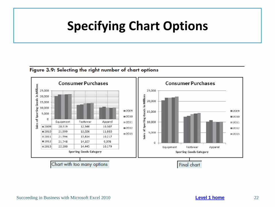
Specifying Chart Options
Succeeding in Business with Microsoft Excel 2010 22 Level 1 home

Understanding Area and Pie Charts
• Area chart- combines the features of a line chart with a bar or column chart by filling in the area below the line, and displaying the trend values over time or categories.
• Pie chart- displays the percentage contribution that each category makes to a whole or 100%.
Succeeding in Business with Microsoft Excel 2010 23 Level 1 home
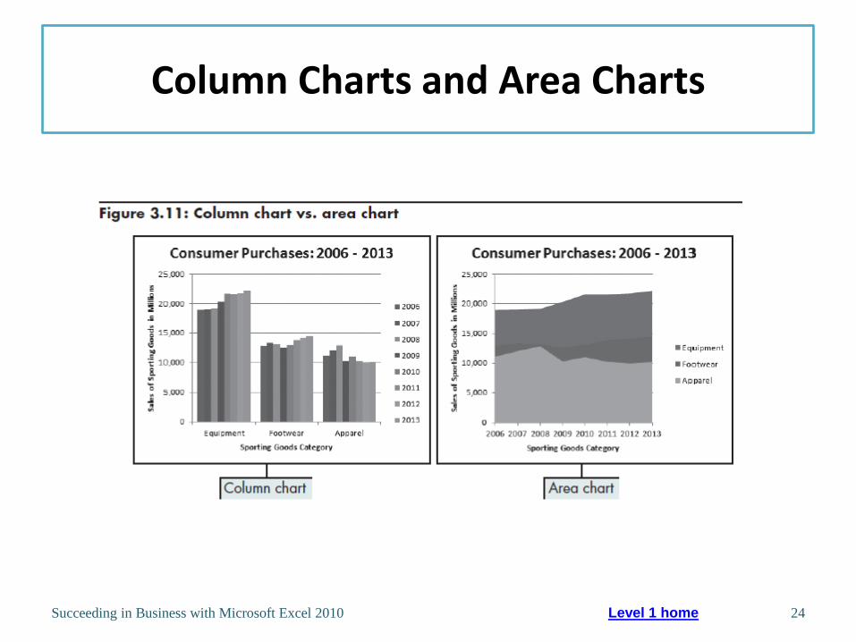
Column Charts and Area Charts
Succeeding in Business with Microsoft Excel 2010 24 Level 1 home

Selecting Pie Chart Source Data
Succeeding in Business with Microsoft Excel 2010 25 Level 1 home

Pie Charts
Succeeding in Business with Microsoft Excel 2010 26 Level 1 home
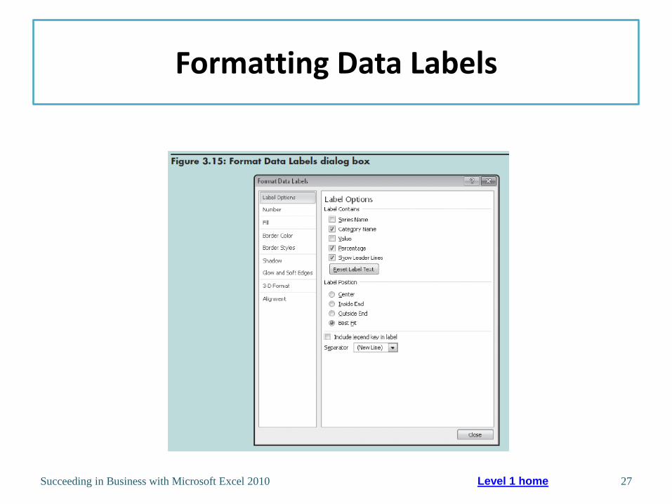
Formatting Data Labels
Succeeding in Business with Microsoft Excel 2010 27 Level 1 home

Working with 3-D Charts
Succeeding in Business with Microsoft Excel 2010 28 Level 1 home

Level 1 Summary
• Using charts to illustrate quantitative information adds visual analysis to problem solving
• Tufte’s guiding principles on creation of graphics
• How choice of chart type can influence viewer’s perception of information presented
• Differences between main chart types
• Different interpretation of data can result from use of different chart type
Succeeding in Business with Microsoft Excel 2010 29

Level 2 Objectives: Evaluating Chart Sub-Types
• Examine the effectiveness of different chart sub-types
• Evaluate the stacked and 100% stacked sub-types
• Explore the Pie of Pie and Bar of Pie sub-types
• Create various stock charts to display financial data
• Clarify data with trendlines and moving averages
Succeeding in Business with Microsoft Excel 2010 30

Examining Sub-types for Various Chart Types
Stacked charts • Illustrate cumulative effects of data in
categories
• Available for line, bar, column, area charts
Summing to 100%
(100% stacked sub-
type)
• Illustrate cumulative (rather than individual)
contribution for each category as a
percentage
• Available for line, bar, column, area charts
• Combines features of a pie chart with features
of line, column, or area charts
• Similar to pie except pieces are in a column
instead of a circle
Succeeding in Business with Microsoft Excel 2010 31
Level 2 home

Adding Things Up: Stacked Chart Options
Succeeding in Business with Microsoft Excel 2010 32 Level 2 home

Summing to 100%: Alternatives to Pie Charts
• Showing the cumulative contribution for each category as a percentage can reduce confusion over whether the line on the chart represents the individual or cumulative contribution to the whole.
Succeeding in Business with Microsoft Excel 2010 33 Level 2 home

Slicing the Pie Too Thin: Summarizing Too Much Detail in Pie Charts
Succeeding in Business with Microsoft Excel 2010 34 Level 2 home
An excessive number of pie slices makes the chart cluttered
and confusing.

Pie of Pie and Bar of Pie Chart Sub-Types
• Decrease number of pie segments to improve visual display of data
• Use Format Data Series dialog box to select options for splitting data series
– Position
– Value
– Percent Value
– Custom
Succeeding in Business with Microsoft Excel 2010 35 Level 2 home

Pie of Pie Sub-Type
Succeeding in Business with Microsoft Excel 2010 36 Level 2 home

Using Format Data Series to Change the Format
Succeeding in Business with Microsoft Excel 2010 37 Level 2 home

Applied Formatting Changes
Succeeding in Business with Microsoft Excel 2010 38 Level 2 home
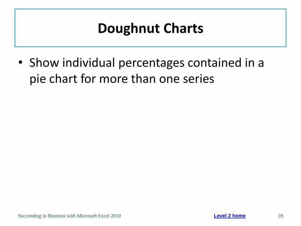
Doughnut Charts
• Show individual percentages contained in a pie chart for more than one series
Succeeding in Business with Microsoft Excel 2010 39 Level 2 home

Doughnut Charts
Succeeding in Business with Microsoft Excel 2010 40 Level 2 home

Monitoring a Business with Stock Charts
• Excel stock reporting charts are somewhat based on the candlestick plot format
• Stock chart sub-types
– High-Low-Close
– Open-High-Low-Close
– Volume-High-Low-Close
– Volume-Open-High-Low-Close
Succeeding in Business with Microsoft Excel 2010 41 Level 2 home

Sample High-Low-Close Chart
Succeeding in Business with Microsoft Excel 2010 42 Level 2 home

Sample Open-High-Low-Close Chart
Succeeding in Business with Microsoft Excel 2010 43 Level 2 home

Sample Volume-High-Low-Close Chart
Succeeding in Business with Microsoft Excel 2010 44 Level 2 home

Sample Volume-Open-High-Low-Close Chart
Succeeding in Business with Microsoft Excel 2010 45 Level 2 home

Adding Trendlines and Moving Averages
• Trendlines
– Graphically illustrate trends in data using a statistical technique known as regression
• Moving average line
– Used to smooth out the data, making it easier to spot trends
Succeeding in Business with Microsoft Excel 2010 46 Level 2 home

Adding Trendlines and Moving Averages
Succeeding in Business with Microsoft Excel 2010 47 Level 2 home

Level 2 Summary
• Chart sub-types for line, column, and area charts (stacked and 100% stacked)
• Pie of Pie and Bar of Pie chart sub-types
• Sub-types of stock charts
• Clarifying data in stock charts using trendlines and moving averages
Succeeding in Business with Microsoft Excel 2010 48

Level 3 Objectives: Exploring More Advanced Chart Types
• Understand and evaluate radar, bubble, and dashboard charts
• Compare a bubble chart with a 3-D column chart
• Explore and customize a dashboard chart
• Create and customize a doughnut chart
Succeeding in Business with Microsoft Excel 2010 49

Evaluating the Effectiveness of Radar, Bubble, and Dashboard Charts
Radar charts
Powerful method of displaying and
comparing data across categories
Bubble charts Allow three-dimensional data to be
plotted in 2-D on two axes
Dashboard charts Feature a set of charts that
summarize several sets of data
graphically
Succeeding in Business with Microsoft Excel 2010 50 Level 3 home

Understanding Radar Charts
Succeeding in Business with Microsoft Excel 2010 51 Level 3 home
The straight lines that
radiate out from the center
represent categories.

Plotting 3-D Data in Two Axes: Bubble Charts Versus 3-D Column Charts
Succeeding in Business with Microsoft Excel 2010 52 Level 3 home

Sample Bubble Chart
Succeeding in Business with Microsoft Excel 2010 53 Level 3 home
The market share of each shoe style is represented by the size of the bubbles.

Solving Bubble Chart Problems
Succeeding in Business with Microsoft Excel 2010 54 Level 3 home

Solving Bubble Chart Problems
Succeeding in Business with Microsoft Excel 2010 55 Level 3 home

Creating a Management Dashboard
• Build a dashboard chart
• Define the normal operating range
• Create the value indicator
• Create the doughnut chart
• Add digital values to the chart
Succeeding in Business with Microsoft Excel 2010 56 Level 3 home

Build a Dashboard Chart
Succeeding in Business with Microsoft Excel 2010 57 Level 3 home
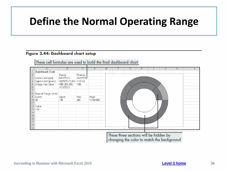
Define the Normal Operating Range
Succeeding in Business with Microsoft Excel 2010 58 Level 3 home

Level 3 Summary
• More advanced chart types
– Radar charts
– Bubble charts
• How to combine chart types within the same chart to build a management dashboard
Succeeding in Business with Microsoft Excel 2010 59

Chapter Summary
• Charts offer the opportunity to add visual analysis to problem solving
• Chart types and their differences including – Line
– Column
– Bar
– Area
– Pie
– XY (Scatter)
Succeeding in Business with Microsoft Excel 2010 60

Chapter Summary
• Chart sub-types further summarize the data being presented
• Advanced chart types such as radar and bubble charts
Succeeding in Business with Microsoft Excel 2010 61

Chapter Summary
Succeeding in Business with Microsoft Excel 2010 62

Succeeding in Business with Microsoft Excel 2010 63