LIS 570 Summarising and presenting data - Univariate analysis continued Bivariate analysis.
Chapter 3
Collecting, presenting andsummarising data
Data are the key to many important management decisions. Is a new product sellingwell? Do potential customers like the new advertising campaign? Should we launch anew product? These are all questions that can be answered with data. We begin thispart of the course with some basic methods of collecting, representing and describingdata. We will start off by we looking at the different kinds of data that exist, how wemight obtain these data, and some basic methods for presenting them. But first – someimportant definitions...
3.1 Important definitions
For the work we will look at over the next six months or so, you must be familiar withthe following words and phrases, and you must understand what they mean!
The quantities measured in a study are called random variables and a particularoutcome is called an observation. A collection of observations is the data. Thecollection of all possible outcomes is the population.If we were interested in the heightof people doing Accounting & Finance courses at Newcastle, that would be our randomvariable; a particular person’s height would be the observation and if we measuredeveryone doing ACC1012, those would be our data, which would form a sample fromthe population of all students registered on Accounting & Finance degrees.
In practice it is difficult to observe whole populations, unless we are interested in avery limited population, e.g. the students taking ACC1012. In reality we usuallyobserve a subset of the population; we will come back to sampling later in Section 3.2.
Once we have our data, it is important to understand what type it is – so we can figureout exactly what to do with it. You should refer to Section 2.1 of the summer revisionbooklet for full details – the diagram overleaf provides a useful summary – you maywant to annotate this!
61
62 CHAPTER 3. COLLECTING, PRESENTING AND SUMMARISING DATA
✎
Lee Fawcett
3.2 Sampling
We can rarely observe the whole population. Instead, we observe some sub–set of this,that is, the sample. The difficulty is in obtaining a representative sample. For example,if you were to ask the people leaving a gym if they exercised this would produce abiased sample and would not be representative of the population as a whole. Theimportance of obtaining a representative sample cannot be stressed too highly. As wewill see in Semester 2, we use the data from our samples in order to make inferences
about the population and these inferences influence the decision making process.
There are three general forms of sampling techniques.
1. Random sampling – where the members of the sample are chosen by somerandom mechanism.
2. Quasi–random sampling – where the mechanism for choosing the sample is onlypartly random.
3. Non–random sampling – where the sample is specifically selected.

3.2. SAMPLING 63
3.2.1 Simple Random Sampling
If we had a population of 200 students we could put all their names into a hat anddraw out 20 names as our sample. Each name has an equally likely chance of beingdrawn and so the sample is completely random. Furthermore, each possible sample of20 has an equal chance of being selected. In reality, the drawing of the names would bedone by a computer and the population and samples would be considerably larger. Thedisadvantages of this method are that we often do not have a complete list of thepopulation. For example, if you were surveying the market for some new software, thepopulation would be everybody with a compatible computer. It would be almostimpossible to obtain this information. Not all elements of the population are equallyaccessible and hence you could waste time trying to obtain data from people who areunwilling to provide it. Thirdly, it is possible that, purely by chance, you could pick anunrepresentative sample, either over– or under–representing elements of the population.
3.2.2 Stratified Sampling
This is a form of random sample where clearly defined groups, or strata, exist withinthe population, for example males and females, working or not working, age groups etc.If we know the overall proportion of the population that falls into each of these groups,we can randomly sample from each of the groups and then adjust the results accordingto the known proportions. For example, assume that the population is 55% female and45% male and we wanted a sample of 1000. We could first decide to have 550 femalesand 450 males in our sample. We would then pick the members of our sample fromtheir respective groups randomly. We do not have to make the numbers in the samplesproportional to the numbers in the strata because we could adjust the results butsampling within each stratum ensures that that stratum is properly represented in ourresults and gives us more precise information about the population as a whole. Suchsampling should generally reflect the major groupings within the population.
The disadvantages are that we need clear information on the size and composition ofeach group or stratum, which can be difficult to obtain; and as with simple randomsampling, We still need to know the entire population so as to sample from it.
3.2.3 Systematic Sampling
This is a form of quasi–random sampling which can be used where the population isclearly structured. For example, if you were interested in obtaining a 10% sample froma batch of components being manufactured, you would select the first component atrandom; after that, you pick every tenth item to come off the production line. Thesimplicity of selection makes this a particularly easy sampling scheme to implement,especially in a production setting. The disadvantages of this method are that it is notrandom and if there is a pattern in the process it may be possible to obtain a biasedsample. It is only really applicable to structured populations.

64 CHAPTER 3. COLLECTING, PRESENTING AND SUMMARISING DATA
3.2.4 Multi–stage Sampling
This is another form of quasi–random sampling. These types of sampling schemes arecommon where the population is spread over a wide geographic area which might bedifficult or expensive to sample from. Multi–stage sampling works, for example, bydividing the area into geographically distinct smaller areas, randomly selecting one (ormore) of these areas and then sampling, whether by random, stratified or systematicsampling schemes within these areas. For example, if we were interested in samplingschool children, we might take a random (or stratified) sample of education authorities,then, within each selected authority, a random (or stratified) sample of schools, then,within each selected school, a random (or stratified) sample of pupils. This is likely tosave time and cost less than sampling from the whole population. The sample can bebiased if the stages are not carefully selected. Indeed, the whole scheme needs to becarefully thought through and designed to be truly representative.
3.2.5 Cluster Sampling
This is a method of non–random sampling. For example, a geographic area issub–divided into clusters and all the members of a particular cluster are then surveyed.This differs from multi–stage sampling covered in Section 3.2.4 where the members ofthe cluster were sampled randomly. Here, no random sampling occurs. The advantageof this method is that, because the sampling takes place in a concentrated area, it isrelatively inexpensive to perform.
The very fact that small clusters are picked to allow an entire cluster to be surveyedintroduces the strong possibility of bias within the sample. If you were interested in thetake up of organic foods and were sampling via the cluster method you could easily getbiased results; if, for example, you picked an economically deprived area, theproportion of those surveyed that ate organically might be very low, while if you pickeda middle class suburb the proportion is likely to be higher than the overall population.
3.2.6 Judgemental sampling
Here, the person interested in obtaining the data decides whom they are going to ask.This can provide a coherent and focused sample by choosing people with experienceand relevant knowledge to provide their opinions. For example, the head of a servicedepartment might suggest particular clients to survey based on his judgement. Theymight be people he believes will be honest or have strong opinions. This methodologyis non–random and relies on the judgement of the person making the choice. Hence, itcannot be guaranteed to be representative. It is prone to bias.

3.3. FREQUENCY TABLES 65
3.2.7 Accessibility sampling
Here, only the most easily accessible individuals are sampled. This is clearly prone tobias and only has convenience and cheapness in its favour. For example, a sample ofgrain taken from the top of a silo might be quite unrepresentative of the silo as a wholein terms of moisture content.
3.2.8 Quota Sampling
This method is similar to stratified sampling but uses judgemental (or some other)sampling rather than random sampling within groups. We would classify thepopulation by any set of criteria we choose to sample individuals and stop when wehave reached our quota. For example, if we were interested in the purchasing habits of18–23 year old male students, we would stop likely candidates in the street; if theymatched the requirements we would ask our questions until we had reached our quotaof 50 such students. This type of sampling can lead to very accurate results as it isspecifically targeted, which saves time and expense.
The accurate identification of the appropriate quotas can be problematic. This methodis highly reliant on the individual interviewer selecting people to fill the quota. If this isdone poorly bias can be introduced into the sample.
3.2.9 Sample Size
When considering data collection, it is important to ensure that the sample contains asufficient number of members of the population for adequate analysis to take place.Larger samples will generally give more precise information about the population.Unfortunately, in reality, issues of expense and time tend to limit the size of the sampleit is possible to take. For example, national opinion polls often rely on samples in theregion of just 1000.
3.3 Frequency Tables
Once we have collected our data, often the first stage of any analysis is to present themin a simple and easily understood way. Tables are perhaps the simplest means ofpresenting data. There are many types of tables. For example, we have all seen tableslisting sales of cars by type, or exchange rates, or the financial performance ofcompanies. These types of tables can be very informative. However, they can also bedifficult to interpret, especially those which contain vast amounts of data.
Frequency tables are amongst the most commonly–used tables and are perhaps themost easily understood. They can be used with continuous, discrete, categorical andordinal data. Frequency tables have uses in some of the techniques we will later on inthis chapter.

66 CHAPTER 3. COLLECTING, PRESENTING AND SUMMARISING DATA
3.3.1 Frequency tables for categorical data
The following table presents the modes of transport used daily by 30 students to get toand from University (survey date: 3rd August 2012).
Student Mode Student Mode Student Mode1 Car 11 Walk 21 Walk2 Walk 12 Walk 22 Metro3 Car 13 Metro 23 Car4 Walk 14 Bus 24 Car5 Bus 15 Train 25 Car6 Metro 16 Bike 26 Bus7 Car 17 Bus 27 Car8 Bike 18 Bike 28 Walk9 Walk 19 Bike 29 Car10 Car 20 Metro 30 Car
The table obviously contains much information. However, it is difficult to see whichmethod of transport is the most widely used. One obvious next step would be to countthe number of students using each mode of transport:
Mode FrequencyCar 10Walk 7Bike 4Bus 4Metro 4Train 1Total 30
This gives us a much clearer picture of the methods of transport used. Also of interestmight be the relative frequency of each of the modes of transport. The relativefrequency is simply the frequency expressed as a proportion of the total number ofstudents surveyed. If this is given as a percentage, as here, this is known as thepercentage relative frequency.
Mode Frequency Relative Frequency (%)Car 10 33.3Walk 7 23.4Bike 4 13.3Bus 4 13.3Metro 4 13.3Train 1 3.4Total 30 100

3.3. FREQUENCY TABLES 67
3.3.2 Frequency tables for count data
☛
✡
✟
✠Example 3.1
The following table shows the raw data for car sales at a new car showroom over a twoweek period in July 2012.
Date Cars Sold Date Cars Sold01/07/12 9 08/07/12 1002/07/12 8 09/07/12 503/07/12 6 10/07/12 804/07/12 7 11/07/12 405/07/12 7 12/07/12 606/07/12 10 13/07/12 807/07/12 11 14/07/12 9
Present these data in a relative frequency table by number of days on which differentnumbers of cars were sold.
✎
Cars Sold Tally Frequency Relative Frequency %
Totals

68 CHAPTER 3. COLLECTING, PRESENTING AND SUMMARISING DATA
3.3.3 Frequency tables for continuous data
With discrete data, and especially with small data sets, it is easy to count thequantities in the defined categories. With continuous data this is not possible. Strictlyspeaking, no two observations are precisely the same. With such observations we groupthe data together. For example, the following data set represents the service time inseconds for callers to a credit card call centre.
214.8412 220.6484 216.7294 195.1217 211.4795195.8980 201.1724 185.8529 183.4600 178.8625196.3321 199.7596 206.7053 203.8093 203.1321200.8080 201.3215 205.6930 181.6718 201.7461180.2062 193.3125 188.2127 199.9597 204.7813198.3838 193.1742 204.0352 197.2206 193.5201205.5048 217.5945 208.8684 197.7658 212.3491209.9000 197.6215 204.9101 203.1654 192.9706208.9901 202.0090 195.0241 192.7098 219.8277208.8920 200.7965 191.9784 188.8587 206.8912
To produce a continuous data frequency table we first need to divide the range of thevariable into smaller ranges called class intervals. The class intervals should, betweenthem, cover every possible value. There should be no gaps between the intervals. Oneway to ensure this is to include the boundary value as the smallest value in the nextclass above. This can be written as, for example, 20 ≤ obs < 30. This means we includeall observations (represented by “obs”) within this class interval that have a value of atleast 20 up to values just below 30.
Some things to think about:
• Often for simplicity we would write the class intervals up to the number ofdecimal places in the data and avoid using the inequalities; for example, 20 up to29.999 if we were working to 3 decimal places.
• We need to include the full range of data in our table and so we need to identifythe minimum and maximum points (sometimes our last class might be “greaterthan such and such”).
• The class interval width should be a convenient number – for example 5, 10, or100, depending on the data. Obviously we do not want so many classes that eachone has only one or two observations in it.
• The appropriate number of classes will vary from data set to data set; however,with simple examples that you would work through by hand, it is unlikely thatyou would have more than ten to fifteen classes.

3.3. FREQUENCY TABLES 69
☛
✡
✟
✠Example 3.2
Create a frequency table for the call centre data. Also, find the relative frequencies ineach class interval.
✎
Class Interval Tally Frequency Relative Frequency %
Totals

70 CHAPTER 3. COLLECTING, PRESENTING AND SUMMARISING DATA
3.4 Graphical methods for presenting data
We have looked at ways of collecting data and then collating them into tables.Frequency tables are useful methods of presenting data; they do, however, have theirlimitations. With large amounts of data graphical presentation methods are oftenclearer to understand. Here, we look at methods for producing graphicalrepresentations of data of the types we have seen previously.
3.4.1 Stem and Leaf plots
Stem and leaf plots are a quick and easy way of representing data graphically. Theycan be used with both discrete and continuous data. You should refer to Section 2.3.1of the summer revision booklet for more details about these plots.
Example: Percentage returns on a share
The following numbers show the percentage returns on an ordinary share for 23consecutive months:
0.2 –2.1 1.0 0.1 –0.5 2.4 –2.3 1.5 1.2 –0.6 2.4 –1.21.7 –1.3 –1.2 0.9 0.5 0.1 –0.1 0.3 –0.4 0.5 0.9
Here, the largest value is 2.4 and the smallest –2.3, and we have lots of decimal valuesin between. Thus, it seems sensible here to have a stem unit of 1 and a leaf unit of 0.1.A stem and leaf diagram for this set of returns then might look like:
–2 3 1–1 3 2 2–0 6 5 4 10 1 1 2 3 5 5 9 91 0 2 5 72 4 4
Stem Leaf
n = 23, stem unit = 1, leaf unit = 0.1.
Example: Production line data
Consider the following data on lengths of items on a production line (in cm):
2.97 3.81 2.54 2.01 3.49 3.09 1.99 2.64 2.31 2.22
The stem and leaf plot for this is shown overleaf. Notice that all figures have beenrounded down, or cut, to one decimal place.

3.4. GRAPHICAL METHODS FOR PRESENTING DATA 71
1 92 0 2 3 5 6 93 0 4 8
n = 10, stem unit = 1 cm, leaf unit = 0.1 cm.
Why do you think we cut the extra digits?
✎
☛
✡
✟
✠Example 3.3
The observations in the table below are the recorded time it takes to get through to anoperator at a telephone call centre (in seconds). Construct a stem–and–leaf plot for thesedata, and comment.
✎
54 56 50 67 55 38 49 45 39 5045 51 47 53 29 42 44 61 51 5030 39 65 54 44 54 72 65 58 62
Stem Leaf
n = stem unit = leaf unit =
72 CHAPTER 3. COLLECTING, PRESENTING AND SUMMARISING DATA
☛
✡
✟
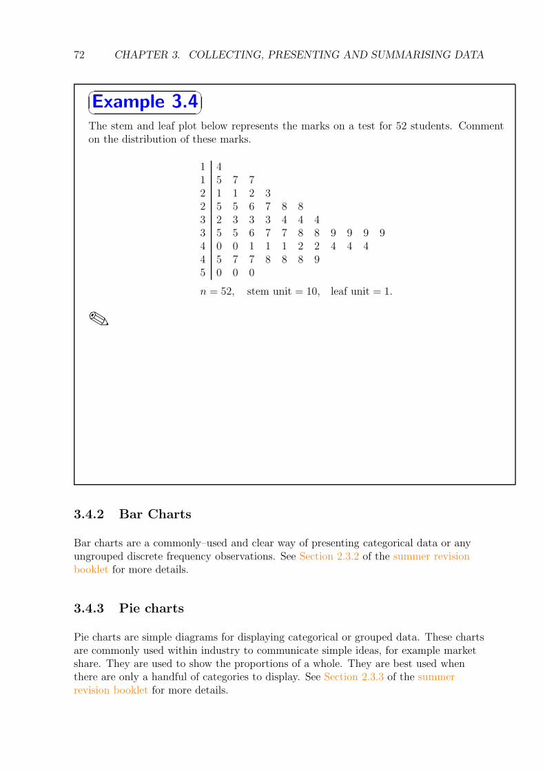
✠Example 3.4
The stem and leaf plot below represents the marks on a test for 52 students. Commenton the distribution of these marks.
1 41 5 7 72 1 1 2 32 5 5 6 7 8 83 2 3 3 3 4 4 43 5 5 6 7 7 8 8 9 9 9 94 0 0 1 1 1 2 2 4 4 44 5 7 7 8 8 8 95 0 0 0
n = 52, stem unit = 10, leaf unit = 1.
✎
3.4.2 Bar Charts
Bar charts are a commonly–used and clear way of presenting categorical data or anyungrouped discrete frequency observations. See Section 2.3.2 of the summer revisionbooklet for more details.
3.4.3 Pie charts
Pie charts are simple diagrams for displaying categorical or grouped data. These chartsare commonly used within industry to communicate simple ideas, for example marketshare. They are used to show the proportions of a whole. They are best used whenthere are only a handful of categories to display. See Section 2.3.3 of the summerrevision booklet for more details.
3.4. GRAPHICAL METHODS FOR PRESENTING DATA 73
3.4.4 Histograms
Bar charts have their limitations; for example, they cannot be used to presentcontinuous data. When dealing with continuous random variables a different kind ofgraph is required. This is called a histogram. At first sight these look similar to barcharts. There are, however, two critical differences:
• the horizontal (x-axis) is a continuous scale. As a result of this there are no gaps
between the bars (unless there are no observations within a class interval);
• the height of the rectangle is only proportional to the frequency if the classintervals are all equal. With histograms it is the area of the rectangle that isproportional to their frequency.
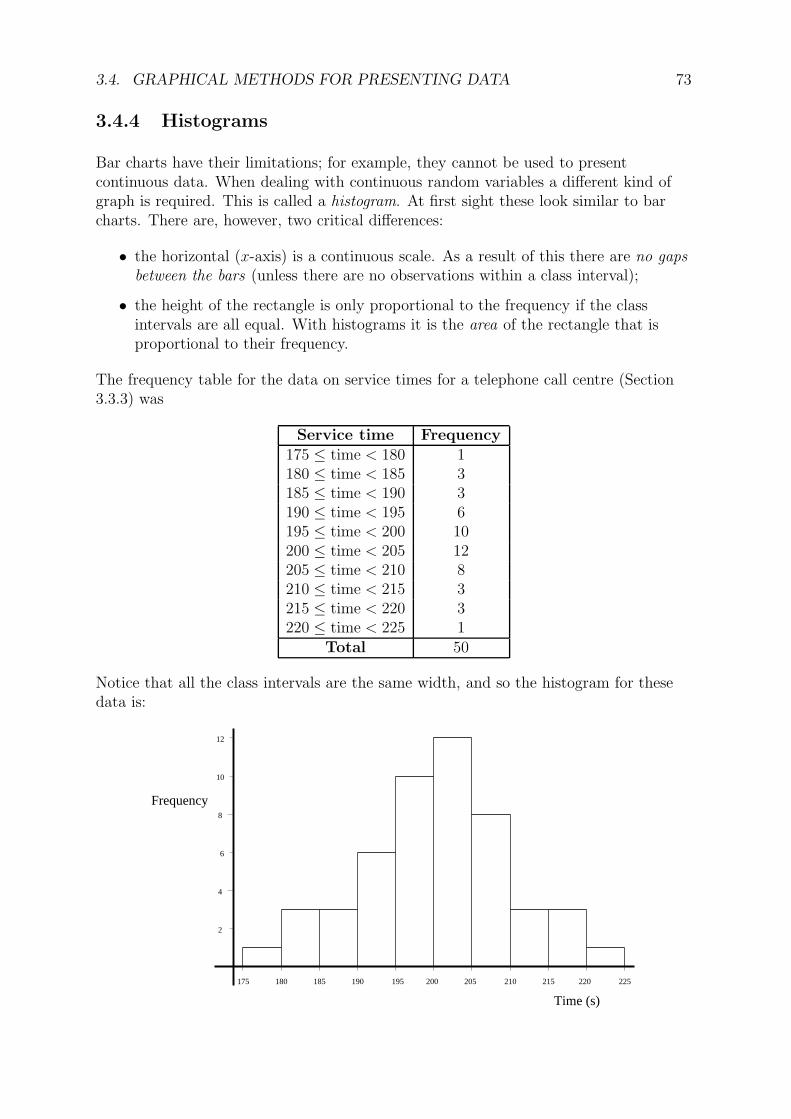
The frequency table for the data on service times for a telephone call centre (Section3.3.3) was
Service time Frequency175 ≤ time < 180 1180 ≤ time < 185 3185 ≤ time < 190 3190 ≤ time < 195 6195 ≤ time < 200 10200 ≤ time < 205 12205 ≤ time < 210 8210 ≤ time < 215 3215 ≤ time < 220 3220 ≤ time < 225 1
Total 50
Notice that all the class intervals are the same width, and so the histogram for thesedata is:
185
Time (s)
190180175 195 200 205 210 215 220 225
Frequency
12
8
10
6
4
2

74 CHAPTER 3. COLLECTING, PRESENTING AND SUMMARISING DATA
☛
✡
✟
✠Example 3.5
The Holiday Hypermarket travel agency received 64 telephone calls yesterday morning.The table below gives information of the lengths, in minutes, of these telephone calls.
Length (x) minutes Frequency Frequency density0 ≤ x < 5 4 0.85 ≤ x < 15 10 1.015 ≤ x < 30 2430 ≤ x < 40 2040 ≤ x < 45 6
Complete this table, and construct a histogram for these data. What is the modal class
here?
Length (minutes)
5 10 15 20 25 30 35 40

3.4. GRAPHICAL METHODS FOR PRESENTING DATA 75
3.4.5 Percentage Relative Frequency Histograms
When we produced frequency tables in Section 3.3, we included a column forpercentage relative frequency. This contained values for the frequency of each group,relative to the overall sample size, expressed as a percentage. For example, apercentage relative frequency table for the data on service time (in seconds) for calls toa credit card service centre is:
Service time Frequency Relative Frequency (%)175 ≤ time < 180 1 2180 ≤ time < 185 3 6185 ≤ time < 190 3 6190 ≤ time < 195 6 12195 ≤ time < 200 10 20200 ≤ time < 205 12 24205 ≤ time < 210 8 16210 ≤ time < 215 3 6215 ≤ time < 220 3 6220 ≤ time < 225 1 2
Totals 50 100
You can plot these data like an ordinary histogram, or, instead of usingfrequency/frequency density on the vertical axis (y-axis), you could use the percentage
relative frequency/percentage relative frequency density.
frequencyRelative
(%)
185
Time (s)
190180175 195 200 205 210 215 220 225
24
20
16
12
8
4
Note that the y-axis now contains the relative percentages rather than the frequencies.You might well ask “why would we want to do this?”.

76 CHAPTER 3. COLLECTING, PRESENTING AND SUMMARISING DATA
These percentage relative frequency histograms are useful when comparing two samplesthat have different numbers of observations. If one sample were larger than the otherthen a frequency histogram would show a difference simply because of the largernumber of observations. Looking at percentages removes this difference and enables usto look at relative differences.
For example, in the following graph (produced in the computer package Minitab – seeSemester 2) there are data from two groups and four times as many data points for onegroup as the other. The left–hand plot shows an ordinary histogram and it is clear thatthe comparison between groups is masked by the quite different sample sizes. Theright–hand plot shows a histogram based on (percentage) relative frequencies and thisenables a much more direct comparison of the distributions in the two groups.
Overlaying histograms on the same graph can sometimes not produce such a clearpicture, particularly if the values in both groups are close or overlap one anothersignificantly.

3.4. GRAPHICAL METHODS FOR PRESENTING DATA 77
3.4.6 Relative Frequency Polygons
These are a natural extension of the relative frequency histogram. They differ in that,rather than drawing bars, each class is represented by one point and these are joinedtogether by straight lines. The method is similar to that for producing a histogram:
1. Produce a percentage relative frequency table.
2. Draw the axes
– The x-axis needs to contain the full range of the classes used.
– The y-axis needs to range from 0 to the maximum percentage relativefrequency.
3. Plot points: pick the mid point of the class interval on the x-axis and go up untilyou reach the appropriate percentage value on the y-axis and mark the point. Dothis for each class.
4. Join adjacent points together with straight lines.
The relative frequency polygon is exactly the same as the relative frequency histogram,but instead of having bars we join the mid–points of the top of each bar with a straightline. Consider the following simple example.
Class Interval Mid Point % Relative Frequency0 ≤ x < 10 5 1010 ≤ x < 20 15 2020 ≤ x < 30 25 3530 ≤ x < 40 35 2540 ≤ x < 50 45 10
We can draw this easily by hand:
Relativefrequency
(%)
10 20 30 40 50
x
10
20
30
40
Relative frequency polygon
0
0

78 CHAPTER 3. COLLECTING, PRESENTING AND SUMMARISING DATA
These percentage relative frequency polygons are very useful for comparing two or moresamples – we can easily “overlay” many relative frequency polygons, but overlaying thecorresponding histograms could get really messy! Consider the following data on grossweekly income (in £) collected from two sites in Newcastle. Let us suppose that manymore responses were collected in Jesmond so that a direct comparison of the frequenciesusing a standard histogram is not appropriate. Instead we use relative frequencies.
Weekly Income (£) West Road (%) Jesmond Road (%)0 ≤ income < 100 9.3 0.0100 ≤ income < 200 26.2 0.0200 ≤ income < 300 21.3 4.5300 ≤ income < 400 17.3 16.0400 ≤ income < 500 11.3 29.7500 ≤ income < 600 6.0 22.9600 ≤ income < 700 4.0 17.7700 ≤ income < 800 3.3 4.6800 ≤ income < 900 1.3 2.3900 ≤ income < 1000 0.0 2.3
The computer package Minitab (see Semester 2) was used to produce the followingplot of the percentage relative frequency polygons for the two groups.
We can clearly see the differences between the two samples. The line connecting theboxes represents the data from West Road and the line connecting the circlesrepresents those for Jesmond Road. The distribution of incomes on West Road isskewed towards lower values, whilst those on Jesmond Road are more symmetric. Thegraph clearly shows that income in the Jesmond Road area is higher than that in theWest Road area.

3.4. GRAPHICAL METHODS FOR PRESENTING DATA 79
3.4.7 Cumulative Frequency Polygons (Ogives)
Cumulative percentage relative frequency is also a useful tool. The cumulativepercentage relative frequency is simply the sum of the percentage relative frequenciesat the end of each class interval (i.e. we add the frequencies up as we go along).Consider the example from the previous section:
Class Interval % Relative Frequency Cumulative % Relative Frequency0 ≤ x < 10 10 1010 ≤ x < 20 20 3020 ≤ x < 30 35 6530 ≤ x < 40 25 9040 ≤ x < 50 10 100
At the upper limit of the first class the cumulative % relative frequency is simply the %relative frequency in the first class, i.e. 10. However, at the end of the second class, at20, the cumulative % relative frequency is 10 + 20 = 30. The cumulative % relativefrequency at the end of the last class must be 100.
The corresponding graph, or ogive, is simple to produce by hand:
1. Draw the axes.
2. Label the x-axis with the full range of the data and the y-axis from 0 to 100%.
3. Plot the cumulative % relative frequency at the end point of each class.
4. Join adjacent points, starting at 0% at the lowest class boundary.
10 20 30 40 50
x
(%)frequency
relativeCumulative
Ogive
20
40
60
80
100
0
0
80 CHAPTER 3. COLLECTING, PRESENTING AND SUMMARISING DATA
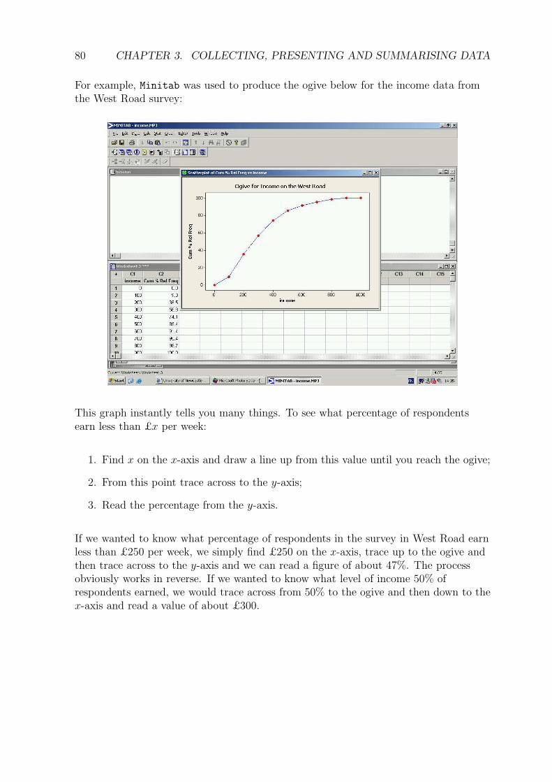
For example, Minitab was used to produce the ogive below for the income data fromthe West Road survey:
This graph instantly tells you many things. To see what percentage of respondentsearn less than £x per week:
1. Find x on the x-axis and draw a line up from this value until you reach the ogive;
2. From this point trace across to the y-axis;
3. Read the percentage from the y-axis.
If we wanted to know what percentage of respondents in the survey in West Road earnless than £250 per week, we simply find £250 on the x-axis, trace up to the ogive andthen trace across to the y-axis and we can read a figure of about 47%. The processobviously works in reverse. If we wanted to know what level of income 50% ofrespondents earned, we would trace across from 50% to the ogive and then down to thex-axis and read a value of about £300.

3.4. GRAPHICAL METHODS FOR PRESENTING DATA 81
Ogives can also be used for comparison purposes. The following plot contains theogives for the income data at both the West Road and Jesmond Road sites.
It clearly shows the ogive for Jesmond Road is shifted to the right of that for WestRoad. This tells us that the surveyed incomes are higher on Jesmond Road. We cancompare the percentages of people earning different income levels between the two sitesquickly and easily.
This technique can also be used to great effect for examining the changes before andafter the introduction of a marketing strategy. For example, daily sales figures of aproduct for a period before and after an advertising campaign might be plotted. Here,a comparison of the two ogives can be used to help assess whether or not the campaignhas been successful.
3.4.8 Scatter Plots
Scatter plots are used to plot two variables which you believe might be related, forexample, height and weight, advertising expenditure and sales, or age of machinery andmaintenance costs.
Consider the following data for monthly output (y thousand units) and total costs (xthousand pounds) at a factory.
x 10.3 12 12 13.5 12.2 14.2 10.8 18.2 16.2 19.5 17.1 19.2
y 2.4 3.9 3.1 4.5 4.1 5.4 1.1 7.8 7.2 9.5 6.4 8.3

82 CHAPTER 3. COLLECTING, PRESENTING AND SUMMARISING DATA
If you were interested in the relationship between the cost of production and thenumber of units produced you could easily plot this by hand. Here, we have usedMinitab to produce the scatterplot (see Semester 2).
The plot highlights a clear relationship between the two variables: the more unitsmade, the more it costs in total. This relationship is shown on the graph by theupwards trend within the data – as monthly output increases so too does total cost. Adownwards sloping trend would imply that as output increased, total costs declined, anunlikely scenario. This type of plot is the first stage of a more sophisticated analysiswhich we will develop in Semester 2 of this course.
3.4.9 Time Series Plots
So far we have only considered data where we can (at least for some purposes) ignorethe order in which the data come. Not all data are like this. One exception is the caseof time series data, that is, data collected over time. Examples include monthly sales ofa product, the price of a share at the end of each day or the air temperature at middayeach day. Such data can be plotted by using a scatter plot, but with time as the(horizontal) x-axis, and where the points are connected by lines.

3.4. GRAPHICAL METHODS FOR PRESENTING DATA 83
Consider the following data on the number of computers sold (in thousands) by quarter(January-March, April-June, July-September, October-December) at a large warehouseoutlet.
Year (Quarter) 2000 (Q1) 2000 (Q2) 2000 (Q3) 2000 (Q4) 2001 (Q1) 2001 (Q2) 2001 (Q3) 2001 (Q4)Units sold 86.7 94.9 94.2 106.5 105.9 102.4 103.1 115.2
Year (Quarter) 2002 (Q1) 2002 (Q2) 2002 (Q3) 2002 (Q4) 2003 (Q1) 2003 (Q2) 2003 (Q3) 2003 (Q4)Units sold 113.7 108.0 113.5 132.9 126.3 119.4 128.9 142.3
Year (Quarter) 2004 (Q1) 2004 (Q2) 2004 (Q3)Units sold 136.4 124.6 127.9
The time series plot, as produced in Minitab, is shown below (see Semester 2 for moredetails):
The plot clearly shows us two things: firstly, that there is an upwards trend to thedata, and secondly that there is some regular variation around this trend. We will comeback to more sophisticated techniques for analysing time series data later in the course.
84 CHAPTER 3. COLLECTING, PRESENTING AND SUMMARISING DATA
3.5 Numerical summaries of data
So far we have only considered graphical methods for presenting data. These arealways useful starting points. As we shall see, however, for many purposes we mightalso require numerical methods for summarising data. Before we introduce some waysof summarising data numerically, let us first think about some notation.
3.5.1 Mathematical notation
Before we can talk more about numerical techniques we first need to define some basicnotation. This will allow us to generalise all situations with a simple shorthand.
Very often in statistics we replace actual numbers with letters in order to be able towrite general formulae. We generally use a single upper case letter to represent ourrandom variable and the lower case to represent sample data, with subscripts todistinguish individual observations in the sample. Amongst the most common letters touse is x, although y and z are frequently used as well. For example, suppose we ask arandom sample of three people how many mobile phone calls they made yesterday. Wemight get the following data: 1, 5, 7. If we take another sample we will most likely getdifferent data, say 2, 0, 3. Using algebra we can represent the general case as x1, x2, x3:
1st sample 1 5 72nd sample 2 0 3typical sample x1 x2 x3
This can be generalised further by referring to the random variable as a whole as Xand the ith observation in the sample as xi. Hence, in the first sample above, thesecond observation is x2 = 5 whilst in the second sample it is x2 = 0. The letters i andj are most commonly used as the index numbers for the subscripts.
The total number of observations in a sample is usually referred to by the letter n.Hence in our simple example above n = 3.
The next important piece of notation to introduce is the symbol∑
. This is the uppercase of the Greek letter sigma, pronounced “sigma”. It is used to represent the phrase“sum the values”. This symbol is used as follows:
n∑
i=1
xi = x1 + x2 + · · ·+ xn.
This notation is used to represent the sum of all the values in our data (from the firsti = 1 to the last i = n), and is often abbreviated to
∑x when we sum over all the data
in our sample.

3.5. NUMERICAL SUMMARIES OF DATA 85
3.5.2 Measures of Location
These are also referred to as measures of centrality or, more commonly, averages. Ingeneral terms, they tell us the value of a “typical” observation. There are threemeasures which are commonly used: the mean, the median, and the mode. We willconsider these in turn.
The Arithmetic Mean
The arithmetic mean is perhaps the most commonly used measure of location. Weoften refer to it as the average or just the mean. The arithmetic mean is calculated bysimply adding all our data together and dividing by the number of data we have. So ifour data were 10, 12, and 14, then our mean would be
10 + 12 + 14
3=
36
3= 12.
We denote the mean of our sample, or sample mean, using the notation x̄ (“x bar”). Ingeneral, the mean is calculated using the formula
x̄ =1
n
n∑
i=1
xi
or equivalently as
x̄ =
∑x
n.
For small data sets this is easy to calculate by hand, though this is simplified by usingthe statistics mode on a University approved calculator. This will be shown to you inthe workshops.
Sometimes we might not have the raw data; instead, the data might be available in theform of a table. It is still possible to calculate the mean from such data. Let us firstconsider the case where we have some ungrouped discrete data. Previously we haveseen the data:
Date Cars Sold Date Cars Sold01/07/12 9 08/07/12 1002/07/12 8 09/07/12 503/07/12 6 10/07/12 804/07/12 7 11/07/12 405/07/12 7 12/07/12 606/07/12 10 13/07/12 807/07/12 11 14/07/12 9
The mean number of cars sold per day is
x̄ =9 + 8 + . . .+ 8 + 9
14= 7.71.
These data can be presented as the frequency table:
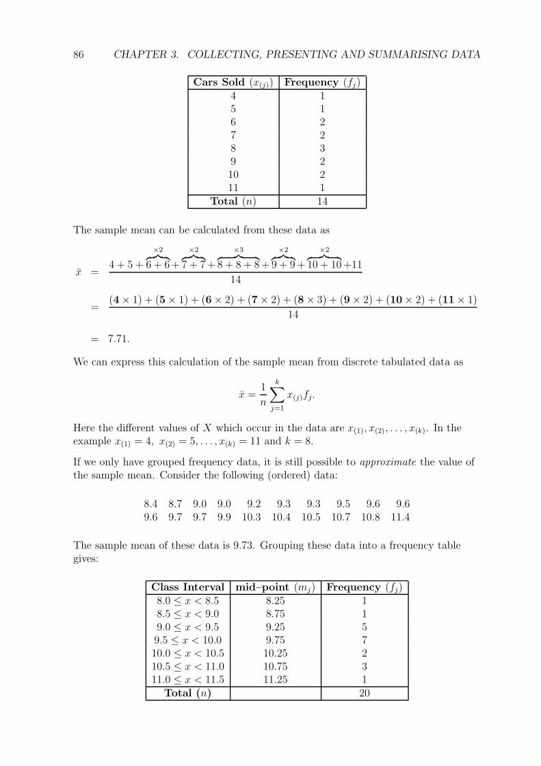
86 CHAPTER 3. COLLECTING, PRESENTING AND SUMMARISING DATA
Cars Sold (x(j)) Frequency (fj)4 15 16 27 28 39 210 211 1
Total (n) 14
The sample mean can be calculated from these data as
x̄ =4 + 5 +
×2︷ ︸︸ ︷
6 + 6+
×2︷ ︸︸ ︷
7 + 7+
×3︷ ︸︸ ︷
8 + 8 + 8+
×2︷ ︸︸ ︷
9 + 9+
×2︷ ︸︸ ︷
10 + 10+11
14
=(4× 1) + (5× 1) + (6× 2) + (7× 2) + (8× 3) + (9× 2) + (10× 2) + (11× 1)
14
= 7.71.
We can express this calculation of the sample mean from discrete tabulated data as
x̄ =1
n
k∑
j=1
x(j)fj.
Here the different values of X which occur in the data are x(1), x(2), . . . , x(k). In theexample x(1) = 4, x(2) = 5, . . . , x(k) = 11 and k = 8.
If we only have grouped frequency data, it is still possible to approximate the value ofthe sample mean. Consider the following (ordered) data:
8.4 8.7 9.0 9.0 9.2 9.3 9.3 9.5 9.6 9.69.6 9.7 9.7 9.9 10.3 10.4 10.5 10.7 10.8 11.4
The sample mean of these data is 9.73. Grouping these data into a frequency tablegives:
Class Interval mid–point (mj) Frequency (fj)8.0 ≤ x < 8.5 8.25 18.5 ≤ x < 9.0 8.75 19.0 ≤ x < 9.5 9.25 59.5 ≤ x < 10.0 9.75 710.0 ≤ x < 10.5 10.25 210.5 ≤ x < 11.0 10.75 311.0 ≤ x < 11.5 11.25 1
Total (n) 20
3.5. NUMERICAL SUMMARIES OF DATA 87
When the raw data are not available, we don’t know where each observation lies ineach interval. The best we can do is to assume that all the values in each interval lie atthe central value of the interval, that is, at its mid–point. Therefore, the (approximate)sample mean is calculated using the the frequencies (fj) and the mid–points (mj) as
x̄ =1
n
k∑
j=1
fjmj .
For the grouped data above, we obtain
x̄ =1
20(1× 8.25 + 1× 8.75 + · · ·+ 3× 10.75 + 1× 11.25) = 9.775.
This value is fairly close to the correct sample mean and is a reasonable approximationgiven the partial information we have in the table.
For large samples with narrow intervals, this approximate value will be very close tothe correct sample mean (calculated using the raw data).
The Median
The median is occasionally used instead of the mean, particularly when the data havean asymmetric profile (as indicated by a histogram or stem–and–leaf plot – see earlier).The median is the middle value of the observations when they are listed in ascendingorder. It is straightforward to determine the median for small data sets, particularlyvia a stem and leaf plot. For larger data sets, the calculation is more easily done usingMinitab (see Semester 2).
The median is that value that has half the observations above it and half below. If thesample size (n) is an odd number, we have:
median =
(n + 1
2
)th
largest observation.
For example, if our data were 2, 3, 3, 5, 6, 7, 9, then the sample size (n = 7) is an oddnumber and therefore the median is the
7 + 1
2= 4th largest observation,
that is, the median is the fourth largest (or smallest) ranked observation: for these datathe median = 5.
If the sample size (n) is an even number the process is slightly more complicated:
median = average of the(n
2
)th
and the(n
2+ 1
)th
largest observations.
For example, if our data were 2, 3, 3, 5, 6, 7, 9, 10 then the sample size (n = 8) is an

88 CHAPTER 3. COLLECTING, PRESENTING AND SUMMARISING DATA
even number and therefore
median = average of the
(8
2
)th
and the
(8
2+ 1
)th
largest observations
=5 + 6
2= 5.5.
It is possible to estimate the median value from an ogive as it is half way through theordered data and hence is at the 50% level of the cumulative frequency. The accuracyof this estimate will depend on the accuracy of the ogive drawn.
The Mode
This is the final measure of location we will look at. It is the value of the randomvariable in the sample which occurs with the highest frequency. It is usually found byinspection. For discrete data this is easy. The mode is simply the most common value.So, on a bar chart, it would be the category with the highest bar. For example, considerthe following data: 2, 2, 2, 3, 3, 4, 5. Quite obviously the mode is 2 as it occurs mostoften. We often talk about modes in terms of categorical data. For example, in asurvey of 12 students, 4 said they read the Metro newspaper, 5 said they read The Sun
and 3 said they read The Times. Thus, the mode is The Sun, as it is the most popularnewspaper. It is possible to refer to modal classes with grouped data. This is simplythe class with the greatest frequency of observations. For example, the model class of
Class Frequency10 ≤ x < 20 1020 ≤ x < 30 1530 ≤ x < 40 30
is obviously 30 ≤ x < 40. It is not possible to put a single value on the mode with suchcontinuous data. However, the modal class might tell you much about the data. Modalclasses are also obvious from histograms, being the highest peaked bar. Of course, if wechange the class boundaries, the position of the modal class may change.
3.5.3 Measures of Spread
A measure of location is insufficient in itself to summarise data as it only describes thevalue of a typical outcome and not how much variation there is in the data. Forexample, the two datasets 6, 22, 38 and 21, 22, 23 both have the same mean (22) andthe same median (22). However the first set of data ranges considerably from this valuewhile the second stays very close. They are quite clearly very different data sets. Themean or the median does not fully represent the data. There are three basic measuresof spread which we will consider: the range, the inter–quartile range and the sample
variance.

3.5. NUMERICAL SUMMARIES OF DATA 89
The Range
This is the simplest measure of spread. It is simply the difference between the largestand smallest observations. In our simple example above the range for the first set ofnumbers is 38− 6 = 32 and for the second set it is 23− 21 = 2. These clearly describevery different data sets. The first set has a much wider range than the second.
There are two problems with the range as a measure of spread. When calculating therange you are looking at the two most extreme points in the data, and hence the valueof the range can be unduly influenced by one particularly large or small value, knownas an outlier. The second problem is that the range is only really suitable forcomparing (roughly) equally sized samples as it is more likely that large samplescontain the extreme values of a population.
The Inter–Quartile Range
The inter–quartile range describes the range of the middle half of the data and so isless prone to the influence of the extreme values.
To calculate the inter–quartile range (IQR) we simply divide the the ordered data intofour quarters. The three values that split the data into these quarters are called thequartiles. The first quartile (lower quartile, Q1) has 25% of the data below it; thesecond quartile (median, Q2) has 50% of the data below it; and the third quartile(upper quartile, Q3) has 75% of the data below it. We already know how to find themedian, and the other quartiles are calculated as follows:
Q1 =(n+ 1)
4th smallest observation
Q3 =3(n+ 1)
4th smallest observation.
Just as with the median, these quartiles might not correspond to actual observations.For example, in a dataset with n = 20 values, the lower quartile is the 5 1
4th largest
observation, that is, a quarter of the way between the 5th and 6th largest observations.This calculation is essentially the same process we used when calculating the median.Consider again the data:
8.4 8.7 9.0 9.0 9.2 9.3 9.3 9.5 9.6 9.69.6 9.7 9.7 9.9 10.3 10.4 10.5 10.7 10.8 11.4
Here the 5th and 6th smallest observations are 9.2 and 9.3 respectively. Therefore, thelower quartile is Q1 = 9.225. Similarly the upper quartile is the 15 3
4smallest
observation, that is, three quarters of the way between 10.3 and 10.4; so Q3 = 10.375.
The inter–quartile range is simply the difference between the upper and lower quartiles,that is
IQR = Q3 −Q1
which for these data is IQR = 10.375− 9.225 = 1.15.

90 CHAPTER 3. COLLECTING, PRESENTING AND SUMMARISING DATA
The interquartile range can also be estimated from the ogives in a similar manner tothe median. Simply draw the ogive and then read off the values for 75% and 25% andcalculate the difference between them. This is especially useful if you only havegrouped data. Again the accuracy depends on the quality of your graph.
The inter–quartile range is useful as it allows us to make comparisons between theranges of two data sets, without the problems caused by outliers or uneven sample sizes.
The Sample Variance and Standard Deviation
The sample variance is the standard measure of spread used in statistics. It is usuallydenoted by s2 and is simply the “average” of the squared distances of the observationsfrom the sample mean. Strictly speaking, the sample variance measures deviationabout a value calculated from the data (the sample mean) and so we use an n− 1divisor rather than n. That is, we use the formula
s2 =(x1 − x̄)2 + (x2 − x̄)2 + . . .+ (xn − x̄)2
n− 1.
We can rewrite this using more condensed mathematical notation and simplify this to
s2 =1
n− 1
n∑
i=1
(xi − x̄)2 ,
or equivalently as
s2 =1
n− 1
{n∑
i=1
x2i − n (x̄)2
}
.
Note that the notation x2i represents the squared value of the observation xi. That is,
x2i = (xi)
2.
The sample standard deviation s is the positive square root of the sample variance.This quantity is often used in preference to the sample variance as it has the sameunits as the original data and so is perhaps easier to understand.
If this appears complicated, don’t worry, as most basic calculators will give the samplestandard deviation when in Statistics mode. Note that the correct standard deviationis given by the s or σn−1 button on the calculator and not the σ or σn buttons.
A different calculation is needed when the data are given in the form of a groupedfrequency table with frequencies (fi) in intervals with mid–points (mi). First thesample mean x̄ is approximated (as described earlier) and then the sample variance isapproximated as
s2 =1
n− 1
{k∑
i=1
fim2i − n (x̄)2
}
.

3.5. NUMERICAL SUMMARIES OF DATA 91
☛
✡
✟
✠Example 3.6
Consider again the data
8.4 8.7 9.0 9.0 9.2 9.3 9.3 9.5 9.6 9.69.6 9.7 9.7 9.9 10.3 10.4 10.5 10.7 10.8 11.4
Calculate the sample variance and hence the sample standard deviation.
✎

92 CHAPTER 3. COLLECTING, PRESENTING AND SUMMARISING DATA
3.5.4 Box–and–whisker plots
Box and whisker plots are another graphical method for displaying data and areparticularly useful in highlighting differences between groups, for example, differentspending patterns between males and females or comparing pricing within designatedmarket segments. These plots use some of the key summary statistics we have lookedat earlier – the quartiles – and also the maximum and minimum observations.
The plot is constructed as follows. After laying out an x–axis for the full range of thedata, a rectangle is drawn with ends at the the upper and lower quartiles. Therectangle is split into two at the median. This is the “box”. Finally, lines are drawnfrom the box to the minimum and maximum values – these are the “whiskers”.
☛
✡
✟
✠Example 3.7
Suppose that, from our data, we obtain the following summary statistics:
Minimum min = 10Lower quartile Q1 = 40Median Q2 = 43Upper quartile Q3 = 45Maximum max = 50
Complete the associated box–and–whisker plot, and comment.
✎
5 10 15 20 25 30 35 40 45 50

3.6. CHAPTER 3 PRACTICE QUESTIONS 93
3.6 Chapter 3 practice questions
1. Identify the type of data described in each of the following examples:
(a) An opinion poll was taken asking people which party they would vote for ina general election.
(b) In a steel production process the temperature of the molten steel ismeasured and recorded every 60 seconds.
(c) A market researcher stops you in Northumberland Street and asks you torate between 1 (disagree strongly) and 5 (agree strongly) your response toopinions presented to you.
(d) The hourly number of units produced by a beer bottling plant is recorded.
2. Reem AlBarri, Andrew Alcock and Sarah Koullapi all work as business analystsfor a leading clothing manufacturer. The design team want to know howsuccessful a new pair of jeans will be, and so they ask the analysts to conductsome research.
(a) Andrew is lazy. He goes home that night and asks his four flatmates to givethe new jeans a score from 1–5, and then reports his findings back to thedesign team the next day.
What sort of sampling scheme has Andrew adopted, and why might it beflawed?
(b) Reem thinks she will try to collect a simple random sample of people whomight wear the jeans; she will then try to elicit their opinions. Why might asimple random sample be difficult to obtain here?
(c) Sarah is more thoughtful than both Reem and Andrew. She thinks aboutthe target population for the new jeans: females in the age group 21–30. Shethen spends a full day walking up and down Northumberland Street,stopping people he thinks fulfil this criteria and asking them to decidewhether or not they would buy the new jeans.
What sort of sampling scheme has Sarah adopted?
3. Clark Taylor is the managing director of Taylor’s Taytos, an Irish potato companysupplying potatoes to a leading manufacturer of crisps. The following table showsthe weight (in kilograms) of sacks of potatoes leaving her factory yesterday:
10.04 9.38 9.75 11.23 10.80 10.45 9.8912.48 9.77 10.46 10.05 10.32 10.66 10.50
Display these data in a stem–and–leaf plot. Note the number of decimal placesand adjust accordingly. Clearly state both the stem and leaf units.

94 CHAPTER 3. COLLECTING, PRESENTING AND SUMMARISING DATA
4. (a) There are 200 students taking ACC1012: 120 female students and 80 malestudents. We are interested in how often ACC1012 students use their mobiletelephones to make calls. Rather than survey all 200 students, we randomlysample 30 female students and 20 male students, and ask them to record thenumber of calls they make, from their mobile phone, over a one monthperiod; the results are shown below.
98 99 99 100 100101 100 104 97 101102 100 99 101 99100 96 99 101 9999 98 95 99 9997 101 100 101 101103 102 96 98 10398 100 102 99 10198 99 100 98 99102 98 99 99 97
(i) What form of sampling technique has been used to select these 50students? Explain your answer, and give one advantage and onedisadvantage of this type of sampling. Is this form of sampling trulyrandom, quasi–random or non–random?
(ii) Put these data into a relative frequency table, and comment.
(b) From a complete list of all 200 ACC1012 students, one name is picked atrandom: Samuel James Paul Ribchester. Last month, Samuel made 50phone calls from his mobile phone.
(i) What sampling technique was used to select Samuel?
(ii) Comment on Samuel’s telephone usage relative to the rest of the class.
(iii) The following data are the recorded length (in seconds) for the 50 callsJake made last month (written in ascending order). Construct afrequency table appropriate for these data, and use this to construct ahistogram.
257.7226 259.6408 263.5242 267.5344 267.9781270.7399 278.3108 281.1613 281.4837 283.6594285.9805 286.6464 286.9626 289.5667 292.0031292.0917 292.6725 293.2735 293.4027 293.9145293.9364 298.4445 299.6535 300.1725 300.5140301.6963 302.4314 302.5770 303.3484 303.9191304.1124 304.6044 305.4378 306.5106 306.9344310.2583 310.9137 311.5926 312.7291 312.9645313.9611 314.8500 314.8501 317.9180 320.7182323.7993 326.9056 327.7353 337.5806 346.4497

3.6. CHAPTER 3 PRACTICE QUESTIONS 95
5. Consider the following data for daily sales at a small record shop, before andafter a local radio advertising campaign.
Daily Sales Before After1000 ≤ sales < 2000 10 72000 ≤ sales < 3000 30 103000 ≤ sales < 4000 40 254000 ≤ sales < 5000 20 355000 ≤ sales < 6000 15 376000 ≤ sales < 7000 12 407000 ≤ sales < 8000 10 208000 ≤ sales < 9000 8 109000 ≤ sales < 10000 0 5
Totals 145 189
(a) Calculate the percentage relative frequency for before and after.
(b) Plot the relative frequency polygons for both on one graph and comment.
6. A market researcher asked 650 students what their favourite daily newspaperwas. The results are summarised in the frequency table below. Represent thesedata in an appropriate graphical manner.
The Times 140The Sun 200The Sport 50The Guardian 120The Financial Times 20The Mirror 80The Daily Mail 10The Independent 30

96 CHAPTER 3. COLLECTING, PRESENTING AND SUMMARISING DATA
7. Recall the data from question 3 on the weight (in kg) sacks of potatoes leavingTaylor’s Taytos potato farm. This was a subset of observations from thefollowing larger sample:
10.4 10.0 9.3 11.3 9.611.2 10.5 8.5 10.4 8.29.3 9.6 10.3 10.0 11.511.3 10.8 8.9 10.0 9.510.0 11.3 11.0 9.7 10.69.9 10.2 10.6 10.2 8.18.7 9.4 10.9 10.0 9.99.2 11.6 9.6 9.5 10.410.6 8.8 10.1 10.3 9.710.7 10.6 12.8 10.6 10.2
(i) Calculate the mean of the data.
(ii) Put the data in a grouped frequency table.
(iii) Estimate the sample mean from the grouped frequency table. Why is this anestimate of the sample mean?
(iv) Calculate the median of the data.
(v) Find the modal class.
(vi) Calculate the range of the data.
(vii) Calculate the inter–quartile range.
(viii) Calculate the sample standard deviation.

3.6. CHAPTER 3 PRACTICE QUESTIONS 97
8. The following observations are the number of passenger planes landing on runwayEast 2 at New York’s JFK airport, per hour, over a ten hour period on Friday23rd December 2011:
30 28 27 33 35 32 25 27 30 1
(a) Estimate the average number of passenger planes arriving, per hour, using(i) the mean and (ii) the median.
(b) Summarise the spread of these data by calculating (i) the range; (ii) theinter–quartile range and (iii) the standard deviation.
(c) Runway East 2 was closed for most of the final hour during the observationperiod due to a snowstorm. Given this information, comment on the datasetabove and suggest which of your summaries of location and spread would bethe most suitable. Which would be the least suitable? Why?
(d) Draw a box and whisker plot for these data.
9. Chloe collected the following data on the weight, in grams, of “large” chocolatechip cookies produced by Millie’s Cookie Company.
27.1 22.4 26.5 23.4 25.6 26.3 51.3 24.9 26.0 25.4
To summarise, Chloe was going to calculate the mean and standard deviation forthis sample. However, her friend Mark warned her that the mean and standarddeviation might be inappropriate measures of location and spread for these data.
(a) Do you agree with Mark? If so, why?
(b) Mark suggested the geometric mean as an alternative to the standardsample mean, given by
x̄g =n
√√√√
n∏
i=1
xi,
where the notation∏
represents the product, as opposed to∑
which
represents the sum.
(i) Calculate the geometric mean for this dataset.
(ii) Do you think Mark was right to suggest the geometric mean as analternative measure of average? Explain your answer.
(c) Calculate measures of location and spread that you feel are more suitable.