Chapter 2: Organizing and Summarizing Data · PDF fileChapter 2: Organizing and Summarizing...
23
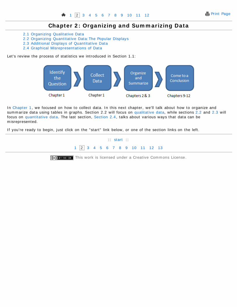
Print Page 1 2 3 4 5 6 7 8 9 10 11 12 Chapter 2: Organizing and Summarizing Data 2.1 Organizing Qualitative Data 2.2 Organizing Quantitative Data:The Popular Displays 2.3 Additional Displays of Quantitative Data 2.4 Graphical Misrepresentations of Data Let's review the process of statistics we introduced in Section 1.1: In Chapter 1, we focused on how to collect data. In this next chapter, we'll talk about how to organize and summarize data using tables in graphs. Section 2.2 will focus on qualitative data, while sections 2.2 and 2.3 will focus on quantitative data. The last section, Section 2.4, talks about various ways that data can be misrepresented. If you're ready to begin, just click on the "start" link below, or one of the section links on the left. :: start :: 1 2 3 4 5 6 7 8 9 10 11 12 13 This work is licensed under a Creative Commons License.
-
Upload
nguyenminh -
Category
Documents
-
view
234 -
download
2
Transcript of Chapter 2: Organizing and Summarizing Data · PDF fileChapter 2: Organizing and Summarizing...
Print Page 1 2 3 4 5 6 7 8 9 10 11 12
Chapter 2: Organizing and Summarizing Data2.1 Organizing Qualitative Data2.2 Organizing Quantitative Data:The Popular Displays2.3 Additional Displays of Quantitative Data2.4 Graphical Misrepresentations of Data
Let's review the process of statistics we introduced in Section 1.1:
In Chapter 1, we focused on how to collect data. In this next chapter, we'll talk about how to organize andsummarize data using tables in graphs. Section 2.2 will focus on qualitative data, while sections 2.2 and 2.3 willfocus on quantitative data. The last section, Section 2.4, talks about various ways that data can bemisrepresented.
If you're ready to begin, just click on the "start" link below, or one of the section links on the left.
:: start ::
1 2 3 4 5 6 7 8 9 10 11 12 13
This work is licensed under a Creative Commons License.
Objectives
Print Page 1 2 3 4 5 6 7 8 9 10 11 12 13
Section 2.1: Organizing Qualitative Data2.1 Organizing Qualitative Data2.2 Organizing Quantitative Data:The Popular Displays2.3 Additional Displays of Quantitative Data2.4 Graphical Misrepresentations of Data
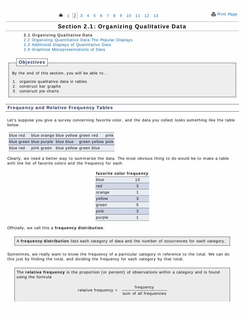
By the end of this section, you will be able to...
1. organize qualitative data in tables2. construct bar graphs3. construct pie charts
Frequency and Relative Frequency Tables
Let's suppose you give a survey concerning favorite color, and the data you collect looks something like the tablebelow.
blue red blue orange blue yellow green red pinkblue green blue purple blue blue green yellow pinkblue red pink green blue yellow green blue
Clearly, we need a better way to summarize the data. The most obvious thing to do would be to make a tablewith the list of favorite colors and the frequency for each.
favorite color frequencyblue 10red 3orange 1yellow 3green 5pink 3purple 1
Officially, we call this a frequency distribution.
A frequency distribution lists each category of data and the number of occurrences for each category.
Sometimes, we really want to know the frequency of a particular category in reference to the total. We can dothis just by finding the total, and dividing the frequency for each category by that total.
The relative frequency is the proportion (or percent) of observations within a category and is foundusing the formula
relative frequency = frequency
sum of all frequencies
A relative frequency distribution lists each category of data together with the relative frequency ofeach category.
favorite color relative frequencyblue 10/26 ≈ 0.38red 3/26 ≈ 0.12orange 1/26 ≈ 0.04yellow 3/26 ≈ 0.12green 5/26 ≈ 0.19pink 3/26 ≈ 0.12purple 1/26 ≈ 0.04
Technology
Here's a quick overview of how to create frequency and relative frequency tables in StatCrunch.
1. Enter or import the data.2. Select Stat > Tables > Frequency.3. Select the column(s) you want to summarize and click Next.4. Add any modifications for an "Other" category and how to order the
categories.5. Click Calculate and another window with these numbers calculated
will pop up.6. You can then choose Options > Copy to copy the output for use
elsewhere.
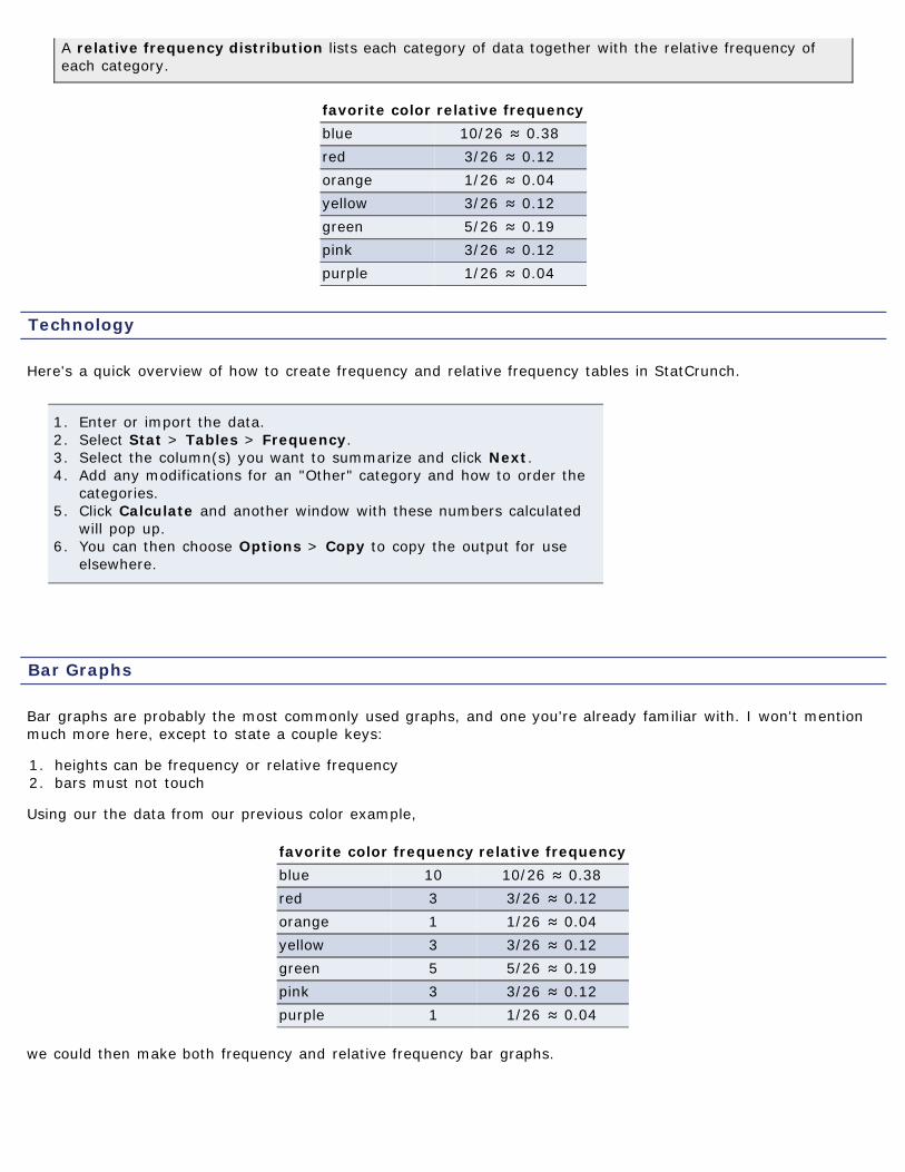
Bar Graphs
Bar graphs are probably the most commonly used graphs, and one you're already familiar with. I won't mentionmuch more here, except to state a couple keys:
1. heights can be frequency or relative frequency2. bars must not touch
Using our the data from our previous color example,
favorite color frequency relative frequencyblue 10 10/26 ≈ 0.38red 3 3/26 ≈ 0.12orange 1 1/26 ≈ 0.04yellow 3 3/26 ≈ 0.12green 5 5/26 ≈ 0.19pink 3 3/26 ≈ 0.12purple 1 1/26 ≈ 0.04
we could then make both frequency and relative frequency bar graphs.
Technology
Here's a quick overview of how to create bar graphs in StatCrunch.
1. Enter or import the data.2. Select Graphics > Bar Graph, then choose with data or with
summary.3. If you chose with data, select the column(s) you wish to use and
click Next. If you chose with summary, set the columns containingthe categories and counts and click Next.
4. Choose the type (Frequency or Relative Frequency) and click Next.5. Enter any modifications and/or color schemes and click Create
Graph!6. You can then choose Options > Copy to copy the box plot for use
elsewhere.
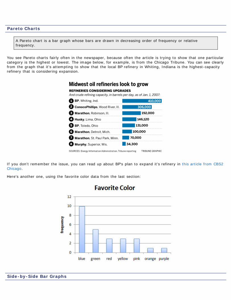
Pareto Charts
A Pareto chart is a bar graph whose bars are drawn in decreasing order of frequency or relativefrequency.
You see Pareto charts fairly often in the newspaper, because often the article is trying to show that one particularcategory is the highest or lowest. The image below, for example, is from the Chicago Tribune. You can see clearlyfrom the graph that it's attempting to show that the local BP refinery in Whiting, Indiana is the highest-capacityrefinery that is considering expansion.
If you don't remember the issue, you can read up about BP's plan to expand it's refinery in this article from CBS2Chicago.
Here's another one, using the favorite color data from the last section:
Side-by-Side Bar Graphs
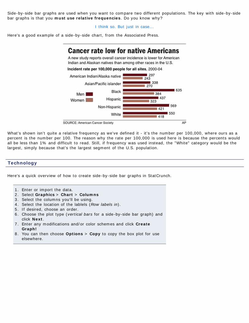
Side-by-side bar graphs are used when you want to compare two different populations. The key with side-by-sidebar graphs is that you must use relative frequencies. Do you know why?
I think so. But just in case...
Here's a good example of a side-by-side chart, from the Associated Press.
What's shown isn't quite a relative frequency as we've defined it - it's the number per 100,000, where ours as apercent is the number per 100. The reason why the rate per 100,000 is used here is because the percents wouldall be less than 1% and difficult to read. Still, if frequency was used instead, the "White" category would be thelargest, simply because that's the largest segment of the U.S. population.
Technology
Here's a quick overview of how to create side-by-side bar graphs in StatCrunch.
1. Enter or import the data.2. Select Graphics > Chart > Columns3. Select the columns you'll be using.4. Select the location of the lablels (Row labels in).5. If desired, choose an order.6. Choose the plot type (vertical bars for a side-by-side bar graph) and
click Next.7. Enter any modifications and/or color schemes and click Create
Graph!8. You can then choose Options > Copy to copy the box plot for use
elsewhere.
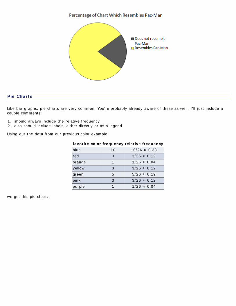
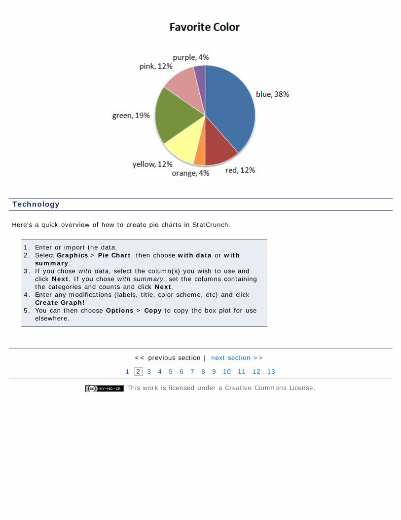
Pie Charts
Like bar graphs, pie charts are very common. You're probably already aware of these as well. I'll just include acouple comments:
1. should always include the relative frequency2. also should include labels, either directly or as a legend
Using our the data from our previous color example,
favorite color frequency relative frequencyblue 10 10/26 ≈ 0.38red 3 3/26 ≈ 0.12orange 1 1/26 ≈ 0.04yellow 3 3/26 ≈ 0.12green 5 5/26 ≈ 0.19pink 3 3/26 ≈ 0.12purple 1 1/26 ≈ 0.04
we get this pie chart:.
Technology
Here's a quick overview of how to create pie charts in StatCrunch.
1. Enter or import the data.2. Select Graphics > Pie Chart, then choose with data or with
summary.3. If you chose with data, select the column(s) you wish to use and
click Next. If you chose with summary, set the columns containingthe categories and counts and click Next.
4. Enter any modifications (labels, title, color scheme, etc) and clickCreate Graph!
5. You can then choose Options > Copy to copy the box plot for useelsewhere.
<< previous section | next section >>
1 2 3 4 5 6 7 8 9 10 11 12 13
This work is licensed under a Creative Commons License.
Objectives
Example 1
Print Page 1 2 3 4 5 6 7 8 9 10 11 12 13
Section 2.2: Organizing Quantitative Data: The Popular Displays2.1 Organizing Qualitative Data2.2 Organizing Quantitative Data:The Popular Displays2.3 Additional Displays of Quantitative Data2.4 Graphical Misrepresentations of Data
By the end of this section, you will be able to...
1. organize quantitative data into tables2. construct histograms for discrete and continuous data3. draw stem-and-leaf plots4. draw dot plots5. identify the shape of a distribution
Like qualitative data in the last section, quantitative data can (and should) be organized into tables. We'll breakthis page up into two parts - discrete and continuous.
Organizing Discrete Data into Tables
If you recall from Section 1.2,
A discrete variable is a quantitative variable that has either a finite number of possible values or acountable number of values. (Countable means that the values result from counting - 0, 1, 2, 3, ...)
Since we can list all the possible values (that's essentially what countable means), one way to make a table isjust to list the values along with their corresponding frequency.
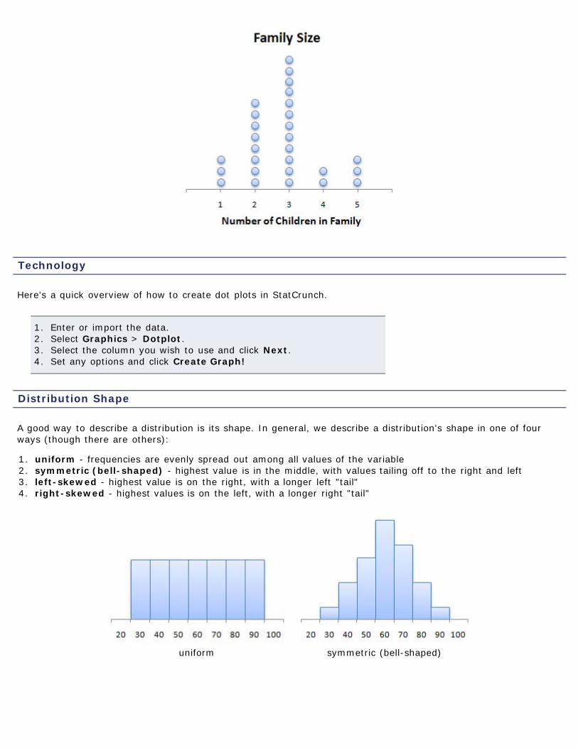
Here's some data I collected from a previous students Mth120 course. Itrefers to the number of children in their family (including themselves).
2 2 2 4 5 3 3 3 32 1 2 3 5 3 4 3 12 3 5 3 2 1 3 2
An easy way to compile the data would then be to make a frequency orrelative frequency table as we did before.
children frequency relative frequency1 3 3/26 ≈ 0.122 8 8/26 ≈ 0.313 10 10/26 ≈ 0.384 2 2/26 ≈ 0.085 3 3/26 ≈ 0.12
Example 2
Example 3
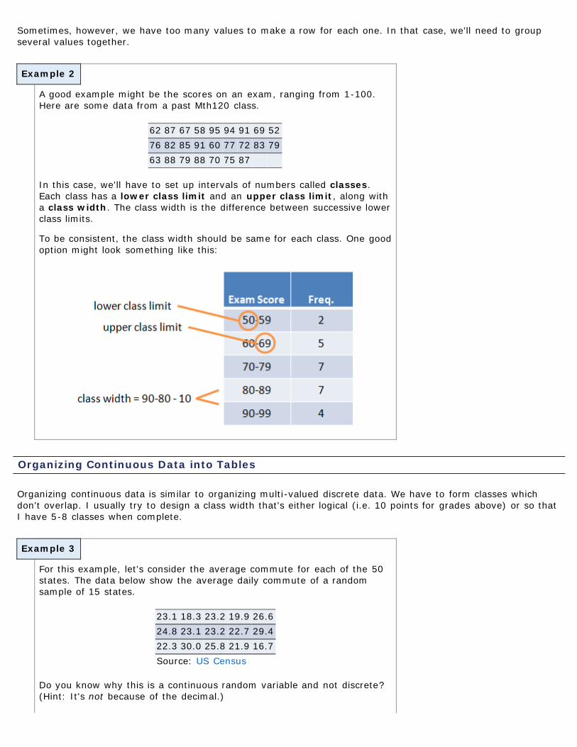
Sometimes, however, we have too many values to make a row for each one. In that case, we'll need to groupseveral values together.
A good example might be the scores on an exam, ranging from 1-100.Here are some data from a past Mth120 class.
62 87 67 58 95 94 91 69 5276 82 85 91 60 77 72 83 7963 88 79 88 70 75 87
In this case, we'll have to set up intervals of numbers called classes.Each class has a lower class limit and an upper class limit, along witha class width. The class width is the difference between successive lowerclass limits.
To be consistent, the class width should be same for each class. One goodoption might look something like this:
Organizing Continuous Data into Tables
Organizing continuous data is similar to organizing multi-valued discrete data. We have to form classes whichdon't overlap. I usually try to design a class width that's either logical (i.e. 10 points for grades above) or so thatI have 5-8 classes when complete.
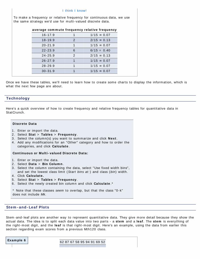
For this example, let's consider the average commute for each of the 50states. The data below show the average daily commute of a randomsample of 15 states.
23.1 18.3 23.2 19.9 26.624.8 23.1 23.2 22.7 29.422.3 30.0 25.8 21.9 16.7Source: US Census
Do you know why this is a continuous random variable and not discrete?(Hint: It's not because of the decimal.)
Example 6
I think I know!
To make a frequency or relative frequency for continuous data, we usethe same strategy we'd use for multi-valued discrete data.
average commute frequency relative frequency16-17.9 1 1/15 ≈ 0.0718-19.9 2 2/15 ≈ 0.1320-21.9 1 1/15 ≈ 0.0722-23.9 6 6/15 = 0.4024-25.9 2 2/15 ≈ 0.1326-27.9 1 1/15 ≈ 0.0728-29.9 1 1/15 ≈ 0.0730-31.9 1 1/15 ≈ 0.07
Once we have these tables, we'll need to learn how to create some charts to display the information, which iswhat the next few page are about.
Technology
Here's a quick overview of how to create frequency and relative frequency tables for quantitative data inStatCrunch.
Discrete Data
1. Enter or import the data.2. Select Stat > Tables > Frequency.3. Select the column(s) you want to summarize and click Next.4. Add any modifications for an "Other" category and how to order the
categories, and click Calculate.
Continuous or Multi-valued Discrete Data:
1. Enter or import the data.2. Select Data > Bin Column.3. Select the column containing the data, select "Use fixed width bins",
and set the lowest class limit (Start bins at:) and class (bin) width.4. Click Calculate.5. Select Stat > Tables > Frequency.6. Select the newly created bin column and click Calculate.*
* Note that these classes seem to overlap, but that the class "0-k"does not include Mk.
Stem-and-Leaf Plots
Stem-and-leaf plots are another way to represent quantitative data. They give more detail because they show theactual data. The idea is to split each data value into two parts - a stem and a leaf. The stem is everything ofthe right-most digit, and the leaf is that right-most digit. Here's an example, using the data from earlier thissection regarding exam scores from a previous Mth120 class.
62 87 67 58 95 94 91 69 52
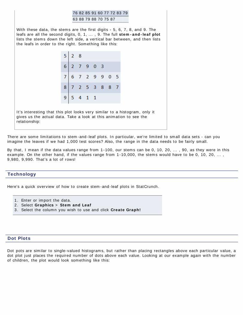
76 82 85 91 60 77 72 83 7963 88 79 88 70 75 87
With these data, the stems are the first digits - 5, 6, 7, 8, and 9. Theleafs are all the second digits, 0, 1, ... , 9. The full stem-and-leaf plotlists the stems down the left side, a vertical bar between, and then liststhe leafs in order to the right. Something like this:
It's interesting that this plot looks very similar to a histogram, only itgives us the actual data. Take a look at this animation to see therelationship:
There are some limitations to stem-and-leaf plots. In particular, we're limited to small data sets - can youimagine the leaves if we had 1,000 test scores? Also, the range in the data needs to be fairly small.
By that, I mean if the data values range from 1-100, our stems can be 0, 10, 20, ... , 90, as they were in thisexample. On the other hand, if the values range from 1-10,000, the stems would have to be 0, 10, 20, ... ,9,980, 9,990. That's a lot of rows!
Technology
Here's a quick overview of how to create stem-and-leaf plots in StatCrunch.
1. Enter or import the data.2. Select Graphics > Stem and Leaf3. Select the column you wish to use and click Create Graph!
Dot Plots
Dot pots are similar to single-valued histograms, but rather than placing rectangles above each particular value, adot plot just places the required number of dots above each value. Looking at our example again with the numberof children, the plot would look something like this:
Technology
Here's a quick overview of how to create dot plots in StatCrunch.
1. Enter or import the data.2. Select Graphics > Dotplot.3. Select the column you wish to use and click Next.4. Set any options and click Create Graph!
Distribution Shape
A good way to describe a distribution is its shape. In general, we describe a distribution's shape in one of fourways (though there are others):
1. uniform - frequencies are evenly spread out among all values of the variable2. symmetric (bell-shaped) - highest value is in the middle, with values tailing off to the right and left3. left-skewed - highest value is on the right, with a longer left "tail"4. right-skewed - highest values is on the left, with a longer right "tail"
uniform symmetric (bell-shaped)
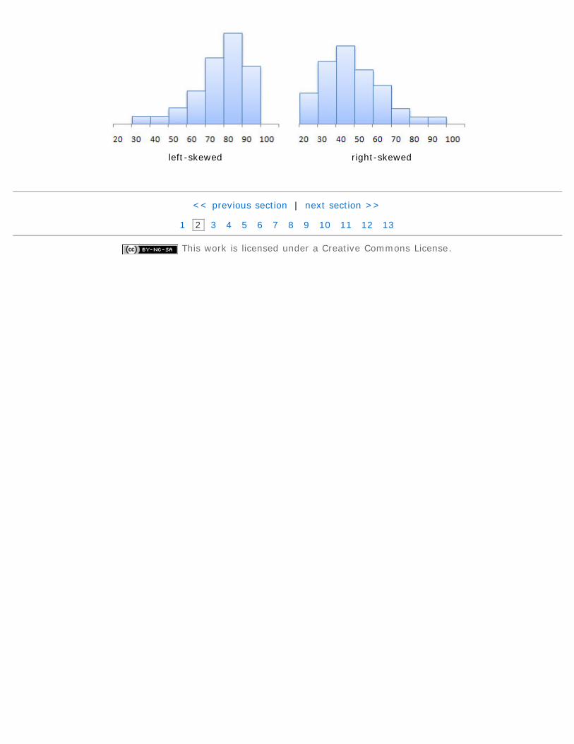
left-skewed right-skewed
<< previous section | next section >>
1 2 3 4 5 6 7 8 9 10 11 12 13
This work is licensed under a Creative Commons License.
Objectives
Example 1
Print Page 1 2 3 4 5 6 7 8 9 10 11 12 13
Section 2.3: Additional Displays of Quantitative Data2.1 Organizing Qualitative Data2.2 Organizing Quantitative Data:The Popular Displays2.3 Additional Displays of Quantitative Data2.4 Graphical Misrepresentations of Data
By the end of this section, you will be able to...
1. construct frequency polygons*2. create cumulative frequency and relative frequency tables3. construct ogives*4. draw time-series graphs
* You will not be tested on these objectives.
In addition to histograms, stem-and-leaf plots, and dot plots, there are some other, section common plots. We'llintroduce a couple in this section. The first type, frequency polygons, are not a type of plot that will beexpected of you on exams, though you will be asked questions about them on homework.
Frequency Polygons
A frequency polygon is drawn by plotting a point above each class midpoint and connecting the pointswith a straight line. (Class midpoints are found by average successive lower class limits.)
To illustrate the idea, let's look at the average commute data from thelast section.
average commute midpoint frequency relative frequency16-17.9 17 1 1/15 ≈ 0.0718-19.9 19 2 2/15 ≈ 0.1320-21.9 21 1 1/15 ≈ 0.0722-23.9 23 6 6/15 = 0.4024-25.9 25 2 2/15 ≈ 0.1326-27.9 27 1 1/15 ≈ 0.0728-29.9 29 1 1/15 ≈ 0.0730-31.9 31 1 1/15 ≈ 0.07
The three images below show the relationship between the histogram andthe frequency polygon.
Note: No technology section this time, since you won't be asked to do this for exams.
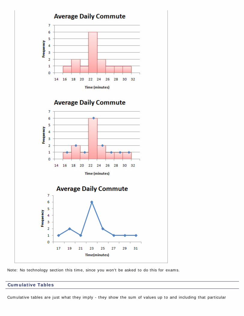
Cumulative Tables
Cumulative tables are just what they imply - they show the sum of values up to and including that particular
Example 2
category. As with regular tables, we can have both cumulative frequency and relative frequency.
To illustrate the idea, let's look at the average commute data from thelast section.
average commute frequency cumulative frequency16-17.9 1 118-19.9 2 320-21.9 1 422-23.9 6 1024-25.9 2 1226-27.9 1 1328-29.9 1 1430-31.9 1 15
average commuterelative
frequency
cumulativerelative
frequency16-17.9 1/15 ≈ 0.07 1/15 ≈ 0.0718-19.9 2/15 ≈ 0.13 3/15 ≈ 0.2020-21.9 1/15 ≈ 0.07 4/15 ≈ 0.2722-23.9 6/15 = 0.40 10/15 ≈ 0.6724-25.9 2/15 ≈ 0.13 12/15 = 0.8026-27.9 1/15 ≈ 0.07 13/15 ≈ 0.8728-29.9 1/15 ≈ 0.07 14/15 ≈ 0.9330-31.9 1/15 ≈ 0.07 15/15 = 1.00
Technology
Unfortunately, there is no easy way to create cumulative tables inStatCrunch. The best method is to create a regular frequency or relativefrequency table and compute the cumulative values by hand.
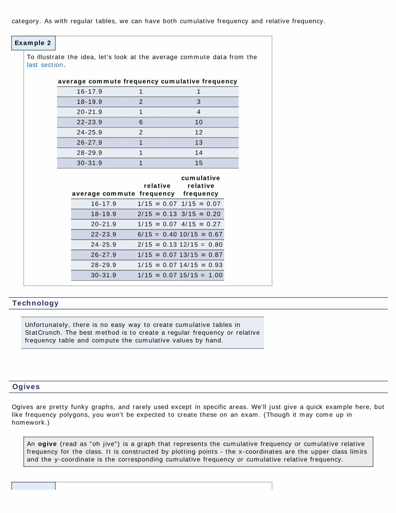
Ogives
Ogives are pretty funky graphs, and rarely used except in specific areas. We'll just give a quick example here, butlike frequency polygons, you won't be expected to create these on an exam. (Though it may come up inhomework.)
An ogive (read as "oh jive") is a graph that represents the cumulative frequency or cumulative relativefrequency for the class. It is constructed by plotting points - the x-coordinates are the upper class limitsand the y-coordinate is the corresponding cumulative frequency or cumulative relative frequency.
Example 3
To illustrate the idea, let's again use the average commute data from thelast section.
average commuterelative
frequency
cumulativerelative
frequency16-17.9 1/15 ≈ 0.07 1/15 ≈ 0.0718-19.9 2/15 ≈ 0.13 3/15 ≈ 0.2020-21.9 1/15 ≈ 0.07 4/15 ≈ 0.2722-23.9 6/15 = 0.40 10/15 ≈ 0.6724-25.9 2/15 ≈ 0.13 12/15 = 0.8026-27.9 1/15 ≈ 0.07 13/15 ≈ 0.8728-29.9 1/15 ≈ 0.07 14/15 ≈ 0.9330-31.9 1/15 ≈ 0.07 15/15 = 1.00
Note: No technology section this time, since you won't be asked to do this for exams.
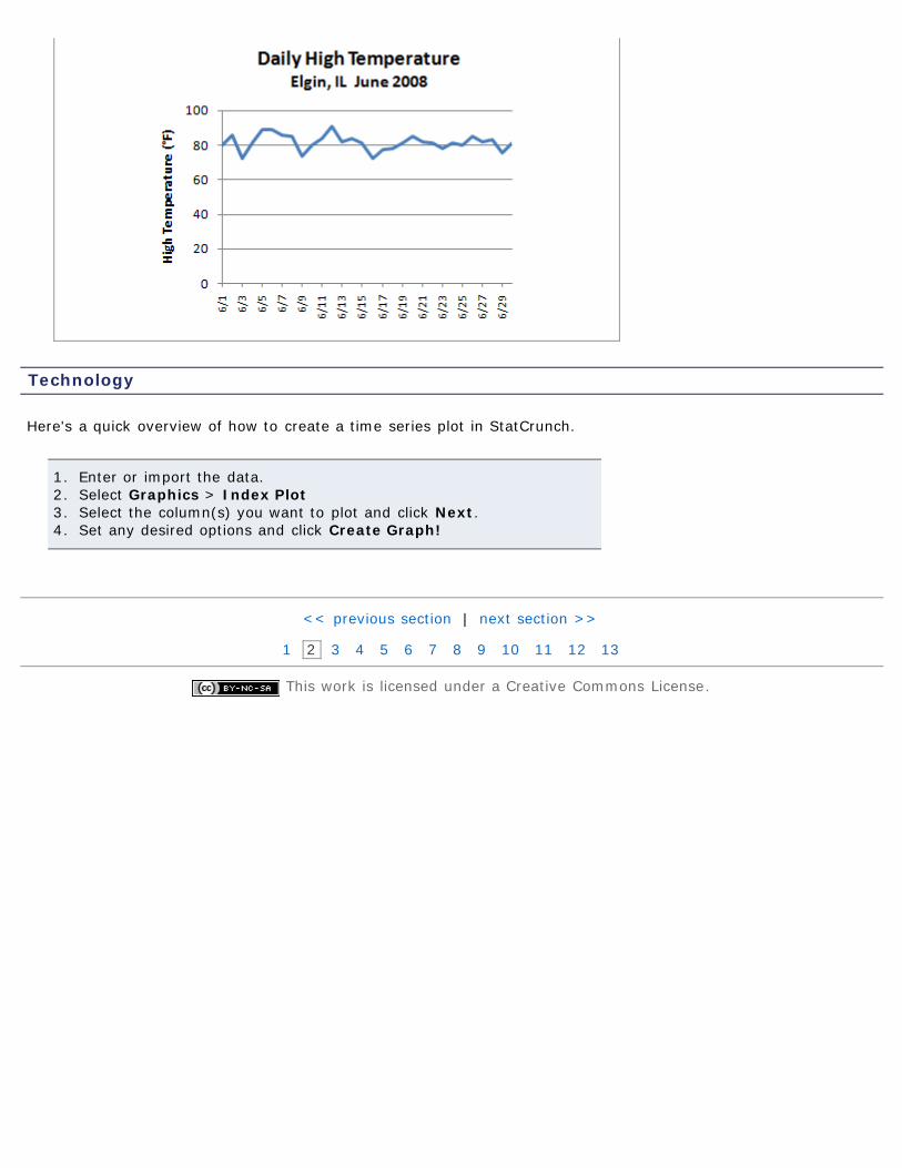
Time-Series Graphs
Time series graphs are much more common than the last couple times we've looked at. It's common to see stock
Example 4
prices and daily temperature graphs in the news - both are time series plots.
A time series plot is obtained by plotting the time in which a variable is measured on the horizontalaxis and the corresponding value of the variable on the vertical axis.
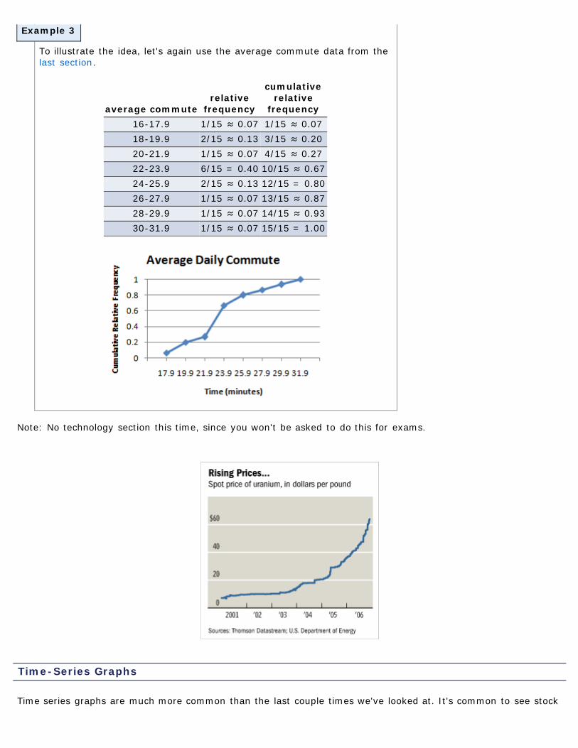
The example above is from the Chicago Tribune and reflects the price of uranium from 2001-2006.
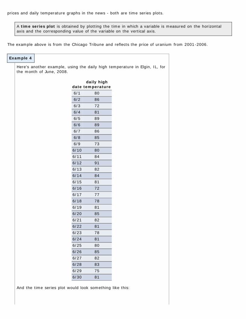
Here's another example, using the daily high temperature in Elgin, IL, forthe month of June, 2008.
datedaily high
temperature6/1 806/2 866/3 726/4 816/5 896/6 896/7 866/8 856/9 736/10 806/11 846/12 916/13 826/14 846/15 816/16 726/17 776/18 786/19 816/20 856/21 826/22 816/23 786/24 816/25 806/26 856/27 826/28 836/29 756/30 81
And the time series plot would look something like this:
Technology
Here's a quick overview of how to create a time series plot in StatCrunch.
1. Enter or import the data.2. Select Graphics > Index Plot3. Select the column(s) you want to plot and click Next.4. Set any desired options and click Create Graph!
<< previous section | next section >>
1 2 3 4 5 6 7 8 9 10 11 12 13
This work is licensed under a Creative Commons License.
Objectives
Example 1
Example 2
Print Page 1 2 3 4 5 6 7 8 9 10 11 12 13
Section 2.4: Graphical Misrepresentations of Data2.1 Organizing Qualitative Data2.2 Organizing Quantitative Data:The Popular Displays2.3 Additional Displays of Quantitative Data2.4 Graphical Misrepresentations of Data
By the end of this section, you will be able to...
1. describe what can make a graph misleading or deceptive
Misleading and Deceptive Graphs
The author of your text makes an interesting distinction between "misleading" and "deceptive" graphs. It's animportant point, so read through that paragraph before continuing on to the examples. (Page 104)
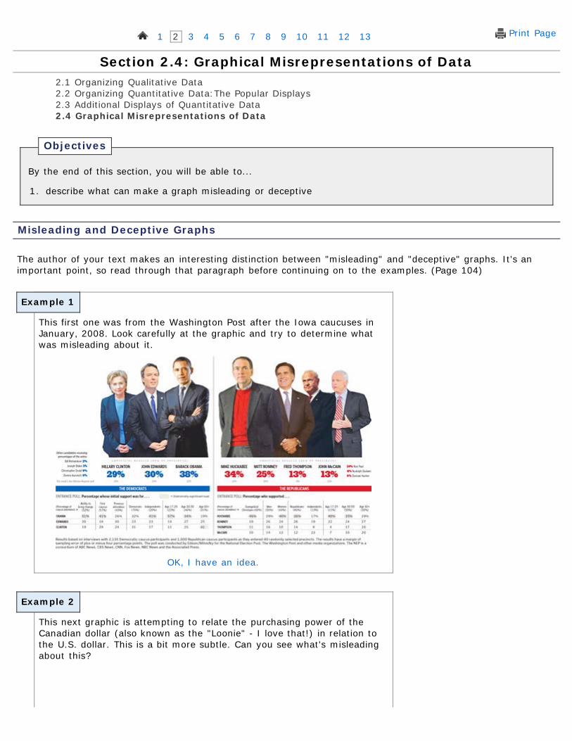
This first one was from the Washington Post after the Iowa caucuses inJanuary, 2008. Look carefully at the graphic and try to determine whatwas misleading about it.
OK, I have an idea.
This next graphic is attempting to relate the purchasing power of theCanadian dollar (also known as the "Loonie" - I love that!) in relation tothe U.S. dollar. This is a bit more subtle. Can you see what's misleadingabout this?
Example 3
OK, I'm ready.
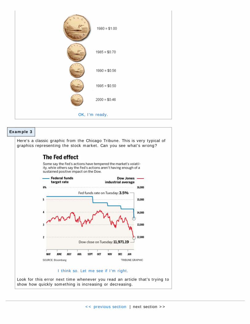
Here's a classic graphic from the Chicago Tribune. This is very typical ofgraphics representing the stock market. Can you see what's wrong?
I think so. Let me see if I'm right.
Look for this error next time whenever you read an article that's trying toshow how quickly something is increasing or decreasing.
<< previous section | next section >>

1 2 3 4 5 6 7 8 9 10 11 12 13
This work is licensed under a Creative Commons License.