Chapter 10 Basic Control Charts
36
10/2/2012 1 Chapter 10 Basic Control Charts Introduction • In the second half of 1920s, Dr. Walter Shewhart of Bell Lab concluded that there were two components to variations that were displayed in all manuf. processes. • The first one was a steady component (random variation) that appeared to be inherent in the process. • The second one was an intermittent variation to assignable causes. • He concluded that assignable causes could be economically discovered and removed with an effective diagnostic program, but the random causes could not be removed without making basic process changes. • Standard control chart based on 3 limits.
Transcript of Chapter 10 Basic Control Charts
10/2/2012
1
Chapter 10
Basic Control Charts
Introduction
• In the second half of 1920s, Dr. Walter Shewhart of
Bell Lab concluded that there were two components to
variations that were displayed in all manuf. processes. • The first one was a steady component (random
variation) that appeared to be inherent in the process.
• The second one was an intermittent variation to
assignable causes.
• He concluded that assignable causes could be
economically discovered and removed with an effective
diagnostic program, but the random causes could not be
removed without making basic process changes.
• Standard control chart based on 3 limits.
10/2/2012
2
Introduction
• Shewhart control charts came into wide use in the
1940s because of war production efforts.
• Western Electric is credited with the addition of other
tests based on sequences or runs.
• 94% of the troubles belong to the system
(responsibility of management), 6% special.
10.1 S4/IEE Application Examples:
Control Charts
• Satellite-level metric: The last three-year’s ROI for a
company was reported monthly in a control chart.
• Transactional 30,000-foot-level metric: One random paid
invoice was selected each day from last year’s invoices,
where the number of days beyond the due date was
measured and reported (i.e., days sales outstanding
[DSO]). The DSO for each sample was reported in a
control chart.
• Transactional 30,000-foot-level metric: The mean and
standard deviation of DSOs was tracked using a weekly
subgroup. An 𝑋𝑚𝑅 control chart was used for each chart
in lieu of an 𝑋 and 𝑠 chart.
10/2/2012
3
10.1 S4/IEE Application Examples:
Control Charts
• Manufacturing 30,000-foot-level metric (KPOV): One random
sample of a manufactured part was selected each day over
the last year. The diameter of the part was measured and
plotted in an 𝑋𝑚𝑅 control chart.
• Transactional and manufacturing 30,000-foot-level cycle time
metric (a lean metric): One randomly selected transaction
was selected each day over the last year, where the time
from order entry to fulfillment was measured and reported in
an 𝑋𝑚𝑅 control chart.
• Transactional and manufacturing 30,000-foot-level inventory
metric or satellite-level TOC metric (a lean metric): Inventory
was tracked monthly using an 𝑋𝑚𝑅 control chart.
10.1 S4/IEE Application Examples:
Control Charts
• Manufacturing 30,000-foot-level quality metric: The number of
printed circuit boards produced weekly for a high-volume
manufacturing company is similar. The weekly failure rate of
printed circuit boards is tracked on an 𝑋𝑚𝑅 control chart
rather than a 𝑝 chart.
• Transactional 50-foot-level metric (KPIV): An S4/ IEE project
to improve the 30,000-foot-level metrics for DSOs identified a
KPIV to the process, the importance of timely calling
customers to ensure that they received a company’s invoice.
A control chart tracked the time from invoicing to when the
call was made, where one invoice was selected hourly.
10/2/2012
4
10.1 S4/IEE Application Examples:
Control Charts
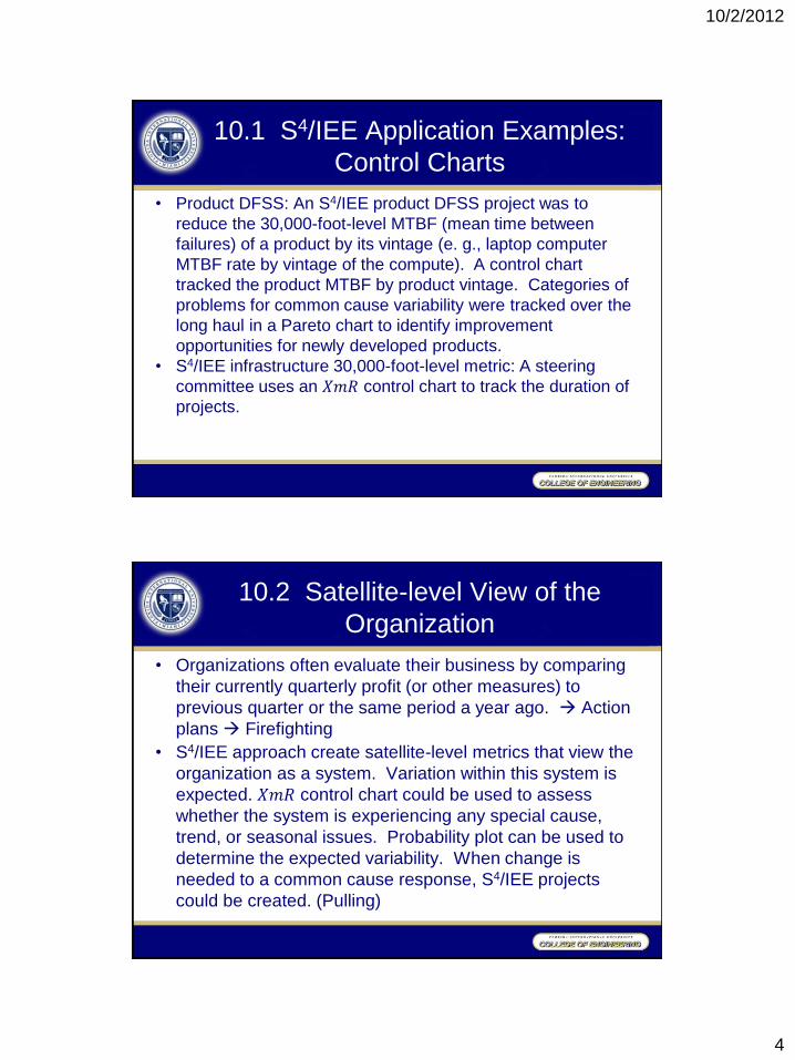
• Product DFSS: An S4/IEE product DFSS project was to
reduce the 30,000-foot-level MTBF (mean time between
failures) of a product by its vintage (e. g., laptop computer
MTBF rate by vintage of the compute). A control chart
tracked the product MTBF by product vintage. Categories of
problems for common cause variability were tracked over the
long haul in a Pareto chart to identify improvement
opportunities for newly developed products.
• S4/IEE infrastructure 30,000-foot-level metric: A steering
committee uses an 𝑋𝑚𝑅 control chart to track the duration of
projects.
10.2 Satellite-level View of the
Organization
• Organizations often evaluate their business by comparing
their currently quarterly profit (or other measures) to
previous quarter or the same period a year ago. Action
plans Firefighting
• S4/IEE approach create satellite-level metrics that view the
organization as a system. Variation within this system is
expected. 𝑋𝑚𝑅 control chart could be used to assess
whether the system is experiencing any special cause,
trend, or seasonal issues. Probability plot can be used to
determine the expected variability. When change is
needed to a common cause response, S4/IEE projects
could be created. (Pulling)
10/2/2012
5
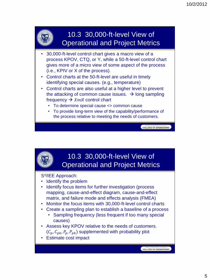
10.3 30,000-ft-level View of
Operational and Project Metrics
• 30,000-ft-level control chart gives a macro view of a
process KPOV, CTQ, or Y, while a 50-ft-level control chart
gives more of a micro view of some aspect of the process
(i.e., KPIV or X of the process).
• Control charts at the 50-ft-level are useful in timely
identifying special causes. (e.g., temperature)
• Control charts are also useful at a higher level to prevent
the attacking of common cause issues. long sampling
frequency 𝑋𝑚𝑅 control chart
• To determine special cause <> common cause
• To provide long-term view of the capability/performance of
the process relative to meeting the needs of customers.
10.3 30,000-ft-level View of
Operational and Project Metrics
S4/IEE Approach:
• Identify the problem
• Identify focus items for further investigation (process
mapping, cause-and-effect diagram, cause-and-effect
matrix, and failure mode and effects analysis (FMEA)
• Monitor the focus items with 30,000-ft-level control charts
• Create a sampling plan to establish a baseline of a process
• Sampling frequency (less frequent if too many special
causes)
• Assess key KPOV relative to the needs of customers.
(𝐶𝑝, 𝐶𝑝𝑘, 𝑃𝑝, 𝑃𝑝𝑘) supplemented with probability plot
• Estimate cost impact
10/2/2012
6
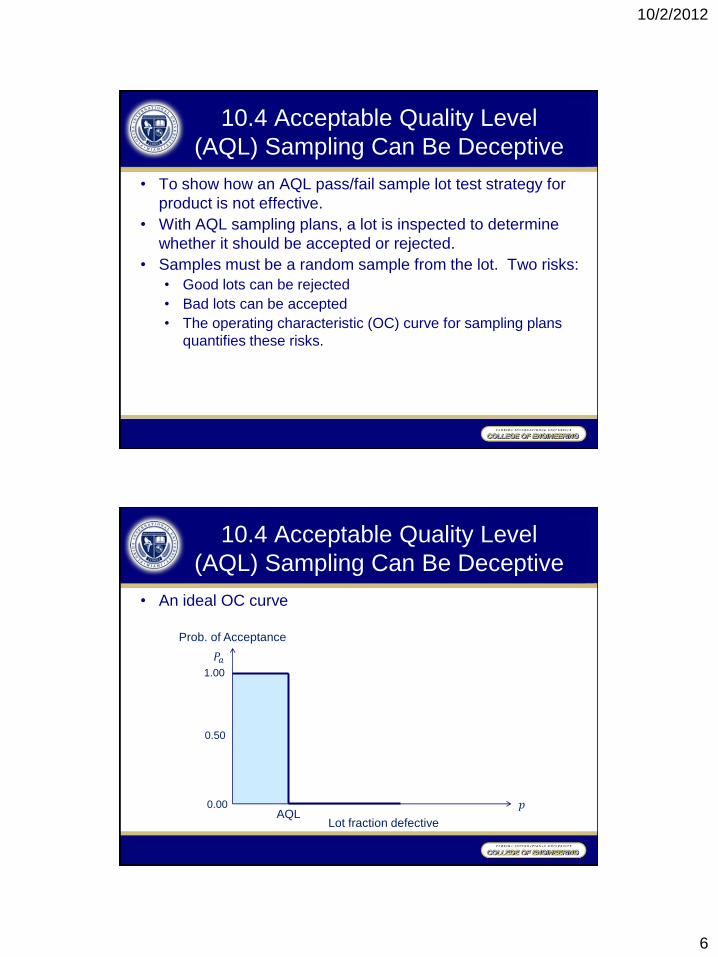
10.4 Acceptable Quality Level
(AQL) Sampling Can Be Deceptive
• To show how an AQL pass/fail sample lot test strategy for
product is not effective.
• With AQL sampling plans, a lot is inspected to determine
whether it should be accepted or rejected.
• Samples must be a random sample from the lot. Two risks:
• Good lots can be rejected
• Bad lots can be accepted
• The operating characteristic (OC) curve for sampling plans
quantifies these risks.
10.4 Acceptable Quality Level
(AQL) Sampling Can Be Deceptive
• An ideal OC curve
Prob. of Acceptance
𝑃𝑎
1.00
0.00
Lot fraction defective
𝑝 AQL
0.50
10/2/2012
7
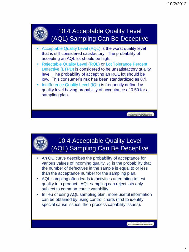
10.4 Acceptable Quality Level
(AQL) Sampling Can Be Deceptive
• Acceptable Quality Level (AQL) is the worst quality level
that is still considered satisfactory. The probability of
accepting an AQL lot should be high.
• Rejectable Quality Level (RQL) or Lot Tolerance Percent
Defective (LTPD) is considered to be unsatisfactory quality
level. The probability of accepting an RQL lot should be
low. This consumer’s risk has been standardized as 0.1.
• Indifference Quality Level (IQL) is frequently defined as
quality level having probability of acceptance of 0.50 for a
sampling plan.
10.4 Acceptable Quality Level
(AQL) Sampling Can Be Deceptive
• An OC curve describes the probability of acceptance for
various values of incoming quality. 𝑃𝑎 is the probability that
the number of defectives in the sample is equal to or less
than the acceptance number for the sampling plan.
• AQL sampling often leads to activities attempting to test
quality into product. AQL sampling can reject lots only
subject to common-cause variability.
• In lieu of using AQL sampling plan, more useful information
can be obtained by using control charts (first to identify
special cause issues, then process capability issues).
10/2/2012
8
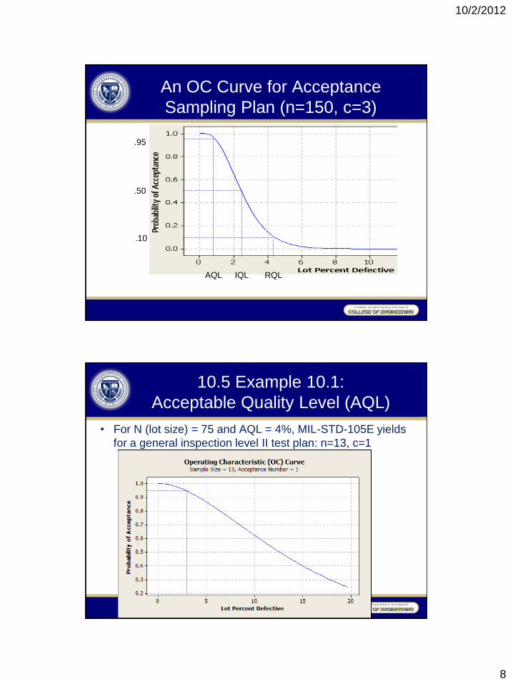
An OC Curve for Acceptance
Sampling Plan (n=150, c=3)
IQL
.50
.95
AQL
.10
RQL
10.5 Example 10.1:
Acceptable Quality Level (AQL)
• For N (lot size) = 75 and AQL = 4%, MIL-STD-105E yields
for a general inspection level II test plan: n=13, c=1
10/2/2012
9
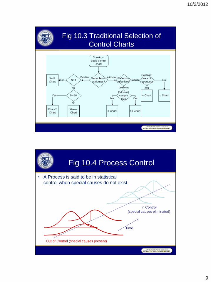
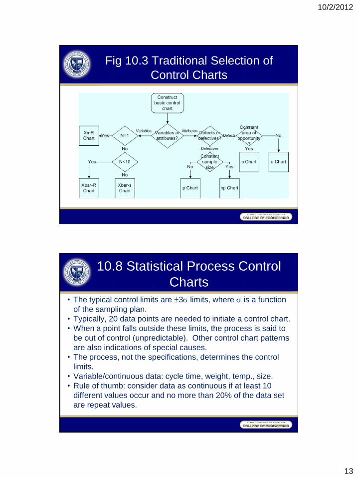
Fig 10.3 Traditional Selection of
Control Charts
Fig 10.4 Process Control
Time
In Control
(special causes eliminated)
Out of Control (special causes present)
• A Process is said to be in statistical
control when special causes do not exist.
10/2/2012
10
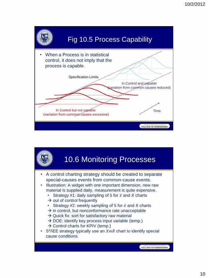
Fig 10.5 Process Capability
Time
In Control and capable
(variation from common causes reduced)
In Control but not capable
(variation from common causes excessive)
Specification Limits
• When a Process is in statistical
control, it does not imply that the
process is capable.
10.6 Monitoring Processes
• A control charting strategy should be created to separate
special-causes events from common-cause events. • Illustration: A widget with one important dimension, new raw
material is supplied daily, measurement is quite expensive.
• Strategy #1: daily sampling of 5 for 𝑥 and 𝑅 charts
out of control frequently
• Strategy #2: weekly sampling of 5 for 𝑥 and 𝑅 charts
in control, but nonconformance rate unacceptable
Quick fix: sort for satisfactory raw material
DOE: identify key process input variable (temp.)
Control charts for KPIV (temp.)
• S4/IEE strategy typically use an 𝑋𝑚𝑅 chart to identify special
cause conditions.
10/2/2012
11
10.7 Rational Sampling and
Rational Subgrouping
• Rational sampling involves the best selection of the what,
where, how, and when for measurements. Sampling plans
should lead to analyses that give insight.
• Traditionally, rational subgrouping involves the selection of
samples that yield relatively homogeneous conditions within
the subgroup. • For 𝑥 and 𝑅 charts, the within-subgroup variation defines the
control limits (thus the sensitivity of the control charts).
• Different subgrouping methods can dramatically affect the
measured variation within subgroups.
• 𝑥 charts identify differences between the subgroups, while the
𝑅 charts identify inconsistency within the subgroups.
Consider the source of variation, then organize the subgroups
10.7 Rational Sampling and
Rational Subgrouping
• For high-level metrics, infrequent subgrouping/sampling is
preferred to reduce firefighting.
• When process capability/performance improvements are
needed, S4/IEE projects are pulled into the system.
10/2/2012
12
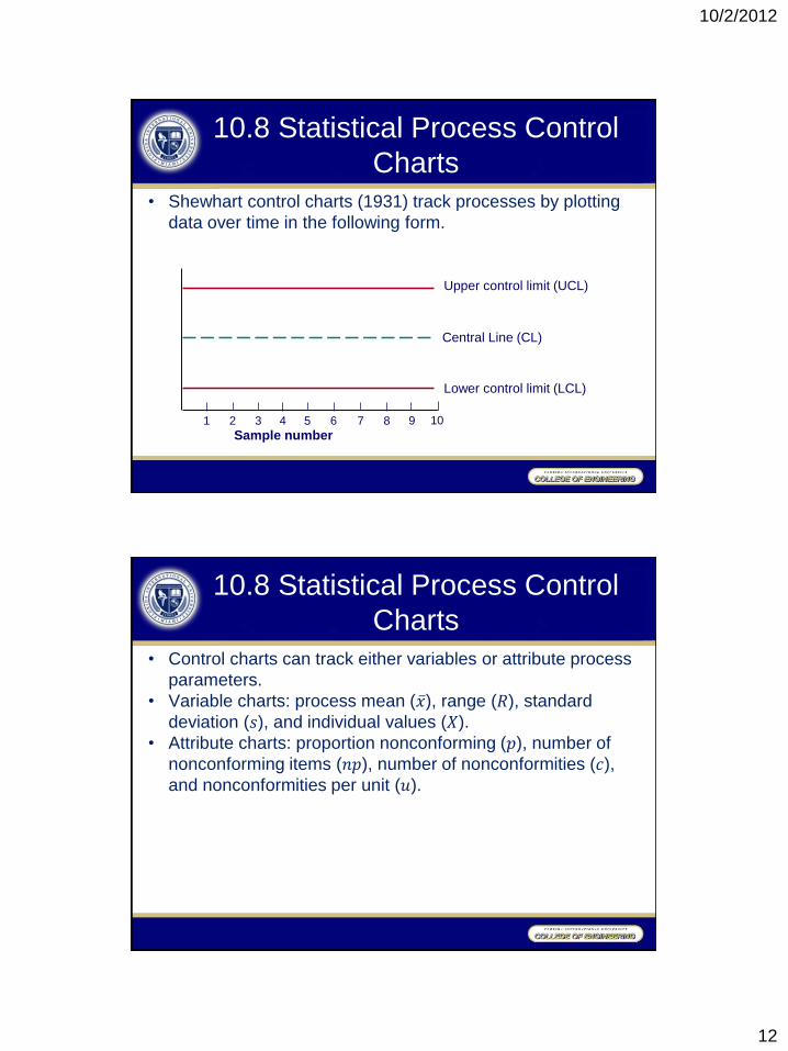
10.8 Statistical Process Control
Charts
• Shewhart control charts (1931) track processes by plotting
data over time in the following form.
1 2 3 4 5 6 7 8 9 10
Sample number
Upper control limit (UCL)
Central Line (CL)
Lower control limit (LCL)
10.8 Statistical Process Control
Charts
• Control charts can track either variables or attribute process
parameters.
• Variable charts: process mean (𝑥 ), range (𝑅), standard
deviation (𝑠), and individual values (𝑋).
• Attribute charts: proportion nonconforming (𝑝), number of
nonconforming items (𝑛𝑝), number of nonconformities (𝑐),
and nonconformities per unit (𝑢).
10/2/2012
13
Fig 10.3 Traditional Selection of
Control Charts
10.8 Statistical Process Control
Charts
• The typical control limits are 3 limits, where is a function
of the sampling plan.
• Typically, 20 data points are needed to initiate a control chart.
• When a point falls outside these limits, the process is said to
be out of control (unpredictable). Other control chart patterns
are also indications of special causes.
• The process, not the specifications, determines the control
limits.
• Variable/continuous data: cycle time, weight, temp., size.
• Rule of thumb: consider data as continuous if at least 10
different values occur and no more than 20% of the data set
are repeat values.

10/2/2012
14
10.9 Interpretation of
Control Chart Patterns
• When a process is in control (predictable), the control chart
pattern should exhibit “natural characteristics” as if it were
from random data.
• Unnatural patterns classified as “mixture” have an absence of
points near the center line. (a combination of 2 different
patterns on 1 chart, one at high level and one at low level)
• Unnatural patterns classified as “stratification” have very
small up and down variation. (samples are taken consistently
from a widely different distribution)
• Unnatural patterns classified as “instability” have points
outside the control limits. (something has changed within the
process)
10.9 Interpretation of
Control Chart Patterns
Sampling errors • Type I error: process is stated to be out of control/
unpredictable without special cause (when bad sample was
drawn)
• Chance of error increases with the introduction of more
criteria when analyzing the charts.
• Type II error: process is stated to be in control/predictable
with special cause exists (when good sample was drawn)
10/2/2012
15
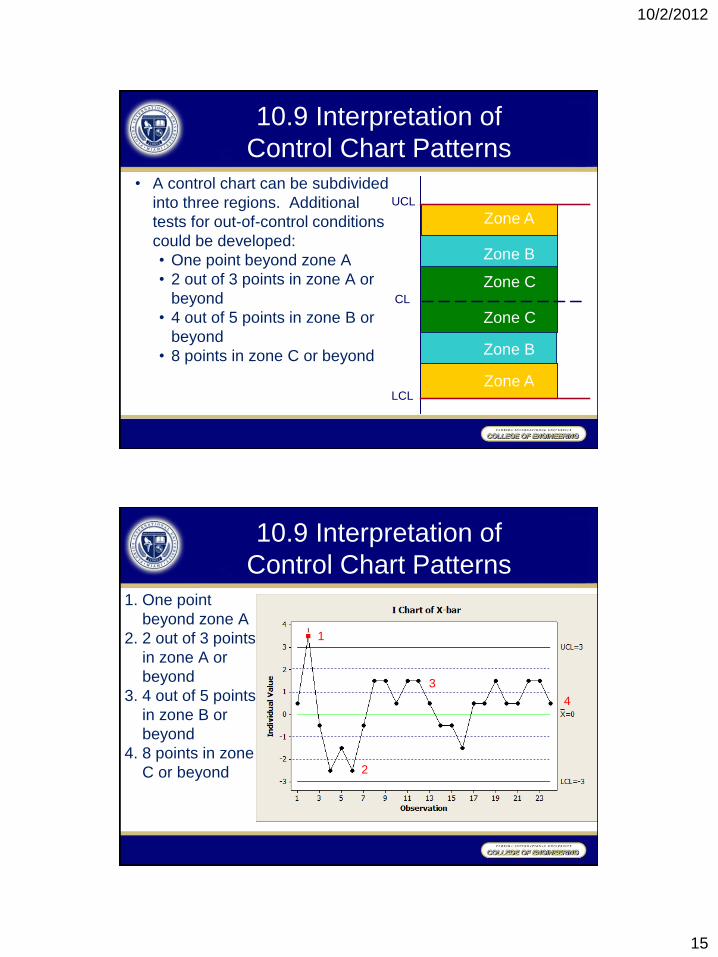
10.9 Interpretation of
Control Chart Patterns
• A control chart can be subdivided
into three regions. Additional
tests for out-of-control conditions
could be developed:
• One point beyond zone A
• 2 out of 3 points in zone A or
beyond
• 4 out of 5 points in zone B or
beyond
• 8 points in zone C or beyond
Zone C
Zone C
Zone A
Zone A
Zone B
Zone B
UCL
LCL
CL
10.9 Interpretation of
Control Chart Patterns
1. One point
beyond zone A
2. 2 out of 3 points
in zone A or
beyond
3. 4 out of 5 points
in zone B or
beyond
4. 8 points in zone
C or beyond
1
2
3
4
10/2/2012
16
10.9 Interpretation of
Control Chart Patterns
• Run tests: A shift has occurred if:
• At least 10 out of 11 sequential data points are on the
same side of the centerline.
• At least 12 out of 14 sequential data points are on the
same side of the centerline.
• At least 14 out of 17 sequential data points are on the
same side of the centerline.
• At least 16 out of 20 sequential data points are on the
same side of the centerline.
• Cost of additional tests: Decreasing average run length(ARL)
• Other patterns within a control chart can tell a story. A cyclic
pattern may indicate that samples are being taken from 2
different distributions.
10.10 𝑥 − 𝑅 and 𝑥 − 𝑠 Charts: Mean and Variability Measurements
• A rational subgrouping of 𝑚 samples of size 𝑛 is taken over
some period of time. The number of 𝑚 samples should be at
least 20 to 25, where 𝑛 is often smaller and either 4, 5, or 6.
• For each sample of size 𝑛, a mean (𝑥 ) and range (𝑅) can be
determined.
• For a process variable to be in statistical control, both the
mean and range of the process must be in control.
• For a new process, the process mean (𝜇) is typically not
known, it has to be calculated using 𝑥 =𝑥 1+𝑥 2+⋯+𝑥 𝑚
𝑚
• The mean range value (𝑅 ) is 𝑅 =𝑅1+𝑅2+⋯+𝑅𝑚
𝑚
• For small sample size, a good estimation for the population
standard deviation is 𝜎 = 𝑅 𝑑2
10/2/2012
17
10.10 𝑥 − 𝑅 and 𝑥 − 𝑠 Charts: Mean and Variability Measurements
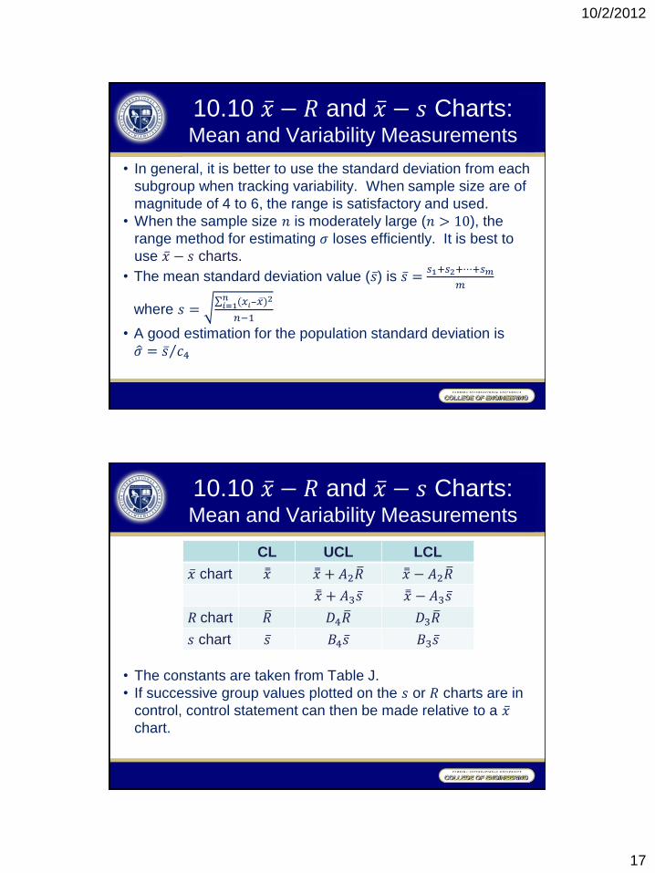
• In general, it is better to use the standard deviation from each
subgroup when tracking variability. When sample size are of
magnitude of 4 to 6, the range is satisfactory and used.
• When the sample size 𝑛 is moderately large (𝑛 > 10), the
range method for estimating 𝜎 loses efficiently. It is best to
use 𝑥 − 𝑠 charts.
• The mean standard deviation value (𝑠 ) is 𝑠 =𝑠1+𝑠2+⋯+𝑠𝑚
𝑚
where 𝑠 = (𝑥𝑖−𝑥 )
2𝑛𝑖=1
𝑛−1
• A good estimation for the population standard deviation is
𝜎 = 𝑠 𝑐4
10.10 𝑥 − 𝑅 and 𝑥 − 𝑠 Charts: Mean and Variability Measurements
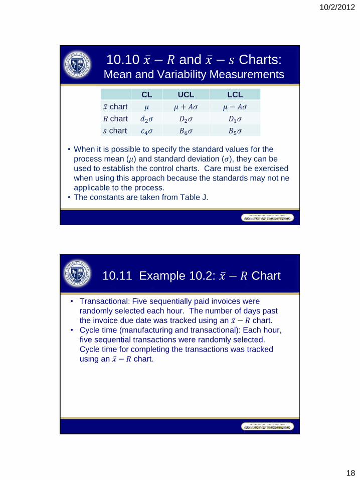
• The constants are taken from Table J.
• If successive group values plotted on the 𝑠 or 𝑅 charts are in
control, control statement can then be made relative to a 𝑥 chart.
CL UCL LCL
𝑥 chart 𝑥 𝑥 + 𝐴2𝑅 𝑥 − 𝐴2𝑅
𝑥 + 𝐴3𝑠 𝑥 − 𝐴3𝑠
𝑅 chart 𝑅 𝐷4𝑅 𝐷3𝑅
𝑠 chart 𝑠 𝐵4𝑠 𝐵3𝑠
10/2/2012
18
10.10 𝑥 − 𝑅 and 𝑥 − 𝑠 Charts: Mean and Variability Measurements
• When it is possible to specify the standard values for the
process mean (𝜇) and standard deviation (𝜎), they can be
used to establish the control charts. Care must be exercised
when using this approach because the standards may not ne
applicable to the process.
• The constants are taken from Table J.
CL UCL LCL
𝑥 chart 𝜇 𝜇 + 𝐴𝜎 𝜇 − 𝐴𝜎
𝑅 chart 𝑑2𝜎 𝐷2𝜎 𝐷1𝜎
𝑠 chart 𝑐4𝜎 𝐵6𝜎 𝐵5𝜎
10.11 Example 10.2: 𝑥 − 𝑅 Chart
• Transactional: Five sequentially paid invoices were
randomly selected each hour. The number of days past
the invoice due date was tracked using an 𝑥 − 𝑅 chart.
• Cycle time (manufacturing and transactional): Each hour,
five sequential transactions were randomly selected.
Cycle time for completing the transactions was tracked
using an 𝑥 − 𝑅 chart.
10/2/2012
19
10.11 Example 10.2: 𝑥 − 𝑅 Chart
• A grinding machine is to produce treads for a hydraulic
system of an aircraft to a diameter of 0.4037±0.0013”.
• Go/no-go thread ring gages are currently used in a 100%
test plan to reject non-conforming parts.
• In an attempt to better understand the process variability,
variable data were taken for the process.
• Measurements were taken every hour on 5 parts using a
visual comparator with accuracy of .0001”.
• The data, sample means, and sample ranges are recorded
in Table 10.1. (All data are expressed in units of 0.0001”
in excess of 0.4000”.)
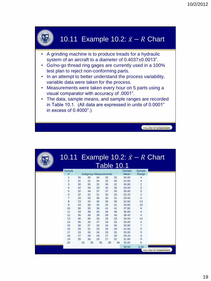
10.11 Example 10.2: 𝑥 − 𝑅 Chart
Table 10.1 Sample
# Subgroup Measurements
Sample
Mean Sample
Range
1 36 35 34 33 32 34.00 4
2 31 31 34 32 30 31.60 4
3 30 30 32 30 32 30.80 2
4 32 33 33 32 35 33.00 3
5 32 34 37 37 35 35.00 5
6 32 32 31 33 33 32.20 2
7 33 33 36 32 31 33.00 5
8 23 33 36 35 36 32.60 13
9 43 36 35 24 31 33.80 19
10 36 35 36 41 41 37.80 6
11 34 38 35 34 38 35.80 4
12 36 38 39 39 40 38.40 4
13 36 40 35 26 33 34.00 14
14 36 35 37 34 33 35.00 4
15 30 37 33 34 35 33.80 7
16 28 31 33 33 33 31.60 5
17 33 30 34 33 35 33.00 5
18 27 28 29 27 30 28.20 3
19 35 36 29 27 32 31.80 9
20 33 35 35 39 36 35.60 6
33.55 6.20
10/2/2012
20
10.11 Example 10.2: 𝑥 − 𝑅 Chart
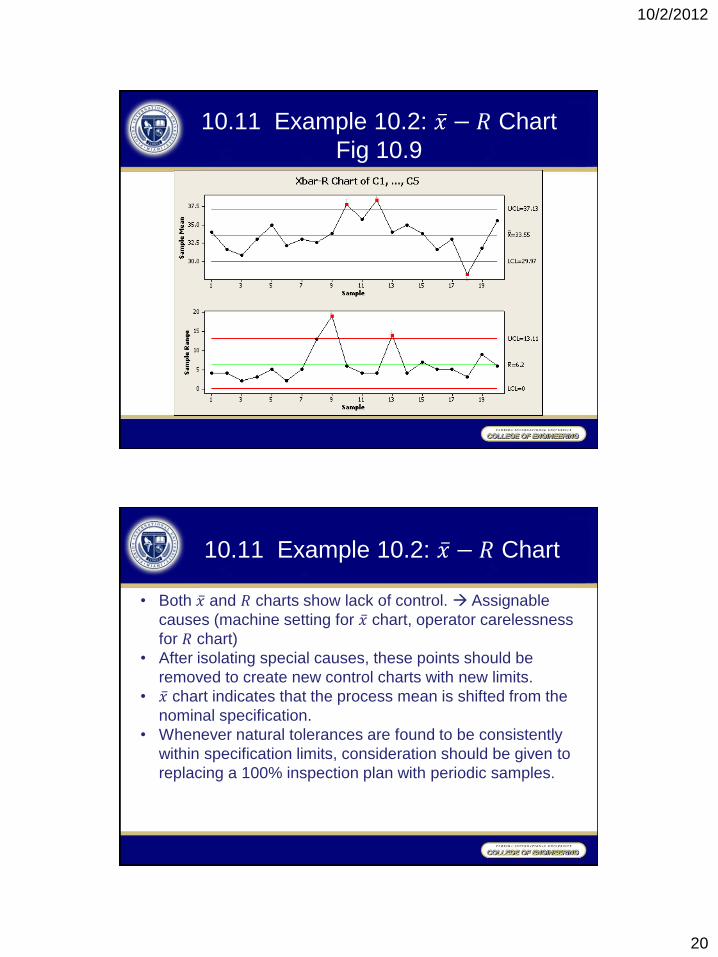
Fig 10.9
10.11 Example 10.2: 𝑥 − 𝑅 Chart
• Both 𝑥 and 𝑅 charts show lack of control. Assignable
causes (machine setting for 𝑥 chart, operator carelessness
for 𝑅 chart)
• After isolating special causes, these points should be
removed to create new control charts with new limits.
• 𝑥 chart indicates that the process mean is shifted from the
nominal specification.
• Whenever natural tolerances are found to be consistently
within specification limits, consideration should be given to
replacing a 100% inspection plan with periodic samples.
10/2/2012
21
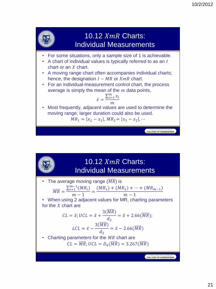
10.12 𝑋𝑚𝑅 Charts:
Individual Measurements
• For some situations, only a sample size of 1 is achievable.
• A chart of individual values is typically referred to as an 𝐼 chart or an 𝑋 chart.
• A moving range chart often accompanies individual charts;
hence, the designation 𝐼 − 𝑀𝑅 or 𝑋𝑚𝑅 chart.
• For an individual-measurement control chart, the process
average is simply the mean of the 𝑚 data points,
𝑥 = 𝑥𝑖
𝑚𝑖=1
𝑚
• Most frequently, adjacent values are used to determine the
moving range; larger duration could also be used.
𝑀𝑅1 = 𝑥2 − 𝑥1 , 𝑀𝑅2= 𝑥3 − 𝑥2 ,⋯
10.12 𝑋𝑚𝑅 Charts:
Individual Measurements
• The average moving range (𝑀𝑅) is
𝑀𝑅 = (𝑀𝑅𝑖)
𝑚−1𝑖=1
𝑚 − 1=
(𝑀𝑅1) + (𝑀𝑅2) + ⋯+ (𝑀𝑅𝑚−1)
𝑚 − 1
• When using 2 adjacent values for MR, charting parameters
for the 𝑋 chart are
𝐶𝐿 = 𝑥 ; 𝑈𝐶𝐿 = 𝑥 +3(𝑀𝑅)
𝑑2= 𝑥 + 2.66(𝑀𝑅);
𝐿𝐶𝐿 = 𝑥 −3 𝑀𝑅
𝑑2= 𝑥 − 2.66(𝑀𝑅)
• Charting parameters for the 𝑀𝑅 chart are
𝐶𝐿 = 𝑀𝑅;𝑈𝐶𝐿 = 𝐷4(𝑀𝑅) = 3.267(𝑀𝑅)
10/2/2012
22
10.12 𝑋𝑚𝑅 Charts:
Individual Measurements
• Some practitioners prefer not to construct 𝑀𝑅 charts
because any information that can be obtained from the 𝑀𝑅
is contained in the 𝑋 chart, and the moving ranges are
correlated, which can induce patterns of runs or cycles.
• Because of this artificial autocorrelation, the assessment of
𝑀𝑅 charts should not involve the use of run tests for out-
of-control conditions.
10.13 Example 10.3: 𝑋𝑚𝑅 Charts
S4/IEE Application Examples
• Transactional: One paid invoice was randomly selected
each day. The number of days past the invoice due date
was tracked using an 𝑋𝑚𝑅 chart.
• Cycle time (manufacturing and transactional): One
transaction was randomly selected daily. Cycle time for
completing the transaction was tracked using an 𝑋𝑚𝑅
chart.
10/2/2012
23
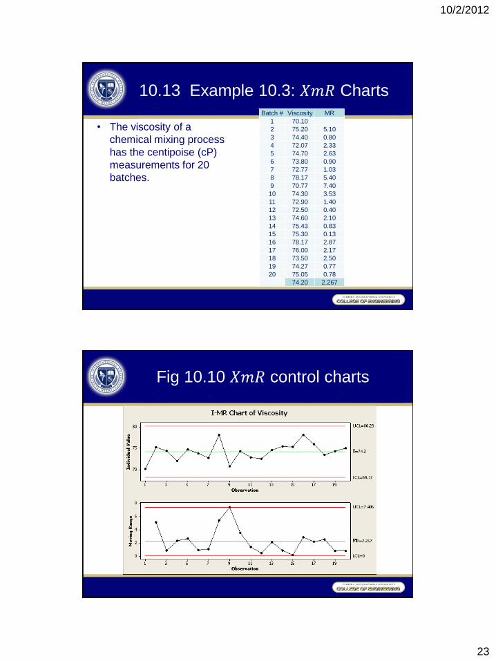
10.13 Example 10.3: 𝑋𝑚𝑅 Charts
• The viscosity of a
chemical mixing process
has the centipoise (cP)
measurements for 20
batches.
Batch # Viscosity MR
1 70.10
2 75.20 5.10
3 74.40 0.80
4 72.07 2.33
5 74.70 2.63
6 73.80 0.90
7 72.77 1.03
8 78.17 5.40
9 70.77 7.40
10 74.30 3.53
11 72.90 1.40
12 72.50 0.40
13 74.60 2.10
14 75.43 0.83
15 75.30 0.13
16 78.17 2.87
17 76.00 2.17
18 73.50 2.50
19 74.27 0.77
20 75.05 0.78
74.20 2.267
Fig 10.10 𝑋𝑚𝑅 control charts
10/2/2012
24
10.13 Example 10.3: 𝑋𝑚𝑅 Charts
• The 𝑋𝑚𝑅 charts indicate no out-of-control condition for
these data.
• If the 20 batch readings are considered as a random
sample, a probability plot could be made to determine the
expected range of viscosities experienced by the
customer.
• Process capability/performance metric assessments could
also be made.
10.14 𝑥 − 𝑅 v.s. 𝑋𝑚𝑅 Charts
• Wheeler (1995) favors the 𝑋𝑚𝑅 chart for most real-time
applications involving periodic data collection.
• Charting individual values to achieve a timely response
to any shift in process location.
• Charting moving average values when it is more
important to know about recent trends.
• For an 𝑥 − 𝑅 chart, short-term variability is estimated from
the variability within a subgroup, while in an 𝑋𝑚𝑅 chart,
variability is estimated from the moving range.
10/2/2012
25
10.15 Attribute Control Charts
• For binomial and Poisson distributions, the standard deviation
is dependent on the mean of the data.
• For binomial and Poisson distribution based control charts, it
is assumed that the underlying probabilities remain fixed over
time when a process is in statistical control.
• For large sample sizes, batch-to-batch variation can be
greater than the prediction.
• The assumption that “the sum of one or more binomial
random variables will follow a binomial distribution” is not
true if these random variables have different values.
• the classical control chart formulas squeeze limits
toward the centerline
• process out of control most of the time
10.15 Attribute Control Charts
• The usual remedy for the problem is to plot the attribute
failure rates as individual measurements.
• The failure rate for the time of interest can be very low.
Use 𝑋𝑚𝑅 charts to track time between failures
• The batch sample size could be different. Use 𝑍 chart.
• Laney (1997) suggests using 𝑍&𝑀𝑅 charts
10/2/2012
26
10.16 𝑝 Chart: Fraction Nonconforming Measurements
• Consider 𝑚 rational subgroups where each subgroup has
𝑛 items with 𝑥 nonconformities or defective units. The
fraction nonconforming (𝑝) for a subgroup is 𝑝 =𝑥
𝑛
• The process average nonconforming 𝑝 = 𝑝𝑖
𝑚𝑖=1
𝑚 where in
general 𝑚 should be at least 20 to 25.
• The chart parameters for this binomial scenario are
𝐶𝐿 = 𝑝 , 𝑈𝐶𝐿 = 𝑝 + 3𝑝 (1−𝑝 )
𝑛 , 𝐿𝐶𝐿 = 𝑝 − 3
𝑝 (1−𝑝 )
𝑛
• The LCL cannot be less than zero.
10.16 𝑝 Chart: Fraction Nonconforming Measurements
Solutions to unequal sample sizes:
• Use the average sample size
• Adjust the control chart limits for each sample.
𝑝 = 𝐷𝑖
𝑚𝑖=1
𝑛𝑖𝑚𝑖=1
where 𝐷𝑖 is the number of nonconformances within the
𝑖th sample.
The chart parameters for this binomial scenario are
𝐶𝐿 = 𝑝 , 𝑈𝐶𝐿 = 𝑝 + 3𝑝 (1−𝑝 )
𝑛𝑖 , 𝐿𝐶𝐿 = 𝑝 − 3
𝑝 (1−𝑝 )
𝑛𝑖
• Perform a Z transformation on the data.
10/2/2012
27
10.17 Example 10.4: 𝑝 Chart
S4/IEE Application Examples
• Transactional workflow metric (could similarly apply to
manufacturing; e.g., inventory or time to complete a
manufacturing process): The number of days beyond the due
date was measured and reported for all invoices. If an
invoice was beyond 30 days late it was considered a failure
or defective transaction. The number of nonconformances for
total transactions per day was plotted using a 𝑝 chart.
• Transactional quality metric: The number of defective
recorded invoices was measured and reported. The number
of defective transactions was compared daily to the total
number of transactions using a 𝑝 chart.
10.17 Example 10.4: 𝑝 Chart
• A machine manufactures cardboard cans used to package
frozen orange juice. Cans are then inspected whether they
will leak when filled with orange juice.
• A 𝑝 chart is initially established by taking 30 samples of 50
cans at half-hour intervals within the manufacturing process.
• An alternative analysis approach is described in Example
10.5.
10/2/2012
28
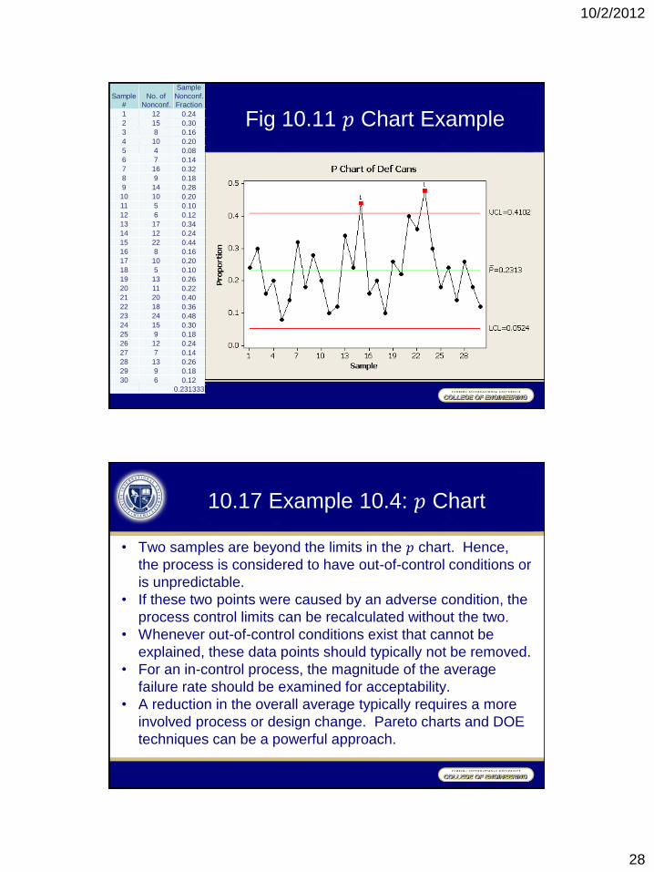
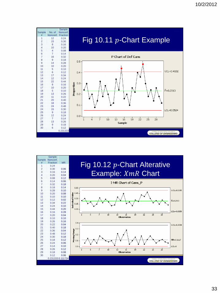
Fig 10.11 𝑝 Chart Example
Sample
# No. of
Nonconf.
Sample
Nonconf.
Fraction
1 12 0.24
2 15 0.30
3 8 0.16
4 10 0.20
5 4 0.08
6 7 0.14
7 16 0.32
8 9 0.18
9 14 0.28
10 10 0.20
11 5 0.10
12 6 0.12
13 17 0.34
14 12 0.24
15 22 0.44
16 8 0.16
17 10 0.20
18 5 0.10
19 13 0.26
20 11 0.22
21 20 0.40
22 18 0.36
23 24 0.48
24 15 0.30
25 9 0.18
26 12 0.24
27 7 0.14
28 13 0.26
29 9 0.18
30 6 0.12
0.231333
10.17 Example 10.4: 𝑝 Chart
• Two samples are beyond the limits in the 𝑝 chart. Hence,
the process is considered to have out-of-control conditions or
is unpredictable.
• If these two points were caused by an adverse condition, the
process control limits can be recalculated without the two.
• Whenever out-of-control conditions exist that cannot be
explained, these data points should typically not be removed.
• For an in-control process, the magnitude of the average
failure rate should be examined for acceptability.
• A reduction in the overall average typically requires a more
involved process or design change. Pareto charts and DOE
techniques can be a powerful approach.
10/2/2012
29
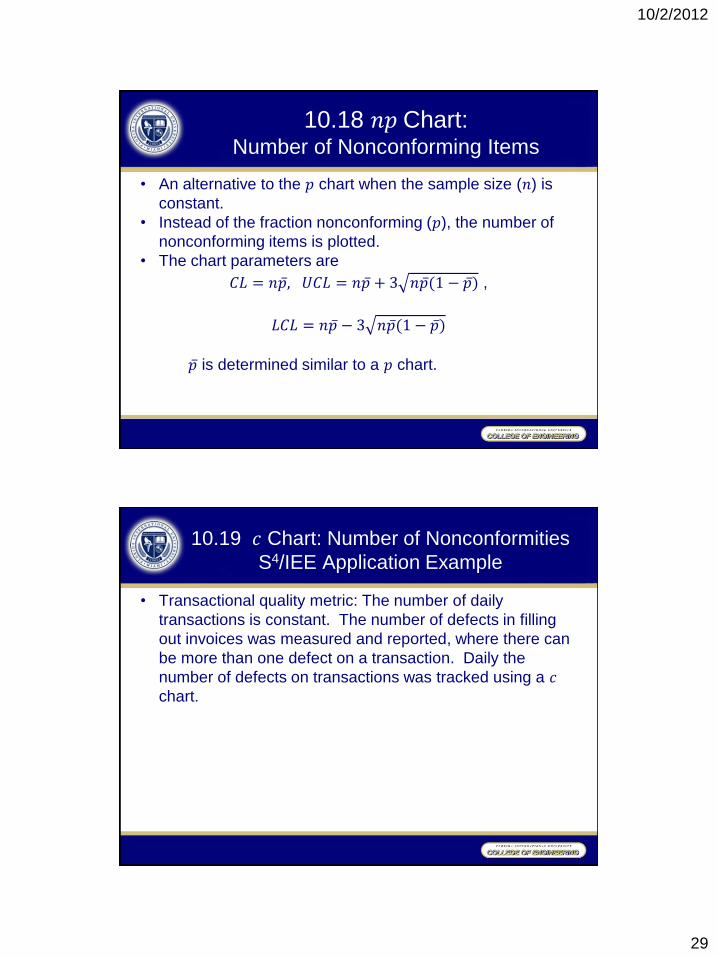
10.18 𝑛𝑝 Chart: Number of Nonconforming Items
• An alternative to the 𝑝 chart when the sample size (𝑛) is
constant.
• Instead of the fraction nonconforming (𝑝), the number of
nonconforming items is plotted.
• The chart parameters are
𝐶𝐿 = 𝑛𝑝 , 𝑈𝐶𝐿 = 𝑛𝑝 + 3 𝑛𝑝 (1 − 𝑝 ) ,
𝐿𝐶𝐿 = 𝑛𝑝 − 3 𝑛𝑝 (1 − 𝑝 )
𝑝 is determined similar to a 𝑝 chart.
10.19 𝑐 Chart: Number of Nonconformities
S4/IEE Application Example
• Transactional quality metric: The number of daily
transactions is constant. The number of defects in filling
out invoices was measured and reported, where there can
be more than one defect on a transaction. Daily the
number of defects on transactions was tracked using a 𝑐
chart.
10/2/2012
30
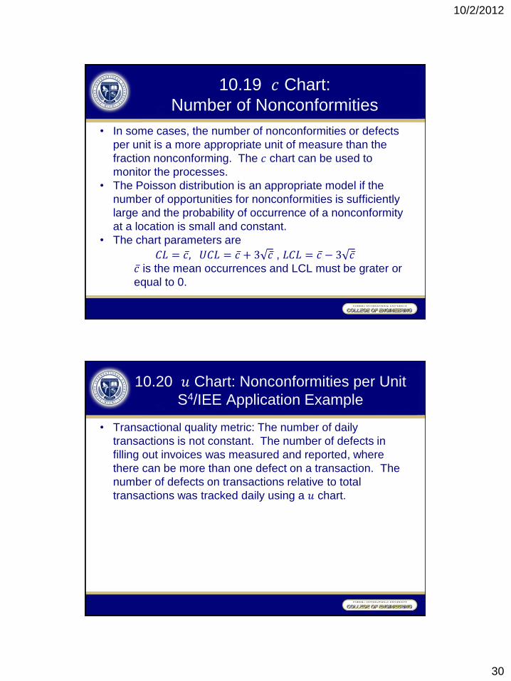
10.19 𝑐 Chart:
Number of Nonconformities
• In some cases, the number of nonconformities or defects
per unit is a more appropriate unit of measure than the
fraction nonconforming. The 𝑐 chart can be used to
monitor the processes.
• The Poisson distribution is an appropriate model if the
number of opportunities for nonconformities is sufficiently
large and the probability of occurrence of a nonconformity
at a location is small and constant.
• The chart parameters are
𝐶𝐿 = 𝑐 , 𝑈𝐶𝐿 = 𝑐 + 3 𝑐 , 𝐿𝐶𝐿 = 𝑐 − 3 𝑐 𝑐 is the mean occurrences and LCL must be grater or
equal to 0.
10.20 𝑢 Chart: Nonconformities per Unit
S4/IEE Application Example
• Transactional quality metric: The number of daily
transactions is not constant. The number of defects in
filling out invoices was measured and reported, where
there can be more than one defect on a transaction. The
number of defects on transactions relative to total
transactions was tracked daily using a 𝑢 chart.
10/2/2012
31
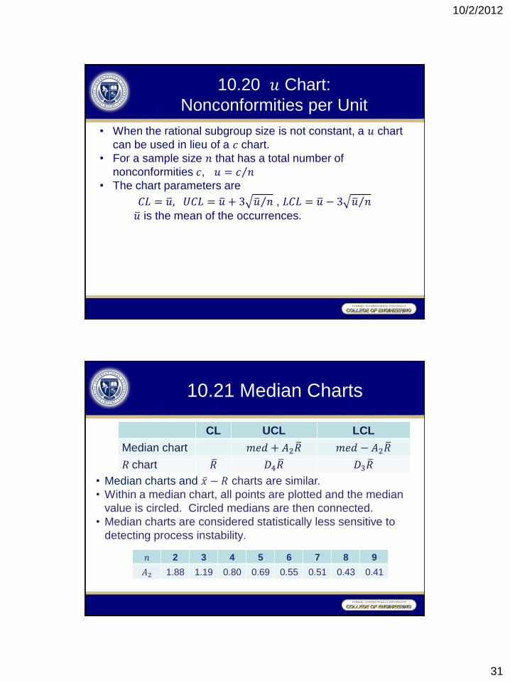
10.20 𝑢 Chart:
Nonconformities per Unit
• When the rational subgroup size is not constant, a 𝑢 chart
can be used in lieu of a 𝑐 chart.
• For a sample size 𝑛 that has a total number of
nonconformities 𝑐, 𝑢 = 𝑐 𝑛
• The chart parameters are
𝐶𝐿 = 𝑢 , 𝑈𝐶𝐿 = 𝑢 + 3 𝑢 𝑛 , 𝐿𝐶𝐿 = 𝑢 − 3 𝑢 𝑛
𝑢 is the mean of the occurrences.
10.21 Median Charts
• Median charts and 𝑥 − 𝑅 charts are similar.
• Within a median chart, all points are plotted and the median
value is circled. Circled medians are then connected.
• Median charts are considered statistically less sensitive to
detecting process instability.
CL UCL LCL
Median chart 𝑚𝑒𝑑 + 𝐴2𝑅 𝑚𝑒𝑑 − 𝐴2𝑅
𝑅 chart 𝑅 𝐷4𝑅 𝐷3𝑅
𝑛 2 3 4 5 6 7 8 9
𝐴2 1.88 1.19 0.80 0.69 0.55 0.51 0.43 0.41
10/2/2012
32
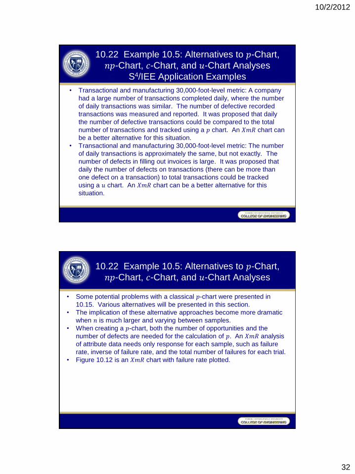
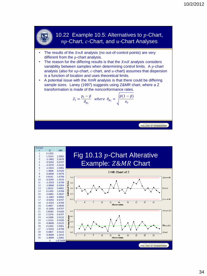
10.22 Example 10.5: Alternatives to 𝑝-Chart,
𝑛𝑝-Chart, 𝑐-Chart, and 𝑢-Chart Analyses
S4/IEE Application Examples
• Transactional and manufacturing 30,000-foot-level metric: A company
had a large number of transactions completed daily, where the number
of daily transactions was similar. The number of defective recorded
transactions was measured and reported. It was proposed that daily
the number of defective transactions could be compared to the total
number of transactions and tracked using a 𝑝 chart. An 𝑋𝑚𝑅 chart can
be a better alternative for this situation.
• Transactional and manufacturing 30,000-foot-level metric: The number
of daily transactions is approximately the same, but not exactly. The
number of defects in filling out invoices is large. It was proposed that
daily the number of defects on transactions (there can be more than
one defect on a transaction) to total transactions could be tracked
using a 𝑢 chart. An 𝑋𝑚𝑅 chart can be a better alternative for this
situation.
10.22 Example 10.5: Alternatives to 𝑝-Chart,
𝑛𝑝-Chart, 𝑐-Chart, and 𝑢-Chart Analyses
• Some potential problems with a classical 𝑝-chart were presented in
10.15. Various alternatives will be presented in this section.
• The implication of these alternative approaches become more dramatic
when 𝑛 is much larger and varying between samples.
• When creating a 𝑝-chart, both the number of opportunities and the
number of defects are needed for the calculation of 𝑝. An 𝑋𝑚𝑅 analysis
of attribute data needs only response for each sample, such as failure
rate, inverse of failure rate, and the total number of failures for each trial.
• Figure 10.12 is an 𝑋𝑚𝑅 chart with failure rate plotted.
10/2/2012
33
Fig 10.11 𝑝-Chart Example
Sample
# No. of
Nonconf.
Sample
Nonconf.
Fraction
1 12 0.24
2 15 0.30
3 8 0.16
4 10 0.20
5 4 0.08
6 7 0.14
7 16 0.32
8 9 0.18
9 14 0.28
10 10 0.20
11 5 0.10
12 6 0.12
13 17 0.34
14 12 0.24
15 22 0.44
16 8 0.16
17 10 0.20
18 5 0.10
19 13 0.26
20 11 0.22
21 20 0.40
22 18 0.36
23 24 0.48
24 15 0.30
25 9 0.18
26 12 0.24
27 7 0.14
28 13 0.26
29 9 0.18
30 6 0.12
0.231333
Fig 10.12 𝑝-Chart Alterative
Example: 𝑋𝑚𝑅 Chart
Sample
#
Sample
Nonconf.
Fraction MR
1 0.24
2 0.30 0.06
3 0.16 0.14
4 0.20 0.04
5 0.08 0.12
6 0.14 0.06
7 0.32 0.18
8 0.18 0.14
9 0.28 0.10
10 0.20 0.08
11 0.10 0.10
12 0.12 0.02
13 0.34 0.22
14 0.24 0.10
15 0.44 0.20
16 0.16 0.28
17 0.20 0.04
18 0.10 0.10
19 0.26 0.16
20 0.22 0.04
21 0.40 0.18
22 0.36 0.04
23 0.48 0.12
24 0.30 0.18
25 0.18 0.12
26 0.24 0.06
27 0.14 0.10
28 0.26 0.12
29 0.18 0.08
30 0.12 0.06
0.231333 0.111724
10/2/2012
34
10.22 Example 10.5: Alternatives to 𝑝-Chart,
𝑛𝑝-Chart, 𝑐-Chart, and 𝑢-Chart Analyses
• The results of the 𝑋𝑚𝑅 analysis (no out-of-control points) are very
different from the 𝑝-chart analysis.
• The reason for the differing results is that the 𝑋𝑚𝑅 analysis considers
variability between samples when determining control limits. A 𝑝-chart
analysis (also for 𝑛𝑝-chart, 𝑐-chart, and 𝑢-chart) assumes that dispersion
is a function of location and uses theoretical limits.
• A potential issue with the XmR analysis is that there could be differing
sample sizes. Laney (1997) suggests using Z&MR chart, where a Z
transformation is made of the nonconformance rates.
𝑍𝑖 =𝑝𝑖 − 𝑝
𝜎 𝑝𝑖
𝑤ℎ𝑒𝑟𝑒 𝜎 𝑝𝑖=
𝑝 (1 − 𝑝 )
𝑛𝑖
Fig 10.13 𝑝-Chart Alterative
Example: 𝑍&𝑀𝑅 Chart
Sample
# Zi MR
1 0.1453
2 1.1514 1.0061
3 -1.1962 2.3476
4 -0.5254 0.6707
5 -2.5376 2.0122
6 -1.5315 1.0061
7 1.4868 3.0183
8 -0.8608 2.3476
9 0.8161 1.6769
10 -0.5254 1.3415
11 -2.2023 1.6769
12 -1.8669 0.3354
13 1.8222 3.6891
14 0.1453 1.6769
15 3.4990 3.3537
16 -1.1962 4.6952
17 -0.5254 0.6707
18 -2.2023 1.6769
19 0.4807 2.6830
20 -0.1900 0.6707
21 2.8283 3.0183
22 2.1576 0.6707
23 4.1698 2.0122
24 1.1514 3.0183
25 -0.8608 2.0122
26 0.1453 1.0061
27 -1.5315 1.6769
28 0.4807 2.0122
29 -0.8608 1.3415
30 -1.8669 1.0061
0 1.873458
10/2/2012
35
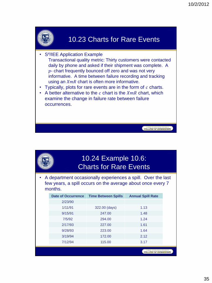
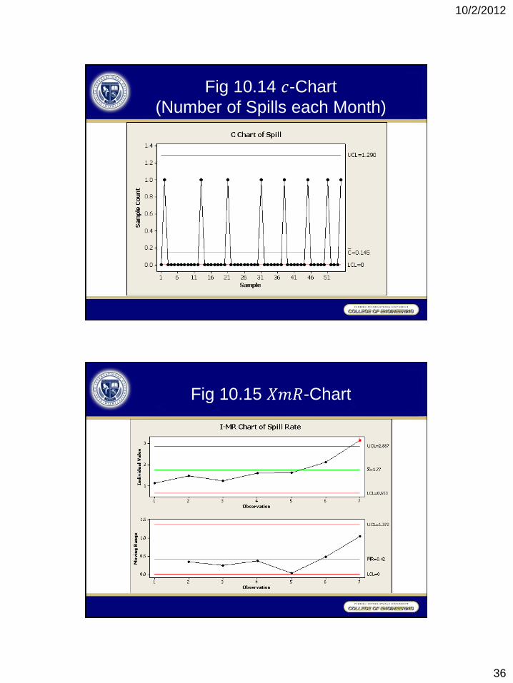
10.23 Charts for Rare Events
• S4/IEE Application Example Transactional quality metric: Thirty customers were contacted
daily by phone and asked if their shipment was complete. A
𝑝- chart frequently bounced off zero and was not very
informative. A time between failure recording and tracking
using an 𝑋𝑚𝑅 chart is often more informative.
• Typically, plots for rare events are in the form of 𝑐 charts.
• A better alternative to the 𝑐 chart is the 𝑋𝑚𝑅 chart, which
examine the change in failure rate between failure
occurrences.
10.24 Example 10.6:
Charts for Rare Events
• A department occasionally experiences a spill. Over the last
few years, a spill occurs on the average about once every 7
months.
Date of Occurrence Time Between Spills Annual Spill Rate
2/23/90
1/11/91 322.00 (days) 1.13
9/15/91 247.00 1.48
7/5/92 294.00 1.24
2/17/93 227.00 1.61
9/28/93 223.00 1.64
3/19/94 172.00 2.12
7/12/94 115.00 3.17
10/2/2012
36
Fig 10.14 𝑐-Chart
(Number of Spills each Month)
Fig 10.15 𝑋𝑚𝑅-Chart