ch 6 Descriptive statistics.ppt - Jordan University of ... · Figure 6-3 (out of order) A...
37
Descriptive Statistics 6-1 Numerical Summaries of 6-4 Box Plots CHAPTER OUTLINE Chapter 6 Title and Outline 1 6-1 Numerical Summaries of Data 6-2 Stem-and-Leaf Diagrams 6-3 Frequency Distributions and Histograms 6-4 Box Plots 6-5 Time Sequence Plots 6-6 Probability Plots
Transcript of ch 6 Descriptive statistics.ppt - Jordan University of ... · Figure 6-3 (out of order) A...

Descriptive Statistics
6-1 Numerical Summaries of 6-4 Box Plots
CHAPTER OUTLINE
Chapter 6 Title and Outline
1
6-1 Numerical Summaries of
Data
6-2 Stem-and-Leaf Diagrams
6-3 Frequency Distributions
and Histograms
6-4 Box Plots
6-5 Time Sequence Plots
6-6 Probability Plots

Numerical Summaries of Data
• Data are the numeric observations of a phenomenon of interest. The totality of all observations is a population. A portion used for analysis is a random sample.
• We gain an understanding of this collection, possibly massive, by describing it numerically and graphically, usually with the sample data.
© John Wiley & Sons, Inc. Applied Statistics and Probability for Engineers, by Montgomery and Runger.
• We describe the collection in terms of shape, center, and spread.
• The center is measured by the mean.
• The spread is measured by the variance.
Sec 6-1 Numerical Summaries of Data 2

Populations & Samples
© John Wiley & Sons, Inc. Applied Statistics and Probability for Engineers, by Montgomery and Runger.
Sec 6-1 Numerical Summaries of Data 3
Figure 6-3 (out of order) A population is described, in part, by its parameters, i.e.,
mean (μ) and standard deviation (σ). A random sample of size n is drawn from a
population and is described, in part, by its statistics, i.e., mean (x-bar) and standard
deviation (s). The statistics are used to estimate the parameters.

Mean
1 2
1 2 1
If the observations in a random sample are
denoted by , ,..., , the is
... (6-1)
For the observations in a populatio
sample mea
n
nn
n
i
n i
n
x x x
xx x x
xn n
N
=+ + += =
∑
© John Wiley & Sons, Inc. Applied Statistics and Probability for Engineers, by Montgomery and Runger.
Sec 6-1 Numerical Summaries of Data 4
For the observations in a population
denoted by
N
x
( )
1 2
1
1
, ,..., , the is
analogous to a probability distribution as
= (6-2
population mean
)
N
N
iNi
i
i
x x
x
x f xN
µ =
=
⋅ =∑
∑

Example 6-1: Sample Mean
Consider 8 observations (xi) of pull-off force from engine
connectors as shown in the table.
i x i
1 12.6
2 12.9
3 13.4
4 12.2
8
1 12.6 12.9 ... 13.1 average
8 8
10413.0 pounds
i
i
x
x = + + += = =
= =
∑
© John Wiley & Sons, Inc. Applied Statistics and Probability for Engineers, by Montgomery and Runger.
Sec 6-1 Numerical Summaries of Data 5
4 12.2
5 13.6
6 13.5
7 12.6
8 13.1
12.99
= AVERAGE($B2:$B9)
Figure 6-1 The sample mean is the balance point.
10413.0 pounds
8= =

Variance Defined
( )
1 2
2
2 1
If the observations in a sample are
denoted by , ,..., , the is
sampl
e varianc
(6-3)1
en
n
i
i
n
x x x
x x
sn
=
−
=−
∑
© John Wiley & Sons, Inc. Applied Statistics and Probability for Engineers, by Montgomery and Runger.
Sec 6-1 Numerical Summaries of Data 6
For the observations iN
( ) ( )( )
1 2
2
22 1
1
n a population
denoted by , ,..., , the ,
analogous to the variance of a probability distribution, is
= (
population varian
6-5
ce
)
N
N
iNi
i
i
x x x
x
x f xN
µ
σ µ =
=
−
− ⋅ =∑
∑

Standard Deviation Defined
• The standard deviation is the square root of the
variance.
• σ is the population standard deviation symbol.
© John Wiley & Sons, Inc. Applied Statistics and Probability for Engineers, by Montgomery and Runger.
• s is the sample standard deviation symbol.
• The units of the standard deviation are the same as:
– The data.
– The mean.
Sec 6-1 Numerical Summaries of Data 7

Rationale for the Variance
© John Wiley & Sons, Inc. Applied Statistics and Probability for Engineers, by Montgomery and Runger.
Sec 6-1 Numerical Summaries of Data 8
Figure 6-2 The xi values above are the deviations from the
mean. Since the mean is the balance point, the sum of the left
deviations (negative) equals the sum of the right deviations
(positive). If the deviations are squared, they become a
measure of the data spread. The variance is the average data
spread.

Example 6-2: Sample Variance
Table 6-1 displays the quantities needed to calculate
the summed squared deviations, the numerator of
the variance. i x i x i - xbar (x i - xbar)2
1 12.6 -0.40 0.1600
2 12.9 -0.10 0.0100
3 13.4 0.40 0.1600
4 12.3 -0.70 0.4900
Dimension of:
xi is pounds
Mean is pounds.
© John Wiley & Sons, Inc. Applied Statistics and Probability for Engineers, by Montgomery and Runger.
Sec 6-1 Numerical Summaries of Data 9
4 12.3 -0.70 0.4900
5 13.6 0.60 0.3600
6 13.5 0.50 0.2500
7 12.6 -0.40 0.1600
8 13.1 0.10 0.0100
sums = 104.00 0.00 1.6000
divide by 8 divide by 7
mean = 13.00 variance = 0.2286
0.48standard deviation =
Mean is pounds.
Variance is pounds2.
Standard deviation is pounds.
Desired accuracy is generally
accepted to be one more place
than the data.

Computation of s2
The prior calculation is definitional and tedious. A
shortcut is derived here and involves just 2 sums.
( ) ( )2
22
2 1 1
2
1 1
n n
i i i
i i
n n n
x x x x x x
sn n
= =
− + −
= =− −
∑ ∑
∑ ∑ ∑
© John Wiley & Sons, Inc. Applied Statistics and Probability for Engineers, by Montgomery and Runger.
Sec 6-1 Numerical Summaries of Data 10
2 22 2
1 1 1
22
1
2
2
1 1
2 2
1 1
6 4)1 1
( -
n n n
i i i
i i i
n n
i i
i i
n
i
i
x nx x x x nx x nx
n n
x nx x x n
n n
= =
=
=
= =
+ − + − ⋅
= =−
−
−
−
=
−
−
=
∑ ∑
∑ ∑ ∑
∑

Example 6-3: Variance by Shortcut
( )
2
2
1 12
2
1
1,353.60 104.0 8
n n
i i
i i
x x n
sn
= =
−
=−
−=
∑ ∑ i x i x i2
1 12.6 158.76
2 12.9 166.41
3 13.4 179.56
4 12.3 151.29
© John Wiley & Sons, Inc. Applied Statistics and Probability for Engineers, by Montgomery and Runger.
Sec 6-1 Numerical Summaries of Data 11
( )
2
1,353.60 104.0 8
7
1.600.2286 pounds
7
0.2286 0.48 poundss
−=
= =
= =
4 12.3 151.29
5 13.6 184.96
6 13.5 182.25
7 12.6 158.76
8 13.1 171.61
sums = 104.0 1,353.60

What is this “n–1”?
• The population variance is calculated with N, the population size. Why isn’t the sample variance calculated with n, the sample size?
• The true variance is based on data deviations from the true mean, μ.
© John Wiley & Sons, Inc. Applied Statistics and Probability for Engineers, by Montgomery and Runger.
the true mean, μ.
• The sample calculation is based on the data deviations from x-bar, not μ. X-bar is an estimator of μ; close but not the same. So the n-1 divisor is used to compensate for the error in the mean estimation.
Sec 6-1 Numerical Summaries of Data 12
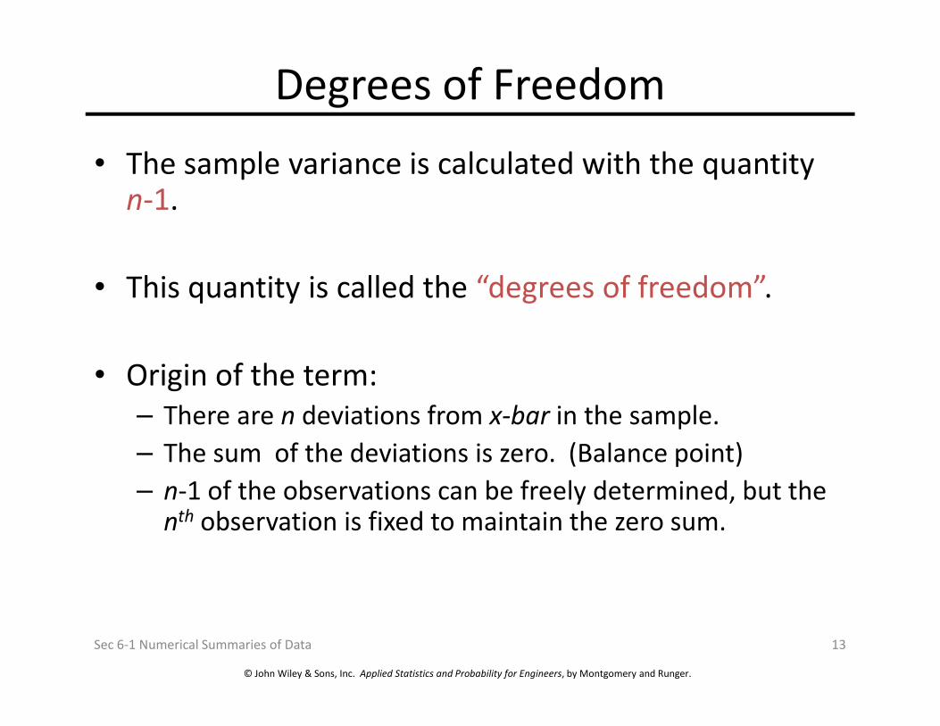
Degrees of Freedom
• The sample variance is calculated with the quantity n-1.
• This quantity is called the “degrees of freedom”.
• Origin of the term:
© John Wiley & Sons, Inc. Applied Statistics and Probability for Engineers, by Montgomery and Runger.
• Origin of the term:
– There are n deviations from x-bar in the sample.
– The sum of the deviations is zero. (Balance point)
– n-1 of the observations can be freely determined, but the nth observation is fixed to maintain the zero sum.
Sec 6-1 Numerical Summaries of Data 13

Sample Range
If the n observations in a sample are denoted by x1, x2, …, xn, the sample range is:
r = max(xi) – min(xi)
© John Wiley & Sons, Inc. Applied Statistics and Probability for Engineers, by Montgomery and Runger.
It is the largest observation in the sample less the smallest observation.
From Example 6-3:
r = 13.6 – 12.3 = 1.30
Note that: population range ≥ sample range
Sec 6-1 Numerical Summaries of Data 14

Intro to Stem & Leaf Diagrams
First, let’s discuss dot diagrams – dots representing data on the number line.
Minitab produces this graphic using the Example 6-1 data.
Dotplot of Force
© John Wiley & Sons, Inc. Applied Statistics and Probability for Engineers, by Montgomery and Runger.
Sec 6-2 Stem-And-Leaf Diagrams 15
13.613.413.213.012.812.612.4
Force
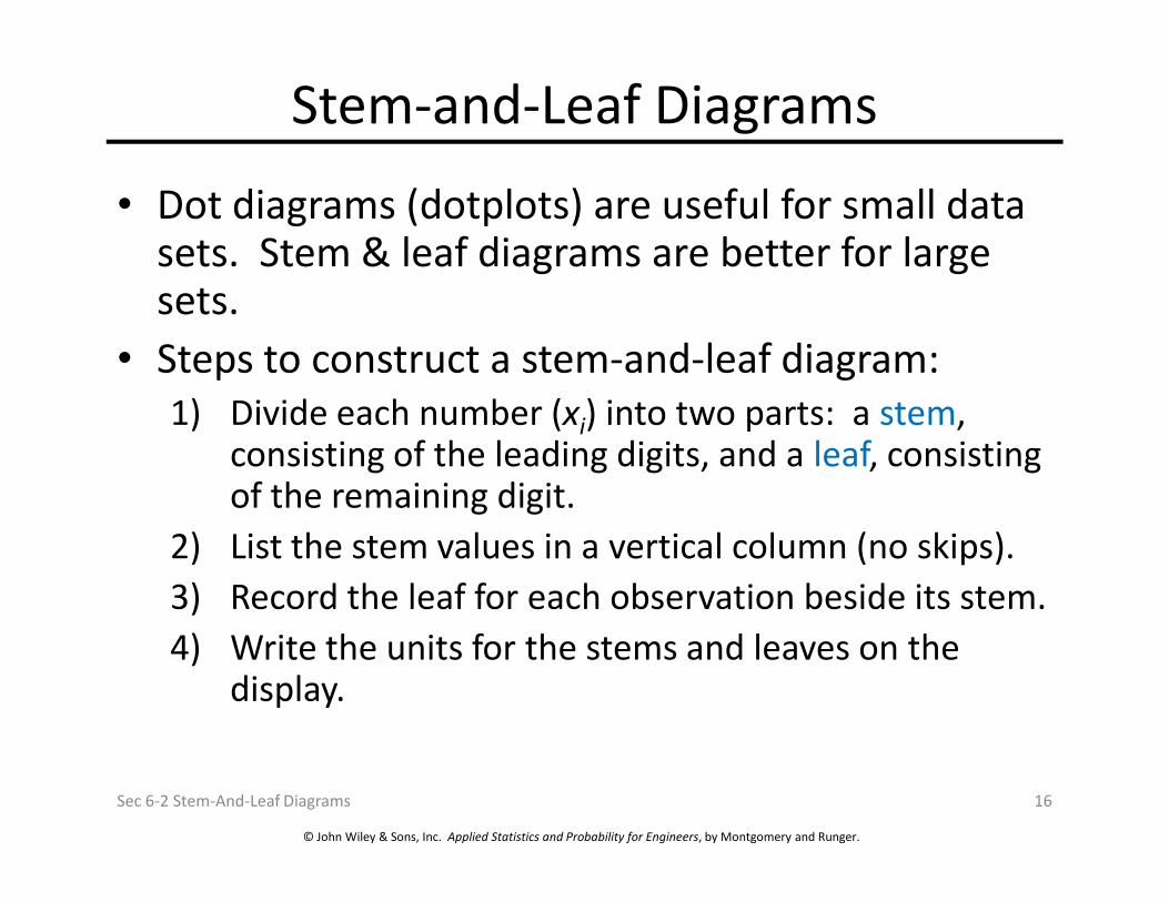
Stem-and-Leaf Diagrams
• Dot diagrams (dotplots) are useful for small data sets. Stem & leaf diagrams are better for large sets.
• Steps to construct a stem-and-leaf diagram:
1) Divide each number (xi) into two parts: a stem, consisting of the leading digits, and a leaf, consisting
© John Wiley & Sons, Inc. Applied Statistics and Probability for Engineers, by Montgomery and Runger.
consisting of the leading digits, and a leaf, consisting of the remaining digit.
2) List the stem values in a vertical column (no skips).
3) Record the leaf for each observation beside its stem.
4) Write the units for the stems and leaves on the display.
Sec 6-2 Stem-And-Leaf Diagrams 16

Example 6-4: Alloy Strength
105 221 183 186 121 181 180 143
97 154 153 174 120 168 167 141
245 228 174 199 181 158 176 110
163 131 154 115 160 208 158 133
207 180 190 193 194 133 156 123
134 178 76 167 184 135 229 146
218 157 101 171 165 172 158 169
Table 6-2 Compressive Strength (psi) of
Aluminum-Lithium Specimens
© John Wiley & Sons, Inc. Applied Statistics and Probability for Engineers, by Montgomery and Runger.
Sec 6-2 Stem-And-Leaf Diagrams 17
218 157 101 171 165 172 158 169
199 151 142 163 145 171 148 158
160 175 149 87 160 237 150 135
196 201 200 176 150 170 118 149
Figure 6-4 Stem-and-leaf diagram for Table 6-2
data. Center is about 155 and most data is
between 110 and 200. Leaves are unordered.
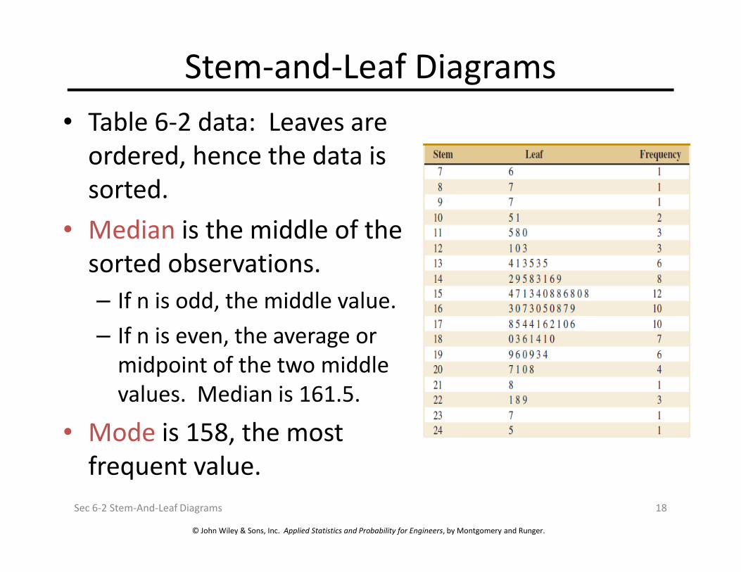
Stem-and-Leaf Diagrams
• Table 6-2 data: Leaves are
ordered, hence the data is
sorted.
• Median is the middle of the
sorted observations.
If n is odd, the middle value.
© John Wiley & Sons, Inc. Applied Statistics and Probability for Engineers, by Montgomery and Runger.
– If n is odd, the middle value.
– If n is even, the average or
midpoint of the two middle
values. Median is 161.5.
• Mode is 158, the most
frequent value.
Sec 6-2 Stem-And-Leaf Diagrams 18

Quartiles• The three quartiles partition the data into four equally sized
counts or segments.– 25% of the data is less than q1.
– 50% of the data is less than q2, the median.
– 75% of the data is less than q3.
• Calculated as Index = f (n+1) where:– Index (I) is the Ith item (interpolated) of the sorted data list.
– f is the fraction associated with the quartile.
© John Wiley & Sons, Inc. Applied Statistics and Probability for Engineers, by Montgomery and Runger.
– f is the fraction associated with the quartile.
– n is the sample size.
• For the Table 6-2 data:
Sec 6-2 Stem-And-Leaf Diagrams 19
f Index Ith (I +1)th quartile
0.25 20.25 143 145 143.50
0.50 40.50 160 163 161.50
0.75 60.75 181 181 181.00
Value of
indexed item

Percentiles
• Percentiles are a special case of the quartiles.
• Percentiles partition the data into 100
segments.
• The Index = f (n+1) methodology is the same.
• The 37%ile is calculated as follows:
© John Wiley & Sons, Inc. Applied Statistics and Probability for Engineers, by Montgomery and Runger.
• The 37%ile is calculated as follows:
– Refer to the Table 6-2 stem-and-leaf diagram.
– Index = 0.37(81) = 29.97
– 37%ile = 153 + 0.97(154 – 153) = 153.97
Sec 6-2 Stem-And-Leaf Diagrams 20

Interquartile Range
• The interquartile range (IQR) is defined as:
IQR = q3 – q1.
• From Table 6-2:
IQR = 181.00 – 143.5 = 37.5
© John Wiley & Sons, Inc. Applied Statistics and Probability for Engineers, by Montgomery and Runger.
Sec 6-2 Stem-And-Leaf Diagrams 21
Variable N Mean StDev
Strength 80 162.66 33.77
Min Q1 Median Q3 Max
76.00 143.50 161.50 181.00 245.00
5-number summary

Histograms
• A histogram is a visual display of the data
distribution, similar to a bar chart or a stem-
and-leaf diagram.
• Steps to build one with equal bin widths:
1) Label the bin boundaries on the horizontal scale.
© John Wiley & Sons, Inc. Applied Statistics and Probability for Engineers, by Montgomery and Runger.
1) Label the bin boundaries on the horizontal scale.
2) Mark & label the vertical scale with the
frequencies or relative frequencies.
3) Above each bin, draw a rectangle whose height
is equal to the frequency or relative frequency.
Sec 6-3 Frequency Distributions And Histograms 22

Histograms
Class Frequency
Relative
Frequency
Cumulative
Relative
Frequency
70 ≤ x < 90 2 0.0250 0.0250
90 ≤ x < 110 3 0.0375 0.0625
110 ≤ x < 130 6 0.0750 0.1375
130 ≤ x < 150 14 0.1750 0.3125
150 ≤ x < 170 22 0.2750 0.5875
Table 6-4 Frequency Distribution of Table 6-2 Data
Considerations:Range = 245 – 76 = 169
Sqrt(80) = 8.9
Trial class width = 18.9
Frequency Distribution
for the data in Table 6-2
© John Wiley & Sons, Inc. Applied Statistics and Probability for Engineers, by Montgomery and Runger.
Sec 6-3 Frequency Distributions And Histograms 23
150 ≤ x < 170 22 0.2750 0.5875
170 ≤ x < 190 17 0.2125 0.8000
190 ≤ x < 210 10 0.1250 0.9250
210 ≤ x < 230 4 0.0500 0.9750
230 ≤ x < 250 2 0.0250 1.0000
80 1.0000
Trial class width = 18.9
Decisions:Number of classes = 9
Class width = 20
Range of classes = 20 * 9 = 180
Starting point = 70

Histogram of the Table 6-2 Data
© John Wiley & Sons, Inc. Applied Statistics and Probability for Engineers, by Montgomery and Runger.
Sec 6-3 Frequency Distributions And Histograms 24
Figure 6-7 Histogram of compressive strength of 80 aluminum-lithium alloy
specimens. Note these features – (1) horizontal scale bin boundaries & labels
with units, (2) vertical scale measurements and labels, (3) histogram title at top
or in legend.
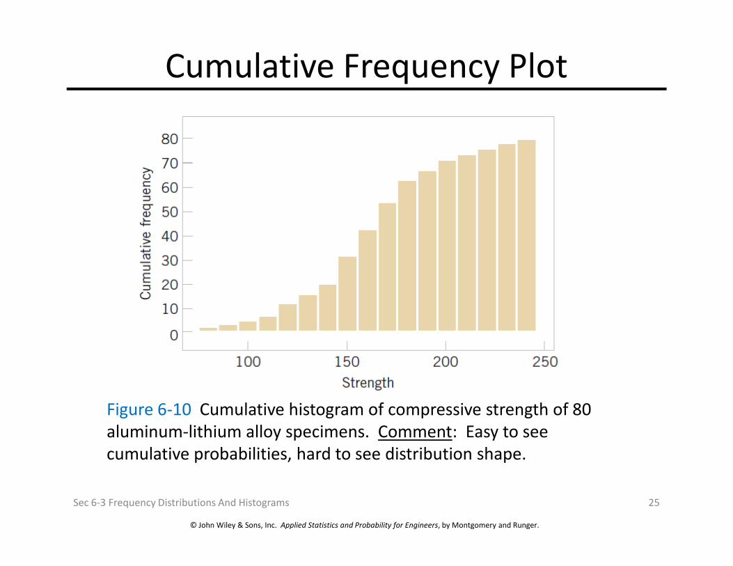
Cumulative Frequency Plot
© John Wiley & Sons, Inc. Applied Statistics and Probability for Engineers, by Montgomery and Runger.
Sec 6-3 Frequency Distributions And Histograms 25
Figure 6-10 Cumulative histogram of compressive strength of 80
aluminum-lithium alloy specimens. Comment: Easy to see
cumulative probabilities, hard to see distribution shape.

Shape of a Frequency Distribution
© John Wiley & Sons, Inc. Applied Statistics and Probability for Engineers, by Montgomery and Runger.
Sec 6-3 Frequency Distributions And Histograms 26
Figure 6-11 Histograms of symmetric and skewed distributions.
(b) Symmetric distribution has identical mean, median and mode
measures.
(a & c) Skewed distributions are positive or negative, depending on the
direction of the long tail. Their measures occur in alphabetical order as
the distribution is approached from the long tail.☺

Histograms for Categorical Data
• Categorical data is of two types:– Ordinal: categories have a natural order, e.g., year in
college, military rank.
– Nominal: Categories are simply different, e.g., gender, colors.
• Histogram bars are for each category, are of equal width, and have a height equal to the category’s
© John Wiley & Sons, Inc. Applied Statistics and Probability for Engineers, by Montgomery and Runger.
width, and have a height equal to the category’s frequency or relative frequency.
• A Pareto chart is a histogram in which the categories are sequenced in decreasing order. This approach emphasizes the most and least important categories.
Sec 6-3 Frequency Distributions And Histograms 27

Example 6-6: Categorical Data Histogram
© John Wiley & Sons, Inc. Applied Statistics and Probability for Engineers, by Montgomery and Runger.
Sec 6-3 Frequency Distributions And Histograms 28
Figure 6-12 Airplane production in 1985. (Source: Boeing
Company) Comment: Illustrates nominal data in spite of the
numerical names, categories are shown at the bin’s midpoint, a
Pareto chart since the categories are in decreasing order.

Box Plot or Box-and-Whisker Chart
• A box plot is a graphical display showing center,
spread, shape, and outliers.
• It displays the 5-number summary: min, q1, median,
q3, and max.
© John Wiley & Sons, Inc. Applied Statistics and Probability for Engineers, by Montgomery and Runger.
Sec 6-4 Box Plots 29
Figure 6-13 Description of a box plot.

Box Plot of Table 6-2 Data
© John Wiley & Sons, Inc. Applied Statistics and Probability for Engineers, by Montgomery and Runger.
Sec 6-4 Box Plots 30
Figure 6-14 Box plot of compressive strength of 80 aluminum-
lithium alloy specimens. Comment: Box plot may be shown
vertically or horizontally, data reveals three outliers and no extreme
outliers. Lower outlier limit is: 143.5 – 1.5*(181.0-143.5) = 87.25.

Time Sequence Plots
• A time series plot shows the data value, or statistic,
on the vertical axis with time on the horizontal axis.
• A time series plot reveals trends, cycles or other
time-oriented behavior that could not be otherwise
seen in the data.
© John Wiley & Sons, Inc. Applied Statistics and Probability for Engineers, by Montgomery and Runger.
Sec 6-5 Time Sequence Plots 31
Figure 6-16 Company sales by year (a) & by quarter (b). The annual time
interval masks cyclical quarterly variation, but shows consistent progress.

Probability Plots
• How do we know if a particular probability distribution is
a reasonable model for a data set?
• We use a probability plot to verify such an assumption
using a subjective visual examination.
© John Wiley & Sons, Inc. Applied Statistics and Probability for Engineers, by Montgomery and Runger.
• A histogram of a large data set reveals the shape of a
distribution. The histogram of a small data set would not
provide such a clear picture.
• A probability plot is helpful for all data set sizes.
Sec 6-6 Probability Plots 32

How To Build a Probability Plot
• To construct a Normal Probability Plot (NPP):
– Sort the data observations in an ascending order:
x(1), x(2),…, x(n).
– The observed value x(j) is plotted against the
© John Wiley & Sons, Inc. Applied Statistics and Probability for Engineers, by Montgomery and Runger.
– The observed value x(j) is plotted against the
cumulative distribution (j – 0.5)/n.
– If the paired numbers form a straight line, it is
reasonable to assume that the data follows the
proposed distribution.
Sec 6-6 Probability Plots 33

Example 6-7: Battery LifeThe effective service life (minutes) of batteries used in a laptop are given in the
table. We hypothesize that battery life is adequately modeled by a normal
distribution. The probability plot is shown on normal probability vertical scale.
j x (j ) (j -0.5)/10 100(j -0.5)/10
1 176 0.05 5
Table 6-6 Calculations for Constructing
a Normal Probability Plot
© John Wiley & Sons, Inc. Applied Statistics and Probability for Engineers, by Montgomery and Runger.
Sec 6-6 Probability Plots 34
1 176 0.05 5
2 183 0.15 15
3 185 0.25 25
4 190 0.35 35
5 191 0.45 45
6 192 0.55 55
7 201 0.65 65
8 205 0.75 75
9 214 0.85 85
10 220 0.95 95
Figure 6-22 Normal probability plot for battery life.

Use of the Probability Plot
• The probability plot can identify variations
from a normal distribution shape.
– Light tails of the distribution – more peaked.
– Heavy tails of the distribution – less peaked.
– Skewed distributions.
© John Wiley & Sons, Inc. Applied Statistics and Probability for Engineers, by Montgomery and Runger.
– Skewed distributions.
• Larger samples increase the clarity of the
conclusions reached.
Sec 6-6 Probability Plots 35

Probability Plot Variations
© John Wiley & Sons, Inc. Applied Statistics and Probability for Engineers, by Montgomery and Runger.
Sec 6-6 Probability Plots 36
Figure 6-24 Normal probability plots indicating a non-normal distribution.
(a) Light tailed distribution
(b) Heavy tailed distribution
(c) Right skewed distribution

Important Terms & Concepts of Chapter 6
Box plot
Frequency distribution & histogram
Median, quartiles & percentiles
Multivariable data
Standard deviation
Variance
Probability plot
Relative frequency distribution
Sample:
© John Wiley & Sons, Inc. Applied Statistics and Probability for Engineers, by Montgomery and Runger.
Multivariable data
Normal probability plot
Pareto chart
Population:
Mean
Sample:
Mean
Standard deviation
Variance
Stem-and-leaf diagram
Time series plots
Chapter 6 Summary 37