Cape Cod Wedding - Amy & Jesse - WellWed Cape Cod & The Islands - Spring / Summer 2011

Cape Cod Museum of Art
Depth Perception

2

4
‘
Cape Cod Museum of Art 60 Hope Lane Dennis, Massachusetts 02638
Catalog published in conjunction with the exhibition, Depth Perception, in the Polhemus Savery DaSilva Gallery of the Cape Cod Museum of Art, May 11-June 4, 2017, on the occasion of the 11th International Encaustic Conference in Provincetown, Massachusetts
Exhibition curated by Cherie Mittenthal and Joanne Mattera
All images © the individual artists All essays © the individual authors Catalog design © Jane Guthridge and Karen Freedman Editor: Joanne Mattera
All rights reserved. This book or any portion thereof may not be reproduced or used in any manner whatsoever without the express written permission of the artists and writers in this book, except for the use of brief quotations in a book review or scholarly journal.

5
Director’s Foreword 7 Edith A. Tonelli
Curator’s Foreword 9 Cherie Mittenthal
Curator’s Essay 11 Joanne Mattera
ARTISTS Pamela Blum 16
Steven J. Cabral 18
Karen Freedman 20
Lorraine Glessner 22
Jane Guthridge 24
Susan Lasch Krevitt 26
Joanne Mattera 28
Sandi Miot 30
Cherie Mittenthal 32
Wayne Montecalvo 34
Laura Moriarty 36
Nancy Natale 38
Carol Pelletier 40
Lisa Pressman 42
Lynda Ray 44
Stephanie Roberts-Camello 46
Toby Sisson 48
Dietlind Vander Schaaf 50
Janise Yntema 52
Table of CONTENTS

6
The Cape Cod Museum of Art, Dennis, Massachusetts

7
Michael Giaquinto, CCMoA’s exhibitions curator, who was actively involved in the 2013 exhibition, writes: “It has been a pleasure to work with Joanne Mattera and Cherie Mittenthal over the years to help organize exhibitions to coincide with their Encaustic Conference. From our first meeting, it was clear that they both were dedicated to this hugely refreshing medium. Once again, we all get to work together and I thank them for their encouragement to be part of this exciting endeavor.”
As for me, when I first heard, “encaustic,” several years ago, I thought: Painting with wax? The Hot Wax Technique? I remember hearing about these processes in art history class, when studying ancient artistic traditions. We know that mid-20th-century collage artists, notably Jasper Johns, rejuvenated the technique in order to manipulate and adhere a variety of materials to their canvases. What has interested me in the last few years, however, is the artists’ manipulation of the wax itself, creating layers of translucent colors and sculptural possibilities.
Thus, when Cherie Mittenthal came to us last year about hosting an exhibition at the museum, I was eager to have her, and her co-curator, Joanne Mattera, focus on artworks that manipulate the medium to create depth
and three-dimensionality. They have produced a marvel-ously diverse and absorbing exhibition, with the apt title of Depth Perception. I definitely concur with my colleague, Michael Giaquinto, in admiring the dedication and com-mitment that so many artists have to this medium.
This museum’s mission is to make art accessible and empowering for everyone in an inspiring and joyful envi-ronment. I am honored to be able to share this exhibition with our visitors, to expose them to the joy and the inspi-ration behind this technique of painting, and to surprise and delight them. For many, this will be a first introduc-tion to an “unknown” technique, and for others, who are familiar with the process, it is a rare opportunity to see the inspiring work of some of the best and most creative practitioners of this art in one space. We are grateful not only to the two curators of this exhibition, but also to the artists, for creating and lending their work to us for this depth-defying and illuminating presentation. ■
—Edith A. Tonelli, Ph.D.Director
Cape Cod Museum of Art
THE CAPE COD MUSEUM OF ART (CCMoA) is delighted to once again host an exhibition in
celebration of the International Encaustic Conference, now in its 11th year, organized by the
Truro Center for the Arts at Castle Hill. The museum has a history of working with Cherie
Mittenthal and Joanne Mattera to bring examples of painting in wax, from far and wide, formally
curated, into our gallery space.
Director’s FOREWORD

8
A view of Edgewood Farm at Truro Center for the Arts at Castle Hill

9
I’m excited to be co-curating Depth Perception with Joanne. We are thrilled to be invited back to the Cape Cod Museum of Art to share the passion of this 2,000-year-old medium and to share the expression of Depth Perception through the works of 19 accomplished artists. This exhibition showcases paintings and sculp-tures that we felt really embody what the medium of encaustic can do within a theme. “Depth perception” has many meanings, from the ability to perceive spatial relationships, especially distances between objects, to layering, to deepness, to complexity, to the lowness of pitch. What you see on these pages is the expression of these ideas.
In conjunction with this special exhibition, there are sev-eral other exhibitions organized to take place to run con-currently with it and the Conference: The Conference’s juried show, this year called Sense of Place, juried by Patricia Miranda, at the Gallery at Castle Hill in Truro; and two Conference Curatorial Projects, which encourage
artist attendees to propose and curate exhibitions under the aegis of our annual event: The Space Between Shadow and Light, curated by Debra Claffey for Gallery X, also on the Castle Hill campus; and Photosynthesis, curated by Sherrie Posternak and Lia Rothstein, at the Julie Heller Gallery in Provincetown.
Two additional Provincetown galleries, long supporters of the Encaustic Conference, have organized exhibitions as well: the invitational, Black Tie (optional), organized by Adam and Marian Peck, for the Adam Peck Gallery; and Alternative Wax (our first political show!), at Kobalt Gallery, juried by Kobalt’s owner/director, Francine D’Olimpio, as well as my own solo there.
Heartfelt thanks to Edith Tonelli, director of the Cape Cod Museum of Art, and Michael Giaquinto, the museum’s exhibitions curator, for creating the place and oppor-tunity for us to bring encaustic and its ideas to a wider audience on the Cape. ■
IN THE PAST YEAR, TRURO CENTER FOR THE ARTS AT CASTLE HILL has taken over the
ownership of the International Encaustic Conference from the founder and director, Joanne
Mattera, who has built an amazing place for artists to come together, to network, to share ideas,
and to learn new techniques all around the medium of encaustic. Castle Hill and I, as the new
director of the Conference, are very honored and happy to continue her vision, to build upon
it and to change it, to grow it and to make it our own.
—Cherie Mittenthal
Depth Perception co-curator CHERIE MITTENTHAL is executive director of Truro Center for the Arts at Castle Hill, and director of the International Encaustic Conference. She shows at Kobalt Gallery in Provincetown.
Curator’s FOREWORD

10 Jane Guthridge
Detail: Changing Light 3

11
DIGGING DEEPER: Depth Perception represents the second time that participants from the
International Encaustic Conference have been invited to exhibit at the Cape Cod Museum of Art.
In 2013, to coincide with Conference 7, the museum’s curator of exhibitions, Michael Giaquinto,
selected 31 artists for the exhibition we called Swept Away: Translucence, Transparence, Transcendence
in Contemporary Encaustic. Our focus was the ineffable luminosity of encaustic, the way pigment-
ed wax seems to gather and embrace light before reflecting it to the gaze of a viewer. This year
the museum’s director, Edith Tonelli, invited Cherie Mittenthal and me to curate an exhibition to
run concurrently with Conference 11. Her challenge: Think three-dimensionally.
Depth Perception is our response. The title refers not only to the physical way three-dimensional work is experienced, but to the way a two-dimensional surface can be developed to suggest depth, either by perspective on a flat plane or by the buildup of the surface into low or high relief. A good deal of the work in this exhibition engages the chromatic richness and opacity of encaustic. This is a change from our first show; nevertheless for some the translucence of wax remains essential, as it suggests an optical depth far greater than the physical thickness of the medium itself.
We selected 19 artists. Conference participants all, their work encourages viewers to consider the vast range of expression within our curatorial concept, thereby underscoring the idea that there is no such thing as “encaustic art” but simply art that is made with the medium of encaustic. Our selections are intended to relate conceptually, but for the sake of discussion I’ll consider them in terms of dimension: sculpture, painting, and the space in between.
SCULPTURE Three-dimensional work comprises but a small percentage of what we see in encaustic. This is not surprising, given the over-2,000-year history of encaustic painting, but as more sculptors discover encaustic and as more encaustic painters discover the appeal of working dimensionally, this percentage will increase.
Laura Moriarty’s referents are geologic. Creating sculpture in the same way the earth forms land masses, Moriarty uses heat and pressure, taking what she calls “po-etic license with geology.” For Runaround, the multipart sculpture in this exhibition, she constructed eccentric spheres with layers of pigmented wax and then sliced them down the middle. The reveal is thrillingly complex, worlds aswim in color. Coral and teal nestle tightly in the center of an oddly shaped orb. A yolky mass of violet floats in the congeal of primordial soup, while a thin red/orange line wends its way around brainlike folds of lavender and yellow. Each is, you might say, a cerebral map of the imagination.
Our history with the
Cape Cod Museum of Art:
Two views of the 2013 exhibition,
Swept Away: Translucence, Transparence,
Transcendence in Contemporary Encaustic
Curator’s ESSAYby Joanne Mattera

12
Stephanie Roberts-Camello
Detail: Revision
Sandi Miot
Detail: Purple Biome
Sandi Miot looks to oceanic biomes—specific environments containing interrelated life and plant forms—for her inspiration. Her aqueous visions are brilliantly hued, each in a chromatic family, constructed from such diverse non-marine materials as seed pods, yarn, and lace. Miot has painted each Biome with a judicious application of wax. The Purple Biome included in Depth Perception might have been dredged from fathoms below the surface. Like much of what we pull up from under the water, it seems to have collected additional stuff from the ebb and flow of the tides—except that the tide master here is the artist. Look closely to see just how fully chromatic a “monochrome” can be.
Susan Lasch Krevitt’s three-legged sculpture, Bound Trio, stands some 30 inches tall, its spindly columns cloaked in muslin and supported by the artist’s signature wrap-ping and binding. The Three Graces it is not. Lasch Krevitt’s work is imposing. Raw and muscular, it defies our expectations about wax. Yes, encaustic can radiate lumi-nous beauty, but here it cops an attitude. Like her exhibition colleagues—indeed, like most accomplished artists working in encaustic—Lasch Krevitt has developed a unique way to construct her work. Fluent in textile applications and comfortable with materials from rags to rubber, she builds forms that stand, sometimes defiantly, on their own two—or here, three—feet.
Pamela Blum’s sculptures come with questions that don’t necessarily provide (or require) answers. Is that a dancer’s gam? A bovine foreleg? And what’s that trio of spheres at the end of their extension? However you see the work, these sculptures are built of a metal armature overlaid with plaster and then given a skin of wax in the artist’s particular palette of black and white. The lack of discernable flesh tones emphasizes the objectness of each form; still, an abundance of figure drawing precedes their creation. Fully dimensional, they are often displayed on the wall. In this exhibition Limb #2 and Limb #3 interact with each other and with the shadows they are intended to create.
THE SPACE IN BETWEEN Occupying the middle ground between sculpture and painting in this exhibition are two works that claim their space in different ways: one is a dimensional work that retains its relationship to the wall, the other a flat print framed and pedestaled so that both sides may be displayed.
Stephanie Roberts-Camello’s paintings, such as Revision, break from the conven-tions of flatness and rectilinearity. Building her surface with layer upon layer of wax paint, she manipulates the mass while it is still warm, scraping it partially free of its substrate and shaping it to reveal the record of its making. There’s a lot of history here. Roberts-Camello sees the action and result as a metaphor for confront-ing personal struggle. In terms of painting it’s a risky action. Timidity won’t get her very far, while over zealousness can cause the whole thing to collapse on itself. In art as in life, it’s all about finessing the balance.
A painter and printmaker, Jane Guthridge is moved by nature, particularly the light and vastness of her Rocky Mountain home. For her two-dimensional work Guthridge plies layers of translucent encaustic prints with hand-cut Mylar film. The resulting construction, such as Changing Light 3, offers a sense of the celestial infinite. Recently

13
Janise Yntema
Hallwood, angle view
Guthridge has begun forming cut and acrylic-painted Mylar into small sculptural units that are pinned to the wall, thereby bringing physical dimension and shadow into her work. I mention this to underscore the fact that so many of us who work in encaustic are fluent in other mediums and strategies; we draw on the most effective to realize a particular vision. (It’s the reason serious artists refuse to be pigeonholed by the term “encaustic artist.”)
PAINTING Landscape and geometric abstraction comprise the majority of works in this third grouping. Perhaps landscape is not quite accurate, since sky and water rather than land mass are more in evidence, but certainly the horizon prevails. Among the geometric works, the angle predominates. We begin with the horizon.
Janise Yntema captures the recollection of light. Hue is the reminder to her of a particular geographic location. An American living abroad, she paints locations we might find romantic—the coast of Southern England or, across the Channel, the ocean off Northern France—in a minimalist manner that allows the viewer to travel deep into an unseeable distance. We perceive Yntema’s geography through a braille of atmosphere. The translucence of encaustic paint heightens the experience. And in the simple act of continuing the painting around the sides of the panel, she creates a physical container for the uncontainable.
On the other side of the Atlantic, Carol Pelletier paints the New England coast. Ethereal light and space are what she’s after. Twilight is her magic hour, when colors intensify just before the sun falls below the horizon. She describes this time of day as having “emotional depth.” Unlike her colleagues who paint with molten wax, Pelletier uses oil and cold wax. Solvent gives beeswax a pastelike consistency and soft sheen. Mixed with oil paint and applied without heat, it creates the same kind of lush visual dimension as encaustic, requiring the same kind of chromatic control. Pelletier’s virtuosic layering of translucent and nearly-opaque color intensifies the vastness of her views.
Farther down the coast, Cherie Mittenthal paints Provincetown harbor from what may well be the best vantage point in town: a loft with a view that extends from Long Point to Truro and a perspective that goes all the way out to sea. A physical painter, Mittenthal mixes marble dust into her wax when it is molten and carves into it when it has hardened. The horizon is ever present, but her expression of water is never the same. Peaked-roof houses occupy the foreground of many paintings. In her newest works another element appears: the image of a chair. These images articulate her interests: a safe haven and a sense of place.
Dietlind Vander Schaaf, whose painting, Vatn 4, appears on the cover of this volume, has extracted from landscape the essence of aqueousness. (“Vatn” is the Icelandic word for water.) This is a painting you look not at but into. Physically it is comprised of many dozens of layers of translucent wax, so the experience is not unlike peering into a quiet pool. At the same time, its surface markings suggest water’s ripples or waves and the reflections of the natural world above the horizon. Vander Schaaf is a contemplative observer of nature who attempts and succeeds in capturing evanes-cent beauty.

14
Karen Freedman
Detail: Ruche 0352.127
Landscape is Lorraine Glessner’s inspiration, and it provides what you might call the underbrush of her multilayered paintings. But her compositions are also rife with ge-ometry and a meandering linear element. In Pink Snow a series of diminishing ovals leads to a maplike shape. With the seeming perspective of the ovals, and Glessner’s linear arabesques on a planar surface, our sense of space is challenged. Are we looking down? Or are we up against a flat picture plane? Those luscious schmears of color further complicate our perspective. In this exhibition Glessner’s painting provides a bridge between landscape and abstraction.
A prolific painter, Lisa Pressman creates abstractions that draw from recollection and intuition. Her surfaces are densely layered with chromatic brush strokes and scribed marks. She refers to her work as “a visual synthesis of stored memory.” In other words each painting is a slice of personal experience distilled into color, shape and composition. In her new series, Stop It, Pressman employs one element, the X, as a formal means of building up a painting by negating what she has previ-ously laid down. Yes, the cancelling out is a metaphor, but it is also a reminder that what has come before is simply a foundation for what will come to be.
From spiraling galaxies to planetary orbs to hexagonal honeycombs, geometry is woven into the fabric of the universe. Karen Freedman’s astonishing body of work, Ruche, is part of this fabric. Her explorations of hexagonal patterns yield complex multilayered compositions that bring together translucent and opaque color into visually kinetic networks. Colors shift from foreground to background. Nearly hidden patterns emerge to assume compositional primacy before slipping back into the the matrix of the structure. In the mysteriously titled Ruche 0352.127 Freedman’s virtuosic sense of color is apparent, as is her formidable technical prowess with the medium.
In his ongoing Ukiyo Series, Steven J. Cabral has created a virtual space in which crisply executed triangles appear to drift, occasionally bumping up against the picture plane. His use of a translucent beeswax ground keeps the space tantalizingly ambiguous. In Ukiyo 6 most of the triangles are linear and open, but one is solid. Within it Cabral has scribed smaller triangles—a worlds-within-worlds execution of vibrational movement and planar shifts. “Ukiyo” describes the hedonism of 17th and 18th century Japan, and ukiyo-e, translated as “floating world,” are the woodblock prints depicting its sensual and sexual license. In Cabral’s work the float is visual, its pleasure strictly geometric.
Lynda Ray is a genius at creating the perception of dimension on a flat plane. First there is the herringbone pattern that makes what appears to be an accordion-fold painting. Then there are the linear geometric shapes that dance vertiginously above the peaks of the folds. With Banded Iron Ray heightens the illusion by employing a notched panel. It is such an effective formal device that you have to look twice to understand that what you think you see is not really what you see at all. Each painting in her oeuvre provides multiple illusionistic surprises.

15
Steven J. CabralDetail: Ukiyo 6
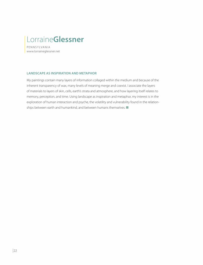
For an artist who intends no spatial illusion in her work, Nancy Natale has done a stellar job of creating a modestly sized path to infinity. Viewing her Passage, I am reminded of the Cave of the Sibyl outside of Naples, Italy, that ancient passage-way of trapezoidal arches cut from volcanic tuff, which is said to have led to the dwelling place of the Oracle. Natale’s geometry and materials are different, but her formal one-point perspective is equally compelling. A master of the mix, Natale has combined encaustic, twine, and tack-held leather into a shadowy monochromatic mirage that invites you to enter, if you dare.
Joanne Mattera My own series of hard-edge abstraction, Chromatic Geometry, is an unintentional exercise in depth perception. I’m a formalist concerned with color relationships and composition. My intent for this series is to explore balance via triangular shapes of varying sizes on a flat plane, but the moment I bisected the field chromatically an unintentional “horizon” appeared. I was several paintings into the series before I saw what others were seeing: perspective. I’m still thinking formally, so here we are: you see tomato, I see tomahto.
Toby Sisson has long mined a black and white palette, so much so that the subtle-ties she wrests from her paints and the manner in which she applies them, from a confident swipe to the softest of washes, yield a result that feels satisfyingly chromat-ic. A printmaker as well as a painter, Sisson has lately turned to encaustic monotype and the inspiration of James Baldwin to produce a series of small-scale prints that express outrage against and resistance to the racial discord in our country. In her series, Grow Inward Like a Root, of which numbers II, III, and VI are in the exhibition, we see fractured fields and compositional divisions. However exquisitely rendered, their reference is anything but.
Wayne Montecalvo takes a photograph apart and puts it back together like nobody else. The resulting image is intentionally out of register, unequivocally at odds with conventional thinking about what an image should look like. Working digitally, Montecalvo separates the layers of an image into its individual chromatic components and silkscreen prints them on nearly transparent paper or fabric; then he sandwiches them between applications of clear encaustic wax (which is to say, beeswax hardened slightly with damar resin). In Say That Again the image of a stain is thus physically dimensional, and by manipulating the register and color of the layers, he has given the image its own shadow.
I join with co-curator Cherie Mittenthal in thanking the Cape Cod Museum of Art’s Michael Giaquinto and Edith Tonelli for supporting the Encaustic Conference and encouraging our curatorial effort. I’d like to acknowledge the accomplished artists who made their work available for this exhibition, and from their ranks give special thanks to the team that designed and produced this catalog: Karen Freedman, Jane Guthridge, and Nancy Natale. ■
Founder and director emerita of the International Encaustic Conference, JOANNE MATTERA is now editor in chief of ProWax Journal (www.prowaxjournal2.blogspot.com), a quarterly online publication for artists who work with wax and encaustic. She exhibits widely and often.

16
REPEL AND AMUSE
Isolated limbs, and other body parts, which simultaneously repel and amuse the viewer, have
recurred in my work since 2010. Limb #2 and Limb #3 require several kinds of depth perception:
First, they are three-dimensional. In addition, they suggest emotional and intellectual responses,
i.e. two more kinds of “depth perception.” Viewers might ask, Are they broken prosthetic legs? Broken
dolls’ legs? Do they reflect a thwarted desire to dance? Are they mutations? As is my wont, alas, all of
the above. ■
PamelaBlumN E W Y O R Kwww.pamelablum.com

17
Limb #2-prototype and Limb #3-prototype, both 2016; encaustic , oil, papier maché, plaster gauze, aluminum mesh, plastic balls; 16 1/2 × 4 × 3 3/4 inches, left, and 14 × 4 × 3 inches

18
DRIFT AND GLIDE
The Ukiyo Series focuses on shifting perspectives and depths. It offers a journey of interactions
filled with forms and lines that drift above and glide through atmospheric planes, while evoking a
sense of energetic playfulness and movement. This collective body of work is a synthesis of inner
thoughts and emotions which are depicted in narrative hues and shapes, meant to capture the
fleeting fragments of past, present, and future. ■
Steven J.CabralM A S S A C H U S E T T Swww.stevenjcabral.com

19
Ukiyo 6, 2017, encaustic and oil on panel, 20 × 24 inches

20
LEVELS OF COMPLEXITY
When I first began working with encaustic, I was immediately drawn to its unique characteristics of
translucency and luminosity. I exploit those qualities to create a visual environment that is modified
and transformed through the juxtaposition and layering of opaque and translucent color. My
urgent need to add levels of complexity to both the design and execution of each painting
challenges the viewer’s visual perception. This multi-leveled approach brings a sense of depth and
movement to my paintings, which are physically static but are ever changing visually. ■
KarenFreedmanP E N N S Y LVA N I Awww.karenfreedman.com

21
Ruche 0352.127, 2016, encaustic and casein on panel, 16 × 16 × 11/2 inches
22
LANDSCAPE AS INSPIRATION AND METAPHOR
My paintings contain many layers of information collaged within the medium and because of the
inherent transparency of wax, many levels of meaning merge and coexist. I associate the layers
of materials to layers of skin, cells, earth’s strata and atmosphere, and how layering itself relates to
memory, perception, and time. Using landscape as inspiration and metaphor, my interest is in the
exploration of human interaction and psyche, the volatility and vulnerability found in the relation-
ships between earth and humankind, and between humans themselves. ■
LorraineGlessnerP E N N S Y LVA N I Awww.lorraineglessner.net

23
Pink Snow, 2015; encaustic, collage, mixed media on panel; 12 × 12 inches

24
BETWEEN THE REAL AND THE IMAGINED
Moving from the Midwest to the abundant sunlight and dramatic skies of Colorado has inspired my
work. I have always been interested in looking closely at nature and find that the vast areas of wilder-
ness in the West allow for a deeper contemplation of the ethereal qualities of the natural world—the
rich colors of the land, the gentle curve of plants, the patterns of dappled light through trees. I abstract
and reconfigure these patterns to convey the underlying rhythms and harmonies of our environment,
creating a space that is somewhere between the real and the imagined. I employ complex layers of
color and light to create the sensation of deep space. I layer translucent encaustic prints and Dura-Lar to
bend and refract, obscure and reveal, diffusing light in various ways. As the light surrounding the work
changes throughout the day, the work will change as well. I think this constant change is a beautiful
metaphor for life. ■
JaneGuthridgeCO L O R A D Owww.janeguthridge.com

25
Changing Light 3, 2017; Dura-Lar, encaustic, and archival inkjet on Kozo; 20 × 18 × 4 inches

26
STRUCTURE AND CONNECTION
Bound Trio is part of the ongoing Construct/Constrict series in which I explore the relationships of structure and
connection through transformation. Using textiles, rubber and encaustic I build organic abstractions referenc-
ing the natural world. Individually, these diverse materials don’t have enough structural strength to stand tall
on their own. Through physical manipulation, most often binding and folding, I devise methods allowing the
materials to gain strength and support each other. ■
SusanLasch KrevittC A L I F O R N I Awww.susanlaschkrevitt.com

27
Bound Trio, 2015; rubber, textiles, encaustic; 30 × 8 × 8 inches

28
A SURPRISE IN THE ORDER OF THINGS
With my ongoing Chromatic Geometry series, I’ve skewed the conventional grid so that it has
become a field of attenuated diamonds integral to the visual structure of the painting. Formally I’m
thinking about the division of the diamonds into greater or lesser amounts, allowing me to resolve
relationships of color and shape. Each resulting triangular shape is a fulcrum that affects the equi-
poise of the field. With the horizontal division of the field into two hues, something else is taking
place: an ambiguous figure-ground relationship. Those differently sized triangles are now visually
kinetic, shifting between foreground and the deeper space suggested by that planar meeting of
hues. I hadn’t intended it, but there it is, a welcome surprise in the order of things ■
JoanneMatteraN E W Y O R Kwww.joannemattera.com

29
Chromatic Geometry 40, 2016, encaustic on panel, 18 × 18 inches

30
Detail: Purple Biome
A VISUAL INVESTIGATION INTO TEXTURE AND COLOR
Wikipedia describes a biome as “a formation of plants and animals that have common charac-
teristics due to similar climates.” Examples of biome environments may be forests, deserts, or
oceans. My Biome is a dialogue influenced by our vanishing coral reefs, but it is from the distinct
climate of my own mind: a visual investigation into texture and color. It is a testimony to the
amazing, astounding variety of organisms that live on this planet. My Biomes are created from an
assortment of materials: dried plants, seeds, pods, fiber, yarn, felt, fabric, paper, lace, or any other
thing that would hold the wax and pastel mediums. Relating Biome to Depth Perception, one
might say Biome emerges out of the deep recesses of my imagination and expands sculpturally
into three-dimensional space. ■
SandiMiotC A L I F O R N I Awww.sandimiot.com

31
Purple Biome, 2016; wax, pastel, oil, dried plants, seeds, pods, fiber, fabric, paper, lace; 15 × 18 × 3 inches

32
Detail: House with Chair
A SENSE OF PLACE
My work explores the ritual of layering. I work predominantly in encaustic and mixed media. I feel
there is a depth that is inherent to the medium depending on how it is used. Layering, scraping,
digging, dripping, being transparent or opaque are all very interesting to me. My work is about the
sense of place. This series also focuses on adhering a smaller painting to the surface, which creates
a different form of depth and makes an interesting juxtaposition. ■
CherieMittenthalM A S S A C H U S E T T Swww.cheriemittenthal.com

33
House with Chair, 2017; encaustic, rubber, mixed media; 20 × 16 inches

34
HOW MUCH IS REVEALED, HOW MUCH IS OBSCURED
My work is constructed in layers created on separate surfaces that float above or below each other.
Beginning with a photograph, drawing, or simply a stain, I take digital images apart and reassemble
them, placing sections off-register and separating them to exaggerate the space between each
layer. The interruption between layers creates a visual gap or pause from one level to the next. I use
encaustic medium to make the separation greater or shallower, depending on how much space is
built up between each layer. How much is revealed, and how much is obscured, is something that
is determined by how the layers are combined. ■
WayneMontecalvoN E W Y O R Kwww.waynemontecalvo.com

35
Say That Again, 2017; watercolor, coffee stain, acrylic, ink, encaustic on handmade and Tengucho papers; 24 × 17 inches

36
Detail: Runaround
SCIENTIFIC REPRESENTATION AND ACTS OF ABSTRACTION
Activating the boundary of painting and sculpture, my work strikes a balance between scientific
representation and acts of abstraction. Taking poetic license with geology, I created Runaround
by literally painting in the round, and then slicing the pieces open to reveal geode-like intricacies
shown in cross-section. Distilling the vast time/space continuum into something containable, my
aim with this small environment is to draw viewers in and give them an Alice in Wonderland experi-
ence of exploring, maybe even escaping to, a colorful new world. ■
LauraMoriartyN E W Y O R Kwww.lauramoriarty.com

37
Runaround, 2017, encaustic, 16 × 22 × 5 1/2 inches

38
THE GEOMETRIC VIEW TO INFINITY
I never intend, or even look for, spatial illusions in my work. Sometimes they happen. In Passage,
particularly, vertical lines of twine, which grow shorter as they near the center, reinforce the geo-
metric view to infinity. I was surprised to see the classic negative/positive illusion caused by shifting
focus between the painted and constructed sections. My usual concern is surface and texture.
Passage is one in a series that combines sections of assembled elements with areas painted in
encaustic. In this series I cut up discarded handbags to repurpose the leather, hardware, and other
components. I also added repurposed rubber. I kept the palette achromatic to emphasize materi-
ality and surface. My intention was to bring together the soft, skin-like appearance of the wax with
real skin from the handbags and the smooth surface of rubber. These soft and touchable materials
contrasted with the sharp geometric angles of the compositions. ■
NancyNataleM A S S A C H U S E T T Swww.nancynatale.net
39
Passage, 2015; encaustic, leather, rubber, string, tacks; 18 × 18 inches

40
THE EPHEMERAL QUALITIES OF TWILIGHT
This work is about investigating the ephemeral qualities of twilight. I am interested in resolving the
discord between the frenzied and meditative elements of time. There’s no real way to control mo-
mentum, but we have all been witnesses to its varying speeds. We live in a frenetic world, in which
we have perceived the fleeting comings and goings of the days, weeks, months and years. We also
have had moments that are frozen, and our recall of those moments helps to magically recycle our
relationship to time and space. Sometimes it feels like déjà vu. Twilight happens to be one of my
favorite times of day. It is where the light greets the darkness, with a short pause. Color becomes
intensified, and the structure of the sky and ground are in flux, creating visual and emotional depth.
Twilight holds in it a feeling of two worlds: a beginning and an end. ■
CarolPelletierM A S S A C H U S E T T S a n d M A I N Ewww.carolpelletier.net

41
Burned Ground, 2017, oil and cold wax, 14 × 14 inches

42
A METAPHOR FOR CROSSING OUT PAST ACTIONS
Stop It is part of a new series that began as an exercise—much like meditation—of paying close at-
tention to the act of painting itself. I was looking for a repetitive mark that would allow me to focus
on the specific ways I lay paint down. As I experimented, the double stroke of the X emerged. Over
time I began using the X explicitly to cover up or cancel what was below, to push the earlier layers
back or down, away from me and the viewer. This created a physical feeling of depth and a psy-
chological mystery: not knowing what is underneath or why it must be hidden. The series is both
personal and political. The act of X-ing is a metaphor for crossing out and rejecting past actions—
one’s own and others’. ■
LisaPressmanN E W J E R S E Ywww.lisapressman.net
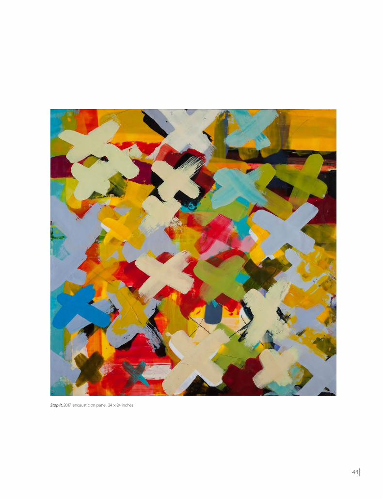
43
Stop It, 2017, encaustic on panel, 24 × 24 inches
44
CONTAINERS OF TIME
Looking at nature through the lens of the human-made world, I am interested in the intersection
and balance of the two. I’m strongly influenced by patterns we find in nature—especially the sides
of the canyons of the Southwest, honeycombs of bees, geological structures, and microscopic
views of nature. We also make structures and learn continuously from nature. The given rectangular
shape of the panel spurs me on to create work in which I organize the surface in concert with that
shape by sometimes cutting into it, as in this piece. Linear elements float above the load-bearing
chevron strata to create an effect like a double-exposure photo, capturing multiple compressed
moments, as if one is looking through the present to reveal an earlier period. As a result my paint-
ings become containers of time, each plane or layer acting as a marker that unfolds with viewing. ■
LyndaRayV I R G I N I Awww.lyndarayart.com

45
Banded Iron, 2015, encaustic on panel, 12 × 24 inches

46
A SENSE OF RESILIENCE AND LIFE
Upon first glance of my encaustic relief, Revision, you realize that part of the painting is protruding
off the surface. No trompe l’oeil at play here—it is physically in your space. I have broken free from
the surface and gone beyond the traditional four-corner format. A closer focus reveals the peeling,
layering, scarring, and ripping, a metaphor for the obstacles and personal struggles in life. Seem-
ingly destructive to the surface, the peeling plays a positive role in removing a build up and seeing
what has been lying dormant. The depth created by working this way is jarring to me, confronta-
tional, alluring and frightening. There is risk involved, but the presence of this relief work conveys a
sense of resilience and life which keeps me returning. It speaks with a boldness and beauty which
is also fragile. This opposition between image/content and material is the catalyst for the develop-
ment of this series. ■
StephanieRoberts-CamelloM A S S A C H U S E T T Swww.stephanierobertscamello.com

47
Revision, 2016, encaustic relief, 15 × 18 × 3¼ inches

48
grow inward like a root VI, 2017, encaustic monotype on paper mounted on wood, 12 × 9 inches
A TIRELESS RESISTANCE TO RACISM
A volume of James Baldwin’s lesser known verses, Jimmy’s Blues and Other Poems, inspired an
ongoing body of black-and-white work, of which these prints are a part. Baldwin’s writings chroni-
cle the legacy of racial injustice in 20th century America as well as his personal struggles with the
homophobia of that era. Bearing witness to the depth of his pain are fragmented bits of text and
abstracted forms that allude to drops of sweat and blood, daggerlike weapons and dark wounds
that grow inward like a root. While responding to his work with my own, I was struck by the
parallels between the racial strife that Baldwin wrote about decades ago and the violence inflicted
upon black bodies in America today. The widespread protests against these incidents demonstrate
a tireless resistance to racism in the 21st century. My work, in its quiet way, is a part of that battle. ■
TobySissonR H O D E I S L A N Dwww.tobysisson.com

49
grow inward like a root III, 2017, encaustic monotype on paper mounted on wood, 12 × 9 inches
grow inward like a root II, 2017, encaustic monotype on paper mounted on wood, 12 × 9 inches

50
Detail: Vatn 4
MOMENTS OF BEAUTY AND STILLNESS
I began this series after returning from a meditation retreat in the Berkshires. Each afternoon I found
myself drawn to the nearby lake. There I would spend an hour sitting on the shore watching light
and clouds move across the lake’s surface or standing in a shallow pool looking down through the
water to the silt and fish below. Every day the lake was different. The more I looked, the more I saw.
Vatn, Icelandic for water, uses the language of abstraction to explore the physical nature of water.
The painting was built up through approximately 75 layers of encaustic medium, resulting in a work
that appears three-dimensional. An underpainting draws the viewer’s eye down into the work,
while the pierced surface and repetitive mark making suggest light and movement. Vatn represents
my effort to capture and embody those temporary moments of beauty and inner stillness. ■
DietlindVander SchaafM A I N Ewww.dietlindvanderschaaf.com

51
Vatn 4, 2017, encaustic and oil on panel, 16 × 20 inches

52
HISTORIES OF CAPTURED LIGHT
What is my understanding of this reality I experience, the moments from which life is fabricated?
How true are my perceptions of place and time? Do my senses accurately inform, or are all impres-
sions overshadowed by memory and desire? I find I can retain small moments in time through
color: histories of captured light and times of day, reflecting a space between the natural and ideal.
My work explores this perception of light, revealed through color, composing personal environ-
ments, minimal and abstract. Light permeates this translucent beeswax and remains composition-
ally present—nature and her mysteries at play. Is this acid hue crackling with industrial electricity or
lazily warm with the welcomed heat of an early summer sun? Both impressions are equally antic-
ipated. But today, in a 16-inch-square panel, I can walk miles along a distant south English coast,
transported only by tones of yellow. ■
JaniseYntemaB E LG I U Mwww.janiseyntema.com

53
Hallwood, 2017, encaustic on panel, 16 × 16 inches

54

55

Prepared by MagCloud for Janise Yntema. Get more at karefreeartist.magcloud.com.