Business card-freemium (1.02MB)
3
14 COOL BUSINESS CARD DESIGNS BY BRYN MOOTH Those who say print is dead must be walking around with pretty crappy business cards in their hipster mes- senger laptop bags. Sure, we could all use the Bump app on our smartphones to exchange digits. But even in the tech age, there’s something of value in the exchange of smart, printed business cards with eye- catching designs. Especially in great business cards like these, which manage to communicate a whole lot of information — both directly and indirectly — about the people and companies they represent. Beyond the standard name/ address/e-mail/phone data (does anyone use fax any- more?), these creative business card designs convey personality, philosophy, attitude and brand. We went looking for cool business card designs (both client work and graphic designer business cards) with interesting printing or production techniques in addition to great aesthetics. Some of the cards in our gallery were letterpress printed on yummy paper; others were digitally printed or assembled by hand. Regardless of cost or medium, we’d be glad to keep these business cards in our Rolo- dex. 1.) DANDEE DESIGNS — A DURABLE BUSI- NESS CARD Designer/client: Danyelle Mathews Material: lightweight wood Production: Laser-burning Printer: Bullfrog Graphics Why we love it: Blogger and mom Danyelle Mathews regularly plays with wood for the cute and clever craft projects (think kid-friendly games like travel tic-tac- toe) that she shares on her website, so the material was the ideal choice for her business card. Mathews’ wooden cards really stand out; the pretty script and scissor motif tie into her online brand. 2.) KELLI MARIE – DEVELOPING YOUR PER- SONAL IDENTITY Designer/client: Kelli Marie Daly, www.kellimarie.me Paper: Crane Lettra 220lb. Fluorescent White Production: Letterpress, die cut Printer: Mama’s Sauce, www.mamas-sauce.com Why we love it: A recent graduate of the Illinois Institute of Art, designer Kelli Marie Daly needed a business card that would help prospective employees remember her. Daly’s cat-eye glasses are a signature look, so she designed a card that spotlights her cool eyewear and touts her appreciation for type and craft. 3.) ANGELO LEMBESIS — A BIZ CARD FIT FOR A DESIGNER/PRINTER Design firm/printer: Studio SloMo, www.studioslomo. com Designer: Sarah Wymer Client: Angelo Lembesis Paper: Reich Savoy 236lb. Bright White Production: Harry Otto Printing Co. (for inking the edges) Why we love it: The super-thick paper that designer and printer Sarah Wymer chose for these business cards for a jazz pianist really put the Vandercook SP-15 press through its paces. The stock’s heft makes the card’s painted edges stand out (though trimming out the cards was time-consuming). Wymer says she grooves on the balance between the hands-on work of printing and the digital work of design. 4.) K FLICK — EYE-CATCHING DESIGN Design firm: Petal and Print, www.petalandprint.com Designer: Katie McDonough Kutil Client: K Flick Studio, www.kflickstudio.com Paper: .022 weight chipboard Production: Gold foil stamping Why we love it: Jeweler Kohli Flick’s collection is a blend of fancy and earthy, and the juxtaposition between gold and cardboard perfectly captures her design aesthetic in a business card. The logo is based upon a vintage taxidermied deer that Flick purchased several years ago — another statement of her elegantly rustic style. Flick and designer Katie McDonough Kutil trade their work (we’d like in on that arrange- ment). 5.) CINQ PARTNERS — BUSINESS CARD OF A GRAPHIC DESIGN COLLABORATION Design firm/client: Cinq Partners, www.cinqpartners. com Designers: Steve Wilson, Steph Doyle, Nikita Prokhorov Paper: Neenah Neutech 160 lb. Pure White Wove Production: Blind emboss, letterpress Printer: The Mandate Press, www.themandatepress. com Why we like it: This collective of three independent designers who work in separate cities began with five members; hence, the name. The logo is a riff on Museo Sans, with the ‘i’ and ‘n’ linked to create a ‘5.’
-
Upload
mitesh-take -
Category
Design
-
view
21 -
download
0
Transcript of Business card-freemium (1.02MB)

14 Cool Business Card designs
b y b r y n M o o t h
Those who say print is dead must be walking around with pretty crappy business cards in their hipster mes-senger laptop bags. Sure, we could all use the Bump app on our smartphones to exchange digits. But even in the tech age, there’s something of value in the exchange of smart, printed business cards with eye-catching designs.
Especially in great business cards like these, which manage to communicate a whole lot of information — both directly and indirectly — about the people and companies they represent. Beyond the standard name/address/e-mail/phone data (does anyone use fax any-more?), these creative business card designs convey personality, philosophy, attitude and brand.
We went looking for cool business card designs (both client work and graphic designer business cards) with interesting printing or production techniques in addition to great aesthetics.
Some of the cards in our gallery were letterpress printed on yummy paper; others were digitally printed or assembled by hand. Regardless of cost or medium, we’d be glad to keep these business cards in our Rolo-dex.
1.) DAnDEE DESIGnS — A DUrAbLE bUSI-nESS CArD
Designer/client: Danyelle MathewsMaterial: lightweight woodProduction: Laser-burningPrinter: Bullfrog Graphics
Why we love it: Blogger and mom Danyelle Mathews regularly plays with wood for the cute and clever craft projects (think kid-friendly games like travel tic-tac-toe) that she shares on her website, so the material was the ideal choice for her business card. Mathews’ wooden cards really stand out; the pretty script and scissor motif tie into her online brand.
2.) KELLI MArIE – DEVELoPInG yoUr PEr-SonAL IDEntIty
Designer/client: Kelli Marie Daly, www.kellimarie.mePaper: Crane Lettra 220lb. Fluorescent WhiteProduction: Letterpress, die cutPrinter: Mama’s Sauce, www.mamas-sauce.com
Why we love it: A recent graduate of the Illinois Institute of Art, designer Kelli Marie Daly needed a business card that would help prospective employees remember her. Daly’s cat-eye glasses are a signature look, so she designed a card that spotlights her cool eyewear and touts her appreciation for type and craft.
3.) AnGELo LEMbESIS — A bIZ CArD FIt For A DESIGnEr/PrIntEr
Design firm/printer: Studio SloMo, www.studioslomo.com Designer: Sarah WymerClient: Angelo LembesisPaper: Reich Savoy 236lb. Bright WhiteProduction: Harry Otto Printing Co. (for inking the edges)
Why we love it: The super-thick paper that designer and printer Sarah Wymer chose for these business cards for a jazz pianist really put the Vandercook SP-15 press through its paces. The stock’s heft makes the card’s painted edges stand out (though trimming out the
cards was time-consuming). Wymer says she grooves on the balance between the hands-on work of printing and the digital work of design.
4.) K FLICK — EyE-CAtChInG DESIGn
Design firm: Petal and Print, www.petalandprint.comDesigner: Katie McDonough KutilClient: K Flick Studio, www.kflickstudio.com Paper: .022 weight chipboardProduction: Gold foil stamping
Why we love it: Jeweler Kohli Flick’s collection is a blend of fancy and earthy, and the juxtaposition between gold and cardboard perfectly captures her design aesthetic in a business card. The logo is based upon a vintage taxidermied deer that Flick purchased several years ago — another statement of her elegantly rustic style. Flick and designer Katie McDonough Kutil trade their work (we’d like in on that arrange-ment).
5.) CInQ PArtnErS — bUSInESS CArD oF A GrAPhIC DESIGn CoLLAborAtIon
Design firm/client: Cinq Partners, www.cinqpartners.comDesigners: Steve Wilson, Steph Doyle, Nikita ProkhorovPaper: Neenah Neutech 160 lb. Pure White WoveProduction: Blind emboss, letterpressPrinter: The Mandate Press, www.themandatepress.com
Why we like it: This collective of three independent designers who work in separate cities began with five members; hence, the name. The logo is a riff on Museo Sans, with the ‘i’ and ‘n’ linked to create a ‘5.’

On their business card, the number becomes a graphic motif, with a stylized ‘5’ blind-embossed into luscious paper. Designer Steve Wilson says the challenge was printing over the embossed pattern, so they bumped up the type size and loosened the kerning to make it work.
6.) rED oAK — DESIGn thAt EXEMPLIFIES thE CLIEnt nAME
Designer/firm: Ed Adams, Flicker to Flame, www.flick-ertoflame.comClient: Red Oak DigitalPaper: 16 pt. silk matte cardstockProduction: Match color and spot gloss varnishPrinter: Taste of Ink, www.tasteofink.com
Why we like it: The company’s name doesn’t have much to do with its work (the client does video produc-tion), so designer Ed Adams went for a more literal representation of a red oak rather than trying to get too conceptual. The simple wood-grain pattern makes for an attractive and appropriate design; and the one-color/spot-varnish solution generated visual bang on a tight budget.
7.) brADy CLArK — brAnDInG yoU
Client/designer: M. Brady Clark, www.mbradyclark.com Production: Die cutPrinter: print100.com
Why we like it: For an online, offshore print job, Clark’s cards look pro. His design is truly a reflection of him and his capabilities: The specs are a signature part of his wardrobe, and they help convey his background as an apparel designer. Before setting up his own shop, Clark designed menswear for Billabong-USA; he divides his time between custom apparel for clients in the entertainment biz and on branding and packag-ing work.
8.) WIn WIthoUt PItChInG — GrAPhIC DESIGnEr bUSInESS CArD
Designer/firm: Brian Sooy, Sooy+Co., www.sooyco.comClient: Blair Enns, Win Without PitchingPaper: Mohawk Pegasus 80 lb. cover, Midnight Black VellumProduction: White pigment stamp, red foil stampPrinter: Irwin Engraving www.irwinengraving.com
Why we like it: Brian Sooy always brings elegance and restraint to his type and graphic designs. Sooy designed the book “Win Without Pitching,” plus a companion business card for consultant Blair Enns. The WWP monogram is hand-lettered and stamped in opaque white, while the text (Mrs. Eaves) is red foil. A rich black stock matches the books black linen cover.
9.) rEACtor — ‘WorLD’S MoSt EXPEn-SIVE bUSInESS CArD’
Client/design firm: Reactor, Kansas City, MO, www.yourreactor.comPapers: Plike cover stock in black and white; Neenah Classic Crest 120 lb. double-thick coverProduction: Two match colors (silver, fluorescent), laser die-cut, steel rule die-cut, thermography, hand assem-bly
Why we like it: At 8 bucks each, 100 hours of design/engineering time and 8 hours of assembly for 250 cards, it’s no wonder Reactor calls this the “world’s most expensive business card.” Each triple-layer card carries an embedded fortune, which links to a special website where the recipient could register to win a gift. Cutting, registering and gluing the cards took a ton of trial-and-error, but since Reactor specializes in high-end print design, the card’s a great representation of their work.
10.) DUStIn K FrIESEn — bUSInESS CArD WIth A CrEAtIVE ShAPE
Designer/printer/client: Dustin K. Friesen, www.dkfri-esen.com Paper: Crane Lettra 110 lb. Pearl WhiteProduction: Digital printing, die cut, hand assemblyPrinter: Taylor University Press
Why we like it: Dustin Friesen created a monogram-based logo with a graphic background that recalls both four-color printing (C, M and Y overlaid) and a camera lens aperture. Despite the design’s simplicity, the shape really makes this card stand out. A true DIY job befitting a college student’s budget, the card cost Friesen 50 bucks and 6 hours: He glued together two sheets of 110 lb. paper to create a double-thick cover stock and die-cut the cards using a rotary cutter from Staples.
6 • SEPtEMbEr 20
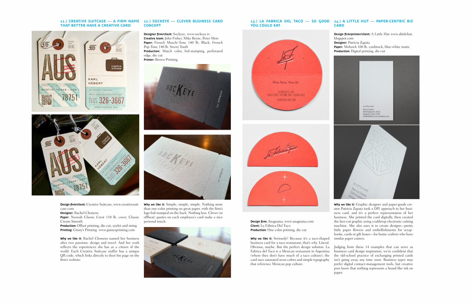
11.) CrEAtIVE SUItCASE — A FIrM nAME thAt bEttEr hAVE A CrEAtIVE CArD
Design firm/client: Creative Suitcase, www.creativesuit-case.comDesigner: Rachel ClemensPaper: Neenah Classic Crest 110 lb. cover, Classic Cream SmoothProduction: Offset printing, die cut, eyelet and stringPrinting: Ginny’s Printing www.ginnysprinting.com
Why we like it: Rachel Clemens named her business after two passions: design and travel. And her work reflects the experiences she has as a citizen of the world. Each Creative Suitcase staffer has a unique QR code, which links directly to their bio page on the firm’s website.
12.) SoCKEyE — CLEVEr bUSInESS CArD ConCEPt
Designer firm/client: Sockeye, www.sockeye.tvCreative team: John Fisher, Mike Byrne, Peter MetzPaper: French Muscle-Tone 140 lb. Black; French Pop-Tone 140 lb. Sweet ToothProduction: Match color, foil-stamping, perforated edge, die cutPrinter: Brown Printing
Why we like it: Simple, simple, simple. Nothing more than one-color printing on great paper, with the firm’s logo foil-stamped on the back. Nothing less. Clever (or offbeat) quotes on each employee’s card make a nice personal touch.
13.) LA FAbrICA DEL tACo — So GooD yoU CoULD EAt
Design firm: Anagrama, www.anagrama.comClient: La Fábrica Del TacoProduction: One color printing, die cut
Why we like it: Seriously? Because it’s a taco-shaped business card for a taco restaurant, that’s why. Literal. Obvious, maybe. But the perfect design solution. La Fabrica del Taco is a Mexican restaurant in Argentina (where they don’t have much of a taco culture); the card uses saturated neon colors and simple typography that reference Mexican pop culture.
14.) A LIttLE hUt — PAPEr-CEntrIC bIZ CArD
Design firm/printer/client: A Little Hut www.alittlehut.blogspot.comDesigner: Patricia ZapataPaper: Mohawk 100 lb. cardstock, blue-white matteProduction: Digital printing, die cut
Why we like it: Graphic designer and paper-goods cre-ator Patricia Zapata took a DIY approach to her busi-ness card, and it’s a perfect representation of her business. She printed the card digitally, then created the kiss-cut graphic using a tabletop electronic cutting machine. She also uses it to create designs—pretty little paper flowers and embellishments for scrap-books, cards or gift boxes—for home crafters who have similar paper cutters.
Judging from these 14 examples that can serve as business card design inspiration, we’re confident that the old-school practice of exchanging printed cards isn’t going away any time soon. Business types may prefer digital contact-management tools, but creative pros know that nothing represents a brand like ink on paper.