Baldwin Brochures/form30.pdf · LOGOS 4 COLOR LOGOS The Baldwin logo is available in several...
29
BRAND IDENTITY STANDARDS March 2012
Transcript of Baldwin Brochures/form30.pdf · LOGOS 4 COLOR LOGOS The Baldwin logo is available in several...
BRAND IDENTITY STANDARDS
March 2012
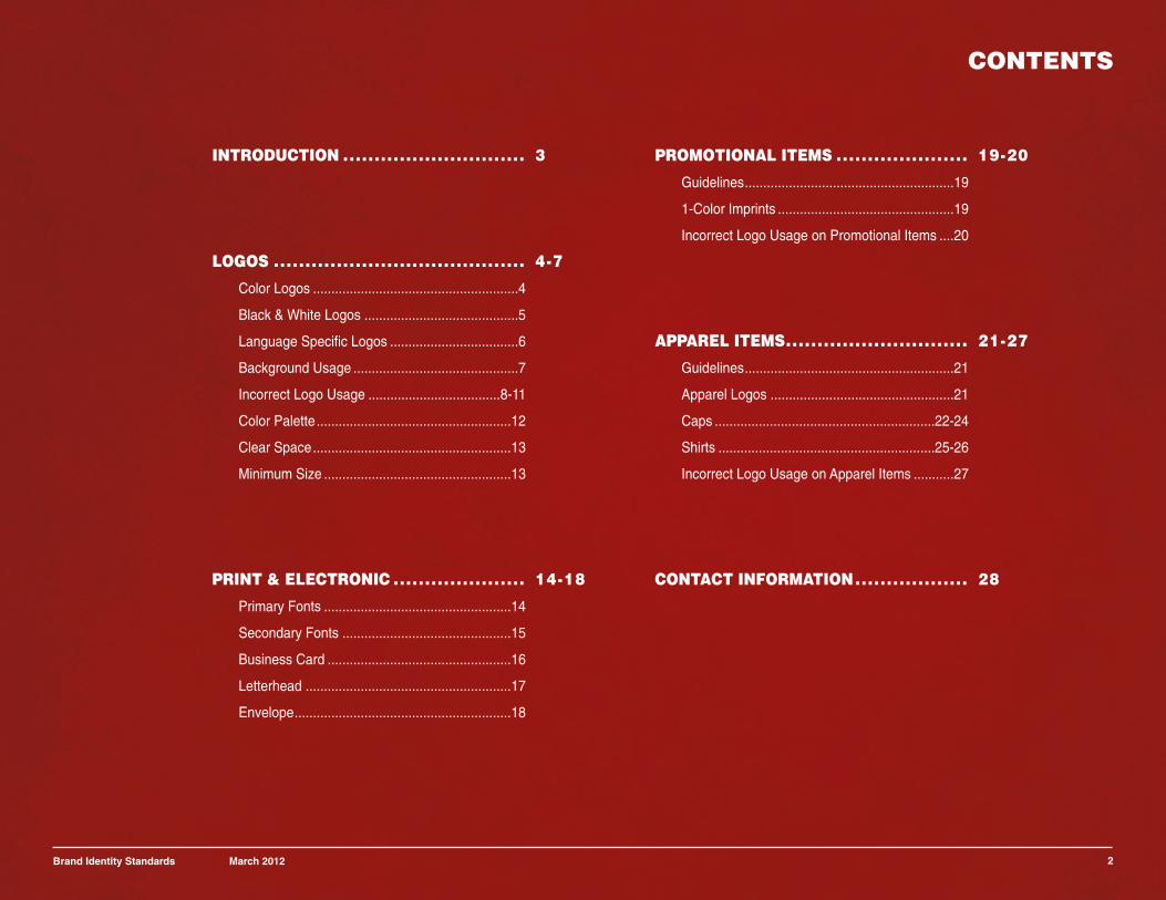
CONTENTS
2Brand Identity Standards March 2012
INTRODUCTION ............................. 3
LOGOS ........................................ 4-7
Color Logos ........................................................4
Black & White Logos ..........................................5
Language Specific Logos ...................................6
Background Usage .............................................7
Incorrect Logo Usage ....................................8-11
Color Palette.....................................................12
Clear Space......................................................13
Minimum Size ...................................................13
PRINT & ELECTRONIC ..................... 14-18
Primary Fonts ...................................................14
Secondary Fonts ..............................................15
Business Card ..................................................16
Letterhead ........................................................17
Envelope...........................................................18
PROMOTIONAL ITEMS ..................... 19-20
Guidelines.........................................................19
1-Color Imprints ................................................19
Incorrect Logo Usage on Promotional Items ....20
APPAREL ITEMS............................. 21-27
Guidelines.........................................................21
Apparel Logos ..................................................21
Caps ............................................................22-24
Shirts ...........................................................25-26
Incorrect Logo Usage on Apparel Items ...........27
CONTACT INFORMATION.................. 28
INTRODUCTION
3
BALDWIN FILTERS
These guidelines have beenprepared to ensure our brand ispresented in a consistent mannereverywhere. It is importantto follow these guidelines tomaintain an effective andconsistent standard in ourcommunications.
If you have any questions orcomments, please contact theMarketing CommunicationsDepartment at Baldwin Filters [email protected].
Brand Identity Standards March 2012
Baldwin Filters has a strong reputation in the mobile filtration industry. The Baldwin brand is acritical element of how we present ourselves to the global community; it is as important as theproducts and services we provide.
Given our leading market position, it is important for us to maintain a consistent image and astrong, distinctive brand identity. We must ensure that the representation of our brand and thebasic elements of our identity are always used correctly.
The guidelines in this document are not meant to inhibit, but to help you present a consistent lookacross all visual communications. These guidelines may not cover every situation, but theyshould give you the tools needed to communicate effectively.
By adhering to these guidelines, we will ensure that our identity stays strong and we promote aconsistent image to the world across all of our communications.
If you have any questions or comments, please contact the Marketing CommunicationsDepartment at Baldwin Filters at [email protected].
A STRONG BRAND IS IMPORTANT
LOGOS
4
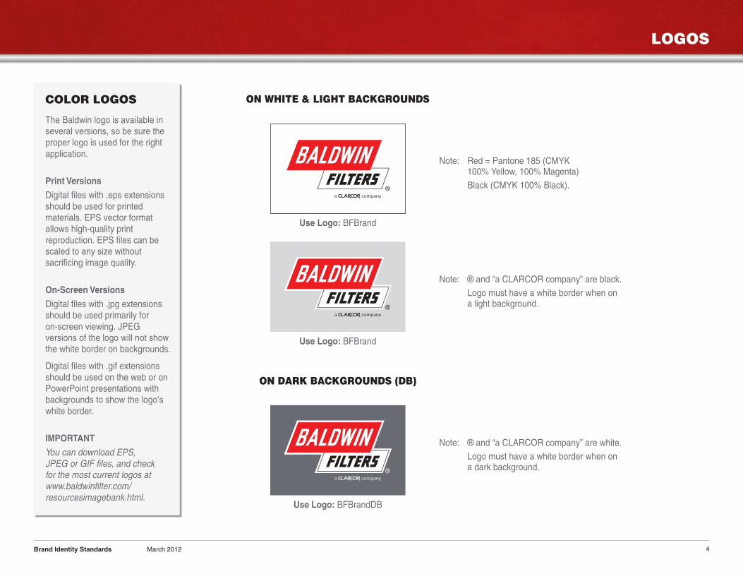
COLOR LOGOS
The Baldwin logo is available inseveral versions, so be sure theproper logo is used for the rightapplication.
Print Versions
Digital files with .eps extensionsshould be used for printedmaterials. EPS vector formatallows high-quality printreproduction. EPS files can bescaled to any size withoutsacrificing image quality.
On-Screen Versions
Digital files with .jpg extensionsshould be used primarily foron-screen viewing. JPEGversions of the logo will not showthe white border on backgrounds.
Digital files with .gif extensionsshould be used on the web or onPowerPoint presentations withbackgrounds to show the logo’swhite border.
IMPORTANT
You can download EPS,JPEG or GIF files, and checkfor the most current logos atwww.baldwinfilter.com/resourcesimagebank.html.
Brand Identity Standards March 2012
ON WHITE & LIGHT BACKGROUNDS
Note: ® and “a CLARCOR company” are black.
Logo must have a white border when ona light background.
Use Logo: BFBrand
ON DARK BACKGROUNDS (DB)
Note: ® and “a CLARCOR company” are white.
Logo must have a white border when ona dark background.
Use Logo: BFBrandDB
Use Logo: BFBrand
Note: Red = Pantone 185 (CMYK100% Yellow, 100% Magenta)
Black (CMYK 100% Black).
LOGOS
5
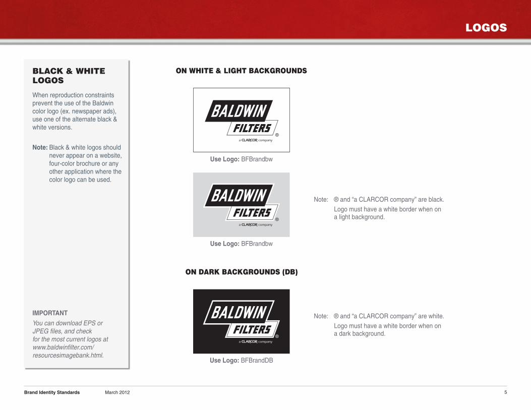
BLACK & WHITELOGOS
When reproduction constraintsprevent the use of the Baldwincolor logo (ex. newspaper ads),use one of the alternate black &white versions.
Note: Black & white logos shouldnever appear on a website,four-color brochure or anyother application where thecolor logo can be used.
IMPORTANT
You can download EPS orJPEG files, and checkfor the most current logos atwww.baldwinfilter.com/resourcesimagebank.html.
Brand Identity Standards March 2012
ON WHITE & LIGHT BACKGROUNDS
Note: ® and “a CLARCOR company” are black.
Logo must have a white border when ona light background.
Use Logo: BFBrandbw
ON DARK BACKGROUNDS (DB)
Note: ® and “a CLARCOR company” are white.
Logo must have a white border when ona dark background.
Use Logo: BFBrandDB
Use Logo: BFBrandbw
LOGOS
6
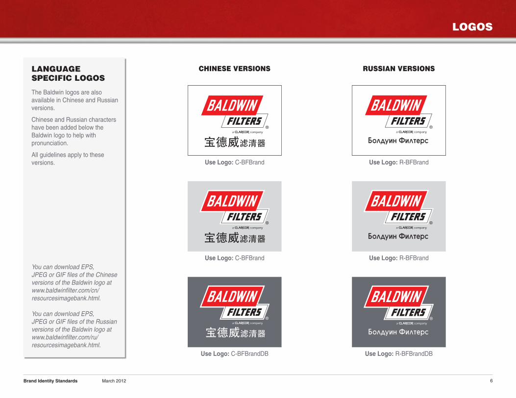
LANGUAGESPECIFIC LOGOS
The Baldwin logos are alsoavailable in Chinese and Russianversions.
Chinese and Russian charactershave been added below theBaldwin logo to help withpronunciation.
All guidelines apply to theseversions.
You can download EPS,JPEG or GIF files of the Chineseversions of the Baldwin logo atwww.baldwinfilter.com/cn/resourcesimagebank.html.
You can download EPS,JPEG or GIF files of the Russianversions of the Baldwin logo atwww.baldwinfilter.com/ru/resourcesimagebank.html.
Brand Identity Standards March 2012
CHINESE VERSIONS RUSSIAN VERSIONS
Use Logo: C-BFBrand
Use Logo: C-BFBrand
Use Logo: C-BFBrandDB
ÅÓΉÛËÌ îËÎÚÂÒ
ÅÓΉÛËÌ îËÎÚÂÒÅÓΉÛËÌ îËÎÚÂÒ
ÅÓΉÛËÌ îËÎÚÂÒÅÓΉÛËÌ îËÎÚÂÒ
Use Logo: R-BFBrand
Use Logo: R-BFBrand
Use Logo: R-BFBrandDB
LOGOS
7
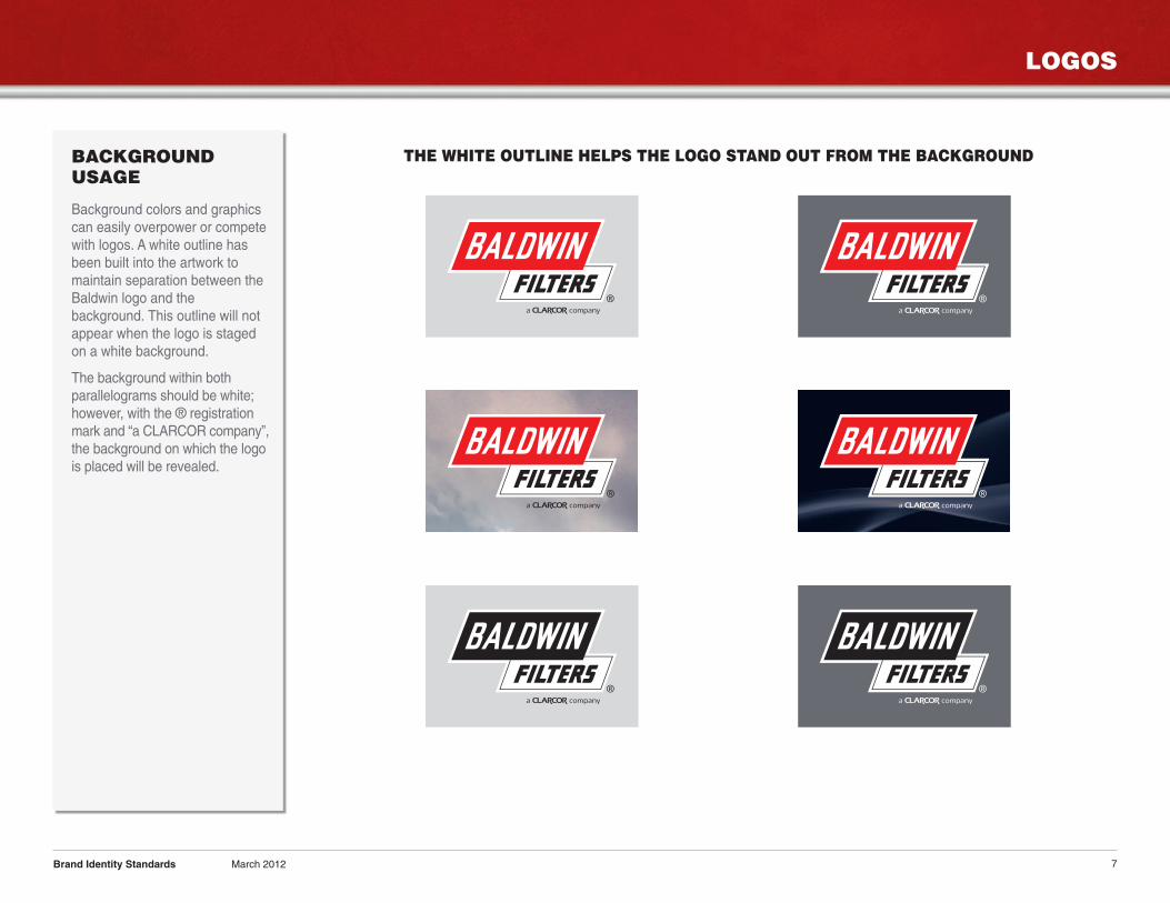
BACKGROUNDUSAGE
Background colors and graphicscan easily overpower or competewith logos. A white outline hasbeen built into the artwork tomaintain separation between theBaldwin logo and thebackground. This outline will notappear when the logo is stagedon a white background.
The background within bothparallelograms should be white;however, with the ® registrationmark and “a CLARCOR company”,the background on which the logois placed will be revealed.
Brand Identity Standards March 2012
THE WHITE OUTLINE HELPS THE LOGO STAND OUT FROM THE BACKGROUND
LOGOS
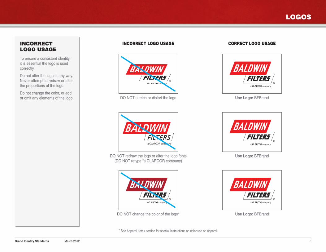
8Brand Identity Standards March 2012
DO NOT stretch or distort the logo
INCORRECT LOGO USAGE CORRECT LOGO USAGE
Use Logo: BFBrand
INCORRECTLOGO USAGE
To ensure a consistent identity,it is essential the logo is usedcorrectly.
Do not alter the logo in any way.Never attempt to redraw or alterthe proportions of the logo.
Do not change the color, or addor omit any elements of the logo.
a CLARCOR company
DO NOT redraw the logo or alter the logo fonts(DO NOT retype “a CLARCOR company)
Use Logo: BFBrand
DO NOT change the color of the logo* Use Logo: BFBrand
* See Apparel Items section for special instructions on color use on apparel.
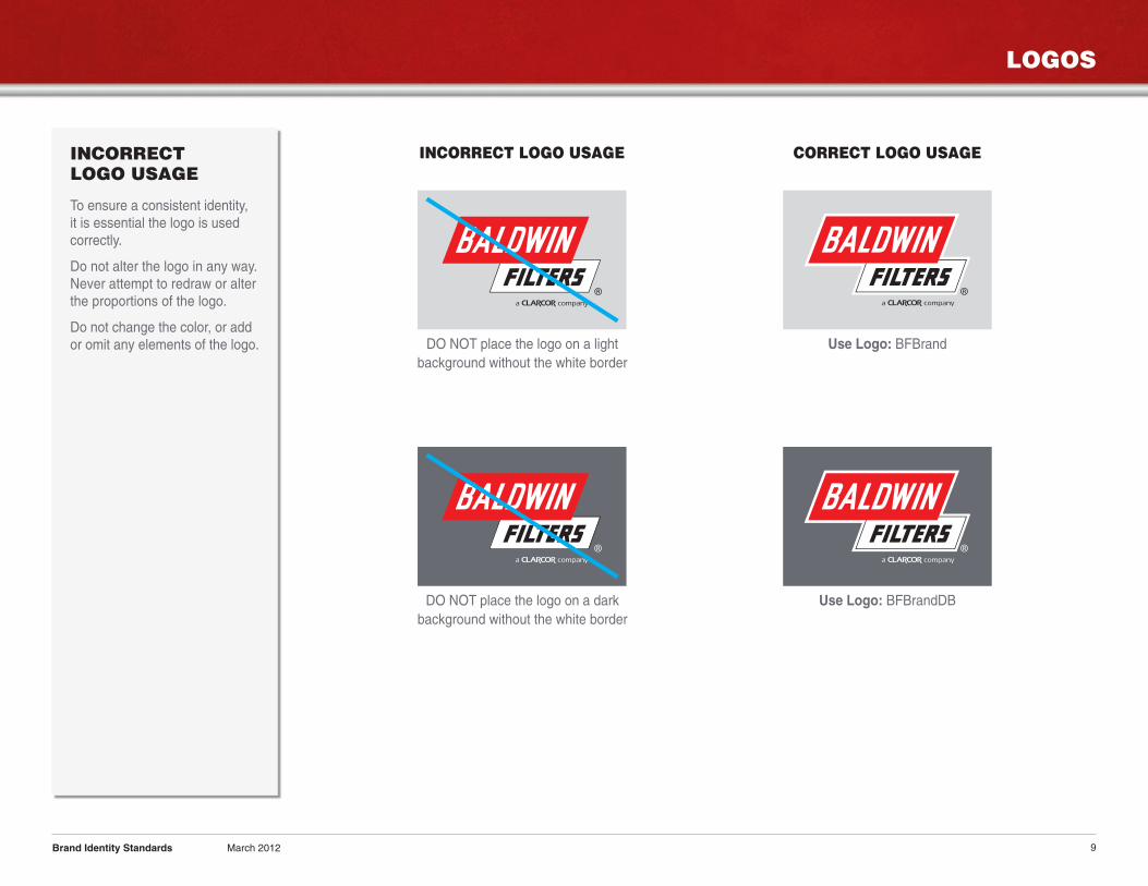
LOGOS
9
INCORRECTLOGO USAGE
To ensure a consistent identity,it is essential the logo is usedcorrectly.
Do not alter the logo in any way.Never attempt to redraw or alterthe proportions of the logo.
Do not change the color, or addor omit any elements of the logo.
Brand Identity Standards March 2012
DO NOT place the logo on a lightbackground without the white border
Use Logo: BFBrand
DO NOT place the logo on a darkbackground without the white border
Use Logo: BFBrandDB
INCORRECT LOGO USAGE CORRECT LOGO USAGE
LOGOS
10
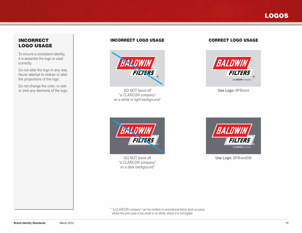
INCORRECTLOGO USAGE
To ensure a consistent identity,it is essential the logo is usedcorrectly.
Do not alter the logo in any way.Never attempt to redraw or alterthe proportions of the logo.
Do not change the color, or addor omit any elements of the logo.
Brand Identity Standards March 2012
INCORRECT LOGO USAGE CORRECT LOGO USAGE
DO NOT leave off“a CLARCOR company”on a dark background*
* “a CLARCOR company” can be omitted on promotional items, such as pens,where the print area is too small or on shirts, where it is not legible.
Use Logo: BFBrandDB
DO NOT leave off“a CLARCOR company”
on a white or light background*
Use Logo: BFBrand
LOGOS
11
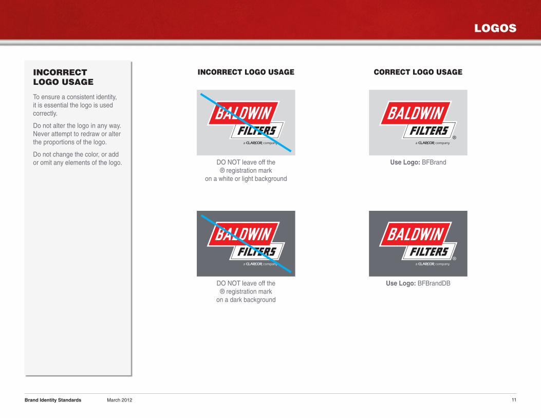
INCORRECTLOGO USAGE
To ensure a consistent identity,it is essential the logo is usedcorrectly.
Do not alter the logo in any way.Never attempt to redraw or alterthe proportions of the logo.
Do not change the color, or addor omit any elements of the logo.
Brand Identity Standards March 2012
INCORRECT LOGO USAGE CORRECT LOGO USAGE
DO NOT leave off the® registration markon a dark background
Use Logo: BFBrandDB
DO NOT leave off the® registration mark
on a white or light background
Use Logo: BFBrand
LOGOS
12
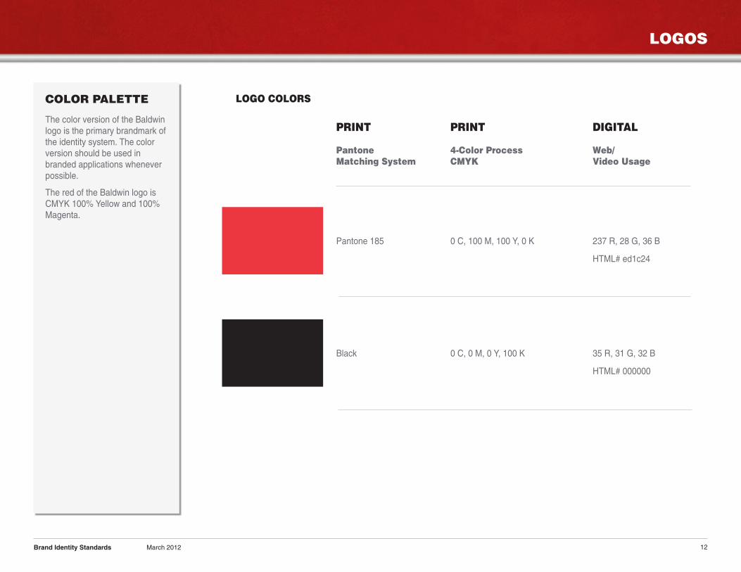
COLOR PALETTE
The color version of the Baldwinlogo is the primary brandmark ofthe identity system. The colorversion should be used inbranded applications wheneverpossible.
The red of the Baldwin logo isCMYK 100% Yellow and 100%Magenta.
Brand Identity Standards March 2012
PRINT PRINT DIGITAL
Pantone 4-Color Process Web/Matching System CMYK Video Usage
Pantone 185 0 C, 100 M, 100 Y, 0 K 237 R, 28 G, 36 B
HTML# ed1c24
Black 0 C, 0 M, 0 Y, 100 K 35 R, 31 G, 32 B
HTML# 000000
LOGO COLORS
LOGOS
13
CLEAR SPACE
A minimum area surrounding thelogo must be kept clear of anyother typography, graphicelements and the trim edge of aprinted piece. More than theminimum clear space isencouraged if applicationsprovide the opportunity.
Minimum clear space on all sidesis equal to height of the word“FILTERS”.
MINIMUM SIZE
A minimum size for reproductionhas been established for the logoto protect the clarity and impact ofthe brand identity and itsappearance.
The height of the logo should beno smaller than 3/8 in. (9.5 mm)in all applications.
The height is measured fromthe top of the “BALDWIN”parallelogram to the bottom ofthe “FILTERS” parallelogram.
Brand Identity Standards March 2012
H = Height of the word “FILTERS”
HH
H
H
H
H H
H
H
H
H = Height of the word “FILTERS”
The height of the minimum sizeis equal to 3/8 in. (9.5 mm).
3/8 in. (9.5 mm)
WITHOUT WHITE BORDER WITH WHITE BORDER
PRINT & ELECTRONIC
14
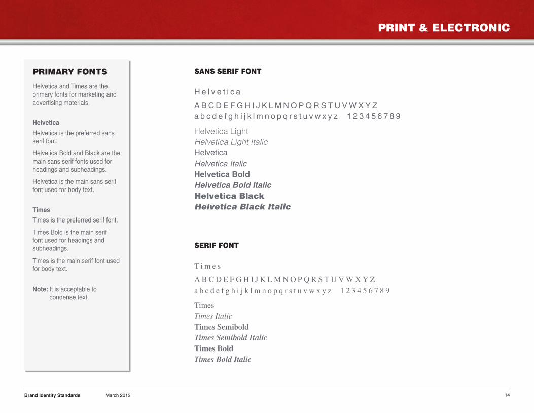
PRIMARY FONTS
Helvetica and Times are theprimary fonts for marketing andadvertising materials.
Helvetica
Helvetica is the preferred sansserif font.
Helvetica Bold and Black are themain sans serif fonts used forheadings and subheadings.
Helvetica is the main sans seriffont used for body text.
Times
Times is the preferred serif font.
Times Bold is the main seriffont used for headings andsubheadings.
Times is the main serif font usedfor body text.
Note: It is acceptable tocondense text.
Brand Identity Standards March 2012
H e l v e t i c a
A BCDE FGH I J K LMNOPQRS TUVWXY Za b c d e f g h i j k l m n o p q r s t u v w x y z 1 2 3 4 5 6 7 8 9
Helvetica Light
Helvetica Light Italic
HelveticaHelvetica ItalicHelvetica BoldHelvetica Bold ItalicHelvetica BlackHelvetica Black Italic
T i m e s
A B CD E F GH I J K LMNO PQR S TUVWXYZa b c d e f g h i j k l m n o p q r s t u v w x y z 1 2 3 4 5 6 7 8 9
TimesTimes ItalicTimes SemiboldTimes Semibold ItalicTimes BoldTimes Bold Italic
SANS SERIF FONT
SERIF FONT
PRINT & ELECTRONIC
15
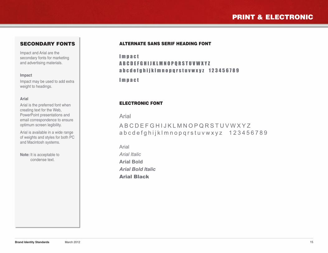
SECONDARY FONTS
Impact and Arial are thesecondary fonts for marketingand advertising materials.
Impact
Impact may be used to add extraweight to headings.
Arial
Arial is the preferred font whencreating text for the Web,PowerPoint presentations andemail correspondence to ensureoptimum screen legibility.
Arial is available in a wide rangeof weights and styles for both PCand Macintosh systems.
Note: It is acceptable tocondense text.
Brand Identity Standards March 2012
I m p a c t
A B C D E F G H I J K L M N O P Q R S T U V W X Y Z
a b c d e f g h i j k l m n o p q r s t u v w x y z 1 2 3 4 5 6 7 8 9
I m p a c t
ALTERNATE SANS SERIF HEADING FONT
Arial
A B C D E F G H I J K L M N O P Q R S T U V W X Y Z
a b c d e f g h i j k l m n o p q r s t u v w x y z 1 2 3 4 5 6 7 8 9
Arial
Arial Italic
Arial Bold
Arial Bold Italic
Arial Black
ELECTRONIC FONT
PRINT & ELECTRONIC
16
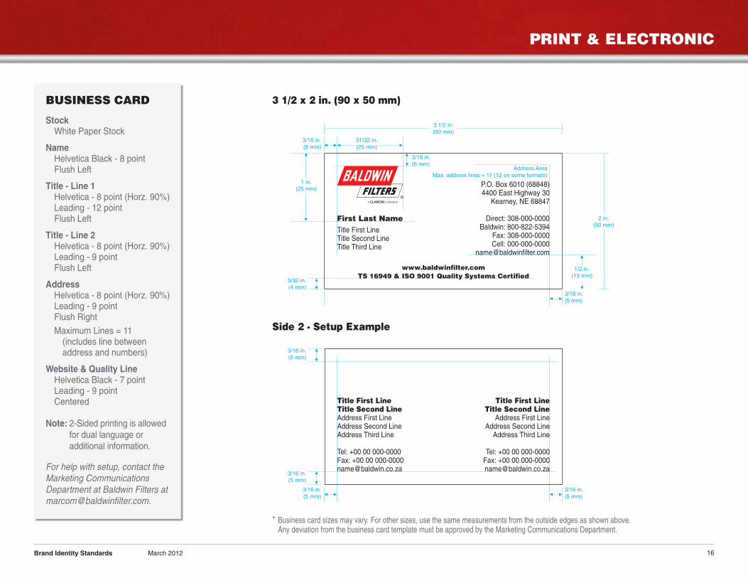
BUSINESS CARD
StockWhite Paper Stock
NameHelvetica Black - 8 pointFlush Left
Title - Line 1Helvetica - 8 point (Horz. 90%)Leading - 12 pointFlush Left
Title - Line 2Helvetica - 8 point (Horz. 90%)Leading - 9 pointFlush Left
AddressHelvetica - 8 point (Horz. 90%)Leading - 9 pointFlush Right
Maximum Lines = 11(includes line betweenaddress and numbers)
Website & Quality LineHelvetica Black - 7 pointLeading - 9 pointCentered
Note: 2-Sided printing is allowedfor dual language oradditional information.
For help with setup, contact theMarketing CommunicationsDepartment at Baldwin Filters [email protected].
Brand Identity Standards March 2012
First Last NameTitle First LineTitle Second LineTitle Third Line
P.O. Box 6010 (68848)4400 East Highway 30
Kearney, NE 68847
Direct: 308-000-0000Baldwin: 800-822-5394
Fax: 308-000-0000Cell: 000-000-0000
www.baldwinfilter.comTS 16949 & ISO 9001 Quality Systems Certified
1/2 in.(13 mm)
3/16 in.(5 mm)
1 in.(25 mm)
3/16 in.(5 mm)
Address AreaMax. address lines = 11 (12 on some formats)
3/16 in.(5 mm)
5/32 in.(4 mm)
31/32 in.(25 mm)
3 1/2 in.(90 mm)
2 in.(50 mm)
3/16 in.(5 mm)
3/16 in.(5 mm)
3/16 in.(5 mm)
3/16 in.(5 mm)
3 1/2 x 2 in. (90 x 50 mm)
Side 2 - Setup Example
* Business card sizes may vary. For other sizes, use the same measurements from the outside edges as shown above.Any deviation from the business card template must be approved by the Marketing Communications Department.
Title First LineTitle Second Line
Address First LineAddress Second LineAddress Third Line
Tel: +00 00 000-0000Fax: +00 00 [email protected]
Title First LineTitle Second LineAddress First LineAddress Second LineAddress Third Line
Tel: +00 00 000-0000Fax: +00 00 [email protected]
PRINT & ELECTRONIC
17
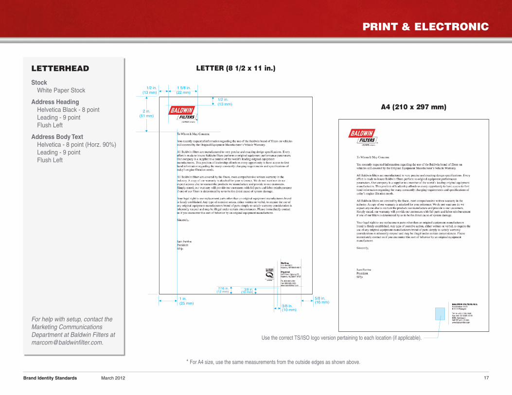
LETTERHEAD
StockWhite Paper Stock
Address HeadingHelvetica Black - 8 pointLeading - 9 pointFlush Left
Address Body TextHelvetica - 8 point (Horz. 90%)Leading - 9 pointFlush Left
For help with setup, contact theMarketing CommunicationsDepartment at Baldwin Filters [email protected].
Brand Identity Standards March 2012
A4 (210 x 297 mm)2 in.
(51 mm)
1/2 in.(13 mm)
1/2 in.(13 mm)
3/8 in.(10 mm)
1 in.(25 mm)
1 5/8 in.(22 mm)
7/16 in.(12 mm)
5/8 in.(16 mm)
3/8 in.(10 mm)
* For A4 size, use the same measurements from the outside edges as shown above.
Use the correct TS/ISO logo version pertaining to each location (if applicable).
LETTER (8 1/2 x 11 in.)
PRINT & ELECTRONIC
18
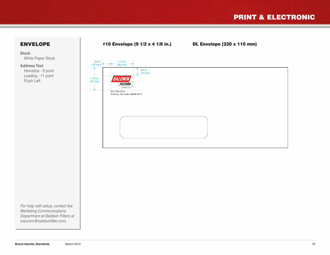
ENVELOPE
StockWhite Paper Stock
Address TextHelvetica - 9 pointLeading - 11 pointFlush Left
For help with setup, contact theMarketing CommunicationsDepartment at Baldwin Filters [email protected].
Brand Identity Standards March 2012
#10 Envelope (9 1/2 x 4 1/8 in.) DL Envelope (220 x 110 mm)
1 1/4 in.(32 mm)
3/8 in.(10 mm)
3/8 in.(10 mm)
1 1/4 in.(32 mm)
PROMOTIONAL ITEMS
19
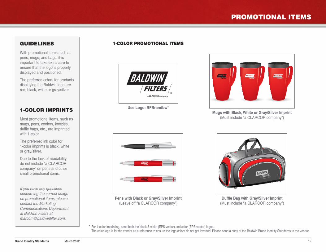
GUIDELINES
With promotional items such aspens, mugs, and bags, it isimportant to take extra care toensure that the logo is properlydisplayed and positioned.
The preferred colors for productsdisplaying the Baldwin logo arered, black, white or gray/silver.
1-COLOR IMPRINTS
Most promotional items, such asmugs, pens, coolers, koozies,duffle bags, etc., are imprintedwith 1-color.
The preferred ink color for1-color imprints is black, whiteor gray/silver.
Due to the lack of readability,do not include “a CLARCORcompany” on pens and othersmall promotional items.
If you have any questionsconcerning the correct usageon promotional items, pleasecontact the MarketingCommunications Departmentat Baldwin Filters [email protected].
Brand Identity Standards March 2012
Mugs with Black, White or Gray/Silver Imprint(Must include “a CLARCOR company”)
Duffle Bag with Gray/Silver Imprint(Must include “a CLARCOR company”)
Pens with Black or Gray/Silver Imprint(Leave off “a CLARCOR company”)
Use Logo: BFBrandbw*
1-COLOR PROMOTIONAL ITEMS
* For 1-color imprinting, send both the black & white (EPS vector) and color (EPS vector) logos.The color logo is for the vendor as a reference to ensure the logo colors do not get inverted. Please send a copy of the Baldwin Brand Identity Standards to the vendor.
PROMOTIONAL ITEMS
20
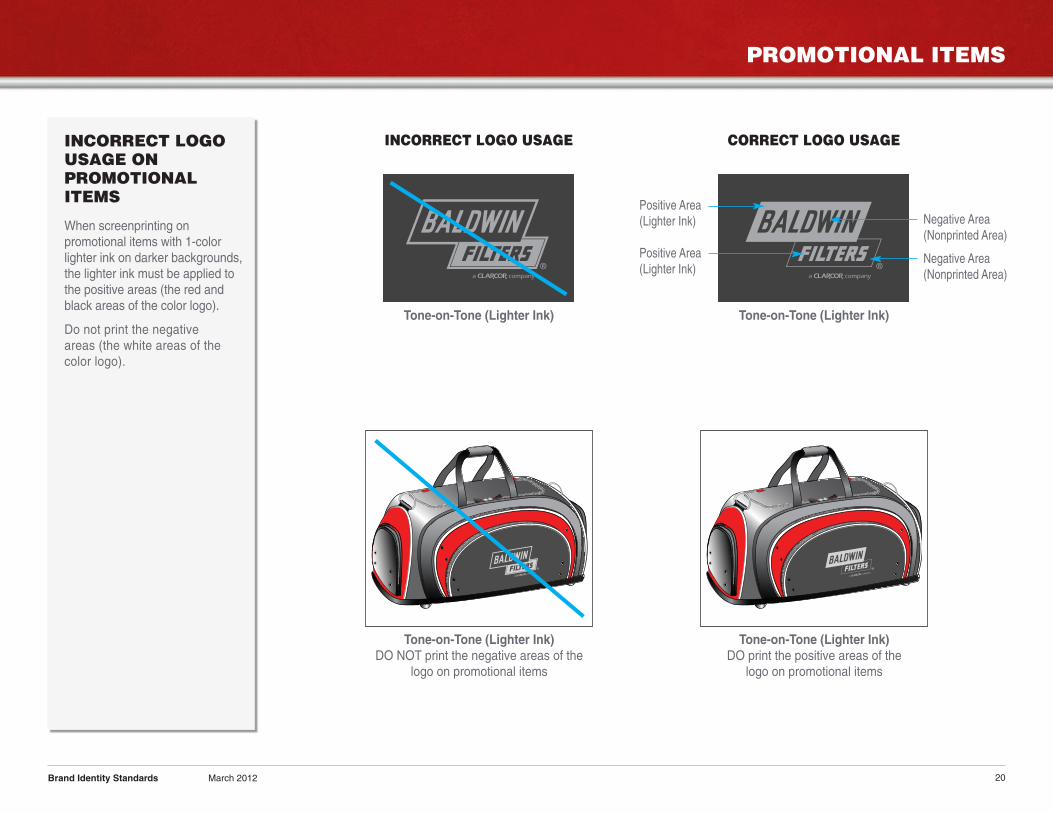
INCORRECT LOGOUSAGE ONPROMOTIONALITEMS
When screenprinting onpromotional items with 1-colorlighter ink on darker backgrounds,the lighter ink must be applied tothe positive areas (the red andblack areas of the color logo).
Do not print the negativeareas (the white areas of thecolor logo).
Brand Identity Standards March 2012
INCORRECT LOGO USAGE CORRECT LOGO USAGE
Tone-on-Tone (Lighter Ink) Tone-on-Tone (Lighter Ink)
Tone-on-Tone (Lighter Ink)DO print the positive areas of the
logo on promotional items
Tone-on-Tone (Lighter Ink)DO NOT print the negative areas of the
logo on promotional items
Positive Area(Lighter Ink)
Positive Area(Lighter Ink)
Negative Area(Nonprinted Area)
Negative Area(Nonprinted Area)
APPAREL ITEMS
21
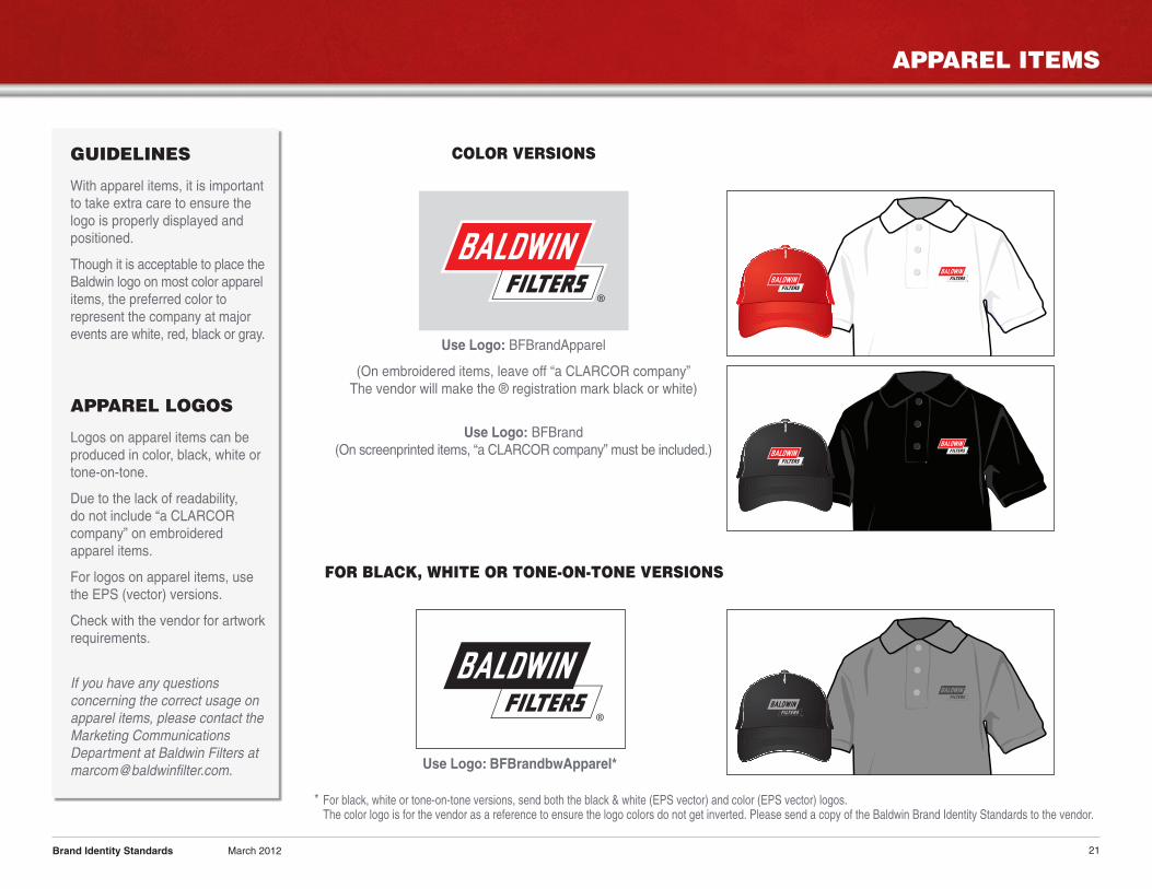
GUIDELINES
With apparel items, it is importantto take extra care to ensure thelogo is properly displayed andpositioned.
Though it is acceptable to place theBaldwin logo on most color apparelitems, the preferred color torepresent the company at majorevents are white, red, black or gray.
APPAREL LOGOS
Logos on apparel items can beproduced in color, black, white ortone-on-tone.
Due to the lack of readability,do not include “a CLARCORcompany” on embroideredapparel items.
For logos on apparel items, usethe EPS (vector) versions.
Check with the vendor for artworkrequirements.
If you have any questionsconcerning the correct usage onapparel items, please contact theMarketing CommunicationsDepartment at Baldwin Filters [email protected].
Brand Identity Standards March 2012
Use Logo: BFBrandApparel
(On embroidered items, leave off “a CLARCOR company”The vendor will make the ® registration mark black or white)
Use Logo: BFBrand(On screenprinted items, “a CLARCOR company” must be included.)
FOR BLACK, WHITE OR TONE-ON-TONE VERSIONS
Use Logo: BFBrandbwApparel*
COLOR VERSIONS
* For black, white or tone-on-tone versions, send both the black & white (EPS vector) and color (EPS vector) logos.The color logo is for the vendor as a reference to ensure the logo colors do not get inverted. Please send a copy of the Baldwin Brand Identity Standards to the vendor.
APPAREL ITEMS
22
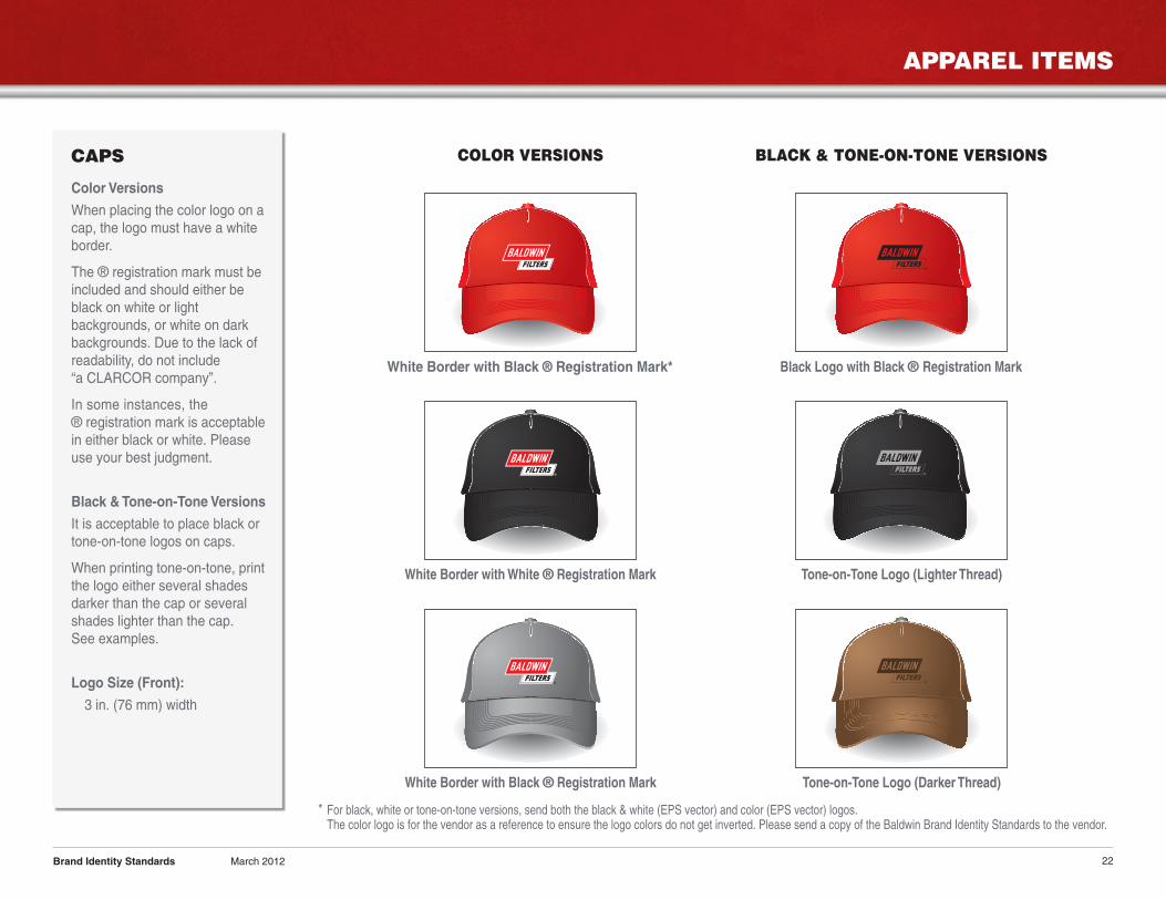
CAPS
Color Versions
When placing the color logo on acap, the logo must have a whiteborder.
The ® registration mark must beincluded and should either beblack on white or lightbackgrounds, or white on darkbackgrounds. Due to the lack ofreadability, do not include“a CLARCOR company”.
In some instances, the® registration mark is acceptablein either black or white. Pleaseuse your best judgment.
Black & Tone-on-Tone Versions
It is acceptable to place black ortone-on-tone logos on caps.
When printing tone-on-tone, printthe logo either several shadesdarker than the cap or severalshades lighter than the cap.See examples.
Logo Size (Front):
3 in. (76 mm) width
Brand Identity Standards March 2012
COLOR VERSIONS BLACK & TONE-ON-TONE VERSIONS
White Border with Black ® Registration Mark*
White Border with White ® Registration Mark
White Border with Black ® Registration Mark
Black Logo with Black ® Registration Mark
Tone-on-Tone Logo (Lighter Thread)
Tone-on-Tone Logo (Darker Thread)
* For black, white or tone-on-tone versions, send both the black & white (EPS vector) and color (EPS vector) logos.The color logo is for the vendor as a reference to ensure the logo colors do not get inverted. Please send a copy of the Baldwin Brand Identity Standards to the vendor.
APPAREL ITEMS
23
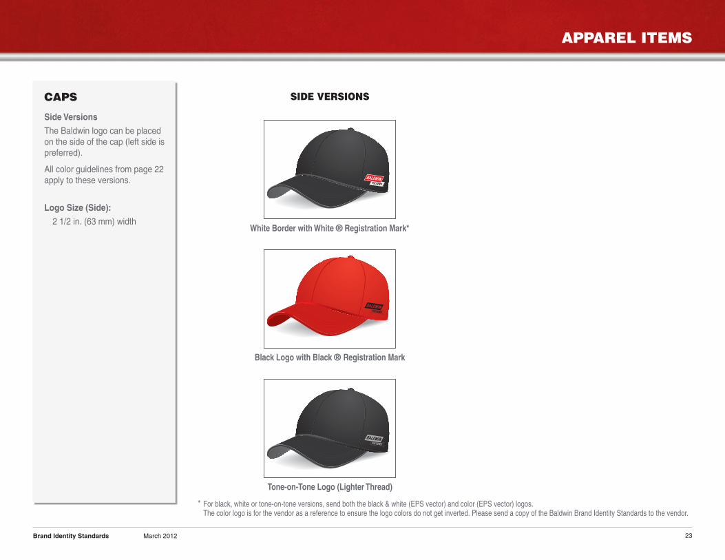
CAPS
Side Versions
The Baldwin logo can be placedon the side of the cap (left side ispreferred).
All color guidelines from page 22apply to these versions.
Logo Size (Side):
2 1/2 in. (63 mm) width
Brand Identity Standards March 2012
SIDE VERSIONS
White Border with White ® Registration Mark*
Black Logo with Black ® Registration Mark
Tone-on-Tone Logo (Lighter Thread)
* For black, white or tone-on-tone versions, send both the black & white (EPS vector) and color (EPS vector) logos.The color logo is for the vendor as a reference to ensure the logo colors do not get inverted. Please send a copy of the Baldwin Brand Identity Standards to the vendor.

APPAREL ITEMS
24
CAPS
It is important to note, whenprinting black or tone-on-toneversions, cap vendors stitch theword “BALDWIN”, but may ormay not stitch the background ofthe bottom parallelogram aroundthe word “FILTERS” due to spaceand readability; therefore, it isimportant to try and match Color2 as closely as possible to thecap color.
Brand Identity Standards March 2012
TONE-ON-TONE (LIGHTER THREAD) TONE-ON-TONE (DARKER THREAD)
Color 1Color 2
Color 1 (Positive Area) = Darker Thread
Color 1 should be several shades darker thanthe cap to create a good contrast.
Use Color 1 for the Positive Areas:The parallelogram behind “BALDWIN”The word “FILTERS”The parallelogram outline around “FILTERS”The ® Registration Mark
Color 2 (Negative Area) = Lighter Thread
Color 2 should match the color of the cap asclose as possible.
Use Color 2 for the Negative Areas:The word “BALDWIN”The inside of the parallelogram around“FILTERS” (optional)
Backgroundbehind “FILTERS”may or may nothave stitching.If no stitching, thenthe hat color willshow through.
Color 1Color 2
Color 1 (Positive Area) = Lighter Thread
Color 1 should be several shades lighter thanthe cap to create a good contrast.
Use Color 1 for the Positive Areas:The parallelogram behind “BALDWIN”The word “FILTERS”The parallelogram outline around “FILTERS”The ® Registration Mark
Color 2 (Negative Area) = Darker Thread
Color 2 should match the color of the cap asclose as possible.
Use Color 2 for the Negative Areas:The word “BALDWIN”The inside of the parallelogram around“FILTERS” (optional)
Backgroundbehind “FILTERS”may or may nothave stitching.If no stitching, thenthe hat color willshow through.
APPAREL ITEMS
25
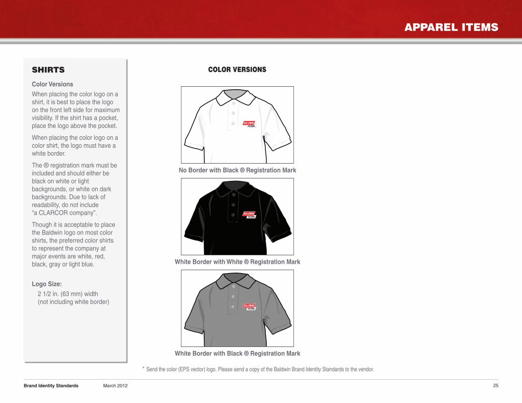
SHIRTS
Color Versions
When placing the color logo on ashirt, it is best to place the logoon the front left side for maximumvisibility. If the shirt has a pocket,place the logo above the pocket.
When placing the color logo on acolor shirt, the logo must have awhite border.
The ® registration mark must beincluded and should either beblack on white or lightbackgrounds, or white on darkbackgrounds. Due to lack ofreadability, do not include“a CLARCOR company”.
Though it is acceptable to placethe Baldwin logo on most colorshirts, the preferred color shirtsto represent the company atmajor events are white, red,black, gray or light blue.
Logo Size:
2 1/2 in. (63 mm) width(not including white border)
Brand Identity Standards March 2012
COLOR VERSIONS
No Border with Black ® Registration Mark
White Border with Black ® Registration Mark
White Border with White ® Registration Mark
* Send the color (EPS vector) logo. Please send a copy of the Baldwin Brand Identity Standards to the vendor.
APPAREL ITEMS
26
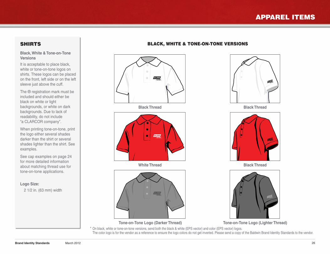
SHIRTS
Black, White & Tone-on-ToneVersions
It is acceptable to place black,white or tone-on-tone logos onshirts. These logos can be placedon the front, left side or on the leftsleeve just above the cuff.
The ® registration mark must beincluded and should either beblack on white or lightbackgrounds, or white on darkbackgrounds. Due to lack ofreadability, do not include“a CLARCOR company”.
When printing tone-on-tone, printthe logo either several shadesdarker than the shirt or severalshades lighter than the shirt. Seeexamples.
See cap examples on page 24for more detailed informationabout matching thread use fortone-on-tone applications.
Logo Size:
2 1/2 in. (63 mm) width
Brand Identity Standards March 2012
BLACK, WHITE & TONE-ON-TONE VERSIONS
Black Thread Black Thread
White Thread Black Thread
Tone-on-Tone Logo (Darker Thread) Tone-on-Tone Logo (Lighter Thread)* On black, white or tone-on-tone versions, send both the black & white (EPS vector) and color (EPS vector) logos.The color logo is for the vendor as a reference to ensure the logo colors do not get inverted. Please send a copy of the Baldwin Brand Identity Standards to the vendor.
APPAREL ITEMS
27
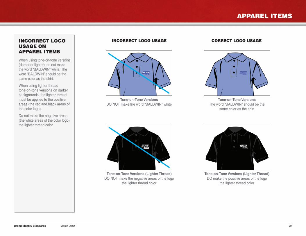
INCORRECT LOGOUSAGE ONAPPAREL ITEMS
When using tone-on-tone versions(darker or lighter), do not makethe word “BALDWIN” white. Theword “BALDWIN” should be thesame color as the shirt.
When using lighter threadtone-on-tone versions on darkerbackgrounds, the lighter threadmust be applied to the positiveareas (the red and black areas ofthe color logo).
Do not make the negative areas(the white areas of the color logo)the lighter thread color.
Brand Identity Standards March 2012
Tone-on-Tone VersionsDO NOT make the word “BALDWIN” white
Tone-on-Tone Versions (Lighter Thread)DO NOT make the negative areas of the logo
the lighter thread color
Tone-on-Tone VersionsThe word “BALDWIN” should be the
same color as the shirt
Tone-on-Tone Versions (Lighter Thread)DO make the positive areas of the logo
the lighter thread color
INCORRECT LOGO USAGE CORRECT LOGO USAGE

CONTACT INFORMATION
28
UPDATES
Periodically check our website atwww.baldwinfilter.com/resourcesimagebank.html toensure you have the latest PDFversion of our Brand IdentityStandards, as well as our mostcurrent logos.
If the logo or format you arelooking for is not on our website,please contact the MarketingCommunications Departmentat Baldwin Filters [email protected].
Brand Identity Standards March 2012
Thank you for taking the time to review our brand identity standards. If you have any questions orneed additional assistance, please contact the Marketing Communications Department atBaldwin Filters.
4400 East Highway 30P.O. Box 6010Kearney, NE 68848-6010
Ph: 308-234-1951Toll Free: 800-822-5394Fax: 308-233-9424Email: [email protected]
www.baldwinfilter.com
MARKETING COMMUNICATIONS DEPARTMENT
Form 30 Brand Identity Standards March 2012 © 2012 Baldwin Filters, Inc.