Brand Manual - WordPress.com · The Brand & Vision 2 Visual Identity Colours ... This four week...
48
NATURAL PUPPINESS Brand Manual
Transcript of Brand Manual - WordPress.com · The Brand & Vision 2 Visual Identity Colours ... This four week...

NATURALPUPPINESS
Brand Manual
NATURALPUPPINESS
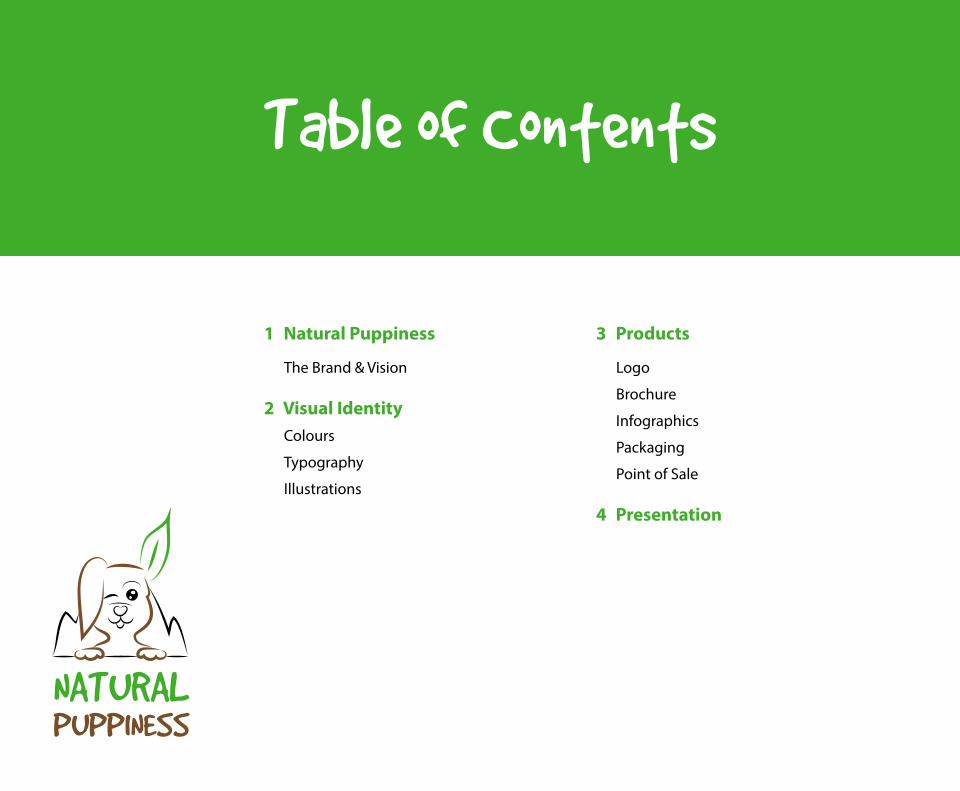
1 Natural Puppiness
The Brand & Vision
2 Visual IdentityColours
Typography
Illustrations
3 Products
Logo
Brochure
Infographics
Packaging
Point of Sale
4 Presentation
Table of Contents
3 Natural Puppiness
NATURALPUPPINESS
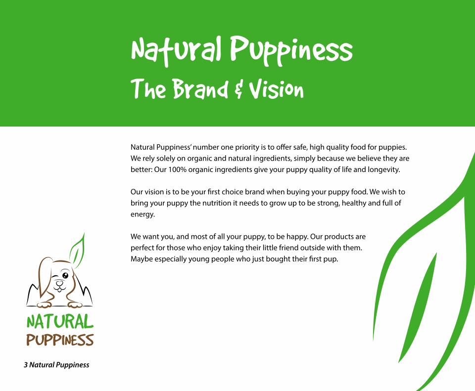
Natural PuppinessThe Brand & Vision
Natural Puppiness’ number one priority is to offer safe, high quality food for puppies. We rely solely on organic and natural ingredients, simply because we believe they are better: Our 100% organic ingredients give your puppy quality of life and longevity.
Our vision is to be your first choice brand when buying your puppy food. We wish to bring your puppy the nutrition it needs to grow up to be strong, healthy and full of energy.
We want you, and most of all your puppy, to be happy. Our products are perfect for those who enjoy taking their little friend outside with them. Maybe especially young people who just bought their first pup.

4 Natural Puppiness
NATURALPUPPINESS
Visual IdentityColours
Natural Puppiness’ earth colours reflect the love for nature and quality time outdoors. We use the colours green and brown, and also integrate black and white.
Pantone 463 CCMYK: C 35% M 61%
Y 83% K 44%RGB: R 109 G 78 B 46
Web #6D4E2EPantone 361 C
CMYK: C 73% M 0%
Y 100% K 0%
RGB: R 109 G 172 B 58
Web #6DAC3A
Pantone 3435 CCMYK: C 88% M 44%
Y 77% K 52%RGB: R 45 G 72 B 55Web #2D4837
5 Natural Puppiness
NATURALPUPPINESS
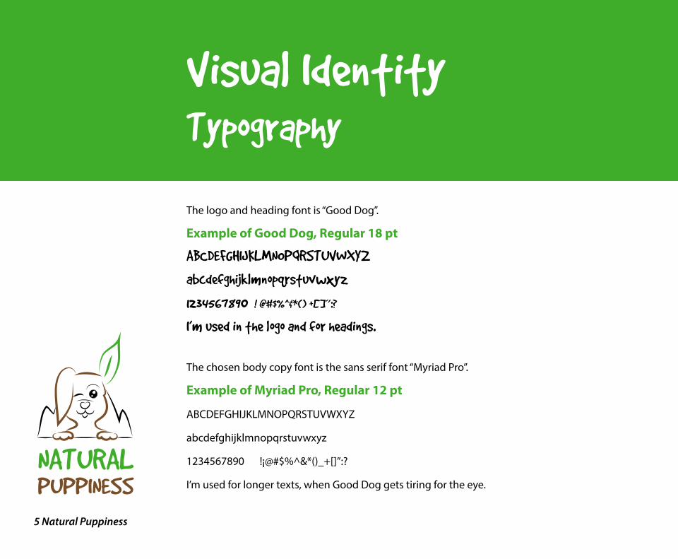
The logo and heading font is “Good Dog”.
Example of Good Dog, Regular 18 pt
ABCDEFGHIJKLMNOPQRSTUVWXYZ
abcdefghijklmnopqrstuvwxyz
1234567890 !¡@#$%^&*()_+[]”:?
I’m used in the logo and for headings.
The chosen body copy font is the sans serif font “Myriad Pro”.
Example of Myriad Pro, Regular 12 pt
ABCDEFGHIJKLMNOPQRSTUVWXYZ
abcdefghijklmnopqrstuvwxyz
1234567890 !¡@#$%^&*()_+[]”:?
I’m used for longer texts, when Good Dog gets tiring for the eye.
Visual IdentityTypography
6 Natural Puppiness
NATURALPUPPINESS
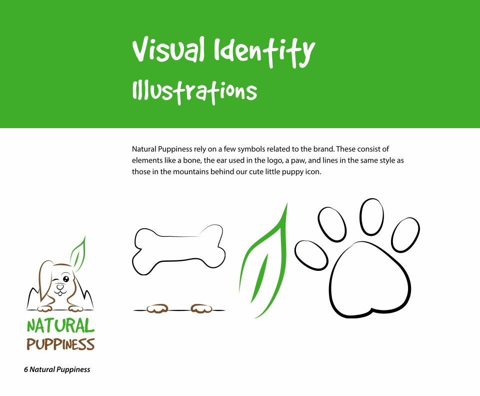
Natural Puppiness rely on a few symbols related to the brand. These consist of elements like a bone, the ear used in the logo, a paw, and lines in the same style as those in the mountains behind our cute little puppy icon.
Visual IdentityIllustrations

7 Natural Puppiness
NATURALPUPPINESS
ProductsLogo
The Natural Puppiness logo identifies Natural Puppiness: Dog Food Product. It should be reproduced according to the guidelines provided.
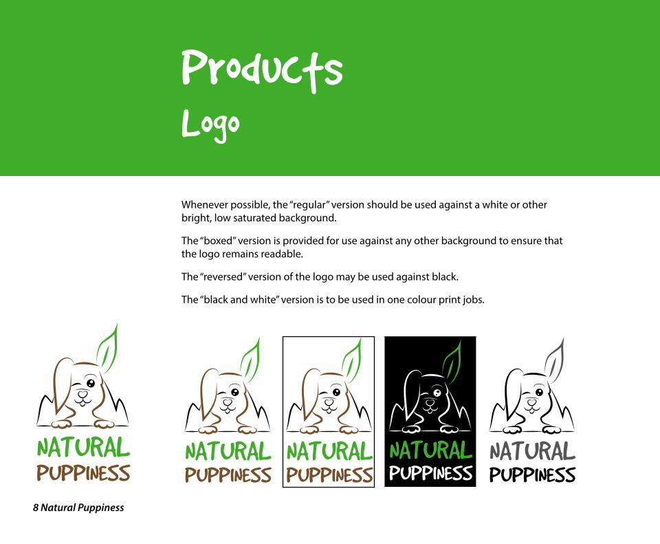
The Natural Puppiness logo consists of two partsThe icon part – a happy puppy in front of a mountain
The type part - “NATURAL PUPPINESS”
There are four approved versions of the logoRegular
Boxed
Reversed
Black and White
8 Natural Puppiness
NATURALPUPPINESS
ProductsLogo
Whenever possible, the “regular” version should be used against a white or other bright, low saturated background.
The “boxed” version is provided for use against any other background to ensure that the logo remains readable.
The “reversed” version of the logo may be used against black.
The “black and white” version is to be used in one colour print jobs.
NATURALPUPPINESS
NATURALPUPPINESS
NATURALPUPPINESSNATURALPUPPINESS
NATURALPUPPINESS
9 Natural Puppiness
NATURALPUPPINESS
ProductsSecondary Logo
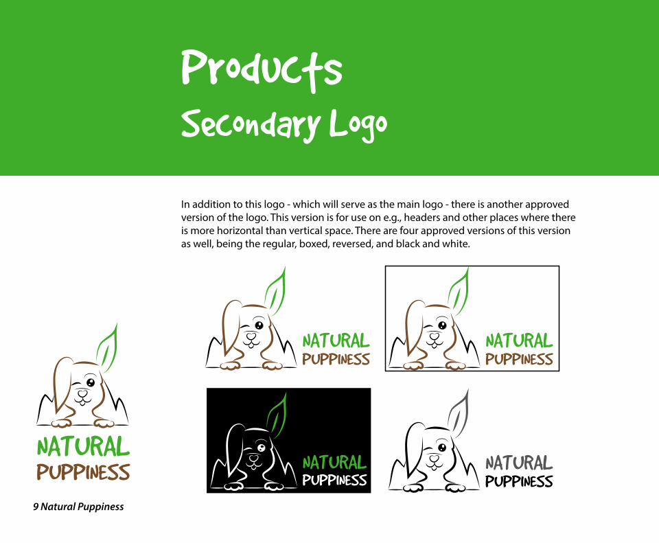
In addition to this logo - which will serve as the main logo - there is another approved version of the logo. This version is for use on e.g., headers and other places where there is more horizontal than vertical space. There are four approved versions of this version as well, being the regular, boxed, reversed, and black and white.
NATURALPUPPINESS
NATURALPUPPINESS
NATURALPUPPINESS
NATURALPUPPINESS
10 Natural Puppiness
NATURALPUPPINESS
ProductsLogo Do’s
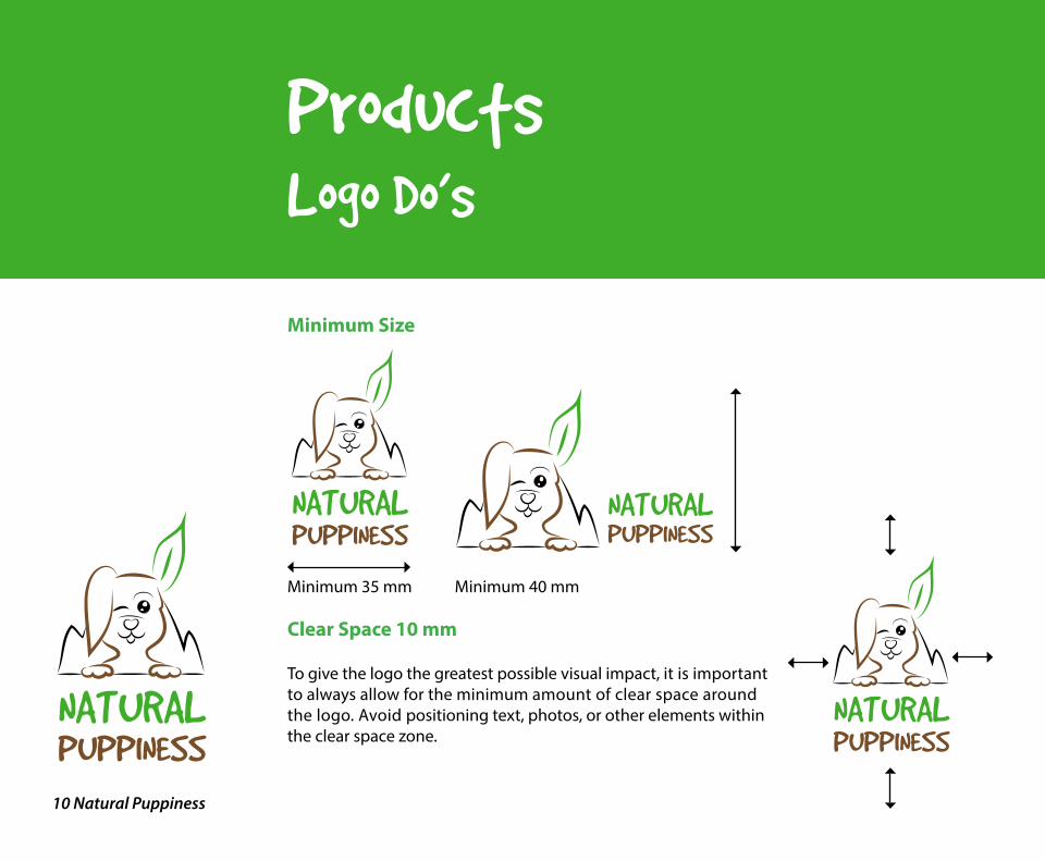
Minimum Size
Minimum 35 mm Minimum 40 mm
Clear Space 10 mm
To give the logo the greatest possible visual impact, it is important to always allow for the minimum amount of clear space around the logo. Avoid positioning text, photos, or other elements within the clear space zone.
NATURALPUPPINESS
NATURALPUPPINESS
NATURALPUPPINESS

11 Natural Puppiness
NATURALPUPPINESS
ProductsLogo Don’ts
Distorted
Too Small
Against High Saturated Colour Background (unless in Boxed Version)
NATURALPUPPINESS
NATURALPUPPINESS
NATURALPUPPINESS
12 Natural Puppiness
NATURALPUPPINESS
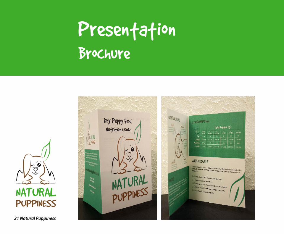
ProductsBrochure
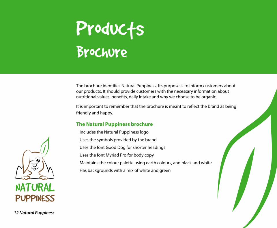
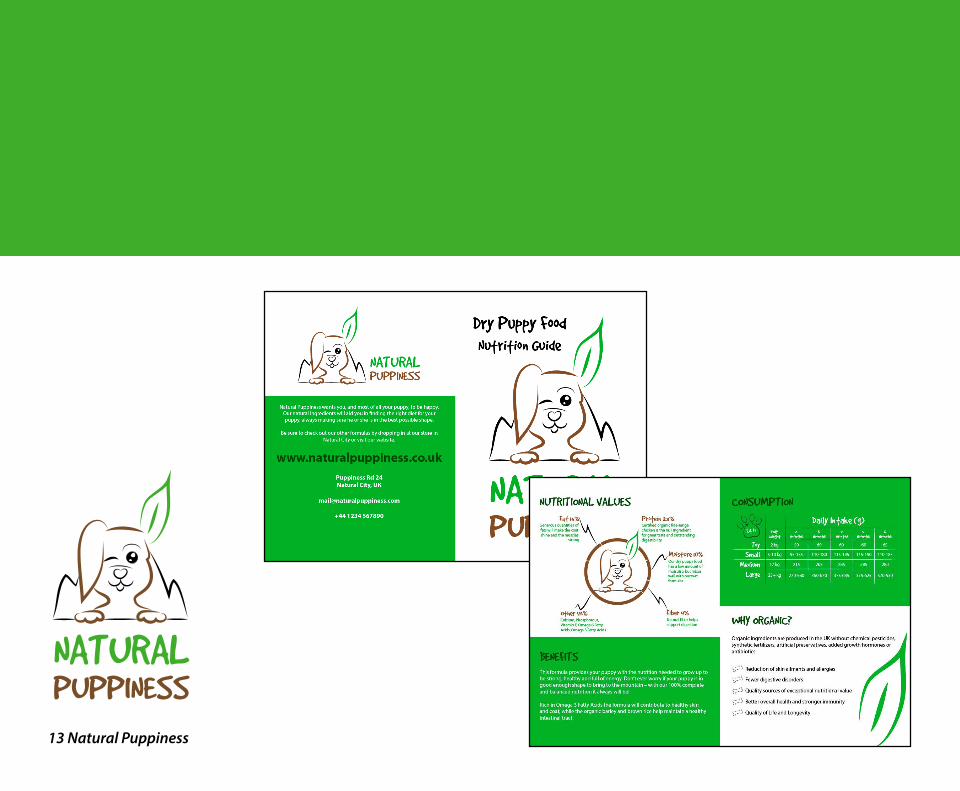
The brochure identifies Natural Puppiness. Its purpose is to inform customers about our products. It should provide customers with the necessary information about nutritional values, benefits, daily intake and why we choose to be organic.
It is important to remember that the brochure is meant to reflect the brand as being friendly and happy.
The Natural Puppiness brochureIncludes the Natural Puppiness logo
Uses the symbols provided by the brand
Uses the font Good Dog for shorter headings
Uses the font Myriad Pro for body copy
Maintains the colour palette using earth colours, and black and white
Has backgrounds with a mix of white and green
13 Natural Puppiness
NATURALPUPPINESS
14 Natural Puppiness
NATURALPUPPINESS
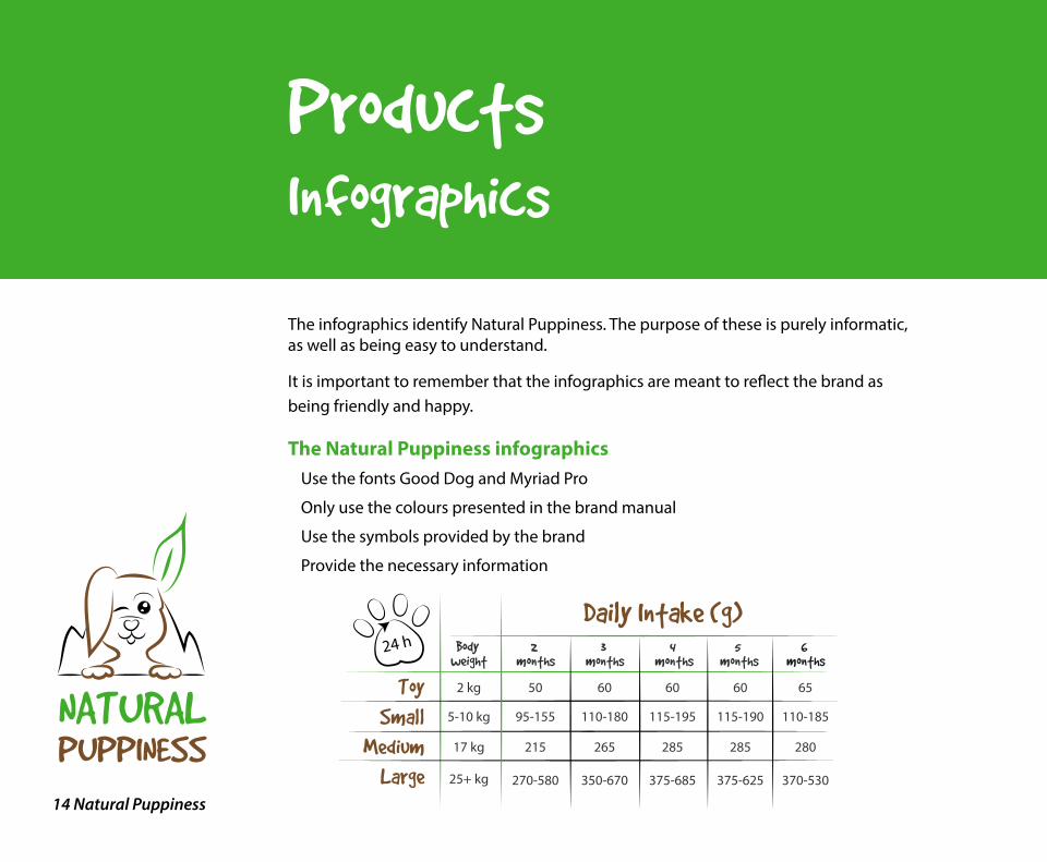
ProductsInfographics
The infographics identify Natural Puppiness. The purpose of these is purely informatic, as well as being easy to understand.
It is important to remember that the infographics are meant to reflect the brand as being friendly and happy.
The Natural Puppiness infographicsUse the fonts Good Dog and Myriad Pro
Only use the colours presented in the brand manual
Use the symbols provided by the brand
Provide the necessary information
Daily Intake (g)
Toy
Small
Medium
Large
Body weight
2 months
3 months
4 months
5 months
6 months
5-10 kg
17 kg
2 kg
25+ kg
50 60 60 60 65
95-155 110-180 115-195 115-190 110-185
215 265 285 285 280
270-580 350-670 375-685 375-625 370-530
24 h
15 Natural Puppiness
NATURALPUPPINESS
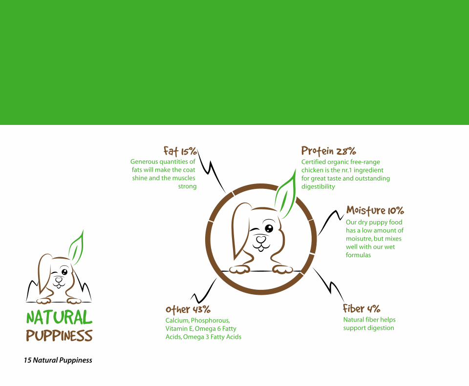
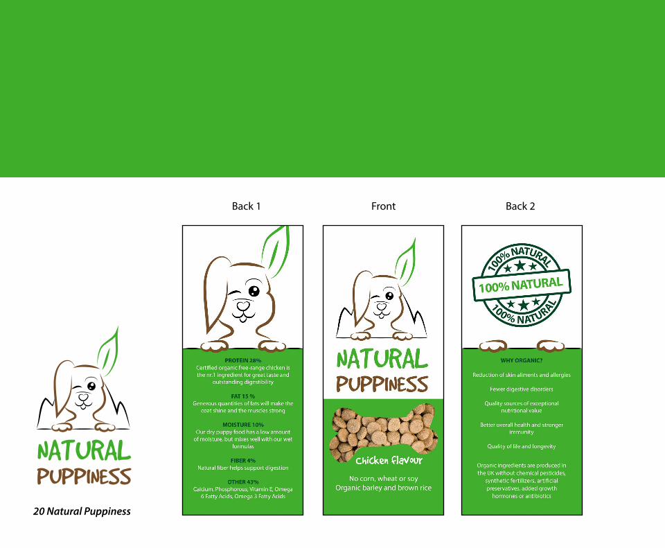
Natural fiber helps support digestion
Our dry puppy foodhas a low amount ofmoisutre, but mixeswell with our wetformulas
Generous quantities of fats will make the coat shine and the muscles
strong
Fat 15%
Moisture 10%
Certified organic free-range chicken is the nr.1 ingredient for great taste and outstanding digestibility
Calcium, Phosphorous, Vitamin E, Omega 6 Fatty Acids, Omega 3 Fatty Acids
Protein 28%
Fiber 4%Other 43%

16 Natural Puppiness
NATURALPUPPINESS
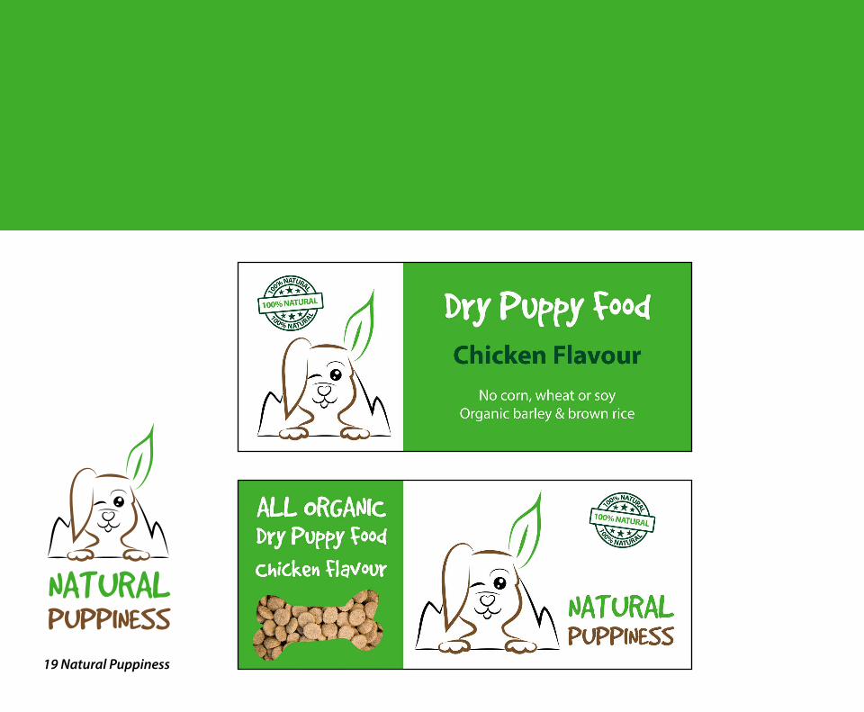
ProductsPackaging
The packaging identifies Natural Puppiness. Its purposes are to hold the content (pellets), protect the pellets, be convenient for transportation and for customers to use, provide our customers with the necessary information, and have an appealing look.
It is important to remember that the packaging is meant to reflect the brand as being friendly and happy.
The Natural Puppiness packagingUses the fonts Good Dog and Myriad Pro
Only uses the colours presented in the brand manual
Uses the symbols provided by the brand
Provides the necessary information
Has a zip lock function to make it easy to store

17 Natural Puppiness
NATURALPUPPINESS
FrontLeft side Right side Back
NATURALPUPPINESS
Dry Puppy Food
5 kg
Chicken flavour - No corn, wheat or soy - Organic barley and brown rice
NATURALPUPPINESS
NATURALPUPPINESS
NATURALPUPPINESS
100% NATURAL
10
0% NATURAL
100% NATURAL
5 kg
Chicken flavour
No corn, wheat or soyOrganic barley and brown rice
IngredientsOrganic Chicken, Poultry Meal, Organic Barley, Poultry Fat (Preserved with Mixed Tocopherols and Citric Acid), Organic Brown Rice, Organic Millet, Organic Flaxseed, Natural Chicken Flavor, Minerals (Zinc Proteinate, Iron Proteinate, Calcium Iodate, Sodium Selenite), Dried Egg Product, Organic Apples, Organic Carrots, Salt, Dicalcium Phosphate, Choline Chloride, Potassium Chloride, Vitamins (Vitamin E Supplement, L-Ascorbyl-2-Polyphosphate, Calcium Pantothenate), Yeast Culture (Saccharomyces Cerevisiae), Dried Enterococcus Faecium Fermentation Product, Rosemary Extract.
Daily Intake (g)
Toy
Small
Medium
Large
Body weight
2 months
3 months
4 months
5 months
6 months
5-10 kg
17 kg
2 kg
25+ kg
50 60 60 60 65
95-155 110-180 115-195 115-190 110-185
215 265 285 285 280
270-580 350-670 375-685 375-625 370-530
24 h
Natural Puppiness provide your puppy with the nutrition needed to grow up to be strong, healthy and full of energy.
Rich in Omega 3 Fatty Acids the formula will contribute to healthy skin and coat, while the organic barley and brown rice help maintain a healthy intestinal tract.
Organic ingredients are produced in the UK without chemical pesticides, synthetic fertilizers, arti�cial preservatives, added growth hormones or antibiotics.
Fat 15%Generous quantities of fats will make the coat shine and the
muscles strong
Protein 28%Certi�ed organic
free-range chicken is the nr.1 ingredient for
great taste and outstanding digestibility
Moisture 10%Our dry puppy food
food has a low amount of moisture, but mixes well with
our wet formulas
Fiber 4%Natural �ber helps support digestion
Other 43%Calcium, Phosphorus, Vitamin E, Omega 6
Fatty Acids, Omega 3 Fatty Acids
www.naturalpuppiness.co.uk
Puppiness Rd 24, Natural City, [email protected]+44 1234 567890
Why organic?
Reduction of skin alinments and allergiesFewer digestive disordersQuality sources of exceptional nutritional valueBetter overall health and stronger immunityQuality of life and longevity
Caloric Content3,488 kcal/kg, 384 kcal/cup
Made in United Kingdom
CERTIFIED ORGANIC BYNoro� Natural,University 5, UKwww.noro�natural.org
Best before: See bottom of packaging
BEST BEFORE: 12 2017 R062A 137 CK
18 Natural Puppiness
NATURALPUPPINESS
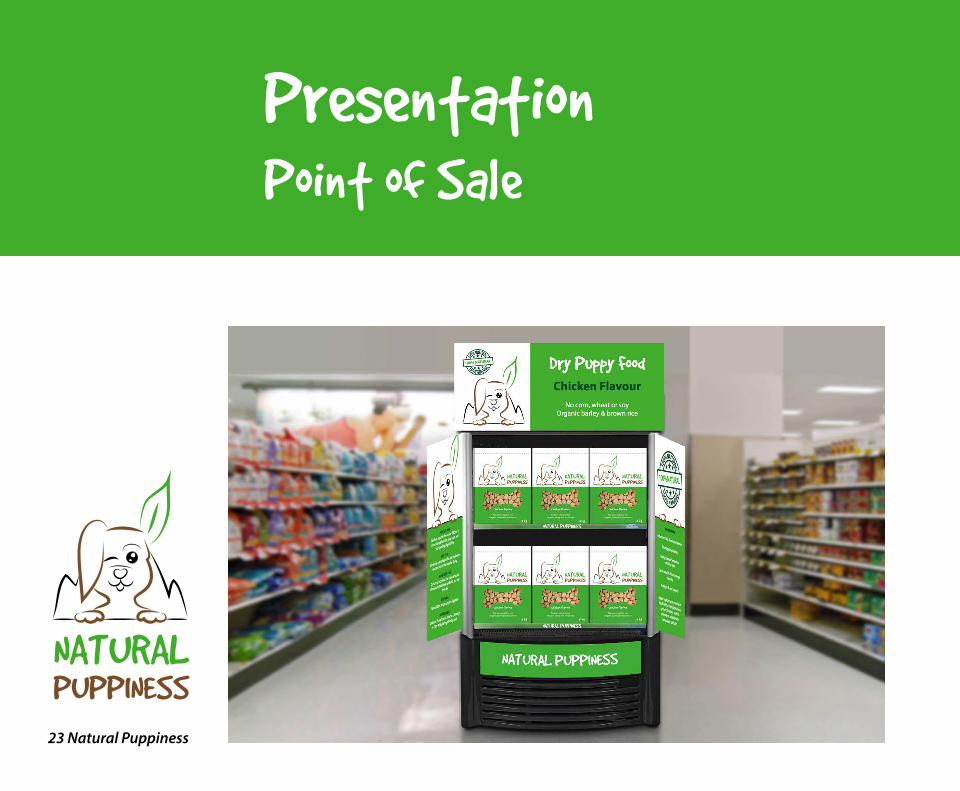
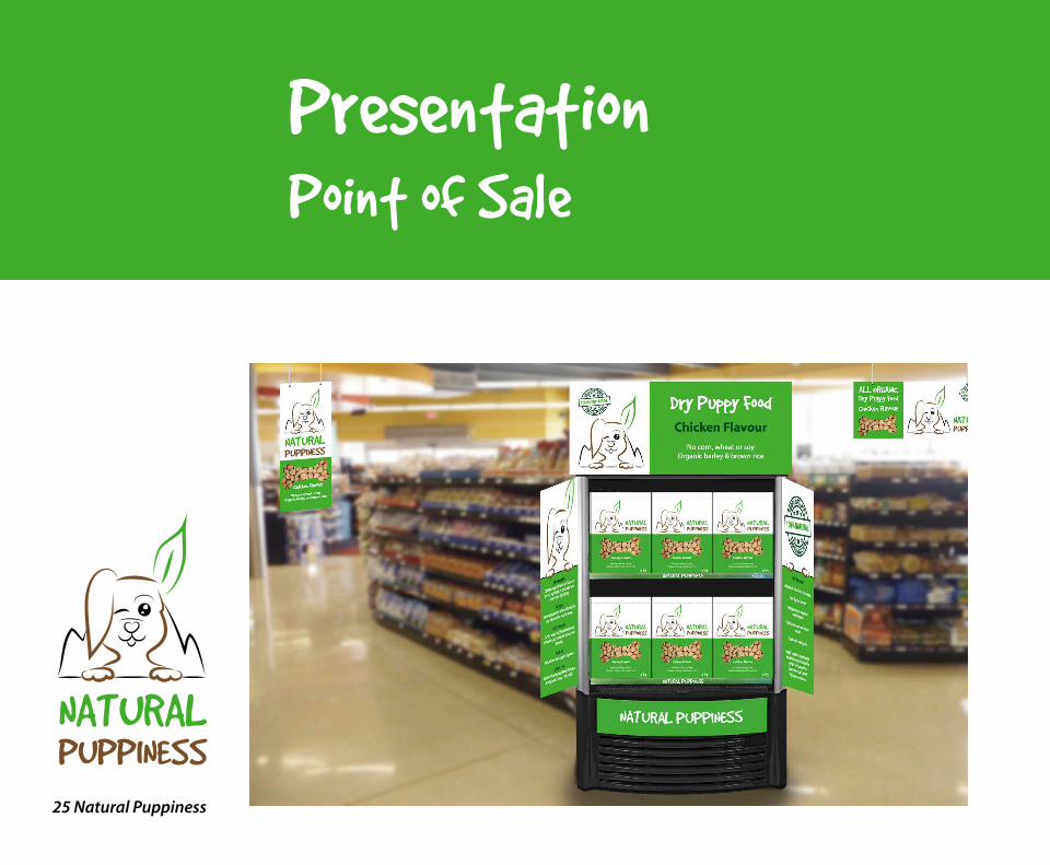
ProductsPoint of Sale
The point of sale elements identify Natural Puppiness. Their purpose is to promote the product in-store. They need to help customers clearly see the product, integrate with the brand’s look and feel, and persuade customers to buy.
It is important to remember that the point of sale elements are meant to reflect the brand as being friendly and happy.
The Natural Puppiness point of sale elementsUse the fonts Good Dog and Myriad Pro
Only use the colours presented in the brand manual
Use the symbols provided by the brand
Provide the necessary information
Help bring attention to the product
Integrate with the brand’s identity
19 Natural Puppiness
NATURALPUPPINESS
20 Natural Puppiness
NATURALPUPPINESS
Back 1 Front Back 2
21 Natural Puppiness
NATURALPUPPINESS
PresentationBrochure

22 Natural Puppiness
NATURALPUPPINESS
PresentationPackaging
23 Natural Puppiness
NATURALPUPPINESS
PresentationPoint of Sale

24 Natural Puppiness
NATURALPUPPINESS
PresentationPoint of Sale
25 Natural Puppiness
NATURALPUPPINESS
PresentationPoint of Sale
NATURALPUPPINESS
Page 1
NATURALPUPPINESS
INTRODUCTION
This four week project period has for me been about designing a brand identity for a fun, energetic and organic puppy food brand. A logo, brochure, infographics, brochure, packaging and point of sale elements have been created and designed to give the brand an identity.
Interpretation of TaskI understood this assignment as getting some freedom in deciding what kind of dog food product brand I wanted to work with, and then having to follow certain guidelines to create specific products for the brand.
Concept and Target GroupMy food product brand is an all organic brand based in the UK, called Natural Puppiness. The brand targets young people with puppies, and especially people interested in the outdoors. The product I’m focusing on marketing here are dry pellets.
Message/Achieved Action
Name - Natural Puppiness.
Typography - Good Dog and Myriad Pro.
Colours - Brown and two shades of green, as well as black and white.
Elements - The elements are all related to dogs and the outdoors.
RESEARCH AND WORK PRO CESS
Research and Analysis
Name - I decided to call my product Natural Puppiness. UrbanDictionary’s definition of the word “puppiness” is: “The feeling of unbearable joy brought on by the appearance of puppies. A fluffy, happy feeling of adorable joy from the undisputed masters of cuteness, puppies…” I also would like to think the word can translate to a puppy “in happiness.” Since it’s an organic brand, I thought “Natural” fit well.
Defining Target Group - My target group are young people (in their 20’s) who just bought their first puppy, and who enjoy taking their puppy outside with them. They are interested in giving their dog the best food; food that gives them energy to play outside, and that will keep them healthy.
MANDATORY ASSIGNMENT 07: Branding and Packaging
Page 2
NATURALPUPPINESS
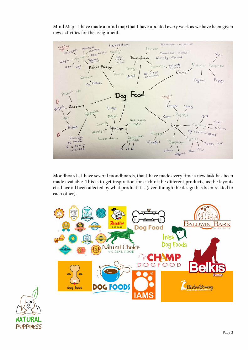
Mind Map - I have made a mind map that I have updated every week as we have been given new activities for the assignment.
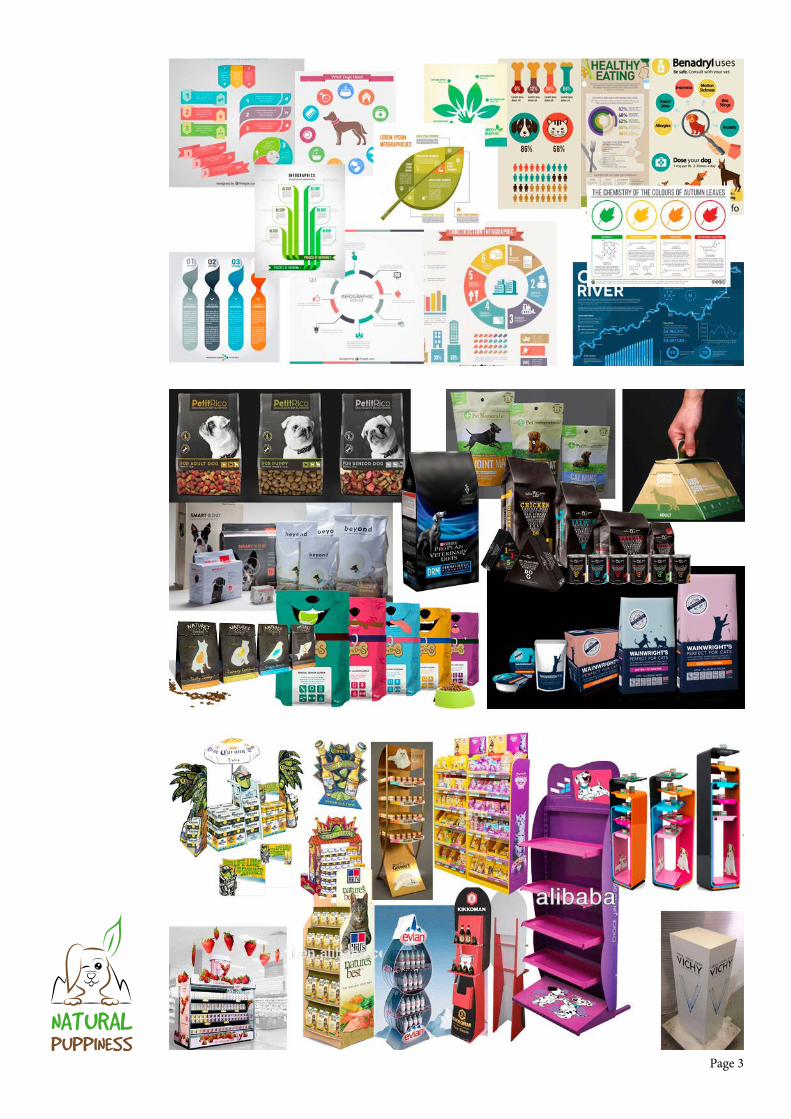
Moodboard - I have several moodboards, that I have made every time a new task has been made available. This is to get inspiration for each of the different products, as the layouts etc. have all been affected by what product it is (even though the design has been related to each other).
v
Page 3
NATURALPUPPINESS
Page 4
NATURALPUPPINESS
Product Design Processes
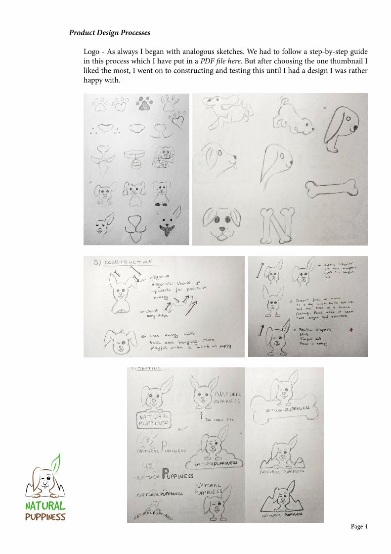
Logo - As always I began with analogous sketches. We had to follow a step-by-step guide in this process which I have put in a PDF file here. But after choosing the one thumbnail I liked the most, I went on to constructing and testing this until I had a design I was rather happy with.
Page 5
NATURALPUPPINESS
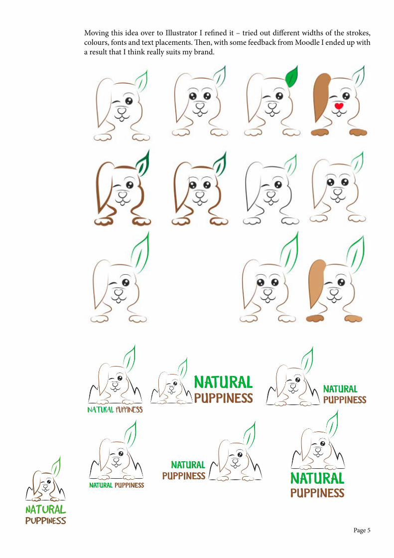
Moving this idea over to Illustrator I refined it – tried out different widths of the strokes, colours, fonts and text placements. Then, with some feedback from Moodle I ended up with a result that I think really suits my brand.
Page 6
NATURALPUPPINESS
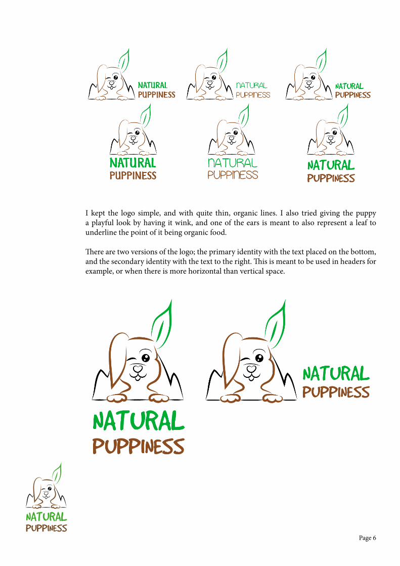
I kept the logo simple, and with quite thin, organic lines. I also tried giving the puppy a playful look by having it wink, and one of the ears is meant to also represent a leaf to underline the point of it being organic food.
There are two versions of the logo; the primary identity with the text placed on the bottom, and the secondary identity with the text to the right. This is meant to be used in headers for example, or when there is more horizontal than vertical space.
Page 7
NATURALPUPPINESS
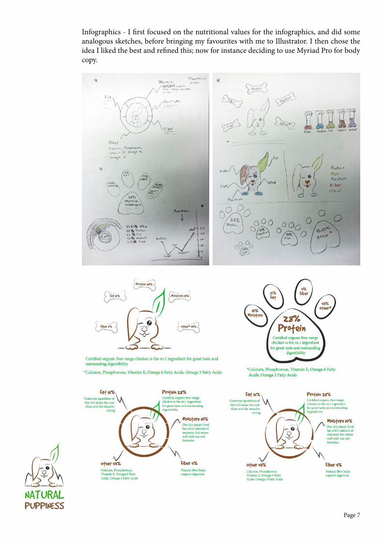
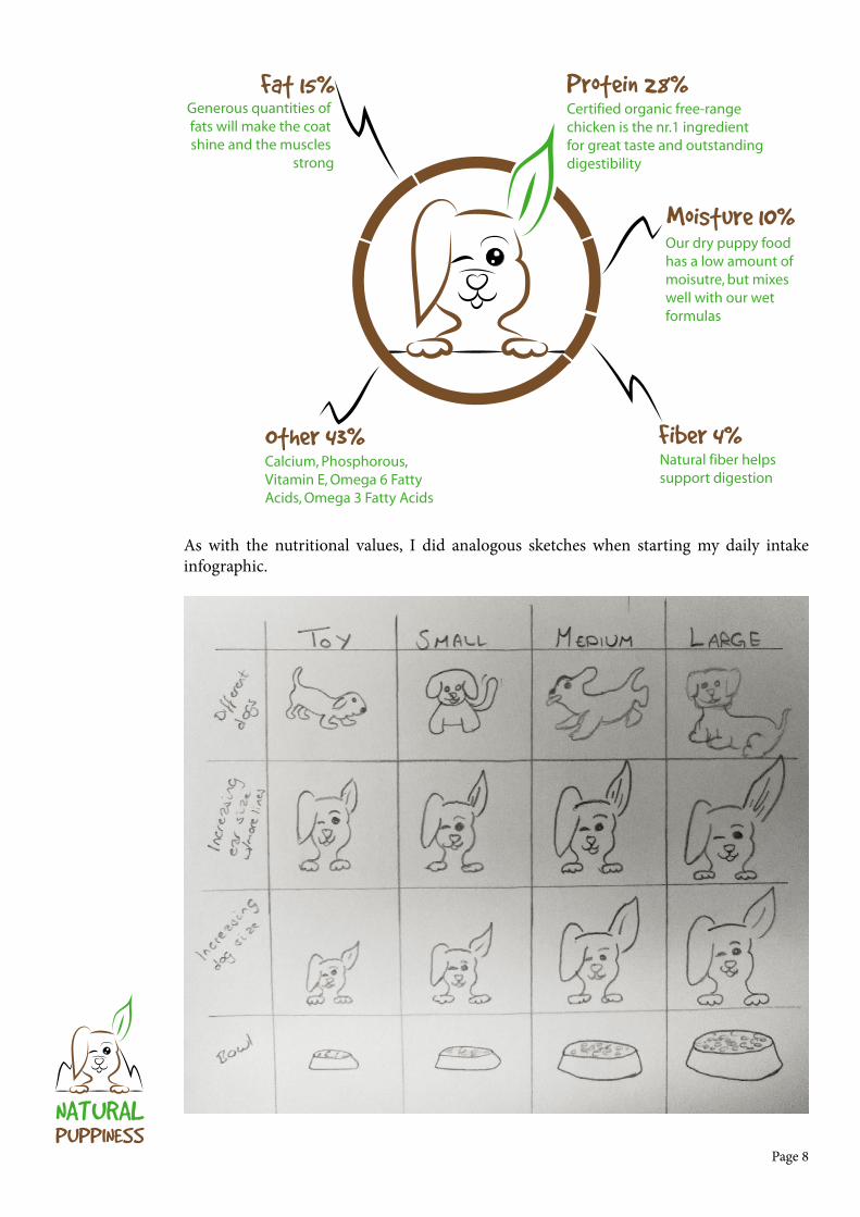
Infographics - I first focused on the nutritional values for the infographics, and did some analogous sketches, before bringing my favourites with me to Illustrator. I then chose the idea I liked the best and refined this; now for instance deciding to use Myriad Pro for body copy.
Page 8
NATURALPUPPINESS
Natural fiber helps support digestion
Our dry puppy foodhas a low amount ofmoisutre, but mixeswell with our wetformulas
Generous quantities of fats will make the coat shine and the muscles
strong
Fat 15%
Moisture 10%
Certified organic free-range chicken is the nr.1 ingredient for great taste and outstanding digestibility
Calcium, Phosphorous, Vitamin E, Omega 6 Fatty Acids, Omega 3 Fatty Acids
Protein 28%
Fiber 4%Other 43%
As with the nutritional values, I did analogous sketches when starting my daily intake infographic.

Page 9
NATURALPUPPINESS
Daily Intake (g)
Toy
Small
Medium
Large
Body weight
2 months
3 months
4 months
5 months
6 months
5-10 kg
17 kg
2 kg
25+ kg
50 60 60 60 65
95-155 110-180 115-195 115-190 110-185
215 265 285 285 280
270-580 350-670 375-685 375-625 370-530
Daily Intake (g)
Toy
Small
Medium
Large
Body weight
2 months
3 months
4 months
5 months
6 months
5-10 kg
17 kg
2 kg
25+ kg
50 60 60 60 65
95-155 110-180 115-195 115-190 110-185
215 265 285 285 280
270-580 350-670 375-685 375-625 370-530
Daily Intake (g)
Toy
Small
Medium
Large
Body weight
2 months
3 months
4 months
5 months
6 months
5-10 kg
17 kg
2 kg
25+ kg
50 60 60 60 65
95-155 110-180 115-195 115-190 110-185
215 265 285 285 280
270-580 350-670 375-685 375-625 370-530
Daily Intake (g)
Toy
Small
Medium
Large
Body weight
2 months
3 months
4 months
5 months
6 months
5-10 kg
17 kg
2 kg
25+ kg
50 60 60 60 65
95-155 110-180 115-195 115-190 110-185
215 265 285 285 280
270-580 350-670 375-685 375-625 370-530
2 kg
50-65 g
5-10 kg
95-185 g
17 kg
215-280 g
25+ kg
270-530 g
24 h
2 kg
50-65 g
5-10 kg
95-185 g
17 kg
215-280 g
25+ kg
270-530 g
24 h
24 hDaily Intake (g)
Toy
Small
Medium
Large
Body weight
2 months
3 months
4 months
5 months
6 months
5-10 kg
17 kg
2 kg
25+ kg
50 60 60 60 65
95-155 110-180 115-195 115-190 110-185
215 265 285 285 280
270-580 350-670 375-685 375-625 370-530
Daily Intake (g)
Toy
Small
Medium
Large
Body weight
2 months
3 months
4 months
5 months
6 months
5-10 kg
17 kg
2 kg
25+ kg
50 60 60 60 65
95-155 110-180 115-195 115-190 110-185
215 265 285 285 280
270-580 350-670 375-685 375-625 370-530
Daily Intake (g)
Toy
Small
Medium
Large
Body weight
2 months
3 months
4 months
5 months
6 months
5-10 kg
17 kg
2 kg
25+ kg
50 60 60 60 65
95-155 110-180 115-195 115-190 110-185
215 265 285 285 280
270-580 350-670 375-685 375-625 370-530
Daily Intake (g)
Toy
Small
Medium
Large
Body weight
2 months
3 months
4 months
5 months
6 months
5-10 kg
17 kg
2 kg
25+ kg
50 60 60 60 65
95-155 110-180 115-195 115-190 110-185
215 265 285 285 280
270-580 350-670 375-685 375-625 370-530
2 kg
50-65 g
5-10 kg
95-185 g
17 kg
215-280 g
25+ kg
270-530 g
24 h
2 kg
50-65 g
5-10 kg
95-185 g
17 kg
215-280 g
25+ kg
270-530 g
24 h
24 h
Page 10
NATURALPUPPINESS
Daily Intake (g)
Toy
Small
Medium
Large
Body weight
2 months
3 months
4 months
5 months
6 months
5-10 kg
17 kg
2 kg
25+ kg
50 60 60 60 65
95-155 110-180 115-195 115-190 110-185
215 265 285 285 280
270-580 350-670 375-685 375-625 370-530
24 h
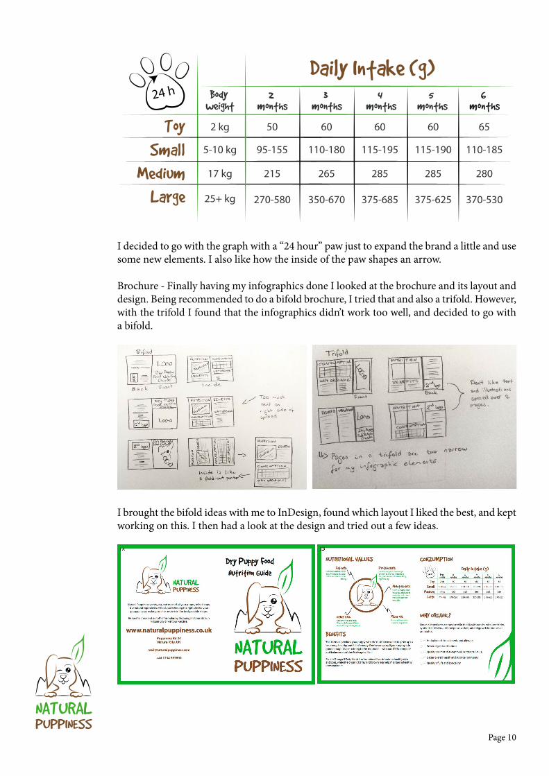
I decided to go with the graph with a “24 hour” paw just to expand the brand a little and use some new elements. I also like how the inside of the paw shapes an arrow.
Brochure - Finally having my infographics done I looked at the brochure and its layout and design. Being recommended to do a bifold brochure, I tried that and also a trifold. However, with the trifold I found that the infographics didn’t work too well, and decided to go with a bifold.
I brought the bifold ideas with me to InDesign, found which layout I liked the best, and kept working on this. I then had a look at the design and tried out a few ideas.

Page 11
NATURALPUPPINESS
I asked for feedback on Moodle and got a few tips that I tried out and was really happy with. Having some of the background in green now, I made a few changes to my daily intake graph to make it better visible on the green.

Page 12
NATURALPUPPINESS
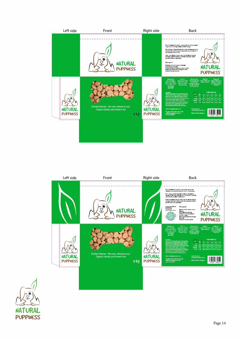
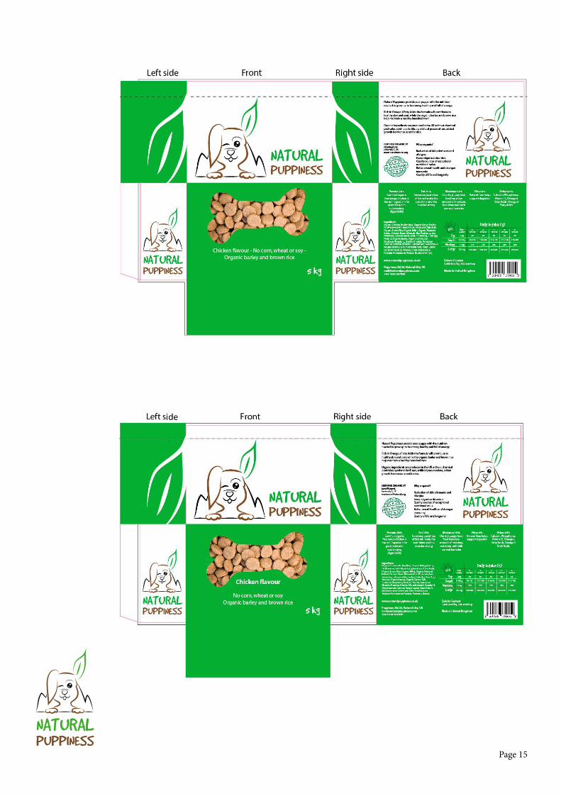
Packaging - Since I decided my product is dry pellets (solid form), I don’t need to make the packaging out of waterproof material. I would however like it to be easy to open and close with a zip lock, since it’s meant to last for a little while. It needs to be strong material as I’m thinking it should be about 5 kg. My first approach was to draw thumbnails for different packaging formats, and then the layout when I had chosen the type of packaging I wanted.

Page 13
NATURALPUPPINESS
Making sure the layout fit with the other elements I had already designed, I was inspired by the way I segmented the different areas in my brochure with blocks of colour. I think this made the design more interesting as there was now more going on, while also helping separating content.
Knowing I would like to integrate some of the illustrations (bone, ear, paw), I brought my favourite idea into Illustrator. The point of having the bone on the front of the packaging is that it is see-through, so one can see the content.
Page 14
NATURALPUPPINESS
Page 15
NATURALPUPPINESS
Page 16
NATURALPUPPINESS
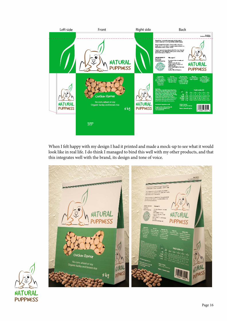
When I felt happy with my design I had it printed and made a mock-up to see what it would look like in real life. I do think I managed to bind this well with my other products, and that this integrates well with the brand, its design and tone of voice.
Page 17
NATURALPUPPINESS
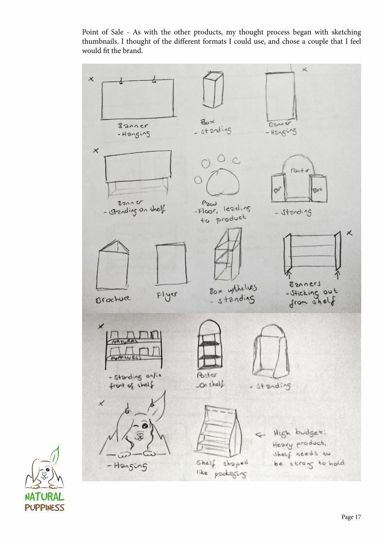
Point of Sale - As with the other products, my thought process began with sketching thumbnails. I thought of the different formats I could use, and chose a couple that I feel would fit the brand.

Page 18
NATURALPUPPINESS
With my design from other products in mind, I chose text, layout and elements to work with my point of sale elements. I decided to go with a horizontal and a vertical banner. The horizontal is to be placed on top of shelves or hanging from the roof, with one unique design on both sides. As for the vertical, there are two different layouts: they both have the same front, but unique designs on the other side, with more information. These are meant to hang on the side of a shelf, or in a slightly larger size from the roof.

Page 19
NATURALPUPPINESS
DESIGN CHOICES
Style/GenreMy style is quite minimalistic, and I would say it’s modern and happy. It’s simple in terms of not using too many elements, colours or typefaces, and having a brand identity I feel is consistent over all products.
TypographyI use two fonts: Good Dog and Myriad Pro. Good Dog is the font I use in the logo and in headings. This is a font by Fonthead Design, and is a happy font that well represents Natural Puppiness. Myriad Pro, which I use for body copy, was released in 1992 and designed by Robert Slimbach and Carol Twombly. This is a sans serif font with a humanistic treatment of letter proportions and design details.
ABCDEFGHIJKLMNOPQRSTUVWXYZ
1234567890 §!”#$%&/()=?`@*¨^-.,
ABCDEFGHIJKLMNOPQRSTUVWXYZ1234567890 §!”#$%&/()=?`@*¨^-.,
Page 20
NATURALPUPPINESS
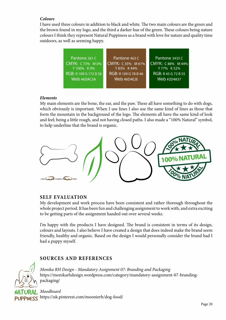
ColoursI have used three colours in addition to black and white. The two main colours are the green and the brown found in my logo, and the third a darker hue of the green. These colours being nature colours I think they represent Natural Puppiness as a brand with love for nature and quality time outdoors, as well as seeming happy.
ElementsMy main elements are the bone, the ear, and the paw. These all have something to do with dogs, which obviously is important. When I use lines I also use the same kind of lines as those that form the mountain in the background of the logo. The elements all have the same kind of look and feel; being a little rough, and not having closed paths. I also made a “100% Natural” symbol, to help underline that the brand is organic.
SELF EVALUATIONMy development and work process have been consistent and rather thorough throughout the whole project period. It has been fun and challenging assignment to work with, and extra exciting to be getting parts of the assignment handed out over several weeks.
I’m happy with the products I have designed. The brand is consistent in terms of its design, colours and layouts. I also believe I have created a design that does indeed make the brand seem friendly, healthy and organic. Based on the design I would personally consider the brand had I had a puppy myself.
SOURCES AND REFERENCES
Monika RH Design - Mandatory Assignment 07: Branding and Packaginghttps://monikarhdesign.wordpress.com/category/mandatory-assignment-07-branding-packaging/
Moodboardhttps://uk.pinterest.com/moonierh/dog-food/
Pantone 463 CCMYK: C 35% M 61%
Y 83% K 44%RGB: R 109 G 78 B 46
Web #6D4E2E
Pantone 361 CCMYK: C 73% M 0%
Y 100% K 0%RGB: R 109 G 172 B 58
Web #6DAC3A
Pantone 3435 CCMYK: C 88% M 44%
Y 77% K 52%RGB: R 45 G 72 B 55
Web #2D4837
100% NATURAL10
0% NATURAL
100% NATURAL
Page 21
NATURALPUPPINESS
Urban Dictionary – Puppiness http://www.urbandictionary.com/define.php?term=puppiness
Good Doghttp://www.dafont.com/good-dog.font
Myriad Prohttps://en.wikipedia.org/wiki/Myriad_(typeface)
Pet MD - Puppy Nutrition: What is the Best Puppy Food & Morehttp://www.petmd.com/dog/puppycenter/nutrition/evr_dg_the_importance_of_proper_nutrition_for_puppies
My Sweet Puppy – Top 20 Best Puppy Foodhttp://mysweetpuppy.net/top-20-best-puppy-foods/
A lot of my information has been borrowed from Castor Pollux Organix and adjusted to fit my product better.
http://www.castorpolluxpet.com
https://www.chewy.com/castor-pollux-organix-puppy-recipe/dp/34968
https://www.amazon.com/Organix-Chicken-Brown-Recipe-25-Pound/dp/B001BCOZ3E/ref=sr_1_2?s=pet-supplies&ie=UTF8&qid=1479379858&sr=1-2&keywords=Castor+Pollux
https://www.amazon.com/Castor-Pollux-Organix-Grain-Free-Potatoes/dp/B00CGICZFC/ref=sr_1_1?s=pet-supplies&ie=UTF8&qid=1479380217&sr=1-1&keywords=Castor+Pollux&refinements=p_n_feature_eleven_browse-bin%3A6514407011
Photos and Images
Bar Codehttp://www.wpclipart.com/signs_symbol/business/barcodes/barcode_UPC-A_T.png
Pellets – Front of Packaginghttp://www.thehonestkitchen.com/blog/the-importance-of-pigments-in-dog-food/
Pellets – On Presentation of Packaginghttp://www.grupobynsa.com/sites/default/files/styles/shadowbox/public/productosDetalle/bynsa1-1-61_croquetas.jpg?itok=_83I8GCh
100% Natural Icon Inspirationhttp://ecoworm.co.uk
Point of Sale Presentationhttps://fortunedotcom.files.wordpress.com/2014/11/freshpet-chiller-in-store.jpg
Point of Sale Presentationhttp://www.shopcousa.com/wp-content/uploads/HEB-Curved-Gondola-End-Cap.jpg
http://www.petmd.com/dog/puppycenter/nutrition/evr_dg_the_importance_of_proper_nutrition_for_puppies
Page 22
NATURALPUPPINESS
Noroff Lessons
Sketching Techniques, Week 3, Noroffhttps://www.noroff.no/student/fagskole/lc/dmk/1/en/dmk1/GRA102/week03/
Brand Identity, Week 4, Noroffhttps://www.noroff.no/student/fagskole/lc/dmk/1/en/dmk1/GRA109/week04/
Typography, Week 5, Noroffhttps://www.noroff.no/student/fagskole/lc/dmk/1/en/dmk1/GRA102/week05/
Colour Theory, Week 6, Noroffhttp://www.noroff.no/student/fagskole/lc/dmk/1/en/dmk1/GRA102/week06/
Creative Workflow, Week 26, Noroffhttps://www.noroff.no/student/fagskole/lc/dmk/1/en/dmk1/GRA110/week26/
Visual Language, Week 27, Noroffhttps://www.noroff.no/student/fagskole/lc/dmk/1/en/dmk1/GRA110/week27/
Packaging Design, Week 28, Noroffhttps://www.noroff.no/student/fagskole/lc/dmk/1/en/dmk1/GRA110/week28/
Point to Sale, Week 29, Noroffhttps://www.noroff.no/student/fagskole/lc/dmk/1/en/dmk1/GRA110/week29/
Lynda.com Tutorials
Drawing Vector Graphics, by Von Glitschkahttp://www.lynda.com/Illustrator-tutorials/Drawing-Vector-Graphics/109450-2.html
Package Design with Illustrator, by William Everharthttp://www.lynda.com/Illustrator-tutorials/Package-Design-Illustrator/148421-2.html
Developing Brand Identity Collateral, by Steve Harrishttp://www.lynda.com/InDesign-tutorials/Developing-Brand-Identity-Collateral/114175-2.html
Before & After: Things Every Designer Should Know, by John McWadehttp://www.lynda.com/Design-Page-Layout-tutorials/Before-After-Things-Every-Designer-Should-Know/110285-2.html
Brand Building Basics, by Lorrie Thomas Rosshttp://www.lynda.com/Business-Skills-tutorials/Building-Your-Brand/101957-2.html
Designing a Logo, by Nigel Frenchhttp://www.lynda.com/Illustrator-tutorials/Designing-Logo/673-2.html