Brand Identity Guidelines - Clarkson College more information on the brand identity guidelines for...
23
Brand Identity Guidelines 2010
Transcript of Brand Identity Guidelines - Clarkson College more information on the brand identity guidelines for...

Brand Identity Guidelines2010
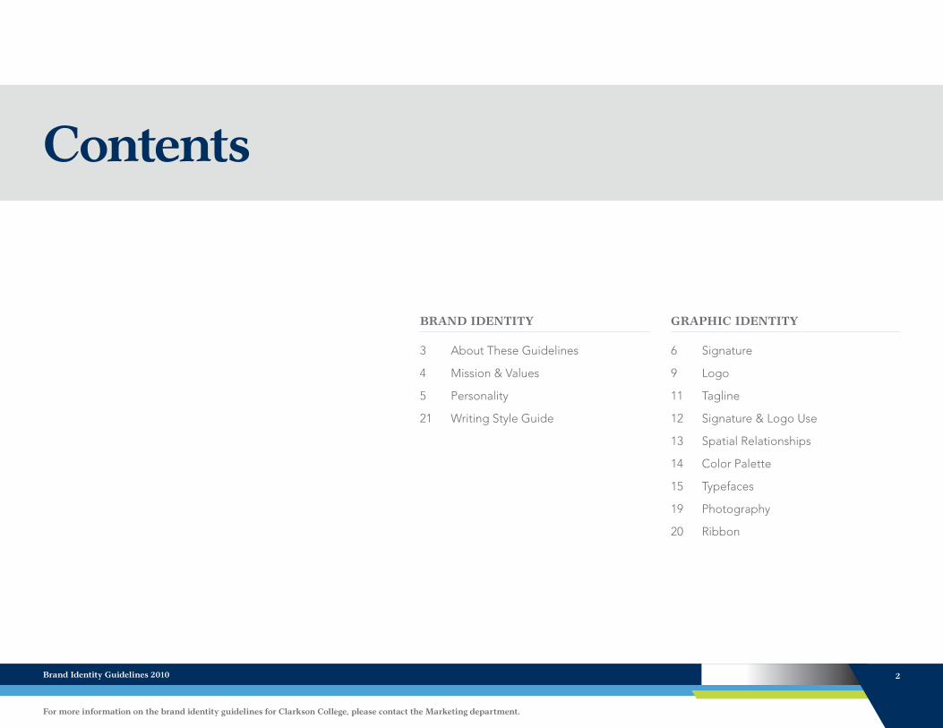
Contents
BRAND IDENTITY
3 About These Guidelines
4 Mission & Values
5 Personality
21 Writing Style Guide
GRAPHIC IDENTITY
6 Signature
9 Logo
11 Tagline
12 Signature & Logo Use
13 Spatial Relationships
14 Color Palette
15 Typefaces
19 Photography
20 Ribbon
Brand Identity Guidelines 2010 2
For more information on the brand identity guidelines for Clarkson College, please contact the Marketing department.

The Clarkson College brand is everywhere in everything we do, say and touch as an institution.
The following pages outline the brand identity guidelines of Clarkson College. They are a guide to the usage and presentation of the elements and characteristics of our brand.
These guidelines are an essential tool in establishing and maintaining an identity that will properly communicate the Clarkson College brand across all audiences.
It is important to use the logo and logotype consistently and with consideration. It should be used to unify and strengthen all internal and external communications. The design of the logo and logotype
has been carefully considered; its form is distinct and should not be altered in any way. It is the responsibility of each faculty and staff member to properly follow the standards in order to represent the Clarkson College identity with maximum impact.
Using the logotype incorrectly undermines the Clarkson College image. Therefore, it is very important that this manual be followed carefully. Any attempts to recreate this icon and logotype should be avoided. Always use the original, electronic files that are available through the Marketing department.
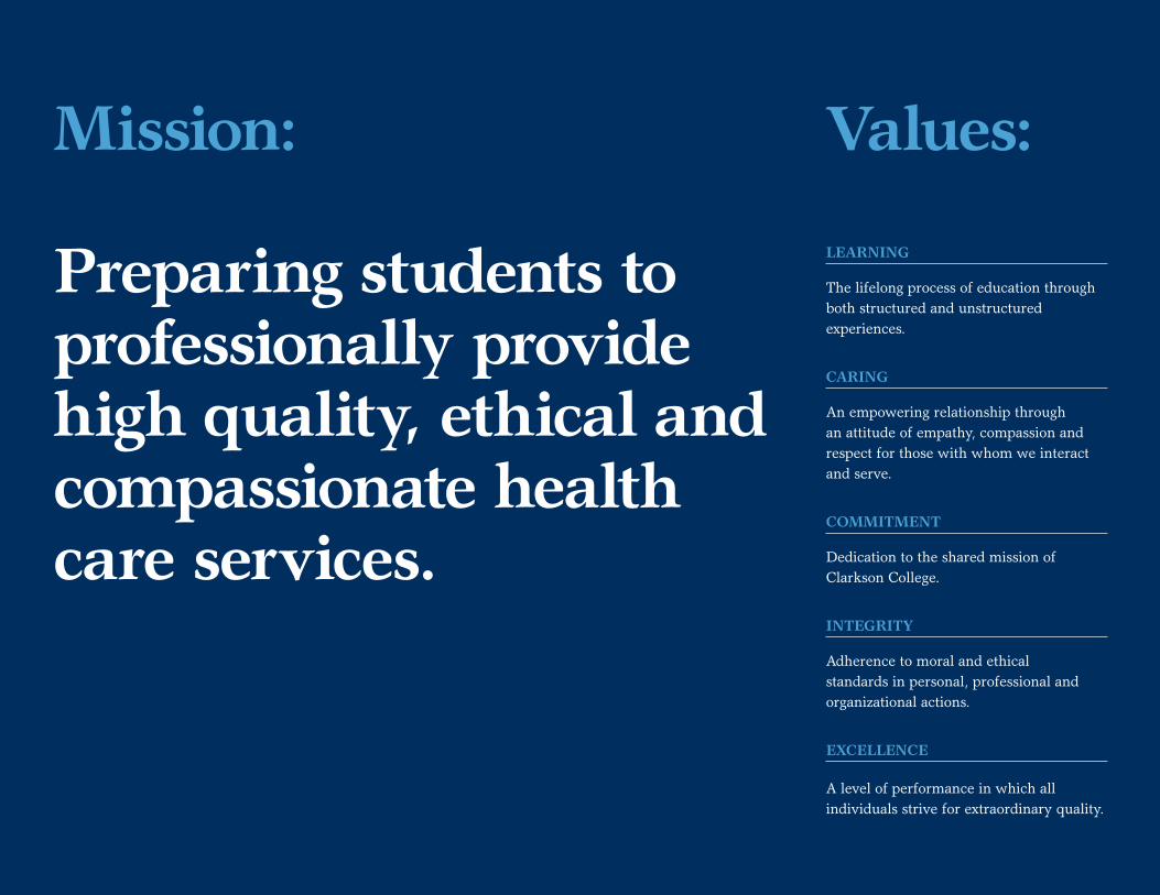
Mission:
Preparing students to professionally provide high quality, ethical and compassionate health care services.
Values:
LEARNING
The lifelong process of education through both structured and unstructured experiences.
CARING
An empowering relationship through an attitude of empathy, compassion and respect for those with whom we interact and serve.
COMMITMENT
Dedication to the shared mission of Clarkson College.
INTEGRITY
Adherence to moral and ethical standards in personal, professional and organizational actions.
EXCELLENCE
A level of performance in which all individuals strive for extraordinary quality.
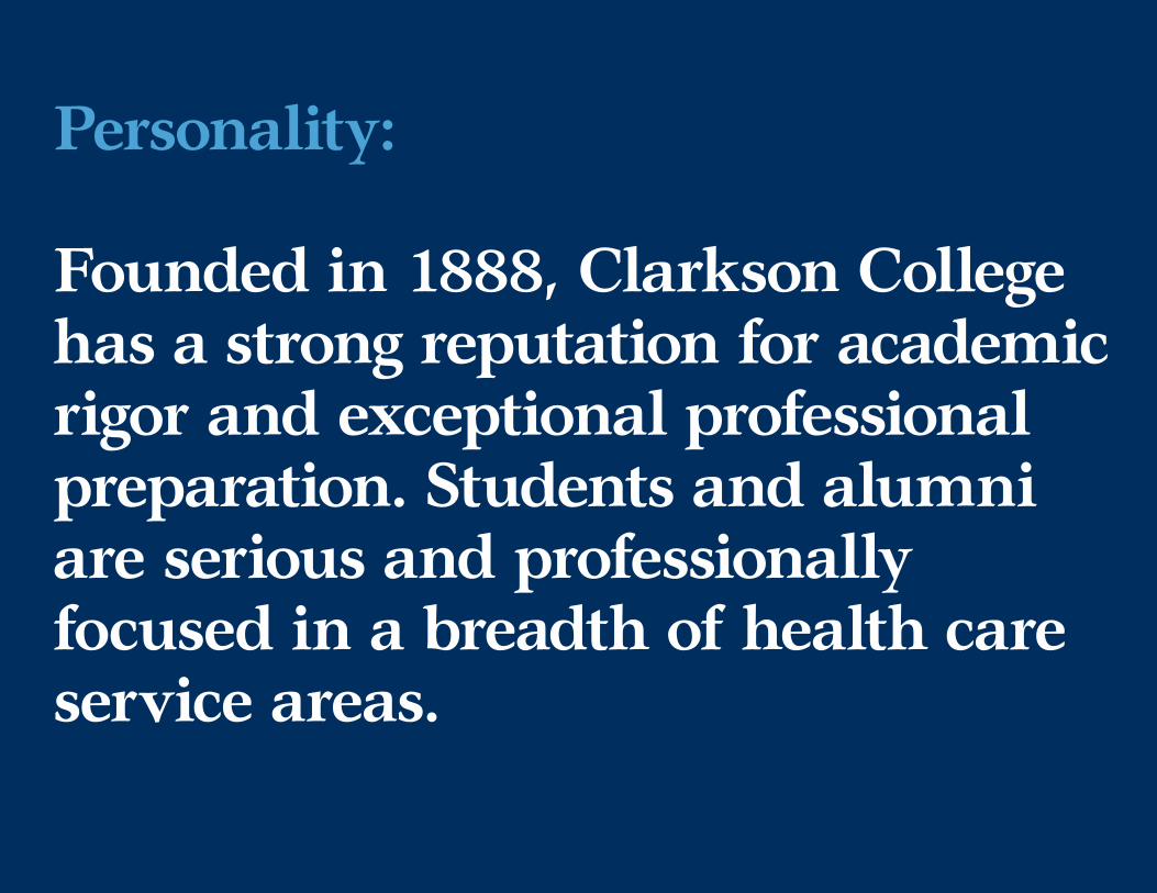
Personality:
Founded in 1888, Clarkson College has a strong reputation for academic rigor and exceptional professional preparation. Students and alumni are serious and professionally focused in a breadth of health care service areas.

SignatureThe Clarkson College signature is made up of three components: The icon, logotype and tagline. These three elements should always appear in relationship to one another as shown in these guidelines. The icon and logotype should always be used together, never seperately. In certain instances when space is limited, the icon may be considered to be used seperately after consulting with the Marketing department.
Icon
Logotype
Tagline
Logo
Signature
Brand Identity Guidelines 2010 6
For more information on the brand identity guidelines for Clarkson College, please contact the Marketing department.

SignatureThe Clarkson College primary signature is made up of three components: The icon, logotype and tagline. These three elements should always appear in relationship to one another as shown in these guidelines. The primary signature is to be used at all times unless a horizontal format is needed for a specific application.
PRIMARY SIGNATURE
CMYK Coated CMYK Uncoated 1 Color Spot
Black Reversed
Brand Identity Guidelines 2010 7
For more information on the brand identity guidelines for Clarkson College, please contact the Marketing department.

HORIZONTAL SIGNATURE
CMYK Coated CMYK Uncoated 1 Color Spot
Black Reversed
SignatureThe Clarkson College horizontal signature is made up of three components: The icon, logotype and tagline. These three elements should always appear in relationship to one another as shown in these guidelines. The horizontal signature is to be used only when the primary signature will not fit a specific application.
Brand Identity Guidelines 2010 8
For more information on the brand identity guidelines for Clarkson College, please contact the Marketing department.
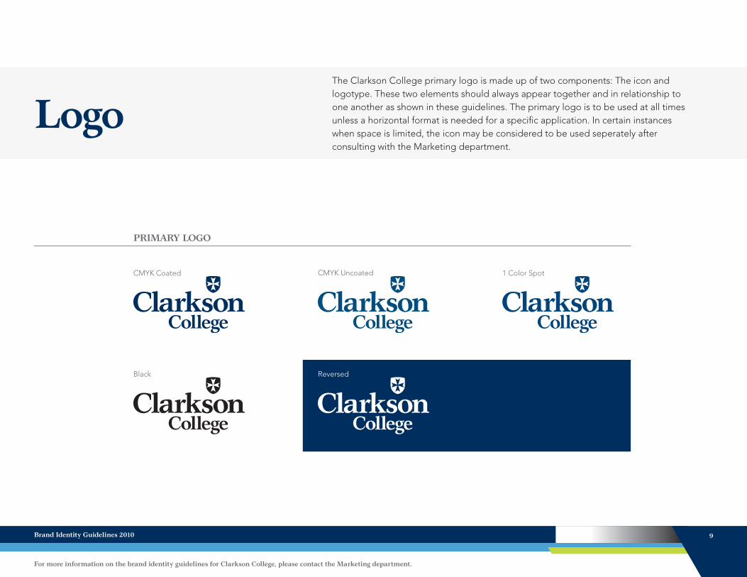
LogoThe Clarkson College primary logo is made up of two components: The icon and logotype. These two elements should always appear together and in relationship to one another as shown in these guidelines. The primary logo is to be used at all times unless a horizontal format is needed for a specific application. In certain instances when space is limited, the icon may be considered to be used seperately after consulting with the Marketing department.
PRIMARY LOGO
CMYK Coated CMYK Uncoated 1 Color Spot
Black Reversed
Brand Identity Guidelines 2010 9
For more information on the brand identity guidelines for Clarkson College, please contact the Marketing department.
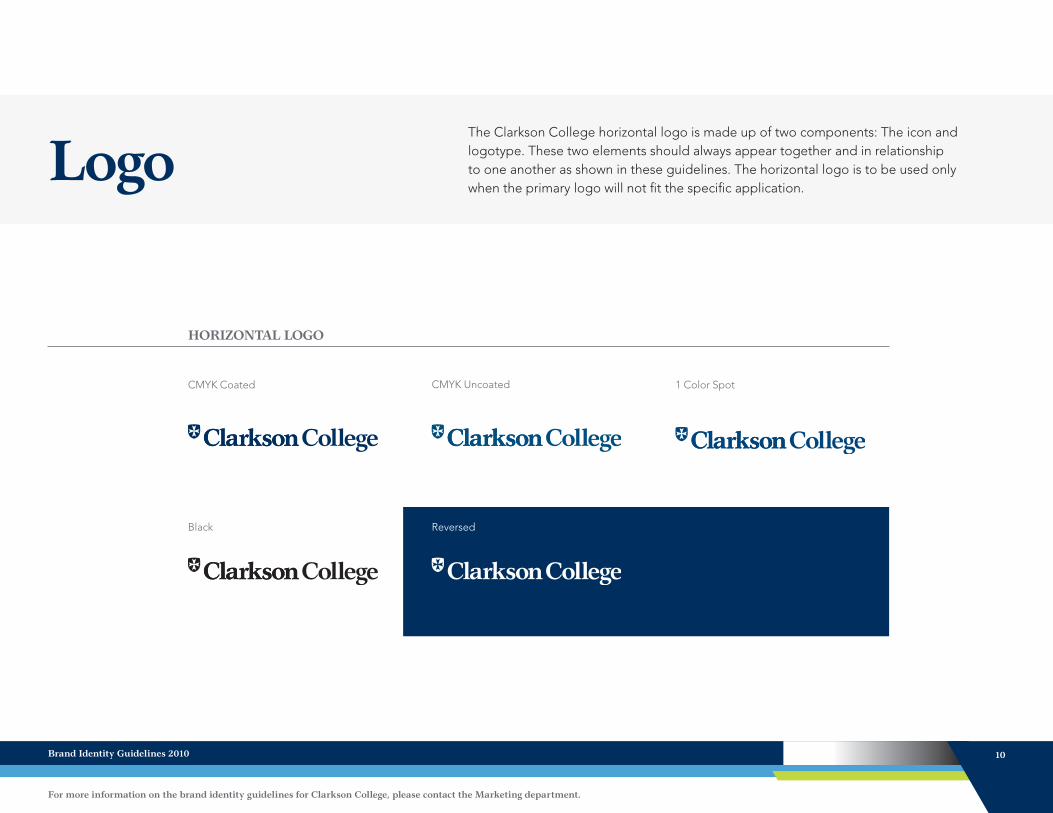
LogoThe Clarkson College horizontal logo is made up of two components: The icon and logotype. These two elements should always appear together and in relationship to one another as shown in these guidelines. The horizontal logo is to be used only when the primary logo will not fit the specific application.
HORIZONTAL LOGO
CMYK Coated CMYK Uncoated 1 Color Spot
Black Reversed
Brand Identity Guidelines 2010 10
For more information on the brand identity guidelines for Clarkson College, please contact the Marketing department.
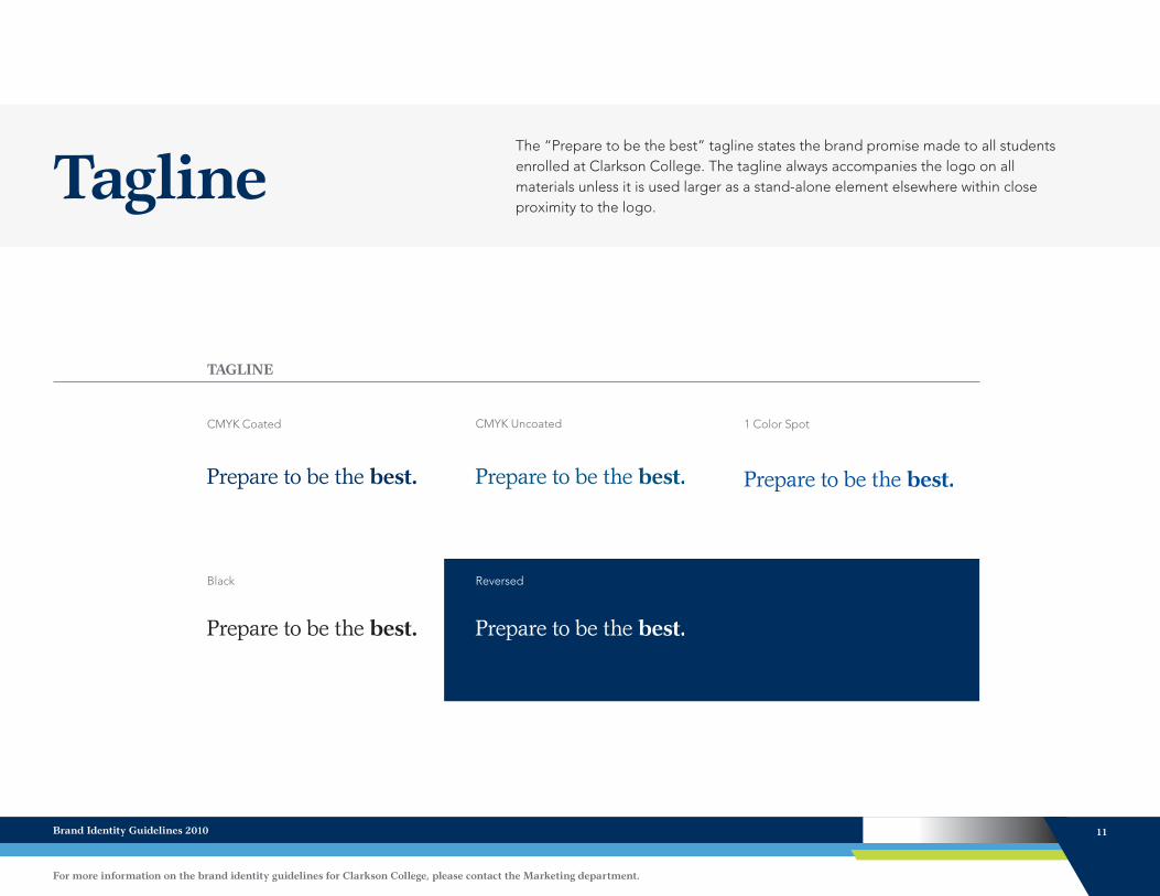
TaglineThe “Prepare to be the best” tagline states the brand promise made to all students enrolled at Clarkson College. The tagline always accompanies the logo on all materials unless it is used larger as a stand-alone element elsewhere within close proximity to the logo.
TAGLINE
CMYK Coated CMYK Uncoated 1 Color Spot
Black Reversed
Brand Identity Guidelines 2010 11
For more information on the brand identity guidelines for Clarkson College, please contact the Marketing department.

Signature & Logo UseUsing the Clarkson College signature and logo properly is essential to maintaining our brand. These guidelines serve as a referencing point to help ensure the College signature and logo are used properly in various applications.
RESIZING
Hold the “shift” key to keep proportion whenever the signature or logo needs to be resized within a document.
SPATIAL RELATIONSHIPS
When placing the signature or logo, there is a set amount of surrounding space that should not have anything placed in it. Refer to “Spatial Relationships” on page 13.
WHAT FILE TYPE TO USE
When creating a document that will be printed, always use an EPS file. EPS files provide greater clarity on printed pieces compared to a JPEG.
When creating something that will never be printed (PowerPoint presentation, e-mail signature), use a JPEG file. Never use a JPEG file if the document will be printed. Use an EPS file instead.
HOW TO PLACE AN EPS
An EPS file is inserted in Microsoft Office programs just like a picture is inserted into these programs. Since most computers do not have the appropriate software to open an EPS file, users are not be able to double-click to open an EPS like they can with a JPEG file.
Brand Identity Guidelines 2010 12
For more information on the brand identity guidelines for Clarkson College, please contact the Marketing department.
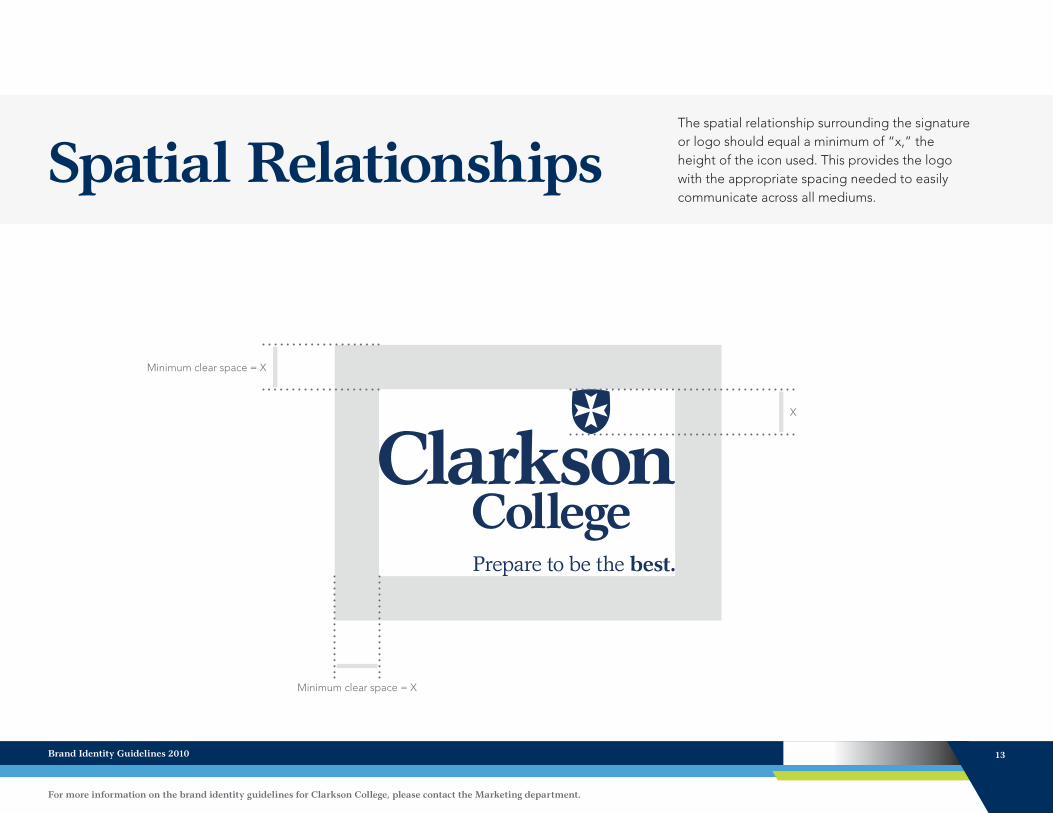
Spatial Relationships
Minimum clear space = X
The spatial relationship surrounding the signature or logo should equal a minimum of “x,” the height of the icon used. This provides the logo with the appropriate spacing needed to easily communicate across all mediums.
X
Minimum clear space = X
Brand Identity Guidelines 2010 13
For more information on the brand identity guidelines for Clarkson College, please contact the Marketing department.

Color Palette
Midnight Blue
PANTONE 295
CMYK (C) 100 068 008 052
CMYK (U) 099 051 008 036
RGB 000 047 095
HTML 002F5F
The Clarkson College brand has a limited color palette to provide consistency and recognition. Colors are important to our visual identity; consistency is essential. Our colors are specified as Pantone colors, and these colors are our “ideal colors.” All colors should match the value for “Pantone coated” as much as possible to ensure identical color in all uses and media.
LOGO COLOR SECONDARY COLORS
Sky Blue
PANTONE 542
CMYK (C) 064 019 001 004
CMYK (U) 057 013 007 003
RGB 100 160 200
HTML 64A0C8
Leaf Green
PANTONE 363
CMYK (C) 078 005 098 024
CMYK (U) 059 003 096 020
RGB 060 138 046
HTML 3C8A2E
Spring Green
PANTONE 382
CMYK (C) 028 000 092 000
CMYK (U) 032 000 082 000
RGB 190 214 000
HTML BED600
Atmosphere Gray
PANTONE Cool Gray 2
CMYK (C) 005 003 004 008
CMYK (U) 004 003 007 009
RGB 213 214 210
HTML D5D6D2
Storm Gray
PANTONE Cool Gray 9
CMYK (C) 029 023 016 051
CMYK (U) 028 016 012 035
RGB 116 118 120
HTML 747678
Leaf Green
Spring Green
Atmosphere Gray Storm Gray
Brand Identity Guidelines 2010 14
For more information on the brand identity guidelines for Clarkson College, please contact the Marketing department.

TypefacesBy using different script variations of the same font, we can optimize legibility and help the reader obtain a better overview. At the same time, we establish consistent expression throughout our communications. The Garth Graphic font has a lot of flexibility. The different script variations should be chosen carefully, and the condensed versions of this font should never be used in pieces relating to Clarkson College.
Garth GraphicGarth Graphic RegularABCDEFGHIJKLMNOPQRSTUVWXYZ abcdefghijklmnopqrstuvwxyz 1234567890!@#$%&*
Typically used for subheads and body copy
Garth Graphic ItalicABCDEFGHIJKLMNOPQRSTUVWXYZ abcdefghijklmnopqrstuvwxyz 1234567890!@#$%&*
Typically used for subheads and emphasis in body copy
Garth Graphic BoldABCDEFGHIJKLMNOPQRSTUVWXYZ abcdefghijklmnopqrstuvwxyz 1234567890!@#$%&*
Typically used for headings and emphasis in body copy
Garth Graphic Bold ItalicABCDEFGHIJKLMNOPQRSTUVWXYZ abcdefghijklmnopqrstuvwxyz 1234567890!@#$%&*
Typically used for subheads and emphasis in body copy
Brand Identity Guidelines 2010 15
For more information on the brand identity guidelines for Clarkson College, please contact the Marketing department.
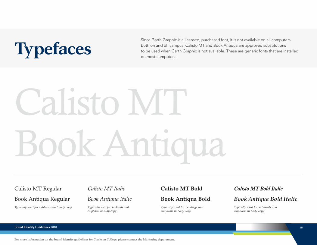
TypefacesSince Garth Graphic is a licensed, purchased font, it is not available on all computers both on and off campus. Calisto MT and Book Antiqua are approved substitutions to be used when Garth Graphic is not available. These are generic fonts that are installed on most computers.
Calisto MTBook AntiquaCalisto MT Regular
Book Antiqua RegularTypically used for subheads and body copy
Calisto MT Italic
Book Antiqua ItalicTypically used for subheads and emphasis in body copy
Calisto MT Bold
Book Antiqua BoldTypically used for headings and emphasis in body copy
Calisto MT Bold Italic
Book Antiqua Bold ItalicTypically used for subheads and emphasis in body copy
Brand Identity Guidelines 2010 16
For more information on the brand identity guidelines for Clarkson College, please contact the Marketing department.

Typefaces While Garth Graphic is to be used as the primary font of Clarkson College, Avenir can be used as secondary font to provide variation and flexibility. Avenir is a clean, modern font with excellent legibility.
AvenirAvenir LT Std 35 LightABCDEFGHIJKLMNOPQRSTUVWXYZ abcdefghijklmnopqrstuvwxyz 1234567890!@#$%&*
Typically used for subheads and body copy
Avenir LT Std 35 Light ObliqueABCDEFGHIJKLMNOPQRSTUVWXYZ abcdefghijklmnopqrstuvwxyz 1234567890!@#$%&*
Typically used for subheads and emphasis in body copy
Avenir LT Std 85 HeavyABCDEFGHIJKLMNOPQRSTUVWXYZ abcdefghijklmnopqrstuvwxyz 1234567890!@#$%&*
Typically used for headings and emphasis in body copy
Avenir LT Std 85 Heavy ObliqueABCDEFGHIJKLMNOPQRSTUVWXYZ abcdefghijklmnopqrstuvwxyz 1234567890!@#$%&*
Typically used for subheads and emphasis in body copy
Brand Identity Guidelines 2010 17
For more information on the brand identity guidelines for Clarkson College, please contact the Marketing department.
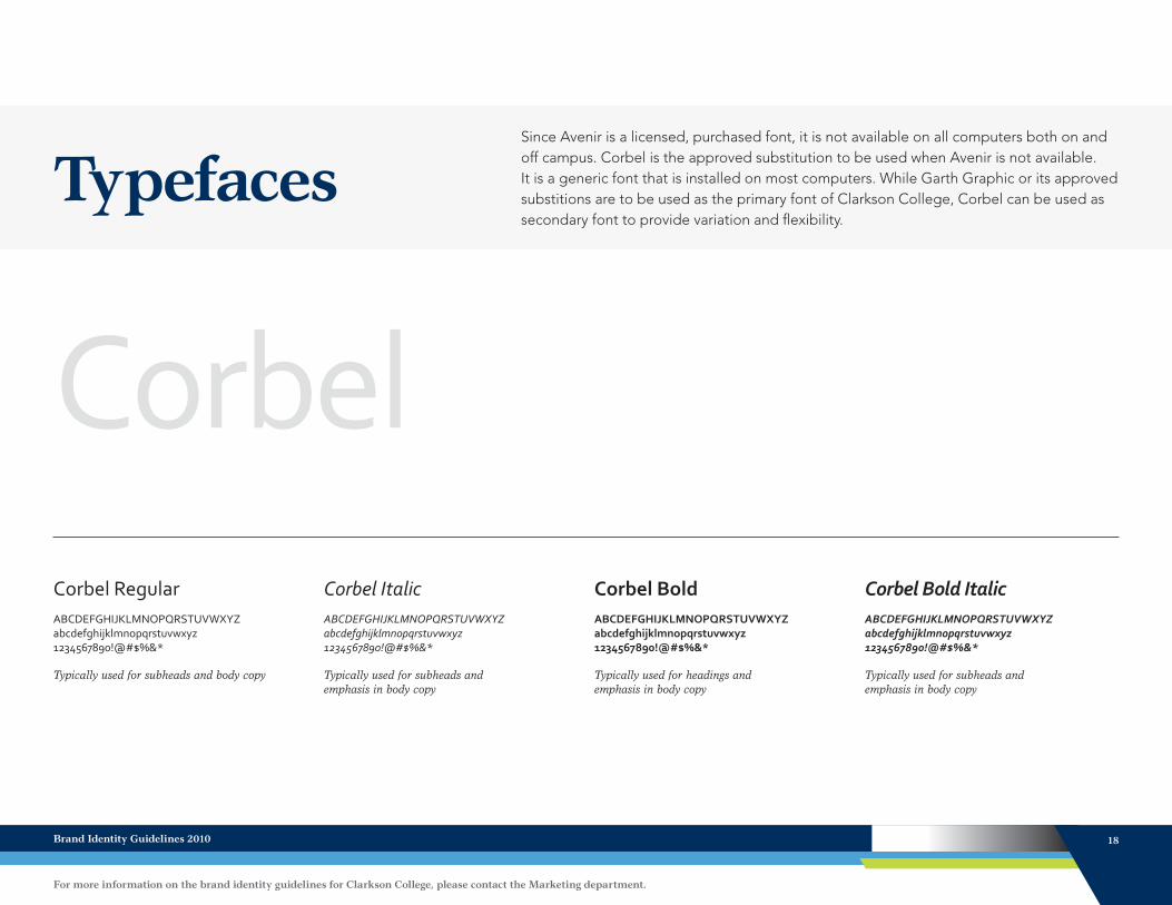
TypefacesSince Avenir is a licensed, purchased font, it is not available on all computers both on and off campus. Corbel is the approved substitution to be used when Avenir is not available. It is a generic font that is installed on most computers. While Garth Graphic or its approved substitions are to be used as the primary font of Clarkson College, Corbel can be used as secondary font to provide variation and flexibility.
CorbelCorbel RegularABCDEFGHIJKLMNOPQRSTUVWXYZ abcdefghijklmnopqrstuvwxyz 1234567890!@#$%&*
Typically used for subheads and body copy
Corbel ItalicABCDEFGHIJKLMNOPQRSTUVWXYZ abcdefghijklmnopqrstuvwxyz 1234567890!@#$%&*
Typically used for subheads and emphasis in body copy
Corbel BoldABCDEFGHIJKLMNOPQRSTUVWXYZ abcdefghijklmnopqrstuvwxyz 1234567890!@#$%&*
Typically used for headings and emphasis in body copy
Corbel Bold ItalicABCDEFGHIJKLMNOPQRSTUVWXYZ abcdefghijklmnopqrstuvwxyz 1234567890!@#$%&*
Typically used for subheads and emphasis in body copy
Brand Identity Guidelines 2010 18
For more information on the brand identity guidelines for Clarkson College, please contact the Marketing department.
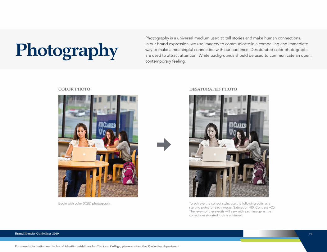
PhotographyPhotography is a universal medium used to tell stories and make human connections. In our brand expression, we use imagery to communicate in a compelling and immediate way to make a meaningful connection with our audience. Desaturated color photographs are used to attract attention. White backgrounds should be used to communicate an open, contemporary feeling.
COLOR PHOTO DESATURATED PHOTO
To achieve the correct style, use the following edits as a starting point for each image: Saturation -80, Contrast +20. The levels of these edits will vary with each image as the correct desaturated look is achieved.
Begin with color (RGB) photograph.
Brand Identity Guidelines 2010 19
For more information on the brand identity guidelines for Clarkson College, please contact the Marketing department.
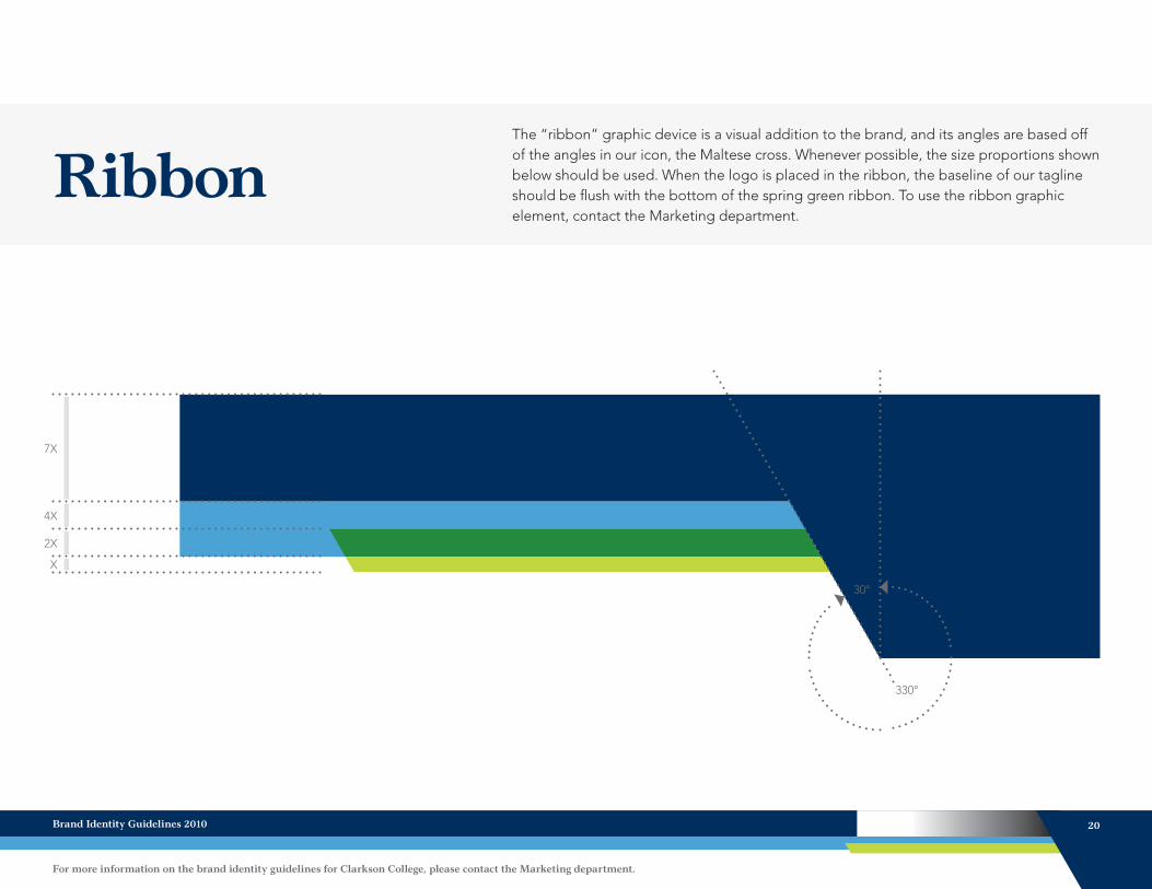
Ribbon
330°
The “ribbon” graphic device is a visual addition to the brand, and its angles are based off of the angles in our icon, the Maltese cross. Whenever possible, the size proportions shown below should be used. When the logo is placed in the ribbon, the baseline of our tagline should be flush with the bottom of the spring green ribbon. To use the ribbon graphic element, contact the Marketing department.
X
2X
4X
7X
30°
Brand Identity Guidelines 2010 20
For more information on the brand identity guidelines for Clarkson College, please contact the Marketing department.
Writing Style GuidePart of maintaining the Clarkson College brand is the consistent use of writing styles, references and abbreviations. These guidelines serve as a referencing point to help maintain the brand in various applications.
REFERENCING THE COLLEGE
When referencing Clarkson College, “Clarkson College” or “the College” should be used. The College should never be referred to in the possessive tense such as “Clarkson’s” or “Clarkson College’s.”
ADDRESS
Whenever the Clarkson College return address is used, it should be styled and punctuated as follows:101 South 42 St. Omaha, NE 68131-2739
ALUMNI
Alumni refers to a group of male and female graduates or a group of male graduates. Alumnus is a single male graduate, and alumna is a single
female graduate. Alumnae refers to a group of female graduates.
DEGREES
Degrees should be listed as follows: diploma, certificate, Associate of Science in..., Bachelor of Science in..., Master of Science in..., Associate’s degree, Bachelor’s degree, Master’s degree and Post-Master’s degree. Certificate is capitalized when referencing the formal name of the certificate earned, such as “Post-Masters Certificate in Business.”
DEPARTMENTS
Department names within the College should be capitalized, such as “Marketing department,” “Admissions office,” “Registrar’s office” or “President’s office.”
HEALTH CARE
Health care is spelled as two words.
MISSION & VALUES
Capitalize when referencing the Clarkson College Mission and Values. The Values of Learning, Caring, Commitment, Integrity and Excellence.
PHONE NUMBERS
When listing phone numbers, periods should replace dashes between the numbers as follows: 402.552.3100
PROGRAM NAMES
Clarkson College programs should always be capitalized and never referenced as schools, such as
“School of Nursing” or “School of Allied Health.”
SERVICE
Should be referenced as “Service at Clarkson College” or “Service.”
TITLES
Titles should be capitalized when a name is associated with the title. If a title appears without a name, it should not be capitalized.
WEBSITE
Spell as one word with a lowercase “w” unless beginning a sentence. When listing the URL for our site, it should be listed as follows: ClarksonCollege.edu
Brand Identity Guidelines 2010 21
For more information on the brand identity guidelines for Clarkson College, please contact the Marketing department.
For more information on the brand identity guidelines for Clarkson College, contact the Marketing department.
Brand Identity Guidelines
Jina Paul, Director of MarketingPH 402 552 6114 [email protected]
Nicole Bonk, Graphic Design & Brand Management CoordinatorPH 402 552 [email protected]
Adam Hardy, Digital & Website DesignerPH 402 552 [email protected]
Stefanie Skrdla, Academic Outreach LiaisonPH 402 552 [email protected]
Mikaela Yeager, Marketing SpecialistPH 402 552 [email protected]

ClarksonCollege.edu