Brand Guidelines - Viget
11
Transcript of Brand Guidelines - Viget
Brand Guidelines
Core
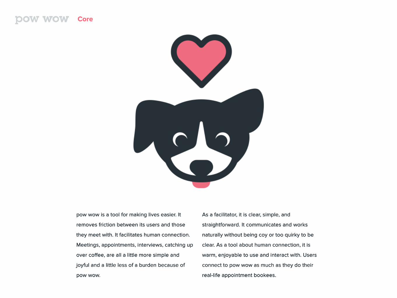
pow wow is a tool for making lives easier. It
removes friction between its users and those
they meet with. It facilitates human connection.
Meetings, appointments, interviews, catching up
over coffee, are all a little more simple and
joyful and a little less of a burden because of
pow wow.
As a facilitator, it is clear, simple, and
straightforward. It communicates and works
naturally without being coy or too quirky to be
clear. As a tool about human connection, it is
warm, enjoyable to use and interact with. Users
connect to pow wow as much as they do their
real-life appointment bookees.
Logo
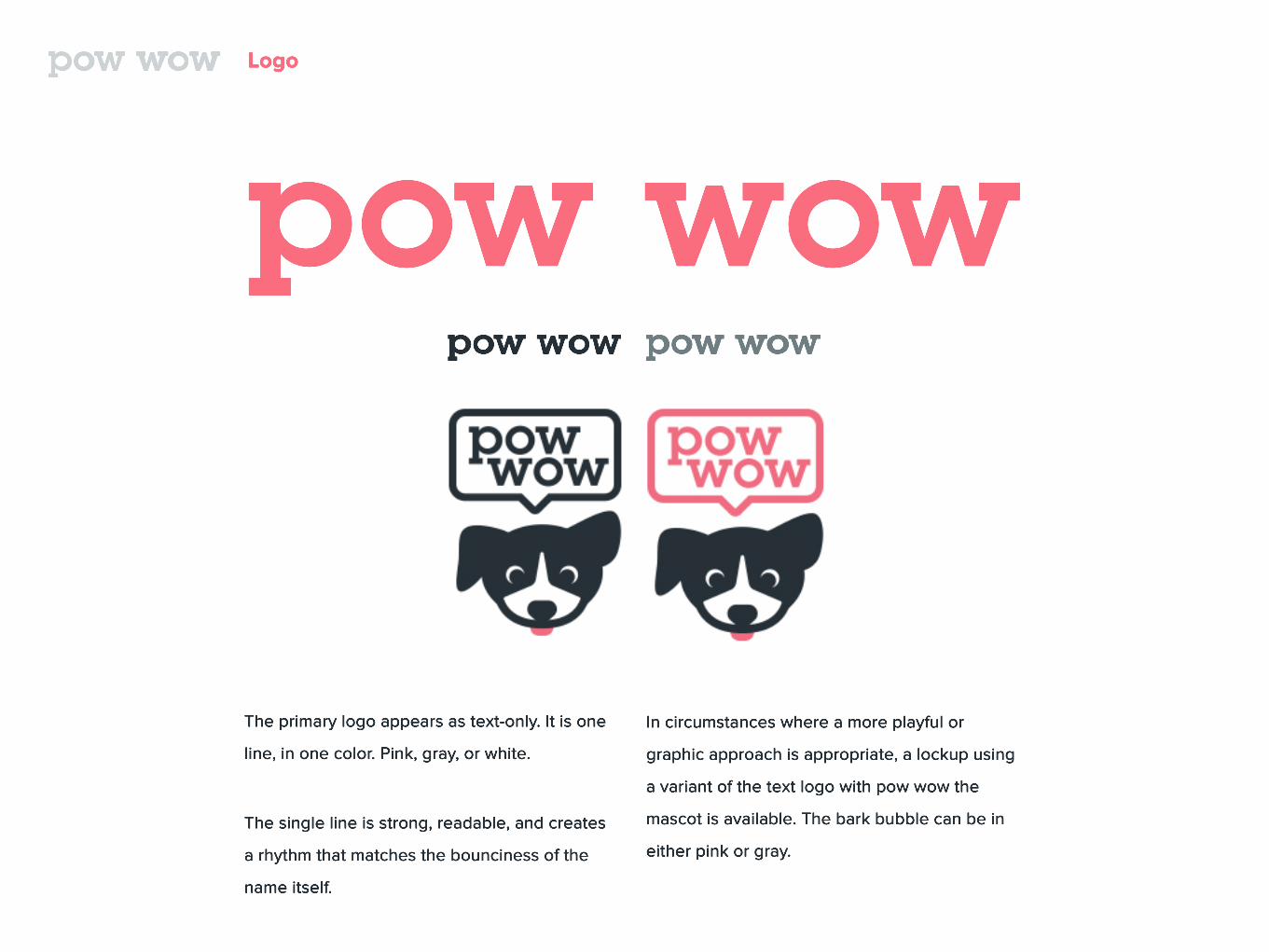
The primary logo appears as text-only. It is one
line, in one color. Pink, gray, or white.
The single line is strong, readable, and creates
a rhythm that matches the bounciness of the
name itself.
In circumstances where a more playful or
graphic approach is appropriate, a lockup using
a variant of the text logo with pow wow the
mascot is available. The bark bubble can be in
either pink or gray.
Mascot
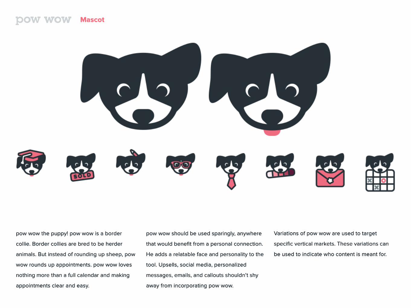
pow wow the puppy! pow wow is a border
collie. Border collies are bred to be herder
animals. But instead of rounding up sheep, pow
wow rounds up appointments. pow wow loves
nothing more than a full calendar and making
appointments clear and easy.
pow wow should be used sparingly, anywhere
that would benefit from a personal connection.
He adds a relatable face and personality to the
tool. Upsells, social media, personalized
messages, emails, and callouts shouldn’t shy
away from incorporating pow wow.
Variations of pow wow are used to target
specific vertical markets. These variations can
be used to indicate who content is meant for.
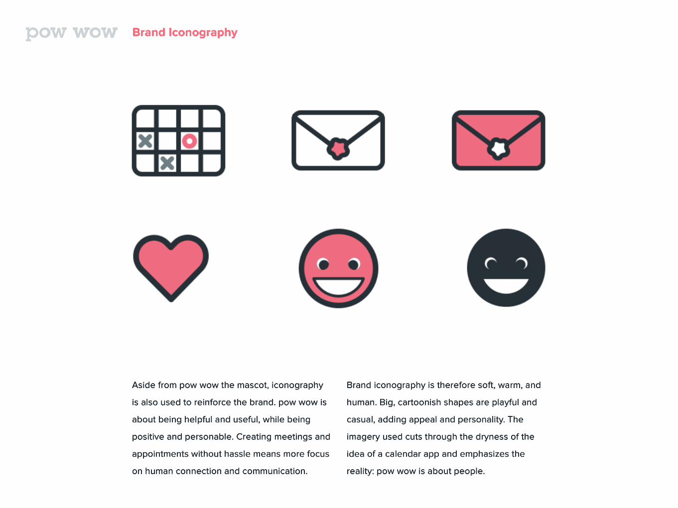
Brand Iconography
Aside from pow wow the mascot, iconography
is also used to reinforce the brand. pow wow is
about being helpful and useful, while being
positive and personable. Creating meetings and
appointments without hassle means more focus
on human connection and communication.
Brand iconography is therefore soft, warm, and
human. Big, cartoonish shapes are playful and
casual, adding appeal and personality. The
imagery used cuts through the dryness of the
idea of a calendar app and emphasizes the
reality: pow wow is about people.
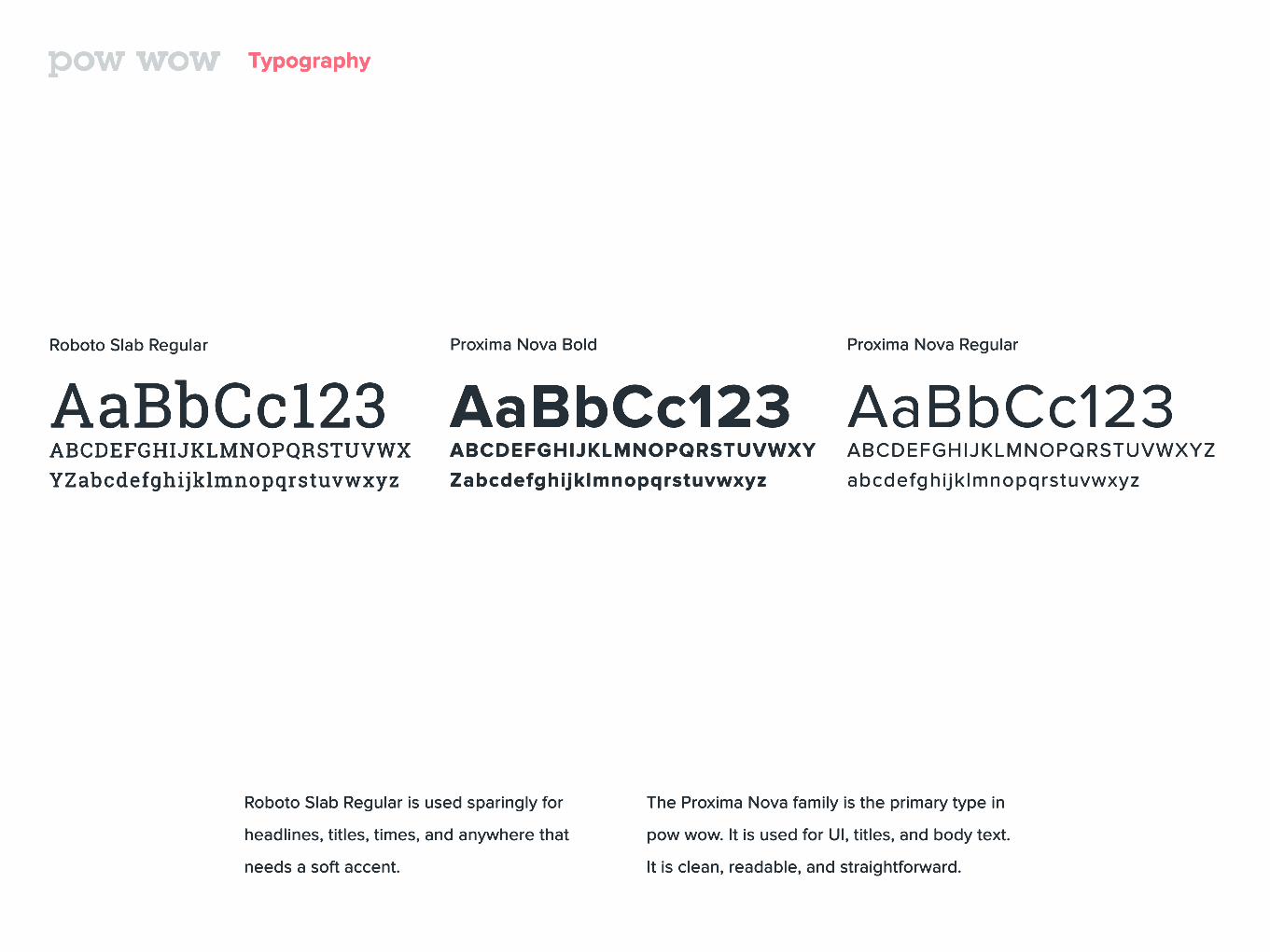
Typography
Roboto Slab Regular
AaBbCc123ABCDEFGHIJKLMNOPQRSTUVWXYZabcdefghijklmnopqrstuvwxyz
Proxima Nova Bold
AaBbCc123ABCDEFGHIJKLMNOPQRSTUVWXY
Zabcdefghijklmnopqrstuvwxyz
Proxima Nova Regular
AaBbCc123ABCDEFGHIJKLMNOPQRSTUVWXYZ
abcdefghijklmnopqrstuvwxyz
Roboto Slab Regular is used sparingly for
headlines, titles, times, and anywhere that
needs a soft accent.
The Proxima Nova family is the primary type in
pow wow. It is used for UI, titles, and body text.
It is clean, readable, and straightforward.
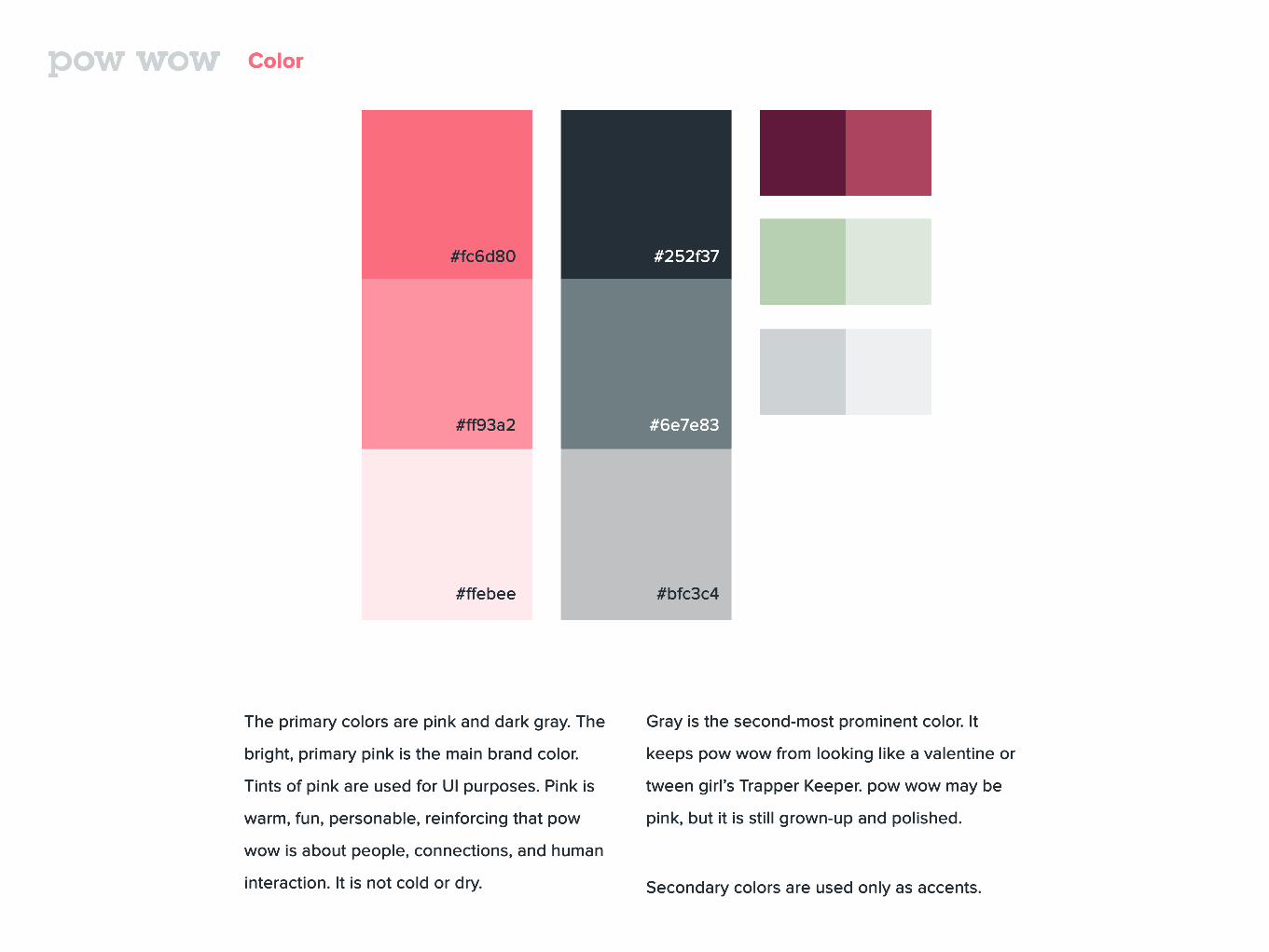
Color
The primary colors are pink and dark gray. The
bright, primary pink is the main brand color.
Tints of pink are used for UI purposes. Pink is
warm, fun, personable, reinforcing that pow
wow is about people, connections, and human
interaction. It is not cold or dry.
#fc6d80
#ff93a2
#ffebee
#252f37
#6e7e83
#bfc3c4
Gray is the second-most prominent color. It
keeps pow wow from looking like a valentine or
tween girl’s Trapper Keeper. pow wow may be
pink, but it is still grown-up and polished.
Secondary colors are used only as accents.
Pattern
Photography
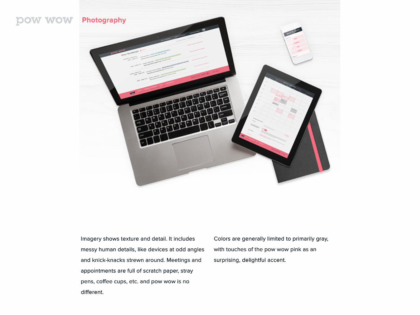
Imagery shows texture and detail. It includes
messy human details, like devices at odd angles
and knick-knacks strewn around. Meetings and
appointments are full of scratch paper, stray
pens, coffee cups, etc. and pow wow is no
different.
Colors are generally limited to primarily gray,
with touches of the pow wow pink as an
surprising, delightful accent.
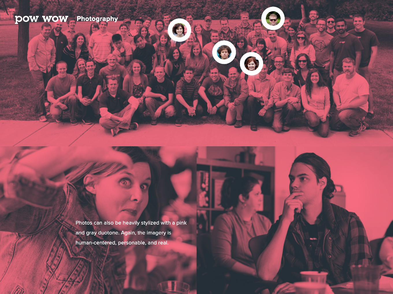
Photography
Photos can also be heavily stylized with a pink
and gray duotone. Again, the imagery is
human-centered, personable, and real.

Voice
When it comes to the voice of pow wow, think
Khanh! Khanh is fun and friendly and perky.
She’s helpful and wants to make your day
easier/smoother/better.
At the same time, Khanh is on top of everything,
no-nonsense, and knows exactly where you
need to be and when better than you do.
HelpfulInformative
Informed
Interested
Matter-of-fact
HumanPPersonal
Natural
Excited
Self-aware