Brand Guidelines - · PDF file109 C FFD200 C 1 R 255 M 16 G 210 Y 100B 0 K 0 Pantone HEX # 389...
19
Brand Guidelines
Transcript of Brand Guidelines - · PDF file109 C FFD200 C 1 R 255 M 16 G 210 Y 100B 0 K 0 Pantone HEX # 389...

Brand Guidelines

1 BRAND POSITIONING
Manifesto . . . . . . . . . . . . . . . . . . . . . . . . . . . . . . . . . . . . . . . . . . . . . . . . . . . . . . . . . . . . . . . . . . . . . . . . . . . . . 1 .1
Vision & Mission . . . . . . . . . . . . . . . . . . . . . . . . . . . . . . . . . . . . . . . . . . . . . . . . . . . . . . . . . . . . . . . . . . . . . . .1 .2
Values . . . . . . . . . . . . . . . . . . . . . . . . . . . . . . . . . . . . . . . . . . . . . . . . . . . . . . . . . . . . . . . . . . . . . . . . . . . . . . . . 1 .3
2 BRAND IDENTITY
Preferred Logo . . . . . . . . . . . . . . . . . . . . . . . . . . . . . . . . . . . . . . . . . . . . . . . . . . . . . . . . . . . . . . . . . . . . . . . . 2 .1
Preferred Logo With Tagline . . . . . . . . . . . . . . . . . . . . . . . . . . . . . . . . . . . . . . . . . . . . . . . . . . . . . . . . . . . .2 .2
Safety Area . . . . . . . . . . . . . . . . . . . . . . . . . . . . . . . . . . . . . . . . . . . . . . . . . . . . . . . . . . . . . . . . . . . . . . . . . . . .2 .3
Primary and Secondary Colour Palette . . . . . . . . . . . . . . . . . . . . . . . . . . . . . . . . . . . . . . . . . . . . . . . . . . .2 .4
Colour Variations . . . . . . . . . . . . . . . . . . . . . . . . . . . . . . . . . . . . . . . . . . . . . . . . . . . . . . . . . . . . . . . . . . . . . .2 .5
Colour Variations Unacceptable Usage . . . . . . . . . . . . . . . . . . . . . . . . . . . . . . . . . . . . . . . . . . . . . . . . . . .2 .6
Minimum Sizes . . . . . . . . . . . . . . . . . . . . . . . . . . . . . . . . . . . . . . . . . . . . . . . . . . . . . . . . . . . . . . . . . . . . . . . .2 .7
Co-Branding . . . . . . . . . . . . . . . . . . . . . . . . . . . . . . . . . . . . . . . . . . . . . . . . . . . . . . . . . . . . . . . . . . . . . . . . . .2 .8
3 BRAND ELEMENTS
Typography . . . . . . . . . . . . . . . . . . . . . . . . . . . . . . . . . . . . . . . . . . . . . . . . . . . . . . . . . . . . . . . . . . . . . . . . . . . 3 .1
Wordmark Symbol . . . . . . . . . . . . . . . . . . . . . . . . . . . . . . . . . . . . . . . . . . . . . . . . . . . . . . . . . . . . . . . . . . . . .3 .2
Imagery . . . . . . . . . . . . . . . . . . . . . . . . . . . . . . . . . . . . . . . . . . . . . . . . . . . . . . . . . . . . . . . . . . . . . . . . . . . . . . .3 .3
Imagery cont' and Imagery Dont's . . . . . . . . . . . . . . . . . . . . . . . . . . . . . . . . . . . . . . . . . . . . . . . . . . . . . . . .3 .4
Design Suggestions . . . . . . . . . . . . . . . . . . . . . . . . . . . . . . . . . . . . . . . . . . . . . . . . . . . . . . . . . . . . . . . . . . . .3 .5
ContentsColumbia Valley Brand Guidelines
1.1
MANIFESTOThe city is a pressure cooker.
Office life, small spaces, traffic, noise, pollution, commuting and hectic schedules all conspire to turn ordinary human beings into stressed out, time-starved, nervous wrecks . No wonder a recent survey revealed that 73% of all working city dwellers, aged 20 to 64, reported uncomfortable levels of stress and anxiety . No wonder therapists are seeing more patients now than at any other time in Canadian history . No wonder our society is set to pop more pills for stress-related disorders this decade, than in the two previous decades—combined .
Fortunately, there is another way .
The Columbia Valley, with its hot springs, weather, lakes, beaches, ski hills, scenery, golf courses, and peaceful ambiance, represents a no-side effects cure for what ails city dwellers . It provides unhurried asylum for the stressed, the over worked, and the anxious—all in one valley—that’s just a three-hour drive away . The Great Divide isn’t just a geographical feature that provides our border, it is a metaphorical watershed . One that separates a chaotic, stressful existence from a more relaxed, peaceful one .
We recharge depleted batteries . We save tortured souls . We are the peaceful garden that is humanity’s birthright .
We are Columbia Valley. Where the city unwinds.
Brand positioningColumbia Valley Brand Guidelines

1.2
VISIONColumbia Valley will be recognized as Canada’s premier region for the treatment, and reversal of, City Stress Disorder™ .
MISSIONWe are mindful therapists who provide the relaxing, unhurried environments and calming facilities that help even the most stressed individuals on the planet to unwind, chill out, and recharge .
Brand positioningColumbia Valley Brand Guidelines

1.3
VALUESPeace
An unhurried, calming, kind attitude pervades everything we do
Respect
For our fellow humans, our traditions, and our environment
Mindfulness
We live in the here and now
Brand positioningColumbia Valley Brand Guidelines

2.1
PREFERRED LOGOOur logo consists of two elements – a wordmark and a symbol . These two components are always placed in a fixed relationship and should never be altered, modified (beyond what is reflected in this document), separated or redesigned in any way .
The Columbia Valley symbol is constructed using the following Pantone colours: PMS 389 C (Green), PMS 2925 C (Blue), PMS 109 C (Yellow), PMS 431 (Grey) . See page 2 .4 for converted values used for process printing and digital uses .
Symbol
Wordmark
When reproducing the logo, use only the artwork supplied with these guidelines . The logo must appear clearly and in the approved colours .
Brand identityColumbia Valley Brand Guidelines

2.2
PREFERRED LOGO WITH TAGLINEAlways leave the “X” amount of clear space between the Columbia Valley symbol, logo and tagline to ensure it is easily identifiable, visible and legible, wherever it is used . The tagline should always be as a single line and not broken up .
Font: Yeah Papa
Font: DIN Next LT Pro Medium
For the foreseeable future, the symbol, wordmark and tagline should be used on all communication pieces .
Use of the symbol+wordmark (excluding the tagline) will be approved on a case-by-case basis by the Brand Team .
Brand identityColumbia Valley Brand Guidelines

2.3
SAFETY AREAClear space "X" amount is the minimum “breathing room” that must be maintained around the logo . It also defines the minimum distance between the logo and the edge of a printed piece .
Do not position any text, graphic elements, or other visual marks inside the recommended clear space .
Brand identityColumbia Valley Brand Guidelines

2.4
COLOURSColumbia Valley colours are inspired by the three main elements that makes the valley such a special place .
Sun Water/Snow Nature
PRIMARY COLOURS
Pantone HEX # 2925 C 009BDF
C 76 R 0M 24 G 155Y 0 B 223K 0
Pantone HEX # 109 C FFD200
C 1 R 255M 16 G 210Y 100 B 0K 0
Pantone HEX # 389 C CEDF00
C 25 R 206M 0 G 223Y 100 B 0K 0
Pantone HEX # 431 C 5B6770
C 67 R 91M 52 G 103Y 44 B 112K 17
SECONDARY COLOURS
Pantone HEX # 2975 C 96D5EA
C 38 R 150M 2 G 213Y 5 B 234K 0
Pantone HEX # 151 C FF8400
C 0 R 255M 59 G 132Y 100 B 0K 0
Pantone HEX # 354 C 00AF43
C 95 R 0M 0 G 175Y 100 B 67K 0
Pantone HEX # 298 C 3DB5E6
C 65 R 61M 10 G 181Y 1 B 230K 0
Pantone HEX # 1375 C FF9F19
C 0 R 255M 45 G 159Y 96 B 25K 0
Pantone HEX # 375 C 94D600
C 47 R 148M 0 G 214Y 100 B 0K 0
Brand identityColumbia Valley Brand Guidelines

2.5
COLOUR VARIATIONSThe logo can be used with different colours and background interaction, however, only within the previously noted primary and secondary colour palette (p 2 .4) . Do not alter the logo colours and/or colour combination in any way, beyond what is noted within this document . Examples shown on this page are illustrative, not exhaustive .
Primary colours background- For situations where the preferred logo is not possible or recommended .
- Ensure primary colours are selected .
Preferred backgrounds .- Use the preferred logo for four-colour process or spot-colour print media, such as events, newspaper ads, etc .
Black and monotone options- For situations where the full-colour or white logo is not practical, or permitted . Community or local newspapers and ads . Promotional items that require single colour printing .
Colour or monotone usage over images- Make sure the logo has enough contrast to provide legibility against image backgrounds .
- You may use really subtle drop shadows (see example on the left) .
Brand identityColumbia Valley Brand Guidelines

2.6
COLOUR VARIATIONS UNACCEPTABLE USAGEThe legibility of the logo is key to achieve the desired impact . Avoid using any variation of the isolated logo over colours that are not recommended in this manual . Examples shown on this page are illustrative, not exhaustive .
Primary colour for logo and background-Don’t change the colour of parts of the logo symbol . Use the variations from previous page
Colour backgrounds .- Don’t use logo variations that don’t provide enough contrast for the logo
Over images - Don’t use the logo over an image that doesn’t provide enough legibility for the logo
Drop shadows - Don’t use strong drop shadows . Use only when necessary, and the drop shadows should be almost imperceptible, mimicking the background colours
Brand identityColumbia Valley Brand Guidelines

2.7
MINIMUM SIZESBecause the main logo is a vector file, there is no maximum size restriction . The preferred size for the Columbia Valley logo is 1 .5 in . (108 pixels) . However, in order to keep the clarity of the image, it is not to be used smaller than 1 in . (72 pixels) in width .
1 .5 in . wide108 pixels
2 .5 in . wide180 pixels
1 in . wide72 pixels
A note on .png and .jpg files: each version of the logo has been saved in two sizes . The smaller one has been built to the minimum size allowable, and is to be used only at that size (i .e . do not enlarge) . The larger version should be adequate size for most applications, and can be sized down, but no smaller than 1 inch . If a .jpg is needed larger than the 4 in . File available, please contact the Brand Team .
Brand identityColumbia Valley Brand Guidelines
2.8
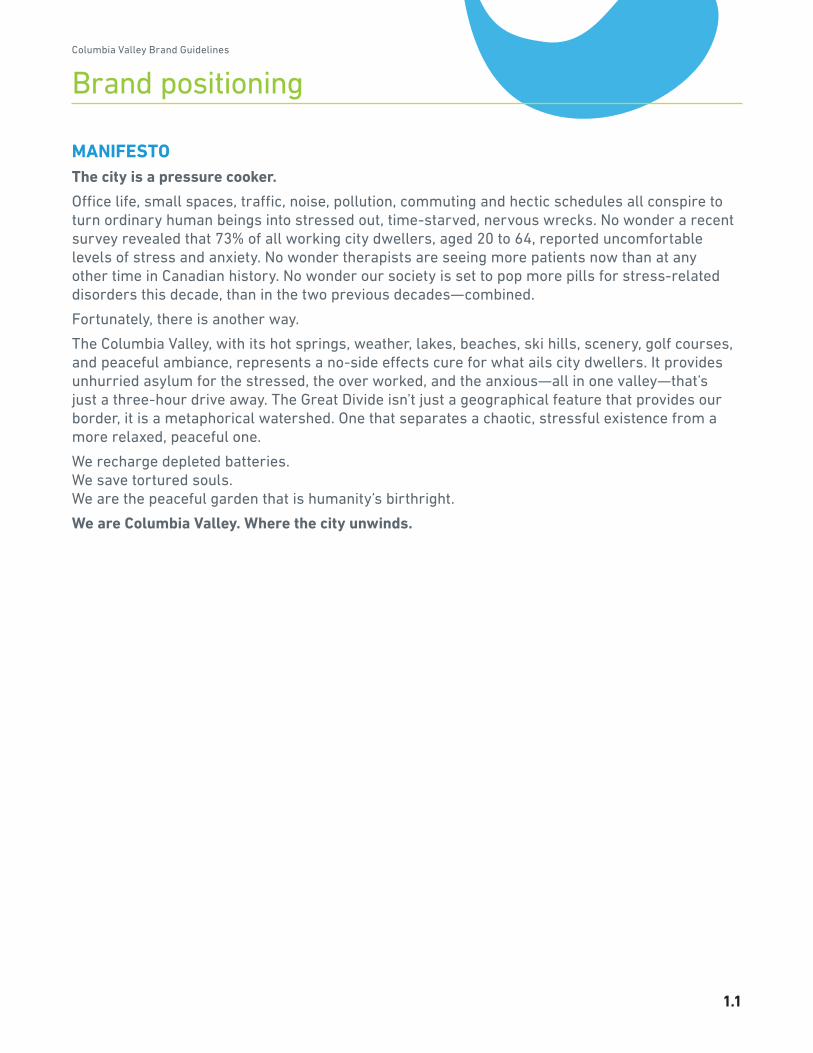
COLUMBIA VALLEY LOGO CO-BRANDINGA number of opportunities exist to marry the Columbia Valley logo (symbol+wordmark {and tagline}) with another brand's visual ID . If the environment in which the logo will appear is neutral, the Columbia Valley wordmark should be the prominent focus . However, if the environment where the logo will appear is owned, initiated or paid for by the other brand, it is appropriate that their brand be the prominent focus .
Prominent focus: Columbia Valley
Prominent focus: Partner
When a marketing partner is the primary focus, the Columbia Valley logo would be approx 1/3 the size of the primary logo .
Columbia Valley logo in the primary position with a 0 .5pt rule separating the partner logo . General rule is the primary logo is same width as the secondary logo . Only when the partner's logo is extremely wide, should the horizontal version be used .
Brand identityColumbia Valley Brand Guidelines
3.1
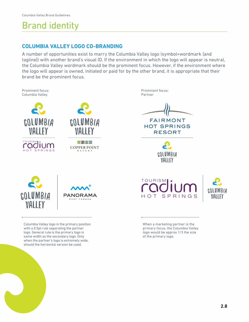
TYPOGRAPHYThe Yeah Papa typeface is the font used for the Columbia Valley wordmark and may also be used for headlines in advertising . The DIN Next LT Pro typeface comes in a variety of weights, and offers flexibility for both print and website assets . Commitment to this typeface will create a consistent, strong identity .
YEAH PAPA - Logo wordmark, and possible Headlines .
abcdefghijklmnopqrstuvwxyz1234567890 !@#$%&*()_
DIN NEXT LT PRO LIGHT / LIGHT ITALIC
AaBbCcDdEeFf1234567890!@#$%&*()+=AaBbCcDdEeFf1234567890!@#$%&*()+=DIN NEXT LT PRO MEDIUM / MEDIUM ITALIC
AaBbCcDdEeFf1234567890!@#$%&*()+=AaBbCcDdEeFf1234567890!@#$%&*()+=DIN NEXT LT PRO BOLD / BOLD ITALIC
AaBbCcDdEeFf1234567890!@#$%&*()+=AaBbCcDdEeFf1234567890!@#$%&*()+=DIN NEXT LT PRO HEAVY / HEAVY ITALIC
AaBbCcDdEeFf1234567890!@#$%&*()+=AaBbCcDdEeFf1234567890!@#$%&*()+=
Brand elementsColumbia Valley Brand Guidelines

3.2
WORDMARK SYMBOLColumbia Valley logo has a custom designed symbol . It is based on elements from the nature and Columbia Valley’s amenities .
The symbol can break apart and act as our signature and can be used to introduce or sign off communications .
Through out this document the use of these symbols are shown on each page as a visual accent dividing sections . See page 3 .5 for an example of outdoor advertising .
Brand elementsColumbia Valley Brand Guidelines

3.3
• Positive • Happy expressions captured during a candid moment, never posed
• Real • Enjoying the moment • Full of life • Aspirational restful activity
• Realization • Contemplating • Interactions
• Pleasures • Immersions
IMAGERY - To convey a desirable destination, our imagery will have to follow a few rules .
Brand elementsColumbia Valley Brand Guidelines

3.4
• Cheesy • Forced expressions, or any expressions captured during a staged moment looking directly at the camera
• Natural wonders • Unique differentials and unexpected angles of the valley's beauty
• Dated photography • Amateur looking • Over the top, treated imagery
• Poor representation of the nature (i .e . Inconvenient, dangerous, unappealing)
2.5 IMAGERY DONT’S - Some images can convey a fake or poor image of the valley .
IMAGERY - cont .
Brand elementsColumbia Valley Brand Guidelines

3.5
DESIGN SUGGESTIONSA mix of photography and elements from the logo symbol can create a unique, colourful and impactful layout . Try to select colours from the primary or secondary colour palette to complement the photo's colours (i .e . Golf course - use green colours, Waters - blue tones), only employing colours from the primary and secondary colour board, p 2 .4 .
Radium
Next stop
•
Ca
na
l
Fl
at
s
• F
ai
rm
on
t
• I
nv
er
me
re
•
Ra
di
um
•
Brand elementsColumbia Valley Brand Guidelines

BRAND TEAM CONTACT INFO:Andrea Tubbs
Tel: 250 .688 .0189 Email: info@itstimetounwind .com