BRAND GUIDELINE - The Work Project · PURPOSE OF BRAND GUIDELINE A collection of documents which...
30
BRAND GUIDELINE
Transcript of BRAND GUIDELINE - The Work Project · PURPOSE OF BRAND GUIDELINE A collection of documents which...

BR AND GUIDELINE

PURPOSE OF BR AND GUIDELINE
A collection of documents which sets out how to use the design elements in a consistent way. It is developed to complement The Work Project’s graphic language.
2

CONTENT
I - V I S UA L I D E N T I T Y
I a . LO G OT Y P E
I b . V I S UA L I D E N T I T Y S Y S T E M
I c . C O LO U R PA L E T T E
I d . S EC O N DA RY T Y P E FAC E
I I - C O L L AT E R A L S

I - VISUAL IDENTITY
I a . LO G OT Y P E
I b . V I S UA L I D E N T I T Y S Y S T E M
I c . C O LO U R PA L E T T E
I d . S EC O N DA RY T Y P E FAC E
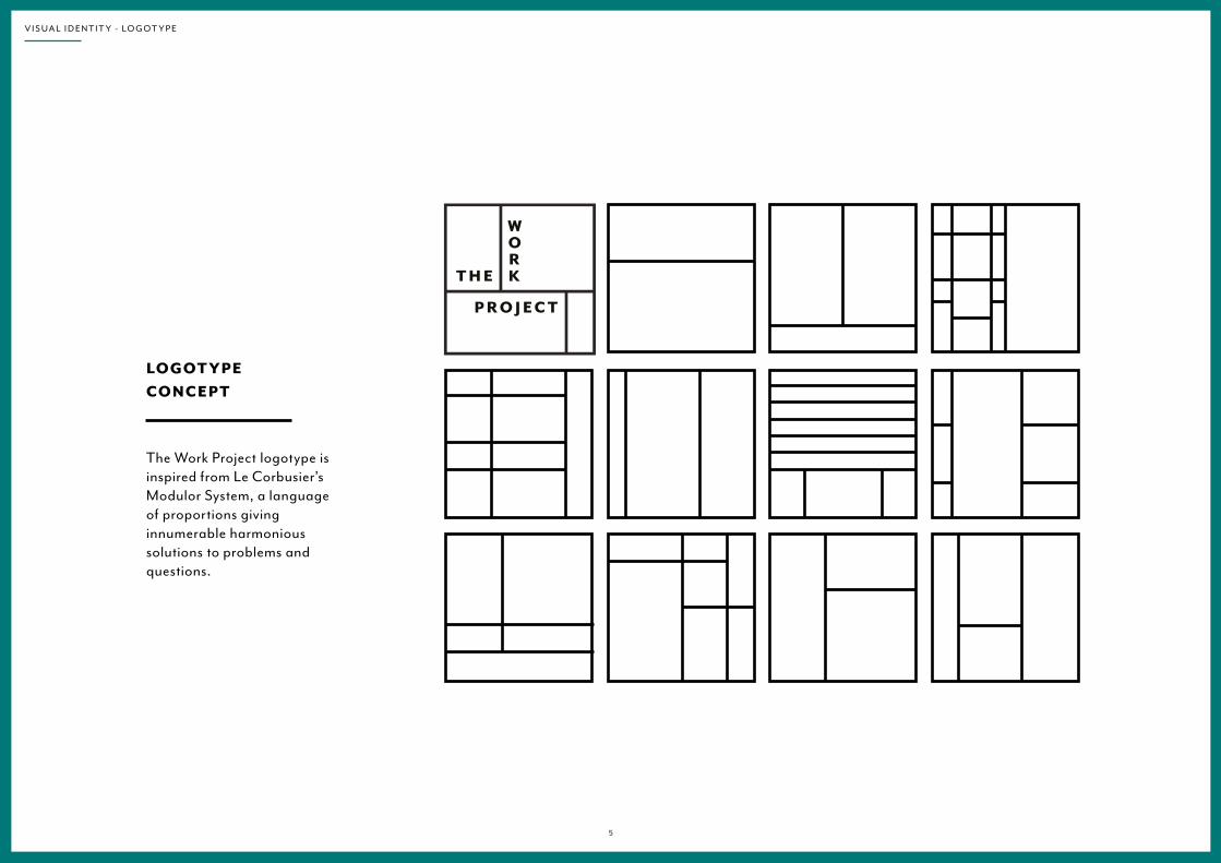
LOGOT YPE CONC EP T
The Work Project logotype is inspired from Le Corbusier’s Modulor System, a language of proportions giving innumerable harmonious solutions to problems and questions.
5
V I S U A L I D E N T I T Y - L O G O T Y P E

LOGOT YPE COMPONENTS
Grid
Grid Lines
Englisghsignature
The customised English signature ‘The’, ‘Work’ and ‘Project’ are placed in seperated spaces divided by grid lines, only at the corner. The different elements cannot be used seperately.
6
V I S U A L I D E N T I T Y - L O G O T Y P E

COMPONENTS SPATIAL REL ATION SHIP
All spatial relationships in the logo are calculated based upon the unit of “X”, which equals to the width / height of the square frame.
0.07 X
0.07 X
0.06 X
0.06 X 0.06 X
X
7
V I S U A L I D E N T I T Y - L O G O T Y P E

MINIMUMC LEAR SPAC E
To ensure that the logo is always read accurately, minimum space requirement should be followed strictly in all situation when the logo is used.
A space of 0.25X must be allowed on all sides of the logo as indicated. “X” equals to the width / height of the frame.
X
0.25 X
0.25 X
0.25 X
0.25 X
8
V I S U A L I D E N T I T Y - L O G O T Y P E

MINIMUM SIZERECOMMENDATION
The minimum size of the logotype is 20 mm height. It cannot be used in any smaller size for readability issues.
Minimum size:20 mm
9
V I S U A L I D E N T I T Y - L O G O T Y P E
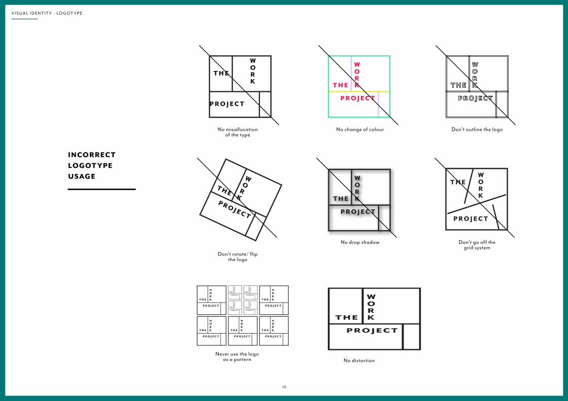
No misallocation of the type
Don’t rotate/ flip the logo
No change of colour
No drop shadow
Don’t outline the logo
Don’t go off the grid system
INCORRECTLOGOT YPE USAGE
No distortionNever use the logo
as a pattern
1 0
V I S U A L I D E N T I T Y - L O G O T Y P E

VISUAL IDENTIT Y SYSTEM CONC EP T
The visual identity system takes reference from Le Corbusier’s Modulor System, with its perfect proportions to achieve harmonious visual impacts.
1 1
V I S U A L I D E N T I T Y - G R I D S Y S T E M

LOGOT YPE VARIATION SWITH GRID
From the Modulor System, 6 types of grids are chosen and modified to provide logotype variations used in different situations, allowing flexibility of dynamic logotypes.
Main logotype
1 2
V I S U A L I D E N T I T Y - G R I D S Y S T E M
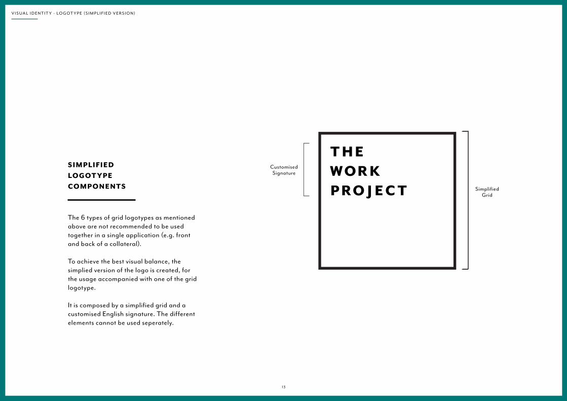
SimplifiedGrid
CustomisedSignature
The 6 types of grid logotypes as mentioned above are not recommended to be used together in a single application (e.g. front and back of a collateral).
To achieve the best visual balance, the simplied version of the logo is created, for the usage accompanied with one of the grid logotype.
It is composed by a simplified grid and a customised English signature. The different elements cannot be used seperately.
SIMPLIFIEDLOGOT YPECOMPONENTS
1 3
V I S U A L I D E N T I T Y - L O G O T Y P E (S I M P L I F I E D V E R S I O N )

All spatial relationships in the logo are calculated based upon the unit of “X”, which equals to the width / height of the square frame.
COMPONENTS SPATIAL REL ATION SHIP
1 4
V I S U A L I D E N T I T Y - L O G O T Y P E (S I M P L I F I E D V E R S I O N )
X
0.08 X
0.1 X

MINIMUMC LEAR SPAC E
To ensure that the logo is always read accurately, minimum space requirement should be followed strictly in all situation when the logo is used.
A space of 0.25X must be allowed on all sides of the logo as indicated. “X” equals to the width / height of the frame.
X
0.25 X
0.25 X
0.25 X
0.25 X
1 5
V I S U A L I D E N T I T Y - L O G O T Y P E (S I M P L I F I E D V E R S I O N )

MINIMUM SIZERECOMMENDATION
The minimum size of the logotype is 20 mm height. It cannot be used in any smaller size for readability issues.
Minimum size:20 mm
1 6
V I S U A L I D E N T I T Y - L O G O T Y P E (S I M P L I F I E D V E R S I O N )

No misallocation of the type
Don’t rotate/ flip the logo
No change of colour
No drop shadow
Don’t outline the logo
INCORRECTLOGOT YPE USAGE
No distortion
Never use the logo as a pattern
1 7
V I S U A L I D E N T I T Y - L O G O T Y P E (S I M P L I F I E D V E R S I O N )

COLOUR PALET TE
The main brand colour is 100% black, used in the logotype.
Five other colours are used to create variations.
PANTONE 623U
CMYK: 33, 6, 24, 2RGB: 150, 181, 171
BLACK CMYK 0, 0, 0, 100
PANTONE 563U
CMYK: 48, 0, 26, 0RGB: 118, 185, 175
PANTONE 7718U
CMYK: 95, 0, 48, 22RGB: 53, 130, 130
PANTONE 560U
CMYK: 85, 32, 79, 59 RGB: 75, 94, 91
PANTONE 7506U
CMYK: 0, 5, 21, 1RGB: 249, 225, 183
1 8
V I S U A L I D E N T I T Y - C O L O U R PA L E T T E

COLOUR VARIATION S
The colour combinations can vary from two to three colours in the logotype grid system. However, the white part should stay dominant.
Main logotype
1 9
V I S U A L I D E N T I T Y - C O L O U R PA L E T T E

BL AC K & WHITE VERSION
2 0
V I S U A L I D E N T I T Y - C O L O U R PA L E T T E

BL AC K & WHITE SIMPLIFIED VERSION
2 1
V I S U A L I D E N T I T Y - C O L O U R PA L E T T E

BL AC K & WHITE APPLICATION
Use the black logotype on light background pictures.
Use the white logotype on dark background pictures.
Avoid disturbing visual elements in the picture behind the logotype.
2 2
V I S U A L I D E N T I T Y - C O L O U R PA L E T T E

INCORRECT COLOUR USAGE Avoid dark background
colour behind the text. Keep a balanced layout of colour combinations.
No other colour than black on the logotype and the grid.
No vivid colour. Always use the colour palette.
Never use only one colour. Don’t overfill the frame.
Never use the logotype with colours on a background picture.
2 3
V I S U A L I D E N T I T Y - C O L O U R PA L E T T E
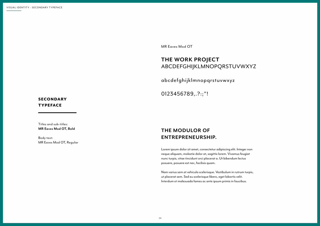
MR Eaves Mod OT
THE WORK PROJECTABCDEFGHIJKLMNOPQRSTUVWXYZ
abcdefghijklmnopqrstuvwxyz
0123456789,.?:;”!
THE MODULOR OF ENTREPRENEURSHIP.
Lorem ipsum dolor sit amet, consectetur adipiscing elit. Integer non neque aliquam, molestie dolor at, sagittis lorem. Vivamus feugiat nunc turpis, vitae tincidunt orci placerat a. Ut bibendum lectus posuere, posuere est nec, facilisis quam.
Nam varius sem at vehicula scelerisque. Vestibulum in rutrum turpis, ut placerat sem. Sed eu scelerisque libero, eget lobortis velit. Interdum et malesuada fames ac ante ipsum primis in faucibus.
SECONDARYT YPEFAC E
Titles and sub-titles: MR Eaves Mod OT, Bold Body text: MR Eaves Mod OT, Regular
2 4
V I S U A L I D E N T I T Y - S E C O N D A R Y T Y P E FA C E
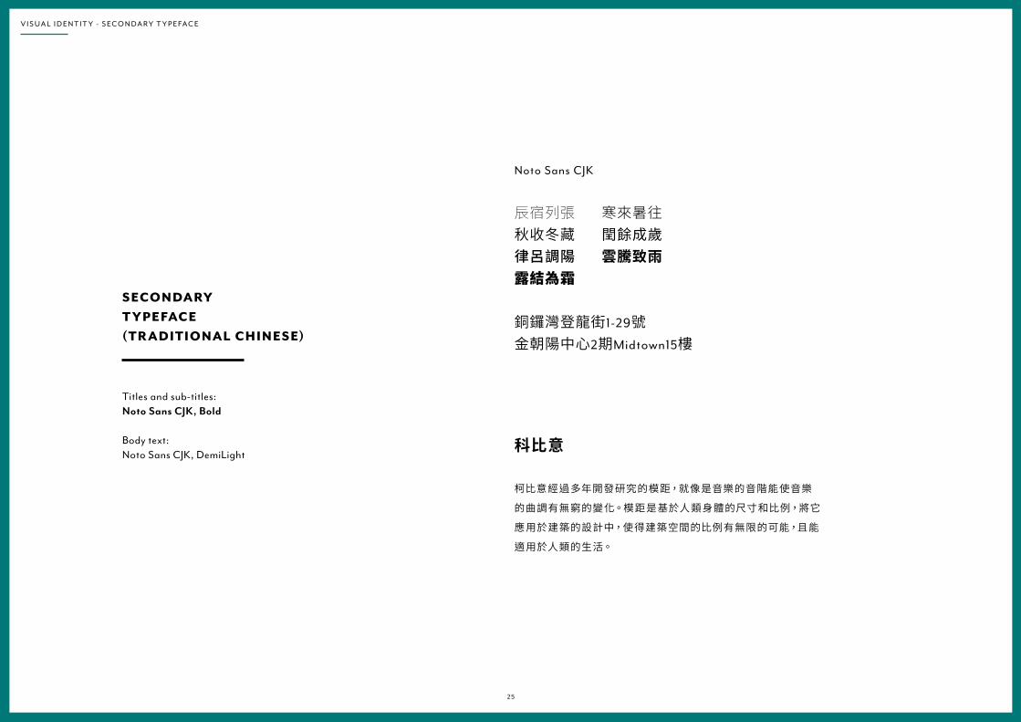
Noto Sans CJK
辰宿列張 寒來暑往秋收冬藏 閏餘成歲律呂調陽 雲騰致雨露結為霜
銅鑼灣登龍街1-29號金朝陽中心2期Midtown15樓
科比意
柯比意經過多年開發研究的模距,就像是音樂的音階能使音樂
的曲調有無窮的變化。模距是基於人類身體的尺寸和比例,將它
應用於建築的設計中,使得建築空間的比例有無限的可能,且能
適用於人類的生活。
SECONDARYT YPEFAC E (TR ADITIONAL C HINESE)
Titles and sub-titles: Noto Sans CJK, Bold Body text: Noto Sans CJK, DemiLight
2 5
V I S U A L I D E N T I T Y - S E C O N D A R Y T Y P E FA C E

II - COLLATERALS
B U S I N E S S C A R D S

BUSINESS CARDS
Design preview.Dimensions: 85w x 55h mm
C O L L AT E R A L S
2 7

BUSINESS CARDS
Design preview.Blind emboss printing on logotype and grid.
C O L L AT E R A L S
2 8

BUSINESS CARDS
Design preview.Different variations according to the grid system.
C O L L AT E R A L S
2 9