
Bootstrap 3
28
Bootstrap 3 Lanh Le - 2013
-
Upload
lanh-le-thi-my -
Category
Technology
-
view
338 -
download
4
Transcript of Bootstrap 3

Bootstrap 3
Lanh Le - 2013

Content
❏Why Bootstrap?
❏ Bootstrap Support
❏Demonstration
❏ Font Awesome

Bootstrap Support

Bootstrap Support
Responsive DesignUsing LESS

Bootstrap Support
Modules Package
Grid System
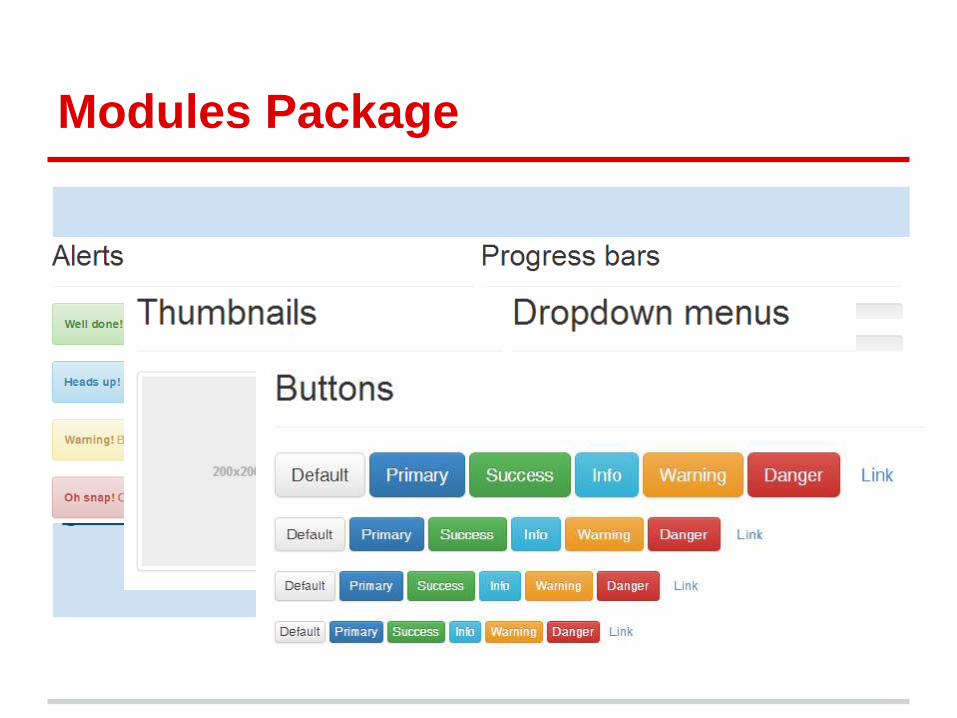
Dropdowns Button groups Button dropdowns Input
groups Navs Navbar Breadcrumbs Pagination
Labels Badges Jumbotron Page header
Thumbnails Alerts Progress bars Media object List
group Panels Wells
Modules Package

Sample Modules
Single button dropdowns
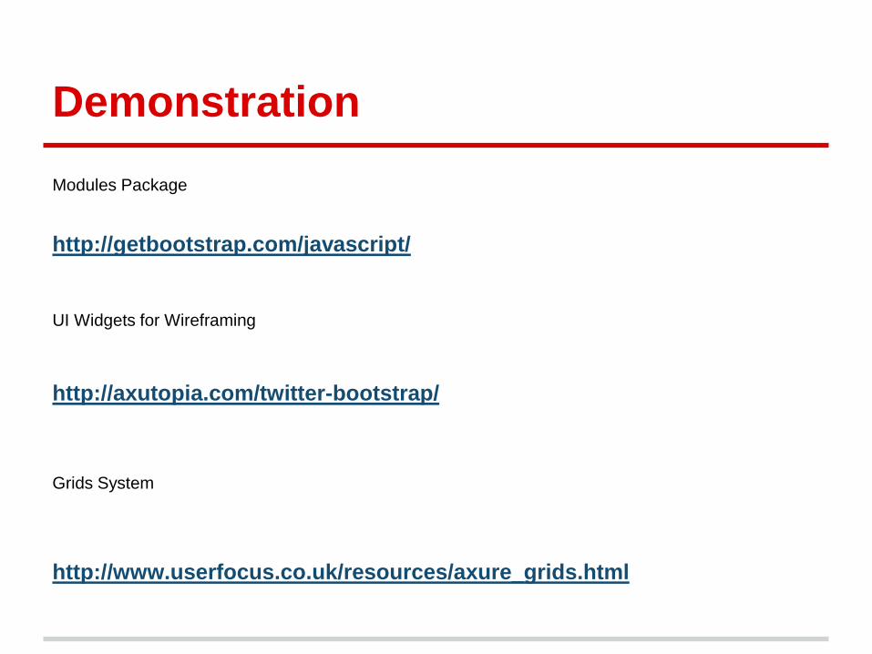
Demonstration
http://getbootstrap.com/javascript/
http://axutopia.com/twitter-bootstrap/
UI Widgets for Wireframing
Modules Package
Grids System
http://www.userfocus.co.uk/resources/axure_grids.html

Basic Template
<!DOCTYPE html>
<html>
<head>
<title>Bootstrap 101 Template</title>
<meta name="viewport" content="width=device-width, initial-scale=1.0">
<!-- Bootstrap -->
<link href="css/bootstrap.min.css" rel="stylesheet" media="screen">
<!-- HTML5 shim and Respond.js IE8 support of HTML5 elements and media queries -->
…
</head>
<body>
<h1>Hello, world!</h1>
<!-- jQuery (necessary for Bootstrap's JavaScript plugins) -->
<script src="//code.jquery.com/jquery.js"></script>
<!-- Include all compiled plugins (below), or include individual files as needed -->
<script src="js/bootstrap.min.js"></script>
</body>
</html>

Viewport
Mobile First<meta name="viewport" content="width=device-width, initial-scale=1.0">
User-scalable=”No”<meta name="viewport" content="width=device-width, initial-scale=1.0, maximum-
scale=1.0, user-scalable=no">

Breakpoints & Media Queries
/* Extra small devices (phones, up to 480px) */
/* No media query since this is the default in Bootstrap */
/* Small devices (tablets, 768px and up) */
@media (min-width: @screen-sm) { ... }
/* Medium devices (desktops, 992px and up) */
@media (min-width: @screen-md) { ... }
/* Large devices (large desktops, 1200px and up) */
@media (min-width: @screen-lg) { ... }

Grids & Breakpoints
(*) is column width from 1 to 12
.col-xs-* => @media (max-width: @screen-xs-max) { ... }
.col-sm-* => @media (min-width: @screen-sm-min) and (max-width: @screen-sm-max) { ... }
.col-md-* => @media (min-width: @screen-md-min) and (max-width: @screen-md-max) { ... }
.col-lg-* => @media (min-width: @screen-lg-min) { ... }
Extra small
devicesPhones (<768px)
Small devices
Tablets (≥768px)
Medium devices
Desktops (≥992px)
Large devices Desktops
(≥1200px)
Max container width None (auto) 750px 970px 1170px
Class prefix .col-xs- .col-sm- .col-md- .col-lg-

Grids - Samples
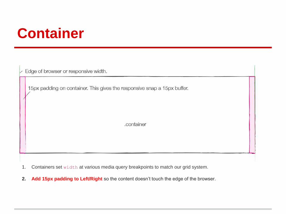
Container
1. Containers set width at various media query breakpoints to match our grid system.
2. Add 15px padding to Left/Right so the content doesn’t touch the edge of the browser.

Row
1. Rows must be placed within a .container for proper alignment and padding.
2. Use rows to create horizontal groups of columns.
3. Rows only go with columns

Column
1. User columns to layout the content.
2. Columns are created by specifying the number (from 1-12 columns)
3. Columns create gutters (gaps between column content) via padding.

Nested Rows
1. Rows can go inside of columns
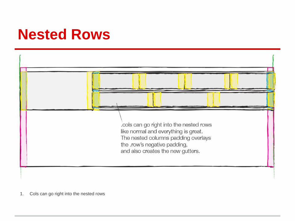
Nested Rows
1. Cols can go right into the nested rows

Offsets
1.

What... if?
Working with “Row” and “Column” without “Container”?
Grids Summary
❖ Containers:
➢ Containers set width at various media query breakpoints to match our grid system.
➢ Containers add 15px padding to the left & right so the content doesn’t touch the edge of the browser.
❖ Rows
➢ Use rows to create horizontal groups of columns.
➢ Rows must be placed within a .container for proper alignment and padding.
➢ Rows only go with columns
➢ Rows can go inside of columns (nested content)
❖ Columns:
➢ User columns to layout the content.
➢ Columns are created by specifying the number (from 1-12 columns)
➢ Columns create gutters (gaps between column content) via padding.
➢ Cols can go right into the nested rows

Advantages & Disadvantages
- Designer MUST follow Grids system.
- Too much Combination Classes.
- Easy To Learn
- Designer/Developer Do the Same Way
- A Bunds of UI Patterns
Advantages:
Disadvantages:

Tools
Bootstrap Themeshttp://www.bootstrapthemeroller.com/twitter-bootstrap-themeroller.html
Bootstrap Templateshttp://www.bootstraptor.com/bootstrap3
Bootstrap Wireframe Kithttp://axutopia.com/twitter-bootstrap/
Bootstrap CDNhttp://www.bootstrapcdn.com/
- 370 Icons (Icon Library)
- 06 Standard Sizes (Sample Icon)
- Scalabled Icons
- Multiple Ways to Style the Icon:
Rotated/Flipped/Spinning/Outlined/Bordered/Sizing/Fixed
See sample: http://fontawesome.io/examples/

06 Standard Sizes
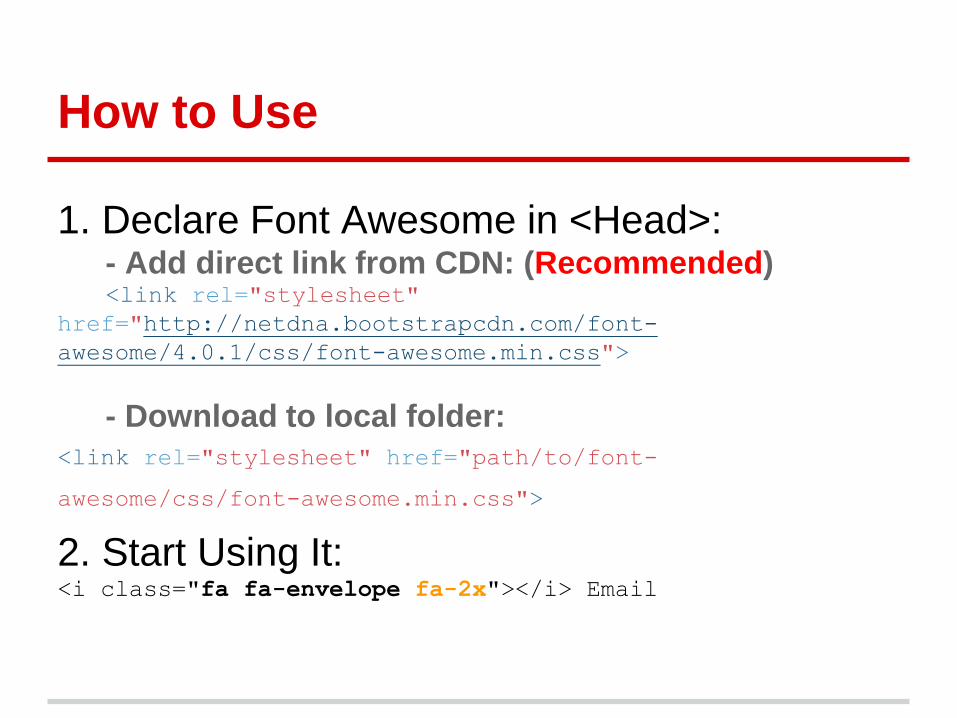
How to Use
1. Declare Font Awesome in <Head>:- Add direct link from CDN: (Recommended)<link rel="stylesheet"
href="http://netdna.bootstrapcdn.com/font-
awesome/4.0.1/css/font-awesome.min.css">
- Download to local folder:
<link rel="stylesheet" href="path/to/font-
awesome/css/font-awesome.min.css">
2. Start Using It:<i class="fa fa-envelope fa-2x"></i> Email

How to Use
fa-[name]-[shape]-[o]-[direction]
<i class="fa fa-envelope fa-2x"></i> Email
Sample 1:
<i class="fa fa-envelope-o fa-5x fa-border”></i>
Sample 2:

Thank you