Book+Layout+and+Typographic+Design+FULL
131
From the view of designers, design is inseparable with life, music, food and friends. Earlier before designing a book, conception is the soul of the overall design. At this time, designers need more inspiration to fresh the book and thus catch the readers’ eyes. Book design is "propositional", so the inspiration of designers always comes from the content of a book. Designers usually combine what they had acquired in books and living experience with the proposition of the book on hand, eventually turn it into the designing process. While thinking about the overall design of a book, designers should take the diversity of book design into account, which according to different propositions and types of books to differ the conception. What’s more, the form of book must be based on the nature, content, readers and other factors of the book. Cover design is top priority of book design. Cover design can be conceived as a kind of visual communication artwork, which means that it could arouse a visual and psychological resonance of readers in terms of vision and conception. The conception of cover is a concentrated expression of the designers’ own artistic culture and cultural deposits. The cover should be full of sense of times and vividness. It is through different forms of choice and comparison that the conception and the design could be really arouses the readers’ feelings. "Light to see” means that the cover is just to give a beam of sunlight onto the invisible content of the book, and thus make the book full of vitality. …,staat creative agency 3group Only after the designers have understood the content of a book do they start to choose the form of art to express the book content. The integrated visual language of the cover, title page, text layout and top margin could give a perfect presentation of the book’s content. A classic design could really present the original creativity and fascinating spiritual of the designer. The expression of the book’ s content is always realised by the form design. Form design is not simply refers to a kind of form or design, but to focus on the content, which determines the form and grasps the book overall from the view of microworld to macroworld. Designers that could apply the form design flexibly to present the book’s content will be able to integrate the content with form completely. In addition, the creation of the layout design’s aesthetics is an important part in the visual communication design of a book. That is to say, form design should not only consistent with the message that the book expresses from the view of logic, but also need giving strong visual aesthetic impact. In the book design, any subtle changes of the fonts, lines, colours and other elements could provide a different experience for readers. The book design always consists of words, images, colours and other elements, including the capture of the any disposable visual image and management to convey the content and core of the text. A rational expression of the imagery thinking can go beyond the expression of the words, so that to generate added value for the book. Britta Siegmund Creative Inc BOOK: LAYOUT AND TYPO - GRAPHIC DESIGN BOOK: LAYOUT AND TYPOGRAPHIC DESIGN DESIGN MEDIA PUBLISHING LIMITED DESIGN MEDIA PUBLISHING LIMITED 3 Deep Design Alexander Egger Andreas Preis Artiva Design Edenspiekermann iji-design
-
Upload
whatsinausername -
Category
Documents
-
view
70 -
download
1
description
Layout and Concept Design of A Book
Transcript of Book+Layout+and+Typographic+Design+FULL
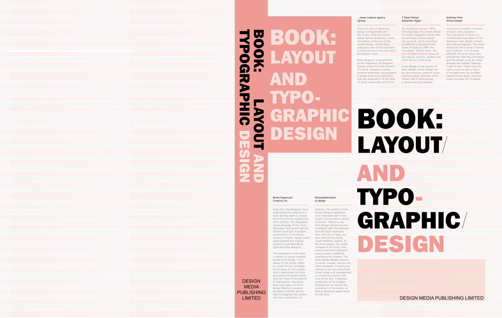
From the view of designers, design is inseparable with life, music, food and friends. Earlier before designing a book, conception is the soul of the overall design. At this time, designers need more inspiration to fresh the book and thus catch the readers’ eyes.
Book design is "propositional", so the inspiration of designers always comes from the content of a book. Designers usually combine what they had acquired in books and living experience with the proposition of the book on hand, eventually turn it into
the designing process. While thinking about the overall design of a book, designers should take the diversity of book design into account, which according to different propositions and types of books to differ the conception. What’s more, the form of book must be based on the nature, content, readers and other factors of the book.
Cover design is top priority of book design. Cover design can be conceived as a kind of visual communication artwork, which means that it could arouse a visual and psychological
resonance of readers in terms of vision and conception. The conception of cover is a concentrated expression of the designers’ own artistic culture and cultural deposits. The cover should be full of sense of times and vividness. It is through different forms of choice and comparison that the conception and the design could be really arouses the readers’ feelings. "Light to see” means that the cover is just to give a beam of sunlight onto the invisible content of the book, and thus make the book full of vitality.
…,staat creative agency3group
Only after the designers have understood the content of a book do they start to choose the form of art to express the book content. The integrated visual language of the cover, title page, text layout and top margin could give a perfect presentation of the book’s content. A classic design could really present the original creativity and fascinating spiritual of the designer.
The expression of the book’s content is always realised by the form design. Form design is not simply refers to a kind of form or design, but to focus on the content, which determines the form and grasps the book overall from the view of microworld to macroworld. Designers that could apply the form design flexibly to present the book’s content will be able to integrate the content with form completely. In
addition, the creation of the layout design’s aesthetics is an important part in the visual communication design of a book. That is to say, form design should not only consistent with the message that the book expresses from the view of logic, but also need giving strong visual aesthetic impact. In the book design, any subtle changes of the fonts, lines, colours and other elements could provide a different experience for readers. The book design always consists of words, images, colours and other elements, including the capture of the any disposable visual image and management to convey the content and core of the text. A rational expression of the imagery thinking can go beyond the expression of the words, so that to generate added value for the book.
Britta SiegmundCreative Inc
BOOK: LAYOUT AND TYPO-GRAPHIC DESIGN
BO
OK
: LAYOU
T AN
DTYP
OG
RA
PH
IC D
ES
IGN
DESIGN MEDIA PUBLISHING LIMITED
DESIGN MEDIA
PUBLISHING LIMITED
3 Deep DesignAlexander Egger
Andreas PreisArtiva Design
Edenspiekermanniji-design


BOOK: LAYOUT AND TYPO-GRAPHIC DESIGN
DESIGN MEDIA PUBLISHING LIMITED

CONTENTSPerface
Layout and Concept Design of A Book
The Expression of The Book's Content and Form
Component Design of A Book
Cover
Spine
Fly Page
Contents
Layout
Copyright Page
Design Method
Gridding
The Selection of Fonts
The Combination of Colours
The Arrangement of Images
Cases Analysis
Index
004
006
007
008
012
014
254

Dissimilarity
One of the principles of human nature is to impose one's will, as well as transformation of the world according to his/her
own necessities. A designer, that aspires to gain designated model, proceeds similarly – abides by the rules or breaks them
intentionally. When creating a layout, a designer makes use of graphic elements, images and typography, arranging them in a
controlled manner on pages of a publication coming into existence. In spite of technical development yet we still use the rules of
harmony and proportions introduced by ancient Greeks and Egyptians.
These rules enable us to manage complicated graphic arrangements of publications. The usage of the rule of thirds, absolute and
relative measures, Fibonacci or Renard numbers, or Karl Gerstner's grid of 58 equal units provides legible transfer of information.
Thanks to that the structure, that reflects reality, is created. That ensures the balance of the composition. At the same time it is
possible to preserve the element of creation as a consequence of diversified details. The utilisation of established rules does not
guarantee that a project would be accepted positively.
There are many ways to create a good layout and the most important thing is to use generally accepted principles in an individual
manner that lead us to a formation of an innovative project.
Ryszard Bienert3group
PERFACE
006-007
From the view of designers, design is inseparable with life,
music, food and friends. Earlier before designing a book,
conception is the soul of the overall design. At this time,
designers need more inspiration to fresh the book and thus
catch the readers’ eyes.
Book design is "propositional", so the inspiration of designers
always comes from the content of a book. Designers
usually combine what they had acquired in books and
living experience with the proposition of the book on hand,
eventually turn it into the designing process. While thinking
about the overall design of a book, designers should take
the diversity of book design into account, which according
to different propositions and types of books to differ the
conception. What’s more, the form of book must be based
on the nature, content, readers and other factors of the
book.
Cover design is top priority of book design. Cover design can
be conceived as a kind of visual communication artwork,
which means that it could arouse a visual and psychological
resonance of readers in terms of vision and conception.
The conception of cover is a concentrated expression of
the designers’ own artistic culture and cultural deposits.
The cover should be full of sense of times and vividness.
It is through different forms of choice and comparison that
the conception and the design could be really arouses the
readers’ feelings. "Light to see” means that the cover is just
to give a beam of sunlight onto the invisible content of the
book, and thus make the book full of vitality.
According to the book content, designers in the process of
conceiving and sketching always try to combine the view of
point, line, surface, body, space, texture, colour and living
experience into the design ideas and design.
Only after the designers have understood the content of a
book do they start to choose the form of art to express the
book content. The integrated visual language of the cover,
title page, text layout and top margin could give a perfect
presentation of the book’s content. A classic design could
really present the original creativity and fascinating spiritual
of the designer.
The expression of the book’s content is always realised
by the form design. Form design is not simply refers to a
kind of form or design, but to focus on the content, which
determines the form and grasps the book overall from the
view of microworld to macroworld. Designers that could
apply the form design flexibly to present the book’s content
will be able to integrate the content with form completely. In
addition, the creation of the layout design’s aesthetics is an
important part in the visual communication design of a book.
That is to say, form design should not only consistent with
the message that the book expresses from the view of logic,
but also need giving strong visual aesthetic impact. In the
book design, any subtle changes of the fonts, lines, colours
and other elements could provide a different experience for
readers. The book design always consists of words, images,
colours and other elements, including the capture of the
any disposable visual image and management to convey
the content and core of the text. A rational expression of
the imagery thinking can go beyond the expression of the
words, so that to generate added value for the book.
Book is not an instant static solid, so in the conveying of
the book’s content should pay more attention on the visual
process, which is a kind of movement in the visual space.
It refers to the process that the sight with various visual
elements in a certain space goes along a certain trajectory.
It aims to guide the eyes following with the design elements
to convey the messages of the design. A good book design
should include two aspects of time and space, which is
one thread, runs through the book and could be invisible.
Designers need to turn this invisible thread into graphic
or figurative language to show the readers. Therefore,
designers need to use the interrelated and interactive
relationship between various components to create a
rational and emotional visual design environment. They
should control the content of design and various elements
associated with the form subjectively and re-combine them,
so that make the whole text clear and integrated.
The expression of the book’s content refers to the integration
and unification of the form and the content, for the content
needs to be presented by the form. Any work that separates
from the content to pursuit of form would turn to be a
failure. In another perspective, the content determines the
form, and the form serves for the content. Needless to say,
they complement each other, "never betray". Designers
need to be aware of the structure of time and space on the
book content, and understand the hierarchical space and
time as well as the temporal flow in sight, so that to catch
the readers’ eyes.
Layout and Concept Design of A Book The Expression of The Book's Content and Form

008-009
A book that gives a unique aesthetics from the overall to the
details may not just an ordinary book; it could be a kind of
artwork. Stunning appearance is not everything, only the
perfect details of design can bring readers to get the double
resonance in mind and feeling.
1. Cover
If a book is seen as a product, then there is no doubt that
cover is the packaging of the product. In traditional industry,
packaging design is a vital category, which means that the
failure of packaging design would cause a series of negative
reaction for sales and others. Cover is an expression of
a book. Whether it could touch the readers’ mind or not
became a key to the success of a book.
Cover not only to reflect the content, nature, but also to
provide readers with the aesthetics, and well protect the
book. Cover design includes the design of title, names of the
author and publishers as well as the decorative images and
colours. How to make the cover reflect the content of the
book and how to make it affect the readers’ mind are the
most important parts in the cover design.
The colour of cover is always determined by the content
of book as well as the readers’ age, educational level and
other characteristics. Bright colours are always applied in
the children's books; soft and pleasing colours are always
can be seen in the elderly reading; while colours between
bright and gray should be used in young people's books.
In addition, the content of the book also has specific
requirements for colours, for instance a book that focuses
on the revolutionary theme is suitable to red tones; some
theme that emphasises on exposing the dark social evils is
appropriate for white or black colour; while the fresh and
energetic book prefers bright colours, etc. Readers with
different cultural awareness, nationality and occupation
could have different colour preferences for books.
An innovative cover requires the designer to master a wide
range of knowledge. The knowledge of architecture, music,
drama, film literature and so on can provide rich and fresh
inspiration for designers. Designers in designing the cover
must have a good solid foundation and a certain space of
imagination in order to have the ability to fully express
the book's shape, colour and texture to touch the readers’
feeling.
2.Book Spine
Design of the book spine is an important visual language
second to that of cover in a book. Hans Pitt Virbo mentioned
in his book Developing of the Books Art that “it is spine that
presents ninety percent of a book”. Generally, most of books
sold in bookstores are always inserted in the shelf and can
not be completely displayed, at this time, book spine turns
to be the first visual language to express the style of a book.
Therefore, design of the spine is very important.
The space of spine is usually narrow and small, which needs
the designers to provide a refined layout design to make
this special place play its supreme role. Usually, spine is
often appropriate to use the unique composition and brilliant
colours to form a strong visual impact and thus stands out
from the crowd. However, the design of spine should go
harmoniously with the style and content of the whole book.
3.Fly Page
The fly page is a bridge between cover and inside of a
book. A classic book lacks of the fly page, just like a flaw on
the white jade, greatly reduces the value of its collection.
The fly page includes expansion page, blank page, like
page, frontispiece inserts or title page (the amount of
books), copyright page, inscription, thank offering, etc.
With the improvement of the aesthetics, the quality of the
fly page is also getting better and better, some of which
use high quality specialty paper, and some fly pages even
emit fragrance; while some with a number of decorative
patterns or illustrations relate with the content of the book.
Undoubtedly, this improvement will be a joy for the book
lovers and thereby increases the value of book, attracting
more buyers.
The design of fly page is required to reflect the theme
of the book content just as the cover design. In order to
construct a good bridge between the cover and content of
a book, illustrations, photography, calligraphy and other
art forms or printing process should be employed. As an
integral part of the overall design, the fly page should go
harmoniously with the cover and other design. Designers
should inherit the design tradition and also be innovative.
The emergence of the new materials and new craft not only
plays a breakthrough role in the traditional design concept,
but also calls the designers to take advantage of these new
technologies to design more innovative and unique books.
4 .Contents
Seen from the award-winning design of the contents of
books, we can see that the layout design of contents has
got rid of the coloured thread and changeable font as much
as possible. Some designers interest in the application of
colour, with some beautiful colour preferences listed in the
directory layout design, this "bulge" or "depression" results
could cause the readers’ visual fatigue while turning over
the book. A good designer will not abuse the colour, just
let the book's tone close to nature. If he chooses multi-
colour to achieve aesthetically pleasing results, he would
pay attention to the order of composition of neon. In many
masterpieces, there are some blanks just like that in the
Chinese painting could give readers a sense of relaxing and
Component Design of A Book
010-011
pleasing. The more important of the title is, the more blanks
are needed. Blank in the dense layout of the contents just
likes a beam of sunlight in the darkness, giving a sense of
pleasure.
5. Layout
Layout design refers to format design of the full text in a
book. Generally, besides the cover, the lining papers and
the title page, the forewords are also included. The layout
design should be original, beautiful, simple and popular and
go harmoniously with the book's contents. Visual sense is
the main sense organ of the human’s appreciation of the
beauty. Therefore, the layout design comes before the book
content to impress the readers; an excellent layout design
will attract readers to read the book content further. In
contrast, a book without a sense of design whose layout
design even gives a sense of suffocation will be hard to
attract the readers. This means that the layout design has
"advertising effect." Colour, line and other elements of each
particular object in the layout design are able to arouse the
reader's feelings.
In the layout design, symmetry as a design form has been
used widely. This design gives a sense of stability, unification
and elegance. In practice, absolute symmetry of the layout
design is rare, and too much emphasis on symmetry is also
easy to make the layout look stiff. Designers will usually
clever use the form of balance on typography to make up
for the shortcoming of the symmetry. Subtle changes in the
layout that are a little "breaks" of the absolutely symmetrical
layout could give a sense of novelty. This sense is generated
by designers’ applying the form of balance to coordinate the
contradiction between absolute symmetry and unbalance.
In the design process, designers should avoid imbalance
caused by too much changes.
Generally, in a book with texts and images, unique images
will give the readers a strong visual impact. Sometimes,
quality of the picture will directly affect the layout
design. Images can be enlarged according to the needs
of composition or even dealt with cross-page order and
bleeding. This will make layout more lively and bring a sense
of relaxing. What’s more, the arrangement of text should
correspond with the human engineering. Overlong lines will
cause reading fatigue and reduce the reading speed.
Most of the layout is two-dimensional graphic design.
Adjustment of the layout elements in accordance with the
distance could create a three-dimensional visual effect. The
changes of the font size and colour could contribute to a
sense of layer. Compared with the dark colours, light colours
seem closer to the readers. In addition, the improvement
of the arrangement of layout elements which refers to
the scale, directions, colours and other details could help
forming a mature perfect visual sense of space gradually.
This is so called a three-dimensional illusion of space based
on a two-dimensional plane. It aims to make the entire
layout full of rhythm, appears flexible and far-reaching, but
also to convey information clearly, will attract the reader's
attention and enhance their comprehension.
6. Copyright Page
Copyright page includes book title, the name of author,
editor, criticizer, publishers and the name and location of
printers and license number of book publishing business
permits as well as format, printed sheet, number of words.
In addition, there are also date of publication, order in the
edition and printed, printing number as well as ISBN and
pricing.
The title types in the copyright page are larger than other
types in this page, and the rest of the text is arranged
according to the classification. Some layout design also use
columns and decorative lines to fresh the page.
012-013
4. The Arrangement of Images
In recent years, blank layout is gradually developed into an
effective means to fresh the layout. Bold and rational use
of blank could perfectly present the good aesthetic taste of
designers and break the old and dull layout, so that giving
the whole page a sense of transparence, openness and
brightness as well as cleanness.
Design methods now are various. For a new case, the
designer redesigns the existing design methods in mind and
re-creates it which can greatly improve the design and make
the book design always being fresh.
1. Gridding
Gridding is not simply to put the words and pictures
together, but a form of rule that is developed from the
interrelated composition. It emphasizes the sense of
proportion, order, continuity, clarity, times, accuracy and
rigor. It perfectly coordinates the relationship between the
design elements. In essence, grid is the skeleton of layout
design which can bring a sense of order and structure for
design.
2. The Selection of Fonts
Type plays important role in the book design, which should
have distinct characteristics and styles. The ideal design is
to select different fonts to guide the readers. Text itself is an
art form, whether Chinese or English can be with handsome,
vigorous, lively, soft and other styles. It is convenient for
readers to read that the font goes harmoniously with the
content and style.
The brightness of pages varies with the difference of the
font, size, thickness, row spacing and kerning distances
which determine the layout of the composition in the colour
of black and white and grey. The changes of font size and
the choice of font could reflect the content of the text
elements, giving readers a taste of publications from the
spirit and the content. The type of the title should not be
too illegible or unrecognisable. Brief and small type should
not employ the strong and thick black font. Font which
is made up with simple lines and arcs gives a sense of
softness and calmness; the beautiful and elegant "decorated
letters” always give a sense of nobleness; round and thick
font always could be used in the cartoons. These general
knowledge and disciplines are the base of designing a
good book. In the designer's opinion, the choice of font is
a combination of understanding and intuition, while the
intuition comes from the accumulation of experience.
3.The Combination of Colours
Generally, colours are usually given to the feelings. In a
sense, colours reflect human’s character. In a similar way,
the colour sometimes can show the spirit of a book. Actually,
the colour content has not definitive meaning, while it always
causes physical and mental activity on us. For example,
the monotonous and simple colours of black, white, yellow,
always bring a sense of solemnity. The symbolism of colour
is formed with experience accumulation and habits while
people cognizing and using colours.
Design Methods
014-015
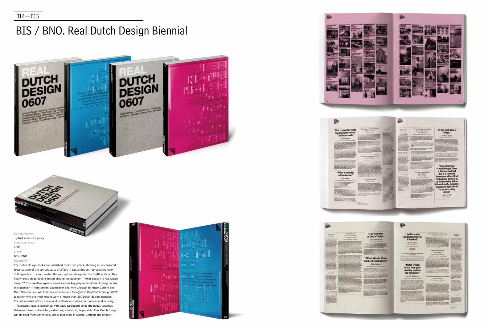
BIS / BNO. Real Dutch Design Biennial
Design Agency:
…,staat creative agency
Production Date:
2006
Client:
BIS / BNO
Description:
The Dutch Design books are published every two years, showing an uncensored
cross-section of the current state of affairs in Dutch design, representing over
300 agencies. …,staat created the concept and design for the 06/07 edition. This
nearly 1000-page book is based around the question: “What exactly is real Dutch
design?”. The creative agency asked various key players in different design areas
this question – from Stefan Sagmeister and Wim Crouwel to Anton Corbijn and
Marc Newson. You will find their answers and thoughts in Real Dutch Design 0607,
together with the most recent work of more than 300 Dutch design agencies.
The set consists of two books and is all about contrast in material and in design
– fluorescent plastic combined with basic cardboard binds the pages together.
Between these contradictory extremes, everything is possible. Real Dutch Design
can be read from either side, and is published in Dutch, German and English.
016-017
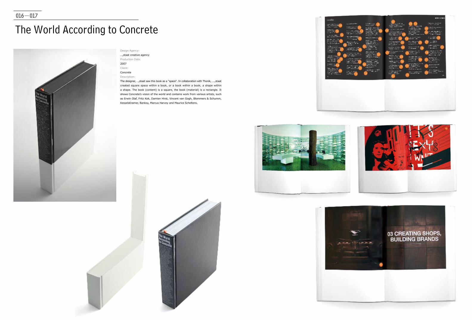
The World According to Concrete
Design Agency:
…,staat creative agency
Production Date:
2007
Client:
Concrete
Description:
The designer, …,staat saw this book as a "space". In collaboration with Thonik, ...,staat
created square space within a book, or a book within a book; a shape within
a shape. The book (content) is a square, the book (material) is a rectangle. It
shows Concrete’s vision of the world and contains work from various artists, such
as Erwin Olaf, Fritz Kok, Damien Hirst, Vincent van Gogh, Blommers & Schumm,
KesselsKramer, Banksy, Marcus Harvey and Maurice Scheltens.
018-019
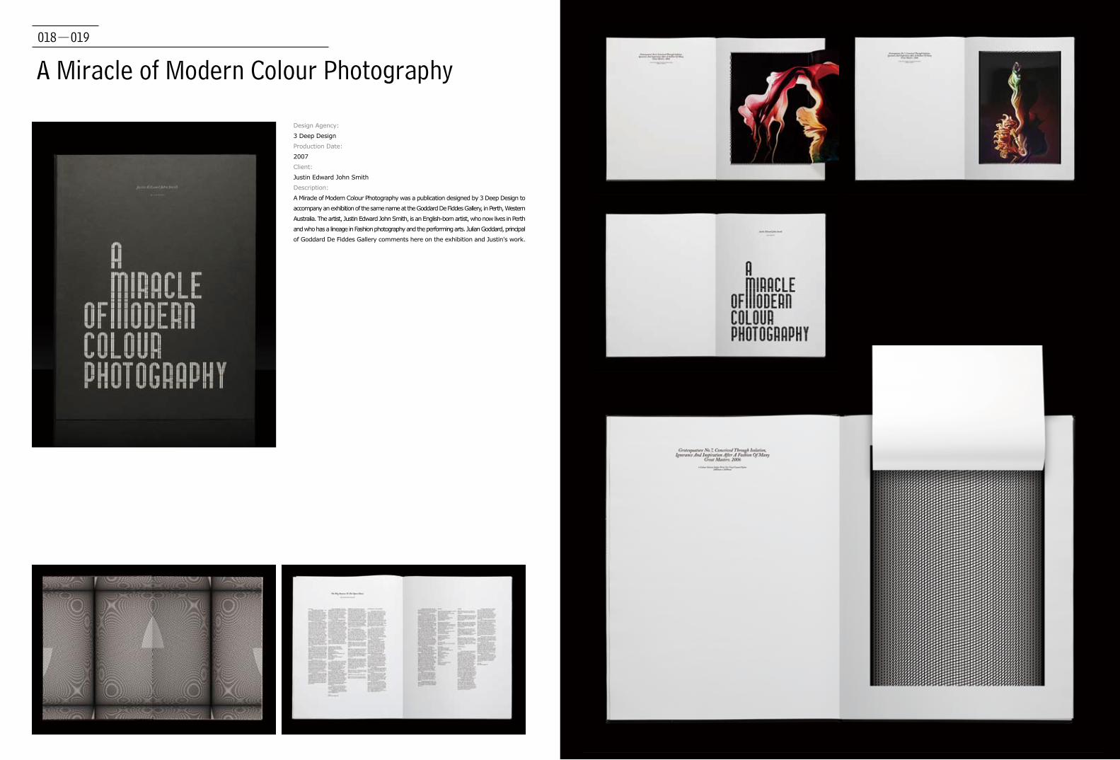
A Miracle of Modern Colour Photography
Design Agency:
3 Deep Design
Production Date:
2007
Client:
Justin Edward John Smith
Description:
A Miracle of Modern Colour Photography was a publication designed by 3 Deep Design to
accompany an exhibition of the same name at the Goddard De Fiddes Gallery, in Perth, Western
Australia. The artist, Justin Edward John Smith, is an English-born artist, who now lives in Perth
and who has a lineage in Fashion photography and the performing arts. Julian Goddard, principal
of Goddard De Fiddes Gallery comments here on the exhibition and Justin's work.

020-021
Goalkeeper ForeverDesign Agency:
3group
Designer:
Ryszard Bienert
Production Date:
2009
Client:
Galeria Piekary
Description:
Book “Goalkeeper Forever” was designed
for the photography exhibition of Zbigniew
Sosnowski in Piekary Gallery in Poznan,
Poland. In its character design relates to 1970s'
photography style. There are 5 different kinds
of paper used inside the book: coated matt,
offset white, cream, handmade paper and
different grammature of “newspaper like” stock.
Shots are printed by use of duotone Black and
Pantone Gray. Cover has two differently-sized
sleeves, the bigger one is a poster printed
on uncoated paper, the smaller one is gloss
laminated. There inserts of different size in the
book printed on the thin stock, gloss laminated
throughout.
022-023
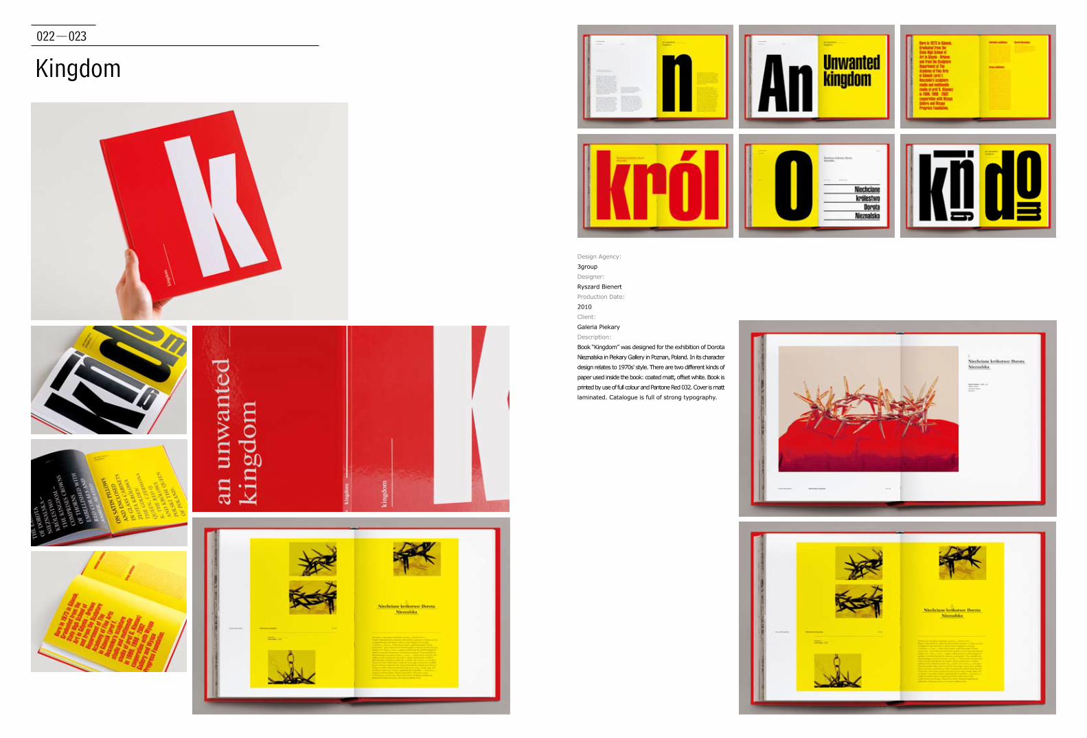
Kingdom
Design Agency:
3group
Designer:
Ryszard Bienert
Production Date:
2010
Client:
Galeria Piekary
Description:
Book “Kingdom” was designed for the exhibition of Dorota
Nieznalska in Piekary Gallery in Poznan, Poland. In its character
design relates to 1970s' style. There are two different kinds of
paper used inside the book: coated matt, offset white. Book is
printed by use of full colour and Pantone Red 032. Cover is matt
laminated. Catalogue is full of strong typography.
024-025
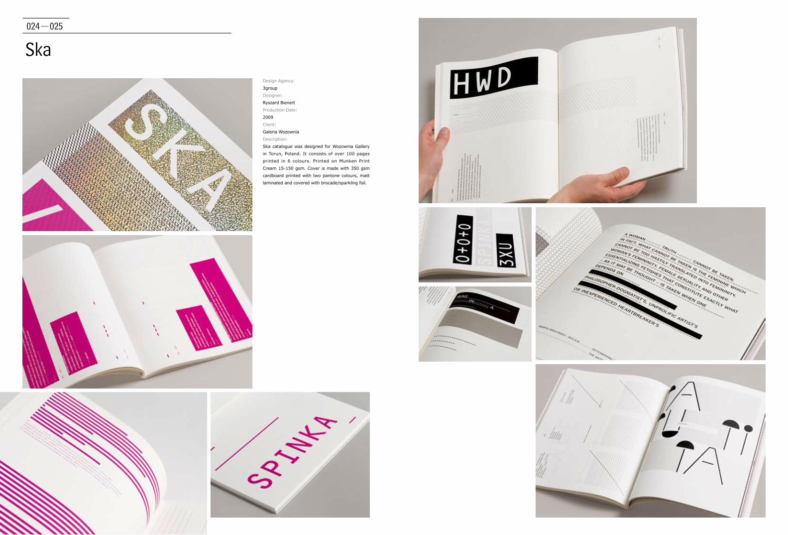
SkaDesign Agency:
3group
Designer:
Ryszard Bienert
Production Date:
2009
Client:
Galeria Wozownia
Description:
Ska catalogue was designed for Wozownia Gallery
in Torun, Poland. It consists of over 100 pages
printed in 6 colours. Printed on Munken Print
Cream 15-150 gsm. Cover is made with 350 gsm
cardboard printed with two pantone colours, matt
laminated and covered with brocade/sparkling foil.
026-027
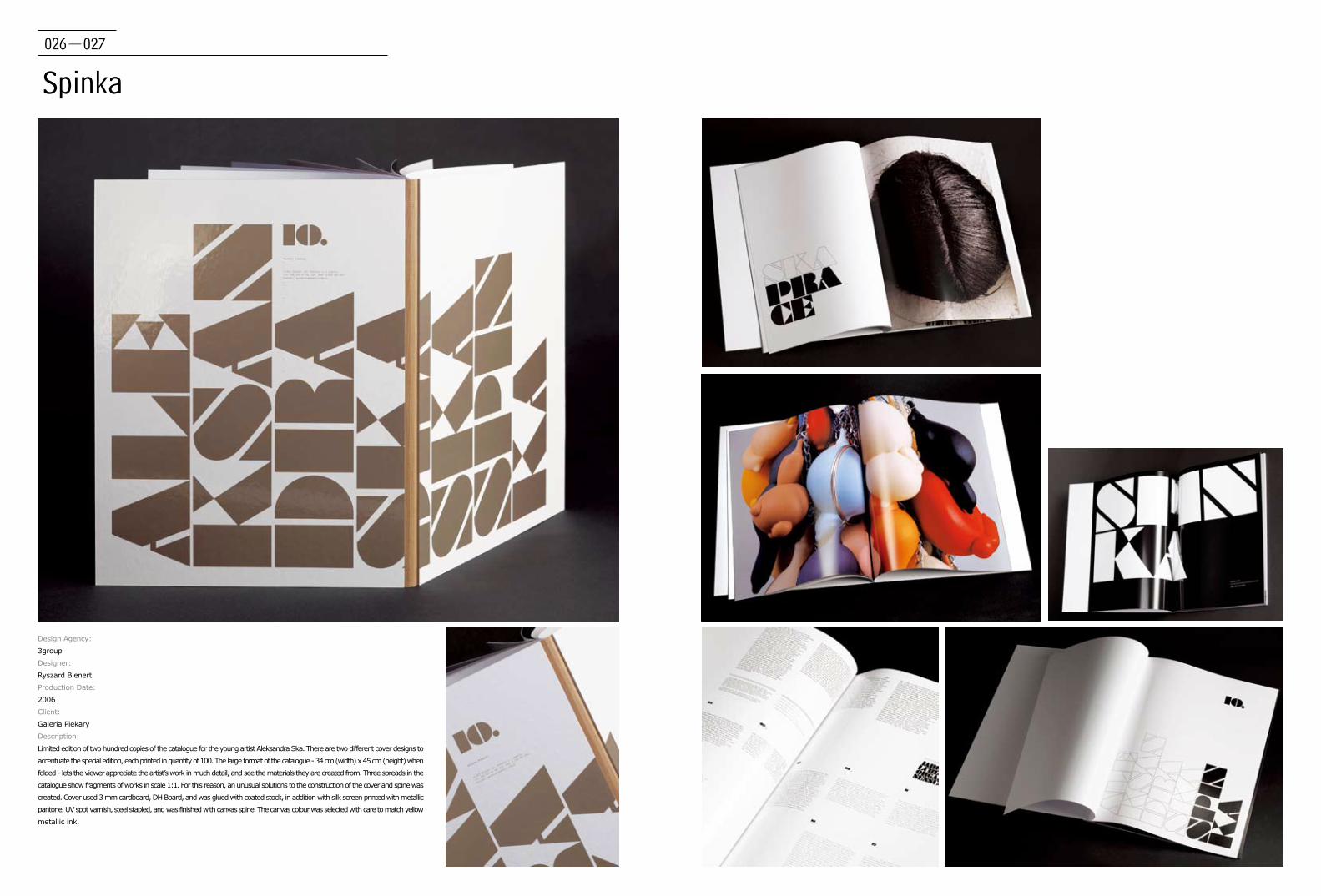
Spinka
Design Agency:
3group
Designer:
Ryszard Bienert
Production Date:
2006
Client:
Galeria Piekary
Description:
Limited edition of two hundred copies of the catalogue for the young artist Aleksandra Ska. There are two different cover designs to
accentuate the special edition, each printed in quantity of 100. The large format of the catalogue - 34 cm (width) x 45 cm (height) when
folded - lets the viewer appreciate the artist’s work in much detail, and see the materials they are created from. Three spreads in the
catalogue show fragments of works in scale 1:1. For this reason, an unusual solutions to the construction of the cover and spine was
created. Cover used 3 mm cardboard, DH Board, and was glued with coated stock, in addition with silk screen printed with metallic
pantone, UV spot varnish, steel stapled, and was finished with canvas spine. The canvas colour was selected with care to match yellow
metallic ink.
028-029
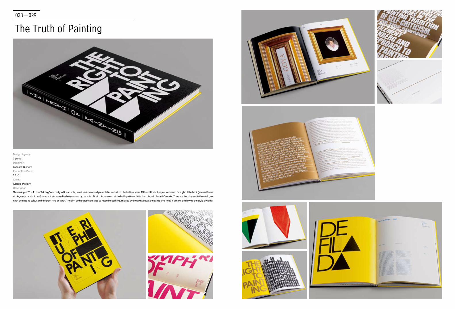
The Truth of Painting
Design Agency:
3group
Designer:
Ryszard Bienert
Production Date:
2010
Client:
Galeria Piekary
Description:
The catalogue “The Truth of Painting” was designed for an artist, Kamil Kuskowski and presents his works from the last few years. Different kinds of papers were used throughout the book (seven different
stocks, coated and coloured) to accentuate several techniques used by the artist. Stock colours were matched with particular distinctive colours in the artist's works. There are four chapters in the catalogue,
each one has its colour and different kind of stock. The aim of the catalogue was to resemble techniques used by the artist but at the same time keep it simple, similarly to the style of works.
030-031
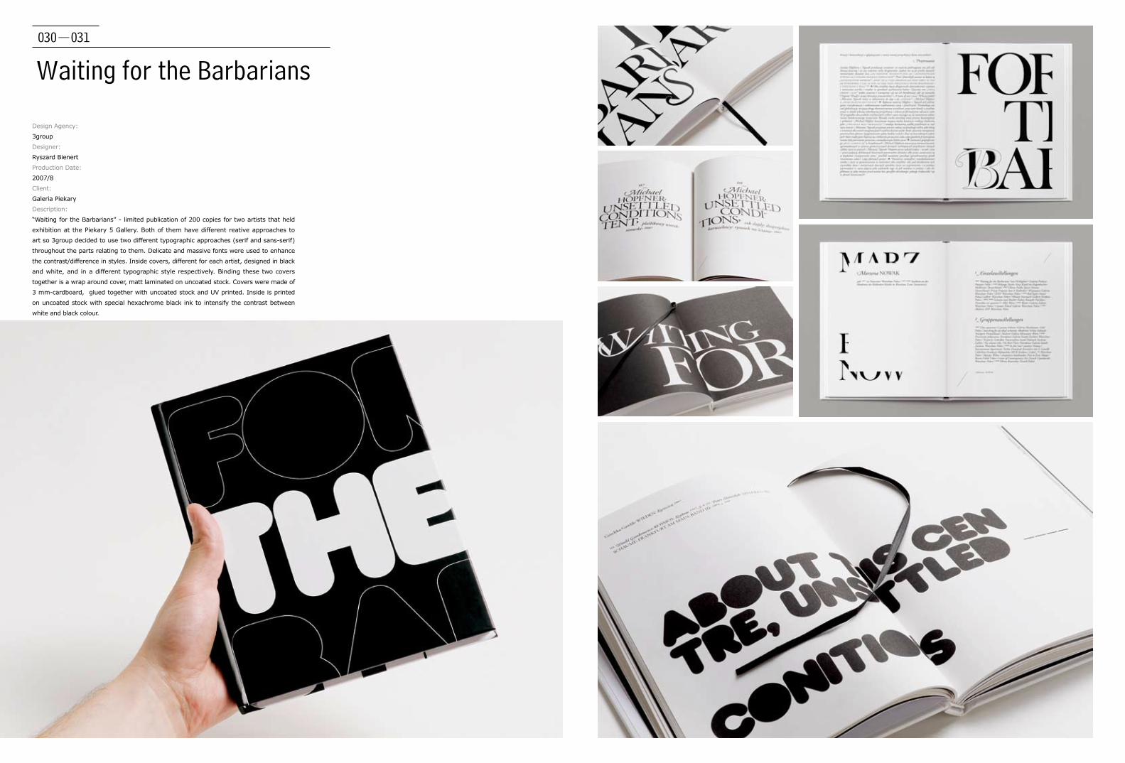
Waiting for the Barbarians
Design Agency:
3group
Designer:
Ryszard Bienert
Production Date:
2007/8
Client:
Galeria Piekary
Description:
“Waiting for the Barbarians” - limited publication of 200 copies for two artists that held
exhibition at the Piekary 5 Gallery. Both of them have different reative approaches to
art so 3group decided to use two different typographic approaches (serif and sans-serif)
throughout the parts relating to them. Delicate and massive fonts were used to enhance
the contrast/difference in styles. Inside covers, different for each artist, designed in black
and white, and in a different typographic style respectively. Binding these two covers
together is a wrap around cover, matt laminated on uncoated stock. Covers were made of
3 mm-cardboard, glued together with uncoated stock and UV printed. Inside is printed
on uncoated stock with special hexachrome black ink to intensify the contrast between
white and black colour.

032-033
Design Agency:
Alexander Egger
Designer:
Alexander Egger
Production Date:
2010
Client:
Rupa Publishing
Description:
Everybody gets a little bit lost sometimes. It is
a monograph, with 180 pages, softcover and
dustjacket.
Satellites Mistaken for Stars

034-035Description:
The third edition of a loose series of publications edited by Designforum Vienna
documents its activities in the first four years of its existance. Designforum
Vienna is located since 2006 in the Museumsquartier in Vienna and presents itself
as a centre of competence, of interest intermediation and service whose function
consists of propagating and increasing the interest in design and its underlying
conditions to the public awareness and to deepen the dialogue about design, its
fuctions and its importance for economy and society. Which is achieved through
exhibitions, lectures, symposiums, podium discussions, events and competitions.
With its manifold programmes Designforum Vienna sucessfully presented in
the period of the last four years substantial design topics to a growing audience
and left also a lasting impression in the Austian media landscape. DOKUMENT-
Designforum Wien 2006–2010 describes the framework of the activities originated
by the institution and the motivation of its initiators, supporters and sponsors.
The book breathes a raw and strong power with tendencies to an open discourse. An approach
which is reflected also in the design: a thick bound portfolio of work encased by two heavy cardboard
covers, embossment, open spine, conceptual playful typography, experiments of codes and space in
the opening spreads of the different chapters, strong and clear colours which determine the single.
The book comes infolded in a double-sided poster which gives variation in appearance, underlines
the processual and temporary character of the book and generates a flexibility of viewpoints through
seemingly two different covers.
Dokument – Designforum Wien
Design Agency:
Alexander Egger, Isolde Fitzel
Creative Director:
Alexander Egger
Designer:
Alexander Egger, Isolde Fitzel
Photography:
Lisa Fleck
Client:
Designforum Vienna
Production Date:
2010
Nationality:
Italy/Germany
036-037
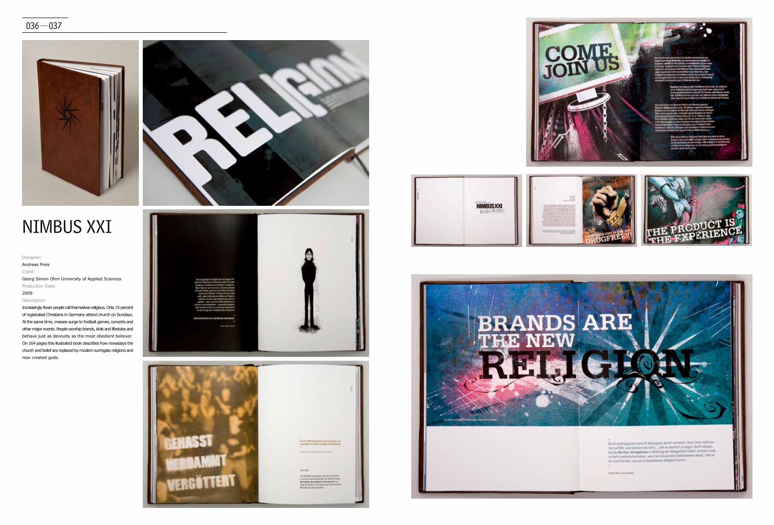
NIMBUS XXIDesigner:
Andreas Preis
Client:
Georg Simon Ohm University of Applied Sciences
Production Date:
2009
Description:
Increasingly fewer people call themselves religious. Only 15 percent
of registrated Christians in Germany attend church on Sundays.
At the same time, masses surge to football games, concerts and
other major events. People worship brands, idols and lifestyles and
behave just as devoutly as the most obedient believer.
On 164 pages this illustrated book describes how nowadays the
church and belief are replaced by modern surrogate religions and
new created gods.
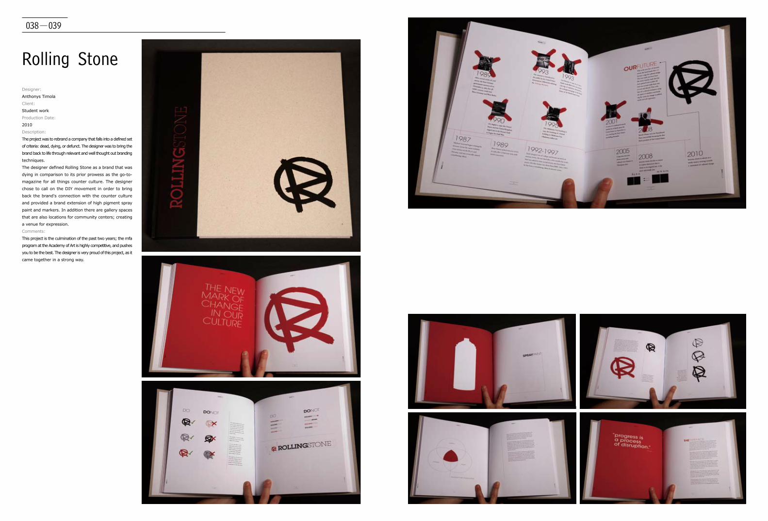
038-039
Rolling StoneDesigner:
Anthonys Timola
Client:
Student work
Production Date:
2010
Description:
The project was to rebrand a company that falls into a defined set
of criteria: dead, dying, or defunct. The designer was to bring the
brand back to life through relevant and well thought out branding
techniques.
The designer defined Rolling Stone as a brand that was
dying in comparison to its prior prowess as the go-to-
magazine for all things counter culture. The designer
chose to call on the DIY movement in order to bring
back the brand's connection with the counter culture
and provided a brand extension of high pigment spray
paint and markers. In addition there are gallery spaces
that are also locations for community centers; creating
a venue for expression.
Comments:
This project is the culmination of the past two years; the mfa
program at the Academy of Art is highly competitive, and pushes
you to be the best. The designer is very proud of this project, as it
came together in a strong way.

040-041
Friendly Fire
Designer:
Anthonys Timola
Photography:
Dominic Stimola
Client:
student work
Production Date:
2010
Description:
This book was created as an informational and archival guide for the Friendly Fire Film Festival. Friendly Fire is
a fictitious film festival that celebrates the filmmaker Oliver Stone, and an era of social turbulence in America
and South East Asia. The three locations of the film festival, New York City, Washington DC, and Ho Chi Min
City were chosen to comemorate the many momentous occations of the era.
Comments:
The designer put in a lot of personal heart and soul into the piece as the era is an important one in his family. His father is a Vietnam
Veteran and it was very important to him to aim this towards his fellow veterans. He found it difficult to put persoanl feelings aside; if he
was to do it again, He would have steered clear of such personal subjects.
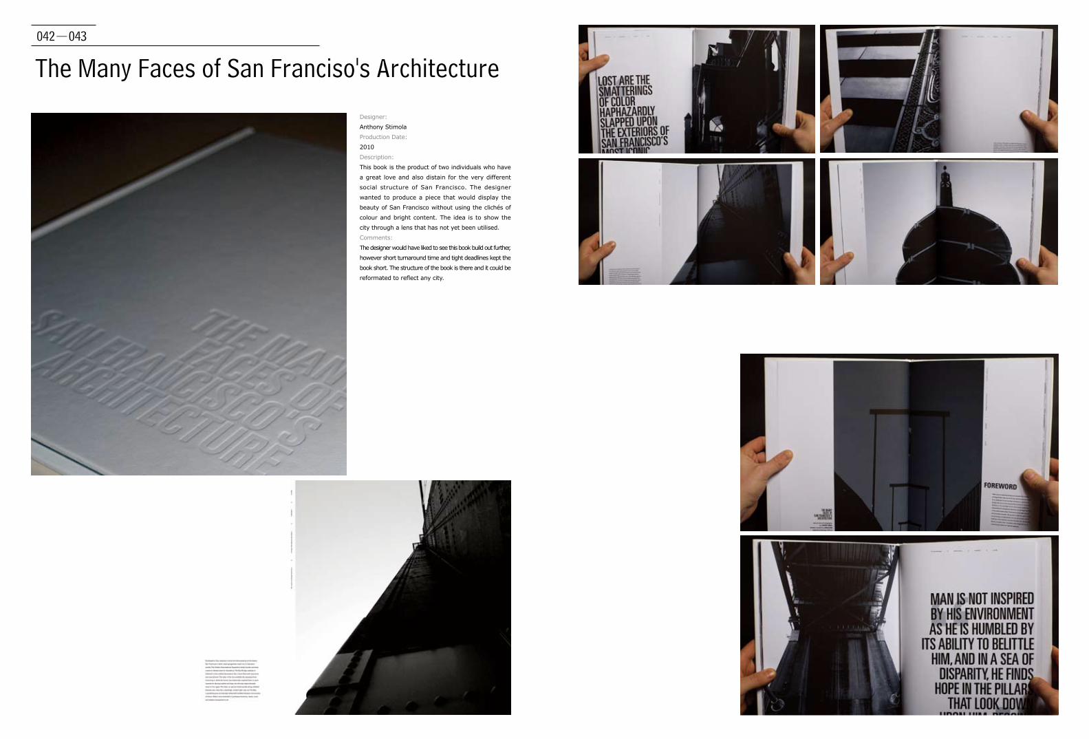
042-043
The Many Faces of San Franciso's Architecture
Designer:
Anthony Stimola
Production Date:
2010
Description:
This book is the product of two individuals who have
a great love and also distain for the very different
social structure of San Francisco. The designer
wanted to produce a piece that would display the
beauty of San Francisco without using the clichés of
colour and bright content. The idea is to show the
city through a lens that has not yet been utilised.
Comments:
The designer would have liked to see this book build out further,
however short turnaround time and tight deadlines kept the
book short. The structure of the book is there and it could be
reformated to reflect any city.
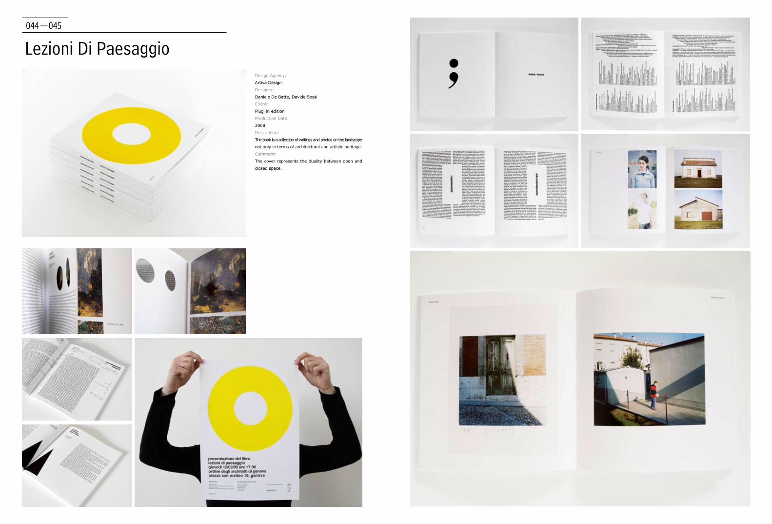
044-045
Lezioni Di PaesaggioDesign Agency:
Artiva Design
Designer:
Daniele De Batté, Davide Sossi
Client:
Plug_in edition
Production Date:
2008
Description:
The book is a collection of writings and photos on the landscape
not only in terms of architectural and artistic heritage.
Comment:
The cover represents the duality between open and
closed space.

046-047
Utopia & Comunità
Design Agency:
Artiva Design
Designer:
Daniele De Batté, Davide Sossi
Client:
Plug_in Edition
Production Date:
2009
Description:
The book deals with communities and cohousing, reading and consultation are
facilitated by the division in cards and the integration of photographic materials.
Comment:
The use of black and white is a reference to the underground magazines of the
1960s.
Designers also used on some pages typefaces olivetti's typewriter to have a
more different and original typography.

048-049
A Series of Poetry Books and Covers ByFederico García Lorca
Design Agency:
Massachusetts College of Art and Design
Award:
Bookbuilders of Boston Scholarship, 2008
Production Date:
2008
Description:
Books are hardcovered with a dust jacket, uncoated
paper.
Comments:
The book covers and interior design from this series are a modern
visual interpretation of the writings of Federico Garcia Lorca.
Metaphorical representation, bold use of colour and of shapes
hint at the important influence of Spanish folklore on Lorca's
work. Its initial illustrated capital letters invite the reader to
embark on a journey of sensuality, music, longing, and love.

050-051
John Cage: Music of ChangesDesign Agency:
Massachusetts College of Art and Design
Client:
Massachusetts College of Art and Design
Award:
Bookbuilders of Boston Scholarship 2008
Production Date:
2008
Description:
Hardcover, uncoated and special paper.
Comments:
This book celebrates the creative work and
philosophy of American avant-garde composer John
Cage. The visual language of this publication reflects
the textures and dynamism found in Cage’s music,
while the structure of the book retains a sense of
unpredictability. The book’s design is based on a
lecture on composition given by Cage in Darmstadt
which was in sync with the length of “Music of
Changes”, the musical piece.
HumansDesign Agency:
Ateljé Altmann HB
Designer:
Christian Altmann, Oskar Holmquist
Client:
Kristina Dalberg
Production date:
2009
Description:
'This performance was inspired by a dream. It combines films
(Boat, Bridge, Building, Moon, Stars, and Wall) with short
stories, personal reflections and facts in order to tell a bigger
story about people, cities and the human condition.' Kristina is
transfering her films and lecture 'Humans' into book form. We
decided to release it with four different coloured dust jackets
made of the finest muted coloured Kolorit paper available
from the swedish paper distributor Map. Kristina loved the
idea to clad the stories in this slightly dusted coat in fine
colour nuances. Very personal views deserve warm regards
for it. Together with Oskar Holmquist we delivered something
we will be proud for many years to come. which was in sync
with the length of “Music of Changes”, the musical piece.
052-053
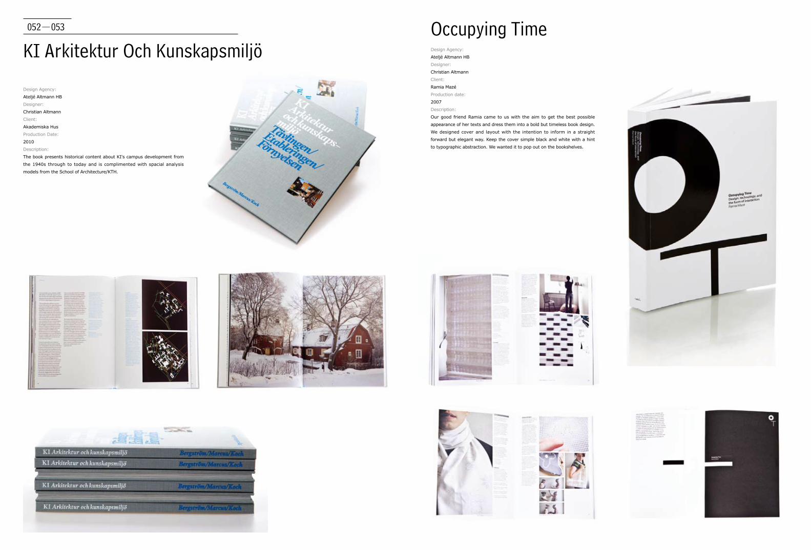
KI Arkitektur Och KunskapsmiljöOccupying Time
Design Agency:
Ateljé Altmann HB
Designer:
Christian Altmann
Client:
Akademiska Hus
Production Date:
2010
Description:
The book presents historical content about KI's campus development from
the 1940s through to today and is complimented with spacial analysis
models from the School of Architecture/KTH.
Design Agency:
Ateljé Altmann HB
Designer:
Christian Altmann
Client:
Ramia Mazé
Production date:
2007
Description:
Our good friend Ramia came to us with the aim to get the best possible
appearance of her texts and dress them into a bold but timeless book design.
We designed cover and layout with the intention to inform in a straight
forward but elegant way. Keep the cover simple black and white with a hint
to typographic abstraction. We wanted it to pop out on the bookshelves.

054-055
Static! Designing for Energy Awareness
Design Agency:
Ateljé Altmann HB
Designer:
Christian Altmann, Oskar Holmquist
Client:
The Interactive Institute
Production Date:
2010
Description:
This book presents the Static! design examples and perspectives on issues in
(sustainable) design today. Grounded in passion and humour, as well as rigor and
research, the book asks designers and consumers – that is, all of people – to rethink
the form, and future, of electricity in the world.
International Space Syntax SymposiumDesign Agency:
Ateljé Altmann HB
Designer:
Christian Altmann
Client:
Architecture School/KTH
Production Date:
2009
Description:
Christian Altmann designed a logo that consists of
two vertical bars, set apart to allow for space... That
mark became the visual metaphor for the 7th Space
Syntax Symposium 2009. The commission included
an organisational website, a on-screen event
animation (in collaboration with Kristofer Vahlström
at Propeller), poster series for different architectural
events, a conference pack containing the book of
proceedings, programmes, noteblock and other
materials.
056-057
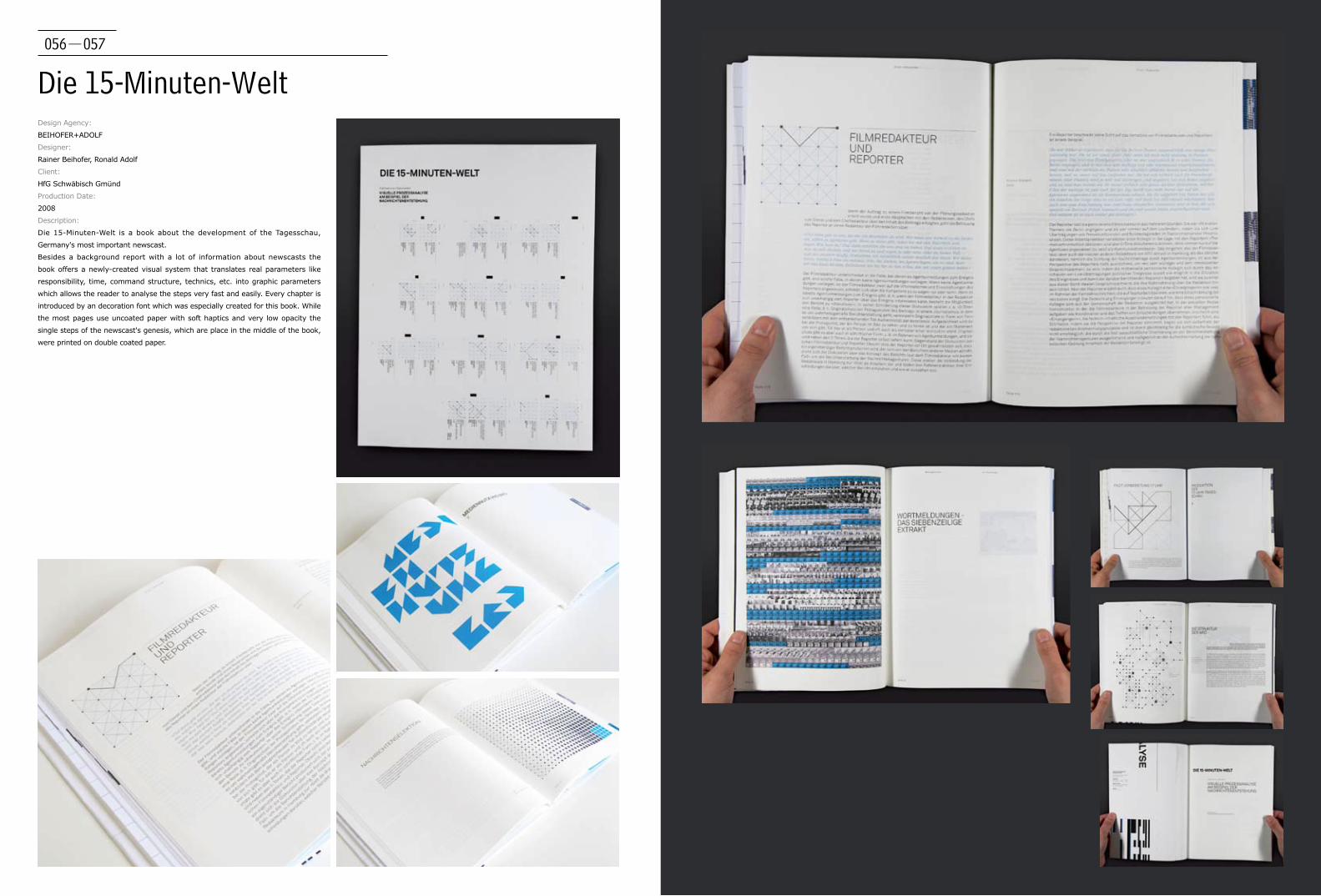
Die 15-Minuten-WeltDesign Agency:
BEIHOFER+ADOLF
Designer:
Rainer Beihofer, Ronald Adolf
Client:
HfG Schwäbisch Gmünd
Production Date:
2008
Description:
Die 15-Minuten-Welt is a book about the development of the Tagesschau,
Germany's most important newscast.
Besides a background report with a lot of information about newscasts the
book offers a newly-created visual system that translates real parameters like
responsibility, time, command structure, technics, etc. into graphic parameters
which allows the reader to analyse the steps very fast and easily. Every chapter is
introduced by an decoration font which was especially created for this book. While
the most pages use uncoated paper with soft haptics and very low opacity the
single steps of the newscast's genesis, which are place in the middle of the book,
were printed on double coated paper.
058-059
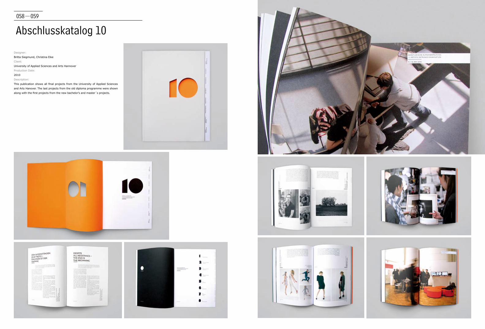
Abschlusskatalog 10
Designer:
Britta Siegmund, Christina Eike
Client:
University of Applied Sciences and Arts Hannover
Production Date:
2010
Description:
This publication shows all final projects from the University of Applied Sciences
and Arts Hanover. The last projects from the old diploma programme were shown
along with the first projects from the new bachelor’s and master´s projects.
060-061
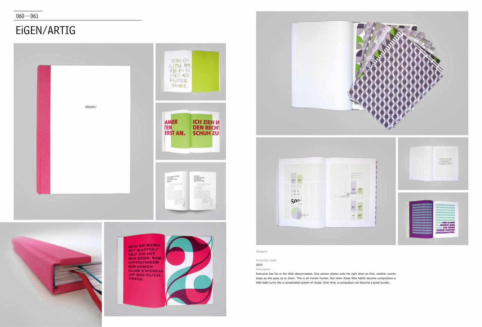
EiGEN/ARTIG
Designer:
Production Date:
2010
Description:
Everyone has his or her little idiosyncrasies. One person always puts his right shoe on first, another counts
steps as she goes up or down. This is all merely human. But when these little habits become compulsions a
little habit turns into a complicated system of rituals. Over time, a compulsion can become a great burden.

062-063
I Am You
Designer:
Ellen Tongzhou Zhao
Location:
Paris, France
Production Date:
2007
Description:
This project "I Am You" is a book which talks about itself, its conception, its
construction and its reading. It can be read in two directions and it has two
beginnings. It highlights the moment of reading, this both solitary and shared
meeting between the object of the book and the person who reads it. It is also in
this moment that the two identities (of the book and the author, or of the book
and the reader, or of the reader and the author) confront each other. This book
invites the reader to think about the meaning of the book, the author, the reader,
and the act of reading.
064-065
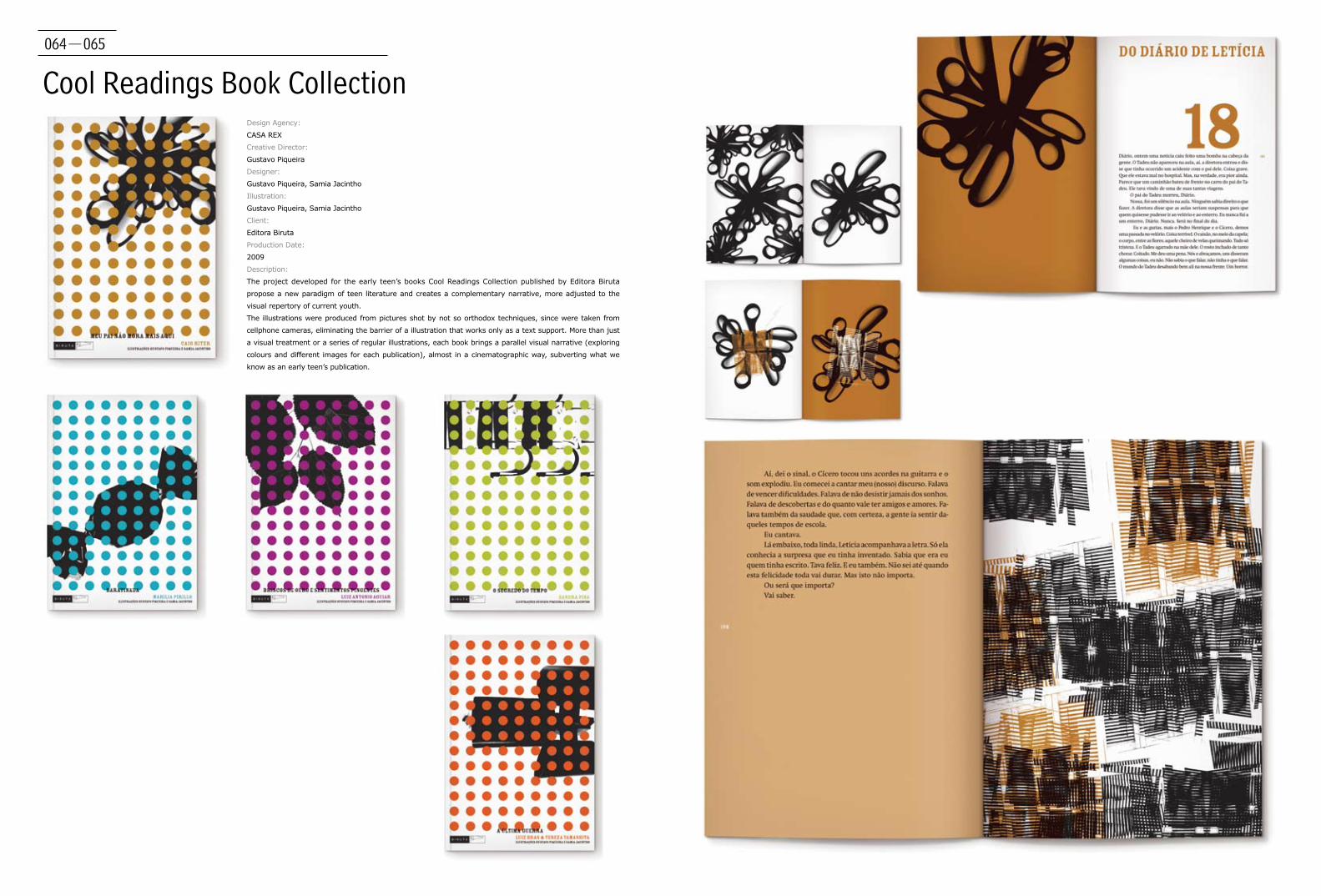
Cool Readings Book CollectionDesign Agency:
CASA REX
Creative Director:
Gustavo Piqueira
Designer:
Gustavo Piqueira, Samia Jacintho
Illustration:
Gustavo Piqueira, Samia Jacintho
Client:
Editora Biruta
Production Date:
2009
Description:
The project developed for the early teen’s books Cool Readings Collection published by Editora Biruta
propose a new paradigm of teen literature and creates a complementary narrative, more adjusted to the
visual repertory of current youth.
The illustrations were produced from pictures shot by not so orthodox techniques, since were taken from
cellphone cameras, eliminating the barrier of a illustration that works only as a text support. More than just
a visual treatment or a series of regular illustrations, each book brings a parallel visual narrative (exploring
colours and different images for each publication), almost in a cinematographic way, subverting what we
know as an early teen’s publication.

066-067
Our MovieDesign Agency:
CASA REX
Creative Director:
Gustavo Piqueira
Designer:
Gustavo Piqueira, Samia Jacintho
Illustration:
Gustavo Piqueira, Samia Jacintho
Client:
Jogo de Amarelinha
Production Date:
2010
Description:
Our Movie is a book that tells a story about two young lovers. Instead of
creating illustrations that portray the book’s narrative, the designer used
visuals in the form of soft shapes that weave through the pages in parallel
to the narrative, almost like a sound track. These emotive fluid graphics
follow the relationship and story of the couple from their first date through
to the romance, the sex, and finally, their split.
My Amerindian Friend Design Agency:
CASA REX
Creative Director:
Gustavo Piqueira
Designer:
Gustavo Piqueira, Samia Jacintho
Client:
Editora Biruta
Production Date:
2009
Description:
The adolescent book "My Amerindian Friend" traces
the story of friendship and conflicts that arise when
Amerindian children start to study at a school with
other kids who come from different backgrounds and
traditions. While it broaches the subject of inclusion at
school, the book also inevitably deals with the other
side of the story - the exclusion and the prejudice. In
developing the book graphics, this theme of portraying
different sides of a story have been taken into
consideration. The result is a unique project that has
made unusual use of illustrations positioned at different
angles creating a metaphoric sense of perspective.
068-069
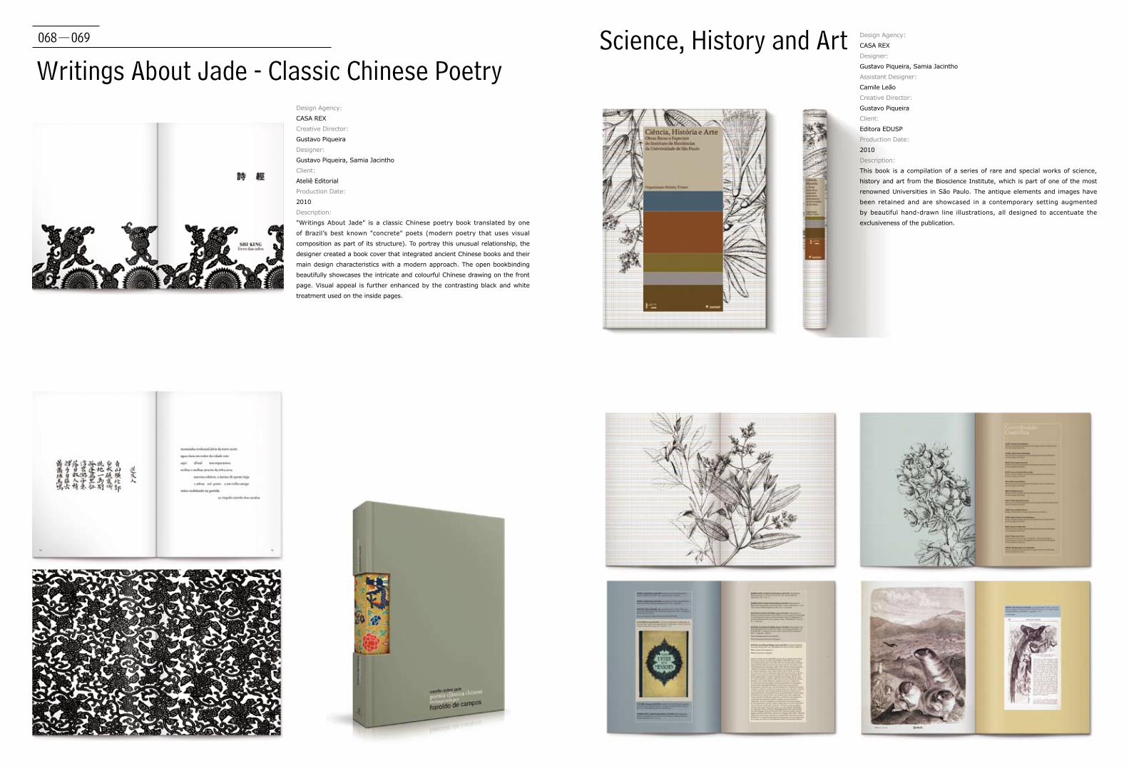
Writings About Jade - Classic Chinese PoetryDesign Agency:
CASA REX
Creative Director:
Gustavo Piqueira
Designer:
Gustavo Piqueira, Samia Jacintho
Client:
Ateliê Editorial
Production Date:
2010
Description:
"Writings About Jade" is a classic Chinese poetry book translated by one
of Brazil’s best known "concrete" poets (modern poetry that uses visual
composition as part of its structure). To portray this unusual relationship, the
designer created a book cover that integrated ancient Chinese books and their
main design characteristics with a modern approach. The open bookbinding
beautifully showcases the intricate and colourful Chinese drawing on the front
page. Visual appeal is further enhanced by the contrasting black and white
treatment used on the inside pages.
Science, History and Art Design Agency:
CASA REX
Designer:
Gustavo Piqueira, Samia Jacintho
Assistant Designer:
Camile Leão
Creative Director:
Gustavo Piqueira
Client:
Editora EDUSP
Production Date:
2010
Description:
This book is a compilation of a series of rare and special works of science,
history and art from the Bioscience Institute, which is part of one of the most
renowned Universities in São Paulo. The antique elements and images have
been retained and are showcased in a contemporary setting augmented
by beautiful hand-drawn line illustrations, all designed to accentuate the
exclusiveness of the publication.

070-071
Information - In Formation
Designer:
Christian Grutsch
Client:
Information - In Formation
Production Date:
2010
Description:
Diploma thesis on abstraction. The book is divided
into two sections. On the one hand there is a short
overview on abstract theory, on the other hand a
personal interpretation. For personal interpretation
the designer collected printed matter and made a
selection. Out of this selection the designer created
abstract compostitions, leaving only colour and
basic geometric shapes. Some compositions, even
when abstracted, are still readable, others remain a
miracle.
072-073
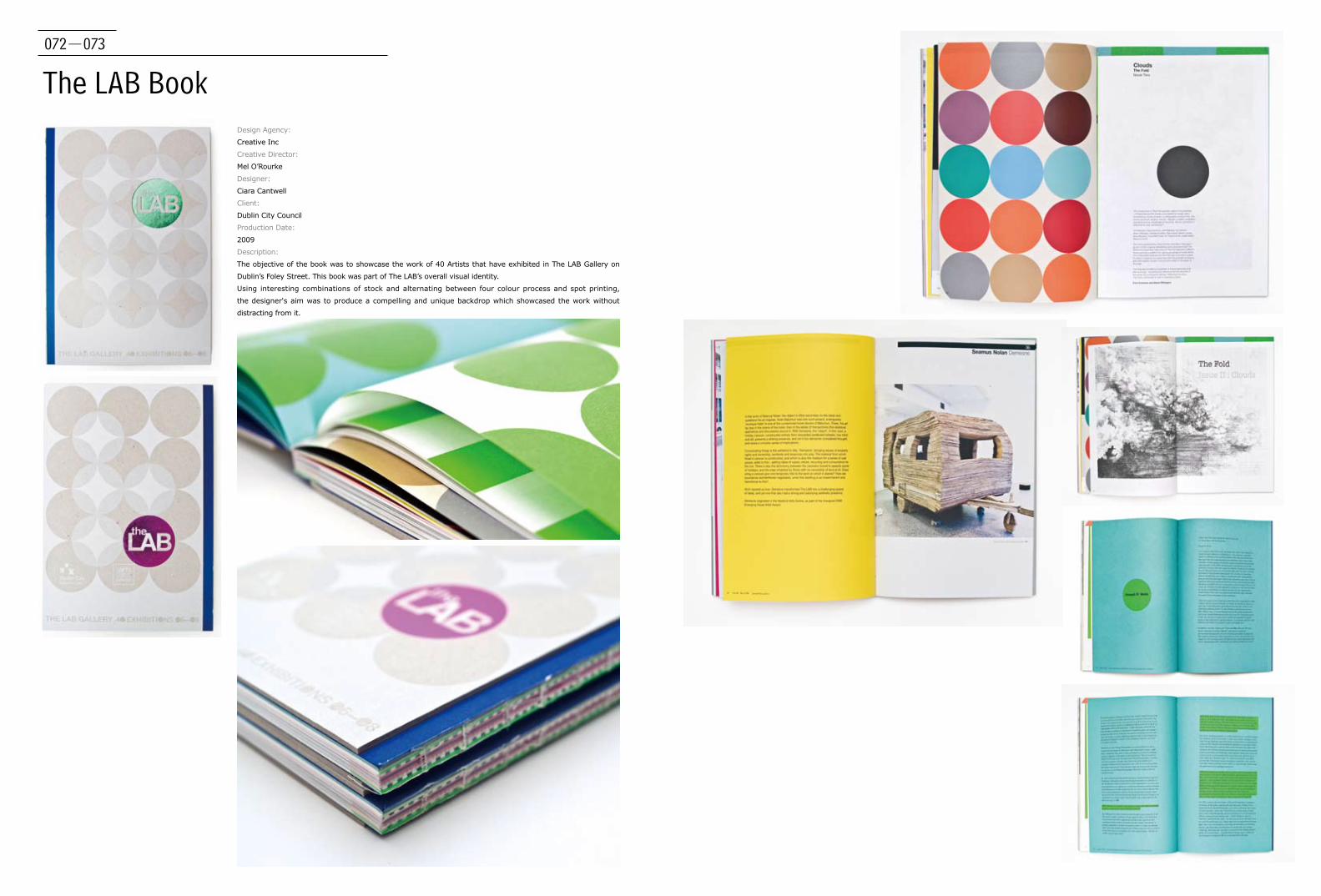
The LAB BookDesign Agency:
Creative Inc
Creative Director:
Mel O’Rourke
Designer:
Ciara Cantwell
Client:
Dublin City Council
Production Date:
2009
Description:
The objective of the book was to showcase the work of 40 Artists that have exhibited in The LAB Gallery on
Dublin’s Foley Street. This book was part of The LAB’s overall visual identity.
Using interesting combinations of stock and alternating between four colour process and spot printing,
the designer's aim was to produce a compelling and unique backdrop which showcased the work without
distracting from it.
074-075
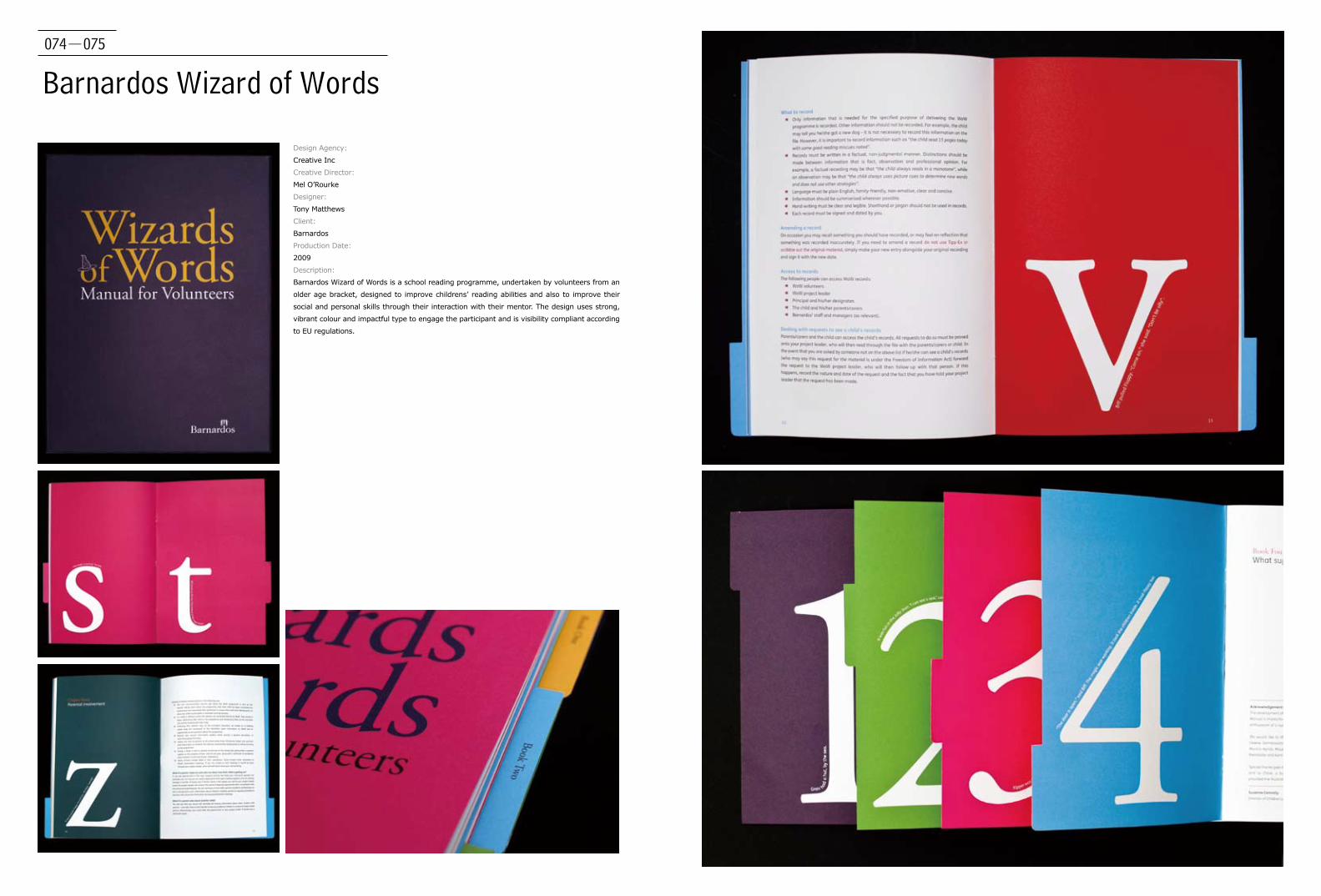
Barnardos Wizard of Words
Design Agency:
Creative Inc
Creative Director:
Mel O’Rourke
Designer:
Tony Matthews
Client:
Barnardos
Production Date:
2009
Description:
Barnardos Wizard of Words is a school reading programme, undertaken by volunteers from an
older age bracket, designed to improve childrens’ reading abilities and also to improve their
social and personal skills through their interaction with their mentor. The design uses strong,
vibrant colour and impactful type to engage the participant and is visibility compliant according
to EU regulations.
076-077
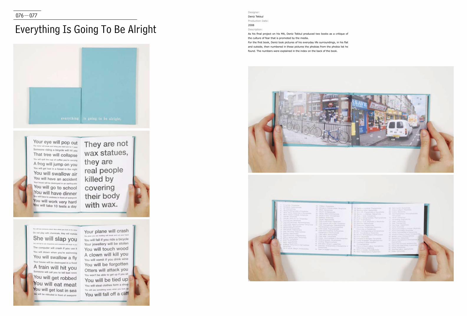
Everything Is Going To Be Alright
Designer:
Deniz Tekkul
Production Date:
2008
Description:
As his final project on his MA, Deniz Tekkul produced two books as a critique of
the culture of fear that is promoted by the media.
For the first book, Deniz took pictures of his everyday life surroundings, in his flat
and outside, then numbered in these pictures the phobias from the phobia list he
found. The numbers were explained in the index on the back of the book.

078-079
MA Research BookDesigner:
Deniz Tekkul
Production Date:
2008
Description:
Deniz Tekkul designed this book to document all his
research and design process during the MA Graphic design
communication at Chelsea College of Art and Design, London.
080-081
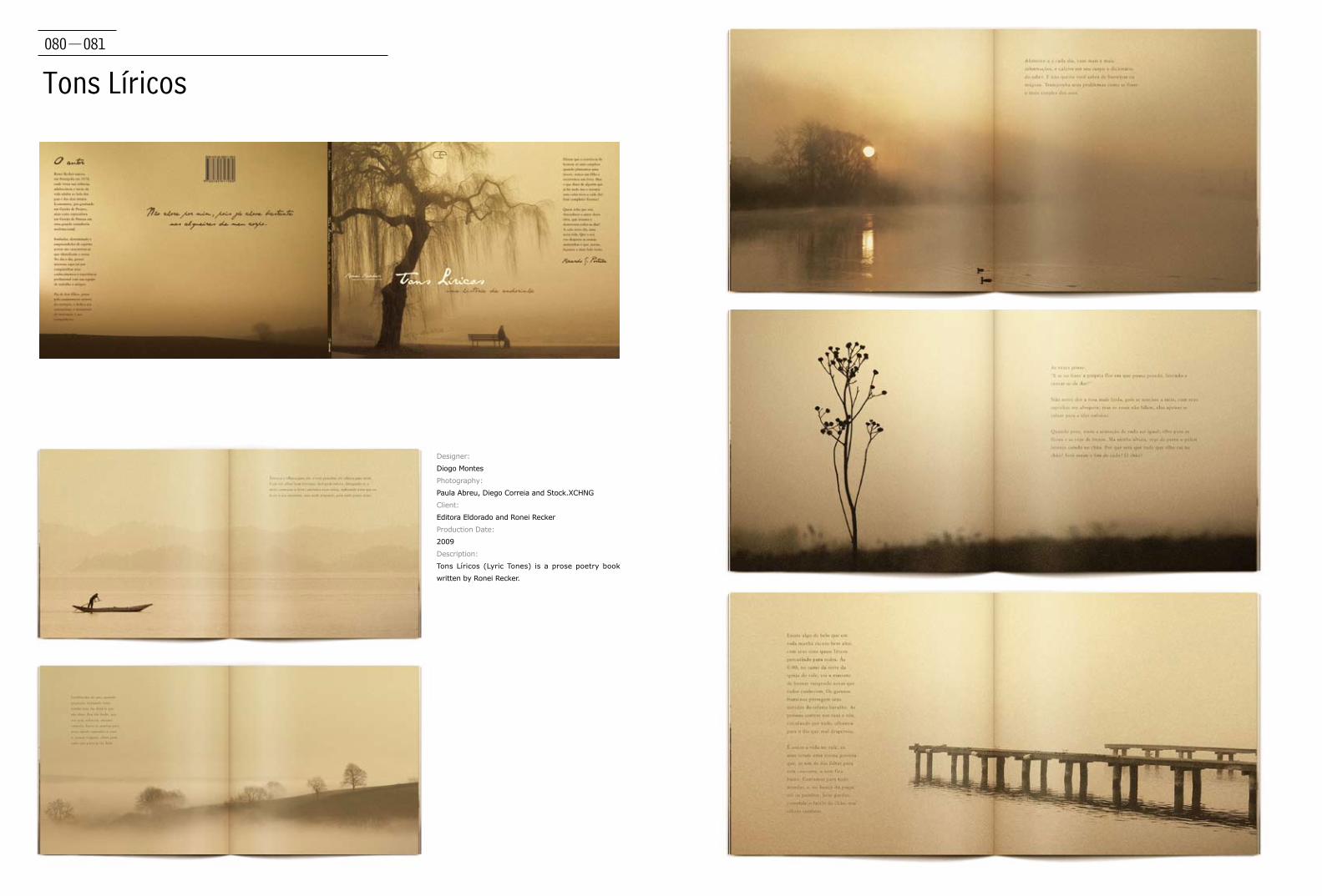
Tons Líricos
Designer:
Diogo Montes
Photography:
Paula Abreu, Diego Correia and Stock.XCHNG
Client:
Editora Eldorado and Ronei Recker
Production Date:
2009
Description:
Tons Líricos (Lyric Tones) is a prose poetry book
written by Ronei Recker.

082-083
Hering BerlinDesign Agency:
Edenspiekermann
Client:
Hering Berlin
Production Date:
2009
Description:
The complex shapes and decorations of Hering
porcelain come to life in the image brochure;
blind embossing, die cuts, metallic paints and
spot varnishes make the porcelain look as lifelike
as objects can possibly get in print. There’s also
the 700-page general catalogue with the highest
standard of clarity and design. No wonder then
that the company’s appearance has caused such
a stir in the industry. The product catalogue and
the brochure won Silver European Design Award in
May 2009.

084-085
Futu Design GuideDesign Agency:
Publishing and Design Guide
Creative Director:
Edgar Bąk
Client:
Publishing and Design Guide
Production Date:
2009
Description:
It is a guide about design, fashion, architecture and
music, published bimonthly.
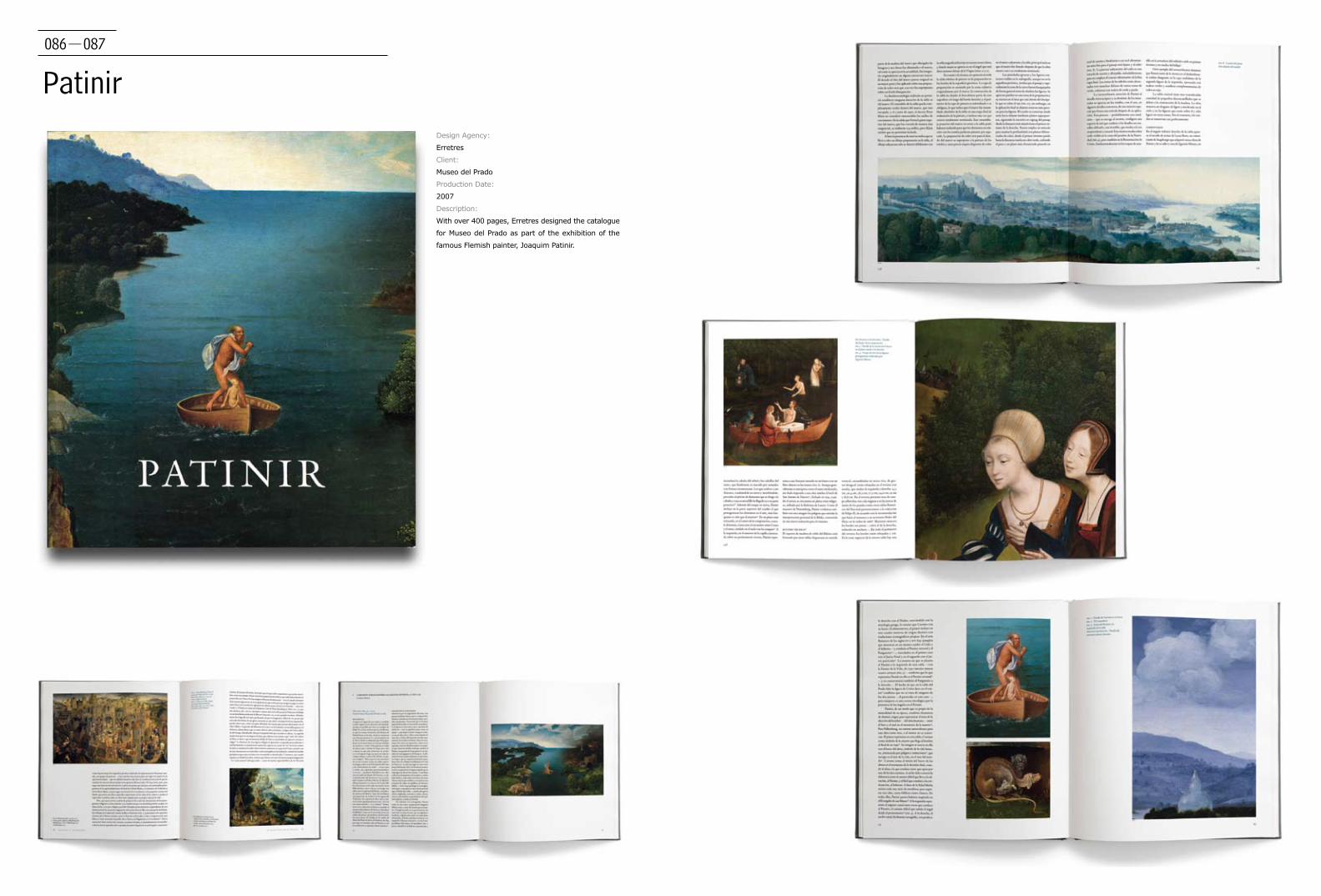
086-087
PatinirDesign Agency:
Erretres
Client:
Museo del Prado
Production Date:
2007
Description:
With over 400 pages, Erretres designed the catalogue
for Museo del Prado as part of the exhibition of the
famous Flemish painter, Joaquim Patinir.

088-089
Horacio Coppola Fotografía
Design Agency:
Erretres
Designer:
Erretres
Client:
Fundacion Telefonica, Madrid, Spain
Production Date:
2008
Description:
Fundación Telefónica organised an exhibition about the works of Argentinean photographer, Horacio
Coppola. This catalogue highlights his works as one of Latin America’s prominent photographers during
the 20th century. In addition, Erretres designed the exhibition’s logo, its entire environmental graphics and
website. The design team received the 2008 Visual Award for Best Book Design.

090-091
MarínDesign Agency:
Erretres
Client:
Fundación Telefónica, Madrid, Spain
Production Date:
2007
Description:
Erretres designed the logo and exhibition graphics,
as well as the catalogue and website for the
exhibition Marín, showcasing a selection of the
works of the unknown photographer, Luis Ramón
Marín, now considered one of the precursors of
photojournalism in Spain. The design team received
the 2008 PHotoEspaña Award for Best Photography
Book.

092-093
Obras Maestras
Design Agency:
Erretres
Client:
La Fábrica, Madrid, Spain
Production Date:
Since 2009
Description:
Obras Maestras are books designed in big format
that offer a deep analysis of the life and works of
the most important contemporary photographers
of Spain. Two books are published each year and
amongst the material edited, personal albums and
chronologies of the authors are included. The most
recent books include the works of Chema Madoz,
Català-Roca and Isabel Muñoz.
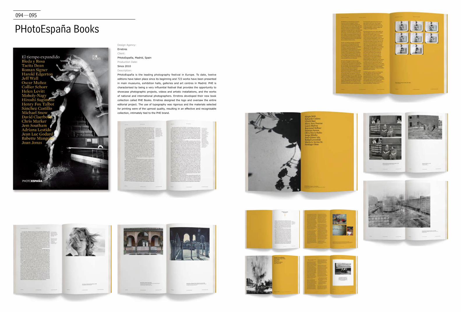
094-095
PHotoEspaña BooksDesign Agency:
Erretres
Client:
PHotoEspaña, Madrid, Spain
Production Date:
Since 2010
Description:
PHotoEspaña is the leading photography festival in Europe. To date, twelve
editions have taken place since its beginning and 723 works have been presented
in main museums, exhibition halls, galleries and art centres in Madrid. PHE is
characterised by being a very influential festival that provides the opportunity to
showcase photographic projects, videos and artistic installations, and the works
of national and international photographers. Erretres developed their new book
collection called PHE Books. Erretres designed the logo and oversaw the entire
editorial project. The use of typography was rigorous and the materials selected
for printing were of the upmost quality, resulting in an effective and recognisable
collection, intimately tied to the PHE brand.
096-097
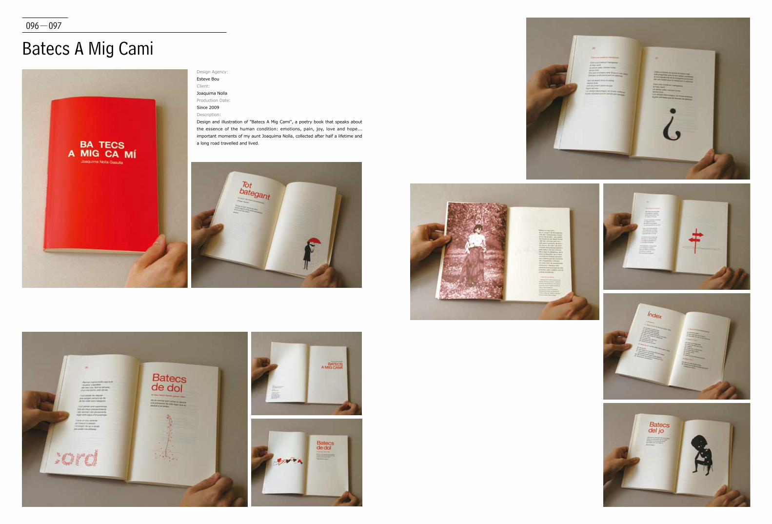
Batecs A Mig CamiDesign Agency:
Esteve Bou
Client:
Joaquima Nolla
Production Date:
Since 2009
Description:
Design and illustration of "Batecs A Mig Cami", a poetry book that speaks about
the essence of the human condition: emotions, pain, joy, love and hope...
important moments of my aunt Joaquima Nolla, collected after half a lifetime and
a long road travelled and lived.
098-099
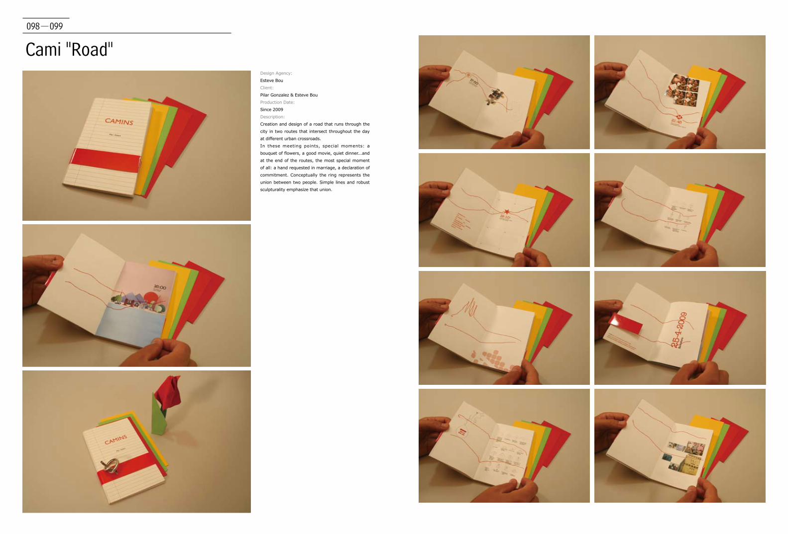
Cami "Road"Design Agency:
Esteve Bou
Client:
Pilar Gonzalez & Esteve Bou
Production Date:
Since 2009
Description:
Creation and design of a road that runs through the
city in two routes that intersect throughout the day
at different urban crossroads.
In these meeting points, special moments: a
bouquet of flowers, a good movie, quiet dinner...and
at the end of the routes, the most special moment
of all: a hand requested in marriage, a declaration of
commitment. Conceptually the ring represents the
union between two people. Simple lines and robust
sculpturality emphasize that union.
100-101
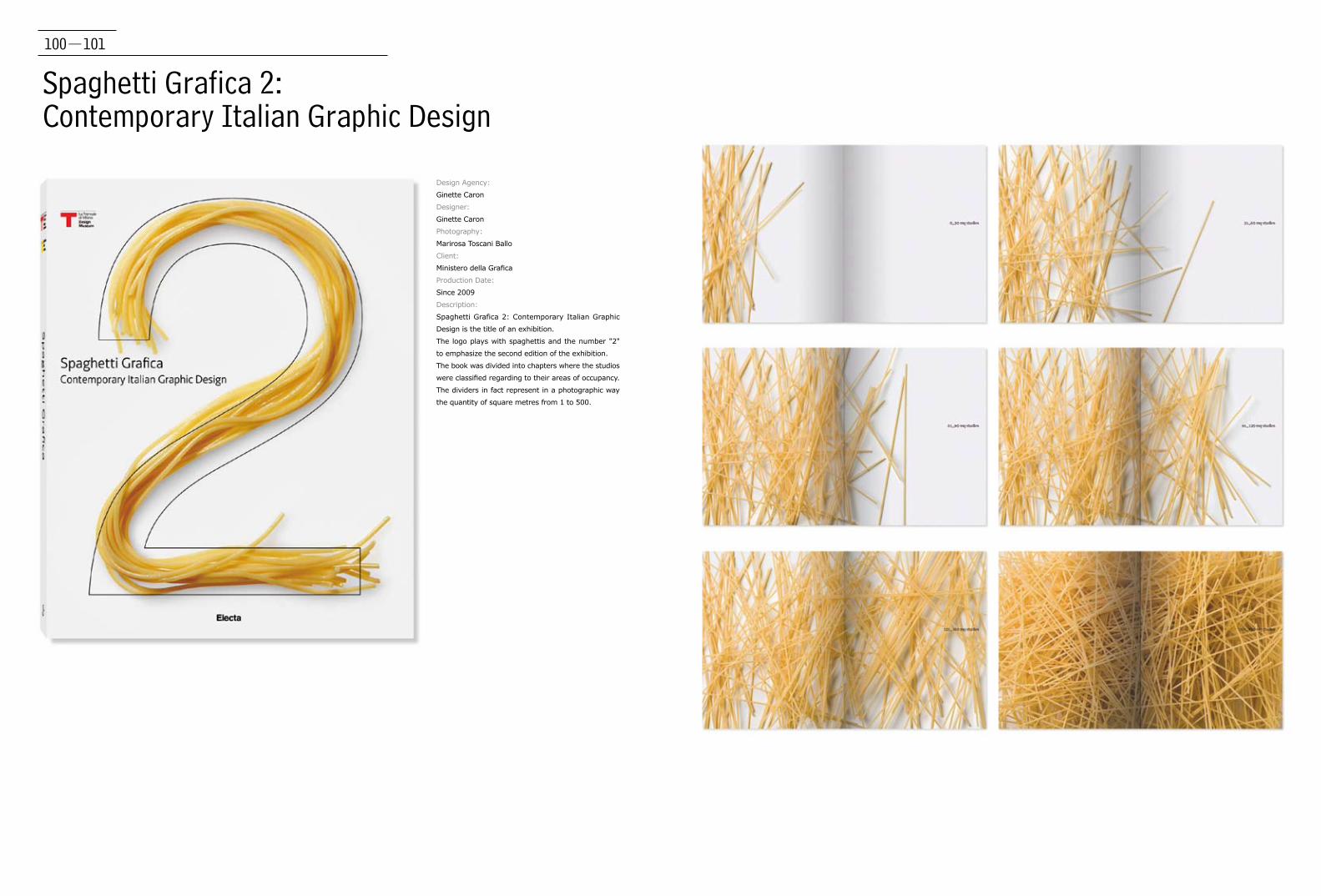
Spaghetti Grafica 2: Contemporary Italian Graphic Design
Design Agency:
Ginette Caron
Designer:
Ginette Caron
Photography:
Marirosa Toscani Ballo
Client:
Ministero della Grafica
Production Date:
Since 2009
Description:
Spaghetti Grafica 2: Contemporary Italian Graphic
Design is the title of an exhibition.
The logo plays with spaghettis and the number "2"
to emphasize the second edition of the exhibition.
The book was divided into chapters where the studios
were classified regarding to their areas of occupancy.
The dividers in fact represent in a photographic way
the quantity of square metres from 1 to 500.
102-103
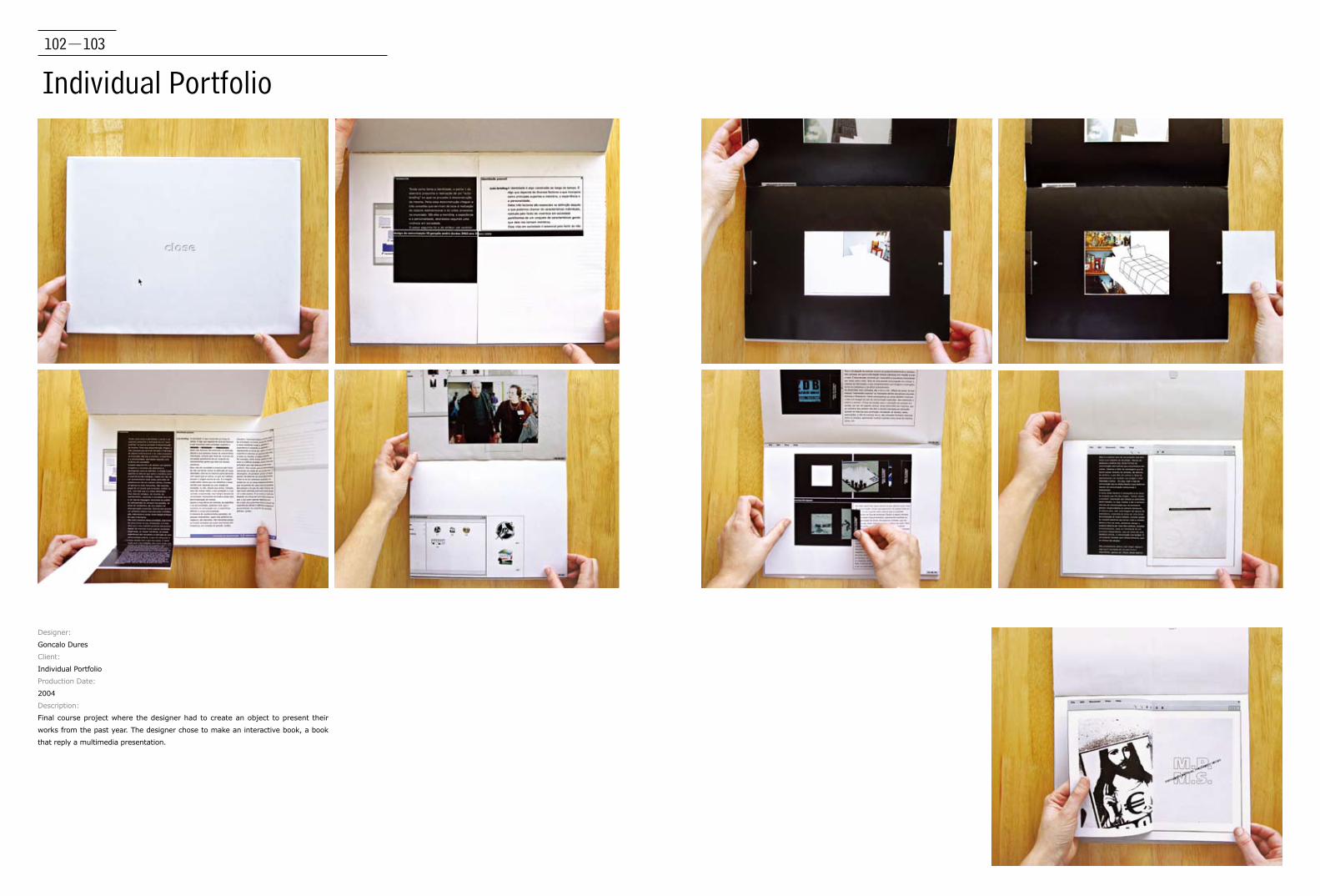
Individual Portfolio
Designer:
Goncalo Dures
Client:
Individual Portfolio
Production Date:
2004
Description:
Final course project where the designer had to create an object to present their
works from the past year. The designer chose to make an interactive book, a book
that reply a multimedia presentation.

104-105
Uma História Chamada Tipografia
Designer:
Gonalo Dures, Pedro Motta, Rita Alves
Client:
Proposal
Production Date:
2003
Description:
Academic project of a book was developed to present a theoretic research about
typography. Designers created a short story, a tale, with characters made of
letters who go explaining the rules of typography.
106-107
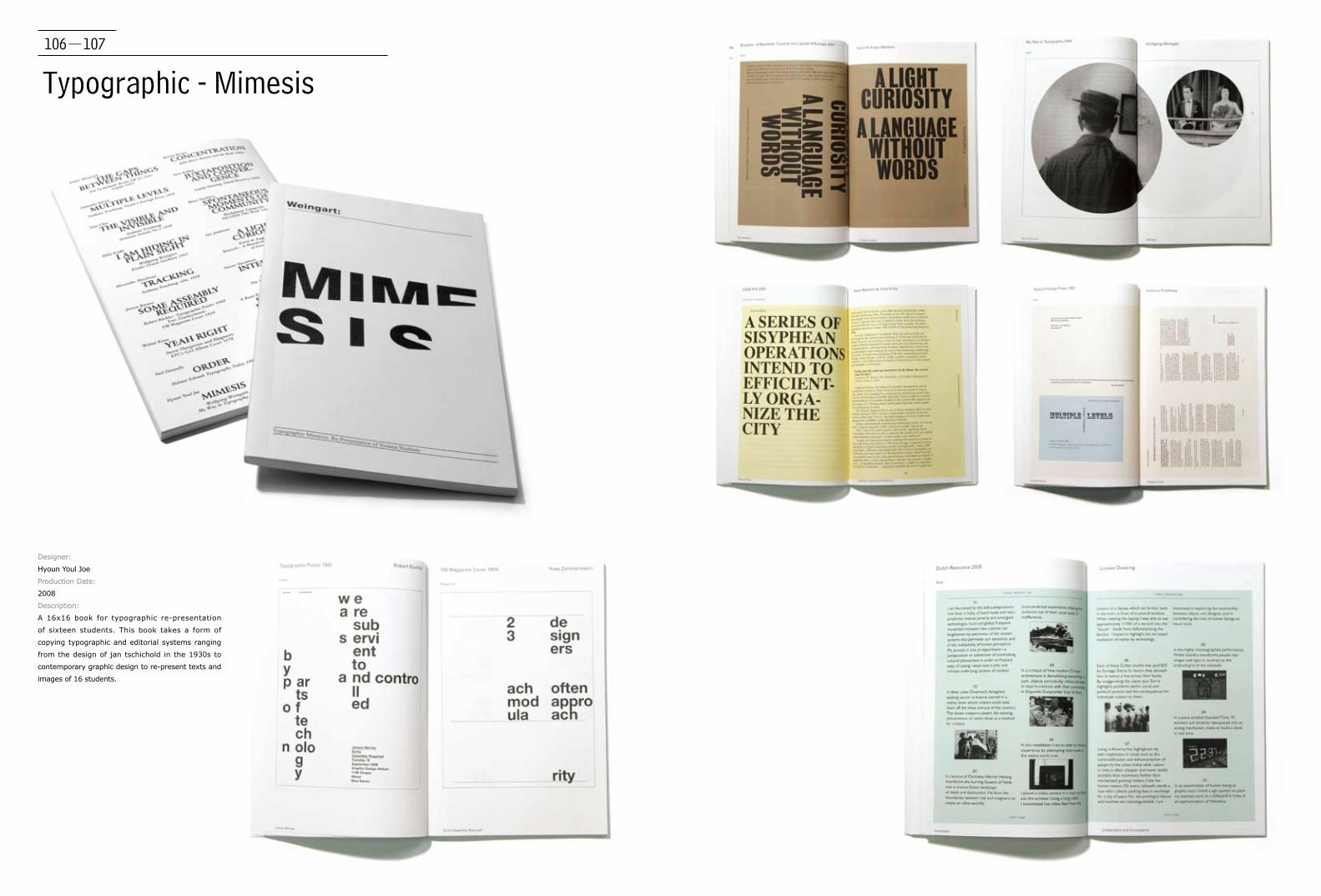
Typographic - Mimesis
Designer:
Hyoun Youl Joe
Production Date:
2008
Description:
A 16x16 book for typographic re-presentation
of sixteen students. This book takes a form of
copying typographic and editorial systems ranging
from the design of jan tschichold in the 1930s to
contemporary graphic design to re-present texts and
images of 16 students.

108-109
Steppe StoriesDesign Agency:
iji-design
Designer:
Dmitry Galsan
Client:
Publishing Project "Buryad-Mongol Nom"
Production Date:
2010
Description:
This book is a collection of both ancient and
contemporary stories, amusing legends and tales
that are still living among the people of Buryat-
Mongolia (Buryatia), Oirat-Mongolia (Kalmykia),
Mongolia and Inner Mongolia Regions. This book is a
dedication to everyone who is interested in history,
folklore, life and traditions of the Mongol people.
Written in Russian, with titles translated into classical
Mongolian script.

110-111
The Best Dutch Book Designs 2007Design Agency:
Ingeborg Scheffers
Client:
The Best Dutch Book Designs
Production Date:
2008
Description:
First there was one original book made, this was then photographed and these
images have been placed in a book again. By doing this all elements exist like
threads on threads. The spreads reproduced of the price winning book has the
same page number as in the catalogue. This is how the decision is made which
spread to choose. Special editions for prizewinners. The prize winners got an
extra reproduction of their book on glossy paper. The designer was inspired by
early full-colour reproductions of paintings in art books which where pasted in
later after being first printed in black & white.

112-113
Ruimte Voor VerdiepingDesign Agency:
Ingeborg Scheffers
Client:
Plat form Interieur architecture
Photography:
dirkwolf.com
Production Date:
2008
Description:
"Ruimte Voor Verdieping" details the importance of
having a masters' programme in interior architecture.
The report addresses the differences between the
advanced study of architecture and that of interior
architecture. Nowadays both qualifications overlap
one another in certain aspects. As a result, there
deserves to be an increase in both the quality and
intensity of interior architecture education. The book
is designed inside-out. De front (cover) of the book
is on the inside. The pages of the book are folded
together and bound along the spine of the book. To
be found on the inside of these pages are pictures
of the facades of buildings designed by interior
architect. The pages are printed on thin paper
enabling the silhouettes of these facades to shine
through, while on the front of the page is text about
interior architecture and an explanation about what
the interior architect has designed for that building.

114-115
Proefkoken Voor De Koningin (Testcooking For The Queen)
Design Agency:
Ingeborg Scheffers
Client:
Cuisine Culinaire Nederland (CCN)
Production Date:
2008
Description:
This is a cookbook for CCN. The design of this book is based
on this fact. This book has been made specifically for the semi-
professional. The pages in the book have a special line to fold
the page along. Using this, a cook can choose if he wants to cook
without the detailed steps and only have the list of ingredients. If
he decides to make a particular dish it is easy to fold the pages
in a unique way. In this way, a very hardworking cook will end
up with a book which has this special shape. This way of folding
(dog-ear) will get you quick to your favorite dishes. Also, this
cookbook has measurements in the back of the book. Different
cooks were asked several things like what a pinch of salt or a
hand of capers amounts to. By using photographs it is attempted
to make the size of these measurements clear. In the recipes of
the book you get directed to this measurements chapter.
Award: Bronze price OUTPUT 10 (International Contest in Graphic
Design; 900 participants from 38 different countries)

116-117 Lettering System for Paris Airport40 Stories
Designer:
James Kuo and Profis
Client:
40 Stories
Production Date:
2009
Description:
In 2009, Toronto Christian Resource Centre (CRC) published 40 Stories. In
design perspective, the designer chose typefaces for the body text and headline
allowing for a maximum word count per page within the layout golden section
grid. In overcoming the design challenge, art direction chose to make the text-
heavy book appealing and universal by balancing words with contemporary, full-
bleed photography, as well as by using a golden section grid design for the book
structure and content presentation.
Designer:
Javier Melon Gil
Client:
Savannah College of Art and Design
Production Date:
2010
Description:
Lettering System for Paris Airport is a typographic book based on Frutiger's work at Charles
de Gaulle International Airport. The designer took the shape of an airline ticket and created
interesting layouts with an European design style. After learning different typographic
treatments the designer was assigned to create a book, this is the result.
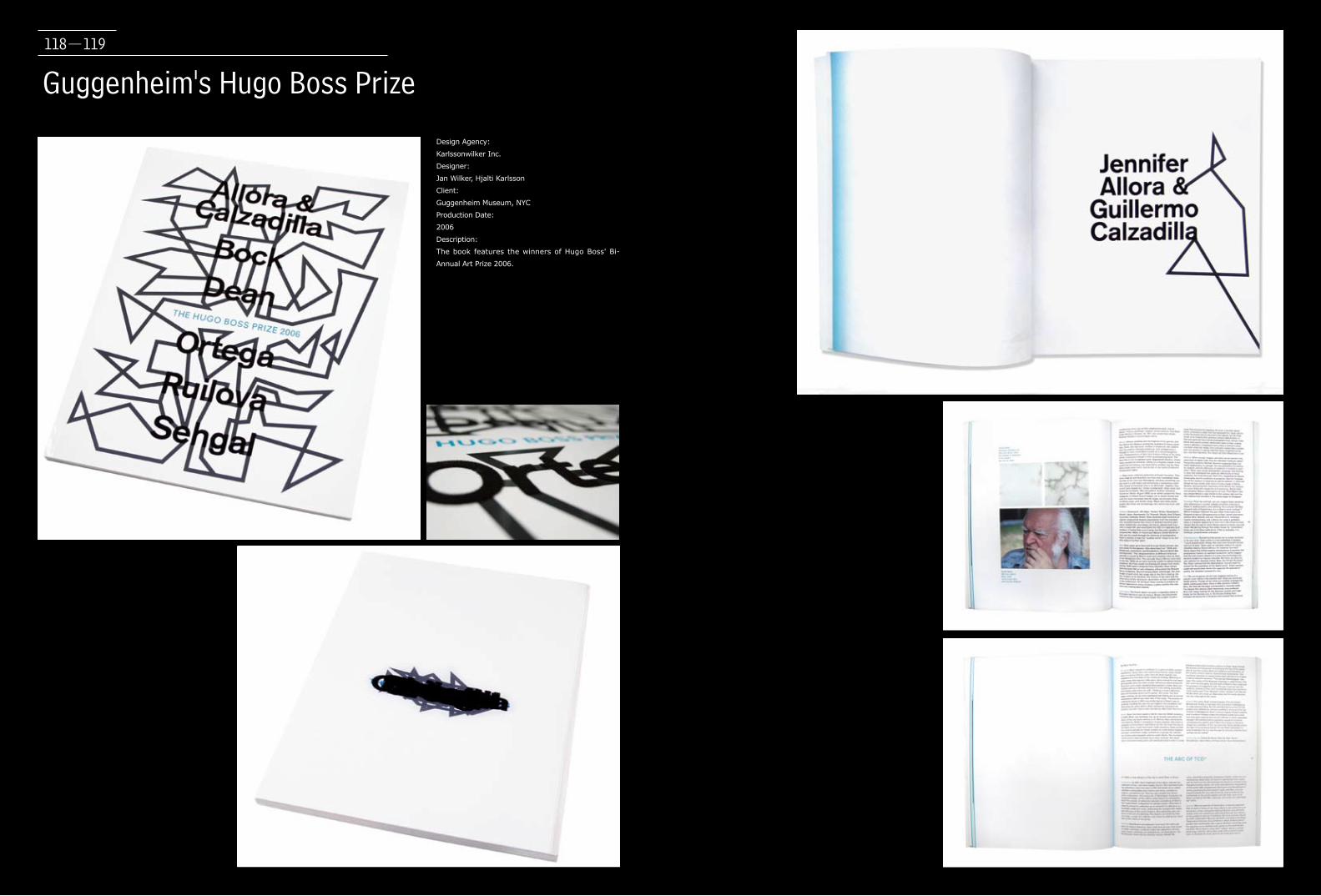
Guggenheim's Hugo Boss Prize
Design Agency:
Karlssonwilker Inc.
Designer:
Jan Wilker, Hjalti Karlsson
Client:
Guggenheim Museum, NYC
Production Date:
2006
Description:
The book features the winners of Hugo Boss' Bi-
Annual Art Prize 2006.
118-119
120-121
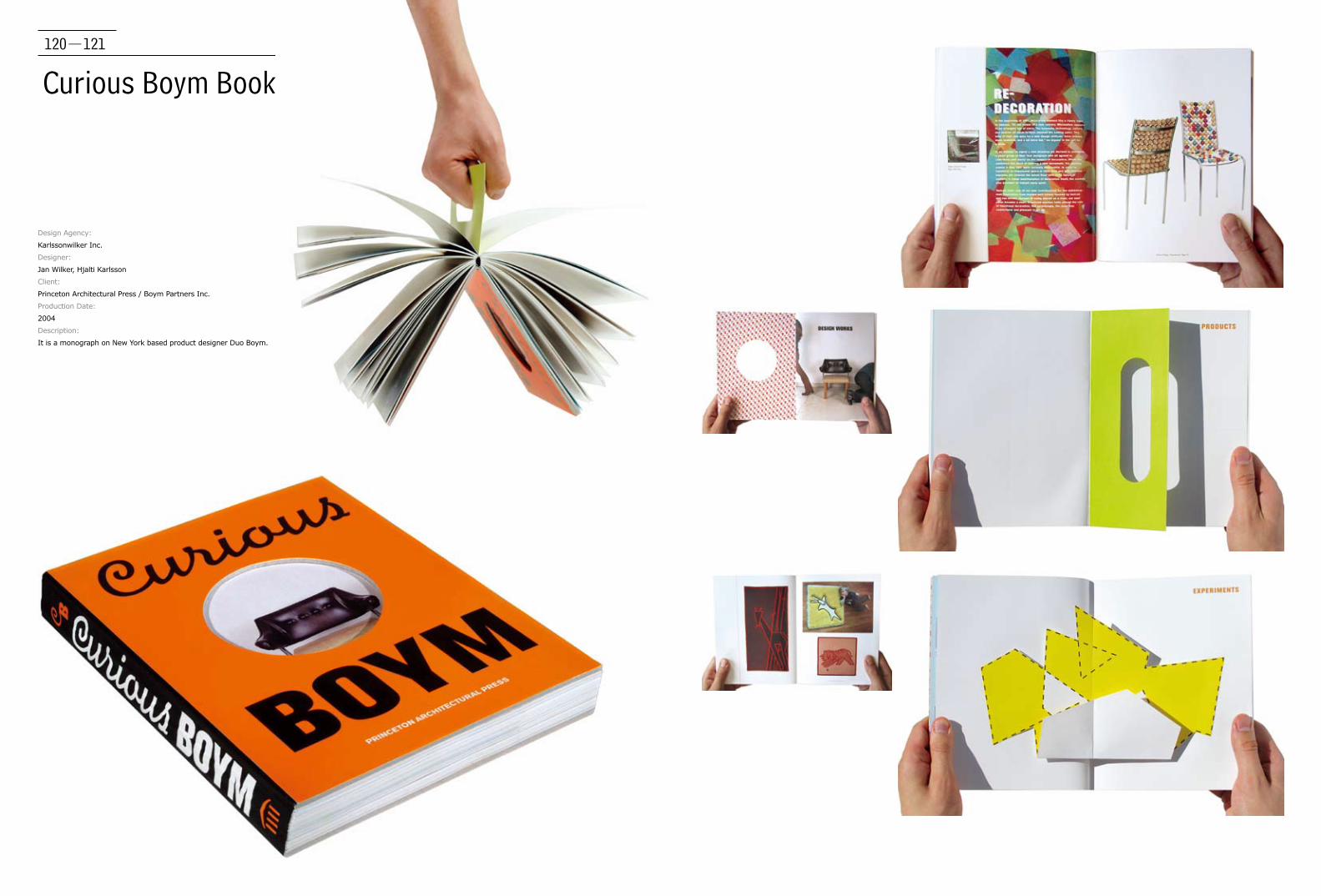
Curious Boym Book
Design Agency:
Karlssonwilker Inc.
Designer:
Jan Wilker, Hjalti Karlsson
Client:
Princeton Architectural Press / Boym Partners Inc.
Production Date:
2004
Description:
It is a monograph on New York based product designer Duo Boym.

122-123
Tell Me Why
Design Agency:
Karlssonwilker Inc.
Designer:
Jan Wilker, Hjalti Karlsson
Client:
Princeton Architectural Press
Production Date:
2003
Description:
It is a monograph on Karlssonwilker, an New York
based design studio.
124-125
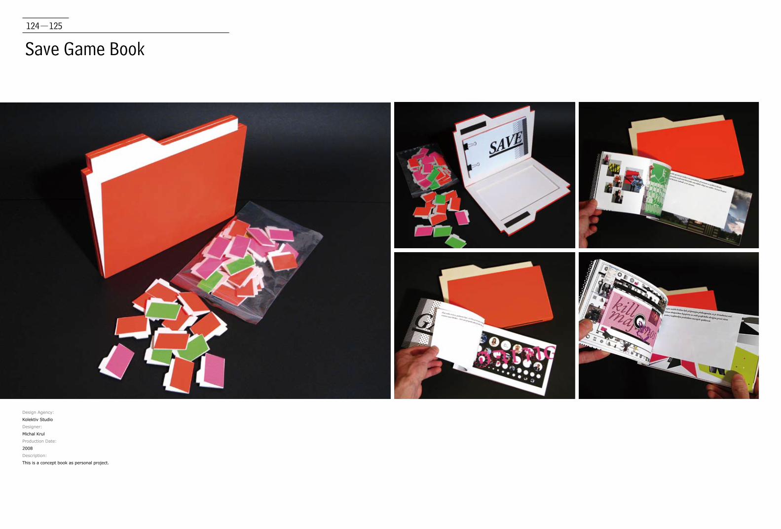
Save Game Book
Design Agency:
Kolektiv Studio
Designer:
Michal Krul
Production Date:
2008
Description:
This is a concept book as personal project.
126-127
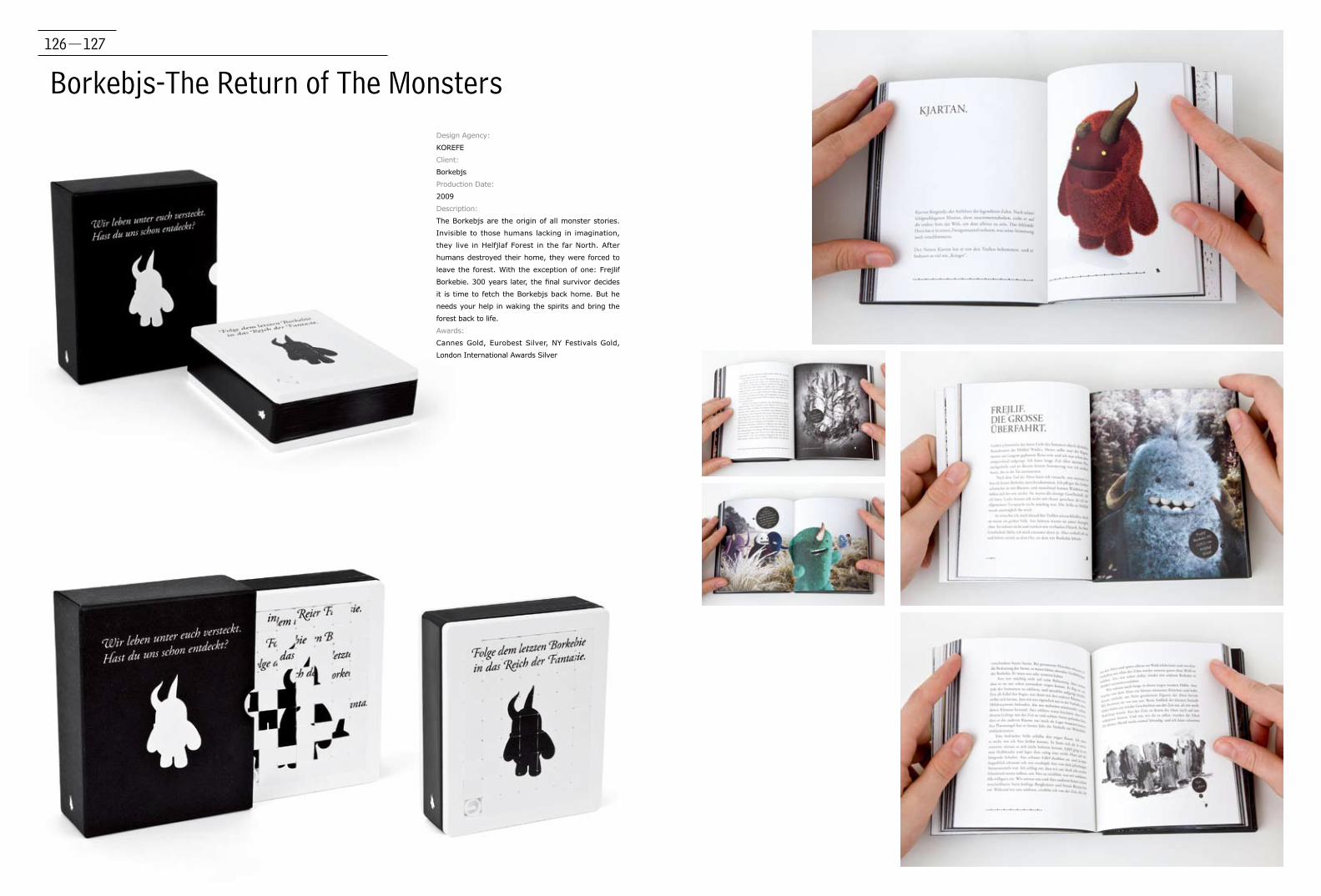
Borkebjs-The Return of The MonstersDesign Agency:
KOREFE
Client:
Borkebjs
Production Date:
2009
Description:
The Borkebjs are the origin of all monster stories.
Invisible to those humans lacking in imagination,
they live in Helfjlaf Forest in the far North. After
humans destroyed their home, they were forced to
leave the forest. With the exception of one: Frejlif
Borkebie. 300 years later, the final survivor decides
it is time to fetch the Borkebjs back home. But he
needs your help in waking the spirits and bring the
forest back to life.
Awards:
Cannes Gold, Eurobest Silver, NY Festivals Gold,
London International Awards Silver

128-129
Fibre Art WalesDesign Agency:
Kutchibok
Designer:
Alwyn Thomas, Sion Dafydd
Client:
Fibre Art Wales
Production Date:
2010
Description:
Fibre Art Wales is a selected group of professional
fibre artists. As well as exhibiting fibre art members
work to commission, they have won international
awards and prizes and have their work included in
many public and private collections worldwide.
The brief was to design a publication comprised
of Fibre Art Wales’ latest work, promoting the
development and growth of the group and
celebrating their 10th year anniversary.
130-131
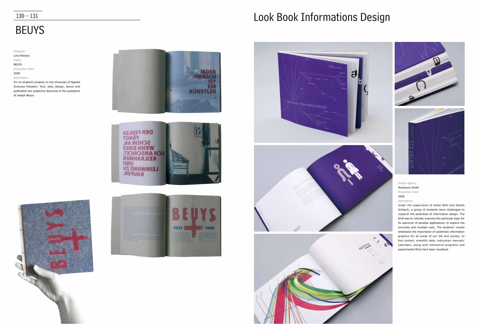
BEUYSLook Book Informations Design
Designer:
Lina Khesina
Client:
BEUYS
Production Date:
2006
Description:
It's on student’s projects on the University of Applied
Sciences Potsdam. Text, idea, design, layout and
publication are subjective discourse to the quotations
of Joseph Beuys.
Design Agency
Moniteurs GmbH
Production Date:
2008
Description:
Under the supervision of Heike Nehl and Sibylle
Schlaich, a group of students were challenged to
research the potentials of information design. The
brief was to critically examine this particular topic for
its spectrum of possible applications, to explore the
everyday and multiple uses. The students' results
emphasise the importance of systematic information
graphics for all areas of our life and society. In
this context, scientific data, instruction manuals,
calendars, along with interactive programs and
experimental films have been visualised.

132-133
The Origins of Film-Catalan Film Producers
Design Agency:
LeCool Publishing
Client:
LeCool Publishing & Catalan Films
Production Date:
2009
Description:
It is the Catalan Film directors' directory.
134-135
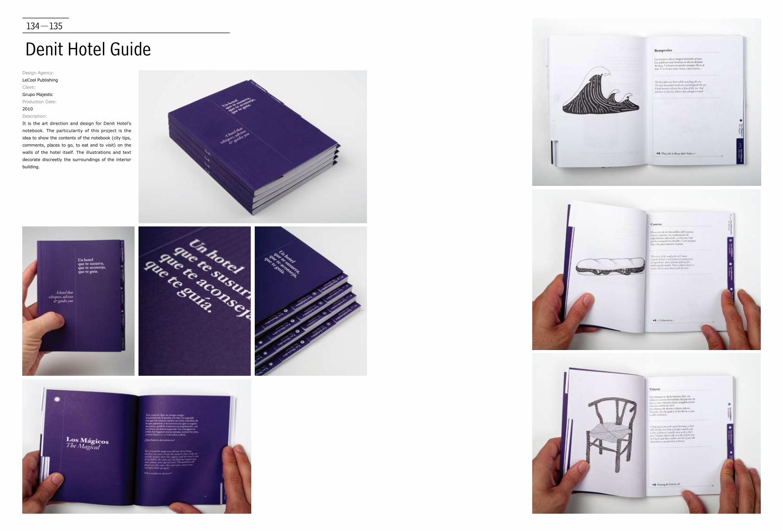
Denit Hotel GuideDesign Agency:
LeCool Publishing
Client:
Grupo Majestic
Production Date:
2010
Description:
It is the art direction and design for Denit Hotel's
notebook. The particularity of this project is the
idea to show the contents of the notebook (city tips,
comments, places to go, to eat and to visit) on the
walls of the hotel itself. The illustrations and text
decorate discreetly the surroundings of the interior
building.

136-137
Notes from Barcelona
Design Agency:
LeCool Publishing
Client:
Grupo Majestic
Production Date:
2008
Description:
It is an illustrated guide of nice places of Barcelona.
138-139
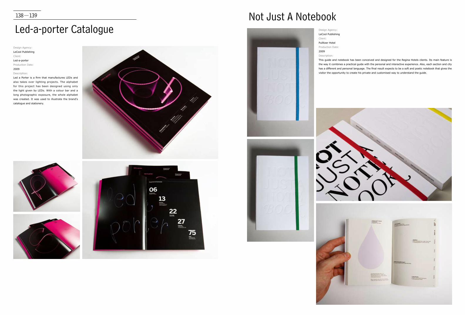
Led-a-porter CatalogueDesign Agency:
LeCool Publishing
Client:
Led-a-porter
Production Date:
2009
Description:
Led a Porter is a firm that manufactures LEDs and
also takes over lighting projects. The alphabet
for this project has been designed using only
the light given by LEDs. With a colour bar and a
long photographic exposure, the whole alphabet
was created. It was used to illustrate the brand's
catalogue and stationery.
Not Just A NotebookDesign Agency:
LeCool Publishing
Client:
Pullitzer Hotel
Production Date:
2009
Description:
This guide and notebook has been conceived and designed for the Regina Hotels clients. Its main feature is
the way it combines a practical guide with the personal and interactive experience. Also, each section and city
has a different and personal language. The final result expects to be a soft and poetic notebook that gives the
visitor the opportunity to create his private and customised way to understand the guide.
140-141
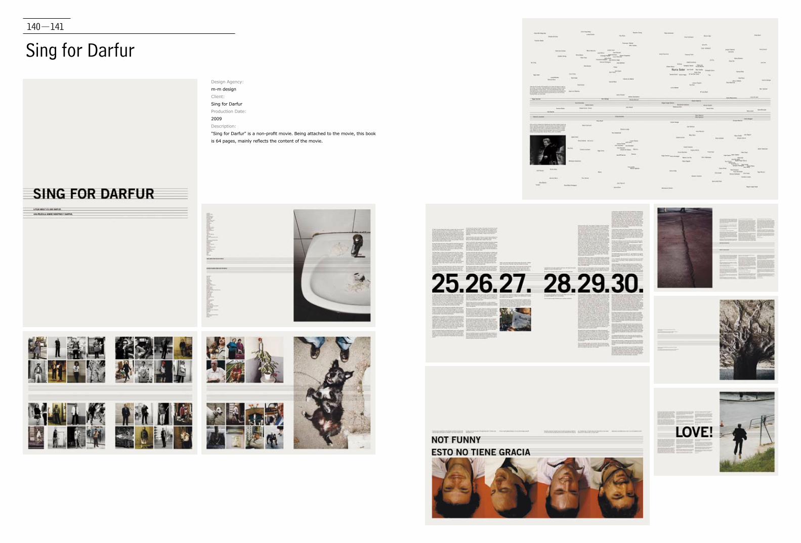
Sing for DarfurDesign Agency:
m-m design
Client:
Sing for Darfur
Production Date:
2009
Description:
"Sing for Darfur" is a non-profit movie. Being attached to the movie, this book
is 64 pages, mainly reflects the content of the movie.
142-143
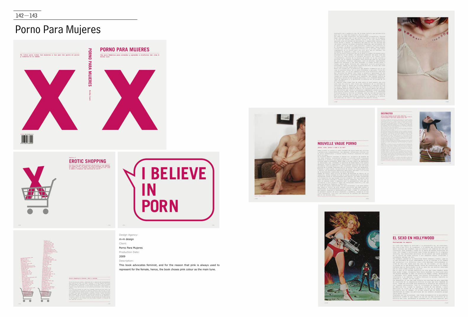
Porno Para Mujeres
Design Agency:
m-m design
Client:
Porno Para Mujeres
Production Date:
2009
Description:
This book advocates feminist, and for the reason that pink is always used to
represent for the female, hence, the book choses pink colour as the main tune.
144-145
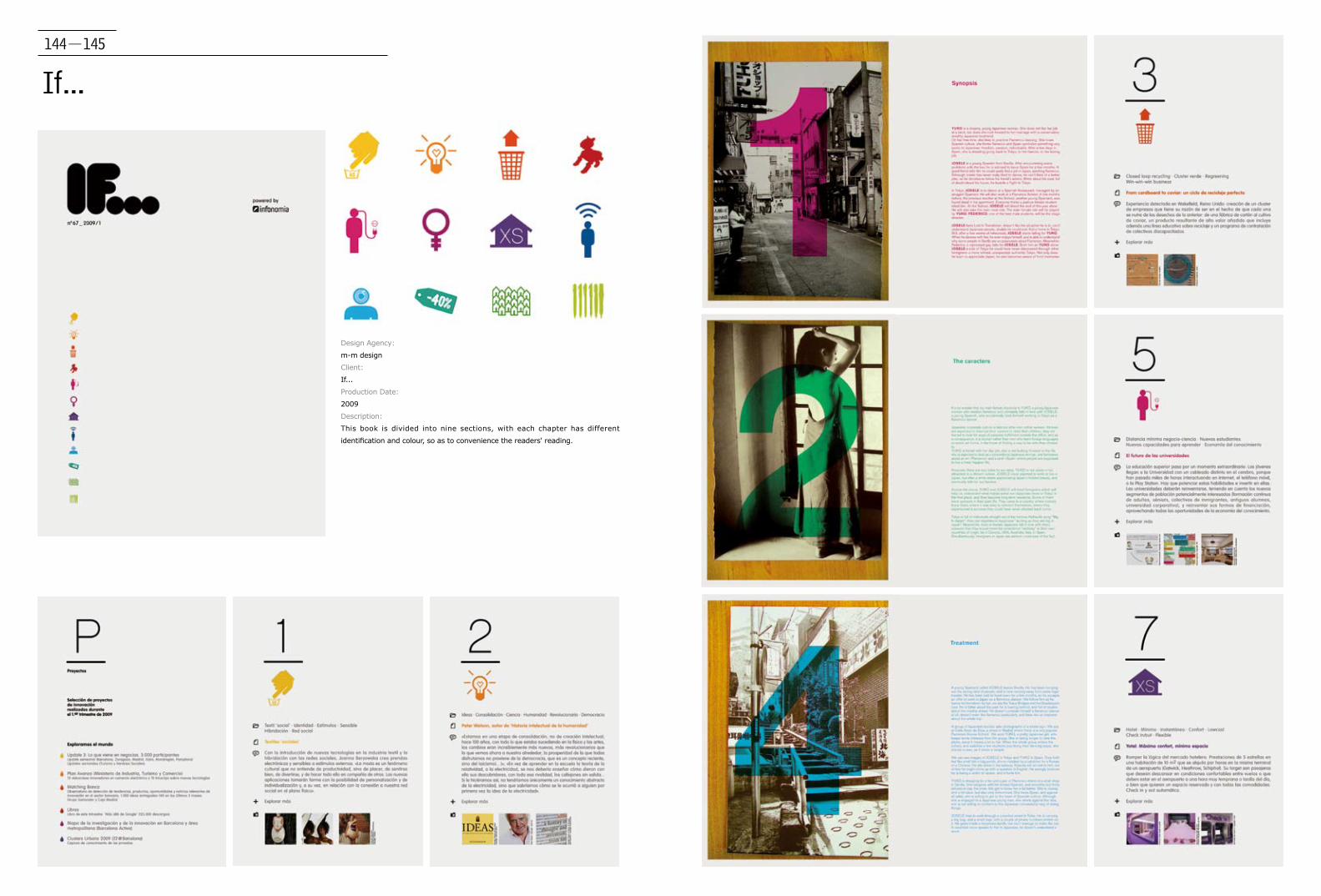
If...
Design Agency:
m-m design
Client:
If...
Production Date:
2009
Description:
This book is divided into nine sections, with each chapter has different
identification and colour, so as to convenience the readers' reading.

146-147
Living Identity
Design Agency:
Moving Brands
Client:
Self initiated project
Production Date:
2009
Description:
"Living identity" is the first self-initiated paper from the Moving
Brands' studio. To help the book "live" beyond its printed form, the
designer made their logo – featured on the book’s cover – into a
marker for Augmented Reality (AR) technology. The book is divided
in to two sections, both in content and paper. The designer wanted
to place their written views up front, so the first section was printed
on Cyclus, uncoated stock to give it the feel of notepaper. In the
second section, which showcases the work, the designer used a gloss
stock with spot varnish for the images. The cover is a 12 page gate
fold and acts as a "reveal" for their project timeline, spanning eleven
years of our history.
148-149
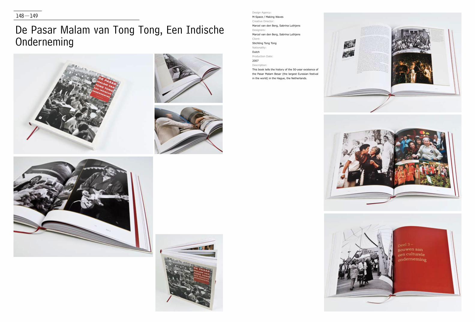
De Pasar Malam van Tong Tong, Een Indische Onderneming
Design Agency:
M-Space / Making Waves
Creative Director:
Marcel van den Berg, Sabrina Luthjens
Designers:
Marcel van den Berg, Sabrina Luthjens
Client:
Stichting Tong Tong
Nationality:
Dutch
Production Date:
2007
Description:
This book tells the history of the 50-year existence of
the Pasar Malam Besar (the largest Eurasian festival
in the world) in the Hague, the Netherlands.
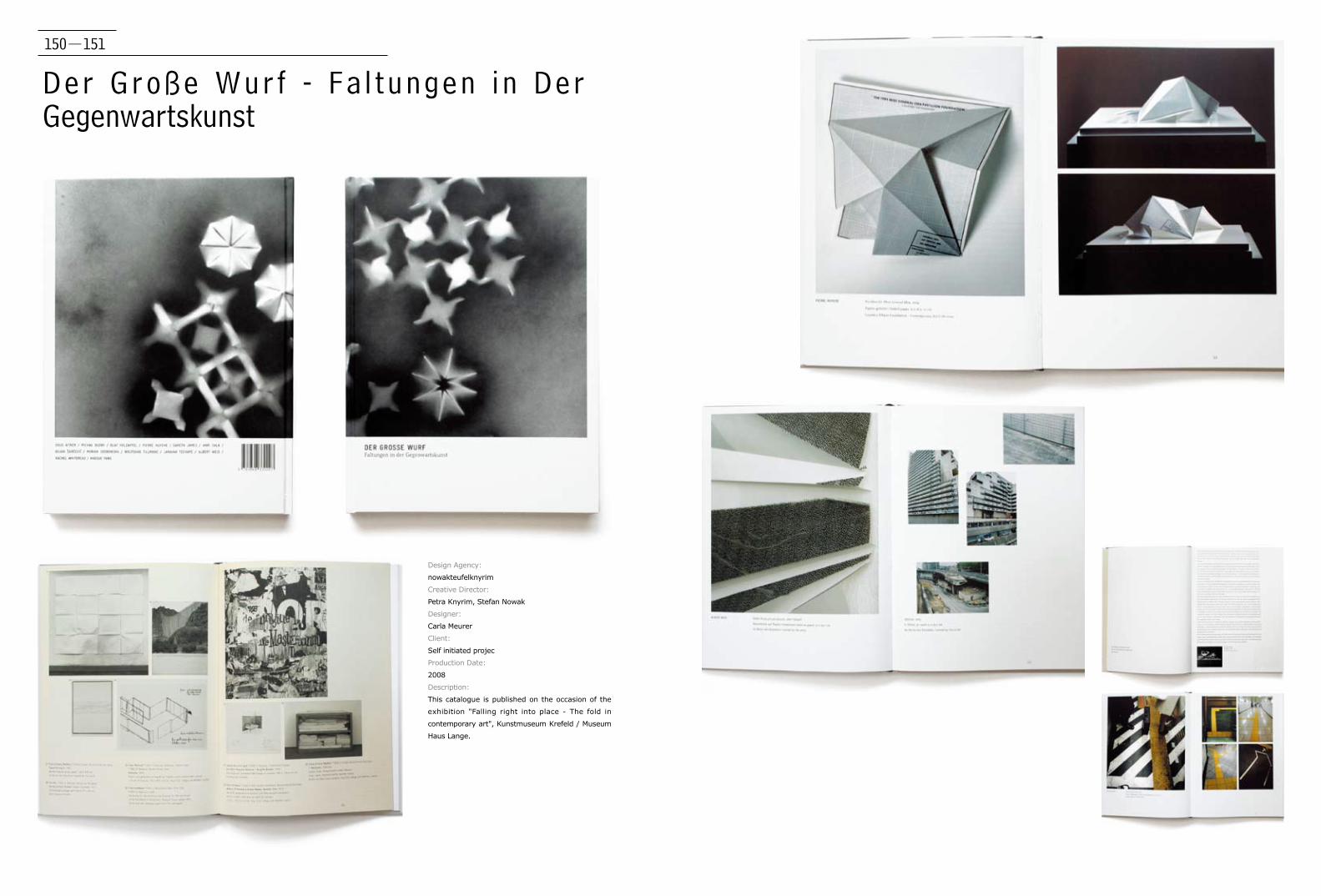
150-151
Der Große Wur f - Fa l tungen in Der Gegenwartskunst
Design Agency:
nowakteufelknyrim
Creative Director:
Petra Knyrim, Stefan Nowak
Designer:
Carla Meurer
Client:
Self initiated projec
Production Date:
2008
Description:
This catalogue is published on the occasion of the
exhibition "Falling right into place - The fold in
contemporary art", Kunstmuseum Krefeld / Museum
Haus Lange.

152-153
Folio Book Art Directior:
Mark Pernice
Design:
Mark Pernice, Eriko Yahiro
Production Date:
2007
Description:
The designer contracted the lovely and talented Eriko Yahiro to make this
beautifully crafted book and slipcase. Black leather bound with aluminum
inlays and a solid walnut slipcase.
Black leather was bound with aluminum inlays and a solid walnut slipcase.

154-155
„ “
Design Agency:
Oezlen Sagir
Client:
Georg Simon Ohm University of Applied Sciences
Production Date:
2007
Description:
"It is not until limitations are put on him that the master really shows
himself", said Goethe about the relationship between the artist and his
materials.
Against the background of a clearly reduced layout, the work can
completely concentrate on the portrayal and interpretation of individual
quotations, of which some are presented typographically and others
in combination with illustrations. The content of the chosen quotes is
tailored to the situation of (design) students, who are at the start of
their professional career and still have a lot ahead of them and hand
employing different printing techniques and bound with great skill using
high quality paper.
Comment:
When the designer came up with the idea about manual printing a
complete illustrated book, he was scared to make mistakes hard to
repair. But in the end he was amazed about how this imperfections
could inspire him so much to solve further pages, as well as how this
unforeseeable accidents made this book a unique and full of new ideas one.
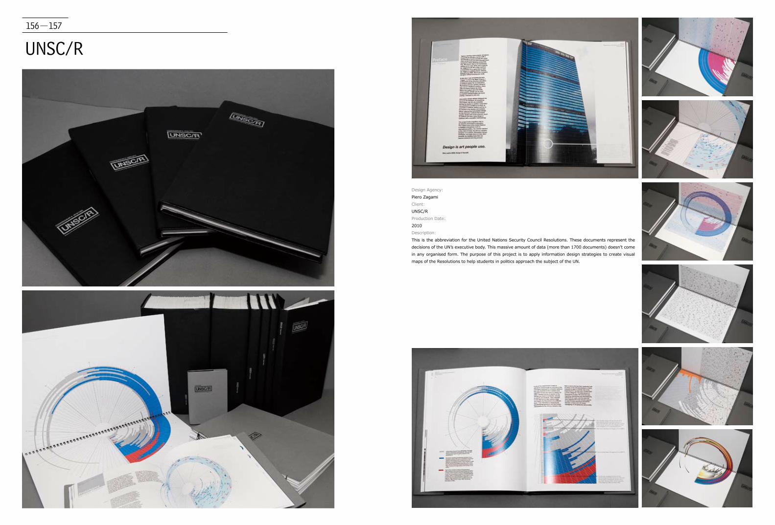
156-157
UNSC/R
Design Agency:
Piero Zagami
Client:
UNSC/R
Production Date:
2010
Description:
This is the abbreviation for the United Nations Security Council Resolutions. These documents represent the
decisions of the UN’s executive body. This massive amount of data (more than 1700 documents) doesn’t come
in any organised form. The purpose of this project is to apply information design strategies to create visual
maps of the Resolutions to help students in politics approach the subject of the UN.

158-159
Volume
Design Agency:
Poero Zagami
Client:
Volume
Production Date:
2008
Description:
MA Final Show Catalogue was produced for the MAGD 2008 course at the London
College of Communication. In charge of collecting visual material of each of the 70
students' projects. In charge of the photography of several content images in the
book. Cover design and catalogue layout were produced in collaboration with E.
Hoffmann, D. Naegele and N. Di Costanzo.

160-161
Denkmalpflege in der Stadt BernDesign Agency:
Pirol, Büro für Visuelle Gestaltung
in cooperation with Bern University of Arts Atelier
Designer:
Ruth Amstutz and Simone Farner
in cooperation with Franco Bonaventura (BUA)
Client:
Denkmalpflege der Stadt Bern
Production Date:
2009
Description:
The book starts with a series of orthophotos of the city of Berne, where all
the monuments mentioned in the book are marked. This map-pages and the
colour photos at the end of the book build a frame around the four-year report:
A documentation of 70 projects of preservation of monuments in pictures and
texts, grouped according to the districts of the city.
162-163
Block800
Art Director:
Pitertsev Mikhail
Designer:
Pitertsev Mikhail
Client:
LZID Ltd.
Production Date:
2009
Description:
Block800 is the new type of finishing work material by LZID
Ltd. Block800 is an artificial decorating stonelike material
specially created for cladding surfaces. Capability of unique
colouring is avaliable.

164-165
ESPN - Ultimate Highlight Reel
Art Director:
Joshua Berger
Designer:
Joshua Berger, Todd Houlette
Client:
ESPN Books / Melcher Media
Production Date:
2009
Description:
This nearly 400-page coffee table book was
produced as part of the 25th anniversary of ESPN's
SportsCenter. It contains 365 of the "wildest,
weirdest, most unforgettable SportsCenter moments
of all time."
166-167
Liza Ryan: SPILL Art Director:
Joshua Berger
Designer:
Joshua Berger
Client:
Reed College Cooley Gallery
Production Date:
2009
Description:
It is the catalogue published on the occasion of the
exhibition Liza Ryan: SPILL, on view at the Cooley
Gallery in winter of 2009. The exhibition was curated
by gallery director, Stephanie Snyder. Subsequent
exhibition and release party were held at Griffin
Gallery, Los Angeles. SPILL was recently acquired by
the Getty Museum.
168-169
Amplificador
Design Agency:
qubo + Scheps Workshop
Client:
Scheps Workshop, Architecture University of Uruguay
Production Date:
2010
Description:
Amplificador gathers a series of conferences and
workshops that took place between 2005 and 2009,
addressing various issues, each viewed from different
disciplines.
It is a low circulation, low cost book, printed only in
two inks, its design attempts to exploit the most of
these restrictions. Format, materials and finishes are
decisions that follow from this.
The two inks are used as an expressive resource, they
are visible from the outside, existing two variants of
the same book cover. Inside they alternate, separating
sections, creating textures, stopping at margins or
bleeding. The result is a delicate, diverse and powerful
object.
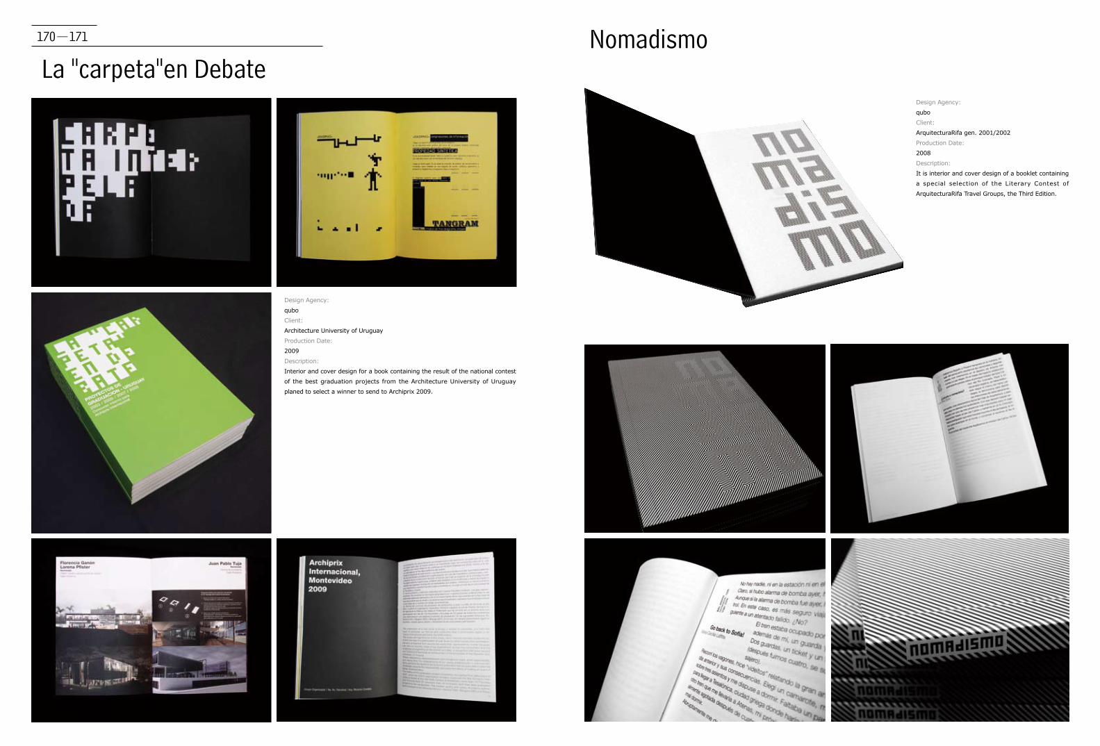
170-171
La "carpeta"en DebateNomadismo
Design Agency:
qubo
Client:
Architecture University of Uruguay
Production Date:
2009
Description:
Interior and cover design for a book containing the result of the national contest
of the best graduation projects from the Architecture University of Uruguay
planed to select a winner to send to Archiprix 2009.
Design Agency:
qubo
Client:
ArquitecturaRifa gen. 2001/2002
Production Date:
2008
Description:
It is interior and cover design of a booklet containing
a special selection of the Literary Contest of
ArquitecturaRifa Travel Groups, the Third Edition.
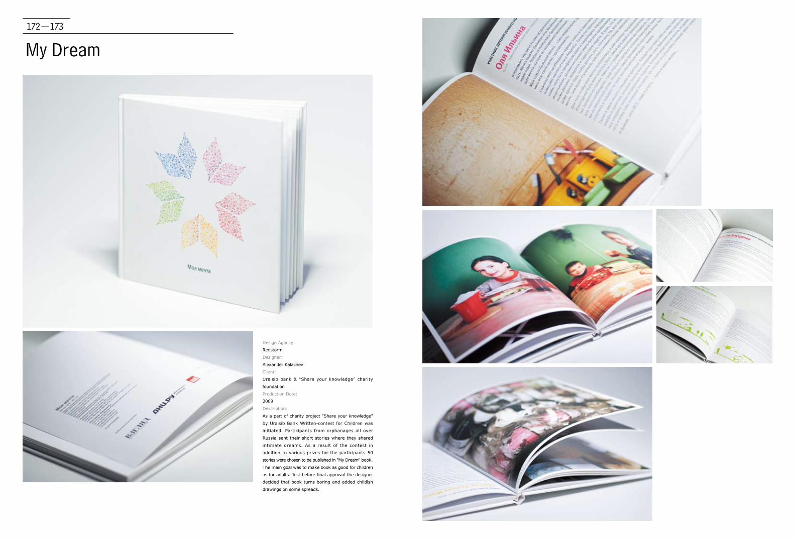
172-173
My Dream
Design Agency:
Redstorm
Designer:
Alexander Kalachev
Client:
Uralsib bank & “Share your knowledge” charity
foundation
Production Date:
2009
Description:
As a part of charity project "Share your knowledge"
by Uralsib Bank Written-contest for Children was
initiated. Participants from orphanages all over
Russia sent their short stories where they shared
intimate dreams. As a result of the contest in
addition to various prizes for the participants 50
stories were chosen to be published in "My Dream" book.
The main goal was to make book as good for children
as for adults. Just before final approval the designer
decided that book turns boring and added childish
drawings on some spreads.
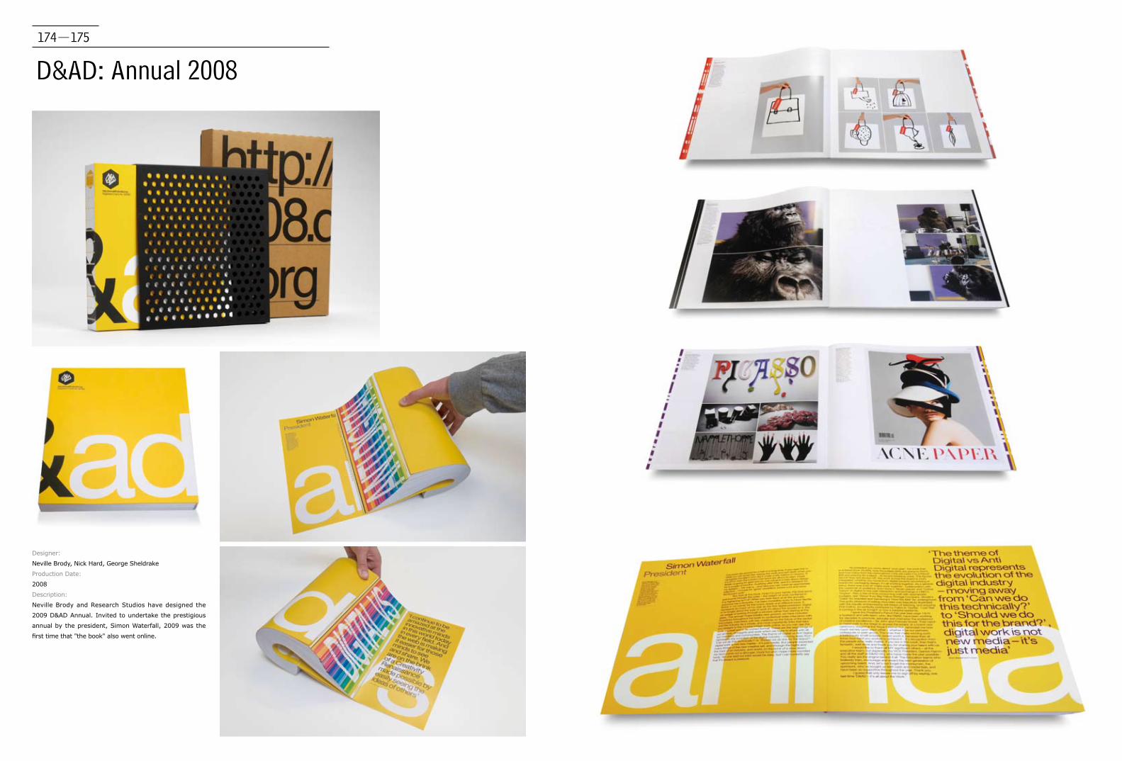
174-175
D&AD: Annual 2008
Designer:
Neville Brody, Nick Hard, George Sheldrake
Production Date:
2008
Description:
Neville Brody and Research Studios have designed the
2009 D&AD Annual. Invited to undertake the prestigious
annual by the president, Simon Waterfall, 2009 was the
first time that "the book" also went online.
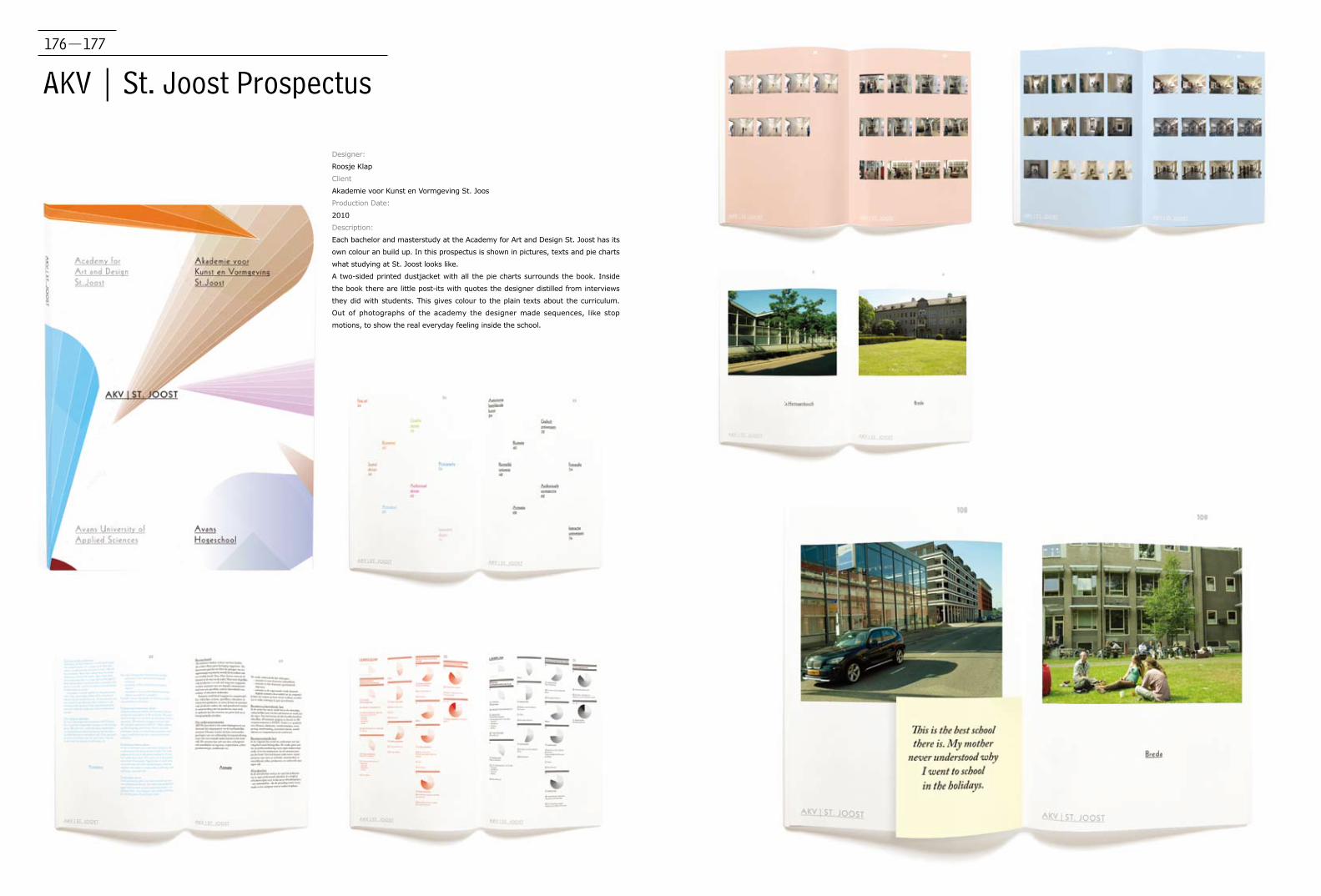
176-177
AKV | St. Joost Prospectus
Designer:
Roosje Klap
Client
Akademie voor Kunst en Vormgeving St. Joos
Production Date:
2010
Description:
Each bachelor and masterstudy at the Academy for Art and Design St. Joost has its
own colour an build up. In this prospectus is shown in pictures, texts and pie charts
what studying at St. Joost looks like.
A two-sided printed dustjacket with all the pie charts surrounds the book. Inside
the book there are little post-its with quotes the designer distilled from interviews
they did with students. This gives colour to the plain texts about the curriculum.
Out of photographs of the academy the designer made sequences, like stop
motions, to show the real everyday feeling inside the school.
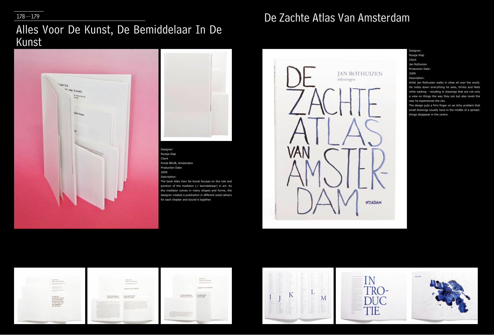
Alles Voor De Kunst, De Bemiddelaar In De Kunst
De Zachte Atlas Van Amsterdam
Designer:
Roosje Klap
Client
Fonds BKVB, Amsterdam
Production Date:
2009
Description:
The book Alles Voor De Kunst focuses on the role and
position of the mediator (= bemiddelaar) in art. As
the mediator comes in many shapes and forms, the
designer created a publication in different sized cahiers
for each chapter and bound it together.
178-179
Designer:
Roosje Klap
Client
Jan Rothuizen
Production Date:
2009
Description:
Artist Jan Rothuizen walks in cities all over the world.
He notes down everything he sees, thinks and feels
while walking - resulting in drawings that are not only
a view on things the way they are but also reveil the
way he experiences the city.
The design puts a firm finger on an itchy problem that
small drawings usually have in the middle of a spread:
things disappear in the centre.
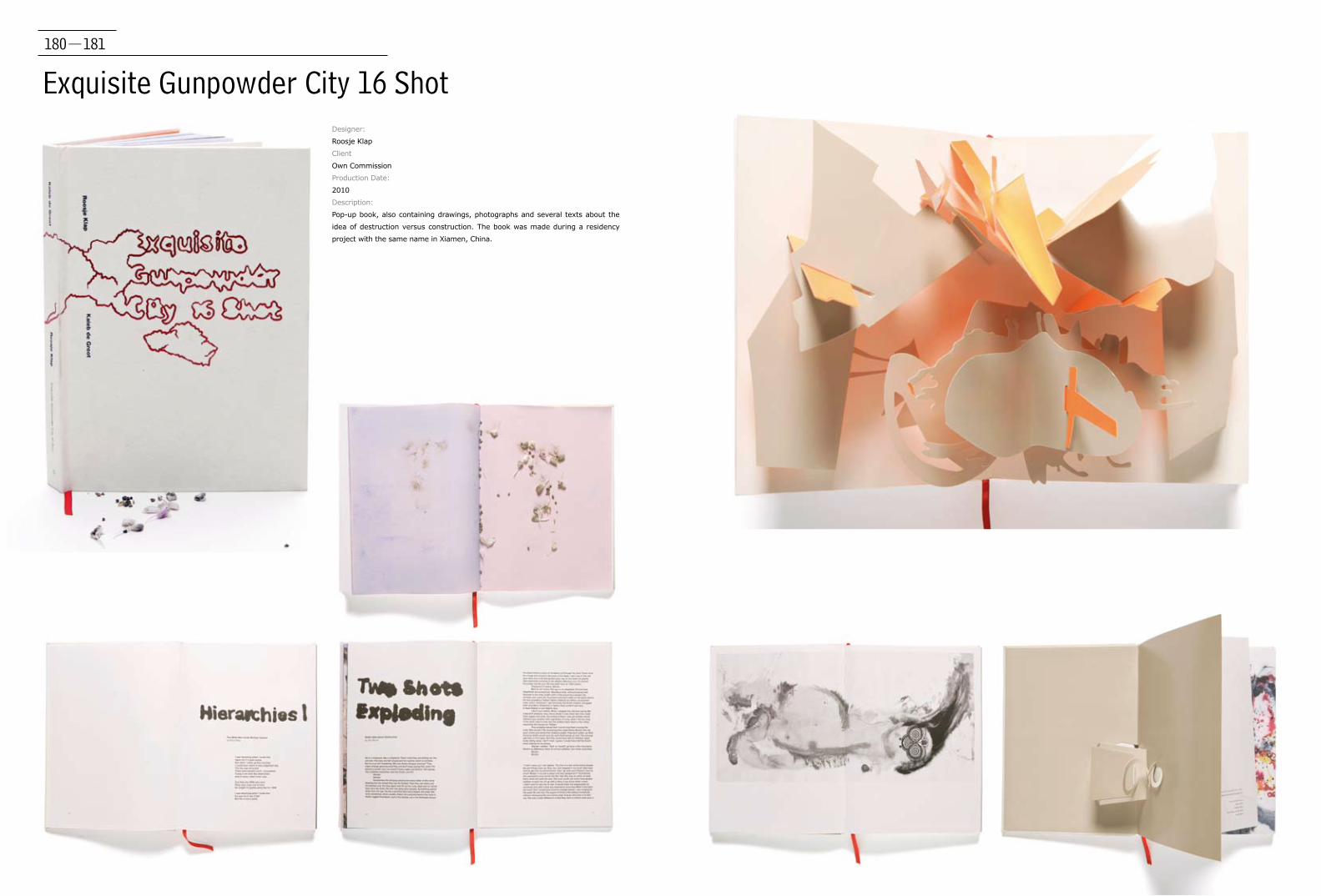
180-181
Exquisite Gunpowder City 16 ShotDesigner:
Roosje Klap
Client
Own Commission
Production Date:
2010
Description:
Pop-up book, also containing drawings, photographs and several texts about the
idea of destruction versus construction. The book was made during a residency
project with the same name in Xiamen, China.

The Encyclopedia of Fictional Artists / The Addition
Designer:
Roosje Klap
Client
JRP Ringier, Zürich (Switzerland)
Production Date:
2010
Description:
First published nearly a decade ago, and here
translated into English for the first time, "The
Encyclopedia of Fictional Artists" is a project
by author and editor Koen Brams, for which he
commissioned and compiled an anthology of
imaginary biographies based on the numerous
artists invented by writers across the centuries,
from the beginning of the seventeenth century to
the present. The imaginary artist is, of course, a
supremely seductive figure to readers, writers and
artists alike, being a sort of screen upon which
the most astounding imaginary creations may be
projected, without need of them ever being visible
to the eye. As such, "The Encyclopedia of Fictional
Artists" constitutes a trove of inspiration for all
manner of creative endeavor. The Addition is Krist
Gruijthuisen's editorial answer to the Encyclopedia,
in which he invites more than 30 artists to reflect on
the aspirations and ideals of encyclopedias.
182-183
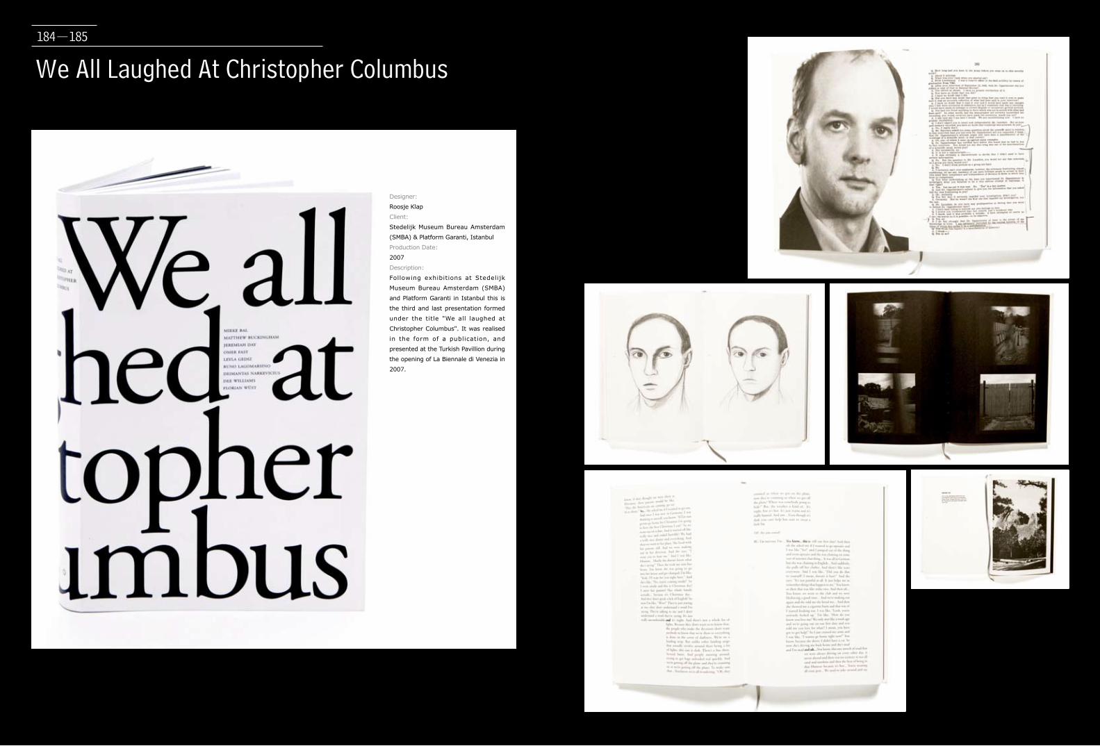
We All Laughed At Christopher Columbus
Designer:
Roosje Klap
Client:
Stedelijk Museum Bureau Amsterdam
(SMBA) & Platform Garanti, Istanbul
Production Date:
2007
Description:
Following exhibitions at Stedelijk
Museum Bureau Amsterdam (SMBA)
and Platform Garanti in Istanbul this is
the third and last presentation formed
under the title "We all laughed at
Christopher Columbus". It was realised
in the form of a publication, and
presented at the Turkish Pavillion during
the opening of La Biennale di Venezia in
2007.
184-185
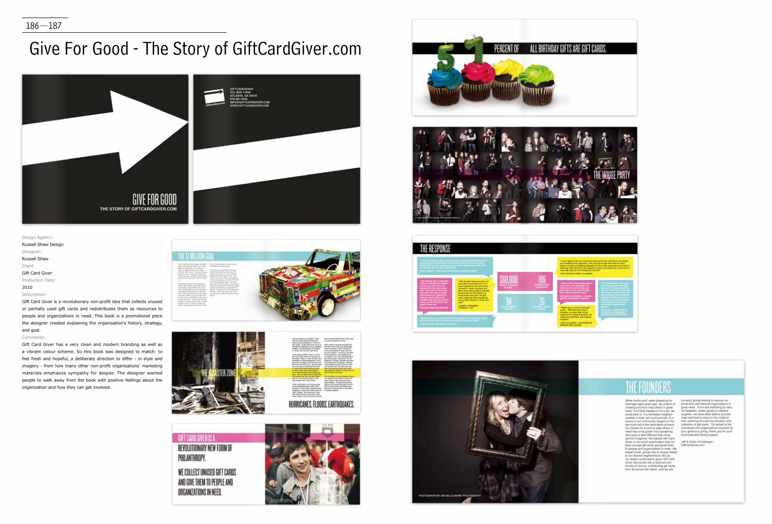
186-187
Give For Good - The Story of GiftCardGiver.com
Design Agency:
Russell Shaw Design
Designer:
Russell Shaw
Client
Gift Card Giver
Production Date:
2010
Description:
Gift Card Giver is a revolutionary non-profit idea that collects unused
or partially used gift cards and redistributes them as resources to
people and organizations in need. This book is a promotional piece
the designer created explaining the organisation’s history, strategy,
and goal.
Comments:
Gift Card Giver has a very clean and modern branding as well as
a vibrant colour scheme. So this book was designed to match: to
feel fresh and hopeful, a deliberate direction to differ - in style and
imagery - from how many other non-profit organisations’ marketing
materials emphasize sympathy for despair. The designer wanted
people to walk away from the book with positive feelings about the
organization and how they can get involved.

188-189
Across SingaporeDesign Agency:
sciencewerk
Designer:
Octavia S.
Client
sciencewerk
Production Date:
2010
Description:
Across Singapore is a visual publication project visualising the
hustle bustle of Singapore, from the city, MRT, to suburb areas.
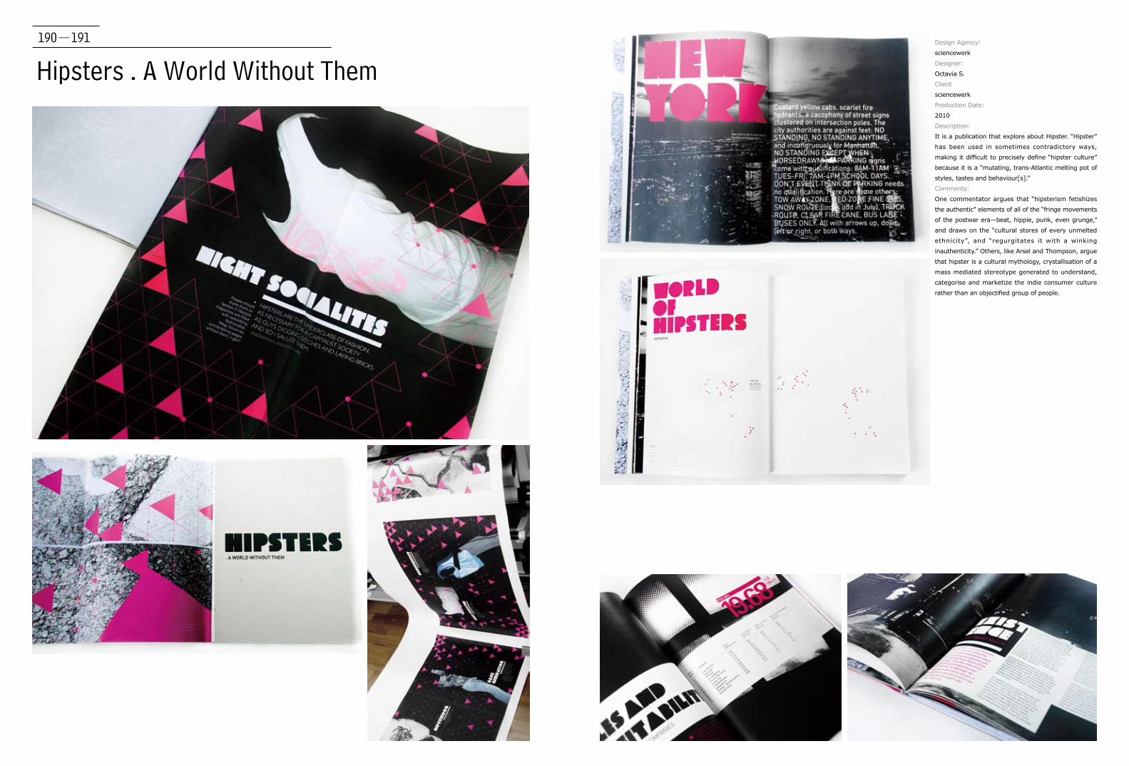
Hipsters . A World Without ThemDesign Agency:
sciencewerk
Designer:
Octavia S.
Client
sciencewerk
Production Date:
2010
Description:
It is a publication that explore about Hipster. “Hipster”
has been used in sometimes contradictory ways,
making it difficult to precisely define “hipster culture”
because it is a “mutating, trans-Atlantic melting pot of
styles, tastes and behaviour[s].”
Comments:
One commentator argues that “hipsterism fetishizes
the authentic” elements of all of the “fringe movements
of the postwar era—beat, hippie, punk, even grunge,”
and draws on the “cultural stores of every unmelted
ethnicity”, and “regurgitates it with a winking
inauthenticity.” Others, like Arsel and Thompson, argue
that hipster is a cultural mythology, crystallisation of a
mass mediated stereotype generated to understand,
categorise and marketize the indie consumer culture
rather than an objectified group of people.
190-191
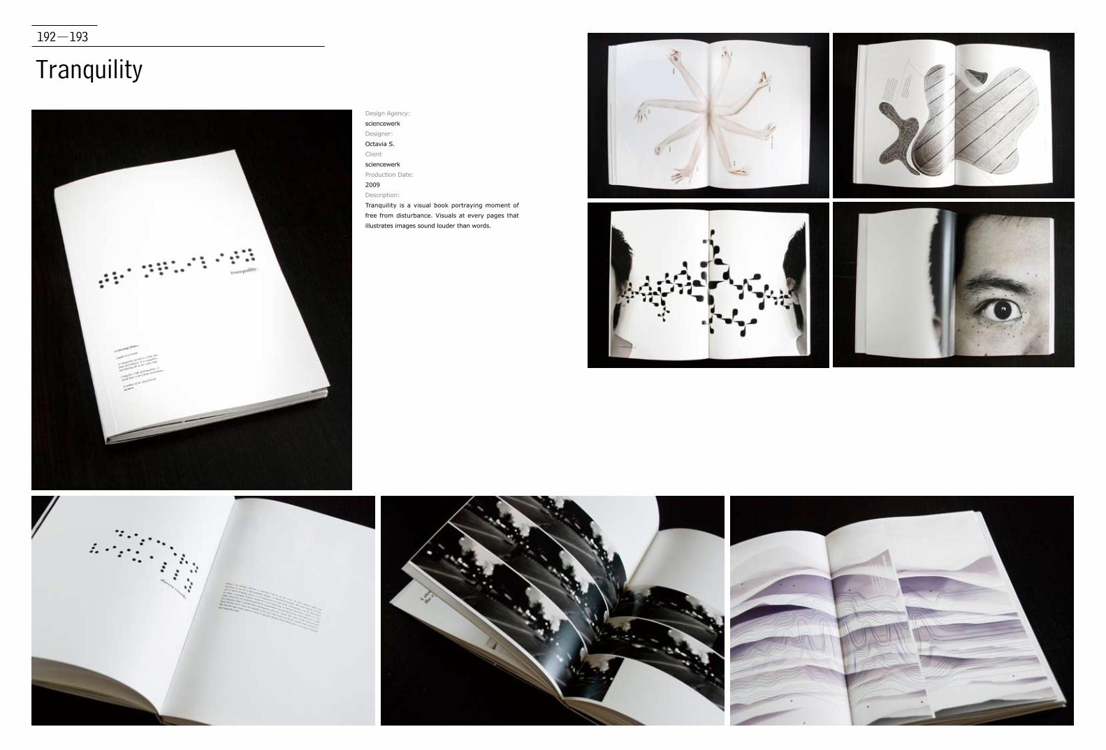
192-193
TranquilityDesign Agency:
sciencewerk
Designer:
Octavia S.
Client
sciencewerk
Production Date:
2009
Description:
Tranquility is a visual book portraying moment of
free from disturbance. Visuals at every pages that
illustrates images sound louder than words.
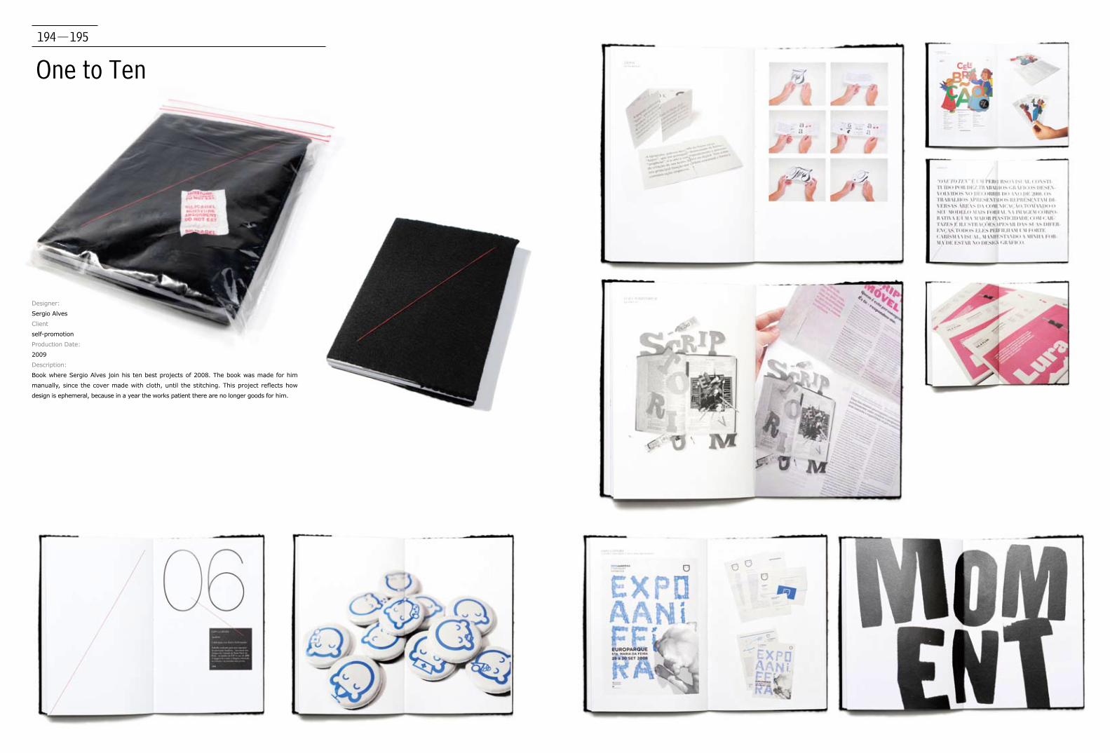
194-195
One to Ten
Designer:
Sergio Alves
Client
self-promotion
Production Date:
2009
Description:
Book where Sergio Alves join his ten best projects of 2008. The book was made for him
manually, since the cover made with cloth, until the stitching. This project reflects how
design is ephemeral, because in a year the works patient there are no longer goods for him.
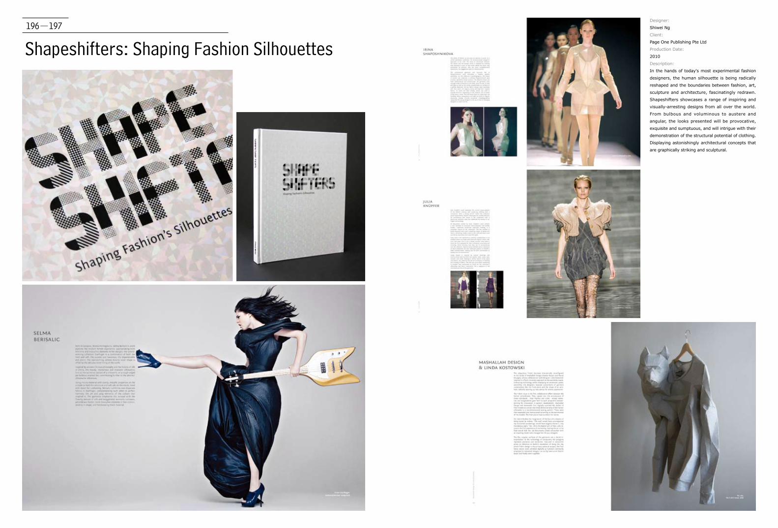
196-197
Shapeshifters: Shaping Fashion Silhouettes
Designer:
Shiwei Ng
Client:
Page One Publishing Pte Ltd
Production Date:
2010
Description:
In the hands of today's most experimental fashion
designers, the human silhouette is being radically
reshaped and the boundaries between fashion, art,
sculpture and architecture, fascinatingly redrawn.
Shapeshifters showcases a range of inspiring and
visually-arresting designs from all over the world.
From bulbous and voluminous to austere and
angular, the looks presented will be provocative,
exquisite and sumptuous, and will intrigue with their
demonstration of the structural potential of clothing.
Displaying astonishingly architectural concepts that
are graphically striking and sculptural.
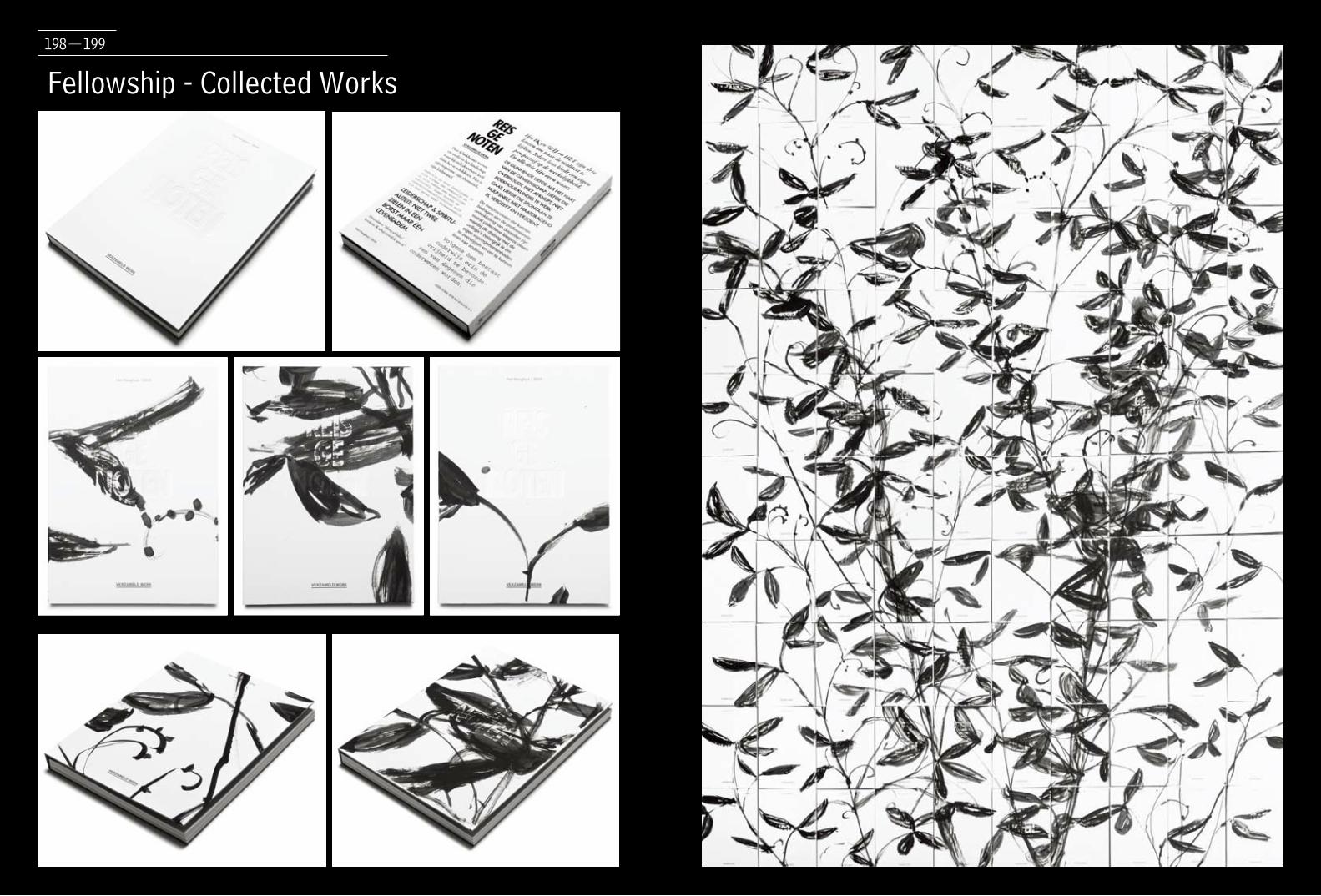
Fellowship - Collected Works198-199

200-201
Design Agency:
Since 1416, Graphic Design & Visual Research
Designer:
Dirk Claessens, Maarten Verweij, Kees de Klein
Client:
Het Hooghuis
Production Date:
2010
Description:
In September 2009 a number of people were invited to contribute to the liber
amicorum in honour of the retirement of Henk Peters, an inspiring school leader in
the city of Oss, the Netherlands.
The theme - collaboration & connection - has been approached from the
perspective of the different authors.
The diversity of the design (paper, layout, typography) is based on the diversity of
the textual content.
A constant factor in the book is the work of fine artist Han Klinkhamer. His work
draws a trail through the book and embraces the individual texts. Besides dozens
of paintings of farmer fields scattered through the publication, Klinkhamer has
signed the first 100 books by a painting. In his studio 100 publications were
arranged into a blank canvas, each book got a unique cover.
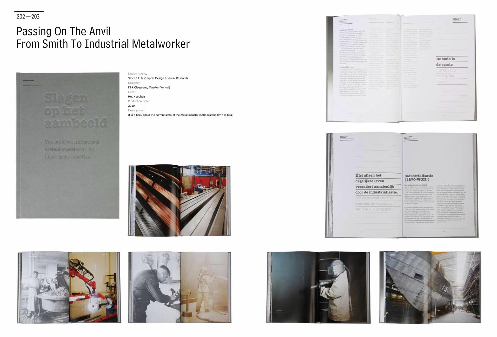
202-203
Passing On The AnvilFrom Smith To Industrial Metalworker
Design Agency:
Since 1416, Graphic Design & Visual Research
Designer:
Dirk Claessens, Maarten Verweij
Client:
Het Hooghuis
Production Date:
2010
Description:
It is a book about the current state of the metal industry in the historic town of Oss.

204-205
StartgidsDesign Agency:
Jens Dawn
Designer:
Jens Dawn
Client:
Design Platform Limburg
Production Date:
2009
Description:
The Startgids is a guide for college graduated
designers in Belgium to give advice about starting a
design practice.
This guide contains two changing colours and black
throughout the book, this makes it cheaper to print
(also cheaper for the client). Two Colours are more
relaxing for the eyes and therefore Jens Dawn think
are beneficial in reading. The Illustrations are a
collection of wild subjective inspiration taken from
the titles (topics) in the guide. The cover is the “work
in progress” page of the illustrations, that combine
all the topics together.
The book got printed on 2,000 copies and got send
to the Dutch speaking designers that finished their
years in college. In March 2011, the guide got updated
and had a new printing of another 2,000 copies.
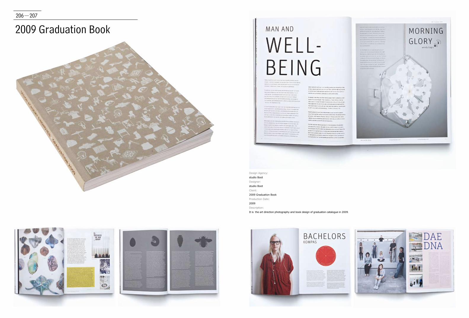
206-207
2009 Graduation Book
Design Agency:
studio Boot
Designer:
studio Boot
Client:
2009 Graduation Book
Production Date:
2009
Description:
It is the art direction photography and book design of graduation catalogue in 2009.
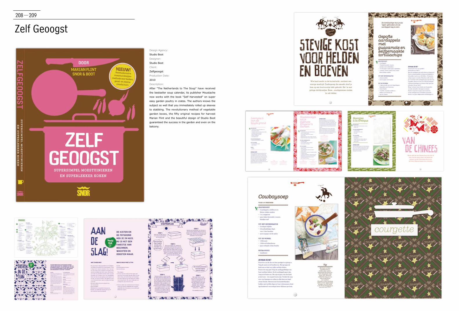
208-209
Zelf Geoogst
Design Agency:
Studio Boot
Designer:
Studio Boot
Client:
Zelfgeoogst
Production Date:
2010
Description:
After "The Netherlands to The Soup" have received
the bestseller soup calendar, its publisher Moustache
now works with the book "Self Harvested" on super
easy garden poultry in crates. The authors knows the
subject so well that you immediately rolled up sleeves
to stabbing. The revolutionary method of vegetable
garden boxes, the fifty original recipes for harvest
Marian Flint and the beautiful design of Studio Boot
guaranteed the success in the garden and even on the
balcony.
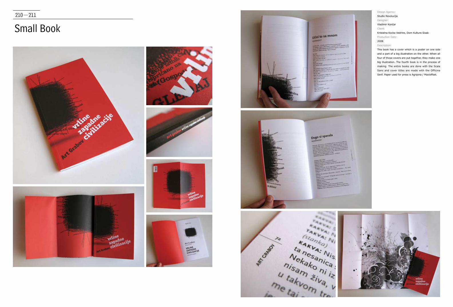
210-211
Small Book
Design Agency:
Studio Revolucija
Designer:
Vladimir Končar
Client:
Kristalna Kocka Vedrine, Dom Kulture Sisak
Production Date:
2008
Description:
This book has a cover which is a poster on one side
and a part of a big illustration on the other. When all
four of those covers are put together, they make one
big illustration. The fourth book is in the process of
making. The entire books are done with the Scala
Sans and cover titles are made with the Officina
Serif. Paper used for press is Agripina / Maxioffset.

212-213
Szembeszélo
Designer:
Márton Borzák, Réka Diósi
Client:
BT-Press
Production Date:
2010
Description:
The book was designed to feature 30 interviews
and stories with famous Hungarian people. Actors,
writers and many other well-known people share
unique and interesting stories about their lives.
The cover was divided into several pieces using
recursive tiling algorithm to represent the structure
of the book: various stories in various lengths.
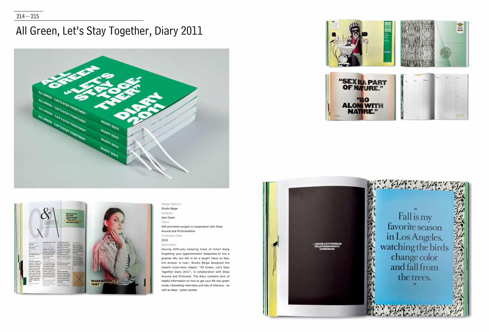
214-215
All Green, Let’s Stay Together, Diary 2011
Design Agency:
Studio Beige
Designer:
Jens Dawn
Client:
Self promotion project in cooperation with Shop
Around and PrintvisieWork
Production Date:
2010
Description:
Having difficulty keeping track of time? Keep
forgetting your appointments? Desperate to live a
greener life, but still in for a laugh? Have no fear,
the answer is near: Studio Beige designed the
instant must-have classic: "All Green, Let's Stay
Together Diary 2011", in collaboration with Shop
Around and Printvisie. The diary contains tons of
helpful information on how to get your life into green
mode, interesting interviews and lots of hilarious - as
well as deep - green quotes.
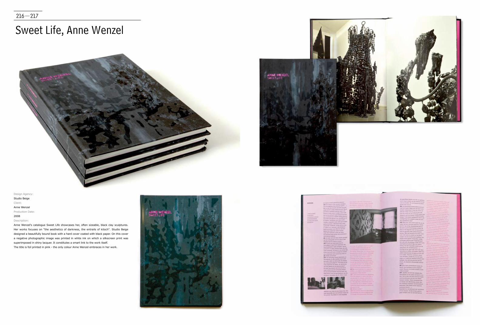
216-217
Sweet Life, Anne Wenzel
Design Agency:
Studio Beige
Client:
Anne Wenzel
Production Date:
2008
Description:
Anne Wenzel's catalogue Sweet Life showcases her, often sizeable, black clay sculptures.
Her works focuses on "the aesthetics of darkness, the entrails of kitsch". Studio Beige
designed a beautifully bound book with a hard cover coated with black paper. On this cover
a negative photographic image was printed in white ink on which a silkscreen print was
superimposed in shiny lacquer. It constitutes a smart link to the work itself.
The title is foil printed in pink - the only colour Anne Wenzel embraces in her work.
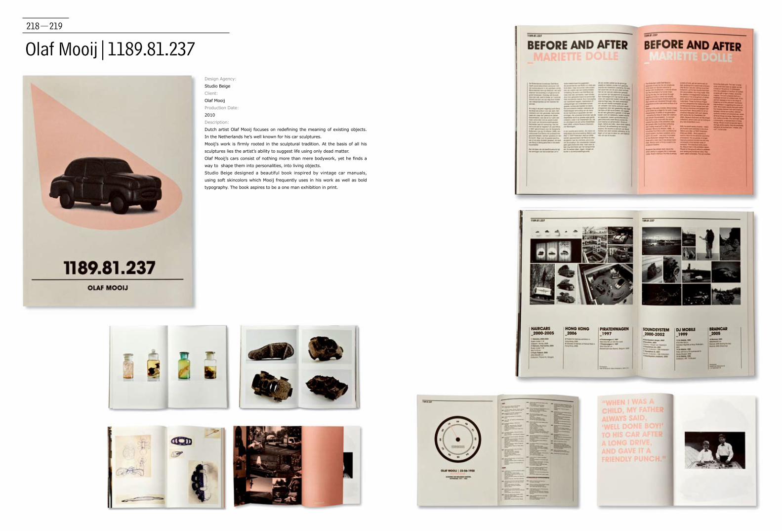
218-219
Olaf Mooij|1189.81.237 Design Agency:
Studio Beige
Client:
Olaf Mooij
Production Date:
2010
Description:
Dutch artist Olaf Mooij focuses on redefining the meaning of existing objects.
In the Netherlands he’s well known for his car sculptures.
Mooij's work is firmly rooted in the sculptural tradition. At the basis of all his
sculptures lies the artist’s ability to suggest life using only dead matter.
Olaf Mooij’s cars consist of nothing more than mere bodywork, yet he finds a
way to shape them into personalities, into living objects.
Studio Beige designed a beautiful book inspired by vintage car manuals,
using soft skincolors which Mooij frequently uses in his work as well as bold
typography. The book aspires to be a one man exhibition in print.
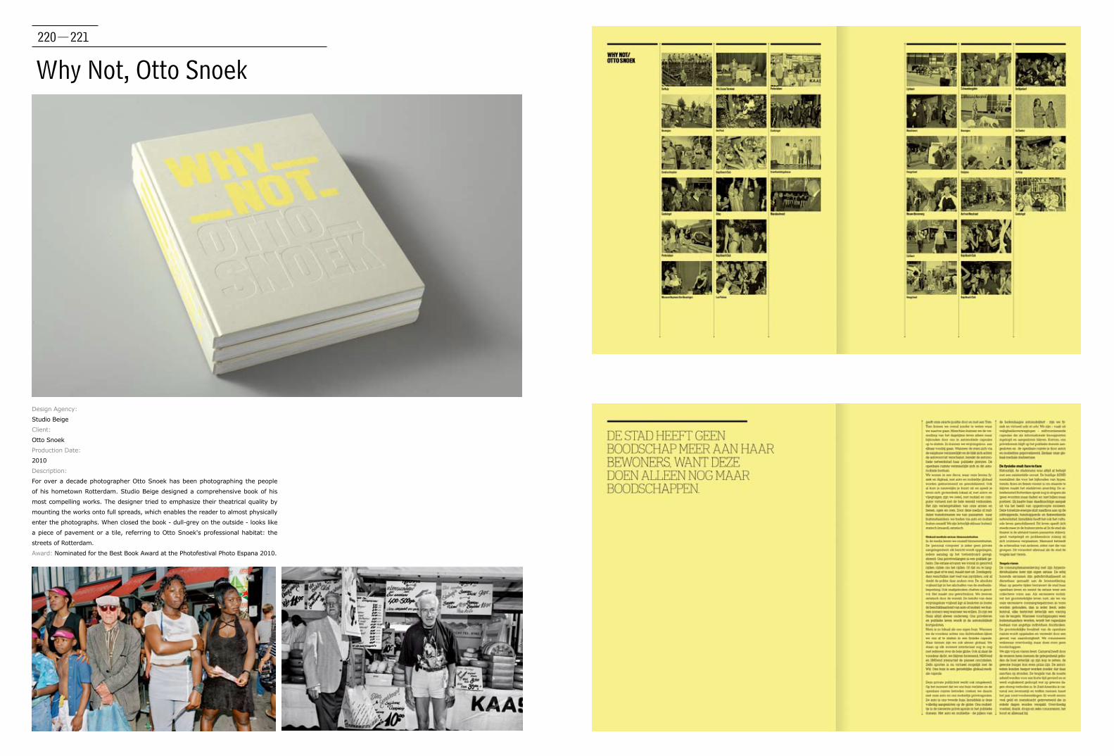
220-221
Why Not, Otto Snoek
Design Agency:
Studio Beige
Client:
Otto Snoek
Production Date:
2010
Description:
For over a decade photographer Otto Snoek has been photographing the people
of his hometown Rotterdam. Studio Beige designed a comprehensive book of his
most compelling works. The designer tried to emphasize their theatrical quality by
mounting the works onto full spreads, which enables the reader to almost physically
enter the photographs. When closed the book - dull-grey on the outside - looks like
a piece of pavement or a tile, referring to Otto Snoek's professional habitat: the
streets of Rotterdam.
Award: Nominated for the Best Book Award at the Photofestival Photo Espana 2010.
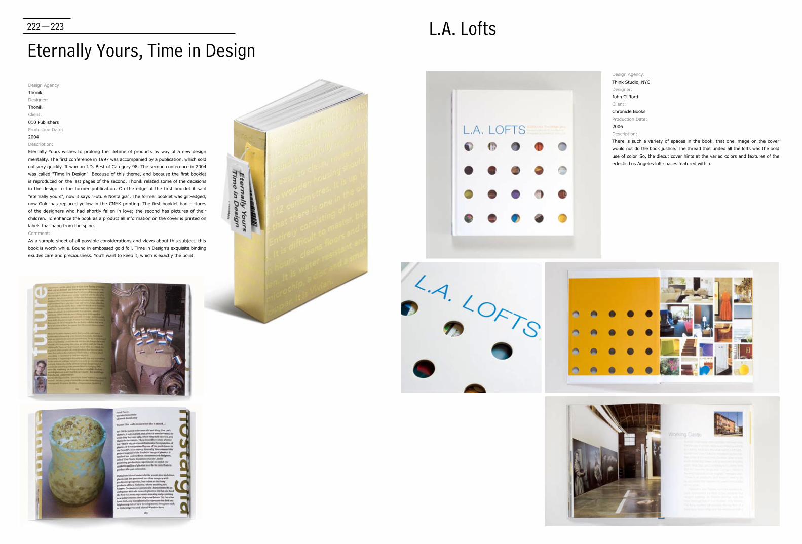
222-223
Eternally Yours, Time in DesignL.A. Lofts
Design Agency:
Think Studio, NYC
Designer:
John Clifford
Client:
Chronicle Books
Production Date:
2006
Description:
There is such a variety of spaces in the book, that one image on the cover
would not do the book justice. The thread that united all the lofts was the bold
use of color. So, the diecut cover hints at the varied colors and textures of the
eclectic Los Angeles loft spaces featured within.
Design Agency:
Thonik
Designer:
Thonik
Client:
010 Publishers
Production Date:
2004
Description:
Eternally Yours wishes to prolong the lifetime of products by way of a new design
mentality. The first conference in 1997 was accompanied by a publication, which sold
out very quickly. It won an I.D. Best of Category 98. The second conference in 2004
was called "Time in Design". Because of this theme, and because the first booklet
is reproduced on the last pages of the second, Thonik related some of the decisions
in the design to the former publication. On the edge of the first booklet it said
"eternally yours", now it says "Future Nostalgia". The former booklet was gilt-edged,
now Gold has replaced yellow in the CMYK printing. The first booklet had pictures
of the designers who had shortly fallen in love; the second has pictures of their
children. To enhance the book as a product all information on the cover is printed on
labels that hang from the spine.
Comment:
As a sample sheet of all possible considerations and views about this subject, this
book is worth while. Bound in embossed gold foil, Time in Design’s exquisite binding
exudes care and preciousness. You’ll want to keep it, which is exactly the point.

224-225
One Million
Design Agency:
Think Studio, NYC
Designer:
John Clifford, Herb Thornby
Client:
Abrams Image
Production Date:
2010
Description:
The plan of the book is simple: two hundred pages; five
thousand dots to a page. Author and New Yorker editor Hendrik
Hertzberg wants the reader to actually see, perhaps for the first
time ever, exactly one million of something. To keep the simple
design lively, the value of the dots were varied so they twinkle
and animate a bit. The design won AIGA 50 Books/50 Covers;
HOW Magazine International Design Award.
Comment:
A great example of humour intertwined with good information
design.FPO/Under Consideration the design is exactly what it
should be Fast Companies Co. Design.
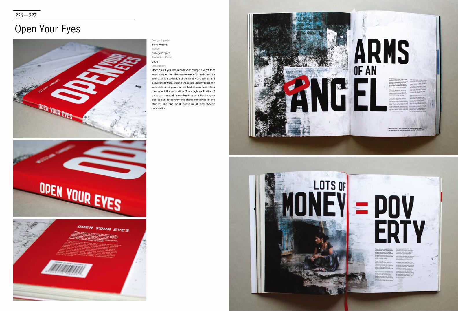
226-227
Open Your EyesDesign Agency:
Tiana Vasiljev
Client:
College Project
Production Date:
2008
Description:
Open Your Eyes was a final year college project that
was designed to raise awareness of poverty and its
effects. It is a collection of the third world stories and
occurrences from around the globe. Bold typography
was used as a powerful method of communication
throughout the publication. The rough application of
paint was created in combination with the imagery
and colour, to portray the chaos contained in the
stories. The final book has a rough and chaotic
personality.

228-229
Fairly UnfairDesign Agency:
Toby Ng Design
Client:
Toby Ng
Production Date:
2007
Description:
This little game book contain games which are specially designed for lawyers.
No, sorry, not everyone is given the opportunity to take the challenge. The
rules are as set – simply the same as in all judicial courts and proceedings.
Fair enough? This piece of work is inspired by the designer's experience of
sitting in a few court sessions and listening to the discourse in them. Don’t be
fooled by the indication of trial language being your mother tongue, indeed, the
conversations are filled with specialised terminology which bar common people
from understanding. Last remark to players of these games: you should follow
the instructions, but do not think about winning or completing the tasks.
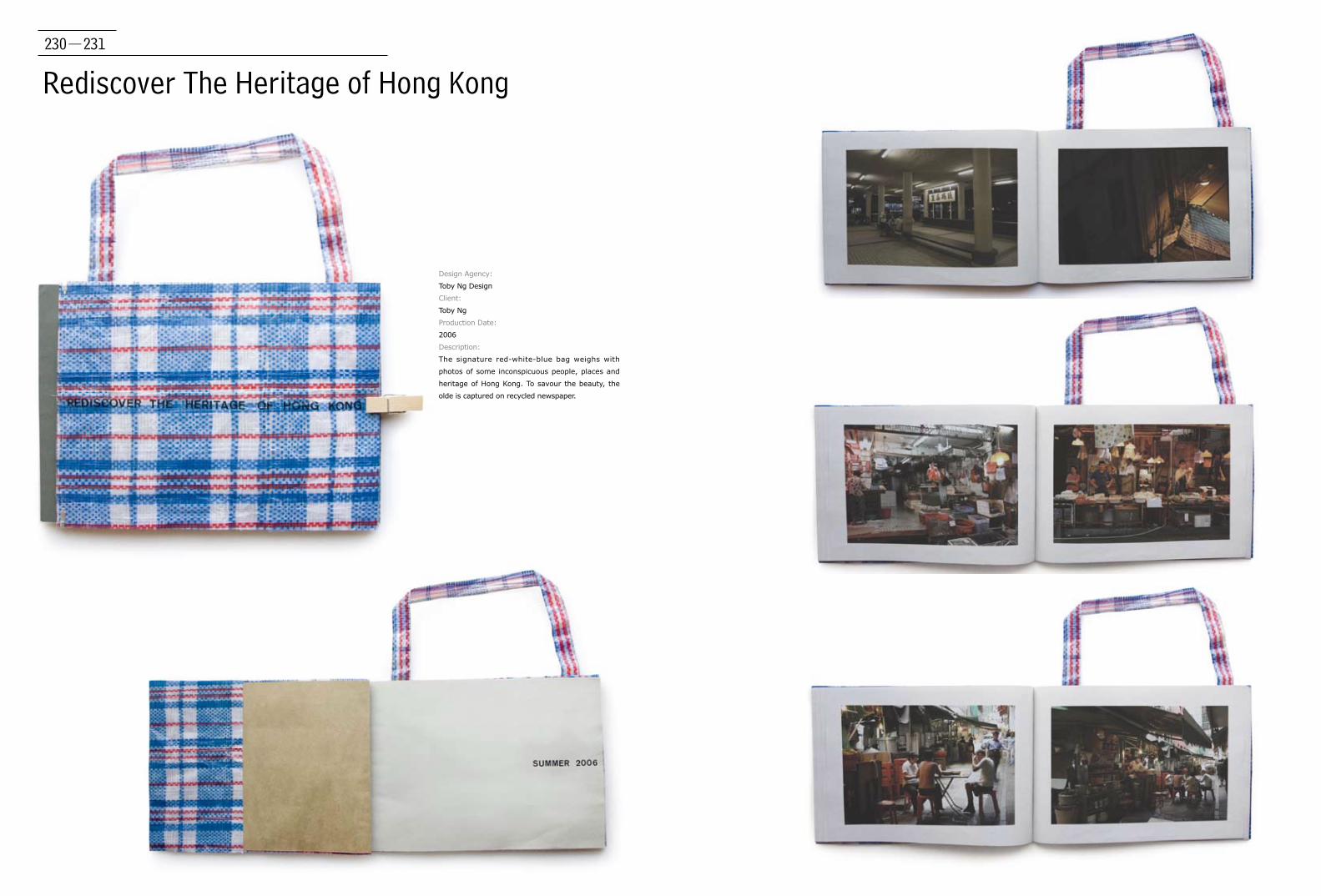
230-231
Rediscover The Heritage of Hong Kong
Design Agency:
Toby Ng Design
Client:
Toby Ng
Production Date:
2006
Description:
The signature red-white-blue bag weighs with
photos of some inconspicuous people, places and
heritage of Hong Kong. To savour the beauty, the
olde is captured on recycled newspaper.

232-233
Uncovered
Design Agency:
Toby Ng Design
Client:
Uncovered
Production Date:
2008
Description:
If a book-cover is where people identify a book, no
identity, like the ones in it, is offered to this book.
Perspective is all that matters: read the book in any
usual way and repeat the same in reverse – learn
their stories in English, or in Chinese, or in both. The
choice is upon you, but for the personages, they do
not have one.

234-235
Concept Book & Kit For Prototype Typeface Experimental Work
Designer:
Toshiyasu Nanbu
Client:
Taste Inc.
Production Date:
2010
Description:
In this Concept Book & Kit For Prototype Typeface
Experimental Works, the Taste Inc. designed by art
book form is an image book by an original font of
production.
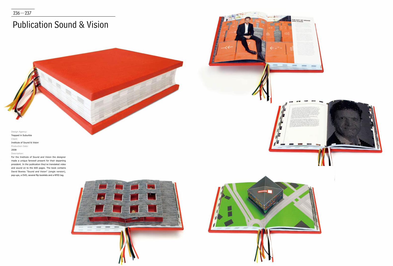
236-237
Publication Sound & Vision
Design Agency:
Trapped in Suburbia
Client:
Institute of Sound & Vision
Production Date:
2008
Description:
For the Institute of Sound and Vision the designer
made a unique farewell present for their departing
president. In the publication they've translated video
and sound on to the 600 pages. The book contains
David Bowies "Sound and Vision" (single version),
pop-ups, a DVD, several flip booklets and a RFID tag.

238-239
Book VJ Movement
Design Agency:
Trapped in Suburbia
Client:
VJ Movement
Production Date:
2009
Description:
VJ Movement gives journalist around the world the opportunity to show
their stories and tell their truths. Everyone can join the VJ Movement
and pitch their story ideas to the journalists. If you want to hear more
about a certain topic because you can’t see this on the regular news,
you can pitch your idea. If your idea get the most votes, a professional
VJ journalist will report the story for you and it will be published online.
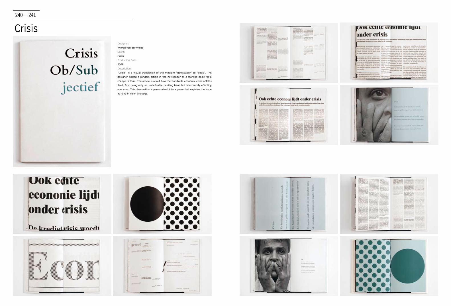
240-241
CrisisDesigner:
Wilfred van der Weide
Client:
Crisis
Production Date:
2009
Description:
"Crisis" is a visual translation of the medium "newspaper" to "book". The
designer picked a random article in the newspaper as a starting point for a
change in form. The article is about how the worldwide economic crisis unfolds
itself, first being only an undefinable banking issue but later surely effecting
everyone. This observation is personalised into a poem that explains the issue
at hand in clear language.
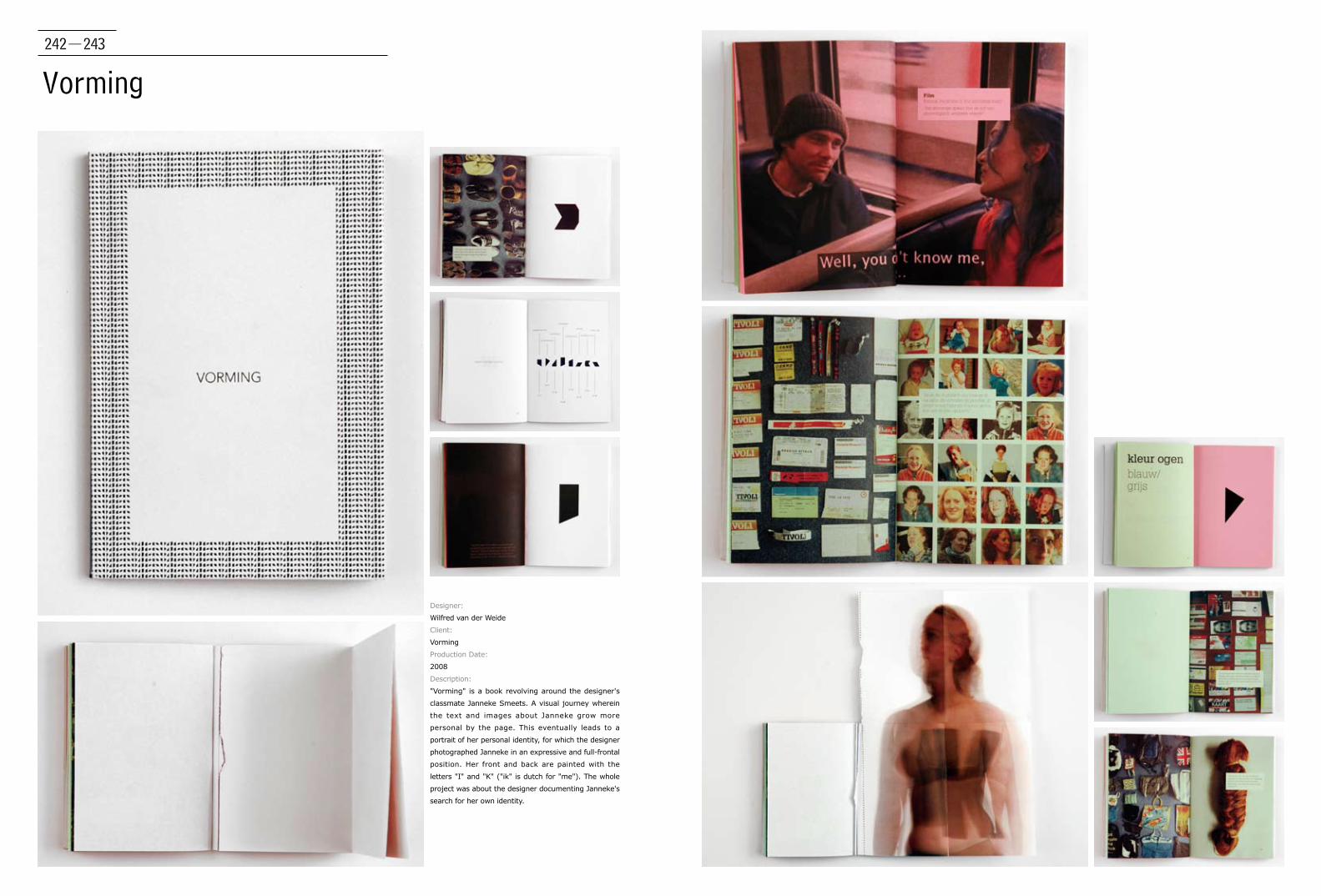
242-243
Vorming
Designer:
Wilfred van der Weide
Client:
Vorming
Production Date:
2008
Description:
"Vorming" is a book revolving around the designer's
classmate Janneke Smeets. A visual journey wherein
the text and images about Janneke grow more
personal by the page. This eventually leads to a
portrait of her personal identity, for which the designer
photographed Janneke in an expressive and full-frontal
position. Her front and back are painted with the
letters "I" and "K" ("ik" is dutch for "me"). The whole
project was about the designer documenting Janneke's
search for her own identity.
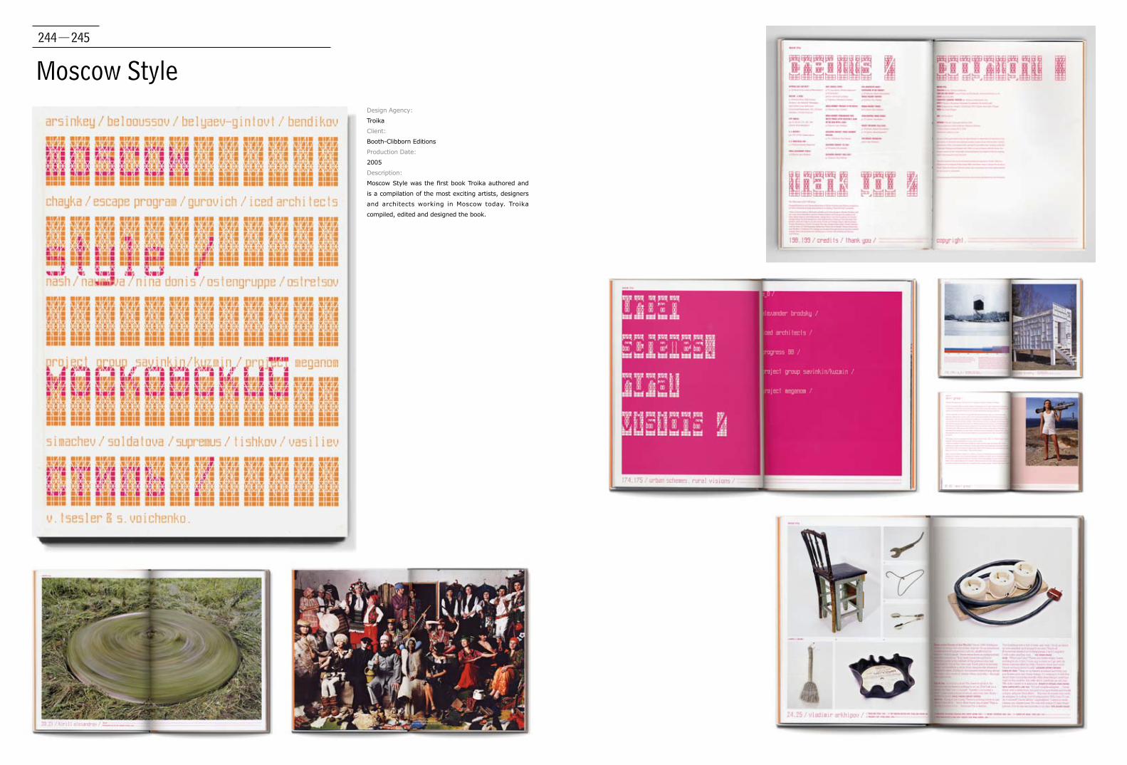
244-245
Moscow StyleDesign Agency:
Troika
Client:
Booth-Clibborn Editions
Production Date:
2005
Description:
Moscow Style was the first book Troika authored and
is a compilation of the most exciting artists, designers
and architects working in Moscow today. Troika
compiled, edited and designed the book.
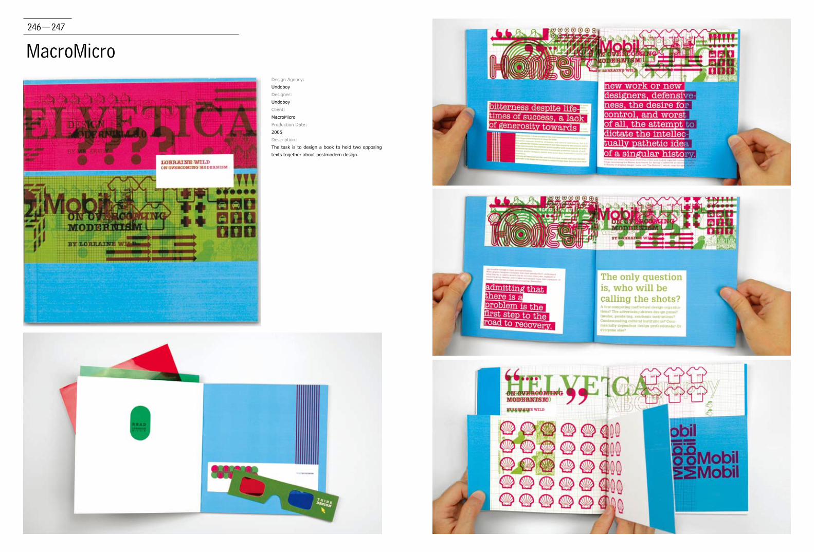
246-247
MacroMicroDesign Agency:
Undoboy
Designer:
Undoboy
Client:
MacroMicro
Production Date:
2005
Description:
The task is to design a book to hold two opposing
texts together about postmodern design.
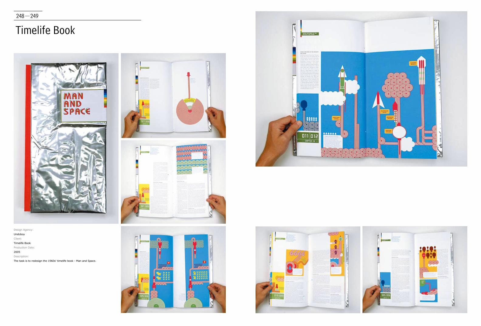
248-249
Timelife Book
Design Agency:
Undoboy
Client:
Timelife Book
Production Date:
2005
Description:
The task is to redesign the 1960s' timelife book - Man and Space.

250-251
The Art of Participation: 1950 to Now
Design Agency:
Volume Inc.
Creative Director
Adam Brodsley, Eric Heiman
Designer:
Iran Narges
Client:
The San Francisco Museum of Modern Art
Production Date:
2008
Description:
Exhibition "The Art of Participation: 1950 to Now"
presents an overview of participation-based art
since the 1950s, reflecting on how artists create
situations in which the public takes a collaborative
role in the art-making process.
The exhibit catalogue's design demands similar
participation on the audience's part by providing
a space on the cover for a second, later book
that will be a record of how visitor contributions
change the form and content of the exhibition
over its run at SFMOMA.
This theme is investigated further in the
catalogue's interior through the "incomplete"
nature of the headline typography and the empty
spaces of the body text that are meant to be
"filled in" (whether literally or mentally) by the
reader.
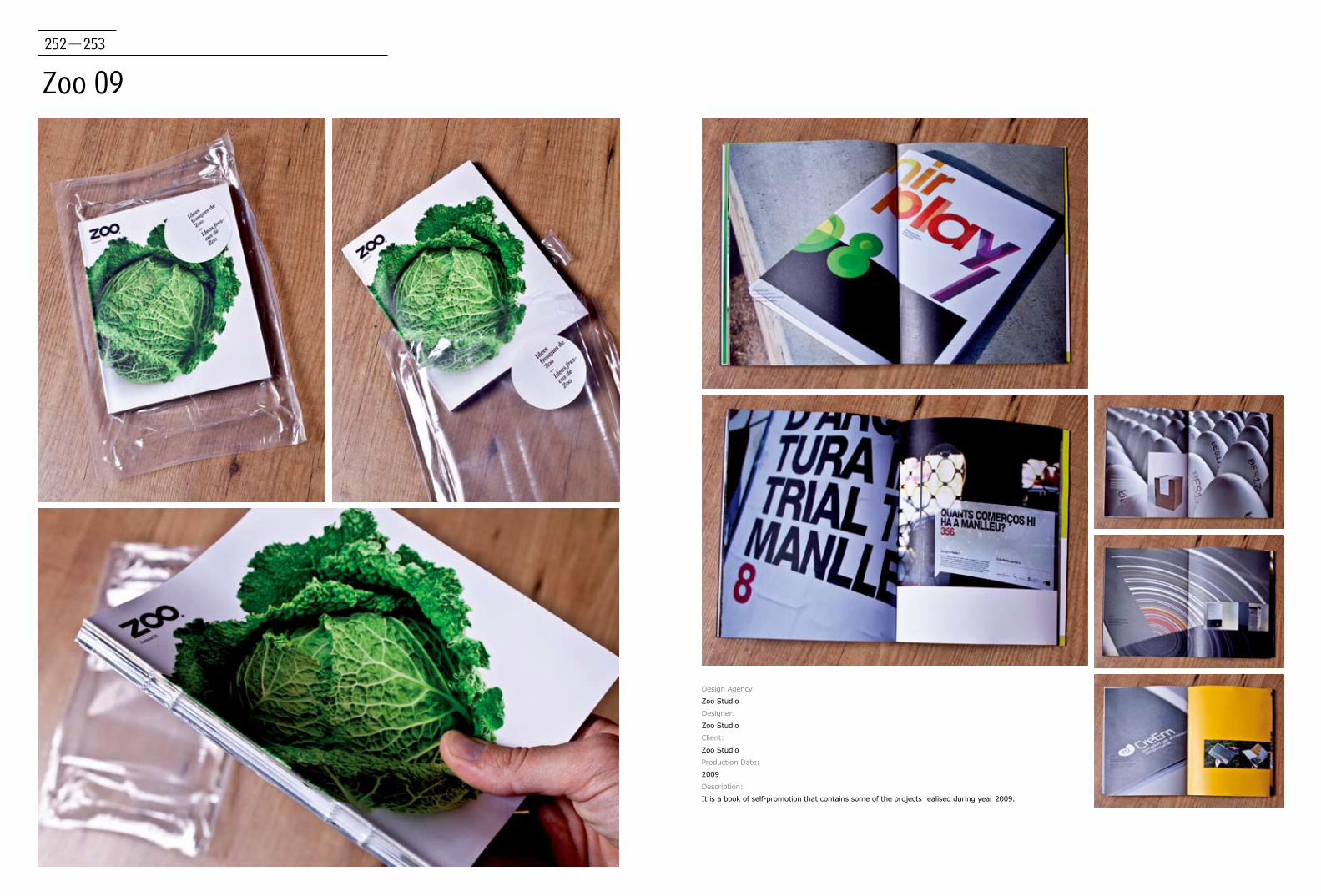
252-253
Zoo 09
Design Agency:
Zoo Studio
Designer:
Zoo Studio
Client:
Zoo Studio
Production Date:
2009
Description:
It is a book of self-promotion that contains some of the projects realised during year 2009.

…,staat creative agency
14,16
3 Deep Design
18
3group
20, 22, 24, 26, 28, 30
Alexander Egger
32, 34
Andreas Preis
36
Anthony Stimola
42
Anthonys Timola
38, 40
AnyaVedmid
48, 50
Artiva Design
44, 46
Ateljé Altmann HB
51, 52, 53, 54, 55
BEIHOFER+ADOLF
56
Britta Siegmund
58, 60
CASA REX
64, 66, 67, 68, 69
Christian Grutsch
70
Creative Inc
72, 74
Deniz Tekkul
76, 78
Diogo Montes
80
Edenspiekermann
82
Ellen Tongzhou Zhao
62
Erretres
86, 88, 90, 92, 94
Esteve Bou
96, 98
Ginette Caron
100
Goncalo Dures
102, 104
Hyoun Youl Joe
106
iji-design
108
Ingeborg Scheffers
110, 112, 114
James Kuo and Profis
116
Javier Melon Gil
117
Jens Dawn
204
Joshua Berger
164, 166
Karlssonwilker Inc.
118, 120, 122
Kolektiv Studio
124
KOREFE
126
Kutchibok
128
LeCool Publishing
132, 134, 136, 138
Lina Khesina
130
Mark Pernice
152
Márton Borzák, Réka Diósi
212
m-m design
140, 142, 144
Moving Brands
146
M-Space / Making Waves
148
nowakteufelknyrim
150
Oezlen Sagir
154
Piero Zagami
156, 158
Pirol
160
Pitertsev Mikhail
162
Publishing and Design Guide
84
qubo + Scheps Workshop
168, 170, 171
Redstorm
172
Research Studios/Neville Brody
174
Roosje Klap
176, 178, 179, 180, 182, 184
Russell Shaw Design
186
sciencewerk
188, 190, 192
Sergio Alves
194
Shiwei Ng
196
Since 1416, Graphic Design & Visual Research
200, 202
Studio Beige
214, 216, 218, 220
studio Boot
206, 208
Studio Revolucija
210
Think Studio, NYC
223, 224
Thonik
222
Tiana Vasiljev
226
Toby Ng Design
228, 230, 232
Toshiyasu Nanbu
234
Trapped in Suburbia
236, 238
Troika
244
Undoboy
246, 248
Volume Inc.
250
Wilfred van der Weide
240, 242
Zoo Studio
252
INDEX