Board of Directors Meeting - CT.GOV-Connecticut's … · the sharing of marketing materials. 13 ......
140
Board of Directors Meeting September 17, 2015
Transcript of Board of Directors Meeting - CT.GOV-Connecticut's … · the sharing of marketing materials. 13 ......

Board of Directors MeetingSeptember 17, 2015
2
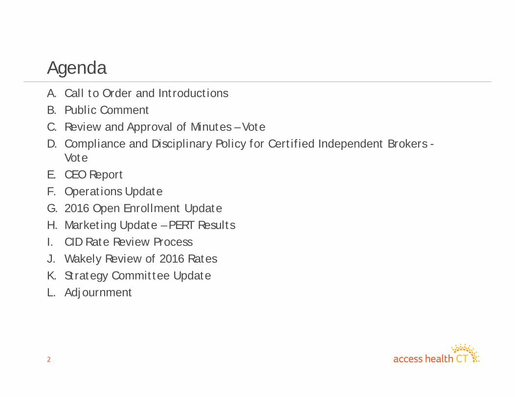
AgendaA. Call to Order and IntroductionsB. Public CommentC. Review and Approval of Minutes – VoteD. Compliance and Disciplinary Policy for Certified Independent Brokers -
VoteE. CEO ReportF. Operations UpdateG. 2016 Open Enrollment UpdateH. Marketing Update – PERT ResultsI. CID Rate Review ProcessJ. Wakely Review of 2016 Rates K. Strategy Committee UpdateL. Adjournment
3
Public Comment
4
Review and Approval of Minutes (Votes)
5
Compliance and Disciplinary PolicyFor Certified Independent Brokers
(Vote)
6
CEO Update
7
Operations Update
8
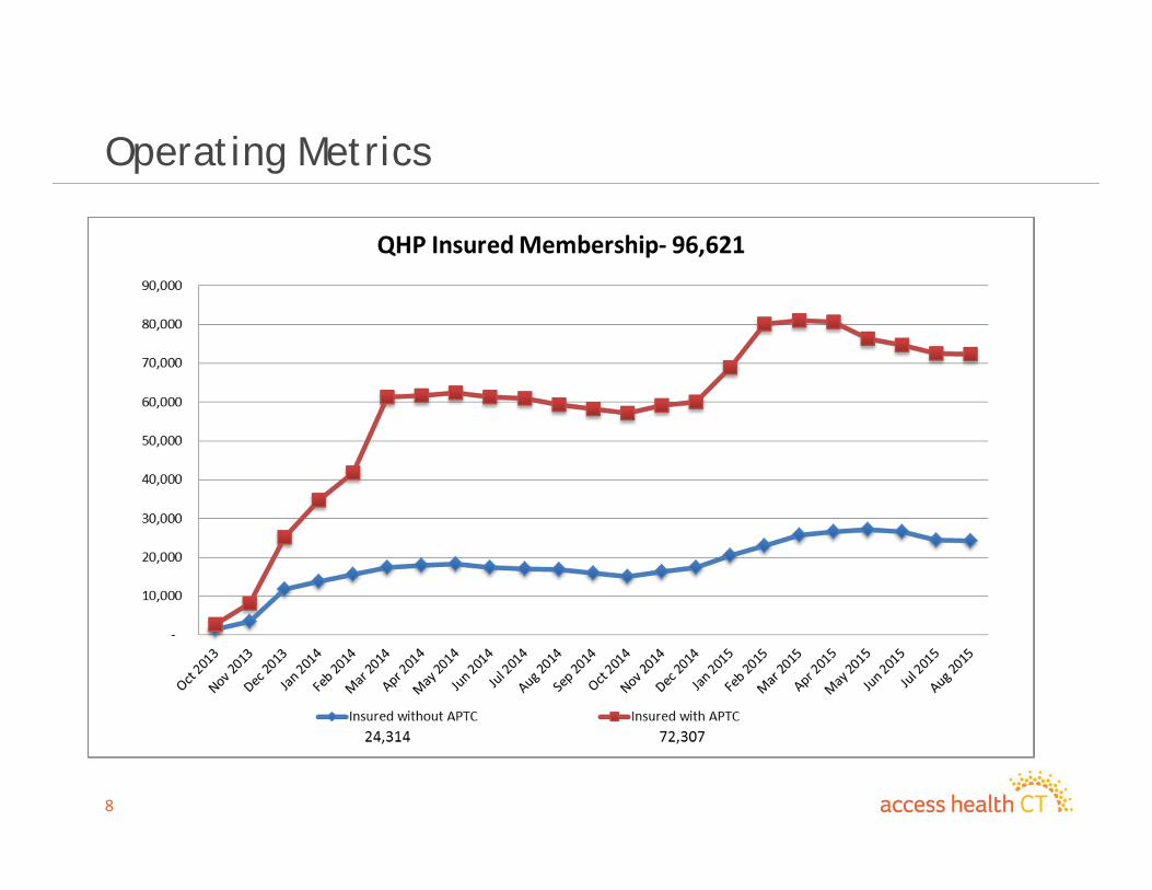
Operating Metrics

9
Operating Metrics
10
Husky A Transition to Private Health Plans
• Access Health CT (AHCT) and the Department of Social Services jointly developed a marketing and enrollment plan to minimize the risk of a gap in coverage for those who are losing Husky A coverage.
• Identified an estimated 1,200 enrollees who need to be transitioned immediately to avoid a gap in coverage starting September 1, 2015
– Marketing and Outreach• Final Eligibility Determination Notice• Launched landing page on Learn More tab• Direct Mailing (August 7th)

11
Husky A Transition to Private Health Plans, Con’t…
– Operations• AHCT and DSS joint notice re: Change in Law• Automated calls were made in either English or Spanish
instructing to enroll on line or call contact center.• Outbound campaign – Personal calls were made by call center
representatives to this population.
– Brokers• Notified brokers via e-mail re: population transition needing
enrollment assistance to avoid gap in coverage
12
Husky A Transition to Private Health Plans, Con’t..
– Carriers• Met with all carriers and assured each there would be no gap in
coverage.
– Office of Healthcare Advocate (OHA)• Met with the OHA for their input and received constructive
feedback on the intended communication and outreach efforts we were doing.
– Connecticut Health Foundation (CHF)• Met with CHF for their input on communication and outreach.
We all agreed to make a more concerted effort to reach a specific target audience by more frequent communication and the sharing of marketing materials.
13
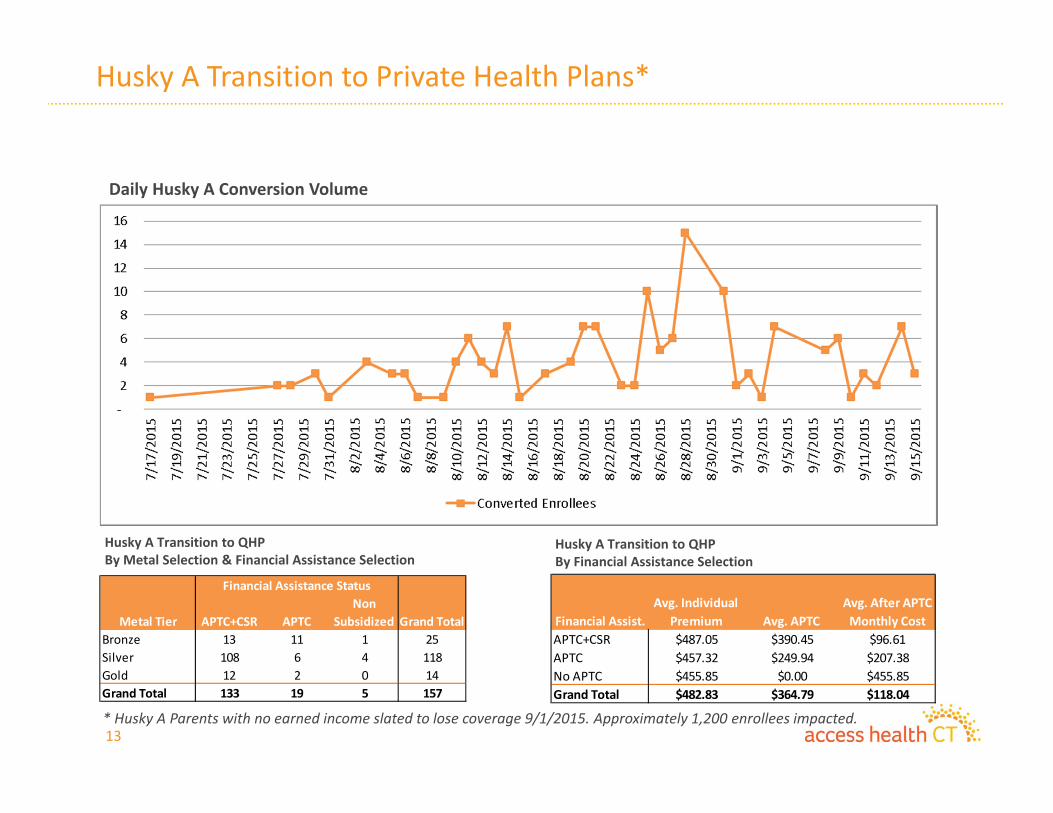
Husky A Transition to Private Health Plans*
Daily Husky A Conversion Volume
Husky A Transition to QHPBy Metal Selection & Financial Assistance Selection
Husky A Transition to QHPBy Financial Assistance Selection
APTC+CSR APTCNon
SubsidizedBronze 13 11 1 25Silver 108 6 4 118Gold 12 2 0 14Grand Total 133 19 5 157
Financial Assistance Status
Grand TotalMetal TierAPTC+CSR $487.05 $390.45 $96.61APTC $457.32 $249.94 $207.38No APTC $455.85 $0.00 $455.85Grand Total $482.83 $364.79 $118.04
Avg. APTCAvg. After APTC Monthly CostFinancial Assist.
Avg. Individual Premium
* Husky A Parents with no earned income slated to lose coverage 9/1/2015. Approximately 1,200 enrollees impacted.
14
Capital Community College
• The Capital Community College 5 week course was jointly developed with AHCT and started on August 19th.
• The curriculum includes basic knowledge of the Affordable Care Act (ACA), specific communication skills and an introduction to the AHCT Integrated Eligibility System.
• Fourteen (14) students enrolled in the course.• Course participants could potentially work in Enrollment
Centers, CEP sites or the Call Center.• AHCT Management visited the class in August. Jim Wadleigh,
CEO, of AHCT addressed the class and participated in a Q&A with participants.
• Graduation is scheduled for September 22nd at 5:00 p.m.
15
2016 Open Enrollment Update
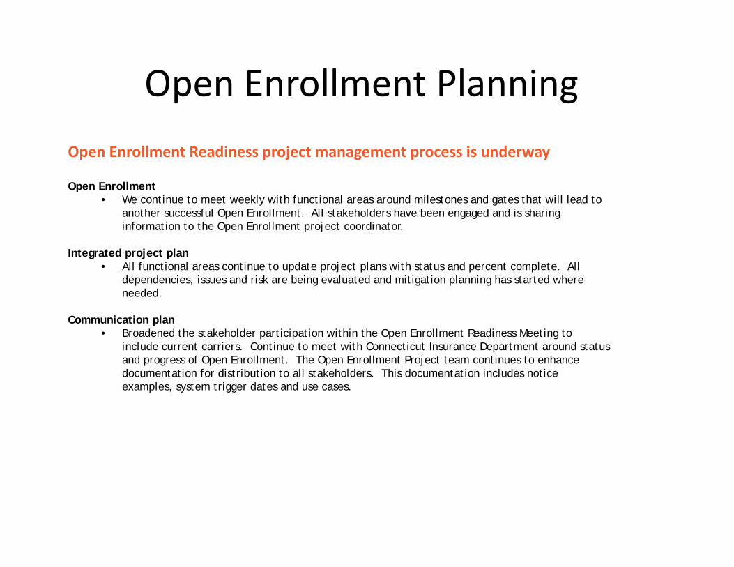
Open Enrollment PlanningOpen Enrollment Readiness project management process is underway
Open Enrollment• We continue to meet weekly with functional areas around milestones and gates that will lead to
another successful Open Enrollment. All stakeholders have been engaged and is sharing information to the Open Enrollment project coordinator.
Integrated project plan• All functional areas continue to update project plans with status and percent complete. All
dependencies, issues and risk are being evaluated and mitigation planning has started where needed.
Communication plan• Broadened the stakeholder participation within the Open Enrollment Readiness Meeting to
include current carriers. Continue to meet with Connecticut Insurance Department around status and progress of Open Enrollment. The Open Enrollment Project team continues to enhance documentation for distribution to all stakeholders. This documentation includes notice examples, system trigger dates and use cases.
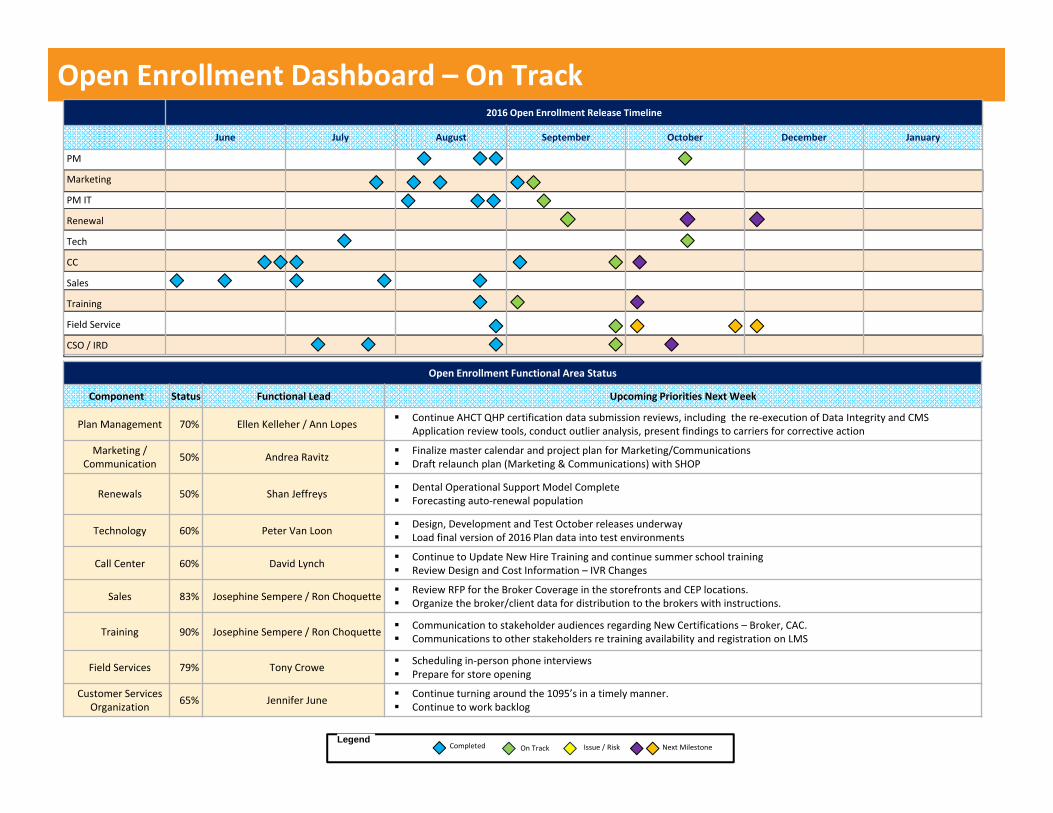
Open Enrollment Dashboard – On Track
Open Enrollment Functional Area Status
Component Status Functional Lead Upcoming Priorities Next Week
Plan Management 70% Ellen Kelleher / Ann Lopes Continue AHCT QHP certification data submission reviews, including the re‐execution of Data Integrity and CMS Application review tools, conduct outlier analysis, present findings to carriers for corrective action
Marketing / Communication 50% Andrea Ravitz Finalize master calendar and project plan for Marketing/Communications
Draft relaunch plan (Marketing & Communications) with SHOP
Renewals 50% Shan Jeffreys Dental Operational Support Model Complete Forecasting auto‐renewal population
Technology 60% Peter Van Loon Design, Development and Test October releases underway Load final version of 2016 Plan data into test environments
Call Center 60% David Lynch Continue to Update New Hire Training and continue summer school training Review Design and Cost Information – IVR Changes
Sales 83% Josephine Sempere / Ron Choquette Review RFP for the Broker Coverage in the storefronts and CEP locations. Organize the broker/client data for distribution to the brokers with instructions.
Training 90% Josephine Sempere / Ron Choquette Communication to stakeholder audiences regarding New Certifications – Broker, CAC. Communications to other stakeholders re training availability and registration on LMS
Field Services 79% Tony Crowe Scheduling in‐person phone interviews Prepare for store opening
Customer Services Organization 65% Jennifer June Continue turning around the 1095’s in a timely manner.
Continue to work backlog
2016 Open Enrollment Release Timeline
June July August September October December January
PM
Marketing
PM IT
Renewal
Tech
CC
Sales
Training
Field Service
CSO / IRD
Completed On TrackLegend
Next MilestoneIssue / Risk
18
Marketing Update

Access Health CTEnrollee/Leaver Satisfaction and Understanding Study
July 2015
Table of Contents
20
Page
Methodology 3
Detail of Survey Completes 4
Executive Summary 5
Satisfaction & Expectations 8
Leaver Behavior 11
Prior Health Insurance Status 14
Information Sources & Enrollment Channel 18
Metal Tier & Carrier 29
Imagery and Price Perceptions 36
Re-Enrollment 40
Health Engagement Overview 53
Health Engagement – QHP Drill Down 57
Appendix I: Respondent Profiles – QHP and Medicaid 69
Appendix II: Targeting Groups’ Demographics 77
Appendix III: Additional Slides for New Enrollees vs. Renewals, QHP Only 82
Appendix IV: Additional Slides 96
Appendix V: A Word About Targeting 100
Appendix VI: Utilization Drill Down by Subgroup – QHP 106

Methodology
21
A telephone survey among primary enrollees (new, renewal and those who have terminated their coverage – “Leavers”) of Access Health CT’s available plans (either a QHP or Medicaid plan) was conducted:
– Dialing began June 4th, 2015 and ended June 24th, 2015– Interviews were conducted in English (n=1,020) and Spanish (n=122)– Customer sample records included landline and cell phone numbers
Executive Summary
22
An examination of “Year Two” data brings to light some successes to celebrate as well as some challenges moving forward:
• Half of “Year Two” new QHP enrollees did not have health insurance in the year prior, signaling continued success in reducing the size of Connecticut’s remaining uninsured population.
• However, though Satisfaction remains at parity to 2014, sizeable gaps remain between QHP and Medicaid customers across several measures, including call center satisfaction, health engagement, expectation fulfillment and imagery perceptions of Access Health CT. Elevating the QHP customer experience should be a priority.
• While the majority of “Leavers” remain open to reengaging with Access Health CT in the future, a sizeable portion made the decision to “go bare”(i.e. not have coverage and thus violate the mandate) rather than continue their coverage through Access Health CT.
Executive Summary, continued
23
• An assessment of enrollment channel and information sources invites Access Health CT to refine its outreach and communication strategies.
– Medicaid customers made heavy use of DSS and the Access Health CT call center as sources of information in 2015, relying on the website, enrollment centers and TV advertising far less than they did in 2014.
– Brochures and pamphlets mailed to the home gained traction as information sources in 2015 among both QHP and Medicaid populations. As a cost effective and widely used medium, ensure the content of print material is compelling, relevant and complete.
• Correct carrier identification remains a bit of a challenge, with confusion occurring between HealthyCT and ConnectiCare plan enrollees. Clarifying carriers may help stave off assistance requests via the call center.
Executive Summary, continued
24
• The combination of low usage among certain subgroups along with the prospect of future price hikes creates urgency in Access Health CT’s execution of strong value-based messaging for current customers.
– Our modeling analysis (accompanying this report) shows us that the remaining, significantly reduced uninsured population is uninsured for far more idiosyncratic reasons than in the past, and will be increasingly more difficult to reach and persuade. Therefore, value is a critical message for prospective enrollees, too.
– Keep in mind this focus on value extends not only to messaging, but to demonstrations as well. Expanding health literacy, with a focus on effective health insurance utilization, will provide additional support to well-crafted messaging moving forward.

Satisfaction & Expectations
25

Satisfaction with Access Health Connecticut – 2015
26
Medicaid customers are more likely than QHP customers to be very or extremely satisfied with Access Health CT. These results parallel what was found regarding satisfaction with the enrollment process (56% QHP and 69% Medicaid) in the 2014 survey. As expected, Leavers report significantly lower satisfaction than current customers – either QHP or Medicaid.
6%C 2% 4%
9%C
3%
15%BC
8%C
3%
13%BC
21%
22%
28%BC
40%D
42%D
29%
17%D28%BD
11%
QHP (B) Medicaid (C) Leavers (D)
Extremely satisfied
Very satisfied
Somewhat satisfied
Not very satisfied
Not satisfied at all
Don't know/refused
Base: QHP (609); Medicaid (232); Leavers (301)Bb/Cc/Dd = Statistically significant at the 95%/90% Confidence IntervalQ1. Overall, how satisfied [[IF NEW ENROLLEE OR RENEWAL]] [are you] [[IF LEAVER]] [were you] with Access Health Connecticut? Would you say you are/were…?
56%D 70%BD 40% Top 2 Box
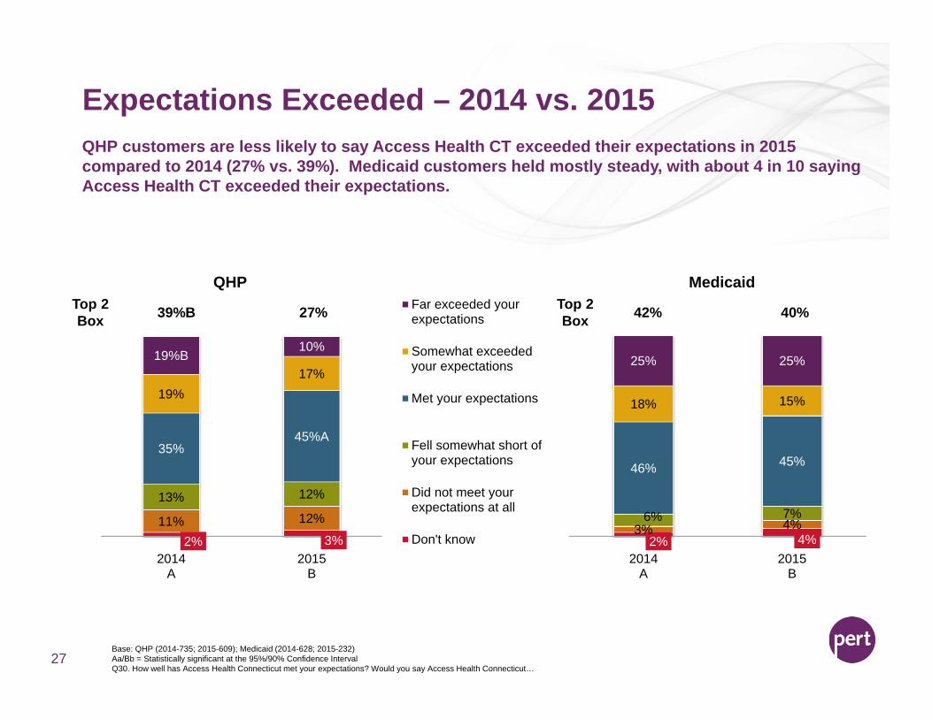
Expectations Exceeded – 2014 vs. 2015
27
QHP customers are less likely to say Access Health CT exceeded their expectations in 2015 compared to 2014 (27% vs. 39%). Medicaid customers held mostly steady, with about 4 in 10 saying Access Health CT exceeded their expectations.
2% 3%11% 12%13% 12%
35%45%A
19%17%
19%B10%
2014A
2015B
QHPFar exceeded yourexpectations
Somewhat exceededyour expectations
Met your expectations
Fell somewhat short ofyour expectations
Did not meet yourexpectations at all
Don't know
Base: QHP (2014-735; 2015-609); Medicaid (2014-628; 2015-232)Aa/Bb = Statistically significant at the 95%/90% Confidence IntervalQ30. How well has Access Health Connecticut met your expectations? Would you say Access Health Connecticut…
2% 4%3% 4%6% 7%
46% 45%
18% 15%
25% 25%
2014A
2015B
MedicaidTop 2 Box 39%B 27% Top 2
Box 42% 40%
Leaver Behavior
28
Too expensive/can't afford it - general
Other personal situations (marriage, divorce, death in family, etc.)
I/my spouse got a job with health insurance
I qualified for Medicare
Didn't use it
I movedPoor customer service/Poor experience dealing with Access Health
ConnecticutNot worth it/Not valuable/Poor coverage
I qualified for Medicaid
Too expensive/can't afford it - copays and deductibles
Too expensive/can't afford it - premiums specifically
Poor choice in doctors/hospitals/my doctor wasn't coveredPoor customer service/Poor experience dealing with the insurance
carrierToo expensive/can't afford it - prescriptions
Other
Don't know/Refused
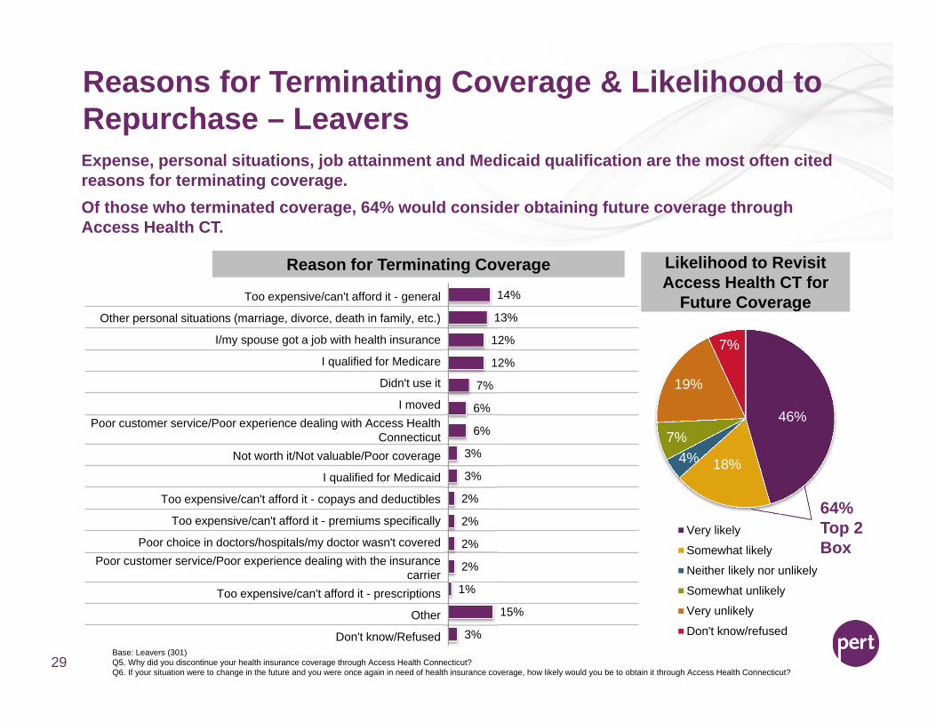
Reasons for Terminating Coverage & Likelihood to Repurchase – Leavers
29
14%
13%
12%
12%
7%
6%
6%
3%
3%
2%
2%
2%
2%
1%
15%
3%
Expense, personal situations, job attainment and Medicaid qualification are the most often cited reasons for terminating coverage. Of those who terminated coverage, 64% would consider obtaining future coverage through Access Health CT.
Reason for Terminating Coverage
46%
18%4%7%
19%
7%
Very likely
Somewhat likely
Neither likely nor unlikely
Somewhat unlikely
Very unlikely
Don't know/refused
Base: Leavers (301)Q5. Why did you discontinue your health insurance coverage through Access Health Connecticut?Q6. If your situation were to change in the future and you were once again in need of health insurance coverage, how likely would you be to obtain it through Access Health Connecticut?
Likelihood to Revisit Access Health CT for
Future Coverage
64% Top 2 Box
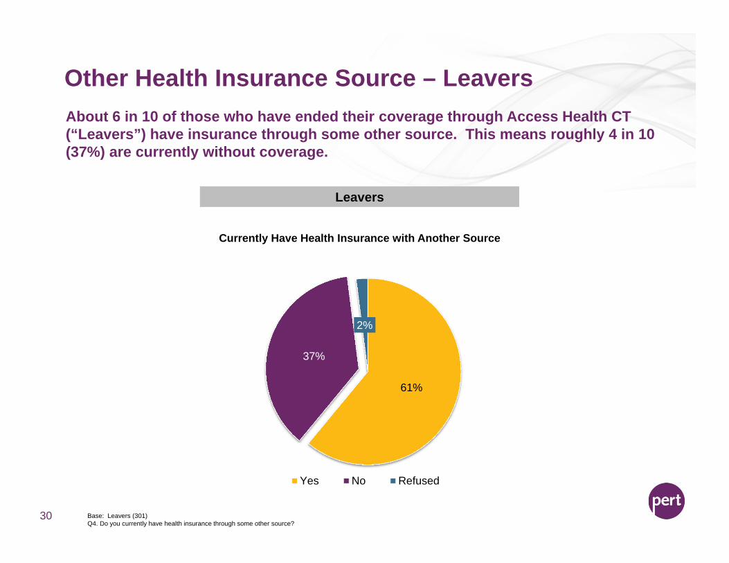
Other Health Insurance Source – Leavers
30
About 6 in 10 of those who have ended their coverage through Access Health CT (“Leavers”) have insurance through some other source. This means roughly 4 in 10 (37%) are currently without coverage.
Currently Have Health Insurance with Another Source
Leavers
61%
37%
2%
Yes No Refused
Base: Leavers (301)Q4. Do you currently have health insurance through some other source?
Prior Health Insurance Status
31
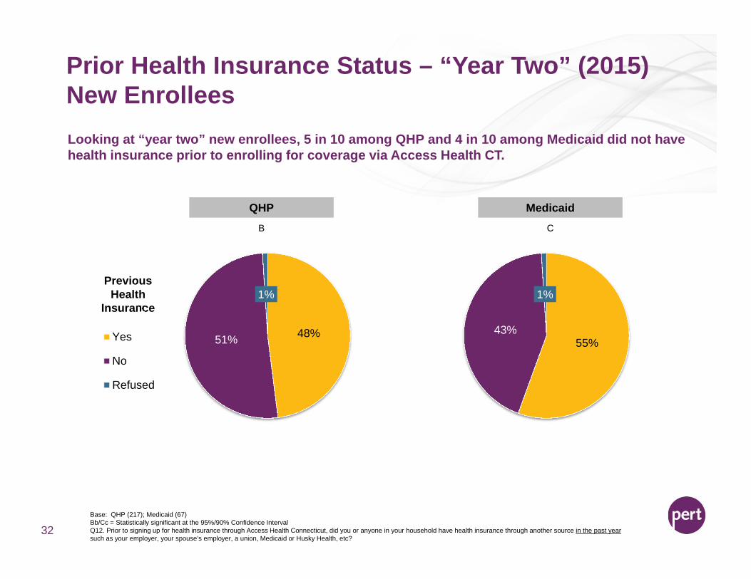
Prior Health Insurance Status – “Year Two” (2015) New Enrollees
32
Looking at “year two” new enrollees, 5 in 10 among QHP and 4 in 10 among Medicaid did not have health insurance prior to enrolling for coverage via Access Health CT.
Previous Health
Insurance
48%51%
1%
Yes
No
Refused
Base: QHP (217); Medicaid (67)Bb/Cc = Statistically significant at the 95%/90% Confidence IntervalQ12. Prior to signing up for health insurance through Access Health Connecticut, did you or anyone in your household have health insurance through another source in the past year such as your employer, your spouse’s employer, a union, Medicaid or Husky Health, etc?
55%43%
1%
QHP MedicaidB C
Prior Health Insurance Status – New Enrollees2014 vs. 2015
Aa/Bb, Cc/Dd, Aa/Cc, Bb/Dd = Statistically significant at the 95%/90% Confidence IntervalQ12 Prior to signing up for health insurance through Access Health Connecticut, did you or anyone in your household have health insurance through another source in the past year such as your employer, your spouse’s employer, a union, Medicaid or Husky Health, etc?
33
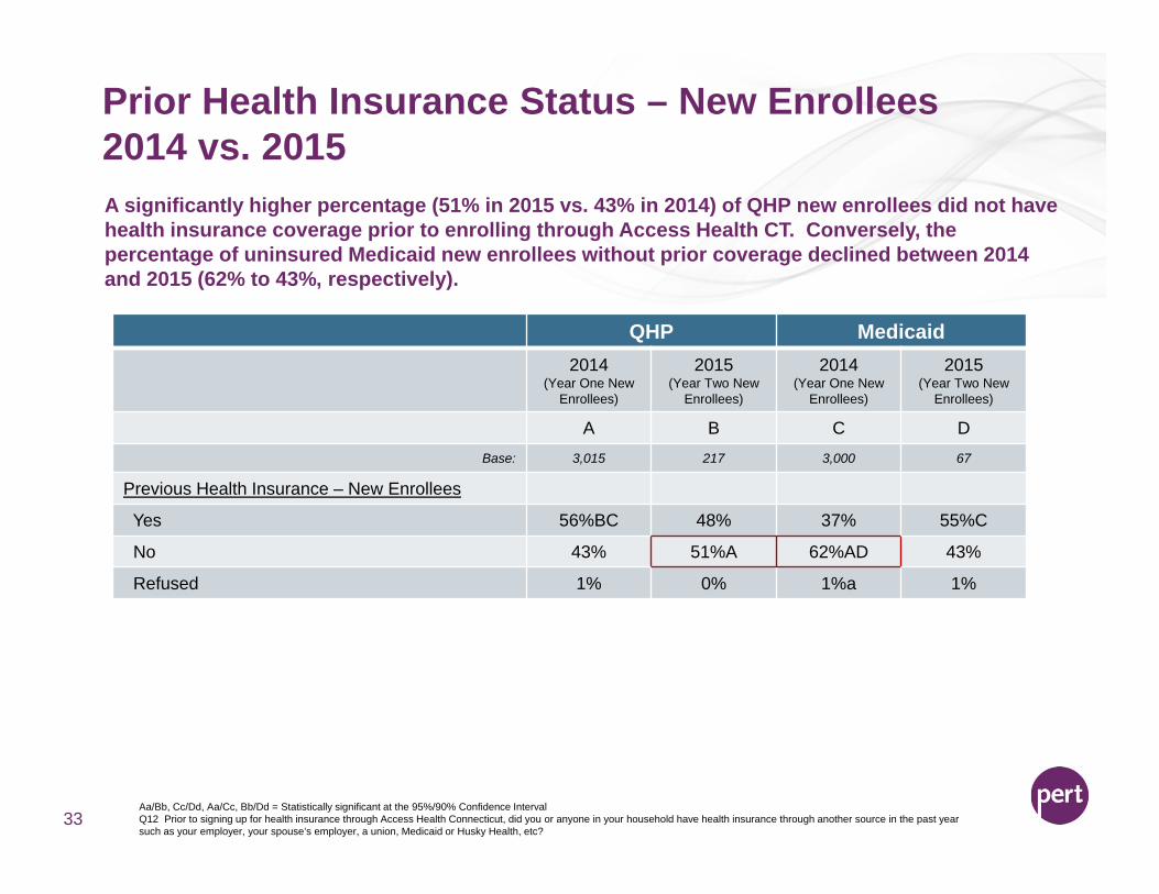
A significantly higher percentage (51% in 2015 vs. 43% in 2014) of QHP new enrollees did not have health insurance coverage prior to enrolling through Access Health CT. Conversely, the percentage of uninsured Medicaid new enrollees without prior coverage declined between 2014 and 2015 (62% to 43%, respectively).
QHP Medicaid2014
(Year One New Enrollees)
2015(Year Two New
Enrollees)
2014(Year One New
Enrollees)
2015(Year Two New
Enrollees)
A B C DBase: 3,015 217 3,000 67
Previous Health Insurance – New Enrollees
Yes 56%BC 48% 37% 55%C
No 43% 51%A 62%AD 43%
Refused 1% 0% 1%a 1%
Prior Health Insurance Source – New Enrollees2014 vs. 2015
34
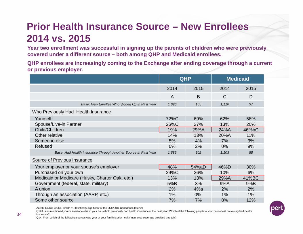
Year two enrollment was successful in signing up the parents of children who were previously covered under a different source – both among QHP and Medicaid enrollees. QHP enrollees are increasingly coming to the Exchange after ending coverage through a current or previous employer.
QHP Medicaid
2014 2015 2014 2015
A B C DBase: New Enrollee Who Signed Up In Past Year 1,696 105 1,110 37
Who Previously Had Health InsuranceYourself 72%C 69% 62% 58%Spouse/Live-in Partner 26%C 27% 13% 20%Child/Children 19% 29%A 24%A 46%bCOther relative 14% 13% 20%A 11%Someone else 5% 4% 7% 3%Refused 0% 2% 0% 9%
Base: Had Health Insurance Through Another Source In Past Year 1,686 302 1,103 88
Source of Previous InsuranceYour employer or your spouse's employer 48% 54%aD 46%D 30%Purchased on your own 29%C 26% 10% 6%Medicaid or Medicare (Husky, Charter Oak, etc.) 13% 13% 29%A 41%BCGovernment (federal, state, military) 5%B 3% 9%A 9%BA union 2% 4%a 2% 2%Through an association (AARP, etc.) 1% 0% 1% 1%Some other source 7% 7% 8% 12%Aa/Bb, Cc/Dd, Aa/Cc, Bb/Dd = Statistically significant at the 95%/90% Confidence IntervalQ12A. You mentioned you or someone else in your household previously had health insurance in the past year. Which of the following people in your household previously had health insurance? Q14. From which of the following sources was your or your family’s prior health insurance coverage provided through?
Information Sources & Enrollment Channel
35
1% 2%6%C 2%6% 3%
20% 22%
33%C23%
34% 47%B
Extremely helpful
4
3
2
Not at all helpful
Don't know/refused
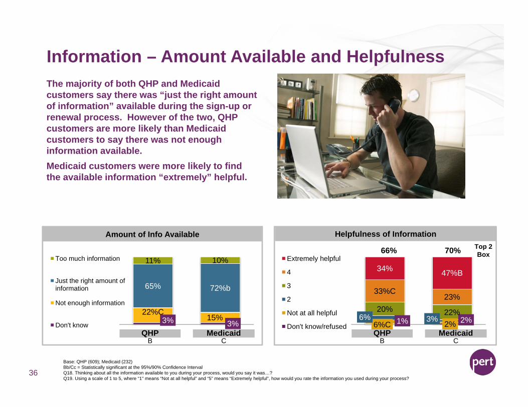
Information – Amount Available and Helpfulness
36
The majority of both QHP and Medicaid customers say there was “just the right amount of information” available during the sign-up or renewal process. However of the two, QHP customers are more likely than Medicaid customers to say there was not enough information available.Medicaid customers were more likely to find the available information “extremely” helpful.
3% 3%22%C
15%
65% 72%b
11% 10%Too much information
Just the right amount of information
Not enough information
Don't know
Amount of Info Available Helpfulness of Information
QHP MedicaidB C
Base: QHP (609); Medicaid (232) Bb/Cc = Statistically significant at the 95%/90% Confidence IntervalQ18. Thinking about all the information available to you during your process, would you say it was…?Q19. Using a scale of 1 to 5, where “1” means “Not at all helpful” and “5” means “Extremely helpful”, how would you rate the information you used during your process?
QHP MedicaidB C
66% 70% Top 2 Box
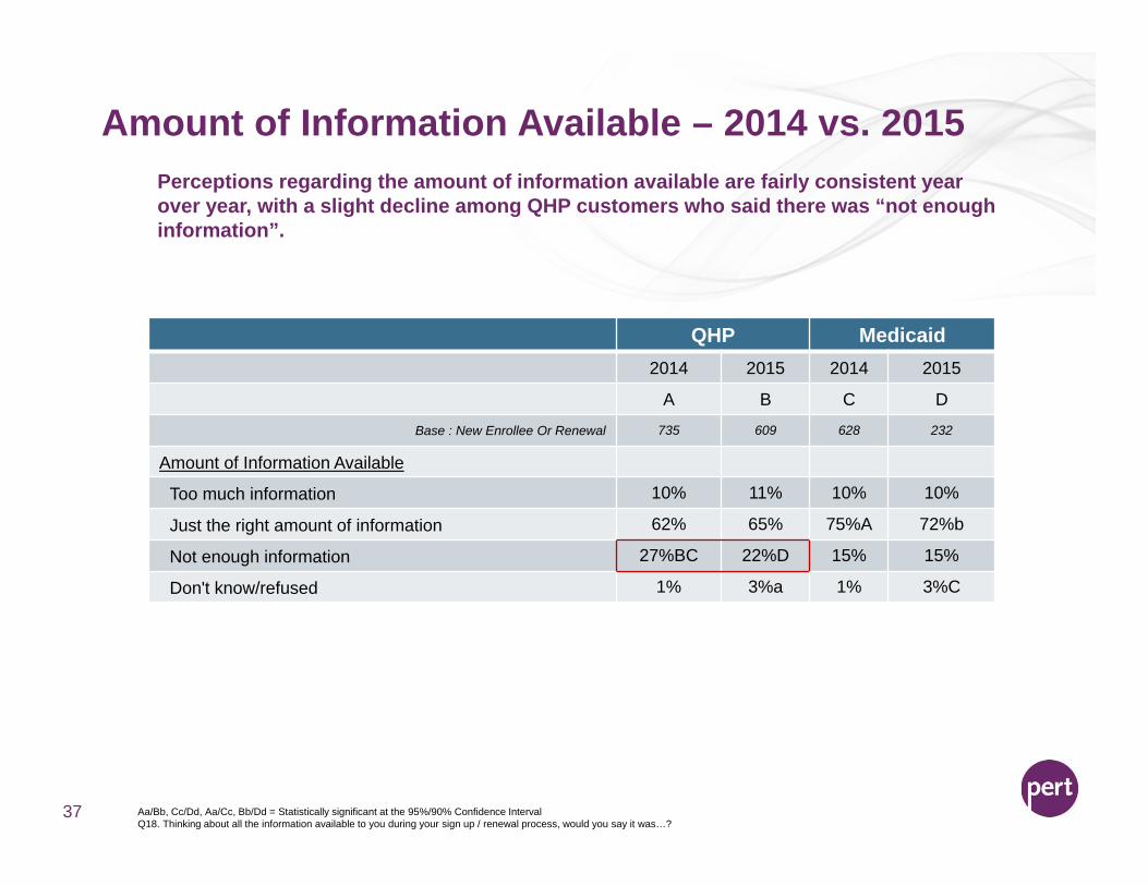
Amount of Information Available – 2014 vs. 2015
37
Perceptions regarding the amount of information available are fairly consistent year over year, with a slight decline among QHP customers who said there was “not enough information”.
QHP Medicaid2014 2015 2014 2015
A B C D
Base : New Enrollee Or Renewal 735 609 628 232
Amount of Information Available
Too much information 10% 11% 10% 10%
Just the right amount of information 62% 65% 75%A 72%b
Not enough information 27%BC 22%D 15% 15%
Don't know/refused 1% 3%a 1% 3%C
Aa/Bb, Cc/Dd, Aa/Cc, Bb/Dd = Statistically significant at the 95%/90% Confidence IntervalQ18. Thinking about all the information available to you during your sign up / renewal process, would you say it was…?
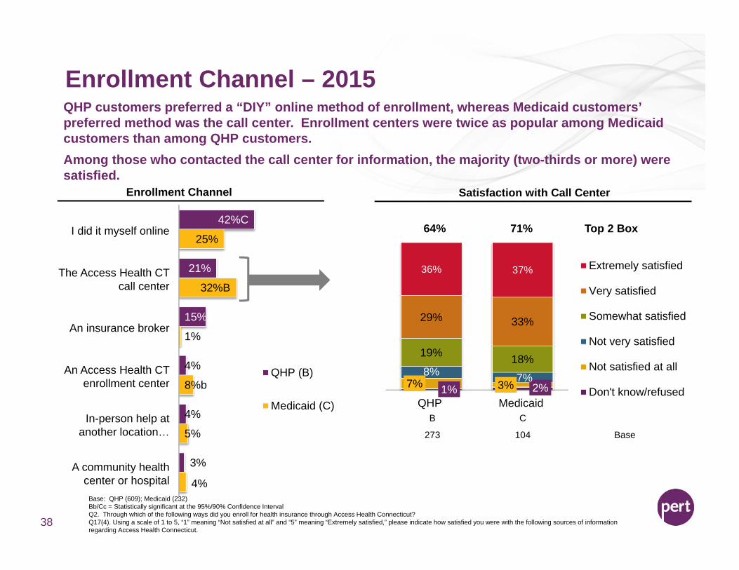
Enrollment Channel – 2015
38
QHP customers preferred a “DIY” online method of enrollment, whereas Medicaid customers’ preferred method was the call center. Enrollment centers were twice as popular among Medicaid customers than among QHP customers. Among those who contacted the call center for information, the majority (two-thirds or more) were satisfied.
42%C
21%
15%
4%
4%
3%
25%
32%B
1%
8%b
5%
4%
QHP (B)
Medicaid (C)1% 2%7% 3%
8% 7%
19% 18%
29% 33%
36% 37%
QHP Medicaid
Extremely satisfied
Very satisfied
Somewhat satisfied
Not very satisfied
Not satisfied at all
Don't know/refused
64% 71% Top 2 BoxI did it myself online
The Access Health CT call center
An insurance broker
An Access Health CT enrollment center
In-person help at another location…
A community health center or hospital
Enrollment Channel Satisfaction with Call Center
B C
273 104 Base
Base: QHP (609); Medicaid (232)Bb/Cc = Statistically significant at the 95%/90% Confidence IntervalQ2. Through which of the following ways did you enroll for health insurance through Access Health Connecticut?Q17(4). Using a scale of 1 to 5, “1” meaning “Not satisfied at all” and “5” meaning “Extremely satisfied,” please indicate how satisfied you were with the following sources of information regarding Access Health Connecticut.
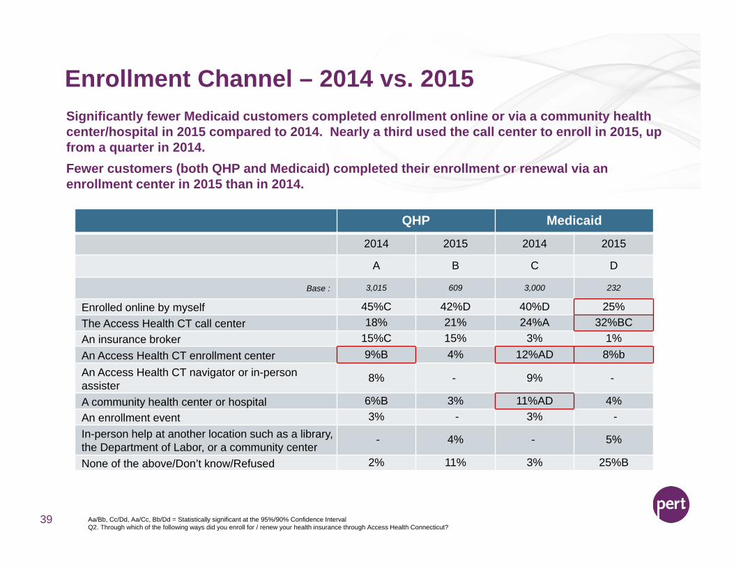
39
Significantly fewer Medicaid customers completed enrollment online or via a community health center/hospital in 2015 compared to 2014. Nearly a third used the call center to enroll in 2015, up from a quarter in 2014. Fewer customers (both QHP and Medicaid) completed their enrollment or renewal via an enrollment center in 2015 than in 2014.
QHP Medicaid2014 2015 2014 2015
A B C D
Base : 3,015 609 3,000 232
Enrolled online by myself 45%C 42%D 40%D 25%The Access Health CT call center 18% 21% 24%A 32%BCAn insurance broker 15%C 15% 3% 1%An Access Health CT enrollment center 9%B 4% 12%AD 8%bAn Access Health CT navigator or in-person assister
8% - 9% -
A community health center or hospital 6%B 3% 11%AD 4%An enrollment event 3% - 3% -In-person help at another location such as a library, the Department of Labor, or a community center
- 4% - 5%
None of the above/Don’t know/Refused 2% 11% 3% 25%B
Enrollment Channel – 2014 vs. 2015
Aa/Bb, Cc/Dd, Aa/Cc, Bb/Dd = Statistically significant at the 95%/90% Confidence IntervalQ2. Through which of the following ways did you enroll for / renew your health insurance through Access Health Connecticut?
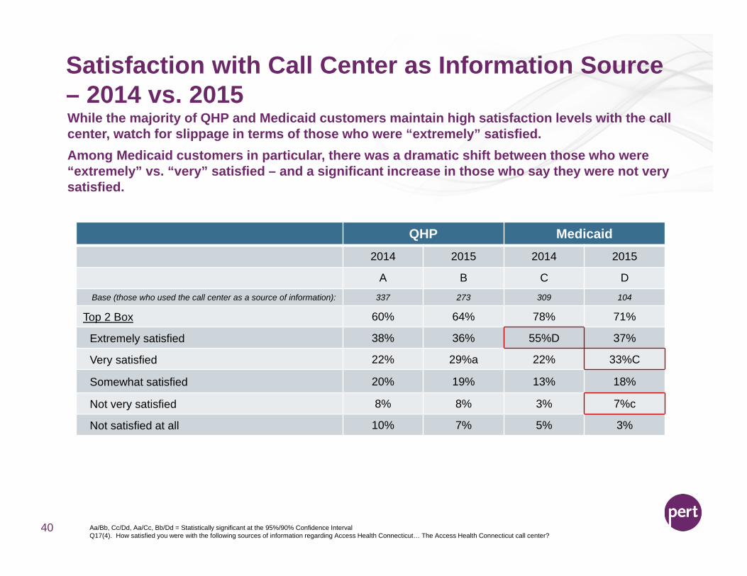
Satisfaction with Call Center as Information Source – 2014 vs. 2015
40
While the majority of QHP and Medicaid customers maintain high satisfaction levels with the call center, watch for slippage in terms of those who were “extremely” satisfied. Among Medicaid customers in particular, there was a dramatic shift between those who were “extremely” vs. “very” satisfied – and a significant increase in those who say they were not very satisfied.
QHP Medicaid2014 2015 2014 2015
A B C DBase (those who used the call center as a source of information): 337 273 309 104
Top 2 Box 60% 64% 78% 71%
Extremely satisfied 38% 36% 55%D 37%
Very satisfied 22% 29%a 22% 33%C
Somewhat satisfied 20% 19% 13% 18%
Not very satisfied 8% 8% 3% 7%c
Not satisfied at all 10% 7% 5% 3%
Aa/Bb, Cc/Dd, Aa/Cc, Bb/Dd = Statistically significant at the 95%/90% Confidence IntervalQ17(4). How satisfied you were with the following sources of information regarding Access Health Connecticut… The Access Health Connecticut call center?

Metal Tier & Carrier
41
2% 2%14% 23%A
67%B 61%
16%B 12%1%
2014A
2015B
PlatinumGoldSilverBronzeCatastrophic
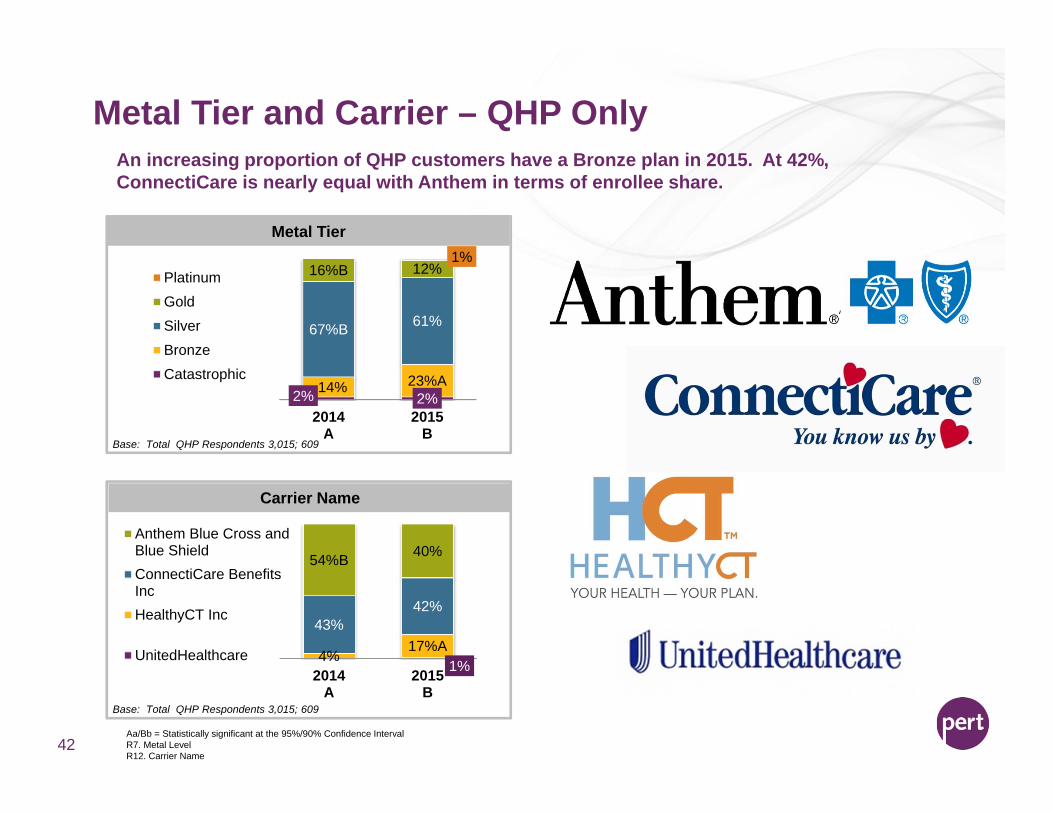
Metal Tier and Carrier – QHP Only
42
An increasing proportion of QHP customers have a Bronze plan in 2015. At 42%, ConnectiCare is nearly equal with Anthem in terms of enrollee share.
Metal Tier
1%4%
17%A43%
42%
54%B 40%
2014A
2015B
Anthem Blue Cross andBlue ShieldConnectiCare BenefitsIncHealthyCT Inc
UnitedHealthcare
Carrier Name
Base: Total QHP Respondents 3,015; 609
Aa/Bb = Statistically significant at the 95%/90% Confidence IntervalR7. Metal LevelR12. Carrier Name
Base: Total QHP Respondents 3,015; 609
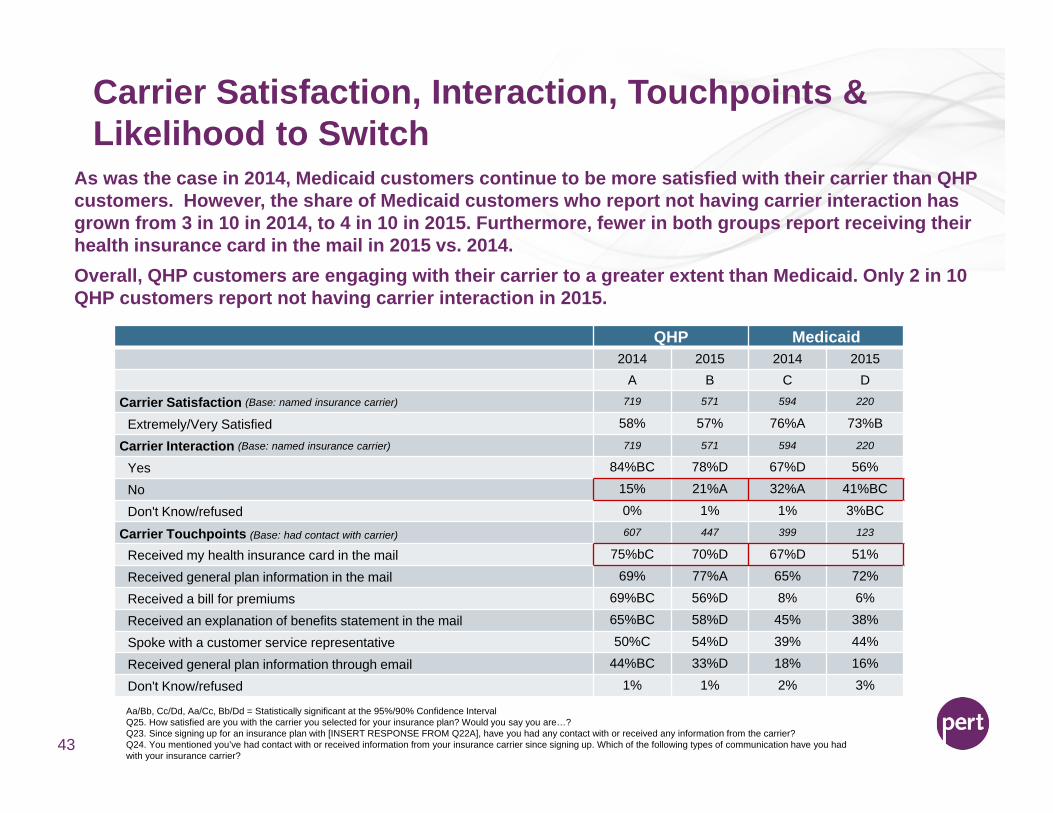
Carrier Satisfaction, Interaction, Touchpoints & Likelihood to Switch
Aa/Bb, Cc/Dd, Aa/Cc, Bb/Dd = Statistically significant at the 95%/90% Confidence IntervalQ25. How satisfied are you with the carrier you selected for your insurance plan? Would you say you are…?Q23. Since signing up for an insurance plan with [INSERT RESPONSE FROM Q22A], have you had any contact with or received any information from the carrier?Q24. You mentioned you’ve had contact with or received information from your insurance carrier since signing up. Which of the following types of communication have you had with your insurance carrier?
43
QHP Medicaid2014 2015 2014 2015
A B C D
Carrier Satisfaction (Base: named insurance carrier) 719 571 594 220
Extremely/Very Satisfied 58% 57% 76%A 73%B
Carrier Interaction (Base: named insurance carrier) 719 571 594 220
Yes 84%BC 78%D 67%D 56%
No 15% 21%A 32%A 41%BC
Don't Know/refused 0% 1% 1% 3%BC
Carrier Touchpoints (Base: had contact with carrier) 607 447 399 123
Received my health insurance card in the mail 75%bC 70%D 67%D 51%
Received general plan information in the mail 69% 77%A 65% 72%
Received a bill for premiums 69%BC 56%D 8% 6%
Received an explanation of benefits statement in the mail 65%BC 58%D 45% 38%
Spoke with a customer service representative 50%C 54%D 39% 44%
Received general plan information through email 44%BC 33%D 18% 16%
Don't Know/refused 1% 1% 2% 3%
As was the case in 2014, Medicaid customers continue to be more satisfied with their carrier than QHP customers. However, the share of Medicaid customers who report not having carrier interaction has grown from 3 in 10 in 2014, to 4 in 10 in 2015. Furthermore, fewer in both groups report receiving their health insurance card in the mail in 2015 vs. 2014. Overall, QHP customers are engaging with their carrier to a greater extent than Medicaid. Only 2 in 10 QHP customers report not having carrier interaction in 2015.

Too little information/communication from carrier
Premiums too expensive
Poor customer service from carrier
Copays/Coinsurance/deductible too expensive
Confusing information from carrier/benefits or coverage not clear
Carrier does not provide high quality coverage
Carrier not easy to get in touch with/not responsive
Carrier does not provide good value/coverage isn't worth it
Preferred doctor/hospital/specialist not in network
Too much information/communication from carrier
Other
Don't know/refused
Reasons for Carrier Dissatisfaction
Aa/Bb = Statistically significant at the 95%/90% Confidence IntervalBase: 2015 (63), 2014 (735)Q26. Why are you not very/not satisfied at all with your carrier?
44
21%
19%
17%
17%
14%
11%
8%
5%
3%
24%B
%
23%
34%A
26%
21%
24%
21%
18%a
19%
19%
1%
10%
1%
2015 A2014 B
QHP
Among the small subset of QHP customers who indicate they are not very/not at all satisfied with their carrier (about 11%), the top reasons cited in 2015 are “too little information/communication”, “premiums too expensive”, “poor customer service” and “copays/coinsurance/deductible too expensive”. While price sensitivity can be challenging to overcome, the share of customers citing “premiums too expensive” has declined from 2014 to 2015. With about 4 in 10 dissatisfied customers indicating customer service and/or communication issues with their carrier, it’s clear expense is not the only barrier to deal with.
Give customers a “roadmap to success” when dealing with carriers. Help them
anticipate information they should be receiving and
when, and equip them with the resources to reach out
to their carrier for help.
Opportunity:Give customers a “roadmap to success” when dealing with carriers. Help them
anticipate information they should be receiving and
when, and equip them with the resources to reach out
to their carrier for help.
Opportunity:
Imagery and Price Perceptions
45

Base: QHP (609); Medicaid (232)Bb/Cc = Statistically significant at the 95%/90% Confidence IntervalQ27. Please tell me how much you agree that the following statements describe Access Health Connecticut, by using a scale of 1 to 5, with “1” meaning “Does not describe at all” and “5” meaning “Describes extremely well”. The higher the number, the more the statement describes Access Health Connecticut.
Allows me to access quality care
Has valuable health insurance coverage
Is for people like me
Made the sign up/renewal process easy
Has health insurance coverage I would recommend to others
Has the right health insurance coverage for me and my family
Lets me compare plans from multiple carriers
Is dependable
Offers quality health insurance coverage
Is trustworthy
Protects my personal health information
Helps me understand my health insurance coverage options
Knowledgeable staff on the phone
Is affordable
Is a good value for the money
Looks out for my best interest
The website is easy to navigate
Acts as an advocate between me and my insurance carrier
Is a partner
Has physical places where I can go and talk to someone
68%
66%
66%
65%
64%
64%
64%
63%
63%
62%
60%
59%
57%
55%
54%
52%
51%
44%
44%
40%
78%B
86%B
83%B
79%B
83%B
82%B
60%
82%B
81%B
81%B
82%B
78%B
80%B
87%B
78%B
78%B
50%
67%B
62%B
61%B
QHP (B)
Medicaid (C)
Access Health CT Imagery
46
Overall, Medicaid customers have much more positive perceptions of Access Health CT than QHP customers. Specifically, perceptions of affordability, value, looking out for individuals’ best interest, and having knowledgeable staff on the phone are areas of focus when messaging to QHP customers. With low ratings and wide gaps compared to Medicaid customers, advocacy relating to the carrier and partnership also represent a critical opportunity area.
Opportunity!
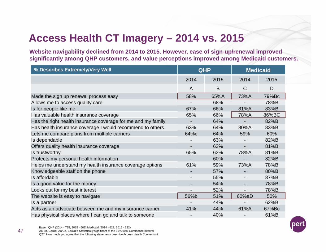
Access Health CT Imagery – 2014 vs. 2015
47
Website navigability declined from 2014 to 2015. However, ease of sign-up/renewal improved significantly among QHP customers, and value perceptions improved among Medicaid customers.
% Describes Extremely/Very Well QHP Medicaid2014 2015 2014 2015
A B C DMade the sign up renewal process easy 58% 65%A 73%A 79%BcAllows me to access quality care - 68% - 78%BIs for people like me 67% 66% 81%A 83%BHas valuable health insurance coverage 65% 66% 78%A 86%BCHas the right health insurance coverage for me and my family - 64% - 82%BHas health insurance coverage I would recommend to others 63% 64% 80%A 83%BLets me compare plans from multiple carriers 64%c 64% 59% 60%Is dependable - 63% - 82%BOffers quality health insurance coverage - 63% - 81%BIs trustworthy 65% 62% 78%A 81%BProtects my personal health information - 60% - 82%BHelps me understand my health insurance coverage options 61% 59% 73%A 78%BKnowledgeable staff on the phone - 57% - 80%BIs affordable - 55% - 87%BIs a good value for the money - 54% - 78%BLooks out for my best interest - 52% - 78%BThe website is easy to navigate 56%b 51% 60%aD 50%Is a partner - 44% - 62%BActs as an advocate between me and my insurance carrier 41% 44% 61%A 67%BcHas physical places where I can go and talk to someone - 40% - 61%B
Base: QHP (2014 - 735; 2015 - 609) Medicaid (2014 - 628; 2015 - 232)Aa/Bb, Cc/Dd, Aa/Cc, Bb/Dd = Statistically significant at the 95%/90% Confidence IntervalQ27. How much you agree that the following statements describe Access Health Connecticut.
Perceptions of Price
48
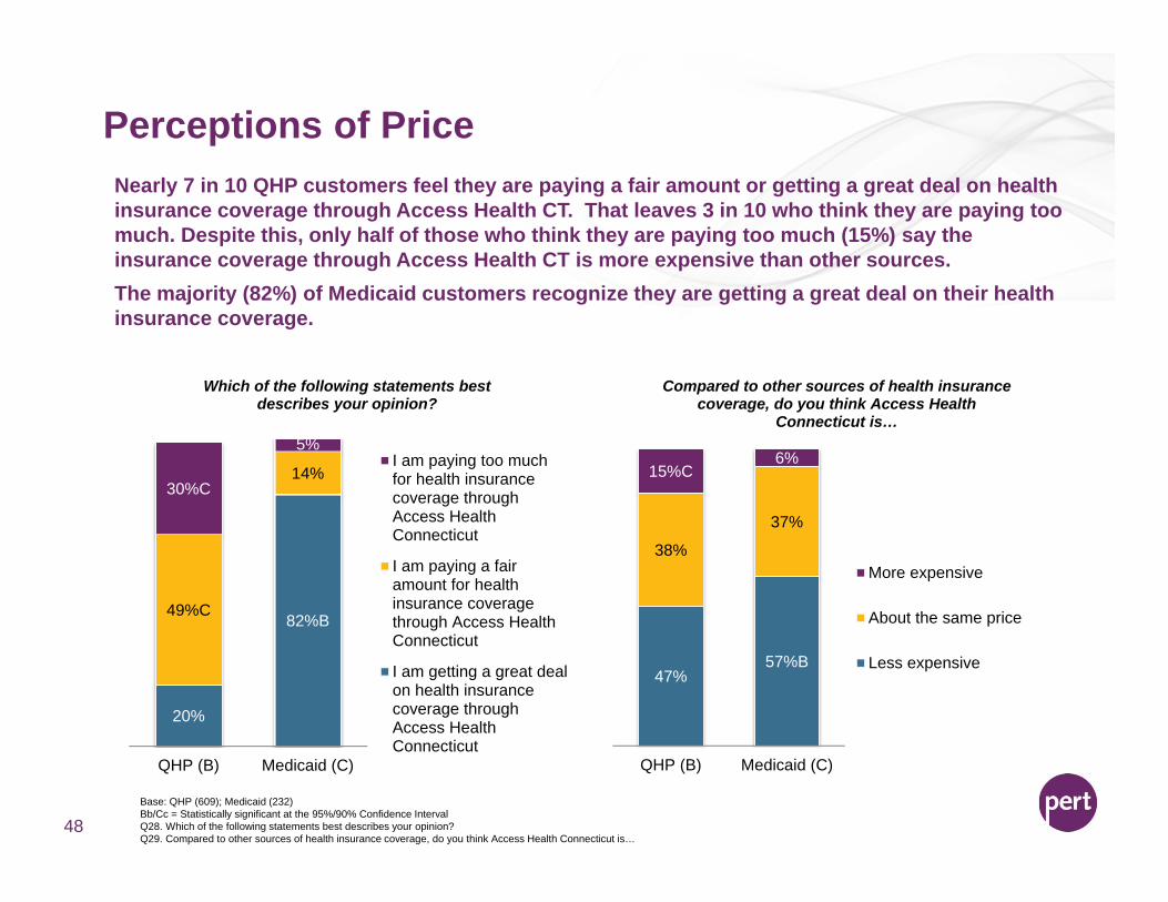
Nearly 7 in 10 QHP customers feel they are paying a fair amount or getting a great deal on health insurance coverage through Access Health CT. That leaves 3 in 10 who think they are paying too much. Despite this, only half of those who think they are paying too much (15%) say the insurance coverage through Access Health CT is more expensive than other sources. The majority (82%) of Medicaid customers recognize they are getting a great deal on their health insurance coverage.
Base: QHP (609); Medicaid (232)Bb/Cc = Statistically significant at the 95%/90% Confidence IntervalQ28. Which of the following statements best describes your opinion?Q29. Compared to other sources of health insurance coverage, do you think Access Health Connecticut is…
20%
82%B49%C
14%30%C
5%
QHP (B) Medicaid (C)
Which of the following statements best describes your opinion?
I am paying too muchfor health insurancecoverage throughAccess HealthConnecticut
I am paying a fairamount for healthinsurance coveragethrough Access HealthConnecticut
I am getting a great dealon health insurancecoverage throughAccess HealthConnecticut
47%57%B
38%
37%
15%C6%
QHP (B) Medicaid (C)
Compared to other sources of health insurance coverage, do you think Access Health
Connecticut is…
More expensive
About the same price
Less expensive
Re-Enrollment
49
It's too expensive for the coverage I getI plan to obtain health insurance coverage from a future employer
It does not offer quality health insurance coverageI do not trust health insurance coverage through Access Health CT
It's too confusing to sign up forInformation is misleading
I just can't afford itIt's not for people like me
I plan to moveI'm healthy, so I don't need coverage
Going On MedicarePoor Service/Poor Interactions With Reps
OtherDon't know/refused
32%22%
15%13%13%13%13%
11%9%
3%3%3%6%8%
Re-Enrollment Likelihood and Barriers (QHP only)
50
Likelihood To Re-enroll
Barriers for Unlikely Re-Enrollment
58%24%
2% 5%8%
3%Very likely
Somewhat likely
Neither likely nor unlikely
Somewhat unlikely
Very unlikely
Don't know
Base: QHP enrollees who are somewhat/very unlikely to re-enroll (79)
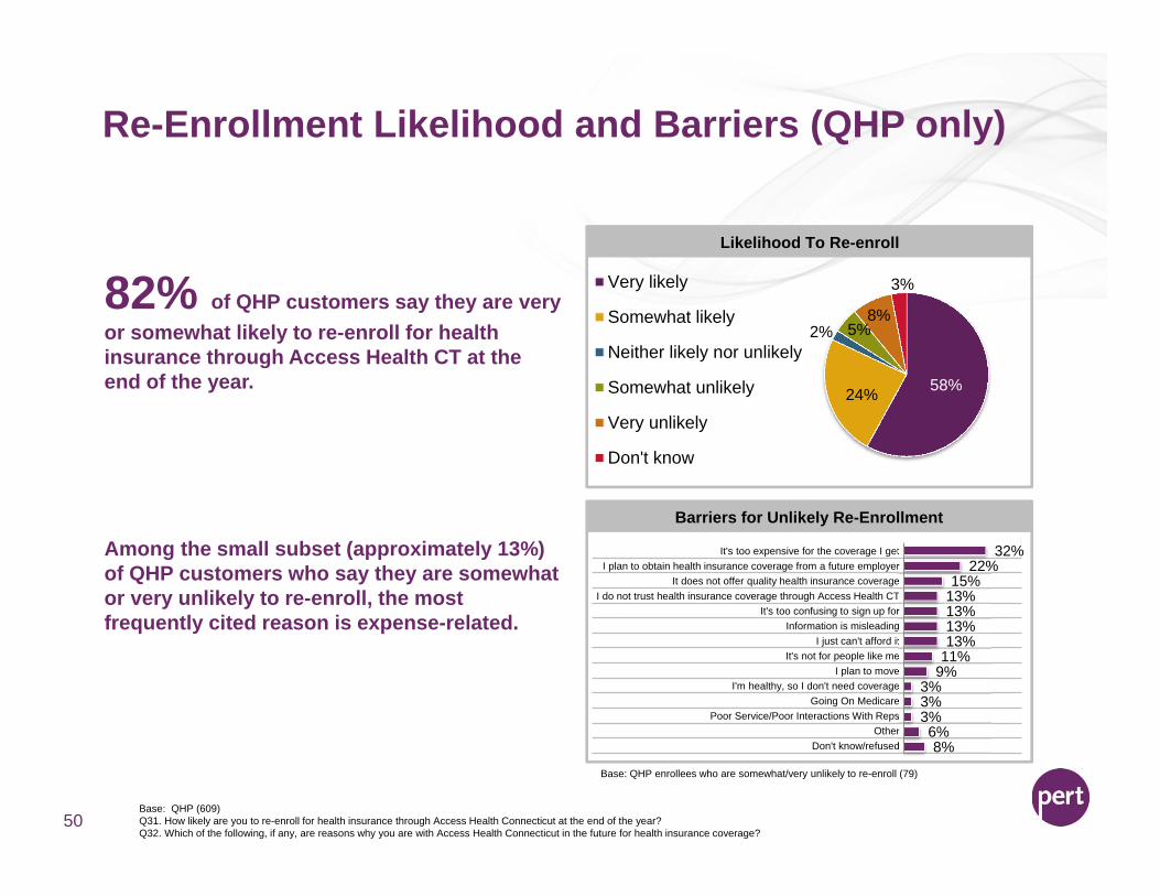
82% of QHP customers say they are very or somewhat likely to re-enroll for health insurance through Access Health CT at the end of the year.
Among the small subset (approximately 13%) of QHP customers who say they are somewhat or very unlikely to re-enroll, the most frequently cited reason is expense-related.
Base: QHP (609)Q31. How likely are you to re-enroll for health insurance through Access Health Connecticut at the end of the year?Q32. Which of the following, if any, are reasons why you are with Access Health Connecticut in the future for health insurance coverage?
Re-Enrollment Likelihood and Barriers (QHP only) –2014 vs. 2015
51
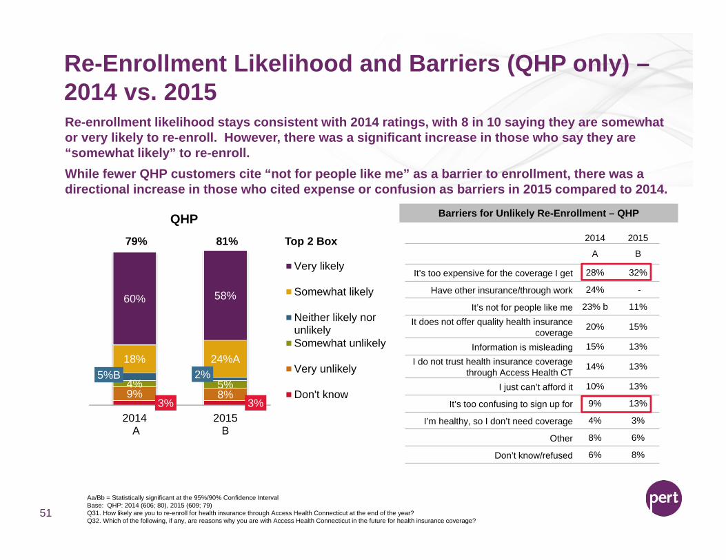
Re-enrollment likelihood stays consistent with 2014 ratings, with 8 in 10 saying they are somewhat or very likely to re-enroll. However, there was a significant increase in those who say they are “somewhat likely” to re-enroll. While fewer QHP customers cite “not for people like me” as a barrier to enrollment, there was a directional increase in those who cited expense or confusion as barriers in 2015 compared to 2014.
3% 3%9% 8%4% 5%
5%B 2%18% 24%A
60% 58%
2014 A
2015B
QHP
Very likely
Somewhat likely
Neither likely norunlikelySomewhat unlikely
Very unlikely
Don't know
2014 2015
A B
It’s too expensive for the coverage I get 28% 32%
Have other insurance/through work 24% -
It’s not for people like me 23% b 11%It does not offer quality health insurance
coverage20% 15%
Information is misleading 15% 13%I do not trust health insurance coverage
through Access Health CT14% 13%
I just can’t afford it 10% 13%
It’s too confusing to sign up for 9% 13%
I’m healthy, so I don’t need coverage 4% 3%
Other 8% 6%
Don’t know/refused 6% 8%
Barriers for Unlikely Re-Enrollment – QHP
Aa/Bb = Statistically significant at the 95%/90% Confidence IntervalBase: QHP: 2014 (606; 80), 2015 (609; 79)Q31. How likely are you to re-enroll for health insurance through Access Health Connecticut at the end of the year?Q32. Which of the following, if any, are reasons why you are with Access Health Connecticut in the future for health insurance coverage?
79% 81% Top 2 Box
Re-Enrollment Intent – QHP
52
3% 2% 4% 1% 3% 6% 5% 4% 1% 2% 5% 2% 3% 2% 8%8% 11% 7% 9% 8% 9% 20% 13%I6% 8%
20% 10%m 6% 11% 11% 8% 14% 8%10%5% 3% 5% 8%F 4% 3%
7%4%
5% 3%6% 4% 3% 5% 6%
4%4%2% 2% 2% 4%
2% 1%2%
2% 3%
20%
2% 2% 1% 11% 3% 1%2%
24% 24% 24%26%
25% 21%20% 27%
23% 24% 21% 27% 21%
33%22% 17% 31%Pq
21%
58% 58% 57% 53% 58% 61% 53% 49%60%H 62%h 60% 59%
55% 63%44%
59% 63%54% 54%
Very likely to re-enroll
Somewhat likely tore-enroll
Neither likely norunlikely to re-enroll
Somewhat unlikelyto re-enroll
Very unlikely to re-enroll
Don't know
Likelihood To Re-EnrollTop 2 Box 81% 82% 81% 79% 83% 82% 73% 77% 83% 86% 60% 80% 82% 84% 78% 81% 80% 86%s 75%
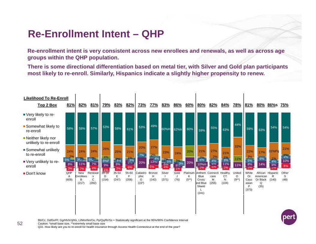
Re-enrollment intent is very consistent across new enrollees and renewals, as well as across age groups within the QHP population. There is some directional differentiation based on metal tier, with Silver and Gold plan participants most likely to re-enroll. Similarly, Hispanics indicate a slightly higher propensity to renew.
QHPA
(609)
New Enrollees
B(217)
RenewalsC
(392)
18-34D
(154)
35-54E
(247)
55-64F
(208)
CatastrophicG
(15*)
BronzeH
(142)
SilverI
(371)
GoldJ
(76)
PlatinumK
(5**)
Anthem Blue
Cross and Blue
ShieldL
(241)
ConnecticareM
(255)
Healthy CTN
(104)
UnitedO
(9**)
White Or
Caucasian
P(373)
African American Or Black
Q(35)
HispanicR
(140)
OtherS
(48)
Bb/Cc, Dd/Ee/Ff, Gg/Hh/Ii/Jj/Kk, Ll/Mm/Nn/Oo, Pp/Qq/Rr/Ss = Statistically significant at the 95%/90% Confidence IntervalCaution: *small base size, **extremely small base sizeQ31. How likely are you to re-enroll for health insurance through Access Health Connecticut at the end of the year?

Re-Enrollment Drivers (QHP only)
The weights tell us the size of the impact of that
attribute
Look for opportunities to showcase
recommendations, highlight value, and
demonstrate coverage that is the “right fit”.
53
Having coverage that they would recommend to others, offers a good value for the money, and is “right for me” are key drivers of re-enrollment.While website navigability and the sign-up or renewal process are entry points to a good customer experience, our results demonstrate the need to ramp up value perceptions beyond basic functionality.
22
33
34
444455
5667
78
910
Drivers of Re-Enrollment – QHP
Has health insurance coverage I would recommend to othersIs a good value for the money
Is for people like meHas valuable health insurance coverage
Has the right health insurance coverage for me and my familyAllows me to access quality care
Offers quality health insurance coverageIs dependable
Is affordableThe website is easy to navigate
Acts as an advocate between me and my insurance carrierHelps me understand my health insurance coverage options
Is a partnerMade the new enrollee/renewal sign up process easy
Is trustworthyLooks out for my best interest
Has physical places where I can go and talk to someoneKnowledgeable staff on the phone
Protects my personal health informationLets me compare plans from multiple carriers
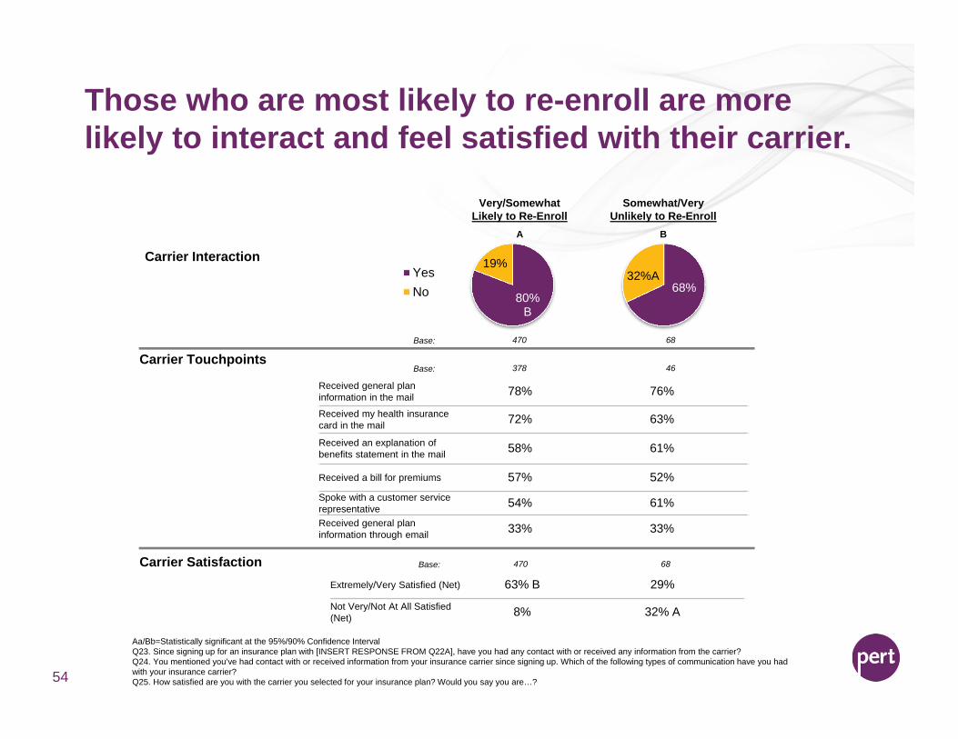
Those who are most likely to re-enroll are more likely to interact and feel satisfied with their carrier.
Aa/Bb=Statistically significant at the 95%/90% Confidence IntervalQ23. Since signing up for an insurance plan with [INSERT RESPONSE FROM Q22A], have you had any contact with or received any information from the carrier?Q24. You mentioned you’ve had contact with or received information from your insurance carrier since signing up. Which of the following types of communication have you had with your insurance carrier?Q25. How satisfied are you with the carrier you selected for your insurance plan? Would you say you are…?54
80%B
19%YesNo
Carrier Interaction
68%32%A
Carrier Touchpoints
Received general plan information in the mail 78% 76%
Received my health insurance card in the mail 72% 63%
Received an explanation of benefits statement in the mail 58% 61%
Received a bill for premiums 57% 52%Spoke with a customer service representative 54% 61%Received general plan information through email 33% 33%
Carrier Satisfaction
Base: 470 68
Base: 378 46
Base: 470 68
Extremely/Very Satisfied (Net) 63% B 29%
Not Very/Not At All Satisfied (Net) 8% 32% A
Very/SomewhatLikely to Re-Enroll
Somewhat/VeryUnlikely to Re-Enroll
A B
Perceptions of Price Varies Based on Re-Enrollment Intent
Aa/Bb = Statistically significant at the 95%/90% Confidence IntervalQ28. Which of the following statements best describes your opinion?Q29. Compared to other sources of health insurance coverage, do you think Access Health Connecticut is…55
Very/Somewhat Likely
to Re-Enroll
Somewhat/Very Unlikely to Re-Enroll
A B
Base: 496 79
Perceptions Of Price
I am paying too much for health insurance coverage through Access Health Connecticut 25% 57% A
I am paying a fair amount for health insurance coverage through Access Health Connecticut 53% B 32%
I am getting a great deal on health insurance coverage through Access Health Connecticut 22% B 11%
Perceptions Of Price Comparative
More expensive 11% 39% A
About the same price 38% 37%
Less expensive 51% B 24%
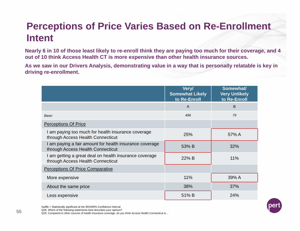
Nearly 6 in 10 of those least likely to re-enroll think they are paying too much for their coverage, and 4 out of 10 think Access Health CT is more expensive than other health insurance sources. As we saw in our Drivers Analysis, demonstrating value in a way that is personally relatable is key in driving re-enrollment.
Access Health CT Imagery Varies Greatly Based on Re-Enrollment Intent
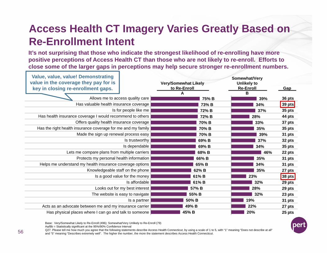
Base: Very/Somewhat Likely to Re-Enroll (496); Somewhat/Very Unlikely to Re-Enroll (79)Aa/Bb = Statistically significant at the 95%/90% Confidence IntervalQ27. Please tell me how much you agree that the following statements describe Access Health Connecticut, by using a scale of 1 to 5, with “1” meaning “Does not describe at all” and “5” meaning “Describes extremely well”. The higher the number, the more the statement describes Access Health Connecticut. 56
Very/Somewhat Likelyto Re-Enroll
Somewhat/Very Unlikely to Re-Enroll Gap
A B75% B
73% B72% B72% B
70% B70% B70% B69% B69% B68% B
66% B65% B
62% B61% B61% B
57% B55% B
50% B49% B
45% B
It’s not surprising that those who indicate the strongest likelihood of re-enrolling have more positive perceptions of Access Health CT than those who are not likely to re-enroll. Efforts to close some of the larger gaps in perceptions may help secure stronger re-enrollment numbers.
Value, value, value! Demonstrating value in the coverage they pay for is key in closing re-enrollment gaps.
39%34%37%
28%33%35%
39%37%
34%46%
35%34%35%
23%32%
28%32%
19%22%
20%
Allows me to access quality care 36 ptsHas valuable health insurance coverage 39 pts
Is for people like me 35 ptsHas health insurance coverage I would recommend to others 44 pts
Offers quality health insurance coverage 37 ptsHas the right health insurance coverage for me and my family 35 pts
Made the sign up renewal process easy 31 ptsIs trustworthy 32 pts
Is dependable 35 ptsLets me compare plans from multiple carriers 22 pts
Protects my personal health information 31 ptsHelps me understand my health insurance coverage options 31 pts
Knowledgeable staff on the phone 27 ptsIs a good value for the money 38 pts
Is affordable 29 ptsLooks out for my best interest 29 pts
The website is easy to navigate 23 ptsIs a partner 31 pts
Acts as an advocate between me and my insurance carrier 27 ptsHas physical places where I can go and talk to someone 25 pts

Health Engagement Overview
57
Health Insurance Usage – 2014 vs. 2015
58
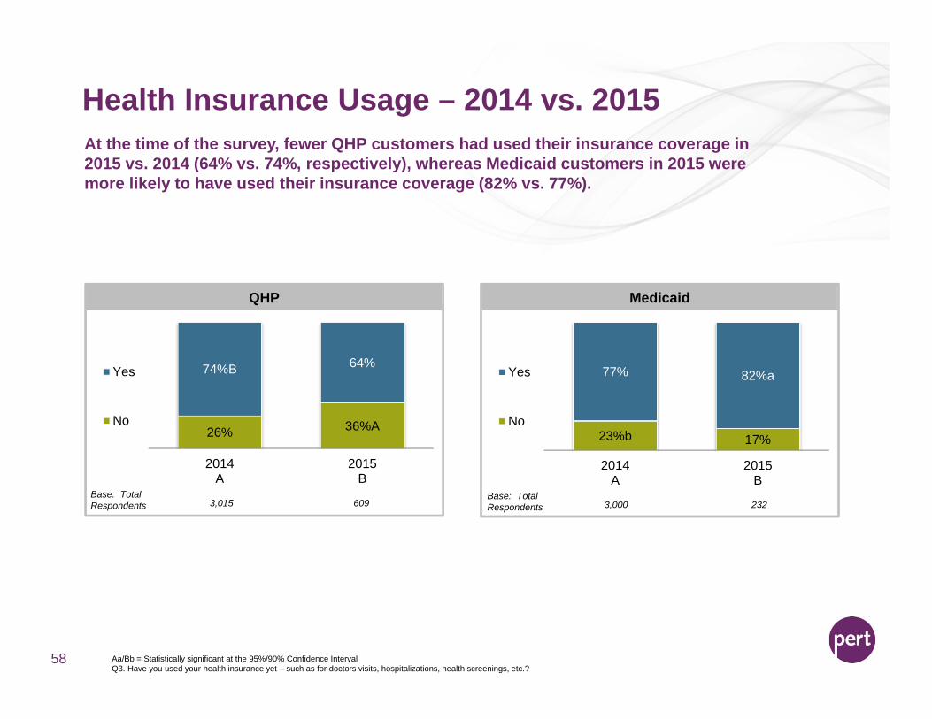
At the time of the survey, fewer QHP customers had used their insurance coverage in 2015 vs. 2014 (64% vs. 74%, respectively), whereas Medicaid customers in 2015 were more likely to have used their insurance coverage (82% vs. 77%).
26% 36%A
74%B 64%
2014A
2015B
Yes
No
QHP
23%b 17%
77% 82%a
2014A
2015B
Yes
No
Medicaid
Base: Total Respondents 3,015 609
Base: Total Respondents 3,000 232
Aa/Bb = Statistically significant at the 95%/90% Confidence IntervalQ3. Have you used your health insurance yet – such as for doctors visits, hospitalizations, health screenings, etc.?
Primary Care Physician2014 vs. 2015
59
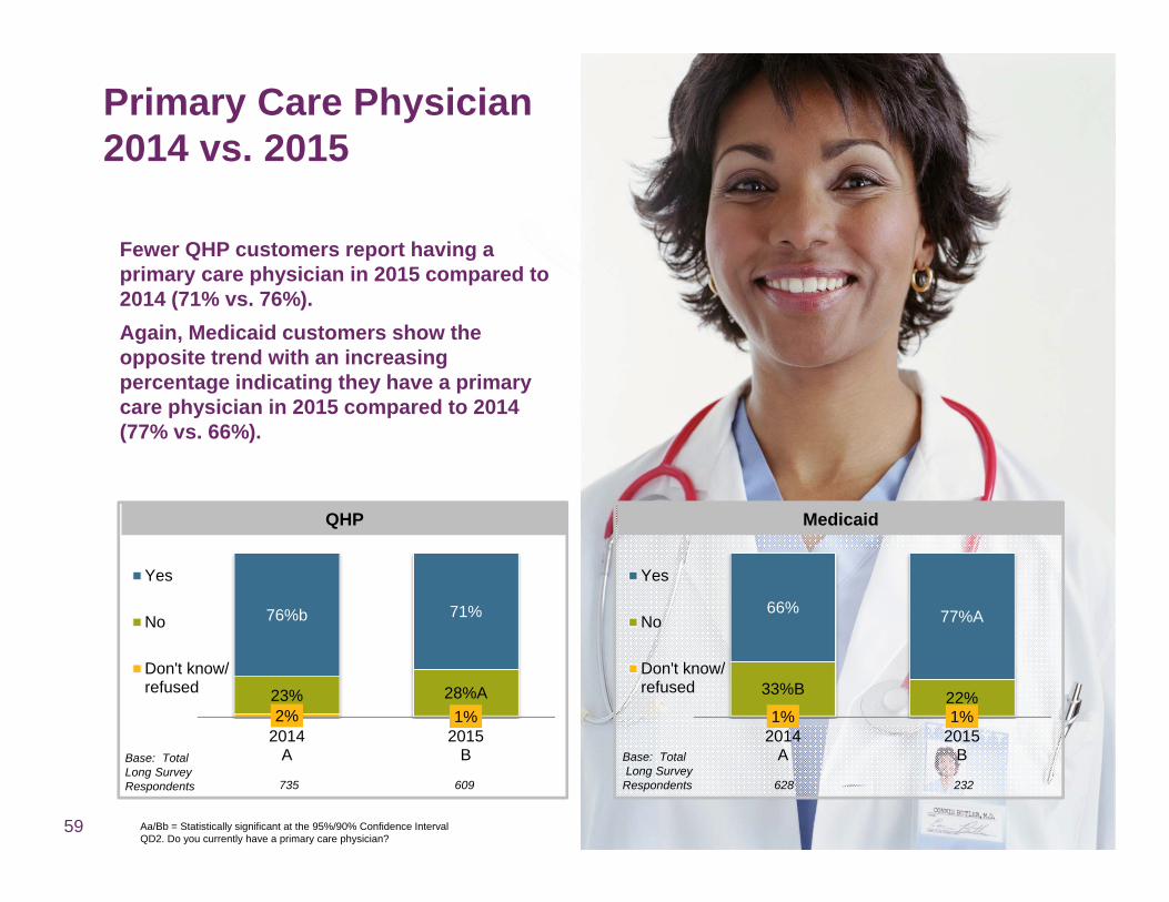
Fewer QHP customers report having a primary care physician in 2015 compared to 2014 (71% vs. 76%). Again, Medicaid customers show the opposite trend with an increasing percentage indicating they have a primary care physician in 2015 compared to 2014 (77% vs. 66%).
2% 1%23% 28%A
76%b 71%
2014A
2015B
Yes
No
Don't know/refused
QHP Medicaid
Base: Total Long Survey Respondents 735 609
Base: TotalLong Survey
Respondents 628 232
Aa/Bb = Statistically significant at the 95%/90% Confidence IntervalQD2. Do you currently have a primary care physician?
1% 1%
33%B 22%
66% 77%A
2014A
2015B
Yes
No
Don't know/refused

60
Health Engagement – 2015 – QHP New Enrollees vs. RenewalsQHP renewal customers are more likely to have used their insurance and have a primary care physician (PCP). Encouraging new enrollees to use their insurance quickly and find a PCP may help to instill lasting value perceptions.
Base: QHP – Total (609); QHP – New Enrollees (217); QHP – Renewals (392)Dd/Ee = Statistically significant at the 95%/90% Confidence IntervalQ3. Have you used your health insurance in 2015 – such as for doctors visits, hospitalizations, health screenings, etc.?QD2. Do you currently have a primary care physician?
64%
71%
56%
61%
68%D
76%D
QHP – Total
QHP – New Enrollees (D)
QHP – Renewals (E)
Yes, have used insurance in 2015
Yes, have primary care physician
Health Engagement – QHP Drill Down
61
Summary of QHP Engagement
62
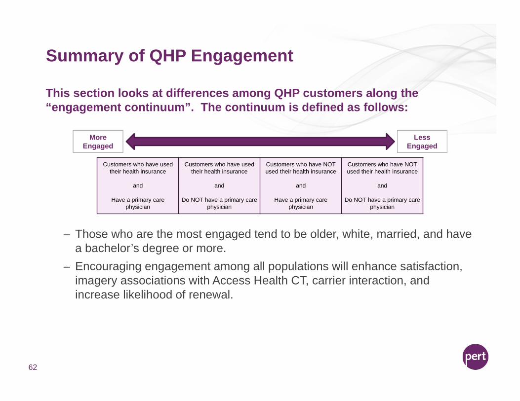
This section looks at differences among QHP customers along the “engagement continuum”. The continuum is defined as follows:
– Those who are the most engaged tend to be older, white, married, and have a bachelor’s degree or more.
– Encouraging engagement among all populations will enhance satisfaction, imagery associations with Access Health CT, carrier interaction, and increase likelihood of renewal.
Customers who have used their health insurance
and
Have a primary care physician
Customers who have used their health insurance
and
Do NOT have a primary care physician
Customers who have NOT used their health insurance
and
Have a primary care physician
Customers who have NOT used their health insurance
and
Do NOT have a primary care physician
Less Engaged
MoreEngaged
63
8% 8% 5% 13% c8% 8% 10% 7%21% 25% 24% 17%
39% 42% 41% 38%
22% bCd 12% 7% 14% cExtremely satisfied
Very satisfied
Somewhat satisfied
Not very satisfied
Not satisfied at all
Used HIHave Primary
Used HINo Primary
Not Used HIHave Primary
Not Used HINo Primary
A B C D
Less Engaged
MoreEngaged
Base: QHP Used HI, Have Primary (322); QHP Used HI, No Primary (65); QHP Not Used HI, Have Primary (110); QHP Not Used HI, No Primary (112)Aa/Bb/Cc/Dd = Statistically significant at the 95%/90% Confidence IntervalQ1. Overall, how satisfied [[IF NEW ENROLLEE OR RENEWAL]] [are you] [[IF LEAVER]] [were you] with Access Health Connecticut? Would you say you are/were…?
Top 2 Box 61% C 54% 48% 53%
QHP Engagement – Satisfaction with Access Health CTThose who are the most engaged report the highest levels of satisfaction with Access Health CT, whereas the least engaged are more likely to say they are “not satisfied at all”.
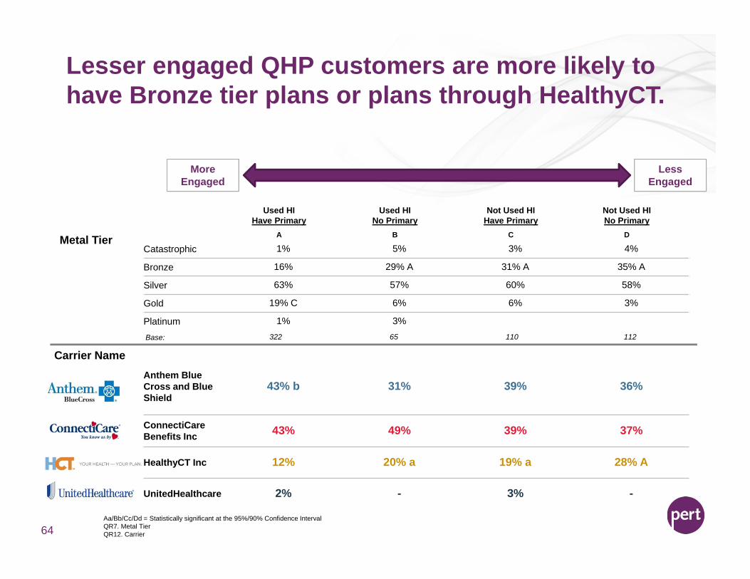
Lesser engaged QHP customers are more likely to have Bronze tier plans or plans through HealthyCT.
Aa/Bb/Cc/Dd = Statistically significant at the 95%/90% Confidence IntervalQR7. Metal TierQR12. Carrier64
Used HIHave Primary
Used HINo Primary
Not Used HIHave Primary
Not Used HINo Primary
A B C DMetal TierCatastrophic 1% 5% 3% 4%
Bronze 16% 29% A 31% A 35% A
Silver 63% 57% 60% 58%
Gold 19% C 6% 6% 3%
Platinum 1% 3%
Carrier NameAnthem Blue Cross and Blue Shield
43% b 31% 39% 36%
ConnectiCare Benefits Inc 43% 49% 39% 37%
HealthyCT Inc 12% 20% a 19% a 28% A
UnitedHealthcare 2% - 3% -
Less Engaged
MoreEngaged
Base: 322 65 110 112

Highly engaged QHP customers are more likely to have carrier contact and high carrier satisfaction.
Aa/Bb/Cc/Dd = Statistically significant at the 95%/90% Confidence IntervalQ23. Since signing up for an insurance plan with [INSERT RESPONSE FROM Q22A], have you had any contact with or received any information from the carrier?Q24. You mentioned you’ve had contact with or received information from your insurance carrier since signing up. Which of the following types of communication have you had with your insurance carrier?Q25. How satisfied are you with the carrier you selected for your insurance plan? Would you say you are…?65
Used HIHave Primary
Used HINo Primary
Not Used HIHave Primary
Not Used HINo Primary
A B C D
86% BCD
13%YesNo
Carrier Interaction
65%35%A
72%
27%A69%
31%A
Carrier Touchpoints
Received general plan information in the mail 75% 80% 78% 81%
Received my health insurance card in the mail 70% 66% 68% 76%
Spoke with a customer service representative 61% CD 59% cD 42% 37%
Received an explanation of benefits statement in the mail 61% c 59% 49% 57%
Received a bill for premiums 59% 49% 53% 52%Received general plan information through email 32% 29% 35% 34%
Carrier Satisfaction
Less Engaged
MoreEngaged
Base: 308 63 103 97
Base: 265 41 74 67
Extremely/Very Satisfied (Net) 61% C 57% 47% 53%
Not Very/Not At All Satisfied (Net) 9% 14% 13% 13%
Base: 308 63 103 97
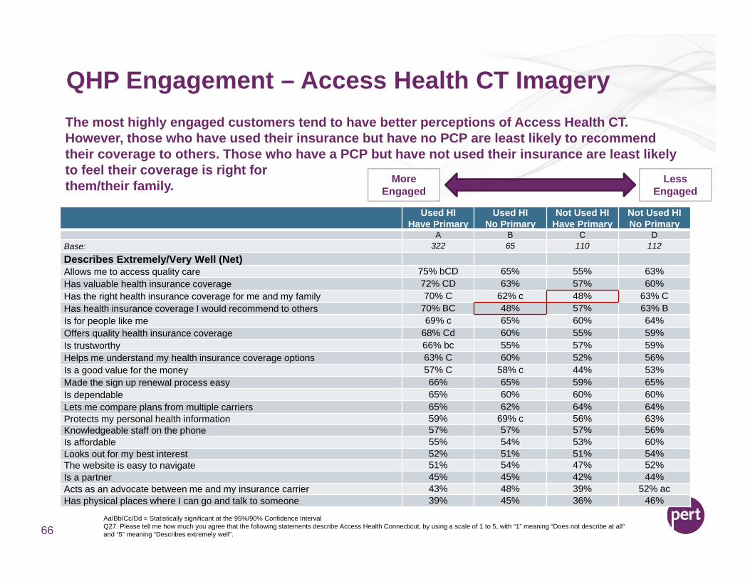
QHP Engagement – Access Health CT Imagery
Aa/Bb/Cc/Dd = Statistically significant at the 95%/90% Confidence IntervalQ27. Please tell me how much you agree that the following statements describe Access Health Connecticut, by using a scale of 1 to 5, with “1” meaning “Does not describe at all” and “5” meaning “Describes extremely well”. 66
Used HIHave Primary
Used HINo Primary
Not Used HIHave Primary
Not Used HINo Primary
A B C DBase: 322 65 110 112
Describes Extremely/Very Well (Net)Allows me to access quality care 75% bCD 65% 55% 63%Has valuable health insurance coverage 72% CD 63% 57% 60%Has the right health insurance coverage for me and my family 70% C 62% c 48% 63% CHas health insurance coverage I would recommend to others 70% BC 48% 57% 63% BIs for people like me 69% c 65% 60% 64%Offers quality health insurance coverage 68% Cd 60% 55% 59%Is trustworthy 66% bc 55% 57% 59%Helps me understand my health insurance coverage options 63% C 60% 52% 56%Is a good value for the money 57% C 58% c 44% 53%Made the sign up renewal process easy 66% 65% 59% 65%Is dependable 65% 60% 60% 60%Lets me compare plans from multiple carriers 65% 62% 64% 64%Protects my personal health information 59% 69% c 56% 63%Knowledgeable staff on the phone 57% 57% 57% 56%Is affordable 55% 54% 53% 60%Looks out for my best interest 52% 51% 51% 54%The website is easy to navigate 51% 54% 47% 52%Is a partner 45% 45% 42% 44%Acts as an advocate between me and my insurance carrier 43% 48% 39% 52% acHas physical places where I can go and talk to someone 39% 45% 36% 46%
Less Engaged
MoreEngaged
The most highly engaged customers tend to have better perceptions of Access Health CT. However, those who have used their insurance but have no PCP are least likely to recommend their coverage to others. Those who have a PCP but have not used their insurance are least likely to feel their coverage is right for them/their family.
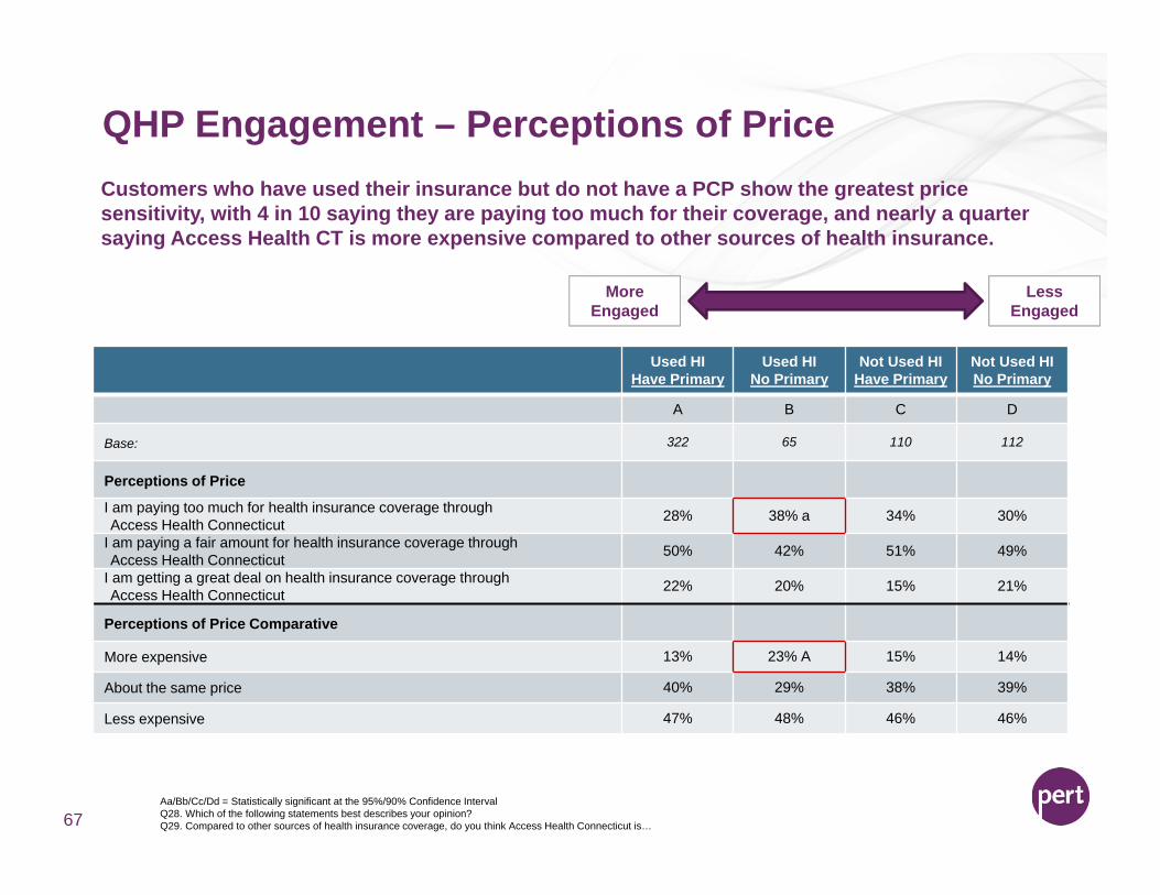
QHP Engagement – Perceptions of Price
Aa/Bb/Cc/Dd = Statistically significant at the 95%/90% Confidence IntervalQ28. Which of the following statements best describes your opinion?Q29. Compared to other sources of health insurance coverage, do you think Access Health Connecticut is…67
Less Engaged
MoreEngaged
Used HIHave Primary
Used HINo Primary
Not Used HIHave Primary
Not Used HINo Primary
A B C D
Base: 322 65 110 112
Perceptions of Price
I am paying too much for health insurance coverage through Access Health Connecticut 28% 38% a 34% 30%
I am paying a fair amount for health insurance coverage through Access Health Connecticut 50% 42% 51% 49%
I am getting a great deal on health insurance coverage through Access Health Connecticut 22% 20% 15% 21%
Perceptions of Price Comparative
More expensive 13% 23% A 15% 14%
About the same price 40% 29% 38% 39%
Less expensive 47% 48% 46% 46%
Customers who have used their insurance but do not have a PCP show the greatest price sensitivity, with 4 in 10 saying they are paying too much for their coverage, and nearly a quarter saying Access Health CT is more expensive compared to other sources of health insurance.
QHP Engagement – Expectations and Re-Enrollment
Aa/Bb/Cc/Dd = Statistically significant at the 95%/90% Confidence IntervalQ30. How well has Access Health Connecticut met your expectations? Would you say Access Health Connecticut…Q31. How likely are you to re-enroll for health insurance through Access Health Connecticut at the end of the year?68
Used HIHave Primary
Used HINo Primary
Not Used HIHave Primary
Not Used HINo Primary
A B C D
Base: 322 65 110 112
Access Health Connecticut Expectations Met
Top 2 Box - Far/Somewhat Exceeded Your Expectations (Net) 30% 20% 26% 26%
Bottom 2 Box - Fell Somewhat Short/Did Not Meet Your Expectations (Net) 25% 26% 19% 27%
Likelihood to Re-Enroll
Top 2 Box - Very Likely/Somewhat Likely To Re-Enroll (Net) 84% d 80% 80% 77%
Bottom 2 Box - Somewhat Unlikely/Very Unlikely To Re-Enroll (Net) 11% 12% 15% 18% A
Less Engaged
MoreEngaged
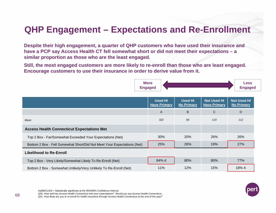
Despite their high engagement, a quarter of QHP customers who have used their insurance and have a PCP say Access Health CT fell somewhat short or did not meet their expectations – a similar proportion as those who are the least engaged. Still, the most engaged customers are more likely to re-enroll than those who are least engaged. Encourage customers to use their insurance in order to derive value from it.

Thank you!
69
Chris BarnesChief Client Strategy Officer
Courtney BrownSenior Account Director
70
CID Rate Review Process
Presented to AHCT By CID Actuary Paul Lombardo, A.S.A., M.A.A.A.
September 17, 2015
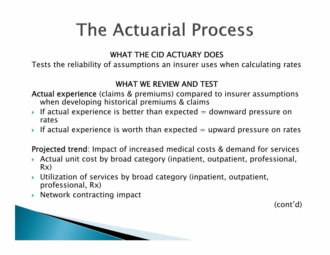
WHAT THE CID ACTUARY DOESTests the reliability of assumptions an insurer uses when calculating rates
WHAT WE REVIEW AND TESTActual experience (claims & premiums) compared to insurer assumptions
when developing historical premiums & claims If actual experience is better than expected = downward pressure on
rates If actual experience is worth than expected = upward pressure on rates
Projected trend: Impact of increased medical costs & demand for services Actual unit cost by broad category (inpatient, outpatient, professional,
Rx) Utilization of services by broad category (inpatient, outpatient,
professional, Rx) Network contracting impact
(cont’d)
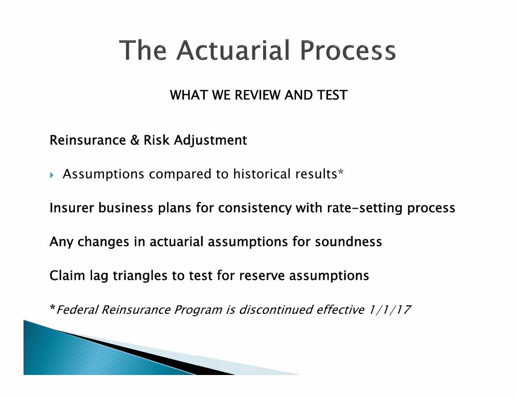
WHAT WE REVIEW AND TEST
Reinsurance & Risk Adjustment
Assumptions compared to historical results*
Insurer business plans for consistency with rate-setting process
Any changes in actuarial assumptions for soundness
Claim lag triangles to test for reserve assumptions
*Federal Reinsurance Program is discontinued effective 1/1/17
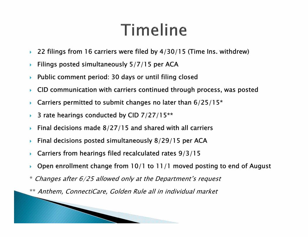
22 filings from 16 carriers were filed by 4/30/15 (Time Ins. withdrew)
Filings posted simultaneously 5/7/15 per ACA
Public comment period: 30 days or until filing closed
CID communication with carriers continued through process, was posted
Carriers permitted to submit changes no later than 6/25/15*
3 rate hearings conducted by CID 7/27/15**
Final decisions made 8/27/15 and shared with all carriers
Final decisions posted simultaneously 8/29/15 per ACA
Carriers from hearings filed recalculated rates 9/3/15
Open enrollment change from 10/1 to 11/1 moved posting to end of August
* Changes after 6/25 allowed only at the Department’s request
** Anthem, ConnectiCare, Golden Rule all in individual market

Reduced annual trend for most filings based on historical unit cost, utilization data
in filing
Disallowed morbidity loads if credible 2014 experience available
Based risk adjustments on 6/30/15 CCIIO report for CT
Disallowed changes to pricing assumptions unless actuarially justified
Significantly reduced costs for removal of age limit on infertility mandate to 25 cents
per member/per month

79
Wakely Review of 2016 Rates
Access Health CT2016 Rate Review and AnalysisSeptember 17, 2015 Presentation
Julia Lerche, FSA, MAAA, MSPHSenior Consulting Actuary
Chris Bach, ASA, MAAA, FCASenior Consulting Actuary
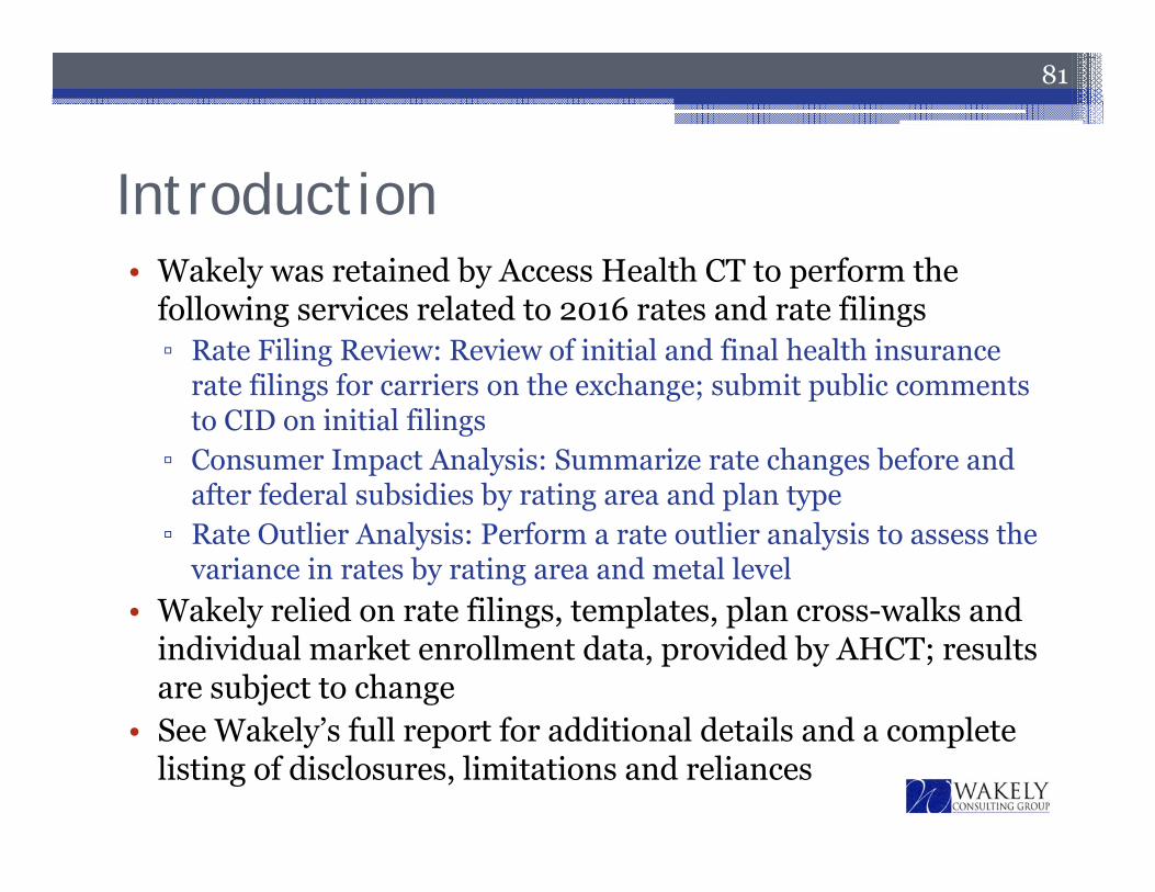
Introduction• Wakely was retained by Access Health CT to perform the
following services related to 2016 rates and rate filings▫ Rate Filing Review: Review of initial and final health insurance
rate filings for carriers on the exchange; submit public comments to CID on initial filings
▫ Consumer Impact Analysis: Summarize rate changes before and after federal subsidies by rating area and plan type
▫ Rate Outlier Analysis: Perform a rate outlier analysis to assess the variance in rates by rating area and metal level
• Wakely relied on rate filings, templates, plan cross-walks and individual market enrollment data, provided by AHCT; results are subject to change
• See Wakely’s full report for additional details and a complete listing of disclosures, limitations and reliances
81
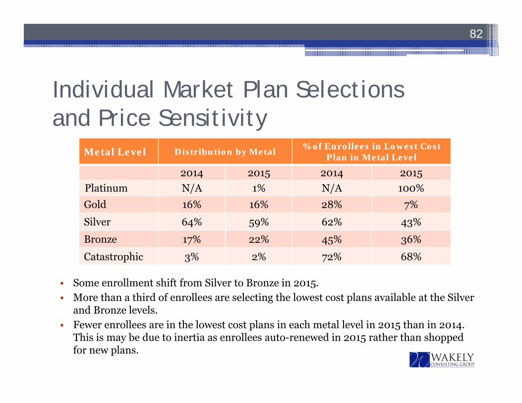
Individual Market Plan Selectionsand Price Sensitivity
82
Metal Level Distribution by Metal % of Enrollees in Lowest Cost Plan in Metal Level
2014 2015 2014 2015Platinum N/A 1% N/A 100%Gold 16% 16% 28% 7%
Silver 64% 59% 62% 43%
Bronze 17% 22% 45% 36%
Catastrophic 3% 2% 72% 68%
• Some enrollment shift from Silver to Bronze in 2015.• More than a third of enrollees are selecting the lowest cost plans available at the Silver
and Bronze levels.• Fewer enrollees are in the lowest cost plans in each metal level in 2015 than in 2014.
This is may be due to inertia as enrollees auto-renewed in 2015 rather than shopped for new plans.
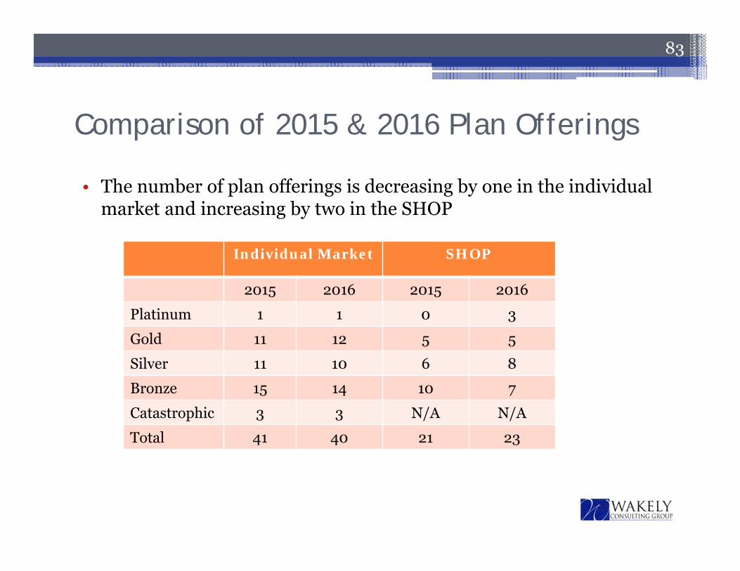
Comparison of 2015 & 2016 Plan Offerings
83
Individual Market SHOP
2015 2016 2015 2016
Platinum 1 1 0 3
Gold 11 12 5 5
Silver 11 10 6 8
Bronze 15 14 10 7
Catastrophic 3 3 N/A N/A
Total 41 40 21 23
• The number of plan offerings is decreasing by one in the individual market and increasing by two in the SHOP
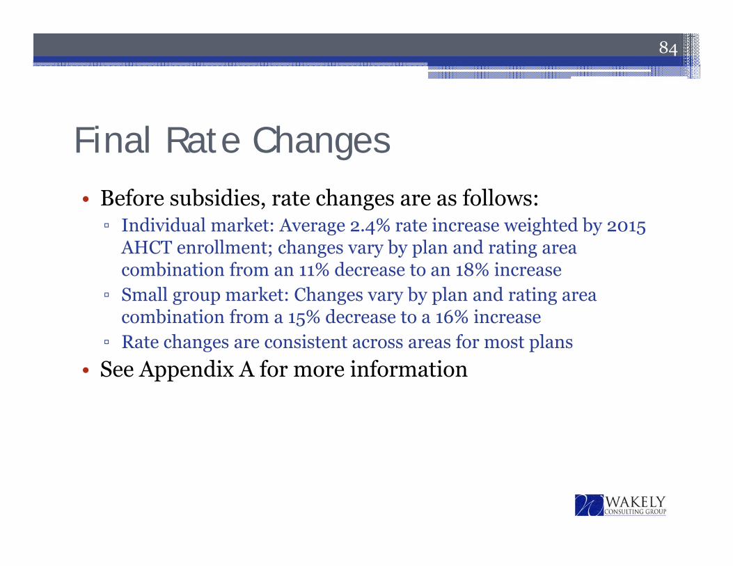
Final Rate Changes• Before subsidies, rate changes are as follows:▫ Individual market: Average 2.4% rate increase weighted by 2015
AHCT enrollment; changes vary by plan and rating area combination from an 11% decrease to an 18% increase
▫ Small group market: Changes vary by plan and rating area combination from a 15% decrease to a 16% increase
▫ Rate changes are consistent across areas for most plans• See Appendix A for more information
84
85
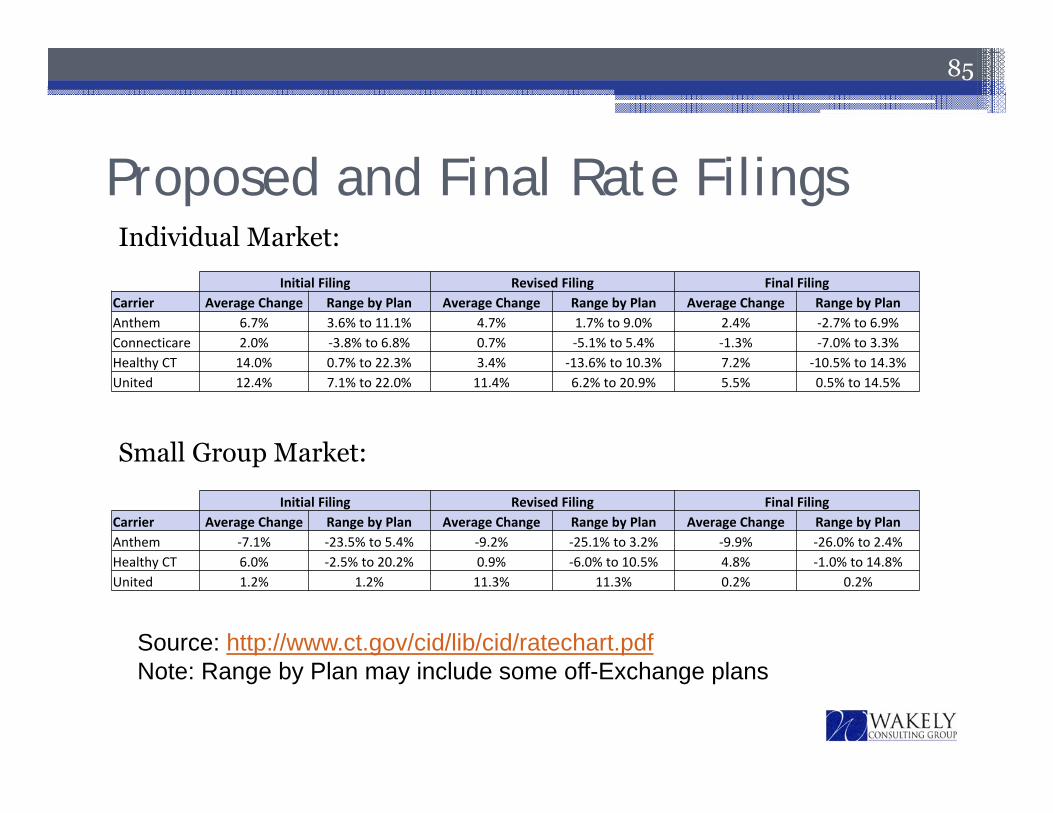
Individual Market:
Small Group Market:
Proposed and Final Rate Filings
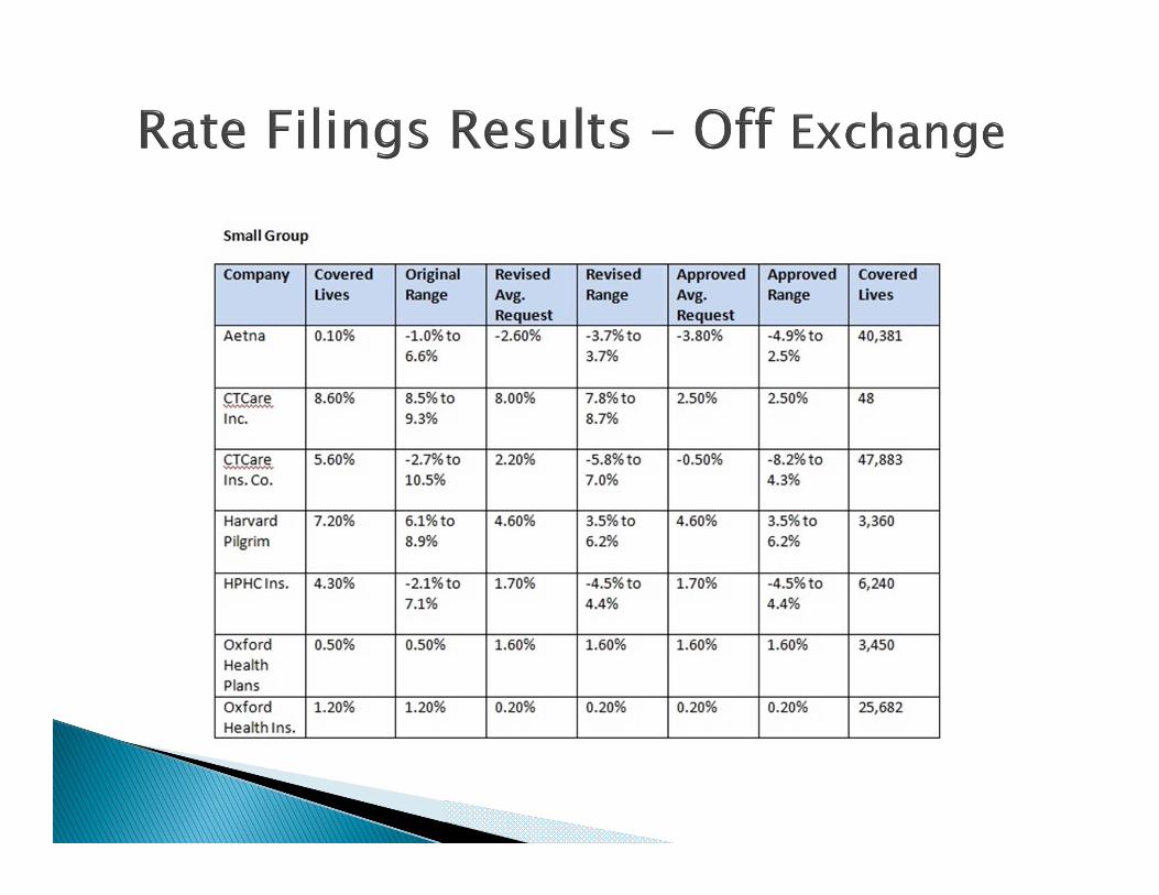
Initial Filing Revised Filing Final FilingCarrier Average Change Range by Plan Average Change Range by Plan Average Change Range by PlanAnthem 6.7% 3.6% to 11.1% 4.7% 1.7% to 9.0% 2.4% ‐2.7% to 6.9%Connecticare 2.0% ‐3.8% to 6.8% 0.7% ‐5.1% to 5.4% ‐1.3% ‐7.0% to 3.3%Healthy CT 14.0% 0.7% to 22.3% 3.4% ‐13.6% to 10.3% 7.2% ‐10.5% to 14.3%United 12.4% 7.1% to 22.0% 11.4% 6.2% to 20.9% 5.5% 0.5% to 14.5%
Initial Filing Revised Filing Final FilingCarrier Average Change Range by Plan Average Change Range by Plan Average Change Range by PlanAnthem ‐7.1% ‐23.5% to 5.4% ‐9.2% ‐25.1% to 3.2% ‐9.9% ‐26.0% to 2.4%Healthy CT 6.0% ‐2.5% to 20.2% 0.9% ‐6.0% to 10.5% 4.8% ‐1.0% to 14.8%United 1.2% 1.2% 11.3% 11.3% 0.2% 0.2%
Source: http://www.ct.gov/cid/lib/cid/ratechart.pdfNote: Range by Plan may include some off-Exchange plans
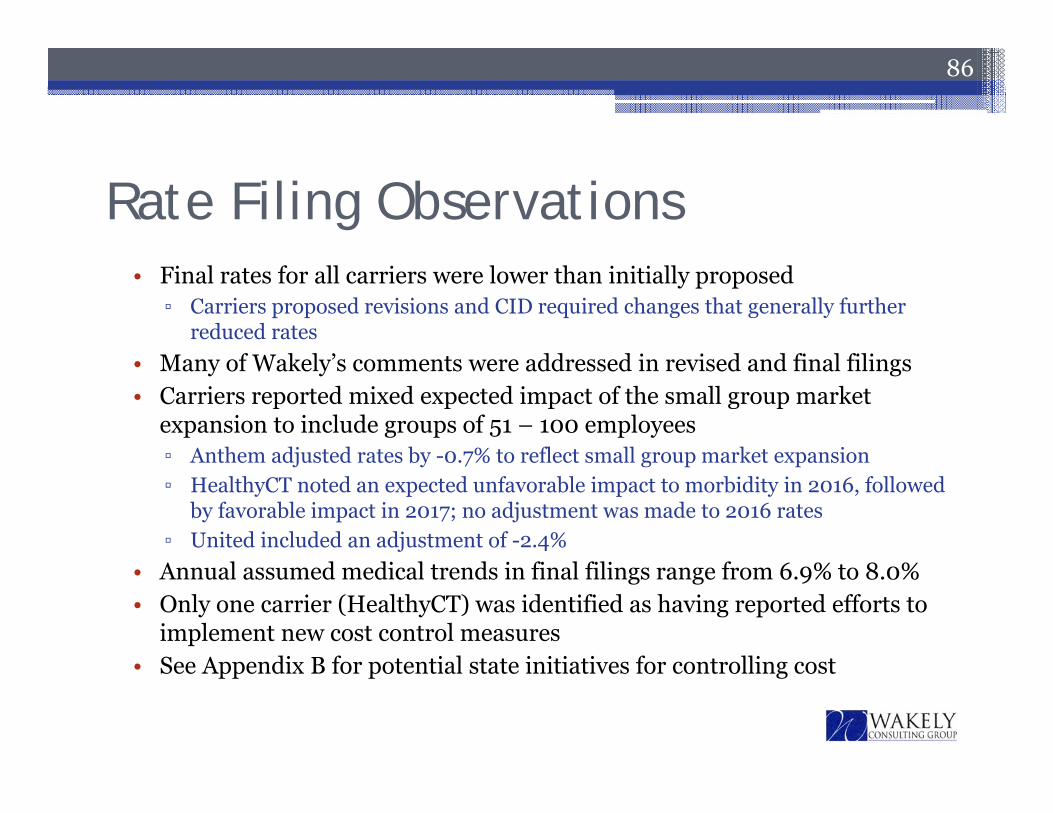
Rate Filing Observations
86
• Final rates for all carriers were lower than initially proposed▫ Carriers proposed revisions and CID required changes that generally further
reduced rates• Many of Wakely’s comments were addressed in revised and final filings• Carriers reported mixed expected impact of the small group market
expansion to include groups of 51 – 100 employees▫ Anthem adjusted rates by -0.7% to reflect small group market expansion▫ HealthyCT noted an expected unfavorable impact to morbidity in 2016, followed
by favorable impact in 2017; no adjustment was made to 2016 rates▫ United included an adjustment of -2.4%
• Annual assumed medical trends in final filings range from 6.9% to 8.0%• Only one carrier (HealthyCT) was identified as having reported efforts to
implement new cost control measures• See Appendix B for potential state initiatives for controlling cost
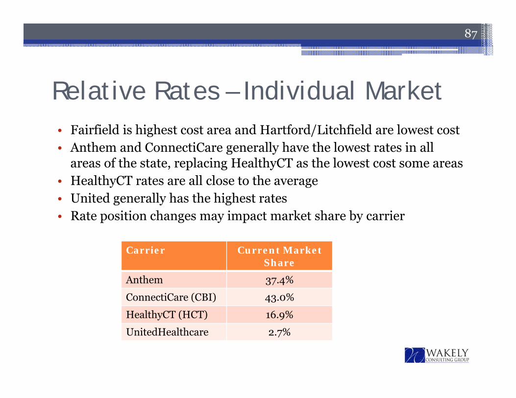
Relative Rates – Individual Market• Fairfield is highest cost area and Hartford/Litchfield are lowest cost• Anthem and ConnectiCare generally have the lowest rates in all
areas of the state, replacing HealthyCT as the lowest cost some areas• HealthyCT rates are all close to the average• United generally has the highest rates• Rate position changes may impact market share by carrier
87
Carrier Current Market Share
Anthem 37.4%
ConnectiCare (CBI) 43.0%
HealthyCT (HCT) 16.9%
UnitedHealthcare 2.7%
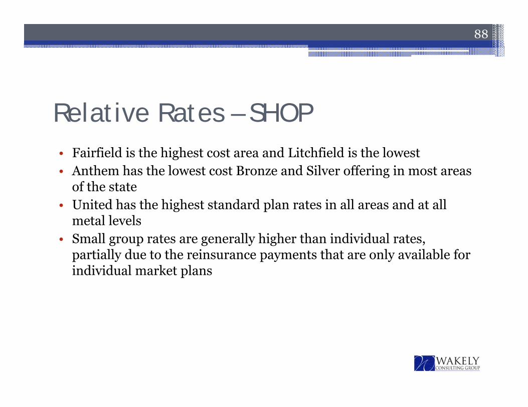
Relative Rates – SHOP• Fairfield is the highest cost area and Litchfield is the lowest• Anthem has the lowest cost Bronze and Silver offering in most areas
of the state• United has the highest standard plan rates in all areas and at all
metal levels• Small group rates are generally higher than individual rates,
partially due to the reinsurance payments that are only available for individual market plans
88
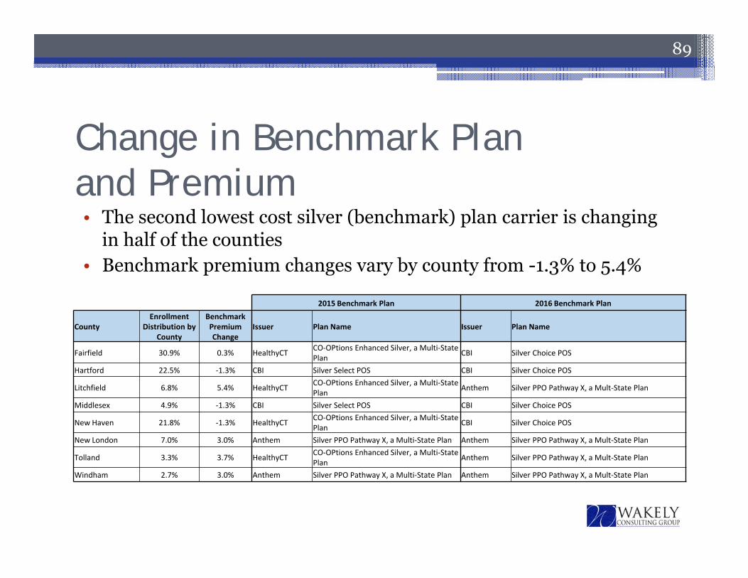
Change in Benchmark Planand Premium
89
49% 2015 Benchmark Plan 2016 Benchmark Plan
CountyEnrollment
Distribution by County
Benchmark Premium Change
Issuer Plan Name Issuer Plan Name
Fairfield 30.9% 0.3% HealthyCT CO‐OPtions Enhanced Silver, a Multi‐State Plan CBI Silver Choice POS
Hartford 22.5% ‐1.3% CBI Silver Select POS CBI Silver Choice POS
Litchfield 6.8% 5.4% HealthyCT CO‐OPtions Enhanced Silver, a Multi‐State Plan Anthem Silver PPO Pathway X, a Mult‐State Plan
Middlesex 4.9% ‐1.3% CBI Silver Select POS CBI Silver Choice POS
New Haven 21.8% ‐1.3% HealthyCT CO‐OPtions Enhanced Silver, a Multi‐State Plan CBI Silver Choice POS
New London 7.0% 3.0% Anthem Silver PPO Pathway X, a Multi‐State Plan Anthem Silver PPO Pathway X, a Mult‐State Plan
Tolland 3.3% 3.7% HealthyCT CO‐OPtions Enhanced Silver, a Multi‐State Plan Anthem Silver PPO Pathway X, a Mult‐State Plan
Windham 2.7% 3.0% Anthem Silver PPO Pathway X, a Multi‐State Plan Anthem Silver PPO Pathway X, a Mult‐State Plan
• The second lowest cost silver (benchmark) plan carrier is changing in half of the counties
• Benchmark premium changes vary by county from -1.3% to 5.4%
Impact for Hypothetical Household• The next slide illustrates the change in the benchmark premium and
premium subsidy amounts by county for a single adult, age 26 (turning 27 in 2016) with household income of 200% FPL
• Key take-aways include▫ Subsidies for this hypothetical household are increasing the most in
Litchfield and are remaining flat in Hartford, Middlesex and New Haven▫ The average subsidy change across all areas of the state is 3% for this
household scenario▫ Benchmark premium increases are higher here than in the prior slide
due to the impact of aging• Impact will vary by household scenario (see Appendix C for an
additional hypothetical household)
90
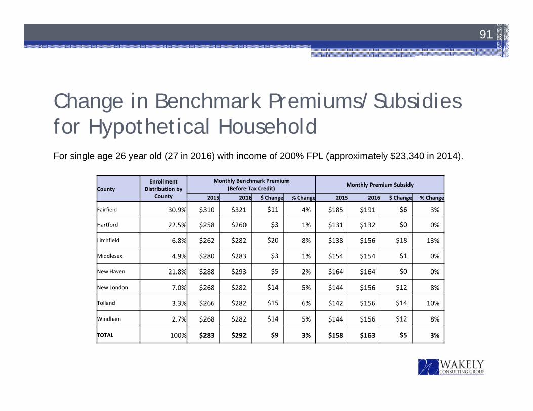
Change in Benchmark Premiums/Subsidies for Hypothetical Household
91
CountyEnrollment
Distribution by County
Monthly Benchmark Premium (Before Tax Credit) Monthly Premium Subsidy
2015 2016 $ Change % Change 2015 2016 $ Change % Change
Fairfield 30.9% $310 $321 $11 4% $185 $191 $6 3%
Hartford 22.5% $258 $260 $3 1% $131 $132 $0 0%
Litchfield 6.8% $262 $282 $20 8% $138 $156 $18 13%
Middlesex 4.9% $280 $283 $3 1% $154 $154 $1 0%
New Haven 21.8% $288 $293 $5 2% $164 $164 $0 0%
New London 7.0% $268 $282 $14 5% $144 $156 $12 8%
Tolland 3.3% $266 $282 $15 6% $142 $156 $14 10%
Windham 2.7% $268 $282 $14 5% $144 $156 $12 8%
TOTAL 100% $283 $292 $9 3% $158 $163 $5 3%
For single age 26 year old (27 in 2016) with income of 200% FPL (approximately $23,340 in 2014).
Rate Impact for Enrollees inLowest Cost Silver Plan• The following slide shows the rate impact before and after subsidies for the
lowest cost Silver plan in each county for our hypothetical household• The first panel of numbers shows the monthly rate change before subsidies for
the 2015 lowest cost Silver plan compared to the 2016 plan members are auto-renewed into
• The second panel of numbers shows the after-subsidy monthly rate change for the 2015 lowest cost Silver plan compared to the 2016 plan members are auto-renewed into
• The third panel of numbers shows the monthly after-subsidy rate change for the 2015 lowest cost Silver plan compared to the 2016 lowest cost Silver plan assuming the individual moves to that plan if it is different from their current plan (plan name is in the third column)▫ The lowest cost Silver plan is changing in Fairfield, Litchfield, New Haven and Tolland,
creating savings opportunities• Results will vary for different household scenarios, see Appendix C for more
information
92
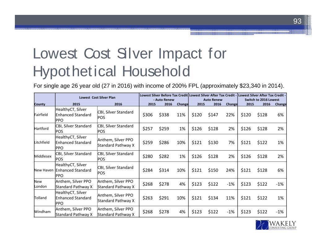
Lowest Cost Silver Impact for Hypothetical Household
93
For single age 26 year old (27 in 2016) with income of 200% FPL (approximately $23,340 in 2014).
Lowest Cost Silver Plan Lowest Silver Before Tax Credit ‐ Auto Renew
Lowest Silver After Tax Credit ‐Auto Renew
Lowest Silver After Tax Credit ‐Switch to 2016 Lowest
County 2015 2016 2015 2016 Change 2015 2016 Change 2015 2016 Change
FairfieldHealthyCT, Silver Enhanced Standard PPO
CBI, Silver Standard POS $306 $338 11% $120 $147 22% $120 $128 6%
Hartford CBI, Silver Standard POS
CBI, Silver Standard POS $257 $259 1% $126 $128 2% $126 $128 2%
LitchfieldHealthyCT, Silver Enhanced Standard PPO
Anthem, Silver PPO Standard Pathway X $259 $286 10% $121 $130 7% $121 $122 1%
Middlesex CBI, Silver Standard POS
CBI, Silver Standard POS $280 $282 1% $126 $128 2% $126 $128 2%
New HavenHealthyCT, Silver Enhanced Standard PPO
CBI, Silver Standard POS $284 $314 10% $121 $150 24% $121 $128 6%
New London
Anthem, Silver PPO Standard Pathway X
Anthem, Silver PPO Standard Pathway X $268 $278 4% $123 $122 ‐1% $123 $122 ‐1%
TollandHealthyCT, Silver Enhanced Standard PPO
Anthem, Silver PPO Standard Pathway X $263 $291 10% $121 $134 11% $121 $122 1%
Windham Anthem, Silver PPO Standard Pathway X
Anthem, Silver PPO Standard Pathway X $268 $278 4% $123 $122 ‐1% $123 $122 ‐1%
Average Impact for Hypothetical Household• The next slide illustrates the change in average premium by area (weighted
by AHCT enrollment by plan in each area) before and after subsidy for the same hypothetical household
• Premium changes are based on auto-renewal into the plan based on mappings provided by AHCT
• Averages represent the impact if all enrollees in the county had the same household characteristics as our example
• Key take-aways include▫ Litchfield enrollees (for this hypothetical household) will experience a 2%
decrease in rates after subsidies because subsidies are increasing by more than the average premium
▫ New Haven enrollees (for this hypothetical household) experience the highest average premium increase after subsidies of 12%
• Impact will vary by household scenario, see Appendix C for an additional household scenario and more information
94
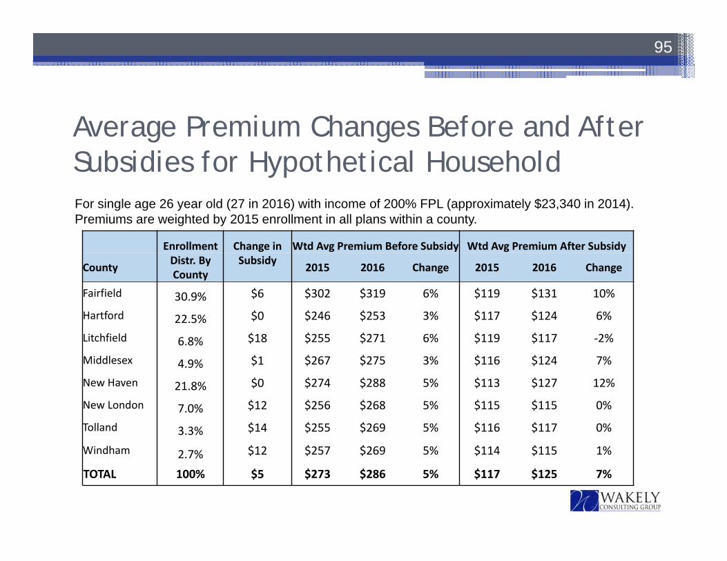
Average Premium Changes Before and After Subsidies for Hypothetical Household
95
For single age 26 year old (27 in 2016) with income of 200% FPL (approximately $23,340 in 2014).Premiums are weighted by 2015 enrollment in all plans within a county.
Enrollment Change in Wtd Avg Premium Before Subsidy Wtd Avg Premium After Subsidy
County Distr. By County
Subsidy 2015 2016 Change 2015 2016 Change
Fairfield 30.9% $6 $302 $319 6% $119 $131 10%
Hartford 22.5% $0 $246 $253 3% $117 $124 6%
Litchfield 6.8% $18 $255 $271 6% $119 $117 ‐2%
Middlesex 4.9% $1 $267 $275 3% $116 $124 7%
New Haven 21.8% $0 $274 $288 5% $113 $127 12%
New London 7.0% $12 $256 $268 5% $115 $115 0%
Tolland 3.3% $14 $255 $269 5% $116 $117 0%
Windham 2.7% $12 $257 $269 5% $114 $115 1%
TOTAL 100% $5 $273 $286 5% $117 $125 7%
96
2016 Rate Changes
97
• Rate changes in this section reflect premium changes from 2015 to 2016 based on carrier plan mappings provided to Wakely by AHCT
• Weighted averages are based on enrollment by plan and county provided to Wakely by AHCT (individual market only)
98
Background
Appendix A
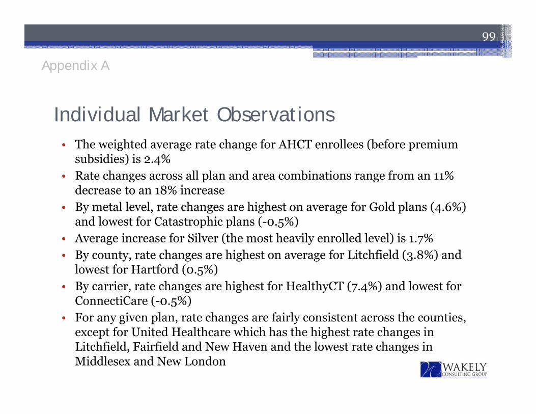
• The weighted average rate change for AHCT enrollees (before premium subsidies) is 2.4%
• Rate changes across all plan and area combinations range from an 11% decrease to an 18% increase
• By metal level, rate changes are highest on average for Gold plans (4.6%) and lowest for Catastrophic plans (-0.5%)
• Average increase for Silver (the most heavily enrolled level) is 1.7%• By county, rate changes are highest on average for Litchfield (3.8%) and
lowest for Hartford (0.5%)• By carrier, rate changes are highest for HealthyCT (7.4%) and lowest for
ConnectiCare (-0.5%)• For any given plan, rate changes are fairly consistent across the counties,
except for United Healthcare which has the highest rate changes in Litchfield, Fairfield and New Haven and the lowest rate changes in Middlesex and New London
99
Individual Market Observations
Appendix A
100
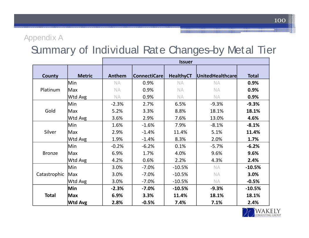
Issuer
County Metric Anthem ConnectiCare HealthyCT UnitedHealthcare Total
PlatinumMin NA 0.9% NA NA 0.9%Max NA 0.9% NA NA 0.9%Wtd Avg NA 0.9% NA NA 0.9%
GoldMin ‐2.3% 2.7% 6.5% ‐9.3% ‐9.3%Max 5.2% 3.3% 8.8% 18.1% 18.1%Wtd Avg 3.6% 2.9% 7.6% 13.0% 4.6%
SilverMin 1.6% ‐1.6% 7.9% ‐8.1% ‐8.1%Max 2.9% ‐1.4% 11.4% 5.1% 11.4%Wtd Avg 1.9% ‐1.4% 8.3% 2.0% 1.7%
BronzeMin ‐0.2% ‐6.2% 0.1% ‐5.7% ‐6.2%Max 6.9% 1.7% 4.0% 9.6% 9.6%Wtd Avg 4.2% 0.6% 2.2% 4.3% 2.4%
CatastrophicMin 3.0% ‐7.0% ‐10.5% NA ‐10.5%Max 3.0% ‐7.0% ‐10.5% NA 3.0%Wtd Avg 3.0% ‐7.0% ‐10.5% NA ‐0.5%
TotalMin ‐2.3% ‐7.0% ‐10.5% ‐9.3% ‐10.5%Max 6.9% 3.3% 11.4% 18.1% 18.1%Wtd Avg 2.8% ‐0.5% 7.4% 7.1% 2.4%
Appendix A
Summary of Individual Rate Changes–by Metal Tier
101
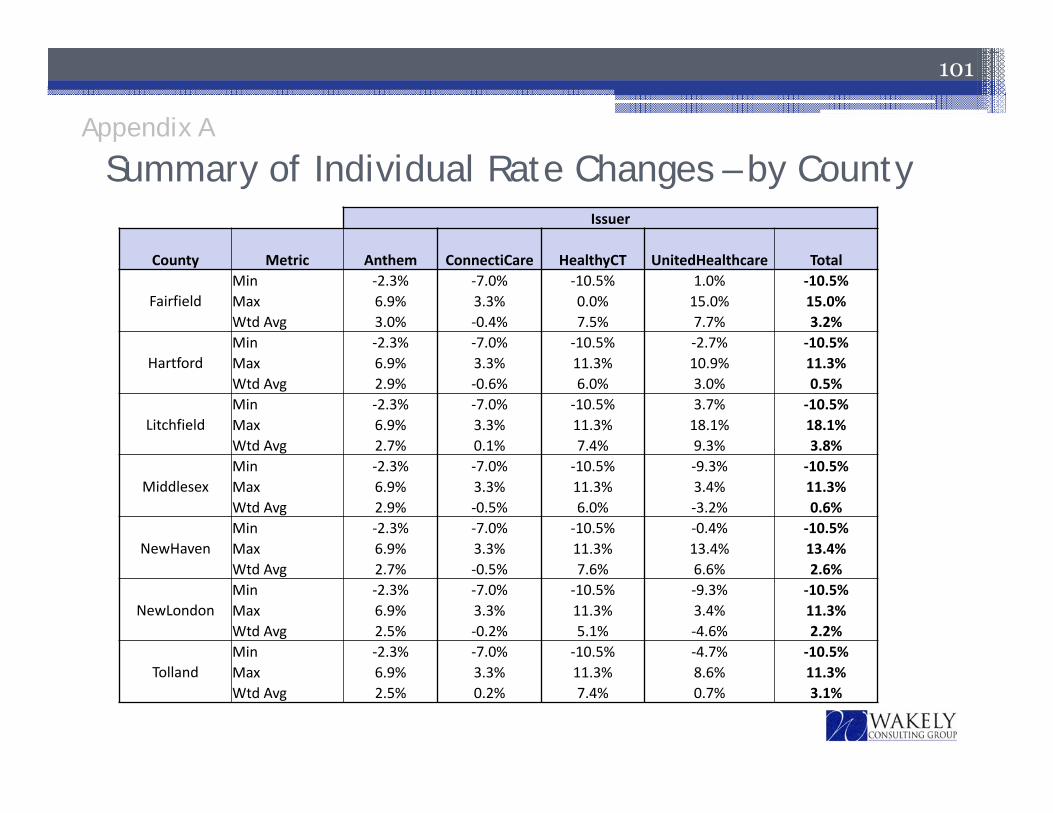
Summary of Individual Rate Changes – by CountyIssuer
County Metric Anthem ConnectiCare HealthyCT UnitedHealthcare Total
FairfieldMin ‐2.3% ‐7.0% ‐10.5% 1.0% ‐10.5%Max 6.9% 3.3% 0.0% 15.0% 15.0%Wtd Avg 3.0% ‐0.4% 7.5% 7.7% 3.2%
HartfordMin ‐2.3% ‐7.0% ‐10.5% ‐2.7% ‐10.5%Max 6.9% 3.3% 11.3% 10.9% 11.3%Wtd Avg 2.9% ‐0.6% 6.0% 3.0% 0.5%
LitchfieldMin ‐2.3% ‐7.0% ‐10.5% 3.7% ‐10.5%Max 6.9% 3.3% 11.3% 18.1% 18.1%Wtd Avg 2.7% 0.1% 7.4% 9.3% 3.8%
MiddlesexMin ‐2.3% ‐7.0% ‐10.5% ‐9.3% ‐10.5%Max 6.9% 3.3% 11.3% 3.4% 11.3%Wtd Avg 2.9% ‐0.5% 6.0% ‐3.2% 0.6%
NewHavenMin ‐2.3% ‐7.0% ‐10.5% ‐0.4% ‐10.5%Max 6.9% 3.3% 11.3% 13.4% 13.4%Wtd Avg 2.7% ‐0.5% 7.6% 6.6% 2.6%
NewLondonMin ‐2.3% ‐7.0% ‐10.5% ‐9.3% ‐10.5%Max 6.9% 3.3% 11.3% 3.4% 11.3%Wtd Avg 2.5% ‐0.2% 5.1% ‐4.6% 2.2%
TollandMin ‐2.3% ‐7.0% ‐10.5% ‐4.7% ‐10.5%Max 6.9% 3.3% 11.3% 8.6% 11.3%Wtd Avg 2.5% 0.2% 7.4% 0.7% 3.1%
Appendix A
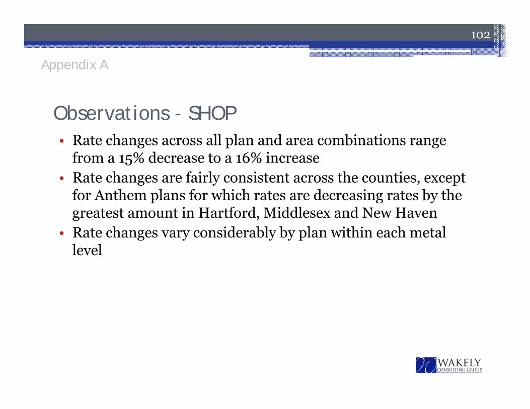
• Rate changes across all plan and area combinations range from a 15% decrease to a 16% increase
• Rate changes are fairly consistent across the counties, except for Anthem plans for which rates are decreasing rates by the greatest amount in Hartford, Middlesex and New Haven
• Rate changes vary considerably by plan within each metal level
102
Observations - SHOP
Appendix A
103
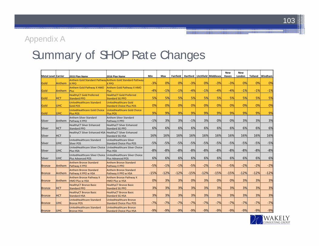
Appendix A
Summary of SHOP Rate ChangesMetal Level Carrier 2015 Plan Name 2016 Plan Name Min Max Fairfield Hartford Litchfield Middlesex
New Haven
New London Tolland Windham
Gold AnthemAnthem Gold Standard Pathway X PPO
Anthem Gold Standard Pathway X PPO ‐3% 0% 0% ‐3% 0% ‐3% ‐3% 0% 0% 0%
Gold AnthemAnthem Gold Pathway X HMO Plus
Anthem Gold Pathway X HMO Plus ‐4% ‐1% ‐1% ‐4% ‐1% ‐4% ‐4% ‐1% ‐1% ‐1%
Gold HCTHealthyCT Gold Preferred Standard PPO
HealthyCT Gold Preferred Standard SG PPO 5% 5% 5% 5% 5% 5% 5% 5% 5% 5%
Gold UHCUnitedHealthcare Standard Gold POS
UnitedHealthcare Gold Standard Choice Plus POS 0% 0% 0% 0% 0% 0% 0% 0% 0% 0%
Gold UHCUnitedHealthcare Gold Choice Plus POS
UnitedHealthcare Gold Choice Plus POS 9% 9% 9% 9% 9% 9% 9% 9% 9% 9%
Silver AnthemAnthem Silver Standard Pathway X PPO
Anthem Silver Standard Pathway X PPO ‐1% 3% 3% ‐1% 3% 0% 0% 3% 3% 3%
Silver HCTHealthyCT Silver Enhanced Standard PPO
HealthyCT Silver Enhanced Standard SG PPO 6% 6% 6% 6% 6% 6% 6% 6% 6% 6%
Silver HCTHealthyCT Silver Enhanced HSA 1
HealthyCT Silver Enhanced Standard SG HSA 16% 16% 16% 16% 16% 16% 16% 16% 16% 16%
Silver UHCUnitedHealthcare Standard Silver POS
UnitedHealthcare Silver Standard Choice Plus POS ‐5% ‐5% ‐5% ‐5% ‐5% ‐5% ‐5% ‐5% ‐5% ‐5%
Silver UHCUnitedHealthcare Silver Choice Plus HSA
UnitedHealthcare Silver Choice Plus HSA ‐8% ‐8% ‐8% ‐8% ‐8% ‐8% ‐8% ‐8% ‐8% ‐8%
Silver UHCUnitedHealthcare Silver Choice Plus Advanced POS
UnitedHealthcare Silver Choice Plus Advanced POS 6% 6% 6% 6% 6% 6% 6% 6% 6% 6%
Bronze AnthemAnthem Bronze Standard Pathway X PPO
Anthem Bronze Standard Pathway X PPO ‐5% ‐1% ‐1% ‐5% ‐2% ‐5% ‐5% ‐2% ‐2% ‐2%
Bronze AnthemAnthem Bronze Standard Pathway X PPO w HSA
Anthem Bronze Standard Pathway X PPO w HSA ‐15% ‐12% ‐12% ‐15% ‐12% ‐15% ‐15% ‐12% ‐12% ‐12%
Bronze AnthemAnthem Bronze Pathway X HMO Plus w HSA
Anthem Bronze Pathway X HMO Plus w HSA 0% 3% 3% 0% 3% 0% 0% 3% 3% 3%
Bronze HCTHealthyCT Bronze Basic Standard PPO
HealthyCT Bronze Basic Standard SG PPO 3% 3% 3% 3% 3% 3% 3% 3% 3% 3%
Bronze HCTHealthyCT Bronze Basic Standard HSA
HealthyCT Bronze Basic Standard SG HSA 3% 3% 3% 3% 3% 3% 3% 3% 3% 3%
Bronze UHCUnitedHealthcare Standard Bronze POS
UnitedHealthcare Bronze Standard Choice Plus POS ‐7% ‐7% ‐7% ‐7% ‐7% ‐7% ‐7% ‐7% ‐7% ‐7%
Bronze UHCUnitedHealthcare Standard Bronze HSA
UnitedHealthcare Bronze Standard Choice Plus HSA ‐9% ‐9% ‐9% ‐9% ‐9% ‐9% ‐9% ‐9% ‐9% ‐9%

Approaches to Reducing Rates
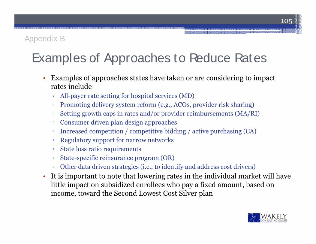
104
105
• Examples of approaches states have taken or are considering to impact rates include▫ All-payer rate setting for hospital services (MD)▫ Promoting delivery system reform (e.g., ACOs, provider risk sharing)▫ Setting growth caps in rates and/or provider reimbursements (MA/RI)▫ Consumer driven plan design approaches▫ Increased competition / competitive bidding / active purchasing (CA)▫ Regulatory support for narrow networks▫ State loss ratio requirements▫ State-specific reinsurance program (OR)▫ Other data driven strategies (i.e., to identify and address cost drivers)
• It is important to note that lowering rates in the individual market will have little impact on subsidized enrollees who pay a fixed amount, based on income, toward the Second Lowest Cost Silver plan
Examples of Approaches to Reduce Rates
Appendix B
Consumer Impact Analysis
106
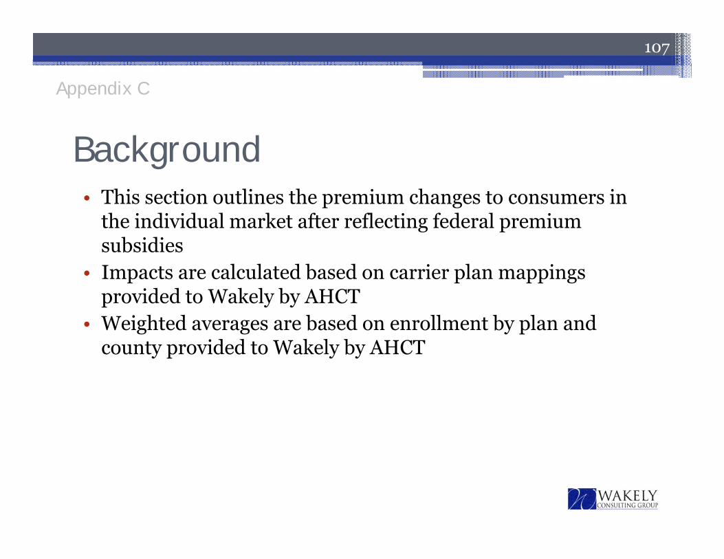
• This section outlines the premium changes to consumers in the individual market after reflecting federal premium subsidies
• Impacts are calculated based on carrier plan mappings provided to Wakely by AHCT
• Weighted averages are based on enrollment by plan and county provided to Wakely by AHCT
107
Background
Appendix C
Background
108
• Premium impact for individuals and households vary based on:▫ Member age(s)▫ The number of family members▫ Geographic region▫ Eligibility for subsidies, i.e. advanced premium tax credit
(“APTC”)▫ Income and household size▫ Plan selection
Appendix C
Subsidy Calculation
• Subsidy eligible households receive a premium subsidy that is equal to difference between▫ The full premium for the second lowest cost silver
(benchmark) plan available for the covered family members
▫ A portion of their household income as defined on the next slide
109
Appendix C
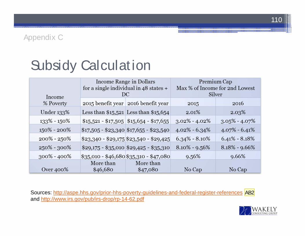
Subsidy Calculation
110
Sources: http://aspe.hhs.gov/prior-hhs-poverty-guidelines-and-federal-register-referencesand http://www.irs.gov/pub/irs-drop/rp-14-62.pdf
Appendix C
AB2
Slide 110
AB2 I did not update the source - we updated the table ourselves this year - not sure there is a source to citeAree Bly, 9/11/2015
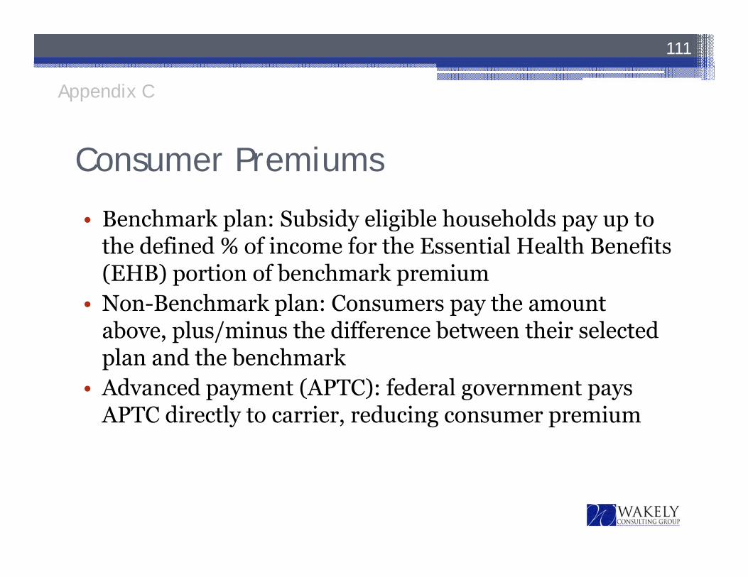
Consumer Premiums
• Benchmark plan: Subsidy eligible households pay up to the defined % of income for the Essential Health Benefits (EHB) portion of benchmark premium
• Non-Benchmark plan: Consumers pay the amount above, plus/minus the difference between their selected plan and the benchmark
• Advanced payment (APTC): federal government pays APTC directly to carrier, reducing consumer premium
111
Appendix C
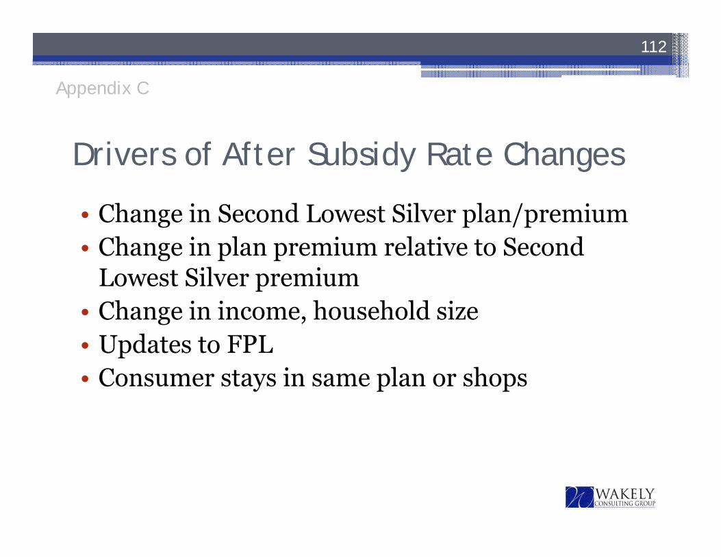
Drivers of After Subsidy Rate Changes
• Change in Second Lowest Silver plan/premium• Change in plan premium relative to Second
Lowest Silver premium• Change in income, household size• Updates to FPL• Consumer stays in same plan or shops
112
Appendix C

Change in Benchmark Plan and Subsidies• The next slide illustrates the change in the benchmark (second
lowest cost silver plan) by county for an age 21 individual, assuming no aging
• Key observations include:▫ The benchmark carrier is changing in four of the eight counties▫ Benchmark premium changes vary by county from -1.3% to 5.4%▫ Litchfield has the highest rate increase / subsidy increase▫ Benchmark premium is decreasing in Hartford, Middlesex and
New Haven
113
Appendix C
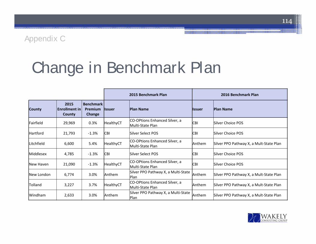
Change in Benchmark Plan
114
49% 2015 Benchmark Plan 2016 Benchmark Plan
County2015
Enrollment in County
Benchmark Premium Change
Issuer Plan Name Issuer Plan Name
Fairfield 29,969 0.3% HealthyCT CO‐OPtions Enhanced Silver, a Multi‐State Plan CBI Silver Choice POS
Hartford 21,793 ‐1.3% CBI Silver Select POS CBI Silver Choice POS
Litchfield 6,600 5.4% HealthyCT CO‐OPtions Enhanced Silver, a Multi‐State Plan Anthem Silver PPO Pathway X, a Mult‐State Plan
Middlesex 4,785 ‐1.3% CBI Silver Select POS CBI Silver Choice POS
New Haven 21,090 ‐1.3% HealthyCT CO‐OPtions Enhanced Silver, a Multi‐State Plan CBI Silver Choice POS
New London 6,774 3.0% Anthem Silver PPO Pathway X, a Multi‐State Plan Anthem Silver PPO Pathway X, a Mult‐State Plan
Tolland 3,227 3.7% HealthyCT CO‐OPtions Enhanced Silver, a Multi‐State Plan Anthem Silver PPO Pathway X, a Mult‐State Plan
Windham 2,633 3.0% Anthem Silver PPO Pathway X, a Multi‐State Plan Anthem Silver PPO Pathway X, a Mult‐State Plan
Appendix C
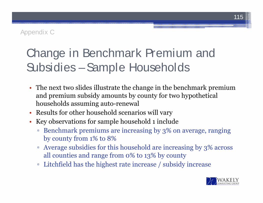
Change in Benchmark Premium and Subsidies – Sample Households
• The next two slides illustrate the change in the benchmark premium and premium subsidy amounts by county for two hypothetical households assuming auto-renewal
• Results for other household scenarios will vary• Key observations for sample household 1 include▫ Benchmark premiums are increasing by 3% on average, ranging
by county from 1% to 8%▫ Average subsidies for this household are increasing by 3% across
all counties and range from 0% to 13% by county▫ Litchfield has the highest rate increase / subsidy increase
115
Appendix C
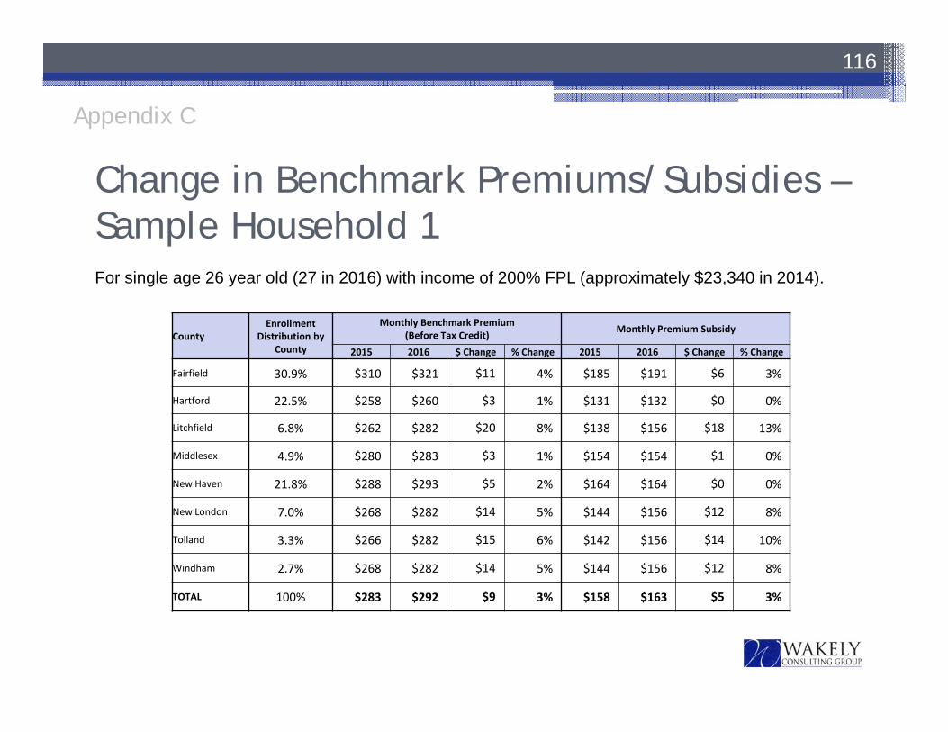
Change in Benchmark Premiums/Subsidies –Sample Household 1
116
CountyEnrollment
Distribution by County
Monthly Benchmark Premium (Before Tax Credit) Monthly Premium Subsidy
2015 2016 $ Change % Change 2015 2016 $ Change % Change
Fairfield 30.9% $310 $321 $11 4% $185 $191 $6 3%
Hartford 22.5% $258 $260 $3 1% $131 $132 $0 0%
Litchfield 6.8% $262 $282 $20 8% $138 $156 $18 13%
Middlesex 4.9% $280 $283 $3 1% $154 $154 $1 0%
New Haven 21.8% $288 $293 $5 2% $164 $164 $0 0%
New London 7.0% $268 $282 $14 5% $144 $156 $12 8%
Tolland 3.3% $266 $282 $15 6% $142 $156 $14 10%
Windham 2.7% $268 $282 $14 5% $144 $156 $12 8%
TOTAL 100% $283 $292 $9 3% $158 $163 $5 3%
For single age 26 year old (27 in 2016) with income of 200% FPL (approximately $23,340 in 2014).
Appendix C
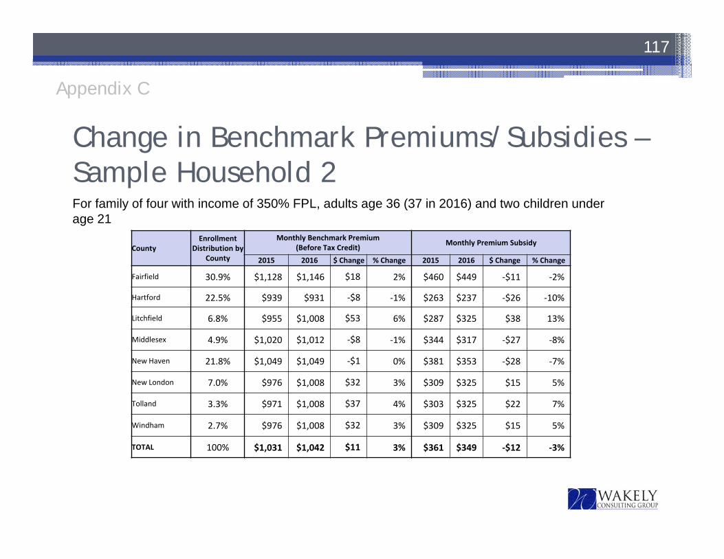
Change in Benchmark Premiums/Subsidies –Sample Household 2
117
CountyEnrollment
Distribution by County
Monthly Benchmark Premium (Before Tax Credit) Monthly Premium Subsidy
2015 2016 $ Change % Change 2015 2016 $ Change % Change
Fairfield 30.9% $1,128 $1,146 $18 2% $460 $449 ‐$11 ‐2%
Hartford 22.5% $939 $931 ‐$8 ‐1% $263 $237 ‐$26 ‐10%
Litchfield 6.8% $955 $1,008 $53 6% $287 $325 $38 13%
Middlesex 4.9% $1,020 $1,012 ‐$8 ‐1% $344 $317 ‐$27 ‐8%
New Haven 21.8% $1,049 $1,049 ‐$1 0% $381 $353 ‐$28 ‐7%
New London 7.0% $976 $1,008 $32 3% $309 $325 $15 5%
Tolland 3.3% $971 $1,008 $37 4% $303 $325 $22 7%
Windham 2.7% $976 $1,008 $32 3% $309 $325 $15 5%
TOTAL 100% $1,031 $1,042 $11 3% $361 $349 ‐$12 ‐3%
For family of four with income of 350% FPL, adults age 36 (37 in 2016) and two children under age 21
Appendix C

Weighted Average Premium Changes –Sample Households• The following slides show the change in average premium by area
(weighted by AHCT enrollment by plan in each area) before and after subsidy for two different household scenarios (defined at the top of each page)
• Averages are weighted by enrollment based on 2015 distribution by county and plan provided by AHCT
• The table shows rate changes before and after subsidy assuming the household auto-renews in 2016 based on its 2015 plan
• Averages represent the impact if all enrollees in the county had the same household characteristics as the example
• Impact will vary for other household scenarios
118
Appendix C

Weighted Average Premium Changes –Sample Household 1
119
For single age 26 year old (27 in 2016) with income of 200% FPL (approximately $23,340 in 2014).Premiums are weighted by 2015 enrollment in all plans within a county.
Enrollment Change in Wtd Avg Premium Before Subsidy Wtd Avg Premium After Subsidy
County Distr. By County
Subsidy 2015 2016 Change 2015 2016 Change
Fairfield 30.9% $6 $302 $319 6% $119 $131 10%Hartford 22.5% $0 $246 $253 3% $117 $124 6%Litchfield 6.8% $18 $255 $271 6% $119 $117 ‐2%Middlesex 4.9% $1 $267 $275 3% $116 $124 7%New Haven 21.8% $0 $274 $288 5% $113 $127 12%New London 7.0% $12 $256 $268 5% $115 $115 0%Tolland 3.3% $14 $255 $269 5% $116 $117 0%Windham 2.7% $12 $257 $269 5% $114 $115 1%
TOTAL 100% $5 $273 $286 5% $117 $125 7%
Appendix C
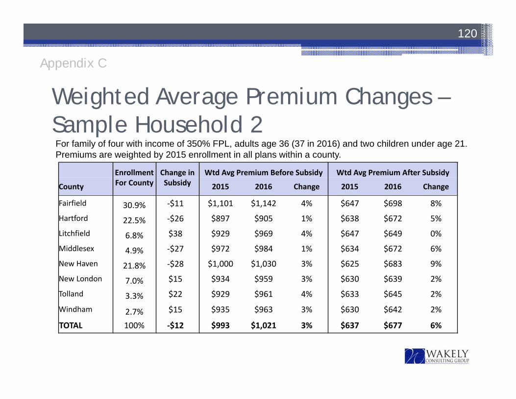
Weighted Average Premium Changes –Sample Household 2
120
For family of four with income of 350% FPL, adults age 36 (37 in 2016) and two children under age 21.Premiums are weighted by 2015 enrollment in all plans within a county.
Enrollment Change in Wtd Avg Premium Before Subsidy Wtd Avg Premium After Subsidy
County For County Subsidy 2015 2016 Change 2015 2016 Change
Fairfield 30.9% ‐$11 $1,101 $1,142 4% $647 $698 8%
Hartford 22.5% ‐$26 $897 $905 1% $638 $672 5%
Litchfield 6.8% $38 $929 $969 4% $647 $649 0%
Middlesex 4.9% ‐$27 $972 $984 1% $634 $672 6%
New Haven 21.8% ‐$28 $1,000 $1,030 3% $625 $683 9%
New London 7.0% $15 $934 $959 3% $630 $639 2%
Tolland 3.3% $22 $929 $961 4% $633 $645 2%
Windham 2.7% $15 $935 $963 3% $630 $642 2%
TOTAL 100% ‐$12 $993 $1,021 3% $637 $677 6%
Appendix C
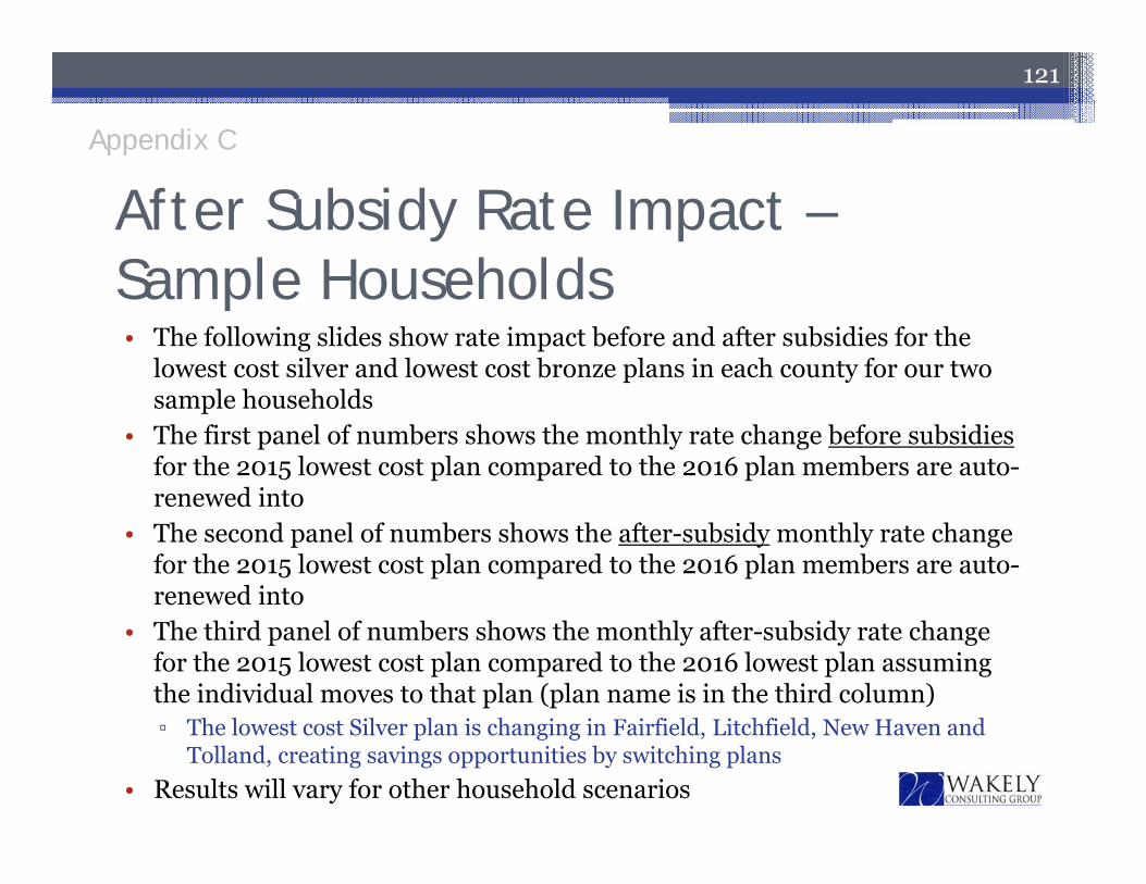
After Subsidy Rate Impact –Sample Households• The following slides show rate impact before and after subsidies for the
lowest cost silver and lowest cost bronze plans in each county for our two sample households
• The first panel of numbers shows the monthly rate change before subsidies for the 2015 lowest cost plan compared to the 2016 plan members are auto-renewed into
• The second panel of numbers shows the after-subsidy monthly rate change for the 2015 lowest cost plan compared to the 2016 plan members are auto-renewed into
• The third panel of numbers shows the monthly after-subsidy rate change for the 2015 lowest cost plan compared to the 2016 lowest plan assuming the individual moves to that plan (plan name is in the third column)▫ The lowest cost Silver plan is changing in Fairfield, Litchfield, New Haven and
Tolland, creating savings opportunities by switching plans• Results will vary for other household scenarios
121
Appendix C
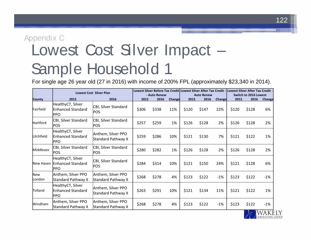
Lowest Cost Silver Impact –Sample Household 1
122
For single age 26 year old (27 in 2016) with income of 200% FPL (approximately $23,340 in 2014).
Lowest Cost Silver Plan Lowest Silver Before Tax Credit ‐ Auto Renew
Lowest Silver After Tax Credit ‐Auto Renew
Lowest Silver After Tax Credit ‐Switch to 2016 Lowest
County 2015 2016 2015 2016 Change 2015 2016 Change 2015 2016 Change
FairfieldHealthyCT, Silver Enhanced Standard PPO
CBI, Silver Standard POS $306 $338 11% $120 $147 22% $120 $128 6%
Hartford CBI, Silver Standard POS
CBI, Silver Standard POS $257 $259 1% $126 $128 2% $126 $128 2%
LitchfieldHealthyCT, Silver Enhanced Standard PPO
Anthem, Silver PPO Standard Pathway X $259 $286 10% $121 $130 7% $121 $122 1%
Middlesex CBI, Silver Standard POS
CBI, Silver Standard POS $280 $282 1% $126 $128 2% $126 $128 2%
New HavenHealthyCT, Silver Enhanced Standard PPO
CBI, Silver Standard POS $284 $314 10% $121 $150 24% $121 $128 6%
New London
Anthem, Silver PPO Standard Pathway X
Anthem, Silver PPO Standard Pathway X $268 $278 4% $123 $122 ‐1% $123 $122 ‐1%
TollandHealthyCT, Silver Enhanced Standard PPO
Anthem, Silver PPO Standard Pathway X $263 $291 10% $121 $134 11% $121 $122 1%
Windham Anthem, Silver PPO Standard Pathway X
Anthem, Silver PPO Standard Pathway X $268 $278 4% $123 $122 ‐1% $123 $122 ‐1%
Appendix C

Lowest Cost Silver Impact –Sample Household 2
123
For family of four with income of 350% FPL, adults age 36 (37 in 2016) and two children under age 21.
Lowest Cost Silver Plan Lowest Silver Before Tax Credit ‐ Auto Renew
Lowest Silver After Tax Credit ‐Auto Renew
Lowest Silver After Tax Credit ‐Switch to 2016 Lowest
County 2015 2016 2015 2016 Change 2015 2016 Change 2015 2016 Change
FairfieldHealthyCT, Silver Enhanced Standard PPO
CBI, Silver Standard POS $1,114 $1,208 8% $654 $759 16% $654 $692 6%
Hartford CBI, Silver Standard POS
CBI, Silver Standard POS $937 $927 ‐1% $674 $690 2% $674 $690 2%
LitchfieldHealthyCT, Silver Enhanced Standard PPO
Anthem, Silver PPO Standard Pathway X $943 $1,022 8% $656 $697 6% $656 $670 2%
Middlesex CBI, Silver Standard POS
CBI, Silver Standard POS $1,018 $1,008 ‐1% $675 $691 2% $675 $691 2%
New HavenHealthyCT, Silver Enhanced Standard PPO
CBI, Silver Standard POS $1,036 $1,123 8% $655 $769 17% $655 $691 6%
New London
Anthem, Silver PPO Standard Pathway X
Anthem, Silver PPO Standard Pathway X $975 $995 2% $666 $670 1% $666 $670 1%
TollandHealthyCT, Silver Enhanced Standard PPO
Anthem, Silver PPO Standard Pathway X $959 $1,039 8% $656 $714 9% $656 $670 2%
Windham Anthem, Silver PPO Standard Pathway X
Anthem, Silver PPO Standard Pathway X $975 $995 2% $666 $670 1% $666 $670 1%
Appendix C
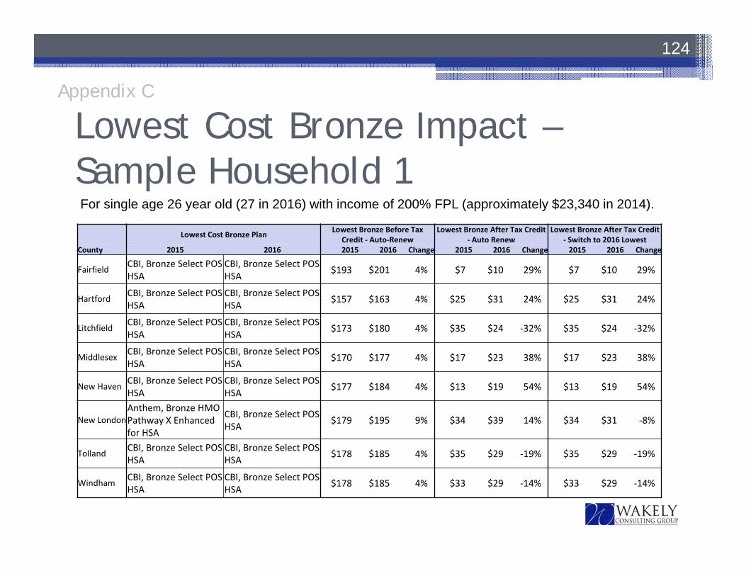
Lowest Cost Bronze Impact –Sample Household 1
124
Lowest Cost Bronze Plan Lowest Bronze Before Tax Credit ‐ Auto‐Renew
Lowest Bronze After Tax Credit ‐ Auto Renew
Lowest Bronze After Tax Credit ‐ Switch to 2016 Lowest
County 2015 2016 2015 2016 Change 2015 2016 Change 2015 2016 Change
Fairfield CBI, Bronze Select POS HSA
CBI, Bronze Select POS HSA $193 $201 4% $7 $10 29% $7 $10 29%
Hartford CBI, Bronze Select POS HSA
CBI, Bronze Select POS HSA $157 $163 4% $25 $31 24% $25 $31 24%
Litchfield CBI, Bronze Select POS HSA
CBI, Bronze Select POS HSA $173 $180 4% $35 $24 ‐32% $35 $24 ‐32%
Middlesex CBI, Bronze Select POS HSA
CBI, Bronze Select POS HSA $170 $177 4% $17 $23 38% $17 $23 38%
New Haven CBI, Bronze Select POS HSA
CBI, Bronze Select POS HSA $177 $184 4% $13 $19 54% $13 $19 54%
New LondonAnthem, Bronze HMO Pathway X Enhanced for HSA
CBI, Bronze Select POS HSA $179 $195 9% $34 $39 14% $34 $31 ‐8%
Tolland CBI, Bronze Select POS HSA
CBI, Bronze Select POS HSA $178 $185 4% $35 $29 ‐19% $35 $29 ‐19%
Windham CBI, Bronze Select POS HSA
CBI, Bronze Select POS HSA $178 $185 4% $33 $29 ‐14% $33 $29 ‐14%
Appendix C
For single age 26 year old (27 in 2016) with income of 200% FPL (approximately $23,340 in 2014).
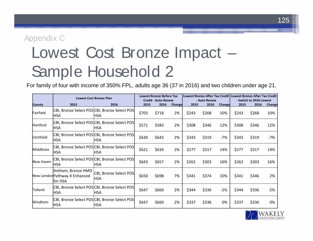
Lowest Cost Bronze Impact –Sample Household 2
125
Lowest Cost Bronze Plan Lowest Bronze Before Tax Credit ‐ Auto‐Renew
Lowest Bronze After Tax Credit ‐ Auto Renew
Lowest Bronze After Tax Credit ‐ Switch to 2016 Lowest
County 2015 2016 2015 2016 Change 2015 2016 Change 2015 2016 Change
Fairfield CBI, Bronze Select POS HSA
CBI, Bronze Select POS HSA $703 $718 2% $243 $268 10% $243 $268 10%
Hartford CBI, Bronze Select POS HSA
CBI, Bronze Select POS HSA $571 $583 2% $308 $346 12% $308 $346 12%
Litchfield CBI, Bronze Select POS HSA
CBI, Bronze Select POS HSA $630 $643 2% $343 $319 ‐7% $343 $319 ‐7%
Middlesex CBI, Bronze Select POS HSA
CBI, Bronze Select POS HSA $621 $634 2% $277 $317 14% $277 $317 14%
New Haven CBI, Bronze Select POS HSA
CBI, Bronze Select POS HSA $643 $657 2% $262 $303 16% $262 $303 16%
New LondonAnthem, Bronze HMO Pathway X Enhanced for HSA
CBI, Bronze Select POS HSA $650 $698 7% $341 $374 10% $341 $346 2%
Tolland CBI, Bronze Select POS HSA
CBI, Bronze Select POS HSA $647 $660 2% $344 $336 ‐2% $344 $336 ‐2%
Windham CBI, Bronze Select POS HSA
CBI, Bronze Select POS HSA $647 $660 2% $337 $336 0% $337 $336 0%
Appendix C
For family of four with income of 350% FPL, adults age 36 (37 in 2016) and two children under age 21.
Weighted Average Premium Change by County and Metal Tier – Sample Households• The following slides show average premium changes by
county and metal tier before and after subsidies for two different household scenarios (defined at the top of each page)▫ Averages are weighted by enrollment based on 2015 distribution
by county and plan provided by AHCT• Assumes the household auto-renews in 2016 based on its 2015
plan.• Counties with higher increases in benchmark plan rates have
lower after subsidy rate increases.
126
Appendix C
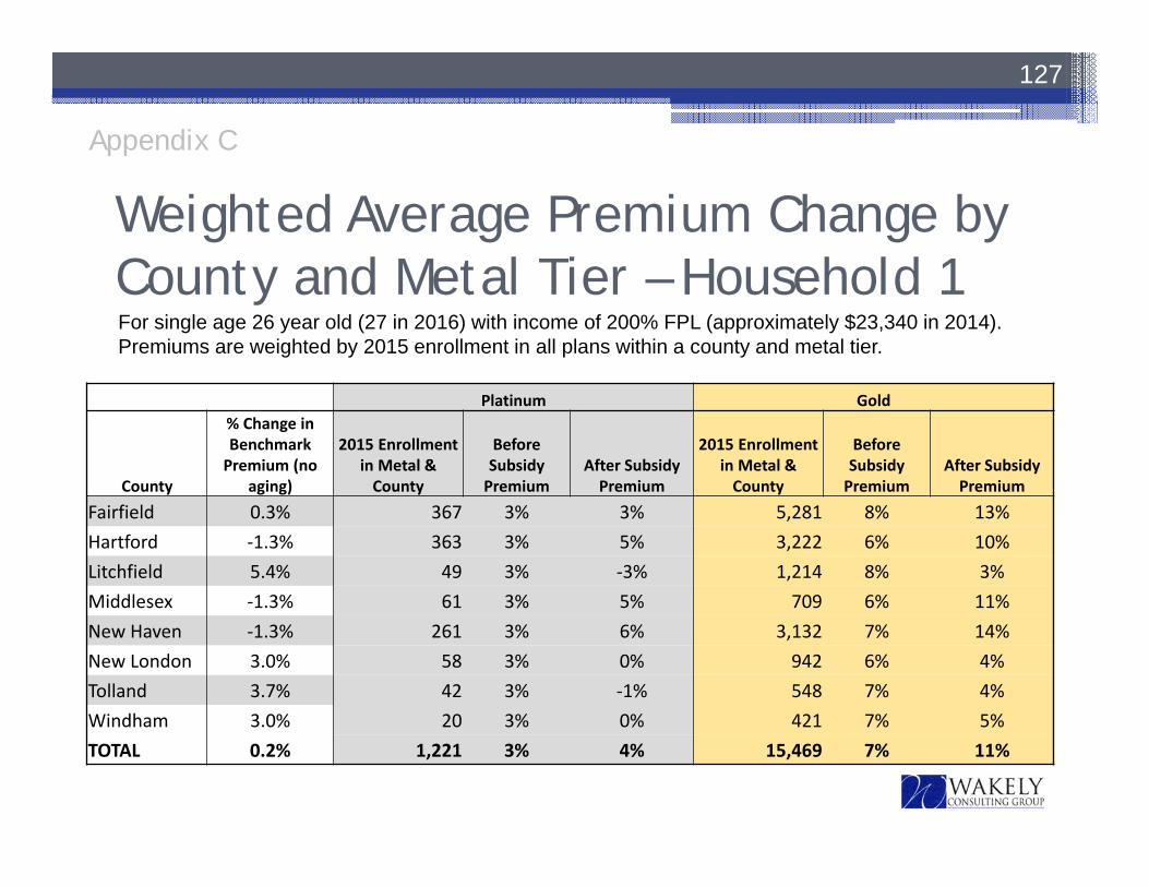
Weighted Average Premium Change by County and Metal Tier – Household 1
127
For single age 26 year old (27 in 2016) with income of 200% FPL (approximately $23,340 in 2014).Premiums are weighted by 2015 enrollment in all plans within a county and metal tier.
Platinum Gold
County
% Change in Benchmark Premium (no
aging)
2015 Enrollment in Metal & County
Before SubsidyPremium
After Subsidy Premium
2015 Enrollment in Metal & County
Before Subsidy Premium
After Subsidy Premium
Fairfield 0.3% 367 3% 3% 5,281 8% 13%Hartford ‐1.3% 363 3% 5% 3,222 6% 10%Litchfield 5.4% 49 3% ‐3% 1,214 8% 3%Middlesex ‐1.3% 61 3% 5% 709 6% 11%New Haven ‐1.3% 261 3% 6% 3,132 7% 14%New London 3.0% 58 3% 0% 942 6% 4%Tolland 3.7% 42 3% ‐1% 548 7% 4%Windham 3.0% 20 3% 0% 421 7% 5%TOTAL 0.2% 1,221 3% 4% 15,469 7% 11%
Appendix C
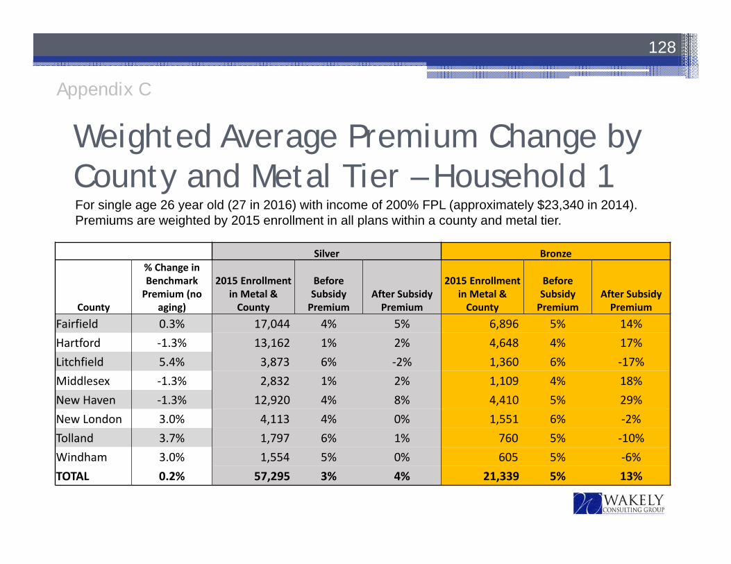
Weighted Average Premium Change by County and Metal Tier – Household 1
128
For single age 26 year old (27 in 2016) with income of 200% FPL (approximately $23,340 in 2014).Premiums are weighted by 2015 enrollment in all plans within a county and metal tier.
Silver Bronze
County
% Change in Benchmark Premium (no
aging)
2015 Enrollment in Metal & County
Before Subsidy Premium
After Subsidy Premium
2015 Enrollment in Metal & County
Before Subsidy Premium
After Subsidy Premium
Fairfield 0.3% 17,044 4% 5% 6,896 5% 14%Hartford ‐1.3% 13,162 1% 2% 4,648 4% 17%Litchfield 5.4% 3,873 6% ‐2% 1,360 6% ‐17%Middlesex ‐1.3% 2,832 1% 2% 1,109 4% 18%New Haven ‐1.3% 12,920 4% 8% 4,410 5% 29%New London 3.0% 4,113 4% 0% 1,551 6% ‐2%Tolland 3.7% 1,797 6% 1% 760 5% ‐10%Windham 3.0% 1,554 5% 0% 605 5% ‐6%TOTAL 0.2% 57,295 3% 4% 21,339 5% 13%
Appendix C
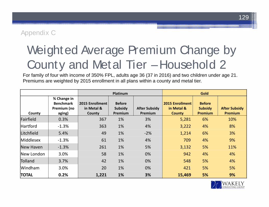
Weighted Average Premium Change by County and Metal Tier – Household 2
129
For family of four with income of 350% FPL, adults age 36 (37 in 2016) and two children under age 21.Premiums are weighted by 2015 enrollment in all plans within a county and metal tier.
Platinum Gold
County
% Change in Benchmark Premium (no
aging)
2015 Enrollment in Metal & County
Before Subsidy Premium
After Subsidy Premium
2015 Enrollment in Metal & County
BeforeSubsidyPremium
After Subsidy Premium
Fairfield 0.3% 367 1% 3% 5,281 6% 10%Hartford ‐1.3% 363 1% 4% 3,222 4% 8%Litchfield 5.4% 49 1% ‐2% 1,214 6% 3%Middlesex ‐1.3% 61 1% 4% 709 4% 9%New Haven ‐1.3% 261 1% 5% 3,132 5% 11%New London 3.0% 58 1% 0% 942 4% 4%Tolland 3.7% 42 1% 0% 548 5% 4%Windham 3.0% 20 1% 0% 421 5% 5%TOTAL 0.2% 1,221 1% 3% 15,469 5% 9%
Appendix C
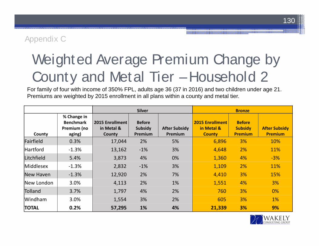
Weighted Average Premium Change by County and Metal Tier – Household 2
130
For family of four with income of 350% FPL, adults age 36 (37 in 2016) and two children under age 21.Premiums are weighted by 2015 enrollment in all plans within a county and metal tier.
Silver Bronze
County
% Change in Benchmark Premium (no
aging)
2015 Enrollment in Metal & County
Before Subsidy Premium
After Subsidy Premium
2015 Enrollment in Metal & County
Before Subsidy Premium
After Subsidy Premium
Fairfield 0.3% 17,044 2% 5% 6,896 3% 10%Hartford ‐1.3% 13,162 ‐1% 3% 4,648 2% 11%Litchfield 5.4% 3,873 4% 0% 1,360 4% ‐3%Middlesex ‐1.3% 2,832 ‐1% 3% 1,109 2% 11%New Haven ‐1.3% 12,920 2% 7% 4,410 3% 15%New London 3.0% 4,113 2% 1% 1,551 4% 3%Tolland 3.7% 1,797 4% 2% 760 3% 0%Windham 3.0% 1,554 3% 2% 605 3% 1%TOTAL 0.2% 57,295 1% 4% 21,339 3% 9%
Appendix C
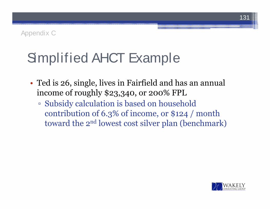
Simplified AHCT Example
• Ted is 26, single, lives in Fairfield and has an annual income of roughly $23,340, or 200% FPL▫ Subsidy calculation is based on household
contribution of 6.3% of income, or $124 / month toward the 2nd lowest cost silver plan (benchmark)
131
Appendix C
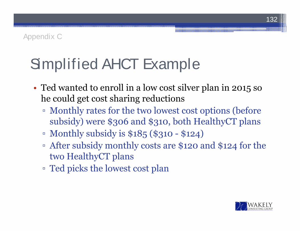
Simplified AHCT Example• Ted wanted to enroll in a low cost silver plan in 2015 so
he could get cost sharing reductions▫ Monthly rates for the two lowest cost options (before
subsidy) were $306 and $310, both HealthyCT plans▫ Monthly subsidy is $185 ($310 - $124)▫ After subsidy monthly costs are $120 and $124 for the
two HealthyCT plans▫ Ted picks the lowest cost plan
132
Appendix C
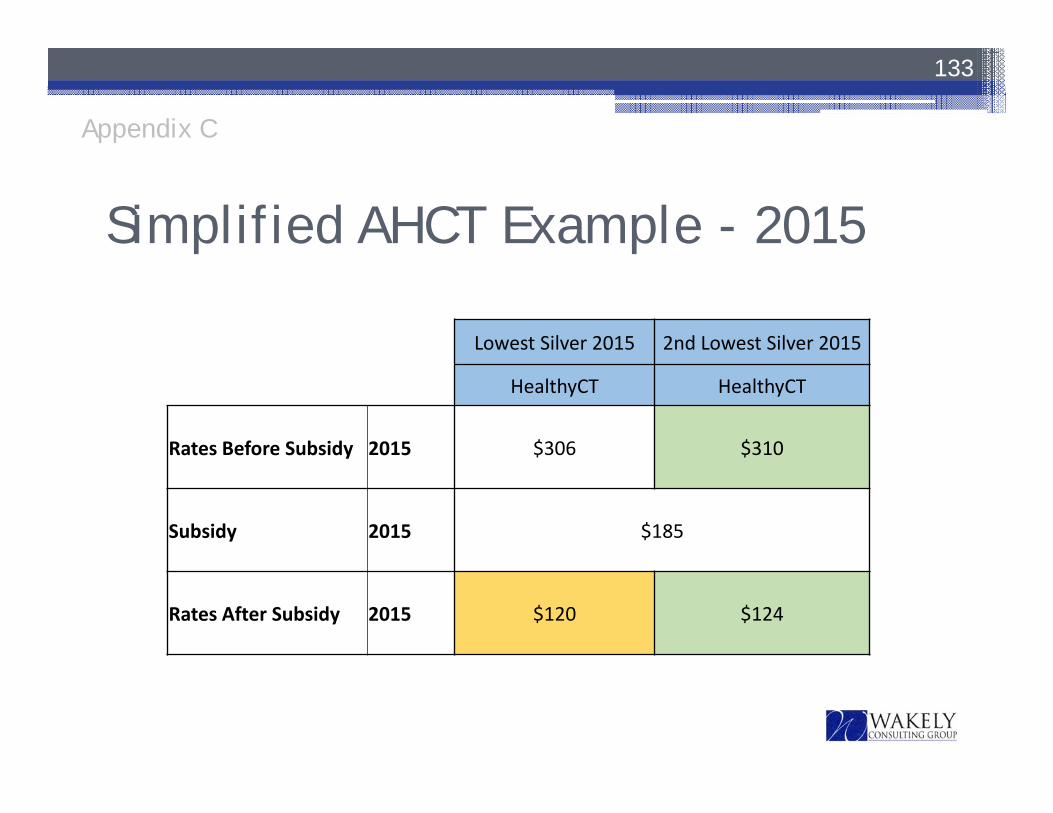
Simplified AHCT Example - 2015
133
Lowest Silver 2015 2nd Lowest Silver 2015
HealthyCT HealthyCT
Rates Before Subsidy 2015 $306 $310
Subsidy 2015 $185
Rates After Subsidy 2015 $120 $124
Appendix C
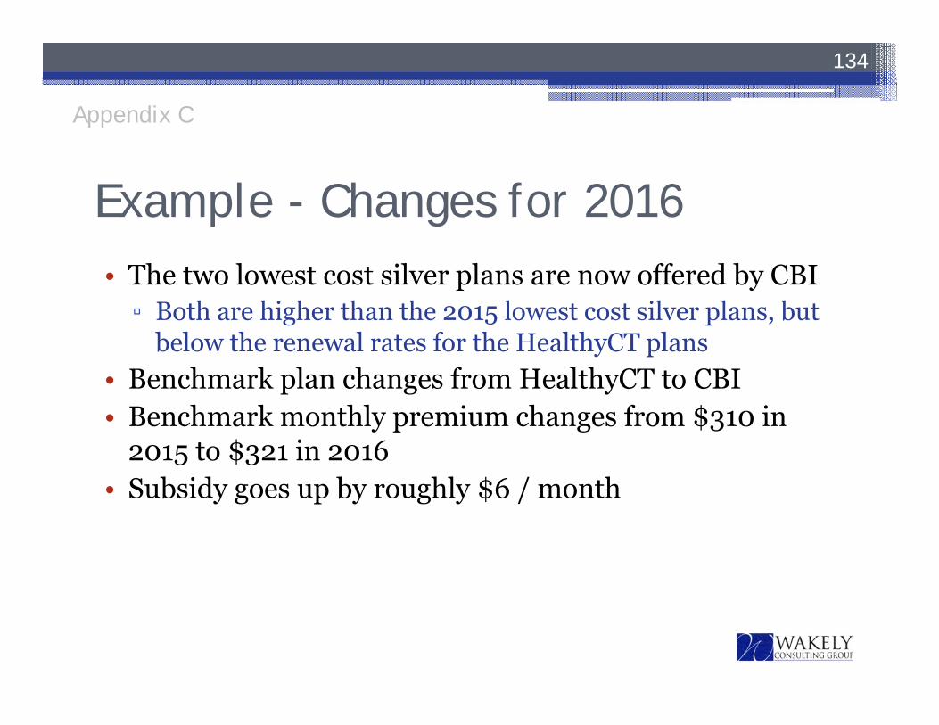
Example - Changes for 2016• The two lowest cost silver plans are now offered by CBI▫ Both are higher than the 2015 lowest cost silver plans, but
below the renewal rates for the HealthyCT plans• Benchmark plan changes from HealthyCT to CBI• Benchmark monthly premium changes from $310 in
2015 to $321 in 2016• Subsidy goes up by roughly $6 / month
134
Appendix C
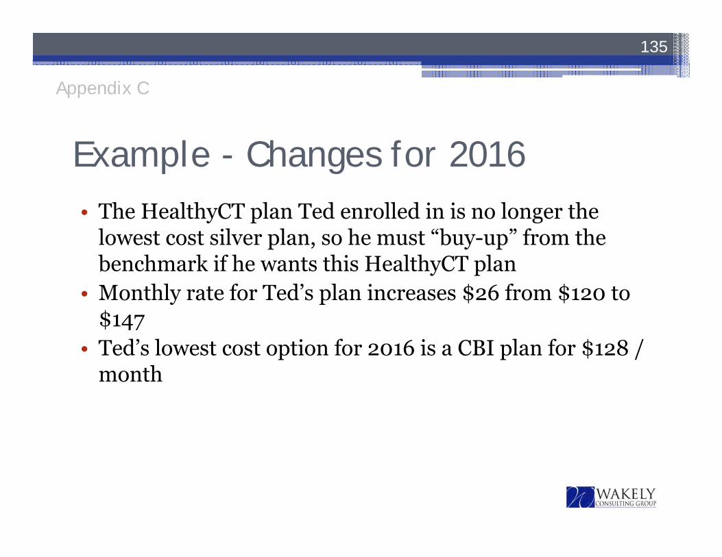
Example - Changes for 2016• The HealthyCT plan Ted enrolled in is no longer the
lowest cost silver plan, so he must “buy-up” from the benchmark if he wants this HealthyCT plan
• Monthly rate for Ted’s plan increases $26 from $120 to $147
• Ted’s lowest cost option for 2016 is a CBI plan for $128 / month
135
Appendix C
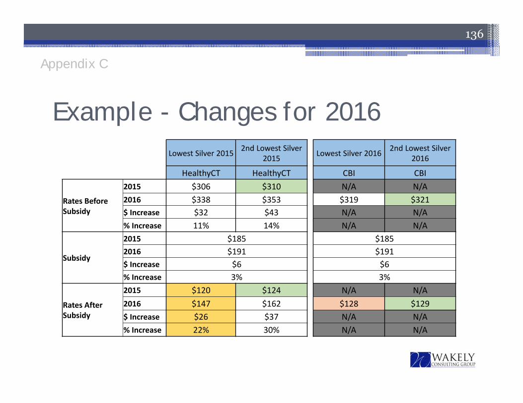
Example - Changes for 2016Lowest Silver 2015 2nd Lowest Silver
2015 Lowest Silver 2016 2nd Lowest Silver 2016
HealthyCT HealthyCT CBI CBI
Rates Before Subsidy
2015 $306 $310 N/A N/A2016 $338 $353 $319 $321$ Increase $32 $43 N/A N/A% Increase 11% 14% N/A N/A
Subsidy
2015 $185 $1852016 $191 $191$ Increase $6 $6% Increase 3% 3%
Rates After Subsidy
2015 $120 $124 N/A N/A2016 $147 $162 $128 $129$ Increase $26 $37 N/A N/A% Increase 22% 30% N/A N/A
136
Appendix C
137
Strategy Committee

138
MetricsMetric Measure FrequencyCall Center User Satisfaction Satisfaction with call center help Weekly/Monthly
Website User Satisfaction Value of website information Monthly
Net Promoter Score Success of consumer experience, measured by recommending AHCT to others
Once a year (during annual survey)
Member Retention Re‐enrolled members during Open Enrollment Annually
Open Enrollment Goal QHP customers vs. membership goal Annually
Staff Diversity Male/Female ratio and ethnicity percentages Quarterly
Turnover of High Performers Employee Turnover rate Annually
Budget vs. Actual Operating within 5% of targets Monthly
Exchange Solutions: Potential Customers Actively Prospected and Sold
Customers prospected and sold services, actual vs. plan
Quarterly
SHOP: Total Quotes, New Groups, Renewal Retention and Membership
Number of quotes, new groups, retentionrate, and membership, actual vs. plan
Quarterly
APCD: Vendor Implementation, Process Management and Analytics
Achievement of goals for data collection and reporting
Quarterly
139
Adjournment


![WEL COME [] notes.pdf · WEL COME Duties and Responsibilities of DDO & Registers to be maintained Prepared by- ... (APTC Form-58) xii) Register of LTC Advance :- :-(APTC Form-52)](https://static.fdocuments.in/doc/165x107/5ace84037f8b9a1d328be855/wel-come-notespdfwel-come-duties-and-responsibilities-of-ddo-registers-to-be.jpg)