Best practices for€¦ · Animation Handbook The Animation Handbook is the guide to best practices...
72
Transcript of Best practices for€¦ · Animation Handbook The Animation Handbook is the guide to best practices...


Best practices for better designDesign Better provides unprecedented access to the insights
that power the world’s best design teams. Design Better is
brought to you by InVision, the digital customer experience
design platform. Learn more at invisionapp.com.
Check out the rest of the DesignBetter.co library
Design Systems Handbook
Design Leadership Handbook
Design Thinking Handbook
Principles of Product Design
Enterprise Design Sprints
DesignOps Handbook

Animation Handbook
The Animation Handbook is the guide to best practices for animation in digital product design. This book uncovers the seven principles of bringing motion into user interface design and explains how animation is the bridge to telling better stories and engaging users in more human and intuitive ways. By bringing elements from our real world experiences into the virtual space, we can build greater trust in our products and better relationships with the people who use them. This book includes stories and interviews with Google, Lyft, Headspace, and Zova Fitness, that put principles into practice, and show how motion can enable stronger design systems and more expressive brands. The Animation Handbook will prime you not just to animate but to craft exceptional and more intuitive digital product interfaces for your customers.

ContentsMotion’s purpose The impact of animation
Principles of animationMaking product magic
Animation collaborationScale solutions
Taking animation furtherSmall things matter
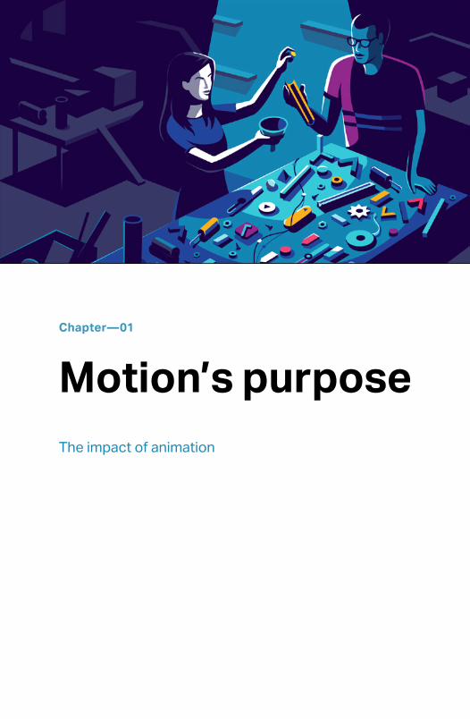
Chapter—01
Motion’s purpose The impact of animation

While the standard flavors of salty, sweet, sour, and bitter
are obvious to us and easy to experience, the fifth flavor—
umami—is ineffable. It’s the salience of parmesan cheese,
anchovies, dried tomatoes, fish sauce, and dashi. Though it
can be oversaturated and overused, umami is an essential
taste modifier that makes the sum of its parts stronger when
it’s properly used.
Animation plays a role similar to umami to elevate good design
to a more satisfying experience. Over the years, we’ve built
small affordances into our interfaces with animation and
motion. Whether the familiar blinking I-beam cursor of our text
editors, or the simple disapproving shake of a bad password,
motion is an essential—yet largely unexamined—bridge
between our physical and virtual worlds. Although motion is an
obvious component of telling stories on film, in games, and in
our software, we’ve only recently begun to elevate animation
to a first-class design ingredient in consumer software.
The greatest value animation adds to software is context.
Animation takes something with no moving parts and adds
the appearance of visible change. These noticeable changes
provide us with tangible and familiar context, which makes
our software more intuitive, discoverable, emotive, and
recognizable.

The rediscovery of motion
A number of forces propelled interface animation to where
it is today. Commercial animation tools like Flash introduced
expressive and limitless animation experimentation, but
eventually lost favor as new technologies like CSS animation
delivered similar functionality without the dependence on a
plugin. And no force influenced modern interface motion and
animation more than the iPhone.
The iPhone took the concept of making a virtual world feel
physical to a new level. No longer were we indirectly prodding
elements from afar with tools like a mouse; we were touching
them. Unlocking the phone was not unlike sliding a chain lock;
the glimmer on the text of the lock invited our attention and
directed our swiping.

Figure 1. The shimmering “slide to unlock” text on the original iPhone
helped introduce people to a new way of opening their phone.
As an app closed, it shrunk to its resting place and taught
us where to find it next time. The momentum of iOS scrolling
mimicked the friction and physics of physical objects making

it feel both familiar and efficient. Pinching and stretching an
album was all that was needed to fan out hundreds of photos
onto a tiny virtual surface.
This was a significant step in creating a natural user interface,
which makes complex software interactions so intuitive that
they almost become invisible. The fluid movement of objects in
the real world began to make their way into software as a core
design component.
Motion communicates change and context
We’re wired to see and learn from motion. A simple flipbook of
frames fools us into seeing a cohesive and continuous story
of motion, an innate human ability that opened the door to
animated film, television, and all forms of cross-reality. While
video games and movies embraced motion to share vivid and
incredible stories, digital products have taken a more timid
approach. However, adopting more considered and consistent
animation experiences will make software a more comfortable
extension of the human mind.
To make software feel familiar, it should behave like the real
world. Most natural forces demonstrate observable motion.

Those few natural forces that happen instantaneously—like
lightning—are harder to process, to the point that we describe
them as supernatural. Like lightning, computers operate at
speeds so fast that elements appear and disappear on screen
instantly, with no inherent need to slow down to human-
perceptible speed. If we were to show a person from the early
twentieth century a computer in action they would, no doubt,
be mystified by the sudden appearance of shapes and text on
screen because it defies perceptions of how the physical world
works. Consciously or not, our modern minds have adapted to
these unnatural gaps in context.
By closing these gaps, we make software less esoteric and
more natural to use, with fewer of the subversive mental
gymnastics that tend to exclude and frustrate users. Simple
acts—like darkening a button when it’s pressed or tapping an
image to expand and fill the screen while everything else fades
and shrinks away—tell us changes are afoot. Though there’s
no functional need to animate an application window shrinking
into its resting place, such visible motion gives us time to
observe the change while also providing a sense of space and
where things reside.
Animation gives the brain clues and context to build a
necessary bridge between the real and virtual worlds. By

filling contextual gaps in an interface’s storytelling, we can
make our virtual world more human, graspable, delightful, and
empowering to all.
Motion catches the eye
We’re often presented with terms and conditions, newsletter
signup forms, and other such text and dialog as we interact
with digital content, which we reflexively close or dismiss. We
must assume that anyone using our software is ignoring large
swaths of it.
Motion has an evolutionary command of our attention that
shows what we’re telling to greater effect than static text
boxes. For instance, through immersive animation, rather than
a lengthy list of rules, video games require little explanation to
get someone on the road to mastery. Animation is more than
look and feel; it’s a way to seamlessly integrate nuance and
context better than most words could.
A typical podcast app has you tap a button to download an
episode, perhaps indicating via a bounce or a notification
banner when the episode is ready to play. This use of motion
tells us when the episode is downloaded, but doesn’t make
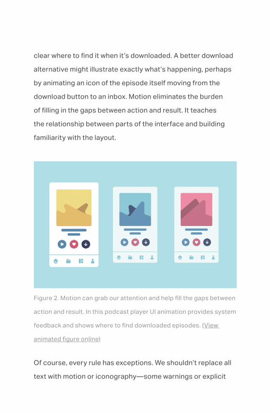
clear where to find it when it’s downloaded. A better download
alternative might illustrate exactly what’s happening, perhaps
by animating an icon of the episode itself moving from the
download button to an inbox. Motion eliminates the burden
of filling in the gaps between action and result. It teaches
the relationship between parts of the interface and building
familiarity with the layout.
Figure 2. Motion can grab our attention and help fill the gaps between
action and result. In this podcast player UI animation provides system
feedback and shows where to find downloaded episodes. (View
animated figure online)
Of course, every rule has exceptions. We shouldn’t replace all
text with motion or iconography—some warnings or explicit

statements are clearer as text. More critically, nothing should
diminish the accessibility of the user experience. Ensure that
for any change you communicate visually you also provide
appropriate accessibility descriptions and announcements for
those who rely on assistive technology.
Good animation serves an underlying purpose that makes
it obvious, felt, and nearly invisible all at once. Look for
opportunities to visually explain cause and effect. By replacing
telling with showing as much as possible, we ensure that every
animation serves a meaningful purpose.
Motion captures emotion
Animation does more than build context and support
wayfinding. Animation provides a universal language to imbue
emotion, augment feeling, and explain hard concepts. Like in
all design, we can instill emotional qualities in our animations
that make them feel a certain way—exuberant, tranquil, sharp,
or playful.
A dating app like Tinder chooses springier, playful animations,
while an exacting synthesizer like AudioKit Synth One keeps
its animations fast and tight. A buttoned-up social media

app suddenly releases an explosion of animation around an
event, like favoriting a photo, as a way to signify the emotion
of a compliment in a way words cannot. Both overt and subtle
animations play an important and assistive role in building the
memorability and trust of a brand experience.
Animation need not only be an accent, though. Animation can
stand on its own to help convey hard emotions and concepts
where words falter. Headspace leverages animation to bypass
stigmas and stereotypes when explaining concepts like
meditation and managing anxiety. Animation is just relatable
enough—but not too real—that it makes a perfect bridge to
unfamiliar concepts.
Even utilities like MailChimp use animation to help assuage
the nerve-wracking act of hitting the send button. No matter
how many times you check for typos, hitting send on a
newsletter to five or 50,000 people is going to come with
a moment of hesitation. An animation of a sympathetically
sweating and shaking hand about to press the send button
alongside you conveys, “It’s ok to feel stressed right now!” The
animated high-five that appears after sending is a nice bit of
reassurance.

Figure 3. Mailchimp uses animation to assuage the nerve-wracking
act of hitting the send button. The animated high-five that appears
after sending provides a bit of reassurance while celebrating the
completion of a big task. (View animated figure online)
Motion invites discovery
The use of expressive animation in an interface invites play,

which leads to experimentation and a deeper understanding
of what’s possible. Think about the “pull to refresh” action we
see in interfaces everywhere. As we swipe down, we glimpse
something just out of view—a hint that ensures we’ll continue
our pulling motion to discover what we’re not seeing.
Figure 4. A “pull to refresh” action in an interface gives a glimpse of
something just out of view—a hint that ensures we’ll discover new
things off screen. (View animated figure online)
Motion and animation do more than just reveal hidden
interactions; they provide guidance on how less obvious
interactions work. For instance, on the Apple iOS lock screen,
we can turn on the flashlight or launch the camera—but only

if we apply just enough intentional pressure on the buttons.
We learn this by not pressing the buttons hard enough at first
and seeing them spring back with resistance. The buttons
grow and dim in proportion to the duration of our touch, which
invites us to adjust the pressure we use to “see what happens.”
The core components of your interface should always be near
the surface and ready to use. However, the secondary—but
useful—bits can be safely tucked away and hinted at with
animation.
Motion enlivens software
Motion is powerful. It’s a vital and overlooked part of our
physical world and a difficult-to-place ingredient of great
interface design. It makes the sum of our design parts stronger
by dissolving the barriers between thought and interface.
While animation and motion may be relatively new disciplines
of software design, they’re critical to creating experiences
that transform technical tools into extensions of our minds.
Read on to learn the principles that turn the complex into the
approachable, whether on your own or as part of a team.

Further Reading
Transitional Interfaces
Designing Interface Animation
The “Why” of Using Animation in Interaction Design
Hacking user perception to make your websites and apps feel
faster
Enhance Your User Experience with Animated Transitions

Chapter—02
Principles of animationMaking product magic

Embellishment is innate to storytelling. When we share our
stories—small or large—we’re trying to make others feel as
though they’ve lived through the experience. By refining and
embellishing, we tell untruths that help do our stories better
justice; by adding touches of over-the-top whimsy we make
them more emotional and thereby memorable; by bending
the physics of time and motion we bring something otherwise
inanimate closer to life, where we’re better equipped to relate
to and understand it. To animate something is to bring it to life.
Where animation makes stories more relatable to audiences,
it also helps us understand and trust the digital “magic”
around us by filling the gaps between cause and effect. Analog
systems like bicycles, toasters, or washing machines have
physical limitations to how they can work or predictably move.
Because we innately understand these limitations, we know
what to expect and gain confidence in the systems around us.
When you pedal a bike the wheels turn and you move
forward; when you press the lever on a toaster the bread
goes down. Even simple circuits, like those in a flashlight or
washing machine, can almost be traced and understood. We
understand the motion of these analog objects because they
live in the physical world.

As digital systems evolved and miniaturized, the simple turned
complex. The reassuring sound of gears turning or the acrid
smoke of a short circuit was replaced with silent workings
and failings; our machinery became more inanimate. What
once moved and could be seen became small, delicate, and
hidden with a layer of software atop. We built the magical
disconnected levers and knobs of software to control the
machinery within.
Arthur C. Clarke’s third law states that “any sufficiently
advanced technology is indistinguishable from magic.”
While the idea of magic is whimsical and powerful, it can be
uncomfortable when it operates in the world around you
outside of your control or understanding. These days, the
mechanics and inner workings of most tools are invisible.
While they’re built upon physical principles, the technological
underpinnings that allow our phones to know who we are with
invisible laser light, or hear our requests from across the house
with far-field microphones, are enough removed from our
understanding to essentially be magic.
In digital systems, almost all of our constraints are lifted, and
nearly anything is possible. Crafting magic is well within our
reach, and by following some established animation principles,
we can make our magic feel more familiar and analog to others.

We can make the profound approachable.
PrinciplesAnimation is a design tool we can use to lend physicality and
tangibility to our abstract digital creations by making them feel
more analog and familiar. There are a handful of established
animation principles to keep in mind when telling stories—
even the tiny, causal stories we see in digital gestures and
interactions.
While animation has found a new home in digital interfaces,
its classical history is rooted in film and entertainment. The
veritable masters were at Walt Disney, where Frank Thomas
and Ollie Johnston’s book, Disney Animation: The Illusion of
Life, established 12 famous principles of animation. While film
animation isn’t exactly the same as digital interface animation,
we can look to, learn from, and rely on film animation’s
established terminology and principles.
In this chapter, we’ll go into detail on seven key animation
principles that inform interface design:

• Timing: the control over when and how long elements
animate
• Pacing: the rate of speed at which elements animate
• Staging: the motion that precedes and informs larger
change
• Follow-through: the demonstration of life-like aftermath of
an animation
• Secondary action: the subtle background animations that
enhance an overall scene
• Overlapping action: the animation that takes place
alongside, and implies a connection to, the primary motion
• Appeal: the imbuing of characters with larger-than-life
features or dramatic proportions

Timing and pacing
Just as timing can make or break a good joke, it can also cause
us to see correlations where none exist, like a coincidence
that feels supernatural. Timing can cause us to see life where
there is none, and—more importantly—establishes mood and
personality.
Figure 1. Timing can cause us to see life where there is none, and—
more importantly—establishes mood and personality. Simple shapes
moving around can appear to tell a story. (View animated figure
online)
In the analog world, transitions tend to have tell-tale, in-

between states that communicate more about how things
work than merely observing the end states. Handles turn when
doors open, text is erased before it’s rewritten, and kettles
whistle louder as they get hotter. We’re wired to pick up on and
react to these kinds of changes.
Digital data changes at a rate imperceptible to humans. Even
when we display changing data on screens, like the number
of footsteps taken or amount of screen time, the transition
between states is sub-perceptual. However, it only takes a
hundred or so milliseconds of movement to make a change
perceptual to the human eye.
These middle states, where objects might move, fade, or flash,
are technically unnecessary—after all, the underlying data
could have changed multiple times in the blink of an eye. But
these transitions are a necessary bit of falseness that makes
the digital world’s magic more familiar and comprehensible. By
introducing animation to our state changes, we make digital
experiences more accessible to humans.

Figure 2. Animation can make state changes in an interface clearer
and more human. (View animated figure online)
The simplest way to humanize state changes is to lengthen
them just enough to be perceptual. In animation, time is our
greatest tool. How we sculpt time can completely change the
perception of an interface’s speed, properties, or even mood.
State transitions, like a new view appearing, an item loading, or
something being scrolled through, all warrant different uses of
timing.

Figure 3. For an object’s physicality to be believable, we need to
feel the force that gets it started and the force that stops it. In other
words, we should see acceleration. (View animated figure online)
The frame is the fundamental unit of animation, with each
frame offering a snapshot of a scene. Differences between
frames blend together to build the illusion of movement and
motion. In traditional animation, timing is usually measured
by how many more frames are used at the beginning or end
of a motion; the more frames used, the slower something
appears to move, and vice versa. In digital animation, we rely
on timing functions that mathematically define how an object
accelerates, eases, or even bounces through a state change.
The simplest function is linear, meaning an object in motion
will advance forward a uniform amount for each unit of time.

This basic timing of motion is perceptual, but something about
it is off (perhaps because this sort of uniform movement is
physically impossible, at least according to Isaac Newton). For
an object’s physicality to be believable, we need to feel the
force that gets it started and the force that stops it. In other
words, we should see acceleration.
Figure 4. A good rule of thumb is to ease-out objects that are
entering or gaining attention, and ease-in objects that are leaving
and losing attention.(View animated figure online)
To predictably recreate this acceleration in digital interfaces,
we use easing functions to dictate where an object will be
along its defined trajectory at a given time.

Easing functions have many names and types, each with
different feelings and use cases. One of the best ways to
experience the difference is with your hands: make a fist, and
then quickly open your hand. Then do the same thing, but open
your hand at one intentional speed. Even though the gesture
takes about the same amount of time, the rate at which you
move changes the feeling and meaning.
Always experiment until you find the right fit for your needs,
but a good rule of thumb is to ease-out objects that are
entering or gaining attention, and ease-in objects that are
leaving and losing attention. When mimicking real life, or
analogs—whether it’s a person, a behavior, or an object—it
helps to imagine how they function.
Staging
Animations can be light or nearly invisible and still improve
usability by preparing the viewer for change. For instance,
if subtitles change suddenly while the viewer’s eye is on the
action, it can be easy to miss the change. A brief period of
nothingness in between subtitle changes stages the change
to come and prepares the viewer’s attention. Small bits of

staging like this help prepare the viewer by giving them time
and directing their focus to what’s about to happen.
Figure 5. When numbers change in interfaces we can add motion
and directionality—the kind we see in the real world on a train station
flipboard or handheld click-counter—to imply the change faster and
with less mental burden. (View animated figure online)
Number counters in interfaces offer another example of
staging. When the numbers change, they may jump or drop.
The display is accurate whether we simply change the number
or introduce a small pulse or flash before the change. However,
this can leave the viewer bewildered and wondering what the
value was prior to the change. If we add some motion and
directionality—the kind we see in the real world on a train

station flipboard or handheld click-counter—we can imply the
change to the viewer faster and with less mental burden.
Follow-through
Simple easing functions provide enough realism when
animating colors and opacities, but they often feel stale when
they’re used to animate motion. Only factory robots come
to perfectly calculated rest after decelerating. Our world is
filled with soft and imprecise movements, like when we reach
to grasp something, or pull a paper towel off a roll. Allowing
objects to slightly overshoot their final resting place with
a bit of spring makes even futuristic interfaces feel more
real. By adding even a modicum of this springiness to eased
animations, we give motion a sub-perceptual air of life, and
objects a sense of weight and friction they otherwise lack.

Figure 6. Our world is filled with soft and imprecise movements, like
when we reach to grasp something, or pull a paper towel off a roll.
Allowing objects to slightly overshoot their final resting place with
a bit of spring makes even futuristic interfaces feel more real. (View
animated figure online)
If animation is the body language of your digital creation, then secondary motions are the micro-expressions that help us tell the difference between a genuine and reluctant expression.
This slight springiness can be achieved through timing
functions, too, by overshooting the final value before dipping

below it and returning, like a putted golf ball rolling beyond,
around, and finally into the hole. Note that springs and
springiness don't necessarily belong everywhere, and should
generally be on the verge of being perceived.
Secondary action
Though you might have a favorite dish, it's the combination of
many different flavors and aromas—including some you might
not even realize—that makes it memorable. The song stuck in
your head is just the right balance of notes and harmonies—
some heard, some disappearing into the background.
Similarly, it’s often secondary action that makes an animation
indescribably great. In classical animation, secondary actions
might be the crossing of a character’s arms as she leans
against a wall, or the smoke rising out of a malfunctioning
computer. In these examples the addition of the secondary
actions can spell the difference between tired and coy, buggy,
or sabotaged. If animation is the body language of your digital
creation, then secondary motions are the micro-expressions
that help us tell the difference between a genuine and

reluctant expression.
These subtle flourishes can tint an entire ensemble of motion
to appear more exuberant, joyous, or sober. Secondary
animation also informs us when a gesture has been dragged
so far it cancels itself or becomes a destructive action. When
implemented with restraint, secondary animation is a powerful
tool for making interactions deeply satisfying, communicative,
and human.
The best use of secondary motion never takes attention from
the primary motion, it only bolsters it. Secondary action
helps establish nuance and hierarchy the same way color,
typography, and layout do for text. While it might not be
noticed by untrained eyes, when used sparingly as punctuation
and garnish, it will always be felt.

Figure 7. It’s often secondary action that makes an animation
indescribably great. When implemented with restraint, secondary
animation is a powerful tool for making interactions deeply
satisfying, communicative, and human. (View animated figure online)
Overlapping action
In traditional animation, an overlapping action is a motion
happening alongside the primary motion, but offset in such a
way that it implies a loose connection. For instance, imagine a
basset hound running with its large ears dropping as it jumps
and flying as it lands. These movements largely follow the
motion of the hound’s body, but are offset in such a way that
they appear more like appendages catching up to the hound’s

actions.
One common example of offsetting in digital interfaces is a
collection of distinct elements which all animate in the exact
same way. Offsetting their animation start time so that they
subtly cascade implies a logical connection between the
elements, like pulling on a chain of links, as opposed to rigidly
moving them in together like cookies on a baking sheet.
Offsetting has an added benefit of breaking up the heaviness
of a transition while indicating that each element is distinct and
interactive.
Note that offsetting the animation of multiple similar elements
can increase fatigue for the viewer by splitting what was one
motion to track into many. It’s important that animations
like this be subtle instead of gratuitous, and grouped tightly
whether there are one or 20 of them. Always keep edge cases
in mind while building these interactions. An incrementing
offset that works for the start of three elements might appear
heavy and sluggish for 12.
Pro tip
Reduce your delay for each element following an easing

function or decay formula (like square root) so that as
elements build in, they appear to pick up the pace—like chains
being pulled off a ship by an anchor.
Sometimes it’s nice to give the last element a bit more duration
and punch to punctuate the whole effect—the loose end
of chain whipping out of your hand and overboard. These
effects can be used on more than lists of items loading, just
like overlapping and secondary action apply to more than
animated coyotes and roadrunners.
Figure 8: One common example of offsetting animation start time
in digital interfaces is a collection of distinct elements which all
animate in the exact same way. Offsetting their animation start time
so that they subtly cascade implies a logical connection between the
elements. (View animated figure online)

Appeal
Not every aspect of animation must be purely functional
or grounded in reality. In classical animation, appeal is the
principle of imbuing characters with larger-than-life features,
like youthful eyes, pronounced jaws, or other dramatic
proportions. It’s unintuitive, but sometimes by making
something brighter and bolder than it really is, we make it more
human and relatable.
Appeal serves as the animated equivalent of branding. The
often understated yet familiar click of a cartridge, feel of a
knob, or rumble of an engine in the real world has become
the small explosion of color when we like something a friend
has shared, or the familiar snap and bounce in a gestural
interface. Appeal via animation is an often overlooked way to
differentiate your work and give it the qualities that make it
memorable and familiar.
Principles in practice
Because we’re used to seeing the causality of the world around
us, it can be unsettling when we can’t observe how something
works. The digital interfaces and tools we work with today
benefit from the human affordances, like animation, that tell
the missing story.
The next chapter demonstrates how to put the animation
principles you just learned into the context of a project
workflow. However, no matter the project, by using tried-and-
true animation principles, looking to nature’s analogs, and
studying the techniques of our favorite interfaces, we’ll gain
the skills to animate the lifeless.
Further Reading
Animation principles for UX and UI designers
The ultimate guide to proper use of animation in UX
Creating Usability with Motion: The UX in Motion Manifesto
Jedi Principles of UI Animation
Sculpting Software Animation


Chapter—03
Animation collaborationScale solutions
Great motion design feels obvious and right when we
experience it, but pulling it off requires careful work behind
the scenes. It takes unique collaboration between design
and engineering to transform a dynamic medium into a more
natural part of the world around it, with a rationale for every
move, a shared understanding of the end goal, and a common
language to describe it all.
Like any creative discipline, we see tried-and-true principles
applied in radically different ways by different practitioners
and teams. In this chapter, we’ll take a spotlight to four unique
organizations and their respective approaches to animation.
Include animation at the start
The most dynamic interface animation takes both engineering
and design thinking. Both mindsets have biases, perspectives,
and skills that complement one another. Close collaboration
between the two leads to great work—something exemplified
well by Zova Fitness.
Zova Fitness is a small startup based in Sydney, Australia.
Their fitness app has gained attention for its great content and
the thoughtfully designed experience, which won the team an

Apple Design Award.
Animation Process — Zova (Watch video online)
Animation is a key part of the Zova Fitness experience.
David Fumberger, chief design officer, shared a bit about his
animation workflow. It included the four key steps he goes
through with his team.
Animation is a key part of the Zova Fitness experience.
David Fumberger, chief design officer, shared a bit about his
animation workflow. It included the four key steps he goes
through with his team.
01. The first step is to layer. This means the team includes
animation at the start of the layout process when creating
a screen in a static layout tool.

02. The second step is to move static assets into a timeline
animation app to mock up the animation. This ensures the
concept works and that the animation holds up. That asset
is also useful for the engineers and stakeholders to get an
idea of the direction animation is headed.
03. The team’s third step is to prototype that animation. David
sits with an engineer and uses everything from the static
layouts to the comped animation to prototype it in code—
though he doesn’t build it into the actual Zova Fitness
app. This prototype gives the team a chance to rapidly
adjust timings and iterate on animation variables to ensure
everything fits and flows before its public.
04. The fourth and final step comes after that process of
prototyping is finished; the engineer takes everything and
pushes it into the product. By that point, all the design
details should have been solved.
For David and his team, it’s crucial to consider animation from
the start of the design process. Failing to do so may create
animated elements that feel tacked on or don’t solve a specific
problem.

David also believes designers should be aware of the
limitations of their medium and work with engineers to
understand those limitations. Likewise, engineers should
communicate and help navigate less obvious limitations, such
as data and platform constraints, that might help their design
counterparts.
Small team success
The Zova Fitness team’s workflow offers a few lessons for
small animation teams:
• Include animation at the start of a project
• Build mocks and prototypes to establish a shared
understanding
• Use prototypes to dial in the details
Support the journey
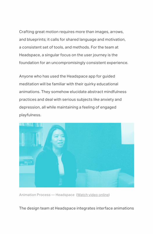
Crafting great motion requires more than images, arrows,
and blueprints; it calls for shared language and motivation,
a consistent set of tools, and methods. For the team at
Headspace, a singular focus on the user journey is the
foundation for an uncompromisingly consistent experience.
Anyone who has used the Headspace app for guided
meditation will be familiar with their quirky educational
animations. They somehow elucidate abstract mindfulness
practices and deal with serious subjects like anxiety and
depression, all while maintaining a feeling of engaged
playfulness.
Animation Process — Headspace (Watch video online)
The design team at Headspace integrates interface animations

into the product in a way that supports people along their
journey. Jon Brennan, senior product designer, and product
designer Christine Cha shared about their process.
At Headspace, they rely on four building blocks of motion
(some of which we covered in the animation principles portion
of chapter two):
• Behavior: the action an object takes, or where it enters the
screen
• Easing: the rate at which something moves from Point A to
Point B
• Duration: how long the animation lasts
• Sequencing: the order of operations
During a transition from one screen or state to the next,
multiple elements move at once; each of the building blocks
above can describe how that movement takes place. As
people go through the Headspace experience, the animations
reinforce the stages of the process and clarify what came

before and what's coming next. Animation helps tie a thread
through it all.
Because it's such a critical part of the product, the animation
process starts just after user research. By starting to think
through animations while the product is still being designed in
wireframes, designers can quickly iterate on and evolve their
concepts.
PRO TIP — Accessible from the start
When you include animation in the design process early, you
also ensure your team enough time to build and test your
animations for accessibility and assistive technologies, or
to design accessible alternatives that surface the same
information another way.
For example, in addition to animating a “pull to refresh”
interface, include accessibility labels or hints that offer an
alternate way to refresh.
One example the team gives is the sleep experience. From a
user need perspective, the app should be smooth and fluid,
and not disruptive to someone’s state of mind. So not only are
the colors muted and dark, but the information is paced in such

a way that nothing jumps out and everything flows smoothly.
Across the app, the Headspace team’s goal is to present a
seamlessly peaceful and serene environment where every
interaction or transition maintains a calm meditation space.
Align on the journey
The Headspace team’s mission to maintain a serene
environment includes these practical tips for working with
animation, which apply to teams of all sizes:
• Establish an environment that every design detail,
including animation, must support
• Align on and communicate the motion toolbox
• Animate at the start of the design process
Animation at scale

As a company scales, making user experiences coherent
across product lines becomes increasingly challenging. At the
same time, the risk of disparate teams duplicating their efforts
in designing interactive elements also increases. For this
reason, design systems have become a popular way to support
the design and development process when building features
more efficiently and delivering cohesive experiences.
Like a good interface, a design system should always guide
us toward the best solutions. It’s important to treat design
systems as living documents, and update them to address
common scenarios, pitfalls, and other problematic situations.
As animation becomes more core to the user experience,
leaving it out of a design system can be a big mistake. It’s a key
component of the user experience, and should be treated as
a first-class design ingredient rather than something tacked
on later with little forethought. At Google, the designers and
engineers working on their design system called Material made
motion a foundational part of the company’s design system.
Richard Fulcher, the UX director of the Material design team,
and senior UI designer Eric Henry explain how animation is
integral to Material with three core principles: motion should
be informative, focused, and expressive.

Informative motion, according to the Material design
system, “shows spatial and hierarchical relationships
between elements, and what will happen if an action is taken.”
Informative motion is akin to what Headspace describes as
motion’s behavior.
Focused motion points to what’s important in a design
or interaction. And expressive motion adds humanity,
personality, style, or brand attributes to a design, playing on
the animation principle of appeal from chapter two.
The Material design system goes on to define and explain how
and when to use motion in interfaces, and provides motion
guidelines to establish hierarchy and how elements are related
to one another. From establishing how to use motion to offer
feedback, to indicating how to offer hints and guidance, the
Material team leaves nothing to chance in clearly defining the
use of motion at Google.
PRO TIP — Codify everything
At an organization as large as Google, it’s impossible for a
single person or team to ensure consistent design practices.
That’s where the Material design system comes into play:
• Document and centralize a single source of truth for all
motion design decisions
• Establish core principles as a north star for all design
efforts
• Thoroughly define every interaction to create shared
understanding of usage
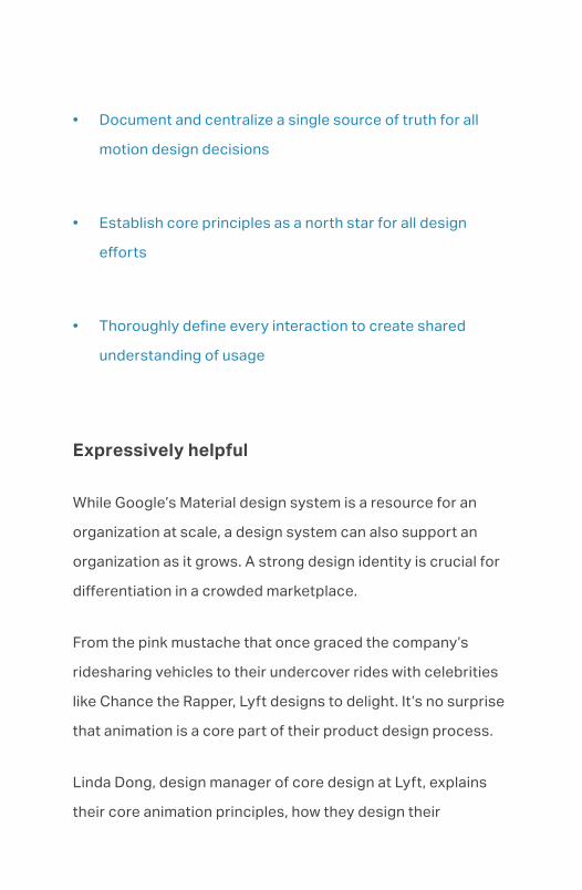
Expressively helpful
While Google’s Material design system is a resource for an
organization at scale, a design system can also support an
organization as it grows. A strong design identity is crucial for
differentiation in a crowded marketplace.
From the pink mustache that once graced the company’s
ridesharing vehicles to their undercover rides with celebrities
like Chance the Rapper, Lyft designs to delight. It’s no surprise
that animation is a core part of their product design process.
Linda Dong, design manager of core design at Lyft, explains
their core animation principles, how they design their

animations for accessibility, and why animation is an important
part of their design system.
The principles of motion at Lyft are be intentional, be
responsive, and be expressive:
• Be intentional: every animation in the Lyft product has a
purpose, whether that’s to direct the riders’ or drivers’
focus to show information changes, or to assist in
navigation
• Be responsive: the product needs to quickly acknowledge
any choices or actions someone has taken, without getting
in the way. It should also shorten the perception of loading
time
• Be expressive: motion should represent Lyft's brand
voice—be bold, simple, and a little rebellious
Together, these principles communicate an animation system
that balances an expressive brand voice (“Hey, we’re Lyft!”)
with an understanding of the real-world scenarios they’re
trying to improve with animation.

These real-world scenarios—usually while someone is driving
or looking for a ride—include designing for accessibility. For
example, notifications might pop up on the screen saying,
"Hey, your driver has arrived." A screen reader should have
time to process that notification before it disappears from the
screen. In designing the animation, it’s very important that the
team sets minimums for animations to make sure someone
actually has time to digest the content before it goes away.
Scenarios like this are represented in Lyft’s motion design
system, the Lyft Product Language, which both teaches
principles of motion and exposes the ethos behind their
particular brand of motion. By sharing principles and ethos
together, designers are better equipped to work with their
teams and evangelize those principles and guidelines.
For the people ultimately using Lyft’s products, the design
system contributes to a more cohesive and intuitive
experience by informing how and when motion should be
executed: is design different for Lyft riders than for drivers?
Where can designers use motion to reduce the perception of
interface load or wait times? When are the best moments for
expressivity?
The moment a team starts designing something, like the

driver arrival notification, is when they start choreographing
motion. For this to work effectively, it’s critical that the design
and engineering teams collaborate on a daily basis and share
responsibilities. This close collaboration makes for the most
efficient use of time and leads to the best solutions while still
allowing for a healthy amount of exploration and refinement.
The job of the Lyft design systems team is to build up the
principles and integrate them into reusable components. This
frees a designer and engineer to simply plug-and-play, safe
in the knowledge that things like timing curves and durations
have been considered carefully. It’s how they ensure that every
animation effort maintains both Lyft’s brand expression and
commitment to supporting its drivers and riders.
PRO TIP — Considerate and appropriate
The Lyft design team maintains a strong brand identity
throughout real-world scenarios as they develop their motion
design principles into reusable design system components:
• Establish bedrock principles for motion that accommodate
a spectrum of scenarios

• Choreograph motion design immediately, with tight
collaboration between designers and engineers
• Across all scenarios, design for accessibility
Advice that scales
As we’ve seen from Zova Fitness, Headspace, Google, and
Lyft, it pays off to consider animation from the beginning of
the design process, no matter the size of the company that
you’re at. Designers and teams who integrate motion from the
beginning will be much more likely to benefit from a cohesive
user experience, increased ease of use, and the overall
delight that animation can bring to a product. Going further,
documenting animation principles and examples as part of a
design system assures that every interaction maintains the
right balance of brand identity, quality, and accessibility.
Further Reading
https://www.ibm.com/design/language/experience/animation/

Understanding motion
Human Interface Guidelines - Animation
Chapter—04
Taking animation furtherSmall things matter

In the previous chapters you’ve read how integral animation
is to modern product design, learned about some animation
guiding principles, and heard how a few of the best design
teams bring motion into their workflows. Now let’s take a look
at how you can take animation further with fluidity, nuance,
consistency—and humanity.
Nuance
While many products use animation, few do so in ways that
respect our attention and make us react the right way at the
right time.
When you search for “coffee” in the Google Maps app, the red
pins that mark your options quickly fade in without distracting
you. While Google’s designers might have been tempted to
overdo the animation with a volley of dropped pins calling
for your attention, they were wise to keep the motion to a
minimum.
When we learn new animation techniques, we have a tendency
to go overboard in attention-grabbing ways. But when we
design for real-world contexts and scenarios—like searching
for a destination while biking, or searching in a dense

metropolitan center with dozens of results—digital hand-
waving is distracting and even dangerous. It’s important that
we frequently step back and consider the diverse contexts in
which the animations will be deployed.
With no physical restraints or real-world gravity, it’s natural to
want our interfaces to take giant animated leaps and bouncy
bounds. But the restraint of nuance is all about ensuring
motion adds clear value to the interface without stealing
attention from more important matters. Nuance means
whittling away as much as possible until it’s subtle, felt, and
nearly unseen. The disapproving shake of a password field, for
example, communicates just as much as an animated alert, but
without taking attention away from the task at hand.
PRO TIP
When you replace text with other forms of visual
communication, like the shake of a password field, be sure
to provide accessible ways of informing those who can’t rely
on sight alone. On the web, this might mean setting an aria
attribute like `aria-invalid .̀ On mobile, it might mean setting a
clearly written bit of accessibility hint text.
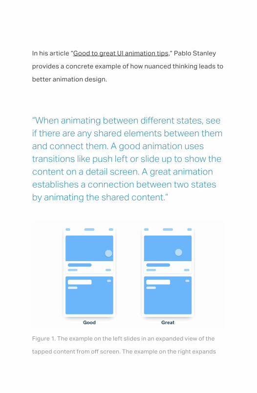
In his article “Good to great UI animation tips,” Pablo Stanley
provides a concrete example of how nuanced thinking leads to
better animation design.
“When animating between different states, see if there are any shared elements between them and connect them. A good animation uses transitions like push left or slide up to show the content on a detail screen. A great animation establishes a connection between two states by animating the shared content.”
Figure 1. The example on the left slides in an expanded view of the
tapped content from off screen. The example on the right expands

the tapped content in place to maintain the mental model between
what was tapped and what was presented. (View animated figure
online)
Consistency
Consistency is meeting expectations and intentions. As we
add physicality to the movement of our designs, we must
maintain consistency of motion just as we do for typography,
layout, color, and the like. When we maintain material, spacial,
and physical consistency, we make a product feel more
cohesive, and we encourage discovery by building confidence
and trust. Then our animations communicate not just how
something works, but also the way the digital world around
them functions.
Contradictions between what we expect and what actually
happens introduces a cognitive load that prevents our designs
from becoming usable without exertion—we force our users
to think, rather than make our product feel like an extension
of their minds. Product designer and engineer Austin Sarner
explains:

“…when you need to allow the user to feel out what’s possible in an interface they’re touching and manipulating, motion provides context. It is an extension of their gestures, of their manipulations. And it guides them as to what’s possible to do, and encourages them to explore more.”
Why invest in animation, and where to focus — Austin Sarner (listen
online)
Consistency doesn’t mean everything we do should move with
the same timing for the same duration through every screen.
We just need to ensure that everything we make is influenced
by common principles. Shared components and design
systems help, but like we learned in the nuance section, we

should evaluate all elements in their contexts of use.
In the Tinder app, for example, a core interface principle is that
everything you see on screen is “real.” The interface relies on
a highly realistic card metaphor, with cards so lifelike that they
appear to be cut from paper and could be held in your hand.
While everything you can touch in the Tinder interface
is interactive, different elements act in different—yet
consistent—ways. When you touch and drag a card from the
flash card-like stack, the card “feels” light because of how
it swivels and pivots around your finger. Other parts of the
interface extend offscreen, lending additional weight; when
you swipe to move these other parts, they feel heavier and
move more rigidly. Despite having similar gestures, neither
element’s motion is designed as a variation of the other; rather
they’re designed around a consistent principle.
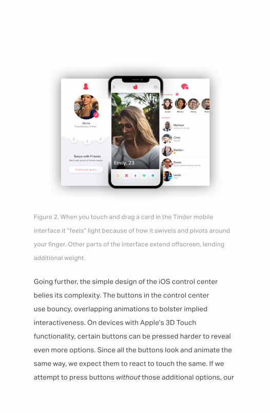
Figure 2. When you touch and drag a card in the Tinder mobile
interface it “feels” light because of how it swivels and pivots around
your finger. Other parts of the interface extend offscreen, lending
additional weight.
Going further, the simple design of the iOS control center
belies its complexity. The buttons in the control center
use bouncy, overlapping animations to bolster implied
interactiveness. On devices with Apple’s 3D Touch
functionality, certain buttons can be pressed harder to reveal
even more options. Since all the buttons look and animate the
same way, we expect them to react to touch the same. If we
attempt to press buttons without those additional options, our

finger is met with a gentle spring-back animation that implies,
“nothing to see here.”
This spring-back maintains physical consistency by behaving
in a way that makes sense to the rest of the interface. Just like
a house with floors that inexplicably emit odd creaks or doors
that swing of their own volition feels haunted, an interface
that breaks our mental model of how things should behave
adds cognitive load to the experience. Understand and stick
to the principles of your interface to maintain confidence and
promote exploration.
IOS Control Center. (View animated figure online)
Humanity

Things like bikes, door handles, and toasters are approachable
because of their human-geared affordances and clear, intuitive
workings. Digital objects like cell phones, computers, and
microwaves, on the other hand, are so complex that their inner
workings are abstracted and inaccessible without advanced
training.
When digital systems were first built, we lacked the ability
to create the affordances we demand from our software
today. Command line interfaces and hierarchical file systems
reflect machine capabilities more than people’s demands. As
computing advanced and became a consumer product, we
began to bend our technology to be more familiar, intuitive,
forgiving, and inviting.
The approachability of the analog world doesn’t exist in the
digital world, so we use sleight of hand to make the digital
more intuitive. Modern software employs plenty of tricks we
rarely think about to make the digital appear more human.
As animators, we have license to bend the truth to make
something feel truer.
Just because we can teleport images across pixels on a
screen in milliseconds doesn’t mean we should. We can move
things in from off screen to cover what we previously looked at,

like a printer spitting out page on top of page. This fakery gives
us a sense of physical space in a digital environment, which
lets us mentally map both what we see and what’s out of view.
Digital animation serves to humanize software by slowing
down the instant in thoughtful ways. When we reach the end of
a long passage of text, we might come up against a bit of tug
when there’s no more content to scroll. This tug is a playful,
non-jarring indication that we’ve reached the end.
When we have face-to-face conversations, we look and listen
for cues, like hesitations or gestures, as part of a natural
back-and-forth. In our text messaging apps, animated typing
indicators—like the bobbing ellipses that signal someone
is typing—reintroduce humanity to a digital experience. We
should always be on the lookout for non-obvious ways to bring
the human element to our products.
Fluidity
It takes more than snappiness, responsiveness, and gestures
to make an interface feel fluid. Chan Karunamuni, in his Apple’s
WWDC talk, says fluidity “boils down to when a tool feels like
an extension of your mind.” It takes a considered use of motion

to build a tool that anticipates our needs with minimal effort.
Most software interactions—like entering a command or
pressing a button—happen after we make a decision; once
we commit to an action or get a response it might trigger an
animation. Fluid interactions happen while we make decisions,
giving us the ability to redirect, cancel, and change our
decisions mid-gesture—like dragging a file to the trash or to a
folder.
While we can play a defined animation at the touch of a button,
a fluid gesture contains too many possibilities to cover this
way. Instead, fluid interfaces should draw inspiration from the
physical movement of the real world to align motion with intent.
Because these motions are tightly coupled with their related
interactions, they must be designed collaboratively from the
start with interactive prototypes to fine-tune the details.

Animation in games and consumer software — Austin Sarner (listen
online)
Touch the future
Good animation takes principles and know-how, but it’s
refinement and nuance that sets a project apart. Thoughtful
animation introduces humanity to a project, and makes an
interface feel intuitive and alive under our touch. With the
knowledge you now have about motion, you’re primed to
not just animate but to craft interfaces that are a seamless
extension of body and mind.

Further Reading
Transitional Interfaces
Spatial Interfaces
Good to great UI animation tips
Designing Fluid Interfaces