“Before” and “After” slides ... - Presentation...
14
Transcript of “Before” and “After” slides ... - Presentation...

What you are about to read is the result of 10 years of hands-on
presentation design experience.
My name is Adam Noar, and I am the founder of Presentation
Panda – a presentation design firm that builds kick-ass
presentations for large businesses, startups, and individuals.
Beyond designing presentations for our clients, we also like to
teach and share our design insights with the world.
One of the best ways to teach presentation design is by showing
“Before” and “After” slides. These types of comparison slides are
excellent for highlighting design errors, and also talking through the
revised changes that transformed the slide into a much stronger
message.
The following “Before” and “After” slides illustrate just A FEW of the
principles presented in my personally written eBook, Slides Made
Simple. If you are interested in creating presentations that will have
your audience SITTING ON THE EDGE OF THEIR SEAT, then I
strongly recommend you pick up a copy of this book.
So without further ado, let’s dive straight into the “Before” and
“After” comparisons.
Click here to find out more about the book that will teach you how-to design presentations like the pros.

Before
After
Quick Tip #1: This BEFORE slide is a typical “Death by
PowerPoint” slide, with an ugly bullet list. The cheesy stock image
to the right also doesn’t help. Notice how the image is also cut off
at the head, which is common in many stock photos. It’s ridiculous
how many of these stock photos come cropped this way, so watch
out for this! To make this slide much more visually interesting, get
rid of the ugly bullet list and cheesy image. Instead, insert some
relevant icons. Notice how all the icons have a consistent look and
feel. They are also given plenty of “white space” (i.e., breathing
room) which gives each category a chance to shine. Finally, notice
how the title of the slide has much more impact by changing the font and increasing the font size on the words “drive revenue.”
Quick Tip #2: This set of slides is another great example of
how a large font creates a more impactful slide. Again, we
have extraneous elements on the BEFORE slide with the
tiny stock photo, a big ugly arrow, and the world image. We
also have long winded text that can be shortened by
extracting the most important information. We can see that
the AFTER slide is much simpler and focuses on a single
point which makes the slide more memorable. When in
doubt, remove the extraneous clutter, decrease the text, and increase font on the most important words of the slide.
Before
After

Quick Tip #3: Minimize the text as much as possible, and
eliminate all images, unless they provide value to the audience.
Also, take a look at the color combination of the BEFORE slide.
There are EIGHT different colors going on which makes the slide
look really sloppy. Notice how much stronger the AFTER slide is
when we minimize the text, eliminate the image that’s not adding
value, and keep the color scheme to only three colors. In the
BEFORE slide, we’re not quite sure what’s the most crucial
element to focus on. On the other hand, the AFTER slide leaves us with a simple and memorable message.
Before
After

Quick Tip #4: There’s lots of things going wrong in the
BEFORE slide here. Here, we can see TONS of text, a poor
contrasting background, a weak image that awkwardly cuts
into the slide, and lots of spelling and grammar issues. First
and foremost, we have to minimize and organize all that text
(especially if you want to keep it all on one slide). As you can
see in the AFTER slide, it looks much cleaner once you
organize and minimize the text. Adding some icons also
helps to make it easy for the audience to categorize and
digest the info. Finally, notice how the darker background
and better font choice makes the slide much easier to read.
Before
After

Quick Tip #5: In the BEFORE slide, there are several key errors
taking place. First, all the images are not consistent – there’s a mix
of real photography and vector images. Along with this, the images
all have different backgrounds (white, black, and purple) which also
contributes to the inconsistent look of the images. In comparison,
the AFTER slide has a consistent set of photo images that all have
a nice white background that provides strong contrast against the
black background. The images have also been placed into circles
which give them a clean and consistent look. Second, the BEFORE
slide could do a much better job at showing the size proportions of
the different foods by adjusting the image sizes accordingly (as
seen in the AFTER slide). Finally, the title of the BEFORE slide is
pretty weak. By simply changing the word “great” to “superfood” you
create more excitement and intrigue for the audience.
After
Before

Quick Tip #7: The BEFORE slide here represents your
typical boring bar chart. If you want to keep the data in a
chart format there are a number of things you can do
improve the chart. For my full list of recommendations check
out my charts section within Slides Made Simple. Keep in
mind that all data doesn’t have to be shown as a chart. In the
AFTER slide you can see that the data looks really clean
when it’s spread out visually over a world map. We can see
that this data is much easier on the eyes, and also makes it
much easier for the audience to compare the customer
service ratings.
Before
After

Quick Tip #7: While the BEFORE slide gets the point across,
it does it in a very bland way. The vector images look pretty
plain, and also lack consistency (the two images to the right
somewhat match but the image on the left looks very different
to the other two). Along with this, the colors don’t seem to be
in harmony either. There is a mix of red, blue, black, white,
and cream, which doesn’t create a very attractive color
scheme. This slide can be MUCH more interesting, as seen
in the AFTER slide. By taking a real photo and highlighting
the key points, directly on the photo, the audience can quickly
grasp the key message.
Before
After

Quick Tip #8: While the BEFORE slide doesn’t look absolutely
terrible, from first glance, there are some key design flaws taking
place. First, while this slide is talking about the benefits of Moringa
plant, it is talking about a SPECIFIC set of benefits; Health Benefits.
Therefore, the title needs to be more specific, and also the image
needs to do a better job at illustrating the message of the slide. As
you can see in the AFTER slide, adding the word “health” to the
slide title and showing a diagram of the human body quickly lets the
audience see that there are many benefits of the Moringa plant
towards different parts of the body. Finally, notice in the AFTER
slide that the key benefits are aligned to the left, which makes it
much easier for the audience to read.
After
Before
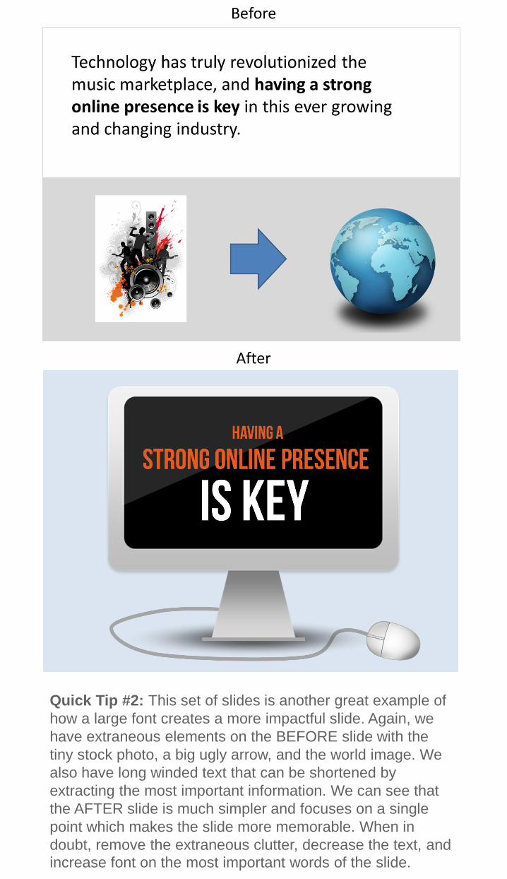
Quick Tip #9: A common design mistake that many people
make is overcrowding a slide with too much information. It
was clear in the BEFORE slide that the slide designer
thought the most interesting take-away was the fact that 1 in
4 companies plan to increase outsourcing by 25%
(highlighted in bold). Therefore, it’s better to take that key
point and make it its own slide (as seen in the AFTER slide).
The generic image in the BEFORE slide also doesn’t do the
slide much justice. I’ve never been a fan of those generic
alien character images! Instead, the AFTER slide image
creatively shows the concept of “1 in 4 organizations”.
Before
After
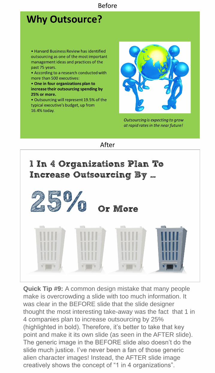
Quick Tip #10: A quote can be a great way to add emphasis
and credibility to your presentation, if it’s inserted in the
correct manner. The BEFORE slide does a bad job at this for
several reasons. First, you don’t have to have a big title that
tells where the quote was mentioned. You can delete that and
just mention it verbally during your presentation. Second, the
BEFORE slide doesn’t inject any emotion. The quote is
placed against a generic background and the image doesn’t
help paint a picture around the quotes meaning. As you can
see in the AFTER slide, there is plenty of emotion coming
from the image that matches the essence of the quote.
Before
After

I hope that you found these “Before” and “After slides” insightful.
Again, the design principles discussed in this guide are just a few
examples from my eBook Slides Made Simple. If you are looking to
take your presentation skills to the next level this book will be your
go-to guide.
Please do me a favor and SHARE THIS GUIDE with your friends.
Do you know someone who could benefit from these tips about
improving presentation skills? Maybe a friend or colleague? Send
them a quick email with this PDF attached.
You have unlimited rights to reprint, republish, distribute and copy
this guide in any form. You can email it to your friends, print it and
hand it to your students or leave a stack at your local Laundromat.
The only condition is that you may not alter it in anyway or charge
money for it.
ONE MORE THING…
If you liked this guide, it would mean the world to me if you could
give me a shout on facebook and/or twitter. I would love to hear
your comments!
Please check out the links below to be directed to either of the fan
pages.
Thanks again, and may you future presentations be impactful and
memorable!
Regards,
Adam Noar
Presentation Panda CEO
(Click on either of the icons above to be directed to the fan page)

Adam Noar is founder and owner of
Presentation Panda - A presentation
design firm that specializes in
creating and delivering professional
presentations for startups, large
businesses and individuals.
Adam and the Presentation Panda
team pride themselves on creating
professional & HIGH-IMPACT
presentations that combine:
• Stunning Visuals
• Well Crafted Structure
• Rich Story Telling
As a full service presentation design firm, the Panda team works
with its clients to transform thoughts, visions, strategies, goals and
objectives into a coherent and compelling presentation that is
custom designed for each specific audience.
Adam has been designing professional presentations for 10 years
delivering hundreds along the way to senior executives at Fortune
500 companies, as well as large and captive audiences at
marketing events around the world.
For details and to learn more about the Presentation Panda design
service please visit:
www.presentationpanda.com
P.S. Make sure to sign up for the Presentation Panda newsletter
(located on the bottom of my website) so you can stay informed on
all of my latest presentation tips, articles, product offerings, and
resources!