Basic Seven Tools of Quality. Quick Overview The Seven ToolsThe Seven Tools –Histograms, Pareto...
30
Basic Seven Tools of Basic Seven Tools of Quality Quality
-
Upload
angel-cashmore -
Category
Documents
-
view
225 -
download
0
Transcript of Basic Seven Tools of Quality. Quick Overview The Seven ToolsThe Seven Tools –Histograms, Pareto...
Basic Seven Tools of Basic Seven Tools of QualityQuality
Quick Quick OverviewOverview
• The Seven ToolsThe Seven Tools– Histograms, Pareto Charts, Cause and Histograms, Pareto Charts, Cause and
Effect Diagrams, Run Charts, Scatter Effect Diagrams, Run Charts, Scatter Diagrams, Flow Charts, Control ChartsDiagrams, Flow Charts, Control Charts
Ishikawa’s Basic Tools of Ishikawa’s Basic Tools of QualityQuality
• Kaoru Ishikawa developed seven basic Kaoru Ishikawa developed seven basic visual tools of quality so that the visual tools of quality so that the average person could analyze and average person could analyze and interpret data.interpret data.
• These tools have been used worldwide These tools have been used worldwide by companies, managers of all levels by companies, managers of all levels and employees.and employees.
HistogramsHistogramsSlide 1 of 3Slide 1 of 3
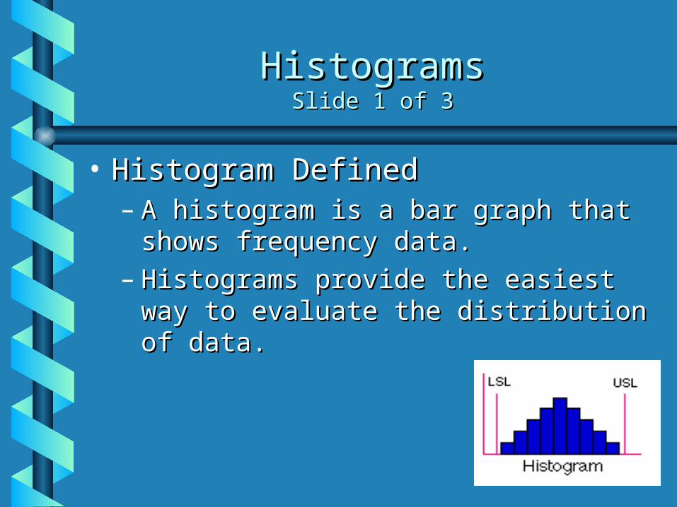
• Histogram DefinedHistogram Defined– A histogram is a bar graph that shows A histogram is a bar graph that shows
frequency data.frequency data.– Histograms provide the easiest way to Histograms provide the easiest way to
evaluate the distribution of data.evaluate the distribution of data.
HistogramsHistogramsSlide 2 of 3Slide 2 of 3
• Creating a HistogramCreating a Histogram– Collect data and sort it into categories.Collect data and sort it into categories.– Then label the data as the independent set or Then label the data as the independent set or
the dependent set.the dependent set.• The characteristic you grouped the data by would The characteristic you grouped the data by would
be the independent variable.be the independent variable.• The frequency of that set would be the dependent The frequency of that set would be the dependent
variable.variable.
– Each mark on either axis should be in equal Each mark on either axis should be in equal increments. increments.
– For each category, find the related frequency For each category, find the related frequency and make the horizontal marks to show that and make the horizontal marks to show that frequency.frequency.
HistogramsHistogramsSlide 3 of 3Slide 3 of 3
• Examples of How Histograms Can Examples of How Histograms Can Be UsedBe Used– Histograms can be used to determine Histograms can be used to determine
distribution of sales.distribution of sales.– Say for instance a company wanted to Say for instance a company wanted to
measure the revenues of other measure the revenues of other companies and wanted to compare companies and wanted to compare numbers.numbers.
Pareto ChartsPareto ChartsSlide 1 of 4Slide 1 of 4
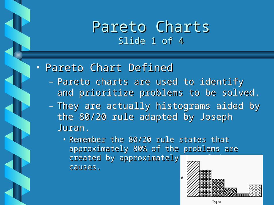
• Pareto Chart DefinedPareto Chart Defined– Pareto charts are used to identify and Pareto charts are used to identify and
prioritize problems to be solved.prioritize problems to be solved.– They are actually histograms aided by the They are actually histograms aided by the
80/20 rule adapted by Joseph Juran.80/20 rule adapted by Joseph Juran.• Remember the 80/20 rule states that Remember the 80/20 rule states that
approximately 80% of the problems are created approximately 80% of the problems are created by approximately 20% of the causes.by approximately 20% of the causes.
Pareto ChartsPareto ChartsSlide 2 of 4Slide 2 of 4
• Constructing a Pareto ChartConstructing a Pareto Chart– First, information must be selected based First, information must be selected based
on types or classifications of defects that on types or classifications of defects that occur as a result of a process.occur as a result of a process.
– The data must be collected and classified The data must be collected and classified into categories.into categories.
– Then a histogram or frequency chart is Then a histogram or frequency chart is constructed showing the number of constructed showing the number of occurrences.occurrences.
Pareto ChartsPareto ChartsSlide 3 of 4Slide 3 of 4
• An Example of How a Pareto Chart Can Be An Example of How a Pareto Chart Can Be UsedUsed– Pareto Charts are used when products are suffering from Pareto Charts are used when products are suffering from
different defects but the defects are occurring at a different defects but the defects are occurring at a different frequency, or only a few account for most of the different frequency, or only a few account for most of the defects present, or different defects incur different costs. defects present, or different defects incur different costs. What we see from that is a product line may experience What we see from that is a product line may experience a range of defects. The manufacturer could concentrate a range of defects. The manufacturer could concentrate on reducing the defects which make up a bigger on reducing the defects which make up a bigger percentage of all the defects or focus on eliminating the percentage of all the defects or focus on eliminating the defect that causes monetary loss. defect that causes monetary loss. • Actual chart is on the next slideActual chart is on the next slide
» Example and chart were obtained from:Example and chart were obtained from:<www.yourmba.co.uk/pareto_diagram.htm><www.yourmba.co.uk/pareto_diagram.htm>
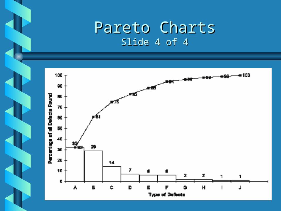
Pareto ChartsPareto ChartsSlide 4 of 4Slide 4 of 4
Cause and Effect DiagramsCause and Effect DiagramsSlide 1 of 4Slide 1 of 4
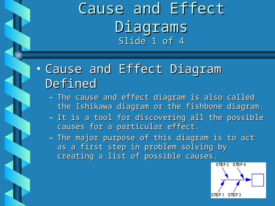
• Cause and Effect Diagram DefinedCause and Effect Diagram Defined– The cause and effect diagram is also called the The cause and effect diagram is also called the
Ishikawa diagram or the fishbone diagram.Ishikawa diagram or the fishbone diagram.– It is a tool for discovering all the possible causes for a It is a tool for discovering all the possible causes for a
particular effect.particular effect.– The major purpose of this diagram is to act as a first The major purpose of this diagram is to act as a first
step in problem solving by creating a list of possible step in problem solving by creating a list of possible causes.causes.
Cause and Effect DiagramsCause and Effect DiagramsSlide 2 of 4Slide 2 of 4
• Constructing a Cause and Effect Constructing a Cause and Effect DiagramDiagram– First, clearly identify and define the problem or effect First, clearly identify and define the problem or effect
for which the causes must be identified. Place the for which the causes must be identified. Place the problem or effect at the right or the head of the problem or effect at the right or the head of the diagram.diagram.
– Identify all the broad areas of the problem.Identify all the broad areas of the problem.– Write in all the detailed possible causes in each of the Write in all the detailed possible causes in each of the
broad areas.broad areas.– Each cause identified should be looked upon for Each cause identified should be looked upon for
further more specific causes.further more specific causes.– View the diagram and evaluate the main causes.View the diagram and evaluate the main causes.– Set goals and take action on the main causes.Set goals and take action on the main causes.
Cause and Effect DiagramsCause and Effect DiagramsSlide 3 of 4Slide 3 of 4
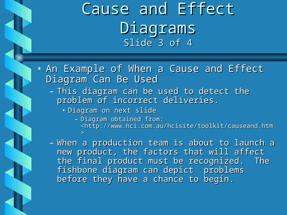
• An Example of When a Cause and Effect An Example of When a Cause and Effect Diagram Can Be UsedDiagram Can Be Used– This diagram can be used to detect the This diagram can be used to detect the
problem of incorrect deliveries.problem of incorrect deliveries.• Diagram on next slideDiagram on next slide
– Diagram obtained from: Diagram obtained from: <http://www.hci.com.au/hcisite/toolkit/causeand.htm><http://www.hci.com.au/hcisite/toolkit/causeand.htm>
– When a production team is about to launch a When a production team is about to launch a new product, the factors that will affect the new product, the factors that will affect the final product must be recognized. The final product must be recognized. The fishbone diagram can depict problems before fishbone diagram can depict problems before they have a chance to begin.they have a chance to begin.
Cause and Effect DiagramsCause and Effect DiagramsSlide 4 of 4Slide 4 of 4
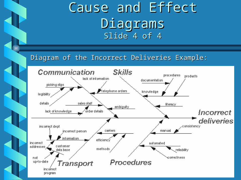
Diagram of the Incorrect Deliveries Example:Diagram of the Incorrect Deliveries Example:
Scatter DiagramsScatter DiagramsSlide 1 of 4Slide 1 of 4
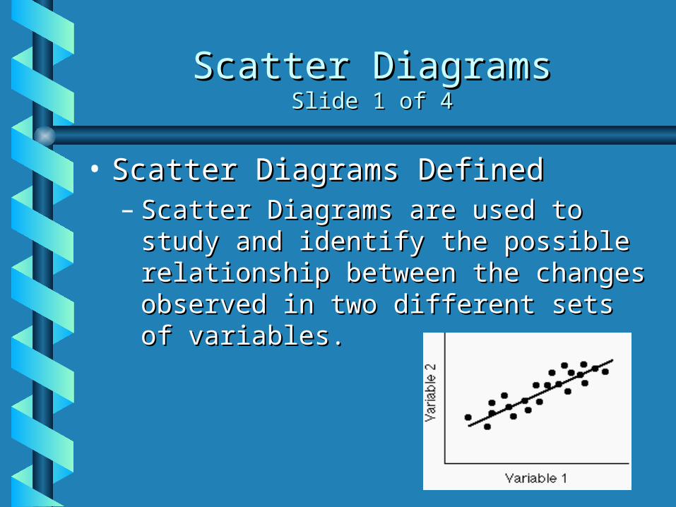
• Scatter Diagrams DefinedScatter Diagrams Defined– Scatter Diagrams are used to study Scatter Diagrams are used to study
and identify the possible relationship and identify the possible relationship between the changes observed in two between the changes observed in two different sets of variables.different sets of variables.
Scatter DiagramsScatter DiagramsSlide 2 of 4Slide 2 of 4
• Constructing a Scatter DiagramConstructing a Scatter Diagram– First, collect two pieces of data and First, collect two pieces of data and
create a summary table of the data.create a summary table of the data.– Draw a diagram labeling the horizontal Draw a diagram labeling the horizontal
and vertical axes. and vertical axes. • It is common that the “cause” variable be labeled It is common that the “cause” variable be labeled
on the X axis and the “effect” variable be labeled on the X axis and the “effect” variable be labeled on the Y axis.on the Y axis.
– Plot the data pairs on the diagram.Plot the data pairs on the diagram.– Interpret the scatter diagram for Interpret the scatter diagram for
direction and strength.direction and strength.
Scatter DiagramsScatter DiagramsSlide 3 of 4Slide 3 of 4
• An Example of When a Scatter An Example of When a Scatter Diagram Can Be UsedDiagram Can Be Used– A scatter diagram can be used to A scatter diagram can be used to
identify the relationship between the identify the relationship between the production speed of an operation and production speed of an operation and the number of defective parts made. the number of defective parts made.
Scatter DiagramsScatter DiagramsSlide 4 of 4Slide 4 of 4
• An Example of When a Scatter Diagram Can An Example of When a Scatter Diagram Can Be Used (cont.)Be Used (cont.)– Displaying the direction of the relationship will Displaying the direction of the relationship will
determine whether increasing the assembly line determine whether increasing the assembly line speed will increase or decrease the number of speed will increase or decrease the number of defective parts made. Also, the strength of the defective parts made. Also, the strength of the relationship between the assembly line speed relationship between the assembly line speed and the number of defective parts produced is and the number of defective parts produced is determined.determined.
– Example obtained from: Example obtained from: <http://www.sytsma.com/tqmtools/Scat.html><http://www.sytsma.com/tqmtools/Scat.html>
Flow ChartsFlow ChartsSlide 1 of 3Slide 1 of 3
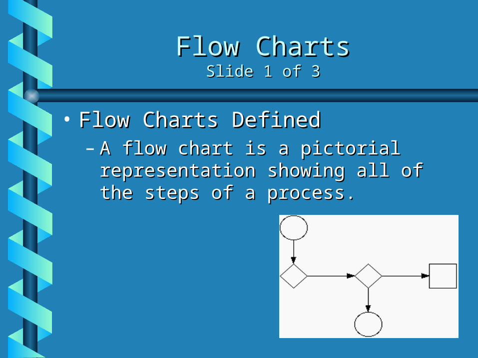
• Flow Charts DefinedFlow Charts Defined– A flow chart is a pictorial A flow chart is a pictorial
representation showing all of the representation showing all of the steps of a process.steps of a process.
Flow ChartsFlow ChartsSlide 2 of 3Slide 2 of 3
• Creating a Flow ChartCreating a Flow Chart– First, familiarize the participants with the First, familiarize the participants with the
flow chart symbols.flow chart symbols.– Draw the process flow chart and fill it out in Draw the process flow chart and fill it out in
detail about each element.detail about each element.– Analyze the flow chart. Determine which Analyze the flow chart. Determine which
steps add value and which don’t in the steps add value and which don’t in the process of simplifying the work.process of simplifying the work.
Flow ChartsFlow ChartsSlide 3 of 3 Slide 3 of 3
• Examples of When to Use a Flow Examples of When to Use a Flow ChartChart– Two separate stages of a process flow Two separate stages of a process flow
chart should be considered:chart should be considered:• The making of the productThe making of the product• The finished productThe finished product
Run ChartsRun ChartsSlide 1 of 3Slide 1 of 3
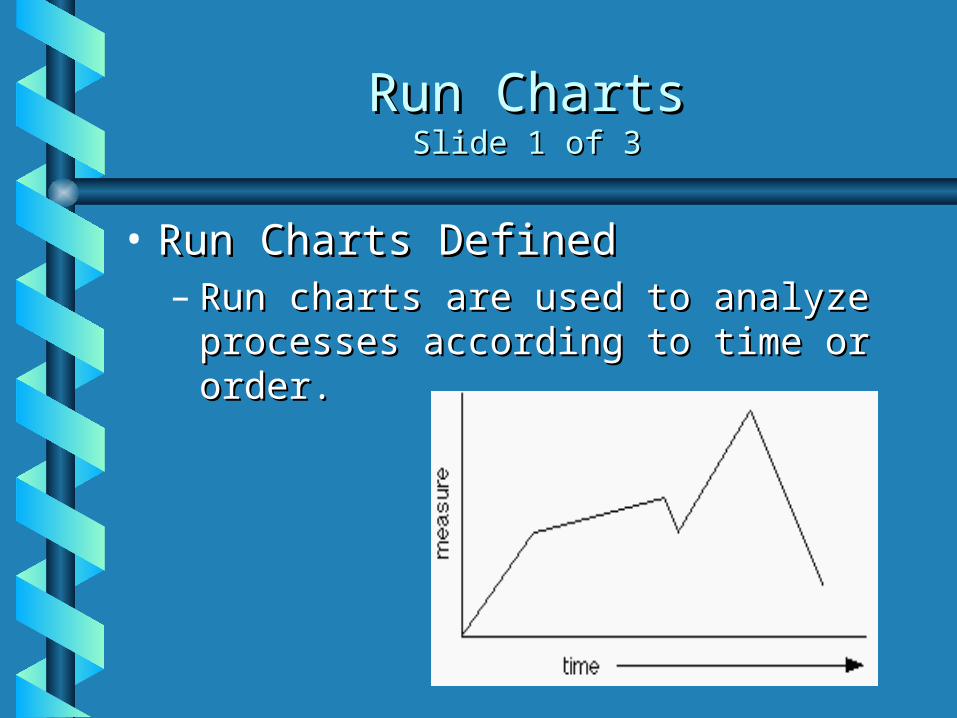
• Run Charts DefinedRun Charts Defined– Run charts are used to analyze Run charts are used to analyze
processes according to time or order.processes according to time or order.
Run ChartsRun ChartsSlide 2 of 3Slide 2 of 3
• Creating a Run ChartCreating a Run Chart– Gathering DataGathering Data
• Some type of process or operation must be available to take Some type of process or operation must be available to take measurements for analysis.measurements for analysis.
– Organizing DataOrganizing Data• Data must be divided into two sets of values X and Y. X values Data must be divided into two sets of values X and Y. X values
represent time and values of Y represent the measurements represent time and values of Y represent the measurements taken from the manufacturing process or operation.taken from the manufacturing process or operation.
– Charting DataCharting Data• Plot the Y values versus the X values.Plot the Y values versus the X values.
– Interpreting DataInterpreting Data• Interpret the data and draw any conclusions that will be beneficial Interpret the data and draw any conclusions that will be beneficial
to the process or operation.to the process or operation.
Run ChartsRun ChartsSlide 3 of 3Slide 3 of 3
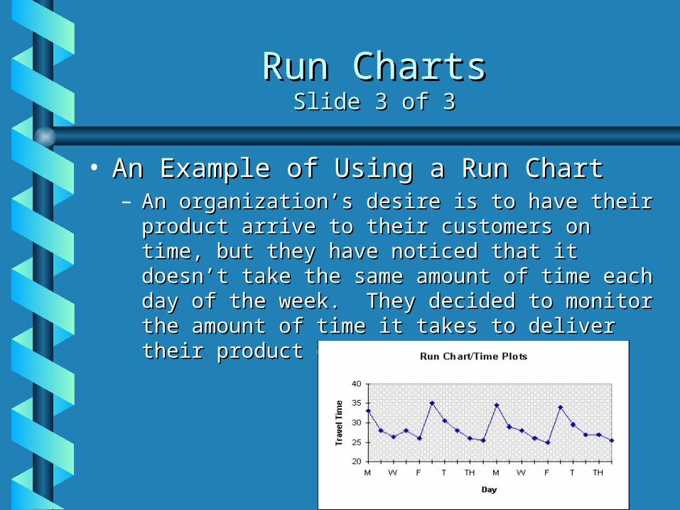
• An Example of Using a Run ChartAn Example of Using a Run Chart– An organization’s desire is to have their product An organization’s desire is to have their product
arrive to their customers on time, but they have arrive to their customers on time, but they have noticed that it doesn’t take the same amount of noticed that it doesn’t take the same amount of time each day of the week. They decided to time each day of the week. They decided to monitor the amount of time it takes to deliver monitor the amount of time it takes to deliver their product over the next few weeks.their product over the next few weeks.
Control ChartsControl ChartsSlide 1 of 3Slide 1 of 3
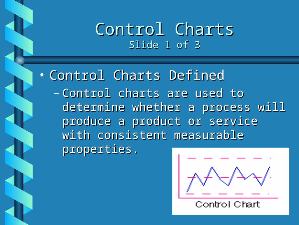
• Control Charts DefinedControl Charts Defined– Control charts are used to determine Control charts are used to determine
whether a process will produce a whether a process will produce a product or service with consistent product or service with consistent measurable properties.measurable properties.
Control ChartsControl ChartsSlide 2 of 3Slide 2 of 3
• Steps Used in Developing Process Steps Used in Developing Process Control ChartsControl Charts– Identify critical operations in the process Identify critical operations in the process
where inspection might be needed.where inspection might be needed.– Identify critical product characteristics.Identify critical product characteristics.– Determine whether the critical product Determine whether the critical product
characteristic is a variable or an attribute.characteristic is a variable or an attribute.– Select the appropriate process control chart.Select the appropriate process control chart.– Establish the control limits and use the chart Establish the control limits and use the chart
to monitor and improve.to monitor and improve.– Update the limits.Update the limits.
Control ChartsControl ChartsSlide 3 of 3Slide 3 of 3
• An Example of When to Use a An Example of When to Use a Control ChartControl Chart– Counting the number of defective Counting the number of defective
products or servicesproducts or services• Do you count the number of defects in a Do you count the number of defects in a
given product or service?given product or service?• Is the number of units checked or tested Is the number of units checked or tested
constant?constant?
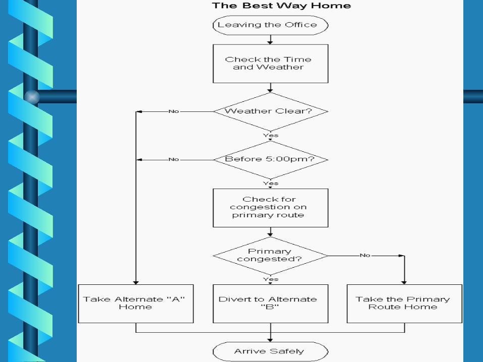
ActivityActivity
• Process Flow Chart for Finding the Best Process Flow Chart for Finding the Best Way HomeWay Home– Construct a process flow chart by making the Construct a process flow chart by making the
best decisions in finding the best route home.best decisions in finding the best route home.– Refer to the prior notes on flowcharts.Refer to the prior notes on flowcharts.
• Remember: Define and analyze the process, build a Remember: Define and analyze the process, build a step-by step picture of the process, and define step-by step picture of the process, and define areas of improvement in the process.areas of improvement in the process.
» Answer is on the next slideAnswer is on the next slide» Example obtained from: Example obtained from:
<http://deming.eng.clemson.edu/pub/tutorials/qct<http://deming.eng.clemson.edu/pub/tutorials/qctools/flowm.htm#Example>ools/flowm.htm#Example>
SummarySummary
This presentation provided learning material for each This presentation provided learning material for each of Ishikawa’s seven basic tools of quality. of Ishikawa’s seven basic tools of quality.
Each tool was clearly defined with definitions, a step-Each tool was clearly defined with definitions, a step-by-step process and an example of how the tool can by-step process and an example of how the tool can be used. be used.
As seen through the presentation, these tools are As seen through the presentation, these tools are rather simple and effective.rather simple and effective.