


Basic Qulaity Tools/Techniques Workshop for process improvement
43
The Basic Quality Tools (Toolbox) For Process Improvement Prepared By: Mr. Mouad Hourani, RN, BSc, MPh Nursing Quality Supervisor Sultan Bin Abdulaziz Humanitarian City 2016
-
Upload
mouad-hourani -
Category
Healthcare
-
view
1.051 -
download
3
Transcript of Basic Qulaity Tools/Techniques Workshop for process improvement

The Basic Quality
Tools (Toolbox) For Process Improvement
Prepared By:
Mr. Mouad Hourani, RN, BSc, MPh
Nursing Quality Supervisor
Sultan Bin Abdulaziz Humanitarian City
2016

Workshop objectives
1. What is the basic quality tools.
2. When to be used.
3. Example of each.
4. Implement using Excel/Visio.
5. Unit performance improvement assignment.
6. Attendance Certificate.

98
98.2
98.4
98.6
98.8
99
99.2
99.4
99.6
99.8
100
0 0.1 0.2 0.3 0.4 0.5 0.6 0.7
25 25
30
20
16
19
32
13
22 23
3
6
0
5
10
15
20
25
30
35
Jan Feb Mar Apr May Jun Jul Aug Sep Oct Nov Dec
Inco
mp
lia
nce
ra
te (
even
t p
er 1
00
0 P
t. D
ay
s)
Chart Title
patient identification incompliance (events per 100 patient days) Target
12
6
23
4
8
16
0
5
10
15
20
25
Medical Nursing Rehab Pharmaciest Dieticians Cleaners
# o
f o
bse
rva
tio
ns
Professions
Number of incomplince observed
The basic Quality
Tools/Techniques
Brain
storming Affinity Diagram
5 Why’s
Flowchart
Fishbone diagram
Check sheet Bar
Chart
Line Chart
Pareto chart
Scatter diagram
Matrix
FOCUSPDSA
1 2
3
4
5
6 7
8
9
10
11
12

Brainstorming
• Is a creative group process used to generate a large volume of ideas in
a minimum amount of time.
• When to Use Brainstorming
1. When a broad range of options (problems, causes, solutions,
actions…etc) is desired.
2. When creative, original ideas are desired.
3. When participation of the entire group is desired.
4. At any stage of performance improvement.

Brainstorming Procedure
1. Materials needed: flipchart, marking pens, tape and blank wall space.
2. Review the rules of brainstorming with the entire group:
• No criticism, no evaluation, no discussion of ideas.
• There are no stupid ideas. The wilder the better.
• All ideas are recorded.
• Piggybacking is encouraged: combining, modifying, expanding others’ ideas.
3. Discuss the problem and better to be conducted using “why,” “how,” or “what” question.
4. everyone should understand the subject of the brainstorm.
5. Allow a minute or two of silence for everyone to think about the question.
6. Invite people to call out their ideas. Record all ideas, in words as close as possible to
those used by the contributor.
7. Continue to generate and record ideas until several minutes’ silence produces no more.

Affinity diagram • The affinity diagram organizes a large number of ideas into their
natural relationships. This method taps a team’s creativity and intuition.
It was created in the 1960s by Japanese anthropologist Jiro Kawakita.
• When to Use an Affinity Diagram:
1. When you are confronted with many facts or ideas in apparent
confusion.
2. When issues seem too large and complex to grasp.
3. When group consensus is necessary.
• Typical situations are:
1. After a brainstorming exercise.
2. When analyzing verbal data, such as survey results.

Affinity Diagram Procedure
1. Record each idea with a marking pen on a separate sticky note or
card.
2. Randomly spread notes on a large work surface so all notes are visible
to everyone.
3. Look for ideas that seem to be related in some way. Place them side
by side. Repeat until all notes are grouped.
4. When ideas are grouped, select a heading for each group.

Affinity Diagram Example

5 Why’s Technique
• The 5 Whys Helps identify the root cause of a problem and Determine
the relationship between different root causes of a problem.
• Developed by Sakichi Toyoda and was used within the Toyota Motor
Corporation.
• It is one of the simplest tools; easy to complete without statistical
analysis.
• When to use 5 Whys ?
1. When problems involve human factors or interactions.
2. Can be used within fishbone tool.
3. When you implement Root cause study of Major incidents.
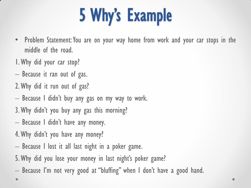
5 Why’s Example • Problem Statement: You are on your way home from work and your car stops in the
middle of the road.
1. Why did your car stop?
– Because it ran out of gas.
2. Why did it run out of gas?
– Because I didn’t buy any gas on my way to work.
3. Why didn’t you buy any gas this morning?
– Because I didn’t have any money.
4. Why didn’t you have any money?
– Because I lost it all last night in a poker game.
5. Why did you lose your money in last night’s poker game?
– Because I’m not very good at “bluffing” when I don’t have a good hand.

5 Why’s and the Fishbone Diagram
• The 5 Whys can be used as a part of the fishbone diagram.
• Once all inputs are established on the fishbone, you can use the 5
Whys technique to drill down to the root causes.

Flowchart
• Also called: process flowchart, process flow diagram.
• A flowchart is a picture of the separate steps of a process in sequential
order.
• Elements that may be included are: sequence of actions, materials or
services entering or leaving the process (inputs and outputs), decisions
that must be made, people who become involved, time involved at each
step and/or process measurements.
• The process described can be anything: a manufacturing process, an
administrative or service process, a project plan. This is a generic tool
that can be adapted for a wide variety of purposes.
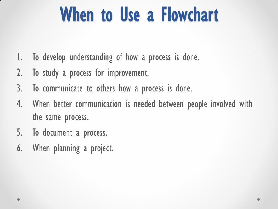
When to Use a Flowchart
1. To develop understanding of how a process is done.
2. To study a process for improvement.
3. To communicate to others how a process is done.
4. When better communication is needed between people involved with
the same process.
5. To document a process.
6. When planning a project.

• Medication administration process.
• Patient transfer process to OR.
• Patient discharge process.
Flowchart Diagram Exercise

Fishbone Diagram
• Also Called: Cause–and–Effect Diagram, Ishikawa Diagram
• The fishbone diagram:
1. Identifies many possible causes for an effect or problem.
2. It can be used to structure a brainstorming session.
3. It immediately sorts ideas into useful categories.
• When to Use a Fishbone Diagram
1. When identifying possible causes for a problem.
2. Especially when a team’s thinking tends to fall into ruts.

Fishbone Diagram Procedure
• Step 1: Materials needed: flipchart or whiteboard, marking pens.
• Step 2: Agree on a problem statement (effect).
• Step 3: Write it at the center right of the flipchart or whiteboard. Draw
a box around it and draw a horizontal arrow running to it.
• Step 4: Brainstorm the major categories of causes of the problem. If this
is difficult use headings of Toyota Production System (5 Ms):
1. Methods
2. Machines (equipment)
3. People (manpower)
4. Materials
5. Measurement
6. Mother Nature(Environment) (added later and we want to include)
Fishbone Diagram Procedure
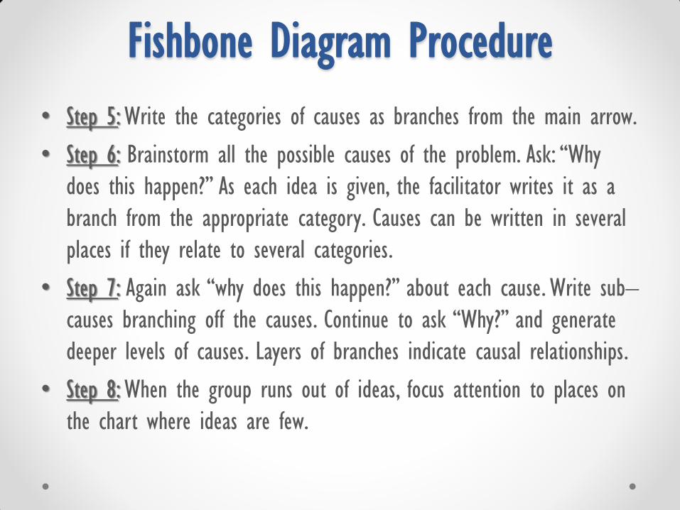
• Step 5: Write the categories of causes as branches from the main arrow.
• Step 6: Brainstorm all the possible causes of the problem. Ask: “Why
does this happen?” As each idea is given, the facilitator writes it as a
branch from the appropriate category. Causes can be written in several
places if they relate to several categories.
• Step 7: Again ask “why does this happen?” about each cause. Write sub–
causes branching off the causes. Continue to ask “Why?” and generate
deeper levels of causes. Layers of branches indicate causal relationships.
• Step 8: When the group runs out of ideas, focus attention to places on
the chart where ideas are few.
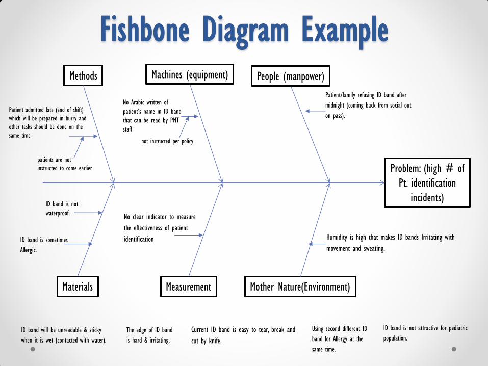
Problem: (high # of
Pt. identification
incidents)
Methods
Mother Nature(Environment) Measurement
People (manpower) Machines (equipment)
Materials
No Arabic written of
patient’s name in ID band
that can be read by PMT
staff
Patient admitted late (end of shift)
which will be prepared in hurry and
other tasks should be done on the
same time
Patient/family refusing ID band after
midnight (coming back from social out
on pass).
Using second different ID
band for Allergy at the
same time.
Current ID band is easy to tear, break and
cut by knife.
Humidity is high that makes ID bands Irritating with
movement and sweating.
ID band is not attractive for pediatric
population. ID band will be unreadable & sticky
when it is wet (contacted with water).
ID band is sometimes
Allergic.
The edge of ID band
is hard & irritating.
ID band is not
waterproof. No clear indicator to measure
the effectiveness of patient
identification
Fishbone Diagram Example
patients are not
instructed to come earlier
not instructed per policy

• High incidents of Medication error.
• Low documentation compliance.
• Low Hand hygiene compliance.
• High incidents of fall.
Fishbone Diagram Exercise
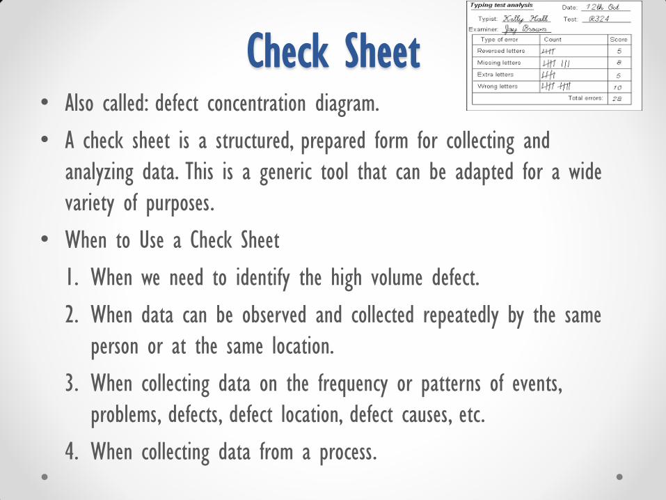
Check Sheet • Also called: defect concentration diagram.
• A check sheet is a structured, prepared form for collecting and
analyzing data. This is a generic tool that can be adapted for a wide
variety of purposes.
• When to Use a Check Sheet
1. When we need to identify the high volume defect.
2. When data can be observed and collected repeatedly by the same
person or at the same location.
3. When collecting data on the frequency or patterns of events,
problems, defects, defect location, defect causes, etc.
4. When collecting data from a process.

Check Sheet Procedure
1. Decide what event or problem will be observed. Develop operational
definitions.
2. Decide when data will be collected and for how long.
3. Design the form. Set it up so that data can be recorded simply by
making check marks or Xs or similar symbols and so that data do
not have to be recopied for analysis.
4. Label all spaces on the form.
5. Test the check sheet for a short trial period to be sure it collects the
appropriate data and is easy to use.
6. Each time the targeted event or problem occurs, record data on the
check sheet.

Check Sheet Example
Documentation compliance within 24hrs of admission
Item Sat Sun Mon Tue Wed Thu Fri Total
Admission
assessment
Meds.
Reconciliation
Nursing education
Nursing care plan

• Patient identification defects.
• Hand hygiene five moments compliance.
• Patients’ discharge delay.
Check Sheet Exercise
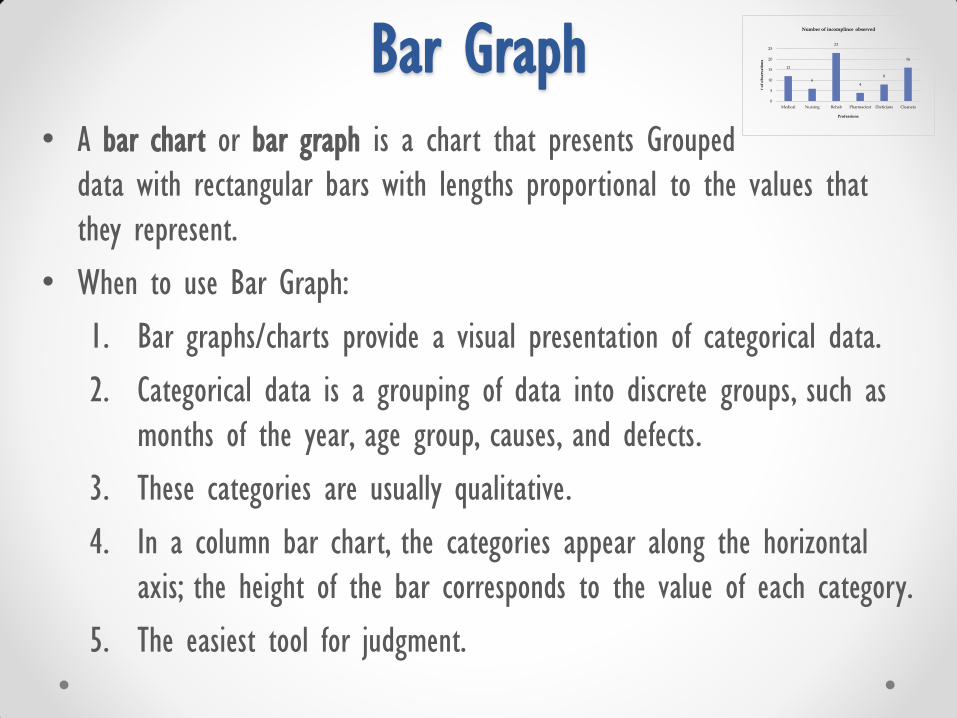
Bar Graph • A bar chart or bar graph is a chart that presents Grouped
data with rectangular bars with lengths proportional to the values that
they represent.
• When to use Bar Graph:
1. Bar graphs/charts provide a visual presentation of categorical data.
2. Categorical data is a grouping of data into discrete groups, such as
months of the year, age group, causes, and defects.
3. These categories are usually qualitative.
4. In a column bar chart, the categories appear along the horizontal
axis; the height of the bar corresponds to the value of each category.
5. The easiest tool for judgment.
12
6
23
4
8
16
0
5
10
15
20
25
Medical Nursing Rehab Pharmaciest Dieticians Cleaners
# o
f o
bse
rva
tio
ns
Professions
Number of incomplince observed

Bar Graph Exercise
• Reasons of high Fall rate.
• Reasons of High HAPU percentage.
• Number of incidents per level.
• OR operation census.

Line Graph
• A line chart or line graph is a type of chart which displays information
as a series of data points called 'markers' connected by straight
line segments.
• It is a basic type of chart common in many fields.
• When to use a line graph:
1. to visualize a trend in data over intervals of time – a time
series – thus the line is often drawn chronologically.
2. To identify a target and monitor performance based on it.
25 25
30
20
16 19
32
13
22 23
3 6
0
5
10
15
20
25
30
35
Jan Feb Mar Apr May Jun Jul Aug Sep Oct Nov Dec
Inco
mp
lia
nce
ra
te (
even
t p
er 1
00
0 P
t. D
ay
s)
Chart Title
patient identification incompliance (events per 100 patient days) Target

Line Graph Exercise
• Fall rate incidents per 1000 patient days
• HAPU percentage.
• Documentation compliance.
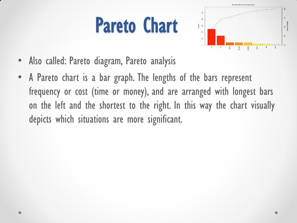
Pareto Chart
• Also called: Pareto diagram, Pareto analysis
• A Pareto chart is a bar graph. The lengths of the bars represent
frequency or cost (time or money), and are arranged with longest bars
on the left and the shortest to the right. In this way the chart visually
depicts which situations are more significant.
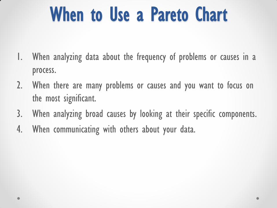
When to Use a Pareto Chart
1. When analyzing data about the frequency of problems or causes in a
process.
2. When there are many problems or causes and you want to focus on
the most significant.
3. When analyzing broad causes by looking at their specific components.
4. When communicating with others about your data.

Pareto Chart Exercise
• Nursing forms and time length of documentation.
• Fall related incidents as per reasons.
• Staff turnover rate as per reasons.

Scatter Diagram
• Also called: scatter plot, X–Y graph
• The scatter diagram graphs pairs of numerical data, with one variable
on each axis, to look for a relationship between them.
• If the variables are correlated, the points will fall along a line or curve.
• The better the correlation, the tighter the points will hug the line.
• When to use a scatter diagram:
1. To display the relationship between two continuous variables
(cause and effect) (X, Y).
2. Helps to whether the cause is significant and needs action or not.
3. If you have 50 and more of data pairs.

• LOS and HAPU.
• Number of monthly patient census in a unit and monthly medication
administration errors.
• Number of ventilator days and VAP.
Scatter Chart Exercise

FOCUS - PDSA
• Also called: FOCUS-PDCA, Deming cycle, Shewhart cycle .
• When to Use Plan–Do–Check–Act
1. As a model for continuous improvement.
2. When starting a new improvement project.
3. When developing a new or improved design of a process, product
or service.
4. When defining a repetitive work process.
5. When planning data collection and analysis in order to verify and
prioritize problems or root causes.
6. When implementing any change.

Steps of FOCUS PDSA STEP DESCRIPTION
TOOLS/ TECHNIQUES TO
USE
F
Find a process to improve:
• Prioritize opportunities based on patient/internal customer
inputs, clinical monitoring and /or strategic directions.
1. Patient survey.
2. Brainstorming.
3. Observation tools.
4. Existing reports.
O
Organize a team:
• Select a team/individual who has the content knowledge of
what you hope to improve.
1. Agenda/meeting
minutes.
2. Communication.
3. Project Charter.
C
Clarify the current status:
• Understand the current problem and current process steps.
• Identify the people/resources involved in the process steps.
• Collect necessary data in current state.
1. Flowchart.
2. Observations.
3. Data collected (e.g.
KPIs).

Steps of FOCUS PDSA
STEP DESCRIPTION TOOLS/ TECHNIQUES TO
USE
U
Understand root causes:
• Understand root causes in order to identify why the
process is not working effectively.
1. Brainstorming.
2. 5 Whys
3. Fishbone diagram.
4. Affinity Diagram.
5. Check sheet.
6. Scatter graph.
S Select the improvement:
Establish a goal regarding what you will improve.
1. Aim statement.
2. Decision Matrix.
3. Pareto chart.
P
Plan the improvement:
• Plan to carry out the cycle (what, how, who, when)
• Create a data collection plan.
• Focus on small tests of change.
1. flowchart.
2. Action plan.
3. Data collection plan.
4. Decision Matrix.
5. Brainstorming.

Steps of FOCUS PDSA STEP DESCRIPTION TOOLS/ TECHNIQUES TO USE
D
Do the improvement:
• Carry out the plan to make change.
• Document problems or unexpected observations.
• Measure the impact of the change.
1. Action plans.
2. Data collection plan.
3. Check sheet.
4. Observations tools.
5. Communication plan.
6. Decision Matrix.
S
Study the results:
• Examine data to determine whether the change led to the expected
improvement (summarize finding results)
1. Run chart.
2. Line graph with targets.
3. Bar graph.
4. Control chart.
5. Scatter graph.
6. Check sheet.
7. Surveys.
A
Act and determine next steps:
Use findings to determine and act upon next steps
1. holds the gains
2. Develop plan to monitor data.
3. Revise change idea and begin new PDSA cycle
4. Start another FOCU-PDSA on a new improvement.
1. Action plan.
2. Story boards.
3. Charter.

Performance Improvement Competition
• Use the learned tools to find an opportunity to improve and implement
performance improvement project/actions.
• Cooperatively with your charge nurse and the staff in your unit, conduct
your improvement project/actions within an identified time frame and
submit to nursing quality supervisor for competition enrollment.
• On a defined date using structured selection criteria, the winners will be
selected and then announced as first, second and third best performance
improvement projects/actions.
• Celebration will be done for the winners and success stories will be
publicized.