BASIC QUALITY TOOLS-1
44
1 1 Basic Quality Tools 1. Check Sheets 2. Histograms 3. Pareto Charts 4. Cause and Effect Diagram 5. Flowcharts 6. Control Charts 7. Scatter Diagrams Many people only consider 7 basic tools. ASQ does not list Flowcharts as one of the basic tools. However, in order to improve processes and know where to measure, you also need to know how the process is designed, what are the variables that influence the process, and how they interact.
Transcript of BASIC QUALITY TOOLS-1

1
1
Basic Quality Tools
1. Check Sheets
2. Histograms
3. Pareto Charts
4. Cause and Effect Diagram
5. Flowcharts
6. Control Charts
7. Scatter Diagrams
Many people only consider 7 basic tools. ASQ does not list Flowcharts
as one of the basic tools. However, in order to improve processes and
know where to measure, you also need to know how the process is
designed, what are the variables that influence the process, and how
they interact.

2
2
Check Sheets
• A structured form for collecting and analyzing data.
• A generic tool that can be adapted for a wide variety of purposes.
• Used by teams to record and compile data
• Easy to understand
• Builds with each observation based on facts
• Forces agreement on each definition
• Generates patterns

3
3
When to Use a Check Sheet
• When data can be observed and collected repeatedly by the same person or at the same location.
• When collecting data on the frequency or patterns of events, problems, defects, defect location, defect causes, etc.
• When collecting data from a production process.
4
4
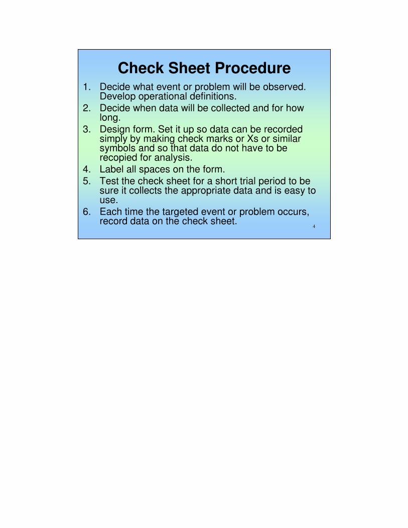
Check Sheet Procedure 1. Decide what event or problem will be observed.
Develop operational definitions. 2. Decide when data will be collected and for how
long. 3. Design form. Set it up so data can be recorded
simply by making check marks or Xs or similar symbols and so that data do not have to be recopied for analysis.
4. Label all spaces on the form. 5. Test the check sheet for a short trial period to be
sure it collects the appropriate data and is easy to use.
6. Each time the targeted event or problem occurs, record data on the check sheet.

5
5
Check Sheets
Keyboard Errors in Class Assignments
1 2 3 Total
Centering || ||| ||| 8
Spelling |||| || |||| |||| | |||| 23
Punctuation |||| |||| |||| |||| |||| |||| |||| |||| 40
Missed Paragraph || | | 4
Wrong Numbers ||| |||| ||| 10
Wrong Page Numbers | | || 4
Tables |||| |||| |||| 13
Totals 34 35 33 102
September-01Mistakes

6
6
Histograms• A frequency distribution shows how often each
different value in a set of data occurs.
• It is the most commonly used graph to show frequency distributions.
• It looks very much like a bar chart, but there are important differences between them.
• It summarizes large amount of data
• It shows relative frequency of occurrence and process centralization with relative distribution of data
• Shows capability of the process
7
7
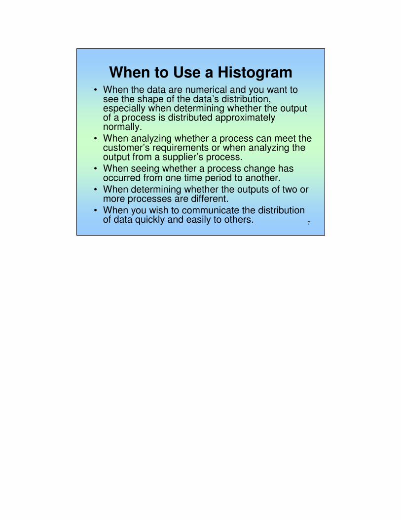
When to Use a Histogram • When the data are numerical and you want to
see the shape of the data’s distribution, especially when determining whether the output of a process is distributed approximately normally.
• When analyzing whether a process can meet the customer’s requirements or when analyzing the output from a supplier’s process.
• When seeing whether a process change has occurred from one time period to another.
• When determining whether the outputs of two or more processes are different.
• When you wish to communicate the distribution of data quickly and easily to others.
8
8
Histogram Analysis
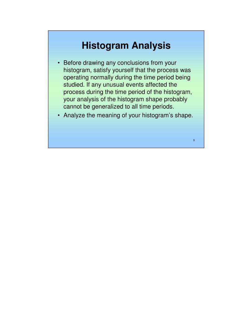
• Before drawing any conclusions from your histogram, satisfy yourself that the process was operating normally during the time period being studied. If any unusual events affected the process during the time period of the histogram, your analysis of the histogram shape probably cannot be generalized to all time periods.
• Analyze the meaning of your histogram’s shape.

9
9
Histograms
1 2 3 4 5 6 7 8 9 10 ClassBoundariesMid PointFrequency
5.5 5.0 5.6 5.5 6.1 7.2 6.8 4.9 8.0 7.1 1 0 - .99 0.5 0
5.3 8.0 4.8 6.2 5.0 8.0 5.2 5.3 5.2 4.9 2 1 - 1.99 1.5 0
8.0 5.2 4.6 4.2 4.2 3.1 5.0 3.1 5.0 8.0 3 2 -2.99 2.5 0
3.1 5.0 7.5 6.2 7.1 6.2 5.3 3.8 4.2 5.2 4 3 -3.99 3.5 8
8.8 4.2 6.3 7.0 6.8 5.3 6.2 7.1 8.0 5.2 5 4 - 4.99 4.5 12
7.0 6.7 6.2 7.1 8.2 5.0 7.0 4.1 3.1 5.0 6 5 - 5.99 5.5 29
6.3 3.4 7.0 5.5 7.8 4.2 7.1 5.6 6.2 7.0 7 6 - 6.99 6.5 19
7.2 6.8 7.1 5.6 6.2 8.0 5.2 5.0 6.7 7.1 8 7 - 7.99 7.5 21
8.1 7.1 6.0 7.1 7.0 3.8 5.0 4.2 3.8 6.7 9 8 - 8.99 8.5 11
8.5 5.8 6.5 5.0 7.1 5.0 6.9 5.5 4.8 7.5 10 9 - 9.99 9.5 0

10
10
Histograms
Histogram
0 0 0
8
12
29
1921
11
00
5
10
15
20
25
30
1 2 3 4 5 6 7 8 9 10
Class
Fre
qu
en
cy

11
11
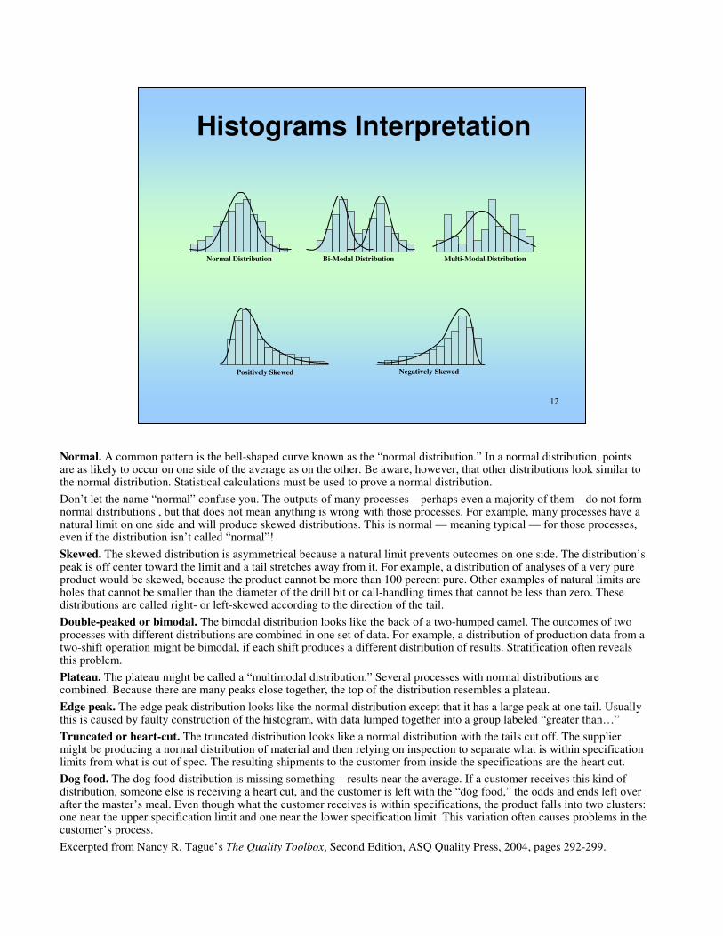
Typical Histogram Shapes and What They Mean
• Normal
• Bi-Modal
• Multi-Modal
• Skewed
Normal. A common pattern is the bell-shaped curve known as the
“normal distribution.” In a normal distribution, points are as likely to
occur on one side of the average as on the other. Be aware, however,
that other distributions look similar to the normal distribution. Statistical
calculations must be used to prove a normal distribution.
Don’t let the name “normal” confuse you. The outputs of many
processes—perhaps even a majority of them—do not form normal
distributions , but that does not mean anything is wrong with those
processes. For example, many processes have a natural limit on one side
and will produce skewed distributions. This is normal — meaning
typical — for those processes, even if the distribution isn’t called
“normal”!
12
12
Histograms Interpretation
Normal Distribution Bi-Modal Distribution Multi-Modal Distribution
Positively Skewed Negatively Skewed
Normal. A common pattern is the bell-shaped curve known as the “normal distribution.” In a normal distribution, points are as likely to occur on one side of the average as on the other. Be aware, however, that other distributions look similar to the normal distribution. Statistical calculations must be used to prove a normal distribution.
Don’t let the name “normal” confuse you. The outputs of many processes—perhaps even a majority of them—do not form normal distributions , but that does not mean anything is wrong with those processes. For example, many processes have a natural limit on one side and will produce skewed distributions. This is normal — meaning typical — for those processes, even if the distribution isn’t called “normal”!
Skewed. The skewed distribution is asymmetrical because a natural limit prevents outcomes on one side. The distribution’s peak is off center toward the limit and a tail stretches away from it. For example, a distribution of analyses of a very pure product would be skewed, because the product cannot be more than 100 percent pure. Other examples of natural limits are holes that cannot be smaller than the diameter of the drill bit or call-handling times that cannot be less than zero. These distributions are called right- or left-skewed according to the direction of the tail.
Double-peaked or bimodal. The bimodal distribution looks like the back of a two-humped camel. The outcomes of two processes with different distributions are combined in one set of data. For example, a distribution of production data from a two-shift operation might be bimodal, if each shift produces a different distribution of results. Stratification often reveals this problem.
Plateau. The plateau might be called a “multimodal distribution.” Several processes with normal distributions are combined. Because there are many peaks close together, the top of the distribution resembles a plateau.
Edge peak. The edge peak distribution looks like the normal distribution except that it has a large peak at one tail. Usually this is caused by faulty construction of the histogram, with data lumped together into a group labeled “greater than…”
Truncated or heart-cut. The truncated distribution looks like a normal distribution with the tails cut off. The supplier might be producing a normal distribution of material and then relying on inspection to separate what is within specification limits from what is out of spec. The resulting shipments to the customer from inside the specifications are the heart cut.
Dog food. The dog food distribution is missing something—results near the average. If a customer receives this kind of distribution, someone else is receiving a heart cut, and the customer is left with the “dog food,” the odds and ends left over after the master’s meal. Even though what the customer receives is within specifications, the product falls into two clusters: one near the upper specification limit and one near the lower specification limit. This variation often causes problems in the customer’s process.
Excerpted from Nancy R. Tague’s The Quality Toolbox, Second Edition, ASQ Quality Press, 2004, pages 292-299.

13
13
Histograms
LCL TARGET LCL LCL TARGET LCL
LCL TARGET LCLLCL TARGET LCL

14
14
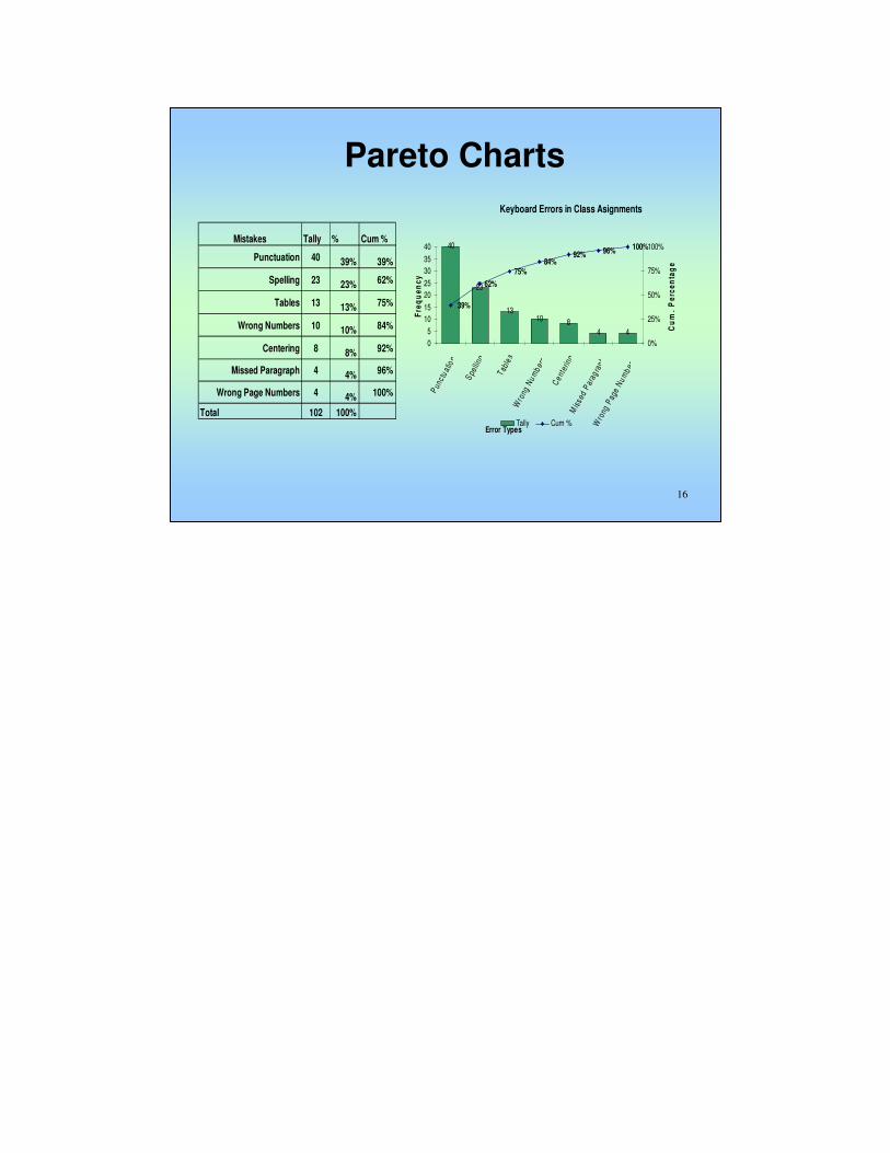
Pareto Charts
• A bar graph where the lengths of the bars represent frequency or cost (time or money), and are arranged with longest bars on the left and the shortest to the right.
• The chart visually depicts which situations are more significant.
• Used by teams to concentrate on greatest problems
• Based on 80-20 Rule
• Easy display of problems in order of importance
• Helps prevents “shifting of problems”

15
15
When to Use a Pareto Chart
• When analyzing data about the frequency of problems or causes in a process.
• When there are many problems or causes and you want to focus on the most significant.
• When analyzing broad causes by looking at their specific components.
• When communicating with others about your data.
16
16
Mistakes Tally % Cum %
Punctuation 40 39% 39%
Spelling 23 23% 62%
Tables 13 13% 75%
Wrong Numbers 10 10% 84%
Centering 8 8% 92%
Missed Paragraph 4 4% 96%
Wrong Page Numbers 4 4% 100%
Total 102 100%
Keyboard Errors in Class Asignments
4
40
23
4810
13
62%
75%84%
92% 96% 100%
39%
0
5
10
15
20
25
30
35
40
Pun
c tu
atio
n
Spe
lling
Tab
les
Wro
ng N
um
ber
s
Cen
terin
gM
isse
d P
arag
raph
Wro
ng P
age
Nu
mb
ers
Error Types
Fre
qu
en
cy
0%
25%
50%
75%
100%
Cu
m.
Pe
rce
nta
ge
Tally Cum %
Pareto Charts

17
17
Pareto Chart Analysis
As any Pareto is constructed, you need to look at the criticality of each category and weigh its value to the improvement effort. Just because a category is the highest, it does not necessarily mean that it is the costliest. As you analyze the graph, look into cost, value, impact, recovery time, etc. on the product, process, operation, organization, etc. You will then apply same rules once you break down each category.

18
18
Pareto Chart with Weights
Mistakes Points Tally Weight % Cum %
Spelling 4 23 92 23% 23%
Punctuation 2 40 80 39% 62%
Centering 3 8 24 8% 70%
Missed Paragraph 4 4 16 4% 74%
Tables 1 13 13 13% 86%
Wrong Numbers 1 10 10 10% 96%
Wrong Page Numbers 1 4 4 4% 100%
Total 102 100%
Keyboard Errors in Class Asignments
4
92
80
10131624
62%70% 74%
86%
96%100%
23%
-5
5
15
25
35
4555
65
75
85
95
Spe
l l ing
Pun
c tu a
tion
Ce n t
e rin
gM
iss e
d P
ara g
raph
T ab l
e sW
ron g
Nu m
b ers
Wr o
ng P
age
Nu m
b ers
Error Types
Fre
qu
en
cy
0%
25%
50%
75%
100%
Weight Cum %
19
19
Cause and Effect Diagram
• Also called Ishikawa or Fishbone Diagram
• It identifies many possible causes for an effect or problem. It can be used to structure a brainstorming session. It immediately sorts ideas into useful categories.
• Used by teams to identify and explore possible causes to problems
• Concentrates on causes, not symptoms
• Involves everyone’s knowledge of process
• Great brainstorming tool

20
20
When to Use a Fishbone Diagram
• When identifying possible causes for a problem
• When causes can come from many different areas
• Especially when a team’s thinking tends to fall into ruts

21
21
Cause and Effect Diagram
Excessive Punctuation
Errors
People
MaterialsMethods
MachineryMachine gets stuck
Too old
Needs Maintenance
No $ for repairs
Improper training
Chairs uncomfortable
Damaged ribbonsTeachers don’t have training in new methods
Too many people taking tests at same time
Not enough typewriters
Students not used to typewriters
Students use computers
Spell check built into programs.
Students attitude about typewriters
Material to type is too hard

22
22
Cause and Effect Analysis
Once you have narrowed down to one or two possible causes, then you need to assemble a team, assign task, or just direct the correction for the situation.
23
23
Flow Charts
• Shows the steps in a process to aid in its understanding
• Identifies locations and steps where data can be collected
• Examines which activities may impact process improvements and streamlines
• Easy to understand and follow

24
24
Flowcharts (Process Flow Diagram)
• Is a generic, pictorial tool that can be adapted for a wide variety of purposes by separating steps of a process in sequential order.
• Elements that may be included are: sequence of actions, materials or services entering or leaving the process (inputs and outputs), decisions that must be made, people who become involved, time involved at each step and/or process measurements.
• The process described can be: a manufacturing process, an administrative or service process, a project plan.
25
25
When to Use a Flowchart
• To develop understanding and to communicate to others of how a process is done.
• To study a process for improvement.
• When better communication is needed between people involved with the same process.
• To document a process. When planning a project.

26
26
Flow Chart Sample
PrepareTest
Materials
PrepareTest
Site
Verify
Number ofStudents
Taking Test
EnoughMaterials
for
Students?
NO
YES
Open Room,Sit Students, and
Distribute Test
Materials
Record
Attendanceand test scores
Collect Testsafter test is over
Read Instructions
andStart Test
ProcureMaterials for
Students Taking Testor Re-schedule Test

27
27
Flowchart Considerations
• The best Flowchart – Do not worry. • Identify and involve all key people
involved with the process. • Do not assign a “technical expert”. • Computer software is available for
drawing flowcharts.
•Don’t worry too much about drawing the flowchart the “right way.”
The right way is the way that helps those involved understand the
process.
•Identify and involve in the flowcharting process all key people
involved with the process. This includes those who do the work in the
process: suppliers, customers and supervisors. Involve them in the
actual flowcharting sessions by interviewing them before the sessions
and/or by showing them the developing flowchart between work
sessions and obtaining their feedback.
•Do not assign a “technical expert” to draw the flowchart. People who
actually perform the process should do it.
•Computer software is available for drawing flowcharts. Software is
useful for drawing a neat final diagram, but the method given here
works better for the messy initial stages of creating the flowchart.
28
28
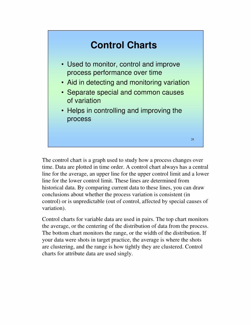
Control Charts
• Used to monitor, control and improve process performance over time
• Aid in detecting and monitoring variation
• Separate special and common causes of variation
• Helps in controlling and improving the process
The control chart is a graph used to study how a process changes over
time. Data are plotted in time order. A control chart always has a central
line for the average, an upper line for the upper control limit and a lower
line for the lower control limit. These lines are determined from
historical data. By comparing current data to these lines, you can draw
conclusions about whether the process variation is consistent (in
control) or is unpredictable (out of control, affected by special causes of
variation).
Control charts for variable data are used in pairs. The top chart monitors
the average, or the centering of the distribution of data from the process.
The bottom chart monitors the range, or the width of the distribution. If
your data were shots in target practice, the average is where the shots
are clustering, and the range is how tightly they are clustered. Control
charts for attribute data are used singly.

29
29
When to Use Control Charts
• To control ongoing processes by finding and correcting problems as they occur.
• To predict the expected range of outcomes from a process.
• To determine whether a process is stable (in statistical control).
• To analyze patterns of process variation from special causes (non-routine events) or common causes (built into the process).
• To determine whether your quality improvement project should aim to prevent specific problems or to make fundamental changes to the process.

30
30
Control Charts
• Types of Data
– Variable: Data that can be measured
• Distance, time, volume, concentration, etc.
– Attribute: Data that is subject to two outcomes
• Pass/fail, Go-NoGo, etc.
31
31
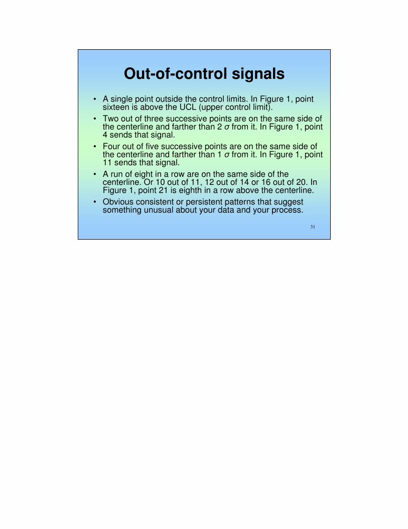
Out-of-control signals
• A single point outside the control limits. In Figure 1, point sixteen is above the UCL (upper control limit).
• Two out of three successive points are on the same side of the centerline and farther than 2 σ from it. In Figure 1, point 4 sends that signal.
• Four out of five successive points are on the same side of the centerline and farther than 1 σ from it. In Figure 1, point 11 sends that signal.
• A run of eight in a row are on the same side of the centerline. Or 10 out of 11, 12 out of 14 or 16 out of 20. In Figure 1, point 21 is eighth in a row above the centerline.
• Obvious consistent or persistent patterns that suggest something unusual about your data and your process.

32
32
33
33
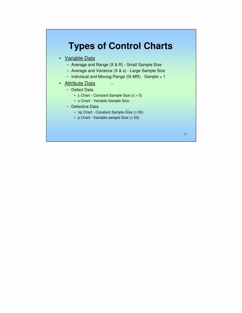
Types of Control Charts• Variable Data
– Average and Range (X & R) - Small Sample Size
– Average and Variance (X & s) - Large Sample Size
– Individual and Moving Range (IX-MR) - Sample = 1
• Attribute Data
– Defect Data
• c Chart - Constant Sample Size (c > 5)
• u Chart - Variable Sample Size
– Defective Data
• np Chart - Constant Sample Size (≥ 50)
• p Chart - Variable sample Size (≥ 50)

34
34
X-Bar Char
2.9
1 2 3 4 5 6 7 8 9 10 11 12 13 14 15 16 17
Week No.
X-B
ar
UCL
UCL
R Chart
0
0.5
1
1 2 3 4 5 6 7 8 9 10 11 12 13 14 15 16 17
Week No.
Range
UCL
UCL

35
35
Scatter Diagrams
• Studies and identifies possible relationship between changes of two variables
• Provides visual and statistical means to test the strength of a potential relationship
• Is a good follow-up to a Cause & Effect Diagram
The scatter diagram graphs pairs of numerical data, with one variable on
each axis, to look for a relationship between them. If the variables are
correlated, the points will fall along a line or curve. The better the
correlation, the tighter the points will hug the line.

36
36
When to Use a Scatter Diagram
• When you have paired numerical data.
• When your dependent variable may have multiple values for each value of your independent variable.
• When trying to determine whether the two variables are related, such as…– When trying to identify potential root causes of problems.
– After brainstorming causes and effects using a fishbone diagram, to determine objectively whether a particular cause andeffect are related.
– When determining whether two effects that appear to be related both occur with the same cause.
– When testing for autocorrelation before constructing a control chart.
37
37

38
38
Scatter Diagram Example
The ZZ-400 manufacturing team suspects a relationship between
product purity (percent purity) and the amount of iron (measured in
parts per million or ppm). Purity and iron are plotted against each other
as a scatter diagram, as shown in the figure below.
There are 24 data points. Median lines are drawn so that 12 points fall
on each side for both percent purity and ppm iron.
To test for a relationship, they calculate:
A = points in upper left + points in lower right = 9 + 9 = 18
B = points in upper right + points in lower left = 3 + 3 = 6
Q = the smaller of A and B = the smaller of 18 and 6 = 6
N = A + B = 18 + 6 = 24
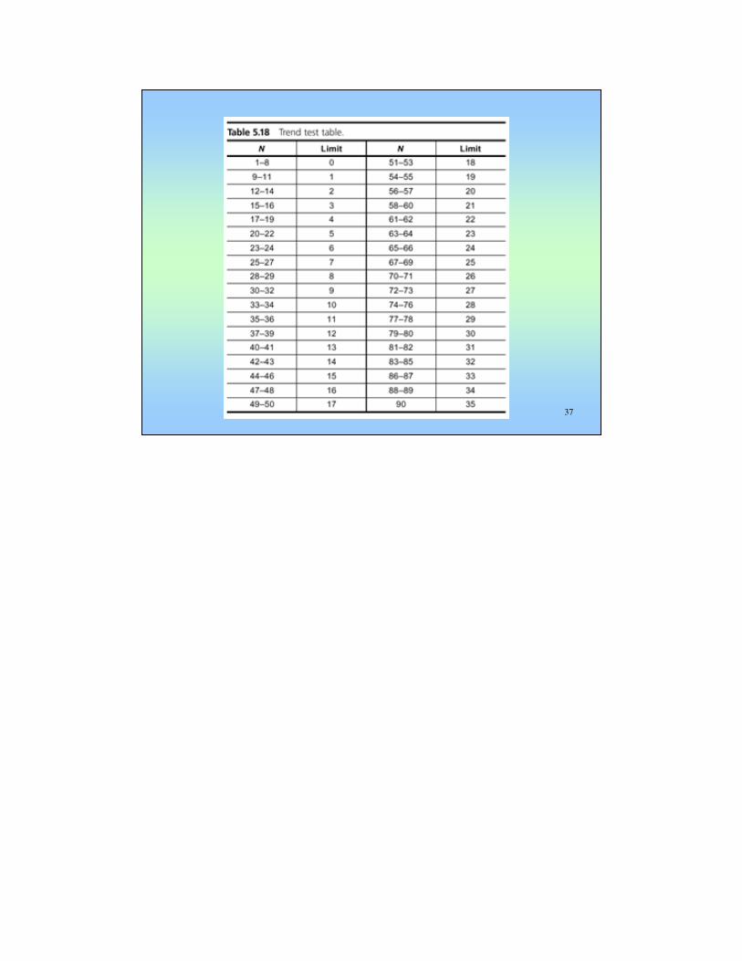
Then they look up the limit for N on the trend test table. For N = 24, the
limit is 6.
Q is equal to the limit. Therefore, the pattern could have occurred from
random chance, and no relationship is demonstrated.

39
39
Scatter Diagrams Interpretation
Positive Correlation
Negative Correlation
No Correlation
Possible Positive Correlation
Possible Negative Correlation
•Here are some examples of situations in which might you use a scatter diagram:
•Variable A is the temperature of a reaction after 15 minutes. Variable B measures the color of the product. You suspect higher temperature makes the product darker. Plot temperature and color on a scatter diagram.
•Variable A is the number of employees trained on new software, and variable B is the number of calls to the computer help line. You suspect that more training reduces the number of calls. Plot number of people trained versus number of calls.
•To test for autocorrelation of a measurement being monitored on a control chart, plot this pair of variables: Variable A is the measurement at a given time. Variable B is the same measurement, but at the previous time. If the scatter diagram shows correlation, do another diagram where variable B is the measurement two times previously. Keep increasing the separation between the two times until the scatter diagram shows no correlation.
•Even if the scatter diagram shows a relationship, do not assume that one variable caused the other. Both may be influenced by a third variable.
•When the data are plotted, the more the diagram resembles a straight line, the stronger the relationship.
•If a line is not clear, statistics (N and Q) determine whether there is reasonable certainty that a relationship exists.
•If the statistics say that no relationship exists, the pattern could have occurred by random chance.
•If the scatter diagram shows no relationship between the variables, consider whether the data might be stratified. If the diagram shows no relationship, consider whether the independent (x-axis) variable has been varied widely. Sometimes a relationship is not apparent because the data don’t cover a wide enough range.
•Think creatively about how to use scatter diagrams to discover a root cause.
•Drawing a scatter diagram is the first step in looking for a relationship between variables.

40
40
ASQ
• A global community of the best quality resources and experts in all fields, organizations, and industries.
• People passionate about quality.
• Bringing together the people, ideas, and tools that make our world work better.

41
41
ASQ Offerings
• ASQ Membership
• Networking
• Certification
• ASQ Learning Institute™
• World Conference and Events
• World Quality Month
• Knowledge Center
• Standards
• Quality Press
• Research
• Social Networking
• Social Responsibility
• Quality for Life™Advocacy

42
42
Central California Section 626
Has served members and professionals in and surrounding Fresno for over 20 years. Our territory extends from Modesto to Bakersfield. The section holds quarterly meetings in its efforts to promote community, networking, and professional development opportunities.

43
43
Mission
To provide resources and an educational forum for ASQ members and interested community members to share and promote quality technology, concepts, and tools, with the purpose of improving ourselves and our organizations for the betterment of society.

44
44
Leadership
Chair: Mr. Rangel Melendez – JAIN [email protected]
Secretary: Mr. Jeff Lahodny – Pacific Southwest [email protected]
Treasurer: Michael Murphy - California Tomato [email protected]
Auditing Chair: Mr. Jeffrey Berry - Baltimore Aircoil Company [email protected]
Membership Chair: Mr. Sam Sit – Grundfos [email protected]
Nominating Committee Chair: Mr. Jeffrey Berry - Baltimore Aircoil Company [email protected]
Certification & recertification Chair: Mr. Rangel Melendez – JAIN Irrigation [email protected]