Barb Manning - Creative Ink Design...
15
Portfolio Barb Manning Creative Ink Design Services
Transcript of Barb Manning - Creative Ink Design...

Portfolio
Barb ManningCreative Ink Design Services

graphic design works
Barb Manning
2
List of Contents
Visual Hierarchy: Event Poster Project 4Dynamic Graphics Magazine Cover 4Unity and Variety Project 5Wishing for Summer Photo Collage 5Design Principle Cards: Color and Emphasis 6Detail of Andrew Wyeth Painting 7Leaf Detail Sketch 7Photo Restoration and Colorization Project 8Cookbook Project 10Shine: Type/Image Integration Project 10Typeface Postcard Project 11Word Expression Project 11Fantasy Animal: A Warrior Trains 12Sample Book of Typography 12Bridge Award Advertisement 13Developing a Focal Point 14Destroy Symmetry: The Butterfl y 15
Contact Information
Barb Manning2179 Parkdale AvenueToledo OH [email protected]
© Barb Manning - Creative Ink Design Services 2014

Portfoliographic design works
3
Dynamic Graphics Magazine Cover
Visual Hierarchy: Event Poster Project
The Dynamic Graphics Magazine Cover Project focused on turning a series of several article titles and a masthead into a realistic magazine cover. I made “Get Your Projects Noticed” the main article on the cover and chose a garden scene as the background. I decided on the girl in the garden scene because the warm red and yellow colors in the image. Its a dramatic image that immediately draws the attention of the potential reader. I then selected the hand holding the magnifying glass to give the perception of “focusing” in on the image of the girl. The use of red for the article titles gives the project a cohesive feel.
The Visual Hierarchy Project involved creating an 11x17 poster that communicated information about a lecture series, including the dates, times, location, and speakers for the series. I chose Calibri as the font for the main text of the poster. It’s a sans serif font that appears clean, but strong. I used reversed small caps on a black background for the heading to give it a sharp, attention-getting appearance. I used three primary colors for the poster: red, blue and black. The white paper acts as a fourth color. A diff erent color identifi es each feature of the poster. The names of the speakers are in red because red draws attention and identifying the speakers is an important piece of the information the poster needs to communicate. The dates, times and location are black because they are of secondary importance, while the brief biographical information about the speakers is blue and italic because it is the least important information.

graphic design works
Barb Manning
4
Wishing for Summer Photo Collage
Unity and Variety Project
In developing the summer photo collage I selected several photos that represented summer and fun. I used two sky photos, a photo of a guy somersaulting on the grass and, one of a girl basking in the sunshine. I also selected a sunfl ower and a photo of a hot air balloon. Using several Photoshop tools, I merged these photos into one seemless, fanciful image of summer.
This project involved creating unity and variety using one letter form as a basis for a design motif. I created unity by using one letter and one primary font. I also used minimal color changes for the letters. The letters are primarily white, gray and black; all “cool” colors. I created variety in the piece by altering the weight and size of the letters, and using uppercase and lowercase letters. The use of cut-out letter squares gives the piece a patchwork texture. The diff erent letter backgrounds also provide a variety of vertical and horizontal lines.

Portfoliographic design works
5
Design Principle Cards: Color and Emphasis
Design has several principles. This project involved creating a set of cards representing color, emphasis, space, and unity and variety. This project won Third Place in the 2007 Davis College Student Design Show.
The cards featured here are Emphasis and Color. I started the project with Emphasis and the choices that I made for that piece decided how to proceed with the other cards.
I used an exclamation mark to symbolize Emphasis and a splash of paint to represent Color. The project is unifi ed by the use of circles, the script font, and the red, gray and black color scheme.

graphic design works
Barb Manning
6
Detail of Andrew Wyeth Painting
Leaf Detail Sketch
This is a drawing of a leaf using one color; the focus is on light and shadows.
This project is a reproduction of an inch-square of detail in an Andrew Wyeth painting on a 10 x 10 inch art board. It deals with close observation and recreation of detail, as well as scaling.

Portfoliographic design works
7
Photo Restoration and Colorization Project
The photo restoration and colorization project involved removing the scratches and tears from an old black and white photo, then colorizing the fi nal image.
The photo I used for this project is one of my 85 year-old grandmother when she was a woman of 32 years. The photo is a copy of a destroyed original. Although the image itself is not damaged it includes damaged areas from the original.
I used several Photoshop tools including the Healing Brush and Clone tool. For the major rips in the photo, I used the Healing Brush tool and the Clone tool to correct the faults. Some sections of the image required the use of the Paint Brush to etch in fi ne lines.
To correct the upper right edge of the photo I used the Select tool to trace out the shutter and copy it. I fl ipped the copied section and merged it with the original photo selection. I used the same process to repair the dress sleeve. To colorize the photo I used the Selection Wand and the Quick Mask Mode tools. I placed each color on a separate layer. I experimented with various levels of opacity and various layer types to get the eff ect I want for the colorized image.

graphic design works
Barb Manning
88

Portfoliographic design works
9
Shine: Type/Image Integration Project
Cookbook Project
The purpose of this project is to turn one or more letters of a word into an image that solidifi es the meaning of the word.
With the defi nition in mind, I originally developed an image with a radial light emanating from the background. However, this idea did not use the type to embody the meaning of the word. Instead, I used Denmark for the letters of “shine”. This is a smooth, chunky sans serif font. The white type on the black background also emphasizes the meaning of the word, since the white letters have a luminescent quality against the background. The image element of the word is a shining fl ashlight which replaces the “i” character. The use of black and white for the image gives the design drama.
For the Cookbook Project, I decided to use strawberries as my main topic. I then focused on drink and dessert recipes for variety.
I designed the cover using a repetition of the word “strawberry” as the background. The title, Strawberry Pleasures, suggest something sweet and fun. I chose Bauhaus 93 for the title font for the same reason. The glass of strawberry ice on the blue napkin invites you into the cookbook.
I chose the photos for the recipe pages fi rst and then selected recipes to match the images. Since red is such a dominant color on the pages I used complimentary colors as elements in the piece. For example, one of the photos has a green overlay. Blue is also used liberally.
graphic design works
Barb Manning
10
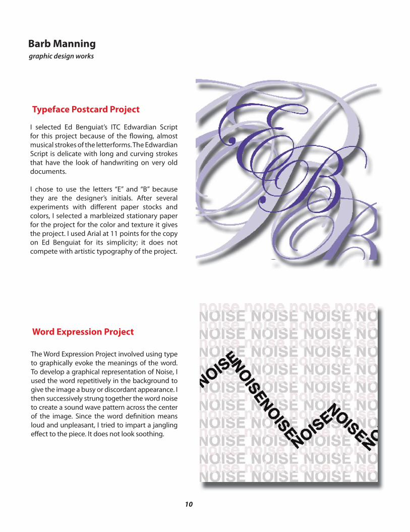
Typeface Postcard Project
Word Expression Project
I selected Ed Benguiat’s ITC Edwardian Script for this project because of the fl owing, almost musical strokes of the letterforms. The Edwardian Script is delicate with long and curving strokes that have the look of handwriting on very old documents.
I chose to use the letters “E” and “B” because they are the designer’s initials. After several experiments with diff erent paper stocks and colors, I selected a marbleized stationary paper for the project for the color and texture it gives the project. I used Arial at 11 points for the copy on Ed Benguiat for its simplicity; it does not compete with artistic typography of the project.
The Word Expression Project involved using type to graphically evoke the meanings of the word. To develop a graphical representation of Noise, I used the word repetitively in the background to give the image a busy or discordant appearance. I then successively strung together the word noise to create a sound wave pattern across the center of the image. Since the word defi nition means loud and unpleasant, I tried to impart a jangling eff ect to the piece. It does not look soothing.

Portfoliographic design works
11
Fantasy Animal: A Warrior Trains
Sample Book of Typography
The Fantasy Animal project combines fi ve photos: two background castle images, a horse, a swordsman and a shield. I merged the two background images fi rst. To combine them into a single image. Once I had the background image developed, I erased the background of the swordsman photo and imported the upper torso of the man into the main photo. I removed the horse head and joined the swordsman and the horse to make the centaur.
This sample book is a compilation of paper samples, typography fonts, color builds and color schemes. Developed with a 1960’s “mod” theme, the book features silhouettes of girls in dramatic poses dispersed throughout in various colors.
The book incorporate script fonts, decorative fonts, paper samples with satin and smooth fi nishes, as well as a half-dozen color schemes and paint swatches.
11

graphic design works
Barb Manning
12
This is The Ability Center of Greater Toledo’s ad in the program book for the University of Toledo Medical Center’s Bridge Awards in 2003. The Bridge Awards honor those who have built a bridge to better health. The award recognizes health care recipients, health care professionals and caregivers for their outstanding strength and commitment to the rehabilitation process. The Ability Center placed this ad in the program book to honor Charles Oswald of Appliance Center and a long-time agency supporter.
Bridge Award Advertisement
This is an ad commissioned by the Maumee Indoor Theatre for their upcoming showing of the Italian fi lm Cinema Paradiso. A fi lm about a young boy’s fascination with a movie house during World War II.
Cinema Paradiso Advertisement

Portfoliographic design works
13
Self-Portrait a la Milton Glaser
In developing my self portrait, I chose to use a collection of items that represent me; similar to the way Glaser used the heart to represent love of New York. I selected a pencil to represent writing and drawing, since those are currently major activities in my life. I selected the computer mouse because the computer is an integral part of modern life and my life. Finally, I selected a platform shoe as a bridge between the past and the present. I wore them growing up in the sixties and seventies, and they are back in style. They symbolize my attempt to stay informed and to always re-envision myself.
Developing a Focal Point
This is the recreation of a collage project using magazine cut-outs of a single letter to express drama and create a focal point with color and scale.

graphic design works
Barb Manning
14
Destroy Symmetry: The Butterfl y
The purpose of this project is understand balance and imbalance and symmetry and asymmetry.
Symmetrical
My symmetrical image is one of a stylized butterfl y hovering over a globe. Each half of the image is a mirror of the other half. Decorative elements in the image activate the negative space in an interesting and dramatic manner. The diff erent geometric elements and thick and thin lines give the image variety.
Balance
My second image destroys the symmetry of the butterfl y and globe. I attempted to give the image a random feel but keep the negative space active and balanced. I cut the butterfl y image into smaller pieces to destroy the original symmetry of the image and put them back together in an interesting pattern. The repetitive nature of some the geometric elements give the piece texture and variety.