Bachelor Thesis Implementation of a Scalable Interactive ...
38
Bachelor Thesis Implementation of a Scalable Interactive Event Data Visualization in Python Humam Kourani RWTH Aachen University, Department of Computer Science, i9 - Chair of Process and Data Science October 6, 2019 Supervisor: Dr. ir. Sebastiaan J. van Zelst First Assessor: Prof. Dr. ir. Wil van der Aalst Second Assessor: Prof. Dr. rer. nat. Martin Grohe 1
Transcript of Bachelor Thesis Implementation of a Scalable Interactive ...

Bachelor Thesis
Implementation of a ScalableInteractive Event Data Visualization in
Python
Humam Kourani
RWTH Aachen University, Department of Computer Science,i9 - Chair of Process and Data Science
October 6, 2019
Supervisor: Dr. ir. Sebastiaan J. van Zelst
First Assessor: Prof. Dr. ir. Wil van der Aalst
Second Assessor: Prof. Dr. rer. nat. Martin Grohe
1

Abstract
This thesis concerns the implementation of a scalable interactive event data vi-sualization in the programming language Python, as part of the PM4Py (ProcessMining for Python) project. The visualization program is able to handle (huge)real data sets, providing valuable insights inside them. Such insights allow pro-cess owners to get advanced information on the execution of their processes.This document starts with explaining the importance of event data visualizationtechniques. Then, some related work on other already implemented visualizationtools is discussed. After that, the architecture of our program is introduced andthree challenges that have emerged during the implementation of the programare addressed. Moreover, an overview of how the program can be called and howit works is given. Our program consists of five Python files. The implementationof all functions of these files is explained briefly in the document as well. Finally,some evaluation results are addressed: a case study on the performance of theprogram and an experiment on the effect of memory limitation on the behaviorof the program. This thesis may be of interest to data analysts in particular, butto data scientists and computer scientists as well.
2

Contents
1 Introduction 4
2 Related Work 62.1 Dotted Chart . . . . . . . . . . . . . . . . . . . . . . . . . . . . . 62.2 Other Event Data Visualizations . . . . . . . . . . . . . . . . . . 7
3 Data Representation 123.1 Event Logs . . . . . . . . . . . . . . . . . . . . . . . . . . . . . . 123.2 Data Exchange . . . . . . . . . . . . . . . . . . . . . . . . . . . . 13
4 Program Description 154.1 Architecture . . . . . . . . . . . . . . . . . . . . . . . . . . . . . . 154.2 Approach . . . . . . . . . . . . . . . . . . . . . . . . . . . . . . . 154.3 Interaction . . . . . . . . . . . . . . . . . . . . . . . . . . . . . . . 184.4 Sampling . . . . . . . . . . . . . . . . . . . . . . . . . . . . . . . . 19
4.4.1 Interactive Sampling . . . . . . . . . . . . . . . . . . . . . 194.4.2 Primary Sampling . . . . . . . . . . . . . . . . . . . . . . 20
5 Evaluation 215.1 Qualitative Evaluation: Case Study . . . . . . . . . . . . . . . . . 215.2 Quantitative Evaluation: Memory Limitation Experiment . . . . . 25
6 Conclusion 28
References 29
A Appendix: Implementation 31A.1 Input - importer.py . . . . . . . . . . . . . . . . . . . . . . . . . 31A.2 Date Conversion - date converter.py . . . . . . . . . . . . . . . . 32A.3 Creating Figures - graph.py . . . . . . . . . . . . . . . . . . . . . 34A.4 Running the Application - factory.py . . . . . . . . . . . . . . . . 37
3

1 Introduction
Data Science is a field of science that deals with the extraction of insights andconclusions from data. Process mining is a family of data science techniquesthat can be applied to analyze and monitor systems based on the events theyproduce. The goal of process mining is to extract information from these eventsin order to improve the systems. Process discovery is one of the most importantfields in process mining. Process discovery techniques analyze event data, aimingat constructing a process model corresponding to this data; in other words, theresulting process model illustrates how the events are related to each other [1].Data visualization techniques are needed to improve process discovery results.Most process discovery algorithms construct their resulting process model con-sidering all behavior recorded in the input event log. However, event logs oftencontain irrelevant behavior, such as exceptions and logging errors, that shouldbe ignored. Considering such behavior results in complex process models andobscures the main behavior of the process [2]. By visually inspecting the data,we can gain a good understanding of the data and get ideas for filtering it toremove irrelevant behavior. This leads to the crucial need for sophisticated datavisualization tools in process discovery.
The dotted chart technique is a powerful data visualization technique thatdepends on the ability of the human brain to visually identify patterns and trendsin large datasets. The dotted chart technique visualizes events in a graphicalway, showing the process execution as it is. It provides a useful overview of theunderlying process; helping to get valuable insights inside it, locate performanceproblems, and provide ideas for improving the process. In order to improve theperformance and allow for better understanding of data, most of dotted charttools provide plenty of useful auxiliary features. They usually allow events to beplotted with a wide selection of options for viewing time and for sorting, coloring,shaping, and sampling events. In addition to that, the zoom in option is offeredas well in order to give the user the opportunity to focus on specific subsets of thedata. All these options make the dotted chart more powerful as a technique forrepresenting data sets and detecting insights, trends, and outliers inside them.Figure 1 shows the result of applying the dotted chart technique on an exampleevent log.
The dotted chart technique helps to achieve important economic advantages.It plays important roles in science, engineering, marketing, banking, trading, anda lot of other domains. It is especially important if we have to deal with hugedata sets. Since machine learning has given us the opportunity to effectivelycollect huge amounts of data, we need to find good solutions to allow for easyunderstanding of complex relationships within the data and exploring insightsinside it, helping to make important decisions that could have massive economicbenefits.
4

Figure 1: The result of applying the dotted chart technique on an example eventlog.
The goal of this thesis is to implement a scalable interactive dotted chartvisualization in Python that should be able to visualize event data sets and findgood solutions to deal with huge data sets as well. The work is done as partof the PM4Py project, which aims at bringing process mining techniques to theprogramming language Python since Python is widely used in the field of datascience.
5

2 Related Work
Our target dotted chart program for interactive event data visualization shouldbe implemented in Python as part of the process mining library PM4Py. Therealready exist some similar visualizations provided by other process mining tools.This chapter addresses some of the already existing dotted chart tools and someother tools that have in some way a similar functionality to the dotted charttools, i.e., tools that allow us to visually inspect the data, providing ideas forfiltering it to remove irrelevant behavior.
2.1 Dotted Chart
One of the most popular event data visualizations is ProM’s dotted chart, whichis provided by the process mining framework ProM. ProM is an extensible, open-source framework that provides a wide variety of process mining techniques in astandard environment [3]. ProM’s dotted chart visualization tool can be used toget an overview of a (huge) data set and visually identify patterns inside it. InProM’s dotted chart, events are visualized as dots in a two-dimensional graph.Along the horizontal axis, time values are shown. Along the vertical axis, com-ponent types are shown. Usually, the horizontal axis is used for the timestampvalues of the events (′time:timestamp′) and the trace name (′concept:name′) isused as component type. In other words, the dotted chart shows how the eventswithin each trace (or component type) are spread over time. Many options forsorting the events in the graph are offered. The dotted chart tool allows us toexplore the event log from different angles: positions, colors, and shapes of thedots can be specified according to the values of chosen attributes. It is also pos-sible to zoom in, so we can focus on the regions of the graph we are interestedin.
ProM’s dotted chart provides several time options. For example, it is possibleto show the relative time spread of events within each trace; that is, the timedifference between each event and the first event within the same trace can beused instead of the real timestamp value (all traces start at time 0). Moreover,ProM’s dotted chart provides multiple performance metrics for the whole eventlog and for the individual traces as well. For instance, for each trace we cancalculate: the position of the first event, the position of the last event, the averageinterval between the events, the minimum interval between the events, and themaximum interval between the events. Further information about ProM’s dottedchart can be found in [4].
Example Figure 2 shows the result of performing a dotted chart analysis on asmall event log, which consists of 62 traces, with ProM’s dotted chart tool. Weconclude from the chart that the maximum time needed for a whole trace is lessthan one hour and all traces have the same order of events: ‘register application’
6

Figure 2: The result of applying ProM’s dotted chart on an example event log.
→ ‘check credit’ → ‘calculate capacity’ → ‘check system’ → ‘accept’ or ‘reject’→ ‘send decision e-mail’.
ProM is not the only framework that provides a dotted chart visualizationtool. One of the other dotted chart tools is provided by the framework bupaRin the programming language R. BupaR is an open-source suite of packages thatprovides a wide variety of business process analysis tools in R [5]. BupaR’s dottedchart functions have only three arguments. The first one is to choose betweenabsolute values and relative values for the x-axis. With the second argument, wecan choose to order the traces by the first event, by the last event, or by duration.The third argument is used to select the color attribute. BupaR provides twofunctions that can be used to create dotted charts. The first one can be used tocreate static dotted charts. The second function can be used to create interactivedotted charts, where the arguments can be interactively modified.
Example Figure 3 shows the result of applying BupaR’s dotted chart on anexample event log that contains data about handling 500 patient cases.
2.2 Other Event Data Visualizations
In addition to the dotted chart, many other powerful event data visualiza-tion tools exist. Each visualization tool shows the event log in a different way.Therefore, the visualization tool should be chosen depending on what informationexactly the user wants to gain about the event log. In this section, we introducesome tools that have a similar functionality to the dotted chart. These tools helpto detect insights inside event logs, providing ideas for filtering the data.
7

Figure 3: The result of applying BupaR’s dotted chart on an example event logthat contains data about handling 500 patient cases.
Explore Event Log Visualizer
The explore event log visualizer is provided by ProM. It is mainly used toexplore patterns in an event log. An event log is represented by the exploreevent log visualizer by unique streams of activities (event classes) called variants.Traces that share the same sequence of activities are grouped together as a singlevariant. The explore event log visualizer offers multiple options for sorting thevariants, grouping the traces, coloring the activities, and classifying the events.On the left side of each variant, the number of traces corresponding to the variantand their percentage are shown. Moreover, general information about the eventlog is shown below: the numbers of traces, events, event classes, attributes,variants, and events per trace; and the timestamps of the first and the last event.If we click on a specific variant, we can inspect the individual traces grouped bythis variant on the right side. If we click on a specific trace on the right side,the values of the events’ attributes in that trace will be shown. If we click on aspecific event, the label, type, and value of all attributes of that events will belisted below.
Example Figure 4 shows the result of applying ProM’s explore event log vi-sualizer on the same small event log used in Figure 2. Compared to the dottedchart visualization, this visualization focuses on the different variants, providing
8

Figure 4: The result of applying ProM’s explore event log visualizer on an ex-ample event log.
more precise information about them. Furthermore, it provides useful informa-tion about the whole event log, such as the total number of traces. However, itdoes not show the spread of events over time.
PM4Py, ProM, and bupaR are all open source process mining toolkits. How-ever, many commercial vendors provide process mining solutions as well. Discois a commercial process mining toolkit that allows its users to generate visualinsight about their process from raw data; helping to optimize performance, con-trol deviations, and explore variations [6]. Disco provides a similar visualizationto ProM’s explore event log visualizer.
Example Figure 5 shows a visualization of an example process provided byDisco. The visualization shows the variants and individual cases of the processin a similar way to ProM’s explore event log visualizer.
Inductive Visual Miner
The inductive visual miner is provided by ProM. It is a process mining toolthat combines process discovery with conformance checking. The inductive visualminer discovers the process model corresponding to the event log and plots thediscovered model with the actual execution of the process (as recorded in theevent log) as an animated graph. In the plotted graph, activities are representedas nodes and the edges represent the successor relation of events inside traces.Each node and each edge is labeled with its frequency. Furthermore, the inductivevisual miner provides some useful options for animation, performance measures,and sampling. Further information about ProM’s inductive visual miner can befound in [7].
9

Figure 5: A visualization of the variants and individual cases of an exampleprocess provided by Disco.
Figure 6: The result of applying ProM’s inductive visual miner on an exampleevent log.
Example Figure 6 shows the result of applying ProM’s inductive visual mineron the same small event log used in Figure 2. This tool discovers the processmodel and provides precise information about how many times each activity/node
10

Figure 7: A visualization of an example process provided by Celonis.
is visited. Moreover, the animation feature allows us to track the time progressof the different cases and detect bottlenecks in the model. However, the dottedchart is a better option if we want to focus on the spread of events over time.
The commercial process mining toolkit Celonis provides a visualization thatis similar to ProM’s inductive visual miner. Celonis is a process mining soft-ware provider that aims at helping companies to save time and money throughimproved process transparency and efficiency. Celonis provides process miningsolutions for analyzing and visualizing business processes. For more informationabout Celonis you can visit its official website (https://www.celonis.com).
Example Figure 7 shows a visualization of an example process provided byCelonis. The visualization is similar to the one provided by ProM’s inductivevisual miner. Activities are represented as nodes and the edges represent thesuccessor relation of events inside traces. Each node and each edge is labeled withits frequency. Furthermore, several useful options for animation, performancemeasures, and sampling are provided.
11

3 Data Representation
Since the goal of this thesis is to implement an interactive data visualiza-tion program, it is important to understand how data are represented, stored,and transformed. In this chapter, the most popular ways used to represent andtransform event data are introduced.
3.1 Event Logs
Data is often represented in the form of events. The term event is used to referto the record of an activity that has happened during the execution of a singleprocess instance [1]. The term trace is used to refer to a sequence of activitiesthat represents a single process execution. In other words, each process executionis assigned a unique trace id in order to distinguish between different executionsof the process. Each event has several attributes that could have different valuesand types. Usually, an event has at least three attributes: an attribute to labelthe event, an attribute that records the time when the activity has happened,and an attribute for the trace id.
Definition (Event): The term event is used to refer to the record of an activitythat has happened during an execution of a process [1].
Example Let us consider a simple process of handling loan applications. Asingle trace represents the handling of a single loan application. Figure 8 shows atrace that represents the execution of the following sequence of activities: ‘registerapplication’→ ‘check credit’→ ‘check system’→ ‘calculate capacity’→ ‘accept’→ ‘send decision e-mail’. The first activity that occurs each time the process isexecuted is the registration of the application; therefore, each trace starts with theevent ‘register application’. Table 1 shows an event representing this activity. Ithas three attributes. The first attribute case:concept:name, which has the stringvalue ‘trace 1’, is used for the trace id. The second attributes concept:name,which has the string value ‘register appliction’, is used to label the event. Thethird attribute time:timestamp, which has the string value ‘2013-04-16 13:28:55’,is used to record the time when the activity has happened.
Event logs are used to trace events to record the behavior of processes. An eventlog is a collection of traces. It corresponds to a set of instances of a particularprocess.
Definition (Event Log): A trace is a sequence of events that represents a theexecution of a single precess instance. An event log is a collection of traces [1].
Example Table 2 shows an event log that represents a simple process of han-dling loan applications. It consists of twelve events grouped in two traces trace1 and trace 2 representing the handling of two applications.
12

Figure 8: A trace representing the execution of the sequence of activites ‘registerapplication’→ ‘check credit’→ ‘check system’→ ‘calculate capacity’→ ‘accept’→ ‘send decision e-mail’.
Name Type Valuecase:concept:name string trace 1
concept:name string register applictiontime:timestamp string 2013-04-16 13:28:55
Table 1: An event representing the activity ‘register application’ in a simpleprocess of handling loan applications.
case:concept:name concept:name time:timestamptrace 1 register appliction 2013-04-16 13:28:55trace 1 check credit 2013-04-16 13:35:10trace 1 check system 2013-04-16 13:38:45trace 1 calculate capacity 2013-04-16 13:41:55trace 1 accept 2013-04-16 13:48:55trace 1 send decision e-mail 2013-04-16 13:49:52trace 2 register appliction 2013-04-16 15:08:05trace 2 check credit 2013-04-16 15:18:10trace 2 check system 2013-04-16 15:18:46trace 2 calculate capacity 2013-04-16 15:21:02trace 2 reject 2013-04-16 15:23:55trace 2 send decision e-mail 2013-04-16 15:24:06
Table 2: An event log that consists of twelve events grouped in two traces trace1 and trace 2 representing the handling of two loan applications.
3.2 Data Exchange
There are many ways used to store and transform event data. Our programsupports three types of files for the input data set. The first type is the XESformat [8]. An XES file can be described as a formatted event log; i.e., it main-tains the general structure of an event log. The second supported type is theCSV format [9]. A CSV file is a text file used to store tabular data in plaintext. A CSV file consists of events separated by line breaks. Each Event consistsof data fields separated by a defined separator. It is possible to insert a headerline containing labels for the columns. The third supported type is the Parquetformat [10]. Parquet stores data column-wise. It is very efficient considering
13

loading time and memory occupation.
14

4 Program Description
This chapter provides an overview of our dotted chart visualization program.It introduces the architecture of the program and briefly explains how it works.Moreover, the main challenges that have emerged during the implementation arediscussed in this chapter as well.
4.1 Architecture
Our dotted chart visualization program is written in Python as part of thePM4Py library, which is an open-source library in Python that supports manyprocess mining techniques [11]. The program consists of five Python files joinedin the Python package dotted-chart in pm4py.visualization. The file importer.pyprovides some functions used while importing the file/element that contains theevent data to be plotted. date converter.py provides some functions used whileconverting dates to the standard date format supported by Plotly. graph.pyprovides some functions used to generate the figures needed for our program.factory.py provides the main function in our program that should be called withappropriate parameters to run the program. The implementation of the programcomponents is explained in Appendix A. The UML-diagram shown in Figure 9describes the architecture of our program. It shows the relations between the fivefiles and the attributes and functions of each of them. Moreover, each externallibrary used by our program is shown in the UML-diagram as well.
4.2 Approach
The main function in our program for interactive event data visualization isthe function dotted chart from factory.py. This is the function that should becalled (with appropriate parameters) by the user in order to run the program andopen the application. When dotted chart is called with appropriate parameters,the PM4Py dotted chart program works according to the main steps shown inFigure 10. In the following, for each of the seven steps a brief explanation isprovided.
Step 1 - Importing Data
The PM4Py dotted chart program accepts the following types of input: PandasDataFrames, PM4Py EventLogs, PM4Py EventStreams, CSV files, XES files,gzipped XES files, and Parquet files. When our program is called, the first stepit does is to convert the input into a Pandas DataFrame. A Pandas DataFrame isa two-dimensional data structure with labeled axes (rows and columns); that is,data is aligned in a tabular fashion in rows and columns. Pandas makes workingwith data simple and intuitive. It provides a rich set of high-performance, easy-to-use functions that make Pandas DataFrames a good choice for representingevent data [12].
15

Figure 9: An UML-diagram showing the architecture of the PM4Py dotted chartprogram. The program consists of the five Python files init .py, importer.py,date converter.py, graph.py, and factory.py.
Step 2 - Converting Dates
One of the main challenges that have emerged during the implementation isthe handling of dates. If dates are inserted in the data set as strings, then insome cases they may not be recognized as dates and be treated as normal stringsinstead. If we want to plot dates on the x-axis or on the y-axis, it makes sense toconsider them and sort them as dates not as strings. The Python graphing libraryPlotly, which is used in our program to generate the graphs, has a standard dateformat for strings; strings are treated by Plotly as dates only if they have thatspecific format. Therefore, our program tries to convert all dates in the data setto strings of the standard date format supported by Plotly. After importing theinput data set as a Pandas DataFrame, the program iterates over all columns
16

Figure 10: Seven main steps showing how the PM4Py dotted chart programworks.
in the DataFrame. In each iteration, it determines the value of the first validindex in the column. If it is a date value and a conversion is needed, a conversionfunction will be generated and this function will be applied to all values in thatcolumn.
Step 3 - Initial Sampling
The function dotted chart has an optional parameter that can be used to setthe maximal number of events to be loaded from the input data set. If this param-eter is used, then the corresponding number of events will be randomly sampledand loaded to our visualization application instead of the whole DataFrame. Af-ter that, the initial sampling percentage is determined according to the valueof the initial sampling parameter. If it is set to None (by default), then theinitial sampling percentage will be set to min{1, (100 000 ÷ the total numberof events)} × 100%. In other words, maximal 100 000 events will be sampled ifsampling is performed on events level. Sampling can be applied either on eventslevel or on traces level as explained in section 4.4.1. The percentage determinedin this step is used as initial value in both cases.
Step 4 - Setting the X-Axis, Y-Axis, and Color Attributes
In this step, the program checks if one or more than one of the optional pa-rameters used to set the x-axis, y-axis, and color attributes have invalid values.If this is the case, it tries to guess appropriate values for them.
17

Step 5 - Setting the Layout Information
The layout of our Dash application is built using the Dash HTML componentsDiv, Label, and Button and the Dash core components Graph, Dropdown, Slider,and RadioItems [13]. Dropdown components are used for the x-axis, y-axis, andcolor attributes. The user can select their values from the list of all columns’ la-bels. Another Dropdown component is used to select how to sort the traces (eachunique y-axis value represents a trace). Three RadioItems components are usedby our program. A RadioItems component is used to allow the user to choose be-tween using real or relative values for the x-axis. Another RadioItems componentis used for selecting the sorting order (ascending or descending). The third usedRadioItems component is for selecting between sampling events or sampling onlywhole traces. For each of the Dropdown and RadioItems components, a Labelcomponent is additionally used to label that component. A Slider componentis used for determining the sampling percentage. A Graph component is usedfor the resulting chart. A Button component is used to control the updatingprocess. The graph will be updated only after the user clicks the button. ManyDiv components are used to organize the HTML document by grouping the othercomponents into sections.
Step 6 - Setting the Updating Information
In order to make our Dash application interactive, a Dash callback decoratoris used [13]. Whenever the user of our program clicks the update button, theupdate function will be called. The update function uses the current values ofthe Dash components to update the figure of Graph component. It starts withsampling the desired percentage of events/traces. Then if relative values shouldbe plotted on the x-axis instead of the real values, the relative values will becomputed. After that the values for the parameters of the function used tocreat the figure will be determined according to the selected sorting criterion.Finally, the updated figure will be generated and returned to update the Graphcomponent.
Step 7 - Running the Server
The final step is to run the server. Our Dash application runs on the webbrowser on http://127.0.0.1:8050/.
4.3 Interaction
The Python graphing library Plotly is used by our program to generate thefinal graphs visualizing the input data sets. Plotly was chosen since it allows usto efficiently generate interactive, high-quality graphs using its Scattergl objects.With these graphs, it is possible to visualize (huge) sets of event data in a sim-ilar way to ProM’s dotted chart. Plotly’s Scattergl graphs support many usefuloptions like the interactive zoom in/out option and the possibility to specify the
18
colors of the events. However, we need our visualization to be more interactive.Users should be able to interact with the program, change some values, and up-date the visualization according to the new values. For this purpose, the Dashframework is used. Dash is an open-source framework for building interactiveweb-based analytic and visualization applications with highly custom user in-terfaces. Instead of dealing with individual graphs using the Plotly’s graphinglibraries, Dash allows its users to have comprehensive interactive analytic appli-cations run on powerful models. Dash provides an interface to a great variety ofinteractive web-based components.
After loading the data set, the user can interact with our Dash applicationwith different options to update the visualization. The x-axis, y-axis, and color-ing attributes can be reset, and it is also possible to choose between showing realor relative values on the x-axis. There are several options available for sortingthe traces (a trace is a unique y-axis value), and they can be sorted either as-cending or descending. Moreover, the user can select to sample either events oronly whole traces, and a slider is provided for selecting the sampling percentage.The sampling options are explained in details in section 4.4. In order to controlthe updating process, a button is used. The user can change any of the compo-nents’ values; and whenever the update button is clicked, the visualization willbe updated according to the new values.
4.4 Sampling
In recent years, the accelerated developments of computer technologies haveenabled us to collect huge amounts of data from different domains. Analyzingthese real data is very useful to many organizations and companies. It helpsthem to improve their systems and achieve large benefits. Using the graphinglibrary Plotly, we achieve great results in efficient time; nevertheless, the timeneeded for the visualization grows with the size the data set and at some pointit will be better to take a reasonable-sized subset for the visualization instead ofthe whole huge data set. This would give a good overview of the process withoutthe need for huge waiting time. Therefore, it is very important for every datavisualization tool to provide good sampling options. Our program provides twooptions for sampling: interactive sampling and primary sampling. These optionsare discussed in this section.
4.4.1 Interactive Sampling
Our program provides an optional parameter that can be used to set the sam-pling percentage. Moreover, another parameter is provided to allow the user todetermine whether to sample events or only whole traces (a trace represents aunique y-axis value). This option is important because in some cases samplingevents would lead to a misunderstanding of the data. For example, if all tracesbegin with the same event and sampling is performed on events level, then the
19

sampling process will result in traces starting with other events. Furthermore,some Dash components are used by our program to allow the user to interactivelyreset the sampling options. A Dash RadioItems component is used to select be-tween sampling events or only whole traces, and a Dash Slider component is usedto set the sampling percentage.
Each time the update button is clicked, the program checks the value of theRadioItems component used to determine whether to sample events or wholetraces. If the sampling should be performed on events level, then the programrandomly samples the number of events corresponds to the value of the samplingpercentage Slider component. If only whole traces should be sampled, then theprogram determines all unique y-axis values, i.e., all traces. Then, the programrandomly samples the number of traces corresponds to the value of the samplingpercentage Slider component. Finally, the program keeps only the events whosey-axis values are in the sampled list of traces.
4.4.2 Primary Sampling
In some cases, i.e., if the data set is very huge, it is better not to load thewhole data set to the program from the beginning. This option is provided byour program as well. Our program provides an optional parameter that can beused to set the maximal number of events to be loaded from the input data set. Ifthis parameter is used, then the corresponding number of events will be randomlysampled and loaded to our visualization application instead of the whole data set.After loading the data set, the user still can use the interactive sampling option,but it will be applied to the initial sampled set, not on the original whole set.For example if only one million events were initially loaded from a two-milliondata set, then the maximal value the sampling slider can be reset to would be50%.
20

5 Evaluation
In this chapter, evaluation results are presented. First, a case study is per-formed to investigate the performance of our dotted chart visualization on real-life data. Then, an experiment about the influence of memory limitation on thebehavior of our program is discussed.
5.1 Qualitative Evaluation: Case Study
This section provides a case study of how the PM4Py dotted chart programcan be used to analyze real data. We consider the gzipped XES file Road TrafficFine Management Process.xes.gz, which is published by the 4TU.Centre for
Research Data [15]. This file represents a real-life event log of events that wasextracted from an information system managing road traffic fines by an Italianpolice department. It contains 561 470 events and 150 370 traces. Each tracerepresents a single fine; therefore, each trace starts with the event ‘create fine’.The timestamps of the events have values between Jan 1, 2000 and Jun 18, 2013.
We apply our PM4Py dotted chart visualization on the road traffic fine manage-ment XES file. We call the function dotted chart with the parameter input set tothe path to the file (′/home/humam/BA/Road Traffic F ine ManagementProcess.xes.gz′). We use none of the optional parameters except max load,which is set to 400 000. The whole code needed for the call of dotted chartis shown in Figure 11. After calling dotted chart the application will run onhttp://127.0.0.1:8050/, and we will get the result shown in Figure 12.
As shown in in Figure 12, the x-axix, the y-axis, and the color attributes wereautomatically set although we did not use any of the optional parameters x, y,or color (they were all set to the default value None). As explained in sectionA.4, the function set attributes tries to guess appropriate values for x, y, andcolor if they are set to None. It set the x-axis attribute to the timestamp values′time:timestamp′, the y-axis to the trace name values ′case:concept:name′, andthe color attribute to the event name values ′concept:name′. Since max load wasset to 400 000, only 400 000 randomly chosen events were loaded from the 561470 events. We can see in Figure 12 that the maximum value of the samplingslider is almost 71% (400 000 / 561 470 ' 0.71). The slider is initially set tothe default value 100 000 events (100 000 / 561 470 ' 0.18) since the optionalparameter sampling percent was not used.
We apply ProM’s dotted chart on the same file in order to check how good theresult of our program is. The visualization we get with ProM’s dotted chart isshown in Figure 13.
We can use the zoom in option in order to get a better view of a particularregion from the graph. For example, we can select the region below where all
21

Figure 11: The code needed for calling the PM4Py dotted chart program withthe input file Road Traffic Fine Management Process.xes.gz and the optionalparameter max load set to 400 000.
X-Axis (timestamp)
X-Axis Values:real valuesstart each trace with 0 (only if x-axis values are dates/numbers)
Y-Axis (trace)
Color Attribute
Sort Traces By
Order:ascendingdescending
Sampling:tracesevents (rows)
UPDATE
time:timestamp
case:concept:name
concept:name ×
DEFAULT (select this option for dates/time)
0% 10% 20% 30% 40% 50% 60% 70%
2000 2002 2004 2006 2008 2010 2012 2014
A10000A19082A28863A39406
A7882C22609N26910N35925N44921N57190N67016N79060N88954
P1186S107764S121056S131905S142595S153200S164233S175317
S41800S56181S66026S75097S87078V10928
Create Fine
Insert Fine Notification
Add penalty
Payment
Send Fine
Send for Credit Collection
Send Appeal to Prefecture
Receive Result Appeal from Prefecture
Insert Date Appeal to Prefecture
Notify Result Appeal to Offender
Appeal to Judge
concept:name
time:timestamp
case
:con
cept
:nam
e
Figure 12: The result of applying the PM4Py dotted chart on the file RoadTraffic Fine Management Process.xes.gz.
traces have names starting with ‘A’. All these traces start up July 2006. We getan overview of the ‘A’ traces as shown in Figure 14.
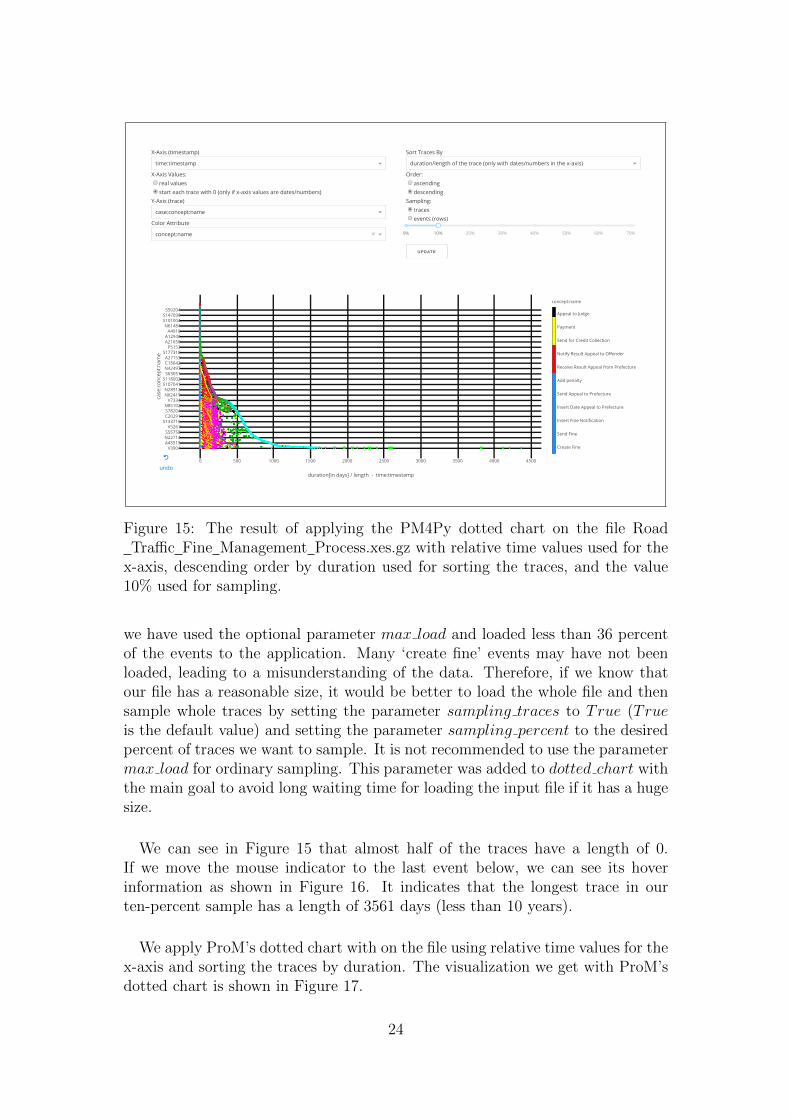
Now we try to get an overview of the event log focusing on the order of theevents in the traces and the length of the traces. For this purpose, it is better touse relative time values instead of the real values. This can be done by selectingthe option ‘start each trace with 0 (only if x-axis values are dates/numbers)’for the x-axis values. Moreover, we order the events descending according thelengths of the traces by selecting the option ‘duration/length of the trace (onlywith dates/numbers in the x-axis)’ for sorting the y-axis values and the option‘descending’ for the order. In addition to that, we move the indicator of thesampling slider to the value 10 in order to sample 10% of the traces. After that
22

Figure 13: The result of applying ProM’s dotted chart on the file Road TrafficFine Management Process.xes.gz.
Figure 14: An overview of the ‘A’ traces in the file Road Traffic FineManagement Process.xes.gz provided by the PM4Py dotted chart.
if we click the update button, the visualization will be updated according to thenew values, and we will get the updated graph shown in Figure 15.
We can see in Figure 15 that the color blue in dominating at time point zero.This is because all traces should start with the event ‘create fine’. However,
23
X-Axis (timestamp)
X-Axis Values:real valuesstart each trace with 0 (only if x-axis values are dates/numbers)
Y-Axis (trace)
Color Attribute
Sort Traces By
Order:ascendingdescending
Sampling:tracesevents (rows)
UPDATE
time:timestamp
case:concept:name
concept:name ×
duration/length of the trace (only with dates/numbers in the x-axis)
0% 10% 20% 30% 40% 50% 60% 70%
0 500 1000 1500 2000 2500 3000 3500 4000 4500
V3904A45515N22714S55758
V5261S133716C20291S78204N85102
V7334N62419N28912
S107041S118002
S63051N42497C15642A27153
S177318P5153
A21656A12948
A4910N61484
S101004S147090
S50204
Create Fine
Send Fine
Insert Fine Notification
Insert Date Appeal to Prefecture
Send Appeal to Prefecture
Add penalty
Receive Result Appeal from Prefecture
Notify Result Appeal to Offender
Send for Credit Collection
Payment
Appeal to Judge
concept:name
duration[in days] / length - time:timestamp
case
:con
cept
:nam
e
undo
↺
Figure 15: The result of applying the PM4Py dotted chart on the file RoadTraffic Fine Management Process.xes.gz with relative time values used for the
x-axis, descending order by duration used for sorting the traces, and the value10% used for sampling.
we have used the optional parameter max load and loaded less than 36 percentof the events to the application. Many ‘create fine’ events may have not beenloaded, leading to a misunderstanding of the data. Therefore, if we know thatour file has a reasonable size, it would be better to load the whole file and thensample whole traces by setting the parameter sampling traces to True (Trueis the default value) and setting the parameter sampling percent to the desiredpercent of traces we want to sample. It is not recommended to use the parametermax load for ordinary sampling. This parameter was added to dotted chart withthe main goal to avoid long waiting time for loading the input file if it has a hugesize.
We can see in Figure 15 that almost half of the traces have a length of 0.If we move the mouse indicator to the last event below, we can see its hoverinformation as shown in Figure 16. It indicates that the longest trace in ourten-percent sample has a length of 3561 days (less than 10 years).
We apply ProM’s dotted chart with on the file using relative time values for thex-axis and sorting the traces by duration. The visualization we get with ProM’sdotted chart is shown in Figure 17.
24

Figure 16: The hover information of the last event below from the visualizationshow in Figure 15.
Figure 17: The result of applying ProM’s dotted chart on the file Road TrafficFine Management Process.xes.gz using relative time values for the x-axis and
sorting the traces by duration.
5.2 Quantitative Evaluation: Memory Limitation Exper-iment
In this section, we discuss the results of an experiment that was done in orderto investigate the effect of memory limitation on the behavior of our dotted chartvisualization program.
Experiment Setup
In order to test the program with different sized inputs, we have generateda Pandas DataFrame df with random data. It has a variable number of rows(events) and the following three columns:1. ′date′: with randomly selected dates between 2000 and 2020.2. ′country′: with randomly selected countries’ abbreviations (255 unique val-ues).3. ′color′: with randomly selected values from [′A′,′B′,′ C ′,′ D′,′ E ′,′ F ′,′G′].
25

In our experiment, the following values were chosen for the parameters ofdotted chart: input was set to df , ′date′ was selected as the x-axis attribute,′country′ was selected as the y-axis attribute, ′color′ was selected as the color at-tribute, real values were selected to be shown on the x-axis (start each trace with0 = False), traces were chosen to be sorted descending by duration, the whole
DataFrame was loaded each time, and no sampling was applied. We have testedour program with the following numbers of events: 50 000, 100 000, 125 000,250 000, 500 000, 1 000 000, 1 200 000, 1 500 000, 1 750 000, 1 900 000, 2 000 000,2 100 000, 4 000 000, 5 000 000, 6 000 000, 7 000 000, and 10 000 000.
Running the Experiment
We started our experiment with limiting the memory to 1 GB. The programwas not able to run the server (even if the input Pandas Datarame consists ofonly one row). For 1.1 GB memory, the program was able to run problem-freewith 50 000 events in the input Pandas DataFrame. Therefore, we tested ourprogram with the following values for the memory: 1.1 GB, 2 GB, 4 GB, 6 GB,8 GB, and without limitation. The experiment was done on a computer with 7.2GB RAM and 3.9 GB swap memory available. As web browser, Google Chrome(version 74.0.3729.169 official build 64-bit) was used.
Experiment Results
Figure 18, Figure 19, and Figure 20 show the results of our experiment. Ineach subplot, the x-axis represents the number of events in the input PandasDataFrame. The y-axis represents the time needed for updating the dotted chartgraph (rounded average values are shown since time values differs between dif-ferent measures). The maximum value shown on the x-axis is the maximumnumber of events for which the program was able to run problem-free. From ourexperiment, we conclude the following results:
1. The minimum memory required for the program is 1.1 GB.
2. The program performed the same for 4 GB memory or more. The maximumaccepted number of events in the input Pandas DataFrame df is 6 million in allthese cases. However, the reason why the program crashes is not the memory inall cases. The time out of the web browser is an important reason as well.
3. The behavior of the program is almost linear. This is indicated by the posi-tions of the dots in the plots.
4. Having more or less memory has no influence on the speed of the program. Itdetermines only the maximum size of accepted input. For example, in all casesapproximately 9 seconds were needed for 100 000 events.
Table 3 shows the maximum number of events that was accepted for the differ-ent memory limits. Considering the values shown in Table 3 and Figure 19, werecommend users to use the value 500 000 for sampling if the available memoryis greater than 2 GB.
26

Figure 18: The results of ourmemory limitation experimentwith 1.1 GB memory.
Figure 19: The results of ourmemory limitation experimentwith 2 GB memory.
Figure 20: The results of ourmemory limitation experimentwith 4 GB or more memory.
Table 3: The maxi-mum number of eventsin the input PandasDataFrame df that wasaccepted for the differ-ent memory limits inour experiment.
Memory Maximum accepted size for df1 GB or less 0
1.1 GB 100 0002 GB 2 000 000
4 GB or more 6 000 000
27

6 Conclusion
This thesis presented the PM4Py dotted chart, which is a scalable interactiveevent data visualization in Python. We provided an overview of the program andthe implementation of its components. Moreover, we carried out a case studyon applying the PM4Py dotted chart on a real-life event log and an experimentinvestigating the relation between the amount of available memory and perfor-mance of the program. The dotted chart visualization is a very powerful toolthat is widely used in the field of data science. Our implementation of the dottedchart visualization adds an important tool to the PM4Py library, which providesa wide variety of process mining techniques. Many improvements can be made tothe program as part of future work. It may be a good idea to add the possibilityto shape the events according to the values of a chosen attribute, similar to thecoloring option. Another useful option that may be added to the program isthe filtering option; that is, to allow the user to interactively select some valuesfor chosen attributes and plot only events whose attributes match the selectedvalues. Moreover, some performance metrics for the whole data set as well forthe individual traces may be added. Work is currently underway to develop aweb interface for the PM4Py library in order to offer an interactive way to usethe library and its process mining tools. Bringing the dotted chart applicationto this web interface may be part of future work as well. A challenging task forfuture work may be to improve the sampling option for better automatic scalingof huge data sets. The results of the memory limitation experiment may be usedin the front-end of PM4Py to better scale the application.
28

References
[1] Wil M. P. van der Aalst: 2016, ‘Process Mining: Data Science in Action’.Second edition.
[2] Goedertier, S., D. Martens, J. Vanthienen, and B. Baesens: 2009, ‘RobustProcess Discovery with Artificial Negative Events’. In: Journal of MachineLearning Research 10, pages 1305-1340.
[3] van Dongen, B. F., A. K. A. de Medeiros, H. M. W. Verbeek, A. J. M. M.Weijters, and W. M. P. van der Aalst: ‘The ProM Framework: A New Erain Process Mining Tool Support’.
[4] Song, M. and W. M. P. van der Aalst: ‘Supporting Process Mining by ShowingEvents at a Glance’. In: Chari, K. and A. Kumar, editors, Proceedings of 17thAnnual Workshop on Information Technologies and Systems (WITS 2007),pages 139–145, Montreal, Canada, 2007.
[5] Janssenswillen, G. and B. Depaire: 2017, ‘bupaR: Business Process Analysisin R’.
[6] Gunther, C. W. and A. Rozinat: ‘Disco: Discover Your Processes’. Fluxicon.
[7] Leemans, S. J. J.: 2017, ‘Inductive Visual Miner, Manual’. ProM 6.7.
[8] 2016, ‘IEEE standard for extensible event stream (XES) for achieving inter-operability in event logs and event streams’. IEEE, New York.
[9] ‘RFC 4180 - Common Format and MIME Type for Comma-Separated Val-ues (CSV) Files’ [online]. Available at: https://tools.ietf.org/html/
rfc4180/.
[10] Vohra, D.: 2016, ‘Apache Parquet’. In: ‘Practical Hadoop Ecosystem’.Apress, Berkeley, CA.
[11] Berti, A., S. J. van Zelst, and W. M. P. van der Aalst: ‘Process Mining forPython (PM4Py): Bridging the Gap Between Process- and Data Science’.
[12] McKinney, W.: ‘pandas: a Foundational Python Library for Data Analysisand Statistics’.
[13] ‘Dash User Guide’ [online]. Available at: https://dash.plot.ly/.
[14] Rhyne, T-M.: 2016, ‘Applying Color Theory to Digital Media and Visual-ization’. CRC Press.
29

[15] de Leoni, M. (Creator) and F. Mannhardt (Creator): 2015, ‘RoadTraffic Fine Management Process’. 4TU.Centre for Research Data.10.4121/uuid:270fd440-1057-4fb9-89a9-b699b47990f5.
30

A Appendix: Implementation
Our program for interactive event data visualization consists of the five Pythonfiles: init .py, importer.py, date converter.py, graph.py, and factory.py. Inthis appendix, these files and the implementation of their functions are discussed.
A.1 Input - importer.py
The file importer.py provides some functions used while importing the file/element that contains the event data to be plotted. importer.py contains thefollowing three functions:
1. import to df(input): this function converts a given input file/element into aPandas DataFrame.
2. import df from log(log): this function converts a given PM4Py EventLoginto a Pandas DataFrame.
3. import df from xes(file): this function converts a given XES file into a PandasDataFrame.
Our program converts the input file/element input into a Pandas DataFrameusing the function import to df(input). In the following for each of the sevenaccepted input types, the behavior of import to df(input) is discussed.
Pandas DataFrame: if the input input of our program is a Pandas DataFrame,import to df(input) will return the same DataFrame.
PM4Py EventLog: if the input input of our program is a PM4Py EventLog,import to df(input) converts it into a Pandas DataFrame using import df fromlog(input). import df from log(input) returns a Pandas DataFrame where each
event is represented as a row. For each event, the unique trace name is insertedin the column ′case:concept:name′. For each item (col, val) in an event, val isinserted in the column col.
PM4Py EventStream: if the input input is a PM4Py EventStream, the func-tion import to df(input) converts it into a Pandas DataFrame using the functionget dataframe from event stream(input) from pm4py.objects.conversion.log.versions.to dataframe. Each event is represented in the returned DataFrameas a row.
CSV File: if the input input of our program is a CSV file, the functionimport to df(input) converts it into a Pandas DataFrame using the functionread csv(input) from pandas where each event is represented in the DataFrameas a row.
31
XES File: if the input input of our program is an XES file, import to df(input)converts it into a Pandas DataFrame using import df from xes(input). Thefunction import df from xes(input) makes use of the lxml.etree module fromthe lxml library, which is a Python library for processing XML and HTML.import df from xes(input) works in a similar way to import df from log(input)since an XES file corresponds to an event log. For a better understanding of theimplementation of import df from xes, you can find information about lxml andlxml.etree at (https://lxml.de/).
Gzipped XES File: in addition to XES files, our program accepts gzippedXES files as input as well. First, import to df(input) decompresses the gzippedXES file input using the function decompress(input) from pm4py.objects.log.util.compression. Then, the resulting XES file will be converted into a PandasDataFrame using the function import df from xes(file).
Parquet File: if the input input is a Parquet file, import to df(input) convertsit into a Pandas DataFrame using the function read parquet(input) from pandas.Moreover, it replaces empty strings in the resulting Pandas DataFrame withnumpy.nan values because Parquet uses empty strings to mark fields with missingdata, and we do not want these empty strings to be considered as real data.
A.2 Date Conversion - date converter.py
This file provides some functions used while converting dates to the standarddate format supported by Plotly. These functions are introduced in this section.
a. get date format(date): this function tries to determine the format of thegiven date string and raises an exception if it fails. For example, get date format(′Feb-18-2019′) returns [′−′,′m′,′ d′,′ y′]. If both the day and the month are givenas numbers that are less than 13, then it returns [ ] to indicate that the functionis not able to distinguish between the day and the month.
b. get format(string): this function gets a string that can be a combina-tion of a date and a time point (strings like: ′15/5/2019′, ′14:25:13′, ′15/5/201914:25:13′) as parameter and returns a two-element list. If the given string hasa date part d, then get date format(d) is the first element of the list to be re-turned, otherwise None. If the given string has a time part, then True is thesecond element of the list to be returned, otherwise False.
c. date converters(format): this function gets a date format of a date stringas parameter and returns a function that can be applied to that string in orderto transform it to a date format supported by Plotly. There are twelve accepteddate formats for the parameter format (all the twelve formats are not supportedas date formats by Plotly). We can recognize them in the if and elif conditionsin the code shown in Figure 21.
32

Figure 21: The implementation of the function date converters.
d. get converter(string): this function gets a string string that can be acombination of a date and a time point (strings like: ′15/5/2019′, ′14:25:13′,′15/5/2019 14:25:13′) as parameter and returns a function that can be applied tothat string in order to transform it to a date format supported by Plotly. It getsthe format of string with get format(string). If it is not possible to distinguishbetween the day and the month in string, then the function returns None toindicate that. If string has no date part or its date part has a format that isalready supported by Plotly, then the function raises an Exception to indicatethat no conversion is needed. Otherwise, it returns a function that should beable to convert string and each string of the same format to another date formatsupported by Plotly.
e. convert date format in df(df): this function converts all dates in thegiven Pandas DataFrame df to the standard date format supported by Plotly. Itreturns a tuple (d, date columns) where d is the given Pandas DataFrame afterconverting all dates and date columns is a list that consists of the labels of alldate columns in the DataFrame. The function convert date format in df(df)iterates over all columns in df and works in each iteration as explained in thefollowing steps:
- It determines the value value of the first valid index in the column. If it is adatetime.datetime object, then the column label will be added to date columnsand its values will be cast to the data type ′str′.
- Else, it checks if value is a date string by trying to parse it using the functionparse from dateutil.parser. If it is not, the function goes to the next iteration tocheck the next column.
- Else, it tries to get the appropriate converter for value using the functionget converter(value). If an exception is raised, then either no conversion is
33

needed or the conversion has failed. In this case, the column label will be addedto the list date columns and the values do not need to be changed.
- Else if the converter is None, then this indicates that it is not possible todistinguish between the day and the month in value. In this case, a new checkwill be started for the next valid index in the column.
- Else, the column label will be added to date columns and the converter will beapplied to all values in the column.
A.3 Creating Figures - graph.py
This file provides the function get figure, which is used to generate the figureobject needed for our program and another two help functions. These functionsare introduced in this section.
a. get n colors(n): this function gets a positive integer number n as parame-ter and returns a list of n colors. There are twelve basic colors defined with theirRGB codes in the list Colors. If the n > 12, the function returns a graduatedn-color scale. If you want to gain a better understanding of the implementationof get n colors(n) and learn more about the different color formats, you can findrelevant information in [14] or you can visit (http://colorizer.org/).
b. sample with evenly spaced indexes(n, list, length): this functionhas three parameters: a positive integer n, a list list, and the length length oflist. It returns two lists: a list elements of n samples from list that containsboth the first element list[0] and the last element list[length−1] and its elementshave indexes in list that are (almost) evenly spaced (evenly spaced indexes willbe calculated; then, they will be rounded to integers).
c. get figure(df, x, y, color, sort by, ascending, default order): thisfunction is the main function in graph.py. It is given a Pandas DataFrame andsome other parameters and it should return a Plotly figure object. This is thefigure object with the event data from the input Pandas DataFrame that shouldbe plotted and the layout details. In our interactive dotted chart Dash applica-tion, each time the user updates some parameters and clicks the update button,the function get figure is called with the updated parameters and it returns anew Plotly figure object. The function get figure has the following parameters:
- df : a Pandas DataFrame containing the event data that should be plotted.
- x: label of the column whose values should be plotted on the x-axis.
- y: label of the column whose values should be plotted on the y-axis.
- color: label of the color column. Two events with the same color value shouldbe plotted with the same color. Two events with different color values should beplotted with the different colors. If color is set to None, then all events shouldbe plotted with the same color.
34

- sort by: label of the sort column. Events should be sorted by this column.If it is set to None, then the order of the events in the DataFrame will not bechanged.
- ascending: if it is set to True, events will be sorted ascending; if it is set toFalse, events will be sorted descending.
- default order: if it is set to True, Plotly’s default order for the traces (a tracerepresents a unique y-axis value) will be used. This is very useful if the y-axisvalues are dates. If it is set to False, the traces will keep in the graph the same or-der they have in the DataFrame after sorting it according to the values of sort byand ascending.
Now, we can give an overview about the implementation of get figure. Itworks in five steps as explained in the following:
1. Checking if x or y is None: in order to be able to create a figure, we need tohave some data at least as values for the x-axis and the y-axis. Therefore, if x ory is set to None, then the function is ended returning an empty figure.
2. Selecting traces’ order: the function get figure always lets Plotly order thex-axis values by its default order. However, for the y-axis values (traces) it ispossible to choose between using the Plotly’s default order and keeping the sameorder the traces have in the DataFrame after sorting it according to the valuesof sort by and ascending.
3. Sorting: if sort by is not set to None, then the events will be sorted accordingto the values of sort by and ascending.
4. Creating Scattergl object: the Plotly figure object to be returned by get figureconsists of two parts: data and layout information. The data part of the figureto is a Scattergl object from plotly.graph objs. get figure uses the values of itsparameters in order to create the appropriate Scattergl object. The function dis-tinguishes between three main cases while calculating the values of the Scatterglobject’s attributes:
Case 1: No coloring is desired.Case 2: Coloring is desired and the values of the color column are not numbers.Case 3: Coloring is desired and the values of the color column are numbers.
5. Setting layout information.
Since creating the Scattergl object is the most important step from the fivesteps mentioned above, we focus on this step in the following. As said before,get figure distinguishes between three main cases while calculating the valuesof the Scattergl object’s attributes:
Case 1 - No coloring is desired: if color is set to None, then the datapart of the figure is a simple Scattergl object from plotly.graph objs where onlythe following attributes are used: x, which sets the x-coordinates; y, which setsthe y-coordinates; mode, which determines the drawing mode; and marker.size,
35

which sets the marker size. You can find further information about Scatterglobjects at (https://plot.ly/python/reference/#scattergl).
Case 2 - Coloring is desired and the values of the color column are notnumbers:
- A numeric representation of the color column is obtained using the functionfactorize from pandas.
- The function get n colors is used to get a list with a unique color for eachunique value from the color column.
- A discrete color scale is defined over the unique values from the color columnand the unique colors. For information about color scales in Python, you canvisit (https://plot.ly/python/colorscales/).
- If there is more than 20 unique values in the color column, then the functionsample with evenly spaced indexes will be used to get 20 samples that will beused as labels on the color bar beside the graph; else, all values will be used aslabels on the color bar.
- The data part of the figure is a Scattergl object from plotly.graph objs similarto the figure in case 1, but some more attributes are used. The attribute textsets text elements associated with each event; it is set to the value of the colorcolumn. The attribute hoverinfo sets the information that appears on hoverfor each event; it is set to the values of the three columns ′x′, ′y′ and ′color′.marker.colorscale sets the color scale. marker.color sets the colors; it is setthe numeric representation of the color column, which will be mapped to thecolor scale. marker.cmin sets the lower bound of the color domain. Moreover,multiple marker.colorbar attributes are used in order to set the color bar. Youcan find further information about the attribute options for Scattergl at (https://plot.ly/python/reference/#scattergl).
Case 3 - Coloring is desired and the values of the color column arenumbers:
- Two help variables are used: minimum is the minimum value in the colorcolumn rounded to the nearest integer less than or equal to it; maximum is themaximum value in the color column rounded to the nearest integer greater thanor equal to it.
- If the integer interval [minimum, maximum] has more than 20 integer elements,20 (almost) evenly spaced elements are sampled using the function sample withevenly spaced indexes in order to be used as labels on the color bar; else, all
values will be used.
- The color scale is created similar to the color scale in case 2, but this time with100 colors. We do not have a unique color for each unique value in this case.Since we have only numbers as values, the interval is broken into 100 smallerintervals and each of them is given a unique color. The function get n colors is
36

used to generate the 100 colors, they are graduated and the color scale looks likea continuous color scale.
- The data part of the figure is a Scattergl object from plotly.graph objs similarto the one in case 2. All attributes used in case 2 are used in case 3 as well inadditional to one more attribute. It is the attribute cmax, which sets the upperbound of the color domain.
A.4 Running the Application - factory.py
This file provides the main function in our program dotted chart in additionto one other help function. These two functions are explained in this section.
a. set attributes(x, y, color, columns): this function is used in dotted chartas a help function. For each of its parameters x, y, and color it checks if its valueis in the list columns; if not, it tries to guess an appropriate value for the vari-able; if it fails, the variable is set to None. At the end, the function returns (x,y, color).
b. dotted chart(input, x, y, color, start each trace with 0, sort tracesby, order ascending, sampling percent, sampling traces, max load):
this is the main function in our program for interactive event data visualization.It is the function that should be called (with appropriate parameters) by theuser in order to run the program and open the application. All parameters fordotted chart are optional except input, which should be set to the input file/ele-ment that contains the event data to be visualized. dotted chart works as shownin the main steps explained in section 4.2. The function dotted chart has thefollowing Parameters:
- input: a file/element that represents a collection of event data to be visu-alized. Supported inputs: Pandas DataFrames, PM4Py EventLogs, PM4PyEventStreams, CSV files, XES files, gzipped XES files, and Parquet files.
- x: x-axis attribute (it can be changed in the app).
- y: y-axis attribute (it can be changed in the app).
- color: color attribute (it can be changed in the app).
- start each trace with 0: if it is set to True, each trace will be plotted startingby 0; if it is set to False (by default), traces will be plotted with the real values(it can be changed in the app).
- sort traces by: an integer that determines how the traces should be sorted (itcan be changed in the app). Possible sorting options:
0 : Plotly’s default sorting (this option is the default option and it is the bestoption for sorting dates/time).
1 : Sorting by the label.2 : keep order (as in the original file).3 : Sorting by x-axis value of the first event in the trace.4 : by the x-axis value of the last event in the trace.
37

5 : Sorting by duration/length of the trace (only with dates/numbers in thex-axis).
- order ascending: determines the sorting order. If it set to True (by default),ascending order will be used; if it is set to False, descending order will be used(it can be changed in the app).
- sampling percent: a number between 0 and 100 that determines the percent-age of events/traces that should be sampled. If it is set to None (by default),then the minimum between max load, 100 000, and the number of all events willbe the number of events to be sampled (it can be changed in the app).
- sampling traces: If it is set to True (by default), sampling percent of thetraces will be sampled. If it is set to False, sampling percent of the events willbe sampled (it can be changed in the app).
- max load: maximal number of events that can be loaded from input. If it isset to None (by default), all events from input will be loaded.
38