
Asp.NET Core Server Controls. Slide 2 Lecture Overview Understanding the types of ASP.NET controls...
32
Asp.NET Core Server Controls
-
date post
19-Dec-2015 -
Category
Documents
-
view
235 -
download
5
Transcript of Asp.NET Core Server Controls. Slide 2 Lecture Overview Understanding the types of ASP.NET controls...
Asp.NET Core Server Controls
Slide 2
Lecture Overview Understanding the types of ASP.NET
controls HTML controls ASP.NET (Web) controls
Slide 3
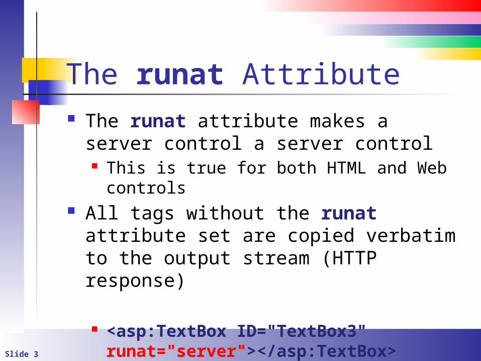
The runat Attribute The runat attribute makes a server
control a server control This is true for both HTML and Web
controls All tags without the runat attribute set
are copied verbatim to the output stream (HTTP response)
<asp:TextBox ID="TextBox3" runat="server"></asp:TextBox>
Slide 4
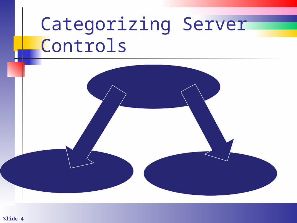
Categorizing Server Controls
ASP.NET CONTROLS
HTML CONTROLS
WEB CONTROLS
Slide 5
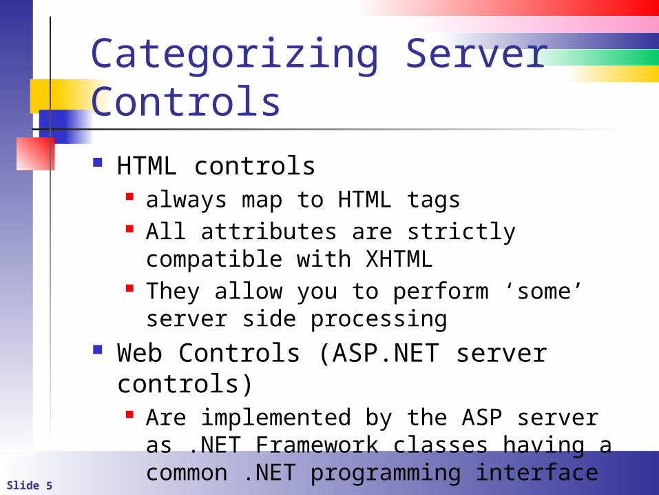
Categorizing Server Controls HTML controls
always map to HTML tags All attributes are strictly compatible with
XHTML They allow you to perform ‘some’ server
side processing Web Controls (ASP.NET server controls)
Are implemented by the ASP server as .NET Framework classes having a common .NET programming interface
Slide 6
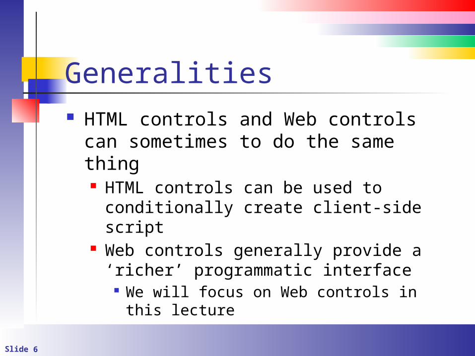
Generalities HTML controls and Web controls can
sometimes to do the same thing HTML controls can be used to conditionally
create client-side script Web controls generally provide a ‘richer’
programmatic interface We will focus on Web controls in this lecture
Slide 7
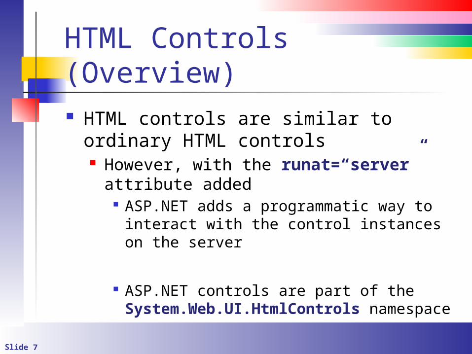
HTML Controls (Overview) HTML controls are similar to ordinary
HTML controls However, with the runat=“server”
attribute added ASP.NET adds a programmatic way to
interact with the control instances on the server
ASP.NET controls are part of the System.Web.UI.HtmlControls namespace
Slide 8
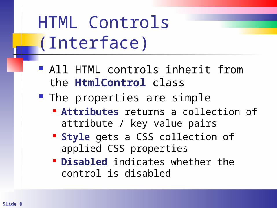
HTML Controls (Interface) All HTML controls inherit from the HtmlControl class
The properties are simple Attributes returns a collection of
attribute / key value pairs Style gets a CSS collection of applied CSS
properties Disabled indicates whether the control is
disabled
Slide 9
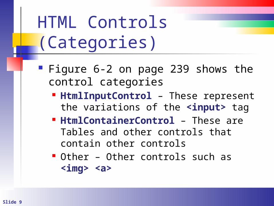
HTML Controls (Categories) Figure 6-2 on page 239 shows the
control categories HtmlInputControl – These represent the
variations of the <input> tag HtmlContainerControl – These are Tables
and other controls that contain other controls
Other – Other controls such as <img> <a>
Slide 10
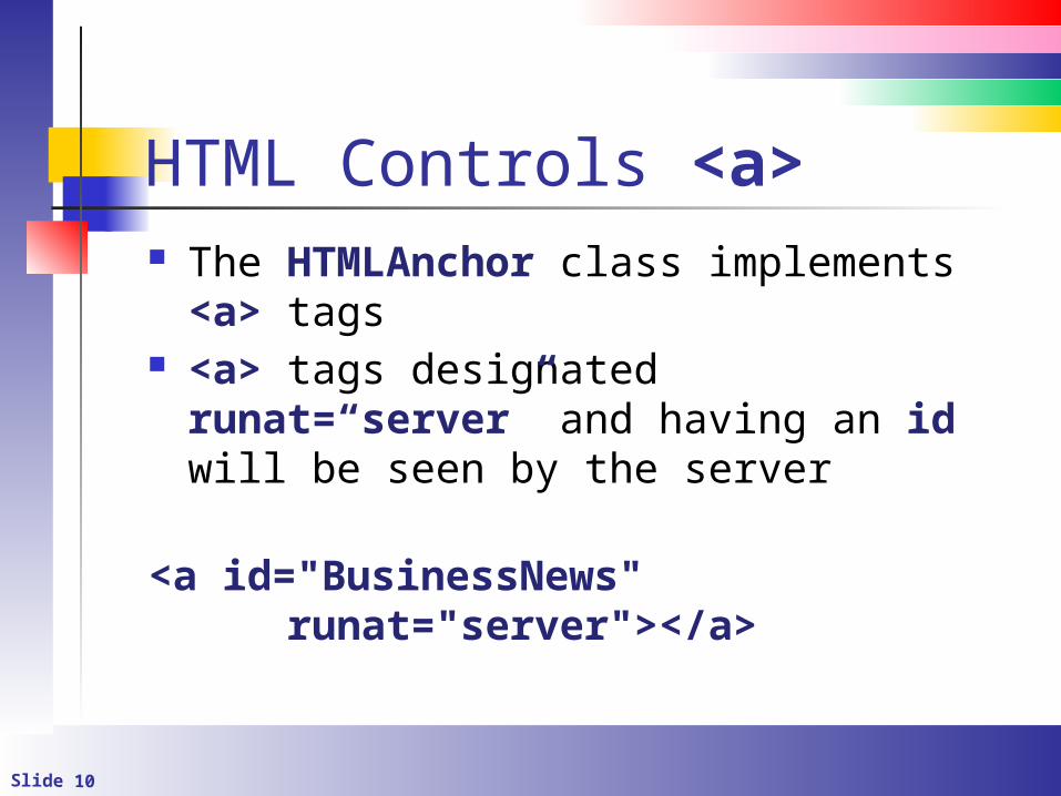
HTML Controls <a> The HTMLAnchor class implements <a>
tags <a> tags designated runat=“server”
and having an id will be seen by the server
<a id="BusinessNews" runat="server"></a>
Slide 11
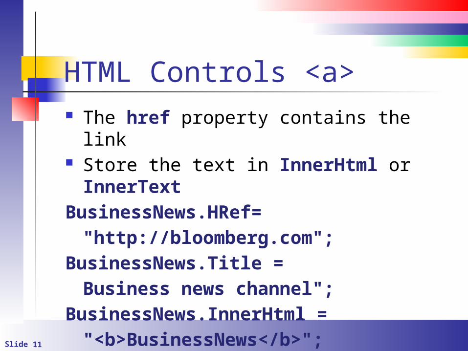
HTML Controls <a> The href property contains the link Store the text in InnerHtml or InnerText
BusinessNews.HRef="http://bloomberg.com";
BusinessNews.Title = Business news channel";
BusinessNews.InnerHtml = "<b>BusinessNews</b>";
Slide 12
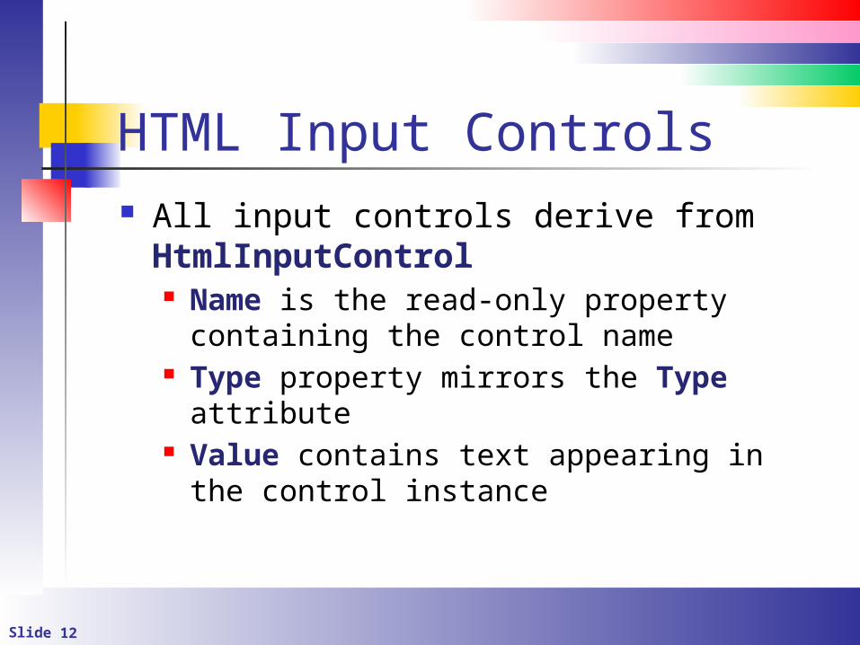
HTML Input Controls All input controls derive from HtmlInputControl Name is the read-only property containing
the control name Type property mirrors the Type attribute Value contains text appearing in the
control instance
Slide 13
The ServerChange event It fires for most HTML controls to denote
that the control’s contents have changed from one postback to the next Use for check boxes, radio buttons, text
boxes, etc.
Slide 14
ASP.NET Server Controls These are unique to ASP.NET All are contained in the System.Web.UI.WebControls namespace All derive from WebControl
runat=“server” attribute is required or the markup will be rendered verbatim
They are not the same as HTML controls The programming interface is more
intuitive
Slide 15
ASP.NET Server Controls (Properties 1) ID – Name that will be used to reference the
control instance programmatically (It’s the Name property that you are used to in VB)
Page – Page object on which the control resides
Parent – parent control instance Use for container controls
Visible – Make the control instance visible or invisible
EnableViewState defines whether contents are persisted through view state
Slide 16
ASP.Net Server Controls (Properties 2) The Style property contains references
to a collection of CSS styleMyControl.Style[“border-color”] = blue;
The CssClass property contains the name of a defined CSS class
txtStyleDemo1.CssClass = "TextBox"
Slide 17
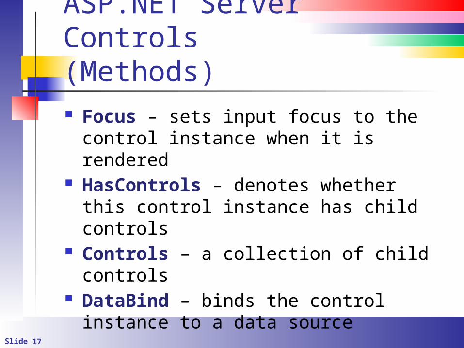
ASP.NET Server Controls(Methods) Focus – sets input focus to the control
instance when it is rendered HasControls – denotes whether this
control instance has child controls Controls – a collection of child controls DataBind – binds the control instance to
a data source
Slide 18
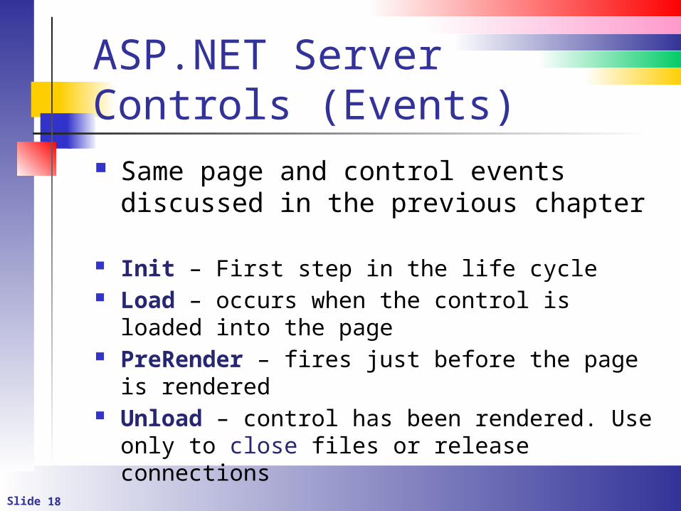
ASP.NET Server Controls (Events) Same page and control events
discussed in the previous chapter
Init – First step in the life cycle Load – occurs when the control is loaded into
the page PreRender – fires just before the page is
rendered Unload – control has been rendered. Use only
to close files or release connections
Slide 19
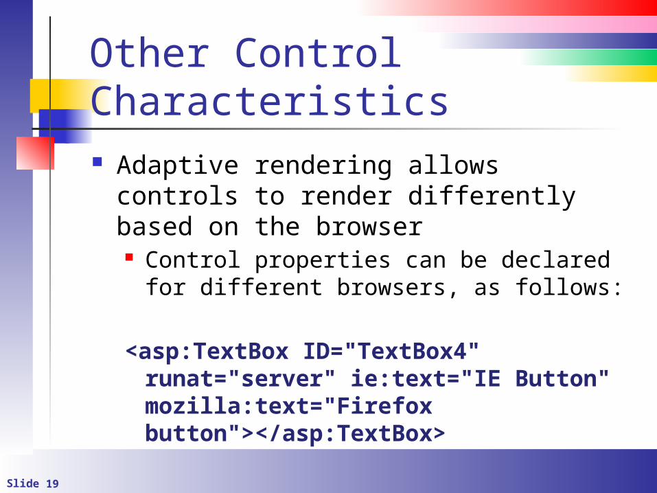
Other Control Characteristics Adaptive rendering allows controls to
render differently based on the browser Control properties can be declared for
different browsers, as follows:
<asp:TextBox ID="TextBox4" runat="server" ie:text="IE Button" mozilla:text="Firefox button"></asp:TextBox>
Slide 20
Control State (Introduction) State information must often be
persisted across page requests Control state is like view state
You generally don’t mess with the control state
Slide 21
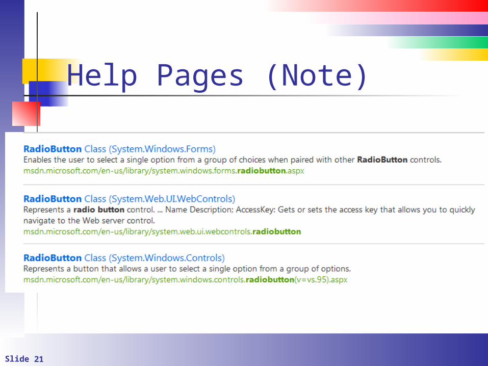
Help Pages (Note)
Slide 22
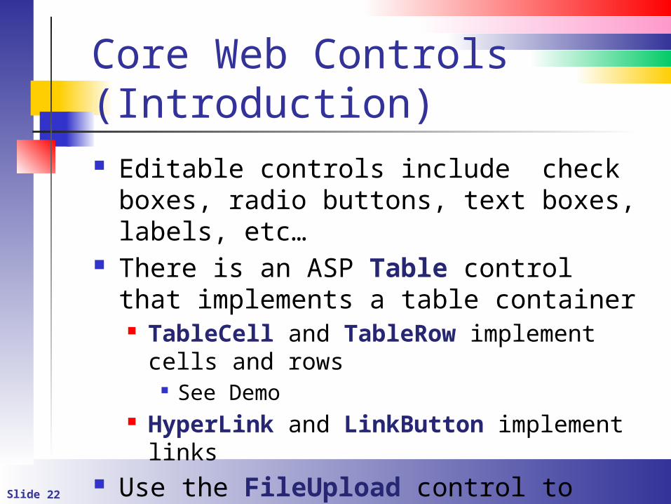
Core Web Controls (Introduction) Editable controls include check boxes,
radio buttons, text boxes, labels, etc… There is an ASP Table control that
implements a table container TableCell and TableRow implement cells
and rows See Demo
HyperLink and LinkButton implement links
Use the FileUpload control to upload files
Slide 23
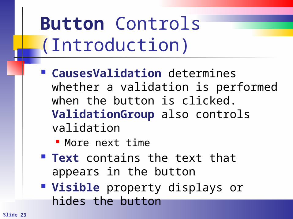
Button Controls (Introduction) CausesValidation determines whether
a validation is performed when the button is clicked. ValidationGroup also controls validation More next time
Text contains the text that appears in the button
Visible property displays or hides the button
Slide 24
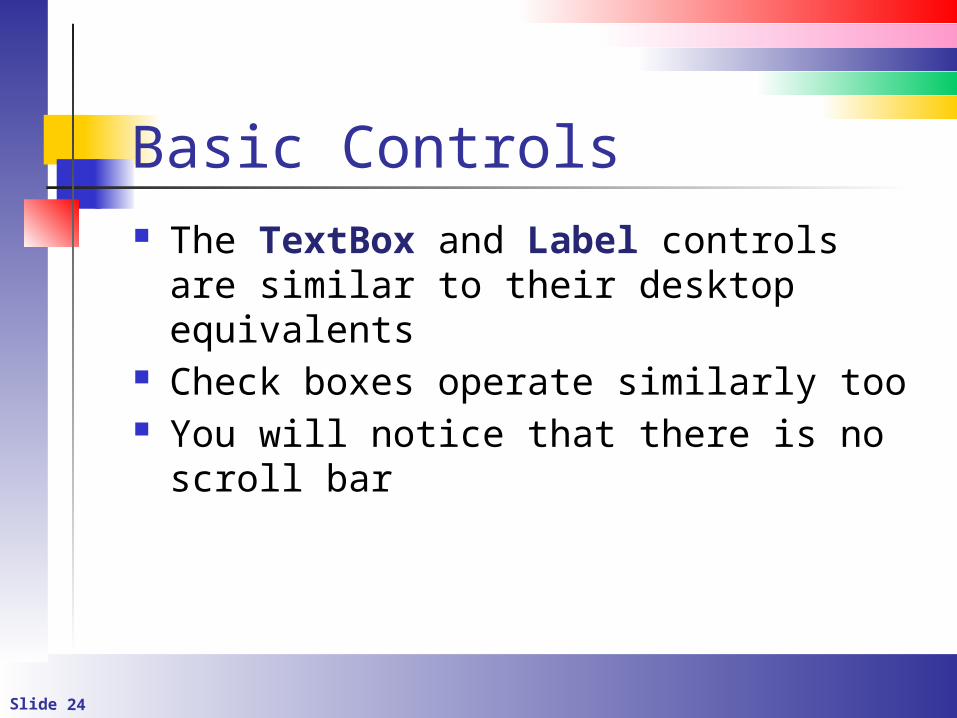
Basic Controls The TextBox and Label controls are
similar to their desktop equivalents Check boxes operate similarly too You will notice that there is no scroll bar
Slide 25
List Controls Many controls work with lists They all work similarly ListBox DropDownList CheckListBox RadioButtonList
Slide 26
The ListBox Control Like the desktop equivalent, SelectedIndexChanged fires when an item is selected
Each item in the ListBox is a ListItem These can be added at design time or at
run time Set AutoPostBack, as necessary
Slide 27
The ListBox Control Properties
SelectedIndex – 0-based index of the item selected
SelectedItem – Text of the selected item SelectedValue – An associated value
(used with data binding Set SelectionMode to allow selection of
multiple items
Slide 28
Container Controls They are used to group other controls
Make the sub controls visible Perform similar actions to all controls in
the group Panel groups child controls MultiView acts as a container for View
controls There are others
Slide 29
The Panel Control Simply put, it groups other controls Use it to
Organize controls visually Make groups of controls visible or invisible Create scrollable regions
Slide 30
The Panel Control Set the ScrollBars property to
enable/disable scrollbars Set the Visible property to hide or
make visible the control
Slide 31
The View and MultiView Controls Use these to create multiple views of
information Works something like a wizard Create one MultiView control
Create many View controls inside of the MultiView
For each View control create a button and set the CommandName and CommandArgument properties
Slide 32
Radio Buttons They work like their desktop equivalents Put in a RadioButtonList to create
button groups SelectedIndex contains the index of the
selected button The value is -1 if nothing is selected