AS Media Studies Logbook
19
OCR Media Studies – AS Level Unit G321: Foundation Portfolio in Media Planning & Research Name: Dan Sgarbini Candidate Number: 2005 Center Name: St. Andrew’s Catholic School Center Number: 64135 Set Brief - Print Music Magazine – Production Preliminary Task Progression and Planning & Research
-
Upload
dan-sgarbini -
Category
Social Media
-
view
111 -
download
2
Transcript of AS Media Studies Logbook

OCR Media Studies – AS Level
Unit G321: Foundation Portfolio in Media
Planning & Research
Name: Dan SgarbiniCandidate Number: 2005Center Name: St. Andrew’s Catholic SchoolCenter Number: 64135
Set Brief - Print
Music Magazine – Production
Preliminary Task Progression and Planning & Research

Section 1) –Preliminary Task

Preliminary Task Progression– EvidenceFront CoverStep-by-step
This is a blank canvas of my soon to be preliminary task front cover. This will be produced on Photoshop and will consist of many relevant features such h as the masthead, cover star and headlines.
This image displays the introduction of a banner which will feature the issue, date and many more features. This will be located above the masthead and has been presented in a dark blue colour in order to stick with school colours and build a brand identity.
This image clearly implies the further changes that have been inflicted upon my preliminary front cover, these changes include the issue number, issue date and St Andrews logo. The logo adds an aspect of relevance and displays familiarity with the audience as parents and students are all well associated with the school logo. The issue details are primarily added in order to inform readers and keep them up to date with the latest issue.

Here I have created a masthead in order to gain brand identity for the A Star and to clearly display the name of my created magazine. I have chosen this font as it is bold, basic and eye catching to the reader and I have added the St Andrews colour scheme of blue and yellow in order to ensure that my magazine is as relevant as possible.
I have also inserted a strapline into my St Andrews school magazine as it also displays brand identity and is the school motto therefore students, parents and staff are all familiar with my strapline and will therefore have an interest in my school magazine. I have placed the strapline in a small font in order to ensure that the masthead stands out and the strap line acts as a backup for the masthead.
I have now introduced codes and conventions around the barcode such as a smaller font masthead, social media links and my magazines website. I have ensured that my conventions are of my St Andrews colour scheme of blue and yellow as it creates brand identity and stays familiar with the target audience.
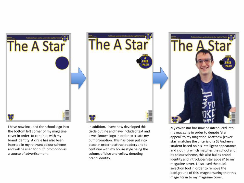
I have now included the school logo into the bottom left corner of my magazine cover in order to continue with my brand identity. A circle has also been inserted in my relevant colour scheme and will be used for puff promotion as a source of advertisement.
In addition, I have now developed this circle outline and have included text and a well known logo in order to create my puff promotion. This has been put into place in order to attract readers and to continue with my house style being the colours of blue and yellow denoting brand identity.
My cover star has now be introduced into my magazine in order to denote ‘star appeal’ to my magazine. Matthew (cover star) matches the criteria of a St Andrews student based on his intelligent appearance and clothing which matches the school and its colour scheme, this also builds brand identity and introduces ‘star appeal’ to my magazine cover. I also used the quick selection tool in order to remove the background of this image ensuring that this mage fits in to my magazine cover.

Furthermore I have now introduced my cover lines and my main headline which all give the reader an insight into the magazine. This is put into place in order to inform readers. I have also ensured that my main headline appears in a bold/larger font than the cover lines in order to denote the importance of this story, they all feature in the same colour scheme building the brand identity of my magazine. These stories also have a stroke effect in order to inflict both of the school colours into the text which maximises my brand identity.
Here is my final draft of my prelim front cover which has been completed through the introduction of the school badge being used as bullet points, not only does this denote relevance but this also keeps parents and students aware of the magazine and what it consists of.

Preliminary Task Progression–Evidence
Contents PageStep-by-step
This screenshot reveals a blank A4 Photoshop template, this will eventually be converted into a preliminary contents page. I will continue with my house style of dark blue and golden yellow as these colours feature in the St Andrews colour scheme.
I have drawn a dark blue rectangle in order to create a banner and background for my masthead copy. This colour is relevant as it is one of the prime colours in the St Andrews colour scheme. I have also added a contents page title in order to reveal to my target audience what this page is about. This appears in a thin font as it appears as basic and easy to read.
My masthead copy has now been inserted with a yellow stroke effect. This feature is vital as it introduces another colour into my house style and reintroduces the magazines identity.

In addition, an issue number has been introduced as has the date in order to keep readers up to date with this magazine. This follows the thin and readable font in order to build a brand identity. I have also added three boxes which will categorise the stories in the magazine, these are blue boxes with a yellow shadow effect, in order to continue with my well established magazine house style. I have also added a web address in order to build communication with readers.
I have now added two St Andrews school logos as readers can familiarise themselves with the school and this is also a key factor in building brand identity. Headings have been added into my boxes in a bold font as it denotes importance and immediately draws in the reader. This has been created in a yellow font as it appears as bright and eye catching due to the contrast between a dark blue and a powerful yellow. Social medias has also been introduced as it builds communication with the readers.

I have now added school logo by my subtitle and have added a screen shot of my preliminary front cover as this features in many content pages from many magazines. I have added the school logo in order to familiarise my audience with the school and to build brand identity. I have added my front cover copy in order to reveal which magazine this is relevant to and to display how I have continued with a specific house style.
Here I have added sublines in order to give the reader an insight into the magazine. I made this a quicker process by creating one story and pressing alt whilst dragging the layer to duplicate it, this ensured that my stories were in a consistent format. I also ensured that the page number and story title’s were in bold in order to denote their significance over the story itself.
I have now added a subtitle for my editorial and have continued with my yellow and blue colour scheme and have added a yellow stroke effect in order to reveal the contrast between the two. I have continued with the same font style to also build brand identity. I have also added a page number in order to navigate readers around my preliminary magazine.

I have now written my editorial via Microsoft Word and have added both my editors details and signature. My editorial appears in a dark blue as this is relevant to my school colour scheme of blue and yellow. My editorial is written in an informal tone as this builds a relationship between the readers and the magazine. This editorial was completed on word due to the fact that this ensures that my grammar and spelling is correct throughout the editorial.
I have now completed my editorial by adding an editors photo and a drop capital, both of these features feature in many magazines as the drop capital clearly reveals where the text starts and the editors image keeps the editorial itself professional.

I have now added images into my contents page in order to cover up blank spaces and to indicate where specific stories feature, both of these images are relevant to stories making the contents page more appealing to the reader. I imported these images via google as many images can be accessed through this site.
This image reveals my finished piece for my preliminary task contents page, in order to complete this I have zoomed into a key story within the contents page and have added a relevant image. Overall my prelim contents page meets the criteria as it consists of a consistent colour scheme, relevant stories and many more relevant features.

Section 2) – Log Book

Music Magazine – Genre research• In order to construct a magazine the first thing to do is to set up a date of publication. The date of publication is simply the
date that you want the magazine to be released as a finished product to the general public. By doing this you are operating with a schedule.
• Secondly you must manage the schedule which must be performed to a high standard if you are aiming to run a magazine company to a high standard. The next step is the Editorial and budgetary decision stage. The editorial decisions involve the magazine’s editorial team assembling and deciding what topics will be covered in the next issue of the magazine from images to cover stories.
• The next process is the content acquisition process and is arguably the most important step because without content you simply cannot have the magazine in the first place. The first step is through in-house staff writers and the second way is through external writers that are commissioned to write on topics that are specialist in nature. It is at this stage that artwork and graphics are also worked on. The artwork is defined as illustrations and pictures that are going to be placed in the magazine. Graphics are the pictures or images that are designed with a computer program.
• Sub editing focuses on one major thing, which is quality control. If the media organization is big enough to have a sub-editor, then he is going to be responsible for this job; if there is no sub-editor, then the editor does this job and they Check the accuracy of all facts in the articles and manage the overall layout and grammar.
• The next stage is page layout. There is a special team responsible for page layouts called the layout staff. Their job is to typeset and layout the various pages that come together to make the magazine.
• In addition proofreading is put into place which involves sending the magazine to a printer in order to have it double checked whether images and headlines are relevant etc. after this the entire magazine is printed out in many copies if the editor approves of it.
• The final method involves distributing the magazines to the public and into retailers so the magazine can be seen and purchased.
• The most popular music magazine in the UK is Q magazine as it covers a wide range of genre from pop to R&B this magazine produces a magazine for multiple genres in order to suit a wide target audience.
• I gathered this step by step magazine production guide from hosbeg.com/the-magazine-production-process

Established Magazine for my ResearchMasthead: The masthead is the main heading and name of the magazine. This is generally located above the cover star and act as a banner however Q magazine do not follow this as their masthead only covers a corner.
Main Headline: The denotation of the headline is “Liam's Beady Eye Kick Off” which denotes the name of the artist automatically appealing to readers of the magazine as they are given a relevant and clear insight of what is due to feature in the magazine. The main headline is generally in a bold, large and appealing font in order to denote its importance over the cover lines. In this image Q magazine have placed the main headline in front of the cover star as the main headline features the artist on the front. It is also presented in a large font that matches the Q magazine colour scheme this highlights their brand identity.
The cover star displays the celebrity starring in the main heading and is generally located in front of the masthead to denote his or her “star appeal” however Q magazine do not follow this basic rule.
Cover lines are generally seen as secondary stories that feature in the magazine however do not have the importance that the main headline possess.
The strapline: The denotation of the strapline is “Discover great music” which inflicts an influence on the reader that this magazine will possess high quality music. This acts as a source of reassurement for the reader as they feel that the music in which they follow is good music, therefore Q magazine are building a relationship with their audience.. This is generally located below the masthead and is generally used to portray a brief insight of the magazine company to all readers.

Target Audience –
Q magazine is a pop and Rock magazine and their target audience can be denoted as the male gender due to the fact that 68.3% of readers are male with 35.5% of readers being between the age bracket of 15-24 (Hartley). This magazine searches for social climbers due to the fact that throughout the magazine the life of music artists is employed which appeals to social climbers as they are materialistically driven (Maslow's). Q magazine also appeals to survivors as it appeals to a wide range of people of many music genres (Maslow) , survivors strive for routine and security which is exactly what this magazine produces as it is released on a monthly basis and covers a wide range of genres appealing to a large target audience. They do not target a specific ethnicity ornationality as the music and presentation on the magazine could be aimed at a wide range of people. This magazine is also used in order to inform and educate readers about multiple genres in the music industry, this also informs and educates readers aboutspecific artists and their complex lifestyles (Katz). In addition this magazine company also uses diversion as it immerses readers within stories through features such as interviews with artists and new albums/singles which all draw readers into the magazine (Katz).
What is the USP of this magazine?
From the research completed into this media product, I think that Q magazines USP is the cover star featuring on the front cover as it clearly displays who will feature in the magazine and the magazine genre that will feature in this magazine. It also connotes “star appeal” (Maslow’s) that will attract buyers due to the fact that music is currently at its peak and many people across the country identify specific figures with good music and by displaying this artists people will automatically feel that good music features in the magazine.

Publisher research
This information was gathered from: http://www.bauermedia.co.uk/brands/q
Q magazine is a monthly music magazine issue that is produced by Bauer media who own multiple sources to the extent that they reach over 22million people in the UK. They own many brands such Kiss, Grazia, Empire, Magic. They aim at people from the age bracket of 15-24 with 35.5% of readers fitting into this age group. 68.3% of readers are of the male gender. This magazine reaches out to a large group of people due to the fact that it covers a wide range of music genres from R&B to pop this magazine features a wide ranges of genre to suit a wide target audience.

Conventions of a Music MagazineMasthead: The masthead is the main heading and name of the magazine. This is generally located superior to the cover star and is generally in a bold font with a established brand.
Cover lines are generally seen as secondary stories that feature in the magazine however do not have the importance that the main headline possess. However give a brief insight into what the magazine possesses.
The cover star is the main USP of a magazine displaying the celebrity starring in the main heading and is generally located in front of the masthead to denote his or her “star appeal”. This determines the cover story and the readers.
Main Headline: This is used to give the reader an insight of the main story in the magazine. And generally features the cover star. This is based on the magazine genre and the artists that are relevant to this.
The Strapline acts as an extra source of information for the masthead as it builds brand identity, acts as a catchy slogan to draw in readers and acts as an extra source of information of what the magazine is about. In this issue of XXL the strapline is “special collectors issue” which denotes the importance of the magazine issue to the reader.
The web address is generally advertised towards the barcode area in order to act as an extra source of information for those who are interest in seeing the next issue, previous issues and many more sources of information regarding the magazine.

Target Audience –
The target market for XXL magazine can be denoted as a prime source of entertainment for men as 78% of readers are male leaving only 22% being female. This is also aimed at African Americans as this category consumes 67% of readers. This is also very popular for adults between the age of 26-29 years of age due to the wide range of music and the genre that perhaps is most suitable for people of this age and is least suitable for those over the age of 60 due to how modern this style of music is which is portrayed in XXL. XXL magazine primarily targets social climbers due to the fact that the hip hop lifestyle is a prime feature in XXL which involves cash, chains, caps and materialistic goods. Those who are social climbers are driven by materialistic objects andthe genre of hip hop denotes this complex and materialistic lifestyle (Maslow). This hip hop magazine also links to diversion due to the fact that readers become drawn into the hip hop lifestyle and those who fall into the diversion category immerse themselves within the magazine. XXL magazine ensures that readers immerse themselves in the hip hop lifestyle and within the story's interviews that feature in the magazine (Katz).
What is the USP of this magazine?
The unique selling point of this magazine is the cover artist as the cover star portrays some “star appeal” (Richard Dyer) that the reader attracts to based on the artist and his or her popularity. The cover star gives a clear insight of what the reader is buying into based on the stars appearance and genre of music. The cover star must be relevant to the magazine issue and must feature in the main headline he or she must also be relevant to the music genre of the magazine.

Publisher research
• My chosen magazine is XXL which is produced by Warner Music.
• Warner music reaches over 19 million adults every week as this is the main target group that they strive to appeal to.
• They also connect people and communities with compelling and quality content, whenever, wherever and however they want.
• This Magazine is produced monthly and is available for customers at the beginning of each month in stores.
XXL Figures:78% Male Readers67% African American Readers