As media foundation portfolio
26
AS MEDIA FOUNDATION PORTFOLIO Magazine Production Folder ALEXANDRA CIROVIC
-
Upload
akiasmedia -
Category
Education
-
view
35 -
download
0
Transcript of As media foundation portfolio

AS MEDIAFOUNDATION PORTFOLIO
Magazine Production Folder
ALEXANDRA CIROVIC
RESEARCH1. Labeling front cover design2. Analysis of a cover3. Analysis of a different cover4. Analysis of a different cover 25. Critical comparasment of two magazine covers 6. Labeling a content page7. Content page analysis8. labeling a content page9. Content page analysis10.Comparasment of two content pages11.Labeling a double spread12.Analysis of a double spread13.3rd double spread analysis14.Questionnaire15.Summary

Front Cover Labeling

Strapline/subheadin
g
Masthead
Cover lines
Main cover line
Main cover image
barcode
Date line/cover price
Strapline/banner
Flashbutton coverline
Spine (the bound edge)

Front cover analysis

Main imageThere is a single image of a building located somewhere in Asia that appears to be very luxurious. It represents the new plans for Asian countries considering the architecture. The image is simple but serious, showing a high tech building with an amazing complex of pools, gardens, etc.
MastheadIt is a short explanation of what is the magazine about. It is the biggest because it is the name of the brand. It’s purposely in white san serif font to be very catchy, especially the fact that it is in bold. And it is split in two parts, yet the other part isn't bold but that is on purpose so It is stylish.Selling lineShort but vivid title of the marketing for the magazine, the attraction for the customers. In this case it states that the ‘Property Report’ magazine is the leading magazine, logically everyone would be attracted to this, everyone wants the best. That is why it is positioned right below the masthead, so they make sure that the customers read it.
Man cover lineIt is large, it has two lines in different size, it is very visible and readable because it explains shortly the main topic of this edition of the magazine. It is in classy Times new roman font and in black color contrasting the background so it is more catchable. Definitely one of the most important pieces of the magazine cover. It is what catches the customers attention at first place, so they continue reading the rest.
DatelineMonth and year of publishing and the price of the magazine.
Cover linesAre there to support the main cover line, and to attract customers by stating some details from the topics inside the magazine. It is in black color as contrast from the light background and times new roman font to give the effect of classiness. Cover lines are crucial in attraction of customers.
Strapline banner Is positioned at the bottom of the magazine in white color so it is eye catching. It states the main subjects in magazine.
Barcode a computer readable code which with the series of numbers keeps the stock control and keeps info about number of issues sold.
Website is there so the customer can enter
it for questions or further information.

Masthead- the masthead being US Weekly tells that the magazine comes out every week. Since it is yellow and san serif font it does not look serious, it gives the impression of a chatty magazine, which it is.Yet the masthead represents informal and low class audience. The masthead of this magazine is positioned in the corner Cover lines
and sub cover images-On the cover there are usually few cover lines next to the main line. They are there to inform the customers about few other interesting subjects in the magazine, they attract the customers to buy the magazine. Not everyone is interested in the main topic which in this case is the divorce of Kris Jenner and Bruce Jenner, so the cover lines are there to inform the customer about other topics that might interest them.
Price-the price is very important for a magazine. Magazines such as this one should not cost too much because they are gossip magazines and not major fashion or real estate ones. They are not big and don’t have a lot of content. Nest to the price there is always a date of publication.
Main image-the main image in combination with the main cover line is representing the main topic of the magazine in that issue. Here we have two celebrities divorcing. the picture of them together ripped, attracts people to buy the magazine because it indicates drama and people love reading about drama, the ripping effect is great when illustrating the breakup between two people. On top of the ripping effect, there is the Main cover line in yellow color to attract customers and san serif font which indicates that the magazine is not serious and classy.
Main cover line (selling line)- the main cover line is connected always with the exclusive of the magazine, in this case the exclusive is the Jenner divorce. The main cover line is there to attract the first sight from people so they look at the whole cover and read the other cover lines, get intrigued and buy the magazine. That’s why the main cover line is always in a eye catching color, big letters and with some mark (question mark, exclamation mark etc.). When the cover editors write a question for the main cover line it attracts customers to see the answer even if they are not interested in the particular topic. With the exclamation mark it gives the effect of seriousness and people want to read what is the serious thing happening in the life of celebrities. Under the main cover line come the sub cover lines telling more widely what is written in the magazine about the main topic.

Heading.VOGUE is the most prestigious magazine in the world, especially in the fashion industry. Here the color is coral pink-redish and it is a great contrast to the subtle background. It is in serif font but in a very classy Times New Roman. It is very large, taking up to 25% of the cover space, it is very important to be eye-catchy, and after all the Vogue name or the word itself is so important, ‘heavy’ and prestigious, so the bigger the better.
Strapline. Vogue always has a strapline here in the left upper corner labeling a special extra topic or information that the customer gets when they buys the issue. Every month it is something different.
Main image.The main cover image is a famous actress named Charlize Theron. She is considered to be one of the most stylish celebrities in the world so no wonder why she got to the cover of Vogue. She is a very classy woman that is why the cover itself is done very subtle and classy. She defines sex appeal that is why she is in this dress with deep cleavage and wet with her hair slicked, with very subtle makeup that emphasizes her blue vivid eyes. The editors went for a sexy mermaid effect with he ocean behind her. And they definitely succeeded.
Primary cover lines.Sometimes magazines have more than one main cover line. Here we have two primary cover lines and one secondary that is to the left. Primary lines label the main topics in the magazine. These lines are always the biggest in a popping contrast color to the background so they are eye-catchy. In this case we have the first line in black , san serif font, very large, giving out a seriousness effect . The second main cover line is in pink and uses an exclamation mark to make it more popping and important.
Secondary cover line.As already said, there are primary and secondary. The reason this is a secondary even though it is large and vivid, is because it is about the character on the cover. That is only few pages of her images and interview while primary ones label what this issue is all about. As I noted under ‘main image’ , that the editor wanted to make a mermaid effect, here it is above her name and surname stating ‘HOLLYWOOD SIREN’ .Cover sub lines.Cover sub lines are there to get the reader most interested once they have started reading the cover page. These lines tell more widely about some other topic in this issue that are more serious or not as fashionable in case of Vogue, but a different kind so the market is wider because than the magazine won’t buy only fashion related people but others too.
Barcode and price.a computer readable code which with the series of numbers keeps the stock control and keeps info about number of issues sold. The price of this magazine suits the prestige status it has, it is very expensive but large also and it is the most prestigious magazine on earth.

Critical comparasment of two magazine covers
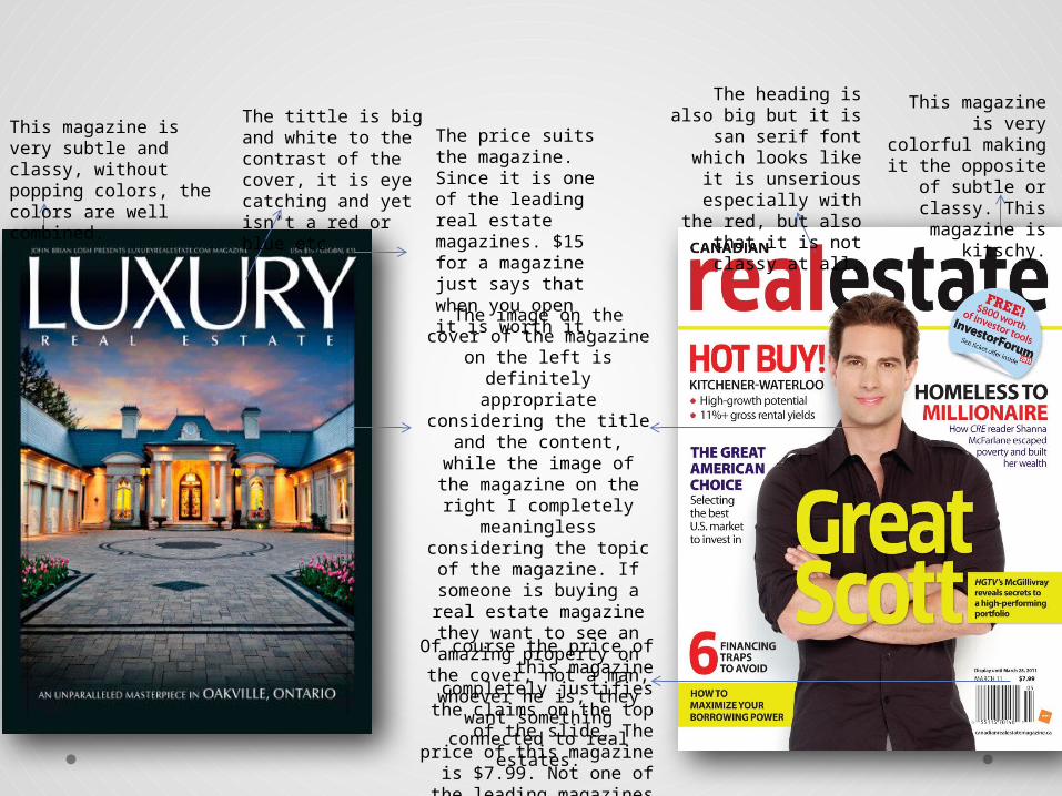
This magazine is very subtle and classy, without popping colors, the colors are well combined.
The tittle is big and white to the contrast of the cover, it is eye catching and yet isn’t a red or blue etc.
This magazine is very colorful
making it the opposite of subtle
or classy. This magazine is
kitschy.
The price suits the magazine. Since it is one of the leading real estate magazines. $15 for a magazine just says that when you open it is worth it.
The heading is also big but it is san serif font which looks like
it is unserious especially with the
red, but also that it is not classy at all.
Of course the price of this magazine completely
justifies the claims on the top of the slide. The price of this magazine is $7.99.
Not one of the leading magazines for sure.
The image on the cover of the magazine on the
left is definitely appropriate considering the title and the content, while the image of the magazine on the right I completely meaningless considering the topic of
the magazine. If someone is buying a real
estate magazine they want to see an amazing property on the cover, not a man, whoever he is, they want something
connected to real estates.

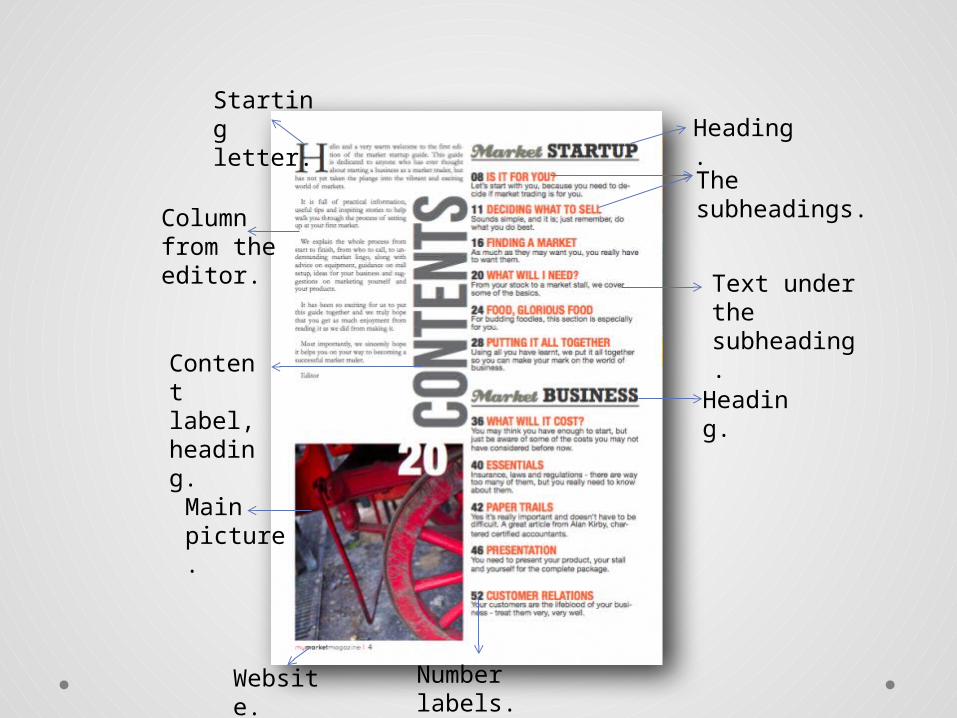
Labeling a content page
Heading.
Heading.
Number labels.
The subheadings.
Text under the subheading.
Main picture.
Content label, heading.
Website.
Starting letter.
Column from the editor.

Content page analysis

The headings/categories. The headings are in red so it is catchy. It is the same color as numbers meaning that it labels something. The numbers and the heading are in bold so it indicates that it is serious and important part of the content page.Numbers. The numbers are big and red because they need to be seen in order to easier find the topic you want to read. The main
heading.Now, this is very interesting because the name of the magazine is presented as an illustration. The hand is representing an ‘I’ and the N being in red and big is very catchy.
Background.The Background is in grey-brownish color, but not too dark. the white and red letters are very nicely visible and the interior of the objects goes well together, just like this beige apple and beige arm perfectly mixed with the red letter, white cubes and the white skeleton.
Contents label.The contents label is there to inform the reader that this is a content page. Colors.The colors are very subtle with only a bit of red popping out, the selection of colors indicates that this is probably a fall issue and that every interior design inside the magazine is Autumn themed.
Layout. Less is more. This particular layout is very simple but yet very classy eye-catchy and fun. It is a portrait layout and very structural. By structural I m

Comparasment of two content pages

Background.The background is very childish with the popping pink and indicates that it is a teen mag.
Background.
The background here is very
sophisticated with the grey-brownish
subtle color, indicating that the mag is serious and
classy.
Font.The font of the mag is serif and it shows that this is a chatty, not serious magazine.
Font.The font of this
magazine is sans serif which
indicates that it is serious and classy
once again.
Subheadings. The sub headings in this
magazine from the left are very vivid, serif font and use of
stickers (referring to the heart) which indicates that it is a cheap, chatty, teen, not classy magazine.
Yet, the subheadings from the magazine that is to the right, are very classy, simple, catchy but not
kitschy, a big difference. The color of the subheadings on the right are compatible with the color scheme from the whole
page while in the magazine that is to the left there are tons of
different colors mixed and it looks very kitschy.
The numbers.The numbers on the magazine to the left are much larger and vivid with the mix of pink and yellow color. The numbers are just thrown around and not in order. The numbers to the right are very subtle and much smaller, big enough to be spotted but small enough to be classy, the red color again compatible with the
whole color scheme and nicely catchy.
Pictures and color scheme.
The main images to the left are very vivid and represent the topics for teenagers while in the magazine
to the right there are no literal images, only few objects, making it
look classy and subtle. The color scheme to the left is a chaos, very vivid, tons of different colors, very
kitschy and everything but not classy. The magazine to the right has only few colors mixed and the colors are coming from the same
color family, to it is very well mixed and it gives the impression of
classy, serious and very tasteful magazine.
Labeling a double spread page
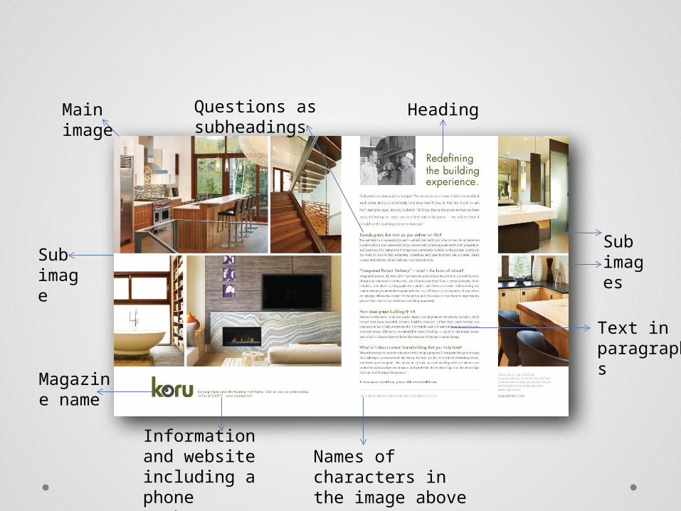
Magazine name
HeadingMain image
Sub image
Sub images
Text in paragraphs
Information and website including a phone number
Names of characters in the image above
Questions as subheadings
Analysis of a double spread

Corner info.Few words placed in the corner here state that this house is on Cyprus and that it is a designer home.
Image of family.The family is Scottish and this house is theirs. When they bought the house it was completely different, but now that they have renovate it, it is absolutely amazing and they want to share their dream come true.
Main image.The main image is the core of the house they renovated. It shows the pool and front part of the house. Since they selected this photo to be the main image it is obviously their favorite part of the house that they are most proud of. The pool is absolutely amazing and since it is full it indicates that the shots were taken in the summer. Sub images and comparison. The sub images are there to show few more parts of the house, and they are presented with photos from the past to be compared with the renovated part. It shows that the family invested a lot of time, effort and money in this house.
The main heading.The main heading is mixed with orange and grey color, the whole article is very nicely combined considering the colors. White, grey, blue and a little bit of popping orange that gives the needed effect for freshness. First of all it is a motivational heading. ‘Not just a Dream’ makes people wonder could they make something they want possible. This house was obviously this family’s dream that they made come true. Since this house is a dream house for most of the people, the heading goes perfectly with it .
The text.There is not a lot of text because the pictures speak more than thousand words. The text Is just a short interview with the family telling how they made it and what is their favorite part of the house. The big starting letter W is in orange, giving the nice fun but still serious effect.
Before&After. Before and after signs in the corner of the photos are there to guide the readers to know why are there two photos and what do they represent.
Interview bullets.Next to the photos there is a bit of text that is part of the interview. Three family members gave their statements/comments about the changes in the house.

3rd double spread analysis

This is a double spread magazine from obviously a teen magazine. It can be concluded by looking at the color pattern, main image, and informal text. The quotation marks in pink, that are opening and closing the main title/statement represent how not serious it is and that the main title is an ironic statement. By writing “I’d” instead of “I would” proves again about the chatty type of magazine. The background is in black so all the pink would pop out nicely. At the right above the page number, there is an information who took the picture and who wrote the text.
The main image is a famous singer indicating that the magazine is only celebrity related. Second main line is the line that goes after the first main (heading) line, a subheading. That line is there to get the reader interested in what are they going to read in that article. In this case the singer’s name ‘LEONA’ is in white and bold, that is revealing an identity of the celebrity because it can happen that not everyone knows about her. On the other hand it can also be creating a “diva” personality for her as it is shocking what she revealed in this interview. The image that they have used is a photoshoped one, it was obviously not taken particularly for this article. Sub images used in this double spread are related to parts of her interview that is obviously very ironic and fun. The quotes written separately from the main text are hers most controversial statements from this interview, and are being pulled out because it is what readers read first and get even more interested.

Questionnaire draft

1. Name, surname2. Female/ Male3. Age4. Student/employee5. Christian/Islam/Buddhist/ other6. Do you read magazines? Yes/no7. Are you interested in real estate?
Yes/no8. Do you prefer more photos or text
in magazines? Text/Photos9. What colors would you like to be
used? Black/blue/red/yellow/green/pink/grey/white/orange/purple/brown
10. Would you buy our magazine? Yes/no/maybe

Summary of research

• My main research in this task is real estate magazine so in connection to the topic I did 2 cover analysis, comparison of 2 covers, analysis of 2 contents and comparison of them, labeling a double spread and analyzing too.
• Since I did more analysis, comparisons, labeling etc., I used other topics too, such as fashion and gossip magazines. So I did analysis of one gossip and fashion magazine. Then, a double spread gossip magazine analysis.
• Most of the time I used the same technique of labeling with arrows and then writing in boxes, but in the last slide I used column technique just to add a bit of difference.