As evaluation
18
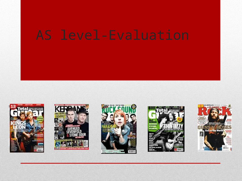
AS level-Evaluation
Transcript of As evaluation
AS level-Evaluation

How does your media product represent a particular social groups?
I used a multitude of colours, three at the least and four at the most to make my magazine and its contents as eye catching and in the audience face as possible to capture the gaze of my chosen social group.
My audience is defiantly a younger audience branching from 14 to early twenties.
Showing their youth my audience is captivated by the chaos my magazine emits showing their rebellious spirts.
There are many extremes of rock. Rock, Punk rock, Alternative Rock, Indie Rock, Christian Rock, Sometimes Metal can even have cross over with Rock. This creates a significant challenge as it makes my target audience the most diverse expecting a multitude of different things.
The fact my audience interests vary so much eliminates my Genre really having a strong house style, sometimes not even having one at all.
Now my Target audience can often get Stereotypes into categories like Goths or Rockers.

Stereotypical Audience

Example of a magazine geared towards Metal/ Rock, very in your face less colours more dark and brooding.
Example of a more punk themed rock magazine looking at a younger audience, more colourful but still in your face literally screaming at you. Q Encompasses all music it
doesn’t really have a genre. Sometimes they have rock bands like Foo fighters your stereotypical rock.
Now this is interesting as these type of rock always has a white and red almost classical look to it but still keeps its attitude hence the fire coming out of his mouth.
The audience for the more classic rock is a big gap from your punk rock listeners. This audience is older 20s through to 50s.
The very incense of this magazine yells rebellion and a sense of not caring. Really relating to its teenage audience on psychological level.
The most aggressive of the magazines really pushes the themes of in your face to the limit often too much for a lot of people.
The level of the energy produced by these magazine can be seen as almost psychotic
Rivals and Inspiration Front Cover- Target Audience tailoring
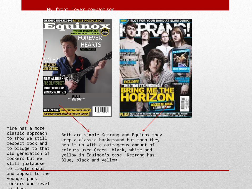
My front Cover comparison
Both are simple Kerrang and Equinox they keep a classic background but then they amp it up with a outrageous amount of colours used Green, black, white and yellow in Equinox's case. Kerrang has Blue, black and yellow.
Mine has a more classic approach to show we still respect rock and to bridge to that old generation of rockers but we still juxtapose to create chaos and appeal to the younger punk rockers who revel in chaos.

Rivals and Inspiration Contents page- Target Audience tailoring
Again the Hammer Contents keeps its menacing feel but in the form of a message a strong message showing who they are and a sense they are proud to be like this.
A sense of House style from hammer as they are only trying to appease Metal and heavy rock listeners a lot of black, red and white. Simple and strong colours sets a real mood of intensity for this magazine.
This Magazine is clearly targeting an older generation in comparison to its other competitors. Which gives it a serious tone over the others as for Hammer readers this magazine is a passion not an interest.
Kerrang keeps its excitement but it is reigned in a little for the contents to draw and bigger audience and show its not all giant and over top. Instead it focuses on smaller additions of colour and plays with its photos across the page to keep interest.
Although Kerrang magazine lacks a house as it’s a collection of multiple different articles with differing audiences, it does however have a clear tone.
This tone is very clearly described in a simple Statement. That here we, judge us as you will.
Rock sound uses multiple different images across its contents page each that has its own vibe representing a different sub genre of the rock music genre.
Its more simple than its competitions but it creates a more chaotic and a clear cut message can be derived from it.

My Contents Page comparison
Again I have used a multitude of colours to draw in my target audience White, Yellow, Black and Red. So Equinox keeps a running theme but adapts to keep our audience interested.
More photos are present on the Kerrang contents but we have different styles theirs is more information driven and can loose its audience I choice to keep the information easy to find but mad it big and explode in a readers face.

Rivals and Inspiration Double page spread- Target Audience tailoring
There is a sense they don’t care and that they don’t apologise they are what they are. This is communicated through their facial expressions and clothing.
The double page is still divided between the image and the article, showing that yes the target audience are usually more imagery driven but even so they still care about what is being said about this band
They give a very in the mud, lived in feel. They are very black and brooding but their background greatly contrasts with this showing them not to be all doom and gloom and that there's more to them then you presume at first glance.
This is more typical where the image is the most important feature and it draws their target audience in. It has an air of mystery about it and gives you a feeling of excitement and of being in the moment with the band.
Its more out their going against convection and coving multiple parts of the groups face causing a distorted image, this rebellious style would resonate with the target audience who would respect it and be further curious about it.

My Double Page Spread comparison
My Double page spread is in keeping with the band and their aggressive music as they are heavy rock, the theme is bleak and intense. Each band members has a unique stance showing their role within the band and who has the control similar to Kerrang’s double page spread.
While my magazine adapts to the band it is showcasing just as Kerrang does there are still elements from across my magazine as Red, Black and white are all previously used.

What kind of Media institution might distribute your media product and why?
BauerBauer media group would be the ideal conglomerate to join forces with as they are wealthy and prompt similar genre music magazines. But that’s the biggest issue the fact that Bauer already has Kerrang under its Banner which means my magazine is unlikely to make its way into partnership with Bauer as they have no need for us and would only see us as a revival.
Vice
Vice would be my key conglomerate while they don’t stray to far from the modern chart music, they may wish to expand and Equinox could be the perfect entry they need to get into the rock music industry.
Team Rock Team rock would be a unknown as they all ready have Metal Hammer and Classic rock, however they don’t really cover the punk rock genre and while my magazine is rock in general we do heavily look into punk rock and could fill and void for team rock.

Publishing Companies- Bauer Media Group
Kerrang is Published by Bauer Media Group. Alongside Kerrang they publish MOJO
Founded in 1875, Hamburg Germany They have a total Revenue of 2.4 billion
They Publish over 600 Magazines They have a presence in 17 Countries
Bauer is the third biggest in the UK They as have a television channel 4music
Bauer Media Group would be the ideal publisher for my magazine. However the problem with getting them on board would be Kerrang as there are stark similarities between my magazine and Kerrang. But mine does have differences and creeps into Metal so that’s something that might attract Bauer, as they don’t have anything to compete with Hammer but I do.
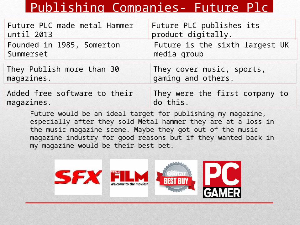
Publishing Companies- Future Plc Future PLC made metal Hammer until 2013 Future PLC publishes its product digitally.
Founded in 1985, Somerton Summerset Future is the sixth largest UK media group
They Publish more than 30 magazines. They cover music, sports, gaming and others.
Added free software to their magazines. They were the first company to do this.
Future would be an ideal target for publishing my magazine, especially after they sold Metal hammer they are at a loss in the music magazine scene. Maybe they got out of the music magazine industry for good reasons but if they wanted back in my magazine would be their best bet.
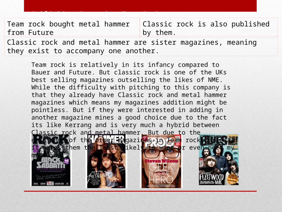
Publishing Companies-Team RockTeam rock bought metal hammer from Future Classic rock is also published by them.
Classic rock and metal hammer are sister magazines, meaning they exist to accompany one another.
Team rock is relatively in its infancy compared to Bauer and Future. But classic rock is one of the UKs best selling magazines outselling the likes of NME. While the difficulty with pitching to this company is that they already have Classic rock and metal hammer magazines which means my magazines addition might be pointless. But if they were interested in adding in another magazine mines a good choice due to the fact its like Kerrang and is very much a hybrid between Classic rock and metal hammer. But due to the existence of the other magazines in Team rocks arsenal it makes them the least likely to want or even need my magazine.

Publishing Companies-SONIC PUBLISHINGThey are a digital publishing house. They publish independent magazine websites.
They are based interiorly in the UK

How did you attract/address your audience?
The most important thing I did was to fine my audiences level and bring myself down to it. To make my magazine open and varied to make everyone of my audiences feel comfortable and feel like they were part of a collectivise and that they could read and like what they wanted and ignored that which wasn’t too important to them.
It’s a very difficult group to target as they want things a certain way with a level of varying desires creating a challenge which essentially means, I have a magazine where each group I address are interested in about ¼ of the magazine, which is very similar to how Kerrang handles it audience.

Kerrang is the perfect example of how I set up my magazine. They tailor to a wide audience and they do this by keeping their magazine varied with a wide selection of musicians and its very much a magazine that invites you at some points and then feels like it tries to kick you in the face during other sections. But this isn't out of design purpose this is out of your personal likes and dislikes. What the audience like about this magazine is its very much a magazine that feels alive and each page feels like a new story and with my magazine I've tried to emulate this in my magazine.

What have you learnt about technologies from the process of constructing this product?
I've learnt how to use Slide share to better share and operate PowerPoints. I have discovered Prezi as a another option for presenting information alongside PowerPoint.
I've learnt how to edit and crop photos where as before I could not image changing them or how to go about it.
I've discovered how to use lighting and composition of shot to create an image for the audience looking at a picture and its said importance in creating an image within an audiences mind.

Looking back at your preliminary task, what do you feel have learnt in the progression from it to full product?
I've learnt how much work Magazine companies put into every monthly issue it is no simple feat to put together a magazine and that comes from just creating a front cover, contents and double page spread. Editors put hours into just the little details of the image like the background colour as seen in the image below.
I've learnt of numerous different useful applications that could help me either in future student endeavours or in a workplace, such as blogger, Prezi, slide share among all the skills developed in Photoshop.