Artists & Illustrators ( Summer 2014 )
84
EXCLUSIVE "Why I can't fi nish my portrait of Oscar Pistorius" www.artistsandillustrators.co.uk STEP-BY-STEP PORTRAIT IN OILS LANDSCAPE PAINTING IN PASTELS WATERCOLOUR STILL LIFE DEMO BRIGHT Brush up your skills this summer with our top art projects IDEAS! PAINTING SECRETS Five Royal Watercolour Society members reveal their techniques ARTISTS OF THE YEAR Submit your work and win £1,000 Artists & I LLUSTRATORS 9 7 7 0 2 6 9 4 6 9 1 5 3 2 8 Summer 2014 £4.20 BUMPER CROSSWORD Win a £435 art course
-
Upload
magdalena-alejandra-piera -
Category
Documents
-
view
40 -
download
5
description
Revista Artists & Illustrators
Transcript of Artists & Illustrators ( Summer 2014 )

EXCLUSIVE
"Why I can't fi nishmy portrait ofmy portrait of
Oscar Pistorius"
www.artistsandillustrators.co.uk
STEP-BY-STEP PORTRAIT IN OILSLANDSCAPE PAINTING IN PASTELSWATERCOLOUR STILL LIFE DEMO
BRIGHTBrush up your skills this summer
with our top art projects
BRIGHTBrush up your skills this summer IDEAS!
PAINTING SECRETSFive Royal Watercolour Society
members reveal their techniques
ARTISTS OF THE YEARSubmit your work and win £1,000
Artists &I L L U S T R A T O R S
9770269469153
28
Summer 2014 £4.20
BUMPERCROSSWORDWin a £435 art course
COVER Sum14 v9.indd 1 10/06/2014 15:43
‘TH
E FRA
ME O
DIH
AM
’ @
TH
EFRA
MEO
DIH
AM
01256 701082 OPENING HOURS: MON-SAT 9 - 5.30
WWW.THEFRAME-GALLERY.CO.UK
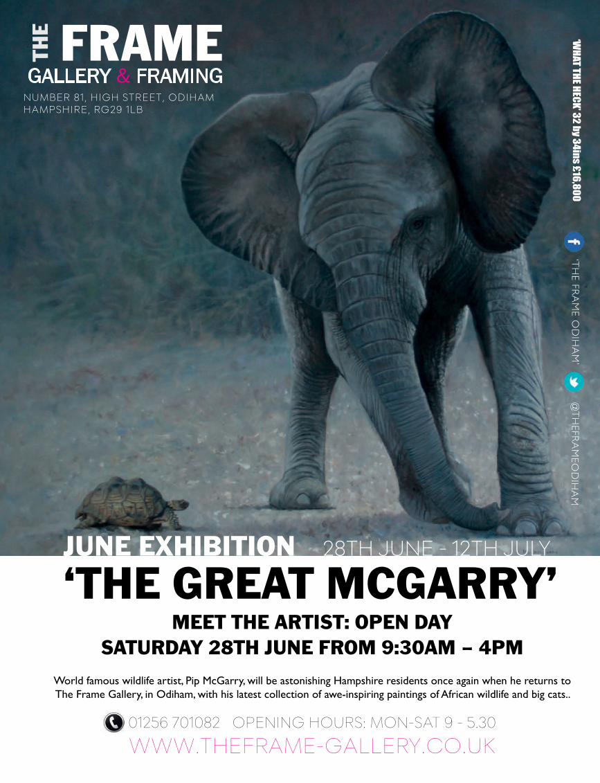
JUNE EXHIBITION 28TH JUNE - 12TH JULY
‘THE GREAT MCGARRY’MEET THE ARTIST: OPEN DAY
SATURDAY 28TH JUNE FROM 9:30AM – 4PMWorld famous wildlife artist, Pip McGarry, will be astonishing Hampshire residents once again when he returns to The Frame Gallery, in Odiham, with his latest collection of awe-inspiring paintings of African wildlife and big cats..
NUMBER 81, HIGH STREET, ODIHAMHAMPSHIRE, RG29 1LB
FRAMEGALLERY & FRAMING
THE ‘W
HAT THE HECK’ 32 by 34ins £16,800
artistandillustrator.indd 1 06/06/2014 00:08
Artists & Illustrators 3
Artists & IllustratorsThe Chelsea Magazine Company Ltd.Jubilee House, 2 Jubilee PlaceLondon SW3 3TQ
Tel: (020) 7349 3700Fax: (020) 7349 3701www.artistsandillustrators.co.uk
EDITORIAL Editor Steve PillSenior Art Editor Chloë CollyerAssistant Editor Terri [email protected]
With thanks to...Mitchell Albala, Grahame Booth, Laura Boswell, Damian Callan, Margaret Evans, Ben Grafton, Neil Hall, David Hinchliffe, Matthew Jeanes, Simon Keitch, Jill Leman, Myles Mellor, Mary O’Neill, Louis Smith and Andrew Tan
ONLINE For all website issues, please contact:[email protected]
ADVERTISINGAdvertisement Manager Tom O’Byrne(020) 7349 [email protected]
Group Advertisement Manager Lyndal Beeton(020) 7349 [email protected]
Advertising Production allpointsmediawww.allpointsmedia.co.uk
MANAGEMENT & PUBLISHINGManaging Director Paul DobsonDeputy Managing Director Steve RossPublisher Simon TemlettCommercial Director Vicki GavinHead of Marketing Will Delmont
SUBSCRIPTIONS AND BACK ISSUES For all enquiries, please contact:
Artists & Illustrators, Subscriptions Department,800 Guillat Avenue, Kent Science ParkSittingbourne, Kent ME9 8GU
[email protected] (01795) 419838http://artists.subscribeonline.co.uk
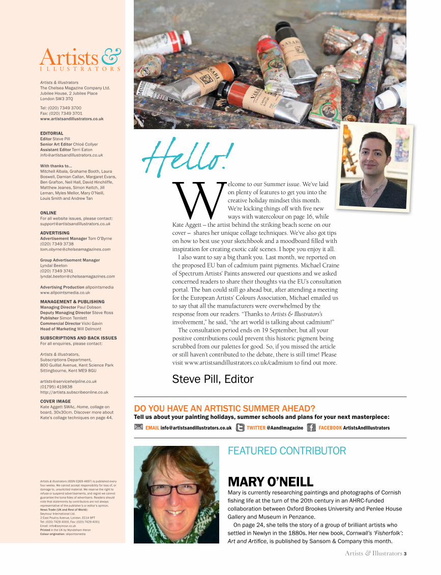
COVER IMAGEKate Aggett SWAc, Home, collage on board, 30x30cm. Discover more about Kate’s collage techniques on page 44.
Artists & Illustrators (ISSN 0269-4697) is published every four weeks. We cannot accept responsibility for loss of, or damage to, unsolicited material. We reserve the right to refuse or suspend advertisements, and regret we cannot guarantee the bona fi des of advertisers. Readers should note that statements by contributors are not always representative of the publisher’s or editor’s opinion.News Trade (UK and Rest of World): Seymour International Ltd.2 East Poultry Avenue, London, EC1A 9PT Tel: (020) 7429 4000, Fax: (020) 7429 4001Email: [email protected] Printed in the UK by Wyndeham Heron Colour origination: allpointsmedia
FEATURED CONTRIBUTOR
MARY O’NEILLMary is currently researching paintings and photographs of Cornish fi shing life at the turn of the 20th century in an AHRC-funded collaboration between Oxford Brookes University and Penlee House Gallery and Museum in Penzance.
On page 24, she tells the story of a group of brilliant artists who settled in Newlyn in the 1880s. Her new book, Cornwall’s ‘Fisherfolk’: Art and Artifi ce, is published by Sansom & Company this month.
Artists &I L L U S T R A T O R S
Welcome to our Summer issue. We’ve laid on plenty of features to get you into the creative holiday mindset this month. We’re kicking things off with fi ve new ways with watercolour on page 16, while
Kate Aggett – the artist behind the striking beach scene on our cover – shares her unique collage techniques. We’ve also got tips on how to best use your sketchbook and a moodboard fi lled with inspiration for creating exotic café scenes. I hope you enjoy it all.
I also want to say a big thank you. Last month, we reported on the proposed EU ban of cadmium paint pigments. Michael Craine of Spectrum Artists’ Paints answered our questions and we asked concerned readers to share their thoughts via the EU’s consultation portal. The ban could still go ahead but, after attending a meeting for the European Artists’ Colours Association, Michael emailed us to say that all the manufacturers were overwhelmed by the response from our readers. “Thanks to Artists & Illustrators’s involvement,” he said, “the art world is talking about cadmium!”
The consultation period ends on 19 September, but all your positive contributions could prevent this historic pigment being scrubbed from our palettes for good. So, if you missed the article or still haven’t contributed to the debate, there is still time! Please visit www.artistsandillustrators.co.uk/cadmium to fi nd out more.
Hello!
Steve Pill, Editor
DO YOU HAVE AN ARTISTIC SUMMER AHEAD?Tell us about your painting holidays, summer schools and plans for your next masterpiece:
EMAIL [email protected] TWITTER @AandImagazine FACEBOOK ArtistsAndIllustrators
3 Eds letter.indd 3 11/06/2014 15:51
CREATE
COLOURS MADE IN SWITZERLAND
SINCE 1915
For additional information and stockists please contact:JAKAR INTERNATIONAL LIMITED
Hillside House, 2-6 Friern Park, London N12 9BXTel: 020 8445 6376 Fax: 020 8445 2714 email: [email protected]
carandache.com
Jakar_Create_195x141cm_GB.indd 1 13.01.12 14:05CREATE
CREATE
COLOURS MADE IN SWITZERLAND
SINCE 1915
For additional information and stockists please contact:JAKAR INTERNATIONAL LIMITED
Hillside House, 2-6 Friern Park, London N12 9BXTel: 020 8445 6376 Fax: 020 8445 2714 email: [email protected]
carandache.com
CREATE
COLOURS MADE IN SWITZERLAND
SINCE 1915
For additional information and stockists please contact:JAKAR INTERNATIONAL LIMITED
Hillside House, 2-6 Friern Park, London N12 9BXTel: 020 8445 6376 Fax: 020 8445 2714 email: [email protected]
carandache.com
Jakar_Create_195x141cm_GB.indd 1 13.01.12 14:05
JAKAR - CREATE - SUM14.indd 1 11/06/2014 15:55
Artists & Illustrators 5
ISSUE 341 ● WWW.ARTISTSANDILLUSTRATORS.CO.UK ● SUMMER 2014
15 SUMMER CROSSWORDCan you complete our prize grid? 31 THE WHITE STUFF
Find out your paper is made
72 THE ART OF THE NOTANChoosing your next composition
38 OSCAR PISTORIUSThe unfi nished portrait revealed 58 BLOOMIN’ LOVELY
Award-winning botanical ideas
60 TAKING NOTESMake the most of your sketchbook 70 FIGURES IN OILS
A dozen tips for quick impressions
Can you complete our prize grid? Find out your paper is made
58 BLOOMIN’ LOVELY
ISTO
CK
PH
OTO
: NEI
L H
ALL
CONTENTS6 YOUR LETTERSWrite to us for the chance to win a £50 voucher
9 THE DIARYThe latest news from the art world
16 WAYS WITH WATERCOLOURFive leading artists share their methods
24 FISHING FOR SUBJECTSHow a Cornish village became a haven for art
36 ARTISTS OF THE YEAR 2014Our search for the best undiscovered artists
40 PORTFOLIOA selection of our members’ AOTY14 entries
44 TALKING TECHNIQUESHow Kate Aggett creates her collage beach scenes
48 MASTERCLASSA step-by-step still life painting demonstration
52 MOODBOARDFind inspiration for creating colourful café scenes
55 PAINTING PROJECTSLearn how to open up your landscapes
59 COLUMNISTLaura Boswell braces herself for public opinion
64 PORTRAIT WORKSHOPLouis Smith concludes his series with a full portrait
82 MY LIFE IN ARTWith the Guild of Aviation Artists’ Michael Turner
5 Contents.indd 5 11/06/2014 12:46
6 Artists & Illustrators
FOLLOW US AT WWW.FACEBOOK.COM/ARTISTSANDILLUSTRATORS FOR A DAILY DOSE OF INSPIRATION!
WRITE TO US Send a letter or email to the addresses below for the chance to win a £50 GreatArt voucher
• POSTYour LettersArtists & Illustrators The Chelsea Magazine Company Ltd. Jubilee House 2 Jubilee Place London SW3 3TQ
The writer of our ‘letter of the month’ will receive a £50 gift voucher from our partner GreatArt, who offers the UK’s largest range of art materials with over 40,000 art supplies and regular discounts and promotions.www.greatart.co.uk
Your Letters…Last November, I attended a one-day life-drawing workshop run by the Bristol Drawing School at the Royal West of England Academy. Full of enthusiasm,
I had a great day and produced several charcoal drawings, one of which I had framed. Naturally when I received the email notifying me of another workshop, I booked up in advance.
Anyway, on the morning of the workshop I really wasn’t in the mood for it, but having paid I went anyway. Arriving about 20 minutes early I slid into a trendy coffee shop nearby. Americano in hand I sat at the fi rst available table. I looked up and there it was: the ideal image for a painting. The warm light poured through the entrance and shot across the wooden fl oor. It danced across the coffee pots and cutlery and made slender silhouettes of three customers caught in its path.
Four or fi ve hours of life drawing that day left me feeling pretty uninspired. However, the day was not a complete loss. Armed with my sketchbook and camera, I returned to the coffee shop two weeks later when the light seemed right. Now I have the bones for my next painting and I may even enter it in Artists of the Year 2015.Nick Smith, Bristol
It just goes to show that you never know when inspiration will strike! Good luck with the painting – hopefully your £50 ‘Letter of the Month’ voucher from GreatArt will help you stock up on materials and we will see the fi nished work among the entries for next year’s competition.
had outings but one time our class went to a gallery in Detroit because London’s National Gallery had sent a large number of British paintings on loan there.
I remember the sister pointing to Turner’s painting and explaining, “Class, that’s the most important one here.” I can’t recall exactly which painting it was, but the colours breathed life. It was beautiful!
I can still see the Turner painting and others in my mind today. I remember the day as if it were yesterday. I broke away from the class and wandered and looked and looked. “How did they do that?”, I asked myself. I knew from then on I wanted to
PIGMENT CONCERNSRE: Campaign for Cadmium, Issue 340I have just received the July issue and read the very interesting article on cadmium pigments.
I am a self-taught artist and the only instruction I have ever received was at school in the days when we used powder paints and huge bristle brushes. I had no idea about cadmium and the possible problems.
This made me wonder how many other hundreds of artists like me have happily washed paint down the sink without realising the dangers it might cause? Thank you for giving us this information – I will watch for the results with interest.Brenda Cumming, via email
Glad to keep you informed, Brenda. To be clear, cadmium is no better or worse than many other paint pigments – it is simply the one under review by the EU. All artists should be careful with chemicals and use them in safe, responsible ways.
ABOUT TURNERI watched the trailer for the new JMW Turner movie on your website and it reminded me of a story I wanted to tell that happened long ago, possibly as far back as 1960.
I spent my childhood in Michigan and went to Epiphany Catholic School. We never really
learn to paint. Soon I saved up and bought a huge box of Old Holland oil paints from a local department store. $139 was a lot of money to save for a kid from a poor neighbourhood but I knew I had something special.
Well, now I’m older but I still thrill whenever I pick up a brush. I never will be a ‘top dog’ but that’s OK – thanks to JMW Turner my world is a much happier place. I cannot wait to see the movie!Margie Stephen, Harrison, Arkansas, USA
If our other readers missed the trailer for Mr Turner – the forthcoming Mike Leigh fi lm starring Timothy Spall in the role of the famous British painter – you can still watch it online at www.artistsandillustrators.co.uk/news
Look out for a full feature on the fi lm in a forthcoming issue of Artists & Illustrators too.
A SHINING EXAMPLERE: Painting Light, Issue 340I enjoyed your article on painting light, and Ken Howard has always been a favourite of mine. Light is what makes me want to paint a certain subject, and I am always striving to get it to look dynamic and alive.
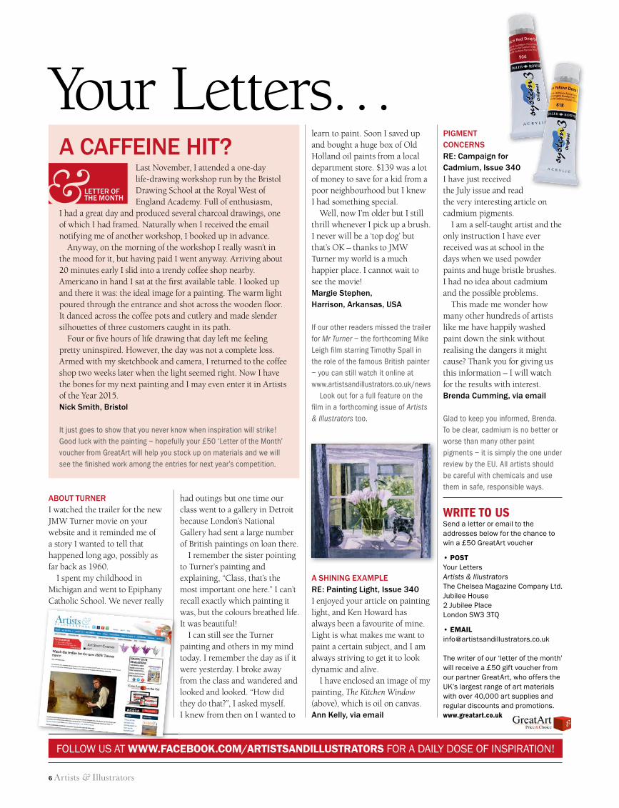
I have enclosed an image of my painting, The Kitchen Window (above), which is oil on canvas.Ann Kelly, via email
A CAFFEINE HIT?
LETTER OF THE MONTH&
6 Letters.indd 6 11/06/2014 11:52
Untitled-6 1 02/06/2014 12:51
8 Artists & Illustrators
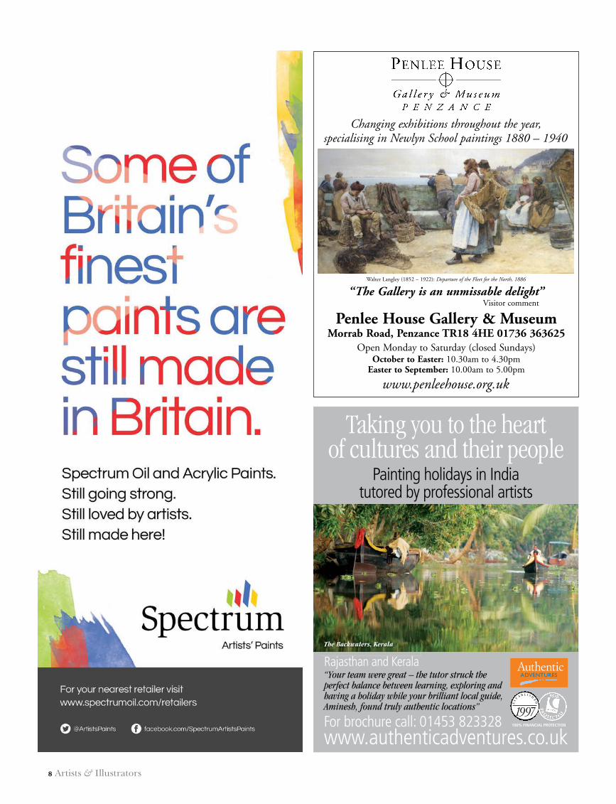
Walter Langley (1852 – 1922): Departure of the Fleet for the North, 1886
“The Gallery is an unmissable delight”Visitor comment
Penlee House Gallery & MuseumMorrab Road, Penzance TR18 4HE 01736 363625
Open Monday to Saturday (closed Sundays) October to Easter: 10.30am to 4.30pm
Easter to September: 10.00am to 5.00pm
www.penleehouse.org.uk
Changing exhibitions throughout the year, specialising in Newlyn School paintings 1880 – 1940
PENZANCE TOWN COUNCIL 1-4 7/9/09 10:40 Page 1
Painting holidays in India tutored by professional artists
100% FINANCIAL PROTECTION
ES
T
A B L I S H
ED
1997
“Your team were great – the tutor struck theperfect balance between learning, exploring andhaving a holiday while your brilliant local guide,Aminesh, found truly authentic locations”
Taking you to the heartof cultures and their people
Rajasthan and Kerala
For brochure call: 01453 823328www.authenticadventures.co.uk
The Backwaters, Kerala
30_A&I_SUM14_.indd 8 11/06/2014 13:50
Artists & Illustrators 9
the diary
NEXT MONTH... CHEF PORTRAITS, ART RETREATS AND A LONDON MASTERCLASS – ON SALE 18 JULY 2014
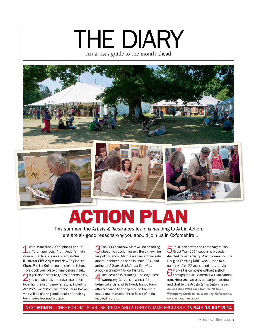
1 With more than 3,000 places and 40 different subjects, Art in Action’s main
draw is practical classes. Harry Potter illustrator Cliff Wright and New English Art Club’s Patrick Cullen are among the tutors – pre-book your place online before 7 July.
2 If you don’t want to get your hands dirty, you can sit back and take inspiration
from hundreds of demonstrators, including Artists & Illustrators columnist Laura Boswell who will be sharing traditional printmaking techniques learned in Japan.
3 The BBC’s Andrew Marr will be speaking about his passion for art. Best known for
his politics show, Marr is also an enthusiastic amateur painter (as seen in Issue 334) and author of A Short Book About Drawing. A book signing will follow his talk.
4 The location is stunning. The eight-acre Waterperry Gardens is a treat for
botanical artists, while hourly fresco tours offer a chance to snoop around the main house and marvel at three fl oors of India-inspired murals.
5 To coincide with the centenary of The Great War, 2014 sees a new section
devoted to war artistry. Practitioners include Douglas Farthing MBE, who turned to oil painting after 22 years of military service.
6 No visit is complete without a stroll through the Art Materials & Publications
tent. Here you can pick up bargain products and chat to the Artists & Illustrators team.Art in Action 2014 runs from 17-20 July at Waterperry Gardens, nr. Wheatley, Oxfordshire. www.artinaction.org.uk
THE DIARYAn artist’s guide to the month ahead
ACTION PLANThis summer, the Artists & Illustrators team is heading to Art in Action.
Here are six good reasons why you should join us in Oxfordshire…
ACTION PLAN
9 The Diary.indd 9 11/06/2014 17:07
10 Artists & Illustrators
the diary
KEEP UP TO DATE WITH ALL THE LATEST NEWS AND EVENTS AT WWW.ARTISTSANDILLUSTRATORS.CO.UK
MO
SE
S H
AR
RIS
, THE N
ATUR
AL S
YSTE
M O
F CO
LOU
RS
, 1769
/1776
© R
OYA
L ACA
DEM
Y OF A
RTS
, LON
DO
N; A
GLO
UC
ES
TER
SH
IRE LA
ND
SC
AP
E, JOH
N N
AS
H, 1
91
4. ©
AS
HM
OLE
AN
MU
SEU
M, U
NIVER
SITY O
F OXFO
RD
© TH
E ES
TATE OF JO
HN
NA
SH
, ALL R
IGH
TS R
ES
ERVED
20
14
, BR
IDG
EMA
N A
RT LIB
RA
RY; S
OU
THA
MP
TON
CITY A
RT G
ALLER
Y
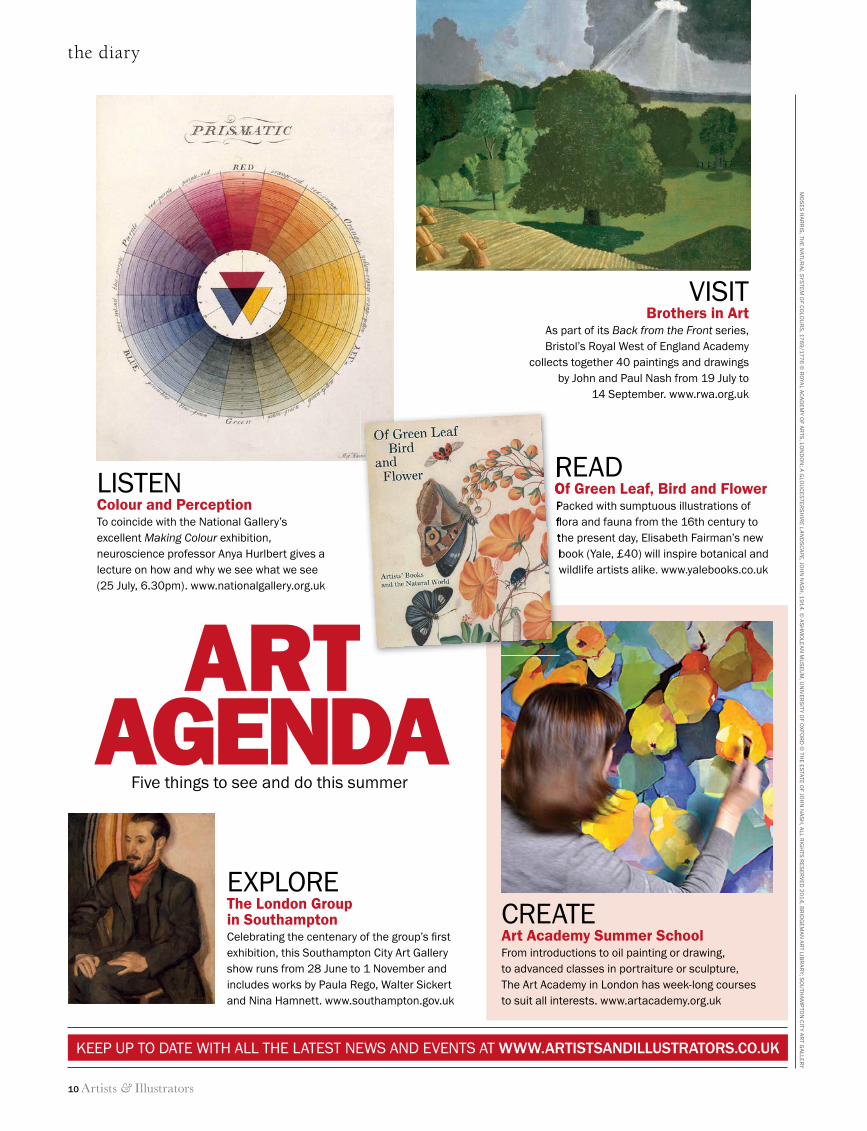
LISTENColour and PerceptionTo coincide with the National Gallery’s excellent Making Colour exhibition, neuroscience professor Anya Hurlbert gives a lecture on how and why we see what we see (25 July, 6.30pm). www.nationalgallery.org.uk
EXPLOREThe London Group in SouthamptonCelebrating the centenary of the group’s fi rst exhibition, this Southampton City Art Gallery show runs from 28 June to 1 November and includes works by Paula Rego, Walter Sickert and Nina Hamnett. www.southampton.gov.uk
CREATEArt Academy Summer SchoolFrom introductions to oil painting or drawing, to advanced classes in portraiture or sculpture, The Art Academy in London has week-long courses to suit all interests. www.artacademy.org.uk
VISITBrothers in Art
As part of its Back from the Front series, Bristol’s Royal West of England Academy
collects together 40 paintings and drawings by John and Paul Nash from 19 July to
14 September. www.rwa.org.uk
READ Of Green Leaf, Bird and FlowerPacked with sumptuous illustrations of fl ora and fauna from the 16th century to the present day, Elisabeth Fairman’s new book (Yale, £40) will inspire botanical and wildlife artists alike. www.yalebooks.co.uk
ARTAGENDA
Five things to see and do this summer
READ Of Green Leaf, Bird and FlowerPacked with sumptuous illustrations of fl ora and fauna from the 16th century to the present day, Elisabeth Fairman’s new book (Yale, £40) will inspire botanical and wildlife artists alike. www.yalebooks.co.uk
10 The Diary.indd 10 11/06/2014 12:04

Artists & Illustrators 11
advertisement feature
Three exciting opportunities for artists courtesy of Mall Galleries
SOCIETY OF WILDLIFE ARTISTSThe Society of Wildlife Artists (SWLA) seeks submissions of work that depicts wildlife subjects and evokes the spirit of the natural world.
Through their exhibitions the SWLA aims to further awareness of the importance of conservation in order to maintain the variety of the world’s ecosystems and its wildlife.
Acceptable media: Painting, sculpture and original printsOnline submission closes: Thursday 21 August 2014, middaySubmission fee: £12 per artwork, £6 per artwork for artists 35 or underFind out more: www.mallgalleries.org.uk
ThE ThREADNEEDLE PRIZE – FIGURATIVE ART TODAYArtists are encouraged to submit fresh and intriguing works that are strong and topical observations or interpretations on the world around us. First prize is £20,000 plus a solo show at Mall Galleries.
Figurative art is more than ever at the forefront of contemporary art practice and is always a subject of debate.
With many high-profile art prizes tending towards conceptual and abstract works, The Threadneedle Prize deliberately sets out to examine figurative art today, producing a comprehensive current survey.
Acceptable media: Painting, drawing, sculpture and original printsOnline submission closes: Thursday 3 July 2014, middaySubmission fee: £12 per artwork, £10 per artwork for studentsFind out more: www.threadneedleprize.com
ROYAL SOCIETY OF MARINE ARTISTSThe Royal Society of Marine Artists (RSMA) seeks submissions of painting and sculpture that involve the sea and the marine environment, including harbours and shorelines, traditional craft and contemporary shipping, creeks, beaches, wildlife – in short anything that involves tidal water.
Acceptable media: Oil, acrylic, watercolour, original prints of any media, drawings, pastels or sculptureOnline submission closes: Thursday 24 July 2014, middaySubmission fee: £12 per artwork, £6 per artwork for artists 35 or underFind out more: www.mallgalleries.org.uk
David Curtis RSMA,
Digging for Bait at Low Tide – Staithe
Lisa Wright,
The Guilty’s Gaze on the Innocent
Matt Underwood SWLA,
Kingfisher
CALL FOR ENTRIES
11 Mall galleries advertorial.indd 11 11/06/2014 11:52
�e Finest Quality Handmade Artists’ Brushes
£15.
00
£29.
50
£4.2
0
£6.6
0
£38.
50
£9.5
0
£5.3
0
£6.5
0
£3.6
5
£4.6
0
Shir
az -
Shor
t Fla
t - S
ize 8
Shir
az -
Long
Fla
t - S
ize 6
£3.5
5
Shir
az -
Filb
ert -
Siz
e 4
£4.4
5
ACRYLIC
£3.6
0
Chu
ngki
ng B
rist
le -
Long
Flat
- Si
ze 8
Chu
ngki
ng B
rist
le -
Filb
ert -
Siz
e 6
Chu
ngki
ng B
rist
le -
Shor
t Flat
- Si
ze 4
Chu
ngki
ng B
rist
le -
Shor
t Flat
- C
hung
king
Bri
stle
- Sh
ort F
lat -
Chu
ngki
ng B
rist
le
£2.0
5
£2.7
5
OIL
�e Finest Quality Handmade Artists’ Brushes
£3.0
5
£11.
45
£8.7
5
Artists & Illustrators 13
the diary
discover a host of tips, ideas and videos at www.artistsandillustrators.co.uk/how-to
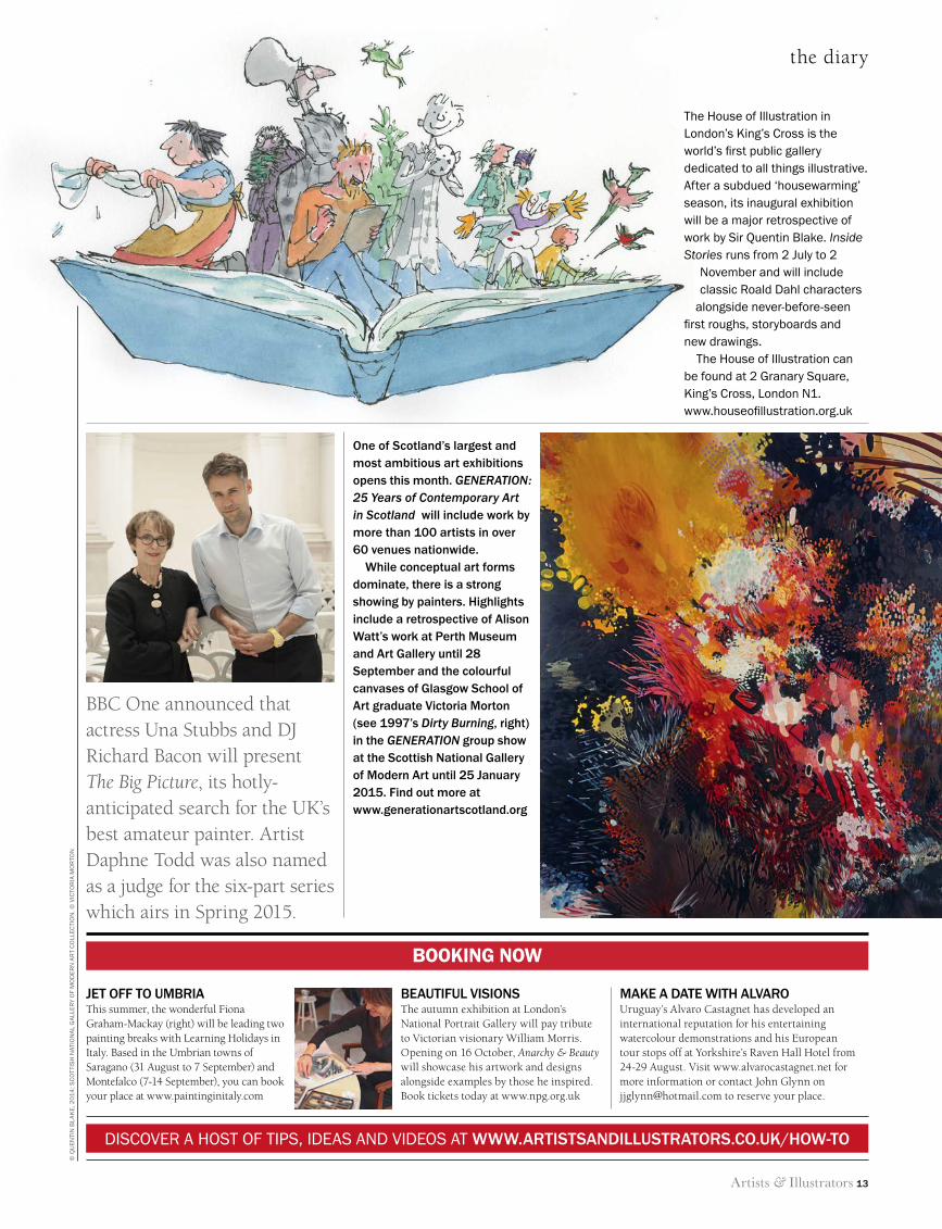
the house of illustration in London’s King’s cross is the world’s first public gallery dedicated to all things illustrative. after a subdued ‘housewarming’ season, its inaugural exhibition will be a major retrospective of work by sir Quentin Blake. Inside Stories runs from 2 July to 2
november and will include classic roald dahl characters
alongside never-before-seen first roughs, storyboards and new drawings.
the house of illustration can be found at 2 Granary square, King’s cross, London n1. www.houseofillustration.org.uk
© Q
uen
tin
BLa
Ke
, 20
14
; sc
ott
ish
nat
ion
aL
Ga
LLer
y o
f M
od
ern
ar
t c
oLL
ecti
on
. © v
icto
ria
Mo
rto
n
booking now
JEt off to umbriaThis summer, the wonderful Fiona Graham-Mackay (right) will be leading two painting breaks with Learning Holidays in Italy. Based in the Umbrian towns of Saragano (31 August to 7 September) and Montefalco (7-14 September), you can book your place at www.paintinginitaly.com
bEautiful visionsThe autumn exhibition at London’s National Portrait Gallery will pay tribute to Victorian visionary William Morris. Opening on 16 October, Anarchy & Beauty will showcase his artwork and designs alongside examples by those he inspired.Book tickets today at www.npg.org.uk
makE a datE with alvaroUruguay’s Alvaro Castagnet has developed an international reputation for his entertaining watercolour demonstrations and his European tour stops off at Yorkshire’s Raven Hall Hotel from 24-29 August. Visit www.alvarocastagnet.net for more information or contact John Glynn on [email protected] to reserve your place.
BBC One announced that actress Una Stubbs and DJ Richard Bacon will present The Big Picture, its hotly-anticipated search for the UK’s best amateur painter. Artist Daphne Todd was also named as a judge for the six-part series which airs in Spring 2015.
one of scotland’s largest and most ambitious art exhibitions opens this month. GENERATION: 25 Years of Contemporary Art in Scotland will include work by more than 100 artists in over 60 venues nationwide.
while conceptual art forms dominate, there is a strong showing by painters. highlights include a retrospective of alison watt’s work at Perth museum and art Gallery until 28 september and the colourful canvases of Glasgow school of art graduate victoria morton (see 1997’s Dirty Burning, right) in the GENERATION group show at the scottish national Gallery of modern art until 25 January 2015. find out more at www.generationartscotland.org
13 The Diary.indd 13 11/06/2014 17:08
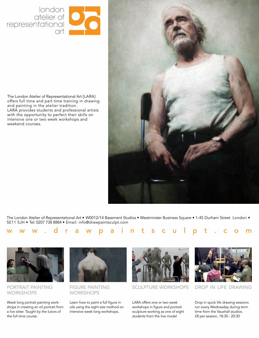
londonatelier of
representationalart
The London Atelier of Representational Art [LARA]offers full time and part time training in drawing and painting in the atelier tradition.LARA provides students and professional artists with the opportunity to perfect their skills on intensive one or two week workshops andweekend courses.
The London Atelier of Representational Art • W0012/14 Basement Studios • Westminster Business Square • 1-45 Durham Street London • SE11 5JH • Tel: 0207 738 8884 • Email: [email protected]
w w w . d r a w p a i n t s c u l p t . c o m
PORTRAIT PAINTING WORKSHOPSWeek long portrait painting work-shops in creating an oil portrait from a live sitter. Taught by the tutors of the full time course.
FIGURE PAINTINGWORKSHOPSLearn how to paint a full figure in oils using the sight size method on intensive week long workshops.
SCULPTURE WORKSHOPS
LARA offers one or two week workshops in figure and portrait sculpture working as one of eight students from the live model
DROP IN LIFE DRAWING
Drop in quick life drawing sessions run every Wednesday during term time from the Vauxhall studios.£8 per session, 18:30 - 20:30
LARA A&I Full page portrait competition.indd 2 08/06/2014 15:16
Artists & Illustrators 15
crossword
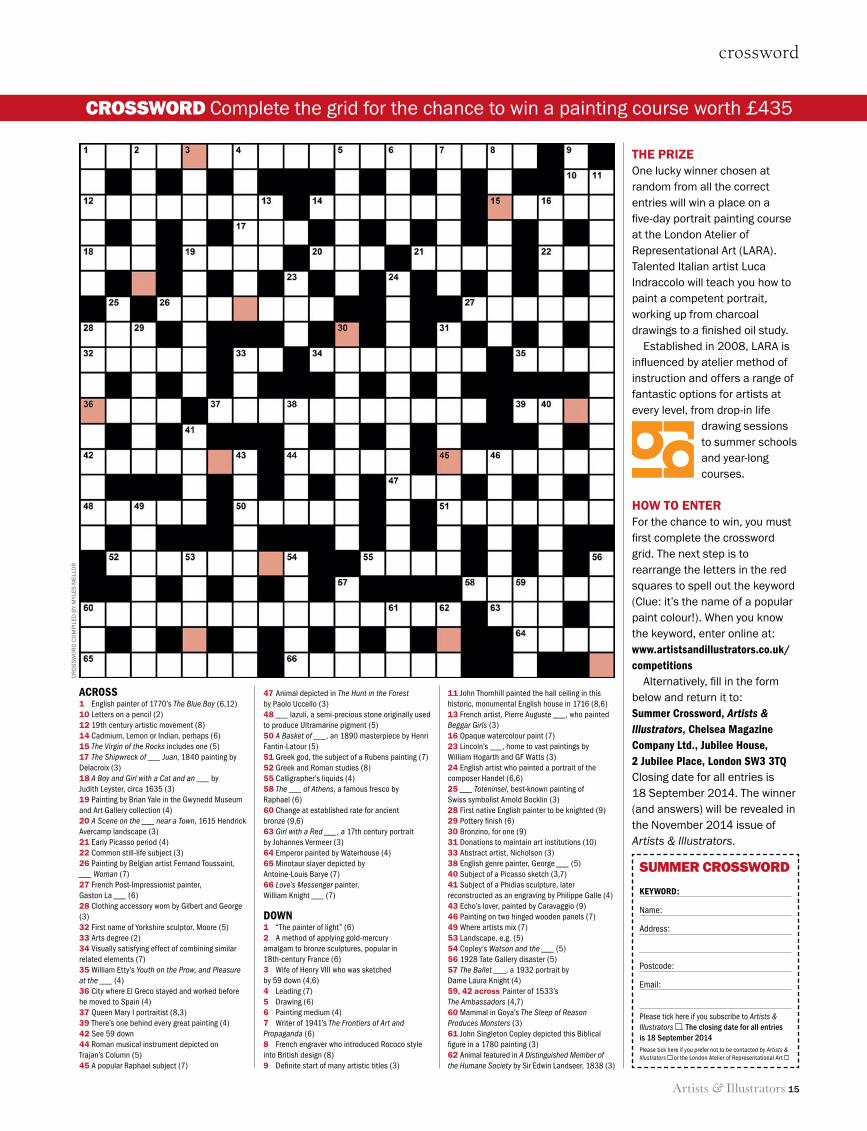
THE PRIZEOne lucky winner chosen at random from all the correct entries will win a place on a five-day portrait painting course at the London Atelier of Representational Art (LARA). Talented Italian artist Luca Indraccolo will teach you how to paint a competent portrait, working up from charcoal drawings to a finished oil study.
Established in 2008, LARA is influenced by atelier method of instruction and offers a range of fantastic options for artists at every level, from drop-in life
drawing sessions to summer schools and year-long courses.
HOW TO ENTERFor the chance to win, you must first complete the crossword grid. The next step is to rearrange the letters in the red squares to spell out the keyword (Clue: it’s the name of a popular paint colour!). When you know the keyword, enter online at: www.artistsandillustrators.co.uk/competitions
Alternatively, fill in the form below and return it to:Summer Crossword, Artists & Illustrators, Chelsea Magazine Company Ltd., Jubilee House, 2 Jubilee Place, London SW3 3TQClosing date for all entries is 18 September 2014. The winner (and answers) will be revealed in the November 2014 issue of Artists & Illustrators.
ACroSS1 English painter of 1770’s The Blue Boy (6,12)10 Letters on a pencil (2)12 19th century artistic movement (8)14 Cadmium, Lemon or Indian, perhaps (6)15 The Virgin of the Rocks includes one (5)17 The Shipwreck of ___ Juan, 1840 painting by Delacroix (3)18 A Boy and Girl with a Cat and an ___ by Judith Leyster, circa 1635 (3)19 Painting by Brian Yale in the Gwynedd Museum and Art Gallery collection (4)20 A Scene on the ___ near a Town, 1615 Hendrick Avercamp landscape (3)21 Early Picasso period (4)22 Common still-life subject (3)26 Painting by Belgian artist Fernand Toussaint, ___ Woman (7)27 French Post-Impressionist painter, Gaston La ___ (6)28 Clothing accessory worn by Gilbert and George (3)32 First name of Yorkshire sculptor, Moore (5)33 Arts degree (2)34 Visually satisfying effect of combining similar related elements (7)35 William Etty’s Youth on the Prow, and Pleasure at the ___ (4)36 City where El Greco stayed and worked before he moved to Spain (4)37 Queen Mary I portraitist (8,3) 39 There’s one behind every great painting (4)42 See 59 down44 Roman musical instrument depicted on Trajan’s Column (5)45 A popular Raphael subject (7)
47 Animal depicted in The Hunt in the Forest by Paolo Uccello (3)48 ___ lazuli, a semi-precious stone originally used to produce Ultramarine pigment (5)50 A Basket of ___, an 1890 masterpiece by Henri Fantin-Latour (5)51 Greek god, the subject of a Rubens painting (7)52 Greek and Roman studies (8)55 Calligrapher’s liquids (4)58 The ___ of Athens, a famous fresco by Raphael (6)60 Change at established rate for ancient bronze (9,6)63 Girl with a Red ___, a 17th century portrait by Johannes Vermeer (3)64 Emperor painted by Waterhouse (4)65 Minotaur slayer depicted by Antoine-Louis Barye (7)66 Love’s Messenger painter, William Knight ___ (7)
DoWn1 “The painter of light” (6)2 A method of applying gold-mercury amalgam to bronze sculptures, popular in 18th-century France (6)3 Wife of Henry VIII who was sketched by 59 down (4,6)4 Leading (7)5 Drawing (6)6 Painting medium (4)7 Writer of 1941’s The Frontiers of Art and Propaganda (6)8 French engraver who introduced Rococo style into British design (8)9 Definite start of many artistic titles (3)
11 John Thornhill painted the hall ceiling in this historic, monumental English house in 1716 (8,6) 13 French artist, Pierre Auguste ___, who painted Beggar Girls (3)16 Opaque watercolour paint (7)23 Lincoln’s ___, home to vast paintings by William Hogarth and GF Watts (3)24 English artist who painted a portrait of the composer Handel (6,6)25 ___ Toteninsel, best-known painting of Swiss symbolist Arnold Bocklin (3)28 First native English painter to be knighted (9)29 Pottery finish (6)30 Bronzino, for one (9)31 Donations to maintain art institutions (10)33 Abstract artist, Nicholson (3)38 English genre painter, George ___ (5)40 Subject of a Picasso sketch (3,7) 41 Subject of a Phidias sculpture, later reconstructed as an engraving by Philippe Galle (4)43 Echo’s lover, painted by Caravaggio (9)46 Painting on two hinged wooden panels (7)49 Where artists mix (7)53 Landscape, e.g. (5)54 Copley’s Watson and the ___ (5)56 1928 Tate Gallery disaster (5)57 The Ballet ___, a 1932 portrait by Dame Laura Knight (4)59, 42 across Painter of 1533’s The Ambassadors (4,7)60 Mammal in Goya’s The Sleep of Reason Produces Monsters (3)61 John Singleton Copley depicted this Biblical figure in a 1780 painting (3)62 Animal featured in A Distinguished Member of the Humane Society by Sir Edwin Landseer, 1838 (3)
CR
OS
SW
OR
d C
Om
pIL
Ed b
y m
yLE
S m
ELLO
R
crossword Complete the grid for the chance to win a painting course worth £435
summer crossword
KeyWorD:
Name:
Address:
Postcode:
Email:
Please tick here if you subscribe to Artists & Illustrators . The closing date for all entries is 18 September 2014Please tick here if you prefer not to be contacted by Artists & Illustrators or the London Atelier of Representational Art
15 Crossword.indd 15 11/06/2014 17:08
16 Artists & Illustrators
ways with watercolour
Ways withFive Royal Watercolour Society artists share their
unique approaches with fellow member Jill Leman
watercolour
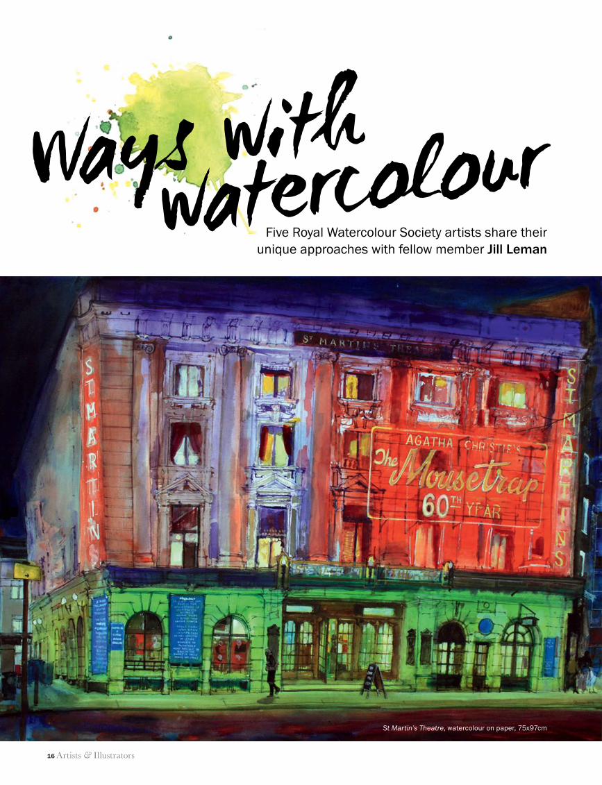
St Martin’s Theatre, watercolour on paper, 75x97cm
16 RWS secrets.indd 16 11/06/2014 11:55
Artists & Illustrators 17
ways with watercolour
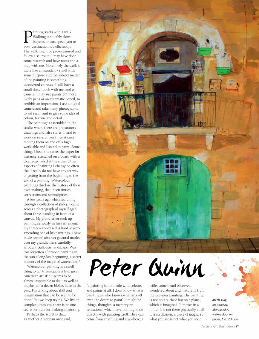
watercolourPainting starts with a walk.
Walking is suitably slow: bicycles or cars speed you to
your destination too efficiently. The walk might be pre-organised and follow a set route; I may have done some research and have notes and a map with me. More likely the walk is more like a meander, a stroll with some purpose and the subject matter of the painting is something discovered en route. I will have a small sketchbook with me, and a camera. I may use paints but more likely pens or an automatic pencil, to scribble an impression. I use a digital camera and take many photographs to aid recall and to give some idea of colour, texture and detail.
The painting is assembled in the studio where there are preparatory drawings and false starts. I tend to work on several paintings at once, moving them on and off a high worktable and I stand to paint. Some things I keep the same: the paper for instance, stretched on a board with a clear edge ruled at the sides. Other aspects of painting I change so often that I really do not have any set way of getting from the beginning to the end of a painting. Watercolour paintings disclose the history of their own making, the uncertainties, corrections and serendipities.
A few years ago when searching through a collection of slides, I came across a photograph of myself aged about three standing in front of a canvas. My grandfather took up painting seriously in his retirement; my three-year-old self is hard at work amending one of his paintings. I have made several abstract gestural marks over my grandfather’s carefully-wrought Galloway landscape. Was this forgotten afternoon painting in the sun a long-lost beginning, a secret memory of the magic of watercolour?
Watercolour painting is a swell thing to do, to misquote a late, great American artist: “It seems to be almost impossible to do it as well as maybe half a dozen blokes have in the past. I’m talking about skill and imagination that can be seen to be done.” Yet we keep trying. We live in complex times and there is no one secret formula for making a painting.
Perhaps the secret is that, as another American once said,
trifle, some detail observed, wondered about and, naturally from the previous painting. The painting is not on a surface but on a plane, which is imagined. It moves in a mind. It is not there physically at all. It is an illusion, a piece of magic, so what you see is not what you see.”
“a painting is not made with colours and paints at all. I don’t know what a painting is; who knows what sets off even the desire to paint? It might be things, thoughts, a memory or sensations, which have nothing to do directly with painting itself. They can come from anything and anywhere, a
Peter Quinnabove Dog
on Balcony,
Marsaxlokk,
watercolour on
paper, 120x145cm>
16 RWS secrets.indd 17 11/06/2014 11:55
18 Artists & Illustrators
ways with watercolour
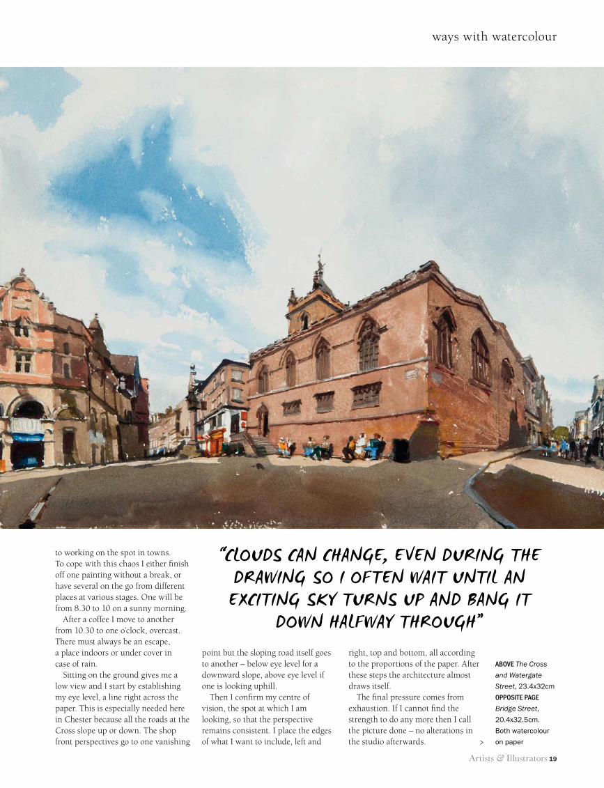
helps to place some near figures early on. If left too late their colours can never be bright enough.
These pictures of the centre of Chester give good examples of these problems. All were completed over five days; the whole package had to be finished by the last afternoon. The one of Bridge Street is the calmest and was started first. But where I was sitting lorries, refuse carts and delivery vans invaded the foreground every morning and made things impossible until Sunday.
Streets are like theatre. The scenery is provided by historic buildings, actors are the crowds of tourists, street cleaners and the town crier. They all get in the way of the bit that you are trying to look at. They ask questions. I do not mind being watched, but cannot paint and give a sensible answer at the same time.
Also there is background noise, music from hymn singers, buskers and shops. Fortunately there were no parked cars; the area around the Cross is for pedestrians. Cars normally form a complete obstacle
But speed and direct observation raise problems with all the things which change during the two or three hours of work.
First, the sky is the most obvious. I try to use what is there when I choose the subject, so ideally the clouds go in first. But they can change, even during the drawing, and I often wait until an exciting sky turns up and bang it down halfway through or even at the end.
Secondly, cast shadows must be convincing. I prefer sunlit scenes, but shadows race across the picture as the sun moves. I usually put all of them in at once and just hope that they will survive and look correct at the end. In fact as a general rule I put down darker tones first and progress to the lightest.
Thirdly, figures, especially in townscapes, are essential. Empty streets look unreal. People give the scale of buildings and by their size help to establish foreground and distances. But they always move. How lifelike they can be when done in a hurry is always a question, but it
I dislike watercolour painting in general. The medium is too easy; it encourages finicky detail and
overworking. But it has the advantage of speed, is quick to apply, quick to dry and the equipment is portable. It is ideal for work out of doors and on special trips.
Of course, speed can mean mistakes, but it gives no time for
second thoughts, for questioning design, for changes. The best stimulus is the pressure that comes from having to make decisions and I find this ensures a fresh vibrant and, hopefully, breathtaking picture.
John Newberry
16 RWS secrets.indd 18 11/06/2014 11:55
Artists & Illustrators 19
ways with watercolour
to working on the spot in towns. To cope with this chaos I either finish off one painting without a break, or have several on the go from different places at various stages. One will be from 8.30 to 10 on a sunny morning.
After a coffee I move to another from 10.30 to one o’clock, overcast. There must always be an escape, a place indoors or under cover in case of rain.
Sitting on the ground gives me a low view and I start by establishing my eye level, a line right across the paper. This is especially needed here in Chester because all the roads at the Cross slope up or down. The shop front perspectives go to one vanishing
point but the sloping road itself goes to another – below eye level for a downward slope, above eye level if one is looking uphill.
Then I confirm my centre of vision, the spot at which I am looking, so that the perspective remains consistent. I place the edges of what I want to include, left and
right, top and bottom, all according to the proportions of the paper. After these steps the architecture almost draws itself.
The final pressure comes from exhaustion. If I cannot find the strength to do any more then I call the picture done – no alterations in the studio afterwards.
above The Cross
and Watergate
Street, 23.4x32cm
opposite page
Bridge Street,
20.4x32.5cm.
Both watercolour
on paper
“Clouds Can Change, even during the drawing so i often wait until an exCiting sky turns up and bang it
down halfway through”
>
16 RWS secrets.indd 19 11/06/2014 11:55
20 Artists & Illustrators
ways with watercolour
You are never too young to start drawing. I have always done so since long before art school
days, which for me began aged 13. The ‘Junior Art School’ as it was known provided art classes for half of each day and generous education for the other half; we learnt a lot and grew up fast.
Being an only child brought up in London I had a lot of freedom and would make sketches wherever I found myself. As my parents were constantly moving house, there were always new subjects nearby. Buildings of all sorts and particularly railway stations and the yards around them became my haven; a mass of upright lines, endless windows of all shapes and sizes, everything within close
proximity. I believe this early experience has affected my outlook in my direction as a visual person.
After completing and passing my NDD (National Diploma in Design), the following three years at the Royal Academy Schools gave me the time to experiment and begin to find my own path towards practising ‘art’. I never at any time thought I would do anything else. Painting meant oil or acrylic and it wasn’t until the late 1970s that I started adding watercolour washes to some of my pencil drawings. Soon I was using pure watercolour with very little drawing only as a compositional guide. Leaving some of the paper white within the design is important to me: it gives a bounce and luminosity. By using plenty of water with the paint I can achieve layers of transparent colour and increase the range of tones. My limited palette is usually a single primary colour, its opposite and adjacent tones.
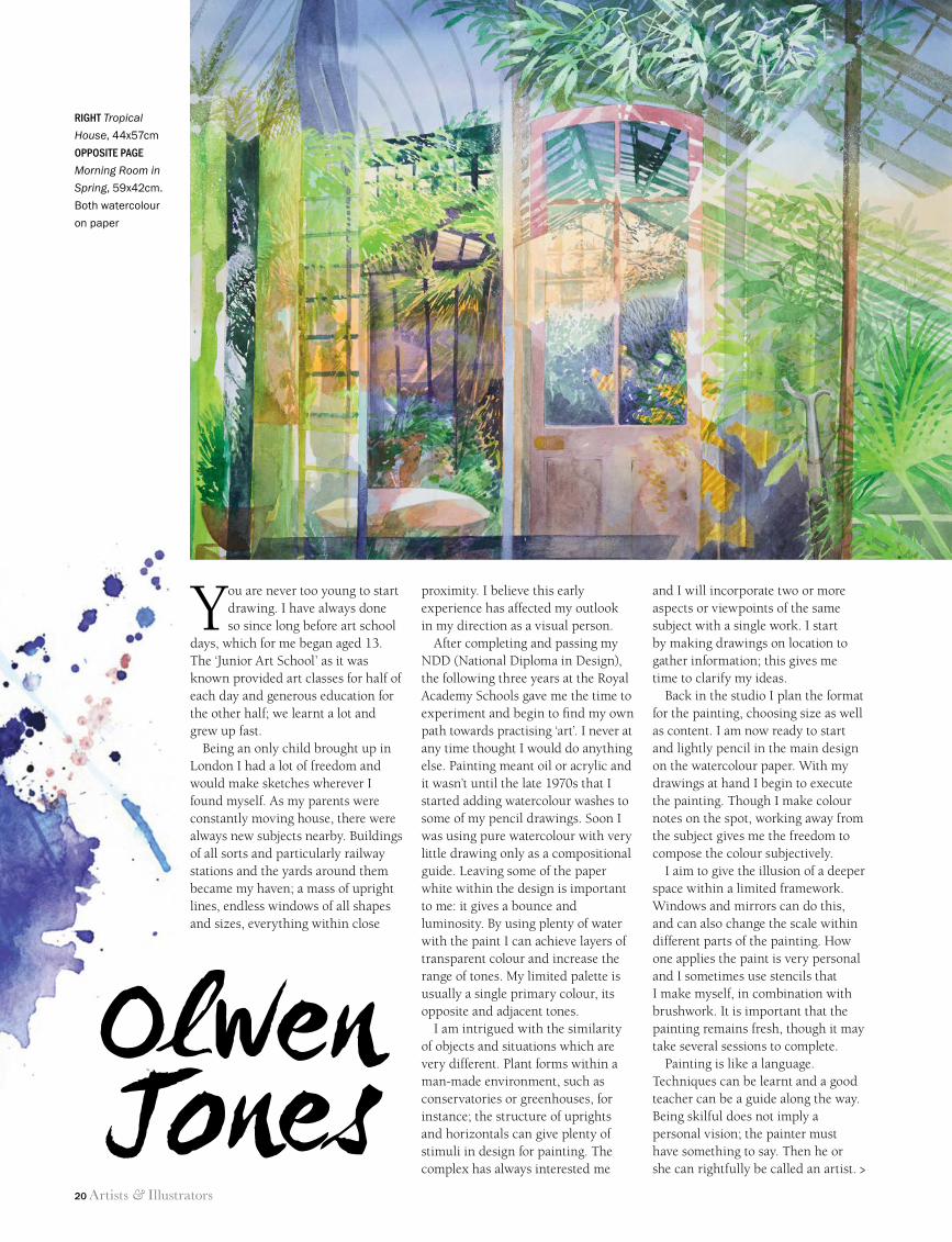
I am intrigued with the similarity of objects and situations which are very different. Plant forms within a man-made environment, such as conservatories or greenhouses, for instance; the structure of uprights and horizontals can give plenty of stimuli in design for painting. The complex has always interested me
and I will incorporate two or more aspects or viewpoints of the same subject with a single work. I start by making drawings on location to gather information; this gives me time to clarify my ideas.
Back in the studio I plan the format for the painting, choosing size as well as content. I am now ready to start and lightly pencil in the main design on the watercolour paper. With my drawings at hand I begin to execute the painting. Though I make colour notes on the spot, working away from the subject gives me the freedom to compose the colour subjectively.
I aim to give the illusion of a deeper space within a limited framework. Windows and mirrors can do this, and can also change the scale within different parts of the painting. How one applies the paint is very personal and I sometimes use stencils that I make myself, in combination with brushwork. It is important that the painting remains fresh, though it may take several sessions to complete.
Painting is like a language. Techniques can be learnt and a good teacher can be a guide along the way. Being skilful does not imply a personal vision; the painter must have something to say. Then he or she can rightfully be called an artist.
Olwen Jones
right Tropical
House, 44x57cm
opposite page
Morning Room in
Spring, 59x42cm.
Both watercolour
on paper
>
16 RWS secrets.indd 20 11/06/2014 11:55
Artists & Illustrators 21
ways with watercolour
16 RWS secrets.indd 21 11/06/2014 11:55
22 Artists & Illustrators
ways with watercolour
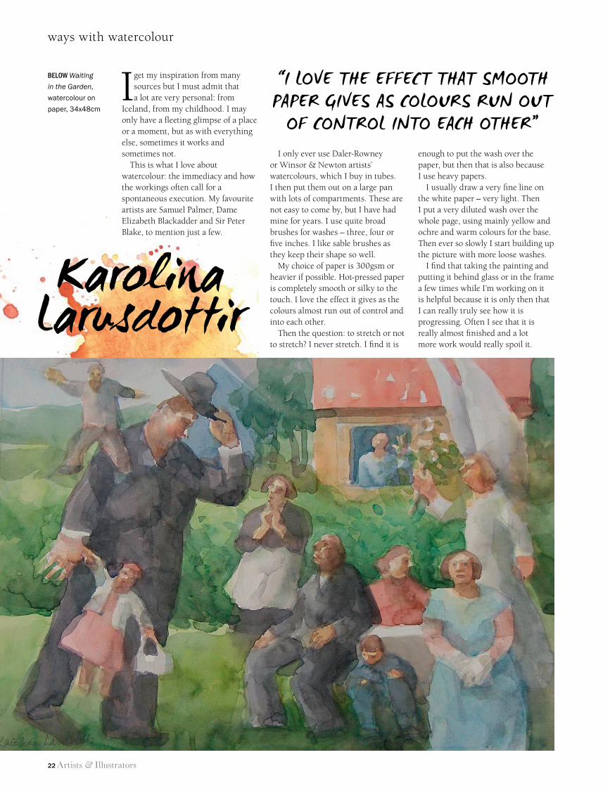
I get my inspiration from many sources but I must admit that a lot are very personal: from
Iceland, from my childhood. I may only have a fleeting glimpse of a place or a moment, but as with everything else, sometimes it works and sometimes not.
This is what I love about watercolour: the immediacy and how the workings often call for a spontaneous execution. My favourite artists are Samuel Palmer, Dame Elizabeth Blackadder and Sir Peter Blake, to mention just a few.
I only ever use Daler-Rowney or Winsor & Newton artists’ watercolours, which I buy in tubes. I then put them out on a large pan with lots of compartments. These are not easy to come by, but I have had mine for years. I use quite broad brushes for washes – three, four or five inches. I like sable brushes as they keep their shape so well.
My choice of paper is 300gsm or heavier if possible. Hot-pressed paper is completely smooth or silky to the touch. I love the effect it gives as the colours almost run out of control and into each other.
Then the question: to stretch or not to stretch? I never stretch. I find it is
enough to put the wash over the paper, but then that is also because I use heavy papers.
I usually draw a very fine line on the white paper – very light. Then I put a very diluted wash over the whole page, using mainly yellow and ochre and warm colours for the base. Then ever so slowly I start building up the picture with more loose washes.
I find that taking the painting and putting it behind glass or in the frame a few times while I’m working on it is helpful because it is only then that I can really truly see how it is progressing. Often I see that it is really almost finished and a lot more work would really spoil it.
David Firmstone mbe
Karolina Larusdottir
below Waiting
in the Garden,
watercolour on
paper, 34x48cm
“i Love the eFFect that smooth paper gives as coLours run out
oF controL into each other”
16 RWS secrets.indd 22 11/06/2014 11:55
Artists & Illustrators 23
ways with watercolour
This is an extract from Jill Leman’s Watercolour Secrets, published by Bloomsbury, RRP £29.99. An accompanying exhibition runs from 3 October to 2 November at Bankside Gallery, London SE1. www.royalwatercoloursociety.co.uk
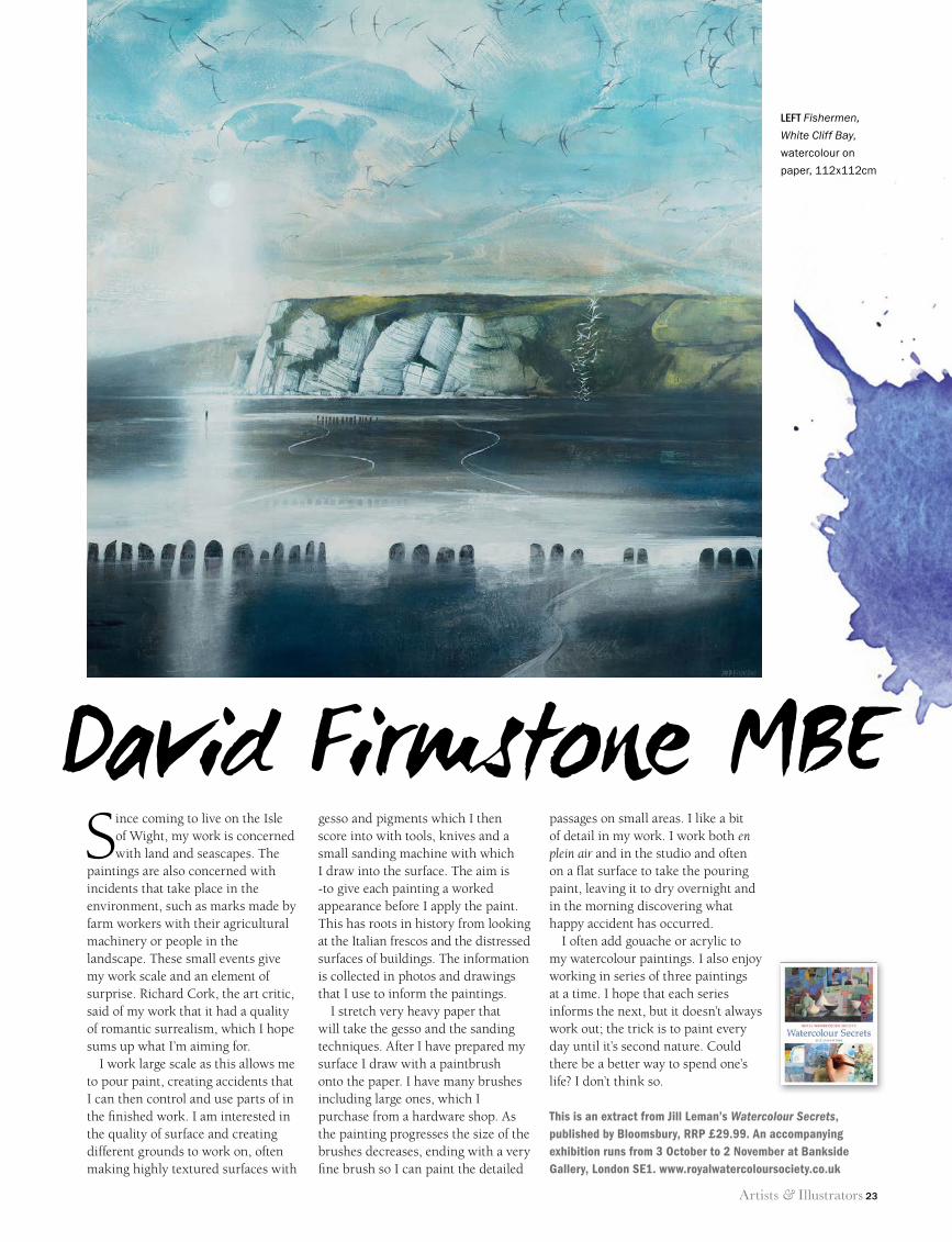
Since coming to live on the Isle of Wight, my work is concerned with land and seascapes. The
paintings are also concerned with incidents that take place in the environment, such as marks made by farm workers with their agricultural machinery or people in the landscape. These small events give my work scale and an element of surprise. Richard Cork, the art critic, said of my work that it had a quality of romantic surrealism, which I hope sums up what I’m aiming for.
I work large scale as this allows me to pour paint, creating accidents that I can then control and use parts of in the fi nished work. I am interested in the quality of surface and creating different grounds to work on, often making highly textured surfaces with
gesso and pigments which I then score into with tools, knives and a small sanding machine with which I draw into the surface. The aim is -to give each painting a worked appearance before I apply the paint. This has roots in history from looking at the Italian frescos and the distressed surfaces of buildings. The information is collected in photos and drawings that I use to inform the paintings.
I stretch very heavy paper that will take the gesso and the sanding techniques. After I have prepared my surface I draw with a paintbrush onto the paper. I have many brushes including large ones, which I purchase from a hardware shop. As the painting progresses the size of the brushes decreases, ending with a very fi ne brush so I can paint the detailed
passages on small areas. I like a bit of detail in my work. I work both en plein air and in the studio and often on a fl at surface to take the pouring paint, leaving it to dry overnight and in the morning discovering what happy accident has occurred.
I often add gouache or acrylic to my watercolour paintings. I also enjoy working in series of three paintings at a time. I hope that each series informs the next, but it doesn’t always work out; the trick is to paint every day until it’s second nature. Could there be a better way to spend one’s life? I don’t think so.
David Firmstone MBE
LEFT Fishermen,
White Cliff Bay,
watercolour on
paper, 112x112cm
16 RWS secrets.indd 23 11/06/2014 11:56
24 Artists & Illustrators
cornwall’s fisherfolk©
th
e a
rti
st’
s e
sta
te/B
rid
gem
an
ar
t Li
Br
ar
y. p
ho
to: h
ar
tLep
oo
L m
us
eum
s a
nd
her
itag
e s
ervi
ce
24 Cornwall Fisherfolk.indd 24 11/06/2014 11:57
Artists & Illustrators 25
cornwall’s fisherfolk
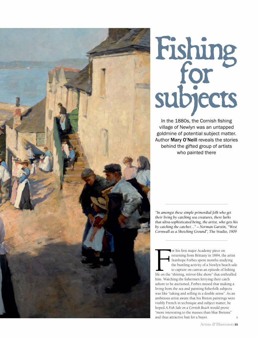
In the 1880s, the Cornish fishing village of Newlyn was an untapped
goldmine of potential subject matter. Author Mary O’Neill reveals the stories
behind the gifted group of artists who painted there
Fishingfor
subjects
For his first major Academy piece on returning from Brittany in 1884, the artist Stanhope Forbes spent months studying the bustling activity of a Newlyn beach sale to capture on canvas an episode of fishing
life on the “shining, mirror-like shore” that enthralled him. Watching the fishermen ferrying their catch ashore to be auctioned, Forbes mused that making a living from the sea and painting fisherfolk subjects was like “taking and selling in a double sense”. As an ambitious artist aware that his Breton paintings were visibly French in technique and subject matter, he hoped A Fish Sale on a Cornish Beach would prove “more interesting to the masses than blue Bretons” and thus attractive bait for a buyer.
“In amongst these simple primordial folk who get their living by catching sea creatures, there lurks that ultra-sophisticated being, the artist, who gets his by catching the catcher…” – Norman Garstin, “West Cornwall as a Sketching Ground”, The Studio, 1909
>
24 Cornwall Fisherfolk.indd 25 11/06/2014 11:57
26 Artists & Illustrators
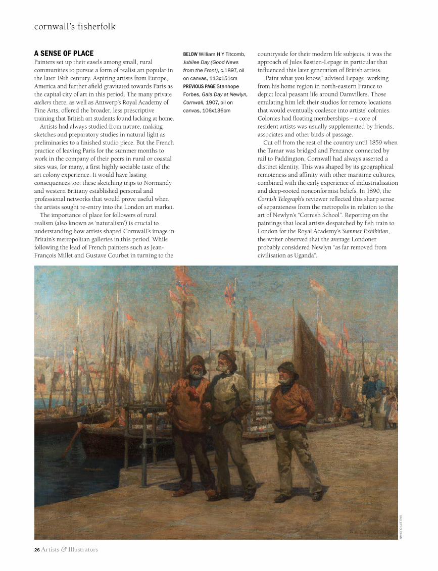
cornwall’s fisherfolk
A sense of plAcePainters set up their easels among small, rural communities to pursue a form of realist art popular in the later 19th century. Aspiring artists from Europe, America and further afield gravitated towards Paris as the capital city of art in this period. The many private ateliers there, as well as Antwerp’s Royal Academy of Fine Arts, offered the broader, less prescriptive training that British art students found lacking at home.
Artists had always studied from nature, making sketches and preparatory studies in natural light as preliminaries to a finished studio piece. But the French practice of leaving Paris for the summer months to work in the company of their peers in rural or coastal sites was, for many, a first highly sociable taste of the art colony experience. It would have lasting consequences too: these sketching trips to Normandy and western Brittany established personal and professional networks that would prove useful when the artists sought re-entry into the London art market.
The importance of place for followers of rural realism (also known as ‘naturalism’) is crucial to understanding how artists shaped Cornwall’s image in Britain’s metropolitan galleries in this period. While following the lead of French painters such as Jean-François Millet and Gustave Courbet in turning to the
countryside for their modern life subjects, it was the approach of Jules Bastien-Lepage in particular that influenced this later generation of British artists.
“Paint what you know,” advised Lepage, working from his home region in north-eastern France to depict local peasant life around Damvillers. Those emulating him left their studios for remote locations that would eventually coalesce into artists’ colonies. Colonies had floating memberships – a core of resident artists was usually supplemented by friends, associates and other birds of passage.
Cut off from the rest of the country until 1859 when the Tamar was bridged and Penzance connected by rail to Paddington, Cornwall had always asserted a distinct identity. This was shaped by its geographical remoteness and affinity with other maritime cultures, combined with the early experience of industrialisation and deep-rooted nonconformist beliefs. In 1890, the Cornish Telegraph’s reviewer reflected this sharp sense of separateness from the metropolis in relation to the art of Newlyn’s “Cornish School”. Reporting on the paintings that local artists despatched by fish train to London for the Royal Academy’s Summer Exhibition, the writer observed that the average Londoner probably considered Newlyn “as far removed from civilisation as Uganda”.
below William H Y Titcomb,
Jubilee Day (Good News
from the Front), c.1897, oil
on canvas, 113x151cm
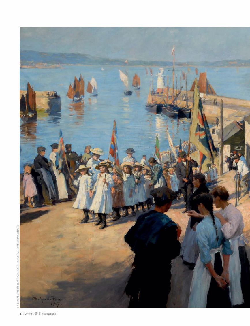
Previous Page Stanhope
Forbes, Gala Day at Newlyn,
Cornwall, 1907, oil on
canvas, 106x136cm
Ga
llerY O
ldH
am
24 Cornwall Fisherfolk.indd 26 11/06/2014 11:57
Artists & Illustrators 27
cornwall’s fisherfolk
Research on the phenomenon of art colonies from Penwith to Northern Jutland has revealed a rhetoric of discovery in colony artists’ letters and memoirs, and in travel journalism generally. Artists across Europe made much of their difficulties reaching sites where these colonies typically evolved in order to convey images of apparently simpler, healthier, organic lives back to their urban audiences. (At least in Newlyn’s case, the rail connection from Penzance was nearby; the colony that settled at Skagen at Denmark’s northerly tip was truly remote.)
And there is a marked anthropological tone in much of the writing about these locations. The spreading of photographs documenting people and places, not only from distant outposts of empire but also from Britain’s own peripheries, tapped into this ethnographic fascination and fuelled an early tourism.
An “Artistic KlondiKe”Early travel guides to Cornwall advised visitors that picturesque fishing villages were best appreciated from a distance. Still described as “quaint” in the 1880s, with their narrow cobbled lanes, whitewashed cottages and busy harbours, Newlyn and St Ives were rapidly modernising; their traditional fisheries squeezed by ecological, economic and industrial changes.
Artists were nevertheless enthusiastic. Since Birmingham artists like Walter Langley had already “discovered” it, Newlyn reminded Forbes of the busy colony at Concarneau in Brittany. He had “struck oil in the way of subjects”; he would later remember Newlyn as an “artistic Klondike”, in reference to the site of the Canadian gold rush. The Cornish town was, he said, a “Rand district of the West” for the treasures to be mined there.
For Henry Scott Tuke, Newlyn was simply “reeking with subjects”. References to pungent smells permeate
the accounts of artists working in fishing villages everywhere. In fact, odours – and dirt – were associated with difference and “otherness” in descriptions of colonial life overseas. Britain’s peripheries, represented by such fishing populations, were perceived in a similar light. Accounts of life in art colonies often contrasted with the selective and rather sanitised representations of reality that artists produced there.
Painting in the open air, sometimes in very busy spots under the gaze of curious locals, could be unnerving. “I mind you painting down here along 20 years ago Mr. Forbes,” the artist recalled an old salt
telling him. “Ain’t you tired of it yet?” Children were invariably
mischievous. One mutinous boy took refuge in a boat, leaving Forbes high and dry on the quay without a model. Briefly entrusting his huge canvas to another six-year-old to watch, the artist returned to find the boy sitting in it. Amazed that he had not actually gone “bang through” it, Forbes found a great bulge in the
canvas. He was pleased to find a “nice quiet baby” for one of his ‘potboilers’ (quick paintings made for profit) when bad weather obliged him to turn his larger nautical work to the wall.
Life in a socially conservative Sabbatarian community, strong on temperance and disapproving of bohemian ways, required some adjustment. Forbes had difficulty persuading young women to model in the street, which, for a plein air figure painter who had selected Newlyn expressly for its handsome inhabitants, was frustrating.
Most significantly, the ban on Sunday work had serious repercussions for all artists. Those who breached it risked being stoned or having their canvases wrecked. And the more frequent the influxes of new artists insensitive to local mores – a problem in the highly cosmopolitan and mobile colony of St Ives – the greater the potential for conflict.
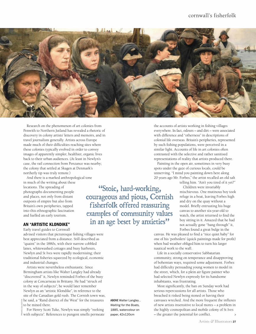
above Walter Langley ,
Waiting for the Boats,
1885, watercolour on
paper, 42x120cm
“Stoic, hard-working, courageous and pious, Cornish fisherfolk offered reassuring
examples of community values in an age beset by anxieties”
pr
ivat
e c
oLL
ecti
on
>
24 Cornwall Fisherfolk.indd 27 11/06/2014 11:57
28 Artists & Illustrators
cornwall’s fisherfolk
Fitting themes Artists depicted the travails of the fisherfolk far more readily than those of the working classes in other walks of life. British painters had long drawn on their picturesque appeal at the water’s edge in a genre the Dutch had popularised in the 17th century. Jozef Israëls’s humble, dimly lit fishermen’s dwellings were also well known in Britain; Langley developed these motifs further. Stoic, hard-working, courageous and pious, Cornish fisherfolk offered reassuring examples of community values in an age beset by anxieties about urban degeneration, agrarian unrest and imperial troubles (all amply reported in the press).
Fishing-related matters assumed greater significance in the 1880s. Loss of life at sea was frequent given the importance of maritime transport, but widely reported disasters such as the Great Storm of October 1881 publicised the economic condition of fishermen and their families as never before. An event showcasing the nation’s fishing industry, liberally covered in the illustrated press, was the 1883 International Fisheries Exhibition in London. Four hundred fishermen from around Britain and Ireland were subsidised to spend a week in the capital, their role very much one of public visibility. Heroised as men of whom any nation would be proud, the fishermen representatives formed a guard of honour at the opening ceremony, dressed in the working costumes of their regions. The spectacle of hardy, healthy and hirsute “toilers of the sea” in sou’westers and oilskins lent the fisherman and his ancient occupation considerable added value as artistic subjects.
Sea themes resonated in a period that included the tercentenary of the defeat of the Armada, a number of naval scares, calls for a costly reform of the navy, and a sense of urgency as concerns for Britain’s maritime supremacy were heightened by an increasingly strident press. Newlyn artists such as Forbes and Frank Wright Bourdillon wrote delightedly of the sham fights and fleet movements they witnessed off
the Cornish coast as naval displays became more frequent in
response. Nationally
significant events such as Jubilee celebrations were also cannily commemorated on canvas. Viewed collectively, paintings of fishing life in West Cornwall convey an image of a stable society that is self-contained, orderly, courageous and stoic. As stalwart seafarers and healthy, industrious and beautiful wives and mothers, Cornwall’s ‘fisherfolk’ are represented as ideal national types – as model citizens. mary’s new book, Cornwall’s ‘Fisherfolk’: Art & Artifice, is published by sansom & Company, RRP £25. to order a copy for £20 with free P&P, call (01179) 737207, quoting Artists & Illustrators. www.sansomandcompany.co.ukModel Citizens: Myths and Realities runs from 14 June to 6 september at Penlee house gallery and museum, Penzance, Cornwall. www.penleehouse.org.uk
Henry Scott Tuke (1858 – 1929)Although he only lived in Newlyn for a few years prior to settling in Falmouth, Tuke regularly returned to the village in Julie of Nantes
– his French sailboat which
doubled as a floating studio.
Frank Bramley (1857 – 1915)Famed for 1888’s A Hopeless Dawn (now owned by Tate), Bramley painted interiors with the ‘square brush technique’ – using the flat of his brush to build up a jigsaw pattern of strokes.
Elizabeth Forbes (1859 – 1912)Dubbed ‘the Queen of Newlyn’, the Canadian wife of Stanhope Forbes was a skilled etcher and figurative painter. In 1899, she co-founded the local art school with her husband, but sadly died of cancer aged just 52.
Stanhope Forbes (1857 – 1947)The Dublin-born plein air painter did much to establish the reputation of the Newlyn artists in London and beyond when his A Fish Sale on a Cornish Beach impressed the crowds at the Royal Academy’s Summer Exhibition in 1885.
Walter Langley (1852 – 1922)The first artist to settle in the village in 1882, Langley remained there until his death 40 years later. He was a skilled watercolourist, using the medium for large-scale narrative scenes.
NEWLYN ARTISTSDiscover who the key players were in the West Cornwall art colony
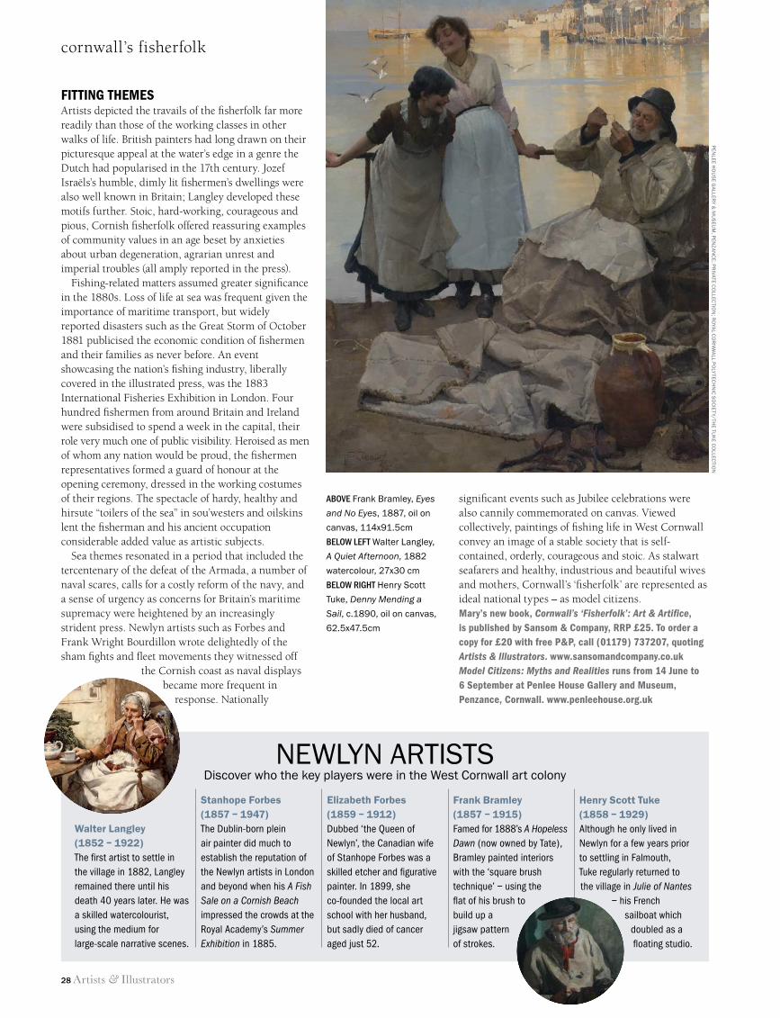
above Frank Bramley, Eyes
and No Eyes, 1887, oil on
canvas, 114x91.5cm
below left Walter Langley,
A Quiet Afternoon, 1882
watercolour, 27x30 cm
below right Henry Scott
Tuke, Denny Mending a
Sail, c.1890, oil on canvas,
62.5x47.5cm
PEN
LEE Ho
uS
E GA
LLERY &
Mu
SEu
M, P
ENz
AN
CE
; PR
IvATE Co
LLECTIo
N; R
oYA
L Co
RN
WA
LL Po
LYTEC
HN
IC S
oC
IETY/TH
E Tuk
E Co
LLECTIo
N
24 Cornwall Fisherfolk.indd 28 11/06/2014 12:25
Artists & Illustrators 29
Hundreds of artists demonstrating their art17 – 20 July Waterperry Gardens, near Wheatley
Alison IngramAndrew MillerAnna MasonBruce IngmanCarole Bury
Cheryl CulverDaniel ShadboltDavid BrayneDavid ParfittDavid Rowlands
Douglas FarthingGareth WatlingJackie MorrisJamie BootsJan Bowman
Jeffery CourtneyJonny GloverJudith GardnerJulie AskewJustine Thorpe
Painters and illustrators demonstrating at Art in Action*Keith JanszMichele Del CampoNathan FordNeil MasonPam Franklin
Richard CollingridgeRosalind WiseSarah SpackmanShelly PerkinsWendy Hunt
*Information correct at going to press
AinA14A&I-SummerHP 2/6/14, 14:551
WE ALSO SELL A WIDE RANGE OF TOOLS AND MATERIALS DIRECT FROM DIY FRAMINGVENUES: High Wycombe, Maidstone, Cardiff, York, Cambridge, Leicester, Manchester, Ipswich, Bristol, Brighton, Canterbury, Derby, Hereford, Christchurch, Telford, Newcastle, Salisbury, Chichester, Tunbridge Wells and many others.
LEARN HOW TO FRAME WITH UK SCHOOL OF FRAMING
TOOLS • MATERIALS • TRAINING
For further details visit www.diyframing.com or call FREEPHONE 0800 801061
UKSoF_A5_LS_Learn_Ad_130214.indd 1 13/02/2014 15:38
29_A&I_SUM14_.indd 29 11/06/2014 09:51
FROGMORE
Birthplace of Paper’s Industrial RevolutionPAPER MILL
two rivers at frogmorepaper for artists & designers
Frogmore Paper Mill Visitor Centre welcomes artists and art groups for tours, courses and gallery space.
Frogmore Paper Mill, Fourdrinier Way, Hemel Hempstead, Herts HP3 9RY
01442 234600www.thepapertrail.org.uk
for paper sales: [email protected]
Frogmore Millon the Gade
Artists & Illustrators 31
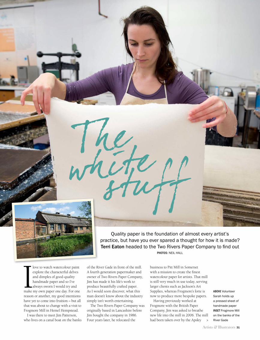
making paper
I love to watch watercolour paint explore the characterful delves and dimples of good-quality handmade paper and so I’ve always sworn I would try and
make my own paper one day. For one reason or another, my good intentions have yet to come into fruition – but all that was about to change with a visit to Frogmore Mill in Hemel Hempstead.
I was there to meet Jim Patterson, who lives on a canal boat on the banks
of the River Gade in front of the mill. A fourth generation papermaker and owner of Two Rivers Paper Company, Jim has made it his life’s work to produce beautifully crafted paper. As I would soon discover, what this man doesn’t know about the industry simply isn’t worth entertaining.
The Two Rivers Paper Company was originally based in Lancashire before Jim bought the company in 1986. Four years later, he relocated the
business to Pitt Mill in Somerset with a mission to create the fi nest watercolour paper for artists. That mill is still very much in use today, serving larger clients such as Jackson’s Art Supplies, whereas Frogmore’s forte is now to produce more bespoke papers.
Having previously worked at Frogmore with the British Paper Company, Jim was asked to breathe new life into the mill in 2006. The mill had been taken over by the Apsley
Quality paper is the foundation of almost every artist’s practice, but have you ever spared a thought for how it is made? Terri Eaton headed to the Two Rivers Paper Company to fi nd out
PHOTOS: NEIL HALL
ABOVE Volunteer
Sarah holds up
a pressed sheet of
handmade paper
INSET Frogmore Mill
on the banks of the
River Gade
Thewhitestuff
>
31 Paper making Two Rivers.indd 31 11/06/2014 16:11
32 Artists & Illustrators
making paper
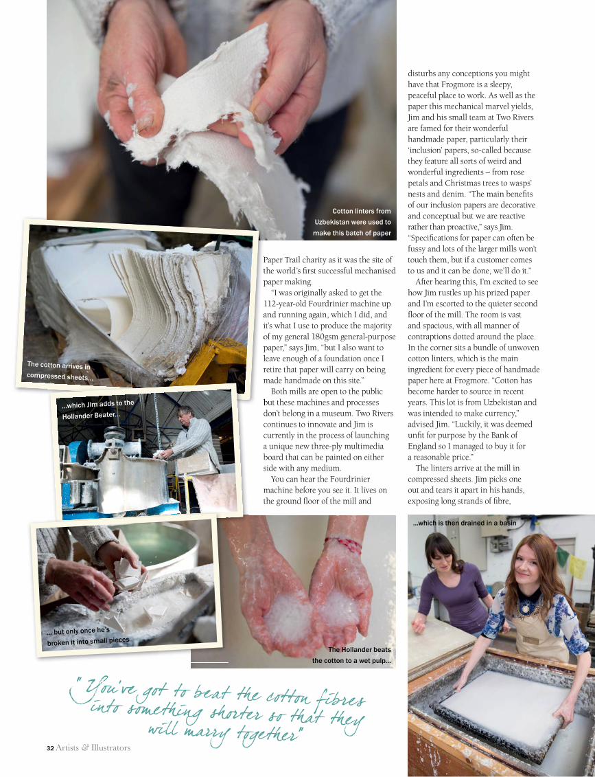
Paper Trail charity as it was the site of the world’s fi rst successful mechanised paper making.
“I was originally asked to get the 112-year-old Fourdrinier machine up and running again, which I did, and it’s what I use to produce the majority of my general 180gsm general-purpose paper,” says Jim, “but I also want to leave enough of a foundation once I retire that paper will carry on being made handmade on this site.”
Both mills are open to the public but these machines and processes don’t belong in a museum. Two Rivers continues to innovate and Jim is currently in the process of launching a unique new three-ply multimedia board that can be painted on either side with any medium.
You can hear the Fourdrinier machine before you see it. It lives on the ground fl oor of the mill and
disturbs any conceptions you might have that Frogmore is a sleepy, peaceful place to work. As well as the paper this mechanical marvel yields, Jim and his small team at Two Rivers are famed for their wonderful handmade paper, particularly their ‘inclusion’ papers, so-called because they feature all sorts of weird and wonderful ingredients – from rose petals and Christmas trees to wasps’ nests and denim. “The main benefi ts of our inclusion papers are decorative and conceptual but we are reactive rather than proactive,” says Jim. “Specifi cations for paper can often be fussy and lots of the larger mills won’t touch them, but if a customer comes to us and it can be done, we’ll do it.”
After hearing this, I’m excited to see how Jim rustles up his prized paper and I’m escorted to the quieter second fl oor of the mill. The room is vast and spacious, with all manner of contraptions dotted around the place. In the corner sits a bundle of unwoven cotton linters, which is the main ingredient for every piece of handmade paper here at Frogmore. “Cotton has become harder to source in recent years. This lot is from Uzbekistan and was intended to make currency,” advised Jim. “Luckily, it was deemed unfi t for purpose by the Bank of England so I managed to buy it for a reasonable price.”
The linters arrive at the mill in compressed sheets. Jim picks one out and tears it apart in his hands, exposing long strands of fi bre,
Paper Trail charity as it was the site of the world’s fi rst successful mechanised paper making.
and running again, which I did, and it’s what I use to produce the majority of my general 180gsm general-purpose paper,” says Jim, “but I also want to leave enough of a foundation once I retire that paper will carry on being made handmade on this site.”
but these machines and processes
“ You’ve got to beat the cotton fibres into something shorter so that they will marry together”
Cotton linters from
Uzbekistan were used to
make this batch of paper
The cotton arrives in compressed sheets…
…which Jim adds to the
Hollander Beater…
... but only once he’s
broken it into small piecesThe Hollander beats
the cotton to a wet pulp...
...which is then drained in a basin
31 Paper making Two Rivers.indd 32 11/06/2014 16:11
Artists & Illustrators 33
making paper
like candyfl oss. “If you slush this down with water in its current state, it will make a bulky useless piece of paper, which is no good to anyone,” he says. “You’ve got to beat the fi bres into something shorter so that they will marry together.”
Medieval paper mills used hammers to pound the fi bres but I’m relieved to learn this is not something we’ll be doing, since I’m completely devoid of upper-body strength. Instead, we use Frogmore’s in-house Hollander Beater, a machine originally invented by the Dutch in the late 17th century to prepare the pulp required to make paper. “The Hollander is fi lled with water pumped straight out of the ground from beneath the mill,” says Jim. “The chalk in the water makes it alkaline so it’s on the right side of the pH spectrum for papermaking.”
The cotton is then dropped into the tank along with a splash of acid-free sizing – an additive used to stop water absorbing into the paper once it’s dried. After fi ve minutes, the pulp is creamier, greasier, more fl uid and ready to take downstairs.
We transport the mix to the ground fl oor using a large bucket and pour it into a freestanding ceramic basin in the corner of the workshop. I’m handed an apron so that can only mean one thing: it’s almost time for
me to roll my sleeves up and get my hands dirty.
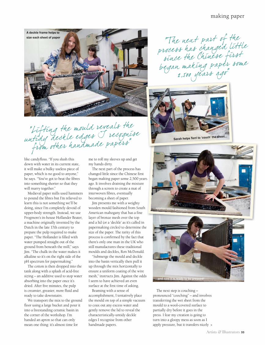
The next part of the process has changed little since the Chinese fi rst began making paper some 2,500 years ago. It involves draining the mixture through a screen to create a mat of interwoven fi bres, eventually becoming a sheet of paper.
Jim presents me with a weighty wooden mould fashioned from South American mahogany that has a fi ne layer of bronze mesh over the top and a lid (or a ‘deckle’ as it’s called in papermaking circles) to determine the size of the paper. The rarity of this process is confi rmed by the fact that there’s only one man in the UK who still manufactures these traditional moulds and deckles, Ron McDonald.
“Submerge the mould and deckle into the basin vertically then pull it up through the mix horizontally to ensure a uniform coating of the wire mesh,” instructs Jim. Against the odds I seem to have achieved an even surface at the fi rst time of asking.
Beaming with a sense of accomplishment, I tentatively place the mould on top of a simple vacuum to coax out any excess water and gently remove the lid to reveal the characteristically-untidy deckle edges I recognise from other handmade papers.
The next step is couching – pronounced “cooching” – and involves transferring the wet sheet from the mould to a wool-covered surface to partially dry before it goes in the press. I fear my creation is going to turn into a gloopy mess as soon as I apply pressure, but it transfers nicely
began making paper some 2,500 years
“Lifting the mould reveals the untidy deckle edges I recognise
from other handmade papers”
“The next part of the process has changed little since the Chinese first
began making paper some 2,500 years ago”
>
A deckle frame helps to
size each sheet of paper
Sarah helps Terri to ‘couch’ the sheet...
...applies some pressure…
…and now it is ready to be pressed!
31 Paper making Two Rivers.indd 33 11/06/2014 16:11
34 Artists & Illustrators
making paper
“Considering how satisfiedI felt after making one sheet, I could understand
why Jim has dedicated hislife to making paper”
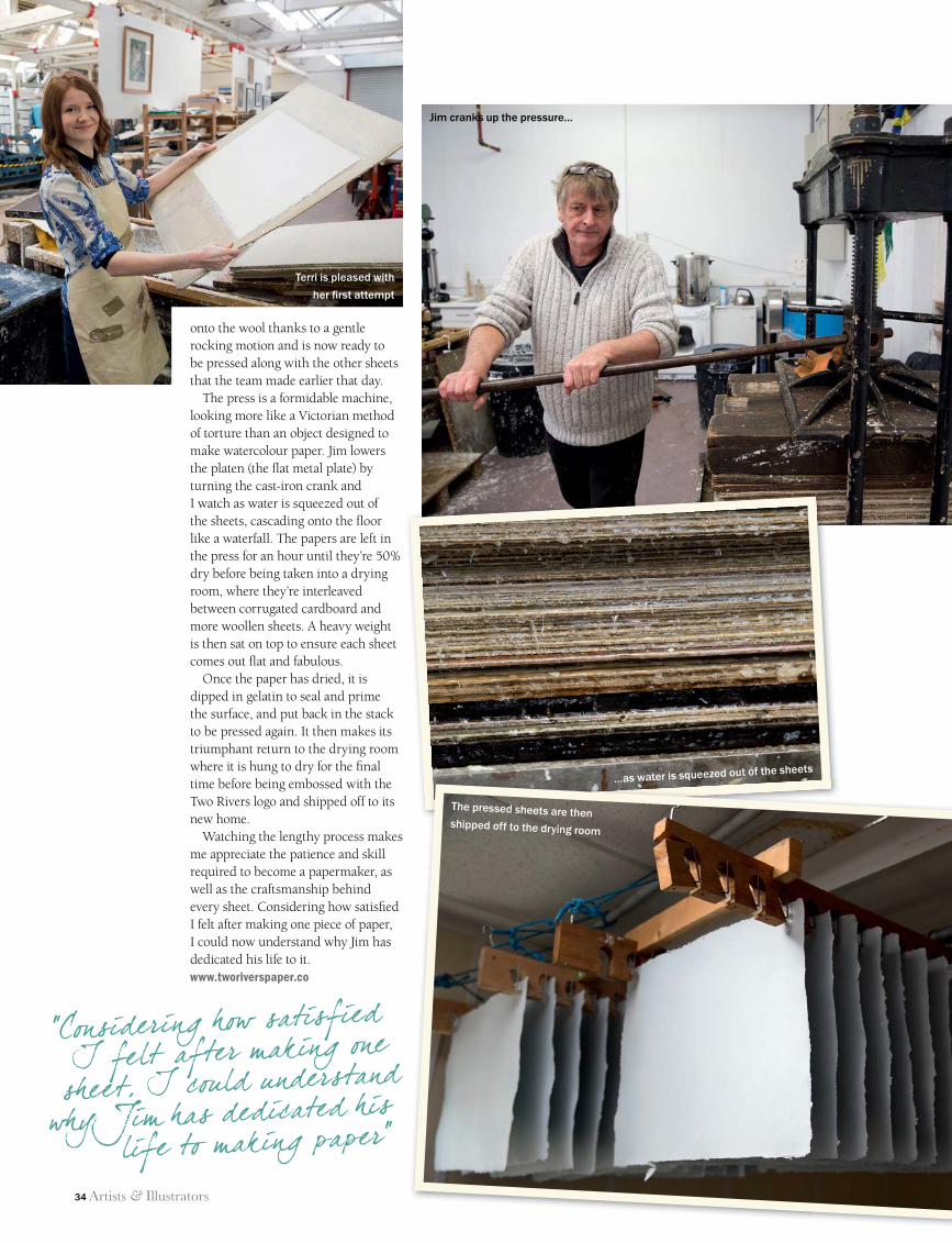
onto the wool thanks to a gentle rocking motion and is now ready to be pressed along with the other sheets that the team made earlier that day.
The press is a formidable machine, looking more like a Victorian method of torture than an object designed to make watercolour paper. Jim lowers the platen (the fl at metal plate) by turning the cast-iron crank and I watch as water is squeezed out of the sheets, cascading onto the fl oor like a waterfall. The papers are left in the press for an hour until they’re 50% dry before being taken into a drying room, where they’re interleaved between corrugated cardboard and more woollen sheets. A heavy weight is then sat on top to ensure each sheet comes out fl at and fabulous.
Once the paper has dried, it is dipped in gelatin to seal and prime the surface, and put back in the stack to be pressed again. It then makes its triumphant return to the drying room where it is hung to dry for the fi nal time before being embossed with the Two Rivers logo and shipped off to its new home.
Watching the lengthy process makes me appreciate the patience and skill required to become a papermaker, as well as the craftsmanship behind every sheet. Considering how satisfi ed I felt after making one piece of paper, I could now understand why Jim has dedicated his life to it.www.tworiverspaper.co
...as water is squeezed out of the sheets
Jim cranks up the pressure...
The pressed sheets are then shipped off to the drying room
Terri is pleased with
her fi rst attempt
31 Paper making Two Rivers.indd 34 11/06/2014 16:12
Artists & Illustrators 35
Our new monthly showcase explores the UK’s rich cultural heritage. Enjoy a great day out for
the whole family at these fantastic venues, exhibitions and events on your doorstep
BEST OF BRITISH
CultureArt &advertisement feature
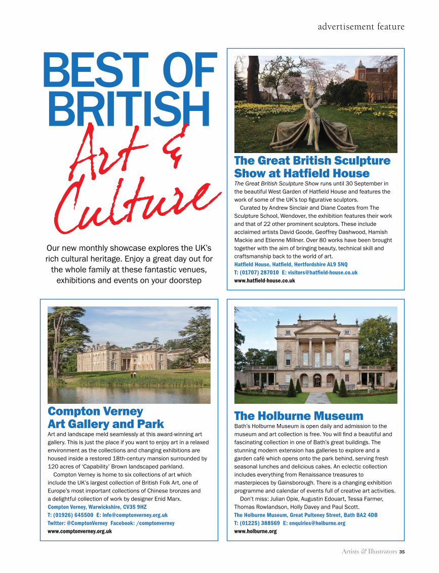
The Great British Sculpture Show at Hatfield House The Great British Sculpture Show runs until 30 September in the beautiful West Garden of Hatfield House and features the work of some of the UK’s top figurative sculptors.
Curated by Andrew Sinclair and Diane Coates from The Sculpture School, Wendover, the exhibition features their work and that of 22 other prominent sculptors. These include acclaimed artists David Goode, Geoffrey Dashwood, Hamish Mackie and Etienne Millner. Over 80 works have been brought together with the aim of bringing beauty, technical skill and craftsmanship back to the world of art.Hatfield House, Hatfield, Hertfordshire AL9 5NQT: (01707) 287010 E: [email protected]
The Holburne MuseumBath’s Holburne Museum is open daily and admission to the museum and art collection is free. You will find a beautiful and fascinating collection in one of Bath’s great buildings. The stunning modern extension has galleries to explore and a garden café which opens onto the park behind, serving fresh seasonal lunches and delicious cakes. An eclectic collection includes everything from Renaissance treasures to masterpieces by Gainsborough. There is a changing exhibition programme and calendar of events full of creative art activities.
Don’t miss: Julian Opie, Augustin Edouart, Tessa Farmer, Thomas Rowlandson, Holly Davey and Paul Scott.The Holburne Museum, Great Pulteney Street, Bath BA2 4DBT: (01225) 388569 E: [email protected]
Compton Verney Art Gallery and ParkArt and landscape meld seamlessly at this award-winning art gallery. This is just the place if you want to enjoy art in a relaxed environment as the collections and changing exhibitions are housed inside a restored 18th-century mansion surrounded by 120 acres of ‘Capability’ Brown landscaped parkland.
Compton Verney is home to six collections of art which include the UK’s largest collection of British Folk Art, one of Europe’s most important collections of Chinese bronzes and a delightful collection of work by designer Enid Marx.Compton Verney, Warwickshire, CV35 9HZT: (01926) 645500 E: [email protected]: @ComptonVerney Facebook: /comptonverneywww.comptonverney.org.uk
BEST OF BRITISH SUM14.indd 35 11/06/2014 15:25
36 Artists & Illustrators
below A selection of
the winning artworks
from our Artists
of the Year 2013
exhibition
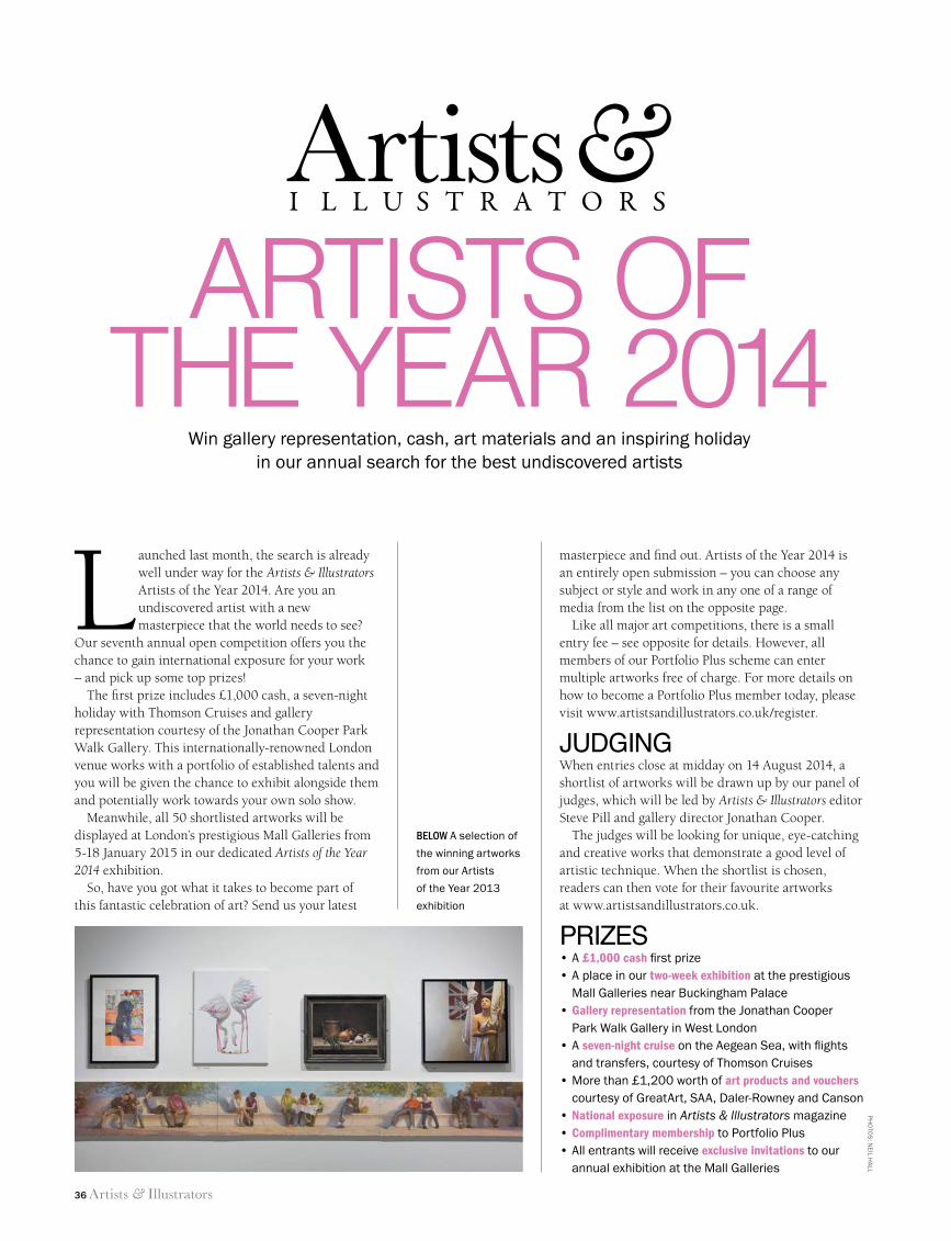
Launched last month, the search is already well under way for the Artists & Illustrators Artists of the Year 2014. Are you an undiscovered artist with a new masterpiece that the world needs to see?
Our seventh annual open competition offers you the chance to gain international exposure for your work – and pick up some top prizes!
The first prize includes £1,000 cash, a seven-night holiday with Thomson Cruises and gallery representation courtesy of the Jonathan Cooper Park Walk Gallery. This internationally-renowned London venue works with a portfolio of established talents and you will be given the chance to exhibit alongside them and potentially work towards your own solo show.
Meanwhile, all 50 shortlisted artworks will be displayed at London’s prestigious Mall Galleries from 5-18 January 2015 in our dedicated Artists of the Year 2014 exhibition.
So, have you got what it takes to become part of this fantastic celebration of art? Send us your latest
Artists of the YeAr 2014
Artists &I L L U S T R A T O R S
masterpiece and find out. Artists of the Year 2014 is an entirely open submission – you can choose any subject or style and work in any one of a range of media from the list on the opposite page.
Like all major art competitions, there is a small entry fee – see opposite for details. However, all members of our Portfolio Plus scheme can enter multiple artworks free of charge. For more details on how to become a Portfolio Plus member today, please visit www.artistsandillustrators.co.uk/register.
JUDGINGWhen entries close at midday on 14 August 2014, a shortlist of artworks will be drawn up by our panel of judges, which will be led by Artists & Illustrators editor Steve Pill and gallery director Jonathan Cooper.
The judges will be looking for unique, eye-catching and creative works that demonstrate a good level of artistic technique. When the shortlist is chosen, readers can then vote for their favourite artworks at www.artistsandillustrators.co.uk.
PRIZES•A£1,000 cash first prize•Aplaceinourtwo-week exhibition at the prestigious
Mall Galleries near Buckingham Palace •Gallery representation from the Jonathan Cooper
Park Walk Gallery in West London•Aseven-night cruise on the Aegean Sea, with flights
and transfers, courtesy of Thomson Cruises•Morethan£1,200worthofart products and vouchers
courtesy of GreatArt, SAA, Daler-Rowney and Canson•National exposure in Artists & Illustrators magazine•Complimentary membership to Portfolio Plus•Allentrantswillreceiveexclusive invitations to our
annual exhibition at the Mall Galleries
Win gallery representation, cash, art materials and an inspiring holiday inourannualsearchforthebestundiscoveredartists
Ph
oTo
S: n
eiL hA
LL
34 AOTY 2014.indd 36 11/06/2014 11:59
Artists & Illustrators 37
artists of the year 2014
HOW TO ENTERThere are two ways to enter this year’s competition:
1. ONLINETake a digital photo of your artwork(s). Go to our website at www.artistsandillustrators.co.uk/2014. Select whether or not you are a Portfolio Plus member. You will be taken to a new screen. Complete the form, taking care to fi ll in all requested fi elds, attach your artworks (up to a maximum of nine per form) and complete your payment information (if applicable). Select the “Submit” button to send us your entries.
2. BY POSTComplete the entry form opposite and post it, along with a photograph or print of your artwork (and cheque if applicable), to:
Artists of the Year 2014, Artists & Illustrators, The Chelsea Magazine Company Ltd., Jubilee House, 2 Jubilee Place, London SW3 3TQ
Entries will only be accepted in one or more of the following mediums: all water-based mediums (including watercolours), oils, acrylics, gouache, all drawing mediums (including pastels and charcoal), collage and all forms of printmaking. Digital art is not accepted. If your artwork is based on photographic reference material, you must either own the copyright to the image(s) or be able to produce written permission from the copyright holder. You may submit as many entries as you like, but you must complete a separate form for each entry. Photocopied forms are accepted.
The closing date for entries is 14 August 2014. Please do not send your original artwork at this time – instead send prints of your work, no larger than A4 in size. Originals must be available to send for the shortlisting stage in September 2014 and display in January 2015, otherwise the work will be disqualifi ed. Unfortunately, we are unable to return any original paintings sent in error at the initial round of judging.
WITH THANKS TO OUR SPONSORS
ABOVE Visitors
admire shortlisted
artworks in the
Artists of the Year
2013 exhibition at
Mall Galleries
Name
Address
Postcode
Date of Birth
Telephone
Title of work
Medium used
Size of work
Artists &I L L U S T R A T O R S
ARTISTS OF THE YEAR 2014
Please tick if you are a subscriber to Artists & IllustratorsThe winner will be announced in the December issue, on sale 7 November 2014. Terms and conditions apply. For full
details, go to www.chelseamagazines.com/terms-and-conditions. Please tick here if you would prefer not to be contacted
by Artists & Illustrators , the competition’s prize donors , or carefully selected third parties .
PLEASE TICK AND COMPLETE ONE OF THE FOLLOWING THREE OPTIONS:
1. I AM A PORTFOLIO PLUS MEMBEREntry is free to all existing Portfolio Plus members. Please complete your unique Portfolio Plus URL here:
www.artistsandillustrators.co.uk/
Not a member? Sign-up today at:www.artistsandillustrators.co.uk/register
2. I WOULD LIKE TO PAY BY CHEQUEI enclose a cheque payable to Artists & Illustrators for £5
3. I WOULD LIKE TO PAY BY CREDIT CARDPlease debit my Mastercard / Visa / Maestro (delete as applicable) the sum of £5
Name on Card (if different from above)
Card No
Expiry Date /
Maestro: Issue No
Valid From /
Signature
Date
34 AOTY 2014.indd 37 11/06/2014 11:59
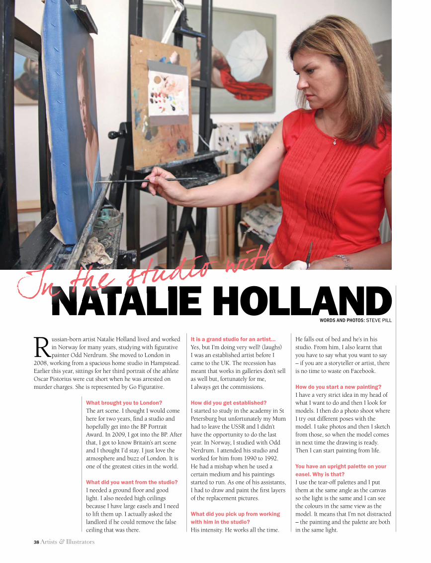
38 Artists & Illustrators
It is a grand studio for an artist…Yes, but I’m doing very well! (laughs) I was an established artist before I came to the UK. The recession has meant that works in galleries don’t sell as well but, fortunately for me, I always get the commissions.
How did you get established?I started to study in the academy in St Petersburg but unfortunately my Mum had to leave the USSR and I didn’t have the opportunity to do the last year. In Norway, I studied with Odd Nerdrum. I attended his studio and worked for him from 1990 to 1992. He had a mishap when he used a certain medium and his paintings started to run. As one of his assistants, I had to draw and paint the fi rst layers of the replacement pictures.
What did you pick up from working with him in the studio?His intensity. He works all the time.
He falls out of bed and he’s in his studio. From him, I also learnt that you have to say what you want to say – if you are a storyteller or artist, there is no time to waste on Facebook.
How do you start a new painting?I have a very strict idea in my head of what I want to do and then I look for models. I then do a photo shoot where I try out different poses with the model. I take photos and then I sketch from those, so when the model comes in next time the drawing is ready. Then I can start painting from life.
You have an upright palette on your easel. Why is that?I use the tear-off palettes and I put them at the same angle as the canvas so the light is the same and I can see the colours in the same view as the model. It means that I’m not distracted – the painting and the palette are both in the same light.
Russian-born artist Natalie Holland lived and worked in Norway for many years, studying with fi gurative painter Odd Nerdrum. She moved to London in
2008, working from a spacious home studio in Hampstead. Earlier this year, sittings for her third portrait of the athlete Oscar Pistorius were cut short when he was arrested on murder charges. She is represented by Go Figurative.
What brought you to London?The art scene. I thought I would come here for two years, fi nd a studio and hopefully get into the BP Portrait Award. In 2009, I got into the BP. After that, I got to know Britain’s art scene and I thought I’d stay. I just love the atmosphere and buzz of London. It is one of the greatest cities in the world.
What did you want from the studio?I needed a ground fl oor and good light. I also needed high ceilings because I have large easels and I need to lift them up. I actually asked the landlord if he could remove the false ceiling that was there.
NATALIE HOLLANDNATALIE HOLLANDIn the studio withWORDS AND PHOTOS: STEVE PILL
38 In the studio.indd 38 11/06/2014 12:01
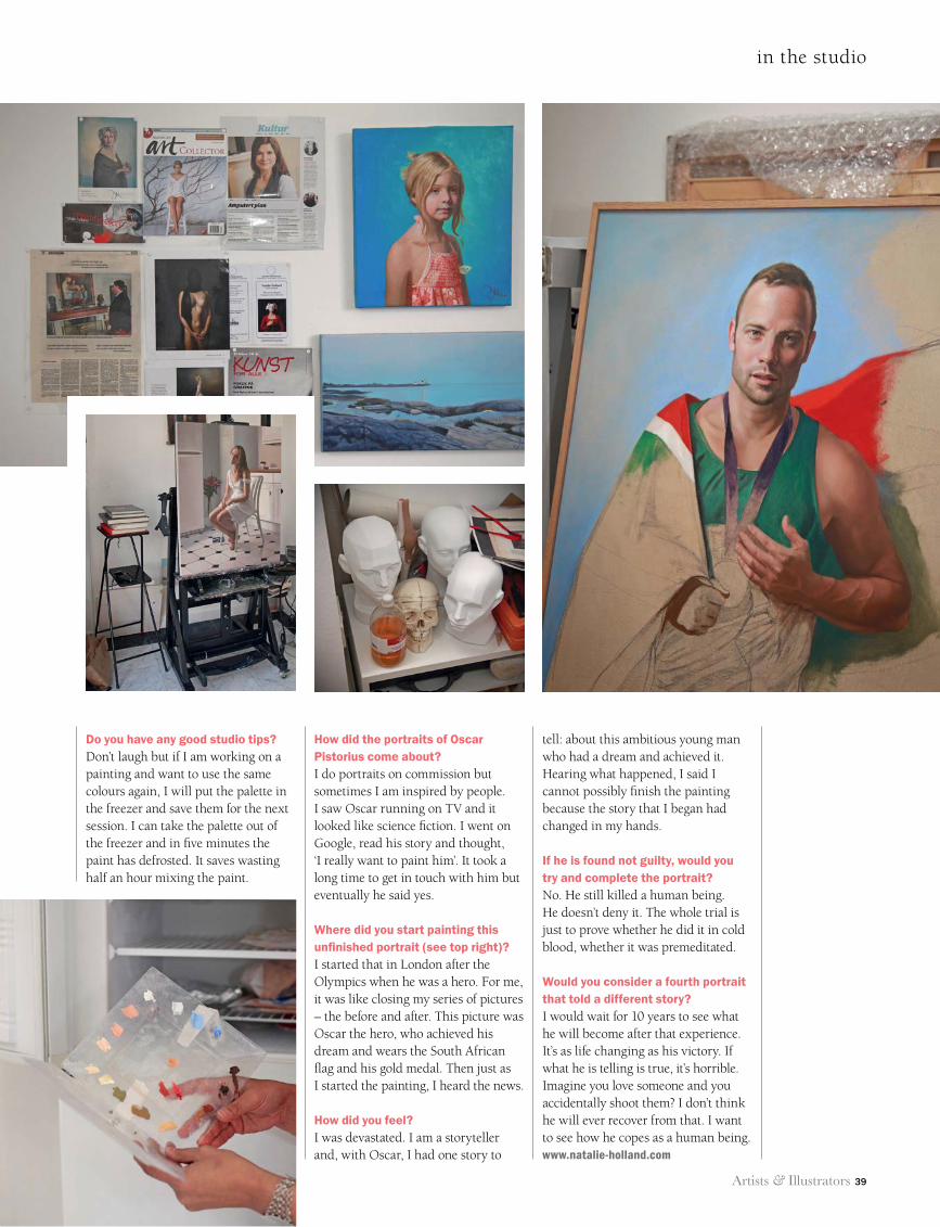
Artists & Illustrators 39
in the studio
Do you have any good studio tips?Don’t laugh but if I am working on a painting and want to use the same colours again, I will put the palette in the freezer and save them for the next session. I can take the palette out of the freezer and in five minutes the paint has defrosted. It saves wasting half an hour mixing the paint.
How did the portraits of Oscar Pistorius come about?I do portraits on commission but sometimes I am inspired by people. I saw Oscar running on TV and it looked like science fiction. I went on Google, read his story and thought, ‘I really want to paint him’. It took a long time to get in touch with him but eventually he said yes.
Where did you start painting this unfinished portrait (see top right)?I started that in London after the Olympics when he was a hero. For me, it was like closing my series of pictures – the before and after. This picture was Oscar the hero, who achieved his dream and wears the South African flag and his gold medal. Then just as I started the painting, I heard the news.
How did you feel?I was devastated. I am a storyteller and, with Oscar, I had one story to
tell: about this ambitious young man who had a dream and achieved it. Hearing what happened, I said I cannot possibly finish the painting because the story that I began had changed in my hands.
If he is found not guilty, would you try and complete the portrait? No. He still killed a human being. He doesn’t deny it. The whole trial is just to prove whether he did it in cold blood, whether it was premeditated.
Would you consider a fourth portrait that told a different story?I would wait for 10 years to see what he will become after that experience. It’s as life changing as his victory. If what he is telling is true, it’s horrible. Imagine you love someone and you accidentally shoot them? I don’t think he will ever recover from that. I want to see how he copes as a human being. www.natalie-holland.com
38 In the studio.indd 39 11/06/2014 12:01
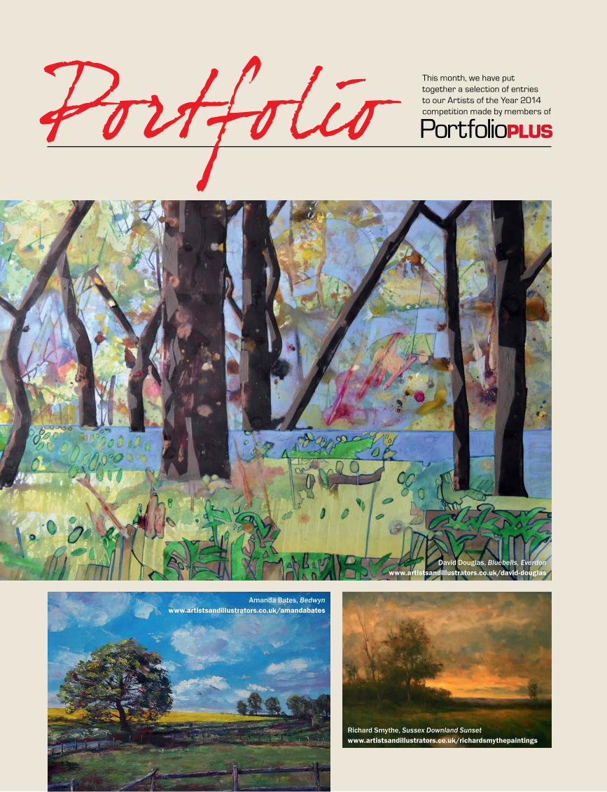
40 Artists & Illustrators
Portfolio This month, we have put together a selection of entries to our Artists of the Year 2014 competition made by members of
PortfolioPLUS
PortfolioPLUS
PortfolioPLUS
PortfolioPLUS
Amanda Bates, Bedwynwww.artistsandillustrators.co.uk/amandabates
David Douglas, Bluebells, Everdonwww.artistsandillustrators.co.uk/david-douglas
Richard Smythe, Sussex Downland Sunsetwww.artistsandillustrators.co.uk/richardsmythepaintings
40 Portfolio.indd 40 11/06/2014 12:02
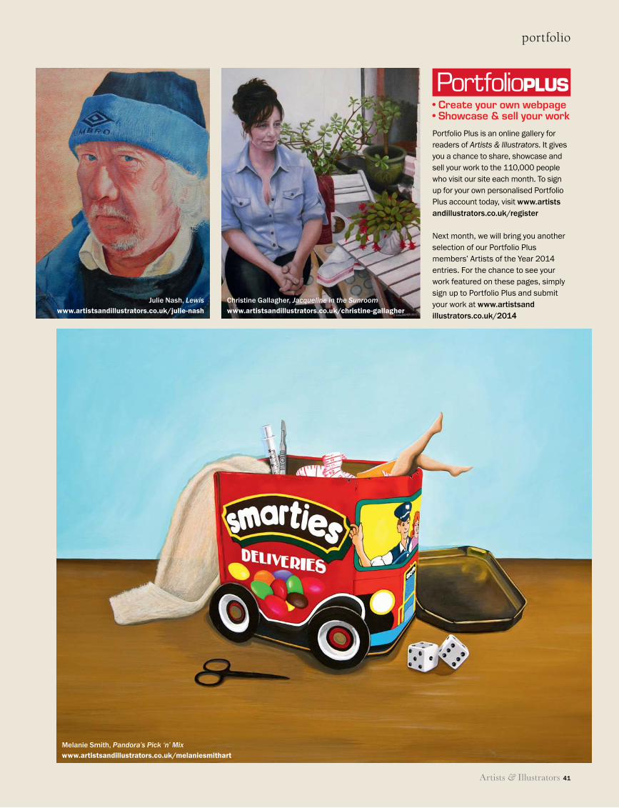
Artists & Illustrators 41
portfolio
PortfolioPLUS
PortfolioPLUS
PortfolioPLUS
PortfolioPLUS
• Create your own webpage• Showcase & sell your work
Portfolio Plus is an online gallery for readers of Artists & Illustrators. It gives you a chance to share, showcase and sell your work to the 110,000 people who visit our site each month. To sign up for your own personalised Portfolio Plus account today, visit www.artists andillustrators.co.uk/register
Next month, we will bring you another selection of our Portfolio Plus members’ Artists of the Year 2014 entries. For the chance to see your work featured on these pages, simply sign up to Portfolio Plus and submit your work at www.artistsand illustrators.co.uk/2014
Melanie Smith, Pandora’s Pick ‘n’ Mixwww.artistsandillustrators.co.uk/melaniesmithart
Christine Gallagher, Jacqueline in the Sunroomwww.artistsandillustrators.co.uk/christine-gallagher
Julie Nash, Lewiswww.artistsandillustrators.co.uk/julie-nash
40 Portfolio.indd 41 11/06/2014 12:02
42 Artists & Illustrators
Beehives at Little Sparta (detail), Eileen Hogan
CALL FORENTRIES2014
An exhibition of smallworks selected by prominentfigures from the art world:two artists, two collectorsand two critics.
Regional collectionpoints across the UK
London submissiondays 5 & 6 September2014
Application forms andfurther information at www.parkerharris.co.uk
x135381_PH_ArtistsIllus_p2_sw_x135381_PH_ArtistsIllus_p2_sw 03/06/2014 08:34
Painting away from home this
summer?Need to get
your artwork home safely?
Protects the surfaceof your artwork from
damage whilein transit
ArtCase by CarriArt
Ideal for wet, impasto or pastel workon canvas orcanvas board
up to A2 (16x23”)Reusable - Waterproof
Go to www.learningholidaysinitaly.com – Contact Freephone: 08081185729 • Email: [email protected]
“It was one of the best holidays I have ever had, combining sympathetic tuition, lovely scenery and good company”.
• Holiday destinations include: Venice, Montefalco, Lake Bolsena & Saragano
• Fully organised holiday including airport transfers, tuition, 4 star accommodation, meals, wine & excursions
• A great holiday for people travelling alone or partners/friends who come together but want to do different activities in the morning
• 85% of guests return
• Recommended by The Sunday Telegraph ‘They have found the perfect formula for a wonderful week’s holiday’
• NO SINGLE PERSON SUPPLEMENT
Painting, Cooking, Photography or Creative Writing Holidays in Italy
La Ghirlanda – Saragano – a pool with a view
QP_Home and Garden.indd 1 30/08/2013 10:19:20
42_A&I_SUM14_.indd 42 11/06/2014 12:19
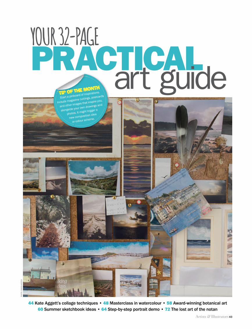
Artists & Illustrators 43
PRACTICALart guideYOUR 32-PAGE
44 Kate Aggett’s collage techniques • 48 Masterclass in watercolour • 58 Award-winning botanical art60 Summer sketchbook ideas • 64 Step-by-step portrait demo • 72 The lost art of the notan
TIP OF THE MONTHTIP OF THE MONTHTIP OF THE MONTH
Start a pinboard of inspirations.
Include magazine cuttings, postcards
and other images that inspire you,
alongside your own drawings and
photos. It might trigger a
new composition idea
or colour scheme.
PH
OTO
: SIM
ON
KEI
TCH
43 Technique opener.indd 43 11/06/2014 12:05
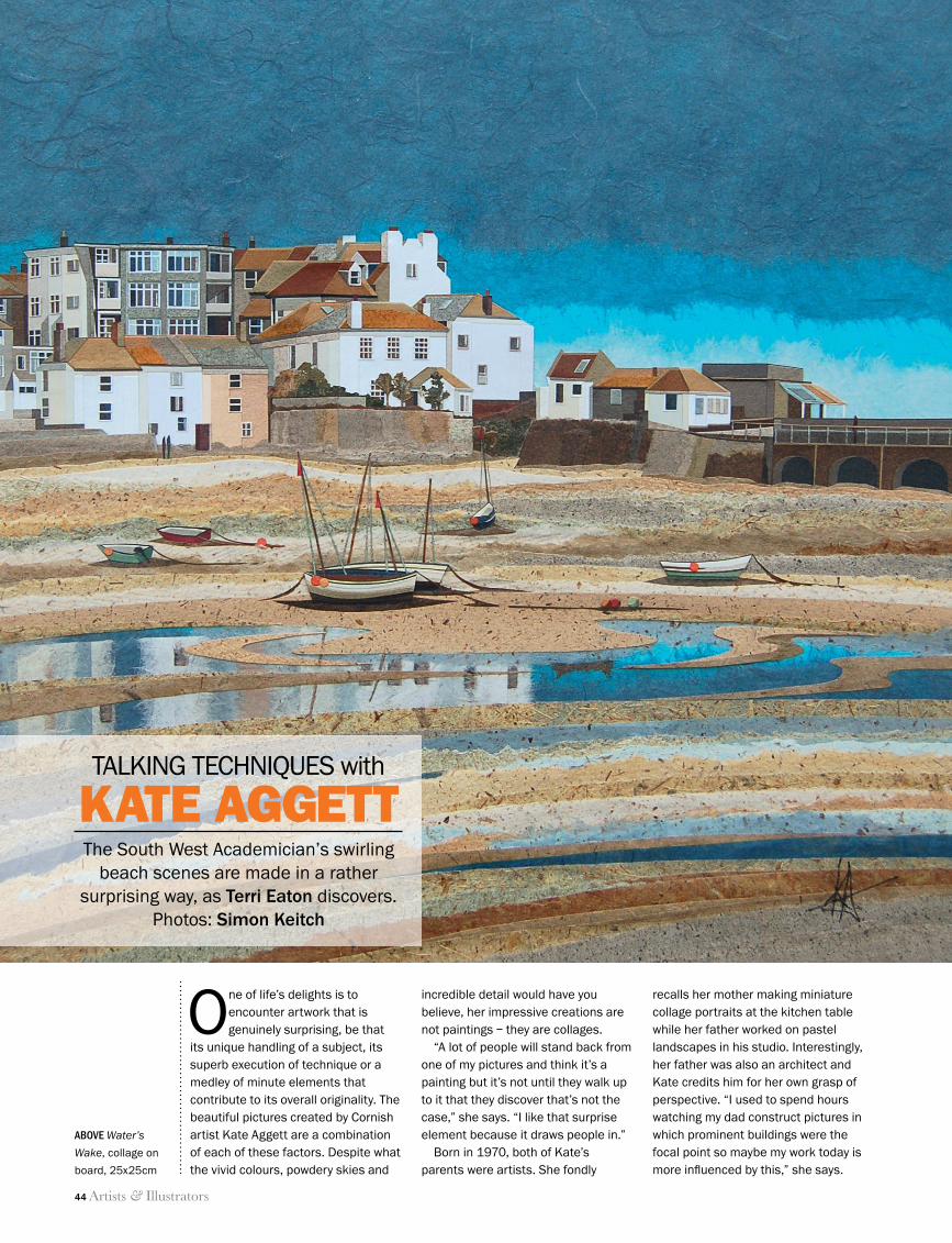
44 Artists & Illustrators
talking techniques
One of life’s delights is to encounter artwork that is genuinely surprising, be that
its unique handling of a subject, its superb execution of technique or a medley of minute elements that contribute to its overall originality. The beautiful pictures created by Cornish artist Kate Aggett are a combination of each of these factors. Despite what the vivid colours, powdery skies and
incredible detail would have you believe, her impressive creations are not paintings – they are collages.
“A lot of people will stand back from one of my pictures and think it’s a painting but it’s not until they walk up to it that they discover that’s not the case,” she says. “I like that surprise element because it draws people in.”
Born in 1970, both of Kate’s parents were artists. She fondly
recalls her mother making miniature collage portraits at the kitchen table while her father worked on pastel landscapes in his studio. Interestingly, her father was also an architect and Kate credits him for her own grasp of perspective. “I used to spend hours watching my dad construct pictures in which prominent buildings were the focal point so maybe my work today is more infl uenced by this,” she says.
The South West Academician’s swirling beach scenes are made in a rather
surprising way, as Terri Eaton discovers. Photos: Simon Keitch
KATE AGGETT
ABOVE Water’s
Wake, collage on
board, 25x25cm
TALKING TECHNIQUES with
44 Talking Techniques.indd 44 11/06/2014 12:06
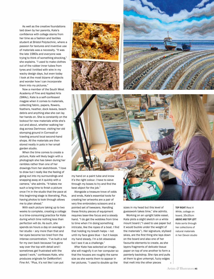
Artists & Illustrators 45
talking techniques
As well as the creative foundations laid down by her parents, Kate’s confi dence with collage stems from her time as a fashion and textiles student at Bristol Polytechnic, where a passion for textures and inventive use of materials was a necessity. “It was the late 1980s and everyone was trying to think of something shocking,” she explains. “I used to make clothes out of the rubber inner tubes from tyres and I knitted with wire in my wacky design days, but even today I look at the most bizarre of objects and wonder how I can incorporate them into my pictures.”
Now a member of the South West Academy of Fine and Applied Arts (SWAc), Kate is a self-confessed magpie when it comes to materials, collecting fabric, papers, fl owers, feathers, heather, dock leaves, beach debris and anything else she can lay her hands on. She is constantly on the lookout for new materials while she’s out and about, whether walking her dog across Dartmoor, visiting her old stomping ground in Cornwall or trawling around local second-hand shops. All the materials are then stored neatly in pots in her small garden studio.
When the time comes to create a picture, Kate will likely begin with a photograph she has taken during her rambles rather than one of her drawings from her sketchbook. “I love to draw but I really like the feeling of going out into my surroundings and snapping away at it quickly with a camera,” she admits. “It takes me such a long time to fi nish a picture once I’m in the studio that the pace at this beginning stage is liberating. Plus, having photos to look through allows me to plan ahead.”
With each picture taking up to two weeks to complete, creating a collage is a time-consuming practice for Kate during which time nothing less than perfection will do. As such, she spends six hours a day on average in her studio – any more than that and her eyes become too tired from the intense concentration. “I’ve built a rod for my own back because I’ve gone way over the top with detail and I sometimes get frustrated with the speed I work,” confesses Kate, who produces originals for DeMontfort Fine Art. “Plus, it’s not like I can put
sizes in my head but this level of guesswork takes time,” she admits.
Working on an upright table easel, Kate plots a slight sketch on a white mount board (“I used to use paper but it would buckle under the weight of the materials”). Her signature, stylised skies, are the fi rst thing she lays down on the board and also one of her favourite elements to create, as she layers fragments of delicate tissue paper on top of one another to form a painterly backdrop. She rips and pulls at them to give unkempt, fuzzy edges that melt into the other pieces
my hand on a paint tube and know it’s the right colour. I have to sieve through my boxes to try and fi nd the best object for the job.”
Alongside a treasure trove of odds and ends, Kate’s essential tools for creating her artworks are a pair of very fi ne embroidery scissors and a pointed set of tweezers. Handling these fi nicky pieces of equipment requires laser-like focus and a steady hand. “I do get the wobbles from time to time when I’m doing something intricate, like the ropes of a boat. I fi nd that holding my breath helps – not until my face goes blue – but it keeps my hand steady. I’m a bit obsessive but I see it as a challenge.”
After Kate has selected an image, she will magnify it on her computer so that the houses are roughly the same size as she wants them to appear in her pictures. “I used to double up the
TOP RIGHT Rest A
While, collage on
board, 35x35cm
ABOVE AND TOP LEFT
Kate sorts through
her collections of
natural materials
in her Devon studio
>
44 Talking Techniques.indd 45 11/06/2014 12:06
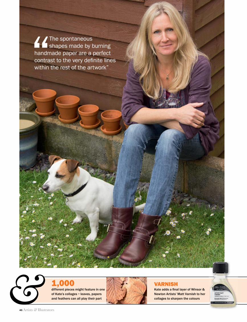
46 Artists & Illustrators
talking techniques
“The spontaneous shapes made by burning
handmade paper are a perfect contrast to the very defi nite lines within the rest of the artwork”
& VARNISH Kate adds a fi nal layer of Winsor & Newton Artists’ Matt Varnish to her collages to sharpen the colours
1,000different pieces might feature in one of Kate’s collages – leaves, papers and feathers can all play their part
44 Talking Techniques.indd 46 11/06/2014 12:06
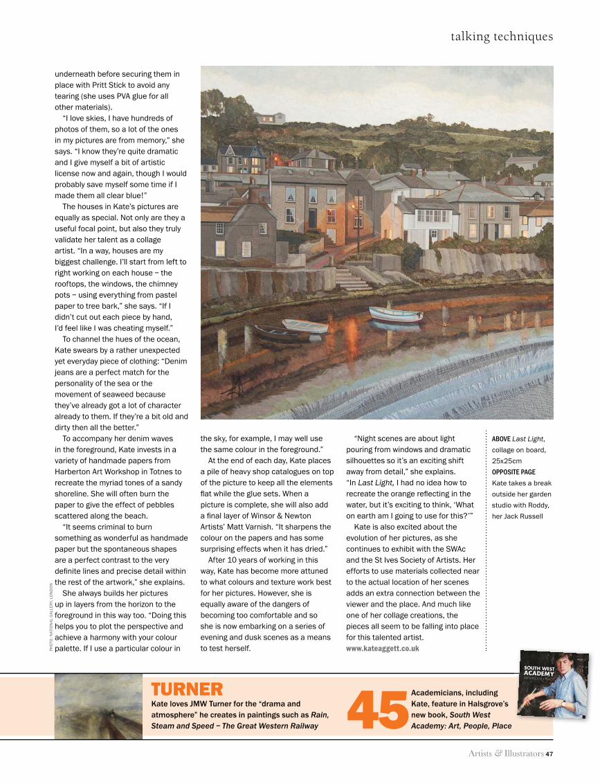
Artists & Illustrators 47
talking techniques
underneath before securing them in place with Pritt Stick to avoid any tearing (she uses PVA glue for all other materials).
“I love skies, I have hundreds of photos of them, so a lot of the ones in my pictures are from memory,” she says. “I know they’re quite dramatic and I give myself a bit of artistic license now and again, though I would probably save myself some time if I made them all clear blue!”
The houses in Kate’s pictures are equally as special. Not only are they a useful focal point, but also they truly validate her talent as a collage artist. “In a way, houses are my biggest challenge. I’ll start from left to right working on each house – the rooftops, the windows, the chimney pots – using everything from pastel paper to tree bark,” she says. “If I didn’t cut out each piece by hand, I’d feel like I was cheating myself.”
To channel the hues of the ocean, Kate swears by a rather unexpected yet everyday piece of clothing: “Denim jeans are a perfect match for the personality of the sea or the movement of seaweed because they’ve already got a lot of character already to them. If they’re a bit old and dirty then all the better.”
To accompany her denim waves in the foreground, Kate invests in a variety of handmade papers from Harberton Art Workshop in Totnes to recreate the myriad tones of a sandy shoreline. She will often burn the paper to give the effect of pebbles scattered along the beach.
“It seems criminal to burn something as wonderful as handmade paper but the spontaneous shapes are a perfect contrast to the very defi nite lines and precise detail within the rest of the artwork,” she explains.
She always builds her pictures up in layers from the horizon to the foreground in this way too. “Doing this helps you to plot the perspective and achieve a harmony with your colour palette. If I use a particular colour in
“Night scenes are about light pouring from windows and dramatic silhouettes so it’s an exciting shift away from detail,” she explains. “In Last Light, I had no idea how to recreate the orange refl ecting in the water, but it’s exciting to think, ‘What on earth am I going to use for this?’”
Kate is also excited about the evolution of her pictures, as she continues to exhibit with the SWAc and the St Ives Society of Artists. Her efforts to use materials collected near to the actual location of her scenes adds an extra connection between the viewer and the place. And much like one of her collage creations, the pieces all seem to be falling into place for this talented artist.www.kateaggett.co.uk
the sky, for example, I may well use the same colour in the foreground.”
At the end of each day, Kate places a pile of heavy shop catalogues on top of the picture to keep all the elements fl at while the glue sets. When a picture is complete, she will also add a fi nal layer of Winsor & Newton Artists’ Matt Varnish. “It sharpens the colour on the papers and has some surprising effects when it has dried.”
After 10 years of working in this way, Kate has become more attuned to what colours and texture work best for her pictures. However, she is equally aware of the dangers of becoming too comfortable and so she is now embarking on a series of evening and dusk scenes as a means to test herself.
TURNERKate loves JMW Turner for the “drama and atmosphere” he creates in paintings such as Rain, Steam and Speed – The Great Western Railway
Academicians, including Kate, feature in Halsgrove’s new book, South West Academy: Art, People, Place45
ABOVE Last Light,
collage on board,
25x25cm
OPPOSITE PAGE
Kate takes a break
outside her garden
studio with Roddy,
her Jack Russell
PH
OTO
: NAT
ION
AL
GA
LLER
Y, L
ON
DO
N
44 Talking Techniques.indd 47 11/06/2014 12:06
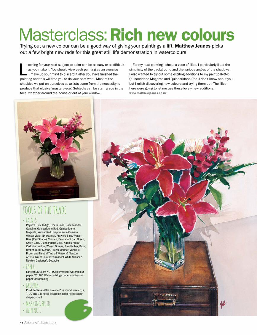
48 Artists & Illustrators
masterclass
Trying out a new colour can be a good way of giving your paintings a lift. Matthew Jeanes picks out a few bright new reds for this great still life demonstration in watercolours
Looking for your next subject to paint can be as easy or as diffi cult as you make it. You should view each painting as an exercise – make up your mind to discard it after you have fi nished the
painting and this will free you to do your best work. Most of the shackles we put on ourselves as artists come from the necessity to produce that elusive ‘masterpiece’. Subjects can be staring you in the face, whether around the house or out of your window.
For my next painting I chose a vase of lilies. I particularly liked the simplicity of the background and the various angles of the shadows. I also wanted to try out some exciting additions to my paint palette: Quinacridone Magenta and Quinacridone Red. I don’t know about you, but I relish discovering new colours and trying them out. The lilies here were going to let me use these lovely new additions.www.matthewjeanes.co.ukface, whether around the house or out of your window.
TOOLS OF THE TRADE• PAINTS
Payne’s Grey, Indigo, Opera Rose, Rose Madder Genuine, Quinacridone Red, Quinacridone Magenta, Winsor Red Deep, Alizarin Crimson, Winsor Violet (Dioxazine), Antwerp Blue, Winsor Blue (Red Shade), Viridian, Permanent Sap Green, Green Gold, Quinacridone Gold, Naples Yellow, Cadmium Yellow, Winsor Orange, Raw Umber, Burnt Umber, Burnt Sienna, Brown Madder, Vandyke Brown and Neutral Tint, all Winsor & Newton Artists’ Water Colour; Permanent White Winsor & Newton Designer’s Gouache
• PAPERLangton 300gsm NOT (Cold Pressed) watercolour paper, 20x16”; White cartridge paper and tracing paper for sketching
• BRUSHESPro-Arte Series 007 Prolene Plus round, sizes 0, 2, 7, 10 and 14; Royal Sovereign Taper Point colour shaper, size 2
• MASKING FLUID• HB PENCIL
Masterclass: Rich new colours
48 Masterclass.indd 48 11/06/2014 12:10
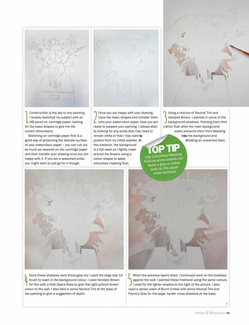
Artists & Illustrators 49
masterclass
1 Construction is the key to any painting. I loosely sketched my subject with an HB pencil on cartridge paper, looking
for the basic shapes to give me the correct dimensions.
Sketching on cartridge paper fi rst is a good way of protecting the delicate surface of your watercolour paper – you can rub out as much as required on the cartridge paper and then transfer your drawing once you are happy with it. If you are a seasoned artist, you might want to just go for it though.
4 Once these shadows were thoroughly dry I used the large size 14 brush to wash in the background colour. I used Vandyke Brown for this with a little Opera Rose to give that light pinkish-brown
colour to the wall. I also bled in some Neutral Tint at the base of the painting to give a suggestion of depth.
5 When the previous layers dried, I continued work on the shadows against the wall. I painted these freehand using the same colours I used for the lighter shadow to the right of the picture. I also
used a darker wash of Burnt Umber with some Neutral Tint and Payne’s Grey for the large, harder cross shadows at the base.
2 Once you are happy with your drawing, trace the basic shapes and transfer them onto your watercolour paper. Now you are
ready to prepare your painting. I always start by looking for any areas that may need to remain white or that I may want to protect from my initial washes. In this instance, the background is a full wash so I lightly mask around the fl owers using a colour shaper to apply colourless masking fl uid.
3 Using a mixture of Neutral Tint and Vandyke Brown, I painted in some of the background shadows. Painting them fi rst
(rather than after the main background wash) prevents them from bleeding
into the background and creating an unwanted stain.
>
remain white or that I may want to protect from my initial washes. In
into the background and creating an unwanted stain.
TOP TIPremain white or that I may want to into the background and
creating an unwanted stain.
TOP TIPremain white or that I may want to remain white or that I may want to
TOP TIPUse Colourless Masking
Fluid as some brands can
leave a grey or yellow
stain on the paper
when removed
48 Masterclass.indd 49 11/06/2014 12:10
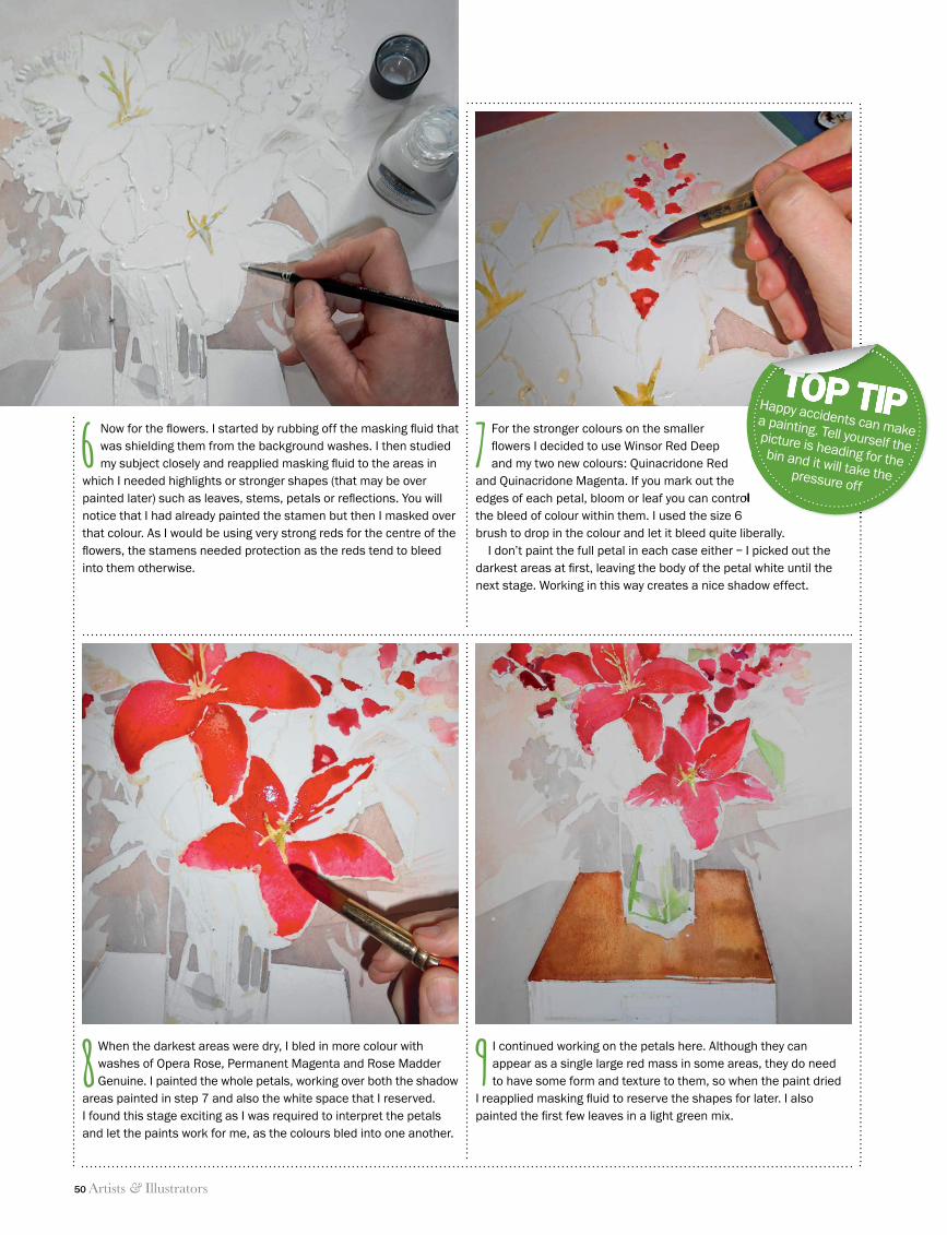
50 Artists & Illustrators
masterclass
9 I continued working on the petals here. Although they can appear as a single large red mass in some areas, they do need to have some form and texture to them, so when the paint dried
I reapplied masking fl uid to reserve the shapes for later. I also painted the fi rst few leaves in a light green mix.
8 When the darkest areas were dry, I bled in more colour with washes of Opera Rose, Permanent Magenta and Rose Madder Genuine. I painted the whole petals, working over both the shadow
areas painted in step 7 and also the white space that I reserved. I found this stage exciting as I was required to interpret the petals and let the paints work for me, as the colours bled into one another.
6 Now for the fl owers. I started by rubbing off the masking fl uid that was shielding them from the background washes. I then studied my subject closely and reapplied masking fl uid to the areas in
which I needed highlights or stronger shapes (that may be over painted later) such as leaves, stems, petals or refl ections. You will notice that I had already painted the stamen but then I masked over that colour. As I would be using very strong reds for the centre of the fl owers, the stamens needed protection as the reds tend to bleed into them otherwise.
7 For the stronger colours on the smaller fl owers I decided to use Winsor Red Deep and my two new colours: Quinacridone Red
and Quinacridone Magenta. If you mark out the edges of each petal, bloom or leaf you can control the bleed of colour within them. I used the size 6 brush to drop in the colour and let it bleed quite liberally.
I don’t paint the full petal in each case either – I picked out the darkest areas at fi rst, leaving the body of the petal white until the next stage. Working in this way creates a nice shadow effect.
edges of each petal, bloom or leaf you can control
TOP TIPTOP TIPTOP TIPHappy accidents can make a painting. Tell yourself the picture is heading for the bin and it will take the pressure off
48 Masterclass.indd 50 11/06/2014 12:10
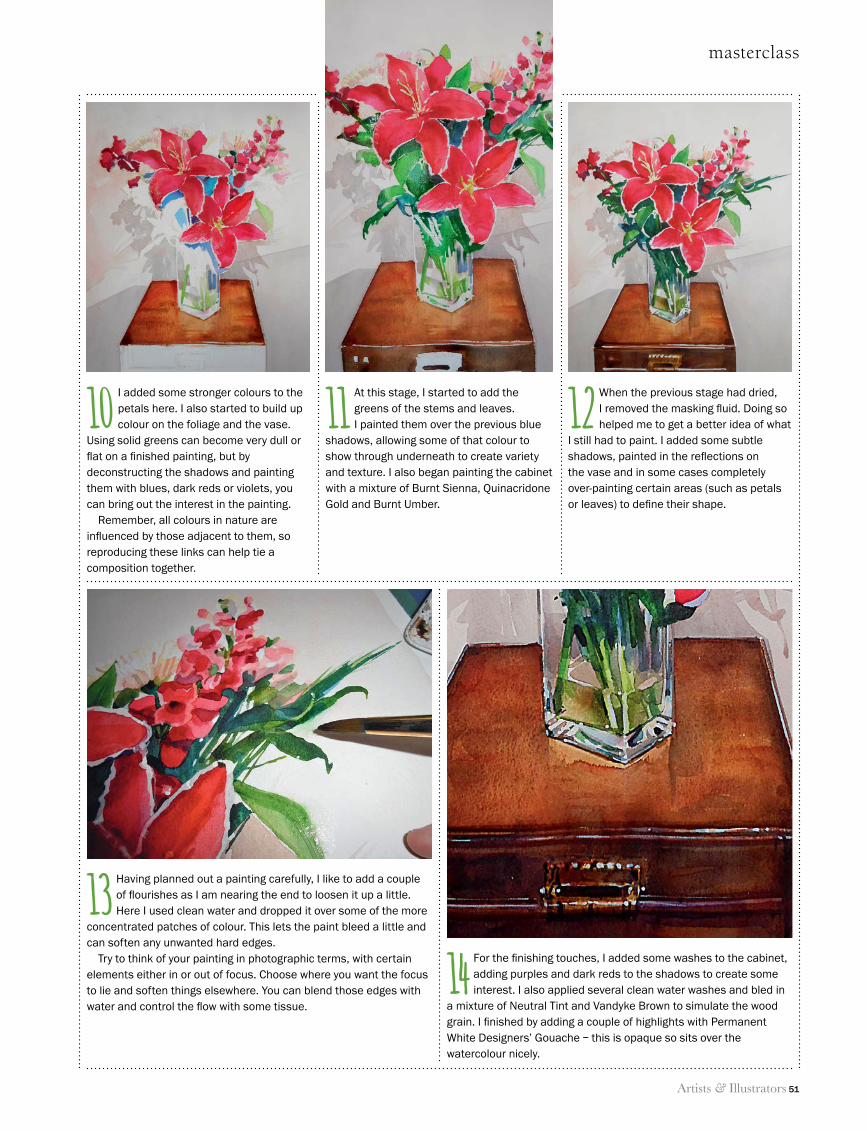
Artists & Illustrators 51
masterclass
14 For the fi nishing touches, I added some washes to the cabinet, adding purples and dark reds to the shadows to create some interest. I also applied several clean water washes and bled in
a mixture of Neutral Tint and Vandyke Brown to simulate the wood grain. I fi nished by adding a couple of highlights with Permanent White Designers’ Gouache – this is opaque so sits over the watercolour nicely.
13 Having planned out a painting carefully, I like to add a couple of fl ourishes as I am nearing the end to loosen it up a little. Here I used clean water and dropped it over some of the more
concentrated patches of colour. This lets the paint bleed a little and can soften any unwanted hard edges.
Try to think of your painting in photographic terms, with certain elements either in or out of focus. Choose where you want the focus to lie and soften things elsewhere. You can blend those edges with water and control the fl ow with some tissue.
12 When the previous stage had dried, I removed the masking fl uid. Doing so helped me to get a better idea of what
I still had to paint. I added some subtle shadows, painted in the refl ections on the vase and in some cases completely over-painting certain areas (such as petals or leaves) to defi ne their shape.
10 I added some stronger colours to the petals here. I also started to build up colour on the foliage and the vase.
Using solid greens can become very dull or fl at on a fi nished painting, but by deconstructing the shadows and painting them with blues, dark reds or violets, you can bring out the interest in the painting.
Remember, all colours in nature are infl uenced by those adjacent to them, so reproducing these links can help tie a composition together.
11 At this stage, I started to add the greens of the stems and leaves. I painted them over the previous blue
shadows, allowing some of that colour to show through underneath to create variety and texture. I also began painting the cabinet with a mixture of Burnt Sienna, Quinacridone Gold and Burnt Umber.
48 Masterclass.indd 51 11/06/2014 12:10
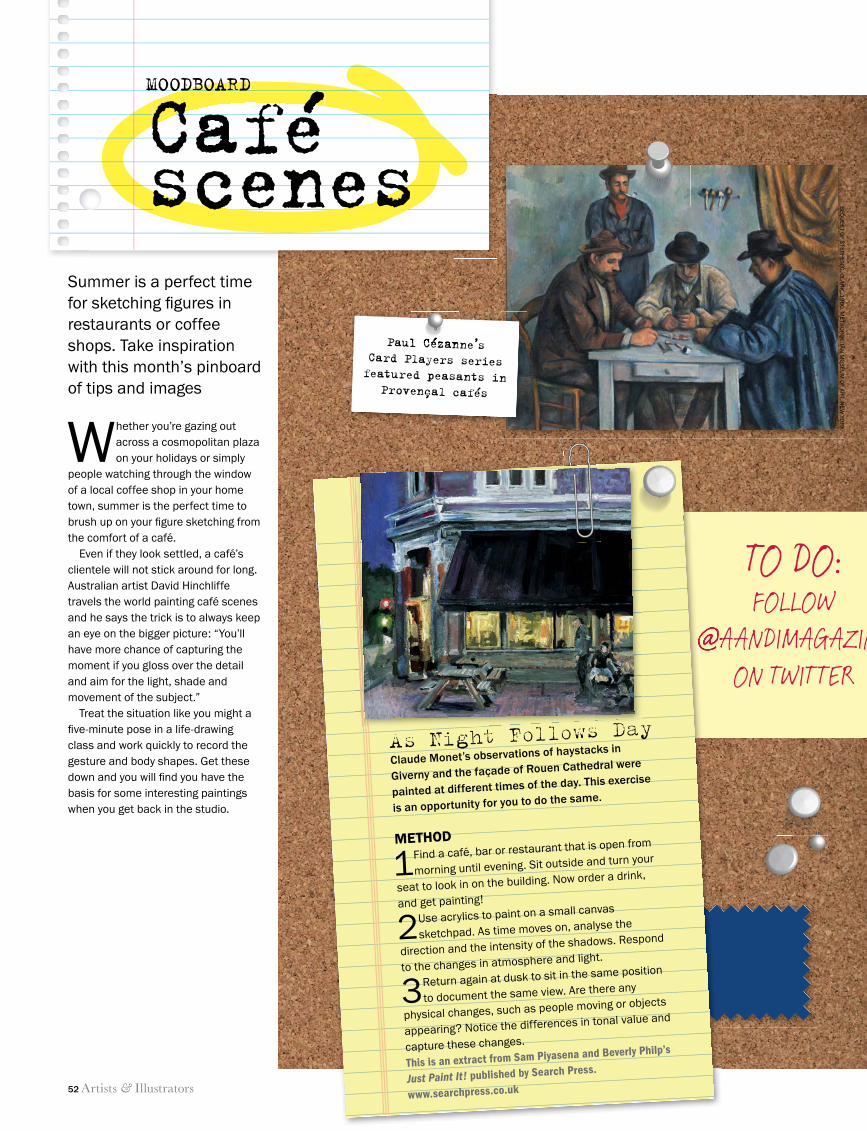
52 Artists & Illustrators
TO DO:FOLLOW
@AANDIMAGAZINEON TWITTER
@AANDIMAGAZINE
MOODBOARD
Caféscenes
As Night Follows DayClaude Monet’s observations of haystacks in
Giverny and the façade of Rouen Cathedral were
painted at different times of the day. This exercise
is an opportunity for you to do the same.
METHOD
1 Find a café, bar or restaurant that is open from
morning until evening. Sit outside and turn your
seat to look in on the building. Now order a drink,
and get painting!
2 Use acrylics to paint on a small canvas
sketchpad. As time moves on, analyse the
direction and the intensity of the shadows. Respond
to the changes in atmosphere and light.
3 Return again at dusk to sit in the same position
to document the same view. Are there any
physical changes, such as people moving or objects
appearing? Notice the differences in tonal value and
capture these changes.
This is an extract from Sam Piyasena and Beverly Philp’s
Just Paint It! published by Search Press.
www.searchpress.co.uk
Paul Cézanne’s Card Players series featured peasants in
Provençal cafés
Whether you’re gazing out across a cosmopolitan plaza on your holidays or simply
people watching through the window of a local coffee shop in your home town, summer is the perfect time to brush up on your fi gure sketching from the comfort of a café.
Even if they look settled, a café’s clientele will not stick around for long. Australian artist David Hinchliffe travels the world painting café scenes and he says the trick is to always keep an eye on the bigger picture: “You’ll have more chance of capturing the moment if you gloss over the detail and aim for the light, shade and movement of the subject.”
Treat the situation like you might a fi ve-minute pose in a life-drawing class and work quickly to record the gesture and body shapes. Get these down and you will fi nd you have the basis for some interesting paintings when you get back in the studio.
Summer is a perfect time for sketching fi gures in restaurants or coffee shops. Take inspiration with this month’s pinboard of tips and images
MOODBOARDMOODBOARD
CaféCaféscenesscenesscenesscenesscenes
Paul Cézanne’s
BEQ
UE
ST O
F STEP
HEN
C. C
LAR
K, 1
96
0. M
ETR
OP
OLITA
N M
US
EUM
OF A
RT, N
EW
YOR
K
52 Moodboard.indd 52 11/06/2014 17:22
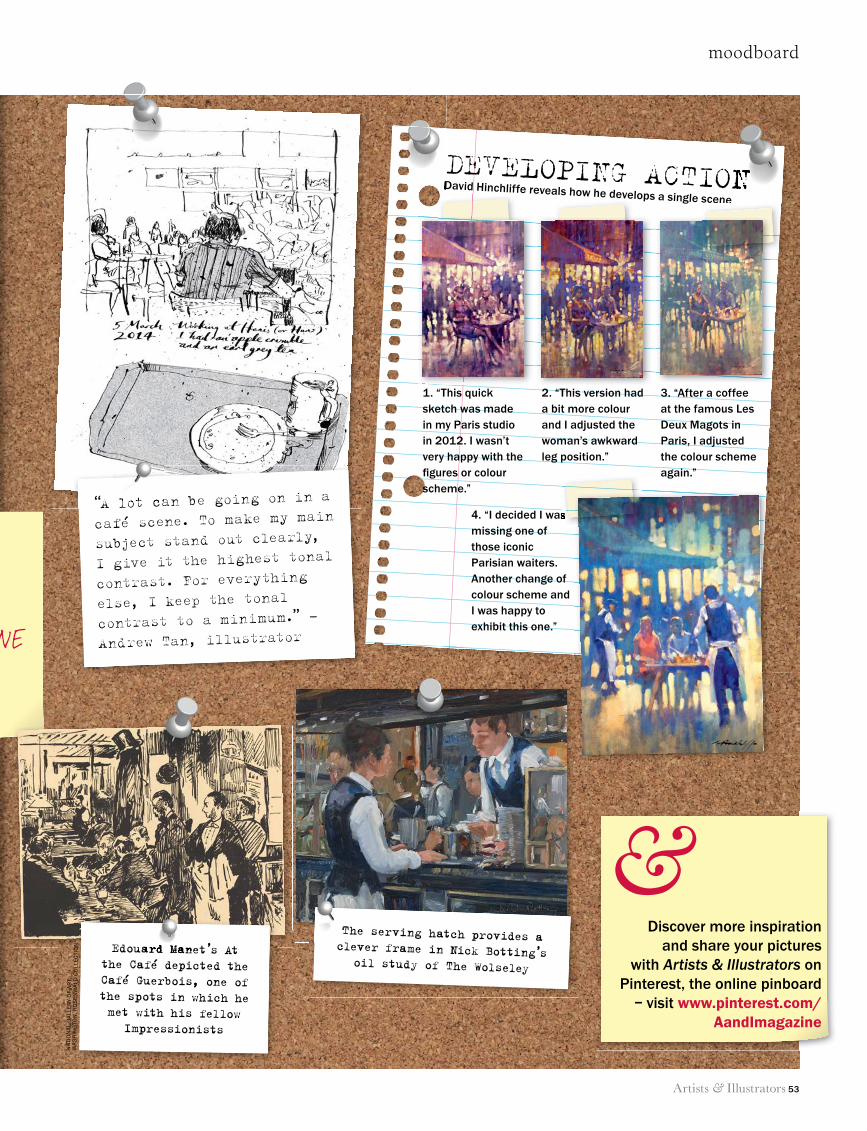
moodboard
Artists & Illustrators 53
TO DO:FOLLOW
@AANDIMAGAZINEON TWITTER
DEVELOPING ACTIONDavid Hinchliffe reveals how he develops a single sceneDavid Hinchliffe reveals how he develops a single scene
DEVELOPING ACTION
Discover more inspiration and share your pictures
with Artists & Illustrators on Pinterest, the online pinboard
– visit www.pinterest.com/AandImagazine
&The serving hatch provides a clever frame in Nick Botting’s
oil study of The Wolseley
Edouard Manet’s At the Café depicted the Café Guerbois, one of the spots in which he met with his fellow
Impressionists
“A lot can be going on in a
café scene. To make my main
subject stand out clearly,
I give it the highest tonal
contrast. For everything
else, I keep the tonal
contrast to a minimum.” –
Andrew Tan, illustrator
4. “I decided I was missing one of those iconic Parisian waiters. Another change of colour scheme and I was happy to exhibit this one.”
3. “After a coffee at the famous Les Deux Magots in Paris, I adjusted the colour scheme again.”
2. “This version had a bit more colour and I adjusted the woman’s awkward leg position.”
1. “This quick sketch was made in my Paris studio in 2012. I wasn’t very happy with the fi gures or colour scheme.”
The serving hatch provides a clever frame in Nick Botting’s
“A lot can be going on in a
David Hinchliffe reveals how he develops a single scene
4. “I decided I was
David Hinchliffe reveals how he develops a single sceneDavid Hinchliffe reveals how he develops a single scene
Edouard Manet’s At
NAT
ION
AL
GA
LLER
Y O
F A
RT,
W
AS
HIN
GTO
N. R
OS
ENW
ALD
CO
LLEC
TIO
N
52 Moodboard.indd 53 11/06/2014 17:23
54 Artists & Illustrators
The Society of Botanical ArtistsDISTANCE LEARNING DIPLOMA COURSE
To obtain a prospectus, applicationform and comprehensive details, visitthe website to download a copy orcontact the Society on 01747 825718.
www.soc-botanical-artists.orgPlease support the Charity, Registration No. 1110869
Course 9 Diploma work by recentlygraduated Amanda Nugus DipSBA(Dist)
• A unique course in botanical painting based on textbooks The Art ofBotanical Painting, The Botanical Palette and Botanical Sketchbook.
• Assignment-led two-year course: eleven separate assignments anda Diploma portfolio specifically created to develop and hone skills.
• Expert guidance and tuition: learn from experienced members of the Society, specialists in the fields of pencil, coloured pencil,gouache and watercolour.
• Comprehensive marking structure: critiques and marking deliveredafter each assignment.
• Meet Tutors and fellow students at the Introductory meeting in thefirst year and a Seminar in the second year of the course, bothduring the Society’s Annual Open Exhibition in London.
Applications being taken now for the 12th course starting in January 2015.Closing date 30 September 2014.
Oil, Acrylic, Alkyd & Watercolour Paints • Mediums, Tools & Easels • Canvases & Papers • Pens, Pencils & Pastels • Block Printing & Screen Printing Inks • Dyes,
Silk & Fabric Paints • Weaving, Feltmaking & Hand Spinning Equipment • Fabrics, Fibres & Yarns
www.georgeweil.com
fine art & craft supplies fromgeorge weil
Visit our showroom at:Old Portsmouth Road, Peasmarsh, Guildford, GU3 1LZ Email: [email protected] Tel: 01483 565800
CALL TO ARTISTS
Cash and art material prizes to be won
22nd October - 2nd November 2014
Festival tickets on sale from July 14th – (01603) 598 676
Norwich Plein Air Art Competition22 & 23 October 2014Submissions via www.paintoutnorwich.org or www.hostryfestival.orgDeadline 1 September 2014
JUDGING PANEL INCLUDES: TREVOR CHAMBERLAIN ROI/RSMA – leading Plein Air artist
COLIN SELF – internationally acclaimed Norwich-based artist AMANDA GEITNER – Head of Collections and Exhibitions
at The Sainsbury Centre for Visual Arts, UEA
In creative partnership with the
54_A&I_SUM14_.indd 54 11/06/2014 09:32
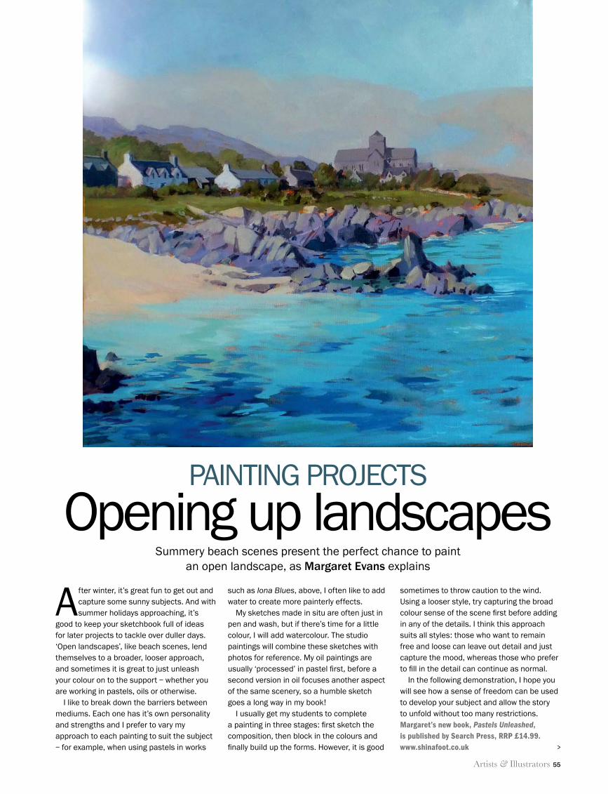
Artists & Illustrators 55
painting projects
Summery beach scenes present the perfect chance to paint an open landscape, as Margaret Evans explains
After winter, it’s great fun to get out and capture some sunny subjects. And with summer holidays approaching, it’s
good to keep your sketchbook full of ideas for later projects to tackle over duller days. ‘Open landscapes’, like beach scenes, lend themselves to a broader, looser approach, and sometimes it is great to just unleash your colour on to the support – whether you are working in pastels, oils or otherwise.
I like to break down the barriers between mediums. Each one has it’s own personality and strengths and I prefer to vary my approach to each painting to suit the subject – for example, when using pastels in works
such as Iona Blues, above, I often like to add water to create more painterly effects.
My sketches made in situ are often just in pen and wash, but if there’s time for a little colour, I will add watercolour. The studio paintings will combine these sketches with photos for reference. My oil paintings are usually ‘processed’ in pastel first, before a second version in oil focuses another aspect of the same scenery, so a humble sketch goes a long way in my book!
I usually get my students to complete a painting in three stages: first sketch the composition, then block in the colours and finally build up the forms. However, it is good
sometimes to throw caution to the wind. Using a looser style, try capturing the broad colour sense of the scene first before adding in any of the details. I think this approach suits all styles: those who want to remain free and loose can leave out detail and just capture the mood, whereas those who prefer to fill in the detail can continue as normal.
In the following demonstration, I hope you will see how a sense of freedom can be used to develop your subject and allow the story to unfold without too many restrictions.Margaret’s new book, Pastels Unleashed, is published by Search Press, RRP £14.99. www.shinafoot.co.uk
pAInTIng prOjEcTS
Opening up landscapes
>
55 Margaret Evans.indd 55 11/06/2014 12:11
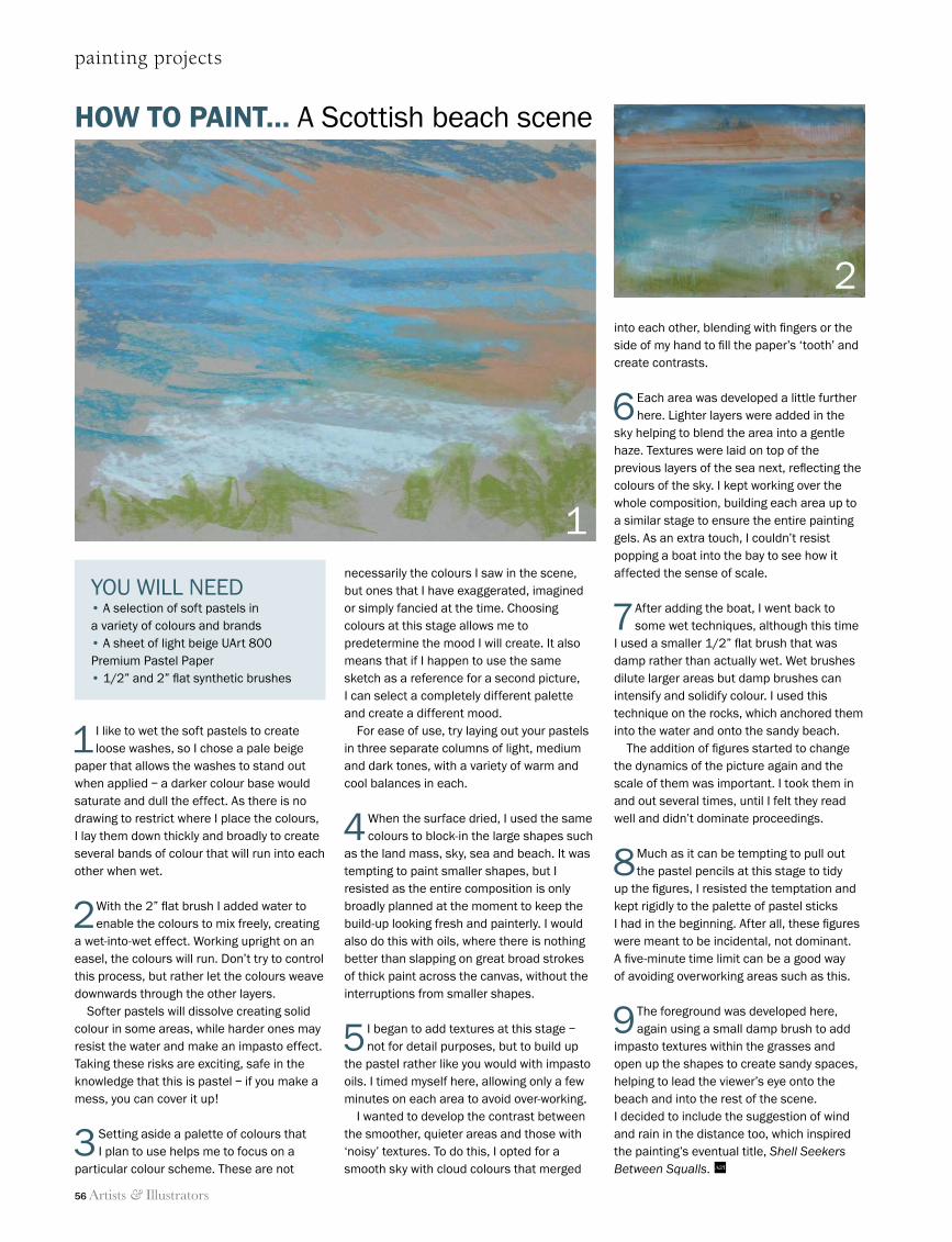
56 Artists & Illustrators
painting projects
HOW TO PAINT… A Scottish beach scene
1
2
YOU WILL NEED• A selection of soft pastels in a variety of colours and brands • A sheet of light beige UArt 800 Premium Pastel Paper• 1/2” and 2” flat synthetic brushes
1 I like to wet the soft pastels to create loose washes, so I chose a pale beige
paper that allows the washes to stand out when applied – a darker colour base would saturate and dull the effect. As there is no drawing to restrict where I place the colours, I lay them down thickly and broadly to create several bands of colour that will run into each other when wet.
2 With the 2” flat brush I added water to enable the colours to mix freely, creating
a wet-into-wet effect. Working upright on an easel, the colours will run. Don’t try to control this process, but rather let the colours weave downwards through the other layers.
Softer pastels will dissolve creating solid colour in some areas, while harder ones may resist the water and make an impasto effect.Taking these risks are exciting, safe in the knowledge that this is pastel – if you make a mess, you can cover it up!
3 Setting aside a palette of colours that I plan to use helps me to focus on a
particular colour scheme. These are not
necessarily the colours I saw in the scene, but ones that I have exaggerated, imagined or simply fancied at the time. Choosing colours at this stage allows me to predetermine the mood I will create. It also means that if I happen to use the same sketch as a reference for a second picture, I can select a completely different palette and create a different mood.
For ease of use, try laying out your pastels in three separate columns of light, medium and dark tones, with a variety of warm and cool balances in each.
4 When the surface dried, I used the same colours to block-in the large shapes such
as the land mass, sky, sea and beach. It was tempting to paint smaller shapes, but I resisted as the entire composition is only broadly planned at the moment to keep the build-up looking fresh and painterly. I would also do this with oils, where there is nothing better than slapping on great broad strokes of thick paint across the canvas, without the interruptions from smaller shapes.
5 I began to add textures at this stage – not for detail purposes, but to build up
the pastel rather like you would with impasto oils. I timed myself here, allowing only a few minutes on each area to avoid over-working.
I wanted to develop the contrast between the smoother, quieter areas and those with ‘noisy’ textures. To do this, I opted for a smooth sky with cloud colours that merged
into each other, blending with fingers or the side of my hand to fill the paper’s ‘tooth’ and create contrasts.
6 Each area was developed a little further here. Lighter layers were added in the
sky helping to blend the area into a gentle haze. Textures were laid on top of the previous layers of the sea next, reflecting the colours of the sky. I kept working over the whole composition, building each area up to a similar stage to ensure the entire painting gels. As an extra touch, I couldn’t resist popping a boat into the bay to see how it affected the sense of scale.
7 After adding the boat, I went back to some wet techniques, although this time
I used a smaller 1/2” flat brush that was damp rather than actually wet. Wet brushes dilute larger areas but damp brushes can intensify and solidify colour. I used this technique on the rocks, which anchored them into the water and onto the sandy beach.
The addition of figures started to change the dynamics of the picture again and the scale of them was important. I took them in and out several times, until I felt they read well and didn’t dominate proceedings.
8 Much as it can be tempting to pull out the pastel pencils at this stage to tidy
up the figures, I resisted the temptation and kept rigidly to the palette of pastel sticks I had in the beginning. After all, these figures were meant to be incidental, not dominant. A five-minute time limit can be a good way of avoiding overworking areas such as this.
9 The foreground was developed here, again using a small damp brush to add
impasto textures within the grasses and open up the shapes to create sandy spaces, helping to lead the viewer’s eye onto the beach and into the rest of the scene. I decided to include the suggestion of wind and rain in the distance too, which inspired the painting’s eventual title, Shell Seekers Between Squalls. A&I
55 Margaret Evans.indd 56 11/06/2014 12:11
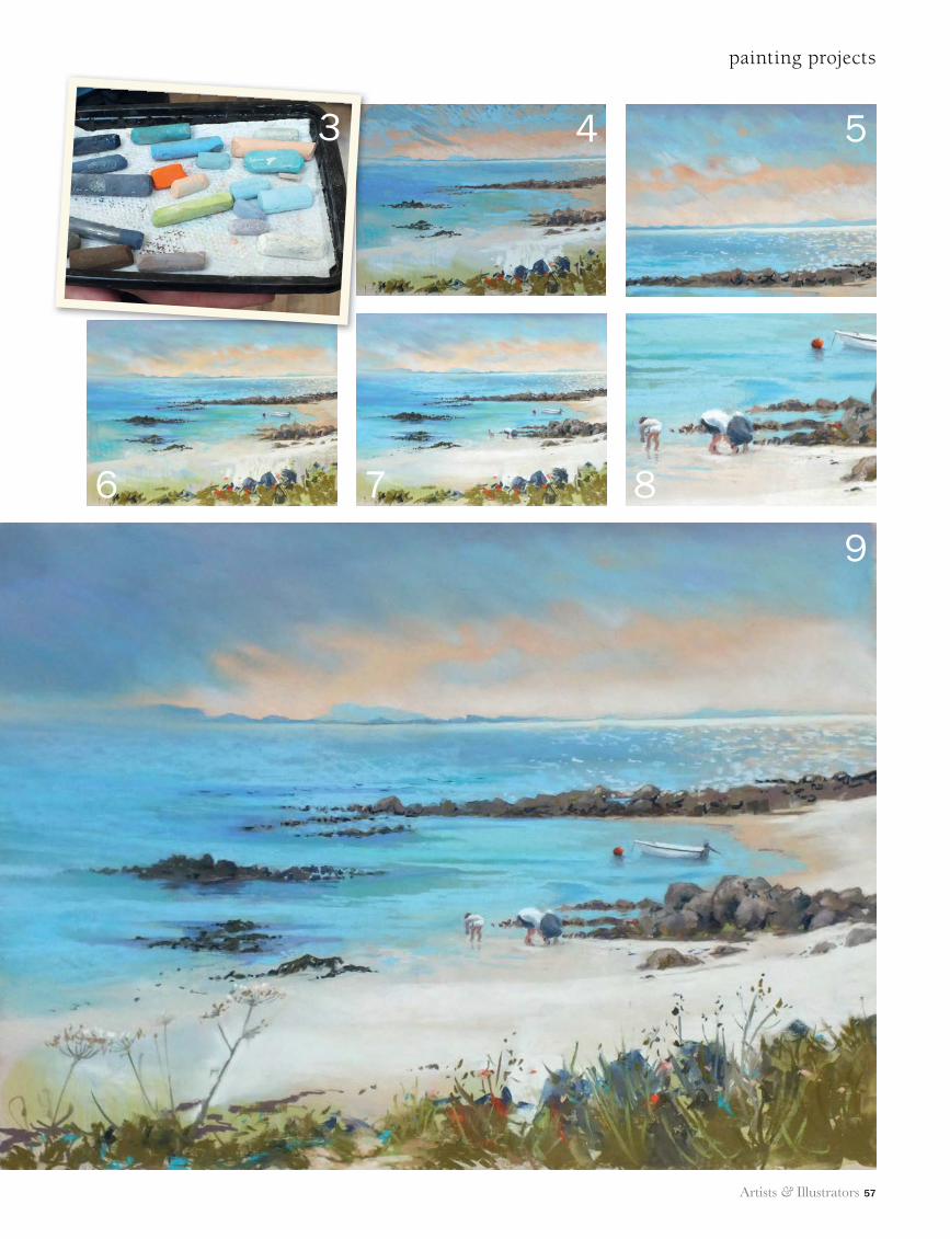
Artists & Illustrators 57
painting projects
4 5
6 7 8
9
3
55 Margaret Evans.indd 57 11/06/2014 12:12
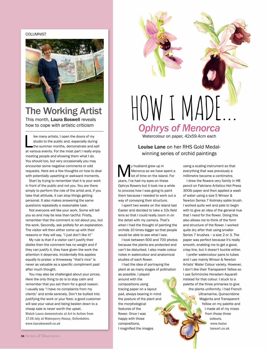
Ophrys of MenorcaWatercolour on paper, 42x59.4cm each
HOW I MADE…
My husband grew up in Menorca so we have spent a lot of time on the island. For
years, I’ve had my eyes on these Ophrys fl owers but it took me a while to process how I was going to paint them because I needed to work out a way of conveying their structure.
I spent two weeks on the island last Easter and decided to take a 10x fi eld lens so that I could really zoom in on the detail with my camera. That’s when I had the thought of painting the orchids 10 times bigger so that people would be able to see what I see.
I took between 600 and 700 photos because the plants are protected and can’t be disturbed. I also made colour notes in watercolour and anatomical studies of each fl ower.
I had the idea of portraying the plant at as many stages of pollination as possible. I played around with the compositions using tracing paper on a layout pad, always bearing in mind the posture of the plant and the morphological features of the fl ower. Once I was happy with those compositions, I magnifi ed the images
using a scaling instrument so that everything that was previously a millimetre became a centimetre.
I drew the fl owers very faintly in HB pencil on Fabriano Artistico Hot Press 300lb paper and then applied a wash of water using a size 5 Winsor & Newton Series 7 Kolinsky sable brush. I worked quite wet and pale to begin with to give an idea of the general hue that I need for the fl ower. Doing this also allows me to think of the form and structure of the fl ower. I worked quite dry after that using smaller Series 7 brushes – a size 2 or 3. The paper was perfect because it’s really smooth, enabling me to get a good, crisp line, but it doesn’t buckle either.
I prefer watercolour pans to tubes and I use mainly Winsor & Newton Artists’ Water Colour variety. However, I don’t like their Transparent Yellow so I use Schmincke Horadam Aquarell instead for that colour. I stuck to a palette of the three primaries to give
the plants uniformity. I had French Ultramarine, Quinacridone Magenta and Transparent
Yellow on my palette andI made all of my mixes from those three
colours.www.louiselaneart.co.uk
58 Artists & Illustrators
Louise Lane on her RHS Gold Medal-winning series of orchid paintings
Like many artists, I open the doors of my studio to the public and, especially during the summer months, demonstrate and sell
at various events. For the most part I really enjoy meeting people and showing them what I do. You should too, but very occasionally you may encounter some negative comments or odd re quests. Here are a few thoughts on how to deal with potentially upsetting or awkward moments.
Start by trying to remember that it is your work in front of the public and not you. You are there simply to perform the role of the artist and, if you take that attitude, it can stop things getting personal. It also makes answering the same questions repeatedly a reasonable task.
Not everyone will like your work. Some will tell you so and may be less than tactful. Firstly, remember that the comment is not about you, but the work. Secondly, ask politely for an explanation. The visitor will then either come up with their reasons or they will say, “I just don’t like it!”
My rule is that if a visitor can’t justify their dislike then the comment has no weight and if they can justify it, they have given the work the attention it deserves. Incidentally this applies equally to praise: a throwaway “that’s nice” is never as valuable as a specifi c compliment paid after much thought.
You may also be challenged about your prices. Here the only thing to do is to stay calm and remember that you set them for a good reason. I usually say “I have no complaints from my clients” and smile serenely. Don’t be bullied into justifying the work or your fees: a good customer will see your value and being beaten down to a cheap sale is never worth the upset.Watch Laura demonstrate at Art in Action from 17-20 July at Waterperry House, Oxfordshire. www.lauraboswell.co.uk
The Working ArtistThis month, Laura Boswell reveals how to cope with artistic criticism
COLUMNIST
58/59 How I Made.indd 58 11/06/2014 12:12
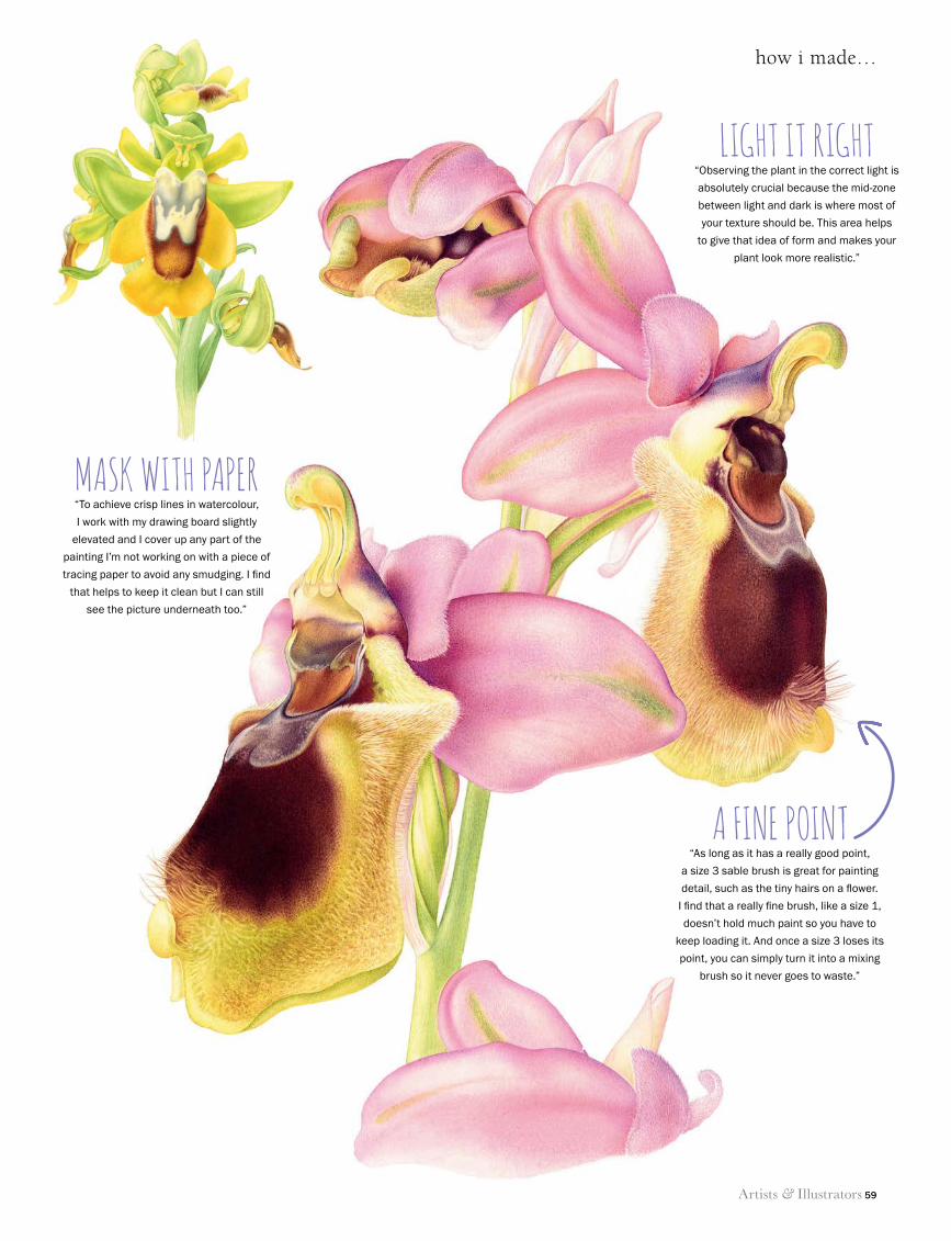
how i made…
Artists & Illustrators 59
A FINE POINT“As long as it has a really good point,
a size 3 sable brush is great for painting
detail, such as the tiny hairs on a fl ower.
I fi nd that a really fi ne brush, like a size 1,
doesn’t hold much paint so you have to
keep loading it. And once a size 3 loses its
point, you can simply turn it into a mixing
brush so it never goes to waste.”
LIGHT IT RIGHT“Observing the plant in the correct light is
absolutely crucial because the mid-zone
between light and dark is where most of
your texture should be. This area helps
to give that idea of form and makes your
plant look more realistic.”
MASK WITH PAPER“To achieve crisp lines in watercolour,
I work with my drawing board slightly
elevated and I cover up any part of the
painting I’m not working on with a piece of
tracing paper to avoid any smudging. I fi nd
that helps to keep it clean but I can still
see the picture underneath too.”
A FINE POINT
58/59 How I Made.indd 59 11/06/2014 12:12
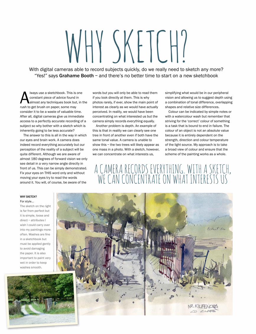
60 Artists & Illustrators
why sketch?
With digital cameras able to record subjects quickly, do we really need to sketch any more? “Yes!” says Grahame Booth – and there’s no better time to start on a new sketchbook
WHY SKETCH?Always use a sketchbook. This is one
constant piece of advice found in almost any techniques book but, in the
rush to get brush on paper, some may consider it to be a waste of valuable time. After all, digital cameras give us immediate access to a perfectly accurate recording of a subject so why bother with a sketch which is inherently going to be less accurate?
The answer to this is all in the way in which our eyes and brain work. A camera does indeed record everything accurately but our perception of the reality of a subject will be quite different. Although we are aware of almost 180 degrees of forward vision we only see detail in a very narrow angle directly in front of us. This can be simply demonstrated. Fix your eyes on THIS word only and without moving your eyes try to read the words around it. You will, of course, be aware of the
words but you will only be able to read them if you look directly at them. This is why photos rarely, if ever, show the main point of interest as clearly as we would have actually perceived. In reality, we would have been concentrating on what interested us but the camera simply records everything equally.
Another problem is depth. An example of this is that in reality we can clearly see one tree in front of another even if both have the same tonal value. A camera is unable to show this – the two trees will likely appear as one mass in a photo. With a sketch, however, we can concentrate on what interests us,
simplifying what would be in our peripheral vision and allowing us to suggest depth using a combination of tonal difference, overlapping shapes and relative size differences.
Colour can be indicated by simple notes or with a watercolour wash but remember that striving for the ‘correct’ colour of something is a task that is bound to end in failure. The colour of an object is not an absolute value because it is entirely dependent on the strength, direction and colour temperature of the light source. My approach is to take a broad view of colour and ensure that the scheme of the painting works as a whole.
A CAMERA RECORDS EVERYTHING. WITH A SKETCH, WE CAN CONCENTRATE ON WHAT INTERESTS US
60 Artists & Illustrators& Illustrators&
WHY SKETCH?
For style...
The sketch on the right
is far from perfect but
it is simple, loose and
direct – attributes I
wish I could carry over
into my paintings more
often. Washes are fi ne
in a sketchbook but
must be applied gently
to avoid damaging
the paper. It is also
important to paint very
wet in order to keep
washes smooth.
60 Grahame Booth.indd 60 11/06/2014 12:31
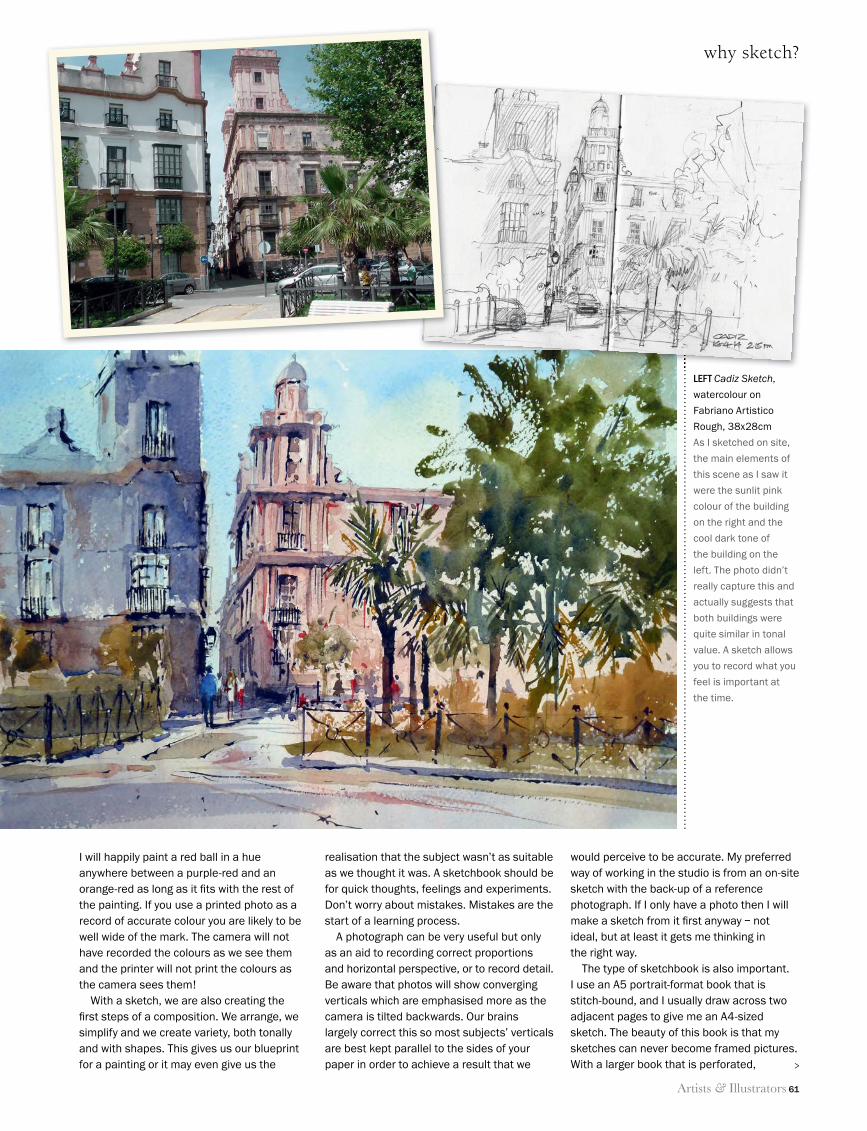
Artists & Illustrators 61
why sketch?
I will happily paint a red ball in a hue anywhere between a purple-red and an orange-red as long as it fi ts with the rest of the painting. If you use a printed photo as a record of accurate colour you are likely to be well wide of the mark. The camera will not have recorded the colours as we see them and the printer will not print the colours as the camera sees them!
With a sketch, we are also creating the fi rst steps of a composition. We arrange, we simplify and we create variety, both tonally and with shapes. This gives us our blueprint for a painting or it may even give us the
realisation that the subject wasn’t as suitable as we thought it was. A sketchbook should be for quick thoughts, feelings and experiments. Don’t worry about mistakes. Mistakes are the start of a learning process.
A photograph can be very useful but only as an aid to recording correct proportions and horizontal perspective, or to record detail. Be aware that photos will show converging verticals which are emphasised more as the camera is tilted backwards. Our brains largely correct this so most subjects’ verticals are best kept parallel to the sides of your paper in order to achieve a result that we
would perceive to be accurate. My preferred way of working in the studio is from an on-site sketch with the back-up of a reference photograph. If I only have a photo then I will make a sketch from it fi rst anyway – not ideal, but at least it gets me thinking in the right way.
The type of sketchbook is also important. I use an A5 portrait-format book that is stitch-bound, and I usually draw across two adjacent pages to give me an A4-sized sketch. The beauty of this book is that my sketches can never become framed pictures. With a larger book that is perforated,
LEFT Cadiz Sketch,
watercolour on
Fabriano Artistico
Rough, 38x28cm
As I sketched on site,
the main elements of
this scene as I saw it
were the sunlit pink
colour of the building
on the right and the
cool dark tone of
the building on the
left. The photo didn’t
really capture this and
actually suggests that
both buildings were
quite similar in tonal
value. A sketch allows
you to record what you
feel is important at
the time.
>
60 Grahame Booth.indd 61 11/06/2014 12:31
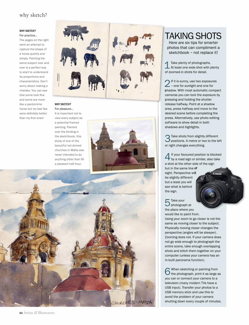
62 Artists & Illustrators
why sketch?
TAKING SHOTSHere are six tips for smarter
photos that can compliment a sketchbook – not replace it!
1 Take plenty of photographs. At least one wide shot with plenty
of zoomed-in shots for detail.
2 If it is sunny, use two exposures – one for sunlight and one for
shadow. With most automatic compact cameras you can lock the exposure by pressing and holding the shutter release halfway. Point at a shadow area, press halfway and move to the desired scene before completing the press. Alternatively, use photo-editing software to show detail in both shadows and highlights.
3 Take shots from slightly different positions. A metre or two to the left
or right changes everything.
4 If your favoured position is blocked by a road sign or similar, also take
a shot at the other side of the sign but in the same line of sight. Perspective will be slightly different but a least you will see what is behind the sign.
5 Take your photograph at
the place where you would like to paint from. Using your zoom to go closer is not the same as moving closer to the subject. Physically moving closer changes the perspective (angles will be steeper). Zooming does not. If your camera does not go wide enough to photograph the entire scene, take enough overlapping shots and stitch them together on your computer (unless your camera has an in-built panorama function).
6 When sketching or painting from the photograph, print it as large as
you can or connect your camera to a television (many modern TVs have a USB input). Transfer your photos to a USB memory stick and use this to avoid the problem of your camera shutting down every couple of minutes.
but in the same line of sight. Perspective will
TAKING SHOTS
1of zoomed-in shots for detail.
2shadow. With most automatic compact cameras you can lock the exposure by pressing and holding the shutter release halfway. Point at a shadow
WHY SKETCH?
For practice...
The pages on the right
were an attempt to
capture the shape of
a horse quickly and
simply. Painting the
same subject over and
over is a perfect way
to start to understand
its proportions and
characteristics. Don’t
worry about making a
mistake. You can see
that some look fi ne
and some are more
like a pantomime
horse but my last few
were defi nitely better
than my fi rst ones!
WHY SKETCH?
For pleasure...
It is important not to
view every subject as
a potential framed
painting. Painted
over the binding in
the sketchbook, this
study of one of the
beautiful red domed
churches in Malta was
never intended to do
anything other than fi ll
a pleasant half hour.
60 Grahame Booth.indd 62 11/06/2014 12:32
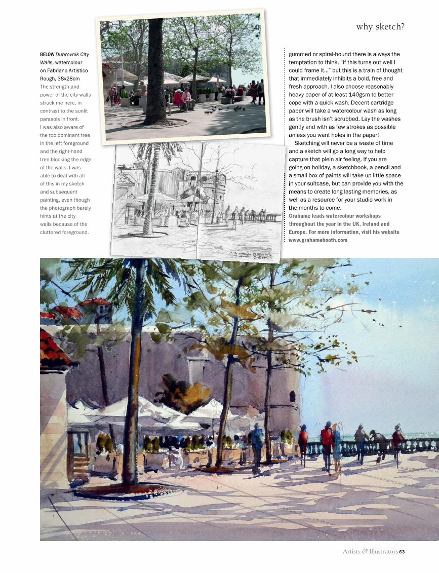
Artists & Illustrators 63
why sketch?
BELOW Dubrovnik City
Walls, watercolour
on Fabriano Artistico
Rough, 38x28cm
The strength and
power of the city walls
struck me here, in
contrast to the sunlit
parasols in front.
I was also aware of
the too dominant tree
in the left foreground
and the right-hand
tree blocking the edge
of the walls. I was
able to deal with all
of this in my sketch
and subsequent
painting, even though
the photograph barely
hints at the city
walls because of the
cluttered foreground.
gummed or spiral-bound there is always the temptation to think, “if this turns out well I could frame it…” but this is a train of thought that immediately inhibits a bold, free and fresh approach. I also choose reasonably heavy paper of at least 140gsm to better cope with a quick wash. Decent cartridge paper will take a watercolour wash as long as the brush isn’t scrubbed. Lay the washes gently and with as few strokes as possible unless you want holes in the paper!
Sketching will never be a waste of time and a sketch will go a long way to help capture that plein air feeling. If you are going on holiday, a sketchbook, a pencil and a small box of paints will take up little space in your suitcase, but can provide you with the means to create long lasting memories, as well as a resource for your studio work in the months to come.Grahame leads watercolour workshops throughout the year in the UK, Ireland and Europe. For more information, visit his website www.grahamebooth.com
unless you want holes in the paper!
and a sketch will go a long way to help capture that plein air feeling. If you are going on holiday, a sketchbook, a pencil and a small box of paints will take up little space in your suitcase, but can provide you with the means to create long lasting memories, as well as a resource for your studio work in the months to come.Grahame leads watercolour workshops throughout the year in the UK, Ireland and Europe. For more information, visit his website www.grahamebooth.com
60 Grahame Booth.indd 63 11/06/2014 12:31
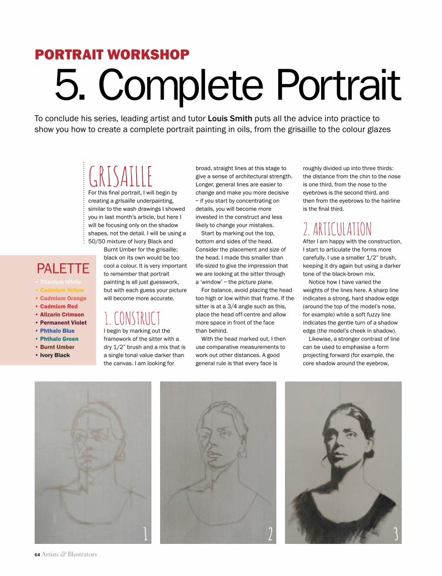
64 Artists & Illustrators
portrait workshop
Palette• Titanium White• Cadmium Yellow• Cadmium Orange• Cadmium Red • Alizarin Crimson• Permanent Violet• Phthalo Blue• Phthalo Green• Burnt Umber• Ivory Black
roughly divided up into three thirds: the distance from the chin to the nose is one third, from the nose to the eyebrows is the second third, and then from the eyebrows to the hairline is the final third.
2. ArticulAtionafter I am happy with the construction, I start to articulate the forms more carefully. I use a smaller 1/2” brush, keeping it dry again but using a darker tone of the black-brown mix.
Notice how I have varied the weights of the lines here. a sharp line indicates a strong, hard shadow edge (around the top of the model’s nose, for example) while a soft fuzzy line indicates the gentle turn of a shadow edge (the model’s cheek in shadow).
likewise, a stronger contrast of line can be used to emphasise a form projecting forward (for example, the core shadow around the eyebrow,
broad, straight lines at this stage to give a sense of architectural strength. longer, general lines are easier to change and make you more decisive – if you start by concentrating on details, you will become more invested in the construct and less likely to change your mistakes.
Start by marking out the top, bottom and sides of the head. Consider the placement and size of the head. I made this smaller than life-sized to give the impression that we are looking at the sitter through a ‘window’ – the picture plane.
For balance, avoid placing the head too high or low within that frame. If the sitter is at a 3/4 angle such as this, place the head off-centre and allow more space in front of the face than behind.
With the head marked out, I then use comparative measurements to work out other distances. a good general rule is that every face is
GriSAillEFor this final portrait, I will begin by creating a grisaille underpainting, similar to the wash drawings I showed you in last month’s article, but here I will be focusing only on the shadow shapes, not the detail. I will be using a 50/50 mixture of Ivory Black and
Burnt Umber for the grisaille; black on its own would be too cool a colour. It is very important to remember that portrait painting is all just guesswork, but with each guess your picture will become more accurate.
1. conStructI begin by marking out the framework of the sitter with a dry 1/2” brush and a mix that is a single tonal value darker than the canvas. I am looking for
to conclude his series, leading artist and tutor Louis Smith puts all the advice into practice to show you how to create a complete portrait painting in oils, from the grisaille to the colour glazes
Portrait WorkshoP
5. Complete Portrait
1 2 3
64 Louis Smith 5.indd 64 11/06/2014 12:52
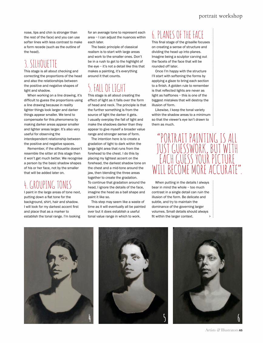
portrait workshop
Artists & Illustrators 65
nose, lips and chin is stronger than the rest of the face) and you can use softer lines with less contrast to make a form recede (such as the outline of the head).
3. SilhouetteThis stage is all about checking and correcting the proportions of the head and also the relationships between the positive and negative shapes of light and shadow.
When working on a line drawing, it’s difficult to guess the proportions using a line drawing because in reality lighter things look larger and darker things appear smaller. We tend to compensate for this phenomena by making darker areas appear smaller and lighter areas larger. It’s also very useful for observing the interdependent relationship between the positive and negative spaces.
Remember, if the silhouette doesn’t resemble the sitter at this stage then it won’t get much better. We recognise a person by the basic shadow shapes of his or her face, not by the smaller that will be added later on.
4. GroupinG toneSI paint in the large areas of tone next, putting down a flat tone for the background, shirt, hair and shadow. I will look for my darkest accent first and place that as a marker to establish the tonal range. I’m looking
for an average tone to represent each area – I can adjust the nuances within each later.
The basic principle of classical realism is to start with large areas and work to the smaller ones. Don’t be in a rush to get to the highlight of the eye – it’s not a detail like this that makes a painting, it’s everything around it that counts.
5. Fall oF liGhtThis stage is all about creating the effect of light as it falls over the form of head and neck. The principle is that the further something is from the source of light the darker it gets. I usually overplay the fall of light and make the shadows darker than they appear to give myself a broader value range and stronger sense of form.
The intention here is to create a gradation of light to dark within the large light area that runs from the forehead to the chest. I do this by placing my lightest accent on the forehead, the darkest shadow tone on the chest and a mid-tone around the jaw, then blending the three areas together to create the gradation. To continue that gradation around the head, I ignore the details of the face, imagine the head as a ball shape and paint it like so.
This step may seem like a waste of time as it will eventually all be painted over but it does establish a useful tonal value range in which to work.
6. planeS oF the FaceThis final stage of the grisaille focuses on creating a sense of structure and dividing the head up into planes. Imagine being a sculptor carving out the facets of the face that will be rounded off later.
Once I’m happy with the structure I’ll start with softening the forms by applying a glaze to bring each section to a finish. A golden rule to remember is that reflected lights are never as light as halftones – this is one of the biggest mistakes that will destroy the illusion of form.
Likewise, I keep the tonal variety within the shadow areas to a minimum so that the viewer’s eye isn’t drawn to them as much.
When putting in the details I always bear in mind the whole – too much contrast in a single detail can ruin the illusion of the form. Be delicate and subtle, and try to maintain the dominance of the governing larger volumes. Small details should always fit within the larger context.
“portrait paintinG iS all juSt GueSSwork, but with each GueSS your picture
will become more accurate”.
>
4 5 6
64 Louis Smith 5.indd 65 11/06/2014 12:52
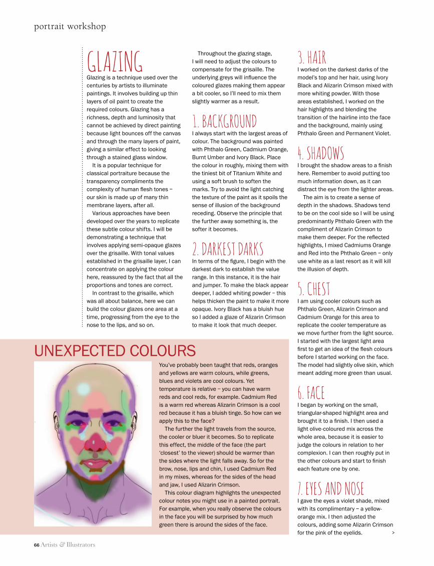
66 Artists & Illustrators
portrait workshop
You’ve probably been taught that reds, oranges and yellows are warm colours, while greens, blues and violets are cool colours. Yet temperature is relative – you can have warm reds and cool reds, for example. Cadmium Red is a warm red whereas Alizarin Crimson is a cool red because it has a bluish tinge. So how can we apply this to the face?
The further the light travels from the source, the cooler or bluer it becomes. So to replicate this effect, the middle of the face (the part ‘closest’ to the viewer) should be warmer than the sides where the light falls away. So for the brow, nose, lips and chin, I used Cadmium Red in my mixes, whereas for the sides of the head and jaw, I used Alizarin Crimson.
This colour diagram highlights the unexpected colour notes you might use in a painted portrait. For example, when you really observe the colours in the face you will be surprised by how much green there is around the sides of the face.
GLAZINGGlazing is a technique used over the centuries by artists to illuminate paintings. It involves building up thin layers of oil paint to create the required colours. Glazing has a richness, depth and luminosity that cannot be achieved by direct painting because light bounces off the canvas and through the many layers of paint, giving a similar effect to looking through a stained glass window.
It is a popular technique for classical portraiture because the transparency compliments the complexity of human flesh tones – our skin is made up of many thin membrane layers, after all.
Various approaches have been developed over the years to replicate these subtle colour shifts. I will be demonstrating a technique that involves applying semi-opaque glazes over the grisaille. With tonal values established in the grisaille layer, I can concentrate on applying the colour here, reassured by the fact that all the proportions and tones are correct.
In contrast to the grisaille, which was all about balance, here we can build the colour glazes one area at a time, progressing from the eye to the nose to the lips, and so on.
Throughout the glazing stage, I will need to adjust the colours to compensate for the grisaille. The underlying greys will influence the coloured glazes making them appear a bit cooler, so I’ll need to mix them slightly warmer as a result.
1. BAckGrouNd I always start with the largest areas of colour. The background was painted with Phthalo Green, Cadmium Orange, Burnt Umber and Ivory Black. Place the colour in roughly, mixing them with the tiniest bit of Titanium White and using a soft brush to soften the marks. Try to avoid the light catching the texture of the paint as it spoils the sense of illusion of the background receding. Observe the principle that the further away something is, the softer it becomes.
2. dArkest dArksIn terms of the figure, I begin with the darkest dark to establish the value range. In this instance, it is the hair and jumper. To make the black appear deeper, I added whiting powder – this helps thicken the paint to make it more opaque. Ivory Black has a bluish hue so I added a glaze of Alizarin Crimson to make it look that much deeper.
3. HAIrI worked on the darkest darks of the model’s top and her hair, using Ivory Black and Alizarin Crimson mixed with more whiting powder. With those areas established, I worked on the hair highlights and blending the transition of the hairline into the face and the background, mainly using Phthalo Green and Permanent Violet.
4. sHAdowsI brought the shadow areas to a finish here. Remember to avoid putting too much information down, as it can distract the eye from the lighter areas.
The aim is to create a sense of depth in the shadows. Shadows tend to be on the cool side so I will be using predominantly Phthalo Green with the compliment of Alizarin Crimson to make them deeper. For the reflected highlights, I mixed Cadmiums Orange and Red into the Phthalo Green – only use white as a last resort as it will kill the illusion of depth.
5. cHestI am using cooler colours such as Phthalo Green, Alizarin Crimson and Cadmium Orange for this area to replicate the cooler temperature as we move further from the light source. I started with the largest light area first to get an idea of the flesh colours before I started working on the face. The model had slightly olive skin, which meant adding more green than usual.
6. FAce I began by working on the small, triangular-shaped highlight area and brought it to a finish. I then used a light olive-coloured mix across the whole area, because it is easier to judge the colours in relation to her complexion. I can then roughly put in the other colours and start to finish each feature one by one.
7. eyes ANd NoseI gave the eyes a violet shade, mixed with its complimentary – a yellow-orange mix. I then adjusted the colours, adding some Alizarin Crimson for the pink of the eyelids.
UnexPeCTed COlOURS
>
64 Louis Smith 5.indd 66 11/06/2014 12:52
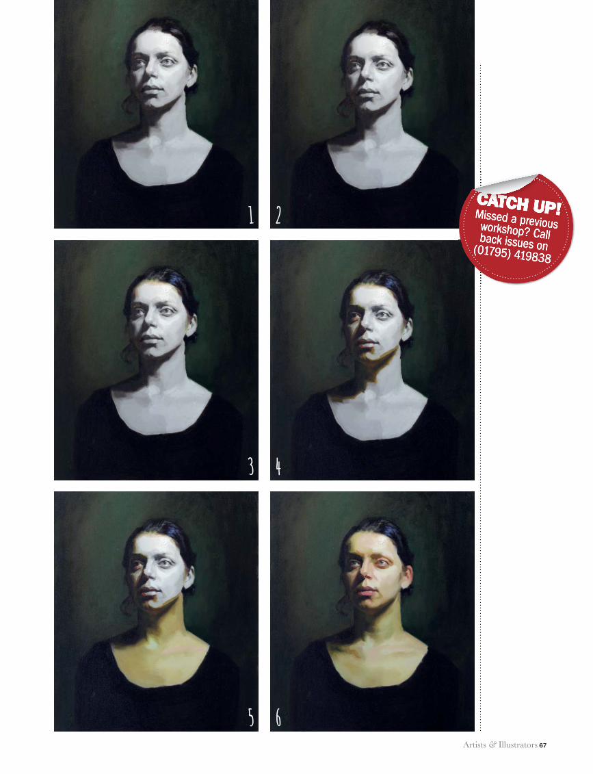
portrait workshop
Artists & Illustrators 67
CATCH UP!Missed a previous workshop? Call back issues on (01795) 419838
CATCH UP!Missed a previous workshop? Call back issues on (01795) 419838
CATCH UP!1 2
3 4
5 6
64 Louis Smith 5.indd 67 11/06/2014 12:53
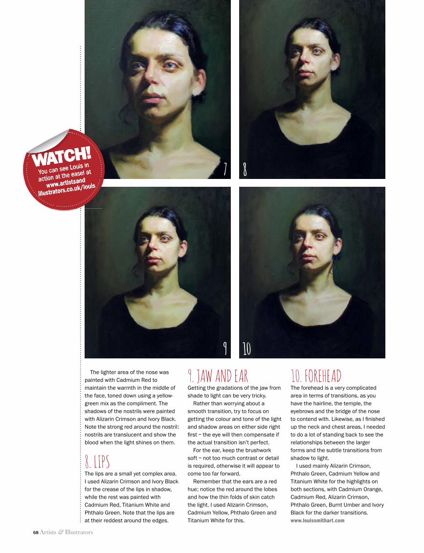
68 Artists & Illustrators
portrait workshop
The lighter area of the nose was painted with Cadmium Red to maintain the warmth in the middle of the face, toned down using a yellow-green mix as the compliment. The shadows of the nostrils were painted with Alizarin Crimson and Ivory Black. Note the strong red around the nostril: nostrils are translucent and show the blood when the light shines on them.
8. LIPSThe lips are a small yet complex area. I used Alizarin Crimson and Ivory Black for the crease of the lips in shadow, while the rest was painted with Cadmium Red, Titanium White and Phthalo Green. Note that the lips are at their reddest around the edges.
9. JAW AND EARGetting the gradations of the jaw from shade to light can be very tricky.
Rather than worrying about a smooth transition, try to focus on getting the colour and tone of the light and shadow areas on either side right fi rst – the eye will then compensate if the actual transition isn’t perfect.
For the ear, keep the brushwork soft – not too much contrast or detail is required, otherwise it will appear to come too far forward.
Remember that the ears are a red hue; notice the red around the lobes and how the thin folds of skin catch the light. I used Alizarin Crimson, Cadmium Yellow, Phthalo Green and Titanium White for this.
10. FOREHEADThe forehead is a very complicated area in terms of transitions, as you have the hairline, the temple, the eyebrows and the bridge of the nose to contend with. Likewise, as I fi nished up the neck and chest areas, I needed to do a lot of standing back to see the relationships between the larger forms and the subtle transitions from shadow to light.
I used mainly Alizarin Crimson, Phthalo Green, Cadmium Yellow and Titanium White for the highlights on both sections, with Cadmium Orange, Cadmium Red, Alizarin Crimson, Phthalo Green, Burnt Umber and Ivory Black for the darker transitions.www.louissmithart.com
WATCH!You can see Louis in
action at the easel at
www.artistsand
illustrators.co.uk/louis
WATCH!You can see Louis in
action at the easel at
www.artistsand
illustrators.co.uk/louis
WATCH!7 8
9 10
64 Louis Smith 5.indd 68 11/06/2014 12:53
Artists & Illustrators 69
www.artsupplies.co.uk
Unit 13 Lodge Bank Estate, Crown Lane, Horwich, Bolton BL6 5HYTel: 01204 690 114 / 08453 30 32 34 Email: [email protected]
Great discounts.......unbeatable service
FREESHIPPING
on orders over £40 to UK Mainland*
@KenBromleyArt facebook.com/KenBromleyArt
Check out our website for great special offers
www.artsupplies.co.ukwww.artsupplies.co.uk
Cover Competition
2014Enter Now
We are giving away £250 worth of Winsor & Newton Art Materials plus the chance to have your painting
on the cover of our next catalogue!Deadline for entries 9th July 2014
www.artsupplies.co.uk/covercomp
...unbeatable service
Check out our website for great special offers
2013
win
ning
ent
ry b
y Sa
m D
olm
an
ai-advert-may-14.indd 1 04/06/2014 14:52:19
FULL & PART-TIMECOURSES INFIGURATIVE ART
HEATHER LEY’S
THE HEATHERLEY SCHOOL OF FINE ART, 75 LOTS ROAD, CHELSEA, LONDON, SW10 0RN
www.heatherleys.org
HEATHERLEY’S
•Drawing/Life Drawing• Portraiture• Oil Painting•Watercolour
• Printmaking
• Sculpture• Open Studio
• Summer CoursesFORAMATEURS AND PROFESSIONAL ARTISTS
Alchemist ® Mediums
“Baroque Floral” by Richard Peterson
“The Cockthief” by David Bowers executed with Alchemist Mediums
Proud of our products... ...prouder of their results.
“Baroque Floral” by Richard Peterson executed with our Amber Varnish “The Cockthief” by David Bowers “Baroque Floral” by Richard Peterson executed with our Amber Varnish“Baroque Floral” by Richard Peterson executed with our Amber Varnish“Baroque Floral” by Richard Peterson executed with our Amber Varnish “The Cockthief” by David Bowers “The Cockthief” by David Bowers “The Cockthief” by David Bowers “The Cockthief” by David Bowers
the Netherlandstel. +31 (0)43 311 2153www.alchemistmediums.com
Makers of Historical and Traditional Amber
Resin and Natural Resin-Based Varnishes and Painting Mediums
tel. +33 (0)549 167265 France
69_A&I_SUM14_.indd 69 10/06/2014 14:34
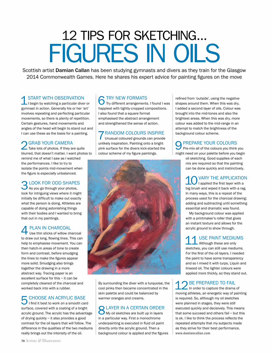
70 Artists & Illustrators
figures in oils
1 start with observationi begin by watching a particular diver or
gymnast in action. generally his or her ‘art’ involves repeating and perfecting particular movements, so there is plenty of repetition. Certain gestures, hand movements and angles of the head will begin to stand out and i can use these as the basis for a painting.
2 grab your Cameratake lots of photos. if they are quite
blurred, that doesn’t matter. i want photos to remind me of what i saw as i watched the performances. i like to try to isolate the points mid-movement when the figure is especially unbalanced.
3 look for odd shapesas you go through your photos,
look for intriguing views where it might initially be difficult to make out exactly what the person is doing. athletes are capable of doing astonishing things with their bodies and i wanted to bring that out in my paintings.
4 plan in CharCoal use thin sticks of willow charcoal
to draw out long, flowing lines. this can help to emphasise movement. you can then hatch-in areas of tone to create form and contrast, before smudging the lines to make the figures appear more solid. smudging also brings together the drawing in a more abstract way. tracing paper is an excellent surface for this – it can be completely cleaned of the charcoal and worked back into with a rubber.
5 Choose an aCryliC basei find it best to work on a smooth card
surface, covered with a coating of a bright acrylic ground. the acrylic has the advantage of drying quickly – it also provides a good contrast for the oil layers that will follow. the difference in the qualities of the two mediums really brings out the intensity of the oil.
refined from ‘outside’, using the negative shapes around them. when this was dry, i added a second layer of oils. Colour was brought into the mid-tones and also the brightest areas. when this was dry, more colour was added to the mid-range in an attempt to match the brightness of the background colour scheme.
9 prepare your Colourspre-mix all of the colours you think you
might need on your palette before you begin oil sketching. good supplies of each mix are required so that the painting can be done quickly and instinctively.
10 vary the appliCationi applied the first layer with a
big brush and wiped it back with a rag. in many ways, this is a repeat of the process used for the charcoal drawing: adding and subtracting until something essential and dramatic was found.
my background colour was applied with a printmaker’s roller that gives an instant texture and allows for the acrylic ground to show through.
11 use paint mediumsalthough these are only
sketches, you can still use mediums. for the first of the oil layers, i needed the paint to have some transparency and so i mixed it with turps, liquin and linseed oil. the lighter colours were applied more thickly, so they stand out.
12 be prepared to fail in order to capture the drama of
moving athletes, an energetic way of painting is required. so, although my oil sketches were planned in stages, they were still executed quickly and decisively. this means that some succeed and others fail – but this is ok. i like to think the process reflects the repeated attempts that my subjects made as they strive for their best performance.www.damiancallan.com
12 tips for sketChing…
scottish artist Damian Callan has been studying gymnasts and divers as they train for the glasgow 2014 Commonwealth games. here he shares his expert advice for painting figures on the move
6 try new formatstry different arrangements. i found i was
happiest with tightly-cropped compositions. i also found that a square format emphasised the abstract arrangement and strengthened the sense of action.
7 random Colours inspireunusual coloured grounds can provide
unlikely inspiration. painting onto a bright pink surface for the divers kick-started the colour scheme of my figure paintings.
by surrounding the diver with a turquoise, the cool pinks then became concentrated in the skin palette and could be balanced by warmer oranges and creams.
8 layer in a Certain ordermy oil sketches are built up in layers
in a particular way. first a monochrome underpainting is executed in fluid oil paint directly onto the acrylic ground. then a background colour is applied and the figures
70 Figure sketching tips.indd 70 11/06/2014 12:56
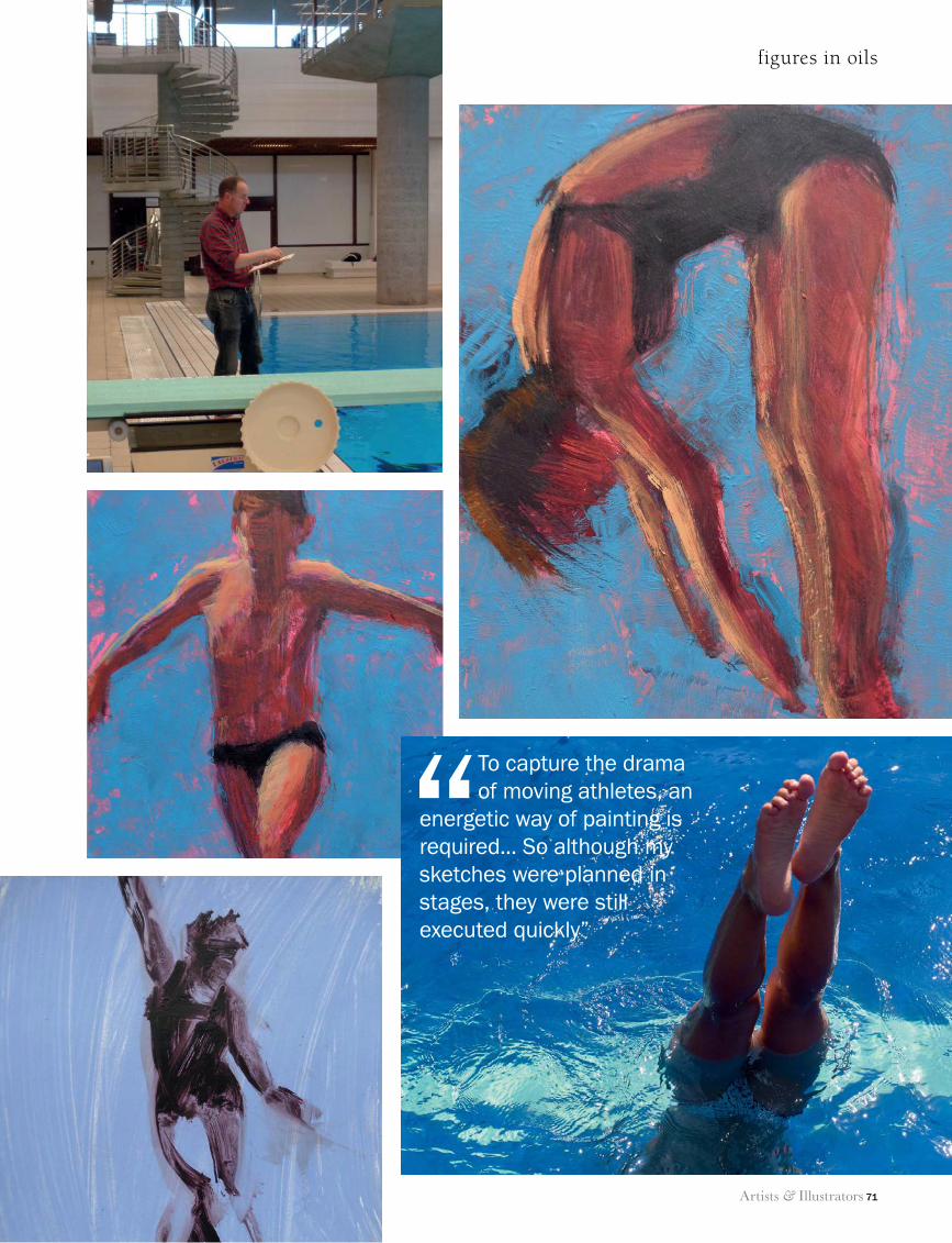
Artists & Illustrators 71
figures in oils
“To capture the drama of moving athletes, an
energetic way of painting is required... So although my sketches were planned in stages, they were still executed quickly”
70 Figure sketching tips.indd 71 11/06/2014 12:57
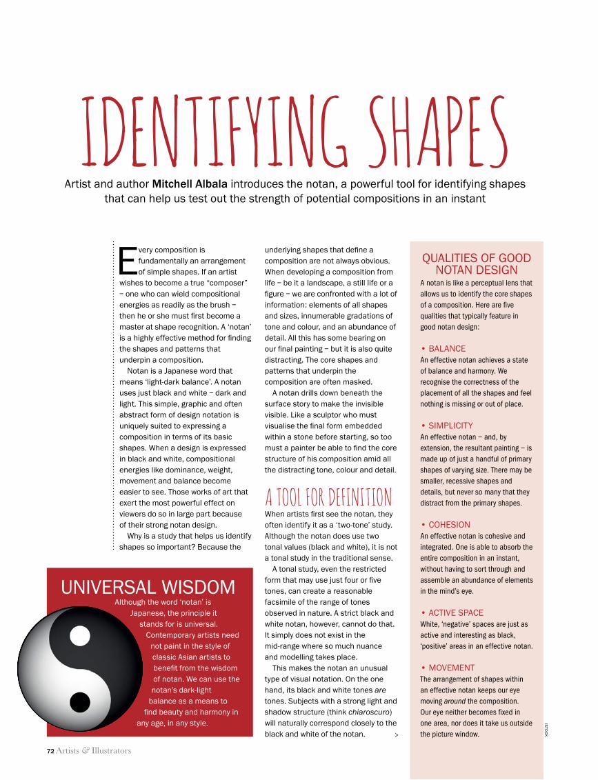
72 Artists & Illustrators
identifying shapes
Artist and author Mitchell Albala introduces the notan, a powerful tool for identifying shapes that can help us test out the strength of potential compositions in an instant
identifying shapesEvery composition is
fundamentally an arrangement of simple shapes. If an artist
wishes to become a true “composer” – one who can wield compositional energies as readily as the brush – then he or she must first become a master at shape recognition. A ‘notan’ is a highly effective method for finding the shapes and patterns that underpin a composition.
Notan is a Japanese word that means ‘light-dark balance’. A notan uses just black and white – dark and light. This simple, graphic and often abstract form of design notation is uniquely suited to expressing a composition in terms of its basic shapes. When a design is expressed in black and white, compositional energies like dominance, weight, movement and balance become easier to see. Those works of art that exert the most powerful effect on viewers do so in large part because of their strong notan design.
Why is a study that helps us identify shapes so important? Because the
underlying shapes that define a composition are not always obvious. When developing a composition from life – be it a landscape, a still life or a figure – we are confronted with a lot of information: elements of all shapes and sizes, innumerable gradations of tone and colour, and an abundance of detail. All this has some bearing on our final painting – but it is also quite distracting. The core shapes and patterns that underpin the composition are often masked.
A notan drills down beneath the surface story to make the invisible visible. Like a sculptor who must visualise the final form embedded within a stone before starting, so too must a painter be able to find the core structure of his composition amid all the distracting tone, colour and detail.
a tool for definitionWhen artists first see the notan, they often identify it as a ‘two-tone’ study. Although the notan does use two tonal values (black and white), it is not a tonal study in the traditional sense.
A tonal study, even the restricted form that may use just four or five tones, can create a reasonable facsimile of the range of tones observed in nature. A strict black and white notan, however, cannot do that. It simply does not exist in the mid-range where so much nuance and modelling takes place.
This makes the notan an unusual type of visual notation. On the one hand, its black and white tones are tones. Subjects with a strong light and shadow structure (think chiaroscuro) will naturally correspond closely to the black and white of the notan.
uNIvErSAL WISdOmAlthough the word ‘notan’ is
Japanese, the principle it stands for is universal.
Contemporary artists need not paint in the style of classic Asian artists to benefit from the wisdom of notan. We can use the notan’s dark-light
balance as a means to find beauty and harmony in
any age, in any style.
QuALITIES Of gOOd NOTAN dESIgN
A notan is like a perceptual lens that allows us to identify the core shapes of a composition. Here are five qualities that typically feature in good notan design:
• BalanceAn effective notan achieves a state of balance and harmony. We recognise the correctness of the placement of all the shapes and feel nothing is missing or out of place.
• SimplicityAn effective notan – and, by extension, the resultant painting – is made up of just a handful of primary shapes of varying size. There may be smaller, recessive shapes and details, but never so many that they distract from the primary shapes.
• coheSionAn effective notan is cohesive and integrated. One is able to absorb the entire composition in an instant, without having to sort through and assemble an abundance of elements in the mind’s eye.
• active SpaceWhite, ‘negative’ spaces are just as active and interesting as black, ‘positive’ areas in an effective notan.
• movementThe arrangement of shapes within an effective notan keeps our eye moving around the composition. Our eye neither becomes fixed in one area, nor does it take us outside the picture window.
ISTO
Ck>
72 Mitchell Albala Notan.indd 72 11/06/2014 16:14
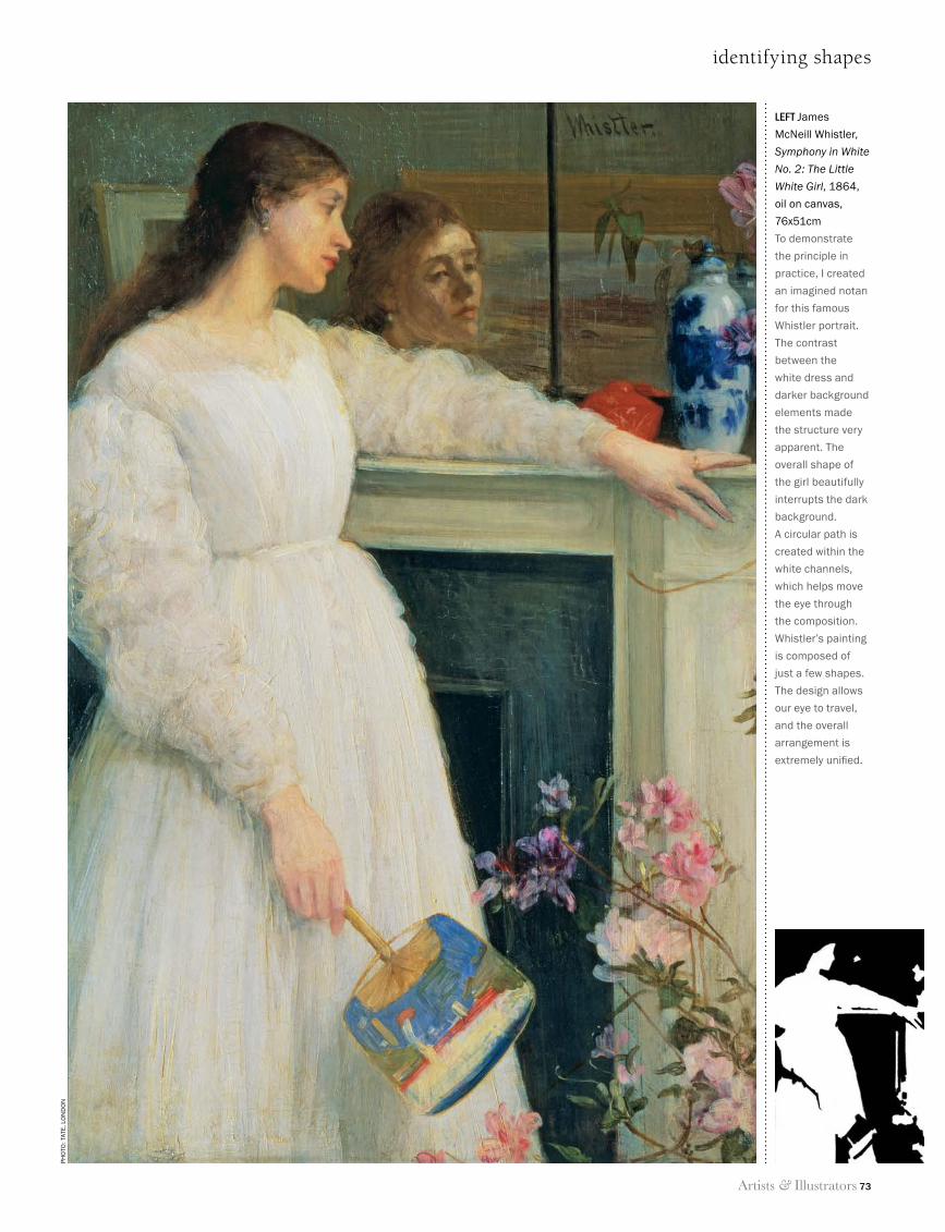
Artists & Illustrators 73
identifying shapes
left James
McNeill Whistler,
Symphony in White
No. 2: The Little
White Girl, 1864,
oil on canvas,
76x51cm
To demonstrate
the principle in
practice, I created
an imagined notan
for this famous
Whistler portrait.
The contrast
between the
white dress and
darker background
elements made
the structure very
apparent. The
overall shape of
the girl beautifully
interrupts the dark
background.
A circular path is
created within the
white channels,
which helps move
the eye through
the composition.
Whistler’s painting
is composed of
just a few shapes.
The design allows
our eye to travel,
and the overall
arrangement is
extremely unified.
ph
oTo
: TAT
e, l
oN
do
N
72 Mitchell Albala Notan.indd 73 11/06/2014 15:57
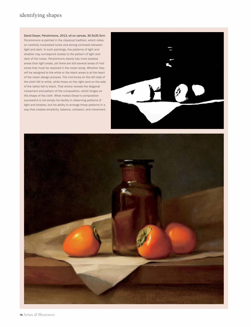
74 Artists & Illustrators
identifying shapes
David Dwyer, Persimmons, 2013, oil on canvas, 30.5x35.5cm
Persimmons is painted in the classical tradition, which relies
on carefully modulated tones and strong contrasts between
light and dark. In such paintings, the patterns of light and
shadow may correspond closely to the pattern of light and
dark of the notan. Persimmons clearly has more shadow
areas than light areas, yet there are still several areas of mid-
tones that must be resolved in the notan study. Whether they
will be assigned to the white or the black areas is at the heart
of the notan design process. The mid-tones on the left side of
the cloth fall to white, while those on the right (and on the side
of the table) fall to black. That choice reveals the diagonal
movement and pattern of the composition, which hinges on
the shape of the cloth. What makes Dwyer’s composition
successful is not simply his facility in observing patterns of
light and shadow, but his ability to arrange those patterns in a
way that creates simplicity, balance, cohesion, and movement.
72 Mitchell Albala Notan.indd 74 11/06/2014 15:57
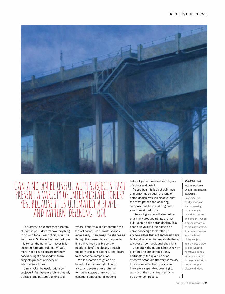
Artists & Illustrators 75
identifying shapes
above Mitchell
Albala, Ballard’s
End, oil on canvas,
61x76cm
Ballard’s End
hardly needs an
accompanying
notan study to
reveal its pattern
and design – when
a notan design is
particularly strong,
it becomes woven
into the fabric
of the subject
itself. Here, a play
of positive and
negative shapes
forms a dynamic
arrangement within
the rectangular
picture window.
Therefore, to suggest that a notan, at least in part, doesn’t have anything to do with tonal description, would be inaccurate. On the other hand, without mid-tones, the notan can never fully describe form and volume. What’s more, not all subjects are strongly based on light and shadow. Many subjects present a variety of intermediate tones.
Can a notan be useful with such subjects? Yes, because it is ultimately a shape- and pattern-defining tool.
When I observe subjects through the lens of notan, I can isolate shapes more easily. I can grasp the shapes as though they were pieces of a puzzle. If I squint, I can easily see the relationship of the pieces, through the dark and light balance, and begin to assess the composition.
While a notan design can be beautiful in its own right, I call it a ‘study’ because I use it in the formative stages of my work to consider compositional options
before I get too involved with layers of colour and detail.
As you begin to look at paintings and drawings through the lens of notan design, you will discover that the most potent and enduring compositions have a strong notan structure at their core.
Interestingly, you will also notice that many great paintings are not built upon a solid notan design. This doesn’t invalidate the notan as a universal design tool; rather, it acknowledges that art and design are far too diversified for any single theory to cover all compositional situations.
Ultimately, the notan is just one way of improving our compositions. Fortunately, the qualities of an effective notan are the very same as those of an effective composition. They are inseparable. Learning to work with the notan teaches us to be better composers.
can a notan be useful with subjects that present a variety of intermediate tones?
yes, because it is ultimately a shape- and pattern-defining tool
>
72 Mitchell Albala Notan.indd 75 11/06/2014 15:57
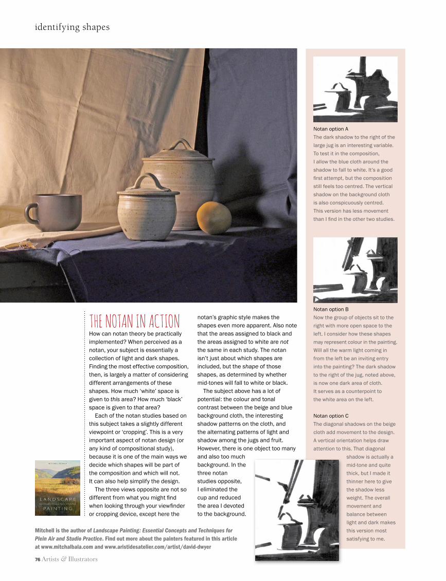
76 Artists & Illustrators
identifying shapes
Mitchell is the author of Landscape Painting: Essential Concepts and Techniques for Plein Air and Studio Practice. Find out more about the painters featured in this article at www.mitchalbala.com and www.aristidesatelier.com/artist/david-dwyer
Notan option A
The dark shadow to the right of the
large jug is an interesting variable.
To test it in the composition,
I allow the blue cloth around the
shadow to fall to white. It’s a good
fi rst attempt, but the composition
still feels too centred. The vertical
shadow on the background cloth
is also conspicuously centred.
This version has less movement
than I fi nd in the other two studies.
Notan option B
Now the group of objects sit to the
right with more open space to the
left. I consider how these shapes
may represent colour in the painting.
Will all the warm light coming in
from the left be an inviting entry
into the painting? The dark shadow
to the right of the jug, noted above,
is now one dark area of cloth.
It serves as a counterpoint to
the white area on the left.
Notan option C
The diagonal shadows on the beige
cloth add movement to the design.
A vertical orientation helps draw
attention to this. That diagonal
shadow is actually a
mid-tone and quite
thick, but I made it
thinner here to give
the shadow less
weight. The overall
movement and
balance between
light and dark makes
this version most
satisfying to me.
THE NOTAN IN ACTIONHow can notan theory be practically implemented? When perceived as a notan, your subject is essentially a collection of light and dark shapes. Finding the most effective composition, then, is largely a matter of considering different arrangements of these shapes. How much ‘white’ space is given to this area? How much ‘black’ space is given to that area?
Each of the notan studies based on this subject takes a slightly different viewpoint or ‘cropping’. This is a very important aspect of notan design (or any kind of compositional study), because it is one of the main ways we decide which shapes will be part of the composition and which will not. It can also help simplify the design.
The three views opposite are not so different from what you might fi nd when looking through your viewfi nder or cropping device, except here the
notan’s graphic style makes the shapes even more apparent. Also note that the areas assigned to black and the areas assigned to white are not the same in each study. The notan isn’t just about which shapes are included, but the shape of those shapes, as determined by whether mid-tones will fall to white or black.
The subject above has a lot of potential: the colour and tonal contrast between the beige and blue background cloth, the interesting shadow patterns on the cloth, and the alternating patterns of light and shadow among the jugs and fruit. However, there is one object too many and also too much background. In the three notan studies opposite, I eliminated the cup and reduced the area I devoted to the background.
72 Mitchell Albala Notan.indd 76 11/06/2014 15:58
Artists & Illustrators 77
Strathmore Competition Quarter Page 2014.pdf 1 6/4/2014 1:19:04 PM
SAA
...tr
uste
d fo
r va
lue
Plea
se q
uote
: AI1
4SUSmall water pot
holder on table
• Comfortable director-style chair supports whilst painting
• Folds Flat
• Availablewith left orright hand table
Handy side pockets tokeep all your materialsat arm's reach
Get out and aboutthis summer…
with the SAA LightweightArtists’ Chair
All materials availableseparately fromwww.saa.co.uk
FROM ONLY
£30.79(SAA members price,
RRP £38.50)
AI14SU SAA Artist Chair 99x129.qxd:_ 3/6/14 16:54 Page 1
Painting Holidays in Cornwallwith Paul Nicholls
The Rose in Vale Country House Hotel, nestling in a beautiful wooded Cornish Valley, provides the perfect venue for your week of painting. Enjoy personalised tutorials in the Spinney by Paul Nicholls and then
experience a variety of locations, including a day to Falmouth Art Gallery, for immediate inspiration. Visit the nearby Cornish seascapes and
landscapes whilst learning new techniques and experimenting with different media. Follow this up with after dinner conversation in the Valley
Restaurant overlooking the enchanting gardens.The next course starts Sunday 28th September 2014 with a maximum of 10 students per week. Prices start at £110 per person and include
half board and all tutorials by Paul Nicholls.For further information please contact the hotel
01872 552202 or email [email protected]
Your own private space to relax, create or work in all year round. We offer the perfect solution – without the need to extend your property.
T: 0800 160 1888 e:[email protected]
REV12026MPITG Advert 99x126.indd 1 10/05/2013 15:51
77_A&I_SUM14_.indd 77 11/06/2014 09:30
THE CLASSIFIED DIRECTORY
To advertise here please call 020 7349 3738
ARTISTS MATERIALS
ARTISTS SERVICES
ART FOR SALE
COURSES
CORRESPONDENCE COURSES
�e Finest Quality Handmade Artists’ Brushes
£38.
50
£7.5
0
£4.1
0
£11.
45
£19.
50
RANDOLPH KELLMAN. Contemporary artist. Visit my online gallery at www.rakeart.co.uk . All enquiries and commissions welcome. Telephone 020 8889 4714. Mobile 07979842456
ArtisticFlare
Affordable art for the home and office
Tel: 020 7736 7921Mobile: 07854 734 290
Website: www.jacquelinemidgen.wordpress.com Email: [email protected] Visits to studio by appointment only
PAINTING MASTERCLASSESWWW.TNSOART.COM
TIM BENSON26th & 27th JulySussex
ANDREW JAMES9th & 10th August
Sussex
Artist & IllustratorArtist & Illustrator
www.mikeskidmoreonline.comT: 01367 252 206
STILL LIFE in OILS with Mike Skidmore
Weekend workshops in the Cotswolds for all levels - materials supplied
ClassicalPORTRAITS in OILS
www.mikeskidmoreonline.comT: 01367 252 206
Mike Skidmore’s classical
Weekend workshops in the Cotswolds for all levels - materials supplied
Pastel Correspondenceand Studio Courses
Personal Online TutorProfessional artist/teacher of 30 yearswww.annabelgreenhalgh.com
Tel 01834 831633 [email protected]
For free course notes and prices.
To advertise in theClassified Directory please
call 020 7349 3738
To advertise in theClassified Directory please
call 020 7349 3738
Art Courses in 2014
• Paint with Acrylics• Printmaking• Art from Imagination
Weekend courses with tuitionfrom pro-artist Nicola Slattery.
Please call: 01986 788 853www.nicolaslattery.com
Rural Dorset Studio3 day workshop
Working from the model • Classical drawing methods • Relief printmaking
August 2 – 4 & August 9 – 11Accommodation, Breakfast & Lunch includedwww.thestudioatwhitehart.
weebly.com07891 031 905
CLASSIFIEDS SUM14.indd 78 11/06/2014 12:31
THE CLASSIFIED DIRECTORY
To advertise here please call 020 7349 3738
HOLIDAYS
HOLIDAYS
EVENTS
To advertise in the Artists & Illustrators Classified Directory please call 020 7349 3738
ENGLAND
ENGLAND
The Guild of Aviation ArtistsE: [email protected] T: 01252 513123
21st - 27th JULY 2014MALL GALLERIES
THE MALL - LONDON
FREE ADMISSION
www.gava.org.uk
Open Monday by invitation only; Tuesday to Saturday 10 am – 5 pm, with Thursday to 8 pm; Final Sunday 10 am – 12.30 pm. Including walkabout tours and painting demonstrations.
AVIATION PAINTINGS OF THE YEAR
Wide range of courses for all abilitiesC17th farmhouse accommodationWonderful location, good foodLight, well-equipped studioNon-painting partners welcome
www.shorlandoldfarm.co.ukTel. Sandy or Mark 01598 763505 Email: [email protected]
Art holidays in beautiful ExmoorShorland Old Farm
Other group bookings also welcome
One and Two Day Art CoursesTutors include: Richard Taylor,
Roger Dellar, Andrew Pitt, Tim Fisher, Joe Dowden,
Charles Evans, Margaret Glass, Carole Massey, Keith Morton, Andrew Pitt and many more...
• Friendly, rural studio with good home cooking • Excellent local accommodation
Call Allison Bond for details: 01255 820466
Email: [email protected]
St Clere’s Hall Lane, St Osyth, Clacton on Sea, Essex, CO16 8RX
Art Breaks with Tony Hogan... Painting the Yorkshire Wolds
and Lake DistrictFOUR & FIVE DAY ART HOLIDAYS IN 2014
All abilities & all media tutored. Inclusive residential or non-residential options. www.hoganart.co.uk
For more details call 01262 420068E-mail: [email protected]
Special Atelier Interactive Acrylic weekends in 2014 with a £100 worth of free materials. A few places still available.
n
sch
thesculp-tureool
http://www.facebook.com/TheSculptureSchoolwww.thesculptureschool.co.uk The Sculpture School @sculptschool
Studio: 01296 620099 Mobile: 07810 480884 email: [email protected]
Call us to discover more...
“Inspirational, fun and informative”
For the BEST in
FIGURATIVESCULPTURETUITIONlearn unique techniqueswith award winning sculptor
Andrew Sinclair A.R.B.S.
NEW!
WEEKLY CLASSES ON
THURSDAYS
‘a great deal more than just a painting holiday...’01579 383491
[email protected] www.callingtonartschool.com
- Courses in drawing, painting, printing and mixed media- ‘Visit Britain’ 4 star accommodation in our georgian town house- Small groups with individual tuition- Location in an Area of Outstanding Natural Beauty- Trips to a variety of local beaches and cornish moorland- Experienced tutors for all levels- Spacious light studio and workshops
CALLINGTON SCHOOL OF ART CORNWALL
SPAIN
Painting Holidays in the Sunny South of Spain Departures January to November
No single supplement% 0808 134 9913
www.paint-andalucia.com
FRANCE
CLASSIFIEDS SUM14.indd 79 11/06/2014 12:31
THE CLASSIFIED DIRECTORY
To advertise here please call 020 7349 3738
To advertise in the Classified Directory please call 020 7349 3738 or see our website www.artistsandillustrators.co.uk
PRINTING
ONLINE
HOLIDAYS
WORLDWIDE
WALES
ART SAFARI www.artsafari.co.uk
Paint & travel the world!! Join Art Safari with tutors Mary-Anne Bartlett, John Threlfall, James Willis & Karen Pearson on exciting painting holidays worldwide. NEW DESTINTATIONS: UK, Norway, Turkey, Italy, Morocco, Swaziland, Madagas-car, Zambia, Namibia, Malawi, Kenya, Cambodia, Japan, Bhutan, India, Arctic & Antarctica. We take small group tours and tailor-made safaris to stunning desti-nations. Learn to paint with experts, take photos, watch wildlife, absorb culture & enjoy the holiday of a lifetime.
Ring us now for tour details: 01394 382235 Email us today: [email protected] ATOL 9916
«clikpic» Websites for artists and photographers
Great websites for only £40 pa includes ecommerce( )Clikpic is an award-winning service for any artist who wantsa website without the cost and hassle of setting one up. Use our online admin system, a variety of stunningtemplates and a vast array of additional functionality, tocreate your own website quickly and very cost-effectively.
Visit www.clikpic.com for a FREE 14 day trial
AI Qtr Pg Strip 211113_Layout 1 21/11/2013 11:39 Page 1
dpsdigital.co.uk
• Greetings Cards• Postcards• Giclée Printing
01529 [email protected]
Project6 30/11/09 09:19 Page
painting holidays
• Professional tuition for all levels
• 3 and 5-day full board residential courses
• Superb home cooked cuisine
• 4 Star en-suite accommodation
• Small groups, large studio space
• non painting partners welcome
e: [email protected] w: www.indigobrown.co.uk
Where better to develop your painting skills than in beautiful Pembrokeshire
...be inspired
t: 01348 840 177 Andrew and Maggie Brown
Fine Art Giclée PrintingHahnemühle and Somerset PapersPhotography and Scanning ServiceGreeting Cards and Postcards Professional and Friendly AdviceNo Set Up Fees + Free Art Guides
Call us on 01656 652447www.geminidigitalcolour.co.uk/offer
�
�
�
�
�
�
Making Art Work
WORLDWIDE
“Your First & Best Choice for aPainting Holiday”
Somerset (inc Cheddar, Wells &The Mendips), Exmoor (incNorth Devon Coast), WyeValley, Lake District
In the UK
01934 733877
ovelyaintingolidaydventure
The Algarve &Andalucia
direct contact with the ownerscookery courses & winery toursoutdoor, art & wellness retreats
www.vacaza.com/magazine
Outdoor, creative, culinary & wellness activities
Vacaza_Flyer60X18mm_Outdoor_adjust.indd 1 17-7-2013 13:14:35
CLASSIFIEDS SUM14.indd 80 11/06/2014 12:32
THE CLASSIFIED DIRECTORY
To advertise here please call 020 7349 3738
www.artistsandillustrators.co.uk
THE CLASSIFIED DIRECTORY
THE BLUE GALLERY16 Joy Street, Barnstaple EX31 1BSTel: 01271 [email protected] www.bluegallery.co.uk
SOUTH WEST ARTOld Fore Street, Sidmouth EX10 8LPTel: 01395 514717info@southwestartmaterials.co.ukwww.southwestartmaterials.co.ukQuality fine art materials, gallery and picture framing.
LAWRENCE ART SUPPLIES Huge range of art supplies – Sussex Art Shop, Mail Order and Online Shop208 Portland Road, Hove BN3 5QTTel: 01273 260260www.lawrence.co.ukCustomer car park. Everything from painting to printmaking. Fast mail order service.
MILLWAYChapel Hill, Stansted MountfitchetEssex CM24 8APTel: 01279 812009/01279 816659Fax: 01279 812741 [email protected]
PEGASUS ART – suppliers of the finest art materialsGriffin Mill, London RoadThrupp, Stroud, Glos GL5 2AZTel: 01453 [email protected]
THE ART SHOP (MONS)8 Cross StreetAbergavenny NP7 5EHTel: 01873852690 [email protected]
GILBERT & CLARK FRAME AND PRINT65 High Street, MaidstoneKent ME14 1SRTel: 01622 [email protected]
ATLANTIS ART MATERIALS– UK’s largest and one ofEuropes biggest art stores 68-80 Hanbury Street, London E1 5JLTel: 0207 377 8855Fax: 0207 3778850www.atlantisart.co.ukCar parking, open 7 days.
LONDON ART132 Finchley Road, Swiss Cottage, London NW3 5HSTel: 020 7433 [email protected] sell a wide range of Art & Craft materials.
RUSSELL & CHAPPLEThe Canvas Specialists68 Drury Lane, London WC2B 5SP UKTel: +44 (0)207 836 7521Fax: +44 (0)207 497 0554www.randc.netCustom canvases, linens, cottons and stretcher bars.
L. CORNELISSEN & SON19th century shop near The British MuseumPigments,Gilding & Etching supplies, tubed colour, brushes, paper, pastels.105 Gt. Russell Street, London WC1B 3RY Tel: +44 (0)20 7636 1045www.cornelissen.com
STUART R. STEVENSONArtists & Gilding Materials68 Clerkenwell Road London EC1M 5QATel: 020 7253 [email protected]
DEVON GLOUCESTERSHIRE
GWENT
KENT
EAST SUSSEX
ESSEX
LONDON
THE ART SHOP DIRECTORY
LONDON LONDON
INTAGLIO PRINTMAKERThe Specialist Supplier of Fine Art Printmaking Products9 Playhouse Court, 62 Southwark Bridge Road, London SE1 0ATTel: 020 7928 2633Fax: 020 7928 [email protected] range of tools available to try in our store (near Tate Modern).
HARRIS MOORE Fine Art SuppliesUnit 12 Minerva Works, 158 Fazeley St, Birmingham B5 5RTTel: 0121 633 3687sales@harrismoorecanvases.co.ukwww.harrismoore.co.ukSpecialists in Artists Canvases and Professional Painting Supplies.
DETAILS ART SHOPat Newcastle Arts Centre67 Westgate Road, Newcastle Upon Tyne, Tyne & Wear NE1 1SG Tel: 0191 2615999E-shop: www.details.co.ukA Winsor & Newton Premier Arts Centre located near the Central Station. Online information: www.newcastle-arts-centre.co.uk
TYNE & WEAR
WEST MIDLANDS
STUDIO SPACE
PORTRAIT WORKSHOP
PRINTING TUTOR
Reproduce your oil, water, pastel, and pen & ink paintings, into prints, cards or posters, in 4 colour with light fast inks. Sizes from A6 105mm x 148mm up to B1 707mm x 1000mm. Short run specialists • limited quantity 10-500 copies.
Highest quality litho printing on many varied paper stocks.Prism, Unit 28, School Close, Chandlers Ford, Eastleigh, Hampshire, SO53 4RA
023 80 266256 • prism.proofi [email protected]
Reproduce your oil, water, pastel, and pen & ink paintings, into prints, cards or posters, in 4 colour with light fast inks. Sizes from A6 105mm x 148mm up to
FINE ART REPRODUCTIONSPrinted by litho graphic printers
PRISM PROOFING 3X1 3.indd 1 8/12/10 15:05:29
JONATHAN NEWEY Pearmans Glade, Shinfield RoadReading RG2 9BETel: 0118 931 4155Web: www.jonathannewey.comEmail: [email protected]: 75 MilesMedia: Watercolour, Acrylic, PencilsSpecial subjects: Landscapes, Architecture, Wildlife
ART WEEKEND WORKSHOPS WITH ALAN LONGMORE•Portraits&Animals•Oils&Acrylicsusingclassical
techniques•Pastels&Graphiteusing
contemporarytechniques•Developyourskillsinrealism•Cost:£150E:[email protected]:+44(0)2392388449www.alanlongmore.com
Wildlife and Pet Portraiture Workshops with Cate Wetherall
Using pastels learn how to create realistic portraits of animals• 1 or 2 day workshops in the Buckinghamshire
countryside• Confidence building classes from beginners to
advanced levels• £85 per day – All materials, lunch and plenty
of tea and coffee throughout the day!• Small friendly Workshops, a maximum of four
people• One to One workshops also available
Email: [email protected]: 07702 060113
www.wildandtame.co.uk
Wimbledon Art Studios020 8947 1183,
www.wimbledonartstudios.co.ukDynamic artist community with
studios available from £40 per wk,open 24/7 with good natural light
WIMBLEDON 3X1 8/9/08 11:15 Pa
CLASSIFIEDS SUM14.indd 81 11/06/2014 12:32
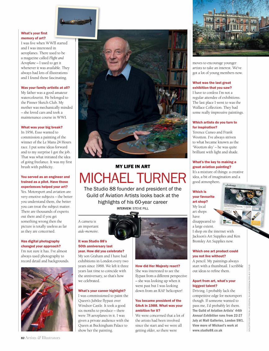
82 Artists & Illustrators
What’s your fi rst memory of art?I was fi ve when WWII started and I was interested in aeroplanes. There used to be a magazine called Flight and Aeroplane – I used to get it whenever it was available. They always had lots of illustrations and I found those fascinating.
Was your family artistic at all?My father was a good amateur watercolourist. He belonged to the Pinner Sketch Club. My mother was mechanically minded – she loved cars and took a maintenance course in WWI.
What was your big break?In 1956, Esso wanted to commission a painting of the winner of the Le Mans 24 Hours race. I put some ideas forward and to my surprise I got the job. That was what initiated the idea of going freelance. It was my fi rst brush with publicity.
You served as an engineer and trained as a pilot. Have those experiences helped your art? Yes. Motorsport and aviation are very emotive subjects – the better you understand them, the better you can treat the subject matter. There are thousands of experts out there and if you get something wrong then the picture is totally useless as far as they are concerned.
Has digital photography changed your approach?I’m not sure it has. I’ve almost always used photography to record detail and backgrounds.
moves to encourage younger artists to take an interest. We’ve got a lot of young members now.
What was the last great exhibition that you saw?I have to confess I’m not a regular attendee of exhibitions. The last place I went to was the Wallace Collection. They had some really impressive paintings.
Which artists do you turn to for inspiration?Terence Cuneo and Frank Wootton. I’ve always striven to what became known as the ‘Wootton sky’ – he was quite brilliant with light and shade.
What’s the key to making a great aviation painting?It’s a mixture of things: a creative idea, a bit of imagination and a good atmosphere.
Which is your favourite art shop?My local art shops have disappeared to a large extent. I shop on the internet with Jackson’s Art Supplies and Ken Bromley Art Supplies now.
Which one art product could you not live without?A pencil. My paintings always start with a thumbnail. I scribble out ideas to refi ne them.
Apart from art, what’s your biggest talent?Driving. I probably lack the competitive edge for motorsport though. If someone wanted to pass me, I’d probably let them. The Guild of Aviation Artists’ 44th Annual Exhibition runs from 22-27 July at Mall Galleries, London SW1. View more of Michael’s work at www.studio88.co.uk
A camera is an important aide-memoire.
It was Studio 88’s 50th anniversary last year. How did you celebrate?My son Graham and I have had exhibitions in London every two years since 1988. We left it three years last time to coincide with the anniversary, so that’s how we celebrated.
What’s your career highlight?I was commissioned to paint the Queen’s Jubilee fl ypast over Windsor Castle. It took a good six months to produce – there were 78 aeroplanes in it. I was given a private audience with the Queen at Buckingham Palace to show her the painting.
The Studio 88 founder and president of the Guild of Aviation Artists looks back at the
highlights of his 60-year careerINTERVIEW: STEVE PILL
MY LIFE IN ART
MICHAEL TURNER
ISTO
CK
; © B
Y KIN
D P
ERM
ISS
ION
OF TH
E TRU
STEE
S O
F THE W
ALLAC
E CO
LLECTIO
N
How did Her Majesty react?She was interested to see the fl ypast from a different perspective – she was looking up when it went past but I was looking down from an RAF helicopter!
You became president of the GAvA in 1988. What was your ambition for it?We were concerned that a lot of the artists had been involved since the start and we were all getting older, so there were
good atmosphere.
I was fi ve when WWII started
82 Life in Art.indd 82 11/06/2014 13:00
AndaluciaTerracotta
Provence
TuscanyBurnt Umber
Switzerland
Lavender
EdelweissEmerald GreenIreland
Discover the stunning scenery and dazzling cityscapes of Europeon a tailor made holiday by rail
Inspir ing dest inat ions by rai l
William Drennan’s ‘green island’ continues to sparkle and shine with its undulating emerald fields, windswept beaches and welcoming local pubs. Don’t miss the spectacular Ring of Kerry, the dramatic cliffs of Inishmor or the untouched beauty of Connemara. Ireland Explorer - 8 night holiday by rail and ferry from £1,239 pp
Small and perfectly formed, Switzerland offers cultural cities, pristine mountain vistas, picturesque lakes and fields full of Alpine flowers. Get up close to the majestic peaks of the Alps on a journey aboard the famous Glacier Express.Classic Glacier & Bernina Express – 4 night holiday by rail from £889 pp
Dotted with hilltop villas and fortresses, cloaked with vines and forests, blessed with gorgeous medieval cities, towns and villages, it is little wonder that Tuscany has inspired artists from the Etruscans to the painters of the masters of the Renaissance. Florence, Siena and Lucca – 7 night holiday by air and rail from £1,029 pp
Discover ornate Moorish palaces, historic sherry bodegas and cobbled streets scented with orange blossom on a holiday to Andalucia. Watch out for spontaneous bouts of flamenco at the local tapas bar.Granada, Seville and Cordoba - 7 night holiday by air and rail from £1,120 pp
Azure skies, bowed green pines, ochre soil and swaying fields of lavender; the vibrant palettes of Van Gogh, Matisse, Cézanne and Picasso still live on in the landscapes around Aix-en-Provence, Arles and Avignon. Aix-en-Provence and Avignon – 4 night holiday by rail from £490 pp
To speak to an experienced consultant please call or visit our website.
020 3327 3500 www.railbookers.com
Railbookers offers tailor made holidays throughout Europe and beyond. Our friendly, experienced travel consultants have an expert knowledge of the rail network and can suggest the best routes to fit in with your requirements. Make the journey part of your holiday in 2014 with Railbookers and get a 10% discount, exclusive to readers of Artists & Illustrators. Just quote “Europe Offer” when you call.
Colours of Europe
Prices correct at time of publication. Prices are subject to availability, based on two people sharing a twin / double room and departing from London. Discount cannot be combined with any other offer. Terms and conditions apply. See www.railbookers.com
Colours of EuropeColours of EuropeColours of EuropeColours of EuropeColours of EuropeExclusive
Reader Offer
10%DISCOUNT Tailor made holidays - just for you