


Art Directed Web Typography
60
& & & & Typography WEB DIRECTED Art
-
Upload
marko-dugonjic -
Category
Design
-
view
85 -
download
0
Transcript of Art Directed Web Typography
&&&
&&&Typography
WEB DIRECTED
Art


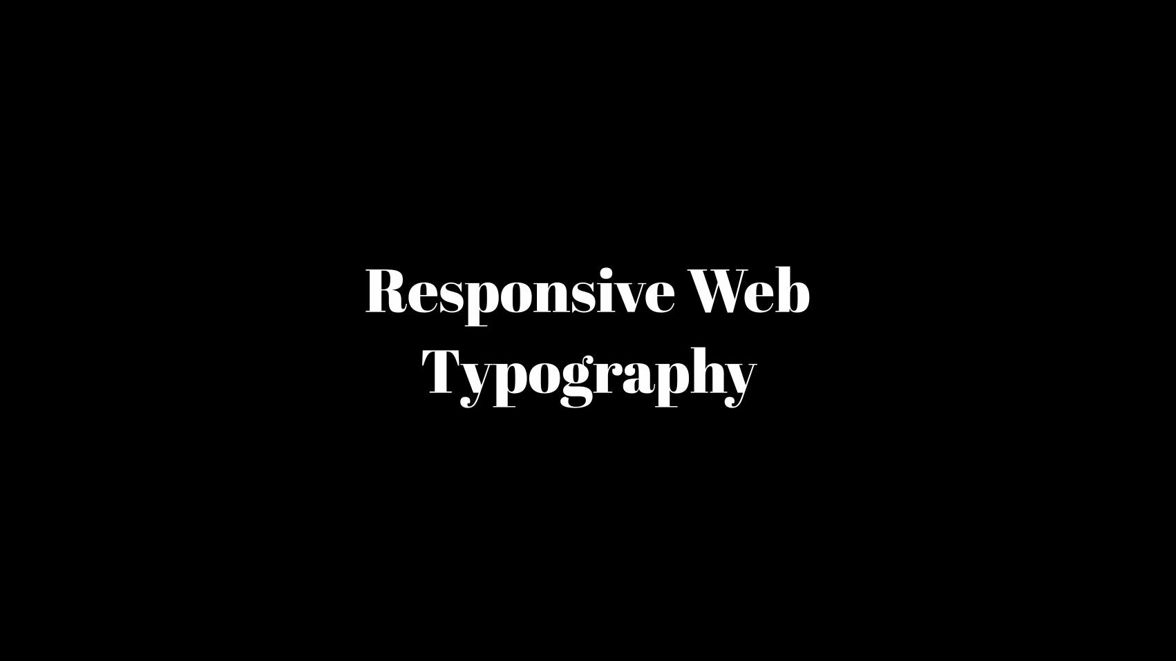
Responsive Web Typography

7 Different font sizes for different reading distances

0,26mm 1,3mm
71cm 350cm

6 Maintain perfect proportions in a paragraph

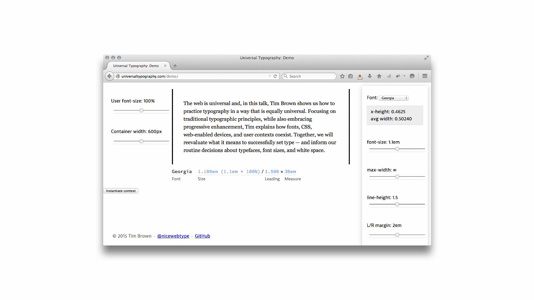
Line height for each breakpoint is adjusted according to the line length rendered at that breakpoint. Short line lengths require tighter line spacing, because the reader’s eye doesn’t have to travel much to reach the next line of text. As line length gets longer, more line spacing is required.
Line height for each breakpoint is adjusted according to the line length rendered at that breakpoint. Short line lengths require tighter line spacing, because the reader’s eye doesn’t have to travel much to reach the next line of text. As line length gets longer, more line spacing is required.
Line height for each breakpoint is adjusted according to the line length rendered at that breakpoint. Short line lengths require tighter line spacing, because the reader’s eye doesn’t have to travel much to reach the next line of text. As line length gets longer, more line spacing is required.

5 Establish hierarchy appropriate for
the screen real-estate
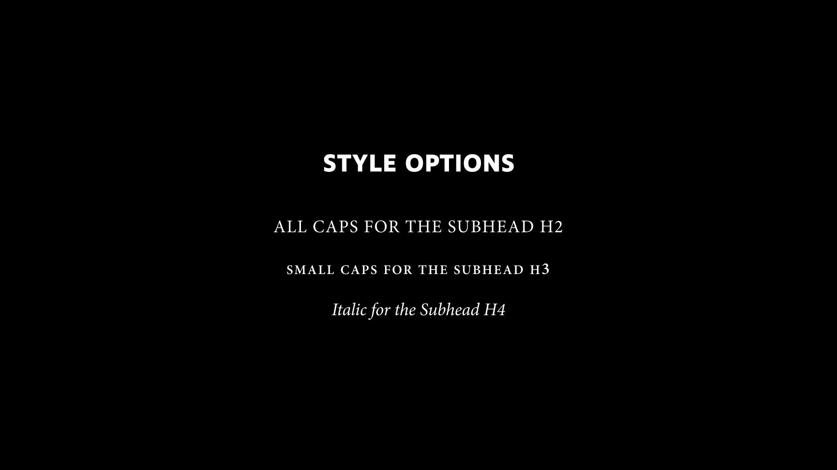
STYLE OPTIONS
ALL CAPS FOR THE SUBHEAD H2
SMALL CAPS FOR THE SUBHEAD H3
Italic for the Subhead H4

SETTING SUBHEADS WITH CSS
blog.typekit.com/2013/07/25/setting-subheads-with-css/ webdesign.maratz.com/lab/subheads/
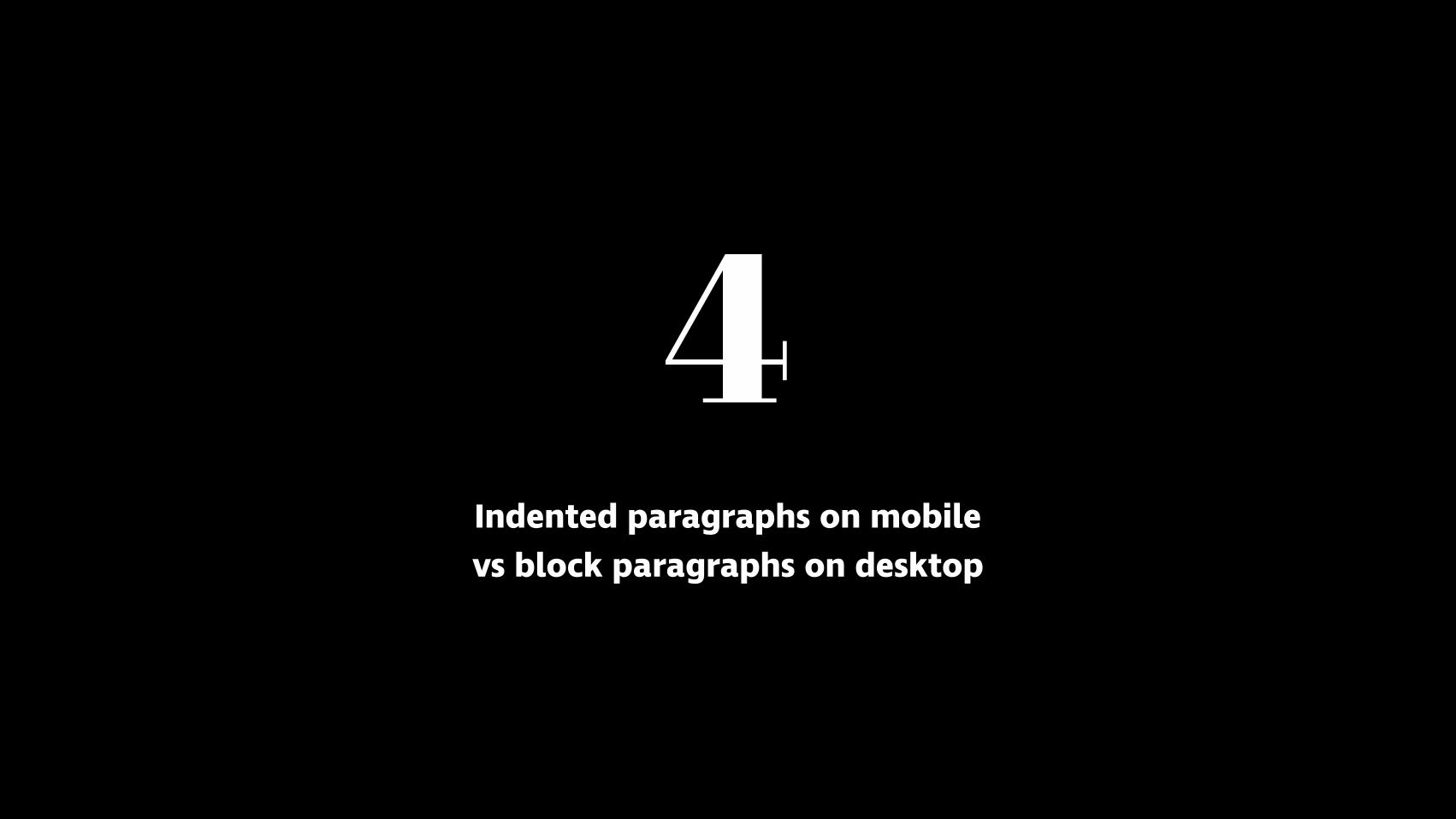
4 Indented paragraphs on mobile vs block paragraphs on desktop
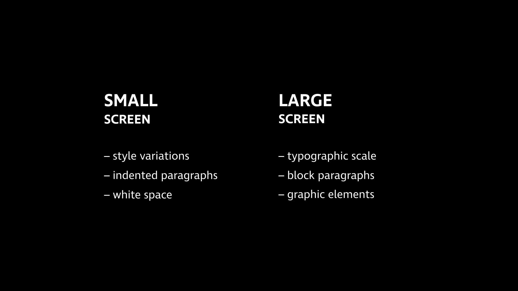
SMALL SCREEN
– style variations – indented paragraphs – white space
LARGE SCREEN
– typographic scale – block paragraphs – graphic elements
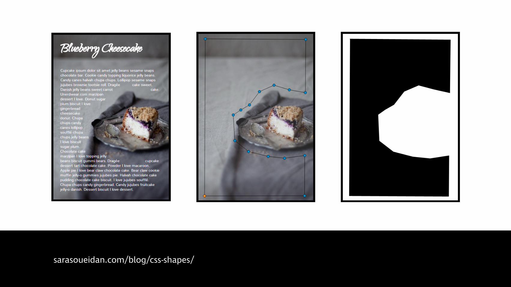
sarasoueidan.com/blog/css-shapes/

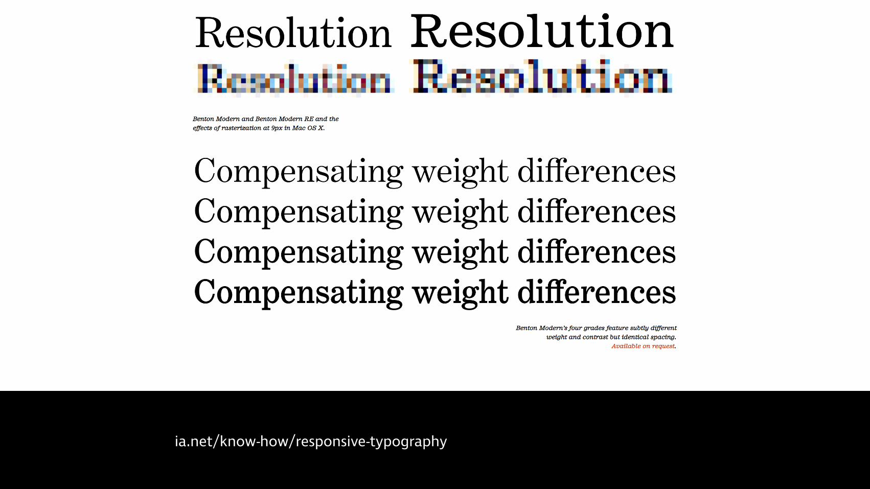
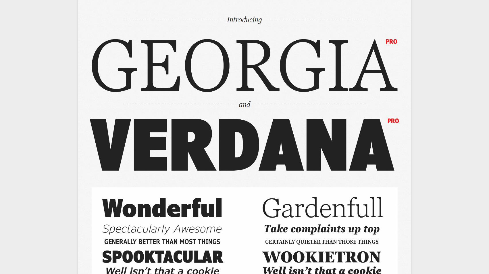
3 Use graded fonts to normalize rendering across
different pixel densities


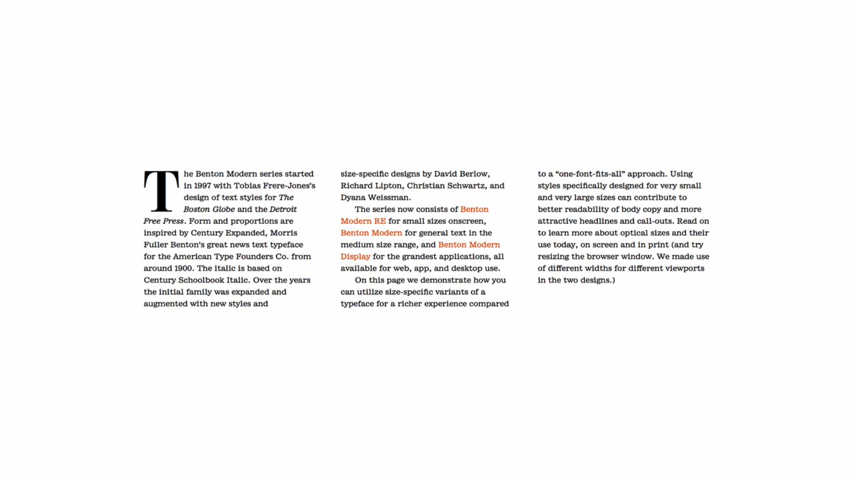
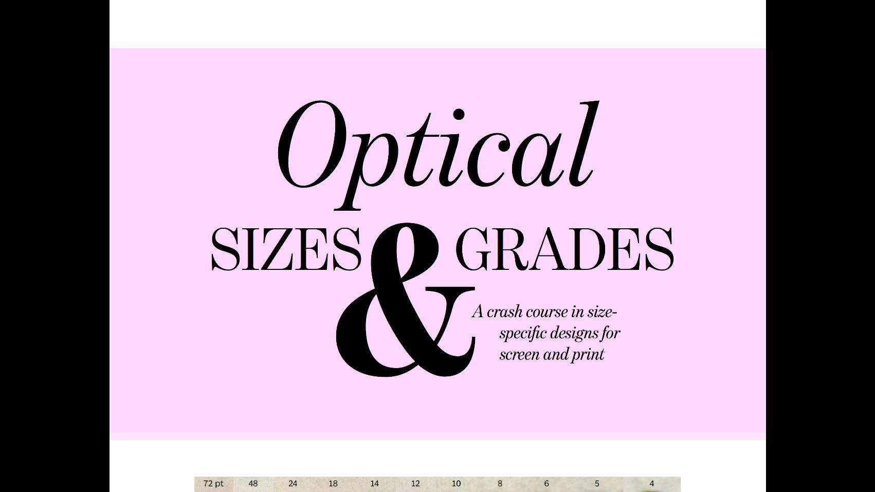
2 Look for type families that have multiple
optical sizes

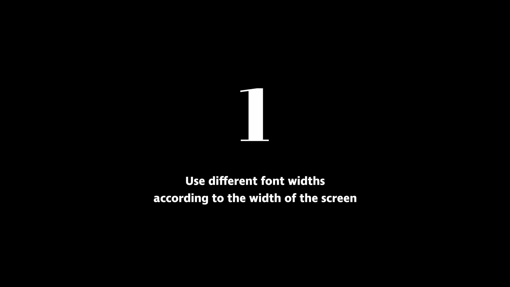
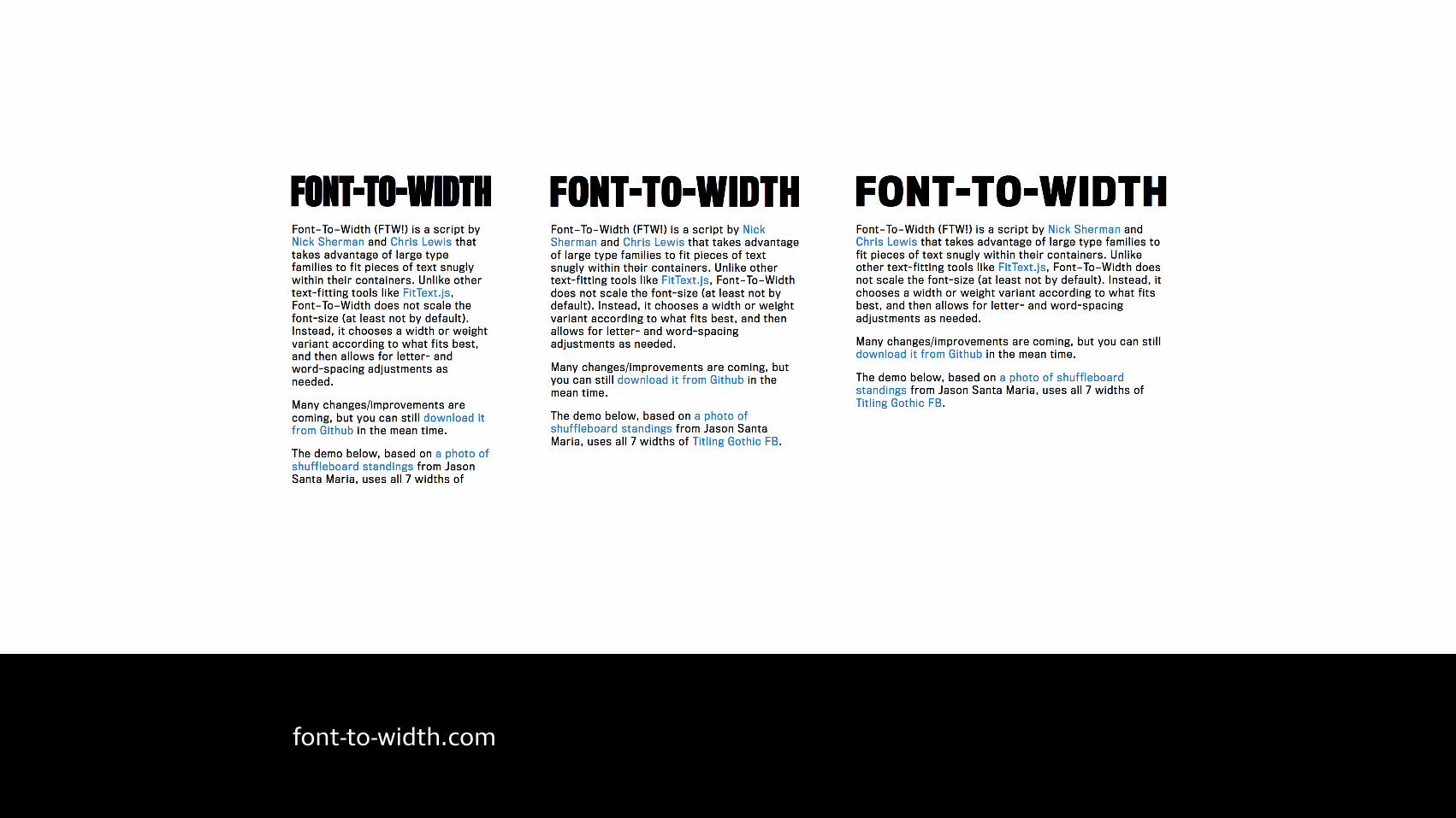
1 Use different font widths
according to the width of the screen

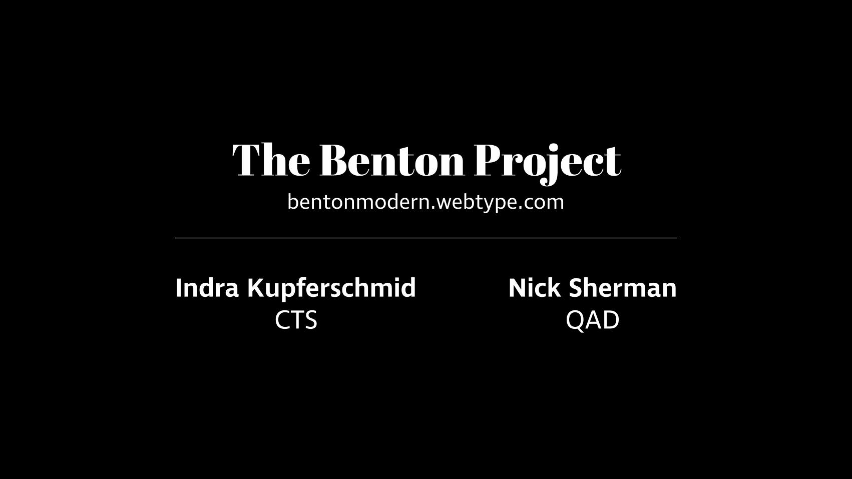
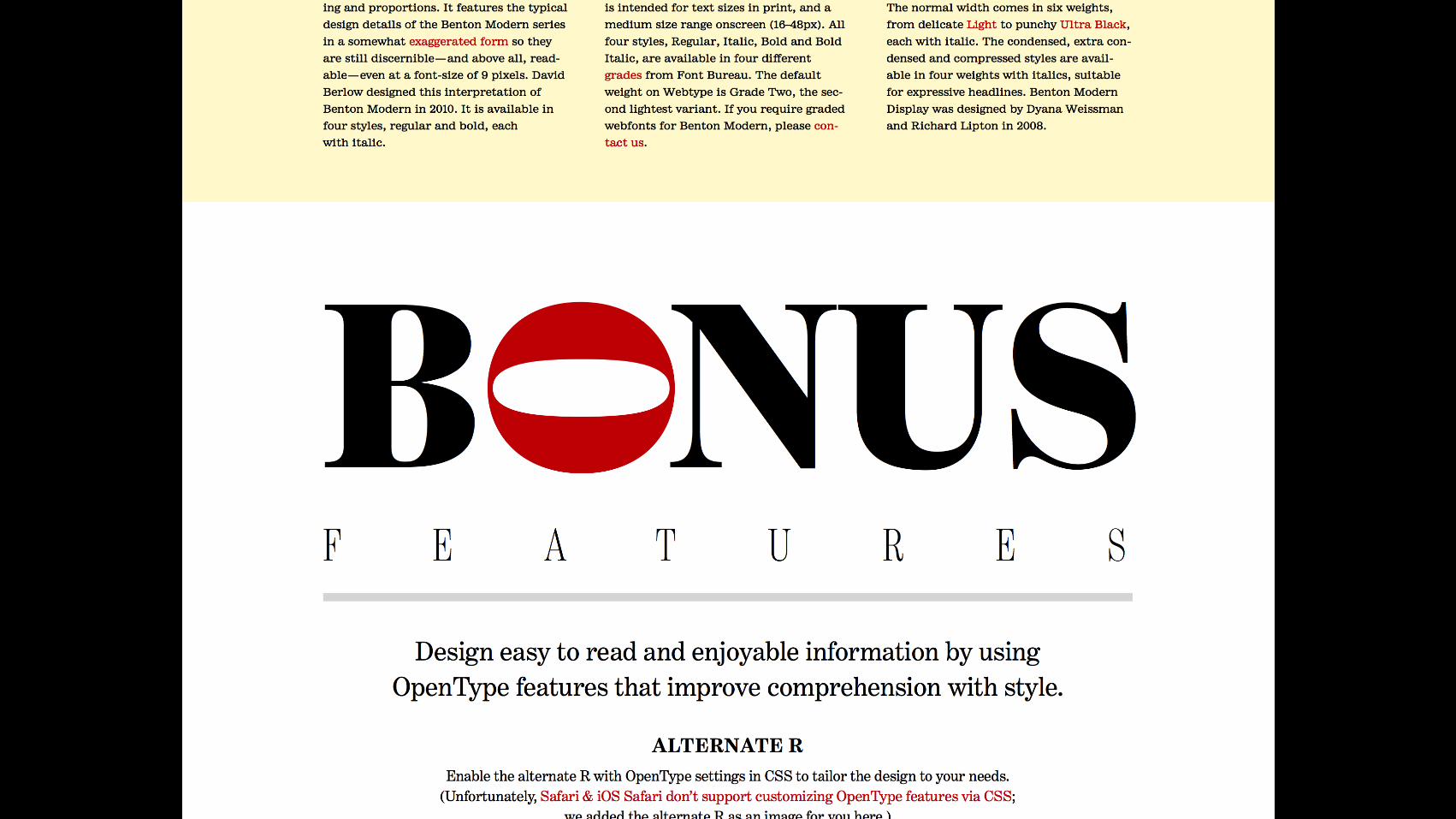
The Benton Project bentonmodern.webtype.com
Indra Kupferschmid CTS
Nick Sherman QAD


.columns { @media only screen and (min-height: 25em) { @media only screen and (min-width: 40em) and (max-width: 59.9375em) { -webkit-columns: 2; -moz-columns: 2; columns: 2; -webkit-column-gap: 2.7em; -moz-column-gap: 2.7em; column-gap: 2.7em; } @media only screen and (min-width: 60em) { -webkit-columns: 3; -moz-columns: 3; columns: 3; -webkit-column-gap: 2.7em; -moz-column-gap: 2.7em; column-gap: 2.7em; } } }


/* Alternate characters */ -webkit-font-feature-settings: "ss01"; -moz-font-feature-settings: "ss01" 1; font-feature-settings: "ss01";
/* Common ligatures */ -webkit-font-feature-settings: "liga"; -moz-font-feature-settings: "liga" 1; font-feature-settings: "liga";
/* Small caps */ -webkit-font-feature-settings: "smcp"; -moz-font-feature-settings: "smcp" 1; font-feature-settings: "smcp";
/* http://clagnut.com/sandbox/css3/ */
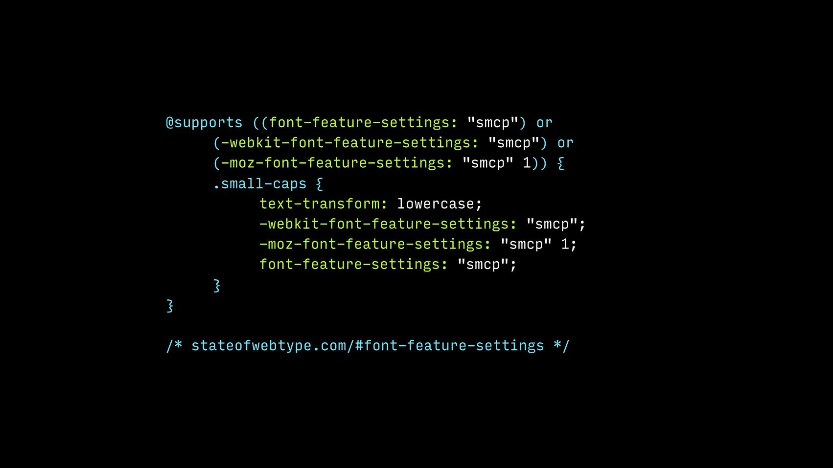
@supports ((font-feature-settings: "smcp") or (-webkit-font-feature-settings: "smcp") or (-moz-font-feature-settings: "smcp" 1)) { .small-caps { text-transform: lowercase; -webkit-font-feature-settings: "smcp"; -moz-font-feature-settings: "smcp" 1; font-feature-settings: "smcp"; } }
/* stateofwebtype.com/#font-feature-settings */


3D effects
drop caps
flipped type
rotated type{ }
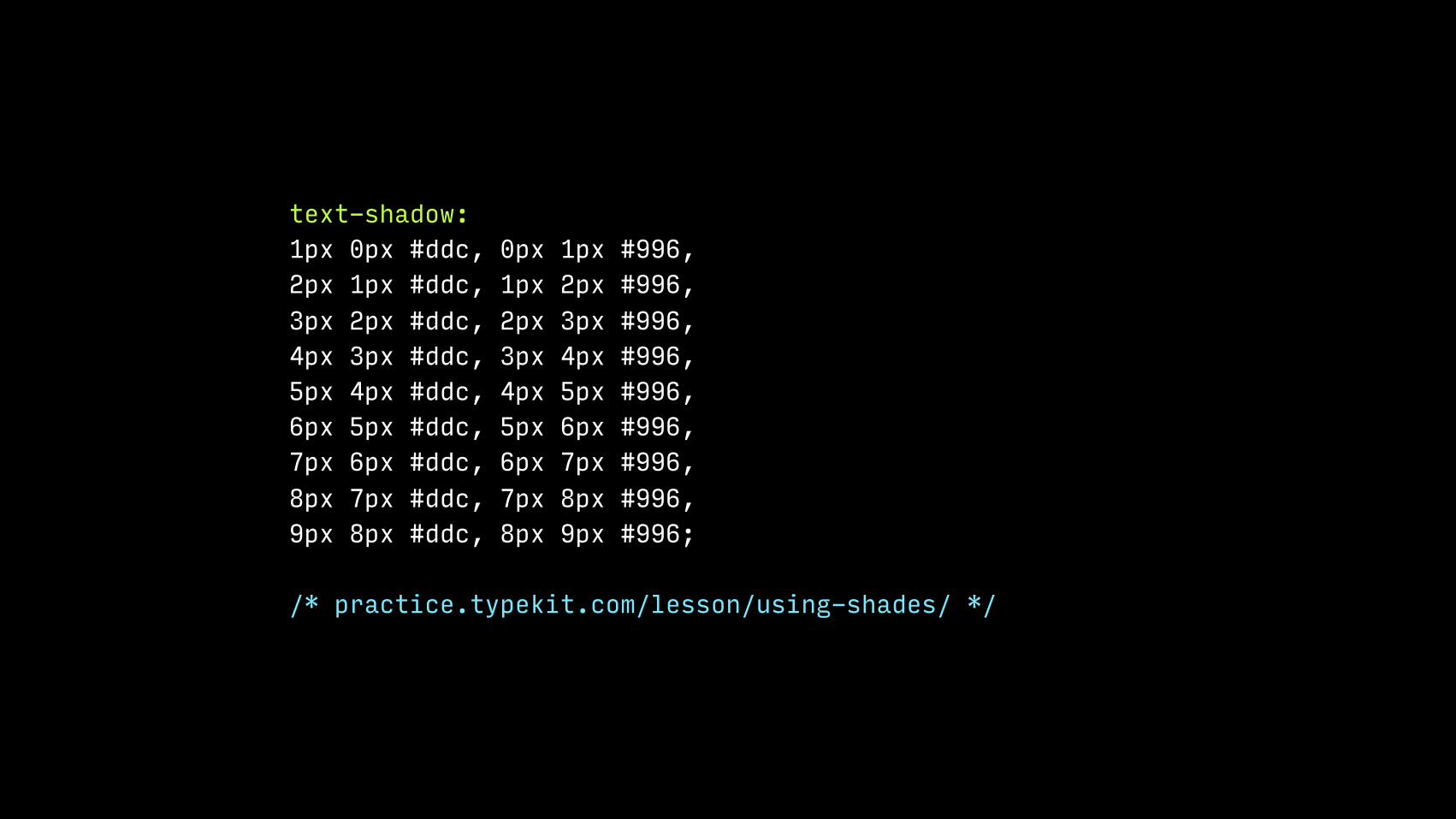
text-shadow: 1px 0px #ddc, 0px 1px #996, 2px 1px #ddc, 1px 2px #996, 3px 2px #ddc, 2px 3px #996, 4px 3px #ddc, 3px 4px #996, 5px 4px #ddc, 4px 5px #996, 6px 5px #ddc, 5px 6px #996, 7px 6px #ddc, 6px 7px #996, 8px 7px #ddc, 7px 8px #996, 9px 8px #ddc, 8px 9px #996;
/* practice.typekit.com/lesson/using-shades/ */

@function generate3DShadow($max,$x,$y) { $val: 1px 0 #{$x}, 0 1px #{$y}; @for $i from 1 through $max { $val: #{$val}, #{$i+1}px #{$i}px #{$x}; $val: #{$val}, #{$i}px #{$i+1}px #{$y}; } @return $val; }
text-shadow: generate3DShadow(10,#ddc,#996);

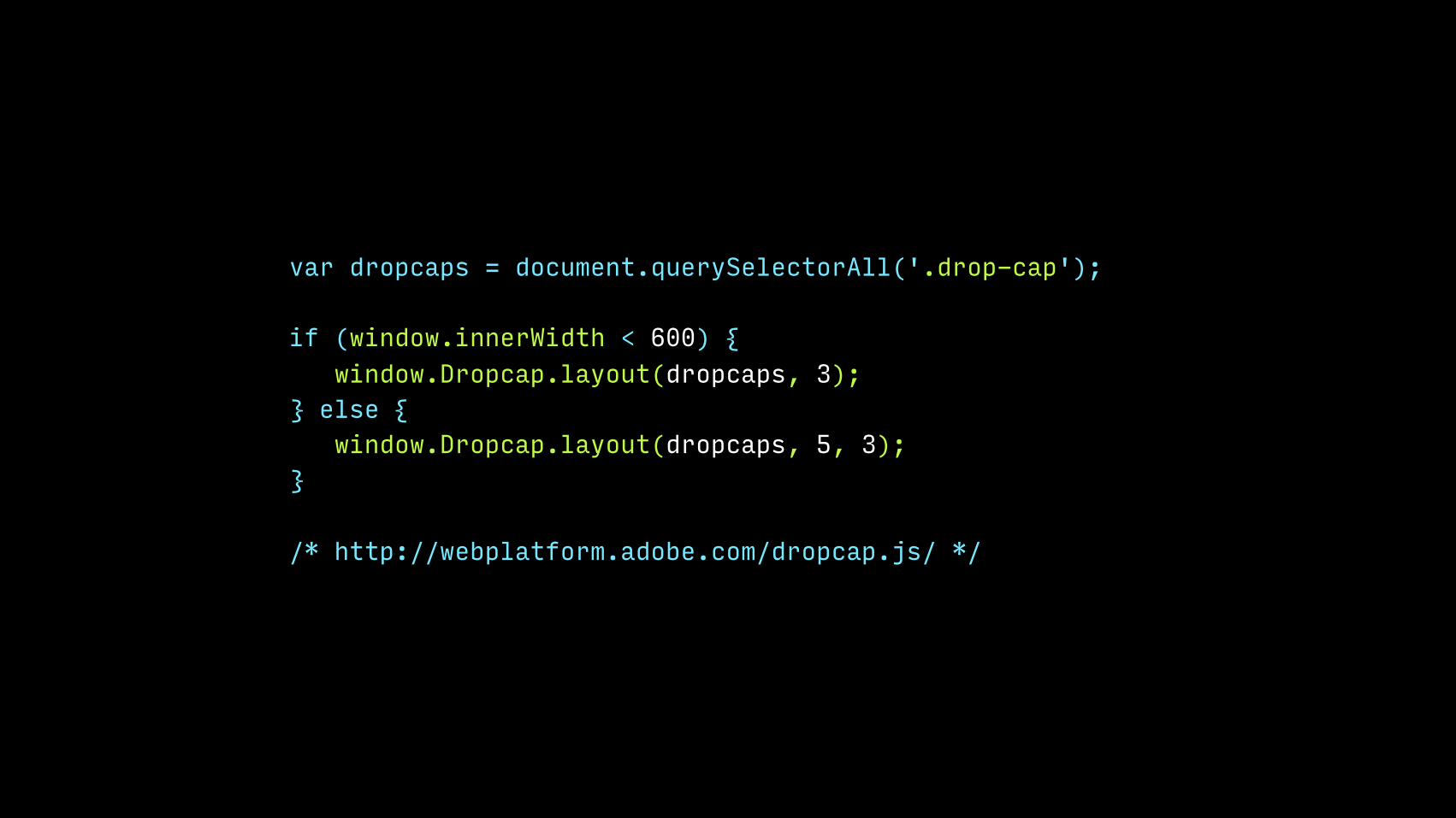
var dropcaps = document.querySelectorAll('.drop-cap');
if (window.innerWidth < 600) { window.Dropcap.layout(dropcaps, 3); } else { window.Dropcap.layout(dropcaps, 5, 3); }
/* http://webplatform.adobe.com/dropcap.js/ */

.o { -webkit-transform: rotate(90deg); -moz-transform: rotate(90deg); transform: rotate(90deg); /* Glyph-specific adjustments */ }

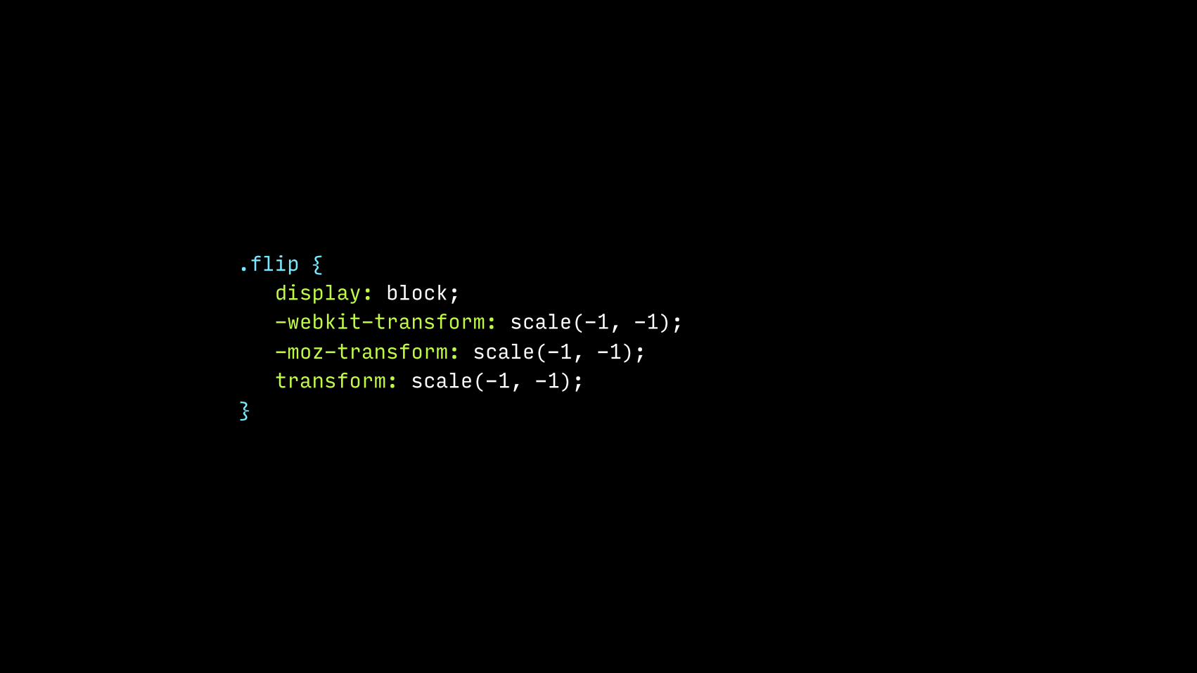
.flip { display: block; -webkit-transform: scale(-1, -1); -moz-transform: scale(-1, -1); transform: scale(-1, -1); }


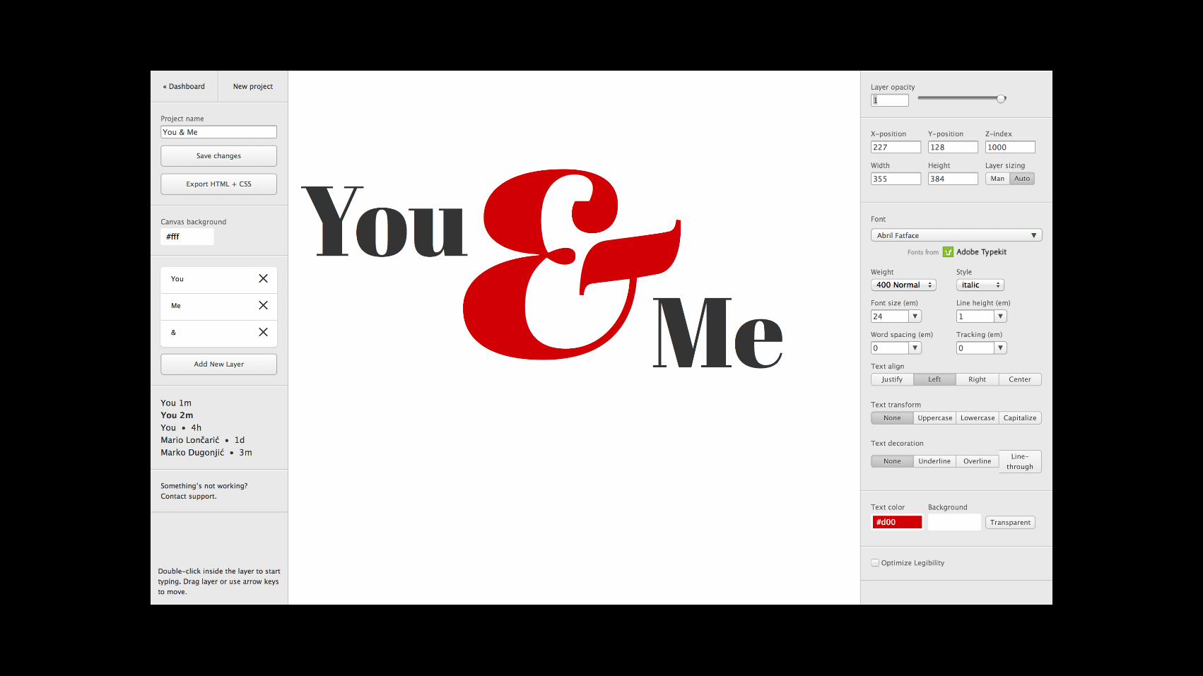
<div class="container"> <h1> <span class="s1">You</span> <span class="s2">&</span> <span class="s3">Me</span> </h1> </div>

.container { font-size: 10vw; } .container h1 { font-size: 1em; line-height: 1; position: relative; width: 100%; height: 0; padding-top: 75%; /* 4:3 aspect ratio */ padding-top: 50%; /* 2:1 aspect ratio */ } .container h1 .s1 { position: absolute; left: 10%; top: 10%; } /* http://webdesign.maratz.com/lab/expressive-web-typography/ */