Arctic monkeys digipak analysis
4
Arctic Monkeys Digipak
-
Upload
amyflint5477 -
Category
Education
-
view
282 -
download
3
Transcript of Arctic monkeys digipak analysis
Arctic Monkeys Digipak
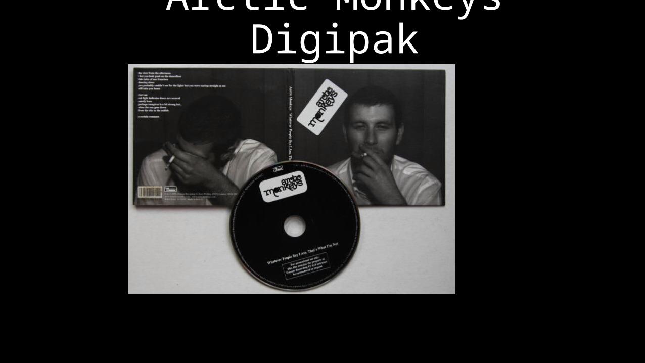
This is the front cover of the album ‘Whatever people say that’s not what I am’ by indie band Arctic Monkeys. This CD cover does not say the name of the album on something unusual for an album cover.
Front cover
The character of the album cover has a laid back feel to him alongside his casual clothing linking in with conventions of the genre and the title of the album itself.
The person on the front is also smoking. Smoking is associated with being cool something indie bands want to appear as.
The band name is shown in the album making it stand out. The bands Logo is placed on the album at an angle linking with the bands reckless attitude.
The black and white style matches the conventions of an indie band and shows the rough and ready style of an indie band.
The character on the album also has a beard making him look slightly rugged again linking with the indie genre and the title of the album.
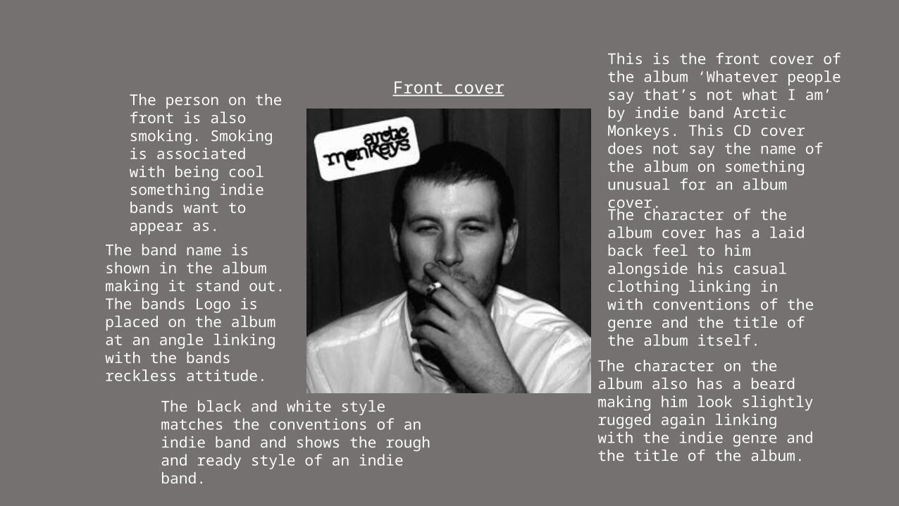
Once again this image is black and white linking back to the conventions of the genre.
The use of cigarettes in on the CD add the reckless feel of an Indie Band.
The fact the cigarettes are all stubbed out and smoked adds to the rugged feel the band are trying to portray.
The CD
The shape of the CD could symbol an ashtray and the amount of cigarettes burnt could suggest how long the band worked on the album as the album was much anticipated by fans.
With the man smoking on the front and the many cigarettes on the CD - this could represent a character and his ongoing addiction.
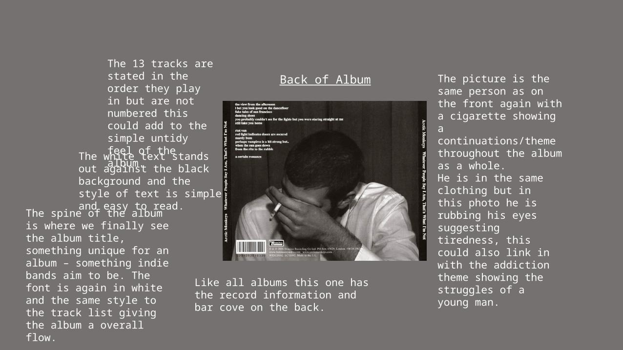
Back of AlbumThe 13 tracks are stated in the order they play in but are not numbered this could add to the simple untidy feel of the album. The white text stands
out against the black background and the style of text is simple and easy to read.
The picture is the same person as on the front again with a cigarette showing a continuations/theme throughout the album as a whole. He is in the same clothing but in this photo he is rubbing his eyes suggesting tiredness, this could also link in with the addiction theme showing the struggles of a young man.
Like all albums this one has the record information and bar cove on the back.
The spine of the album is where we finally see the album title, something unique for an album – something indie bands aim to be. The font is again in white and the same style to the track list giving the album a overall flow.