Architecture and Applications of a Geovisual Analytics...
88
Link¨ oping Studies in Science and Technology Dissertations, No. 1511 Architecture and Applications of a Geovisual Analytics Framework Quan Van Ho Department of Science and Technology Link¨ oping University Norrk¨ oping 2013
Transcript of Architecture and Applications of a Geovisual Analytics...

Linkoping Studies in Science and Technology
Dissertations, No. 1511
Architecture and Applications
of a Geovisual Analytics Framework
Quan Van Ho
Department of Science and TechnologyLinkoping University
Norrkoping 2013

Architecture and Applications of a Geovisual Analytics Framework
Copyright c© 2013 Quan Van Ho unless otherwise [email protected]
Department of Science and Technology, Linkoping UniversitySE-601 74 Norrkoping, Sweden
ISBN 978-91-7519-643-5ISSN 0345-7524
This thesis is available online through Linkoping University Electronic Press:www.ep.liu.se
Printed by LiU-Tryck, Linkoping, Sweden

Abstract
The large and ever-increasing amounts of multi-dimensional, multivariate, multi-source,spatio-temporal data represent a major challenge for the future. The need to analyse andmake decisions based on these data streams, often in time-critical situations, demands inte-grated, automatic and sophisticated interactive tools that aid the user to manage, process,visualize and interact with large data spaces. The rise of ‘Web 2.0’, which is undisput-edly linked with developments such as blogs, wikis and social networking, and the internetusage explosion in the last decade represent another challenge for adapting these tools tothe Internet to reach a broader user community. In this context, the research presentedin this thesis introduces an effective web-enabled geovisual analytics framework imple-mented, applied and verified in Adobe Flash ActionScript and HTML5/JavaScript. It hasbeen developed based on the principles behind Visual Analytics and designed to signifi-cantly reduce the time and effort needed to develop customized web-enabled applicationsfor geovisual analytics tasks and to bring the benefits of visual analytics to the public.The framework has been developed based on a component architecture and includes awide range of visualization techniques enhanced with various interaction techniques andinteractive features to support better data exploration and analysis. The importance ofmultiple coordinated and linked views is emphasized and a number of effective techniquesfor linking views are introduced.
Research has so far focused more on tools that explore and present data while toolsthat support capturing and sharing gained insight have not received the same attention.Therefore, this is one of the focuses of the research presented in this thesis. A snapshottechnique is introduced, which supports capturing discoveries made during the exploratorydata analysis process and can be used for sharing gained knowledge.
The thesis also presents a number of applications developed to verify the usabilityand the overall performance of the framework for the visualization, exploration and anal-ysis of data in different domains. Four application scenarios are presented introducing(1) the synergies among information visualization methods, geovisualization methods andvolume data visualization methods for the exploration and correlation of spatio-temporalocean data, (2) effective techniques for the visualization, exploration and analysis of self-organizing network data, (3) effective flow visualization techniques applied to the analysisof time-varying spatial interaction data such as migration data, commuting data and tradeflow data, and (4) effective techniques for the visualization, exploration and analysis offlood data.


Acknowledgements
My first thanks goes to my supervisors. To Mikael Jern for introducing me to the fieldof geovisual analytics and for his support and guidance during these five years. To JohanMoe at the Ericsson Research department of Ericsson company for his support during thetime I worked with his group in VoSON project.
Second, I would like to thank my colleagues at NCVA and NComVA, especially to PatrikLundblad and Tobias Astrom for their collaboration during the five years, to Markus Johns-son for his contribution to the development of the GAV Flash version of the framework andto Miralem Drek for his contribution to the development of the GAV HTML5/JavaScriptversion of the framework.
Many thanks also go to Matt Cooper for proof-reading some of my papers, to KarljohanLundin Palmerius, Jimmy Johansson, Anja Johansson and Katerina Vrotsou for their helpwhen I started writing this thesis and providing the LaTeX template on which this thesis isbased and to Eva Skrblom for her help during the five years with many conference bookingsand travel arrangements.
I would like to also thank my colleagues at MIT and my friends who have supportedme during these years.
Finally, my special thanks go to my family, especially my wife Cam Tu and my mother,for their support, encouragement and sharing with me through all the good times and hardtimes.


Contents
A Context of the work 11 Introduction . . . . . . . . . . . . . . . . . . . . . . . . . . . . . . . . . . . 3
1.1 Visual analytics . . . . . . . . . . . . . . . . . . . . . . . . . . . . . . 41.2 Geovisual analytics . . . . . . . . . . . . . . . . . . . . . . . . . . . . 71.3 Challenges . . . . . . . . . . . . . . . . . . . . . . . . . . . . . . . . . 81.4 Overview of the included papers . . . . . . . . . . . . . . . . . . . . . 9
2 Background and Related Work . . . . . . . . . . . . . . . . . . . . . . . . . 112.1 Interaction techniques . . . . . . . . . . . . . . . . . . . . . . . . . . . 11
2.1.1 Fisheye lens technique . . . . . . . . . . . . . . . . . . . . . . . 122.1.2 Multiple linked views . . . . . . . . . . . . . . . . . . . . . . . . 12
2.2 Toolkits for spatial-temporal multivariate data . . . . . . . . . . . . . 142.3 Tools for capturing EDA processes . . . . . . . . . . . . . . . . . . . . 152.4 Visual analysis of communication network data . . . . . . . . . . . . . 162.5 Visual analysis of spatial interaction data . . . . . . . . . . . . . . . . 17
B Contributions 193 A Web-enabled Geovisual Analytics Framework . . . . . . . . . . . . . . . . 21
3.1 Framework architecture . . . . . . . . . . . . . . . . . . . . . . . . . . 213.1.1 Atomic and functional component architecture . . . . . . . . . . 233.1.2 Map component . . . . . . . . . . . . . . . . . . . . . . . . . . 24
3.2 Visualization methods . . . . . . . . . . . . . . . . . . . . . . . . . . . 253.3 Interaction techniques . . . . . . . . . . . . . . . . . . . . . . . . . . . 263.4 Perceptual methods . . . . . . . . . . . . . . . . . . . . . . . . . . . . 293.5 Linking components for multiple linked views . . . . . . . . . . . . . . 293.6 Dataset model . . . . . . . . . . . . . . . . . . . . . . . . . . . . . . . 313.7 Architecture of visual analytics applications . . . . . . . . . . . . . . . 313.8 Data providers . . . . . . . . . . . . . . . . . . . . . . . . . . . . . . . 323.9 Snapshot for storytelling and collaboration . . . . . . . . . . . . . . . 323.10 Extendibility . . . . . . . . . . . . . . . . . . . . . . . . . . . . . . . . 343.11 Choices of programming platforms . . . . . . . . . . . . . . . . . . . . 353.12 Implementation challenges . . . . . . . . . . . . . . . . . . . . . . . . 363.13 Conclusions and contributions . . . . . . . . . . . . . . . . . . . . . . 37
4 Geovisual Analytics for Multivariate Spatio-Temporal Data . . . . . . . . . 394.1 Geovisual analytics for time-varying multivariate volume data . . . . . 40
4.1.1 Objective . . . . . . . . . . . . . . . . . . . . . . . . . . . . . . 404.1.2 Approaches and results . . . . . . . . . . . . . . . . . . . . . . . 404.1.3 Conclusions and contributions . . . . . . . . . . . . . . . . . . . 44
4.2 Geovisual analytics for self-organizing network data . . . . . . . . . . 474.2.1 Objective . . . . . . . . . . . . . . . . . . . . . . . . . . . . . . 474.2.2 Approaches and results . . . . . . . . . . . . . . . . . . . . . . . 484.2.3 Conclusions and contributions . . . . . . . . . . . . . . . . . . . 52
4.3 Geovisual analytics for spatial interaction time series data . . . . . . . 554.3.1 Objective . . . . . . . . . . . . . . . . . . . . . . . . . . . . . . 554.3.2 Approaches and results . . . . . . . . . . . . . . . . . . . . . . . 564.3.3 Conclusions and contributions . . . . . . . . . . . . . . . . . . . 60
4.4 Geovisual analytics for flood data . . . . . . . . . . . . . . . . . . . . 624.4.1 Objective . . . . . . . . . . . . . . . . . . . . . . . . . . . . . . 624.4.2 Approaches and results . . . . . . . . . . . . . . . . . . . . . . . 624.4.3 Conclusions and contributions . . . . . . . . . . . . . . . . . . . 65
5 Conclusions and Future Research . . . . . . . . . . . . . . . . . . . . . . . . 675.1 Conclusions and contributions . . . . . . . . . . . . . . . . . . . . . . 675.2 Future research . . . . . . . . . . . . . . . . . . . . . . . . . . . . . . 69
Bibliography . . . . . . . . . . . . . . . . . . . . . . . . . . . . . . . . . . . . . 71
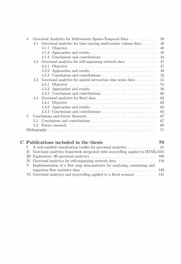
C Publications included in the thesis 79I A web-enabled visualization toolkit for geovisual analytics . . . . . . . . . . 81II Geovisual analytics framework integrated with storytelling applied to HTML5101III Exploratory 3D geovisual analytics . . . . . . . . . . . . . . . . . . . . . . . 109IV Geovisual analytics for self-organizing network data . . . . . . . . . . . . . 119V Implementation of a flow map demonstrator for analyzing commuting and
migration flow statistics data . . . . . . . . . . . . . . . . . . . . . . . . . . 129VI Geovisual analytics and storytelling applied to a flood scenario . . . . . . . 141

Complete list of publications
Quan Ho, Patrik Lundblad, and Mikael Jern. Geovisual analytics framework integratedwith storytelling applied to HTML5. Short paper in Proceeding of 16th AGILE Confer-ence on Geographic Information Science (AGILE 2013), to appear.
Quan Ho and Mikael Jern. Geovisual Analytics and Storytelling Applied to a Flood Sce-nario. Extended abstract in online Proceedings of GeoViz 2013: Interactive Maps thatHelp People Think, http://www.geomatik-hamburg.de/geoviz/.
Quan Ho, Patrik Lundblad, Tobias Astrom, and Mikael Jern. A web-enabled visualizationtoolkit for geovisual analytics. Journal of Information Visualization, Vol. 11(1): pp.22-42, 2011.
Quan Ho, Patrik Lundblad, Tobias Astrom, and Mikael Jern. A web-enabled visualizationtoolkit for geovisual analytics. In Proceedings of Conference on Visualization and DataAnalysis 2011 (EI107), Vol. 7868: pp. 78680R-78680R-12, 2011.
Quan Ho, Phong H. Nguyen, Tobias Astrom, and Mikael Jern. Implementation of a flowmap demonstrator for analyzing commuting and migration flow statistics data. Journalof Procedia - Social and Behavioral Sciences, Vol. 21: pp. 157166, 2011.
Quan Ho, Phong H. Nguyen and Mikael Jern. Implementation and evaluation of a flowmap demonstrator for analyzing work commuting flows between Norway and Sweden. InProceedings of GeoViz 2011: Linking geovisualization with spatial analysis and modeling,http://www.geomatik-hamburg.de/geoviz11/.
Quan Ho, Tobias Astrom, and Mikael Jern. Geovisual Analytics for Self-Organizing Net-work Data. In Proceeding of IEEE Symposium on Visual Analytics Science and Tech-nology (IEEE VAST), pp. 43-50, 2009.
Quan Ho, Tobias Astrom, Mikael Jern, Johan Moe, Fredrik Gunnarsson, and Harald Kallin.Visualization of Self-Organizing Networks Operated by the ANR Algorithm. In Proceed-ing of IEEE International Conference on Research, Innovation and Vision for the Futurein Computing Communications Technologies, pp. 1-8, 2009.
Quan Ho and Mikael Jern. Exploratory 3D Geovisual Analytics. In Proceeding of IEEE In-ternational Conference on Research, Innovation and Vision for the Future in ComputingCommunications Technologies, pp. 276-283, 2008.


Part A
Context of the work


Chapter 1
Introduction
There is no doubt that we are living in the age of data explosion in which large amounts ofdata are generated and collected every day in various areas from sensing data, simulationdata to statistic data. Therefore, there is an ever increasing need for analysing data, gaininginsight into data, extracting meaningful information and communicating the analyticalresults effectively for action. Since our human brain is not good at processing and analysingraw data, especially when facing large amounts of data, we need the means that can supportus to do these jobs. Visualization is one of such means. It is a tool or method whichconstructs mental visual images of data to support gaining insight into the data throughcreating visual representations of the data. It is based on the fact that our human brain isbuilt around pattern recognition, with more than 50 % of its neurons involved with vision.
Visualization is usually divided into two main fields: scientific visualization and infor-mation visualization. The classification is based on the type of data they are concernedwith, even though they overlap to a great extent. While scientific visualization is normallyassociated with physically based data such as physical or medical data and covers accuratevisualizations of the real world, information visualization is associated with abstract andnon-physically based data and covers visualizations of concepts that are often abstractin nature. In addition to this classification, visualization can also be classified based onthe field to which it is applied. For example, when studied and used in cartography, vi-sualization forms a sub-field, geovisualization, which focuses on visualization techniquesand tools supporting geospatial data analysis and, to some extent, overlaps with the fieldsof scientific visualization and information visualization. Geovisualization and informationvisualization techniques are among the subjects of this thesis.
Although visualization has developed dramatically in recent decades and many visual-ization techniques have been invented and proven to be useful tools for supporting dataanalysis, they still do not meet the growing needs for gaining profound insights and answer-ing complex questions. The events of September 11, 2001 shocked America and the wholeworld and showed that employing the best practices and the best technologies of those daysin many areas including visualization could not protect America from the terrorist threats.The events have constituted both needs and challenges for combining technologies fromvarious areas to support the analyst in processing and analysing data coming from varioussources and being in various formats, gaining profound insights and communicating ana-lytical results for collaboration and dissemination. Visual analytics (VA) has emerged as a

4 Introduction
research area to response to these needs and challenges. In 2005, the book Illuminating thePath: The Research and Development Agenda for Visual Analytics [78] was published toaddress these challenges as well as to define a research and development agenda for visualanalytics.
The research presented in this thesis is inspired by the book and responds to the callsfor further research on the development of frameworks that “support seamless integrationof tools so that data requests, visual analysis, note-taking, presentation composition anddissemination all take place within a cohesive environment” as well as the calls for movingresearch into practice. It focuses on the architecture of a geovisual analytics frameworkwhich supports the integration of exploratory, analytical reasoning and communicativetools. It addresses challenges to develop these tools and to adapt them to the Internetto reach a broader user community. It also presents a number of real world interactiveweb-based visualization applications developed based on the framework. Some of themare being used daily for analysing data and presenting analytical results to the publicthrough interactive attractive visualizations to capture their attention as well as to helpthem understand better our society and our world through statistic data.
The thesis is structured as follows. The remainder of this chapter presents the conceptsunderlying the thesis, the research challenges and an overview of the publications includedin the thesis. Chapter 2 describes the background and research related to the thesis.Chapters 3 and 4 summarize a number of selected publications of the author used forthis thesis, mainly including the results and contributions of these publications. Thesepublications are included in the printed version of the thesis but not in the online version ofthe thesis due to copyright restrictions. Chapter 5 provides general conclusions, summarizesthe main contributions of this research and discusses potential directions for future research.
1.1 Visual analytics
Visual analytics is an interdisciplinary field which emerged in the last decade. The term‘visual analytics’ was introduced for the first time by Wong and Thomas [86] in 2004and then defined and discussed in further detail in the book Illuminating the Path: TheResearch and Development Agenda for Visual Analytics [78] of Thomas and Cook whichwas published in 2005 after the shocking events of September 11, 2001 to address challengesfor gaining profound insights from large amounts of data which are normally disparate,conflicting and dynamic and come from many sources.
Visual analytics, as defined by Thomas and Cook [78], is “the science of analytical rea-soning facilitated by interactive visual interfaces”. According to the authors of the book,analytical reasoning is the key factor in the analysis process, and the science of analyticalreasoning aims at providing a reasoning framework upon which analysts can determinewhich technologies are needed for conducting analysis. These technologies can be dataprocessing technologies, data representation technologies, data mining technologies, datavisualization technologies, and so on. Interactive visual interfaces are a part of thesetechnologies, which mainly include visualization techniques and interaction techniques (al-

1.1 Visual analytics 5
though interaction techniques in many cases are a part of visualization techniques).Visual analytics, in the context of the book, emphasizes the importance of the analyst
who applies reasoning techniques and human judgments to gain insight into data andreach conclusions from a combination of evidence and assumptions. Different from thedefinition mentioned above, Keim et al. [43] gave another definition of visual analyticswhich emphasizes the role of automated analysis techniques: “Visual analytics combinesautomated analysis techniques with interactive visualizations for an effective understanding,reasoning and decision making on the basis of very large and complex data sets.”
The goal of visual analytics, as stated by Thomas and Cook, is to facilitate analyticalreasoning processes through the creation of tools which maximize human capacity to per-ceive, understand and reason about complex and dynamic data and situations. Keim etal. [43] stated the goal of visual analytics in a more specific fashion.
“The goal of visual analytics is the creation of tools and techniques to enable people to:
- Synthesize information and derive insight from massive, dynamic, ambiguous, andoften conflicting data.
- Detect the expected and discover the unexpected.
- Provide timely, defensible, and understandable assessments.
- Communicate assessment effectively for action.”
A visual analysis process normally includes the following four phases: (1) processingand representing data, (2) visualising data, (3) analysing data and (4) presenting andcommunicating analytical results; therefore, visual analytics, as suggested by Thomas andCook, includes the following four focus areas:
• data representations and transformations that convert data in ways that supportvisualization and analysis;
• visual representations and interaction techniques which allow the user to see, exploreand understand large amounts of data at once;
• analytical reasoning techniques that enable users to gain deep insights that directlysupport assessment, planning and decision making;
• techniques to support production, presentation and dissemination of the results of theanalysis process to communicate information in the appropriate context to varioustypes of audiences.
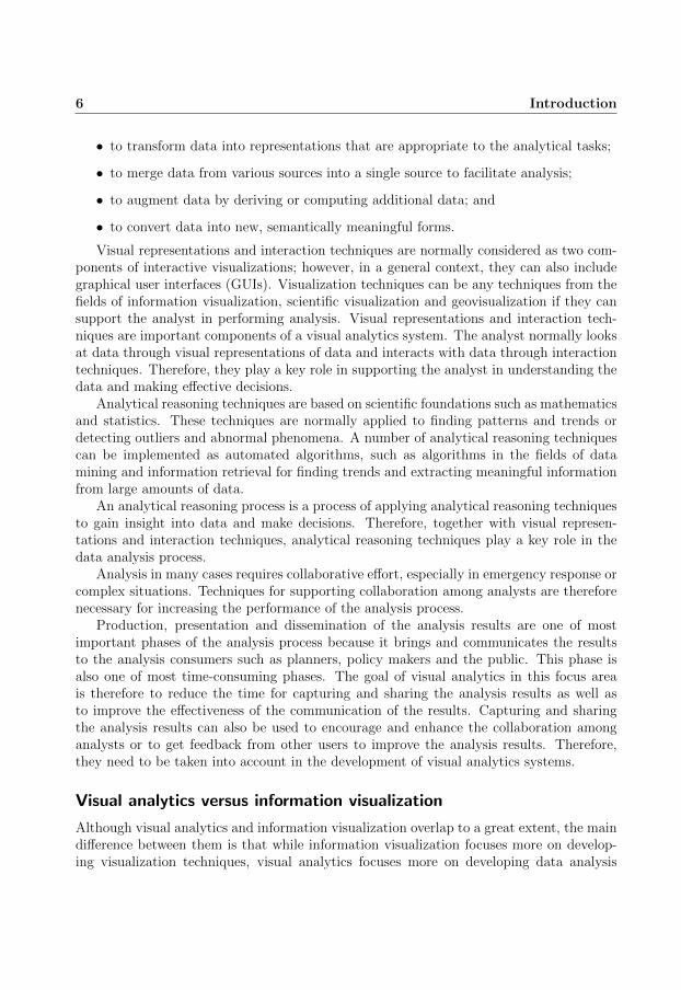
Data representations include techniques representing data that can be in many formssuch as text, images, audios and videos. Since data representations are normally the inputsof visualizations, the quality of data representations affects the quality of visualizations.A typical data representation used in this thesis for statistical data, which is multivariatespatio-temporal, is a three-dimensional array structure, as illustrated in Figure 3.10.
Data transformations are computational procedures which are used to transform datafor various purposes. For example, they can be used
6 Introduction
• to transform data into representations that are appropriate to the analytical tasks;
• to merge data from various sources into a single source to facilitate analysis;
• to augment data by deriving or computing additional data; and
• to convert data into new, semantically meaningful forms.
Visual representations and interaction techniques are normally considered as two com-ponents of interactive visualizations; however, in a general context, they can also includegraphical user interfaces (GUIs). Visualization techniques can be any techniques from thefields of information visualization, scientific visualization and geovisualization if they cansupport the analyst in performing analysis. Visual representations and interaction tech-niques are important components of a visual analytics system. The analyst normally looksat data through visual representations of data and interacts with data through interactiontechniques. Therefore, they play a key role in supporting the analyst in understanding thedata and making effective decisions.
Analytical reasoning techniques are based on scientific foundations such as mathematicsand statistics. These techniques are normally applied to finding patterns and trends ordetecting outliers and abnormal phenomena. A number of analytical reasoning techniquescan be implemented as automated algorithms, such as algorithms in the fields of datamining and information retrieval for finding trends and extracting meaningful informationfrom large amounts of data.
An analytical reasoning process is a process of applying analytical reasoning techniquesto gain insight into data and make decisions. Therefore, together with visual represen-tations and interaction techniques, analytical reasoning techniques play a key role in thedata analysis process.
Analysis in many cases requires collaborative effort, especially in emergency response orcomplex situations. Techniques for supporting collaboration among analysts are thereforenecessary for increasing the performance of the analysis process.
Production, presentation and dissemination of the analysis results are one of mostimportant phases of the analysis process because it brings and communicates the resultsto the analysis consumers such as planners, policy makers and the public. This phase isalso one of most time-consuming phases. The goal of visual analytics in this focus areais therefore to reduce the time for capturing and sharing the analysis results as well asto improve the effectiveness of the communication of the results. Capturing and sharingthe analysis results can also be used to encourage and enhance the collaboration amonganalysts or to get feedback from other users to improve the analysis results. Therefore,they need to be taken into account in the development of visual analytics systems.
Visual analytics versus information visualization
Although visual analytics and information visualization overlap to a great extent, the maindifference between them is that while information visualization focuses more on develop-ing visualization techniques, visual analytics focuses more on developing data analysis
1.2 Geovisual analytics 7
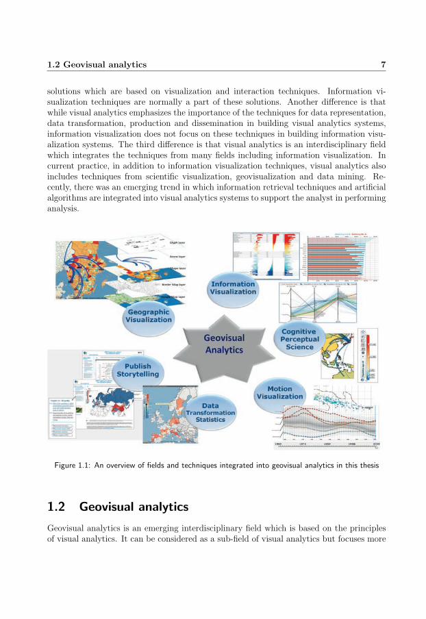
solutions which are based on visualization and interaction techniques. Information vi-sualization techniques are normally a part of these solutions. Another difference is thatwhile visual analytics emphasizes the importance of the techniques for data representation,data transformation, production and dissemination in building visual analytics systems,information visualization does not focus on these techniques in building information visu-alization systems. The third difference is that visual analytics is an interdisciplinary fieldwhich integrates the techniques from many fields including information visualization. Incurrent practice, in addition to information visualization techniques, visual analytics alsoincludes techniques from scientific visualization, geovisualization and data mining. Re-cently, there was an emerging trend in which information retrieval techniques and artificialalgorithms are integrated into visual analytics systems to support the analyst in performinganalysis.
Figure 1.1: An overview of fields and techniques integrated into geovisual analytics in this thesis
1.2 Geovisual analytics
Geovisual analytics is an emerging interdisciplinary field which is based on the principlesof visual analytics. It can be considered as a sub-field of visual analytics but focuses more
8 Introduction
on geographic aspects such as geospatial data, map techniques and geographic phenomena.For example, in 2007, Andrienko et al. [6] suggested one research focus area for geovisualanalytics which focuses on spatial decision support and is named ‘Geovisual Analytics forSpatial Decision Support’. This focus area deals with spatial decision problems whichnormally (1) have complex nature of geographic and temporal spaces, (2) involve multipleactors with different roles and (3) involve tacit criteria and knowledge. It aims at support-ing users to make effective decisions through the use of automated algorithms, interactivevisualizations and human judgements. Another key topic of geovisual analytics is ‘Spaceand Time’ [5] which focuses on both space and time aspects and addresses the temporalnature of geographic data, the characteristics of time as well as the structure of time.
Similar to visual analytics, geovisual analytics is built on the basis of research in manydifferent areas such as information visualization, geovisualization, geographic informationscience and data mining. It also takes into account the concepts from a number of otherfields such as cognition and perception.
Geovisual analytics can be used for many activities ranging from counter-terrorism,disaster management to strategic business decision making.
Figure 1.1 illustrates fields and techniques integrated into geovisual analytics in thisthesis.
1.3 Challenges
Although many advances have been made in the research of visual analytics and geovisualanalytics, many challenges still remain. The first challenge is that the analyst wants to havemore interaction techniques and interactive features in visualizations. For example, whenworking with scatter plots, the analyst normally asks for more interaction techniques andinteractive features such as zoom, animation, colour changing, attribute switching, bubblescaling, bubble tracing, bubble labelling, and so on. In general, it is still a challenge tocombine a rich set of interaction techniques and interactive features into visualizations ina good way to support better analysis.
The second challenge is that during the exploratory data analysis (EDA) process theanalyst normally wants to capture discoveries made and save them so that he or she canshare them with his or her colleagues or present them to other users such as analysisconsumers or the public. This feature requires effective methods for capturing and savinginteractive visualizations so that other users can see what the analyst has discovered andeven interact with saved interactive visualizations to confirm the result or give feedback.In current practice, most of visual analytics systems miss this feature.
The third challenge is to apply visual analytics to solving problems in different domains.There is still a big gap between the increasing needs of the user for analysing data in manydifferent domains and what visual analytics has contributed so far. The challenge comesfrom the fact that data in different domains normally have different characteristics and,in many cases, are very complex. For each specific type of data, it may need a specificsolution with a specific set of visual analytics techniques. The needs of the user may also

1.4 Overview of the included papers 9
vary a lot from domain to domain. This challenge relates also to the fact that the researchso far has not focused on the development of frameworks and systems which can reducethe time and effort for developing visual analytics applications. While visual analyticstools and techniques are many, it is still a challenge to integrate them into frameworkswhich can facilitate the development of visual analytics applications for different problemsin different domains.
Another challenge is to adapt visual analytics tools to the internet environment andmobile platforms so that they can reach a broader user community and the public can ben-efit from them. Together with the rise of ‘Web 2.0’ and the dramatic development of socialnetworks, blogs, wikis and mobile platforms, the need for using visual analytics tools todisseminate data and analytical results in the form of interactive visualizations to get moreattention from the public and the media on various issues is also increasing continuously.However, the current programming platforms for developing web-based visualizations thatcan run on different web platforms and mobile platforms are still limited in many aspectsand still difficult to use.
In summary, the major challenges addressed in this thesis include:
• enhancing visualizations with a rich set of interaction techniques and interactivefeatures to enhance their power in exploring and analysing data;
• effective methods for capturing and saving discoveries made during the EDA process;
• applying visual analytics techniques and principles to solving problems in differentdomains;
• the development of frameworks and systems which integrate various visual analyticstools and techniques to facilitate the development of visual analytics applications;and
• the adaptation of visual analytics tools and systems to the internet environment toreach a broader user community;
1.4 Overview of the included papers
This section presents a short overview of the publications included in the thesis. A morethorough description of their contributions are presented in chapters 3 and 4. The authorof this thesis is the first author of all the papers and the main contributor to papers III,IV, V and VI and one of the main contributors to papers I and II. The main focus of theincluded publications is as follows:
Paper I presents the architecture, modules and features of the GAV Flash version ofthe framework which is named GAV Flash framework. It also presents the challenges forthe implementation of the framework in Adobe Flash Action Script. The author of thisthesis (1) is responsible for the development of the whole framework, (2) together with the
10 Introduction
third author are two main contributors to the design, architecture, modules, features andthe implementation of the framework except the storytelling technique and write the sec-tion GAV Flash framework, (3) together with the second author are two main contributorsto the snapshot technique and write the subsection Snapshot of the section Storytellingand (4) is the main contributor to the section Related work and the subsection ANROSSof the section Case studies.
Paper II introduces the GAV HTML5/JavaScript version of the framework, an adap-tation and extension of the GAV Flash version to HTML5/JavaScript to support tabletsand smartphones, and named GAV HTML5/JavaScript framework. It also presents thechallenges for the implementation of the framework in JavaScript. The author of this thesis(1) is responsible for the development of the GAV HTML5/JavaScript framework, (2) isone of two main contributors to the adaptation and extension of the GAV Flash frame-work to HTML5/JavaScript, (3) is one of two main contributors to the implementationwork, (4) is the main contributor to sections 2 and 3, and (5) partly contributes to section 4.
Paper III presents an approach to and a prototype for the exploration of time-varyingmultivariate volume data based on the synergy among a number of techniques from fieldsof scientific visualization, information visualization and geovisualization. The author ofthis thesis is the main contributor to the paper and the implementation work.
Paper IV presents an approach to and a prototype for the visual analysis of self-organizingnetwork data to demonstrate how an automated algorithm configures a cellular radio net-work. The author of this thesis is the main contributor to the paper and the implementationwork.
Paper V presents an approach to and a demonstrator for the visual analysis of spa-tial interaction data. The author of this thesis is the main contributor to the paper andtogether with the second author are two main contributors to the implementation work.
Paper VI presents an approach to and a demonstrator for the visual analysis of flooddata in a flood scenario. The author of this thesis is the main contributor to the paperand the implementation work.

Chapter 2
Background and Related Work
This chapter will give the background of the research work presented in this thesis and anoverview of research works which relate to this research work and are published before thepapers included in this thesis are published. It mainly addresses the following four subjects:(1) interaction techniques, (2) geovisual analytics frameworks and toolkits, (3) tools forcapturing gained insight and (4) geovisual analytics approaches applied to a number ofspecific domains.
2.1 Interaction techniques
Insight is normally gained through interaction. Without interaction, visualizations be-come static images and therefore less useful. Although static images can still be used foranalysing data, they do not allow the user to interact with data and therefore limit theability to support the user in performing data analysis.
Although interaction (including interaction techniques and interactive features) is animportant component of visualizations, many research papers have focused more on visualrepresentations than interaction aspects. This may originate from the fact that the im-plementation of interaction techniques and interactive features normally takes much moretime than the implementation of visual representations.
Research on interaction can be divided into two parts. In one part, it focuses oncategorizing interaction techniques [22, 44, 68, 88]. For example, Shneiderman [68] classifiesinteraction techniques into: (1) overview, (2) zoom, (3) filter, (4) details-on-demand, (5)relate, (6) history and (7) extract. Dix and Ellis [22] divide them into (1) highlightingand focus, (2) accessing extra information – drill down and hyperlinks, (3) overview andcontext zooming and fisheye views, (4) same representation, changing parameters, (5) samedata, changing representation and (6) linking representation – temporal fusion. In anotherpart, it focuses on finding new interaction techniques or applying interaction techniquesto visualizations [50, 60, 65, 71]. This is also one of the focuses of this research work.The following subsections summarize a number of interaction techniques and highlightthe outstanding features of the interaction techniques designed in this research work incomparison with other research works.
12 Background and Related Work
2.1.1 Fisheye lens technique
The concept of fisheye was introduced for the first time by Robert W. Wood in 1906 andthen applied widely to many areas including visualization areas. For example, Sarkar andBrown [65] applied it to large graphs and maps. Nevertheless, they did not illustrate howthe user can use this technique interactively. In a similar manner, Tominski et al. [81]applied it to tree views and graph visualizations. The distortion caused by the fisheyelens technique, in many cases, makes the focus view difficult for normal users to perceive.To make it easier for normal users, this research work does not use the same principle ofthe fisheye technique; instead, it modifies this technique by removing the distortion effect(as briefly described below) and applies it to bar charts and time graphs, as illustrated inFigure 3.7 and Figure 2.1 (the bottom view). For the bar chart, the bars in the focus viewhave the same width and this width is bigger than the width of the bars in the contextview and can be controlled by the user. This means the user can increase or decrease thewidth of the bars in the focus view. Similarly, for the time graph, the distances betweentwo consecutive time points in the focus view are the same and these distances are tentimes larger than the distances between two consecutive time points in the context view.The focus view in these visualizations can be changed interactively through a dual slider inthe bottom of the view. The user can move the slider to move the focus view or move twocontrol points of the slider to extend or shorten the focus view (i.e. to increase or decreasethe number of items displayed in the focus view).
2.1.2 Multiple linked views
The mulitple linked views subject has been addressed in many research papers [7, 44,62]. Baldonado et al. [7] introduced guidelines for using multiple views in informationvisualization. Keim [44] and Roberts [62, 63] emphasized the advantages of multiple linkedviews. Roberts [62, 63] also provided an excellent overview of using multiple linked views(or coordinated and multiple views). The common mechanisms for linking views include(1) linking based on selection or brushing, (2) linking based on sharing the same data and(3) linking based on filtering. For example, Carr et al. [15] and Becker and Cleveland[9] introduced linking based on selection and brushing in their scatter plots. When itemsare brushed in one scatter plot, they will be highlighted in other scatter plots. Dykes [23]introduced CDV in which a scatter plot and a choropleth map are linked to each otherthrough a selection mechanism. Shneiderman [67] and Livny et al. [47] introduced anotherway of linking views: linking based on sharing the same data among views. This data isqueried from a database through dynamic queries which can be updated through sliderscontrolling the parameters of the queries. The work of Jern and his group [36, 37, 38] isan excellent example of how a number of different linking mechanisms can be integratedinto one system. The linking mechanisms supported in their framework include:
• linking based on selection; when one or many items are selected in one views, theyare highlighted in the other linked views;

2.1 Interaction techniques 13
Figure 2.1: An illustration of two focus-and-context techniques applied to the time graph: (1) the toptime graph uses two sub-graphs, one for the focus view and another for the context view, and (2) thebottom time graph uses a technique which is similar to the fisheye lens technique
• linking based on sharing the same data model; when the data input of views isupdated through dynamic queries, all the views are updated to reflect this change;
• linking based on filtering; this mechanism is done through axes of a parallel coordinateplot which act as sliders; items (or records) are filtered based on their attribute values;
• linking based on sharing the same colour scheme; this mechanism is done througha colour map which contains a number of settings and controls to allow the user tochange the colour map; when the colour map or the colour scheme is changed, alllinked views are updated based on this change;
• linking based on animation (i.e. by sharing the same point in time); when the timeperiod is changed, all linked views are updated to reflect this change;
The research work presented in this thesis inherits, refines and extends the work ofJern and his group. It develops a model to facilitate linking visualization components toeach other. Each linking mechanism is implemented through a linking component (or alinking manager). Views sharing the same linking component are linked to each other. Inaddition, this research work also introduces one more linking mechanism: linking basedon colour filtering, as illustrated in Figure 3.9. This filtering mechanism is similar to thefiltering mechanism which is based on attribute values as mentioned above. The difference

14 Background and Related Work
is that it is done through a colour map containing controls which allow the user to filteritems based on their colours. It also extends the linking mechanism based on selection tosupport the following feature: when one or more items are selected in one view, in additionto being highlighted, these items (or the last selected items if the positions of the items arefar to each other in views) are brought to the centre of linked views. This allows the userto quickly see the selected items (or at least the last selected items) in all linked views.
2.2 Toolkits for spatial-temporal multivariate data
Visual exploration of spatial-temporal and multivariate data has been the subject of manyresearch papers. Andrienko and Andrienko illustrated several motivating approaches intheir earlier papers [3, 4] for the visual exploration of spatial temporal data. Muller andSchumann [52] provided a good overview of visualization methods for time dependent data.Many research papers and efforts [12, 13, 26, 27, 31, 36, 40, 57, 73, 74, 75, 76, 80, 83] focusedon the development of visualization toolkits and systems for different types of data anddifferent purposes. This section provides an overview of frameworks, toolkits and systemswhich highly relate to the research work presented in this thesis.
Jazz [12] is an extensible zoomable user interface (ZUI) graphics toolkit developed inJava. It is developed based on ‘minilithic’ design philosophy and scene graph techniques.It is designed to particularly support the development of ZUI applications. It supportsfisheye views and multiple views; however, it is unclear whether or not it supports linkedviews. It is also not designed to provide highly functional visualizations (e.g. choroplethmap, scatter plot, PCP) to allow developers to quickly build applications. Instead, itprovides a set of nodes based on which developers build visualizations by themselves.
Polaris[73] is a system developed for query, analysis and visualization of multi-dimensionalrelational databases. It is designed to visualize tabular data structures queried from a re-lational database. It develops a grammar of graphics, which is similar to the work ofWilkinson [84], to build up visualizations. A number of visualizations introduced in thesystem include a graphic table, Gantt charts, a map, a line chart, a bar chart and a scatterplot. It supports multiple linked views through the mechanisms based on sharing the samedata, filtering or brushing.
GeoVISTA studio [74, 76], VIS-STAMP [31], Infovis toolkit [26] and GAV C# frame-work [36, 40] are the toolkits and frameworks which are close to the framework developedin this research work. The GeoVISTA studio is developed based on Java and JavaBeans,the Infovis Toolkit is based on Java, and the GAV C# framework is based on C#/.NET.All of them have component architecture and support multiple linked views. Linking mech-anisms supported in these systems include linking based on selection/brushing, filteringand dynamic queries. The GAV C# framework also supports linking views through colour-ing and animation mechanisms. The GeoVISTA studio implements a visual programminginterface to facilitate building applications. The Infovis toolkit implements a fisheye lenstechnique in all visualizations it supports. To the author’s best knowledge, except theGAV C# framework which mentions a mechanism (named snapshot) for capturing EDA

2.3 Tools for capturing EDA processes 15
processes, none of toolkits or systems mentioned above support capturing EDA processes,which is one of necessary and important features for visual analytics systems and also oneof the subjects of this research work.
Although there are many tools for spatial-temporal multivariate data, it has still beena challenge to adapt these tools to the Internet and reach a broader user community,which is one of the goals of this research work. Web-enabled tools are therefore neededfor applications which are explicitly designed with the purpose of visualizing, exploringand communicating spatial-temporal and multivariate data through web environments.Such tools should also employ data transformers and data providers, layout mechanisms,interaction, time animation and storytelling suited to geovisual analytics tasks. Protovis[13, 57] and Flare [27] are examples of web-enabled tools. They include a collection ofinteractive visualization components. Nevertheless, they do not seem to support multiplelinked views, time-animation and abilities to capture EDA processes.
Tableau [75] is another example of a popular web-enabled tool applied to businessanalytics. In addition to a collection of interactive visualizations, it also supports multiplelinked views.
To the author’s best knowledge, most of web-enabled visualization toolkits (in thecontext before the GAV Flash framework developed in this research work was published)either do not support a map view or support a map view with very limited interactivefeatures. They do not seem (1) to support working with online maps such as Google map,Bing map and OpenStreetMap, and (2) to allow putting visualizations, for example glyphlayers, on top of the online maps. These features are among the objectives of this researchwork.
2.3 Tools for capturing EDA processes
Capturing EDA processes is important for sharing, communicating and evaluating analyt-ical results, and collaboration. Many research papers [35, 69, 78] addressed this need. Onecommon and simple approach is to capture the screen or views as static images. Anotherapproach is to capture the state of views. Jern described this idea in his early paper [35]in which discoveries made during an EDA process can be captured into snapshots whichcopy the state of components at the time each snapshot was taken. These discoveriescan be published and presented to the user through interactive visualizations which allowthe user to interact with. Robinson [64] presented a method called “Re-Visualization”and a related tool, named ReVise, that allows users to save and re-use what they havediscovered. Shrinivasan and Wijk [69] introduced a framework which can automaticallycapture the state of visualizations during navigation processes and allows the user to revisitthe visualization states sequentially in the order of creation using back and forward arrowkeys. Keel [42] presented a visual analytics system of computational agents which supportsthe exchange of task-relevant information and incremental discoveries of relationships andknowledge among team members commonly referred to as sense-making. However, it isnot clear what method or approach is used to capture discoveries.
16 Background and Related Work
The research work presented in this thesis uses the same approach as the one used byJern [35, 39] and the others [64, 69]. In addition to capturing the state of visualizations (i.e.property values of visualizations), it also captures the state of the application, such as theapplication layout that includes (1) the relative size of views (or the ratios among views)in the application and (2) which views are being active if views are tabbed. This allowsthe reader has the same view of the application as the author who shares the discoveriesmade during an EDA process.
2.4 Visual analysis of communication network data
As communication networks become more complex, it becomes more important for the net-work operator to understand the behaviour of communication networks. Communicationnetwork data visualization has therefore been the topic of many research papers. Withallet al. [85] provided an excellent overview of the research in this domain. Many researchefforts have focused on the visualization of the topology of networks, which is not the goalof this research work. Many others have focused on the visualization of the geographicalstructure of networks. For example, Becker et al. [8, 10, 11] presented SeeNet, a systemthat uses three graphical tools, ‘Link map’, ‘Node map’ and ‘Matrix display’ to visualizenetwork data, analyse network traffic and study overloads. ‘Link map’ uses line segmentsand arcs to represent pairs of connected nodes in two dimensions. ‘Node map’ uses simpleglyphs such as circles and rectangles to represent node locations and node data. Melissar-gos and Pu [51] presented a variation of the ‘Link map’ in which line segments connectingbetween two nodes are extended to represent load-per-link. Cox et al. [17, 18] extendedthe work of Becker et al. with three-dimensional arcs and bars to present Internet trafficinformation on a globe representation of the earth. They also used three-dimensional arcswith a two-dimensional map of the earth to partly reduce the problem of clutter.
Koutsofios et al. [45, 46] introduced SWIFT-3D that includes multiple linked viewsof interactive 3D maps, statistical displays, network topology diagrams and pixel-orienteddisplays for interactive exploration of large-scale network data. The research work pre-sented in this thesis shares the same approach of using multiple linked views but usesdifferent visualization techniques and analysis approaches to suit well to its goal and itsdata input which are different from the goal and the data input of other research works.More specifically, in addition to node data and node-node relation data, the self-organizingnetwork data used in this research work also contains a specific type of data: networkevents that describe how an automated algorithm operates the network. Therefore, one ofthe goals of this research work is to visualize network events to demonstrate the way anautomated algorithm works.

2.5 Visual analysis of spatial interaction data 17
2.5 Visual analysis of spatial interaction data
Spatial interaction data such as migration and commuting data has been the subject ofmany research papers and efforts [30, 49, 55, 59, 79, 87]. Many of them have focused more onthe visualization aspect than the analysis aspect. A common approach to the visualizationof spatial interactions (or flows) is to use straight lines, arcs or curves to represent flowsand the line thicknesses and/or line colours for the volume of the flows. This approach issimilar to one of the approaches mentioned above for network data, since both types ofdata (network data and spatial interaction data) share the same feature: connections orrelations among nodes (or among geographical locations in the case of spatial interactiondata). When applied to large geographical datasets, flows tend to be cluttered. To addressthis problem, there are a number of different approaches. One approach is to group linesinto bundles [19, 33, 34, 55]. This approach can effectively reduce the cluttering in a flowmap; however, it does not seem to easily support tasks such as comparison of flows backand forth between two locations or to support flow filtering; supporting such tasks areamong the objectives of this research work. Every time the user wants to focus on a subsetof flows, e.g. the top ten biggest flows or only the flows originating from an origin, and filterout all other flows, then the bundles should be redrawn or flow lines should be clusteredagain. In the latter case, the curves representing the flows can be changed. This can makeit more difficult for the user to observe the flows.
The second approach is to use a grid to compute the line density of each cell based onthe total number of migrants moving along flow lines through each cell [59]. This approachis suitable for giving an overall pattern of interactions between places; however, as thisapproach results in an image, it does not seem to support operations such as filtering,selection, brushing, zooming and panning. Supporting such operations is also among theobjectives of this research work.
The third approach is to divide a map into a regular grid in which each cell is used as asmall replica of the whole map [87]. This means each cell has a smaller regular grid (eachsmall cell in a smaller grid is called a square) and a smaller map. Each flow is mapped toa square of the cell from which the flow originates. The coordinates (i.e. row and columnpositions) of this square in the small grid are the same coordinates of the destination cellof the flow in the large grid. Flows mapped to the same square are aggregated. Thisapproach is very promising as it avoids the overlapping among flows while still preservesthe spatial layout of all origin and destination locations. However, the overlapping amongsquares and small maps can make it difficult for the user to determine the destination offlows. Normal users may also find it difficult to understand this technique. It is also hardto compare flows back and forth between two locations.
The fourth approach is to use interactive queries to select and show only a small subsetof data at a time [59]. This approach is more suitable for the objectives of this researchwork. Therefore, it is adopted in this research work.
Although there have been a lot of research efforts in this area, most of them do notseem to meet the objectives of this research work which focuses more on the aspects ofusability, user interactions, animation, analysis and knowledge communication instead of

18 Background and Related Work
giving an overview of spatial interactions.First, most of them, except the work of Guo [30], do not support user interaction
operations such as filtering, selection, brushing, zooming, panning and linking which arevery important to facilitate the EDA process.
Second, none of them use an additional dataset containing location attributes (e.g.income level, employment rate, purchase power) in combination with the flow dataset tosupport the analysis of the flow dataset, for example, answering questions such as ‘Whydo people move from one location to another?’
Third, they do not seem to support the visualization of flow data time series, which isan important aspect in most migration and commuting scenarios.
Fourth, they do not support web-enabled visualization which allows public users toaccess their work easily through internet. Public users, therefore, hardly benefit from theirwork.
Fifth, they do not support capturing analytical results. Therefore, the user cannoteasily communicate or share their discoveries with the others, which is one of importantand needed features for geovisual analytics systems.

Part B
Contributions


Chapter 3
A Web-enabled Geovisual AnalyticsFramework
The research presented in this thesis is based on a recommendation from the visual analytics(VA) research program, “support seamless integration of tools so that data requests, visualanalysis, note-taking, presentation composition and dissemination all take place within acohesive environment” [78, page 18], which addresses the need for integrated exploratory,analytical reasoning and communicative tools. It is concerned with the development ofgeovisual analytics techniques and the integration of these techniques into a frameworkto facilitate the development of applications for geovisual analytics tasks. The research istargeted at the web environment, which is growing dramatically, to meet the needs for theexploration and analysis of data and the presentation and dissemination of gained insightthrough web and internet to reach a broader user community. This chapter provides anoverview of the architecture, modules and features of a web-enabled geovisual analytics(GAV) framework developed within this research. The first version of the framework isimplemented in Adobe Flash ActionScript, named GAV Flash, and is introduced in paperI. The second version of the framework is implemented in HTML5 and JavaScript, namedGAV HTML5/JavaScript, and is introduced in paper II. Both versions share the samedesign principle, architecture and most of the features.
3.1 Framework architecture
The web-enabled framework in this thesis is developed based on component thinking or thecomponent based approach which is inherited from its predecessor (GAV C# framework[36, 37, 38]). Based on this approach, the framework is built as a collection of componentswhich allows application developers to pick and choose from a wide range of visualizations,data providers and data transforms and combine them in various ways they want. Thisfacilitates the development of large-scale systems. In many cases the process of building anapplication based on this framework becomes the process of rigging components together.
Components are designed so that they can easily communicate and be combined withother components and can also be easily extended. To achieve this goal, the interface pro-gramming mechanism is exploited. Each component is defined through an interface whichdetails only necessary functions and properties for communicating with other components.

22 A Web-enabled Geovisual Analytics Framework
An example of this is the dataset, whose interface is limited to functions that supply dataand metadata, but all other functions are encapsulated in its implementation. As thecomponents are only aware of the interfaces, we can easily replace the dataset with someother structure, for example, a direct database connection, without re-implementing anyvisualizations or data processors.
Figure 3.1: An overview of the web-enabled GAV framework architecture
Within this research, the framework is developed to include the following five componenttypes:
• layout components which are for creating application layouts;
• data components which are for loading data, processing data and transforming data;
• visualization components which are for visualization of data and interaction withdata;

3.1 Framework architecture 23
• linking components which are for linking visualization components together to createmultiple-linked views applications; and
• snapshot and storytelling components which are for capturing and saving the stateof components and creating stories as well as publishing stories.
Figure 3.1 shows an overview of the framework architecture in which data componentsare in the bottom, visualization components are in the middle and linking components arein the left. On top of these components is the application level.
3.1.1 Atomic and functional component architecture
Visualization components are usually dynamic and complex components. To facilitatethe development of these components, the multilayered architecture is adopted. Eachcomponent is broken down into small blocks called atomic components or layers. Theseatomic components are used together to form a fully functional component; however, theyare not dependent on each other. Therefore, they can be combined in any way. Thisconcept can take many forms depending on the parent component. One of the clearestexamples is the map component which uses many different layers to display different levelsof data as presented in subsection 3.1.2.
Figure 3.2: The multilayered architecture of a functional parallel coordinates plot component
24 A Web-enabled Geovisual Analytics Framework
In addition to visual layers, each functional visualization component is designed to havea setting panel which includes many controls and settings to allow the user to control thevisual appearance of the component or the way to interact with the component. Figure 3.2shows an example of a functional visualization component, a parallel coordinates plot(PCP), which is composed of a number of visual layers and a setting panel. The settingpanel includes settings which allow the user to change the line opacity and show or hide anumber of layers of the PCP.
The next section will describe an example of a functional component to demonstratethe concept of building a functional component from layers.
3.1.2 Map component
The heart of the map component is a map base class which contains no visual parts atall but controls everything needed to display something within its context. It createstransformations to deal with projections and keeps track of the user’s input as he or shezooms or pans. The visual parts are created in layers, for example, a polygon layer forcoloured regions, a highlighted border layer for selected regions and a glyph layer for regiondata. By making the map independent of its layers, we can combine them in many differentways or create new layers as long as they adhere to the basic principles of the map. Forexample, to make it easier for the user to work with geographic regions, a map layerwhich allows the user to use online web map services such as Google map, Bing map andOpenStreetMap is developed and added into the map component as a background maplayer. Based on this approach, map layers can be easily added into or removed from themap component.
In addition to visual layers, a setting panel is also designed to allow the user to showor hide layers or switch among online maps if any. Some layers such as a pie chart glyphlayer are also designed to have their own setting panels which allow the user to controlthe appearance or the property values of the layers, such as glyph colour, glyph scale andglyph opacity.
The multilayered architecture also facilitates the implementation of interaction tech-niques for the map component. For example, the selection technique is implementedthrough a selection layer which highlights selected regions. Similarly, the hovering tech-nique is implemented through a hovering layer which highlights the region under mousehovering; or an area-of-interest selection technique can be implemented through a rectanglelayer which highlights the area of interest.
Figure 3.3 illustrates the multilayered architecture of the map component with fourtypical layers: a background map layer (Google map in this case), a border layer, a colouredregion layer and a glyph layer (a pie chart glyph layer in this case). Chapter 4 will describea number of other map layers and interaction techniques which are developed and addedinto the map component to solve different geovisual analytics tasks.

3.2 Visualization methods 25
Figure 3.3: The multilayered architecture of the map component
3.2 Visualization methods
To facilitate various visual analysis tasks, the framework is designed to provide a wide rangeof visualization methods including information visualization methods and geovisualizationmethods. Main visualization methods supported in the framework include:
• a map with dynamic layers for the visualization and analysis of geographic data;
• a parallel coordinate plot, table lens, scatter plot and scatter plot matrix for thevisualization and analysis of multivariate data, especially for finding trends, outliersand correlations among variables;
• a bar chart, pie chart and a radar plot for comparing multivariate data items;
• a time graph for the visualization and analysis of time-series data;
• a tree map for the visualization and analysis of hierarchical data including bothspatial hierarchical data and demographical hierarchical data.
Figure 3.4 illustrates visualization methods supported in the framework.

26 A Web-enabled Geovisual Analytics Framework
Figure 3.4: An overview of visualization methods supported in the framework
3.3 Interaction techniques
Since insight is normally gained through interaction, visualization components in the frame-work are integrated with various interaction techniques and interactive features to enhancetheir ability of data exploration and analysis. Interaction techniques implemented in theframework include hovering, brushing, selection, zoom, pan, focusing (i.e. bringing selecteditems to the centre of view and in case of the map component, the map is zoomed in onthe selected regions), dynamic filtering, focus-and-context, drill-down, tooltips, details-on-demand, animation, and so on. For example, the map component is integrated with a richset of interaction techniques and interactive features: selection, tooltips, zoom, pan, hov-ering, focusing, focus-and-context, marker placing, distance measuring, annotation, routecreating and animation. Many of these techniques and features result in layers of the com-ponent as mentioned above. All interaction techniques and their corresponding layers ofthe map component are configurable. This means they can be added into or removed fromthe map component based on the user’s need.
Figure 3.5 shows an example of the map component with a number of interactiontechniques and interactive features: selection, hovering, marker placing, distance measur-ing, annotation and tooltips applied to the analysis of a flood scenario in Lisbon [20], aspresented in paper VI.
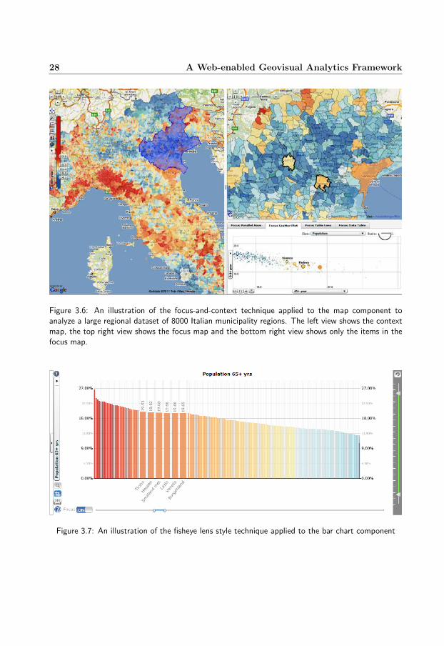
Figure 3.6 shows another example of the map component which is integrated with a

3.3 Interaction techniques 27
Figure 3.5: The map component integrated with various interaction techniques and interactive fea-tures: hovering, selection, marker placing, distance measuring, annotation and tooltips applied to aflood scenario in Lisbon. Selected buildings are displayed with pink borders and a building underhovering is highlighted with a yellow border.
focus-and-context technique and applied to 8000 Italian municipality regions. The usercan interactively select an area of interest in the context map in the left view and thenall regions in that area or the province will be displayed in the focus map in the top rightview [28].
Other components of the framework are also enhanced with a rich set of interactiontechniques and interactive features. For example, in addition to common interaction tech-niques and interactive features such as selection, hovering, tooltips and animation, theparallel coordinates plot is also enhanced with filtering, axis switching and semantic zoom;the scatter plot is enhanced with zoom, scaling and animation; the treemap is enhancedwith drill-down techniques; the bar chart and the time graph are enhanced with the focus-and-context technique, and so on. Figure 3.7 shows the bar chart component integratedwith a technique which is similar to the fisheye lens technique.
Note: Semantic zoom in the context of this research work is different from ordinarygraphical zoom in the aspect that it works on the value space instead of the view space.Nevertheless, values are normally mapped to positions in the view space; in this case,semantic zoom has the similar effect as ordinary graphical zoom.
28 A Web-enabled Geovisual Analytics Framework
Figure 3.6: An illustration of the focus-and-context technique applied to the map component toanalyze a large regional dataset of 8000 Italian municipality regions. The left view shows the contextmap, the top right view shows the focus map and the bottom right view shows only the items in thefocus map.
Figure 3.7: An illustration of the fisheye lens style technique applied to the bar chart component
3.4 Perceptual methods 29
3.4 Perceptual methods
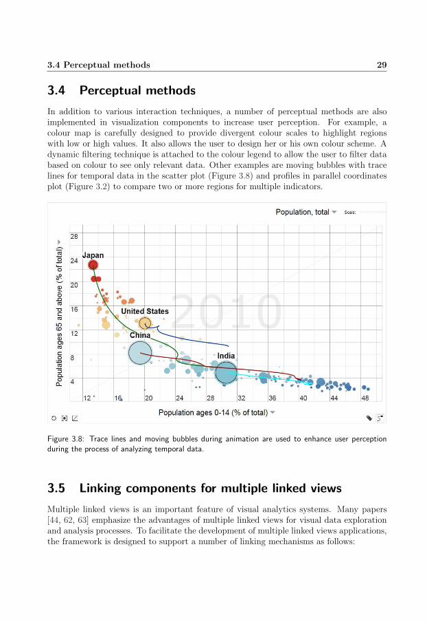
In addition to various interaction techniques, a number of perceptual methods are alsoimplemented in visualization components to increase user perception. For example, acolour map is carefully designed to provide divergent colour scales to highlight regionswith low or high values. It also allows the user to design her or his own colour scheme. Adynamic filtering technique is attached to the colour legend to allow the user to filter databased on colour to see only relevant data. Other examples are moving bubbles with tracelines for temporal data in the scatter plot (Figure 3.8) and profiles in parallel coordinatesplot (Figure 3.2) to compare two or more regions for multiple indicators.
Figure 3.8: Trace lines and moving bubbles during animation are used to enhance user perceptionduring the process of analyzing temporal data.
3.5 Linking components for multiple linked views
Multiple linked views is an important feature of visual analytics systems. Many papers[44, 62, 63] emphasize the advantages of multiple linked views for visual data explorationand analysis processes. To facilitate the development of multiple linked views applications,the framework is designed to support a number of linking mechanisms as follows:

30 A Web-enabled Geovisual Analytics Framework
• linking based on data, i.e. if a dataset is changed, all views linked to this dataset areupdated;
• linking based on selection, i.e. if an item is selected in one view, it will be treated asa selected item in all linked views;
• linking based on filtering, i.e. if an item is filtered out in one view, it will be filteredout in all linked views; filtering can be done based on the attribute value or the colourof items; Figure 3.9 illustrates the linking mechanism based on colour filtering;
• linking based on time animation, i.e. all linked views share the same time animationcontroller which controls the time period during an animation process; when the timeperiod is changed, all linked views are updated; and
• linking based on colouring, i.e. all linked views share the same colouring scheme;whenever there is a change made on the colouring scheme, all views linked to thiscolour scheme are updated to reflect this change.
Figure 3.9: An illustration of the linking mechanism based on colour filtering; only items with redcolour are displayed, other items are filtered out
To implement these linking mechanisms, the framework implements a number of linkingcomponents or managers: a selection manager, a visibility manager, a colour map andan animation manager. The selection manager controls the list of selected items, calledselection list. The visibility manager controls the list of the filtering status of items,called visibility list. The colour map controls the colouring scheme and the animationmanager controls the time period. A new concept is also introduced: a program context
3.6 Dataset model 31
which contains a dataset, a selection manager, a visibility manager, a colour map and ananimation manager. Components sharing the same program context will, therefore, sharethe same dataset, selection list, visibility list, colouring scheme and time period. Whenevera change happens in the program context, all components using this program context willbe informed about the change and each of them will respond to this change by its ownway. For example, a click on a region in a map component will change the selection listand this change will be informed to all components (including the map component itself)which share the same program context as the map component. All linked components willthen highlight the selected data item corresponding to the selected region.
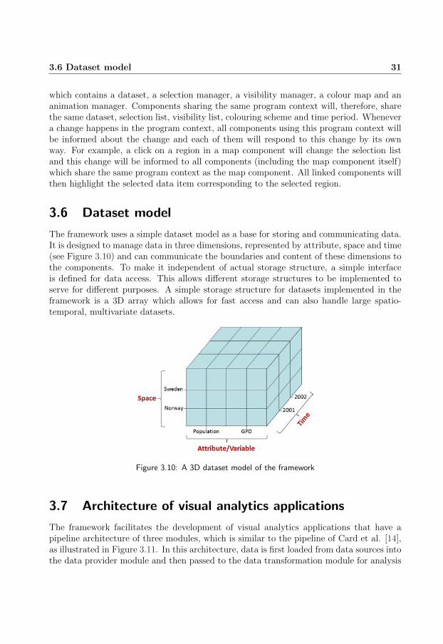
3.6 Dataset model
The framework uses a simple dataset model as a base for storing and communicating data.It is designed to manage data in three dimensions, represented by attribute, space and time(see Figure 3.10) and can communicate the boundaries and content of these dimensions tothe components. To make it independent of actual storage structure, a simple interfaceis defined for data access. This allows different storage structures to be implemented toserve for different purposes. A simple storage structure for datasets implemented in theframework is a 3D array which allows for fast access and can also handle large spatio-temporal, multivariate datasets.
Figure 3.10: A 3D dataset model of the framework
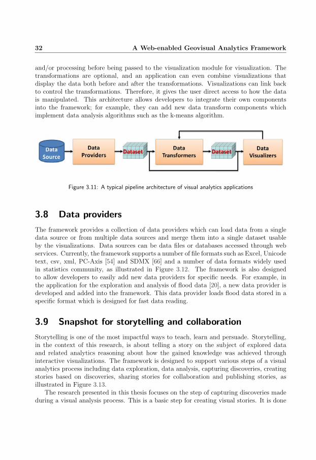
3.7 Architecture of visual analytics applications
The framework facilitates the development of visual analytics applications that have apipeline architecture of three modules, which is similar to the pipeline of Card et al. [14],as illustrated in Figure 3.11. In this architecture, data is first loaded from data sources intothe data provider module and then passed to the data transformation module for analysis
32 A Web-enabled Geovisual Analytics Framework
and/or processing before being passed to the visualization module for visualization. Thetransformations are optional, and an application can even combine visualizations thatdisplay the data both before and after the transformations. Visualizations can link backto control the transformations. Therefore, it gives the user direct access to how the datais manipulated. This architecture allows developers to integrate their own componentsinto the framework; for example, they can add new data transform components whichimplement data analysis algorithms such as the k-means algorithm.
Figure 3.11: A typical pipeline architecture of visual analytics applications
3.8 Data providers
The framework provides a collection of data providers which can load data from a singledata source or from multiple data sources and merge them into a single dataset usableby the visualizations. Data sources can be data files or databases accessed through webservices. Currently, the framework supports a number of file formats such as Excel, Unicodetext, csv, xml, PC-Axis [54] and SDMX [66] and a number of data formats widely usedin statistics community, as illustrated in Figure 3.12. The framework is also designedto allow developers to easily add new data providers for specific needs. For example, inthe application for the exploration and analysis of flood data [20], a new data provider isdeveloped and added into the framework. This data provider loads flood data stored in aspecific format which is designed for fast data reading.
3.9 Snapshot for storytelling and collaboration
Storytelling is one of the most impactful ways to teach, learn and persuade. Storytelling,in the context of this research, is about telling a story on the subject of explored dataand related analytics reasoning about how the gained knowledge was achieved throughinteractive visualizations. The framework is designed to support various steps of a visualanalytics process including data exploration, data analysis, capturing discoveries, creatingstories based on discoveries, sharing stories for collaboration and publishing stories, asillustrated in Figure 3.13.
The research presented in this thesis focuses on the step of capturing discoveries madeduring a visual analysis process. This is a basic step for creating visual stories. It is done

3.9 Snapshot for storytelling and collaboration 33
Figure 3.12: A number of data formats used in statistics community and supported by the framework
through a mechanism called ‘snapshot’ that allows capturing the state of all interactivevisualization views, the dataset and the layout of the application at the capturing timeand saving them as a snapshot into a story file, as illustrated in Figure 3.14.
Snapshots can be captured at any time during an EDA process and they are normallyassociated with text to form a story which can help the analyst to subsequently guide otheranalysts or users to follow the discoveries made.
A number of examples of using snapshots for storytelling and collaboration are pre-sented in chapter 4 through applications developed based on the framework.

34 A Web-enabled Geovisual Analytics Framework
Figure 3.13: An example of an explorative analytics process in which the user (1) explores data, (2)gains insight, (3) creates stories, (4) shares stories and gets feedback and (5) publishes stories.
3.10 Extendibility
To ensure that a specific visual analytics task can be solved by the framework, the frame-work is designed to allow developers to add new features or new layers into an existingcomponent or rewrite a component to improve its performance or even add new compo-nents into it. To facilitate this process, the interface mechanism is extensively employed inthe design of components. More specifically, components are based only on interfaces thatare necessary to make them work when being connected to other components. Neverthe-less, to make the implementation of components easier, the interfaces are kept as simple aspossible. This means that they only contain definitions necessary for communicating withthe components. For example, in the dataset model above, datasets use a simple interface,called IDataset, which only includes definitions of basic functions such as getValue, get-NumRecords, getNumAttributes, getNumSlices and some extra functions such as getMax,getMin and getMean to supply necessary data to other components as well as to avoid therecalculation of the same operation in different components.

3.11 Choices of programming platforms 35
Figure 3.14: An illustration of the snapshot mechanism which allows capturing the state and thelayout of all interactive visualization views and saving them into a story file
3.11 Choices of programming platforms
The development of the framework for web platforms was started in summer 2008. Duringthat time there were only a few programming languages for web platforms such as MicrosoftSilverlight and Adobe Flash ActionScript. Among of them Adobe Flash emerged as a de-factor standard for the development of web-based applications because of its wide spreaduse and easy access to internet users. Furthermore, it is an object-oriented programminglanguage which facilitates large-scale web-based applications. Therefore, in 2008, AdobeFlash has been chosen as a platform for the development of the GAV Flash version. Nev-ertheless, since 2011, there has been an increasing trend of using mobile devices to accessinternet. For the first time ever in 2011, the number of sales of smartphones exceededthose of PCs including tablet computers [61]; however, not all mobile devices supportAdobe Flash, especially Apple ones. To reach a broader user community, we need to finda programming platform which is supported by all modern web browsers and cross de-vice. Since HTML5 and JavaScript meet this condition and are also promoted for futureweb content, they are chosen for the development of the GAV HTML5/JavaScript version.Using HTML5 and JavaScript facilitates integrating the framework into other web-basedframeworks and systems and increases the accessibility of the framework. Nevertheless,choosing Adobe Flash ActionScript in 2008 and then HTML5/JavaScript in early 2012 forthe development of the prototypes of the framework also face a number of challenges asdiscussed in the following section.

36 A Web-enabled Geovisual Analytics Framework
3.12 Implementation challenges
Choosing Adobe Flash ActionScript as a programming platform for the development ofthe framework faces two major challenges when dealing with large datasets and advancedcomponents such as PCP and chorlopleth map: performance and interactivity. For exam-ple, for a PCP, the performance depends largely on the number of lines, the number of linesegments of each line, line thickness, line opacity and the view size. For small datasets ofless than 2000 items over about 10 attributes, the straightforward approach is to representa line by a Flash Shape object. This approach facilitates the implementation of line fil-tering and line colour/opacity transforms through employing the abilities of Flash Playerto show/hide objects and transform their colour/opacity without redrawing. Nevertheless,the rendering time increases quickly for larger datasets. This is due to the pixel colourblending process which consumes more time when the number of lines through a singlepixel increase. To speed up this process we divide lines into groups, each of which includesa subset of lines; the number of lines in each group can be adjusted by users. Each groupis then drawn into a Shape object and then cached as a bitmap. A number of tests aredone and the result shows that the approach with 200 lines in a group is from 6 to 51 timesfaster than the non-grouping approach but uses twice as much memory as the other. Italso shows that putting 100 lines in a group does not improve rendering time but takesone and a half times as much memory as putting 200 lines in a group.
The second challenge comes from the fact that Flash Player does not support multi-threaded ActionScript, which makes the application unresponsive during the execution oftasks that, in many cases, can take up to tens of seconds, such as drawing a large numberof items. Unresponsiveness for a long time can distract the user and make the explorationprocess of the user less efficient. To address this problem in a similar manner to Piringer[56], a library has been developed to simulate a multithreading environment. The approachis to assign each large task (e.g. drawing 10000 lines) to a so-called micro thread (or apseudo thread) and to divide each large task into a number of smaller tasks (e.g. drawing100 lines at a time) so that each small task can be executed in a reasonable time period.Small tasks are then scheduled into frames so that the total execution time of each frame isless than what the given frame rate allows, typically 30 ms per frame. After each frame thecontrol is returned to the Flash Player and allows the user to interact with the application.Threads can be cancelled early due to user interaction, and new threads can be scheduledand executed to reflect user updates. A demonstration of this approach can be found atthe link [28].
Choosing HTML5/JavaScript faces a different challenge which comes from the natureof JavaScript. JavaScript is a prototype-based programming language and does not sup-port object-oriented programming (OOP) in the conventional sense. It does not have theconcepts of class and class inheritance like conventional object-oriented programming lan-guages, such as C++ or Java, which facilitate the development of large scale systems. Toovercome this problem, a number of techniques are implemented to simulate these con-cepts in JavaScript. For example, a special object type (named Klass) is implementedto simulate the concept of class; inheritance is implemented through the use of prototype

3.13 Conclusions and contributions 37
chaining; and encapsulation for private methods is implemented through the use of the‘closure’ concept in JavaScript.
3.13 Conclusions and contributions
This part of the research inherits the component thinking approach, the multilayered com-ponent architecture, the linking mechanisms based on selection and filtering, and the con-cept of snapshot mechanism presented in the papers [36, 37, 38, 40]) to develop two versionsof a web-enabled framework.
All components are reviewed, refined and in many cases are re-designed to have bet-ter layouts, better interfaces, better implementations, new features and new interactiontechniques. For example, the PCP is extended with a setting panel which can be easilyaccessed by one click. Its layer structure is refined; for example, instead of using one layerfor both selected lines and unselected lines, it uses two layers, one for each type of lines.This avoids re-rendering the unselected lines when the colour or the opacity of the selectedlines is changed; new layers are also added, such as a line legend layer and a mean linelayer.
The map component is extended with more map layers such as background map layersfor using online web map services, a pie chart glyph layer or other map layers as presentedin chapter 4. It is also extended with more interaction techniques such as focusing, focus-and-context and other techniques as presented in chapter 4.
The scatter plot is re-designed with a new interface and extended with many newfeatures such as moving bubbles with trace lines, zoom, dynamic scaling and labelling.
The bar chart and the time graph are also re-designed with new interfaces and extendedwith new interaction techniques and new features such as focus-and-context, semantic zoomand scaling.
New components are added, such as a tree map, a table lens, a distribution plot, aradar chart and a pie chart.
The filtering mechanism is extended to include more options: filtering by item andfiltering by category in addition to filtering by value.
The snapshot mechanism is refined and adapted to the web platform.The framework has been used to develop a number of geovisual analytics applications
such as (1) OECD eXplorer [25] which is developed in collaboration with OECD [53]for visualization, analysis and dissemination of statistic data, (2) ANROSS/VoSON [58]which is developed in close collaboration with the Swedish telecom company Ericsson [16]for analysing the behaviour of automated algorithms used to automatically configure self-organizing networks and (3) RoadVis [48, 82] which is developed in close collaborationwith Swedish Meteorological and Hydrological Institute (SMHI) [70] for analysing andcommunicating information about road weather conditions, particularly during the Swedishwinter months. A number of other geovisual analytics applications developed based on theframework, such as a flow map application [32] and a flood application [20], are presentedin chapter 4. The framework has also been used to develop applications which are used

38 A Web-enabled Geovisual Analytics Framework
in a research project to examine the effectiveness, efficiency and user satisfaction of usinggeovisual analytics tools for teaching students [72].
In summary, this part of the research is believed to contribute to the geovisual analyticsfield a new framework which is web-enabled, extendible and has the following features:
• including a wide range of highly interactive visualizations which are enhanced witha rich set of interaction techniques and interactive features;
• supporting different projections and online web map services;
• supporting multiple coordinated and linked views through various linking mecha-nisms;
• supporting a library which simulates a multithreading environment to improve inter-activity;
• facilitating the development of web-enabled interactive visualization applicationsthrough the component architecture;
• supporting many data formats which are widely used in the statistics community;
• supporting loading and merging data from multiple sources;
• supporting the snapshot mechanism for saving and packaging the results of a geovi-sual analytics reasoning process – the foundation for visual storytelling;

Chapter 4
Geovisual Analytics for MultivariateSpatio-Temporal Data
This chapter will present how geovisual analytics is applied to a number of specific domains.More specifically, it summarizes a number of geovisual analytics applications developed inthis thesis work for multivariate spatio-temporal data and summarizes the contributionsof the appended papers, each corresponds to a specific domain. The chapter includesfour sections. Section 4.1 presents the approaches and geovisual analytics techniques fortime-varying multivariate volume data and summarizes the main contributions of paperIII. Section 4.2 presents the approaches and geovisual analytics techniques for multivariatespatio-temporal self-organizing network data and the main contributions of paper IV. Sec-tion 4.3 presents the approaches and geovisual analytics techniques for time-varying spatialinteraction data and summarizes the main contributions of paper V. Section 4.4 presentsthe approaches and geovisual analytics techniques for multivariate spatio-temporal flooddata and summarizes the main contributions of paper VI.

40 Geovisual Analytics for Multivariate Spatio-Temporal Data
4.1 Geovisual analytics for time-varying multivariate vol-ume data
The large and ever-increasing amounts of multi-dimensional, multi-source, time-varyingand geospatial data have been a major challenge for visualization community. The needfor the analysis of this type of data in many cases demands the combination of differenttechniques from different visualization fields. Scientific visualization (SciVis), informationvisualization (InfoVis) and geovisualization (GeoVis) have developed almost parallel toeach other. The combination and integration of the techniques from these fields have stillbeen rare and have not gained enough attention. This part of the research, therefore, hasconcentrated on the integration of different techniques from SciVis, InfoVis and GeoVisto enhance the ability of the visual exploration and analysis of time-varying multivariatevolume data. It is demonstrated through a prototype for the visual exploration and analysisof ocean temperature and salinity volume data.
4.1.1 Objective
The overall goal of this part of the research has been to encourage and promote syner-gies between well-known information- and volume data visualization methods applied in amultiple coordinated and linked views interface. The objective has been
• to extend the GAV C# framework with visualization methods for 4D volume data;
• to develop visual user interface (VUI) and interaction techniques for the explorationof time-varying multivariate volume data;
• to develop a prototype to support the visual exploration and analysis of time-varyingmultivariate volume data; and
• to demonstrate the synergy of integrating volume visualization with common infor-mation visualization and geovisualization interaction techniques and to exploit jointusage in an intuitive and usable manner;
4.1.2 Approaches and results
Time-varying multivariate volume data in the context of this research is data of points ina three-dimensional (3D) space. Each point has a number of attribute values (e.g. temper-ature, pressure and salinity) and these values are time series. To support the visualizationof this type of data, the following visualization techniques (see Figure 4.1) are selected toimplement in the GAV C# framework:
• iso-surface;
• 3D orthogonal cutting planes;

4.1 Geovisual analytics for time-varying multivariate volume data 41
• 2D cutting planes;
• 2D and 3D cursors;
• 2D line graph; and
• volumetric cut-away (or cropping), as illustrated in Figure 4.2 (the middle view).
Figure 4.1: An illustration of the multiple coordinated and linked views of the prototype. The screenusage is also optimized for visual representations. Less than 5% of the screen pixels are devoted totradional GUIs.
To allow the user to easily interact with and explore data, these visualizations areenhanced with various interaction techniques. For example, the 3D visualizations areintegrated with zoom, pan and rotation techniques. The 3D cutting planes can be selectedby clicking, moved by dragging-and-dropping or by scrolling with mouse wheel. They canalso be moved through linked views such as through 2D cutting planes or sliders (to theright edge of Figure 4.1). The volumetric cut-away technique is enhanced with a selectiontechnique which allows the user to select one of eight sub volumes to be cut-away by just

42 Geovisual Analytics for Multivariate Spatio-Temporal Data
one click. The 2D cutting planes are enhanced with the techniques: zoom, pan, rotation,horizontal/vertical flipping and selection. All 2D and 3D visualizations are integrated withtechniques: brushing and brushing-and-selection (i.e. after brushing the cursor will bemoved to the last position of brushing, and this position will be selected and displayed inall linked views). To further facilitate the exploration and analysis of data, a number oflinking mechanisms are implemented, such as linking through (1) selection, (2) sliding (i.e.moving cutting planes), (3) time animation, (4) sharing the same colour scheme and (5)data cropping. For example, when a 3D cutting plane is moved, all views linked to that 3Dcutting plane are updated; when time period is changed through moving the time slider(the top right slider in Figure 4.1) or through moving the red dot in the time graph (thebottom left view in Figure 4.1), all linked views are updated with the new time period;or when a sub data volume is cut-away (through the volumetric cut-away technique), alllinked views are updated with the new data volume (see Figure 4.2).
To allow the user to switch among different modes of interaction, right-click contextmenus and shortcut keys are implemented. An example of a right-click context menu isillustrated in Figure 4.4.
A dynamic layout mechanism is also implemented to allow the user change the size ofviews or move around views by dragging-and-dropping.
Figure 4.2: An illustration of the volumetric cut-away technique and the linking mechanism based ondata cropping
To allow the user to get an immediate interactive response (i.e. less than 200 ms ondesktop computers) when interacting with data, a number of techniques are implemented

4.1 Geovisual analytics for time-varying multivariate volume data 43
to increase the performance of visualizations. For example, data items that are re-usedmany times (e.g. the min/max values of datasets or the results of comparing an isovalueagainst values at grid points of a volume data) are pre-calculated. A ‘lazy calculationmechanism’ is also implemented to avoid executing a process several times. The DirectX‘mesh’ object is used to calculate the normals of an isosurface.
To support the user in storing interactive events in an analytical reasoning process, asimple snapshot mechanism is implemented. The highlighted data points of coordinatedviews, the status of data volume, etc. can be captured, saved and reused at any timeduring the EDA process. This feature aids the visual communication of gained insight andconstructed knowledge.
To demonstrate a synergy and joint usage among different techniques from SciVis,InfoVis and GeoVis, a prototype is developed based on all techniques mentioned above andother techniques from InfoVis such as scatter plot. The prototype includes four modulesas illustrated in Figure 4.3. The module ‘Volume Data Explorer’ includes six linked views:(1) three views each for a 2D cutting plane, (2) one 3D view that integrates an iso-surfaceand three 3D cutting planes, (3) one time graph view and (4) one depth profile graphview. This module has a main layout as illustrated in Figure 4.1. The views can be movedaround by dragging-and-dropping. The module ‘Volume Data Cut-Away’ includes three2D cutting plane views as mentioned above and a 3D view that implements the volumetriccut-away technique. This module has a main layout as illustrated in Figure 4.2. These twomodules are used for the exploration of 4D volume data.
The module ‘Volume Data Correlator’ is designed for finding correlation between twovariables (e.g. temperature and salinity) in 5D volume datasets. It includes five linkedviews as illustrated in Figure 4.4. Two 2D cutting planes are put next to each other andact like two map views, each for one variable. These two views are linked to each otherthrough various interaction techniques such as selection, sub-dataset selection, zoom, pan,brushing and flipping. They are also linked to a scatter plot and line graphs through sub-dataset selection. This means when the user selects an area of interest in one of the twomaps, this area will be displayed in the scatter plot and two line graphs. The scatter plotis also linked back to other views through single item selection.
The prototype has been applied to the exploration of ocean temperature data [1],which is 4D volume data. The result from the exploration process shows that while the3D visualizations allow the user to gain an overall understanding of the data space, the2D visualizations allow the user to access precise data; interaction techniques and linkingmechanisms allow the user to interact with data through different ways and to gain betterunderstanding of data (see Figure 4.1 and Figure 4.2).
The prototype has been also applied to the exploration of ocean temperature andsalinity data, which is 5D volume data. Figure 4.4 shows an area of interest containing asmall spot which is outstanding from its vicinity.

44 Geovisual Analytics for Multivariate Spatio-Temporal Data
Figure 4.3: The prototype includes four modules in the EDA process (Selector, Explorer, Cut-awayand Correlator) demonstrated in a multiple coordinated and linked views interface for the explorationof ocean temperature and salinity volume data at different depth levels for a time period of 12 monthsin 1994.
4.1.3 Conclusions and contributions
This part of the research introduced a geovisual analytics approach to the explorationof time-varying multivariate volume data. It focuses on visual user interface techniquesthrough dynamic data manipulation and multiple coordinated and linked views appliedto a large ocean volume dataset. It encourages the synergy among SciVis, InfoVis andGeoVis techniques to enhance the performance of the exploration and analysis of time-varying multivariate volume data. It also takes into account the performance issue byimplementing different techniques to improve the performance of visualizations and theprototype.
The main contributions of this part of the research can be summarised as follows:

4.1 Geovisual analytics for time-varying multivariate volume data 45
Figure 4.4: A screenshot of five coordinated and linked views for comparing temperature and salinityusing 2D image maps, 2D scatter and 2D depth graph views. A comparison of temperature vs. salinityinside an area of interest is presented for time step August (7). The user has selected an area of specialinterest with high salinity values outside the coast of South America. Volume data inside the selectedarea are shown simultaneously in five coordinated and linked views. Correlation between the twoattributes for a time step is analysed in a 2D scatter and two depth profiles. The value at position(0,86,69) is highlighted in all views. A right-click context menu pops up after a mouse double clickand reveals possible interactive operations available for current view (the right 2D image map). Theuser has selected the operation ‘select area’ which is then applied until a new operation is requested.Shortcut keys are provided for the same purpose. A dynamic time slider updates all linked views withimmediate response time.
• means to interact dynamically with large-scale 4D or 5D volume data with immediateresponse time (i.e. less than 200 milliseconds on desktop computers); interactionmechanisms to support the visual analysis of time-varying multivariate volume data;
• a snapshot mechanism for capturing, saving and reusing interactive views;
• demonstration of the synergy of integrating volume visualization with common in-formation visualization and geovisualization interaction techniques to facilitate ex-ploration and discovery;
• a research toolkit platform for evaluating and implementing synergies between Info-

46 Geovisual Analytics for Multivariate Spatio-Temporal Data
Vis, GeoVis and SciVis methods; and
• a prototype for the visual exploration and analysis of time-varying multivariate vol-ume data;
The prototype can be further extended to include other visualization methods such asa parallel coordinate plot and map glyph layers to provide the user with more means toexplore and analyse time-varying multivariate volume data.
4.2 Geovisual analytics for self-organizing network data 47
4.2 Geovisual analytics for self-organizing network data
Cellular radio networks such as mobile networks are continually growing in both nodecount and complexity. It therefore becomes more difficult to manually configure the net-works and necessary to use time and cost effective algorithms to automatically configurethe networks. There have been a number of attempts to develop such automated algo-rithms. For instance, Ericsson [16], a Swedish telecommunication company, has developedan algorithm, called Automatic Neighbor Relations (ANR) [2], which automatically createsand updates neighbour cell relations as well as assigns and updates physical cell identitiesto avoid local conflicts. A network operated under an automated algorithm is called aself-organizing network. Network operators, however, may not trust automated algorithmsbecause they need to have an understanding of their behaviour, reliability and efficiency,which is not easily perceived. The challenge, therefore, is to develop tools to supportnetwork operators to understand the way automated algorithms work. To provide betterunderstanding of the approaches used in this part of the research, the next paragraph willbriefly describe self-organizing network data.
Self-organizing network data mainly includes three datasets: a cell dataset, a relationdataset and a network event dataset. The cell dataset contains cell properties and cellcounts such as cell global identity (CGI), physical cell identity (PCI), cell location, celldirection and number of call drops. The relation dataset contains property values andcounts of cell relations such as source cell, target cell, number of handover successes andnumber of handover failures. A handover is a process of transferring an ongoing call fromone cell to another cell. This may happen, for example, when people are talking on thephone on a moving train. The network event dataset is a collection of network events whichdescribe how the network is configured or evolved under the operation of an automatedalgorithm. Network events include relations added, relations removed, relations pushedin a black list (i.e. relations should not be used), PCI-conflicts, PCI-conflicts detectedand PCI updates (i.e. cells changing one PCI to other PCI). In these events, PCI-conflictdetected events and PCI update events are the most important ones, since they show howwell an algorithm detects conflicts in the network and reconfigures the network.
4.2.1 Objective
The overall goal of this part of the research is to support network operators to understandthe behaviour, reliability and efficiency of the automated algorithms used to configure thecellular radio networks. The objective is to develop a geovisual analytics system toward tothis goal. The system should be able to
• visualize the data described above;
• show the way how an automated algorithm such as ANR configures a cellular radionetwork; or in other word, how a cellular radio network is evolved under the operationof an automated algorithm;

48 Geovisual Analytics for Multivariate Spatio-Temporal Data
• support the network operator answering a number of questions such as why a cellchanges its PCI, why a relation is added or removed, or how a PCI-conflict is detected;and
• detect abnormal or extreme cells and cell relations so that the network operator canpay more attention on these cells or cell relations.
4.2.2 Approaches and results
The system is developed based on the user-centred approach. To support network operatorsto easily and quickly identify what happen in the network, where they happen and whythey happen, a map is suitable for this purpose. However, since the self-organizing networkdata contains two datasets: a cell dataset and a relation dataset, it is logical to have twomaps, one for the cell dataset and the other for the relation dataset. This approach alsohelps to reduce the clutter which may happen if we use only one map for both datasets.Similarly, each map is divided into a number of layers, each layer representing for oneproperty (or attribute), or one type of count, or one type of event. For property valuesor counts, coloured-polygon and glyph layers are used. For events which involve only onecell (e.g. PCI-conflicts and PCI-updates), it is good to use glyph layers to represent them.However, for events which involve more than one cell (e.g. PCI-conflicts detected), it needsa special method to represent. A PCI-conflict detected event normally involves three cells:two cells which have a PCI conflict and a third cell which detects this conflict. This typeof event also contains the information of the method that is used to detect the conflict,for example, the method of CGI report (CGIR) or the method of mutual relation addition(MRA). For each event of this type, it is good to use two arrows and one glyph to representit. Two arrows represent the relationship among three cells and the glyph represents themethod used to detect the conflict. To distinguish different methods used for detectingconflicts, arrows are coloured differently based on the method used. Figure 4.5 illustrates anumber of cell map layers in which PCI-conflict detected events associated with the methodof MRA are represented by pink arrows and PCI-conflict detected events associated withthe method of CGIR are represented by yellow arrows.
To reduce the overlapping among layers of the cell map, a polygon representing a cell ispartitioned into areas, as illustrated in Figure 4.6; each area is reserved for a layer. Sincea cell, in some cases, can be selected as a source cell and a target cell at the same time, torepresent this cell, the polygon for the cell includes two borders with two different colours,one for the role of a source cell and the other for the role of a target cell, as illustrated inFigure 4.6.
To visualize relations, arrows are selected because of their simplicity. To distinguishdifferent relation types such as relations added, relations removed or relations in a blacklist, arrows are enhanced with colours and glyphs, as illustrated in Figure 4.7. Figure 4.8illustrates the relation map of the system.
In addition to these two maps, a number of other interactive visualizations are selectedto facilitate the exploration and analysis of data. For example, two parallel coordinate

4.2 Geovisual analytics for self-organizing network data 49
Figure 4.5: An illustration of network events occuring in a time interval
Figure 4.6: (a) a polygon partitioned into many areas, each for a layer, to reduce the overlappingamong cell map layers; the polygon can have two borders, one for source cell (the red border) andone for target cell (the yellow border)
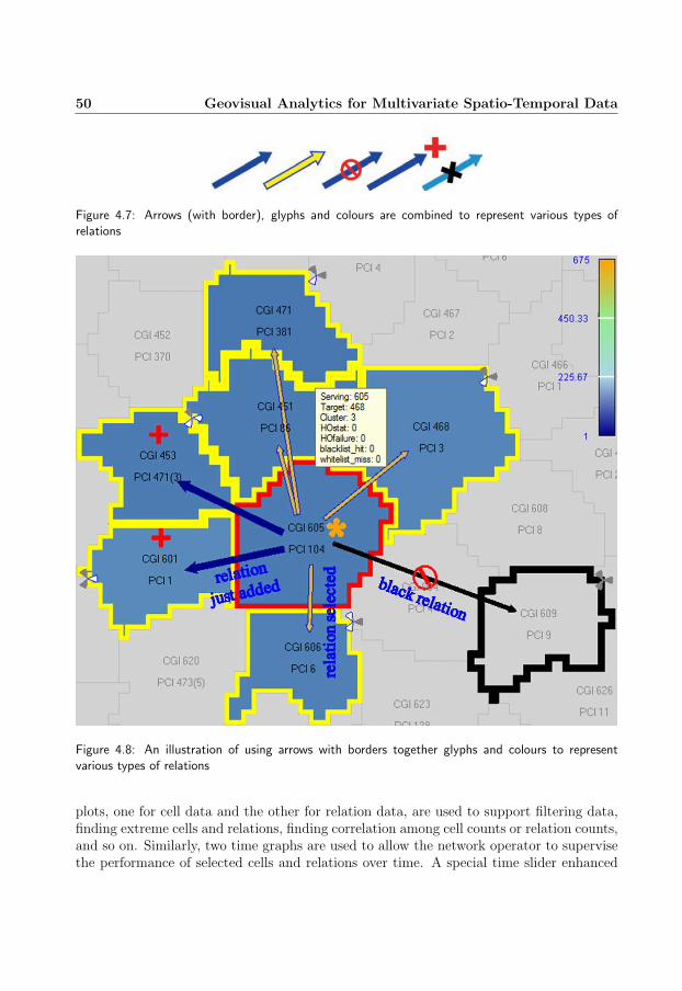
50 Geovisual Analytics for Multivariate Spatio-Temporal Data
Figure 4.7: Arrows (with border), glyphs and colours are combined to represent various types ofrelations
Figure 4.8: An illustration of using arrows with borders together glyphs and colours to representvarious types of relations
plots, one for cell data and the other for relation data, are used to support filtering data,finding extreme cells and relations, finding correlation among cell counts or relation counts,and so on. Similarly, two time graphs are used to allow the network operator to supervisethe performance of selected cells and relations over time. A special time slider enhanced

4.2 Geovisual analytics for self-organizing network data 51
with glyphs (see Figure 4.9) is designed to allow network operators to control the selectionof time interval, time animation and especially to highlight time intervals of change (i.e.intervals in which cells change their PCIs or their relations) of selected cells or the wholenetwork. This can help network operators to easily follow and analyse the changes in thenetwork. Tooltips are also used to provide detailed information of objects which the userhovers on.
Figure 4.9: A time slider enhanced with glyphs to allow network operators to quickly identify timeintervals in which network events of a certain type happen. Yellow squares represents time intervalsof relation updates and red squares represent time intervals of PCI updates.
Figure 4.10: The layout with seven coordinated and linked views of the system: two maps are used tovisualize, interact with and analyze cells and relations; two PCPs are used to explore and examine celland relation attributes/counts in each time interval; two graphs are used to explore and examine celland relation attributes/counts over time; a time slider is used to move back and forth and highlight“intervals of change” of selected cells.
To enhance the performance of visual data analysis processes, the multiple coordinatedand linked views approach is applied. A number of linking mechanisms are implemented,such as linking based on selection, filtering, colouring and animation. Among these linking

52 Geovisual Analytics for Multivariate Spatio-Temporal Data
mechanisms, the most difficult ones are those which link views of cell data with views ofrelation data and vice versa; for example, when a cell is selected in a view of cell data (e.g.the cell map in Figure 4.10), how the relation map should response; and when a relationis selected in a view of relation data (e.g. the relation-based PCP in Figure 4.10) how thecell map should response. The solution suggested in this part of the research is that whena cell is selected in a view of cell data, relations of this cell are selected in all views ofrelation data; and when a relation is selected in a view of relation data, the source cell ofthis relation is selected in all views of cell data.
The system has been used to analyse the self-organizing network data in three casesthat are selected to simulate the behaviour of the ANR algorithm; each case includes 225cells prepared. The simulation is done for one day, including 96 intervals of 15 minutes.
The result shows that the system allows the user to supervise changes in the network;for example, what cells change their relations, their PCIs, what cells have a PCI conflict,how a PCI conflict is detected, and so on. Figure 4.11 shows a situation in which a cell has3 handover failures in time interval 5 and then a PCI conflict involving this cell is detectedin time interval 8 through the method of CGI report (CGIR). The result also shows thatthe system allows the user to detect notable cells or cell relations such as cells with a largenumber of call drops, relations with a large number of handover failures or relations withlong distances, as illustrated in Figure 4.12, which need more information to explain.
The system has been also evaluated by five network domain experts. The feedbackshows that they like the concept of multiple coordinated and linked views which allowsthem to supervise changes in the network. They also like the ability to find ‘problem’ cellsand relations. However, they also suggest a number of features which should be consideredfor further development; for example, the ability to pick lines on time graphs and link themto other views, and the ability to find extreme values in all time intervals instead of in onlyone interval.
4.2.3 Conclusions and contributions
This part of the research presented the approaches and geovisual analytics techniques forself-organizing network data which includes three multivariate spatio-temporal datasets. Ageovisual analytics system has been developed to meet the objectives described above. Thesystem has been evaluated by network domain experts and received positive feedbacks.
The main contributions of this part of the research can be summarized as follows:
• the concept of a multi-border and multi-sub-area polygon for displaying various typesof cell information and data and reduce the overlapping among map layers;
• a visualization method which combines an arrow with different glyphs to representdifferent types of cell relations;
• a visualization method for representing PCI-conflict detected events;
• a time slider enhanced with glyphs to highlight notable time intervals;

4.2 Geovisual analytics for self-organizing network data 53
Figure 4.11: (a) Intervals of change of cell 210; (b) after 3 handover failures in interval 5 from cell224 to cell 225, a PCI conflict between cells 210 and 225 detected in interval 8 by cell 224
• mechanisms for linking between visualization components for cell data and visualiza-tion components for cell relation data and vice versa; and
• a geovisual analytics system which combines all interactive visualizations and inter-action techniques mentioned above for the visual analysis of self-organizing network

54 Geovisual Analytics for Multivariate Spatio-Temporal Data
Figure 4.12: Long distance relations
data.
The research has been continued with further evaluation and improvement. More re-quirements from the users are added into the system. The system has also been updatedto reflect the improvements of the GAV Flash framework based on which the system isdeveloped. Figure 4.13 shows a screenshot of the new system in which glyph shapes andthe colours are improved to meet requirements of the users; the two arrows of PCI-conflictdetected events are also connected through a curve to indicate that they are of the sameevent.
Figure 4.13: The updated system with a new layout, a new colour scheme and new glyph shapes

4.3 Geovisual analytics for spatial interaction time series data 55
4.3 Geovisual analytics for spatial interaction time seriesdata
Spatial interaction data (or movement data) such as trade flows, commuting flows andmigration flows may contain information or movement trends which are valuable to policymakers. Understanding these trends as well as the reasons behind these trends can helpthem have better policies to improve the society. Communicating the gained insight to thecitizens is also important, since it can help the citizens understand their society better.Since there has been a lot of research focusing on giving an overview of spatial interac-tions, this part of the research has focused more on the aspects of user interactions, visualexploration, analysis and knowledge communication.
4.3.1 Objective
The objective of this part of the research has been to develop and evaluate a flow mapdemonstrator that is web-enabled and should support:
• both exploration and presentation of flow data;
• interaction with spatial interaction time series data with interactive performance;
• animation of time series data;
• different background map layers, e.g. Google map or Bing map, for identifying thename of geographic locations;
• dynamic queries and filtering operations;
• time series glyphs to show changes over time;
• a dynamic bar chart to show order and magnitudes of flow values;
• a parallel coordinates plot for detecting correlations and filtering data;
• answering various questions about flow data, such as:
– Which are the dominant flows (or the trend of movement) in a certain year?
– Which are the top municipalities in Norway to which people living in Swedishborder municipalities tend to commute or migrate?
– What is the net migration i.e. the difference between the outflow and the inflowof a region for another region?
– How do flows vary over time?
• gaining insight why people tend to move from one location to another;
The requirements listed above are based on the needs of the target end users (statisticanalysts and policy makers) of the system.

56 Geovisual Analytics for Multivariate Spatio-Temporal Data
4.3.2 Approaches and results
To visualize flow data, a straightforward approach used in this part of the research is touse directed weighted arrows, where each arrow represents a movement from an originto a destination and the thickness of the arrow represents the number of people. Arrowthickness can be dynamically scaled to make arrows more readable; however, they alwaysreflect the values they represent. To avoid overlapping, arrows are displayed as quadraticBezier curves whose curvatures can be dynamically adjusted (see the right view in Figure4.14).
Figure 4.14: Migration flows from Oslo to Swedish counties and vice versa during the period 2006-2009. The bar chart shows (1) the volume of migration flows to Oslo (blue bars) to Sweden, (2) thevolume of migration flows from Oslo to Sweden (green bars), and (3) the difference (or net value)between outflows and inflows (red bars) which shows that there is a positive trend of migrating toOslo from Swedish counties. The blue arrows (right part) show top five migration flows from Swedishcounties to Oslo. The green arrows show inverse flows from Oslo to Swedish counties. The bar chartglyphs (blue ones) show time-series values of top five migration flows from Swedish counties to Oslo.The polygon layer (or region layer) is coloured according to migration volumes from Swedish countiesto Oslo.
The second approach is to use coloured-shaded regions. This approach can be appliedto the case in which the user wants to explore flows originating from an origin. In thiscase, each flow corresponds to a destination and therefore can be visualized by colouringthe region representing that destination (see the right view in Figure 4.14).

4.3 Geovisual analytics for spatial interaction time series data 57
To facilitate the exploration of flow data as well as answering questions such as whatare the top flows in global and what are the top outflows or inflows of a region, the systemis designed to have three modes: a global top flow mode, a local top flow mode and a freeflow mode. The global top flow mode allows the user to find a range of flows (e.g. topfive largest or smallest flows) in a time period. The local top mode allows the user to finda range of flows coming to or going out from a region (e.g. top five largest or smallestcoming in or going out from a region) in a time period. The free flow mode allows theuser to select any flow to examine; for example, the user can select the export flows amongAmerica, Germany and Japan for comparison. Flows can be selected through the map byclick an origin and then a destination or through a data table of flows.
Tooltips and information panels are also used to provide detailed information for flowshovered or selected.
To visualise time series flow data, the first approach is to use a time chart glyph layer. Atime chart glyph can be a bar chart or a line chart, as illustrated in Figure 4.14 and Figure4.15. In addition to the time chart glyph layer, a trend glyph layer is also implemented. Ina trend glyph, the glyph size represents the average amount of people moving or commutingand the glyph slope shows the trend of the movement - increasing or decreasing. The secondapproach to the visualization of time series flow data is through simultaneous animationof arrows, coloured regions and linked views as mentioned below. The animation can bestarted and stopped at any time point, and the animation speed can be also controlled toallow the user to observe changes easily.
Figure 4.15: Time line chart glyphs represent time-series inflows and outflows of regions
To support the user in exploring further and gaining insight into flow data, a numberof interactive visualizations are added into the system such as a bar chart integrated focus-and-context technique and a parallel coordinate plot, which are inherited from the GAVFlash framework. The approach of multiple coordinated and linked views is also appliedto enhance the performance of exploration and analysis process. The linking mechanismsfrom the GAV Flash framework such as linking based on selection, filtering, colouring and

58 Geovisual Analytics for Multivariate Spatio-Temporal Data
animation are inherited. For example, when a region is selected in the map view, valuesof inflows and outflows of this region are displayed in other views. The net values (i.e.the difference between outflows and inflows), total values (e.g. total inflow values, totaloutflow values) are also dynamically calculated and displayed in all other views to providethe user with additional data for the analysis of flow data. Two circle glyph layers areimplemented to represent total inflow values and total outflow values (see Figure 4.17).
To support the user in answering questions such as why people tend to move fromone location to another, the system supports the use of additional regional datasets. Forexample, the user can use a regional dataset of income level, employment rate and highereducation rate to have a better understanding of the trend that more people commutefrom Sweden to Norway for working rather than the opposite. This regional dataset isthen merged with the data dynamically calculated above (net values, total inflow values,total outflow values) and can be displayed in all interactive visualizations.
To support the presentation and communication of the gained insight, the system inher-its the mechanisms of snapshot, storytelling and publishing of the GAV Flash framework.It implements the snapshot mechanism for the flow layers and glyph layers which are de-veloped in this part of the research. It also extends the snapshot mechanism to store twodifferent datasets (the flow dataset and the regional dataset) into snapshots.
Figure 4.16: Top ten global commuting flows among Norwegian and Swedish municipalities in 2008
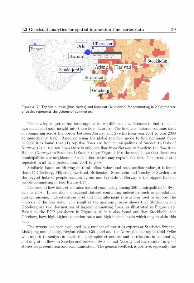
4.3 Geovisual analytics for spatial interaction time series data 59
Figure 4.17: Top five hubs-in (blue circles) and hubs-out (blue circle) for commuting in 2008; the sizeof circles represents the volume of commuters.
The developed system has been applied to two different flow datasets to find trends ofmovement and gain insight into these flow datasets. The first flow dataset contains dataof commuting across the border between Norway and Sweden from year 2001 to year 2008at municipality level. Based on using the global top flow mode to find dominant flowsin 2008 it is found that (1) top five flows are from municipalities of Sweden to Oslo ofNorway; (2) in top ten flows there is only one flow from Norway to Sweden: the flow fromHalden (Norway) to Stromstad (Sweden) (see Figure 4.16); the map shows that these twomunicipalities are neighbours of each other, which may explain this fact. This trend is stillrepeated in all time periods from 2001 to 2008.
Similarly, based on filtering on total inflow values and total outflow values it is foundthat (1) Goteborg, Filipstad, Karlstad, Stromstad, Stockholm and Torsby of Sweden arethe biggest hubs of people commuting out and (2) Oslo of Norway is the biggest hubs ofpeople commuting in (see Figure 4.17).
The second flow dataset contains data of commuting among 290 municipalities in Swe-den in 2008. In addition, a regional dataset containing indicators such as population,average income, high education level and unemployment rate is also used to support theanalysis of the flow data. The result of the analysis process shows that Stockholm andGoteborg are two destinations of largest commuting flows, as illustrated in Figure 4.18.Based on the PCP (as shown in Figure 4.18) it is also found out that Stockholm andGoteborg have high higher education rates and high income levels which may explain thisfact.
The system has been evaluated by a number of statistics experts at Statistics Sweden,Linkoping municipality, Region Vastra Gotaland and the Norwegian county Ostfold Fylkewho used it to analyse in depth the geographic structures and correlations in commutingand migration flows in Sweden and between Sweden and Norway and has resulted in goodstories for presentation and communication. The general feedback is positive, especially the

60 Geovisual Analytics for Multivariate Spatio-Temporal Data
combination of linked views, a ‘heat map’ with overlaid weighted arrows and a dynamic barchart integrated with focus-and-context technique, which allows a comprehensive insightinto the number of people commuting among Swedish regions.
Figure 4.18: Top ten commuting flows among Swedish municipalities in 2008; regions are colouredaccording to higher education rate
Figure 4.19: Stockholm and Gteborg have high income and higher education rate and attract a largenumber of commuters.
4.3.3 Conclusions and contributions
This part of the research presented the approaches and geovisual analytics techniques forspatial interaction dat. It has focused on the aspects of user interactions, visual exploration,analysis and knowledge communication. A demonstrator has been developed and meets theobjectives described above. The demonstrator has been used by many statistics analystsfor various spatial interaction datasets such as commuting data, migration data and tradeflow data.
The main contribution of this part of the research can be summarized as follows:

4.3 Geovisual analytics for spatial interaction time series data 61
• interaction techniques for the exploration of flow data;
• interactive flow and glyph layers;
• the use of additional regional datasets in combination with flow datasets to supportthe analysis of the flow datasets;
• an implementation of the snapshot mechanism and the use of storytelling and pub-lishing techniques for flow data which can be enhanced with regional data; this en-courages the collaboration between statistics analysts and users of statistics as wellas supports the presentation and communication of gained insight to a broad rangeof users through the web platform.
• a web-enabled demonstrator which can be customized to analyse various flow datasets.
The flow map demonstrator has been further developed and evaluated after this partof the research work is published. A number of new features are suggested; for example,(1) there should be an option for the user to decide the layout of views; and (2) scatterplots and time graphs for flow data and regional data should be added into the system toenhance the ability to explore the data. It is also used to analyse global trade flow dataprovided by OECD, as illustrated in Figure 4.20.
Figure 4.20: Top 5 global trade flows in 2008

62 Geovisual Analytics for Multivariate Spatio-Temporal Data
4.4 Geovisual analytics for flood data
The large and ever-increasing amounts of multi-dimensional, multi-source, time-varyingand geospatial digital information represent a major challenge for the analyst. The needto analyse and make decisions based on these information streams, often in time-criticalsituations, demands efficient, integrated and interactive tools that help the user to explore,present, collaborate and communicate visually large information spaces. A serious floodevent which took place on 29 October 2010 in Lisbon and caused a lot of damage tobuildings, especially historical buildings, presents an example of this need. Planners, policymakers and insurance companies would like to have an interactive tool to explore the floodevent data, estimate the damage caused by the flood event, support making plan forrescuing or evacuating people and communicate the analytical results. This part of theresearch addresses this need and proposes a system for the visual analysis of flood datadeveloped based on the GAV Flash framework.
4.4.1 Objective
The objective of this part of the research has been to develop an interactive system whichshould support:
• the exploration of flood data;
• estimating the damage caused by a flood event to buildings;
• planning routes to rescue or evacuate people;
• making-note for collaboration;
• presentation and communication of gained insight;
4.4.2 Approaches and results
The system is developed based on the GAV Flash framework in close collaboration withour research partners and domain experts from the Laboratory for Systems, Instrumenta-tion and Modeling in Science and Technology for Space and the Environment (SIM) [77],UNINOVA [29] and King’s College London [41] in a project funded by the European SpaceAgency (ESA) [24]. A map view is selected as the central view of the system. Based on thecharacteristics of the flood data and the needs of the user, a number of new map layers andnew map techniques are implemented and added into the map component. They include:
• a grid layer for flood water column (or water depth) data; grid cells are colouredbased on their water depth values; and a colour scheme for flood data is designedbased on the suggestion of domain experts;
• a building layer for buildings which allows the user to be able to interact with build-ings and support calculating the damage caused by a flood event to the buildings;
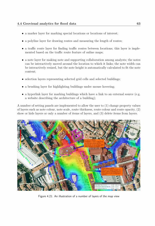
4.4 Geovisual analytics for flood data 63
• a marker layer for marking special locations or locations of interest;
• a polyline layer for drawing routes and measuring the length of routes;
• a traffic route layer for finding traffic routes between locations; this layer is imple-mented based on the traffic route feature of online maps;
• a note layer for making note and supporting collaboration among analysts; the notescan be interactively moved around the location to which it links; the note width canbe interactively resized, but the note height is automatically calculated to fit the notecontent;
• selection layers representing selected grid cells and selected buildings;
• a brushing layer for highlighting buildings under mouse hovering;
• a hyperlink layer for marking buildings which have a link to an external source (e.g.a website describing the architecture of a building);
A number of setting panels are implemented to allow the user to (1) change property valuesof layers such as note colour, note scale, route thickness, route colour and route opacity, (2)show or hide layers or only a number of items of layers, and (3) delete items from layers.
Figure 4.21: An illustration of a number of layers of the map view

64 Geovisual Analytics for Multivariate Spatio-Temporal Data
A number of interaction techniques are designed to allow the user to dynamically andinteractively add markers, routes and notes. This is implemented through a right-clickcontext menu which allows the user to switch among various interaction techniques.
To support evaluating the effects of the flood event on buildings, a number of dataindicators for buildings are calculated. For example, for each building, the intersectionbetween the building and the flood grid is calculated. The water columns at the cells inter-secting with the building are then used to calculate the average water column surroundingthe building. This value is then used to calculate the constant damage to the building.The accumulated damage to the building is calculated based on constant damage values.
Figure 4.22: A snapshot of the system for the visual analysis of flood data
To facilitate the visual analysis of flood data and calculated building data, the systeminherits from the GAV Flash framework the following features:
• interactive visualizations such as the time graph, the scatter plot and the bar chartsfor flood data and building data;
• linking mechanisms such as linking base on colouring, selection, focusing and anima-tion;
• the snapshot mechanism for capturing, saving visual analysis processes; the snapshotmechanism is implemented for the new map layers that are added into the mapcomponent; and

4.4 Geovisual analytics for flood data 65
• the storytelling technique for sharing, presentation and communication of gainedinsight;
The system has been used to gain insight into the flood event which took place on 29October 2010 in Lisbon. It allows the user to detect areas affected by the flood event andestimate the damage to buildings. It has been also evaluated by three users. The generalfeedback is positive. They highly evaluate the features of the system, especially the abilityto dynamically make notes and storytelling technique. They like the animation mechanismwhich allows them to supervise the progress of the flood event and the linking mechanismthrough selection which allows them to view the data from several perspectives. After onehour using the system, one user has produced a short story presenting his gained insightinto the flood event data. Figure 4.22 illustrates a snapshot in this story. The story isavailable at the link [20]. A video illustrating the features of the system is available atthe link [21]. New features are suggested for further development such as the ability todynamically update the formulas for damage estimation, (2) map layers representing policestations, schools, and (3) the ability to export a subset of data of interest.
4.4.3 Conclusions and contributions
This part of the research presented the approaches and geovisual analytics techniques formultivariate, spatio-temporal data flood data. A system has been developed to meet theobjectives described above. It has been evaluated by domain experts and received positivefeedbacks. This part of the research is believed to have the following contributions:
• interactive map layers for making notes and creating routes which are enhanced withlabels displaying distances between points of the routes;
• interaction techniques for creating different map layers such as note layer, route layerand marker layer;
• a technique for dynamically calculating the damage caused by a flood event to build-ings;
• a web-enabled system for the visual exploration and analysis of flood data and sup-porting storytelling, collaboration and dissemination of gained insight.
The next steps are to (1) further evaluate the system with planners and insurancecompanies in Lisbon, (2) test it with real time data which comes every 10 minutes, and(3) develop techniques to improve the performance for rendering large flood datasets.

66 Geovisual Analytics for Multivariate Spatio-Temporal Data
Chapter 5
Conclusions and Future Research
This chapter will summarize the research work presented in this thesis including its maincontributions and then discuss potential directions for future research.
5.1 Conclusions and contributions
The research work presented in this thesis has been inspired by the book Illuminatingthe Path: The Research and Development Agenda for Visual Analytics [78] which (1)addresses the needs as well as challenges for combining technologies from various areas togain insight into data, which in many cases are very complex and dynamic, and (2) calls formoving research into practice. This research has focused on two subjects. The first subjectis the development of a geovisual analytics framework which supports the integration ofexploratory, analytical reasoning and communicative tools to facilitate the developmentof applications for geovisual analytics tasks. In this subject, it is targeted at the webenvironment to meet the growing needs for the exploration and analysis of data and thepresentation and dissemination of gained insight in the form of interactive visualizationsthrough web and internet to reach a broader user community. Although many geovisualanalytics tools have been developed, it has still been a challenge to adapt these tools tothe Internet.
The second subject of this research work is the development of applications which applygeovisual analytics techniques to solving different problems in a number of specific domains.
For the first subject, it has adopted the component thinking in building a web-enabledgeovisual analytics framework. The challenges for building frameworks for web platformshave been addressed. Many visualizations have been integrated into the framework. Visu-alizations have been enhanced with many interaction techniques and interactive featuresto improve their ability of data analysis. The importance of multiple linked views hasbeen highlighted. Many linking mechanisms have been integrated into the frameworkand new linking mechanism have been introduced. The need for capturing and sharinggained insight during the EDA process has been emphasized. A snapshot mechanism hasbeen implemented to support this task. A number of applications have been developed tosolve different problems in different specific domains. Storytelling techniques have beenintegrated into a number of developed applications to support telling stories of data. Insummary, the main contributions of this research work can be considered as follows:
68 Conclusions and Future Research
• a collection of highly interactive visualizations which are enhanced with a rich set ofinteraction techniques and interactive features; especially an interactive map com-ponent which is extendable and configurable, including a rich set of interactive maplayers and supporting the use of online web map services as a background map;
• mechanisms for linking views in multiple views applications;
• a library which simulates a multithreading environment in Adobe Flash ActionScriptto improve interactivity;
• a snapshot mechanism for capturing and saving discoveries, which is the foundationfor the visual storytelling technique;
• an effective web-enabled geovisual analytics framework which integrates all featuresmentioned above and facilitates the development of web-enabled geovisual analyticsapplications;
• demonstration of the synergy of integrating volume visualization with common in-formation visualization and geovisualization interaction techniques to support visualexploration and analysis of data;
• an application for the visual exploration of 5D volume ocean data;
• techniques and an application for the visual exploration and analysis of spatio-temporal multivariate self-organizing network data to support the network operatorhave better understanding of the way an automated algorithm configures a network;
• techniques and an application for the visual exploration and analysis of spatial inter-action time series data based on the needs of target end users; especially the use ofadditional regional datasets in combination with flow datasets to support the analysisof the flow datasets;
• techniques and an application for the visual exploration and analysis of spatio-temporal multivariate flood data;
The framework has been used to develop a number of web-enabled visualization ap-plications which is being used daily by many users. For example, OECD eXplorer [25]is being used by OECD [53] for analysing data and presenting analytical results to thepublic through interactive attractive visualizations to capture their attention as well as tohelp them understand better our society and our world through statistic data. The Road-Vis application [82] is being used by Swedish Meteorological and Hydrological Institute(SMHI) [70] for analysing and communicating information about road weather conditions,particularly during the Swedish winter months. The flow map application (named Flowmap eXplorer) for spatial interaction time series data are being used by OECD and manyother statistic organizations for the visualization and presentation of commuting data, mi-gration data and trade flow data to the public. The framework and applications have beencontinuously improved and updated to meet more requirements from the user.

5.2 Future research 69
5.2 Future research
Although there are many visualizations and interaction techniques supported in the frame-work, users and analysts still want to have more visualizations and interaction techniquesto do their jobs better and faster. This is one of the focuses of the future work.
The second focus is to adapt visualizations and interaction techniques to different screensizes and devices such as laptops, desktops, tablets and smart phones, since there are anincreasing trend in which the user uses mobile devices to access data and present data aswell as analytical results to others. Therefore, visualizations should be designed to adaptwell to different screen sizes, and interaction techniques for touch screen and mobile devicesshould be considered. Thorough user evaluation should be performed to determine whatvisualizations and interaction techniques are best suited to each user groups as well as toeach type of devices (e.g. desktops, laptops, tablets, smart phones, touch screens).
The third focus is the visual analysis of large datasets. Data collected in many fieldsis getting larger and larger. Therefore, we need effective techniques to deal with largedatasets. One possible solution is to combine the focus-and-context technique with ef-fective downsampling techniques and rendering techniques that are based on the GPUtechnology. Another approach to deal with large datasets is to apply data mining tech-niques for extracting patterns and trends in large datasets. Parallel computing can alsocontribute to solutions for large datasets. Therefore, it should be considered in futureresearch.

70 Conclusions and Future Research

Bibliography
[1] NODC World Ocean Atlas 1994. http://www.esrl.noaa.gov/psd/data/gridded/
data.nodc.woa94.html.
[2] Mehdi Amirijoo, Pal Frenger, Fredrik Gunnarsson, Harald Kallin, Johan Moe,and Kristina Zetterberg. Neighbor cell relation list and physical cell identity self-organization in lte. In Proceedings of the 2008 IEEE International Conference onCommunications, pages 37–41, Washington, DC, USA, 2008. IEEE Computer Soci-ety.
[3] Gennady Andrienko and Natalia Andrienko. Interactive visual tools to explore spatio-temporal variation. In Proceedings of the working conference on Advanced visual in-terfaces, AVI ’04, pages 417–420, New York, NY, USA, 2004. ACM.
[4] Gennady Andrienko and Natalia Andrienko. Visual exploration of the spatial distri-bution of temporal behaviors. In Proceedings of the 9th International Conference onInformation Visualisation, IV ’05, pages 799–806, 2005.
[5] Gennady Andrienko, Natalia Andrienko, Urska Demsar, Doris Dransch, Jason Dykes,Sara Irina Fabrikant, Mikael Jern, Menno-Jan Kraak, Heidrun Schumann, and Chris-tian Tominski. Space, time and visual analytics. International Journal of GeographicalInformation Science, 24(10):1577–1600, October 2010.
[6] Gennady Andrienko, Natalia Andrienko, Piotr Jankowski, Menno-Jan Kraak, DanielKeim, Alan MacEachren, and Stefan Wrobel. Geovisual analytics for spatial decisionsupport: Setting the research agenda. Geographical Information Science, 21(8):839–857, January 2007.
[7] Michelle Q. Wang Baldonado, Allison Woodruff, and Allan Kuchinsky. Guidelinesfor using multiple views in information visualization. In Proceedings of the workingconference on Advanced visual interfaces, AVI ’00, pages 110–119, New York, NY,USA, 2000. ACM.
[8] R.A. Becker, S.G. Eick, and A.R. Wilks. Graphical methods to analyze network data.In Communications, 1993. ICC ’93 Geneva. Technical Program, Conference Record,IEEE International Conference on, volume 2, pages 946–951 vol.2, 1993.

72 BIBLIOGRAPHY
[9] Richard A. Becker and William S. Cleveland. Brushing scatterplots. Technometrics,29(2):127–142, May 1987.
[10] Richard A. Becker, Stephen G. Eick, and Allan R. Wilks. Visualizing network data.IEEE Transactions on Visualization and Computer Graphics, 1(1):16–28, 1995.
[11] Richard A. Becker, Stephen G. Eick, and Allan R. Wilks. Exploratory visualizationwith multiple linked views. In Stuart K. Card, Jock D. Mackinlay, and Ben Shneider-man, editors, Readings in Information Visualization: Using Vision to Think, pages215–227. Morgan Kaufmann, December 1999.
[12] Benjamin B. Bederson, Jon Meyer, and Lance Good. Jazz: an extensible zoomableuser interface graphics toolkit in java. In Proceedings of the 13th annual ACM sympo-sium on User interface software and technology, UIST ’00, pages 171–180, New York,NY, USA, 2000. ACM.
[13] Michael Bostock and Jeffrey Heer. Protovis: A graphical toolkit for visualiza-tion. IEEE Transactions on Visualization and Computer Graphics, 15(6):1121–1128,November 2009.
[14] Stuart K. Card, Jock D. Mackinlay, and Ben Shneiderman, editors. Readings inInformation Visualization: Using Vision to Think. Morgan Kaufmann, 1999.
[15] Daniel B. Carr, Richard J. Littlefield, and Wesley L. Nichloson. Scatterplot matrixtechniques for large n. In Proceedings of the Seventeenth Symposium on the interfaceof computer sciences and statistics on Computer science and statistics, pages 297–306,New York, NY, USA, 1986. Elsevier North-Holland, Inc.
[16] Ericsson company. http://www.ericsson.com/.
[17] Kenneth C. Cox and Stephen G. Eick. Case study: 3d displays of internet traffic.In Proceedings of the 1995 IEEE Symposium on Information Visualization, INFOVIS’95, pages 129–, Washington, DC, USA, 1995. IEEE Computer Society.
[18] Kenneth C. Cox, Stephen G. Eick, and Taosong He. 3d geographic network displays.ACM SIGMOD Record, 25(4):50–54, December 1996.
[19] Weiwei Cui, Hong Zhou, Huamin Qu, Pak Chung Wong, and Xiaoming Li. Geometry-based edge clustering for graph visualization. IEEE Transactions on Visualization andComputer Graphics, 14(6):1277–1284, 2008.
[20] Flood demo. http://vitagate.itn.liu.se/GAV/flood/story/.
[21] Flood demo video. http://vitagate.itn.liu.se/GAV/flood/Flood.mp4.
[22] Alan Dix and Geoffrey Ellis. Starting simple: adding value to static visualisationthrough simple interaction. In Proceedings of the working Conference on AdvancedVisual Interfaces, AVI ’98, pages 124–134, New York, NY, USA, 1998. ACM.

BIBLIOGRAPHY 73
[23] Jason Dykes. cdv: a flexible approach to esda with free software connection. InProceedings of the British Cartographic Society 34th Annual Symposium, pages 100–107, 1997.
[24] European Space Agency (ESA). http://www.esa.int/ESA.
[25] OECD eXplorer. http://stats.oecd.org/OECDregionalstatistics/.
[26] Jean-Daniel Fekete. The infovis toolkit. In Proceedings of the IEEE Symposium onInformation Visualization, INFOVIS ’04, pages 167–174, Washington, DC, USA, 2004.IEEE Computer Society.
[27] Flare. http://flare.prefuse.org/.
[28] Focus and context map demo. http://vitagate.itn.liu.se/GAV/gridmap/
Italy2008/.
[29] UNINOVA (Institute for the Development of New Tecnologies). http://www.
uninova.pt.
[30] Diansheng Guo. Flow mapping and multivariate visualization of large spatial interac-tion data. IEEE Transactions on Visualization and Computer Graphics, 15(6):1041–1048, November 2009.
[31] Diansheng Guo, Jin Chen, Alan M. MacEachren, and Ke Liao. A visualization systemfor space-time and multivariate patterns (vis-stamp). IEEE Transactions on Visual-ization and Computer Graphics, 12(6):1461–1474, November 2006.
[32] Quan Ho, Phong H. Nguyen, Astrom, and Mikael Jern. Implementation of a flow mapdemonstrator for analyzing commuting and migration flow statistics data. Procedia -Social and Behavioral Sciences, 21(0):157 – 166, 2011.
[33] Danny Holten. Hierarchical edge bundles: Visualization of adjacency relations inhierarchical data. Visualization and Computer Graphics, IEEE Transactions on,12(5):741–748, 2006.
[34] Danny Holten and Jarke J. van Wijk. Force-directed edge bundling for graph vi-sualization. Computer Graphics Forum (Eurographics/IEEE-VGTC Symposium onVisualization), 28(3):983–990, 2009.
[35] Mikael Jern. Smart documents for web-enabled collaboration. In Rae Earnshawand John Vince, editors, Digital content creation, chapter Smart documents for Web-enabled collaboration, pages 140–162. Springer-Verlag New York, Inc., New York, NY,USA, 2001.
[36] Mikael Jern and Johan Franzen. ”GeoAnalytics” - Exploring spatio-temporal andmultivariate data. In Proceedings of the 10th International Conference on InformationVisualization, IV ’06, pages 25–31. IEEE Computer Society, 2006.

74 BIBLIOGRAPHY
[37] Mikael Jern and Johan Franzen. Integrating infovis and geovis components. In Pro-ceedings of the 11th International Conference on Information Visualization, IV ’07,pages 511–520. IEEE Computer Society, 2007.
[38] Mikael Jern, Sara Johansson, Jimmy Johansson, and Johan Franzen. The GAV toolkitfor multiple linked views. In Proceedings of the Fifth International Conference onCoordinated and Multiple Views in Exploratory Visualization, CMV ’07, pages 85–97,Washington, DC, USA, 2007. IEEE Computer Society.
[39] Mikael Jern, Jakob Rogstadius, Tobias Astrom, and Anders Ynnerman. Visual ana-lytics presentation tools applied in html documents. In Proceedings of the 12th Inter-national Conference Information Visualisation, IV ’08, pages 200–207, Washington,DC, USA, 2008. IEEE Computer Society.
[40] Mikael Jern, Tobias Astrom, and Sara Johansson. Geoanalytics tools applied to largegeospatial datasets. In Proceedings of the 12th International Conference on Informa-tion Visualisation, IV ’08, pages 362–372, 2008.
[41] King’s College London (KCL). http://www.kcl.ac.uk.
[42] Paul E. Keel. Collaborative visual analytics: Inferring from the spatial organizationand collaborative use of information. In Proceedings of IEEE Symposium On VisualAnalytics Science And Technology, VAST 2006, pages 137–144, 2006.
[43] Daniel Keim, Gennady Andrienko, Jean-Daniel Fekete, Carsten Gorg, Jorn Kohlham-mer, and Guy Melancon. Visual analytics: Definition, process, and challenges. InAndreas Kerren, John T. Stasko, Jean-Daniel Fekete, and Chris North, editors, Infor-mation Visualization, chapter Visual Analytics: Definition, Process, and Challenges,pages 154–175. Springer-Verlag, Berlin, Heidelberg, 2008.
[44] Daniel A. Keim. Information visualization and visual data mining. IEEE Transactionson Visualization and Computer Graphics, 8(1):1–8, January 2002.
[45] Eleftherios E. Koutsofios, Stephen C. North, and Daniel A. Keim. Visualizing largetelecommunication data sets. Computer Graphics and Applications, IEEE, 19(3):16–19, 1999.
[46] Eleftherios E. Koutsofios, Stephen C. North, Russell Truscott, and Daniel A. Keim.Visualizing large-scale telecommunication networks and services (case study). In Pro-ceedings of the conference on Visualization ’99: celebrating ten years, VIS ’99, pages457–461, Los Alamitos, CA, USA, 1999. IEEE Computer Society Press.
[47] M. Livny, R. Ramakrishnan, K. Beyer, G. Chen, D. Donjerkovic, S. Lawande, J. Myl-lymaki, and K. Wenger. Devise: integrated querying and visual exploration of largedatasets. In Proceedings of the 1997 ACM SIGMOD international conference on Man-agement of data, SIGMOD ’97, pages 301–312, New York, NY, USA, 1997. ACM.

BIBLIOGRAPHY 75
[48] Patrik Lundblad, Jonas Thoursie, and Mikael Jern. Swedish road weather visualiza-tion. In Proceedings of the 14th International Conference on Information Visualisa-tion, IV ’10, pages 313–321, 2010.
[49] Flow mapper tutorial. http://www.csiss.org/clearinghouse/FlowMapper/
FlowTutorial.pdf.
[50] Michael J. McGuffin and Igor Jurisica. Interaction techniques for selecting and ma-nipulating subgraphs in network visualizations. IEEE Transactions on Visualizationand Computer Graphics, 15(6):937–944, 2009.
[51] George Melissargos and Pearl Pu. Conceptualizing bandwidth allocation in networkmanagement. In Proceedings of the 1999 workshop on new paradigms in informationvisualization and manipulation in conjunction with the eighth ACM internation con-ference on Information and knowledge management, NPIVM ’99, pages 62–69, NewYork, NY, USA, 1999. ACM.
[52] Wolgang Muller and Heidrun Schumann. Visualization methods for time-dependentdata - an overview. In Proceedings of the 2003 Winter Simulation Conference, vol-ume 1, pages 737–745, 2003.
[53] OECD. http://stats.oecd.org.
[54] PC-Axis. http://www.scb.se/pages/list____314011.aspx.
[55] Doantam Phan, Ling Xiao, Ron Yeh, Pat Hanrahan, and Terry Winograd. Flow maplayout. In Proceedings of the Proceedings of the 2005 IEEE Symposium on InformationVisualization, INFOVIS ’05, pages 29–, Washington, DC, USA, 2005. IEEE ComputerSociety.
[56] Harald Piringer, Christian Tominski, Philipp Muigg, and Wolfgang Berger. A multi-threading architecture to support interactive visual exploration. IEEE Transactionson Visualization and Computer Graphics, 15(6):1113–1120, 2009.
[57] Protovis. http://vis.stanford.edu/protovis/.
[58] Ho Van Quan, Tobias Astrom, and Mikael Jern. Geovisual analytics for self-organizingnetwork data. In Proceedings of IEEE Symposium on Visual Analytics Science andTechnology, VAST 2009, pages 43–50, 2009.
[59] Alasdair Rae. From spatial interaction data to spatial interaction information? Geovi-sualisation and spatial structures of migration from the 2001 UK census. Computers,Environment and Urban Systems, 33(3):161–178, May 2009.
[60] Ramana Rao and Stuart K. Card. The table lens: merging graphical and symbolicrepresentations in an interactive focus+context visualization for tabular information.In Conference Companion on Human Factors in Computing Systems, CHI ’94, pages222–, New York, NY, USA, 1994. ACM.

76 BIBLIOGRAPHY
[61] Canalys report 2012. Smart phones overtake client PCs in 2011. http://www.
canalys.com/newsroom/smart-phones-overtake-client-pcs-2011.
[62] Jonathan C. Roberts. Exploratory visualization with multiple linked views. In AlanMacEachren, Menno-Jan Kraak, and Jason Dykes, editors, Exploring Geovisualiza-tion, pages 159–180. Elseviers, Oxford, 2005.
[63] Jonathan C. Roberts. State of the art: Coordinated & multiple views in exploratoryvisualization. In Proceedings of the Fifth International Conference on Coordinatedand Multiple Views in Exploratory Visualization, CMV ’07, pages 61–71, Washington,DC, USA, 2007. IEEE Computer Society.
[64] Anthony C. Robinson and Chris Weaver. Re-visualization: Interactive visualizationof the process of visual analysis. In Proceedings of GIScience Workshop on VisualAnalytics and Spatial Decision Support, pages 1–21, 2006.
[65] Manojit Sarkar and Marc H. Brown. Graphical fisheye views. Communnications ofthe ACM, 37(12):73–83, December 1994.
[66] SDMX. http://sdmx.org/.
[67] Ben Shneiderman. Dynamic queries for visual information seeking. IEEE Software,11(6):70–77, November 1994.
[68] Ben Shneiderman. The eyes have it: a task by data type taxonomy for informationvisualizations. In Proceedings of the IEEE Symposium on Visual Languages, pages336–343, 1996.
[69] Yedendra B. Shrinivasan and Jarke J. van Wijk. Supporting the analytical reasoningprocess in information visualization. In Proceedings of the SIGCHI Conference onHuman Factors in Computing Systems, CHI ’08, pages 1237–1246, New York, NY,USA, 2008. ACM.
[70] SMHI. http://www.smhi.se/.
[71] John Stasko and Eugene Zhang. Focus+context display and navigation techniquesfor enhancing radial, space-filling hierarchy visualizations. In Proceedings of the IEEESymposium on Information Vizualization 2000, INFOVIS ’00, pages 57–, Washington,DC, USA, 2000. IEEE Computer Society.
[72] Linnea Stenliden and Mikael Jern. Visual storytelling understanding and knowledgein education. In Proceedings of the 2nd International Multi-conference on Complexity,Informatics and Cybernetics: IMCIC 2011. International Institute of Informatics andSystemics, 2011.

BIBLIOGRAPHY 77
[73] Chris Stolte, Diane Tang, and Pat Hanrahan. Polaris: A system for query, analysis,and visualization of multidimensional relational databases. IEEE Transactions onVisualization and Computer Graphics, 8(1):52–65, January 2002.
[74] GeoVista studio. http://www.geovistastudio.psu.edu/jsp/index.jsp.
[75] Tableau. http://www.tableausoftware.com/.
[76] Masahiro Takatsuka and Mark Gahegan. Geovista studio: a codeless visual program-ming environment for geoscientific data analysis and visualization. Computers andGeosciences, 28(10):1131–1144, December 2002.
[77] Instrumentation The Laboratory for Systems, Modeling in Science, Technology forSpace, and the Environment (SIM). http://www.sim.ul.pt.
[78] James J. Thomas and Kristin A. Cook, editors. Illuminating the Path: The Researchand Development Agenda for Visual Analytics. IEEE Computer Society, Los Alametos,CA, 2005.
[79] Waldo R. Tobler. Experiments in migration mapping by computer. Cartography andGeographic Information Science, 14(2):155–163, 1987.
[80] Christian Tominski, James Abello, and Heidrun Schumann. Technical section: Cgv-an interactive graph visualization system. Computers and Graphics, 33(6):660–678,December 2009.
[81] Christian Tominski, James Abello, Frank van Ham, and Heidrun Schumann. Fisheyetree views and lenses for graph visualization. In Proceedings of the conference onInformation Visualization, IV ’06, pages 17–24, Washington, DC, USA, 2006. IEEEComputer Society.
[82] RoadVis video. http://vitagate.itn.liu.se/GAV/videos/VDA/RoadVis/
RoadVis_full.wmv.
[83] Hans Voss, Natalia Andrienko, and Gennady Andrienko. Commongis - common accessto geographically referenced data. ERCIM News, 41:44–46, 2000.
[84] Leland Wilkinson, editor. The Grammar of Graphics. Springer, New York, 1999.
[85] M. Withall, I. Phillips, and D. Parish. Network visualisation: a review. IET Commu-nications, 1(3):365–372, 2007.
[86] Pak Chung Wong and Jim Thomas. Visual analytics. IEEE Computer Graphics andApplications, 24(5):20–21, 2004.
[87] Jo Wood, Jason Dykes, and Aidan Slingsby. Visualisation of origins, destinations andflows with od maps. The Cartographic, 47(2):117 – 129, 2010.

78 BIBLIOGRAPHY
[88] Ji Soo Yi, Youn ah Kang, and John T. Stasko. Toward a deeper understanding of therole of interaction in information visualization. IEEE Transactions on Visualizationand Computer Graphics, 13(6):1224–1231, November 2007.