Archisketcher
11
-
Upload
quarto-publishing-group -
Category
Documents
-
view
212 -
download
0
description
A preview of Archisketcher: A Guide for Spotting & Sketching Urban Landscapes, a RotoVision book.
Transcript of Archisketcher


Contents
1 COMPOSITION ................................................ 8
Overview ................................................................. 10
First principles ........................................................ 12
The rule of thirds ................................................... 14
Choosing the right drawing media ....................... 16
Landscape or portrait? ........................................... 18
Borders ..................................................................... 20
Finding a focus ....................................................... 22
Sketching in context .............................................. 24
Scale ......................................................................... 26
Sketching an icon: Brooklyn Bridge .................... 28
My neighborhood: Nina Johansson ..................... 30
My neighborhood: Kumi Matsukawa .................. 32
2 CHOOSING AN APPROACH ................... 34
Overview ................................................................. 36
Precision or expression? ....................................... 38
Using rhythms ......................................................... 42
Marks, shapes and lines ........................................ 44
Capturing a mood .................................................. 46
Negative space ....................................................... 48
Enhancing sketches with digital media ............... 50
Sketching an icon: Sydney Opera House ............ 52
My neighborhood: Shari Blaukopf ....................... 54
My neighborhood: Len Grant ............................... 56
3 PERSPECTIVE ................................................. 58
Overview ................................................................. 60
One-point perspective ........................................... 62
Distance and proximity ......................................... 72
Atmospheric perspective ...................................... 74
Two-point perspective ........................................... 76
Bird’s eye vs. worm’s eye view ............................. 78
Drawing without perspective ............................... 80
Sketching an icon: Notre Dame ........................... 82
My neighborhood: Liz Steel .................................. 84
My neighborhood: Sue Pownall ........................... 86
4 COLOR ................................................................. 88
Overview ................................................................. 90
Exploring tonal values ........................................... 92
Understanding warm and cool colors ................. 94
Should you use black? ........................................... 96
Loosen up with nonwaterproof ink ..................... 98
Choosing color media .......................................... 100
Looking for color and pattern in architecture .. 102
Color before you draw ......................................... 104
Using splashes ...................................................... 106
Deciding whether to use color ........................... 108
Capturing decorative details ............................... 110
Sketching an icon: Petronas Towers .................. 112
My neighborhood: Juliette Plisson .................... 114
My neighborhood: Suhita Shirodkar .................. 116
Introduction ....................................................6

5 VIEWPOINTS ................................................. 118
Overview ............................................................... 120
Sketching in the city ............................................. 122
Sketching in suburbia ........................................... 126
Harbors and ports ................................................ 128
Skylines and panoramas ..................................... 132
Sketching interiors ............................................... 136
On the move ......................................................... 138
Night sketching ..................................................... 142
Sketching an icon: Sagrada Família ................... 144
My neighborhood: Caroline Johnson ................ 146
My neighborhood: Luis Ruiz ............................... 148
6 RESOURCES ................................................... 150
Glossary ................................................................. 152
Websites and blogs ............................................... 154
Groups and associations ..................................... 155
Contributor index ................................................. 156
City index .............................................................. 157
Index .......................................................... 158
Acknowledgments ....................................... 160
Right: Simone Ridyard, View of Oxford Street from the Central Library, Manchester, England

If you are serious about sketching, with practice your drawings will continue to improve and, even more importantly, you will develop your own personal style. Many of the sketchers featured in this book have spent years refining their unique approach, and it’s always such a pleasure to see how someone else has tackled the same view as you—we all approach them so differently!
You don’t need to be an architect to sketch architecture confidently; simply approach it as you would any drawing, or any collection of objects—for example, a still life. It’s about understanding the principles of composition: how you position your objects (or architecture, in this case) on the page. A little understanding of perspective helps, of course, but most important of all is practice and an enthusiasm for drawing buildings and urban environments.
Introduction
6
Increasingly people are taking to the streets and drawing. If you’re sketching in urban environments, it is really important to have a basic understanding of how to draw architecture—or at least the first principles involved in architectural sketching. You don’t need to know the intricate details of perspective, composition or color theory; you just need to observe what’s in front of you and draw it as best you can. Most of all, enjoy the experience and your enthusiasm will be reflected in what you sketch.
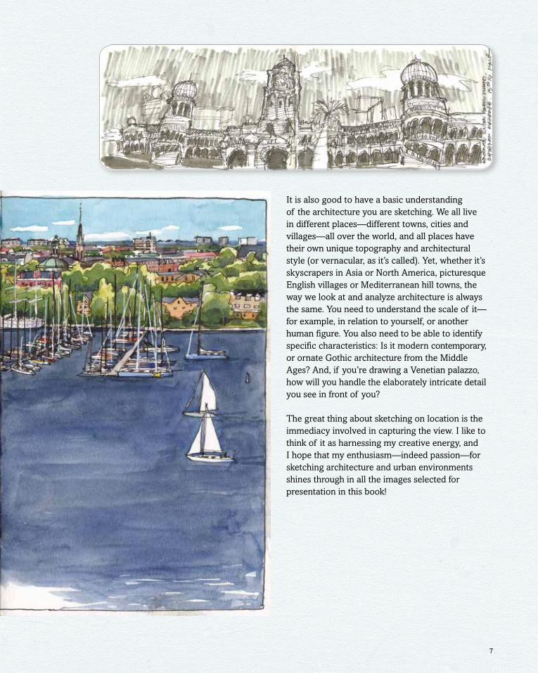
Right: Nina Johansson, The Gotland Runt (“Offshore Race”), Stockholm, SwedenOpposite top: Ahmad Hakym bin Ahmad Hilmy, Merdeka Square, Kuala Lumpur, Malaysia
7
It is also good to have a basic understanding of the architecture you are sketching. We all live in different places—different towns, cities and villages—all over the world, and all places have their own unique topography and architectural style (or vernacular, as it’s called). Yet, whether it’s skyscrapers in Asia or North America, picturesque English villages or Mediterranean hill towns, the way we look at and analyze architecture is always the same. You need to understand the scale of it—for example, in relation to yourself, or another human figure. You also need to be able to identify specific characteristics: Is it modern contemporary, or ornate Gothic architecture from the Middle Ages? And, if you’re drawing a Venetian palazzo, how will you handle the elaborately intricate detail you see in front of you?
The great thing about sketching on location is the immediacy involved in capturing the view. I like to think of it as harnessing my creative energy, and I hope that my enthusiasm—indeed passion—for sketching architecture and urban environments shines through in all the images selected for presentation in this book!

Composition is about achieving balance and harmony in a drawing. When you settle down to sketch, assess the view. Does it make an interesting subject? Analyze why you’ve chosen to draw this view over another. Be clear about what you’re going to draw, too. Is it a detailed element, part of a building or an ambitious cityscape? Is there depth—meaning foreground, middle distance (where the focal point of your drawing should usually be) and background? Is there something to lead the eye into the view?
When thinking about composition, it’s good to start by considering what’s important to you in what you see before you. You don’t have to draw everything absolutely correctly—you can always choose to omit elements that don’t add anything to your sketch.
Consider the view as you would a still-life painting. A still life usually comprises a collection of objects arranged in such a way as to create a balanced composition; the placement of objects is very carefully considered, with an appreciation of both the objects themselves and the space around them. Use the same approach when sketching architecture. Obviously you can’t move things around in the same way, but you yourself can move around the location until you find the right vantage point. Also, unless it’s a deliberate choice, avoid placing your main focal point in the center of your sketch (see page 14).
Overview
10

Composition and contextThis vivid sketch by Shari Blaukopf illustrates composition and an understanding of context beautifully. She has articulated the foreground, which features a bandstand, tree and people. Note, too, how the path draws us farther into the picture. While this may not have been intentional, this is an effective compositional “trick” that leads us to the middle distance. The backdrop of tall buildings in downtown Montreal then provides a city context behind the park in the foreground. By including a few people, Shari has also given this sketch a clear sense of scale.
MistakesNever worry about making mistakes. All the marks you make, even the ones you aren’t happy with, contribute to the overall drawing. Think of it as a tapestry of lines. Sketching is also a learning curve. It’s always interesting to revisit old drawings and see how much your work has changed, modulated and improved during the time that you’ve been sketching!
11
COMPOSITION
Left: Shari Blaukopf, The City, Montreal, Canada

Balancing scope and detailCompositionally, the sketch below ticks all the boxes: foreground landscape, paths leading to the middle distance and the focal elements, and people to establish scale. While acknowledging the scene’s architectural grandeur, Esther Semmens prevents this from over-powering the sketch by using just the right level of detail. “The heavy pollution-stained Scott Monument was the main focus ... and I added extra color to the sky and extra green to the ground to brighten the image and give the monument extra intensity.”
For an architectural sketch, there are three main stages that a beginner needs to focus on. Firstly, and most importantly, study the view. Make decisions about how much of it you want to commit to paper. Think of this as visually assessing or auditing the scene; this is where you work out the composition of your sketch.
Next, start drawing the outline. Ghost in the view you want to draw in blocks, thinking of this as the massing of the architectural elements. If it makes it seem less scary, this can be drawn lightly in pencil. Finally, when the view is established, you can go back and start to add detail. Of course this isn’t what everyone does; sometimes I just start in the middle of the page and work outward. I may not know if I’ve left enough space to show the whole building (frequently I haven’t!), but this can have its own charm. Even this method, though, involves careful study of the view.
First principles
12

Drawing bridgesYou don’t have to be an engineer to grasp the basic structure of a bridge; you just have to draw the elements in proportion so that you capture the spirit of the architecture. Whether it’s a sturdy Victorian bridge like this (the three-arched, cast-iron North Bridge), an elegant suspension bridge like the Golden Gate, or one of literally thousands in between, it all comes down to mapping height to width—the “span” of the bridge. You can do this on site with the simple aid of a pencil (see the tip on page 27). Make sure you study the piers (upright supports) too, noting whether they are heavy stone slabs or slender steel and concrete.
Architectural “bones”This sketch by Colin Binns (left) is drawn with such clarity that you can almost see the thinking behind each line. Colin has established the basic elements of composition in blue pen first—the massing, or “bones,” of the architecture. He has then added lines in black pen to accentuate the massing of buildings and articulate the foreground with shading. See how the walkway draws you in, leading from the edge of the page to the focal point (Manchester Cathedral) in the middle distance? There is a very strong sense of foreground, middle distance and background in this confident sketch.
13
COMPOSITION
Look out for
Above: Colin Binns, Cathedral Square, Manchester, EnglandLeft: Esther Semmens, Scott Monument, Edinburgh, Scotland

This is a “painterly” approach to composition, where it is widely thought that paintings (and drawings) are more aesthetically pleasing if the main focal point is not placed centrally on the page.
If you’re new to sketching, I’d recommend using a viewfinder with a sheet of clear acetate fixed onto it. Divide this sheet into nine equal squares. (If you don’t have a viewfinder then just draw straight onto your paper.) These nine squares are created from the intersection of four lines: two vertical and two horizontal. Compositionally, it is best to place the focal point of your sketch near one of these four intersections rather than dead center on the page, and to place the horizon on one of the horizontal lines.
You will now have either a high or low horizon, and the most interesting part of your sketch will be positioned either to the left or right of center. This will make for a balanced and harmonious composition.
The rule of thirds
Look out for

A low horizonThis is a perfect example of the rule of thirds. Malaysian artist Ch’ng Kiah Kiean has worked this drawing over three panels, and what I suggest is the focal point, with its bright red tiled roof, sits across one of the gutters. See how the main elements in the sketch are drawn low on the page (a low horizon line)? This is a splendid, richly textured drawing showing a real mastery of composition, shadow and depth, and tonal values. You can probably tell that I’m a huge fan of his work!
15
Drawing columnsSan Giorgio Maggiore church was designed by Andrea Palladio, a sixteenth-century Venetian architect whose main influence was classical Roman architecture, as seen in the columns supporting the ornate main architrave and triangular pediment.
There are three types of classical column: Doric (sturdy and “male”), Ionic (more slender and “female”) and Corinthian (more decorated, with a leafy capital). The best way to identify a column is to observe it closely, and to have some understanding of the architectural style and period of the building you are drawing. Columns can be very elaborate, and therefore pretty daunting—as is a lot of classical architecture! But you don’t need to draw every detail; just try and get the proportion and scale right.
COMPOSITION
Look out for
Left: Simone Ridyard, Venice, Italy Above: Ch’ng Kiah Kiean, Yu Chi Village, Taiwan