Visitors and Short Term Business Visa Applications and Extensions Mercedes Balado Bevilacqua
Applications | Connections | Extensions
ApplicationsFor Exercises 1 and 2, use the table below. It shows the height and stride distance for 10 students.
For humans, walking is the most basic form of transportation. An average person is able to walk at a pace of about 3 miles per hour.
The distance a person covers in one step depends on his or her stride. To measure stride distance, measure from the heel of the first foot to the heel of that same foot on the next step.
125.2
124.2
125.2
126.8
124.4
123.8
121.8
120.8
125.6
126.8
150.8
149.5
151.2
153.1
150.6
149.9
146.5
146.5
151.5
153.5
Height (cm) Stride Distance (cm)
stride
1. a. What is the median height of these students? Explain how you found the median.
b. What is the median stride distance of these students? Explain how you found the median.
c. What is the ratio of median height to median stride distance? Explain.
96 Thinking With Mathematical Models

Applications ExtensionsConnectionsApplications Connections Extensions
2. a. Draw a coordinate graph with height (in centimeters) on the horizontal axis and stride distance (in centimeters) on the vertical axis. To choose a scale for each axis, look at the greatest and least values of each measure.
b. Explain how you can use your graph to determine whether the shortest student also has the shortest stride distance.
c. Describe how to estimate the heights of people with each stride distance.
i. 1.50 meters ii. 0.90 meters iii. 1.10 meters
3. In Problem 4.1 you explored the relationship between arm span and height. The scatter plot below shows data for another group of middle school students.
140
150
160
170
180
190
130130140150160 170 180 190
Height (cm)
Height and Arm Span
Arm
Sp
an (
cm)
x
y
Arm span
Height
a. Draw a model line from (130, 130) to (190, 190) on your scatter plot.
b. Use the line to describe the relationship between height and arm span.
c. Write an equation for the line using h for height and a for arm span.
d. What is true about the relationship between height and arm span for points in each part of the graph?
i. points on the model line
ii. points above the model line
iii. points below the model line
97Investigation 4 Variability and Associations in Numerical Data
Applications Connections ExtensionsApplications Connections Extensions
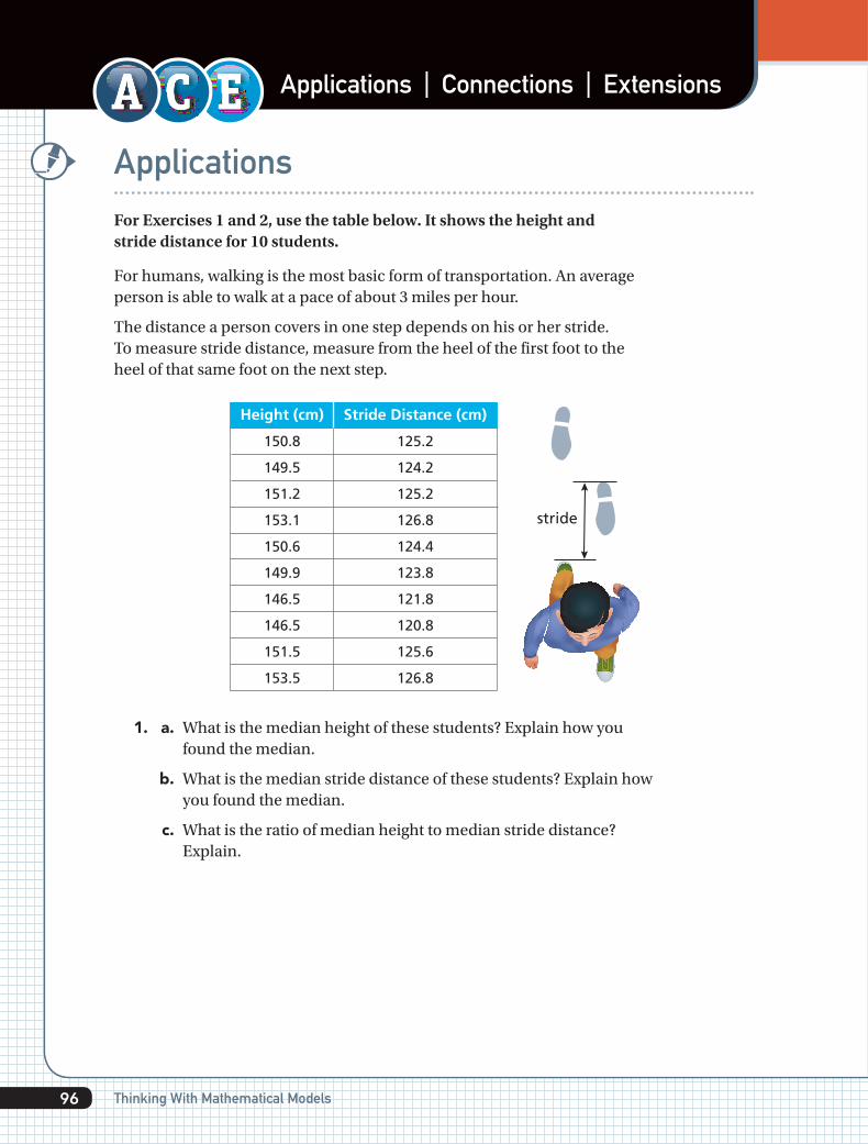
4. a. Make a scatter plot from the table. To keep track of engine type, use two different colors as you plot the points. Use one color for jet engines and one color for propeller engines.
Plane
Boeing 707
Boeing 747
Ilyushin IL-86
McDonnell Douglas DC-8
Antonov An-124
British Aerospace 146
Lockheed C-5 Galaxy
Antonov An-225
Airbus A300
Airbus A310
Airbus A320
Boeing 737
Boeing 757
Boeing 767
Lockheed Tristar L-1011
McDonnell Douglas DC-10
Douglas DC-4 C-54 Skymaster
Douglas DC-6
Lockheed L-188 Electra
Vickers Viscount
Antonov An-12
de Havilland DHC Dash-7
Lockheed C-130 Hercules/L-100
British Aerospace 748/ATP
Convair 240
Curtiss C-46 Commando
Douglas DC-3
Grumman Gulfstream I/I-C
Ilyushin IL-14
Martin 4-0-4
Saab 340
jet
jet
jet
jet
jet
jet
jet
jet
jet
jet
jet
jet
jet
jet
jet
jet
propeller
propeller
propeller
propeller
propeller
propeller
propeller
propeller
propeller
propeller
propeller
propeller
propeller
propeller
propeller
47
71
60
57
69
29
76
84
54
46
38
33
47
49
54
56
29
32
32
26
33
25
34
26
24
23
20
19
22
23
20
44
60
48
45
73
26
68
88
45
44
34
29
38
48
47
50
36
36
30
29
38
28
40
31
32
33
29
24
32
28
21
Engine type Body length (m) Wingspan (m)
Airplane Comparisons
SOU
RC
E: A
irp
ort
Air
pla
nes
98 Thinking With Mathematical Models

Applications ExtensionsConnectionsApplications Connections Extensions
b. Use your results from Exercise 3. Does your equation for the relationship between height and arm span also describe the relationship between body length and wingspan for airplanes? Explain.
c. Predict the wingspan of an airplane with a body length of 40 meters.
d. Predict the body length of an airplane with a wingspan of 60 meters.
5. The scatter plot below shows the relationship between body length and wingspan for different birds.
a. Use your results from Exercise 3. Does your equation for the relationship between height and arm span also describe the relationship between body length and wingspan for birds? Explain.
b. Find a line that fits the overall pattern of points in the scatter plot. What is the equation of your line?
c. Predict the wingspan of a bird with a body length of 60 inches. Explain your reasoning.
20
40
60
80
100
120
00 20 40 60 80 100 120
Body Length (in.)
Bird Body Length and Wingspan
Win
gsp
an (
in.)
x
y
99Investigation 4 Variability and Associations in Numerical Data

Applications Connections ExtensionsApplications Connections Extensions
6. a. The table shows math and science test scores for 10 students. Make a scatter plot of the data.
Science
Student
Math
1
67
71 69 85 35 60 47 74 63
51 87 36 56 44 72 63
2 3 4 5 6 7 8
46
45
9
96
93
10
b. Describe the relationship between the math and science scores.
c. If the data are linear, sketch a line that fits the data.
d. Identify any data values that you think are outliers. Explain why they are outliers.
e. Estimate a correlation coefficient for the data. Is it closest to -1, -0.5, 0, 0.5, or 1? Explain your choice.
7. a. The table shows math scores and distances from home to school for 10 students. Make a scatter plot of the data.
Distance fromhome to school(miles)
Student
Math Score
1
67
0.6 1.7
51
2
0.3
87
3
2.2
36
4
3.1
56
5
0.25
44
6
2.6
72
7
1.5
63
8
0.75
45
9
2.1
93
10
b. Describe the relationship between the math score and distance from home to school.
c. Estimate a correlation coefficient for the data. Is it closest to -1, -0.5, 0, 0.5, or 1? Explain your choice.
100 Thinking With Mathematical Models

Applications ExtensionsConnectionsApplications Connections Extensions
8. a. The table shows the number of servers and average time to fill an order at fast-food restaurants. Make a scatter plot of the data.
Average Time to Fill an Order (min)
Number of Servers
0.6 1.7 0.3 2.2 3.1
3 4 5 6 7
b. Describe the relationship between the number of servers and average time to fill an order.
c. Identify any data values that you think are outliers. Explain why they are outliers.
d. Estimate a correlation coefficient for the data. Is it closest to -1, -0.5, 0, 0.5, or 1? Explain your choice.
9. a. The table shows the number of absences from school and math scores. Make a scatter plot of the data.
b. Describe the relationship between the number of absences and math scores.
c. If the data are linear, write an equation for a line that models the data.
d. Estimate a correlation coefficient for the data. Is it closest to -1, -0.5, 0, 0.5, or 1? Explain your choice.
2
10
0
6
6
2
0
5
7
11
1
69
32
94
53
41
90
92
60
50
10
80
67
49
96
82
79
37
71
55
100
34
46
3
5
1
1
3
7
5
3
0
8
7
Absences Math Scores
101Investigation 4 Variability and Associations in Numerical Data
Applications Connections ExtensionsApplications Connections ExtensionsExtensionsConnectionsApplications
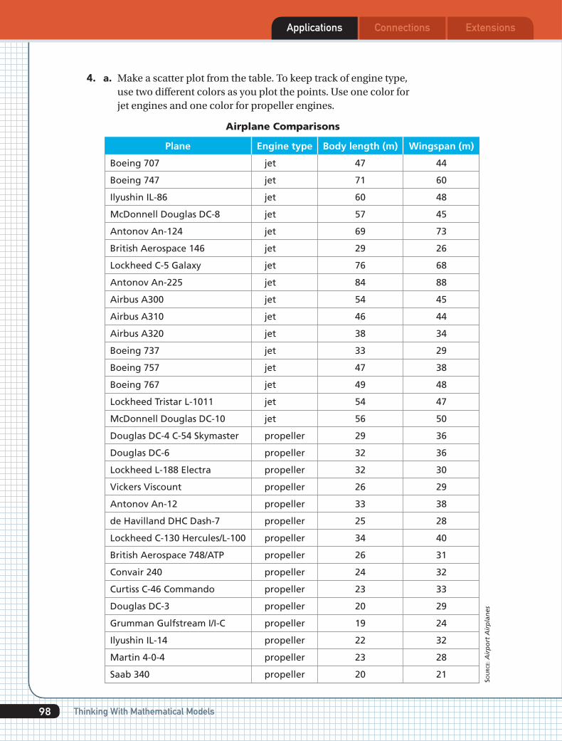
Students collected height measurements from two eighth-grade classes. The measurements are in centimeters.
10. Use the dot plot, data, and summary statistics of height measurements from Class 2 below. Describe the distribution of heights in this class.
Class 2: 130, 132, 132, 137, 137, 138, 138, 138, 139, 139, 139, 145, 146, 147, 147, 147, 147, 150, 152, 153, 155, 156, 163
Heights of Class 2
132130 134 136 138 140 142 144 146 150 152148 158 160 162154 156 164
Mean = 143.8Median = 145Range = 163 - 130 = 33Standard Deviation = 8.6
11. a. The data below show heights from another class of eighth graders. Make a dot plot of the data below.
Class 1: 130, 132, 134, 135, 136, 136, 137, 138, 138, 138, 139, 139, 139, 140, 140, 141, 142, 142, 142, 142, 143, 147, 148
b. Calculate the mean, median, range, and standard deviation of the distribution.
c. Use information from parts (a) and (b) to describe the distribution of heights.
d. Compare the distribution of heights in this class to that of the class in Exercise 10.
e. Could you use either distribution to predict the typical height for eighth-graders? Explain your thinking.
12. Use data sets A, B, and C.
Set A = {9, 10, 11, 7, 13}
Set B = {10, 10, 10, 10, 10}
Set C = {1, 1, 10, 19, 19}
a. Calculate the mean of each data set.
b. Calculate the standard deviation of each data set.
c. Explain how you could identify the data set with the greatest standard deviation before doing any calculations.
102 Thinking With Mathematical Models

Applications ExtensionsConnections ExtensionsExtensionsApplications Connections
13. The table shows the monthly salaries of 20 people.
Salary (dollars)
Number of People 5
3,500 4,000 4,200 4,300
285
a. Calculate the mean of the salaries.
b. Calculate the standard deviation of the salaries.
Connections14. The table shows height, arm span, and the
ratio of arm span to height.
a. Recall Problem 4.1 and the line s = h. Where would you find a point with a ratio greater than 1 (on, above, or below the line)? What does it mean when the ratio is greater than 1?
b. For the line s = h, where would you find a point with a ratio equal to 1 (on, above, or below the line)? What does it mean when the ratio equals 1?
c. For the line s = h, where would you find a point with a ratio less than 1 (on, above, or below the line)? What does it mean when the ratio is less than 1?
Height(inches)
172
167
163
162
163
164
161
161
159
156
154
154
154
155
155
177
171
149
143
142
0.98
0.98
1.01
1.01
0.97
0.96
0.99
0.96
1.01
1.00
1.05
1.02
1.01
0.97
0.99
0.98
1.01
0.97
1.03
1.00
169
163
164
164
159
158
159
155
161
156
162
157
156
150
154
174
172
144
148
142
Arm Span(inches)
Ratio ofArm Spanto Height
103Investigation 4 Variability and Associations in Numerical Data

Applications Connections ExtensionsConnections ExtensionsConnectionsApplications
15. Multiple Choice In testing two new sneakers, the shoe designers judged performance by measuring the heights of jumps. Now a shoe designer needs to choose the better sneaker. Which measure is best for deciding between the two sneakers? Use the graph for each sneaker.
Nu
mb
er o
f Ju
mp
s
Jump Height in Inches10 11 12 13 14 159
0
1
2
3
4
5
6
7
8
9Jump Height—Shoe 1
Nu
mb
er o
f Ju
mp
s
Jump Height in Inches10 11 12 13 14 159
0
1
2
3
4
5
6
7
8
9Jump Height—Shoe 2
A. Use the mode. The most frequent height jumped for Shoe 1 was 11 inches, and the most frequent height jumped for Shoe 2 was 13 or 14 inches.
B. Use the mean. The average jump height for Shoe 1 was 11 inches. For Shoe 2, it was 12.5 inches.
C. Use clusters. Overall, 70, of the students jumped 10 inches to 12 inches in Shoe 1, and the data vary from 9 inches to 15 inches. About 63, of the students jumped 12 inches to 14 inches in Shoe 2, and the data vary from 9 inches to 15 inches.
D. None of the above.
16. a. What is the shape of a distribution when the mean is greater than the median?
b. What is the shape of a distribution when the mean is less than the median?
c. What is the shape of a distribution when the mean and the median are about the same value?
104 Thinking With Mathematical Models

Applications ExtensionsConnectionsConnections ExtensionsApplications Connections
17. Multiple Choice Del Kenya’s test scores are 100, 83, 88, 96, and 100. His teacher told the class that they could choose whichever measure of center they wanted her to use to determine final grades. Which measure do you think Del Kenya should choose?
F. Mean G. Median H. Mode J. Range
18. Multiple Choice Five packages with a mean weight of 6.7 pounds were shipped by the Send-It-Quick Mail House. If the mean weight for four of these packages is 7.2 pounds, what is the weight of the fifth package?
A. 3.35 lb B. 4.7 lb C. 6.95 lb D. 8.7 lb
19. Multiple Choice In Mr. Mamer’s math class, there are three times as many girls as boys. The girls’ mean grade on a recent quiz was 90, and the boys’ mean grade was 86. What was the mean grade for the entire class?
F. 88 G. 44 H. 89 J. 95
20. Some numbered cards are put in a hat, and one is drawn at random. There is an even number of cards, no two of which are alike. How many cards might be in the hat to give the probability equal to the following values of choosing a number greater than the median?
a. 12 b. 1
3 c. 0
105Investigation 4 Variability and Associations in Numerical Data

Applications Connections ExtensionsConnections ExtensionsConnectionsApplications
Extensions21. If you know the number of chirps a cricket makes in a certain period of
time, you can estimate the temperature in degrees Fahrenheit or Celsius.
a. Count the number of chirps in one minute, divide by 4, and add 40 to get the temperature in degrees Fahrenheit. Write a formula using F for temperature and s for chirps per minute.
b. Graph your formula. Use a temperature scale from 0 to 212° F.
c. Use your graph to estimate the number of chirps at each temperature.
i. 0° F ii. 50° F iii. 100° F iv. 212° F
22. a. The chirp frequency of a different kind of cricket allows you to estimate temperatures in degrees Celsius rather than in degrees Fahrenheit. Graph the data in the table.
Temperature (°C)
Frequency
31.4 34.1 29.1 27 24 20.9 27.8 20.8 28.5 28.6 24.626.4 28.1 2722
195 123 212 176 162 140 119 161 118 175 161 171 164 174 144
b. Find a formula that lets you predict the temperature in degrees Celsius from the number of chirps.
c. Use your formula from part (b) to draw a line on the graph using the points plotted in part (a). How well does the line fit the data?
Cold: 15 chirps per 13 seconds
Cool: 25 chirps per 13 seconds
Hot: 49 chirps per 13 seconds
Warm: 37 chirps per 13 seconds
2 seconds
106 Thinking With Mathematical Models

Applications ExtensionsConnectionsConnections ExtensionsConnectionsApplications
23. A newspaper article said students carry heavy backpacks. One middle school class decided to check whether the claim was true. Each student estimated the weight of his or her backpack and then weighed it. The scatter plot shows the estimated and actual backpack weights for each student. The dot plots show the distributions for each variable with their mean.
a. Use the statistics in the box to describe the spread of the estimated backpack weights.
Estimate of Weight
8 10 12 14 16 18 2220 24
Mean = 15.53Median = 15Range = 13SD = 3.14
b. Use the statistics in the box to describe the spread of the actual backpack weights.
Actual Weight
8 10 12 14 16 18 2220 24
Mean = 15.15Median = 16Range = 12.5SD = 3.79
c. Estimate a correlation coefficient for the scatter plot. Is it closest to -1, -0.5, 0, 0.5, or 1? Explain your choice.
0
5
10
15
20
25
0 5 10 15 20 25
Actual Weight
Esti
mat
e o
f W
eig
ht
Backpack Weights
107Investigation 4 Variability and Associations in Numerical Data

Applications Connections ExtensionsApplications Connections ExtensionsExtensionsApplications Connections
24. A group of students estimated, and then counted, the number of seeds in several pumpkins. The two tables show the same data sorted differently: One shows the data sorted by actual count and the other by estimate.
505
506
507
512
523
545
553
568
606
607
720
624
200
500
350
2,000
202
766
521
1,200
423
441
442
446
455
462
467
479
486
492
494
498
759
655
300
621
722
556
621
900
680
1,000
564
1,458
Actual
309
325
336
354
365
367
381
384
387
387
408
410
Estimate
630
621
1,423
1,200
1,200
621
801
604
1,900
1,100
605
622
Number of Pumpkin Seeds Sorted by Actual Count
479
492
387
354
365
607
336
498
387
545
900
1,000
1,100
1,200
1,200
1,200
1,423
1,458
1,900
2,000
446
467
410
506
309
441
486
505
455
423
568
381
621
621
622
624
630
655
680
720
722
759
766
801
Actual
507
553
442
523
512
606
462
494
384
408
325
367
Estimate
200
202
300
350
500
521
556
564
604
605
621
621
Number of Pumpkin Seeds Sorted by Estimate
108 Thinking With Mathematical Models

Applications ExtensionsConnectionsApplications Connections ExtensionsExtensionsApplications Connections
a. How do the actual counts vary? Find the median, the least, and the greatest counts.
b. How do the estimates vary? Find the median, the least, and the greatest estimates.
c. Make a scatter plot of the data. Draw a line on the graph to connect the points (0, 0), (250, 250), (500, 500), and (2250, 2250). What is true about the estimates and actual counts for points near the line?
d. What is true about the estimates and actual counts for points above the line you graphed in part (c)?
e. What is true about the estimates and actual counts for points below the line you graphed in part (c)?
f. In general, did the students make good estimates? Use the median and the range of the data to explain your reasoning.
g. Would a correlation coefficient be closest to -1, -0.5, 0, 0.5, or 1? Explain your choice.
h. One student graphed the data on the scatter plot below. It shows the data bunched together. How could you change the scale(s) on the graph to show the data points better?
200400600800
100012001400160018002000
200 600 1000 1400 1800Actual Count
Esti
mat
ed C
ount
Number of Pumpkin Seeds
109Investigation 4 Variability and Associations in Numerical Data

Applications Connections ExtensionsApplications Connections ExtensionsExtensionsApplications Connections
25. Multiple Choice Janelle made a scatter plot that shows the relationship between her MP3 music downloads and the unused space on her music player. Which statement would you expect to be true?
A. As the number of MP3s downloaded increases, the amount of unused space increases.
B. As the number of MP3s downloaded increases, the amount of unused space stays the same.
C. As the number of MP3s downloaded increases, the amount of unused space decreases.
D. As the number of MP3s downloaded decreases, the amount of space used decreases.
26. a. The graph shows a model of the relationship between pumpkin circumference and pumpkin weight. How does the graph suggest that the linear equation w = c would not be a very accurate model for the relationship of weight and circumference?
250 50 75 100125150175
700
600
500
400
300
200
100
0x
y
Wei
gh
t (l
b)
Circumference (in.)
Pumpkin Measurements
b. Which of the following functions would you expect to express the relationship between pumpkin circumference and pumpkin weight? Explain your choice.
w = kc w = kc2 w = kc3 w = kc
110 Thinking With Mathematical Models