Annaallyyttiiccss RReeffeerreennccee GGuuiiddee 166 … · Detailed Earned Value by WBS Section ......
213
Analytics Reference Guide 16 R2 September 2016
Transcript of Annaallyyttiiccss RReeffeerreennccee GGuuiiddee 166 … · Detailed Earned Value by WBS Section ......
AAnnaallyyttiiccss RReeffeerreennccee GGuuiiddee
1166 RR22
SSeepptteemmbbeerr 22001166

3
Contents
Getting Started ......................................................................................... 9
About Oracle Primavera Analytics ..................................................................... 9
Prerequisites to Use Primavera Analytics .......................................................... 10
About Analyses ......................................................................................... 11
About Subject Areas ................................................................................... 11
About Dashboards ...................................................................................... 13
Logging in to OBI and Navigating to Dashboards ........................................... 15
Editing Sample Analyses .............................................................................. 15
Creating Analyses ...................................................................................... 15
Sample Dashboards ................................................................................... 16
Main Dashboard ........................................................................................ 16
Overview Page .................................................................................. 16
Early Stage Projects Behind Schedule Section ................................ 17
At Completion Cost Summary Section ......................................... 17
Cash Flow Summary by Project Section ....................................... 18
Portfolio Summary Section ...................................................... 19
Location Page ................................................................................... 20
Completion Cost by Location Section .......................................... 21
Risk Page ......................................................................................... 22
Risk Exposure by Location Section ............................................. 22
Detailed Risk by Location Section .............................................. 23
Detailed Risk by Project Section ................................................ 24
Business Processes Dashboard ....................................................................... 25
Overview Page .................................................................................. 25
Business Process Counts Section ................................................ 25
Company Level Business Process Summary Section .......................... 26
Approved Change Orders by Reason Section .................................. 27
Vendor Summary Section ........................................................ 28
Total Commitments > 300k by Vendor Section ............................... 29
Contract Summary by Vendor Section ......................................... 29
Commitments by Project Phase Section ....................................... 30
Top 10 Workflows by Duration Section ........................................ 31
Location Page ................................................................................... 32
Commitments by City, State Section ........................................... 32
History Page ..................................................................................... 33
Historical Business Process Counts Section .................................... 33
Historical Amounts by Vendor Section ......................................... 34
Weekly Business Process Trend by Project and Count Section ............. 35
Analytics Reference Guide
4
Workflow Page .................................................................................. 36
Past Due Workflows Section ..................................................... 36
Completed BP Workflows by Month Section ................................... 37
Steps Past Due by Project Section .............................................. 37
Planned vs. Actual Workflow Duration Section ............................... 38
Revisited Workflow Steps Section .............................................. 39
Top 10 Open Workflows by Duration Section ................................. 40
Completed Tasks by Month Section ............................................ 41
Task Assignee Details Section ................................................... 42
Cash Flow Dashboard .................................................................................. 44
Overview Page .................................................................................. 44
Cash Flow Summary by Project Section ....................................... 44
Cash Flow Summary by CBS Section ............................................ 46
History Page ..................................................................................... 47
Actual vs Forecast Weekly Trend Section ..................................... 47
Baseline Variance Weekly Trend Section ...................................... 48
Cost Sheet Dashboard ................................................................................. 49
Overview Page .................................................................................. 49
Original and Revised Budgets Section .......................................... 49
Original and Revised Commitments Section .................................. 50
Budget vs. Forecast Section ..................................................... 51
Cost Sheet Summary Section .................................................... 52
Budget by Owner Section ........................................................ 53
Location Page ................................................................................... 53
Revised Budget by Location Section ........................................... 54
History Page ..................................................................................... 55
Revised Budget vs. Forecast Weekly Trend Section .......................... 55
Budget Section .................................................................... 56
Contracts Section ................................................................. 57
Cost Summary Section ............................................................ 57
Facilities and Real Estate Dashboard ............................................................... 58
Overview Page .................................................................................. 58
Space by Location Section ....................................................... 59
Lease Expirations Section ........................................................ 60
Rent by Building ................................................................... 61
Work Order by Status Section ................................................... 62
Space Management Page ....................................................................... 63
Floor Rentable Area Section ..................................................... 63
Area by Space Type Section ..................................................... 64
Spaces by Level Status Section ................................................. 65
Space by Assigned Department Section ........................................ 65
Space by Tenant Section ......................................................... 66

Contents
5
Rent & Records by Property Hierarchy Section ............................... 67
Building Owners and Managers Association (BOMA) Section ................ 68
Space Management History Page ............................................................. 69
Rent & Area History Section ..................................................... 70
Level Summary History Section ................................................. 71
BOMA Sheet by Month Section .................................................. 72
Space History by Tenant Section ............................................... 73
Historical Rents by Building Section ............................................ 74
Historical Rent by Department Section ........................................ 75
Cost Sheet Page ................................................................................. 77
Approved Budget by Root Cost Code Section ................................. 78
Cost Sheet Section ................................................................ 79
Lease and Budget by Building Section ......................................... 80
Budget by Month Section ........................................................ 81
Portfolio Analysis Dashboard ......................................................................... 81
Overview Page .................................................................................. 81
Project Investment Map Section ................................................ 82
Proposed vs. Committed Cost Section ......................................... 83
Project Performance by Sponsor Section ...................................... 84
Budget at Completion by Portfolio Section ................................... 85
Performance Page .............................................................................. 85
Portfolio Analysis Trending Section ............................................ 85
Portfolio View Section ........................................................... 86
Prioritization Page .............................................................................. 87
Risk vs. Reward Section .......................................................... 87
Project Initiation Section ........................................................ 88
Rating Section ..................................................................... 89
Project Prioritization - Force Rank by Score Section ........................ 90
Objectives Page ................................................................................. 91
Investment by Strategic Objective Section ................................... 91
Project Performance by Strategic Objective Section ........................ 92
Project Earned Value Dashboard .................................................................... 93
Overview Page .................................................................................. 93
Earned Value Section ............................................................. 94
Project Earned Value Breakdown Section ..................................... 95
CPI/SPI Page ..................................................................................... 97
Cost & Schedule Performance Index Section ................................. 97
CPI/SPI Section .................................................................... 98
Performance Index Section ...................................................... 99
Detailed Earned Value Page .................................................................. 100
Detailed Earned Value by WBS Section ....................................... 100
Project Health Dashboard ........................................................................... 101

Analytics Reference Guide
6
Overview Page ................................................................................. 101
Project Count Section ........................................................... 101
Overall Project Health Section................................................. 102
Cost Account Section ............................................................ 103
Schedule Page .................................................................................. 104
Critical Activities behind Schedule Section .................................. 104
Float Path Section ............................................................... 105
Labor Performance Section ..................................................... 106
Completion Section .............................................................. 107
Percent Complete Analysis Section ........................................... 108
Activity Steps Section ........................................................... 109
Cost Page ....................................................................................... 110
Code Cost Hierarchy Section ................................................... 111
Cost Trend Section ............................................................... 112
Project Cost Breakdown Section ............................................... 113
Cost by Type Section ............................................................ 115
Expenses Section ................................................................. 116
History Page .................................................................................... 116
% Complete History Section .................................................... 117
Milestone Dates That Have Slipped Section .................................. 118
Proposed Budget (Project Cost UDF) History Section ....................... 119
Location Page .................................................................................. 120
At Completion Total Cost by Location Section .............................. 120
Project Code Hierarchy Section ............................................... 121
At Completion Labor Units by State Section ................................. 122
Activity Worksheet Page ...................................................................... 122
Activity Worksheet Section ..................................................... 123
Resource Analysis Dashboard ....................................................................... 123
Overview Page ................................................................................. 124
Resource Alignment Section .................................................... 124
Resource Allocation Section .................................................... 125
Labor Hours by Resource Location Section ................................... 126
Over/Under Allocation Section ................................................ 127
Staffing Page ................................................................................... 128
Staffing Section .................................................................. 128
Allocation by Code Section ..................................................... 129
Hours by Role Section ........................................................... 130
Total Hours by Team Section ................................................... 131
Hierarchies Section .............................................................. 132
Productivity Page .............................................................................. 133
Resource Utilization by Team Section ........................................ 133
Poorly Performing Resources Section ......................................... 134

Contents
7
Periodic and Cumulative Labor Units by Month Section .................... 135
Daily vs. Average SPI by Resource Section ................................... 136
Utilization Page ................................................................................ 137
Resource Availability Section .................................................. 137
Utilization Section ............................................................... 138
Capacity Section ................................................................. 139
Location Page .................................................................................. 140
Resource Location by Role Section ............................................ 140
Cost Summary Page ............................................................................ 140
Cost Summary by Project Section ............................................. 141
Cost Summary by CBS Section .................................................. 142
Current vs. Baseline Cost Section ............................................. 143
Current vs. Baseline Units Section ............................................ 143
Role Utilization ................................................................................. 144
Role Over Limit ................................................................... 144
Top 10 Roles Over Limit ........................................................ 145
Role Utilization Over Time ..................................................... 146
Role Limit by Project ............................................................ 147
Role Under Limit ................................................................. 148
Industry Samples Dashboard ........................................................................ 149
Shutdown/Turnaround/Outage Page ........................................................ 149
Burn Down Hours Section ....................................................... 149
Burn Down Counts Section ...................................................... 150
Daily Performance Section ..................................................... 151
Schedule Compliance Section .................................................. 152
Average vs. Baseline (Hours) Section ......................................... 153
Daily Performance Index (Hours) Section .................................... 154
Routine/On-Line Maintenance Page ......................................................... 154
Work Planning Look Ahead Section ............................................ 155
Work Planning T+1 Critique Section ........................................... 156
On-Line Daily Schedule Adherence - Graded Section ....................... 157
On-Line Daily Schedule Adherence - Standard Section ..................... 158
Schedule Compliance Section .................................................. 159
Admin Dashboard ..................................................................................... 159
Admin Page ..................................................................................... 160
ETL Summary by Datasource Section .......................................... 160
ETL Performance Section ....................................................... 161
Project List Section .............................................................. 162
ETL Parameters Section ....................................................................... 163
More Dashboard ....................................................................................... 163
d3 Dashboard ................................................................................... 164
Gantt Chart - Critical Path Lookahead Section .............................. 164
Analytics Reference Guide
8
Milestone Trend Analysis Section .............................................. 165
Aster Chart - Costs by Country Section ....................................... 166
Donut Chart - Risks by Project Owner Section ............................... 167
Advanced Analytics Dashboard ............................................................... 167
Trendline Section ................................................................ 168
Outlier Section ................................................................... 169
Cluster Section ................................................................... 170
Regression Section ............................................................... 171
Burn Down Activity Use Cases .................................................................... 171
Burn Down Activity Scenarios ....................................................................... 172
Completed Before Outage Project Snapshot Use Case ................................... 172
Started Before Outage Project Snapshot Spanning into Outage Use Case ............. 173
Completed Day of Outage Project Snapshot Use Case ................................... 173
Pre-Outage Work Spanning into Outage Use Case ......................................... 174
Completed as Scheduled on Day 1 of Outage Use Case .................................. 175
Completed Late on Day 3 of Outage Use Case ............................................. 175
Emergent Activity on Day 3 of Outage Use Case .......................................... 176
Deleted After Outage Start Use Case ....................................................... 177
Data Flow from P6 EPPM to Primavera Analytics ................................................. 178
Day 0 (3/31/2013) ............................................................................. 178
Day 1 (4/01/2013) ............................................................................. 181
Day 2 (4/02/2013) ............................................................................. 184
Day 3 (4/03/2013) ............................................................................. 187
Mobile Dashboards .................................................................................. 191
Smartphone Dashboards ............................................................................. 191
Portfolio Section ............................................................................... 192
Location Section ............................................................................... 195
Tablet Dashboards .................................................................................... 198
Portfolio Overview Section ................................................................... 199
Portfolio Performance Section ............................................................... 202
Portfolio Objectives Section ................................................................. 204
Location Cost Map ............................................................................. 207
Location Cost Tiles ............................................................................ 210
Legal Notices ........................................................................................ 213
9
This document demonstrates ways that Primavera Analytics can present data. The sample data is from multiple sources and is intended for illustration only. Data and descriptions are part of the Primavera Analytics sample catalog and therefore may not reflect your environment. You can use the sample dashboards and the Primavera Data Warehouse database to replicate these analyses.
The samples are intended to provide you with a general understanding of Primavera Analytics and Oracle Business Intelligence (OBI). You can use these samples to customize both content and layout to your specific requirements.
For information on the types of views, charts, and gauges that are available, see the OBI help.
For P6 EPPM, see the P6 Data Dictionary available with your version of P6 for information on P6 fields. See the P6 EPPM documentation for information on using or configuring P6 to gather sufficient data for Primavera Analytics.
For Primavera Unifier, refer to the Unifier Reference Guide for information on Primavera Unifier fields. Refer to the Primavera Unifier documentation for information on using or configuring Primavera Unifier to gather sufficient data for Primavera Analytics.
This section highlights the tasks a user will perform when first using Primavera Analytics.
In This Section
About Oracle Primavera Analytics ............................................................................. 9 Prerequisites to Use Primavera Analytics ................................................................ 10 About Analyses ....................................................................................................... 11 About Subject Areas ................................................................................................ 11 About Dashboards ................................................................................................... 13 Editing Sample Analyses ......................................................................................... 15 Creating Analyses ................................................................................................... 15
About Oracle Primavera Analytics
Oracle Primavera Analytics provides an in-depth and comprehensive method for analyzing and evaluating facilities and real estate management, project performance, project history, resource assignments and utilization, business processes, cash flows, and cost sheets.
Built upon the Oracle Business Intelligence (OBI) suite, Primavera Analytics delivers a catalog of analyses that provide an interactive way of viewing, analyzing, and evaluating P6 EPPM and Primavera Unifier data. In addition, Primavera Analytics provides a repository definition that contains the data mappings between the physical data and the presentation layer of OBI.
Getting Started
Analytics Reference Guide
10
The dashboards provide detailed insight into your P6 EPPM and Primavera Unifier data through analytical charts, tables, maps, and graphics. Dashboards allow you to navigate to other analyses to provide precise root-cause analysis. OBI allows you to configure individual analyses with P6 EPPM and Primavera Unifier Action Links, enabling you to navigate directly to your P6 and Unifier site for true "Insight to Action" capabilities. You can save an analysis created with OBI in the OBI Presentation Catalog and integrate the analysis into any OBI dashboard. You can enhance results through options such as charting, results layout, calculations, and drill-down features.
Use Primavera Analytics to:
Perform root-cause analysis and employ management-by-exception.
Gather critical insights into current and historical performance of all projects, programs, and portfolios.
Drill down from aggregated metrics to examine the root-cause of a problem
Make better decisions to eliminate project failure.
Quickly visualize critical project performance in early stages.
Identify and predict cost sheet and cash flow trends early in the project life cycle.
Gain visibility into resource performance through s-curve analysis.
Show staffing needs by portfolio with early warning indicators for upcoming under-staffed project work.
Roll-up business processes to understand trends and trends by various dimensions.
Use geospatial visualization to view project, activity, and resource data metrics by geographic location with full drill-down capabilities.
Primavera Analytics provides a repository definition to use with the OBI suite. The repository definition contains:
A physical representation of the Primavera Data Warehouse.
A business layer to perform customized calculations.
A presentation layer that groups all the calculated business layer fields into logical subject areas.
The repository definition delivers an extensive list of key performance indicators (KPIs) from both P6 and Primavera Unifier. Depending on the data source, this list includes (but is not limited to) Earned Value, Costs, Units, Percent Completes, Counts, Business Processes, Cash Flow, and Cost Sheets. It also enables data to be sliced by various dimensions, including time, EPS, portfolios, projects, activities, resources, project hierarchies, cost breakdown structures, and business processes.
Primavera Analytics delivers a sample dataset, consisting of the Primavera Data Warehouse data, where the dashboards and analyses in the catalog were built. You can use this sample data to view the power of dashboard and analyses delivered in the catalog, and see how you can integrate the catalog with your data.
Prerequisites to Use Primavera Analytics
The following prerequisites need to be met before you can use Primavera Analytics:
P6 EPPM or Primavera Unifier must be installed.
Publishing must be switched on in P6 and Primavera Unifier.
Getting Started
11
You must have module access to Primavera Analytics in P6 and Primavera Unifier.
OBI must be installed.
You must be an OBI user.
Your OBI user name must match your P6 user name and your Primavera Unifier user name.
The catalog must be installed.
The ETL process must be run to update the Analytics data. Run Setup.sh/setup.bat before running the ETL to create the staruser. Work with your administrator to determine the optimal time to run this process.
Contact your administrator if you require any of the above privileges.
About Analyses
Analyses are queries against data (for example, P6 data or Primavera Unifier data) that allow you to evaluate the information. Analyses let you explore and interact with information by visually presenting data in tables, charts, and pivot tables. If you have the required permissions, you can save, organize, and share the results of analyses. You can save analyses that you create in the OBI Presentation Catalog and integrate them into any OBI dashboard. You can enhance analyses through features such as charts, pivot tables, compounded views, calculated items, and drilling.
About Subject Areas
A subject area contains folders, measure columns, attribute columns, hierarchical columns, and hierarchy levels that represent information about the areas of an organization's business or about groups of users with an organization. Subject areas usually have names that correspond to the types of information that they contain.
A subject area corresponds to the presentation layer in an OBI metadata repository. In a repository, the subject area is the highest-level object in the presentation layer and represents the view of the data that end users see when they create or edit an analysis.
Use subject areas to organize the data you see in an analysis.
P6 EPPM Data
Primavera Analytics uses P6 EPPM data for the following subject areas:
Primavera - Activity
Use this subject area to analyze project, WBS, and activity-level details. This subject area includes earned value metrics and percent complete metrics, planned and actual units and hours, and project baseline comparisons.
Primavera - Activity History
Use this subject area to analyze daily activity-level history, including changes to both facts and dimensions, to better understand changes over time. This subject area requires project-specific configuration in P6.
Primavera - Activity User Defined Fields
Use this subject area to analyze activity User Defined Field (UDF) data for cost, integer, or number types. This subject area requires UDF configuration using the ETL process.

Analytics Reference Guide
12
Primavera - Burn Down
Use this subject area to analyze daily project performance through burn down charts and schedule adherence metrics. Metrics include planned, actual, remaining, and emergent counts and units. Emergent data is from activities which were added after burn down began. This subject area requires project specific UDF configuration in P6.
Primavera - Project History
Use this subject area to analyze project and WBS-level history, including changes to both facts and dimensions, to better understand changes over time. This subject area requires project-specific configuration in P6.
Primavera - Project User Defined Fields
Use this subject area to analyze project UDF data for cost, integer, or number types. This subject area requires UDF configuration using the ETL process.
Primavera - Resource Assignment
Use this subject area to analyze resource assignment details for costs and units. This subject area includes information on planned, actual, remaining, staffed, unstaffed, and at completion costs and units.
Primavera - Resource Assignment History
Use this subject area to analyze daily resource assignment-level history, including changes to both facts and dimensions to help you understand changes over time. This subject area requires project specific configuration in P6.
Primavera - Resource Assignment User Defined Fields
Use this subject area to analyze resource assignment UDF data for cost, integer, or number types. This subject area requires UDF configuration using the ETL process.
Primavera - Resource User Defined Fields
Use this subject area to analyze resource UDF data for cost, integer, or number types. This subject area requires user defined field configuration using the ETL process.
Primavera - Resource Utilization
Use this subject area to analyze resource utilization details including actual, available, planned, remaining, at completion, and resource limit units.
Primavera - Role Utilization
Use this subject area to analyze role utilization details for resources.
Primavera - WBS User Defined Fields
Use this subject area to analyze WBS UDF data for cost, integer, or number types. This subject area requires UDF configuration using the ETL process.
Primavera - Work Planning
Use this subject area to analyze weekly work planning process by comparing project scope and schedule freeze dates each week. In this way, potential risks such as activity planned start date changes can quickly be identified. This subject area requires project specific UDF configuration in P6.
Primavera Unifier Data
Primavera Analytics uses Primavera Unifier data for the following subject areas:
Primavera - Business Process
Getting Started
13
Use this subject area to analyze cost and non-cost line items in business processes.
Primavera - Business Process History
Use this subject area to analyze weekly historical business process facts to better understand changes over time. Note that dimensional business process history is not supported.
Primavera - Cash Flow
Use this subject area to analyze WBS shell-level cash flows. You can map columns to predefined WBS shell-level cash flow curves. Ten generic columns are included to support cash flow curves.
Primavera - Cash Flow History
Use this subject area to analyze weekly historical cash flow facts to better understand changes over time. Note that dimensional cash flow history is not supported.
Primavera - Cost Sheet
Use this subject area to analyze cost sheets. You can map your data source to a predefined list of cost sheet columns. Twenty generic columns are included to support mapping of additional datasources from the cost sheet.
Primavera - Generic Cost Sheet
Use this subject area to analyze cost-related activities for a generic cost sheet. You can capture and view cost transaction information based on a timescale, such as quarterly or yearly.
Primavera - Cost Sheet History
Use this subject area to analyze weekly historical cost sheet facts to better understand changes over time. Note that dimensional cost sheet history is not supported.
Primavera - Space Management
Use this subject area to analyze space utilization for Facilities and Real Estate data from Primavera Unifier.
Primavera - Space Management History
Use this subject area to analyze space utilization over time for Facilities and Real Estate data from Primavera Unifier.
About Dashboards
Dashboards enable you to view various types of information quickly and easily. They can be made up of one or more pages, each of which can display various components of the OBI suite. For example, on the Industry Samples Routine/On-Line Maintenance page, values are based on the planned schedule for the beginning of the appropriate execution work week. The execution work week is determined by the values set in P6. This transfer of information is configured during the work planning setup.
Primavera Analytics includes several dashboards in the sample catalog. Use the sample dashboards as starting points to create custom dashboards and analyses that are tailored to your business needs. The power of Primavera Analytics is the ability to easily generate specific content for every user or role.
The following dashboards are included in the sample catalog:

Analytics Reference Guide
14
The Main dashboard provides high-level insight into schedule progress, costs, and risks. You can find information here about the progress of Early Stage projects, the percentage of overallocated resources, and world maps showing the distribution of costs and risks.
The Admin dashboard shows details about the ETL process and Primavera Data Warehouse database configuration. This data is not in any of the Primavera Analytics subject areas, so it is obtained via direct SQL against the Primavera Data Warehouse database.
The More dashboard contains the Advanced Analytics and d3 dashboards. The analyses on these dashboards contain components and technologies that are considered optional within Oracle Business Intelligence. Use these advanced dashboards to manipulate data into visual representations of your analyses. For more information, consult the Primavera Data Warehouse Installation and Configuration Guide for instruction on how to install and configure these optional components.
P6 EPPM Data
The Portfolio Analysis dashboard contains important portfolio information based on project performance, project costs, risks and rewards by project, strategic objectives, and multiple ratings of project codes.
The Project Earned Value dashboard gives an overview of the earned value status of your projects, including Schedule Performance Index (SPI) and Cost Performance Index (CPI).
The Project Health dashboard offers useful tools for determining the health of your projects. In this dashboard, you can view the overall health of your project, look at schedule progress and cost trends, and determine which activities are not on track.
The Resource Analysis dashboard shows the status and usage of roles and resources, measures team progress and productivity, and tells you which roles and resources are underutilized.
The Industry Samples dashboard shows daily burn down, performance, work planning, and schedule compliance for industry related activities.
Primavera Unifier Data
The Business Processes dashboard enables you to view business process data, including business process overview analyses, business process data by geographic location, and business process history analyses.
The Cash Flow dashboard enables you to view cash flow data, including comparisons of actuals vs. forecast and forecast vs. baseline, cash flow data by geographic location, and cash flow history analyses.
The Cost Sheet dashboard enables you to view cost data, including a comparison of original and revised budget details, and cost history analyses.
The Cost Summary dashboard enables you to view cost summaries, including cost breakdowns and budget details.
The Facilities and Real Estate dashboard enables you to view space management data from Primavera Unifier.
The Workflow dashboard enables you to view workflow data, including workflow completion schedules, ownership, and progress.
Each dashboard has filter selections, or prompts, to help narrow the results in the sections by the date, project, location, and so on.
Getting Started
15
Logging in to OBI and Navigating to Dashboards
1) Upload the catalog and RDP file for the corresponding version.
2) Enter the URL for OBI in a web browser. For example,
For OBI 11g: http://servername:9704/analytics
For OBI 12c: http://blr2261915.idc.oracle.com:9502/xmlpserver
3) Enter your User ID and Password that you created during OBI installation.
Note: Check with your Primavera Analytics system administrator to access the Primavera Analytics sample catalog and data.
4) On the Home page, click Dashboards and select the dashboard you want to open from the drop-down list.
Editing Sample Analyses
If deployed by your administrator, Primavera Analytics comes with sample analyses. If you have the required access permissions, you can edit analyses to fit your needs in OBI. Contact your OBI administrator for access.
For more information on editing sample analyses, see the OBI documentation.
To edit sample analyses:
1) In OBI, click Catalog.
2) In the Folders pane, expand Shared Folders, Primavera, Dashboards.
3) Click a dashboard to view a list of analyses.
4) Click Edit for one of the analyses.
5) Roll over an analysis and click the Properties icon which appears.
6) Select Edit Analysis from the Properties menu.
7) Edit the analysis as necessary and click Save .
Creating Analyses
If you have the required permissions, you can create analyses.
To create analyses:
1) In OBI, click New, Analysis.
2) In the Select Subject Area menu, select the main type of subject area that will be used for this analysis.
3) Add columns and filters as necessary to the subject area.
4) Click Save .
5) In the Save As dialog box, select a location for the new analysis and give it a name. Click OK.
6) Click the Results tab to view the results of the analysis.
Analytics Reference Guide
16
Primavera Analytics includes several dashboards in the sample catalog. Use the sample dashboards as starting points to create custom dashboards and analyses that are tailored to your business needs. The power of Primavera Analytics is the ability to easily generate specific content for every user or role.
Main Dashboard
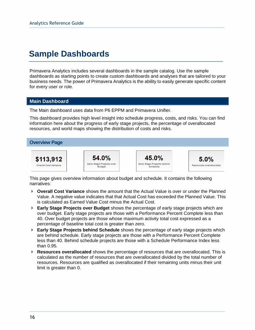
The Main dashboard uses data from P6 EPPM and Primavera Unifier.
This dashboard provides high level insight into schedule progress, costs, and risks. You can find information here about the progress of early stage projects, the percentage of overallocated resources, and world maps showing the distribution of costs and risks.
Overview Page
This page gives overview information about budget and schedule. It contains the following narratives:
Overall Cost Variance shows the amount that the Actual Value is over or under the Planned Value. A negative value indicates that that Actual Cost has exceeded the Planned Value. This is calculated as Earned Value Cost minus the Actual Cost.
Early Stage Projects over Budget shows the percentage of early stage projects which are over budget. Early stage projects are those with a Performance Percent Complete less than 40. Over budget projects are those whose maximum activity total cost expressed as a percentage of baseline total cost is greater than zero.
Early Stage Projects behind Schedule shows the percentage of early stage projects which are behind schedule. Early stage projects are those with a Performance Percent Complete less than 40. Behind schedule projects are those with a Schedule Performance Index less than 0.95.
Resources overallocated shows the percentage of resources that are overallocated. This is calculated as the number of resources that are overallocated divided by the total number of resources. Resources are qualified as overallocated if their remaining units minus their unit limit is greater than 0.
Sample Dashboards

Sample Dashboards
17
Early Stage Projects Behind Schedule Section
Purpose
The stacked line-bar chart on the left displays the early stage projects that are behind schedule. The x-axis shows project names. The y-axis for the bars (left) shows At Complete Units. The y-axis for the line (right) shows Delay percentage.
The stacked line-bar chart on the right displays the projects that are overbudget. The x-axis shows project names. The y-axis for the bars (left) shows At Complete Cost. The y-axis for the line (right) shows Cost Overrun percentage.
Location
1) On the Home page, click Dashboards.
2) Under Primavera, select Main.
3) On the Main dashboard, click the Overview page.
4) On the Overview page, expand the Early Stage Projects behind Schedule section.
Subject Area
Activity
At Completion Cost Summary Section
Purpose
The tree map shows the relative number of projects by country.
The waterfall chart shows At Completion Total Cost amounts for the selected country.
Analytics Reference Guide
18
The x-axis shows months. The y-axis shows the amounts.
Location
1) On the Home page, click Dashboards.
2) Under Primavera, select Main.
3) On the Main dashboard, click the Overview page.
4) On the Overview page, expand the At Completion Cost Summary section.
Subject Area
Activity
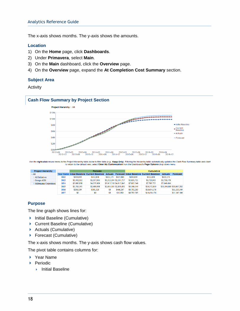
Cash Flow Summary by Project Section
Purpose
The line graph shows lines for:
Initial Baseline (Cumulative)
Current Baseline (Cumulative)
Actuals (Cumulative)
Forecast (Cumulative)
The x-axis shows months. The y-axis shows cash flow values.
The pivot table contains columns for:
Year Name
Periodic
Initial Baseline
Sample Dashboards
19
Current Baseline
Actuals
Forecast
Cumulative
Initial Baseline
Current Baseline
Actuals
Forecast
Right-click on Project Hierarchy elements in the Project Filter pivot table and select Keep Only to filter the contents of the pivot table and line graph.
Location
1) On the Home page, click Dashboards.
2) Under Primavera, select Main.
3) On the Main dashboard, click the Overview page.
4) On the Overview page, expand the Cash Flow Summary by Project section.
Subject Area
Activity
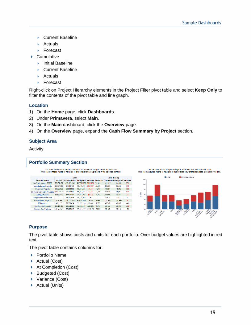
Portfolio Summary Section
Purpose
The pivot table shows costs and units for each portfolio. Over budget values are highlighted in red text.
The pivot table contains columns for:
Portfolio Name
Actual (Cost)
At Completion (Cost)
Budgeted (Cost)
Variance (Cost)
Actual (Units)
Analytics Reference Guide
20
At Completion (Units)
Budgeted (Units)
Variance (Units)
The stacked bar graph shows a stacked bar for the number of Remaining Units and Overallocation Units. There is a bar for any resource that is overallocated.
The x-axis shows Resource Name. The y-axis shows Units in hours. Hover over a bar for specific details.
Location
1) On the Home page, click Dashboards.
2) Under Primavera, select Main.
3) On the Main dashboard, click the Overview page.
4) On the Overview page, expand the Portfolio Summary section.
Subject Area
Activity
Location Page
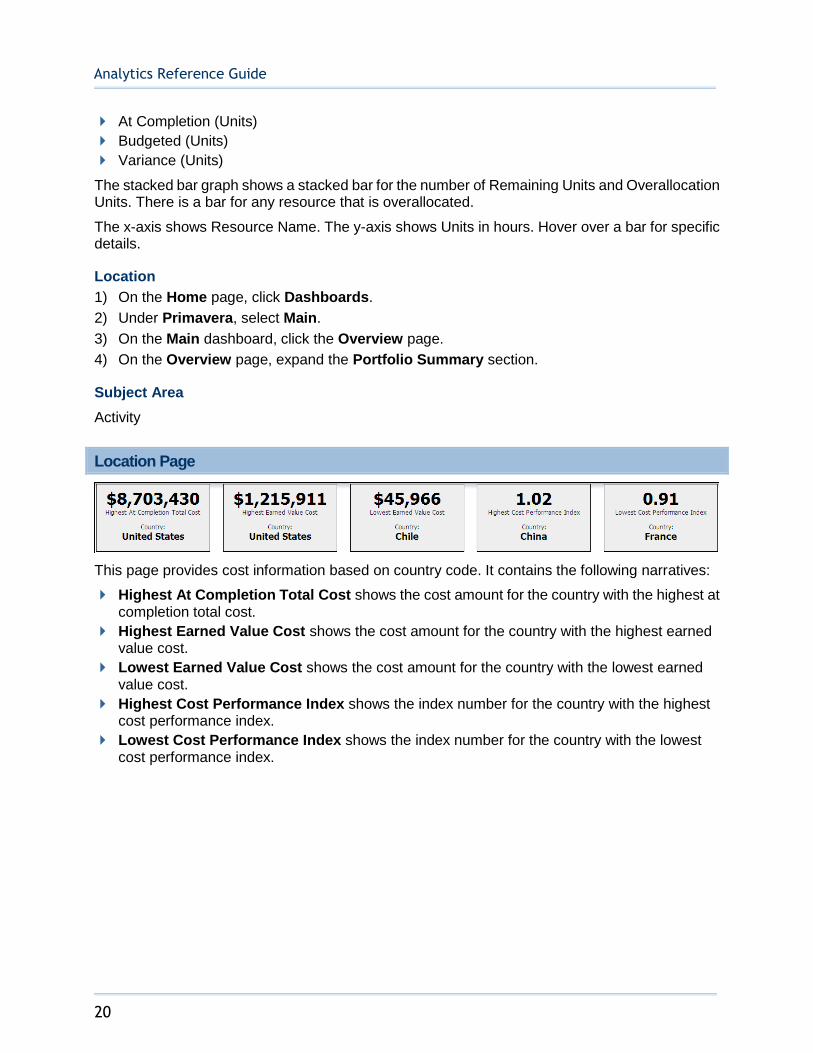
This page provides cost information based on country code. It contains the following narratives:
Highest At Completion Total Cost shows the cost amount for the country with the highest at completion total cost.
Highest Earned Value Cost shows the cost amount for the country with the highest earned value cost.
Lowest Earned Value Cost shows the cost amount for the country with the lowest earned value cost.
Highest Cost Performance Index shows the index number for the country with the highest cost performance index.
Lowest Cost Performance Index shows the index number for the country with the lowest cost performance index.
Sample Dashboards
21
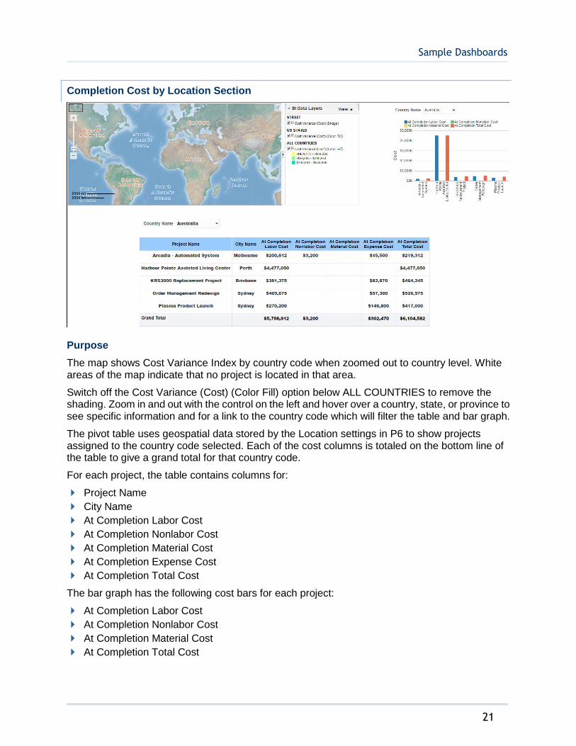
Completion Cost by Location Section
Purpose
The map shows Cost Variance Index by country code when zoomed out to country level. White areas of the map indicate that no project is located in that area.
Switch off the Cost Variance (Cost) (Color Fill) option below ALL COUNTRIES to remove the shading. Zoom in and out with the control on the left and hover over a country, state, or province to see specific information and for a link to the country code which will filter the table and bar graph.
The pivot table uses geospatial data stored by the Location settings in P6 to show projects assigned to the country code selected. Each of the cost columns is totaled on the bottom line of the table to give a grand total for that country code.
For each project, the table contains columns for:
Project Name
City Name
At Completion Labor Cost
At Completion Nonlabor Cost
At Completion Material Cost
At Completion Expense Cost
At Completion Total Cost
The bar graph has the following cost bars for each project:
At Completion Labor Cost
At Completion Nonlabor Cost
At Completion Material Cost
At Completion Total Cost

Analytics Reference Guide
22
The x-axis shows project name. The y-axis shows Cost.
Location
1) On the Home page, click Dashboards.
2) Under Primavera, select Main.
3) On the Main dashboard, click the Location page.
4) On the Location page, expand the Completion Cost by Location section.
Subject Area
Activity
Risk Page
This page shows the risk exposure for each project by country.
Risk Exposure by Location Section
Purpose
The map shows total risk exposure by country code.
Zoom in and out with the control on the left and hover over a country, state, or province to see specific information.
The bar graph shows a bar for each country showing Risk Exposure in dollars. Red bars denote a risk exposure greater than $100,000, yellow bars denote a risk exposure between $50,000 and $100,000, and green bars denote risk exposure less than $50,000.
The x-axis shows Risk Exposure. The y-axis shows country name.
Location
1) On the Home page, click Dashboards.
2) Under Primavera, select Main.
3) On the Main dashboard, click the Risk page.
4) On the Risk page, expand the Risk Exposure by Location section.
Subject Area
Project History
Sample Dashboards
23
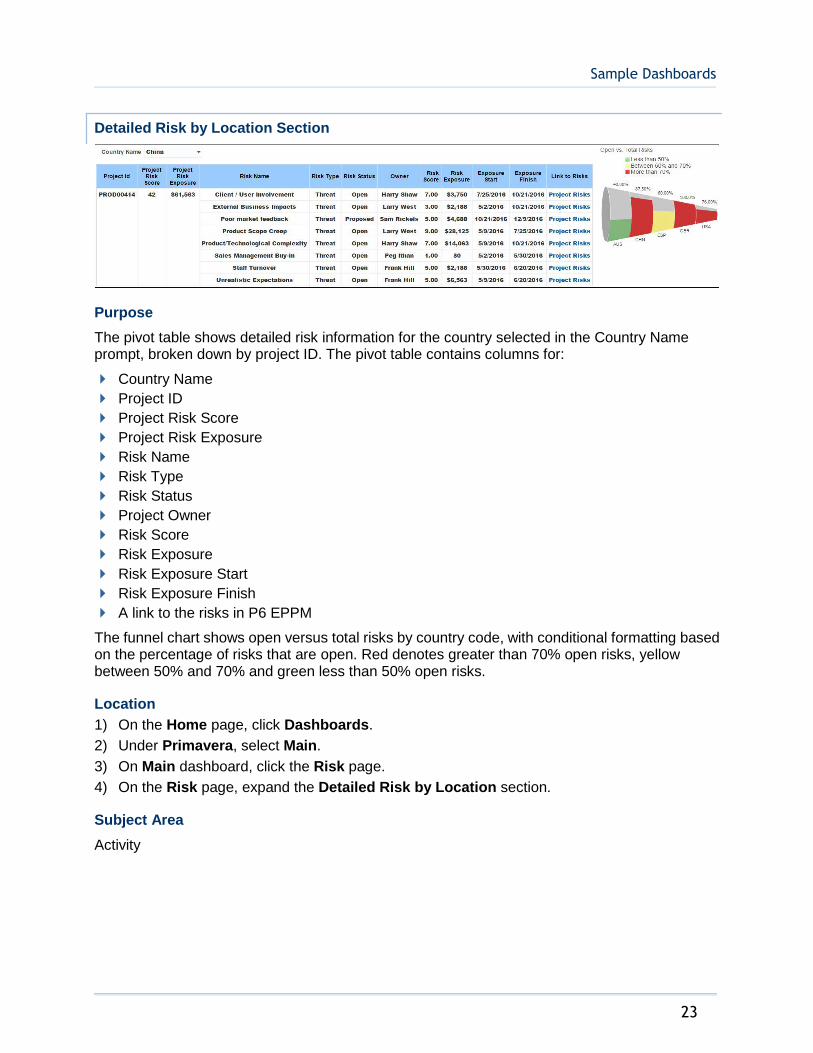
Detailed Risk by Location Section
Purpose
The pivot table shows detailed risk information for the country selected in the Country Name prompt, broken down by project ID. The pivot table contains columns for:
Country Name
Project ID
Project Risk Score
Project Risk Exposure
Risk Name
Risk Type
Risk Status
Project Owner
Risk Score
Risk Exposure
Risk Exposure Start
Risk Exposure Finish
A link to the risks in P6 EPPM
The funnel chart shows open versus total risks by country code, with conditional formatting based on the percentage of risks that are open. Red denotes greater than 70% open risks, yellow between 50% and 70% and green less than 50% open risks.
Location
1) On the Home page, click Dashboards.
2) Under Primavera, select Main.
3) On Main dashboard, click the Risk page.
4) On the Risk page, expand the Detailed Risk by Location section.
Subject Area
Activity
Analytics Reference Guide
24
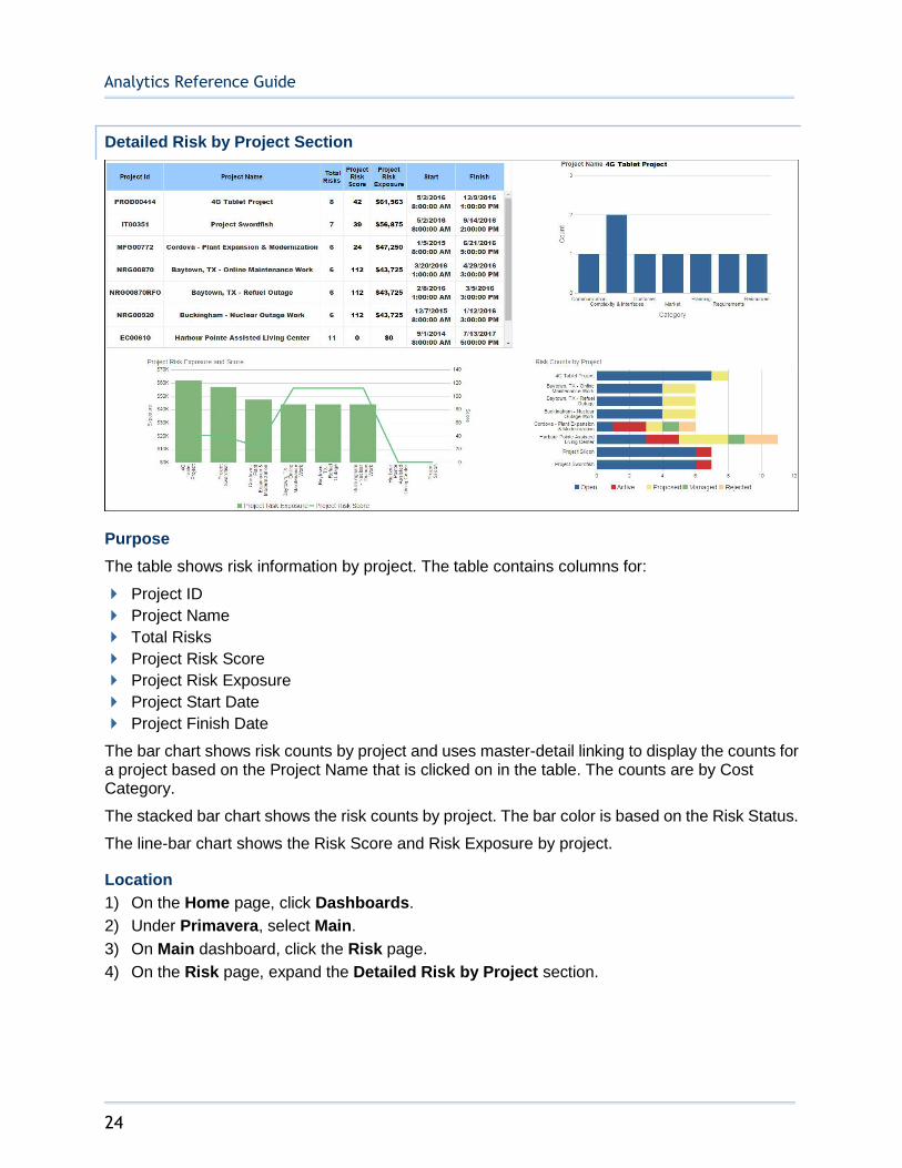
Detailed Risk by Project Section
Purpose
The table shows risk information by project. The table contains columns for:
Project ID
Project Name
Total Risks
Project Risk Score
Project Risk Exposure
Project Start Date
Project Finish Date
The bar chart shows risk counts by project and uses master-detail linking to display the counts for a project based on the Project Name that is clicked on in the table. The counts are by Cost Category.
The stacked bar chart shows the risk counts by project. The bar color is based on the Risk Status.
The line-bar chart shows the Risk Score and Risk Exposure by project.
Location
1) On the Home page, click Dashboards.
2) Under Primavera, select Main.
3) On Main dashboard, click the Risk page.
4) On the Risk page, expand the Detailed Risk by Project section.
Sample Dashboards
25
Subject Area
Activity
Business Processes Dashboard
The Business Process dashboard uses data from Primavera Unifier.
It gives you an enterprise view across your business processes by enabling you to analyze your business process data, including amounts, counts, and quantities. You can easily slice the data by various dimensions, including vendor, portfolio, and cost breakdown structure and drill down to line item granularity.
Overview Page
This page shows business process overview analyses.
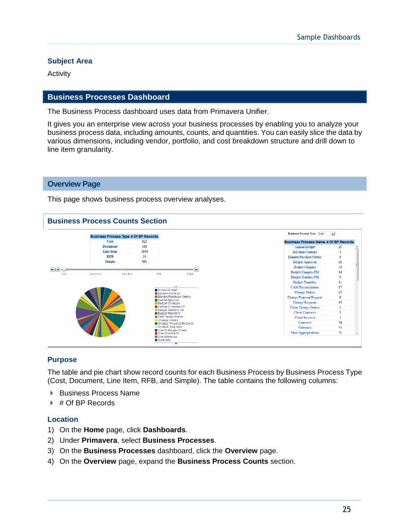
Business Process Counts Section
Purpose
The table and pie chart show record counts for each Business Process by Business Process Type (Cost, Document, Line Item, RFB, and Simple). The table contains the following columns:
Business Process Name
# Of BP Records
Location
1) On the Home page, click Dashboards.
2) Under Primavera, select Business Processes.
3) On the Business Processes dashboard, click the Overview page.
4) On the Overview page, expand the Business Process Counts section.
Analytics Reference Guide
26
Subject Area
Business Process
Company Level Business Process Summary Section
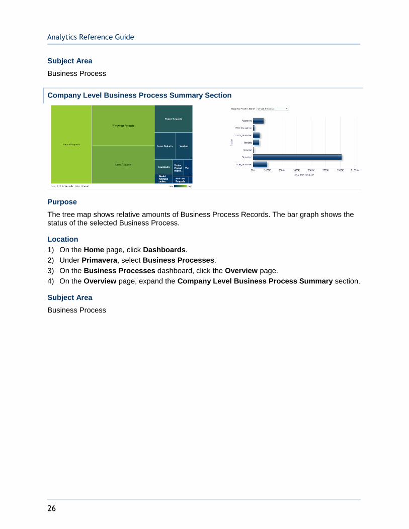
Purpose
The tree map shows relative amounts of Business Process Records. The bar graph shows the status of the selected Business Process.
Location
1) On the Home page, click Dashboards.
2) Under Primavera, select Business Processes.
3) On the Business Processes dashboard, click the Overview page.
4) On the Overview page, expand the Company Level Business Process Summary section.
Subject Area
Business Process

Sample Dashboards
27
Approved Change Orders by Reason Section
Purpose
Depending on the selection, the pie chart and table show amounts for each Change Order broken down by Change Order Reason. The pivot table contains the following columns:
Business Process Name
Status
Reason
# of BP Records
Amount
Location
1) On the Home page, click Dashboards.
2) Under Primavera, select Business Processes.
3) On the Business Processes dashboard, click the Overview page.
4) On the Overview page, expand the Approved Change Orders By Reason section.

Analytics Reference Guide
28
Subject Area
Business Process
Vendor Summary Section
Purpose
The bar graph displays amounts for each Vendor Summary item by Vendor Type or Vendor Name. The x-axis shows Vendor Summary items or Vendor Names, and the y-axis shows amounts.
Location
1) On the Home page, click Dashboards.
2) Under Primavera, select Business Processes.
3) On the Business Processes dashboard, click the Overview page.
4) On the Overview page, expand the Vendor Summary section.
Subject Area
Business Process
Sample Dashboards
29
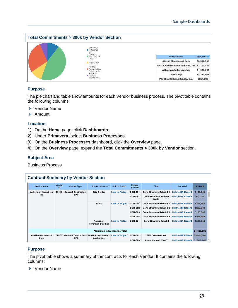
Total Commitments > 300k by Vendor Section
Purpose
The pie chart and table show amounts for each Vendor business process. The pivot table contains the following columns:
Vendor Name
Amount
Location
1) On the Home page, click Dashboards.
2) Under Primavera, select Business Processes.
3) On the Business Processes dashboard, click the Overview page.
4) On the Overview page, expand the Total Commitments > 300k by Vendor section.
Subject Area
Business Process
Contract Summary by Vendor Section
Purpose
The pivot table shows a summary of the contracts for each Vendor. It contains the following columns:
Vendor Name
Analytics Reference Guide
30
Vendor Id
Vendor Type
Project Name
Link to Project
Record Number
Title
Amount
Location
1) On the Home page, click Dashboards.
2) Under Primavera, select Business Processes.
3) On the Business Processes dashboard, click the Overview page.
4) On the Overview page, expand the Contract Summary by Vendor section.
Subject Area
Business Process
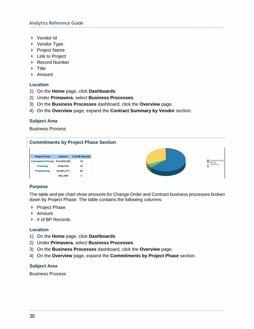
Commitments by Project Phase Section
Purpose
The table and pie chart show amounts for Change Order and Contract business processes broken down by Project Phase. The table contains the following columns:
Project Phase
Amount
# of BP Records
Location
1) On the Home page, click Dashboards.
2) Under Primavera, select Business Processes.
3) On the Business Processes dashboard, click the Overview page.
4) On the Overview page, expand the Commitments by Project Phase section.
Subject Area
Business Process
Sample Dashboards
31
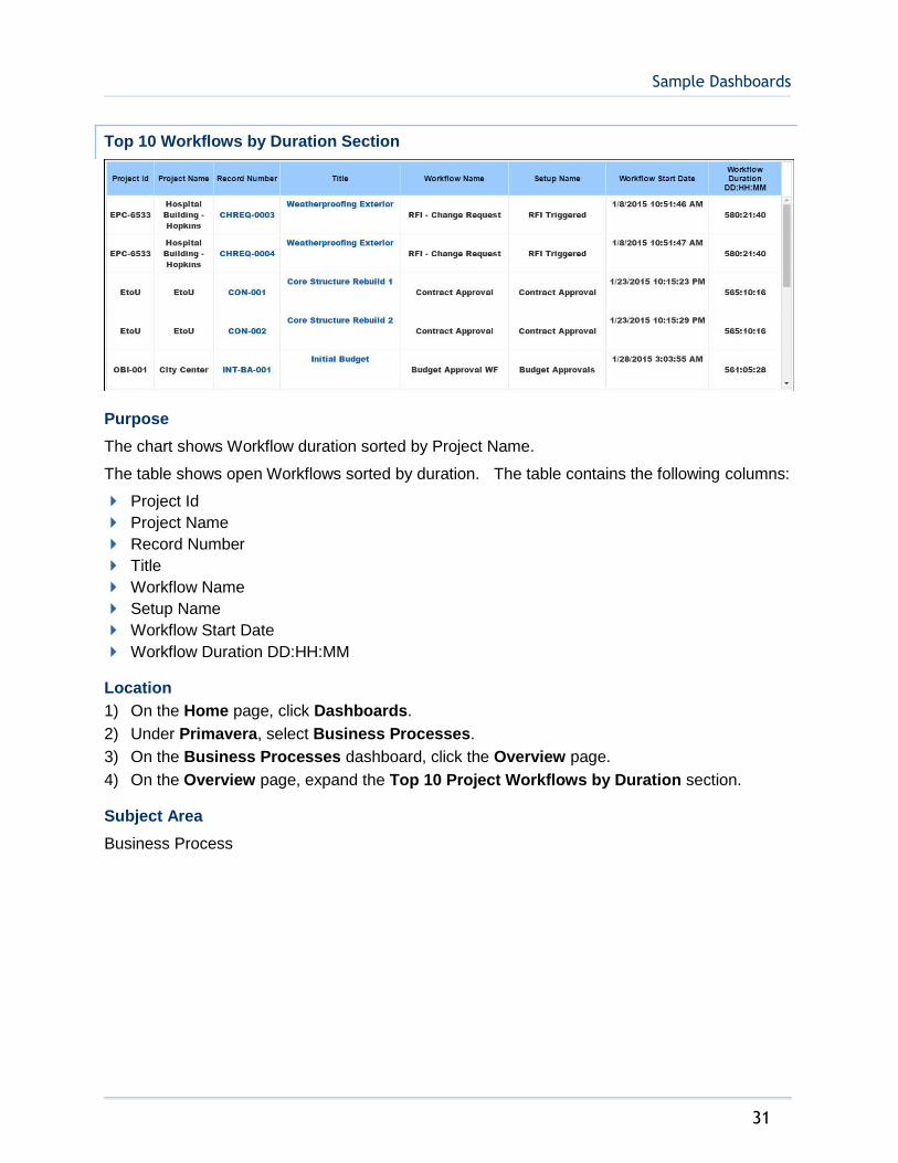
Top 10 Workflows by Duration Section
Purpose
The chart shows Workflow duration sorted by Project Name.
The table shows open Workflows sorted by duration. The table contains the following columns:
Project Id
Project Name
Record Number
Title
Workflow Name
Setup Name
Workflow Start Date
Workflow Duration DD:HH:MM
Location
1) On the Home page, click Dashboards.
2) Under Primavera, select Business Processes.
3) On the Business Processes dashboard, click the Overview page.
4) On the Overview page, expand the Top 10 Project Workflows by Duration section.
Subject Area
Business Process
Analytics Reference Guide
32
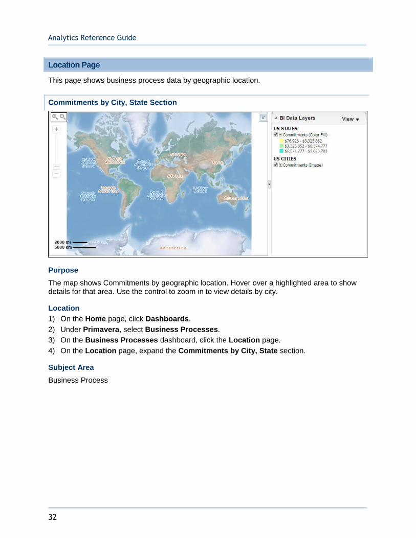
Location Page
This page shows business process data by geographic location.
Commitments by City, State Section
Purpose
The map shows Commitments by geographic location. Hover over a highlighted area to show details for that area. Use the control to zoom in to view details by city.
Location
1) On the Home page, click Dashboards.
2) Under Primavera, select Business Processes.
3) On the Business Processes dashboard, click the Location page.
4) On the Location page, expand the Commitments by City, State section.
Subject Area
Business Process
Sample Dashboards
33
History Page
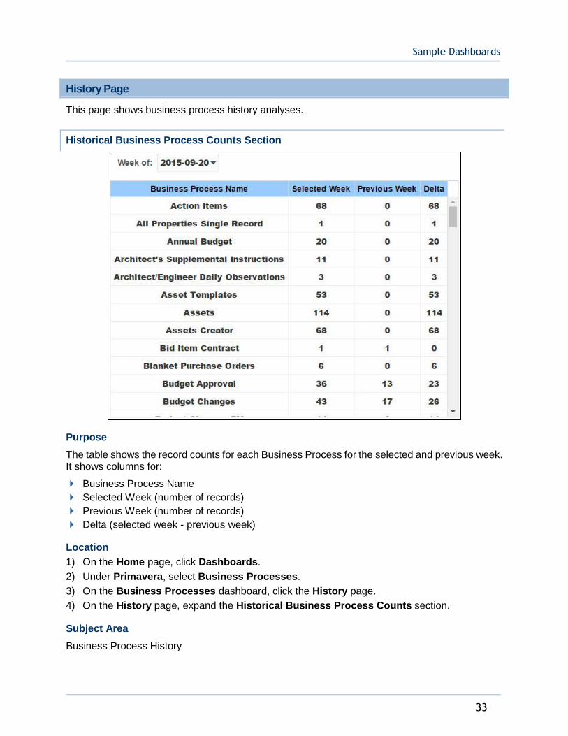
This page shows business process history analyses.
Historical Business Process Counts Section
Purpose
The table shows the record counts for each Business Process for the selected and previous week. It shows columns for:
Business Process Name
Selected Week (number of records)
Previous Week (number of records)
Delta (selected week - previous week)
Location
1) On the Home page, click Dashboards.
2) Under Primavera, select Business Processes.
3) On the Business Processes dashboard, click the History page.
4) On the History page, expand the Historical Business Process Counts section.
Subject Area
Business Process History
Analytics Reference Guide
34
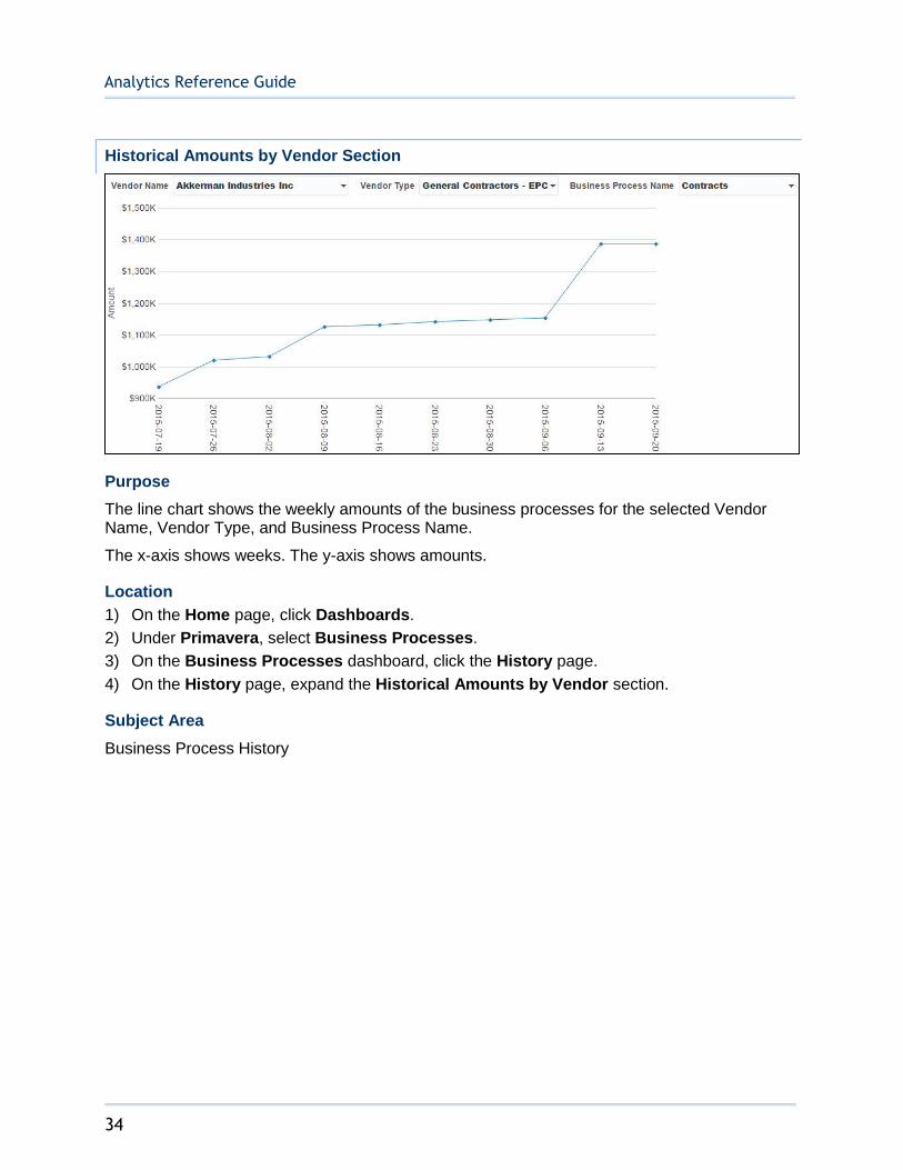
Historical Amounts by Vendor Section
Purpose
The line chart shows the weekly amounts of the business processes for the selected Vendor Name, Vendor Type, and Business Process Name.
The x-axis shows weeks. The y-axis shows amounts.
Location
1) On the Home page, click Dashboards.
2) Under Primavera, select Business Processes.
3) On the Business Processes dashboard, click the History page.
4) On the History page, expand the Historical Amounts by Vendor section.
Subject Area
Business Process History
Sample Dashboards
35
Weekly Business Process Trend by Project and Count Section
Purpose
The line chart shows weekly record counts for the selected Business Process and Project. It contains two lines: One for Approved business processes; the other for Pending business processes.
The x-axis shows weeks. The y-axis shows counts.
Location
1) On the Home page, click Dashboards.
2) Under Primavera, select Business Processes.
3) On the Business Processes dashboard, click the History page.
4) On the History page, expand the Weekly Business Process Trend by Project and Count section.
Subject Area
Business Process History
Analytics Reference Guide
36
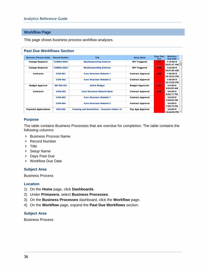
Workflow Page
This page shows business process workflow analyses.
Past Due Workflows Section
Purpose
The table contains Business Processes that are overdue for completion. The table contains the following columns:
Business Process Name
Record Number
Title
Setup Name
Days Past Due
Workflow Due Date
Subject Area
Business Process
Location
1) On the Home page, click Dashboards.
2) Under Primavera, select Business Processes.
3) On the Business Processes dashboard, click the Workflow page.
4) On the Workflow page, expand the Past Due Workflows section.
Subject Area
Business Process
Sample Dashboards
37
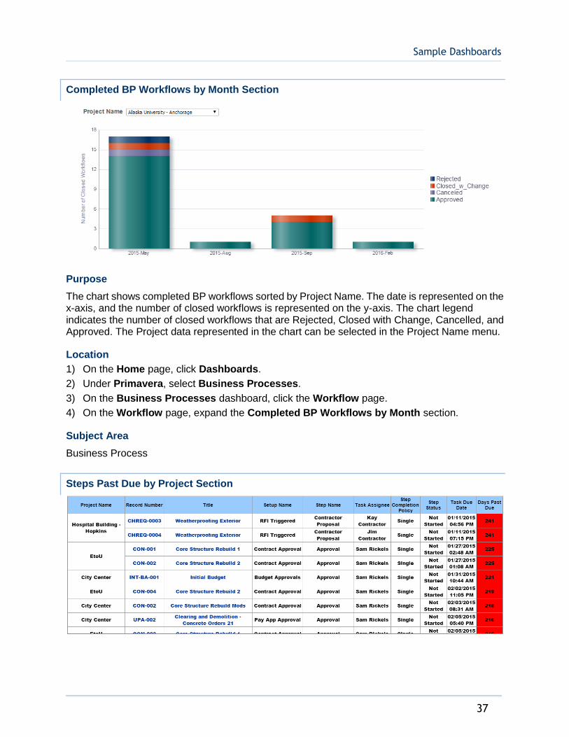
Completed BP Workflows by Month Section
Purpose
The chart shows completed BP workflows sorted by Project Name. The date is represented on the x-axis, and the number of closed workflows is represented on the y-axis. The chart legend indicates the number of closed workflows that are Rejected, Closed with Change, Cancelled, and Approved. The Project data represented in the chart can be selected in the Project Name menu.
Location
1) On the Home page, click Dashboards.
2) Under Primavera, select Business Processes.
3) On the Business Processes dashboard, click the Workflow page.
4) On the Workflow page, expand the Completed BP Workflows by Month section.
Subject Area
Business Process
Steps Past Due by Project Section

Analytics Reference Guide
38
Purpose
The table shows which Steps that are past due, sorted by Project. The table contains the following columns:
Project Name
Record Number
Title
Setup Name
Step Name
Task Assignee
Step Completion Policy
Step Status
Task Due Date
Days Past Due
Location
1) On the Home page, click Dashboards.
2) Under Primavera, select Business Processes.
3) On the Business Processes dashboard, click the Workflow page.
4) On the Workflow page, expand the Steps Past Due by Project section.
Subject Area
Business Process
Planned vs. Actual Workflow Duration Section
Purpose
The chart compares the Workflow Average Planned Duration (DD:HH:MM) to Workflow Average Actual Duration (DD:HH:MM). The workflow data represented in the chart can be selected in the Business Process Name menu.

Sample Dashboards
39
Location
1) On the Home page, click Dashboards.
2) Under Primavera, select Business Processes.
3) On the Business Processes dashboard, click the Workflow page.
4) On the Workflow page, expand the Planned vs. Actual Workflow Duration section.
Subject Area
Business Process
Revisited Workflow Steps Section
Purpose
The Revisited Workflow Steps table shows projects and their respective steps. The table contains the following columns:
Project Id
Project Name
Record Number
Title
Setup Name
Step Sequence
Step Name
Step Start Date
Step End Date
The steps are color coded to indicate how many times each step has been revisited:
White: The step has not been revisited.
Yellow: The step has been revisited once.
Orange: The step has been revisited twice.
Analytics Reference Guide
40
Red: The step has been revisited 3 times or more.
Location
1) On the Home page, click Dashboards.
2) Under Primavera, select Business Processes.
3) On the Business Processes dashboard, click the Workflow page.
4) On the Workflow page, expand the Revisited Workflow Steps section.
Subject Area
Business Process
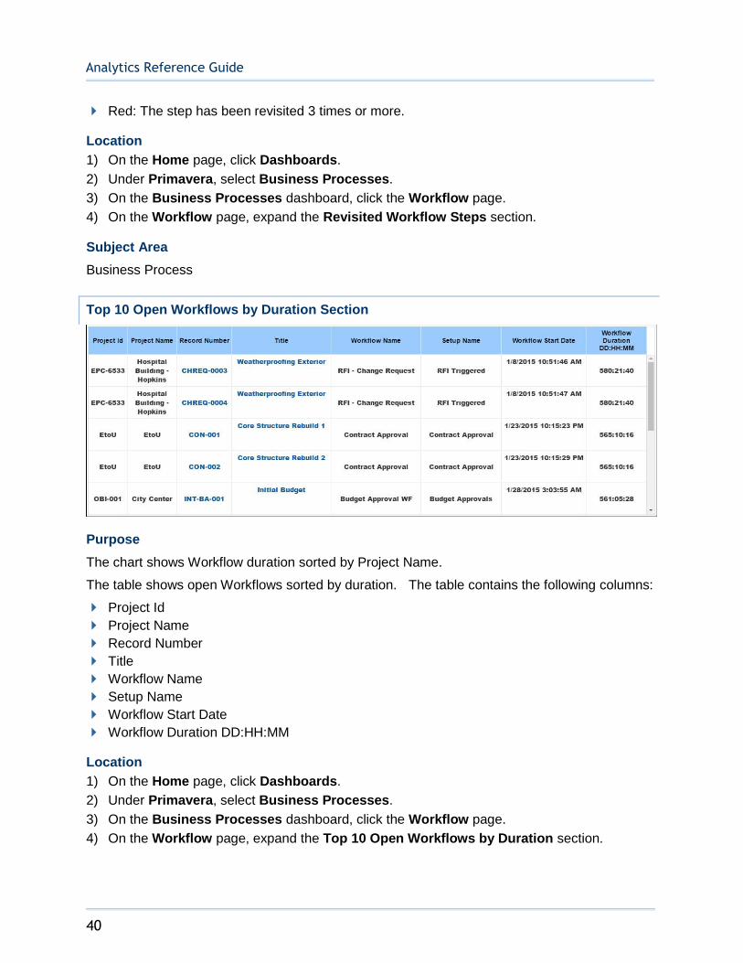
Top 10 Open Workflows by Duration Section
Purpose
The chart shows Workflow duration sorted by Project Name.
The table shows open Workflows sorted by duration. The table contains the following columns:
Project Id
Project Name
Record Number
Title
Workflow Name
Setup Name
Workflow Start Date
Workflow Duration DD:HH:MM
Location
1) On the Home page, click Dashboards.
2) Under Primavera, select Business Processes.
3) On the Business Processes dashboard, click the Workflow page.
4) On the Workflow page, expand the Top 10 Open Workflows by Duration section.
Sample Dashboards
41
Subject Area
Business Process
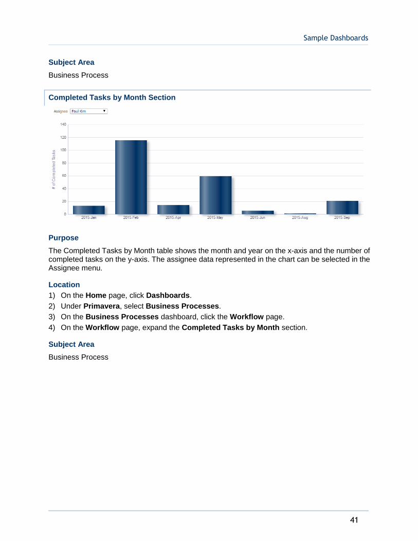
Completed Tasks by Month Section
Purpose
The Completed Tasks by Month table shows the month and year on the x-axis and the number of completed tasks on the y-axis. The assignee data represented in the chart can be selected in the Assignee menu.
Location
1) On the Home page, click Dashboards.
2) Under Primavera, select Business Processes.
3) On the Business Processes dashboard, click the Workflow page.
4) On the Workflow page, expand the Completed Tasks by Month section.
Subject Area
Business Process
Analytics Reference Guide
42
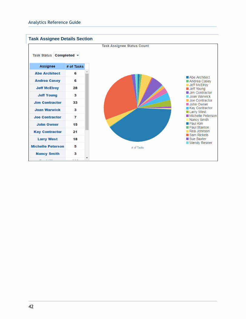
Task Assignee Details Section

Sample Dashboards
43
Purpose
The Task Status Table shows assignees and the number of assigned tasks.
The Task Assignee Status Count chart shows Number of Tasks, sorted by Assignee.
The Task Assignee Counts and Percents table shows the progress of each Assignee towards assigned tasks. The table contains the following columns:
Assignee
Total Tasks
Completed Tasks
Non Response Rate
Completed Tasks (Late)
Late Response Rate
Location
1) On the Home page, click Dashboards.
2) Under Primavera, select Business Processes.
3) On the Business Processes dashboard, click the Workflow page.
4) On the Workflow page, expand the Task Assignee Details section.

Analytics Reference Guide
44
Subject Area
Business Process
Cash Flow Dashboard
The Cash Flow dashboard uses data from Primavera Unifier.
It enables you to view aggregated cost sheet data across projects and cost codes, including comparisons of actuals vs. forecast and forecast vs. baseline. You can easily slice the data by various dimensions, including location, project owner, and portfolio.
Overview Page
This page shows cash flow data, including comparisons of actuals vs. forecast, and forecast vs. baseline. It contains the following narratives:
Initial Baseline shows the total of the Initial Baselines for all cash flows.
Current Baseline shows the total of the Current Baselines for all cash flows.
Actual shows the total of the Actuals for all cash flows.
Forecast shows the total of the Forecasts for all cash flows.
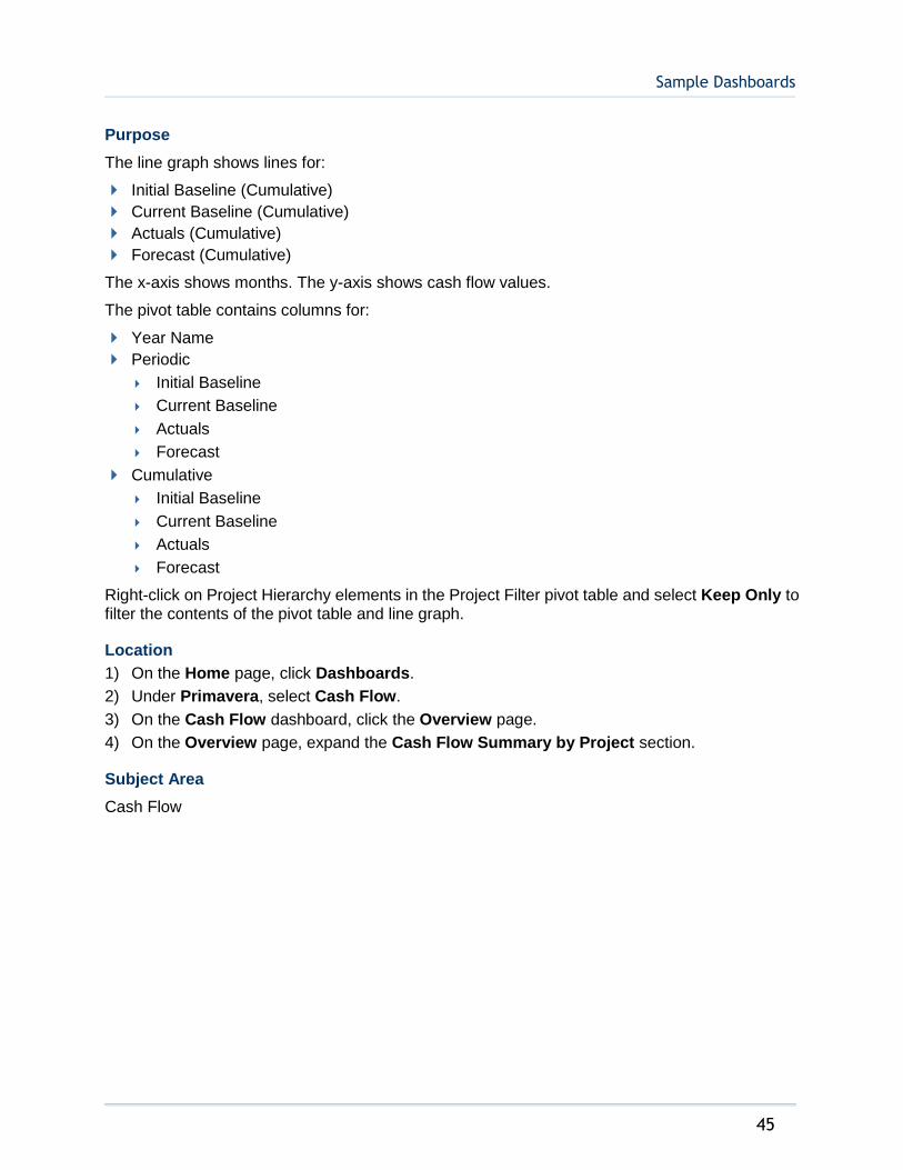
Cash Flow Summary by Project Section
Sample Dashboards
45
Purpose
The line graph shows lines for:
Initial Baseline (Cumulative)
Current Baseline (Cumulative)
Actuals (Cumulative)
Forecast (Cumulative)
The x-axis shows months. The y-axis shows cash flow values.
The pivot table contains columns for:
Year Name
Periodic
Initial Baseline
Current Baseline
Actuals
Forecast
Cumulative
Initial Baseline
Current Baseline
Actuals
Forecast
Right-click on Project Hierarchy elements in the Project Filter pivot table and select Keep Only to filter the contents of the pivot table and line graph.
Location
1) On the Home page, click Dashboards.
2) Under Primavera, select Cash Flow.
3) On the Cash Flow dashboard, click the Overview page.
4) On the Overview page, expand the Cash Flow Summary by Project section.
Subject Area
Cash Flow
Analytics Reference Guide
46
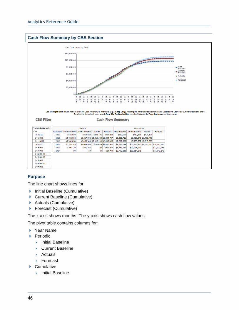
Cash Flow Summary by CBS Section
Purpose
The line chart shows lines for:
Initial Baseline (Cumulative)
Current Baseline (Cumulative)
Actuals (Cumulative)
Forecast (Cumulative)
The x-axis shows months. The y-axis shows cash flow values.
The pivot table contains columns for:
Year Name
Periodic
Initial Baseline
Current Baseline
Actuals
Forecast
Cumulative
Initial Baseline

Sample Dashboards
47
Current Baseline
Actuals
Forecast
Right-click on Project Hierarchy elements in the Project Filter pivot table and select Keep Only to filter the contents of the pivot table and line chart.
Location
1) On the Home page, click Dashboards.
2) Under Primavera, select Cash Flow.
3) On the Cash Flow dashboard, click the Overview page.
4) On the Overview page, expand the Cash Flow Summary by CBS section.
Subject Area
Cash Flow
History Page
This page shows cash flow history analyses.
Actual vs Forecast Weekly Trend Section
Purpose
The pivot table shows weekly details for the selected project. It shows columns for:
Week Name
Actuals
Forecast
% Complete ((Actuals / (Actuals + Forecast)) * 100)
The line-bar chart shows bars for Actuals and Forecast for the selected project. The line represents Percent Complete.
The x-axis shows weeks. The y-axis for the bars (on the left) shows cash flow values. The y-axis for the line (on the right) shows percentages.
Analytics Reference Guide
48
Location
1) On the Home page, click Dashboards.
2) Under Primavera, select Cash Flow.
3) On the Cash Flow dashboard, click the History page.
4) On the History page, expand the Actual vs Forecast Weekly Trend section.
Subject Area
Cash Flow History
Baseline Variance Weekly Trend Section
Purpose
The line-bar chart shows bars for Initial Baseline and Current Baseline for the selected cash flow. The line represents Budget Variance.
The x-axis shows weeks. The y-axis for the bars (on the left) shows cash flow values. The y-axis for the line (on the right) shows baseline variance values.
The pivot table shows weekly details for the selected cash flow. It shows columns for:
Week Name
Initial Baseline
Current Baseline
Baseline Variance (Current Baseline - Initial Baseline)
Location
1) On the Home page, click Dashboards.
2) Under Primavera, select Cash Flow.
3) On the Cash Flow dashboard, click the History page.
4) On the History page, expand the Baseline Variance Weekly Trend section.
Sample Dashboards
49
Subject Area
Cash Flow History
Cost Sheet Dashboard
The Cost Sheet dashboard uses data from Primavera Unifier.
It enables you to view aggregated cost sheet data across projects and cost codes, including a comparison of original and revised budget details, cost data by geographic location, and cost history analyses. You can easily slice the data by various dimensions, including location, project owner, and portfolio.
Overview Page
This page shows cost data, including a comparison of original and revised budget details.
This dashboard provides the following narratives:
Budget shows the total of the Budget cost sheet column.
Commitments shows the total of the Commitments cost sheet column.
Forecast shows the total of the Forecast cost sheet column.
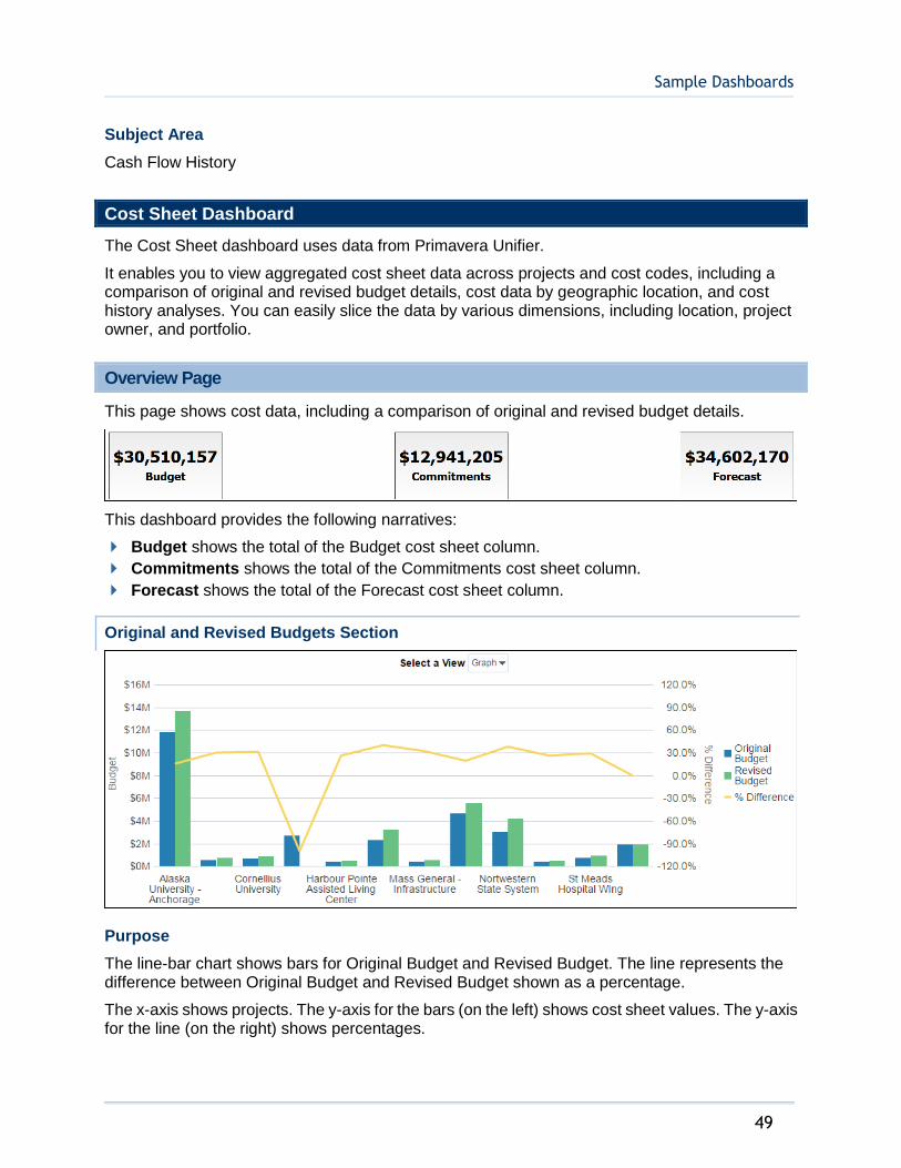
Original and Revised Budgets Section
Purpose
The line-bar chart shows bars for Original Budget and Revised Budget. The line represents the difference between Original Budget and Revised Budget shown as a percentage.
The x-axis shows projects. The y-axis for the bars (on the left) shows cost sheet values. The y-axis for the line (on the right) shows percentages.

Analytics Reference Guide
50
The table contains columns for:
Project Name (root-level)
Original Budget
Revised Budget
% Difference (((Revised Budget - Original Budget) / Original Budget) * 100)
Location
1) On the Home page, click Dashboards.
2) Under Primavera, select Cost Sheet.
3) On the Cost Sheet dashboard, click the Overview page.
4) On the Overview page, expand the Original and Revised Budgets section.
Subject Area
Cost Sheet
Original and Revised Commitments Section
Purpose
The line-bar chart shows bars for Original Commitments and Approved Commitment Changes. The line represents the difference between Original Commitments and Revised Commitments shown as a percentage.
The x-axis shows root-level projects. The y-axis for the bars (on the left) shows cost sheet values. The y-axis for the line (on the right) shows percentages.
The table contains columns for:

Sample Dashboards
51
Project Name (root-level)
Original Commitments
Approved Commitment Changes
% Difference (((Approved Commitment Changes - Original Commitments) / Original Commitments) * 100)
Location
1) On the Home page, click Dashboards.
2) Under Primavera, select Cost Sheet.
3) On the Cost Sheet dashboard, click the Overview page.
4) On the Overview page, expand the Original and Revised Commitments section.
Subject Area
Cost Sheet
Budget vs. Forecast Section
Purpose
The line-bar chart shows bars for Revised Budget and Forecast. The line represents the change between Revised Budget and Forecast shown as a percentage.
The x-axis shows root-level projects. The y-axis for the bars (on the left) shows cost sheet values. The y-axis for the line (on the right) shows percentages.
The table contains columns for:
Project Name (root-level)
Revised Budget
Analytics Reference Guide
52
Forecast
% Change (((Forecast - Revised Budget) / Revised Budget) * 100)
Location
1) On the Home page, click Dashboards.
2) Under Primavera, select Cost Sheet.
3) On the Cost Sheet dashboard, click the Overview page.
4) On the Overview page, expand the Budget vs. Forecast section.
Subject Area
Cost Sheet
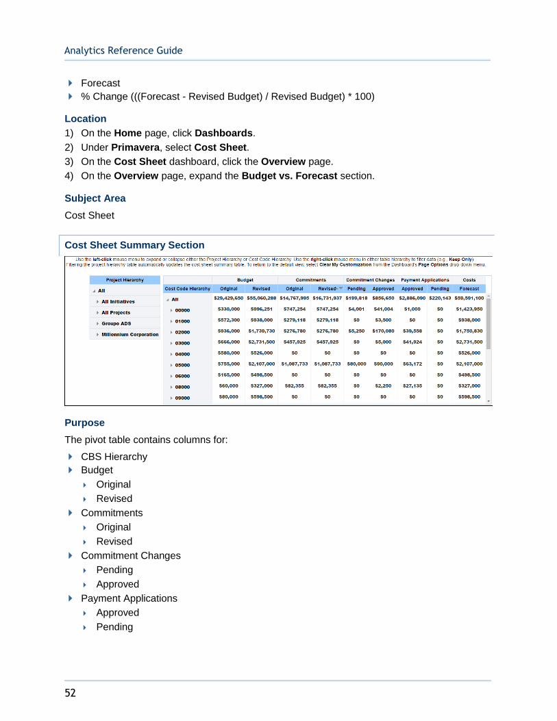
Cost Sheet Summary Section
Purpose
The pivot table contains columns for:
CBS Hierarchy
Budget
Original
Revised
Commitments
Original
Revised
Commitment Changes
Pending
Approved
Payment Applications
Approved
Pending
Sample Dashboards
53
Costs
Forecast
Right-click on Project Hierarchy elements in the left pivot table and select Keep Only to filter the contents of the pivot table on the right.
Location
1) On the Home page, click Dashboards.
2) Under Primavera, select Cost Sheet.
3) On the Cost Sheet dashboard, click the Overview page.
4) On the Overview page, expand the Cost Sheet Summary section.
Subject Area
Cost Sheet
Budget by Owner Section
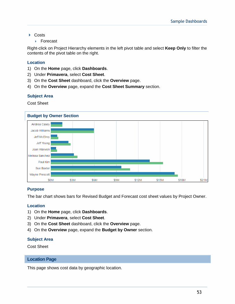
Purpose
The bar chart shows bars for Revised Budget and Forecast cost sheet values by Project Owner.
Location
1) On the Home page, click Dashboards.
2) Under Primavera, select Cost Sheet.
3) On the Cost Sheet dashboard, click the Overview page.
4) On the Overview page, expand the Budget by Owner section.
Subject Area
Cost Sheet
Location Page
This page shows cost data by geographic location.
Analytics Reference Guide
54
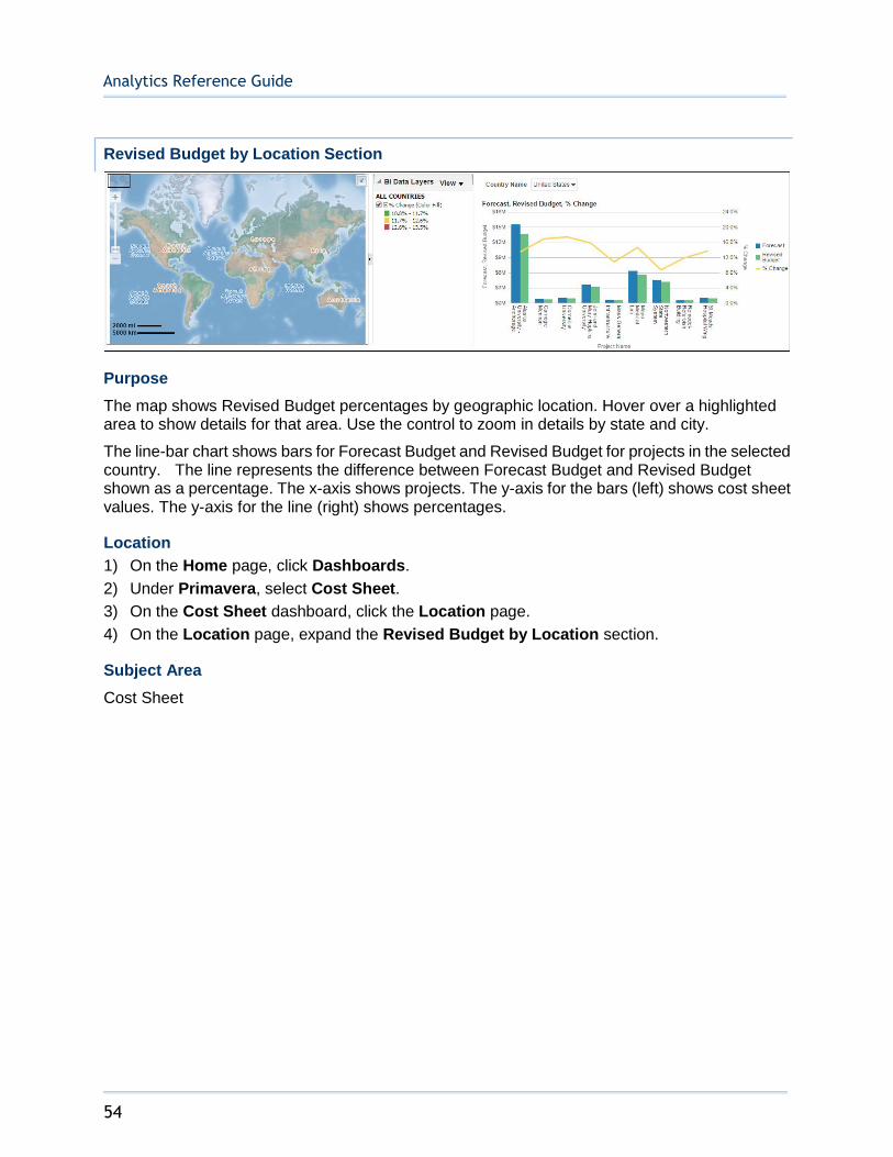
Revised Budget by Location Section
Purpose
The map shows Revised Budget percentages by geographic location. Hover over a highlighted area to show details for that area. Use the control to zoom in details by state and city.
The line-bar chart shows bars for Forecast Budget and Revised Budget for projects in the selected country. The line represents the difference between Forecast Budget and Revised Budget shown as a percentage. The x-axis shows projects. The y-axis for the bars (left) shows cost sheet values. The y-axis for the line (right) shows percentages.
Location
1) On the Home page, click Dashboards.
2) Under Primavera, select Cost Sheet.
3) On the Cost Sheet dashboard, click the Location page.
4) On the Location page, expand the Revised Budget by Location section.
Subject Area
Cost Sheet
Sample Dashboards
55
History Page
This page shows cost history analyses.
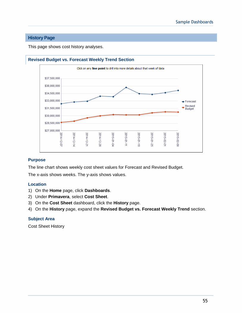
Revised Budget vs. Forecast Weekly Trend Section
Purpose
The line chart shows weekly cost sheet values for Forecast and Revised Budget.
The x-axis shows weeks. The y-axis shows values.
Location
1) On the Home page, click Dashboards.
2) Under Primavera, select Cost Sheet.
3) On the Cost Sheet dashboard, click the History page.
4) On the History page, expand the Revised Budget vs. Forecast Weekly Trend section.
Subject Area
Cost Sheet History
Analytics Reference Guide
56
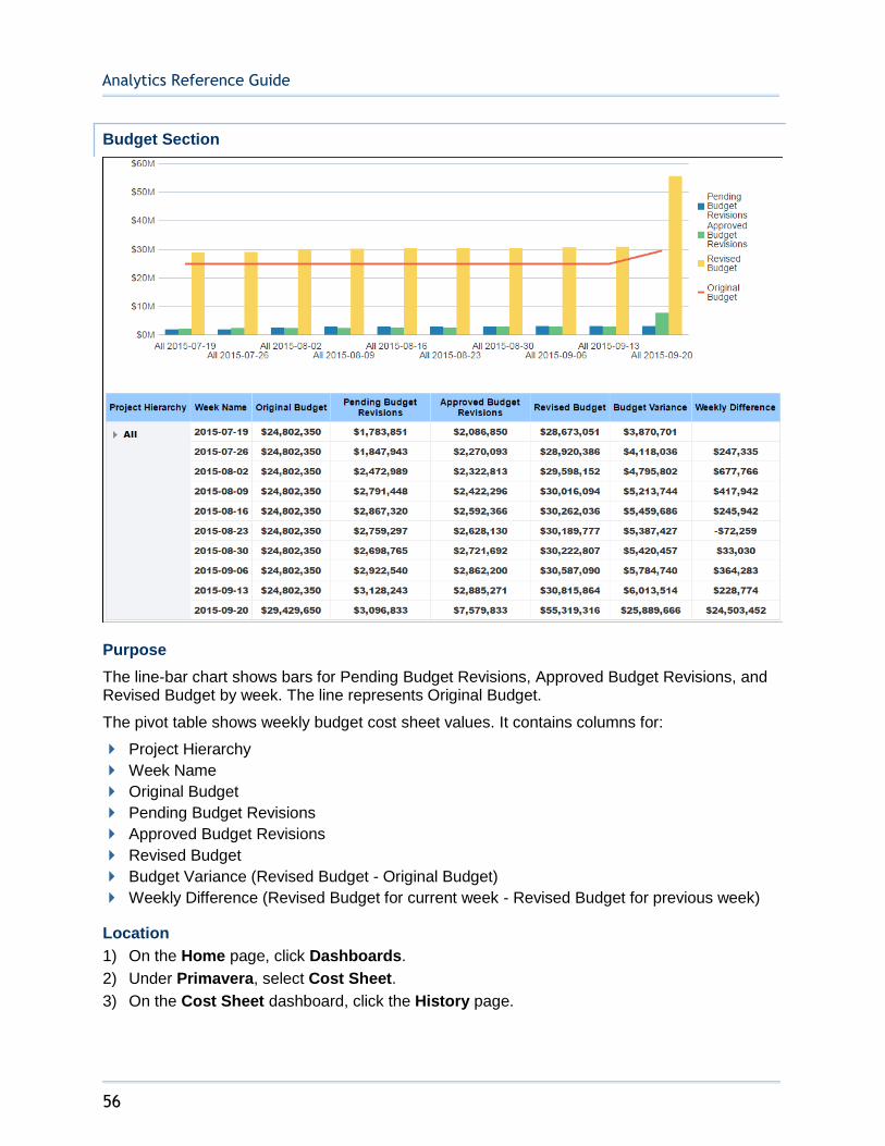
Budget Section
Purpose
The line-bar chart shows bars for Pending Budget Revisions, Approved Budget Revisions, and Revised Budget by week. The line represents Original Budget.
The pivot table shows weekly budget cost sheet values. It contains columns for:
Project Hierarchy
Week Name
Original Budget
Pending Budget Revisions
Approved Budget Revisions
Revised Budget
Budget Variance (Revised Budget - Original Budget)
Weekly Difference (Revised Budget for current week - Revised Budget for previous week)
Location
1) On the Home page, click Dashboards.
2) Under Primavera, select Cost Sheet.
3) On the Cost Sheet dashboard, click the History page.

Sample Dashboards
57
4) On the History page, expand the Budget section.
Subject Area
Cost Sheet History
Contracts Section
Purpose
The line-bar chart shows weekly contract cost sheet values. The bars show Pending and Approved amounts. The lines represent Contracts and Current Commitments.
Location
1) On the Home page, click Dashboards.
2) Under Primavera, select Cost Sheet.
3) On the Cost Sheet dashboard, click the History page.
4) On the History page, expand the Contracts section.
Subject Area
Cost Sheet History
Cost Summary Section

Analytics Reference Guide
58
Purpose
The pivot table shows cost sheet values rolled up to the levels expanded in the Date Hierarchy. It contains columns for:
Date Hierarchy
Costs
Revised Budget
Revised Commitments
Approved Spends
Forecast
Location
1) On the Home page, click Dashboards.
2) Under Primavera, select Cost Sheet.
3) On the Cost Sheet dashboard, click the History page.
4) On the History page, expand the Cost Summary section.
Subject Area
Cost Sheet History
Facilities and Real Estate Dashboard
The Facilities and Real Estate dashboard uses data from Primavera Unifier.
Overview Page
This page shows facilities and real estate data from Primavera Unifier, including custom facts and dimensions for buildings, levels, and spaces.
It contains the following narratives:
Gross Building Area
Floor Rentable Area
Floor Usable Area
Floor Common Area
You can drill down to get details for all narratives.
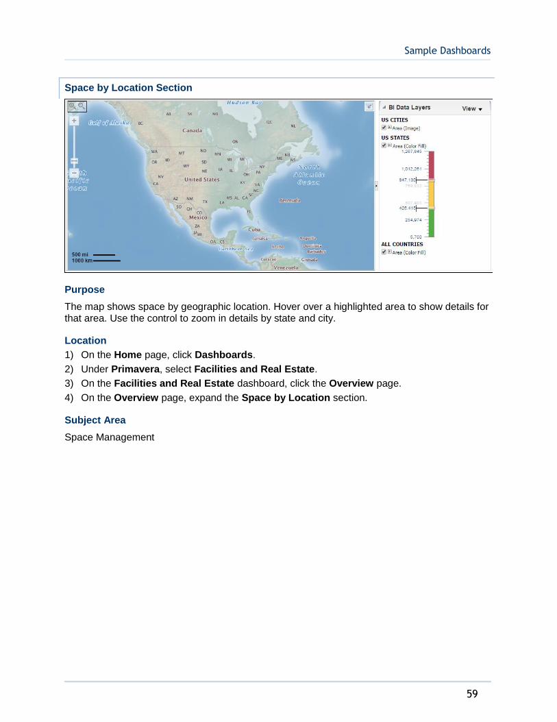
Sample Dashboards
59
Space by Location Section
Purpose
The map shows space by geographic location. Hover over a highlighted area to show details for that area. Use the control to zoom in details by state and city.
Location
1) On the Home page, click Dashboards.
2) Under Primavera, select Facilities and Real Estate.
3) On the Facilities and Real Estate dashboard, click the Overview page.
4) On the Overview page, expand the Space by Location section.
Subject Area
Space Management
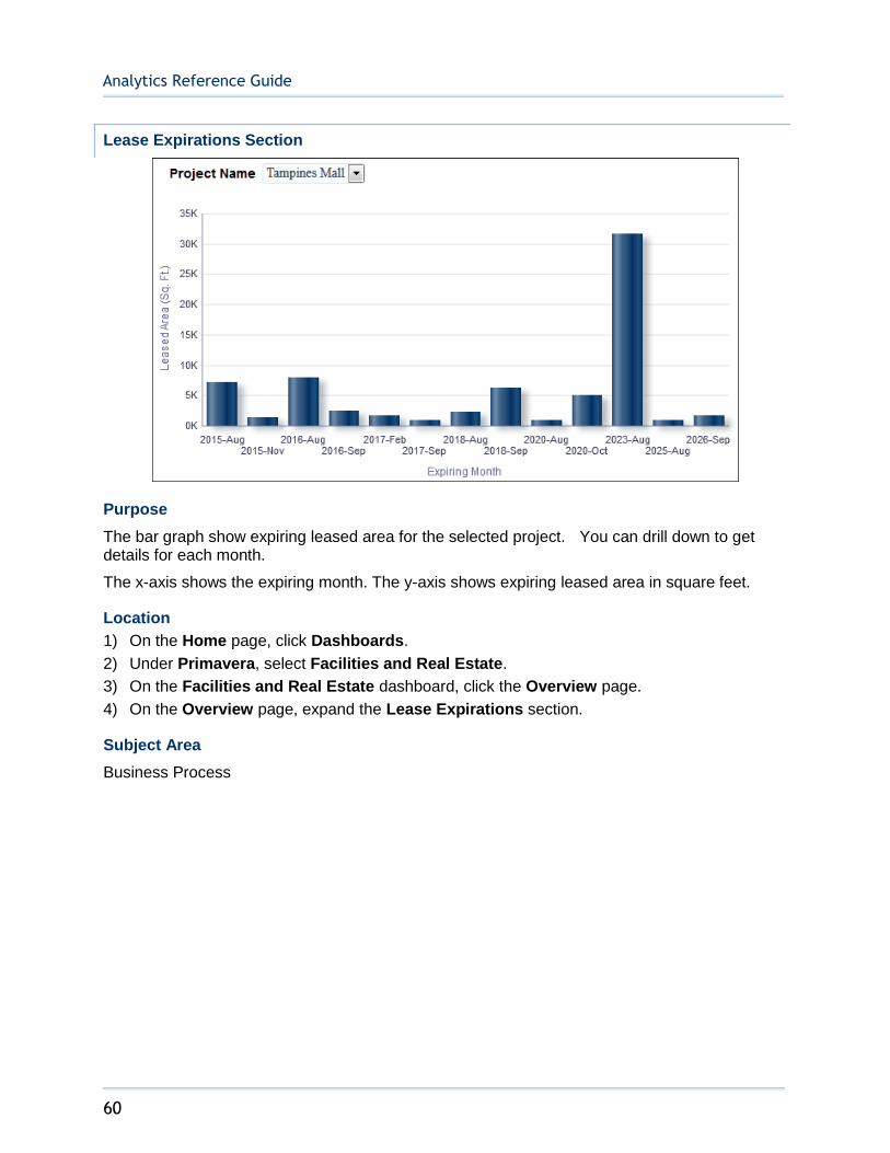
Analytics Reference Guide
60
Lease Expirations Section
Purpose
The bar graph show expiring leased area for the selected project. You can drill down to get details for each month.
The x-axis shows the expiring month. The y-axis shows expiring leased area in square feet.
Location
1) On the Home page, click Dashboards.
2) Under Primavera, select Facilities and Real Estate.
3) On the Facilities and Real Estate dashboard, click the Overview page.
4) On the Overview page, expand the Lease Expirations section.
Subject Area
Business Process

Sample Dashboards
61
Rent by Building
Purpose
The table contains columns for:
Building
Current Monthly Rent
Rent with Multiplier
Delta
Location
1) On the Home page, click Dashboards.
2) Under Primavera, select Facilities and Real Estate.
3) On the Facilities and Real Estate dashboard, click the Overview page.
4) On the Overview page, expand the Rent by Building section.
Subject Area
Space Management
Space Management History
Cost Sheet
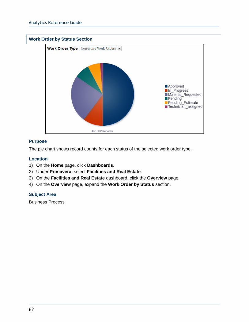
Analytics Reference Guide
62
Work Order by Status Section
Purpose
The pie chart shows record counts for each status of the selected work order type.
Location
1) On the Home page, click Dashboards.
2) Under Primavera, select Facilities and Real Estate.
3) On the Facilities and Real Estate dashboard, click the Overview page.
4) On the Overview page, expand the Work Order by Status section.
Subject Area
Business Process
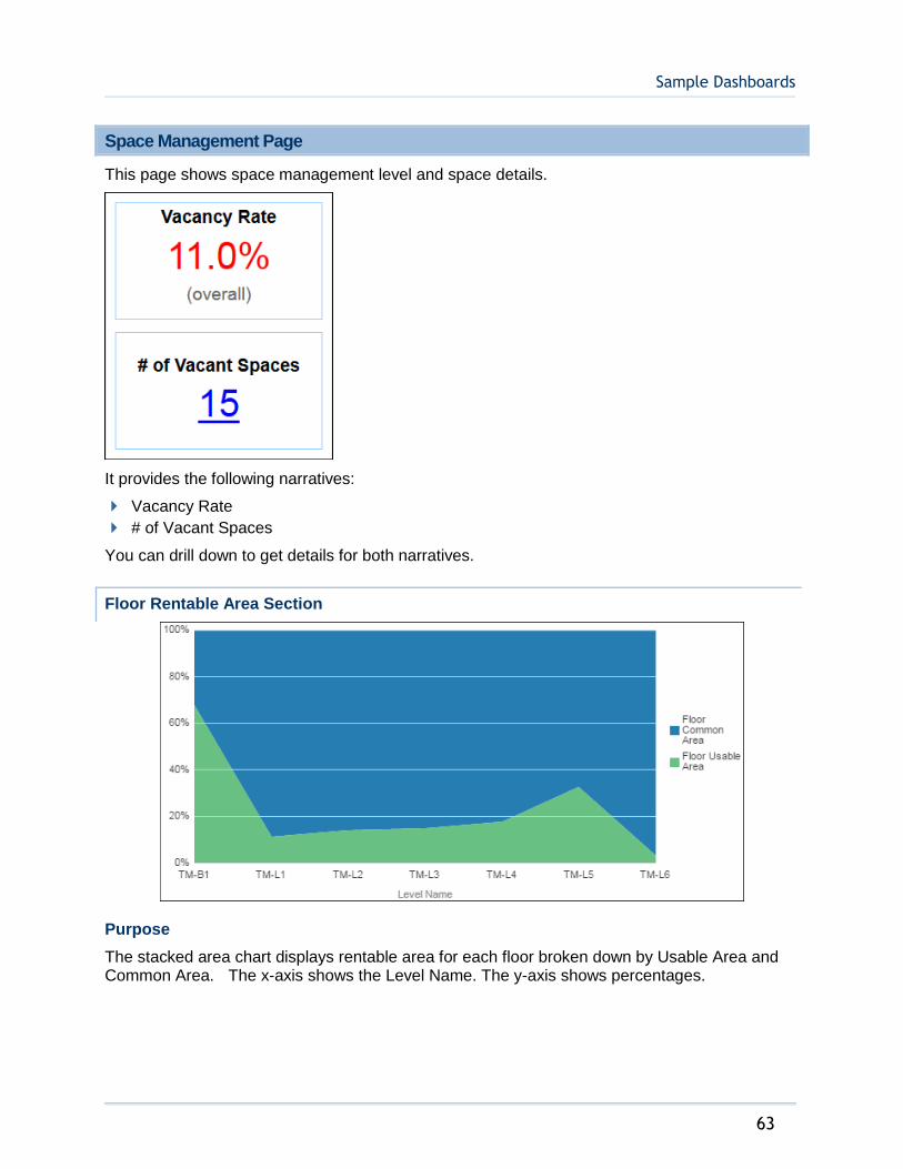
Sample Dashboards
63
Space Management Page
This page shows space management level and space details.
It provides the following narratives:
Vacancy Rate
# of Vacant Spaces
You can drill down to get details for both narratives.
Floor Rentable Area Section
Purpose
The stacked area chart displays rentable area for each floor broken down by Usable Area and Common Area. The x-axis shows the Level Name. The y-axis shows percentages.

Analytics Reference Guide
64
Location
1) On the Home page, click Dashboards.
2) Under Primavera, select Facilities and Real Estate.
3) On the Facilities and Real Estate dashboard, click the Space Management page.
4) On the Space Management page, expand the Floor Rentable Area section.
Subject Area
Space Management
Area by Space Type Section
Purpose
The tree map displays area by space type broken down by building name, number of space records, and area.
Location
1) On the Home page, click Dashboards.
2) Under Primavera, select Facilities and Real Estate.
3) On the Facilities and Real Estate dashboard, click the Space Management page.
4) On the Space Management page, expand the Area by Space Type section.
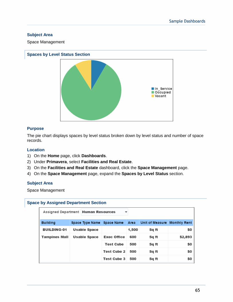
Sample Dashboards
65
Subject Area
Space Management
Spaces by Level Status Section
Purpose
The pie chart displays spaces by level status broken down by level status and number of space records.
Location
1) On the Home page, click Dashboards.
2) Under Primavera, select Facilities and Real Estate.
3) On the Facilities and Real Estate dashboard, click the Space Management page.
4) On the Space Management page, expand the Spaces by Level Status section.
Subject Area
Space Management
Space by Assigned Department Section

Analytics Reference Guide
66
Purpose
The table shows space for the selected Assigned Department, and contains columns for:
Building
Space Type Name
Space Name
Area
Unit of Measure
Monthly Rent
Location
1) On the Home page, click Dashboards.
2) Under Primavera, select Facilities and Real Estate.
3) On the Facilities and Real Estate dashboard, click the Space Management page.
4) On the Space Management page, expand the Space by Assigned Department section.
Subject Area
Space Management
Space by Tenant Section
Purpose
The pivot table shows space for the selected Tenant Name, and contains columns for:
Building
Space Type Name
Space Name
Area
Unit of Measure
Monthly Rent
Location
1) On the Home page, click Dashboards.
2) Under Primavera, select Facilities and Real Estate.
3) On the Facilities and Real Estate dashboard, click the Space Management page.
4) On the Space Management page, expand the Space by Tenant section.
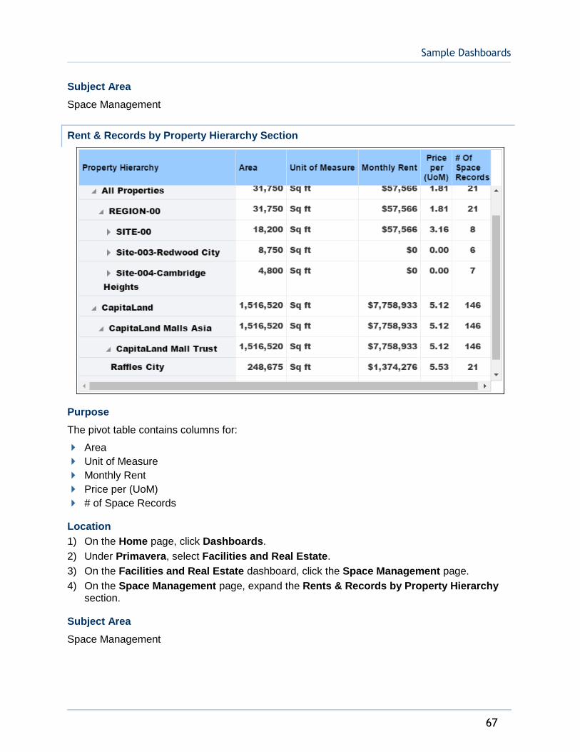
Sample Dashboards
67
Subject Area
Space Management
Rent & Records by Property Hierarchy Section
Purpose
The pivot table contains columns for:
Area
Unit of Measure
Monthly Rent
Price per (UoM)
# of Space Records
Location
1) On the Home page, click Dashboards.
2) Under Primavera, select Facilities and Real Estate.
3) On the Facilities and Real Estate dashboard, click the Space Management page.
4) On the Space Management page, expand the Rents & Records by Property Hierarchy section.
Subject Area
Space Management

Analytics Reference Guide
68
Building Owners and Managers Association (BOMA) Section
Purpose
The pivot table shows Building Owners and Managers Association (BOMA) details for the selected building. It includes columns for:
Level Name
Gross Building Area
Gross Measured Area
Major Vert Pen.
Floor Rentable Area
Useable Areas
Office Area
Store Area
Building Common Area
Floor Useable Area
Floor Common Area
Floor R/U Ratio
Combined R/U Ratio
Location
1) On the Home page, click Dashboards.
2) Under Primavera, select Facilities and Real Estate.
3) On the Facilities and Real Estate dashboard, click the Space Management page.
4) On the Space Management page, expand the Building Owners and Managers Association (BOMA) section.
Subject Area
Space Management
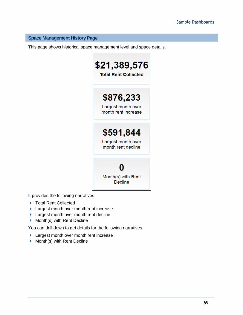
Sample Dashboards
69
Space Management History Page
This page shows historical space management level and space details.
It provides the following narratives:
Total Rent Collected
Largest month over month rent increase
Largest month over month rent decline
Month(s) with Rent Decline
You can drill down to get details for the following narratives:
Largest month over month rent increase
Month(s) with Rent Decline
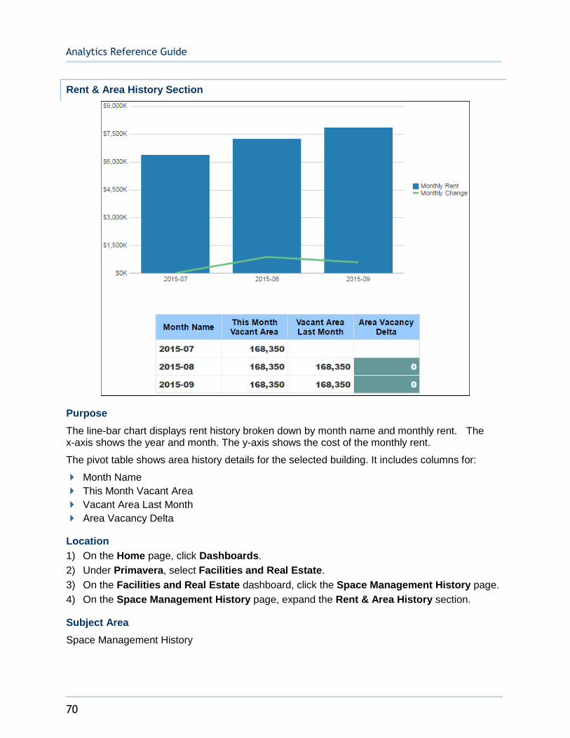
Analytics Reference Guide
70
Rent & Area History Section
Purpose
The line-bar chart displays rent history broken down by month name and monthly rent. The x-axis shows the year and month. The y-axis shows the cost of the monthly rent.
The pivot table shows area history details for the selected building. It includes columns for:
Month Name
This Month Vacant Area
Vacant Area Last Month
Area Vacancy Delta
Location
1) On the Home page, click Dashboards.
2) Under Primavera, select Facilities and Real Estate.
3) On the Facilities and Real Estate dashboard, click the Space Management History page.
4) On the Space Management History page, expand the Rent & Area History section.
Subject Area
Space Management History
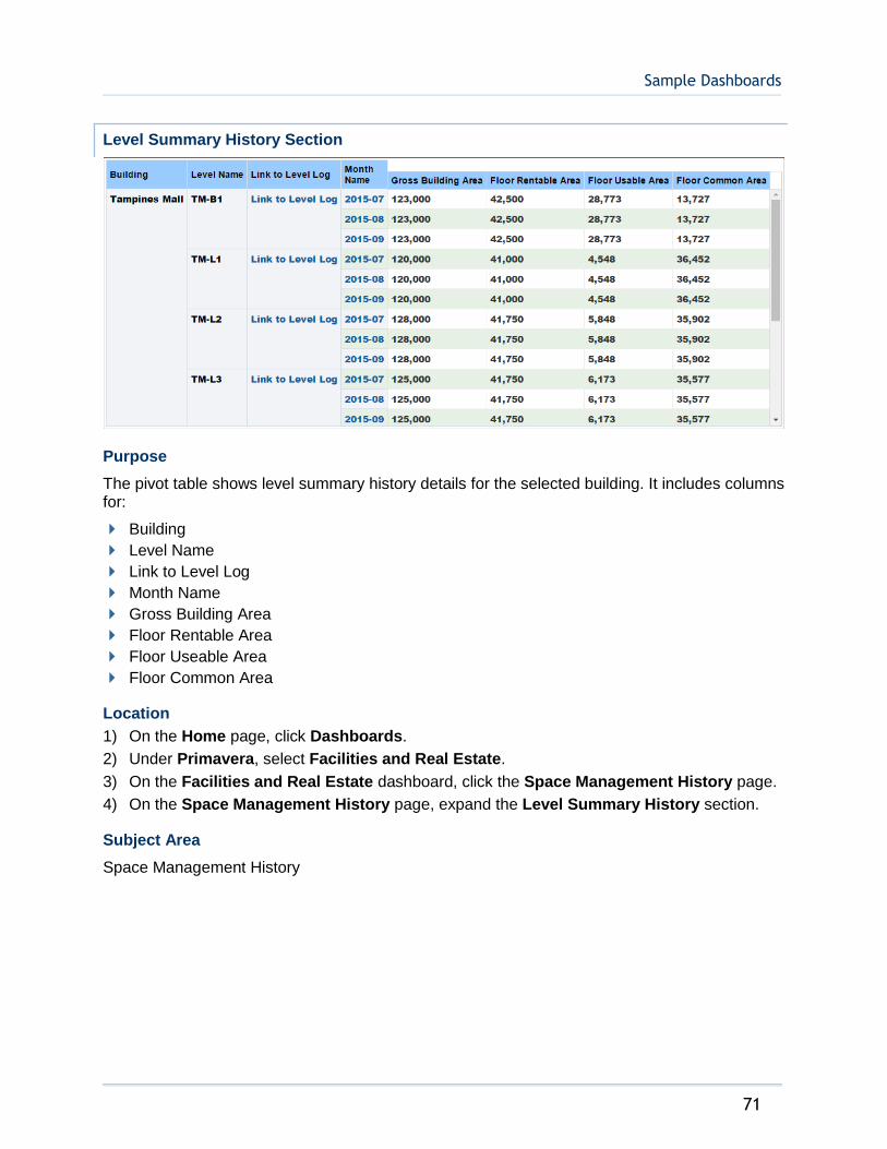
Sample Dashboards
71
Level Summary History Section
Purpose
The pivot table shows level summary history details for the selected building. It includes columns for:
Building
Level Name
Link to Level Log
Month Name
Gross Building Area
Floor Rentable Area
Floor Useable Area
Floor Common Area
Location
1) On the Home page, click Dashboards.
2) Under Primavera, select Facilities and Real Estate.
3) On the Facilities and Real Estate dashboard, click the Space Management History page.
4) On the Space Management History page, expand the Level Summary History section.
Subject Area
Space Management History
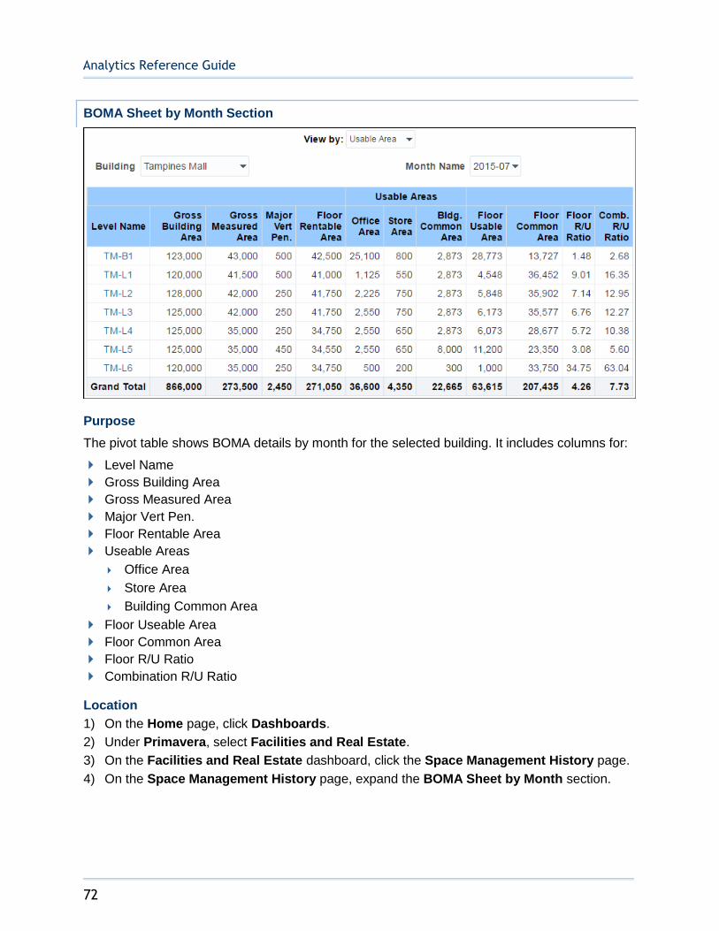
Analytics Reference Guide
72
BOMA Sheet by Month Section
Purpose
The pivot table shows BOMA details by month for the selected building. It includes columns for:
Level Name
Gross Building Area
Gross Measured Area
Major Vert Pen.
Floor Rentable Area
Useable Areas
Office Area
Store Area
Building Common Area
Floor Useable Area
Floor Common Area
Floor R/U Ratio
Combination R/U Ratio
Location
1) On the Home page, click Dashboards.
2) Under Primavera, select Facilities and Real Estate.
3) On the Facilities and Real Estate dashboard, click the Space Management History page.
4) On the Space Management History page, expand the BOMA Sheet by Month section.
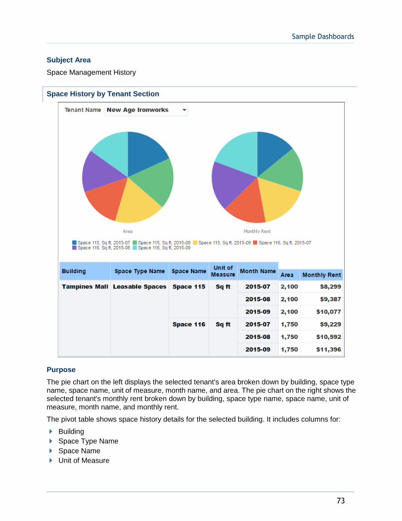
Sample Dashboards
73
Subject Area
Space Management History
Space History by Tenant Section
Purpose
The pie chart on the left displays the selected tenant's area broken down by building, space type name, space name, unit of measure, month name, and area. The pie chart on the right shows the selected tenant's monthly rent broken down by building, space type name, space name, unit of measure, month name, and monthly rent.
The pivot table shows space history details for the selected building. It includes columns for:
Building
Space Type Name
Space Name
Unit of Measure
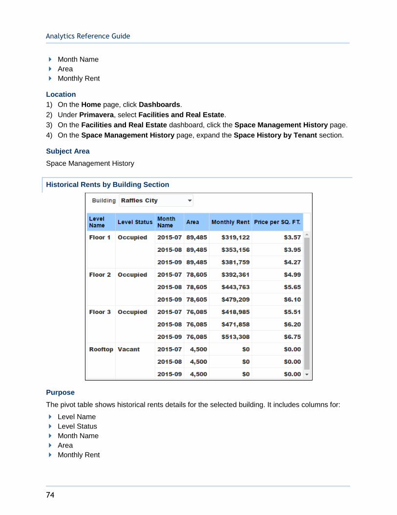
Analytics Reference Guide
74
Month Name
Area
Monthly Rent
Location
1) On the Home page, click Dashboards.
2) Under Primavera, select Facilities and Real Estate.
3) On the Facilities and Real Estate dashboard, click the Space Management History page.
4) On the Space Management History page, expand the Space History by Tenant section.
Subject Area
Space Management History
Historical Rents by Building Section
Purpose
The pivot table shows historical rents details for the selected building. It includes columns for:
Level Name
Level Status
Month Name
Area
Monthly Rent
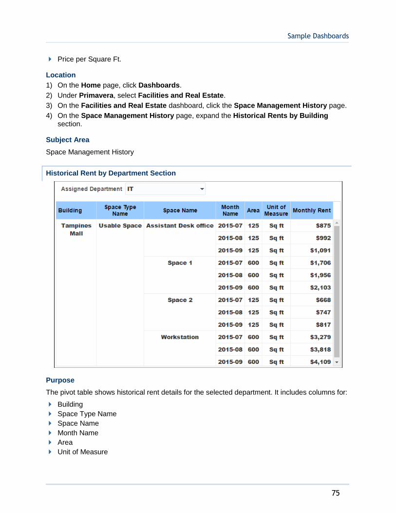
Sample Dashboards
75
Price per Square Ft.
Location
1) On the Home page, click Dashboards.
2) Under Primavera, select Facilities and Real Estate.
3) On the Facilities and Real Estate dashboard, click the Space Management History page.
4) On the Space Management History page, expand the Historical Rents by Building section.
Subject Area
Space Management History
Historical Rent by Department Section
Purpose
The pivot table shows historical rent details for the selected department. It includes columns for:
Building
Space Type Name
Space Name
Month Name
Area
Unit of Measure

Analytics Reference Guide
76
Monthly Rent
Location
1) On the Home page, click Dashboards.
2) Under Primavera, select Facilities and Real Estate.
3) On the Facilities and Real Estate dashboard, click the Space Management History page.
4) On the Space Management History page, expand the Historical Rent by Department section.
Subject Area
Space Management History
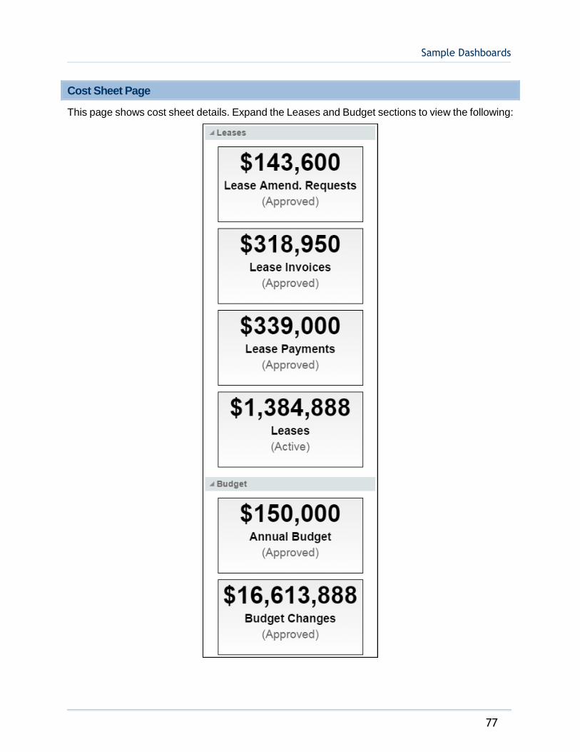
Sample Dashboards
77
Cost Sheet Page
This page shows cost sheet details. Expand the Leases and Budget sections to view the following:

Analytics Reference Guide
78
It provides the following narratives:
Leases
Lease Amend. Requests
Lease Invoices
Lease Payments
Leases
Budget
Annual Budget
Budget Changes
You can drill down to get details for the following narratives:
Leases
Leases
Budget
Annual Budget
Approved Budget by Root Cost Code Section
Purpose
The pie chart on the right displays details of the annual budget (approved). It is broken down by the root level cost code: asset, expenses, liability, and revenue.
The table on the left shows the approved budget by root level cost code details for the selected building.
Location
1) On the Home page, click Dashboards.
2) Under Primavera, select Facilities and Real Estate.
3) On the Facilities and Real Estate dashboard, click the Cost Sheet page.
4) On the Cost Sheet page, expand the Approved Budget by Root Cost Code section.

Sample Dashboards
79
Subject Area
Cost Sheet
Cost Sheet Section
Purpose
Depending on the selection, the bar graph on the right displays annual budget (approved), budget changes-FM (approved), purchase orders-FM (approved), or invoices-generic-FM (approved) details. Depending on the selection, the x-axis represents the year, quarter, or month name. The y-axis represents the cost.
The pivot table to the left displays the cost code hierarchy. You can view the hierarchy and break down of each cost code: asset, equity, expenses, liability, and revenue.
Location
1) On the Home page, click Dashboards.
2) Under Primavera, select Facilities and Real Estate.
3) On the Facilities and Real Estate dashboard, click the Cost Sheet page.
4) On the Cost Sheet page, expand the Cost Sheet section.
Subject Area
Cost Sheet
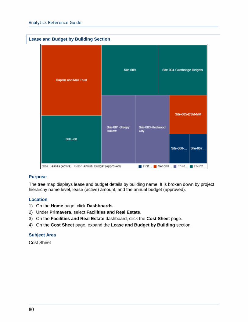
Analytics Reference Guide
80
Lease and Budget by Building Section
Purpose
The tree map displays lease and budget details by building name. It is broken down by project hierarchy name level, lease (active) amount, and the annual budget (approved).
Location
1) On the Home page, click Dashboards.
2) Under Primavera, select Facilities and Real Estate.
3) On the Facilities and Real Estate dashboard, click the Cost Sheet page.
4) On the Cost Sheet page, expand the Lease and Budget by Building section.
Subject Area
Cost Sheet
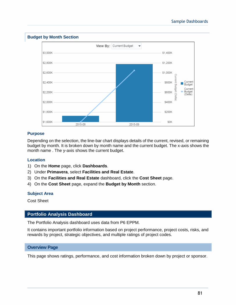
Sample Dashboards
81
Budget by Month Section
Purpose
Depending on the selection, the line-bar chart displays details of the current, revised, or remaining budget by month. It is broken down by month name and the current budget. The x-axis shows the month name . The y-axis shows the current budget.
Location
1) On the Home page, click Dashboards.
2) Under Primavera, select Facilities and Real Estate.
3) On the Facilities and Real Estate dashboard, click the Cost Sheet page.
4) On the Cost Sheet page, expand the Budget by Month section.
Subject Area
Cost Sheet
Portfolio Analysis Dashboard
The Portfolio Analysis dashboard uses data from P6 EPPM.
It contains important portfolio information based on project performance, project costs, risks, and rewards by project, strategic objectives, and multiple ratings of project codes.
Overview Page
This page shows ratings, performance, and cost information broken down by project or sponsor.
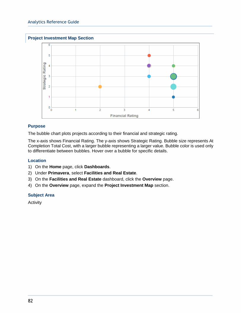
Analytics Reference Guide
82
Project Investment Map Section
Purpose
The bubble chart plots projects according to their financial and strategic rating.
The x-axis shows Financial Rating. The y-axis shows Strategic Rating. Bubble size represents At Completion Total Cost, with a larger bubble representing a larger value. Bubble color is used only to differentiate between bubbles. Hover over a bubble for specific details.
Location
1) On the Home page, click Dashboards.
2) Under Primavera, select Facilities and Real Estate.
3) On the Facilities and Real Estate dashboard, click the Overview page.
4) On the Overview page, expand the Project Investment Map section.
Subject Area
Activity

Sample Dashboards
83
Proposed vs. Committed Cost Section
Purpose
The pivot table shows proposed and committed costs broken down by the project codes you select in the View by lists. Use the left view by list to select the project code to be used on the left side of the table. Use the right View by list to select the project code to be used across the top of the table.
Left view by list project codes:
Sponsor
Business Segment
Project Manager
Project Type
Strategic Objective
Right view by list project codes:
Location
Business Segment
Project Manager
Project Type
Strategic Objective
Proposed Cost is displayed in blue italicized text. Committed Cost is display in black text.
Location
1) On the Home page, click Dashboards.
2) Under Primavera, select Portfolio Analysis.
3) On the Portfolio Analysis dashboard, click the Overview page.
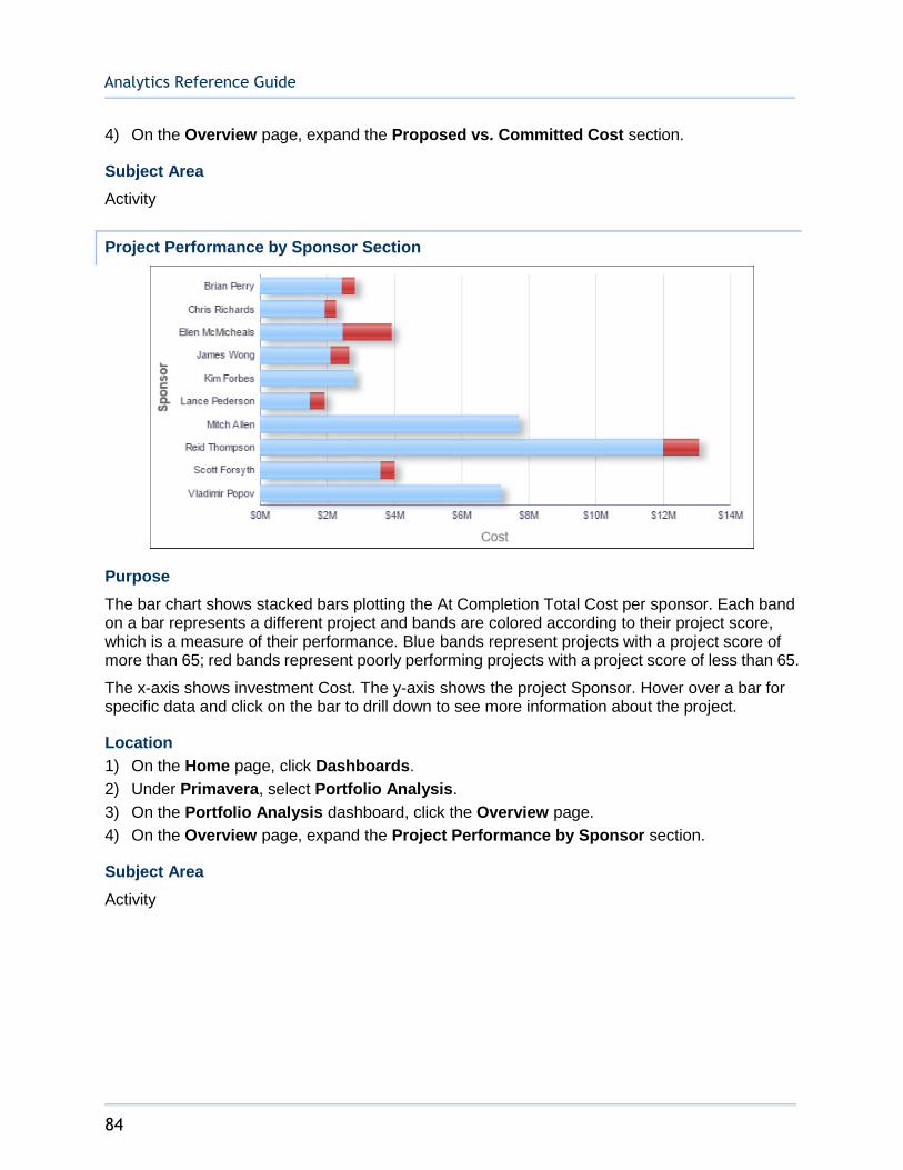
Analytics Reference Guide
84
4) On the Overview page, expand the Proposed vs. Committed Cost section.
Subject Area
Activity
Project Performance by Sponsor Section
Purpose
The bar chart shows stacked bars plotting the At Completion Total Cost per sponsor. Each band on a bar represents a different project and bands are colored according to their project score, which is a measure of their performance. Blue bands represent projects with a project score of more than 65; red bands represent poorly performing projects with a project score of less than 65.
The x-axis shows investment Cost. The y-axis shows the project Sponsor. Hover over a bar for specific data and click on the bar to drill down to see more information about the project.
Location
1) On the Home page, click Dashboards.
2) Under Primavera, select Portfolio Analysis.
3) On the Portfolio Analysis dashboard, click the Overview page.
4) On the Overview page, expand the Project Performance by Sponsor section.
Subject Area
Activity
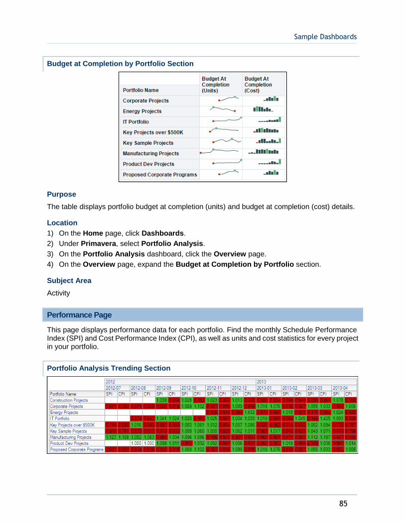
Sample Dashboards
85
Budget at Completion by Portfolio Section
Purpose
The table displays portfolio budget at completion (units) and budget at completion (cost) details.
Location
1) On the Home page, click Dashboards.
2) Under Primavera, select Portfolio Analysis.
3) On the Portfolio Analysis dashboard, click the Overview page.
4) On the Overview page, expand the Budget at Completion by Portfolio section.
Subject Area
Activity
Performance Page
This page displays performance data for each portfolio. Find the monthly Schedule Performance Index (SPI) and Cost Performance Index (CPI), as well as units and cost statistics for every project in your portfolio.
Portfolio Analysis Trending Section
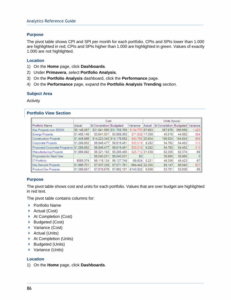
Analytics Reference Guide
86
Purpose
The pivot table shows CPI and SPI per month for each portfolio. CPIs and SPIs lower than 1.000 are highlighted in red; CPIs and SPIs higher than 1.000 are highlighted in green. Values of exactly 1.000 are not highlighted.
Location
1) On the Home page, click Dashboards.
2) Under Primavera, select Portfolio Analysis.
3) On the Portfolio Analysis dashboard, click the Performance page.
4) On the Performance page, expand the Portfolio Analysis Trending section.
Subject Area
Activity
Portfolio View Section
Purpose
The pivot table shows cost and units for each portfolio. Values that are over budget are highlighted in red text.
The pivot table contains columns for:
Portfolio Name
Actual (Cost)
At Completion (Cost)
Budgeted (Cost)
Variance (Cost)
Actual (Units)
At Completion (Units)
Budgeted (Units)
Variance (Units)
Location
1) On the Home page, click Dashboards.

Sample Dashboards
87
2) Under Primavera, select Portfolio Analysis.
3) On the Portfolio Analysis dashboard, click the Performance page.
4) On the Performance page, expand the Portfolio View section.
Subject Area
Activity
Prioritization Page
This page displays the priority of your projects. You can find information on the financial rating and risk of each project, group them by multiple ratings, or see the current phase of each project, separated by strategic rating.
Risk vs. Reward Section
Purpose
The bubble chart plots projects according to their financial rating and risk. Bubbles in the red quadrant of the bubble chart have a low financial rating (reward) and a high risk; those in the white quadrant have a low risk but offer a high reward. Risk in this case is a project code and is not related to P6 EPPM risks functionality.
The x-axis shows Risk. The y-axis shows Financial Rating. Bubble size represents current budget, with a larger bubble representing a larger value. Bubble color is used only to differentiate between bubbles. Hover over a bubble for specific details.
The pivot table groups projects according to their priority. The pivot table contains columns for:
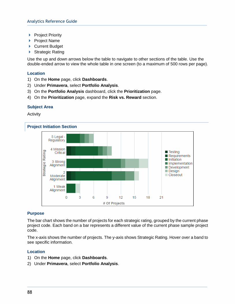
Analytics Reference Guide
88
Project Priority
Project Name
Current Budget
Strategic Rating
Use the up and down arrows below the table to navigate to other sections of the table. Use the double-ended arrow to view the whole table in one screen (to a maximum of 500 rows per page).
Location
1) On the Home page, click Dashboards.
2) Under Primavera, select Portfolio Analysis.
3) On the Portfolio Analysis dashboard, click the Prioritization page.
4) On the Prioritization page, expand the Risk vs. Reward section.
Subject Area
Activity
Project Initiation Section
Purpose
The bar chart shows the number of projects for each strategic rating, grouped by the current phase project code. Each band on a bar represents a different value of the current phase sample project code.
The x-axis shows the number of projects. The y-axis shows Strategic Rating. Hover over a band to see specific information.
Location
1) On the Home page, click Dashboards.
2) Under Primavera, select Portfolio Analysis.
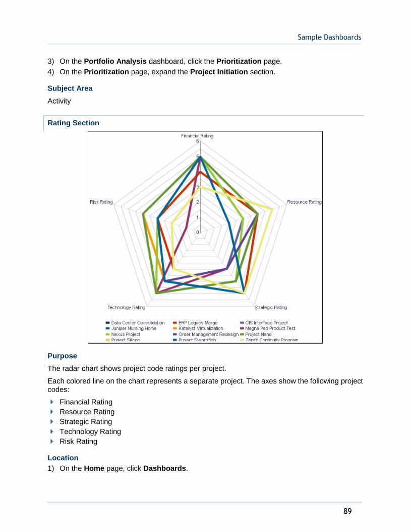
Sample Dashboards
89
3) On the Portfolio Analysis dashboard, click the Prioritization page.
4) On the Prioritization page, expand the Project Initiation section.
Subject Area
Activity
Rating Section
Purpose
The radar chart shows project code ratings per project.
Each colored line on the chart represents a separate project. The axes show the following project codes:
Financial Rating
Resource Rating
Strategic Rating
Technology Rating
Risk Rating
Location
1) On the Home page, click Dashboards.
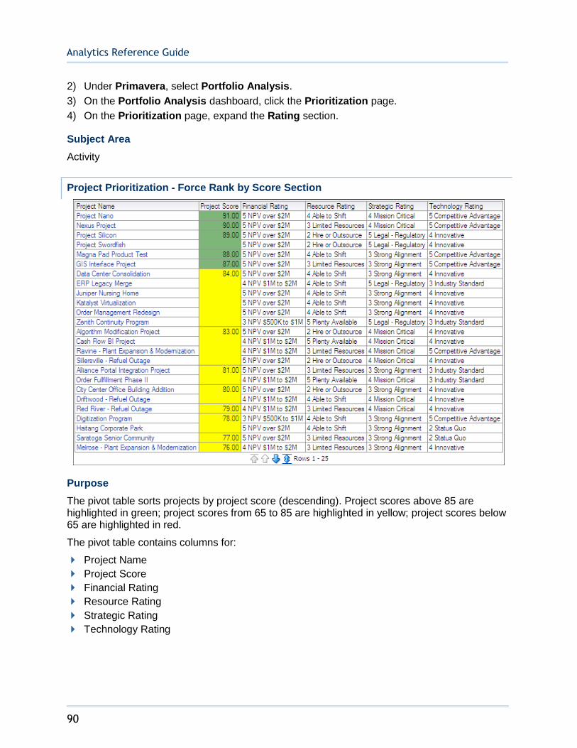
Analytics Reference Guide
90
2) Under Primavera, select Portfolio Analysis.
3) On the Portfolio Analysis dashboard, click the Prioritization page.
4) On the Prioritization page, expand the Rating section.
Subject Area
Activity
Project Prioritization - Force Rank by Score Section
Purpose
The pivot table sorts projects by project score (descending). Project scores above 85 are highlighted in green; project scores from 65 to 85 are highlighted in yellow; project scores below 65 are highlighted in red.
The pivot table contains columns for:
Project Name
Project Score
Financial Rating
Resource Rating
Strategic Rating
Technology Rating
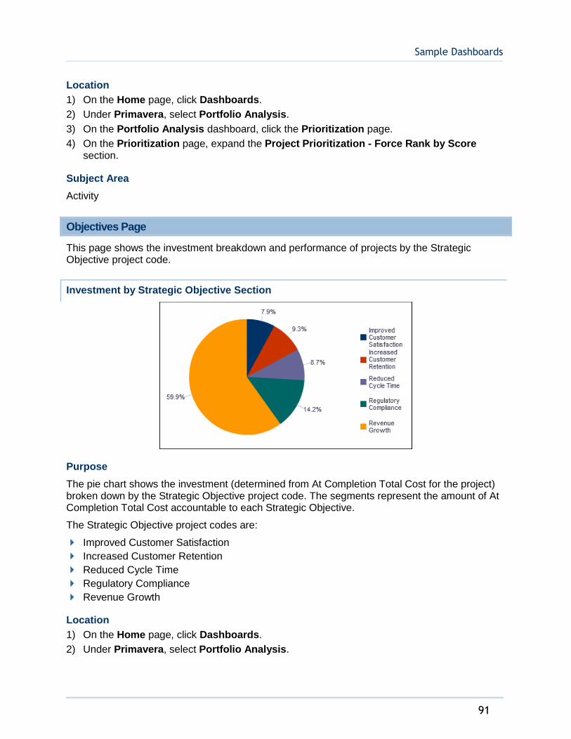
Sample Dashboards
91
Location
1) On the Home page, click Dashboards.
2) Under Primavera, select Portfolio Analysis.
3) On the Portfolio Analysis dashboard, click the Prioritization page.
4) On the Prioritization page, expand the Project Prioritization - Force Rank by Score section.
Subject Area
Activity
Objectives Page
This page shows the investment breakdown and performance of projects by the Strategic Objective project code.
Investment by Strategic Objective Section
Purpose
The pie chart shows the investment (determined from At Completion Total Cost for the project) broken down by the Strategic Objective project code. The segments represent the amount of At Completion Total Cost accountable to each Strategic Objective.
The Strategic Objective project codes are:
Improved Customer Satisfaction
Increased Customer Retention
Reduced Cycle Time
Regulatory Compliance
Revenue Growth
Location
1) On the Home page, click Dashboards.
2) Under Primavera, select Portfolio Analysis.

Analytics Reference Guide
92
3) On the Portfolio Analysis dashboard, click the Objectives page.
4) On the Objectives page, expand the Investment by Strategic Objective section.
Subject Area
Activity
Project Performance by Strategic Objective Section
Purpose
The Improved Customer Satisfaction, Increased Customer Retention, Reduced Cycle Time, Regulatory Compliance, and Revenue Growth stacked bar charts show the investment amount for projects grouped by sponsor name. Each chart shows data for a different set of projects, selected by a project code. Each band on a bar represents a different project. Hover over a section of a bar to see specific data.

Sample Dashboards
93
The x-axis shows Investment. The y-axis shows Sponsor.
Location
1) On the Home page, click Dashboards.
2) Under Primavera, select Portfolio Analysis.
3) On the Portfolio Analysis dashboard, click the Objectives page.
4) On the Objectives page, expand the Project Performance by Strategic Objective section.
Subject Area
Activity
Project Earned Value Dashboard
The Project Earned Value dashboard uses data from P6 EPPM.
This dashboard gives an overview of the earned value status of your projects, including SPI and CPI.
Overview Page
This page shows statistics on a project's planned value, earned value, actual costs, and the estimated cost at completion, grouped by month or project manager.
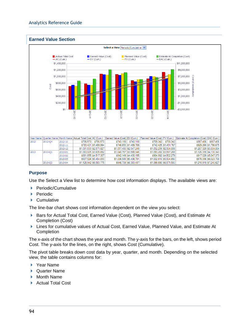
Analytics Reference Guide
94
Earned Value Section
Purpose
Use the Select a View list to determine how cost information displays. The available views are:
Periodic/Cumulative
Periodic
Cumulative
The line-bar chart shows cost information dependent on the view you select:
Bars for Actual Total Cost, Earned Value (Cost), Planned Value (Cost), and Estimate At Completion (Cost)
Lines for cumulative values of Actual Cost, Earned Value, Planned Value, and Estimate At Completion
The x-axis of the chart shows the year and month. The y-axis for the bars, on the left, shows period Cost. The y-axis for the lines, on the right, shows Cost (Cumulative).
The pivot table breaks down cost data by year, quarter, and month. Depending on the selected view, the table contains columns for:
Year Name
Quarter Name
Month Name
Actual Total Cost

Sample Dashboards
95
Actual Cost (Cumulative)
Earned Value (Cost)
Earned Value (Cumulative)
Planned Value (Cost)
Planned Value (Cumulative)
Estimate At Completion (Cost)
Estimate At Completion (Cumulative)
Location
1) On the Home page, click Dashboards.
2) Under Primavera, select Project Earned Value.
3) On the Project Earned Value dashboard, click the Overview page.
4) On the Overview page, expand the Earned Value section.
Subject Area
Activity
Project Earned Value Breakdown Section
Analytics Reference Guide
96
Purpose
Use the Select a View list to determine whether this cost information displays as a bar chart or table. Regardless of the view chosen, the data is the same.
The bar chart breaks down data by the Project Manager project code and shows bars for:
Actual Total Cost
Earned Value (Cost)
Planned Value (Cost)
Estimate to Complete (Cost)
The x-axis shows Cost. The y-axis shows the Project Manager project code. Hover over a bar to see specific information.
The table breaks data down by Project Manager and shows columns for:
Project Manager
Actual Total Cost
Earned Value (Cost)
Planned Value (Cost)
Estimate to Complete (Cost)
Location
1) On the Home page, click Dashboards.
2) Under Primavera, select Project Earned Value.
3) On the Project Earned Value dashboard, click the Overview page.
4) On the Overview page, expand the Project Earned Value Breakdown section.
Subject Area
Activity
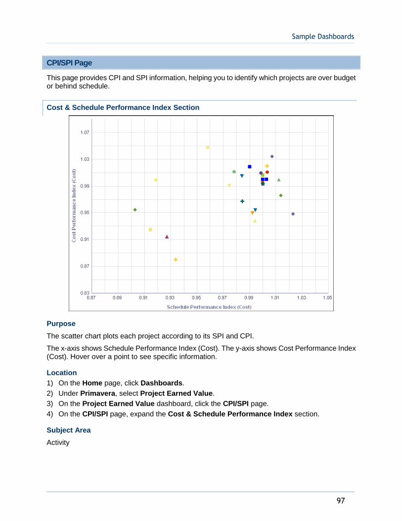
Sample Dashboards
97
CPI/SPI Page
This page provides CPI and SPI information, helping you to identify which projects are over budget or behind schedule.
Cost & Schedule Performance Index Section
Purpose
The scatter chart plots each project according to its SPI and CPI.
The x-axis shows Schedule Performance Index (Cost). The y-axis shows Cost Performance Index (Cost). Hover over a point to see specific information.
Location
1) On the Home page, click Dashboards.
2) Under Primavera, select Project Earned Value.
3) On the Project Earned Value dashboard, click the CPI/SPI page.
4) On the CPI/SPI page, expand the Cost & Schedule Performance Index section.
Subject Area
Activity
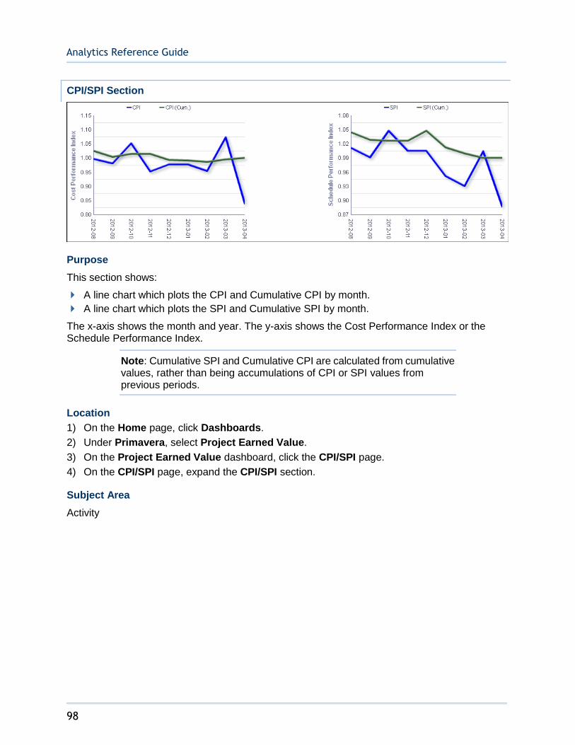
Analytics Reference Guide
98
CPI/SPI Section
Purpose
This section shows:
A line chart which plots the CPI and Cumulative CPI by month.
A line chart which plots the SPI and Cumulative SPI by month.
The x-axis shows the month and year. The y-axis shows the Cost Performance Index or the Schedule Performance Index.
Note: Cumulative SPI and Cumulative CPI are calculated from cumulative values, rather than being accumulations of CPI or SPI values from previous periods.
Location
1) On the Home page, click Dashboards.
2) Under Primavera, select Project Earned Value.
3) On the Project Earned Value dashboard, click the CPI/SPI page.
4) On the CPI/SPI page, expand the CPI/SPI section.
Subject Area
Activity

Sample Dashboards
99
Performance Index Section
Purpose
The bubble chart plots bubbles for projects according to their Cost Performance Index (Cost) and Schedule Performance Index (Cost). The location of each bubble in the chart will tell you whether the project it represents is under or over budget (above or below the horizontal center, respectively) and whether it is behind or ahead of schedule (left or right of the vertical center, respectively).
The x-axis shows Schedule Performance Index (Cost). The y-axis shows Cost Performance Index (Cost). Bubble size represents At Completion Total Cost, with larger bubbles representing larger values. Bubble color is used only to differentiate between bubbles. Hover over a bubble for specific details.
Location
1) On the Home page, click Dashboards.
2) Under Primavera, select Project Earned Value.
3) On the Project Earned Value dashboard, click the CPI/SPI page.

Analytics Reference Guide
100
4) On the CPI/SPI page, expand the Performance Index section.
Subject Area
Activity
Detailed Earned Value Page
This page provides a detailed view of a project's earned value, total costs, and estimate at completion costs.
Detailed Earned Value by WBS Section
Purpose
The bar graph and pivot table break projects down by WBS. It shows cost and cumulative values for:
Actual Cost
Earned Value
Planned Value
Estimate At Completion
Use the expand/collapse control to drill down into the WBS structure.

Sample Dashboards
101
Location
1) On the Home page, click Dashboards.
2) Under Primavera, select Project Earned Value.
3) On the Project Earned Value dashboard, click the Detailed Earned Value page.
4) On the Detailed Earned Value page, expand the Detailed Earned Value by WBS section.
Subject Area
Activity
Project Health Dashboard
The Project Health dashboard uses data from P6 EPPM.
It offers useful tools for determining the health of your projects. On this dashboard, you can view the overall health of your project, look at schedule progress and cost trends, and determine which activities are not on track.
Overview Page
This page provides statistics for your project based on numerous variables, including project codes and ratings. You can view overall health and cost variance by cost account for any of your projects.
Project Count Section
Purpose
Use the View By list to select a project code by which to view the table and pie chart. The available codes are:
Project Manager
Financial Rating
Location
Priority
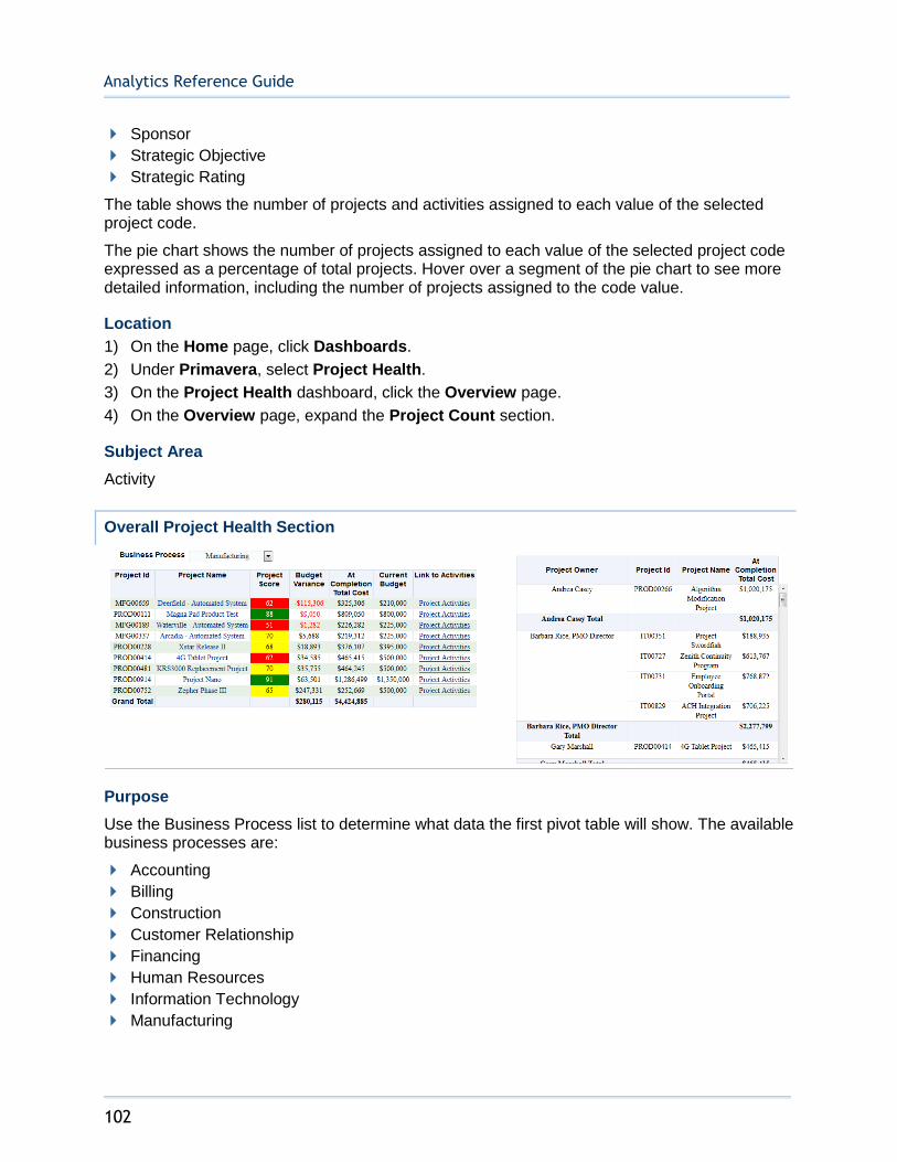
Analytics Reference Guide
102
Sponsor
Strategic Objective
Strategic Rating
The table shows the number of projects and activities assigned to each value of the selected project code.
The pie chart shows the number of projects assigned to each value of the selected project code expressed as a percentage of total projects. Hover over a segment of the pie chart to see more detailed information, including the number of projects assigned to the code value.
Location
1) On the Home page, click Dashboards.
2) Under Primavera, select Project Health.
3) On the Project Health dashboard, click the Overview page.
4) On the Overview page, expand the Project Count section.
Subject Area
Activity
Overall Project Health Section
Purpose
Use the Business Process list to determine what data the first pivot table will show. The available business processes are:
Accounting
Billing
Construction
Customer Relationship
Financing
Human Resources
Information Technology
Manufacturing
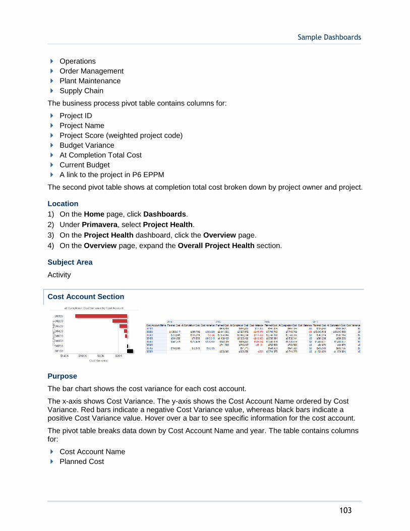
Sample Dashboards
103
Operations
Order Management
Plant Maintenance
Supply Chain
The business process pivot table contains columns for:
Project ID
Project Name
Project Score (weighted project code)
Budget Variance
At Completion Total Cost
Current Budget
A link to the project in P6 EPPM
The second pivot table shows at completion total cost broken down by project owner and project.
Location
1) On the Home page, click Dashboards.
2) Under Primavera, select Project Health.
3) On the Project Health dashboard, click the Overview page.
4) On the Overview page, expand the Overall Project Health section.
Subject Area
Activity
Cost Account Section
Purpose
The bar chart shows the cost variance for each cost account.
The x-axis shows Cost Variance. The y-axis shows the Cost Account Name ordered by Cost Variance. Red bars indicate a negative Cost Variance value, whereas black bars indicate a positive Cost Variance value. Hover over a bar to see specific information for the cost account.
The pivot table breaks data down by Cost Account Name and year. The table contains columns for:
Cost Account Name
Planned Cost
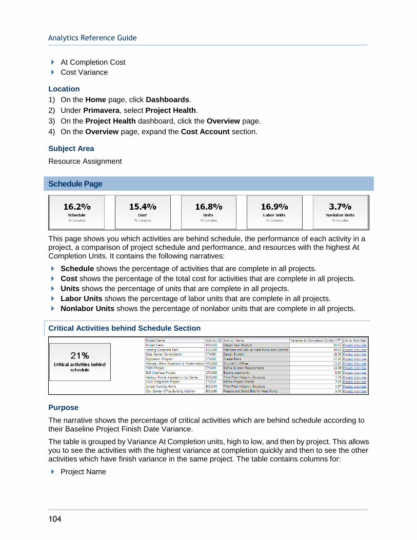
Analytics Reference Guide
104
At Completion Cost
Cost Variance
Location
1) On the Home page, click Dashboards.
2) Under Primavera, select Project Health.
3) On the Project Health dashboard, click the Overview page.
4) On the Overview page, expand the Cost Account section.
Subject Area
Resource Assignment
Schedule Page
This page shows you which activities are behind schedule, the performance of each activity in a project, a comparison of project schedule and performance, and resources with the highest At Completion Units. It contains the following narratives:
Schedule shows the percentage of activities that are complete in all projects.
Cost shows the percentage of the total cost for activities that are complete in all projects.
Units shows the percentage of units that are complete in all projects.
Labor Units shows the percentage of labor units that are complete in all projects.
Nonlabor Units shows the percentage of nonlabor units that are complete in all projects.
Critical Activities behind Schedule Section
Purpose
The narrative shows the percentage of critical activities which are behind schedule according to their Baseline Project Finish Date Variance.
The table is grouped by Variance At Completion units, high to low, and then by project. This allows you to see the activities with the highest variance at completion quickly and then to see the other activities which have finish variance in the same project. The table contains columns for:
Project Name

Sample Dashboards
105
Activity ID
Activity Name
Variance at Completion (Units)
A link to the project activities
Location
1) On the Home page, click Dashboards.
2) Under Primavera, select Project Health.
3) On the Project Health dashboard, click the Schedule page.
4) On the Schedule page, expand the Critical Activities behind Schedule section.
Subject Area
Activity
Float Path Section
Purpose
The pivot table shows the number of activities per float path grouped by primary resource.
The bar chart shows the number of activities for each primary resource in a float path.
The x-axis shows the Float Path. The y-axis shows the number of activities. Hover over a bar for specific information.
Location
1) On the Home page, click Dashboards.
2) Under Primavera, select Project Health.
3) On the Project Health dashboard, click the Schedule page.
4) On the Schedule page, expand the Float Path section.

Analytics Reference Guide
106
Subject Area
Activity
Labor Performance Section
Purpose
The Phase and Department line-bar charts show data for activities assigned to the Phase and Department activity codes. Both of these line-bar charts show:
Bars for the Actual and Planned labor
A line for the Percent of Plan labor units expressed as a percentage of baseline project labor units
The x-axis of the Phase line-bar chart shows Phase code values. The x-axis of the Department line-bar chart shows Department code values. On both line-bar charts the y-axis for the bars, on the left, shows labor Units. On both line-bar charts the y-axis for the line, on the right, shows the Percent of Plan.
Use the Labor Performance By pivot table to determine whether Phase or Department data is displayed. The pivot table contains columns for:
Current Phase or Department
Project
Planned (baseline project labor units)
Actual (actual labor units)
Percent of Plan (actual labor units expressed as a percentage of baseline project labor units)
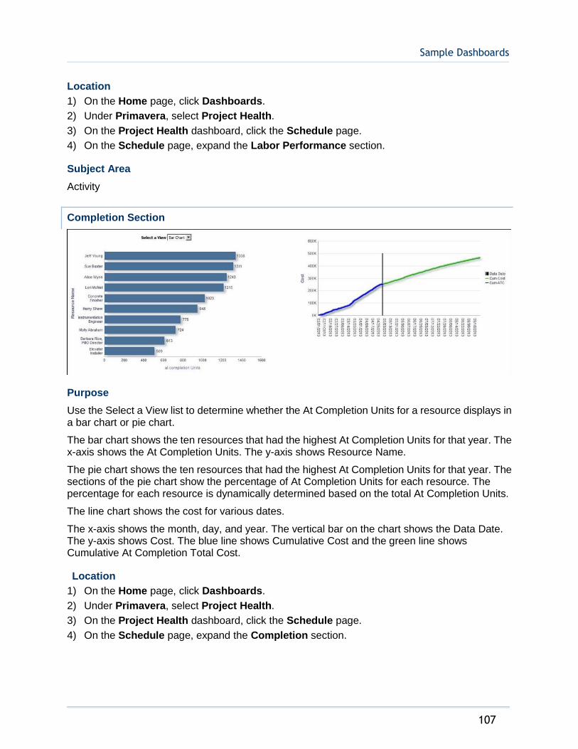
Sample Dashboards
107
Location
1) On the Home page, click Dashboards.
2) Under Primavera, select Project Health.
3) On the Project Health dashboard, click the Schedule page.
4) On the Schedule page, expand the Labor Performance section.
Subject Area
Activity
Completion Section
Purpose
Use the Select a View list to determine whether the At Completion Units for a resource displays in a bar chart or pie chart.
The bar chart shows the ten resources that had the highest At Completion Units for that year. The x-axis shows the At Completion Units. The y-axis shows Resource Name.
The pie chart shows the ten resources that had the highest At Completion Units for that year. The sections of the pie chart show the percentage of At Completion Units for each resource. The percentage for each resource is dynamically determined based on the total At Completion Units.
The line chart shows the cost for various dates.
The x-axis shows the month, day, and year. The vertical bar on the chart shows the Data Date. The y-axis shows Cost. The blue line shows Cumulative Cost and the green line shows Cumulative At Completion Total Cost.
Location
1) On the Home page, click Dashboards.
2) Under Primavera, select Project Health.
3) On the Project Health dashboard, click the Schedule page.
4) On the Schedule page, expand the Completion section.
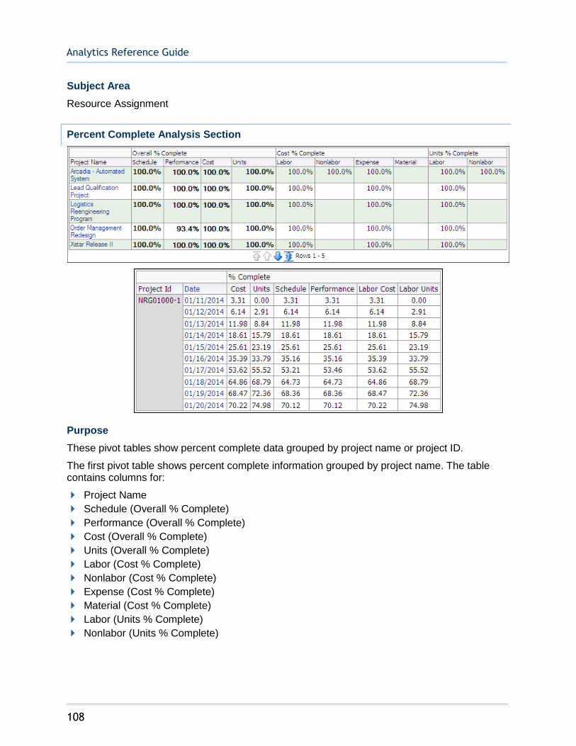
Analytics Reference Guide
108
Subject Area
Resource Assignment
Percent Complete Analysis Section
Purpose
These pivot tables show percent complete data grouped by project name or project ID.
The first pivot table shows percent complete information grouped by project name. The table contains columns for:
Project Name
Schedule (Overall % Complete)
Performance (Overall % Complete)
Cost (Overall % Complete)
Units (Overall % Complete)
Labor (Cost % Complete)
Nonlabor (Cost % Complete)
Expense (Cost % Complete)
Material (Cost % Complete)
Labor (Units % Complete)
Nonlabor (Units % Complete)

Sample Dashboards
109
The second table shows percent complete information grouped by project ID and date. The table contains columns for:
Project ID
Date
Cost (% Complete)
Units (% Complete)
Schedule (% Complete)
Performance (% Complete)
Labor Cost (% Complete)
Labor Units (% Complete)
Location
1) On the Home page, click Dashboards.
2) Under Primavera, select Project Health.
3) On the Project Health dashboard, click the Schedule page.
4) On the Schedule page, expand the Percent Complete Analysis section.
Subject Area
Activity
Activity Steps Section
Purpose
The table shows activity step details for the project selected in the Project Name drop-down. The table contains columns for:
Activity ID
Activity Name
Activity Status
Activity Start Date
Activity Finish Date
Step Name

Analytics Reference Guide
110
Step Weight
Weight Percent Complete
Step Percent Completes
Is Completed
The bar chart shows the count of open and closed activity steps by project for the portfolio selected in the Portfolio Name drop-down.
Location
1) On the Home page, click Dashboards.
2) Under Primavera, select Project Health.
3) On the Project Health dashboard, click the Schedule page.
4) On the Schedule page, expand the Activity Steps section.
Subject Area
Activity
Cost Page
This page shows the cost trends of your project, the cost breakdown by different variables, and the different types of costs your projects incur. It contains the following narratives:
Total Cost shows what the total cost of the selected projects or portfolios will be at completion.
Labor Cost shows what the total labor cost of the selected projects or portfolios will be at completion.
Nonlabor Cost shows what the total nonlabor cost of the selected projects or portfolios will be at completion.
Material Cost shows what the total material cost of the selected projects or portfolios will be at completion.
Expense Cost shows what the total expense cost of the selected projects or portfolios will be at completion.
Use the filters to determine what information displays in the narratives. If no filters are applied, these narratives show data for all projects and portfolios.
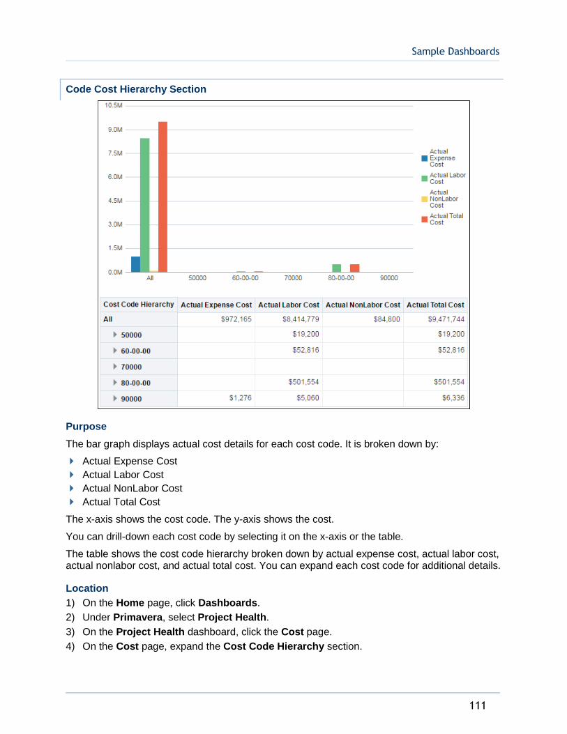
Sample Dashboards
111
Code Cost Hierarchy Section
Purpose
The bar graph displays actual cost details for each cost code. It is broken down by:
Actual Expense Cost
Actual Labor Cost
Actual NonLabor Cost
Actual Total Cost
The x-axis shows the cost code. The y-axis shows the cost.
You can drill-down each cost code by selecting it on the x-axis or the table.
The table shows the cost code hierarchy broken down by actual expense cost, actual labor cost, actual nonlabor cost, and actual total cost. You can expand each cost code for additional details.
Location
1) On the Home page, click Dashboards.
2) Under Primavera, select Project Health.
3) On the Project Health dashboard, click the Cost page.
4) On the Cost page, expand the Cost Code Hierarchy section.

Analytics Reference Guide
112
Subject Area
Activity
Cost Trend Section
Purpose
Use the Select a View list to determine whether cost information displays as a bar chart, line chart, or table.
The bar chart shows bars for:
Actual Total Cost
Remaining Total Cost
At Completion Total Cost
The x-axis shows the year and month. The y-axis shows cost. Hover over a bar to see specific information about it.
The line chart shows lines for:
Actual Total Cost
Remaining Total Cost
At Completion Total Cost
The x-axis shows the year and month. The y-axis shows cost. Hover over a point on a line to see specific information about it.

Sample Dashboards
113
The pivot table breaks data down by project and date. The columns spread the data across five months. The table shows information per project for:
Actual Total Cost
Remaining Total Cost
At Completion Total Cost
Location
1) On the Home page, click Dashboards.
2) Under Primavera, select Project Health.
3) On the Project Health dashboard, click the Cost page.
4) On the Cost page, expand the Cost Trend section.
Subject Area
Project History
Project Cost Breakdown Section
Purpose
Use the Select a View list to determine how cost and project code information displays. Depending on the selection, the view displays as a bar chart or table. The available views are:
Cost Breakdown by Location
Analytics Reference Guide
114
Cost Breakdown by Project Manager
Cost Breakdown by Sponsor
Table by Location
Table by Project Manager
Table by Sponsor
The bar charts break data down by the Location, Project Manager, and Sponsor project codes respectively. The bar charts show bars for:
Actual Total Cost
At Completion Total Cost
Remaining Total Cost
Cost Variance (Cost)
The x-axis shows Cost. The y-axis shows the project code selected in the Select a View list.
The tables break down data by the Location, Project Manager, and Sponsor project codes respectively. The pivot tables show columns for:
Project Manager
Actual Total Cost
At Completion Total Cost
Remaining Total Cost
Cost Variance (Cost)
Location
1) On the Home page, click Dashboards.
2) Under Primavera, select Project Health.
3) On the Project Health dashboard, click the Cost page.
4) On the Cost page, expand the Project Cost Breakdown section.
Subject Area
Activity
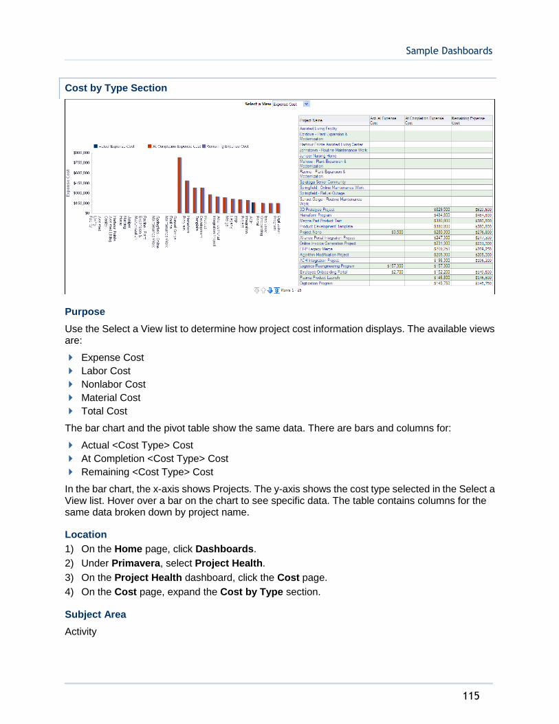
Sample Dashboards
115
Cost by Type Section
Purpose
Use the Select a View list to determine how project cost information displays. The available views are:
Expense Cost
Labor Cost
Nonlabor Cost
Material Cost
Total Cost
The bar chart and the pivot table show the same data. There are bars and columns for:
Actual <Cost Type> Cost
At Completion <Cost Type> Cost
Remaining <Cost Type> Cost
In the bar chart, the x-axis shows Projects. The y-axis shows the cost type selected in the Select a View list. Hover over a bar on the chart to see specific data. The table contains columns for the same data broken down by project name.
Location
1) On the Home page, click Dashboards.
2) Under Primavera, select Project Health.
3) On the Project Health dashboard, click the Cost page.
4) On the Cost page, expand the Cost by Type section.
Subject Area
Activity

Analytics Reference Guide
116
Expenses Section
Purpose
The table shows expense details by project for the Project Owner selected in the drop-down. The sums by project owner of the expense costs are shown above the table. The table contains columns for:
Project ID
Project Name
Project Start Date
Project Finish Date
Project Planned Expense Cost
Project Remaining Expense Cost
Project Actual Expense Cost
The bar chart shows the expense costs by expense category for the project selected in the Project Name drop-down. It is also master-detail linked to the table; the chart displays data for a project based on the Project Name that is clicked on in the table.
Location
1) On the Home page, click Dashboards.
2) Under Primavera, select Project Health.
3) On the Project Health dashboard, click the Cost page.
4) On the Cost page, expand the Expenses section.
Subject Area
Activity
History Page
This page shows the At Completion Variance Percentage of each project in your portfolio, as well as a detailed history of each activity in a project.

Sample Dashboards
117
% Complete History Section
Purpose
These analyses show percent complete information broken down by date.
The table breaks down data by date and shows columns for:
Calendar Date
Project Name
Units (Today % Complete)
Cost (Today % Complete)
Units (Yesterday % Complete)
Cost (Yesterday % Complete)
Units (% Complete Change Yesterday to Today)
Cost (% Complete Change Yesterday to Today)
The line chart shows the Today Percent Complete from the start of project until the given day of analysis. There are lines for Units and Cost.
The x-axis shows the Calendar Date. The y-axis shows the Today Percent Complete on the given day from start. Hover over a point for specific information.
Location
1) On the Home page, click Dashboards.
2) Under Primavera, select Project Health.
3) On the Project Health dashboard, click the History page.
4) On the History page, expand the % Complete History section.
Subject Area
Project History

Analytics Reference Guide
118
Milestone Dates That Have Slipped Section
Purpose
The pivot table shows data for all milestones whose dates have changed since the previous history interval. Data is broken down and ordered by project and date. The table contains columns for:
Project Name
Calendar Date
Activity ID
Activity Name
Activity Type
Current Planned Start
Current Planned Finish
Prior Planned Start
Prior Planned Finish
Use the up and down arrows below the table to navigate to other sections of the table. Use the double-ended arrow to view the whole table in one screen (to a maximum of 500 rows per page).
Location
1) On the Home page, click Dashboards.
2) Under Primavera, select Project Health.
3) On the Project Health dashboard, click the History page.
4) On the History page, expand the Milestone Dates that Have Slipped section.
Subject Area
Project History

Sample Dashboards
119
Proposed Budget (Project Cost UDF) History Section
Purpose
The chart shows progression of changes between Proposed Budget and Original Budget, sorted by date.
Location
1) On the Home page, click Dashboards.
2) Under Primavera, select Project Health.
3) On the Project Health dashboard, click the History page.
4) On the History page, expand the Proposed Budget (Project Cost UDF) History section.
Subject Area
Project History

Analytics Reference Guide
120
Location Page
This page shows the At Completion Total Cost for any of your projects by country or state.
At Completion Total Cost by Location Section
Purpose
The map shows At Completion Total Cost for all projects by country. White areas of the map indicate that no project is located in that area.
Switch off the At Completion Total Cost (Color Fill) option below ALL COUNTRIES to remove the shading when zoomed out to Country level. Switch off the At Completion Total Cost (Image) option below ALL CITIES to remove the shading when zoomed in to state level. Zoom in and out with the control on the left. Hover over a country, state, or province to see specific information or click on a country, state, or province to bring up a call out with specific information.
Location
1) On the Home page, click Dashboards.
2) Under Primavera, select Project Health.
3) On the Project Health dashboard, click the Location page.
4) On the Location page, expand the At Completion Total Cost by Location section.
Subject Area
Activity
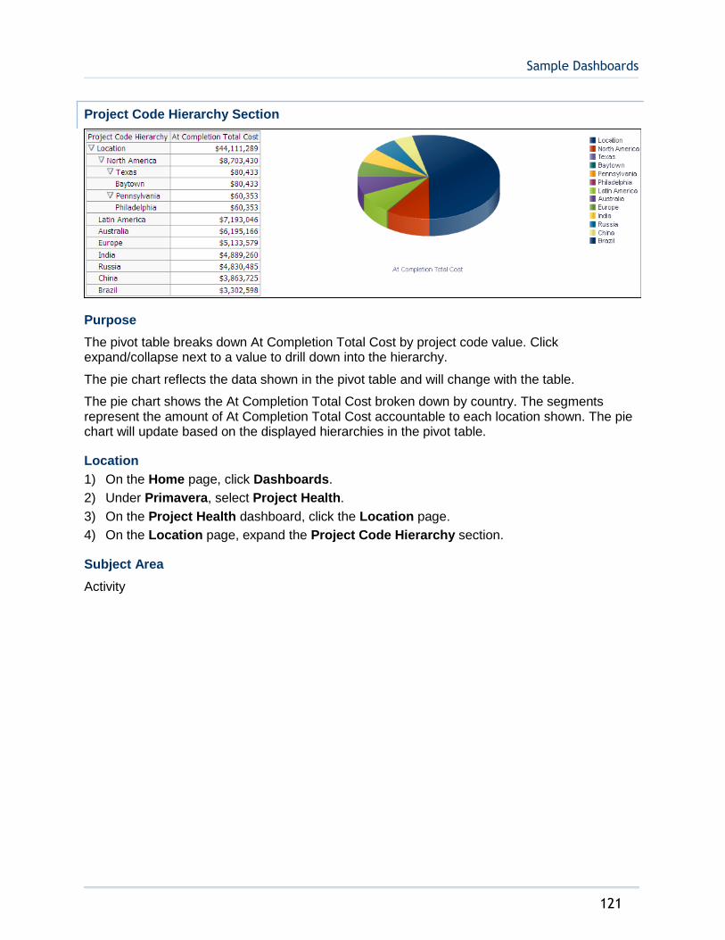
Sample Dashboards
121
Project Code Hierarchy Section
Purpose
The pivot table breaks down At Completion Total Cost by project code value. Click expand/collapse next to a value to drill down into the hierarchy.
The pie chart reflects the data shown in the pivot table and will change with the table.
The pie chart shows the At Completion Total Cost broken down by country. The segments represent the amount of At Completion Total Cost accountable to each location shown. The pie chart will update based on the displayed hierarchies in the pivot table.
Location
1) On the Home page, click Dashboards.
2) Under Primavera, select Project Health.
3) On the Project Health dashboard, click the Location page.
4) On the Location page, expand the Project Code Hierarchy section.
Subject Area
Activity

Analytics Reference Guide
122
At Completion Labor Units by State Section
Purpose
The map shows At Completion Labor Units for projects by state. White areas of the map indicate that no project is located in that area.
Switch off the At Completion Labor Units (Pie Graph) option below US STATES to remove the pie charts from states. Switch off the Remaining Total Cost (Color Fill) option to remove the cost shading on a state. Zoom in and out with the control on the left. Hover over a pie chart to see specific information for that state.
Location
1) On the Home page, click Dashboards.
2) Under Primavera, select Project Health.
3) On the Project Health dashboard, click the Location page.
4) On the Location page, expand the At Completion Labor Units by State section.
Subject Area
Activity
Activity Worksheet Page
This page shows each activity associated with a project within your portfolio.
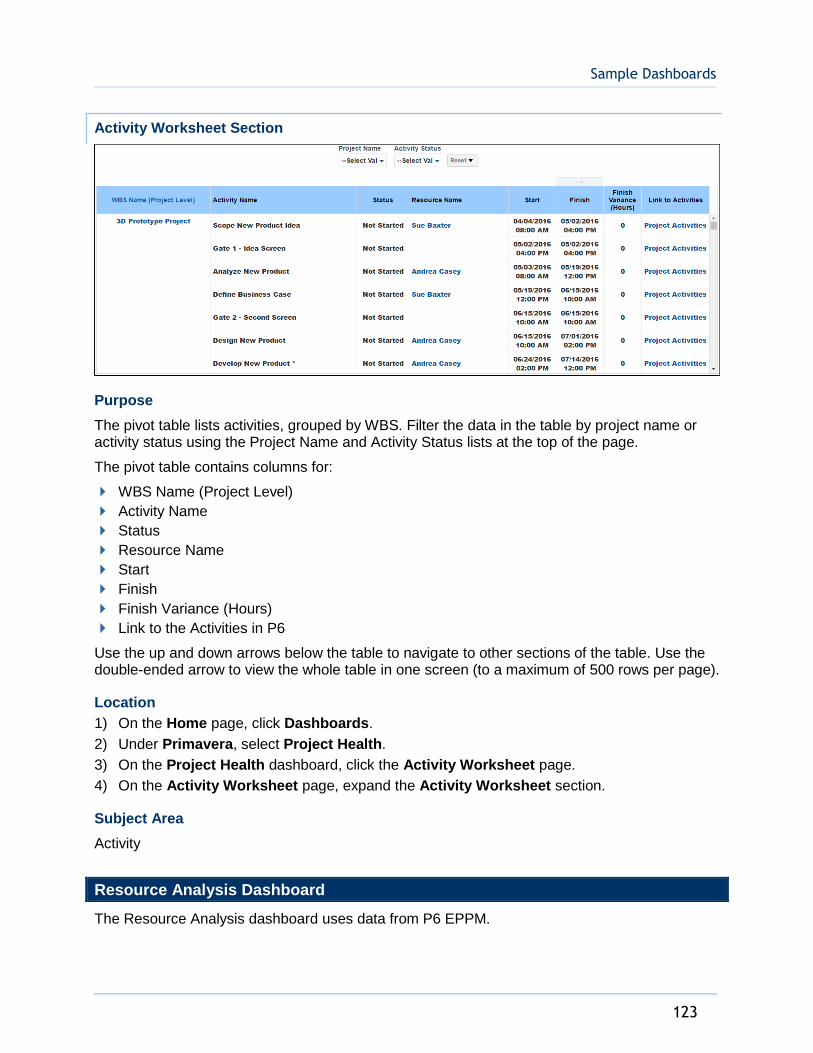
Sample Dashboards
123
Activity Worksheet Section
Purpose
The pivot table lists activities, grouped by WBS. Filter the data in the table by project name or activity status using the Project Name and Activity Status lists at the top of the page.
The pivot table contains columns for:
WBS Name (Project Level)
Activity Name
Status
Resource Name
Start
Finish
Finish Variance (Hours)
Link to the Activities in P6
Use the up and down arrows below the table to navigate to other sections of the table. Use the double-ended arrow to view the whole table in one screen (to a maximum of 500 rows per page).
Location
1) On the Home page, click Dashboards.
2) Under Primavera, select Project Health.
3) On the Project Health dashboard, click the Activity Worksheet page.
4) On the Activity Worksheet page, expand the Activity Worksheet section.
Subject Area
Activity
Resource Analysis Dashboard
The Resource Analysis dashboard uses data from P6 EPPM.
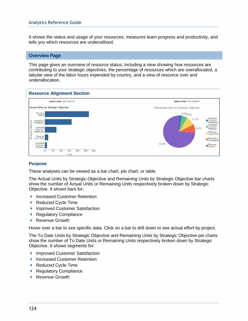
Analytics Reference Guide
124
It shows the status and usage of your resources, measures team progress and productivity, and tells you which resources are underutilized.
Overview Page
This page gives an overview of resource status, including a view showing how resources are contributing to your strategic objectives, the percentage of resources which are overallocated, a tabular view of the labor hours expended by country, and a view of resource over and underallocation.
Resource Alignment Section
Purpose
These analyses can be viewed as a bar chart, pie chart, or table.
The Actual Units by Strategic Objective and Remaining Units by Strategic Objective bar charts show the number of Actual Units or Remaining Units respectively broken down by Strategic Objective. It shows bars for:
Increased Customer Retention
Reduced Cycle Time
Improved Customer Satisfaction
Regulatory Compliance
Revenue Growth
Hover over a bar to see specific data. Click on a bar to drill down to see actual effort by project.
The To Date Units by Strategic Objective and Remaining Units by Strategic Objective pie charts show the number of To Date Units or Remaining Units respectively broken down by Strategic Objective. It shows segments for:
Improved Customer Satisfaction
Increased Customer Retention
Reduced Cycle Time
Regulatory Compliance
Revenue Growth

Sample Dashboards
125
Click on a segment to drill down to see actual effort by project.
The Actual Units and Remaining Units pivot tables show strategic objective and units for each project. The tables show columns for:
Strategic Objective Description
Project Name
Actual Units or Remaining Units
Year Name (Actual Units table only)
Use the up and down arrows below the table to navigate to other sections of the table. Use the double-ended arrow to view the whole table in one screen (to a maximum of 500 rows per page).
Location
1) On the Home page, click Dashboards.
2) Under Primavera, select Resource Analysis.
3) On the Resource Analysis dashboard, click the Overview page.
4) On the Overview page, expand the Resource Alignment section.
Subject Area
Resource Assignment
Resource Allocation Section
Purpose
The bar chart shows how resource usage is distributed over time.
The x-axis shows calendar dates. The y-axis shows Units of time.
The solid horizontal line represents the allocation Limit; the dotted horizontal line represents the overallocation Limit Plus 25%. The green area represents time overallocated by more than 25%; the brown area represents time overallocated by less than 25%; the blue area represents time that is not overallocated. Hover over a bar for specific details. Use the slide to view the allocation for resources in a given quarter.
The stacked bar chart shows the remaining and overallocated units for a resource.
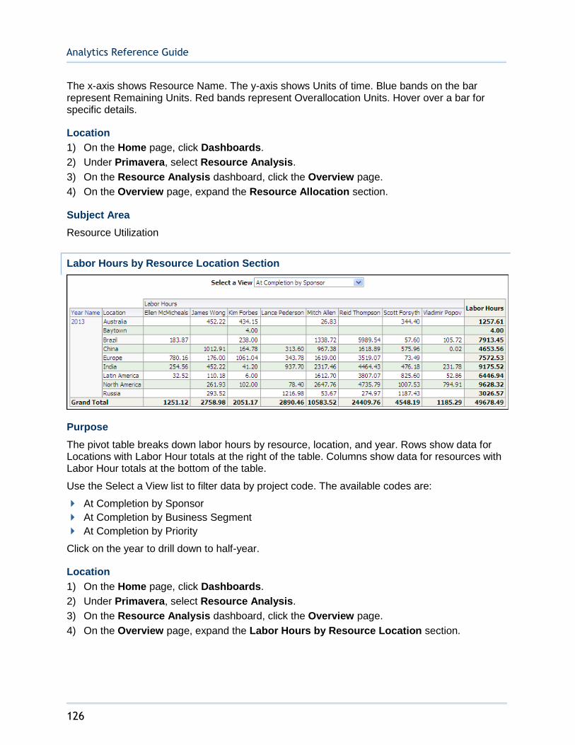
Analytics Reference Guide
126
The x-axis shows Resource Name. The y-axis shows Units of time. Blue bands on the bar represent Remaining Units. Red bands represent Overallocation Units. Hover over a bar for specific details.
Location
1) On the Home page, click Dashboards.
2) Under Primavera, select Resource Analysis.
3) On the Resource Analysis dashboard, click the Overview page.
4) On the Overview page, expand the Resource Allocation section.
Subject Area
Resource Utilization
Labor Hours by Resource Location Section
Purpose
The pivot table breaks down labor hours by resource, location, and year. Rows show data for Locations with Labor Hour totals at the right of the table. Columns show data for resources with Labor Hour totals at the bottom of the table.
Use the Select a View list to filter data by project code. The available codes are:
At Completion by Sponsor
At Completion by Business Segment
At Completion by Priority
Click on the year to drill down to half-year.
Location
1) On the Home page, click Dashboards.
2) Under Primavera, select Resource Analysis.
3) On the Resource Analysis dashboard, click the Overview page.
4) On the Overview page, expand the Labor Hours by Resource Location section.
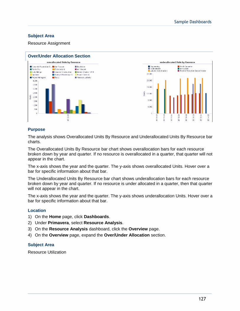
Sample Dashboards
127
Subject Area
Resource Assignment
Over/Under Allocation Section
Purpose
The analysis shows Overallocated Units By Resource and Underallocated Units By Resource bar charts.
The Overallocated Units By Resource bar chart shows overallocation bars for each resource broken down by year and quarter. If no resource is overallocated in a quarter, that quarter will not appear in the chart.
The x-axis shows the year and the quarter. The y-axis shows overallocated Units. Hover over a bar for specific information about that bar.
The Underallocated Units By Resource bar chart shows underallocation bars for each resource broken down by year and quarter. If no resource is under allocated in a quarter, then that quarter will not appear in the chart.
The x-axis shows the year and the quarter. The y-axis shows underallocation Units. Hover over a bar for specific information about that bar.
Location
1) On the Home page, click Dashboards.
2) Under Primavera, select Resource Analysis.
3) On the Resource Analysis dashboard, click the Overview page.
4) On the Overview page, expand the Over/Under Allocation section.
Subject Area
Resource Utilization

Analytics Reference Guide
128
Staffing Page
This page shows staffing activity, allocated and remaining resources remaining, hours allotted by role, and total hours by an entire team.
Staffing Section
Purpose
The pivot table breaks down unit data by project and date. There are rows for:
Staffed
Unstaffed
Total FTE (calculated as Staffed plus Unstaffed)
Click on a project name for links to WBS Earned Value and Activity Worksheet. Click on a year-quarter label to drill down to monthly data. Use the up and down arrows below the table to navigate to other sections of the table. Use the double-ended arrow to view the whole table in one screen (to a maximum of 500 rows per page).
Location
1) On the Home page, click Dashboards.
2) Under Primavera, select Resource Analysis.
3) On the Resource Analysis dashboard, click the Staffing page.
4) On the Staffing page, expand the Staffing section.
Subject Area
Resource Assignment

Sample Dashboards
129
Allocation by Code Section
Purpose
The stacked bar chart shows a stacked bar for each resource code showing Allocated Units and Overallocated units. Use the View by list to select a resource code. The available codes are:
Classification
Location
Plant
Department
The x-axis shows the resource code selected in the View by list. The y-axis shows allocation Units. Hover over a bar to show specific data.
The table breaks down unit data based on the resource code selected in the View by list.
The table contains columns for:
Remaining Units
Overallocated
Allocated
Table rows are determined by the View by list selection.
Location
1) On the Home page, click Dashboards.
2) Under Primavera, select Resource Analysis.
3) On the Resource Analysis dashboard, click the Staffing page.
4) On the Staffing page, expand the Allocation by Code section.
Subject Area
Resource Utilization
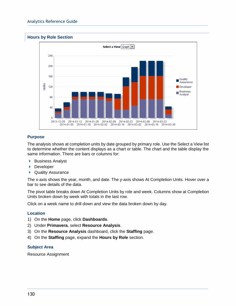
Analytics Reference Guide
130
Hours by Role Section
Purpose
The analysis shows at completion units by date grouped by primary role. Use the Select a View list to determine whether the content displays as a chart or table. The chart and the table display the same information. There are bars or columns for:
Business Analyst
Developer
Quality Assurance
The x-axis shows the year, month, and date. The y-axis shows At Completion Units. Hover over a bar to see details of the data.
The pivot table breaks down At Completion Units by role and week. Columns show at Completion Units broken down by week with totals in the last row.
Click on a week name to drill down and view the data broken down by day.
Location
1) On the Home page, click Dashboards.
2) Under Primavera, select Resource Analysis.
3) On the Resource Analysis dashboard, click the Staffing page.
4) On the Staffing page, expand the Hours by Role section.
Subject Area
Resource Assignment
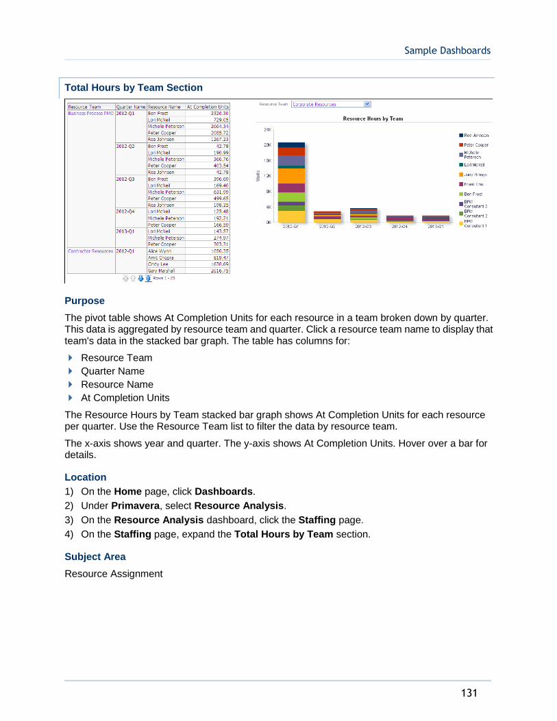
Sample Dashboards
131
Total Hours by Team Section
Purpose
The pivot table shows At Completion Units for each resource in a team broken down by quarter. This data is aggregated by resource team and quarter. Click a resource team name to display that team's data in the stacked bar graph. The table has columns for:
Resource Team
Quarter Name
Resource Name
At Completion Units
The Resource Hours by Team stacked bar graph shows At Completion Units for each resource per quarter. Use the Resource Team list to filter the data by resource team.
The x-axis shows year and quarter. The y-axis shows At Completion Units. Hover over a bar for details.
Location
1) On the Home page, click Dashboards.
2) Under Primavera, select Resource Analysis.
3) On the Resource Analysis dashboard, click the Staffing page.
4) On the Staffing page, expand the Total Hours by Team section.
Subject Area
Resource Assignment

Analytics Reference Guide
132
Hierarchies Section
Purpose
The Resource pivot table and bar chart show units broken down by resource. Both the table and the bar chart display the same information. Hierarchy selections in the Resource table will impact the bar chart. There are columns/bars for:
Remaining Units
Planned Units
Actual Units
In the bar chart, the x-axis shows Resource. The y-axis shows Units. Hover over a bar for details.
The Role pivot table and bar chart show units broken down by role. Both the table and the bar chart display the same information. Hierarchy selections in the Role table will impact the bar chart. There are columns/bars for:
Remaining Units
Planned Units
Actual Units
In the bar chart, the x-axis shows Role. The y-axis shows Units. Hover over a bar for details.
Location
1) On the Home page, click Dashboards.

Sample Dashboards
133
2) Under Primavera, select Resource Analysis.
3) On the Resource Analysis dashboard, click the Staffing page.
4) On the Staffing page, expand the Hierarchies section.
Subject Area
Resource Assignment
Productivity Page
This page shows team progress, resource productivity, and periodic versus cumulative hours.
Resource Utilization by Team Section
Purpose
The bar chart shows the utilization rate percentage for each team. Resource utilization is a measure of a resource's allocated units against the resource limit. The values for each team are an aggregation of values for individual resources (rather than being calculated at team level). When a resource's utilization is more than 100%, the resource is overallocated.
The x-axis shows the Utilization Rate Percentage. The y-axis shows the Resource Team Name.

Analytics Reference Guide
134
Location
1) On the Home page, click Dashboards.
2) Under Primavera, select Resource Analysis.
3) On the Resource Analysis dashboard, click the Productivity page.
4) On the Productivity page, expand the Resource Utilization by Team section.
Subject Area
Resource Utilization
Poorly Performing Resources Section
Purpose
The line-bar chart displays poorly performing resources broken down by resource ID, number of activities, and late percentage.
The x-axis shows the resource ID. The y-axis for the bars, on the left, shows the number of total and late activities. The y-axis for the lines, on the right, shows late percentage. Hover over and click a bar or a point on a line to drill-down for detailed information.
Location
1) On the Home page, click Dashboards.
2) Under Primavera, select Resource Analysis.
3) On the Resource Analysis dashboard, click the Productivity page.
4) On the Productivity page, expand the Poorly Performing Resources section.
Subject Area
Activity

Sample Dashboards
135
Periodic and Cumulative Labor Units by Month Section
Purpose
The analysis shows labor units and cumulative labor units broken down by date. Use the Select a View list to determine whether the content displays as a chart or table. The chart and the table display the same information.
The line-bar chart shows:
Bars for Baseline Project Labor Units, At Completion Labor Units, and Actual Labor Units Cumulative
Lines for Actual Labor Units, Baseline Project Labor Units Cumulative, and Forecast Labor Units Cumulative
The x-axis shows the year and month. The y-axis for the bars, on the left, shows labor Units. The y-axis for the lines, on the right, shows labor Units (Cumulative). Hover over a bar or a point on a line to see detailed information.
The pivot table breaks data down by month and resource. The data is ordered by month. The pivot table contains columns for:
Month Name
Resource Name
Baseline Project Labor Units
Actual Labor Units
At Completion Labor Units
Baseline Project Labor Units Cumulative
Actual Labor Units Cumulative
Forecast Labor Units Cumulative
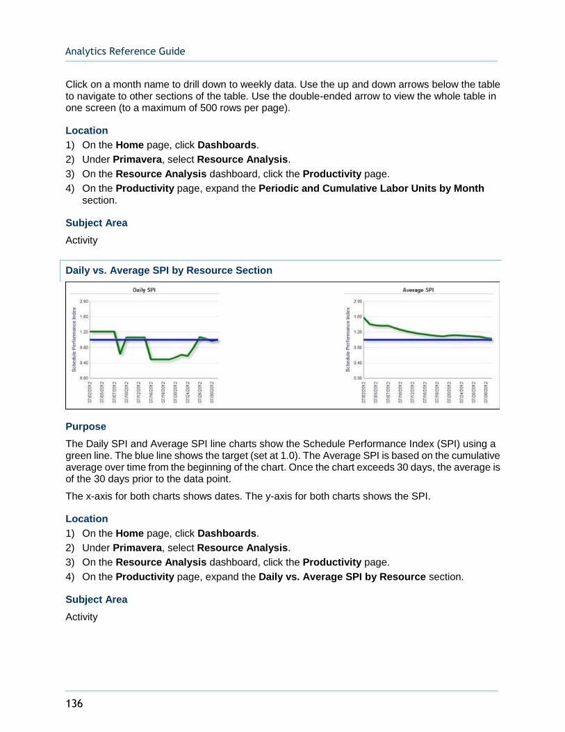
Analytics Reference Guide
136
Click on a month name to drill down to weekly data. Use the up and down arrows below the table to navigate to other sections of the table. Use the double-ended arrow to view the whole table in one screen (to a maximum of 500 rows per page).
Location
1) On the Home page, click Dashboards.
2) Under Primavera, select Resource Analysis.
3) On the Resource Analysis dashboard, click the Productivity page.
4) On the Productivity page, expand the Periodic and Cumulative Labor Units by Month section.
Subject Area
Activity
Daily vs. Average SPI by Resource Section
Purpose
The Daily SPI and Average SPI line charts show the Schedule Performance Index (SPI) using a green line. The blue line shows the target (set at 1.0). The Average SPI is based on the cumulative average over time from the beginning of the chart. Once the chart exceeds 30 days, the average is of the 30 days prior to the data point.
The x-axis for both charts shows dates. The y-axis for both charts shows the SPI.
Location
1) On the Home page, click Dashboards.
2) Under Primavera, select Resource Analysis.
3) On the Resource Analysis dashboard, click the Productivity page.
4) On the Productivity page, expand the Daily vs. Average SPI by Resource section.
Subject Area
Activity
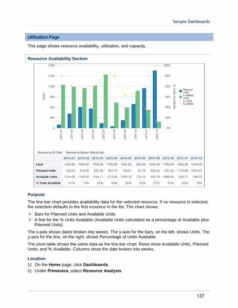
Sample Dashboards
137
Utilization Page
This page shows resource availability, utilization, and capacity.
Resource Availability Section
Purpose
The line-bar chart provides availability data for the selected resource. If no resource is selected, the selection defaults to the first resource in the list. The chart shows:
Bars for Planned Units and Available Units
A line for the % Units Available (Available Units calculated as a percentage of Available plus Planned Units)
The x-axis shows dates broken into weeks. The y-axis for the bars, on the left, shows Units. The y-axis for the line, on the right, shows Percentage of Units Available.
The pivot table shows the same data as the line-bar chart. Rows show Available Units, Planned Units, and % Available. Columns show the date broken into weeks.
Location
1) On the Home page, click Dashboards.
2) Under Primavera, select Resource Analysis.

Analytics Reference Guide
138
3) On the Resource Analysis dashboard, click the Utilization page.
4) On the Utilization page, expand the Resource Availability section.
Subject Area
Resource Utilization
Utilization Section
Purpose
The line-bar chart breaks data down for the selected resource by week. If no resource is selected, the selection defaults to the first resource in the list. The line-bar chart shows:
Bars for Limit, Planned Units, and Actual Units
Lines for Planned % Utilization and Actual % Utilization
The x-axis shows dates broken into weeks. The y-axis for the bars, on the left, shows Units. The y-axis for the lines, on the right, shows Percent Utilization. Hover over a bar or a point on a line to see details.
The table breaks down the selected resource's data by week, showing columns for:
Week Name
Resource Name
Limit
Planned Units
Planned % Utilization
Actual Units
Actual % Utilization
Click a week name to drill down to resource analysis information for that week.
Location
1) On the Home page, click Dashboards.
2) Under Primavera, select Resource Analysis.
3) On the Resource Analysis dashboard, click the Utilization page.
4) On the Utilization page, expand the Utilization section.
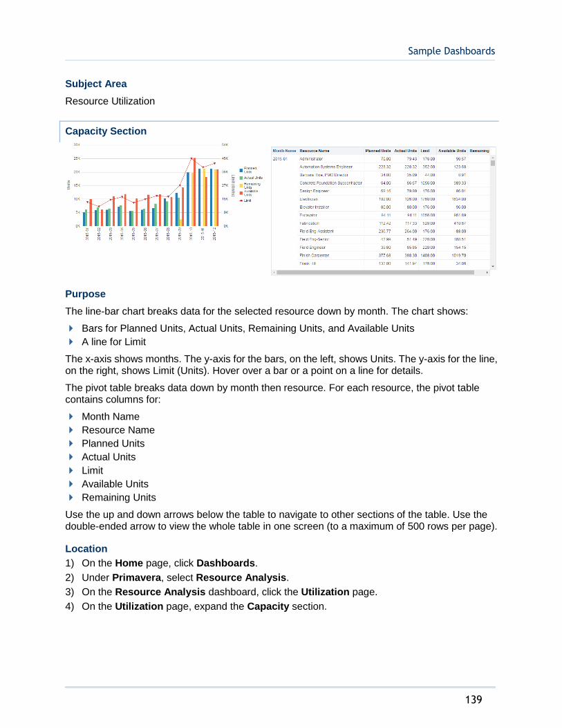
Sample Dashboards
139
Subject Area
Resource Utilization
Capacity Section
Purpose
The line-bar chart breaks data for the selected resource down by month. The chart shows:
Bars for Planned Units, Actual Units, Remaining Units, and Available Units
A line for Limit
The x-axis shows months. The y-axis for the bars, on the left, shows Units. The y-axis for the line, on the right, shows Limit (Units). Hover over a bar or a point on a line for details.
The pivot table breaks data down by month then resource. For each resource, the pivot table contains columns for:
Month Name
Resource Name
Planned Units
Actual Units
Limit
Available Units
Remaining Units
Use the up and down arrows below the table to navigate to other sections of the table. Use the double-ended arrow to view the whole table in one screen (to a maximum of 500 rows per page).
Location
1) On the Home page, click Dashboards.
2) Under Primavera, select Resource Analysis.
3) On the Resource Analysis dashboard, click the Utilization page.
4) On the Utilization page, expand the Capacity section.

Analytics Reference Guide
140
Subject Area
Resource Assignment
Location Page
This page shows location information for resources.
Resource Location by Role Section
Purpose
The map shows resource locations broken down by roles. Locations are marked by gold bubbles. Hover over a gold bubble to see specific information about the resource related to the location.
Location
1) On the Home page, click Dashboards.
2) Under Primavera, select Resource Analysis.
3) On the Resource Analysis dashboard, click the Location page.
4) On the Location page, expand the Resource Location by Role section.
Subject Area
Resource Assignment
Cost Summary Page
This page shows cost summary information for resources. The Cost Summary dashboard uses data from Primavera Unifier.
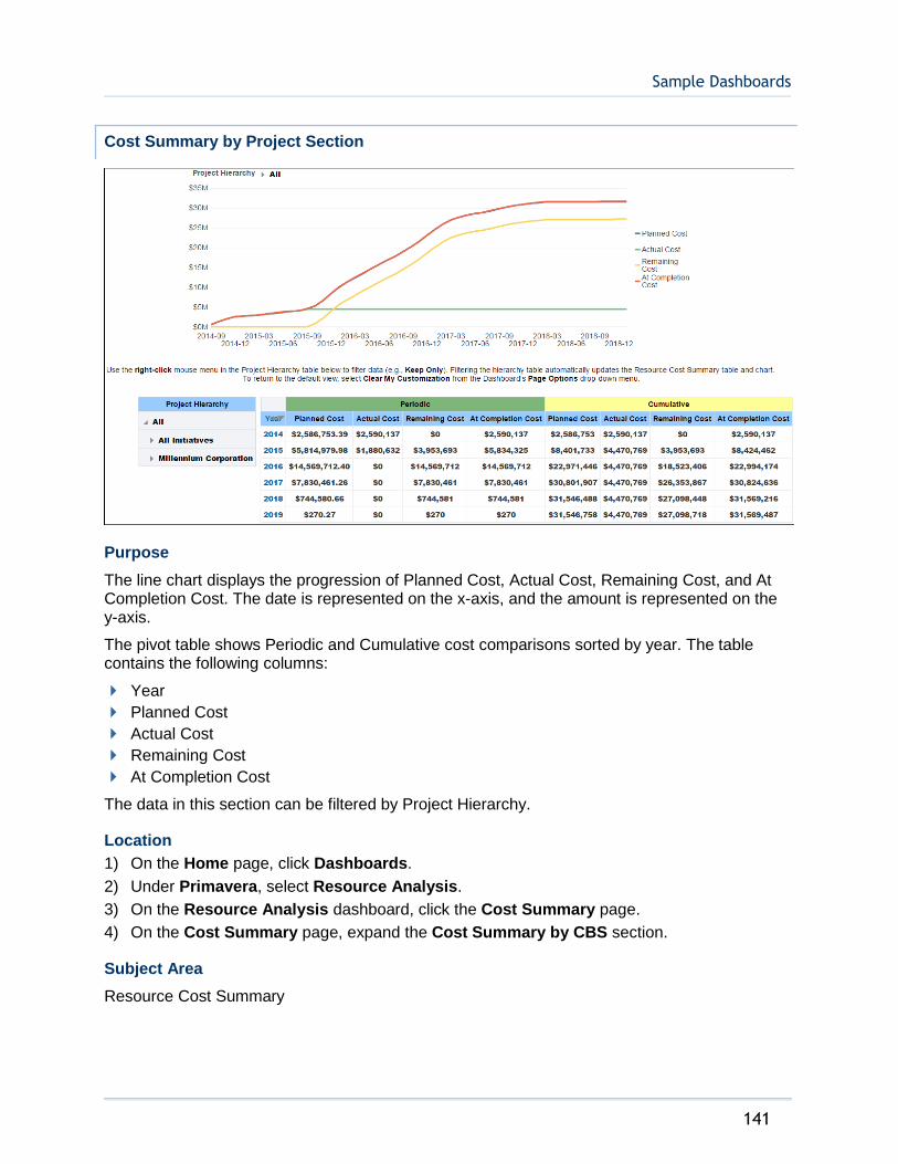
Sample Dashboards
141
Cost Summary by Project Section
Purpose
The line chart displays the progression of Planned Cost, Actual Cost, Remaining Cost, and At Completion Cost. The date is represented on the x-axis, and the amount is represented on the y-axis.
The pivot table shows Periodic and Cumulative cost comparisons sorted by year. The table contains the following columns:
Year
Planned Cost
Actual Cost
Remaining Cost
At Completion Cost
The data in this section can be filtered by Project Hierarchy.
Location
1) On the Home page, click Dashboards.
2) Under Primavera, select Resource Analysis.
3) On the Resource Analysis dashboard, click the Cost Summary page.
4) On the Cost Summary page, expand the Cost Summary by CBS section.
Subject Area
Resource Cost Summary
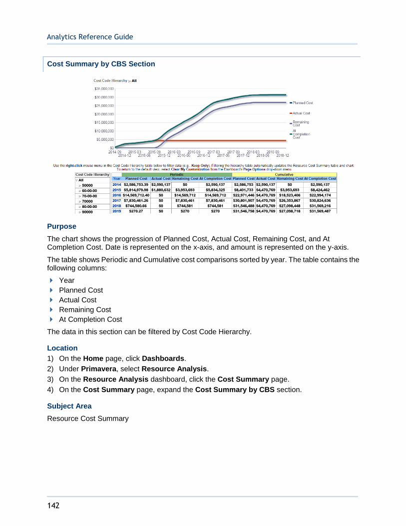
Analytics Reference Guide
142
Cost Summary by CBS Section
Purpose
The chart shows the progression of Planned Cost, Actual Cost, Remaining Cost, and At Completion Cost. Date is represented on the x-axis, and amount is represented on the y-axis.
The table shows Periodic and Cumulative cost comparisons sorted by year. The table contains the following columns:
Year
Planned Cost
Actual Cost
Remaining Cost
At Completion Cost
The data in this section can be filtered by Cost Code Hierarchy.
Location
1) On the Home page, click Dashboards.
2) Under Primavera, select Resource Analysis.
3) On the Resource Analysis dashboard, click the Cost Summary page.
4) On the Cost Summary page, expand the Cost Summary by CBS section.
Subject Area
Resource Cost Summary
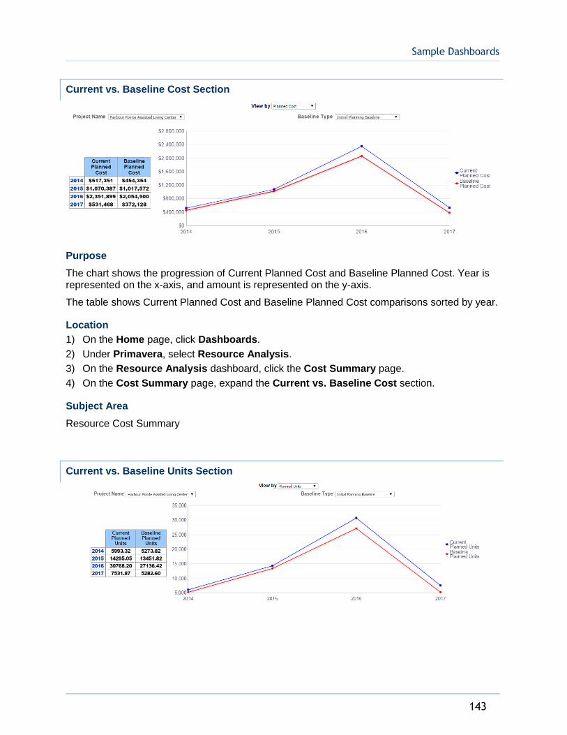
Sample Dashboards
143
Current vs. Baseline Cost Section
Purpose
The chart shows the progression of Current Planned Cost and Baseline Planned Cost. Year is represented on the x-axis, and amount is represented on the y-axis.
The table shows Current Planned Cost and Baseline Planned Cost comparisons sorted by year.
Location
1) On the Home page, click Dashboards.
2) Under Primavera, select Resource Analysis.
3) On the Resource Analysis dashboard, click the Cost Summary page.
4) On the Cost Summary page, expand the Current vs. Baseline Cost section.
Subject Area
Resource Cost Summary
Current vs. Baseline Units Section
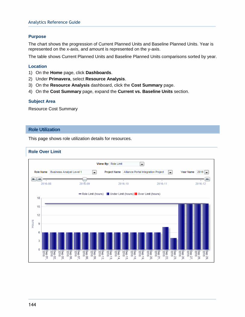
Analytics Reference Guide
144
Purpose
The chart shows the progression of Current Planned Units and Baseline Planned Units. Year is represented on the x-axis, and amount is represented on the y-axis.
The table shows Current Planned Units and Baseline Planned Units comparisons sorted by year.
Location
1) On the Home page, click Dashboards.
2) Under Primavera, select Resource Analysis.
3) On the Resource Analysis dashboard, click the Cost Summary page.
4) On the Cost Summary page, expand the Current vs. Baseline Units section.
Subject Area
Resource Cost Summary
Role Utilization
This page shows role utilization details for resources.
Role Over Limit

Sample Dashboards
145
Purpose
The bar chart shows role limit and primary resource limit details by day for the selected role and project. The x-axis shows the days of the selected month. The y-axis shows hours.
Location
1) On the Home page, click Dashboards.
2) Under Primavera, select Resource Analysis.
3) On the Resource Analysis dashboard, click the Role Utilization page.
4) On the Role Utilization page, expand the Role Over Limit section.
Subject Area
Role Utilization
Top 10 Roles Over Limit
Purpose
The bar chart shows the top ten roles over limit. The x-axis shows roles. The y-axis shows units.
Location
1) On the Home page, click Dashboards.
2) Under Primavera, select Resource Analysis.
3) On the Resource Analysis dashboard, click the Role Utilization page.
4) On the Role Utilization page, expand the Top 10 Roles Over Limit section.
Subject Area
Role Utilization

Analytics Reference Guide
146
Role Utilization Over Time
Purpose
The bar chart shows role utilization by month for the selected role. The x-axis shows the month. The y-axis shows hours.
Location
1) On the Home page, click Dashboards.
2) Under Primavera, select Resource Analysis.
3) On the Resource Analysis dashboard, click the Role Utilization page.
4) On the Role Utilization page, expand the Role Utilization Over Time section.
Subject Area
Role Utilization

Sample Dashboards
147
Role Limit by Project
Purpose
The pivot table shows role limit details by project and by role. It contains columns for:
Project Name
Role Name
Limit (hours)
Planned Units (hours)
Remaining Units (hours)
Location
1) On the Home page, click Dashboards.
2) Under Primavera, select Resource Analysis.
3) On the Resource Analysis dashboard, click the Role Utilization page.
4) On the Role Utilization page, expand the Role Limit by Project section.
Subject Area
Role Utilization

Analytics Reference Guide
148
Role Under Limit
Purpose
The table shows role limit detail for roles under limit for the selected week. It contains columns for:
Role ID
Role Name
Limit (hours)
Planned Units (hours)
Under Limit (hours)
Location
1) On the Home page, click Dashboards.
2) Under Primavera, select Resource Analysis.
3) On the Resource Analysis dashboard, click the Role Utilization page.
4) On the Role Utilization page, expand the Role Under Limit section.
Subject Area
Role Utilization

Sample Dashboards
149
Industry Samples Dashboard
The Industry Samples dashboard uses data from P6 EPPM.
It shows daily burn down, performance, work planning, and schedule adherence for industry related activities.
Shutdown/Turnaround/Outage Page
This page shows an overview of daily burn downs, schedule compliance, and other performance metrics.
Burn Down Hours Section
Purpose
The line-bar chart shows burn down hours broken down by date. Use the View list to determine how the information is displayed. The available views are:
All: This displays totals for the project.
Resource Slider: This filters the chart by resource. The chart will update as the slider is moved.
The line-bar chart shows:
Bars for Original Remaining and Emergent Remaining hours for each day
Lines for the Total Man Hours, Baseline Work Down, and Current Work Down hours for each day
The x-axis shows the date. The y-axis shows hours.
Location
1) On the Home page, click Dashboards.
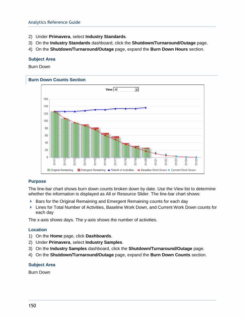
Analytics Reference Guide
150
2) Under Primavera, select Industry Standards.
3) On the Industry Standards dashboard, click the Shutdown/Turnaround/Outage page.
4) On the Shutdown/Turnaround/Outage page, expand the Burn Down Hours section.
Subject Area
Burn Down
Burn Down Counts Section
Purpose
The line-bar chart shows burn down counts broken down by date. Use the View list to determine whether the information is displayed as All or Resource Slider. The line-bar chart shows:
Bars for the Original Remaining and Emergent Remaining counts for each day
Lines for Total Number of Activities, Baseline Work Down, and Current Work Down counts for each day
The x-axis shows days. The y-axis shows the number of activities.
Location
1) On the Home page, click Dashboards.
2) Under Primavera, select Industry Samples.
3) On the Industry Samples dashboard, click the Shutdown/Turnaround/Outage page.
4) On the Shutdown/Turnaround/Outage page, expand the Burn Down Counts section.
Subject Area
Burn Down
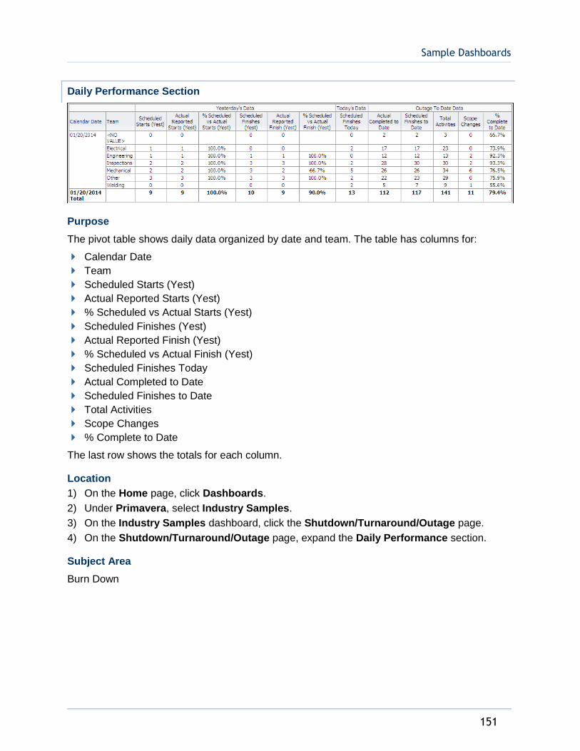
Sample Dashboards
151
Daily Performance Section
Purpose
The pivot table shows daily data organized by date and team. The table has columns for:
Calendar Date
Team
Scheduled Starts (Yest)
Actual Reported Starts (Yest)
% Scheduled vs Actual Starts (Yest)
Scheduled Finishes (Yest)
Actual Reported Finish (Yest)
% Scheduled vs Actual Finish (Yest)
Scheduled Finishes Today
Actual Completed to Date
Scheduled Finishes to Date
Total Activities
Scope Changes
% Complete to Date
The last row shows the totals for each column.
Location
1) On the Home page, click Dashboards.
2) Under Primavera, select Industry Samples.
3) On the Industry Samples dashboard, click the Shutdown/Turnaround/Outage page.
4) On the Shutdown/Turnaround/Outage page, expand the Daily Performance section.
Subject Area
Burn Down
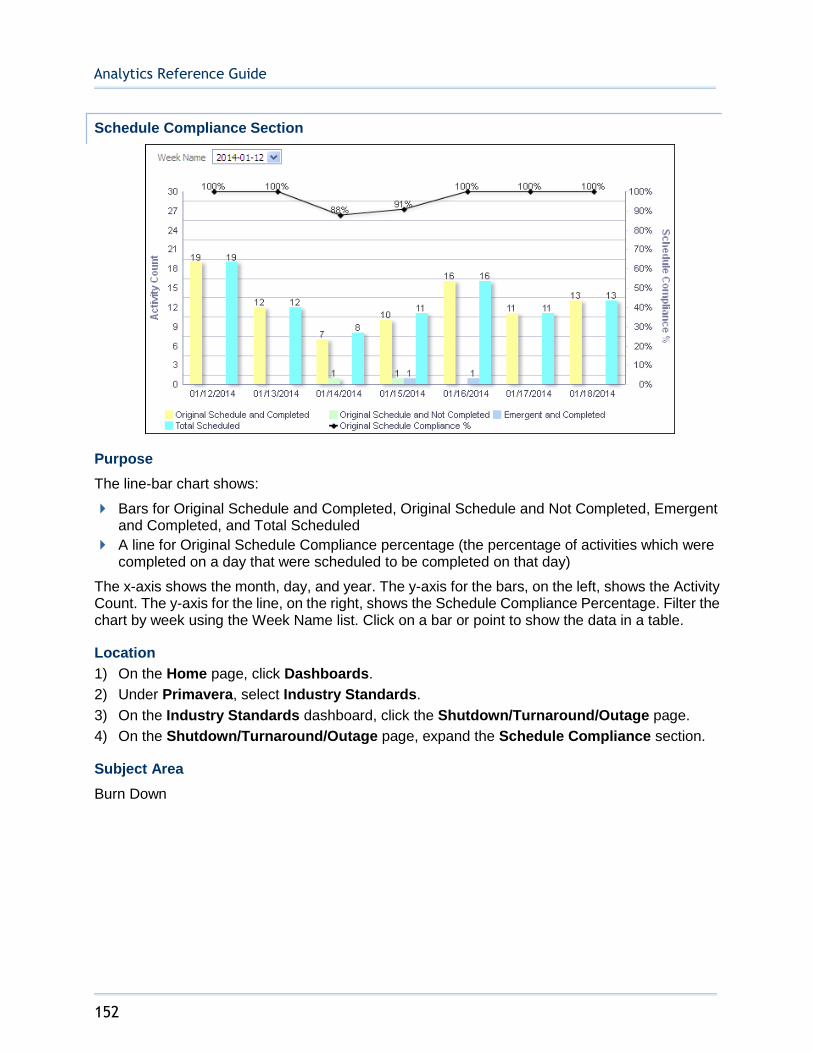
Analytics Reference Guide
152
Schedule Compliance Section
Purpose
The line-bar chart shows:
Bars for Original Schedule and Completed, Original Schedule and Not Completed, Emergent and Completed, and Total Scheduled
A line for Original Schedule Compliance percentage (the percentage of activities which were completed on a day that were scheduled to be completed on that day)
The x-axis shows the month, day, and year. The y-axis for the bars, on the left, shows the Activity Count. The y-axis for the line, on the right, shows the Schedule Compliance Percentage. Filter the chart by week using the Week Name list. Click on a bar or point to show the data in a table.
Location
1) On the Home page, click Dashboards.
2) Under Primavera, select Industry Standards.
3) On the Industry Standards dashboard, click the Shutdown/Turnaround/Outage page.
4) On the Shutdown/Turnaround/Outage page, expand the Schedule Compliance section.
Subject Area
Burn Down

Sample Dashboards
153
Average vs. Baseline (Hours) Section
Purpose
The analysis shows a Baseline, Actuals line chart and a Baseline Average, Actual Average, Baseline Daily, Actual Daily line-bar chart.
The Baseline, Actuals line chart shows lines for Baseline hours and Actuals hours for each day.
The x-axis shows dates. The y-axis shows hours.
The Baseline Average, Actual Average, Baseline Daily, Actual Daily line-bar chart shows:
Bars for Baseline Daily hours and Actual Daily hours
Lines for Baseline Average hours and Actual Average hours
The x-axis shows dates. The y-axis shows hours.
Location
1) On the Home page, click Dashboards.
2) Under Primavera, select Industry Standards.
3) On the Industry Standards dashboard, click the Shutdown/Turnaround/Outage page.
4) On the Shutdown/Turnaround/Outage page, expand the Average vs. Baseline (Hours) section.
Subject Area
Burn Down

Analytics Reference Guide
154
Daily Performance Index (Hours) Section
Purpose
The analysis shows Baseline, Daily Actuals and Baseline, Daily Actuals (AVG) line charts.
The Baseline, Daily Actuals line chart shows lines for:
Baseline (a constant, set to 1)
Daily Actuals (calculated as Actual Labor Units divided by Planned Labor Units)
The x-axis shows dates. The y-axis shows Performance Index (calculated as Actual Labor Units divided by Planned Labor Units).
The Baseline, Daily Actuals (AVG) line chart shows lines for:
Baseline (a constant, set to 1)
Daily Actuals (calculated as a 365 day average of Actual Labor Units divided by Planned Labor Units)
The x-axis shows dates. The y-axis shows Performance Index (calculated as Actual Labor Units divided by Planned Labor Units).
Location
1) On the Home page, click Dashboards.
2) Under Primavera, select Industry Standards.
3) On the Industry Standards dashboard, click the Shutdown/Turnaround/Outage page.
4) On the Shutdown/Turnaround/Outage page, expand the Daily Performance Index (Hours) section.
Subject Area
Activity
Routine/On-Line Maintenance Page
This page shows work planning and schedule adherence.
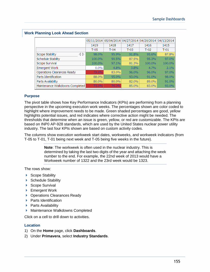
Sample Dashboards
155
Work Planning Look Ahead Section
Purpose
The pivot table shows how Key Performance Indicators (KPIs) are performing from a planning perspective in the upcoming execution work weeks. The percentages shown are color coded to highlight where improvement needs to be made. Green shaded percentages are good, yellow highlights potential issues, and red indicates where corrective action might be needed. The thresholds that determine when an issue is green, yellow, or red are customizable. The KPIs are based on INP0 AP-928 standards, which are used by the United States nuclear power utility industry. The last four KPIs shown are based on custom activity codes.
The columns show execution workweek start dates, workweeks, and workweek indicators (from T-05 to T-01, T-01 being next week and T-05 being five weeks in the future).
Note: The workweek is often used in the nuclear industry. This is determined by taking the last two digits of the year and attaching the week number to the end. For example, the 22nd week of 2013 would have a Workweek number of 1322 and the 23rd week would be 1323.
The rows show:
Scope Stability
Schedule Stability
Scope Survival
Emergent Work
Operations Clearances Ready
Parts Identification
Parts Availability
Maintenance Walkdowns Completed
Click on a cell to drill down to activities.
Location
1) On the Home page, click Dashboards.
2) Under Primavera, select Industry Standards.

Analytics Reference Guide
156
3) On the Industry Standards dashboard, click the Routine/On-Line Maintenance page.
4) On the Routine/On-Line Maintenance page, expand the Work Planning Look Ahead section.
Subject Area
Work Planning
Work Planning T+1 Critique Section
Purpose
The pivot table shows a historical perspective of a particular execution work week, shown in the table as T-00. The table allows you to see how specific Key Performance Indicators (KPIs) performed week after week. The table shows the percentages for T-10 through T-00, T-10 being 10 weeks before the execution work week.
Cells are color coded per KPI to show whether the values represent good performance or indicate that corrective work should considered or is urgently required.
The columns show execution workweek indicators (from T-10 to T-00) and workweeks.
Note: The workweek is often used in the nuclear industry. This is determined by taking the last two digits of the year and attaching the week number to the end. For example, the 22nd week of 2013 would have a Workweek number of 1322 and the 23rd week would be 1323.
The rows show:
Scope Stability
Scope Survival
Schedule Stability
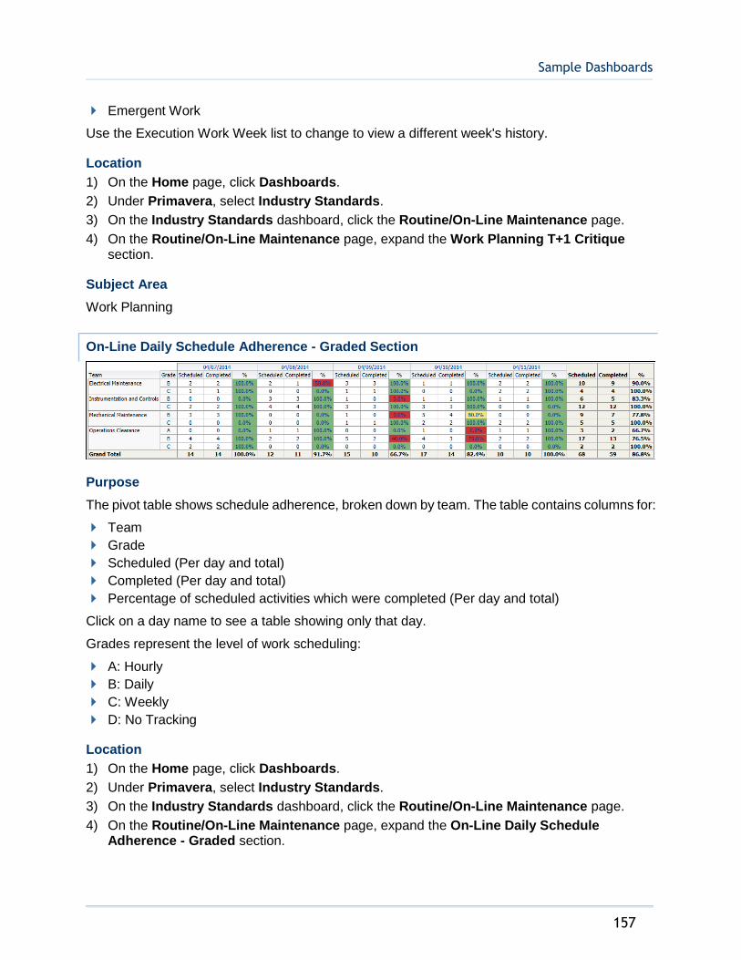
Sample Dashboards
157
Emergent Work
Use the Execution Work Week list to change to view a different week's history.
Location
1) On the Home page, click Dashboards.
2) Under Primavera, select Industry Standards.
3) On the Industry Standards dashboard, click the Routine/On-Line Maintenance page.
4) On the Routine/On-Line Maintenance page, expand the Work Planning T+1 Critique section.
Subject Area
Work Planning
On-Line Daily Schedule Adherence - Graded Section
Purpose
The pivot table shows schedule adherence, broken down by team. The table contains columns for:
Team
Grade
Scheduled (Per day and total)
Completed (Per day and total)
Percentage of scheduled activities which were completed (Per day and total)
Click on a day name to see a table showing only that day.
Grades represent the level of work scheduling:
A: Hourly
B: Daily
C: Weekly
D: No Tracking
Location
1) On the Home page, click Dashboards.
2) Under Primavera, select Industry Standards.
3) On the Industry Standards dashboard, click the Routine/On-Line Maintenance page.
4) On the Routine/On-Line Maintenance page, expand the On-Line Daily Schedule Adherence - Graded section.

Analytics Reference Guide
158
Subject Area
Burn Down
On-Line Daily Schedule Adherence - Standard Section
Purpose
The pivot table shows schedule adherence, broken down by team. The table contains columns for:
Team
Scheduled (Per day and total)
Completed (Per day and total)
Percentage of scheduled activities which were completed (Per day and total)
Click on a week name to see a table showing only that week.
Location
1) On the Home page, click Dashboards.
2) Under Primavera, select Industry Standards.
3) On the Industry Standards dashboard, click the Routine/On-Line Maintenance page.
4) On the Routine/On-Line Maintenance page, expand the On-Line Daily Schedule Adherence - Standard section.
Subject Area
Burn Down
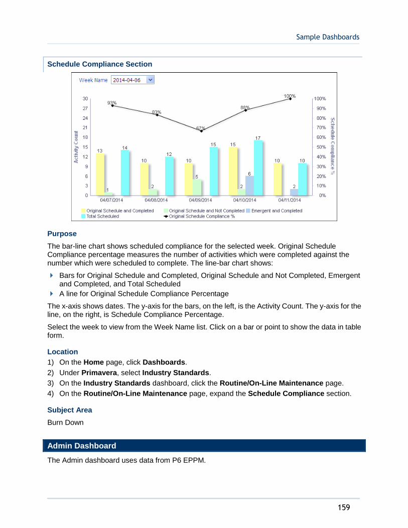
Sample Dashboards
159
Schedule Compliance Section
Purpose
The bar-line chart shows scheduled compliance for the selected week. Original Schedule Compliance percentage measures the number of activities which were completed against the number which were scheduled to complete. The line-bar chart shows:
Bars for Original Schedule and Completed, Original Schedule and Not Completed, Emergent and Completed, and Total Scheduled
A line for Original Schedule Compliance Percentage
The x-axis shows dates. The y-axis for the bars, on the left, is the Activity Count. The y-axis for the line, on the right, is Schedule Compliance Percentage.
Select the week to view from the Week Name list. Click on a bar or point to show the data in table form.
Location
1) On the Home page, click Dashboards.
2) Under Primavera, select Industry Standards.
3) On the Industry Standards dashboard, click the Routine/On-Line Maintenance page.
4) On the Routine/On-Line Maintenance page, expand the Schedule Compliance section.
Subject Area
Burn Down
Admin Dashboard
The Admin dashboard uses data from P6 EPPM.

Analytics Reference Guide
160
It offers a view into the Administration of your data source. On this dashboard, you can see information about the ETL (Extract Transform and Load) process and see a list of projects in the data source.
Admin Page
This page shows information about the ETL process for the data source and a list of projects.
ETL Summary by Datasource Section
Purpose
The table shows information on the last ETL run and ETL history for each data source. The table contains columns for:
Data source Id
Process Id
ETL Start
ETL Finish
ETL Run Time
Total Runs
Avg ETL Run Time
Min ETL Run Time
Max ETL Run Time
Location
1) On the Home page, click Dashboards.
2) Under Primavera, select Admin.
3) On the Admin dashboard, click the Admin page.
4) On the Admin page, expand the ETL Summary section.
Subject Area
None
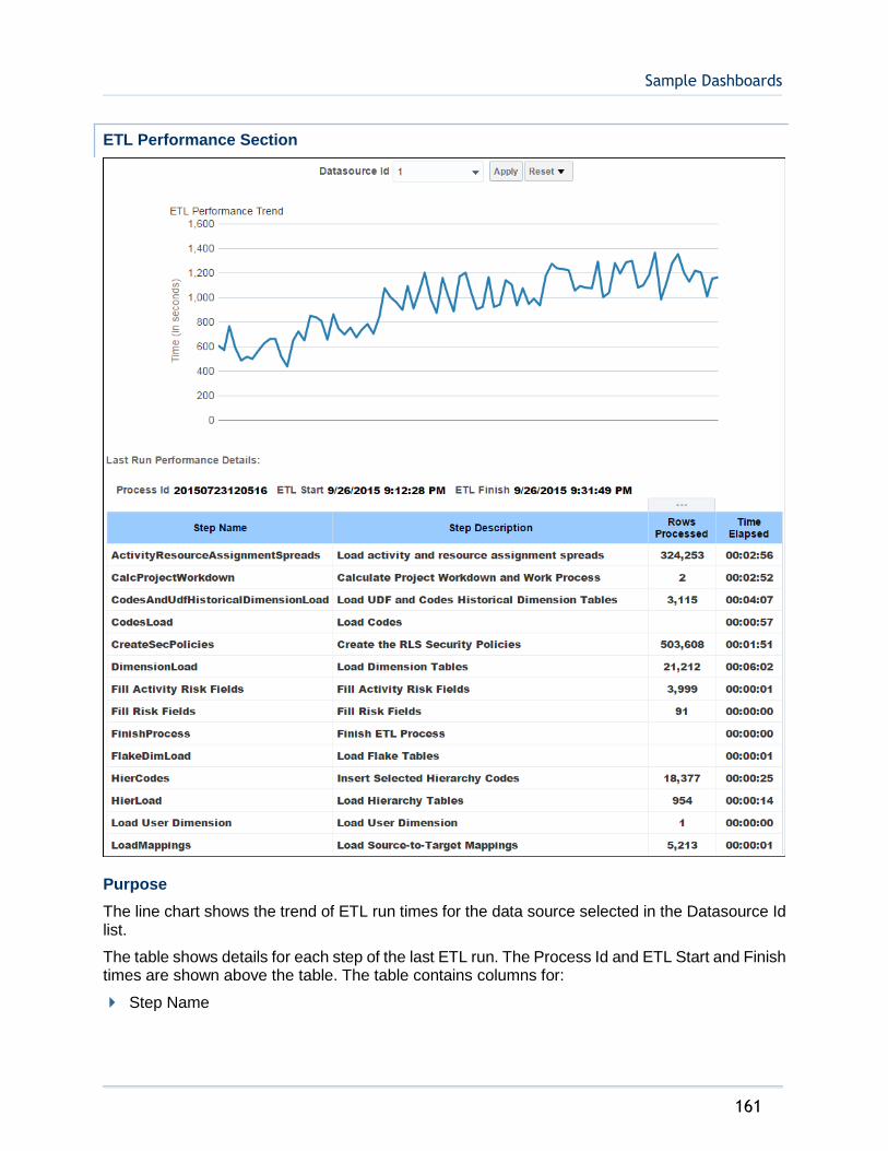
Sample Dashboards
161
ETL Performance Section
Purpose
The line chart shows the trend of ETL run times for the data source selected in the Datasource Id list.
The table shows details for each step of the last ETL run. The Process Id and ETL Start and Finish times are shown above the table. The table contains columns for:
Step Name

Analytics Reference Guide
162
Step Description
Rows Processed
Time Elapsed
Location
1) On the Home page, click Dashboards.
2) Under Primavera, select Admin.
3) On the Admin dashboard, click the Admin page.
4) On the Admin page, expand the ETL Performance section.
Subject Area
None
Project List Section
Purpose
The table shows a list of the projects for the data source selected in the ETL Performance section Datasource Id list. The table contains columns for:
Project Id
Project Name
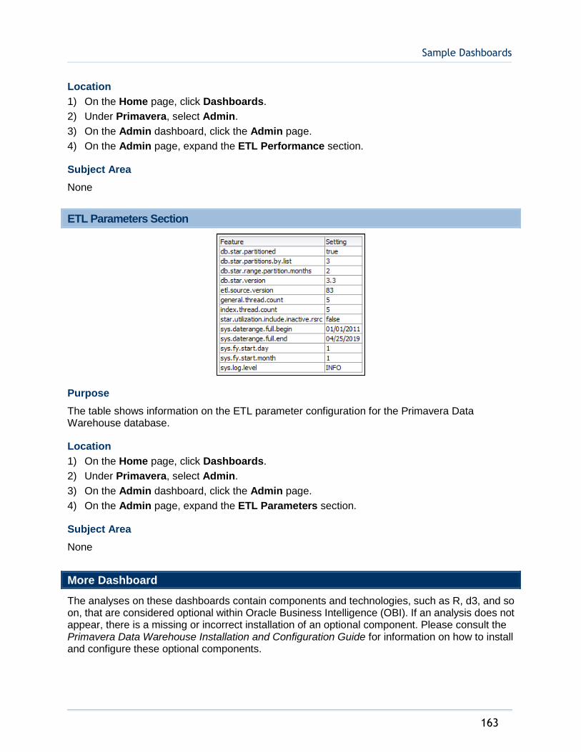
Sample Dashboards
163
Location
1) On the Home page, click Dashboards.
2) Under Primavera, select Admin.
3) On the Admin dashboard, click the Admin page.
4) On the Admin page, expand the ETL Performance section.
Subject Area
None
ETL Parameters Section
Purpose
The table shows information on the ETL parameter configuration for the Primavera Data Warehouse database.
Location
1) On the Home page, click Dashboards.
2) Under Primavera, select Admin.
3) On the Admin dashboard, click the Admin page.
4) On the Admin page, expand the ETL Parameters section.
Subject Area
None
More Dashboard
The analyses on these dashboards contain components and technologies, such as R, d3, and so on, that are considered optional within Oracle Business Intelligence (OBI). If an analysis does not appear, there is a missing or incorrect installation of an optional component. Please consult the Primavera Data Warehouse Installation and Configuration Guide for information on how to install and configure these optional components.
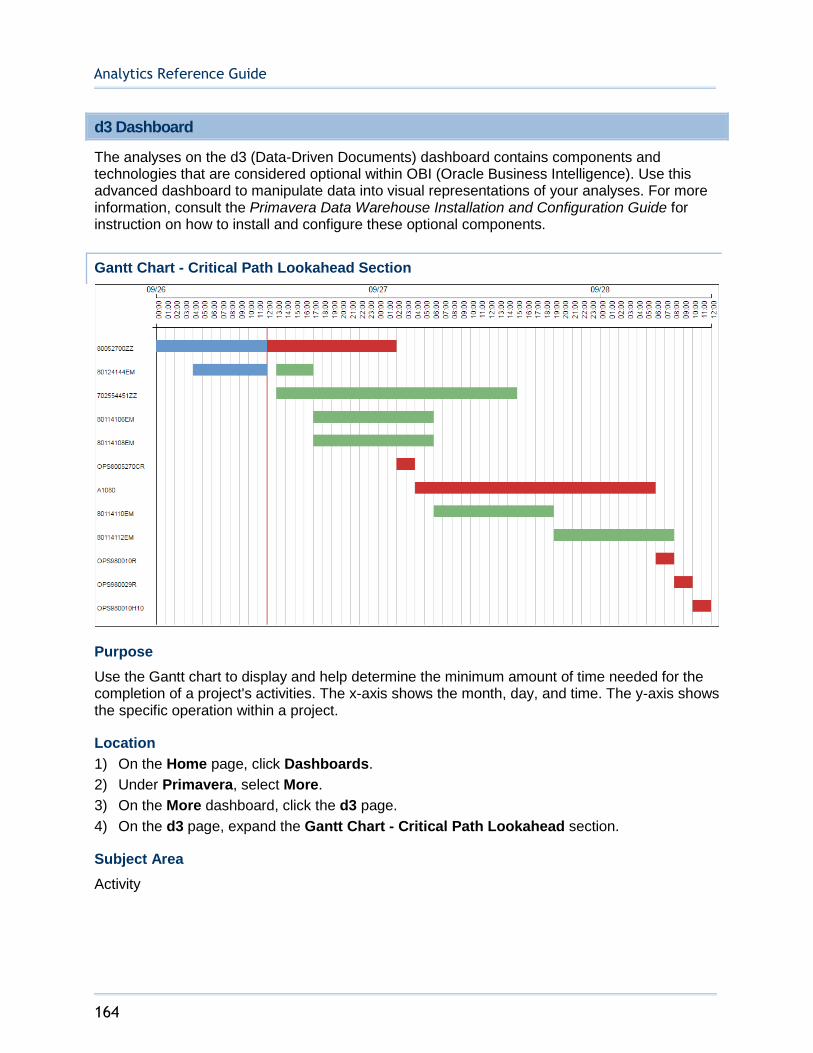
Analytics Reference Guide
164
d3 Dashboard
The analyses on the d3 (Data-Driven Documents) dashboard contains components and technologies that are considered optional within OBI (Oracle Business Intelligence). Use this advanced dashboard to manipulate data into visual representations of your analyses. For more information, consult the Primavera Data Warehouse Installation and Configuration Guide for instruction on how to install and configure these optional components.
Gantt Chart - Critical Path Lookahead Section
Purpose
Use the Gantt chart to display and help determine the minimum amount of time needed for the completion of a project's activities. The x-axis shows the month, day, and time. The y-axis shows the specific operation within a project.
Location
1) On the Home page, click Dashboards.
2) Under Primavera, select More.
3) On the More dashboard, click the d3 page.
4) On the d3 page, expand the Gantt Chart - Critical Path Lookahead section.
Subject Area
Activity
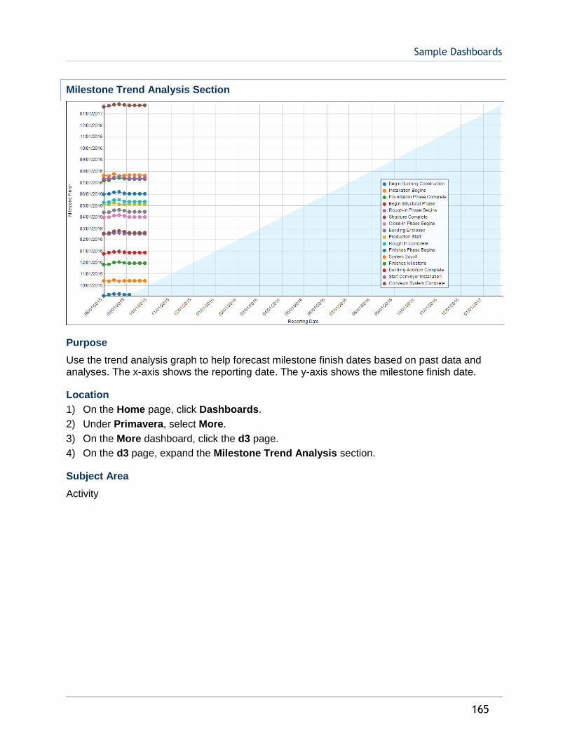
Sample Dashboards
165
Milestone Trend Analysis Section
Purpose
Use the trend analysis graph to help forecast milestone finish dates based on past data and analyses. The x-axis shows the reporting date. The y-axis shows the milestone finish date.
Location
1) On the Home page, click Dashboards.
2) Under Primavera, select More.
3) On the More dashboard, click the d3 page.
4) On the d3 page, expand the Milestone Trend Analysis section.
Subject Area
Activity
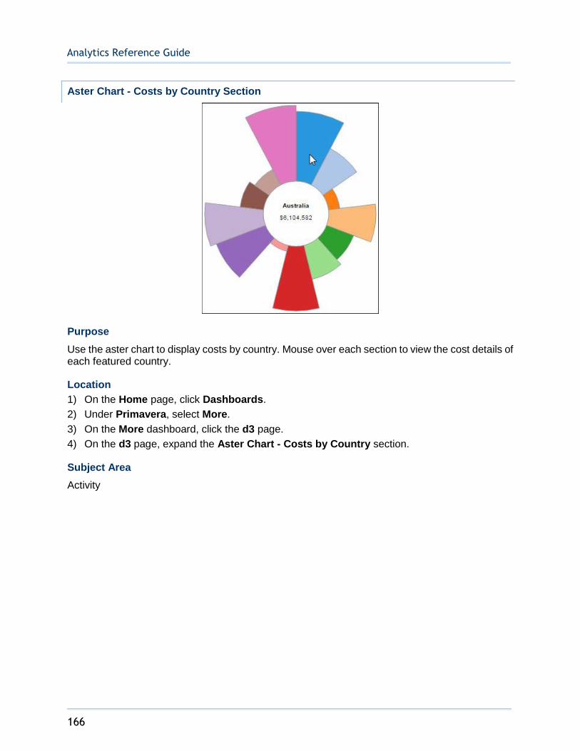
Analytics Reference Guide
166
Aster Chart - Costs by Country Section
Purpose
Use the aster chart to display costs by country. Mouse over each section to view the cost details of each featured country.
Location
1) On the Home page, click Dashboards.
2) Under Primavera, select More.
3) On the More dashboard, click the d3 page.
4) On the d3 page, expand the Aster Chart - Costs by Country section.
Subject Area
Activity

Sample Dashboards
167
Donut Chart - Risks by Project Owner Section
Purpose
Use the donut chart to display risks broken down by project owner. Mouse over each section to view details about the risk's project owner and risk exposure.
Location
1) On the Home page, click Dashboards.
2) Under Primavera, select More.
3) On the More dashboard, click the d3 page.
4) On the d3 page, expand the Donut Chart - Risks by Project Owner section.
Subject Area
Activity
Advanced Analytics Dashboard
The analyses on the Advanced Analytics dashboard contains components and technologies that are considered optional within OBI (Oracle Business Intelligence). Use this advanced dashboard to manipulate data into visual representations of your analyses. For more information, consult the Primavera Data Warehouse Installation and Configuration Guide for instruction on how to install and configure these optional components.

Analytics Reference Guide
168
Trendline Section
Purpose
Use the line graph to display trendline details. The x-axis shows the month name. The blue y-axis shows trend actual labor units, and the green y-axis shows actual labor units. Click a point on either line to drill-down for more information about a particular month.
Location
1) On the Home page, click Dashboards.
2) Under Primavera, select More.
3) On the More dashboard, click the Advanced Analytics page.
4) On the Advanced Analytics page, expand the Trendline section.
Subject Area
Activity
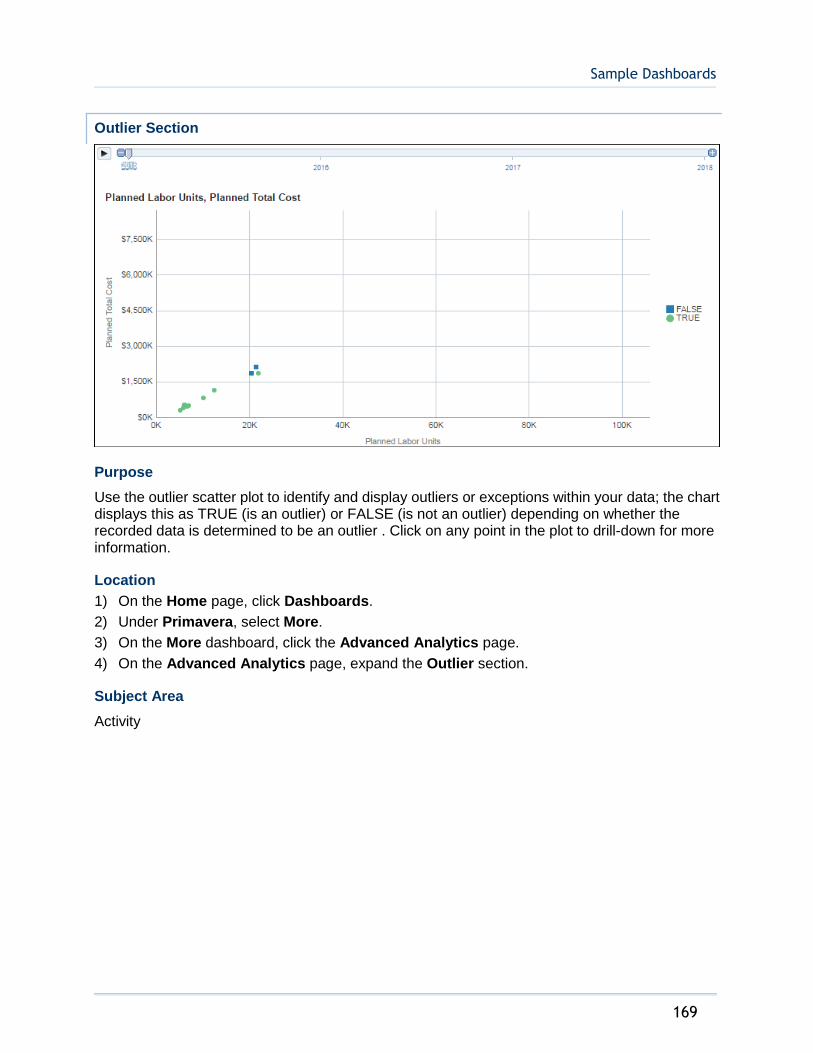
Sample Dashboards
169
Outlier Section
Purpose
Use the outlier scatter plot to identify and display outliers or exceptions within your data; the chart displays this as TRUE (is an outlier) or FALSE (is not an outlier) depending on whether the recorded data is determined to be an outlier . Click on any point in the plot to drill-down for more information.
Location
1) On the Home page, click Dashboards.
2) Under Primavera, select More.
3) On the More dashboard, click the Advanced Analytics page.
4) On the Advanced Analytics page, expand the Outlier section.
Subject Area
Activity
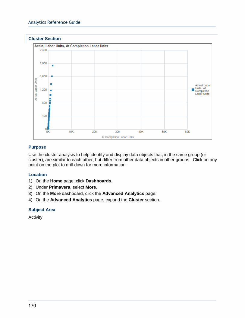
Analytics Reference Guide
170
Cluster Section
Purpose
Use the cluster analysis to help identify and display data objects that, in the same group (or cluster), are similar to each other, but differ from other data objects in other groups . Click on any point on the plot to drill-down for more information.
Location
1) On the Home page, click Dashboards.
2) Under Primavera, select More.
3) On the More dashboard, click the Advanced Analytics page.
4) On the Advanced Analytics page, expand the Cluster section.
Subject Area
Activity
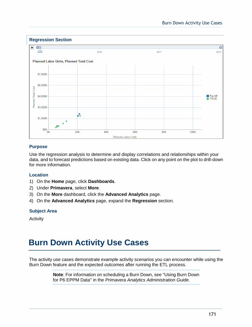
Burn Down Activity Use Cases
171
Regression Section
Purpose
Use the regression analysis to determine and display correlations and relationships within your data, and to forecast predictions based on existing data. Click on any point on the plot to drill-down for more information.
Location
1) On the Home page, click Dashboards.
2) Under Primavera, select More.
3) On the More dashboard, click the Advanced Analytics page.
4) On the Advanced Analytics page, expand the Regression section.
Subject Area
Activity
The activity use cases demonstrate example activity scenarios you can encounter while using the Burn Down feature and the expected outcomes after running the ETL process.
Note: For information on scheduling a Burn Down, see "Using Burn Down for P6 EPPM Data" in the Primavera Analytics Administration Guide.
Burn Down Activity Use Cases
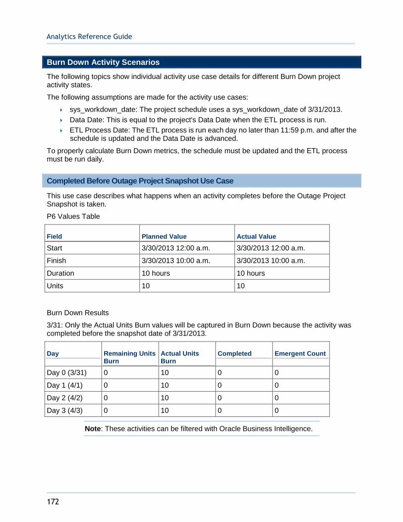
Analytics Reference Guide
172
Burn Down Activity Scenarios
The following topics show individual activity use case details for different Burn Down project activity states.
The following assumptions are made for the activity use cases:
sys_workdown_date: The project schedule uses a sys_workdown_date of 3/31/2013.
Data Date: This is equal to the project's Data Date when the ETL process is run.
ETL Process Date: The ETL process is run each day no later than 11:59 p.m. and after the schedule is updated and the Data Date is advanced.
To properly calculate Burn Down metrics, the schedule must be updated and the ETL process must be run daily.
Completed Before Outage Project Snapshot Use Case
This use case describes what happens when an activity completes before the Outage Project Snapshot is taken.
P6 Values Table
Field Planned Value Actual Value
Start 3/30/2013 12:00 a.m. 3/30/2013 12:00 a.m.
Finish 3/30/2013 10:00 a.m. 3/30/2013 10:00 a.m.
Duration 10 hours 10 hours
Units 10 10
Burn Down Results
3/31: Only the Actual Units Burn values will be captured in Burn Down because the activity was completed before the snapshot date of 3/31/2013.
Day Remaining Units Burn
Actual Units Burn
Completed Emergent Count
Day 0 (3/31) 0 10 0 0
Day 1 (4/1) 0 10 0 0
Day 2 (4/2) 0 10 0 0
Day 3 (4/3) 0 10 0 0
Note: These activities can be filtered with Oracle Business Intelligence.
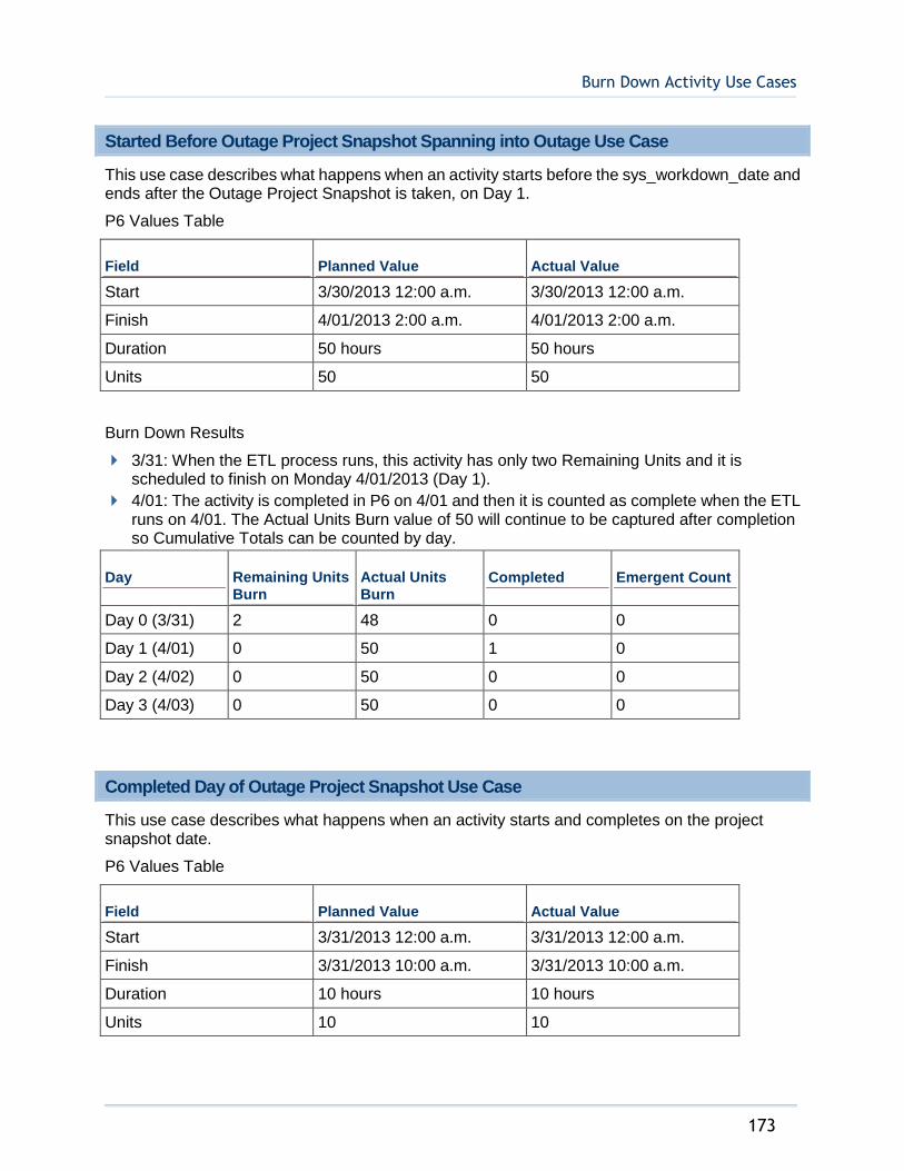
Burn Down Activity Use Cases
173
Started Before Outage Project Snapshot Spanning into Outage Use Case
This use case describes what happens when an activity starts before the sys_workdown_date and ends after the Outage Project Snapshot is taken, on Day 1.
P6 Values Table
Field Planned Value Actual Value
Start 3/30/2013 12:00 a.m. 3/30/2013 12:00 a.m.
Finish 4/01/2013 2:00 a.m. 4/01/2013 2:00 a.m.
Duration 50 hours 50 hours
Units 50 50
Burn Down Results
3/31: When the ETL process runs, this activity has only two Remaining Units and it is scheduled to finish on Monday 4/01/2013 (Day 1).
4/01: The activity is completed in P6 on 4/01 and then it is counted as complete when the ETL runs on 4/01. The Actual Units Burn value of 50 will continue to be captured after completion so Cumulative Totals can be counted by day.
Day Remaining Units Burn
Actual Units Burn
Completed Emergent Count
Day 0 (3/31) 2 48 0 0
Day 1 (4/01) 0 50 1 0
Day 2 (4/02) 0 50 0 0
Day 3 (4/03) 0 50 0 0
Completed Day of Outage Project Snapshot Use Case
This use case describes what happens when an activity starts and completes on the project snapshot date.
P6 Values Table
Field Planned Value Actual Value
Start 3/31/2013 12:00 a.m. 3/31/2013 12:00 a.m.
Finish 3/31/2013 10:00 a.m. 3/31/2013 10:00 a.m.
Duration 10 hours 10 hours
Units 10 10
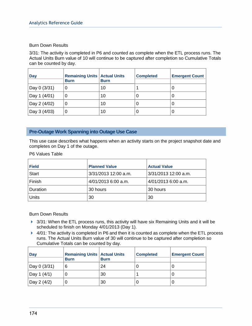
Analytics Reference Guide
174
Burn Down Results
3/31: The activity is completed in P6 and counted as complete when the ETL process runs. The Actual Units Burn value of 10 will continue to be captured after completion so Cumulative Totals can be counted by day.
Day Remaining Units Burn
Actual Units Burn
Completed Emergent Count
Day 0 (3/31) 0 10 1 0
Day 1 (4/01) 0 10 0 0
Day 2 (4/02) 0 10 0 0
Day 3 (4/03) 0 10 0 0
Pre-Outage Work Spanning into Outage Use Case
This use case describes what happens when an activity starts on the project snapshot date and completes on Day 1 of the outage.
P6 Values Table
Field Planned Value Actual Value
Start 3/31/2013 12:00 a.m. 3/31/2013 12:00 a.m.
Finish 4/01/2013 6:00 a.m. 4/01/2013 6:00 a.m.
Duration 30 hours 30 hours
Units 30 30
Burn Down Results
3/31: When the ETL process runs, this activity will have six Remaining Units and it will be scheduled to finish on Monday 4/01/2013 (Day 1).
4/01: The activity is completed in P6 and then it is counted as complete when the ETL process runs. The Actual Units Burn value of 30 will continue to be captured after completion so Cumulative Totals can be counted by day.
Day Remaining Units Burn
Actual Units Burn
Completed Emergent Count
Day 0 (3/31) 6 24 0 0
Day 1 (4/1) 0 30 1 0
Day 2 (4/2) 0 30 0 0
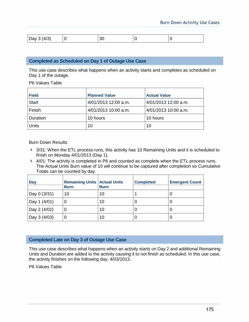
Burn Down Activity Use Cases
175
Day 3 (4/3) 0 30 0 0
Completed as Scheduled on Day 1 of Outage Use Case
This use case describes what happens when an activity starts and completes as scheduled on Day 1 of the outage.
P6 Values Table
Field Planned Value Actual Value
Start 4/01/2013 12:00 a.m. 4/01/2013 12:00 a.m.
Finish 4/01/2013 10:00 a.m. 4/01/2013 10:00 a.m.
Duration 10 hours 10 hours
Units 10 10
Burn Down Results
3/31: When the ETL process runs, this activity has 10 Remaining Units and it is scheduled to finish on Monday 4/01/2013 (Day 1).
4/01: The activity is completed in P6 and counted as complete when the ETL process runs. The Actual Units Burn value of 10 will continue to be captured after completion so Cumulative Totals can be counted by day.
Day Remaining Units Burn
Actual Units Burn
Completed Emergent Count
Day 0 (3/31) 10 10 1 0
Day 1 (4/01) 0 10 0 0
Day 2 (4/02) 0 10 0 0
Day 3 (4/03) 0 10 0 0
Completed Late on Day 3 of Outage Use Case
This use case describes what happens when an activity starts on Day 2 and additional Remaining Units and Duration are added to the activity causing it to not finish as scheduled. In this use case, the activity finishes on the following day, 4/03/2013.
P6 Values Table
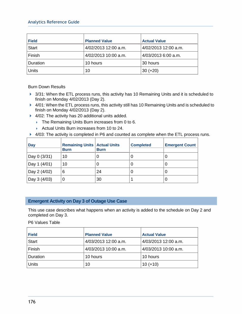
Analytics Reference Guide
176
Field Planned Value Actual Value
Start 4/02/2013 12:00 a.m. 4/02/2013 12:00 a.m.
Finish 4/02/2013 10:00 a.m. 4/03/2013 6:00 a.m.
Duration 10 hours 30 hours
Units 10 30 (+20)
Burn Down Results
3/31: When the ETL process runs, this activity has 10 Remaining Units and it is scheduled to finish on Monday 4/02/2013 (Day 2).
4/01: When the ETL process runs, this activity still has 10 Remaining Units and is scheduled to finish on Monday 4/02/2013 (Day 2).
4/02: The activity has 20 additional units added.
The Remaining Units Burn increases from 0 to 6.
Actual Units Burn increases from 10 to 24.
4/03: The activity is completed in P6 and counted as complete when the ETL process runs.
Day Remaining Units Burn
Actual Units Burn
Completed Emergent Count
Day 0 (3/31) 10 0 0 0
Day 1 (4/01) 10 0 0 0
Day 2 (4/02) 6 24 0 0
Day 3 (4/03) 0 30 1 0
Emergent Activity on Day 3 of Outage Use Case
This use case describes what happens when an activity is added to the schedule on Day 2 and completed on Day 3.
P6 Values Table
Field Planned Value Actual Value
Start 4/03/2013 12:00 a.m. 4/03/2013 12:00 a.m.
Finish 4/03/2013 10:00 a.m. 4/03/2013 10:00 a.m.
Duration 10 hours 10 hours
Units 10 10 (+10)
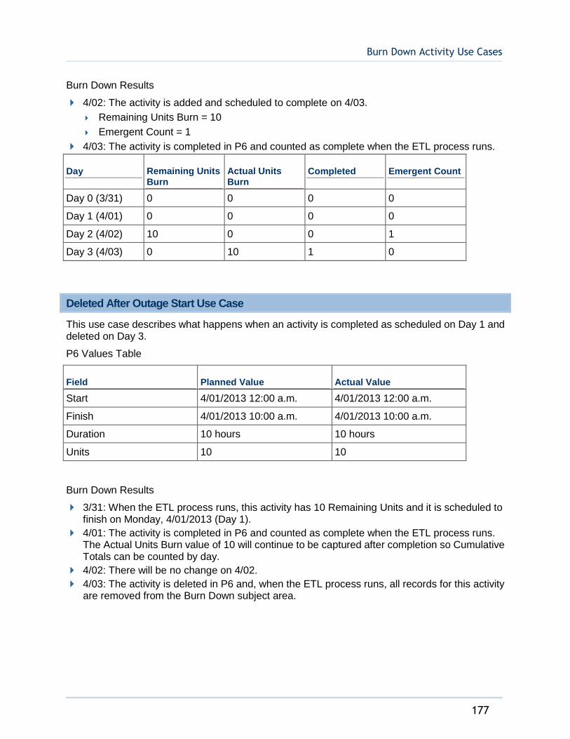
Burn Down Activity Use Cases
177
Burn Down Results
4/02: The activity is added and scheduled to complete on 4/03.
Remaining Units Burn = 10
Emergent Count = 1
4/03: The activity is completed in P6 and counted as complete when the ETL process runs.
Day Remaining Units Burn
Actual Units Burn
Completed Emergent Count
Day 0 (3/31) 0 0 0 0
Day 1 (4/01) 0 0 0 0
Day 2 (4/02) 10 0 0 1
Day 3 (4/03) 0 10 1 0
Deleted After Outage Start Use Case
This use case describes what happens when an activity is completed as scheduled on Day 1 and deleted on Day 3.
P6 Values Table
Field Planned Value Actual Value
Start 4/01/2013 12:00 a.m. 4/01/2013 12:00 a.m.
Finish 4/01/2013 10:00 a.m. 4/01/2013 10:00 a.m.
Duration 10 hours 10 hours
Units 10 10
Burn Down Results
3/31: When the ETL process runs, this activity has 10 Remaining Units and it is scheduled to finish on Monday, 4/01/2013 (Day 1).
4/01: The activity is completed in P6 and counted as complete when the ETL process runs. The Actual Units Burn value of 10 will continue to be captured after completion so Cumulative Totals can be counted by day.
4/02: There will be no change on 4/02.
4/03: The activity is deleted in P6 and, when the ETL process runs, all records for this activity are removed from the Burn Down subject area.
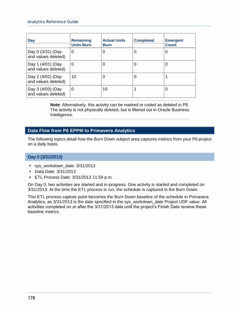
Analytics Reference Guide
178
Day Remaining Units Burn
Actual Units Burn
Completed Emergent Count
Day 0 (3/31) (Day and values deleted)
0 0 0 0
Day 1 (4/01) (Day and values deleted)
0 0 0 0
Day 2 (4/02) (Day and values deleted)
10 0 0 1
Day 3 (4/03) (Day and values deleted)
0 10 1 0
Note: Alternatively, this activity can be marked or coded as deleted in P6. The activity is not physically deleted, but is filtered out in Oracle Business Intelligence.
Data Flow from P6 EPPM to Primavera Analytics
The following topics detail how the Burn Down subject area captures metrics from your P6 project on a daily basis.
Day 0 (3/31/2013)
sys_workdown_date: 3/31/2013
Data Date: 3/31/2013
ETL Process Date: 3/31/2013 11:59 p.m.
On Day 0, two activities are started and in-progress. One activity is started and completed on 3/31/2013. At the time the ETL process is run, the schedule is captured in the Burn Down.
This ETL process capture point becomes the Burn Down baseline of the schedule in Primavera Analytics, as 3/31/2013 is the date specified in the sys_workdown_date Project UDF value. All activities completed on or after the 3/31/2013 date until the project’s Finish Date receive these baseline metrics.

Burn Down Activity Use Cases
179
Schedule Updates
Started before Outage Project Snapshot Spanning into Outage - AC2
Status: In-progress
Actual Units: 48
Remaining Units: 2
Completed Day of Outage Project Snapshot - AC3
Status: Complete
Actual Units: 10
Remaining Units: 0
Pre-Outage Work Spanning into Outage - AC4
Status: In-progress
Actual Units: 24
Remaining Units: 6
Burn Down Hours
Burn Down Hours Summary
38 Baseline Hours remain
38 Actual Hours remain
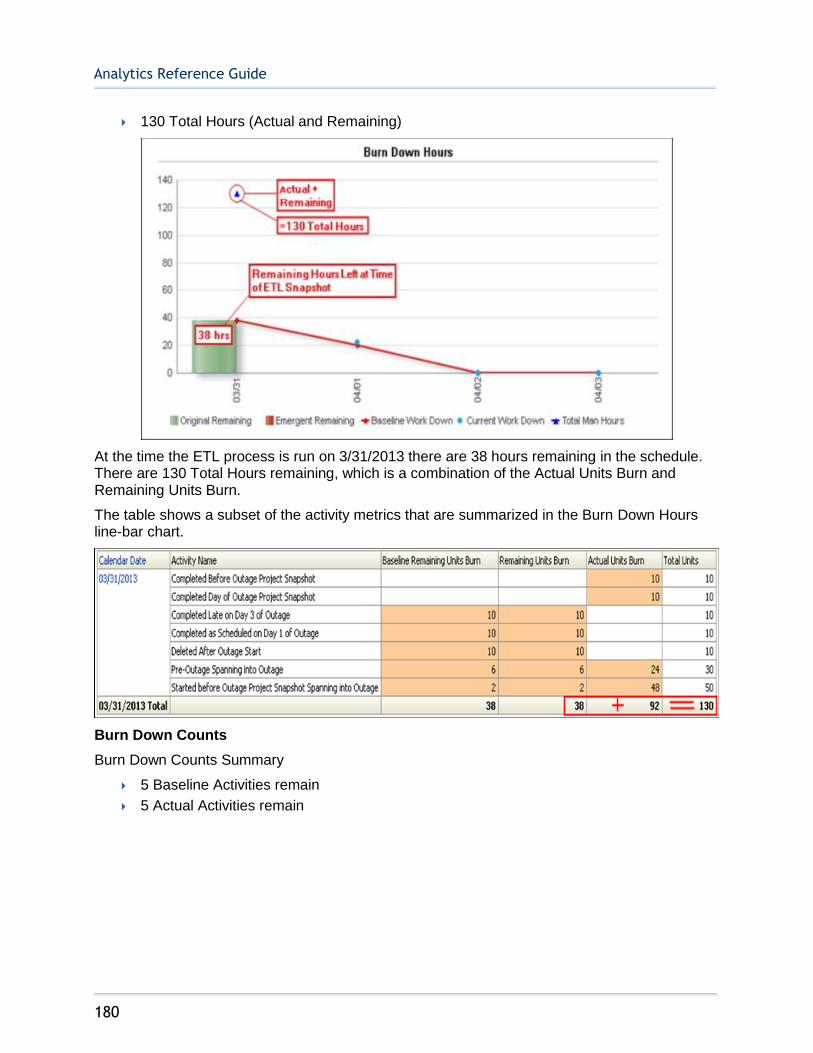
Analytics Reference Guide
180
130 Total Hours (Actual and Remaining)
At the time the ETL process is run on 3/31/2013 there are 38 hours remaining in the schedule. There are 130 Total Hours remaining, which is a combination of the Actual Units Burn and Remaining Units Burn.
The table shows a subset of the activity metrics that are summarized in the Burn Down Hours line-bar chart.
Burn Down Counts
Burn Down Counts Summary
5 Baseline Activities remain
5 Actual Activities remain
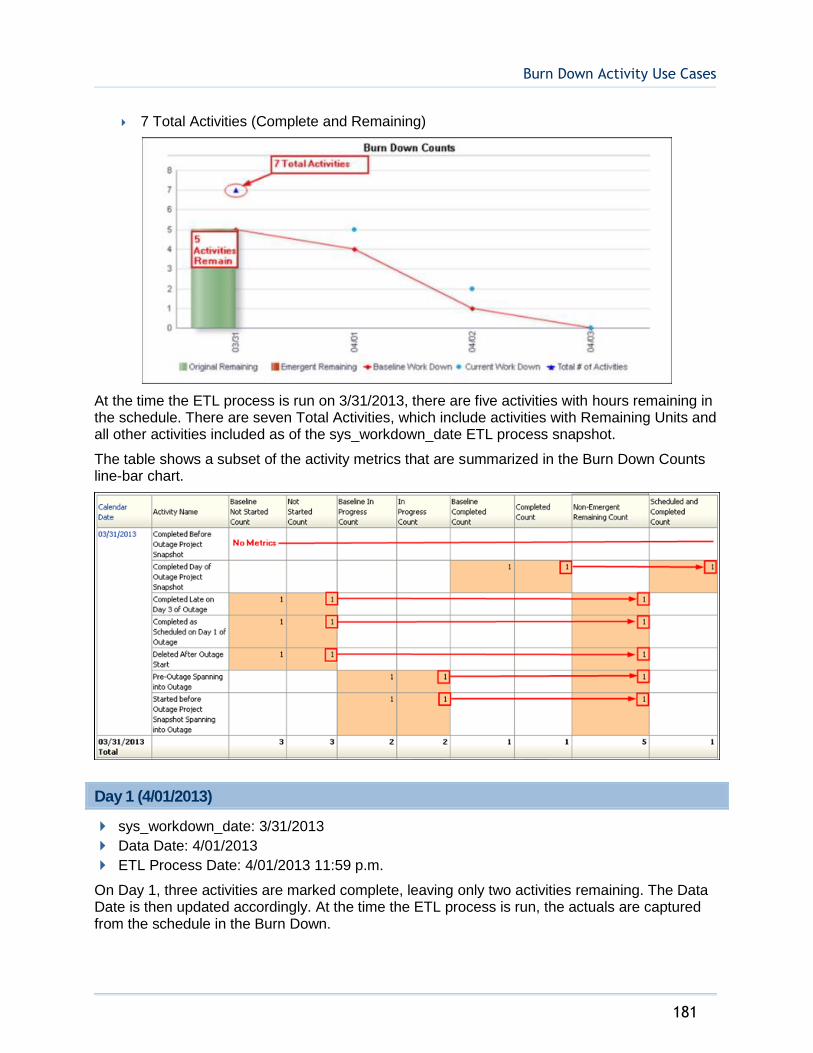
Burn Down Activity Use Cases
181
7 Total Activities (Complete and Remaining)
At the time the ETL process is run on 3/31/2013, there are five activities with hours remaining in the schedule. There are seven Total Activities, which include activities with Remaining Units and all other activities included as of the sys_workdown_date ETL process snapshot.
The table shows a subset of the activity metrics that are summarized in the Burn Down Counts line-bar chart.
Day 1 (4/01/2013)
sys_workdown_date: 3/31/2013
Data Date: 4/01/2013
ETL Process Date: 4/01/2013 11:59 p.m.
On Day 1, three activities are marked complete, leaving only two activities remaining. The Data Date is then updated accordingly. At the time the ETL process is run, the actuals are captured from the schedule in the Burn Down.

Analytics Reference Guide
182
Schedule Updates
Started before Outage Project Snapshot Spanning into Outage - AC2
Status: Complete
Actual Units: 50 (2 today)
Remaining Units: 0
Pre-Outage Work Spanning into Outage - AC4
Status: Complete
Actual Units: 30 (6 today)
Remaining Units: 0
Completed as Schedule on Day 1 of Outage - AC5
Status: Complete
Actual Units: 10
Remaining Units: 0
Burn Down Hours
Burn Down Hours Summary
20 Baseline Hours remain
20 Actual Hours remain
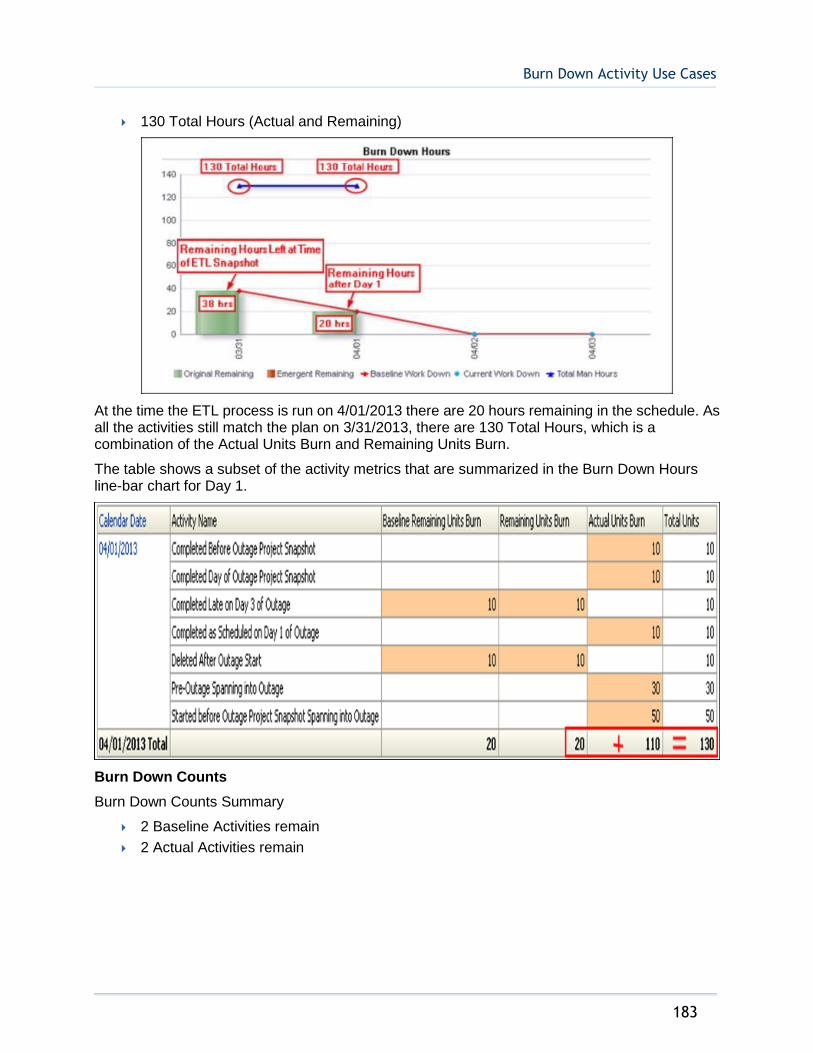
Burn Down Activity Use Cases
183
130 Total Hours (Actual and Remaining)
At the time the ETL process is run on 4/01/2013 there are 20 hours remaining in the schedule. As all the activities still match the plan on 3/31/2013, there are 130 Total Hours, which is a combination of the Actual Units Burn and Remaining Units Burn.
The table shows a subset of the activity metrics that are summarized in the Burn Down Hours line-bar chart for Day 1.
Burn Down Counts
Burn Down Counts Summary
2 Baseline Activities remain
2 Actual Activities remain
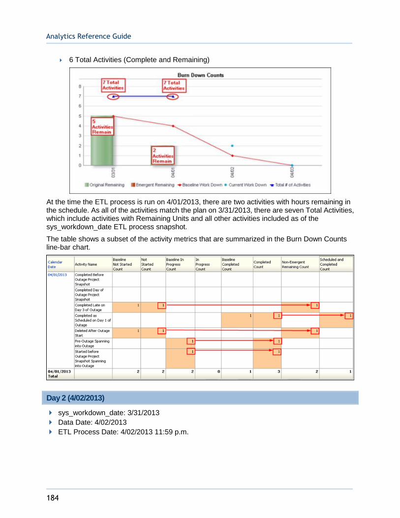
Analytics Reference Guide
184
6 Total Activities (Complete and Remaining)
At the time the ETL process is run on 4/01/2013, there are two activities with hours remaining in the schedule. As all of the activities match the plan on 3/31/2013, there are seven Total Activities, which include activities with Remaining Units and all other activities included as of the sys_workdown_date ETL process snapshot.
The table shows a subset of the activity metrics that are summarized in the Burn Down Counts line-bar chart.
Day 2 (4/02/2013)
sys_workdown_date: 3/31/2013
Data Date: 4/02/2013
ETL Process Date: 4/02/2013 11:59 p.m.

Burn Down Activity Use Cases
185
On Day 2, one activity is marked complete, one activity is started (but not completed as scheduled), and two new activities are added to the schedule to be completed on 4/03/2013. Three activities are left. The Data Date is updated accordingly and the actuals are captured from the schedule in the Burn Down.
Schedule Updates
Completed Late on Day 3 of Outage - AC6
Status: In-progress
Actual Units: 24 (24 today)
Remaining Units: 6
Planned: 10
Emergent Activity A on Day 3 of Outage - AC7
Status: Not Started
Actual Units: 0
Remaining Units: 0
Emergent Activity B on Day 3 of Outage - AC8
Status: Not Started
Actual Units: 0
Remaining Units: 10
Deleted After Outage Start - AC9
Status: Complete
Actual Units: 10 (10 today)
Remaining Units: 0
Burn Down Hours
Burn Down Hours Summary
0 baseline hours remain
6 actual hours remain (from original activities in the schedule)
20 emergent hours remain

Analytics Reference Guide
186
170 Total hours (actual and remaining)
At the time the ETL process is run on 4/02/2013, there are six hours remaining from the late activity with additional units and 20 emergent hours remaining from the activities added to the schedule. There are 170 Total Hours, which is a combination of the Actual Units Burn and Remaining Units Burn. The Baseline Hours are 0, illustrating the deviation from the plan on 3/31.
The table shows a subset of the activity metrics that are summarized in the Burn Down Hours line-bar chart.
Burn Down Counts
Burn Down Counts Summary
1 Baseline Activity remains
1 Actual Activity remains (from original activities in the schedule)
2 Emergent Activities remain

Burn Down Activity Use Cases
187
9 Total Activities (Original and Emergent)
At the time the ETL process is run on 4/02/2013 there are two emergent, one original, and one baseline activity remaining in the schedule. There are nine Total Activities as a result of the two new activities added to the schedule.
The table shows a subset of the activity metrics that are summarized in the Burn Down Counts line-bar chart.
Day 3 (4/03/2013)
sys_workdown_date: 3/31/2013
Data Date: 4/03/2013
ETL Process Date: 4/03/2013 11:59 p.m.

Analytics Reference Guide
188
On Day 3, one activity is deleted. The late activity and two emergent activities are completed. Zero activities now remain. The Data Date is updated accordingly and the actuals are captured from the schedule in the Burn Down.
Schedule Updates
Emergent Activity B on Day 3 of Outage - AC6
Status: Complete
Actual Units: 10
Remaining Units: 0
Emergent Activity A on Day 3 of Outage - AC7
Status: Complete
Actual Units: 30 (6 today)
Remaining Units: 0
Emergent Activity A on Day 3 of Outage - AC8
Status: Complete
Actual Units: 10
Remaining Units: 0
Deleted After Outage Start - AC9
Status: X - Deleted
Burn Down Hours
Burn Down Hours Summary
0 Baseline Hours remain
0 Actual Hours remain (from original activities in the schedule)
0 Emergent Hours remain
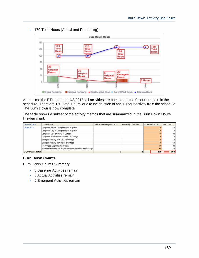
Burn Down Activity Use Cases
189
170 Total Hours (Actual and Remaining)
At the time the ETL is run on 4/3/2013, all activities are completed and 0 hours remain in the schedule. There are 160 Total Hours, due to the deletion of one 10 hour activity from the schedule. The Burn Down is now complete.
The table shows a subset of the activity metrics that are summarized in the Burn Down Hours line-bar chart.
Burn Down Counts
Burn Down Counts Summary
0 Baseline Activities remain
0 Actual Activities remain
0 Emergent Activities remain

Analytics Reference Guide
190
6 Total activities (Original and Emergent)
At the time the ETL process is run on 4/03/2013, there are zero activities remaining in the schedule. There are eight Total Activities as a result of the activity deleted from the schedule.
The table shows a subset of the activity metrics that are summarized in the Burn Down Counts line-chart.
Mobile Dashboards
191
The mobile dashboards were developed using the Oracle Business Intelligence Mobile App Designer. These dashboards are in HTML5 format, which means they can be opened in any modern browser or on any type of mobile device. For details, see "Importing Mobile Dashboards" in the Primavera Analytics Installation and Configuration Guide. Once they have been imported they can be accessed at the following URL:
http://<bi server>:<port>/mobile/appstore/
Smartphone Dashboards
The smartphone dashboards present Portfolio and Location analyses, in a format optimized for viewing on a smartphone.
Mobile Dashboards
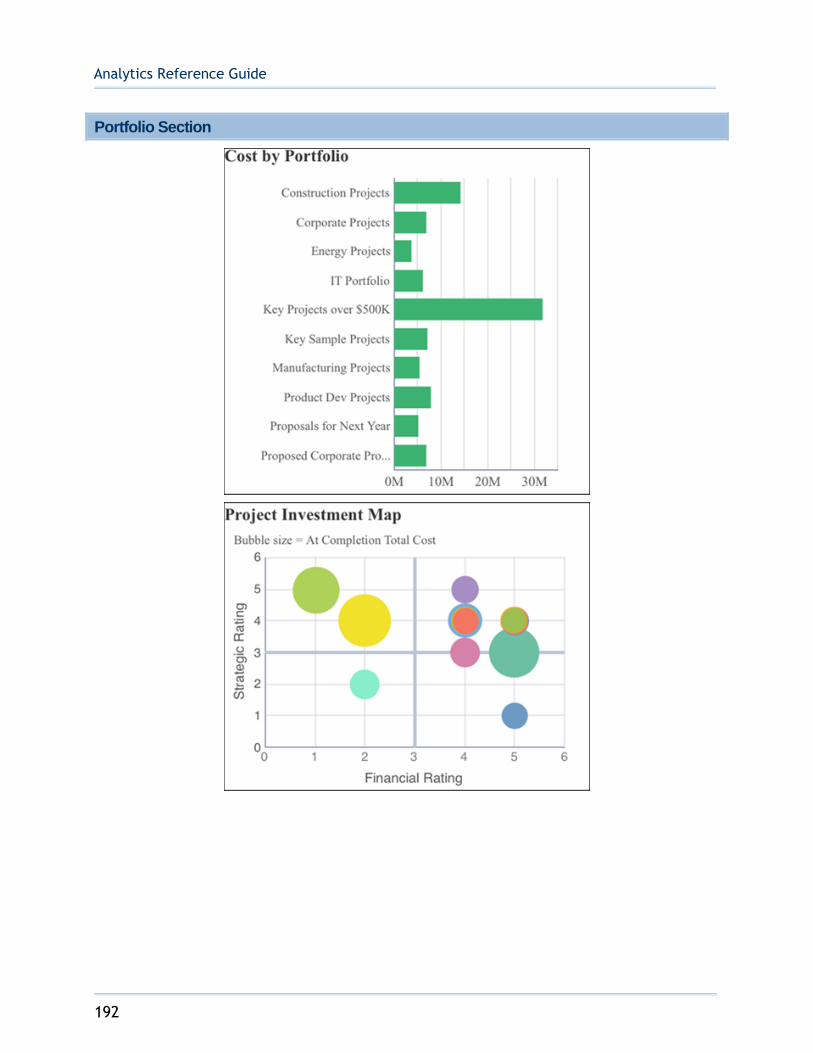
Analytics Reference Guide
192
Portfolio Section
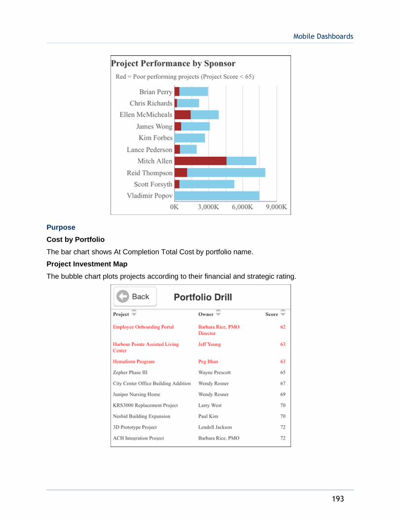
Mobile Dashboards
193
Purpose
Cost by Portfolio
The bar chart shows At Completion Total Cost by portfolio name.
Project Investment Map
The bubble chart plots projects according to their financial and strategic rating.
Analytics Reference Guide
194
The x-axis shows Financial Rating. The y-axis shows Strategic Rating. Bubble size represents At Completion Total Cost, with a larger bubble representing a larger value. Bubble color is used only to differentiate between bubbles.
Project Performance by Sponsor
The stacked bar chart shows stacked bars plotting the At Completion Total Cost per sponsor. Each band on a bar represents a different project and bands are colored according to their project score, which is a measure of their performance. Blue bands represent projects with a project score of more than 65; red bands represent poorly performing projects with a project score of less than 65.
The x-axis shows investment Cost. The y-axis shows the project Sponsor.
Portfolio Drill
The table shows project details for the data point selected in the Cost by Portfolio bar chart, Project Investment Map bubble chart, or Project Performance by Sponsor stacked bar chart on the Portfolio page. Poor performing projects (Project Score < 65) are highlighted in red.
The table contains columns for:
Project Name
Owner
Score
Location
1) From the My Apps page, tap Phone Apps.
2) Tap Executive Dashboard - Phone (Light).
3) Tap Table of Contents.
4) Tap Portfolio.
Subject Area
Activity

Mobile Dashboards
195
Location Section

Analytics Reference Guide
196
Purpose
The accordion navigation page displays At Completion Total Cost by country name. Clicking on a country shows a bar chart of the At Completion Total Cost by city name for the selected country. The stoplight conditional formatting is based on a comparison of At Completion Total Cost vs. Planned Total cost (< 98% = Red, 98-100% = Yellow, > 100% = Green).
Location Drill
The bar chart shows At Completion Total Cost by quarter, for all projects in the city selected from the bar chart on the Location page.
The line chart shows the SPI(Cost) and CPI(Cost) by quarter, for all projects in the city selected from the bar chart on the Location page.
The table lists all projects in the city selected from the bar chart on the Location page.
The table contains columns for:
Project Name
At Completion Total Cost

Mobile Dashboards
197

Analytics Reference Guide
198
Location
1) From the My Apps page, tap Phone Apps.
2) Tap Executive Dashboard - Phone (Light).
3) Tap Table of Contents.
4) Tap Location.
Subject Area
Activity
Tablet Dashboards
The tablet dashboards present Portfolio and Location analyses in a format optimized for viewing on a tablet.

Mobile Dashboards
199
Portfolio Overview Section

Analytics Reference Guide
200
Purpose
Product Investment Map Bubble Chart
The bubble chart plots projects according to their financial and strategic rating.
The x-axis shows Financial Rating. The y-axis shows Strategic Rating. Bubble size represents At Completion Total Cost, with a larger bubble representing a larger value. Bubble color is used only to differentiate between bubbles.
Project Performance by Sponsor Bar Chart
Mobile Dashboards
201
The stacked bar chart shows stacked bars plotting the At Completion Total Cost per sponsor. Each band on a bar represents a different project and bands are colored according to their project score, which is a measure of their performance. Blue bands represent projects with a project score of more than 65; red bands represent poorly performing projects with a project score of less than 65.
The x-axis shows investment Cost. The y-axis shows the project Sponsor.
Portfolio Overview Sidebar
The sidebar shows detailed project information for the data point selected in either the Project Investment Map bubble chart or the Project Performance by Sponsor bar chart.
The columns shown are:
Project Name
Sponsor
Project Owner
Project Score
Strategic Rating
Financial Rating
At Completion Total Cost
Schedule % Completed
Performance % Completed
Cost Variance
Schedule Variance
CPI
SPI
Location
1) From the My Apps page, tap Tablet Apps.
2) Tap Executive Dashboard - Tablet (Light).
3) Tap Table of Contents.
4) Tap Portfolio: Overview.
Subject Area
Activity

Analytics Reference Guide
202
Portfolio Performance Section
Purpose
Portfolio Analysis Trending Pivot Table
The pivot table shows CPI and SPI per month for each portfolio. CPIs and SPIs lower than 1.00 are highlighted in red whereas CPIs and SPIs higher than or equal to 1.00 are highlighted in green.
Portfolio View Pivot Table
The pivot table shows cost and units for each portfolio. Values that are over budget are highlighted in red.
The pivot table contains columns for:
Portfolio Name
Actual (Cost)
At Completion (Cost)
Budgeted (Cost)
Variance (Cost)
Actual (Units)
At Completion (Units)
Budgeted (Units)
Variance (Units)

Mobile Dashboards
203
Location
1) From the My Apps page, tap Tablet Apps.
2) Tap Executive Dashboard - Tablet (Light).
3) Tap Table of Contents.
4) Tap Portfolio: Performance.
Subject Area
Activity
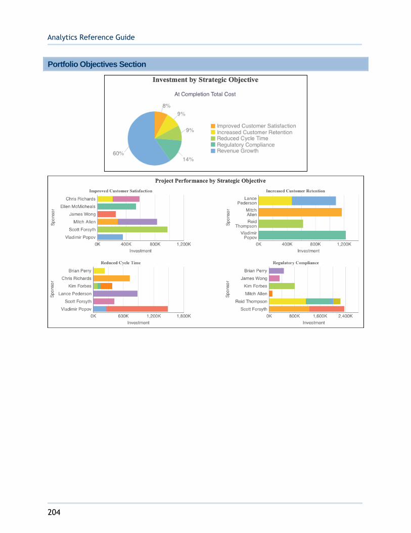
Analytics Reference Guide
204
Portfolio Objectives Section
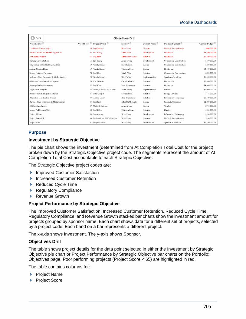
Mobile Dashboards
205
Purpose
Investment by Strategic Objective
The pie chart shows the investment (determined from At Completion Total Cost for the project) broken down by the Strategic Objective project code. The segments represent the amount of At Completion Total Cost accountable to each Strategic Objective.
The Strategic Objective project codes are:
Improved Customer Satisfaction
Increased Customer Retention
Reduced Cycle Time
Regulatory Compliance
Revenue Growth
Project Performance by Strategic Objective
The Improved Customer Satisfaction, Increased Customer Retention, Reduced Cycle Time, Regulatory Compliance, and Revenue Growth stacked bar charts show the investment amount for projects grouped by sponsor name. Each chart shows data for a different set of projects, selected by a project code. Each band on a bar represents a different project.
The x-axis shows Investment. The y-axis shows Sponsor.
Objectives Drill
The table shows project details for the data point selected in either the Investment by Strategic Objective pie chart or Project Performance by Strategic Objective bar charts on the Portfolio: Objectives page. Poor performing projects (Project Score < 65) are highlighted in red.
The table contains columns for:
Project Name
Project Score
Analytics Reference Guide
206
Project Owner
Sponsor
Current Phase
Business Segment
Current Budget
Location
1) From the My Apps page, tap Tablet Apps.
2) Tap Executive Dashboard - Tablet (Light).
3) Tap Table of Contents.
4) Tap Portfolio: Objectives.
Subject Area
Activity

Mobile Dashboards
207
Location Cost Map

Analytics Reference Guide
208
Purpose
Completion Cost by Location
The map shows At Completion Total Cost by country name
The table shows project/activity counts and cost details by country name.
The table contains columns for:
Country
# Projects
# Activities
At Completion Labor Cost
At Completion Nonlabor Cost
At Completion Material Cost
At Completion Expense Cost
At Completion Total Cost

Mobile Dashboards
209
Cost Map Drill
The map shows At Completion Total Cost by city name, for the country selected in the map on the Location: Cost Map page. Selecting any of the cities will filter the table.
The table shows project details for the cities on the map.
The table contains columns for:
Project Name
City Name
Project Owner
SPI
CPI
Schedule Variance
Cost Variance
At Completion Total Cost
Location
1) From the My Apps page, tap Tablet Apps.
2) Tap Executive Dashboard - Tablet (Light).
3) Tap Table of Contents.
4) Tap Portfolio: Cost Map.
Subject Area
Activity

Analytics Reference Guide
210
Location Cost Tiles

Mobile Dashboards
211
Purpose
The tile navigation contains a line chart that shows At Completion Total Cost by quarter, repeated for each country name. The stoplight conditional formatting is based on a comparison of At Completion Total Cost vs. Planned Total cost (< 98% = Red, 98-100% = Yellow, > 100% = Green).
Cost Tile Drill
The bar-line combination chart shows At Completion Total Cost as a bar and Planned Total Cost as a line by quarter, for all projects in the country selected from the Location: Cost Tiles Page
SPI/CPI
This section shows, for all projects in the country selected from the Location: Cost Tiles Page:
A line chart which plots the SPI(Cost) and CPI(Cost) by quarter.
A line chart which plots the SPI(Units) and CPI(Units) by quarter.
Cost by City
The stacked bar-line combination chart shows Actual Total Cost and Remaining Total Cost as stacked bar and Planned Total Cost as a line by city name, for all projects in the country selected from the Location: Cost Tiles Page

Analytics Reference Guide
212
Location
1) From the My Apps page, tap Tablet Apps.
2) Tap Executive Dashboard - Tablet (Light).
3) Tap Table of Contents.
4) Tap Location: Cost Tiles.
Subject Area
Activity

213
Oracle Primavera Analytics Reference Guide
Copyright © 2013, 2016, Oracle and/or its affiliates. All rights reserved. Oracle and Java are registered trademarks of Oracle and/or its affiliates. Other names may be trademarks of their respective owners.
This software and related documentation are provided under a license agreement containing restrictions on use and disclosure and are protected by intellectual property laws. Except as expressly permitted in your license agreement or allowed by law, you may not use, copy, reproduce, translate, broadcast, modify, license, transmit, distribute, exhibit, perform, publish or display any part, in any form, or by any means. Reverse engineering, disassembly, or decompilation of this software, unless required by law for interoperability, is prohibited.
The information contained herein is subject to change without notice and is not warranted to be error-free. If you find any errors, please report them to us in writing.
If this is software or related documentation that is delivered to the U.S. Government or anyone licensing it on behalf of the U.S. Government, the following notice is applicable:
U.S. GOVERNMENT END USERS: Oracle programs, including any operating system, integrated software, any programs installed on the hardware, and/or documentation, delivered to U.S. Government end users are “commercial computer software" pursuant to the applicable Federal Acquisition Regulation and agency-specific supplemental regulations. As such, use, duplication, disclosure, modification, and adaptation of the programs, including any operating system, integrated software, any programs installed on the hardware, and/or documentation, shall be subject to license terms and license restrictions applicable to the programs. No other rights are granted to the U.S. Government.
This software or hardware is developed for general use in a variety of information management applications. It is not developed or intended for use in any inherently dangerous applications, including applications that may create a risk of personal injury. If you use this software or hardware in dangerous applications, then you shall be responsible to take all appropriate failsafe, backup, redundancy, and other measures to ensure its safe use. Oracle Corporation and its affiliates disclaim any liability for any damages caused by use of this software or hardware in dangerous applications.
This software or hardware and documentation may provide access to or information on content, products and services from third-parties. Oracle Corporation and its affiliates are not responsible for and expressly disclaim all warranties of any kind with respect to third-party content, products, and services. Oracle Corporation and its affiliates will not be responsible for any loss, costs, or damages incurred due to your access to or use of third-party content, products, or services.
Legal Notices