Angus,thongs and perfect snogging
5
Angus,Thongs and perfect snogging :Film opening Analysis By Faisa Mohamoud
-
Upload
haverstockmedia -
Category
Education
-
view
152 -
download
1
Transcript of Angus,thongs and perfect snogging

Angus,Thongs and perfect snogging :Film
opening Analysis By Faisa Mohamoud

Just like a conventional teen comedy , the film starts with the institutional company logo , this particular logo shows that it is child friendly with the colour of the writing “Paramount” . The mountains shown shows that this company value themselves a lot and see them selves above other parent companies .
As an audience we automatically have an idea the film will be aimed at children for its use of colour and its popular name “Nikelodean”. This also relates to a conventions of a teen comedy as it always refers to its audience . The film uses a fade to enter the first scene

The start of the movie starts with the typography in place , this was smartly located at the bottom of the screen so that the audience can see the acting going on but can also gain information from the film .
The typography is in a light pink colour and is written very childish .This was done so that the film can particularly appeal to the young , teen ,female audience . The typography goes along with the white house next to it . The main character is wearing green and the writing is in white this is to bring the character in focus .

The title of the film takes up most of the screen this is because it is the name and the audience have to have sufficient knowledge of the film . Another reason is because the audience can interpret what the film is about , this relates to Barthes enigma code . The title is in white which connotes pure , the audience is for young teens (12A) which are shown to be innocent and pure
The name if the main actress is shown here , this shows that its particular character has a lot of significance in this film . The swirl witting shows a fun and child environment and that the film is family and child friendly .
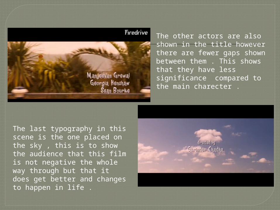
The other actors are also shown in the title however there are fewer gaps shown between them . This shows that they have less significance compared to the main charecter .
The last typography in this scene is the one placed on the sky , this is to show the audience that this film is not negative the whole way through but that it does get better and changes to happen in life .