
Ancillary pack
4
Ancillary pack
-
Upload
somwatkins -
Category
Entertainment & Humor
-
view
58 -
download
0
Transcript of Ancillary pack

Ancillary pack
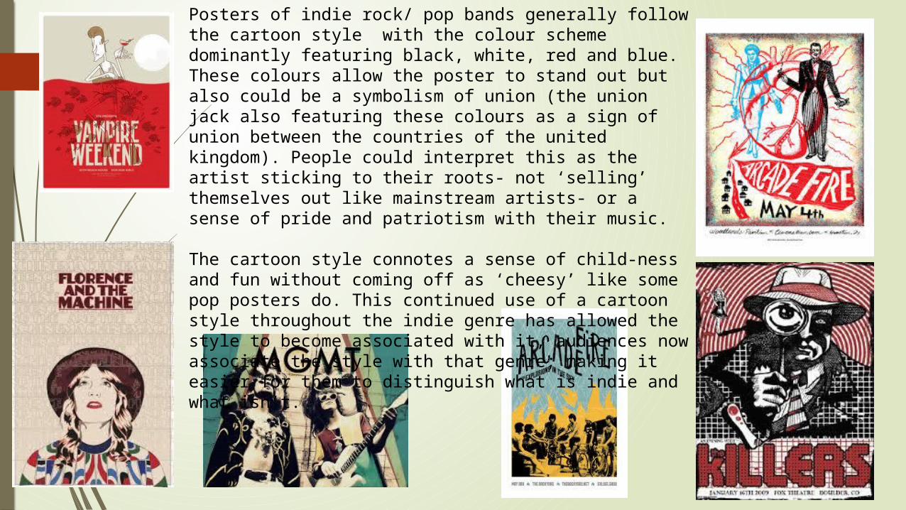
Posters of indie rock/ pop bands generally follow the cartoon style with the colour scheme dominantly featuring black, white, red and blue. These colours allow the poster to stand out but also could be a symbolism of union (the union jack also featuring these colours as a sign of union between the countries of the united kingdom). People could interpret this as the artist sticking to their roots- not ‘selling’ themselves out like mainstream artists- or a sense of pride and patriotism with their music. The cartoon style connotes a sense of child-ness and fun without coming off as ‘cheesy’ like some pop posters do. This continued use of a cartoon style throughout the indie genre has allowed the style to become associated with it, audiences now associate the style with that genre; making it easier for them to distinguish what is indie and what isn’t.
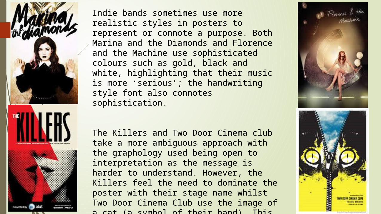
Indie bands sometimes use more realistic styles in posters to represent or connote a purpose. Both Marina and the Diamonds and Florence and the Machine use sophisticated colours such as gold, black and white, highlighting that their music is more ‘serious’; the handwriting style font also connotes sophistication.
The Killers and Two Door Cinema club take a more ambiguous approach with the graphology used being open to interpretation as the message is harder to understand. However, the Killers feel the need to dominate the poster with their stage name whilst Two Door Cinema Club use the image of a cat (a symbol of their band). This maybe because The Killers do not feel that they are recognisable through the images that they have used whilst Two Door Cinema Club only have to use their symbol that their fans will immediately recognise.
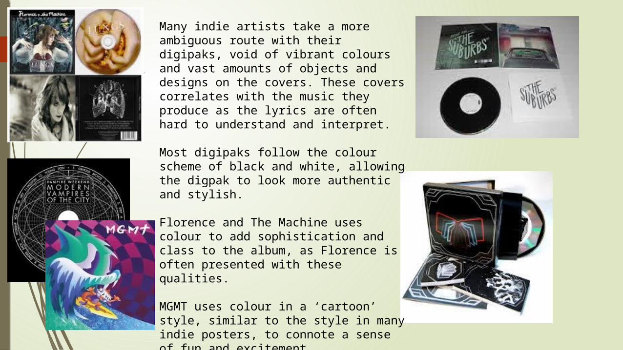
Many indie artists take a more ambiguous route with their digipaks, void of vibrant colours and vast amounts of objects and designs on the covers. These covers correlates with the music they produce as the lyrics are often hard to understand and interpret.
Most digipaks follow the colour scheme of black and white, allowing the digpak to look more authentic and stylish.
Florence and The Machine uses colour to add sophistication and class to the album, as Florence is often presented with these qualities.
MGMT uses colour in a ‘cartoon’ style, similar to the style in many indie posters, to connote a sense of fun and excitement.