Analysis of professional contents pages
12
Analysis of professional contents pages
-
Upload
katepownall -
Category
Data & Analytics
-
view
9 -
download
0
Transcript of Analysis of professional contents pages

Analysis of professional contents pages

Contents pages
Rock soundIssue 130Christmas 2009
Metal HammerJuly 2010
QIssue 297
KerrangIssue 139019/11/11
Main image with big page number & caption
This is used to draw attention to the page. The main image usually matches the main article of the magazine. The big page number is used so the reader knows straight away what page the article is on. The caption gives away a small bit of information about the picture/article.
Q magazine uses a big main image in the centre of the page, so when you open the magazine your eyes are drawn immediately to it.
It also uses big page numbers on its main image and secondary images, but the one by the main image is the biggest as it is the page they want the reader to go to.
Q doesn’t use any captions on its images but it does have information about the articles elsewhere on the page.
Kerrang magazine uses a big main image that takes up most of the page. All of the text on the page frames the image so it makes it seem like it is the most important thing on the page.
It uses big page numbers on its main image and secondary images so the reader can match the picture to the article. It is also used so the reader can skip straight to the page that they want to.
Kerrang also doesn’t use any captions on its images, however like Q it has information elsewhere.

Title
Most contents pages have a title at the top of the page that is the biggest text on the page. This is used so the reader knows what page it is and to grab attention as soon as the reader opens the magazine.The title is usually just ‘Contents’.
Metal Hammer has a big, clear title at the top left of the page. It immediately grabs attention as it stands out because it is the biggest text on the page, and it is black text on a white background.The text has connotations of rock because it is quite jagged and rough, which links to the image of rock.
Q has a big title at the top left of the page, however it does not grab attention as it isn’t the biggest text on the page.The title matches the house style of the magazine as it matches the red, white and black colour scheme.

3/4 column structure
Magazine contents pages normally have a 3/4 column structure. They normally have 3 or 4 columns of text or images.The columns usually frame the main image.The columns are structured this way in order to make the page easy to navigate and help the reader find what they are looking for easily.
Metal Hammer magazine has 4 columns. 2 columns are listing the articles, one is the editor’s note and one is a column of pictures. The 4 column structure means that the page looks busy as there is a lot going on, however it is still easy to read.The columns take up the whole page, as there is no main image for them to frame. This does not fit the codes and conventions of contents pages.
Kerrang has 3 columns of text.The columns frame the main image.The 3 column structure makes the page clear and organised.

Title/logo of magazine
A common convention of magazine contents pages is the title or logo of the magazine.It is usually at the top of the page, in a corner.It is usually quite big text, so it stands out.It is often in a contrasting colour to the rest of the page too.
Rock sound uses the title of the magazine in the top right corner.It stands out because the rest of the page is dark, while the text is white.However, it does not include the logo of the magazine, which is more complex.
Kerrang uses the title of the magazine in the top left corner of the page.Unlike Rock sound, Kerrang does use the logo of the magazine: the smashed looking text.It is also the biggest text with the page, along with the ‘Contents’ title. This signifies that the logo and iconography of the magazine is important to the company.It is white, which stands out on the blue background and contrasts with the yellow text next to it.

Image of the front cover
Contents pages sometimes have an image of the front cover of the magazine.It is normally quite small, and placed near the edge of the page, usually either the top or bottom.This is used for self promotion.
Metal hammer has an image of the front cover of the magazine.It is at the top of the page, in the middle.It is quite small, however it still draws attention as it is placed next to the biggest text on the page. The cover matches the dark, grungy style of the page. This has connotations of the metal genre.
Q magazine uses an image of the front cover on the contents page for self promotion.It is placed in the top right hand corner.It matches the colour scheme of the contents page (and house style): red, white and black. This shows that the magazine is professional.The image is quite big, and it has been placed in a way so the two top corners of the magazine contain the Q logo.

White background
White backgrounds are often used so that text can stand out on the page.It also makes the text clear and easy to read, and helps the reader navigate the magazine quickly and easily.
Kerrang uses a white background on its contents page.As well as making the text on the page easy to read, it also makes the images on the page stand out, as the white frames the main image and contrasts with the darker colours.The white background also makes the red page numbers stand out and makes it easier for the reader to find what they’re looking for.
Q magazine uses a white background that matches the house style of the magazine (Q magazine uses a red, white and black colour scheme).The white makes the black text and red lines stand out, which makes the page easy to navigate and find what you’re looking for.
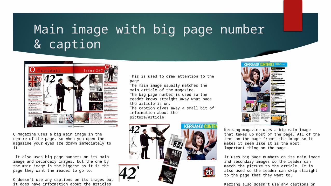
Categorized articles
Magazine contents pages often categorize their articles into sections. For example, features and regulars, or by the type of article (eg. Fashion, music).This helps readers find what they are looking for quickly.It also helps if readers have a particular interest, such as fashion, as they can find it quickly and go straight to it.
Metal Hammer separates its articles into features and regulars.They are side by side on the page.This helps readers see what is exclusive to the issue and what is always in the magazine.The articles all have a title, and then in smaller text a description of the article. This gives an insight into the magazine and grabs the readers attention. The articles all conform to the rock/metal genre as they feature rock artists or rock songs.
Q has its articles sorted into features and regulars.They are on separate sides of the page, which ensures that the articles don’t get mixed up.All of the articles have a title underlined in red and a brief description underneath. This matches the colour scheme, and also ensures that the text doesn’t blend into eachother.The articles match the genre, as they are all music related that appeal to the target audience.

Issue information
Magazines often have issue information on their contents pages.The issue information contains the date and issue number. It is usually quite small, and positioned in a corner so it doesn’t draw attention.Usually, issue information is on the cover so the information doesn’t need to be attention grabbing.It is used so the reader knows what date the magazine is for, and how many issues there have been of the magazine.
Rock sound has the issue information in the top right corner.It is underneath the title of the magazine, so it mimics the masthead on the front cover.It is in a white text so it matches the colour scheme of the page.It also makes it stand out against the dark background.
Kerrang has its issue information in the top right corner.It is the same colour as the title so it ties in with the colour scheme. It is small and doesn’t draw attention, however it still matches the rough, jagged font that Kerrang uses.

Links to other companies
Some contents pages contain links to other companies, such as adverts.It will usually be a company of the same genre as the magazine, as the reader will be interested in it.It is usually quite subtle and doesn’t take up much room, so they don’t take away from the purpose of the contents page.
Kerrang uses an advertisement for a biography of Dave Grohl. This links to the rock genre, as Dave Grohl is in the Foo Fighters, so the target audience of the magazine is the same as the book.The advert is in the bottom corner of the magazine, so it doesn’t obscure the main purpose of the contents page, however it is quite big and colourful so it will still grab attention.

Social media
Some magazines use social media links on their contents page. This allows them to connect with a wider range of people and make the magazine well known.Social media, such as Facebook or Twitter, appeals to the younger generation who are more likely to use the internet to get their information.Using social media also means that the magazine can constantly connect and update the readers, instead of just weekly/monthly.
Kerrang magazine doesn’t have links to social media on the contents page, however it does have links to Facebook and Twitter on the website.
This will appeal to the target audience as people that use the internet to visit the webpage will be more likely to use social media.