Analysis of Indie Folk Back of Album Covers
5
CONVENTIONS OF DIGIPAK BACK COVERS
-
Upload
meggore11 -
Category
Art & Photos
-
view
164 -
download
0
Transcript of Analysis of Indie Folk Back of Album Covers

CONVENTIONS OF DIGIPAK BACK COVERS
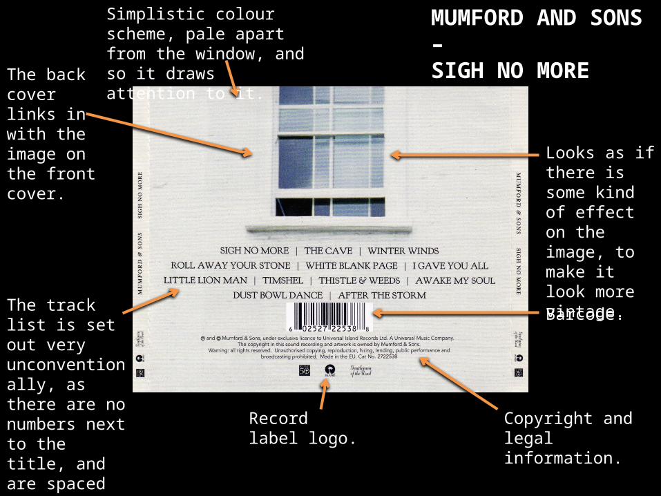
Simplistic colour scheme, pale apart from the window, and so it draws attention to it.
Barcode.
Record label logo.
The back cover links in with the image on the front cover.
The track list is set out very unconventionally, as there are no numbers next to the title, and are spaced out in lines rather than columns going down.
Copyright and legal information.
Looks as if there is some kind of effect on the image, to make it look more vintage.
MUMFORD AND SONS –SIGH NO MORE
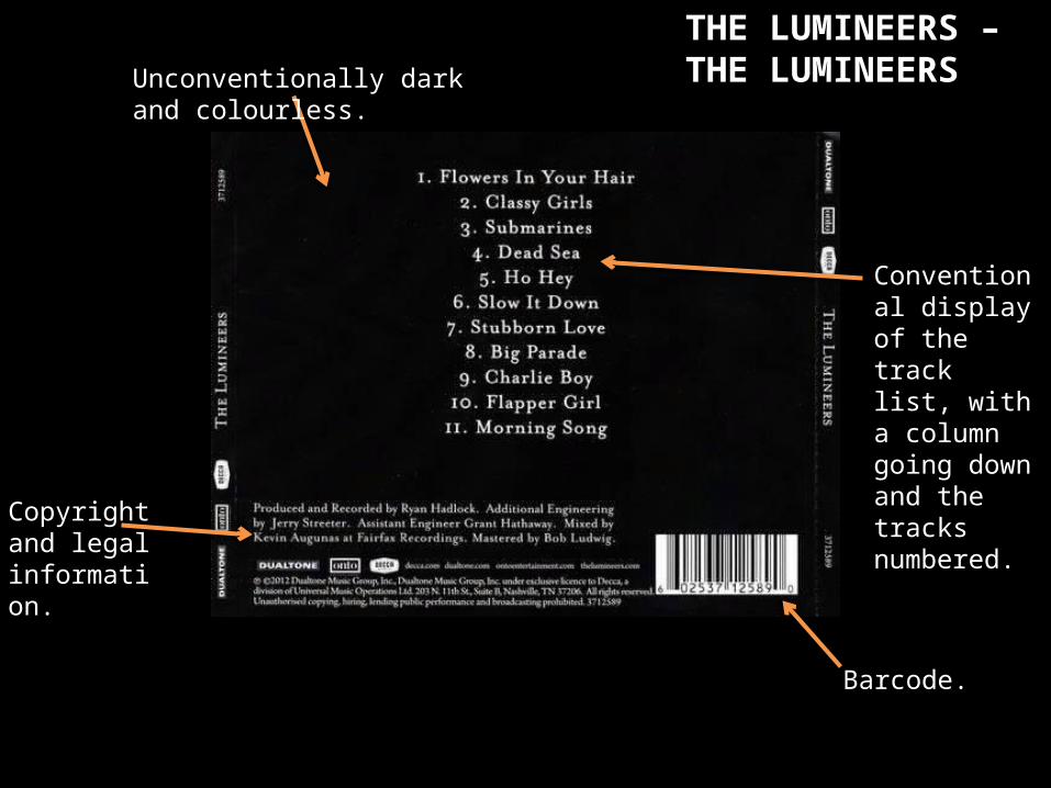
THE LUMINEERS – THE LUMINEERSUnconventionally dark and
colourless.
Conventional display of the track list, with a column going down and the tracks numbered.
Barcode.
Copyright and legal information.
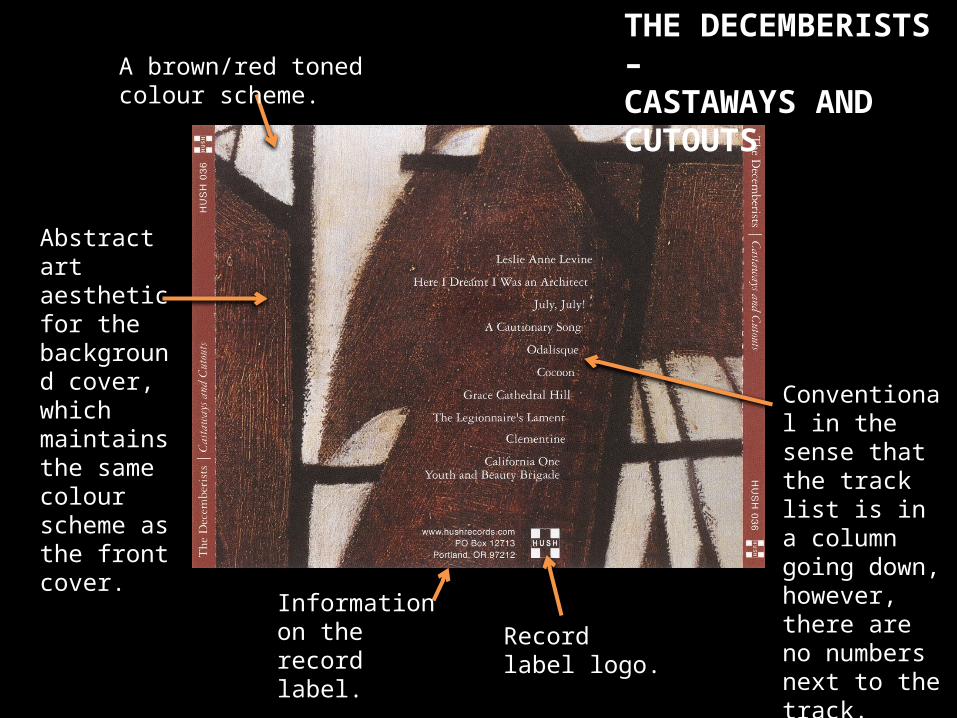
THE DECEMBERISTS – CASTAWAYS AND CUTOUTS
Conventional in the sense that the track list is in a column going down, however, there are no numbers next to the track.
Record label logo.
Information on the record label.
A brown/red toned colour scheme.
Abstract art aesthetic for the background cover, which maintains the same colour scheme as the front cover.
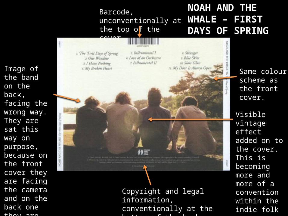
NOAH AND THE WHALE – FIRST DAYS OF SPRING
Copyright and legal information, conventionally at the bottom of the back cover.
Barcode, unconventionally at the top of the cover
Image of the band on the back, facing the wrong way. They are sat this way on purpose, because on the front cover they are facing the camera and on the back one they are looking away.
Same colour scheme as the front cover.
Visible vintage effect added on to the cover. This is becoming more and more of a convention within the indie folk genre throughout the videos, posters and album covers.